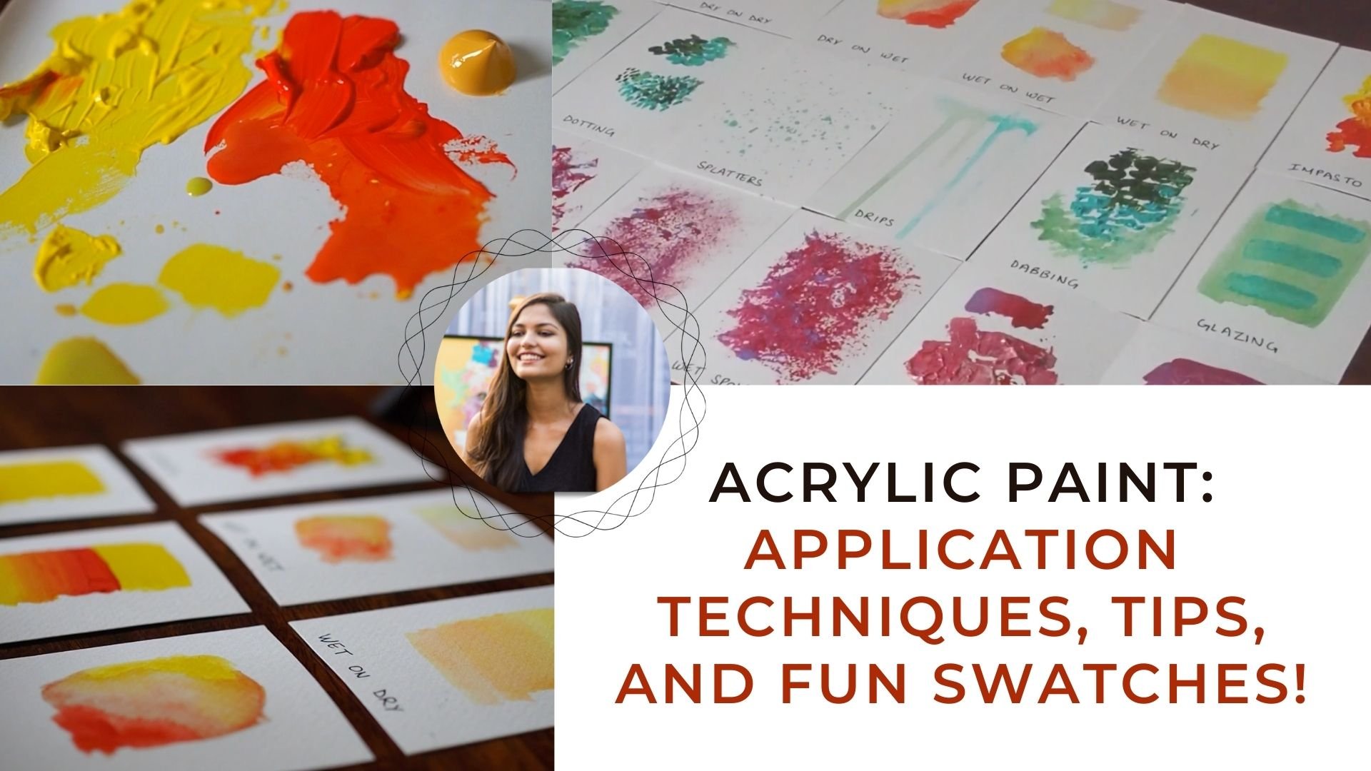
Transcripts
1. Introduction: Hi guys. Scribbling for me is like therapy and
it's something I'm constantly doing in my
sketch book as a way to loosen up my hands and
my mind into the legs, all my creative muscles. And it helps me break down all the technicalities of joining into just a
few relaxing stroke. In this lesson, we're going to cover all the basics
of scribbling. And we're going to
show you the things that worked for me and the possibilities of being
able to do anything anywhere. We're going to start by
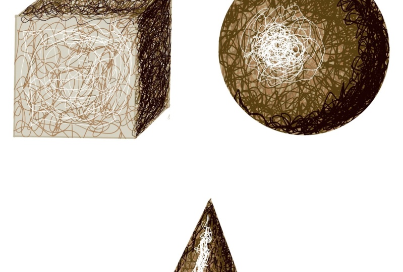
understanding the basics through learning how to create depth and simplified shapes like a cube, a sphere, and a cone. We're creating gorgeous
gradients with scribbles. We're going to chat a bit
about adding highlights and shadows and moving from light
to dark to create contrast. And finally, I'm going to apply what we've
covered this trouble, everyday things we can find around the house or
in our environment. This is a really
simple lesson for anyone thinks
scribble out is cool. Artists Delight. While we are working
on Procreate today, abandon a viva would
work just as well. These steps can be practiced. However you recall,
I've been excited to do this lesson for a while now because I wanted to branch
out into all things tribute. This would be the
first and the CDs. I hope you didn't, and I'll
see you in the next video.
2. 2 Let's prepare!: So before we get started, I want to talk a little bit
in depth about what we're going to cover today and do
some swatches for you guys. Now, I do have my iPad here with me and I'm scribbling
on Procreate. But you can use your sketch
book and a pen or pencil, or literally anything
that's pointing. The world is a lobster. I'm going to use
my technical pen here on Procreate and I've please watch the limited palette of drowns to get started, my opacity is spiked up to max. For this lesson, I'm going
to show you how you can scribble some really
simplified shapes. After all these other
shapes we use to draw just about anything from
a house to a person. We have a cube, a
sphere, and a cone. We're going to
cover what happens when the light is coming from a particular direction
and how to scribble in those shadows and highlights to make the joint pop a bit more. Scribbling is all
about layering. More you layers, the more dense the artwork or that portion of
that artwork is, the more hours you spend on it, the more intricate it becomes. So simplified shapes first. Now to talk more about open
and tighter scribbles. I don't know, That's another
more technical word for it, but I'm going to use
Open and tighter. You can see the difference
between the two right here and how it can
help us create a different, help us create
different values as well as create a
gradient effect. We're then going to use blacks and whites at
the very end to add subtle hints of where the darkest part of the objectives as well
as the lightest part. These are some really simple
sketching tips as well. I find myself using whenever I'm sketching
anything at all. And it's really helpful to apply it to scribble
out so that you can create the same effect
in that drawing without having to sketch it using the sketching techniques. Finally, once you've done all of that, I'm
going to proceed, distribute things that pop up in my mind, everyday objects, people as a fun exercise and urge you guys
to do the same. I'm going to talk
more about this in the final project
section of this class. But for now, let's
get started next up, we've got a cube.
3. 3 cube: Now I spoke about having loose and tight scribbles
in this video with a cube. That's exactly the first thing we're going to aim
to understand. Now, scribbling I find is
really no different to shading in the sense
that I'm going to first cover the entire
surface with a mid-tone. So in our case that is just
losing open scribbles. And gradually as you progress, I'm going to build
on the values and add my darks and my
lights and so on. Here. Further cube
with the base tone, that's my lightest brown on
the far left of my palette. And I'm just doing some really
open-end lose scribbles all over the cube, right here. Essentially for the cube
with the base tone. Now, let's assume
our light source is directly in
front of the cube, which means the top portion of the cube should be a midtone and the right
section of the cube visible to I should
be the shadow. So what I'm gonna do
now is I'm gonna take my second Brown from the top. It's just slightly,
a little bit darker. And I'm going to do slightly tighter scribbles on the top in the right
section of the cube, which would be more
in the shadow. I don't want to do darker or lighter in either of the areas. I'm just my aim is just to cover those two
sections for now. Once I have done that already adds a little bit of
depth to the cute because you can look at it and determine where we have a light source which is directly in the front. One central. With that, I'll use the darkest brown, which is the drown
in the middle. I'll tightly scribble in the
right section of the cube, which is the darkest
area we have. I'll also keep those. The section on the right. I'm just going to keep
it even more tighter and compact and let it
a little bit more than I would the
other two sections because I want to show it as a darkest point of
the of the cube. So already you can see how much of a
difference that makes, because we can see that as a 3D object already
with just scribbles. Now that we have our
values and place, the final thing that
I would do is I will use the black and the white in the darkest and lightest
area of the cube. To add contrast. I'll do
that in a little bit as soon as I'm done
scribbling this section. And I'll tell you
a little bit more about those darkest
values in the, in the sphere that we're
going to cover next. Because I think the
sphere is just, you can actually see how
the gradients shift. So here's what I would like for you guys to remember
from this one. The tighter the scribbles, the darker that
area appears to be. Similarly, you can learn
more scribbles on top of existing scribbles to
achieve a similar effect. White areas with more
open and lose scribbles tend to seem lighter
in comparison. Just experiment with this. Just try even like just pick one color and don't change color and just with that color, try and get the same effect using just tight and
loose scribbles.
4. 4 sphere: So now we've got our sphere. This would be fun. I really enjoy
sketching spheres. To start with a god, my lightest drown
there on the left. I'm just using that to fill in the entire surface of the
sphere to get us started. In this section of our lesson, I'm going to talk a
little bit more about how to create gradients and values. We've got our highlight
section just here to the middle left, bottom left of the cube. And that's where we want to
keep our scribbled really, really, really, really open. And just keep that section three for for when we
add our highlight, which would be the white
just towards the very end. Now a top right, top right corner is gonna be our shadow areas so that I'm not too
worried about layering. So I'm just going to work
more a little bit there, like here now I'm
going to take my slightly darker brown and
I'm going to cover that who? Top and the bottom right
corner of the sphere. And I'm just going to work my way towards the area
that's unhighlight. While I'm not gonna touch that section of
our lightest area, I am going to make sure that my scribbles
are literally come back and I'm going
to start creating depth with this color. And just so our eyes are driven towards where our shadows are and where our
highlights are. That would help us
create more gradients. And as I come towards
the highlight area, my scribbles would
just get a little bit more open and I would keep them do literally
compact on the corners. Now, the next I'm going to
use our darkest brown there. Now that's a shadow color. So I want to use that color
only on the corners again, but I'm kind of bringing it
into our mid-tone section as well to kind of help us create that balance and that
shift from light to dark. I'm keeping my scribbles
really compact on the corner. This would help, again create
that 3D effect and help us add more depth and create
that shift of value. Now that all our
values are in place, I'm going to take
our darkest color, which is the black there. And I'm gonna keep this black only in the corners
of our sphere. Using our darkest
and lightest values just helps create
a lot of contrast. I'm only going to use a
little bit of both just on the corner and just where
the light hits the sphere. Really added 3D
effect of the cube. These are tips that I also use when I am painting
portraits all the time or anything
that's around or anything where I really
need to add contrast. That's where I use the
black and the white. Especially when I want to
show that gradient shift, I'd move from the light to dark.
5. 5 cone: Now finally, we're just going to put everything we
learned together. And we're just going to try
and scribble this cone shape, which I think is a
really interesting thing to scribble as well because it
kind of gives you that hollow bottom ground, um, and it's a bit more complex even though
it is simplified. So what have we learned so far? We know that we want to put open scribbles on areas that we want lighter or the areas that's getting the
most light on it. And tighter or more layers. In areas where you want to show more shadows or two more
darker part of your work. In this cone here, a light source is
again at the left. Butt here we would have
shadows both on the right of the cone as well as the
bottom hollow section. I'm scribbling I find is like shading but a little
bit more laid back, a little bit more unfocused and a little bit more
fun is what I find. I will love working with ink. Just because you can
kind of sit back. I can have a cup of tea and it's something I do before I really get into my day and I start
painting. We go projects. It's just something that gets my brain moving and
gets my hand moving, and it's an incredible warm-up. So I feel like this
lesson is also aimed at helping you understand
what it's like to shade and sketch and
religious to prepare. Just to kind of let
go and have fun. So for now, we're just going to do a little
bit of a recap. The few things that
we learned today. The first is tight scribbles
with more layers to create shadows and less layers and open scribbles to
create the highlights. It's just four or
five simple steps. First step is the base tone, which is you just fill the whole surface of your
project with scribbles. You just take somewhat
of a midtone and you cover your whole surface so you have something to start. On. Step two is the mid-tone. So this, you kind of use everywhere except for where
the light hits directly. So you just want to
leave that area, which is the first
layer of scribbles. And other than
that, we just wanna get a slightly darker
color everywhere else. So I'm creating a gradient. Then step three is
you've got your shadows, which means again, tighter
and more compact scribbles. But you want to
keep this farthest away from your light source or where you get your shadows. That's the only place where I
do this darker brown color. Or just the tightest scribbles. And finally, the
fourth is just kind of refining what you've sketched
and putting everything. I'm just adding scribbles wherever you think
it needs and using your darkest and lightest
colors that your black and your white or whatever is the
darkest color you want to use. And this would just be focused in the small areas that are
the darkest and lightest. Which means it helps
to create a lot of contrast in which you're
painting really helps it pop. With just these
four simple steps. You can literally do
anything in the world. Everything we see can be broken down into the simplified shapes. And in the next section, we are going to scribble
some odd things together. And we're going to use these
same tricks and apply it to different objects and things
that we see around us.
6. 6 Scribbling away: So now bear with me as
we put everything we've learned from the
previous sections, working with the
simplified shapes. I'm just going to use those
same tricks on these, on painting, whatever
we can get a hands-on. For now, just watch
as I do this tree. I've used this bean color, which is my base tone right now. And they've kind of
given everything away. And then gradually
working my way towards darker colors to
enhance the shadows. And I'm using the
yellow for highlight. And already you can
see so much depth and it's just like really, really simple open scribbles. And it's really fun to just
find things that you can do. Here. Now I'm making
a gap, right? I've just sketched it
out really simply. And I've just used this, the pennant, the
similar grounded people using in the previous sections. And again, just give
everything based on Layer and gradually
work your way towards darker tones and
filling in your shadow areas until eventually you're adding contrast with your
black and your white, um, or whatever
colors you want to use as you highlight
any shadow color. That obviously depends on you. I think scribbling is
really, really fun. But there's one thing that I wish that you take
away from this lesson. It's not restrict
yourself with stress. These are just four
simple guidelines. And the more you practice, the more automatic
it will become. You just want to experiment
with different pens of different thickness and
you want to experiment with different objects that
you can sketch and scribble, or you can do a portrait, or you can use different colors. It's, uh, it's meant to be something fun and
relaxing and therapeutic. At least that's what I find. Because I find that I'm shading takes me a
little bit of time, but I really, really
do enjoy scribbling. Just try different objects, have a play around with it. This is what I would like for your project to be kinda
look around you and see what things you
can just sit and do, do or even just
ask someone to sit for you as you scribble. If you do have just a
sketch book and a pen, which is just a
simple black ink pen. Here I'm showing you how
I've done this tree, which is that when I'm still
kind of creating areas where there's more docs and areas
that were there, more lights. Then slowly and move on to slightly more
complex shapes like I think plants make
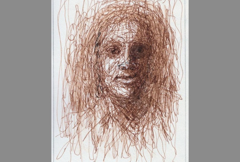
an incredible study. Portraits if you want. Here again, I'm using the same techniques
where I know like the eyes are under the
nose and the lips would be the darker the darkest spots. Have a play around with it. Just sketch whatever you can do. Do, do do the same
things I've done here. And I would love to see
what you guys create. Here. I'm just showing
you how I've laid different layers of scribbles on top of each other to
create even more depth. This is simply just gives it the more
time you spend on it, the more defined and
gorgeous it would look. But even quick, scribble lot I find is just more often than
not is really, really cool. I can't wait to see
what you guys create. And I would like to do some
more lessons and scribbling. Maybe I would really
like to do one on just how to paint trees,
which just scribbles. I think that would be fun, but please do let
me know what you all are looking forward to in the next few lessons and I'll
see you then. Thank you.
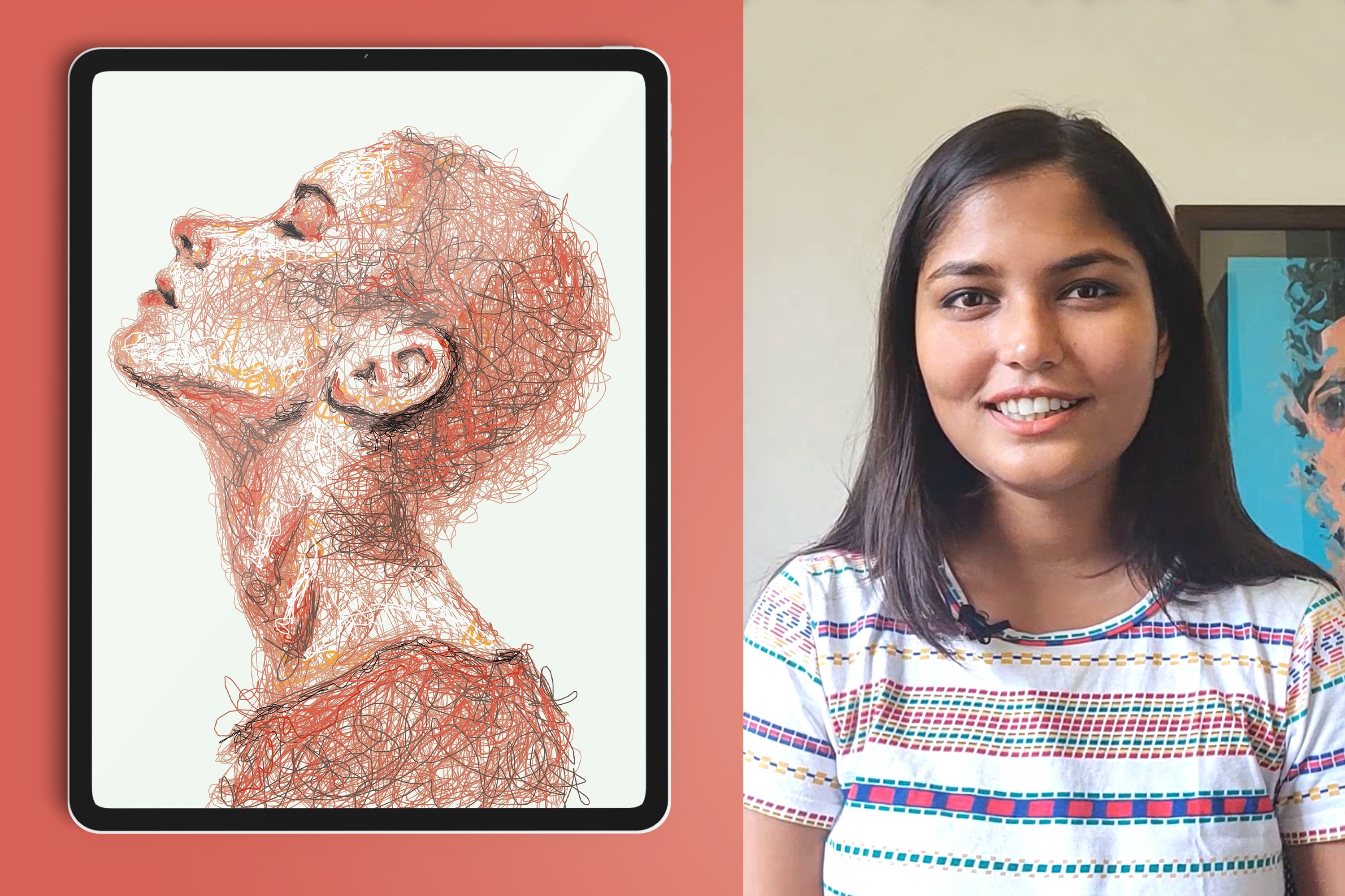
 Varnika Prakash, Delhi based mixed media portrait artist