Transcripts
1. Introduction: Hi, everyone. My name, Miss Eugenia. I graduated as a graphic designer in 2010 and I worked in the industry for five years Street while working as a professional signer, and I found myself missing traditional art. So I made any to channel cold neon. You need to share my watercolor painting journey, my favorite things to paint our food illustrations on loose botanical paintings, my YouTube channel. I also share some of my painting processes and many tutorials. This will be my first time sharing my art old skill share. And I hope you guys enjoy this and learn something in the process. And this course we will start off by covering the tools and art supplies types of water colors and then tracing on watercolor paper and tips and tricks to use masking tape on your watercolor paper. I will then take you through what on dry techniques, which are flat washes and introduction to color values, negative flat washes, radiance, dry brush and brush control, and last but not least, layering. So I hope you guys enjoy and let us begin
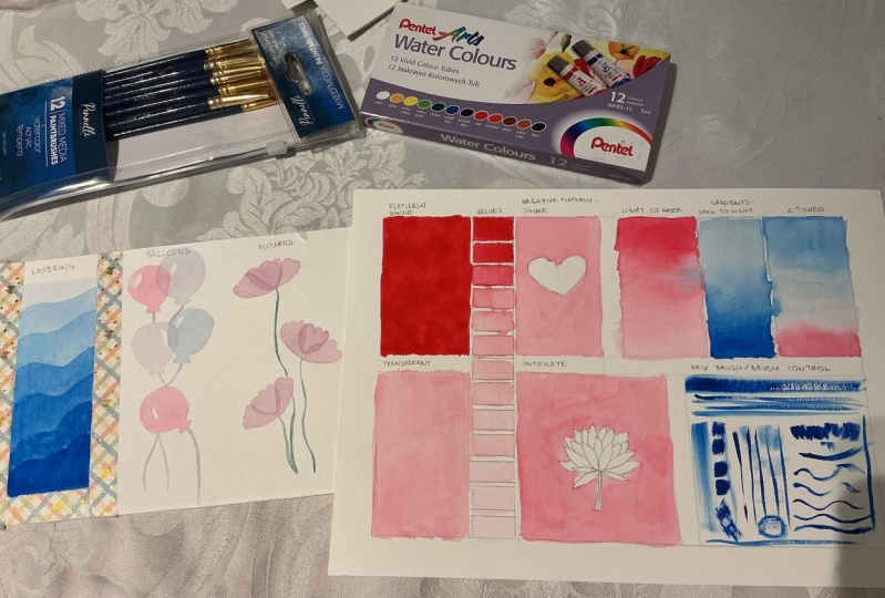
2. Art Supplies: starting watercolors can be daunting. There's so many types of water colors, so many brands, so many different price range. So where do we begin? As a beginner, you may not want to invest so much money into something that you're still unsure about. So let me take you through what I found to be decent our supplies for beginners. Later in the lesson, I will show you the different types of watercolor paints As a beginner, I find two paints are easier to work with, however, is not as easily available as pan pains. So in the demo, I will be using this quite watercolor set. It's a good set for beginners, fairly affordable, and up till now this is the most use palette that I own. You can use so many different things as your palate. I personally also like using white plate can be plastic or it can be ceramic as long as it's white. With this with surface, it would make it easier for you to see the colors that you've mixed. I'm sure you can find something in your house right now that Jenny's for the paper. I find that cats in Excel is a good way to go for its price. You're getting a sturdy 300 GSM paper with good paint absorption. Though there are limitations, I find that this is good paper to start with. However, if you do have a watercolor sketch book, you may also use your sketchbook to do these exercises. Ever since I started watercolors, I've always been comfortable using any synthetic brushes. The brush is that I will be using today is by Liar A and Reefs. I will be using three different types of brushes the flat brush, pointed round brush and finding zeal. Brush. You will also need jars or any container that could hold water. Here. I have to charge to keep the pain from being money. When we use different colors, you will also need a tissue or paper towel to dab and dry your brush and scrap piece of watercolor paper to check if you're fine with the consistency of your paint. If you're taking the option off tracing the template that I've provided as a downloadable, you will also need this station Aires to trace over the template to your watercolor paper
3. Types of Watercolours: what are colors are so far is tall, and it comes with so many different varieties that can be included in the watercolor category. Here is the most used, which is a panel watercolor set here as a preview. I have a Cotman water color and the koi Cotman is a student grade off the Brown Windsor and needed and work so great. So if you're willing to splurge a little bit more, I would recommend this palette. If not, just stick with what you've got. These are the design trample set, which makes them very convenient to use when you're on the go. Now, because this video is about affordable art supplies, I'm going to stick with my koi palette. This pan set is made out of dried watercolors Soto activated. We need to either spray the palate with water before we start or use a brush and what the surface. I find that beginners tend to not wait long enough for the water to settle and activate the paint. That is why you see some paintings. They can look a little bit too light or dull. Don't be scared by the bright colors because the paint also drives a little bit lighter than when it's wet. After your pain is activated, pick up the generous amount with your brush and spread it around your palate. This is so you get even distribution off paint on your brush before you start beating. I also like to put extra paint on the palate, so I have it on hand when I need that particular color instead of having to reactivate the paint again. What a lot of people look for in watercolors is the transparency. Higher grade watercolor tend to be more vibrant and transparent and color. So to show you this transparency, I decided to put a line across the papers so you can see the difference. Next are the two paints. Two prints are what the paint used to be before it's tried to make the pan watercolors that I mentioned earlier. I find these easier to use because you don't really need to wait for the water to reactivate the paint, since it's already fairly wet, so you only need the water to get the consistency that you want. You also don't need a lot of paint because a little goes a lonely here. I'm holding the pen tell tubes, and this particular brand uses guys instead of pigments for their colors, so it creates a smoother texture and no granule ation. If this is what you're looking for in your paintings, thes are great because they glide so smoothly and the colors are very vibrant. These are, however, very opaque and similar to wash paint's. Ah, lot of people love watercolor for his transparent behavior, and most higher end brands tend to have more transparent paints. So pick your pain according to your tastes, because everyone has different preferences. What a lot of people also like to do is purchased the two paints and create their own palette by filling their empty palette up with the colors that they've chosen and then leaving it to dry as pan watercolors. You can even mix your own colors in the pen and let it dry like the others. What's the certain color is finished. You can refill it again with the two pains. Our next set of pain we're going to look at is cold Wash. Paint's thes usually comment larger tubes. Here I have the Windsor and Newton Wash, which is an artist grade set. They're also so many cheap wash says, available by talents, reefs or even secura. And these are usually much cheaper than the water colors that we looked at earlier. Gosh, it's also known as poster paint and is basically an opaque watercolor. It can be worked with a lot of water, but as you build it up, it can become opaque like acrylic. However, gosh has a matte finish compared to acrylics, which tend to have a glass. Your finish because squash iso bacon nature watercolorist also like to use whitewash instead of leaving their paintings with white off a paper to get to the really find highlights or extra details, you can also mix in the white with other colors to create a no pay pastel color. As an example. Here, I will add some weight to the red wash and all painted on top off the red paint, and then you will see that because I used a thick consistency, the pink now covers the red color completely and last but not least, we're going to go through liquid watercolors. Here. I have equal line by talents. I use this back when I was in uni, and these are so smooth and they settle Similar Leads, Inc But it can also be diluted with water, whereas most inks are usually alcohol based. Liquid watercolors produce such vibrant as both colors and also very transparent in nature . Due to how liquid thes are, it might be quite a hassle to use. You would need a lot of separate pans to use on different colors, or else the colors would all puddle up together. So to take some out of the bottle, I used this, pip it and put it on a small container so the colors won't easily contaminate the others. There are also other brands like Don't TIPH Martyrs, which includes the dropper, attached the lid off the bottle and are very hands to use to pain with ease. I just lively down my brush and take the paint straight out from the palate and to delude it. Just add a bit off water. Like any other watercolor. You can already see the vibrancy and how the pain evenly distributes itself across the water as I drag it down
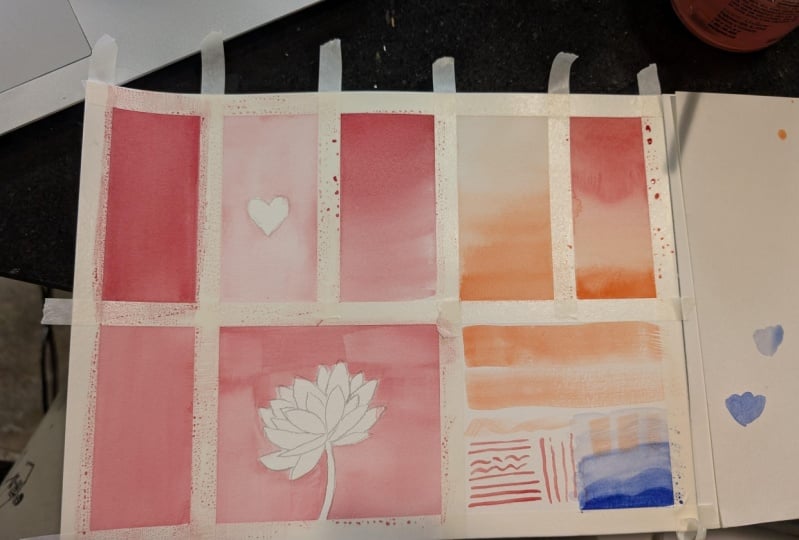
4. Tracing the Template and Masking: When you sketch straight on watercolor paper, you have to make sure that you don't over a race or press on your pencil to partially on the papers so it doesn't damage the fibers. So a lot of artists choose to draw their outline on separate piece of paper, then trace over it to create soft and crafts. Outline that you can hide under the pate. If you're willing to give your hobby a bigger budget, you can splish on a light tablet for around $20 to help you with this. However, if you're still unsure on spending too much on a hobby that you've just started, you can put your drawing against the window with daylight and take advantage of the natural right and trace over your drawing. In this case, I'm tracing the downloadable template that I included in this course. Think you can create your own Tempted. I don't suggest printing straight on your watercolor people because most home printers are inject and the ink is water soluble, so if you get water on it, it will bleed here. I'm just tracing the edges off the boxes and going over it with a ruler later, just to make the process of tracing much faster. There, two boxes set for the negative painting, and I have included a heart shape and a lotus flower shape. You can also trees over thes or even draw your own subject so it's up to you now. I'm just following the guns of the boxes that we've traced previously by using a ruler and joining the dots one by one. Do this with all the boxes and you're done with the template. If you don't feel like drawing the template or you want something with sharper edges, you can use masking tape to make each square. To mask your paper, tear the left off the mosque in tape that you want. You can measure, according to the paper size, then ripped the tape and stick it to a piece of clothing or fabric so it sticks to the tape . This is a trick that I use so the adhesive isn't to struggle that would easily rip off the paper when you take the tape off, so do this toe all the sides and you're done. Mussing also makes it easier for you to paint edges because you don't have to take too much care for the ages As you paint. After you take off the tape, you're presented with a beautiful, crisp edge. Feel free to use your favorite way to create your own template.
5. Technique 1: Flatwash: the first technique we're going to learn as a flat wash. If you are using the template that you've traced over, we are working from the left to the bottom and into the right so hope he can follow. If not, then it's alright. You don't have to follow the template. Just try to paint straits on your watercolor paper and paint along before we start painting , going your supplies ready. You will need the watercolor paper with the template drawn your water color. Paint a door of clean water. Did your papers dab and dry your brush? A pallet on appointed ground brush or a flat brush To activate the paint. Drop water with your brush on the pain of color that you want. They've been there for a while until the pain activates and becomes more soluble so you can easily load your brush with a lot of pigments. When you're paints isn't fully activated. The colors will look like and dull, and that's what I find beginners doing as they load their brush So the painting might look a little bit too light or washed out, so get used to activating your paints and using more vibrant colors, so you can understand the full range of values on watercolor. Let's start painting on this first box. We are going to paint an opaque wash. If you're paint is transparent, that is fine. But the point of this exercise is so you know how it feels to have a lot of pigments on your brush, basically the most opaque or the most vibrant your color can be to do this. If you are using pan pains, make sure to fully activate your paint as mentioned before until you can see the water on your brush. Start to take on the pigment very quickly. Then I like to spread it on the palate until I get a fair amount off the paint so I don't have to reactivate or use more water to get more pigments in the middle of doing the wash. When you feel like you have enough concentrated paint on your palate, you can get to painting, trying to fill in the box with the thick paint. Make sure that your brushes always damp when applying the paint. It shouldn't be dripping, but it should always feel wet so the paint can glide smoothly. What you will find with cheap paper is, paint does not apply as evenly as on good paper. But this does not mean that it's not possible, but rather you'd have to work the paint more to get even coverage off course their limitations. But it can be salvaged. It is easier to use a flat brush for flat washes, however, just like to show you that it's also possible to use from brush. I suggest the bigger the surface area, the bigger your brush should be too white, too many strokes that may create streaky surface. For instance, this wash right here I can go over it again with a flat brush. In order to get a smoother surface, Let's get to the transparent wash With this wash, you want a thinner consistency, so with the remaining paint that you have on your palate at somewhere water and mix it together until you get a thin consistency, as you makes you want to make sure that the paint distribution on your brush is even before you paint with it. The point of this exercise is to know what it feels like to have thinner paint on your brush and how it applies naturally. The thinner, the paint, the foster, the paint will glide. What you want to avoid is too big of a puddle, but still keeping the paper went enough so the paint can still travel evenly without leaving any lines off dried paint. As you can see here, I quickly drag the paint down before anything starts trying, letting the water settle quite naturally, spreading the pigments on the Web surface. I continue pulling the paint down and spreading it on the paper. When your brush runs out of paint, reloaded again, using the paint that you have previously mixed on the palate with any washes that you do, you want to make sure that you have enough paint on your palate too quickly. Reload your brush unless you are already comfortable with quickly getting your paint to the exact consistency. Now that you know how it feels like to have really thick consistency, paint and thin consistency paint, we can start breaking it down into values, whilst other media such as oils and acrylics, where even wash uses wide to make a lighter tint, pure water color do not have white. Instead, to make a lighter tints. Winnicks thinner consistency. Paint. With this exercise you want to. Firstly, activate your paint again, and it's already dry and get the thickest consistency you can then load your brush and apply you stroke on your template. Under the title values, keep adding water little by little and try to go down in value, making the consistency of the paint thinner and thinner as we moved on the value and switching it as you go and see how far you can take it to get close to the white off the paper as you paint. If you accidentally put too much water or too much pain on your paper when it's supposed to be a lighter value, you can easily take the paint off while it's still wet. To do this, try cleaning your brush, then granite on tissue paper. Then, using the dry brush, you can absorb some unwanted puddles or excess paint.
6. Technique 2: Negative Flatwash: Let's try another exercise. Once you know what it feels like to have the watercolor glide smoothly across your paper, as you did previously for the flat wash, we can try leaving a shape in the middle. This technique is called negative flat wash, as pure water color has no opaque white color. We seclude a space for something that we want to leave white. To do this, we're going to use the trust bare flat wash that we've previously made. So make sure your paint is activated and put some on your palate than thin it out to your liking. Make sure your brush is very wet so the paint can spread smoothly and evenly oppress the paper like the transparent flat wash. The idea is to work fast and not let the paint dry on any side. The idea is to leave a small puddle near the edge so the paint has longer time to set and not be absorbed too quickly. Due to the negative shape, this becomes harder than the first flat wash, as you now have to have much better control of your brush. I have included this harsh shape in the template, but you can also create your own negative space for the next folks. We're going to do the exact same thing, but around a subject that is much more intricate than the 1st 1 on the template. I have included this lotus flower, but of course you may draw your own shape. Make sure you include tight spaces that are hard to get around with a brush for a good practice. We're going to use the existing technique as before, but using even better brush control as now, there are finer and more detailed edges and space to be filled. Make sure you have a fair amount of paint with the consistency that you want on your palate , so you don't have to keep going back to reactivating your paint along the way. Load your brush as you would in the previous exercise, and begin to paint a hint as to start at the edge of the box, as it is a fairly easy area where you can use ah what brush to get the pain across. Then, once you're close enough to the lotus petals, put a puddle of paint close to it and dragged the paint from the puddle to get to those tight corners. I suggest you avoid starting in the middle as you would need a dry brush in order to get the paint around to find edges off the flower petals and making the paint dry faster, which would lead Teoh across the edge. So we're quickly and carefully on this one and try to avoid any pain from drying. Remember to reload your puddle on the edges off your paint so you can easily pull the puddle to get even coverage. If you find this particular drawing a bit tricky to paint around, you may drop a simpler shape and slowly redoing the exercise with harder shapes and try to build up your speed and brush controlled before trying more intricate negative paintings. Aziz, we're almost done here. I use a clean, dry brush to absorb excess puddles off paint to create a smoother surface, and we're done with this exercise
7. Technique 3: Gradients: the next exercise we're going to do is Grady int. Here. We're going to be in three different types of radiance. Doctor lie light too dark and too told, which consists off two ingredients off colors. First off, like any off the other exercises, reactivate your paint and play some on your palate. You can also activate two colors at once for this exercise and leaving the water on the paint until we get to the tutto ingredient. Here's a tip before we begin. A palate isn't only great for putting paint on it, but the reason why I make so much on my palate is also to get even distribution off color on my brush. Let's start from the doctor like radiant. Begin by painting a small part off the top of the box with very thick consistency. Paint and while it's still wet at a lighter tone off the color from your palate and spreading at lower from where you've previously painted as you go, keep adding more water until you get to a very light tint. This is very similar to the value exercise, but this time as one large shape, which means you can also pull some darker paint to the lighter What area? Creating a nice, distributed radiant. Keep working on it with your brush until you're happy enough with the distribution off paint. If you accidentally create some street, he lines. That means your paint is drying and thickening up. However, if it's not overly dry, you can still salvage it with a little bit more diluted paint. Just for fun. I decided to use a different color for the next radiant, which is the light to dark. So like any other, I activate the color that I want and putting some lightly on my palette. This time I'm going to mix a light tint instead. So at a lot of water. And if you need, you can use a scrap piece of paper to check. If you are happy enough with delighted that you've made, I always find lighter colors to be harder, she judge on the palate. Once you're happy with how lighted this, start painting it down on the top off this sign box. As we get lower, keep adding more and more paint until you create a nice transition. We're basically doing the exact opposite off what we've been doing previously. If you find your pain to turn streaky and not think enough, you can also leave it to dry first and adding another layer. But you also have to keep in mind how to redistribute the top layer, so it still creates a nice transition that you're looking for. Another extra info. As you can see here, my blue paint is not laying down as smoothly as the previous color. That's because different pain task different pigments, and this causes granule ation. This is not necessarily a bad thing, depending on what you're looking for. Some artists actually look for the grand relation to make the texture, so don't panic. If you see some different colors laying down differently with ground, your leader textures. Last but not least, we're going to go over the two tone ingredient. We're basically doing the exact same thing as we previously did, but with two colors this time one starting from the top and one starting from the bottom, I've used a red on blue, which would create a nice, soft line like color in the middle. Also, as you can see here on this particular Grady int, I'm using toujours off water this is so I can clean dirty brush, but I can also load my brush or pick up color with the cleaner water. By doing this, you avoid money colors. I personally don't do this as I change my water quite often when I paint. But if you really want to keep your colors as vibrant as possible, I suggest you use this method. As you paint this two toned radiance. You will see that the color start to mingle together in the middle. This is completely fine, but make sure that the top and the bottom is still the original pure color. Keep moving the pains around with your brush until you're happy with what he came up with. In this exercise, I made the transition color lighter, but you can also create less contrast and tone if you want to see more off the colors mixing together. Now that we're done with this exercise, less move onto the next one
8. Technique 4: Dry Brush: through this final box, we're going to try a little bit off the technique called dry brush. To do this, activate your paint so you can create Really think consistency. Paint your brush should be slightly depth, but not with the point of this exercise is to see the different types off textures you can create from your brushes. Tried to get enough paint on the bristles on your brush, but dry enough that the bristles would give off a nice six year from the brush to have three brushes. Prepare for this project. Let's just do this with the brushes that we have on hand. Try running the brush across and see the textures that you can create from the Bristol's from the different brushes that you have. You can also try doing different lines, such as excised or waves, or make little dots and see what sort of textures you can make. If you like this technique, he can continue on a separate piece of paper and experiment more with different types of brushes to see what sort of textures you can come up with with different brush shapes. Next, let's cover a little bit about brush control we practice brush control to get the fine details and paintings. This requires good muscle control and patients. However, you also need to get the right consistency and paint in order to make your brush glide easier. On paper, you can practice using a small, fine detail brush and see how even you can make lines. Try to do the same thing again, but this time try to make the lines as fine as possible. So paying with the very, very tip off your brush. This practice is also good if you like painting, botanical or flower paintings because better brush control would mean he can make finer stems for your flowers, giving them more off a delicate field. Keep practicing by moving the brush around. Try making shapes and circles to give you a better idea of how the brush tills as you press it in a certain direction. Let's move on to the next and final lesson
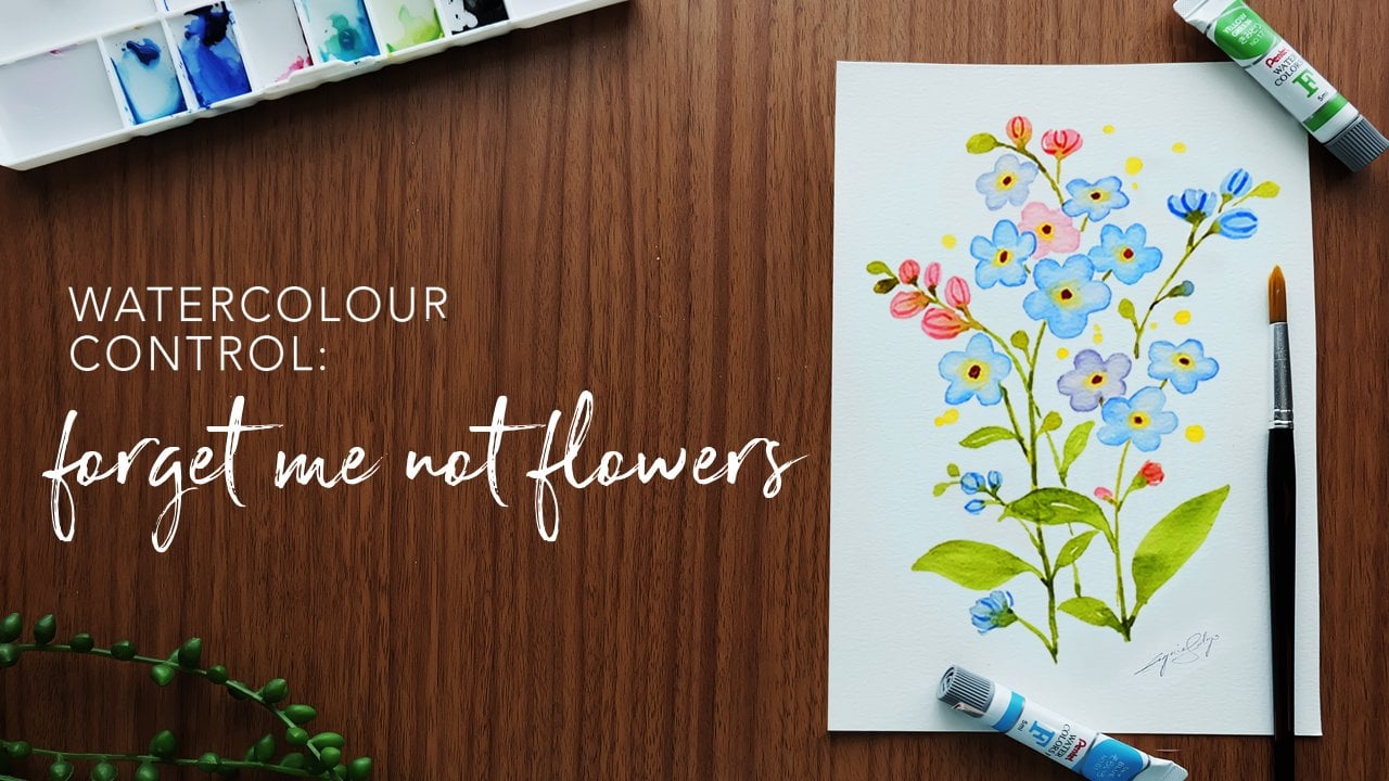
9. Technique 5: Layering: for the final exercise. We're going to go over the technique, layering. So like any of the other exercise, activate your paint and put someone your palate than load your brush. Here I use the books that I've mosque, and we're going to layer paint on top of each other as the names just on this box. I'm going to layer pain and let it go lighter as we get to the top. So think of this as the value exercise, but now we're using the layer technique with it. This technique is great for landscape paintings where you want to pay in layers of mountains. So here we are going to do something similar to that to begin, I used the darkest tone of the color and painting a small section on the bottom. I've made minds have wavy lines, but you can also just do plain straight lines. The key is to make sure that the previous layer is completely dry before you add on another earlier, or you will risk your wet paint spreading to the previous layer. Or you might even take off the page from the previous layer, depending on how dry the paper is, to check. If the layer is completely dry, you can look at it from different angles to see if they're still what patches. Don't touch those patches or you will risk taking off the paint instead. Just leave it until the damp patches disappear once they disappear at on another layer off paint. One thing about cheaper paper is that they take less paint so you're layers can be limited . So in this exercise, I only layer on the previous part that we've painted. Not the whole section drank the colors down until it starts disappearing, because as you spread the paint lower, it will automatically turn a bit more transparent. As you can see on the video, I only take the pain until it starts to blend with the previous layer. But I do not add more pain to drag to the bottom part off the painting. If you are unsure about the colors that you have on your brush, you can use this crab piece of watercolor paper to check if you have the specific value that you have in mind for these layering exercises as a hint. If you don't want to wait around for the paint to dry. You can either use a heat gun or a hair dryer in a low setting. But be careful to not blow away excess paint puddles. So only do this when the pain is completely absorbed but still down. As I have lost and tape off this particular exercise, I'm going to show you how to peel the Moscow tape off. It's really simple, easy and satisfying to look at the perfect clients coming out as the tape is being pulled off. The key is to pull away from the painting, So in case any parts of the paper is accidentally pulled off, you don't risk ripping off your painting. So always remember to pull the tape away from your painting. Now we are going to use the techniques we learned into painting certain subjects as an example. Here, I'm going to paint balloons. I suggest he only used to primary colors and mixing it together to create other colors and tones. This way, you would also get a good feel of color mixing, and your painting will also look harmonious and color. So start by taking the two colors that you chose and put them on your palate. so you have easy access. When you want to mix those pain together, start with the two original colors. Then, as you paint, slowly mix different ratios to get different variations to paint balloons started by painting a circle with the point at the bottom. Don't leave off a wife session as highlight as we've learned from the negative flat wash exercise, paint the rest of the area and at a tiny triangle at the point that you've made on the bottom off the circle. When you have access pain, that's puddling too much on your painting. You can use a clean and dry brush to pick up and observe the access paint. Leave the bloom to dry and paint another one on a different area as you wait for the 1st 1 to dry off. Once the first moon is dry, do the exact same thing on top off the balloon, with the side slightly touching. When your pain is completely dry, issue create two separate subjects. You can paint as many boons as you'd like, and once you're done painting the balloons, finish the painting off using a fine brush and practice a little bit off brush control that we have tried in the previous exercise, Then use a little bit off black and mix in a lot of water to make the paint light and diluted. This would balance out the self colors off the blooms, then use the very tip of your brush and paint the strings on the bottom of each wound. The next one final example I'm going to show you is how to paint flowers with the layering technique that we practice before to begin, mix the colors or take the colors that you want and place it on your palate. Make sure you get the consistency that you want, then load your brush so the pain is evenly distributed in the start painting. To start, we are going to paint a flower petal color and flat and leave. It's dry. Take note that the pedal you just painted will be the middle off the flower. While you wait for that one too dry, paint another one in a different area again. Remember that the first pedal that you drove will be the pedal in the middle of the flower , so this could help you as a quick guide to how you want to place your flowers, place as many as you want. But due to the clarity off the lesson, I just decided to paint a few. If your first pedal is already completely dry, draw another pedal on its side, letting it overlay the first pedal. Paint those pedals flat as usual. Take the excess paint off. If there is any with a clean, dry brush, you will see that this will create a beautiful, transparent effect to the pedals. Now repeat the exact same method to the 2nd 1 and the rest of the powers that you're going to paint. Remember to always make sure that the first or the middle pedal is completely dry before you add another layer to achieve this effect. And last but not least, we're going to finish this off like we did for the balloons so used the same consistency as you did for the balloon strings. But this time you are going to paint the stem, so make sure you're fine. Tip brushes, ready, unloaded, then use the very fine tip of your brush to make the stems carefully. You can wiggle or curve your brush a bit as you're doing this to create a soft, natural step and we are done with the lesson. Stay tuned to the final video for information on your class projects.
10. Student Project and Closing: So we are done with the first basic watercolor course. I'd like to thank you for taking part in this course to the very end on. I hope that you learn something new in the process. I'd also like to invite you to take part in the class project, which would cover old exercises that we did in this course. You can make your own version of it, or you may download the template that is available in the downloadable section. The follow with the boxes, which covers the flat washes the radiance and the dry brush is an a four size and the other , which covers the layering as on a five size. You don't have to be bound to these templates as you can make your own. I also have a second projects for you on If you could take part in both, um, would be really great for the second project. I'd like you to create something of your own three small artworks, which uses one or more techniques that was covered in this course. If you know any additional techniques, feel free to include it. Let your creativity run wild and post your work on this page. I'd love to take a look at what you've created. If you have any questions or feedback, I'd love to hear them. And if you like my first course and are interested in more, please follow me. You can also find be on YouTube for watercolor speed pains, many beginner watercolor tutorials on food illustrations on my channel Nanyan e or Follow Me on Instagram for more artworks at I G underscoring union. I hope to see you again soon. Bye.
 Nianiani, Watercolorist and Graphic Designer