Basic Colored Pencil Techniques for Beginners: Burnishing to achieve a Smooth, Glossy Finish | Smitha Rao | Skillshare

Playback Speed


1.0x


  • 0.5x
  • 0.75x
  • 1x (Normal)
  • 1.25x
  • 1.5x
  • 1.75x
  • 2x

Basic Colored Pencil Techniques for Beginners: Burnishing to achieve a Smooth, Glossy Finish

teacher avatar Smitha Rao, Pencil and Pastel Artist

Watch this class and thousands more

Get unlimited access to every class
Taught by industry leaders & working professionals
Topics include illustration, design, photography, and more

Watch this class and thousands more

Get unlimited access to every class
Taught by industry leaders & working professionals
Topics include illustration, design, photography, and more

Lessons in This Class

    • 1.

      Introduction

      0:41

    • 2.

      Building the Initial Layers

      8:13

    • 3.

      Burnishing Technique

      3:31

    • 4.

      Finishing Touches

      2:18

  • --
  • Beginner level
  • Intermediate level
  • Advanced level
  • All levels

Community Generated

The level is determined by a majority opinion of students who have reviewed this class. The teacher's recommendation is shown until at least 5 student responses are collected.

146

Students

6

Projects

About This Class

Want to get rid of those grainy textures and achieve a smooth, glossy finish in your Colored Pencil Drawings? The secret to it is Burnishing Technique and we will cover it in this Short Class.

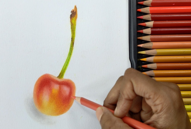
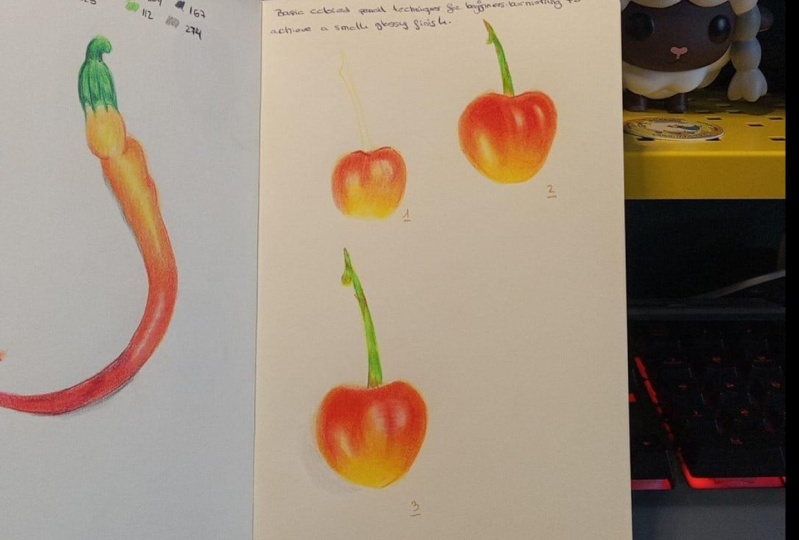
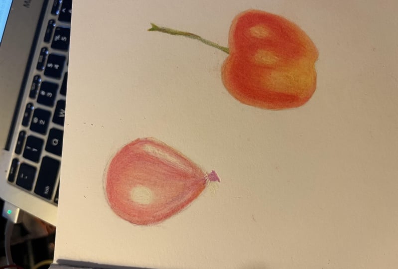
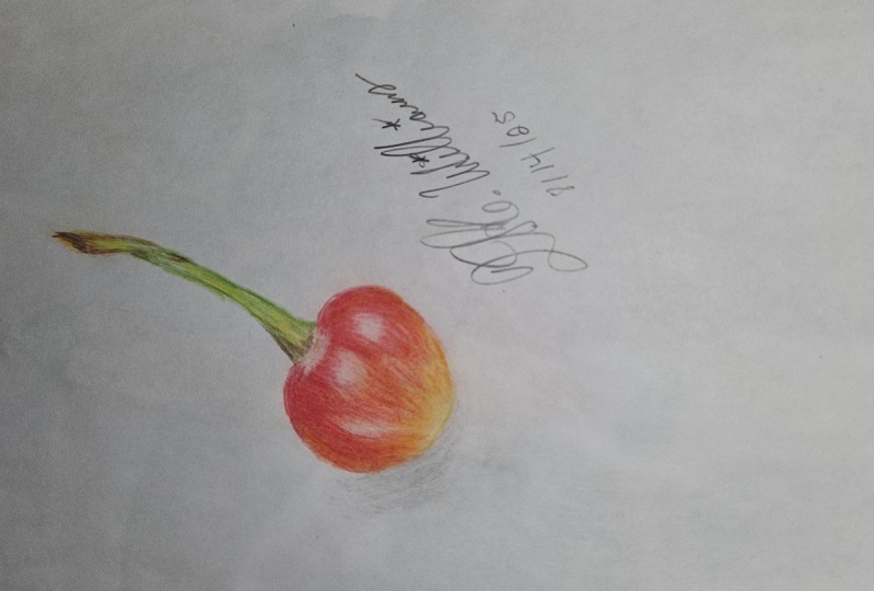
This is the fourth class in our series of short classes on Basic Colored Pencil Techniques for Beginners. The Class Project includes a vibrant, shiny yellow-red Cherry, a perfect subject to practice the Burnishing Technique!

What You'll Learn:

  • How to build up layers of Color, with varying pressure to create depth, richness, and smooth transitions
  • Understand what is Burnishing Technique, when and how to burnish, what colors to burnish with and what tools to use. These concepts will be explained with examples
  • The secret to achieving those almost painterly look in your Colored Pencil Drawings
  • Your Class Project: A Realistic Cherry: To put your new skills into practice, we'll be working step-by-step to create a stunning, realistic Cherry drawing. This project is perfect for reinforcing the techniques of smooth transitions covered in the previous Class of this series and also to practice Burnishing Technique

Who is this class for?

  • Beginners and Intermediate Artists wanting to understand the Burnishing Technique
  • Anyone who wants to add more realism and polish to their colored pencil drawings
  • Anyone who wants to enhance their Colored Pencil Skills

Prerequisite :

Although this is a beginner friendly Class, to get the most out of this class I recommend that you first watch the earlier Classes in the series. This will ensure that you have a solid understanding of foundational skills like layering and blending, before jumping to burnishing

(Please scroll down to the very end of this section to find the Links to those Classes)

What you'll need:

You'll only need a handful of colored pencils and a Paper for this class! We'll focus on making the most of a few key colors to achieve incredible results. (Specific colors will be mentioned in the Projects & Resources section)

Join me and unlock the secret to creating vibrant, glossy finish that will elevate all your future colored pencil artworks!

If you are new to this series and would like to watch from the beginning then please start here:

If you are having a busy day and if I had to pick just one Class from the series for you, then watch the one linked below as it is similar to the current Class:

Attribution:

Background Music- Royalty Free Music from Pixabay 

Reference Photo- @Stockking on Freepik

Meet Your Teacher

Teacher Profile Image

Smitha Rao

Pencil and Pastel Artist

Teacher
Level: All Levels

Class Ratings

Expectations Met?
    Exceeded!
  • 0%
  • Yes
  • 0%
  • Somewhat
  • 0%
  • Not really
  • 0%

Why Join Skillshare?

Take award-winning Skillshare Original Classes

Each class has short lessons, hands-on projects

Your membership supports Skillshare teachers

Learn From Anywhere

Take classes on the go with the Skillshare app. Stream or download to watch on the plane, the subway, or wherever you learn best.

Transcripts

1. Introduction: Ever wondered how to get that smooth glossy finish with colored pencils. It's all about burnishing, and I'll show you how. Hi and welcome to the fourth class in the series of short classes on basic colored pencil techniques. In this class, we'll put all your foundational skills to the test as we draw this juicy yellow red cherry. You'll learn how to gradually build layers, the concept of burnishing, when and where to burnish, and also what colors to burnish with to get that almost painterly effect. Because I want to keep this class focused, I won't be re explaining the techniques covered in previous classes. This class builds directly on those foundations, so make sure you're up to the speed by watching the earlier classes in the series. All right, then, let's get started. 2. Building the Initial Layers: This is a reference photo and we'll be drawing this particular cherry. I have used the Strathmore mixed media paper, which is slightly textured. You can also use a smoother surface. I have used the prisma color premier colored pencils. If you'd like to know the exact shades that I've used, please refer to the projects and resources section. As you can see from the line drawing, I have altered the stock and kept it simple. I started with the sand yellow with very light pressure. You can use any pale yellow that your set has. Shade everywhere, except the highlights. As explained in the earlier lessons, remember to use circular motion. Hold the pencil further away from the tip at an angle so that you'll be able to apply very less pressure. Next, shade with a yellow ocher, mostly at the center. You need to observe the reference photo carefully. Towards the sides, it looks kind of orangish pink. To achieve this, I combine two colors. First, I added a layer of salmon pink. Naming conventions can be specific to the color pencil brand, so don't get confused. This is almost like a coral shade. After that, I added a layer of pink on top of this. I also added hints of pink at the highlight area. As the highlight does not look fully white, it looks pinkish at the center and towards the left at yellowish orange as this area looks quite bright in the reference. At the top, where you have darker tones at a layer of orange followed by a red. If you have completed the chili drawing that fitted in the previous class, then this is going to be quite easy. We used similar shades there and overlapped adjacent shades to get a smooth transition. As I mentioned in the introduction video, all these techniques have been explained in detail in the earlier classes of this series. But I did not want to skip this entire section and directly explain burnishing. That's why I included this initial layering part in this class. It is slightly sped up, but you'll still be able to follow along. If you have any queries, please feel free to post them in the discussion section of this class. To darken the red at some places, I used the shade called scarlet leak. We are done with the first layer now. After that, you need to just repeat the same process again with the same set of colors, slightly increasing the pressure. Observe that I'm still holding the pencil away from the tip so that I don't apply too much pressure. Please remember to observe your reference photo every now and then. You can add another layer now, depending on how your drawing looks at this point. In my case, I felt it required more yellows and hints of oranges at the bottom. Before moving on to the next layer, I used a white pencil to gently blend all the colors together. Please note that this is not burnishing, and hence don't apply heavy pressure. This step is optional. Do it only if you feel the colour transition isn't smooth enough. You can now add a fourth layer with medium pressure. Before I talk about burnishing, I would like to let you know that it's not mandatory to burnish. It depends on the kind of finish that you want in the final drawing, and also it depends on the paper that you use. For example, for the chili drawing, I did not burnish as the colours blended well just by layering and the final drawing looked smooth. Also, I used a smooth bristol paper there, whereas here I'm using a slightly textured paper. Always keep in mind that burnishing should be done in the very end. So once you feel you have added enough layers, and if you still feel there are some white patches at some places in spite of blending, or if you feel the final drawing doesn't look smooth enough, then you need to burnish. So in this case, the cherry does not look smooth or glossy yet as I wanted it to be, that's where burnishing comes into picture and we'll cover it in the next lesson. 3. Burnishing Technique: After building a lot of layers, when you push the pencil onto the paper with very heavy pressure to smoothen everything out, that is called burnishing. This flattens the tooth of the paper, making it almost impossible to add more color on top. Let me demonstrate this with a few examples. I've added several layers of a single color that is red here. Now, I will burnish the right hand side with the same red in the direction that I've shaded initially. Later, I will also burnish in the perpendicular direction to get a much uniform look. You can also use a white pencil to burnish, but that dulls down the pigment, as you can see, on the left hand side. I generally do not use a white pencil for burnishing. Now, suppose you have layered several colors on top of each other. In this example, I've used orange, red, and then a crimson. Here, I need to burnish with the lightest shade that is orange. Observe that the box now looks like it has a tint of orange on red. You can also use a colorless blender to burnish. This is just a wax pencil without any pigment. Don't press too hard with this. Otherwise, it could lead to a waxy buildup. Moving on to the cherry drawing here, burnish each section separately with the lightest color in that section. At the bottom, use a pale yellow and also a white where you can see the highlights. At the sides, burnish with the salmon pink and also use a white at the top where it looks very glossy. While burnishing, remember to use heavy pressure, but don't press so hard that you might end up with a broken pencil tip or a damaged paper. Here at the highlight area, of course, you should use a white and also you can use a pink to burnish wherever the highlight section meets the reds. Now here at the section where we added darker tones, I used both orange and the lighter shade of red. I used red because if I had just used orange to burnish, which is, of course, the lighter shade in that section, then that section would look more orangish. So wherever I wanted the reds to stand out, I burnished with a lighter red. Keep burnishing until you get the desired result. Sometimes you will be able to burnish only for one or two layers if you have already applied a lot of pressure or if your paper wouldn't take too many layers. In the next section, let's complete the stock and the shadows. 4. Finishing Touches: For the shadow, use any lighter shade of gray. Add a few layers with very less pressure and then burnish with a white. I did not make the shadow too dark, as I followed what was there in the reference. As I mentioned earlier, I modified the stock a bit and did not follow the reference exactly. Actually, I used the stalk from the next Jerry as the reference as I wanted to keep it simple. Start with a layer of yellowish green and then a light green. I also used the shade called lime peel at the top and at the base of the stock. M. To make it look yellowish, you can use a brownish green or a yellow och. Use whatever is available in your set. I might have used a few more colors as I used a bigger set. You can refer to the color chart and the projects and resources section to know the exact sheets. At the topmost part, you can use a reddish brown and then a dark brown. Don't over blend the stock. Just get the contrast right with the greens and browns. This is how the drawing turned out. I'm excited to see your version. Please upload your drawing in the projects and resources section. If you have enjoyed this class, please consider leaving a review. That's all for now. Thank you for your time and see you soon.