Transcripts
1. Introduction: Hi, friends, teacher, self-taught,
artist and entrepreneur. This class, I would
like to teach you the basics of color theory. So you want to feel confident when you are working with color, whether it's in your home, your garden, your
wardrobe, or your own art. Glad you're here. Welcome
to Francis Simone presents basic color
theory in procreate. In this beginning class, you will learn the
history of color, the properties of color
in the color wheel, how color is organized, color harmony, and the
psychology behind color. We will complete some practice
pages together and you will be creating an abstract
design for your project. By the end of this class, you will be using
color like a parole. For this class, you will need an iPad and Apple Pencil
and the procreate app. Your journey begins
and less than one, the history of color. Let's get started.
2. Basic Color Theory: Welcome to Lesson one, introduction to color theory. In this lesson, I will go
over the color spectrum, how we see color,
colorblindness, and a few fun facts. The color spectrum appears when light passes
through a prism. A beam of white light is bent and separate it
into bands of color. The hue is always appear
in the same order. And easy way to
remember the order is the acronym Roy G Biv, red, orange, yellow, green, blue, indigo and violet. Hues are what we call the
colors of the spectrum. When light waves reflect off an object into your
eye, you see a color. This leaf appears green
because it reflects the green waves to your eye
and absorbs the other colors. In the rainbow, You see the full spectrum of shoes
because rain drops in the air act as tiny prisons reflecting the
hues to your eyes. When you see white, all of the colors
in the spectrum are being reflected to your eyes. And when you see black, none of the colors
are reflected. Colorblindness
means that your eye doesn't see color
the way it should. Colorblindness makes it hard for some people to tell
the difference between certain colors. Fun fact, Sir Isaac Newton discovered the color
spectrum in 1665. Isaac Newton was grinding lenses for a telescope
when he found out that one of the lenses made blurred rooms of color
around the edge. You stopped working on the lenses and began
his study of color. This was the beginning of the
color wheel is we know it. In the next lesson you
will understand how the color wheel is organized and learn about mixing colors. See you there.
3. The Color Wheel: Welcome to lesson two. In this lesson,
you will learn how the color wheel is organized. Let's start at the beginning
with primary colors, red, yellow, and blue. Primary means first, these are the base colors that all
other colors are made from. You can not make primary colors by mixing other hues together. Secondary colors, green,
orange, and purple. The secondary colors are made by mixing two primary
colors together. Yellow plus blue, green, red plus yellow
gives you an orange. And blue plus red is purple. Next are the intermediate
or tertiary colors. Tertiary means third in order, there's yellow, orange, red, orange, red, violet, blue, violet, blue green,
and yellow green. The intermediate or
tertiary colors are made by mixing one Primary Hue
with one secondary hue. For example, yellow and
orange mix yellow, orange, red plus orange makes red orange and blue plus
green makes blue-green. Color wheel is also organized
into two other groups. Warm and cool colors. Warm colors consist
of orange, red, yellow, and combinations of
these and similar colors. As the name indicates, they tend to make you think of warm things such as
sunlight and heat. Usually warm colors
look as though they come closer or
advanced towards you. The cool colors are
typified by blue, green, and light purple, and combinations of
these and similar colors they can
call them and soup. Where warm colors remind
you of heat and sunshine. Cool colors remind
you of water and sky, even ice and snow. Unlike the warm colors, cool colors look as though they received or move away from you. Here's a fun fact. Artist johann Itten
created this color wheel, also known as the 12th
park color circle. It is a great representation
of the hues around a circle. It shows the relationships
between the primary, secondary and tertiary colors, as well as the results you
get when mixing those hues. This chart is in your downloads. In the next lesson, you will learn
about color value, color harmony in the
psychology of color. See you there.
4. Harmony and the Psychology of Color: Welcome to lesson three. In this lesson, you will
learn about color value, color harmony, and the
psychology of color. A tint is the mixture
of a color with white. This increases the
lightness of the color. A shade is the mixture
of a color with black, which reduces the lightness. A tone is produced either
by mixing with gray, are both tinting and
shading the color. Understanding, shade, tone
and tint helps you to create designs that
are pleasing to the eye and draw people in. Light. Values were used in this
painting by America sought. It helps to convey an upbeat, happy mood, a sense of playfulness or innocence.
And the painting. Conversely, the painting Picture of Dorian Gray by Ivan Albright, uses dark values to
convey a sense of mystery, seriousness,
or injustice. That dark colors create a
dramatic, ominous feeling. Color harmonies, the
relationship between colors that we can use
to convey our messages. The easiest way to establish
relationships between colors is to pay attention
to the difference between warm and cool colors. In this section,
we'll be covering the four basic color harmonies. Monochromatic color harmony is a color scheme based on
a single color cube. It only uses different tints and shades of the same color. Monochromatic scheme is simple. The lack of other
colors prevents the eye from being distracted. Analogous colors
are located next to each other on
the color wheel. They usually represent harmonies
that you find in nature. This image is a good example. It works well because
of the contrast and the harmony of
the colors used. Yellow is a warm color
in green is a cool one. Putting them together creates
a balanced composition. Complimentary
colors are directly opposite of each
other on the wheel. They are visually striking
cues when combined. In Van Gogh's self-portrait, the complimentary colors
of orange and blue. Triads like primary colors, are spaced equal distance
around the color wheel. This color scheme can be
quite elegant if you choose one color that dominates and
use the others is Exxon's. Claude Monet used green, orange, and purple when
painting the poplars. When planning a color scheme, you also need to keep in mind the mood you want to create. And that's where color
psychology comes in. Color can dramatically affect moods, feelings, and emotions. Read can symbolize
aggression or affection. Color is a powerful
communication tool and can be used
to signal action, influence mood, and even create
psychological reactions. Orange is a good example of
energy and extravagance. I've included a handout in the downloads about
color psychology. Purple shows creativity
and relaxation. Colors like features
follow the changes of the emotions the artist
Pablo Picasso has said. And now that you have a foundational understanding
of color theory, let's put it to use. But first, our fun facts. Did you know that men and women see the color red differently? Worldwide? Blue is the most
common favorite color. And yellow and red together
can make you hungry. In the next lesson,
you will apply what you've learned
about color theory. See you there.
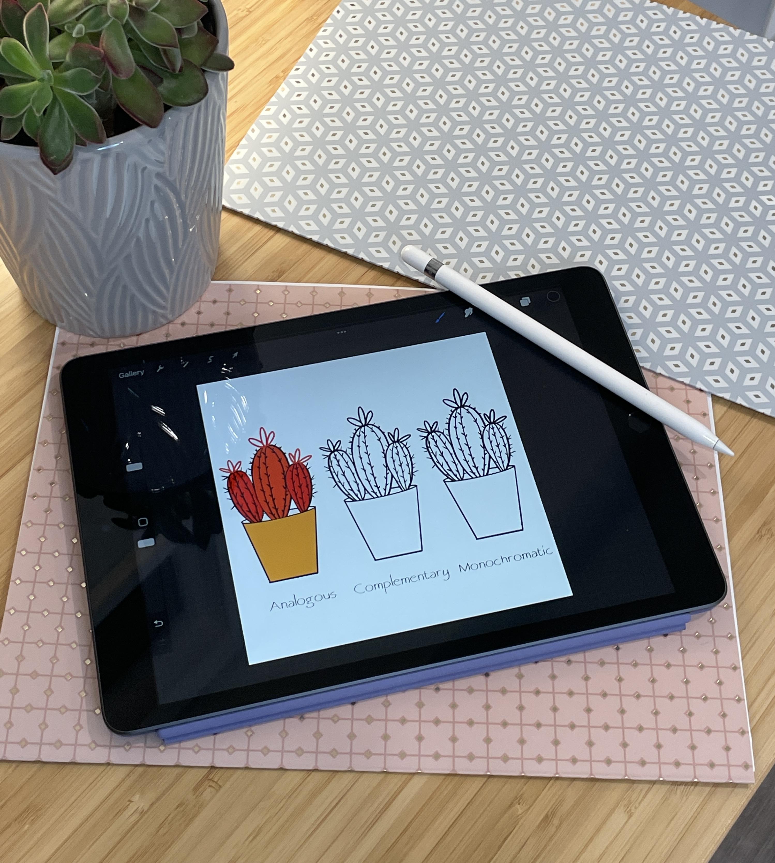
5. Practicing Harmonies: Welcome to lesson four,
practicing harmonies. We will practice creating a simplified version of the
harmonies we've discussed. Be sure that you have downloaded
the practice page and corresponding color
palettes before we begin it downloaded
practice page has four cactus plants that we will color in the
floor harmonies, monochromatic, analogous,
complimentary and triadic. The downloaded
color palette named cactus practice has two colors we will use for this exercise. You can drive the palette out by touching on this
line and dragging. Now I need to zoom in using the two-fingered motion on
the monochromatic plant. I will be using the top
row of green colors. You may follow along using
the same colors as me, or put the five greens
wherever you want them. I'm going to start
out with one of these middle greens on the pot. And then I'm going to
use the darker color to create some depth and dimension. On the inner side, I'm going to zoom in really close
for these small bits. Because sometimes
the color doesn't go exactly where you want it to. Monochromatic schemes
are usually made up of three to seven variance in
your one color palette. For this first cactus, I'm going to use the
lightest green color. Hopes. That's why I zoom in the two finger tap to undo
using different tints and shades and tones
of color helps to create the illusion of depth
and space between objects, as well as creating
three-dimensional form. By adding white to
the base color, we get the tint, and
by adding black, you get shades, tones, or how dull or
saturated dequeue is. It is created by adding gray. With all of these options
for color mixing, there's almost an
infinite number of colors you could create for a
monochromatic color scheme. Now I'm going to use the light. I'm sorry, I'm going to use
the dark with the light and vice verse to create a high
contrast for the flower bud. You will notice in our
pictures today that there's a black outline which helps the scheme from
becoming boring. By adding a strong
neutral like white or black to a
monochromatic scheme. It helps to keep
things interesting. Next, we will move along
to the analogous scheme. For this exercise. We'll be using green, yellow, green, and yellow. The third row of
our color palette. Remember, analogous colors are accused that are next to each
other on the color wheel. Follow along with me
or color as you wish. Analogous colors are pleasing to the eye and found
abundantly in nature. Using analogous colors when
decorating, designing, or even picking out announce, it will create a balanced
and serene look. Usually, you will choose one of your analogous colors to
be the dominant color, a primary or secondary color. I have chosen yellow
for this example. Next is a supporting color, which is a secondary or tertiary
green in this exercise. And a third color that
is the mix of the two. We're using, yellow, green. This way the colors aren't trying to compete
with each other. Many artists use the 603010 rule to achieve a calm,
visually pleasing harmony. 60% of the dominant color, 30% of a supporting color, and ten per cent
of a third color. Choosing analogous colors is
one of the easiest and most eye-catching ways to work
color into a design. Since I have chosen yellow
is my dominant color, I'm going to add it
to the center cactus. I will add greens
to the side cactus. Mike analogous example seems
to be more of a 404010. I like to think of
our roles as tips, experiment, see, and do what
works for you and your art. Coming up next, the
complimentary color scheme. For this color scheme, I'll use various shades
and tints of red and green located in the fourth
row of our color palette, complementary colors
or any two hues positioned exactly opposite of each other on the color wheel, There are made up of
a primary color and a secondary color that
is created by mixing the other two primaries in this example are complimentary
color to red is green, which is made by mixing
blue and yellow together. Pair of complementary
colors is made up of one cool color in
one warm color, you can mix complimentary
colors together. For example, if you start
with red and add green, the color becomes less intense. And if you add enough green, then you will end up
with a neutral color. One place side-by-side. Complimentary colors
have high contrast. And as a result, the
colors intensify. In color theory, this phenomenon is called simultaneous contrast, or how two different
colors affect each other. Some examples up
for a dark color put next to a light one
makes them both brighter. Warm colors will look warmer
when next to cool colors, and the opposite is true. Now, moving on to
our triadic scheme. For this color harmony, I have chosen to practice with
orange, purple, and green, the colors and the second
row of our color palette, tri means three
and color trimer. Try and select the
primary colors are three equally spaced Hughes
around the color wheel. This color scheme can be
quite elegant if we choose one color that dominates and
use the others as accents. Triad color combinations
tend to be vibrant, even when toned down
tinted are shaded, the colors can come across as playful or, or, or adolescent. So we want to be careful with the balance of these colors. Otherwise, combination can be too much in chaotic and hectic. The main or dominant color you use will be the color that
sets the scene or mood, while the other two colors
are the supporting players. As discussed in lesson three, colors can create mood
depending on how they are used, as well as
combinations of color. In our example, we ever using purple is the main
color with green and the orange is her accent colors to create a calm
and peaceful mood. Whereas if we had used
oranges, the main color, it would have created a mode
of energy and excitement. I hope that this practice lesson has given you more knowledge about color harmonies and the results of the
different combinations. In the next lesson, we'll
put this knowledge to use in creating an
abstract landscape. See you there.
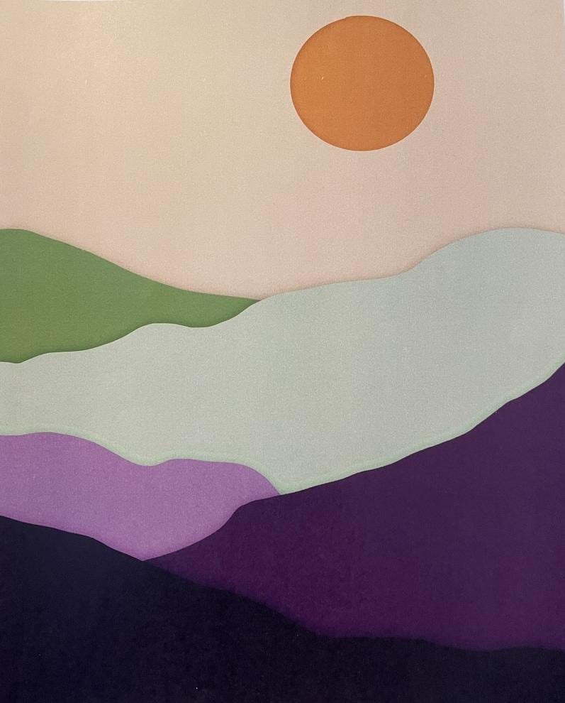
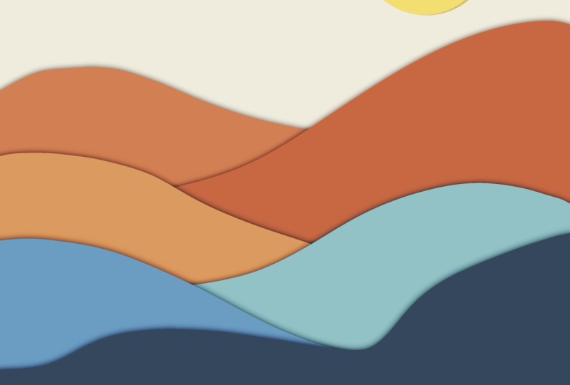
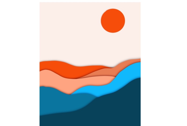
6. Project: To the project lesson. In Procreate, you'll
create a new document by tapping the Plus sign and the top right corner and
the plus sign again, you will make your page
2550 by 3 thousand pixels, which is about 8.5 by 11. So you can print and
frame if you want. Then set the DPI to 300. On the left, I'll tap color
profile and make sure it's CMYK is on because I want to
print out my final project. Then tap Create. Cmyk is for printing and
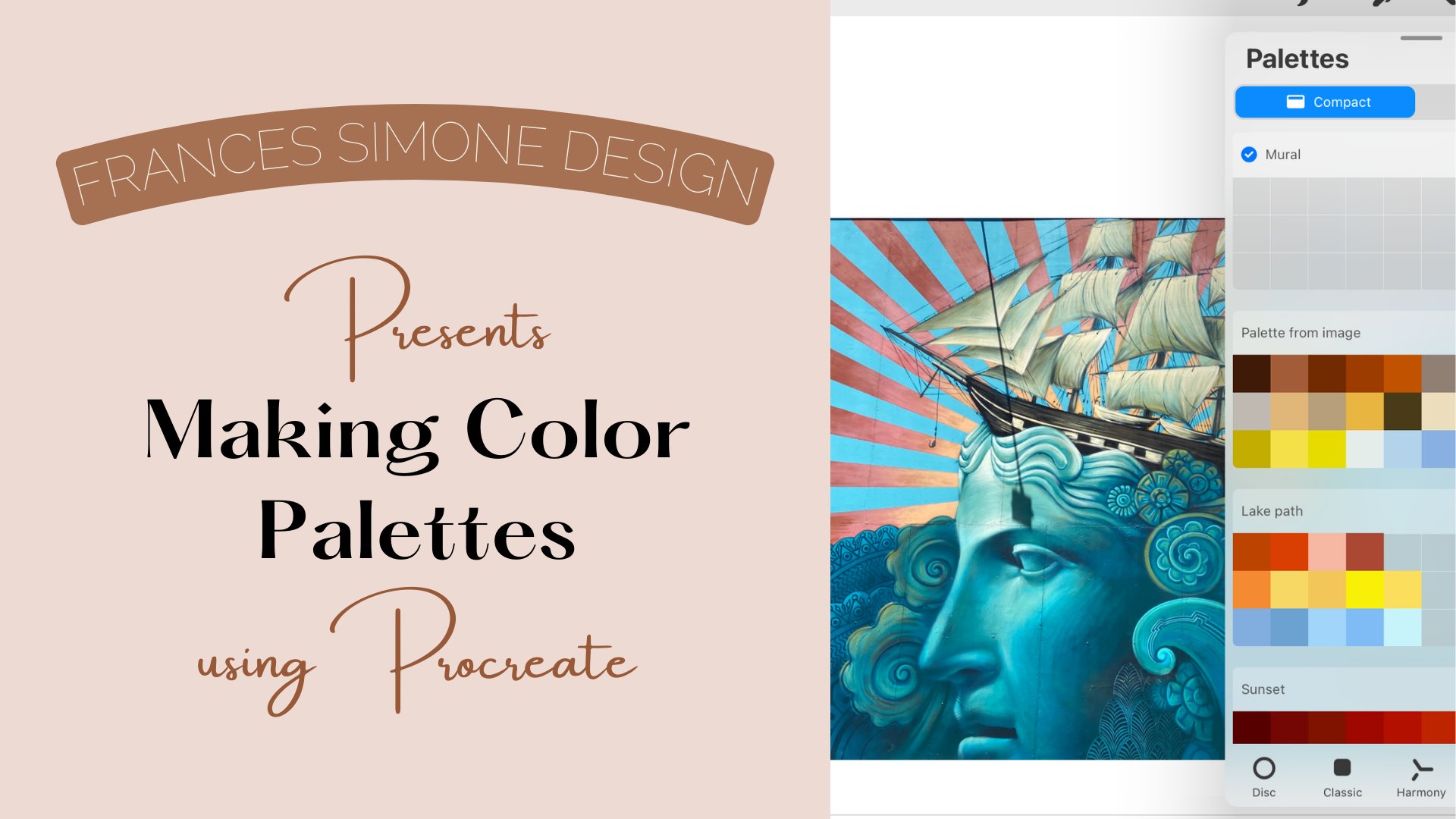
RGB is for digital work. Good color palette. I've provided three
for your use. Complimentary triadic,
monochromatic or analogous, or use one of the ones
supplied by blue procreate. I'm using the complimentary triad color palette
from the Dell mode. By tapping the disk
at the bottom, it isolates that palette. I've also added some neutrals to this palette brush library
by tapping on the brush, choose inking, and then the
syrup brush on the left, adjust the slider to about 6%. Tap on layers. Palettes, choose the beige color and drag and drop
to fill the layer. Now we're going to add
a layer and switch the color to the medium
orange in the second row. Starting on the left, a little over
halfway of the page, draw Hill, drag and
drop the color. When drawing your kills, be sure to begin an end
off of the art board. Your color will feel
inside that area. Add a layer, switch
to a darker orange. And at about the same
place I'm aware I create a hill going in
the opposite direction. Drag and drop the color to fill. We're going to
repeat this process for the next four colors. Add a layer, switch the color, starting on the left, draw Hill. Drag and drop the color. Add a layer, switch the color, start the hill on the right, and drag and drop the color. Continue alternating for
the rest of the colors. Making your Hills is steep
or as flat as you want. I'm going to speed up the video. The hills are finished for now. Let's add the sun. We're going to add
another layer. Choose the lightest orange and draw a circle. As
you complete it. Hold the pen where
the lines meet. This will help to
create a circle. Then you can tap, Edit Shape, tap circle, and it will create
a perfectly round circle. You can then tap the
selection tool to adjust the size and the
location of the sun. When you find the perfect
spot, fill it with color. We'll come back to the
song and a little bit, tap anywhere on the page
to undo the selection. Let's add the shadows to the mountains to
create some depth. To do that, tap on the top mountain layer
than swipe, left. Tap, duplicate. Move down to the
next mountain layer. Tap, swipe and duplicate. Repeat for all the rest
of the mountain layers. Next, on the bottom layer
of each mountain color, you will double tap
the thumbnail and then tap Alpha Lock
for each layer. When you put the alpha
lock on a layer, you will only be
able to paint inside of what already
exists on that layer. Now, go into the color palette
and choose the gray color. And we're going to
fill each alpha, lock the layer by tapping the thumbnail and then
tapping Fill layer. Next, turn off alpha
lock and all the layers, you will have to go into
each one to turn it off. Just like we turned it on. The shadows to our mountains will be using the gray layer. So tap on the top 1 first, and then on the left will tap
on the Adjustments tool or magic wand in the drop-down,
choose Gaussian Blur. You will notice that the top of the screen there's
percentage indicator. By dragging your pen
across the page, we can adjust our shadow to
be at about seven per cent. Then go back to the layer
and tap on the end, open the blend modes, and drag down to
Linear Burn going. This creates a soft
out-of-focus appearance and decreases the brightness,
creating the Shadow. Tap the next gray layer. Tap the Adjustments tool, choose Gaussian
blur, adjust to 7%. Go back to the layer, tap on n, and scroll
to linear burn. We're going to repeat this
on all of the gray layers. Be sure to follow
me on Skillshare, to be notified when
my new class on blurs and blends
becomes available. Now that the shadows
are all in place, let's go back to the sun. The layers panel at a
layer over the sun. Then tap the sun layer, click on the thumbnail and tap Select at the
bottom tab, invert. Make sure where that
color fill is off. You should see
stripes on the Sun. Now go to the layer
that you added above the sun and
fill it with gray. And then click on the thumbnail
and tap clipping mask. Tap the selection
tool and adjust to move that shadow out
from behind the sun. Might have to play
around with it to get it just where you want it. Once you have it in
the position you like. Then you're going to
tap on the Blend Mode, make it linear burn. And we're going to turn down
the opacity to about 20%. And there you have it. An abstract landscape in a
complimentary color scheme. Because I wanted
to print this out. I will tap on the
wrench, tap Share PNG. So we will share with my Mac.
7. Final Thoughts: Congratulations on completing basic color theory
and procreate. I hope that you enjoyed
the class and that you've learned about the
properties of color, how it is organized
on the color wheel, the benefits of color harmony and psychology when using color. I would love to see your
abstract landscape project. Please be sure to upload your completed project
in the class gallery. The class gallery can be found under projects and
resources tab. Click on the green
button that says Create, project, and upload your photo. You can also follow me here on Skillshare by clicking
the follow button. That way you'll
receive an e-mail when I launched my next class. Is there something
that you'd like to learn about in Procreate? If you have an idea
for our class, please let me know in
the class discussion. I would love to create
classes for you. I hope if you'd like to share
your project on Instagram, please tag me at
Francis's own design so I can comment
and like your post, I hope you will continue
to grow and learn about color and to create a
wonderfully colorful life. Thank you for joining me. I'm glad you're here.
 Fran Krutek, Teacher/Artist/Creative