Transcripts
1. Introduction: Hi, class because watercolor
artist and illustrator. Welcome to my
watercolor channel. Here you'll find
a big collection of glasses for beginners. In today's class. I'm so
excited to share with your other color threads for this year and how to
excel in watercolor. Here. Miss Jenna, thank
you for joining and welcome to follow bucket on top. Let's get started.
2. Supplies: So for this class we will
need the following supplies. First of all, we'll
need watercolor paints. I'll be using this set, which is artist from
water cones, 48 colors. However, you can use any set it. And it's good to create a color circle if
you have a different set. So better understand which
colors to use instead. How to create a color wheel. You can find in my basics
of color mixing class, if you didn't take it yet, I highly recommend it. However here I'll be giving
you ready formulas to go. Folder called mix. So besides gold paint will
need water, of course, I usually use three jars to keep my brush
clean every time I go into the paint and change
the water as needed. Also, the paint palette,
except colors in. After every car
story, we'll wash it. Only a paper towel
will need one brush, whichever one you
like and you're most comfortable with,
just use that one. If you're taking notes, you'll need a pencil or a band. Also need a watercolor paper. So I usually recommend you to use with paper you
use in your work. I use this kind of paper. It's called pres.
It's a constant. It's not too expensive and
it's good for beginners. However, when
researching the colors, I would find her formulas. I did also same kind
of paper and they're the experiment until I
find the right mixes. And after I do that, transfer brown mixes
into my color journal, which is made of the same paper. So I highly recommend you to
make her own car journal. And these are the
formulas for every mix. I show it in my every
utterance class. But if you're watching
this first one hand, highly recommend you
to make a god journal. And these are like the
formulas for every shape. Every color in the palette has a number and I put
them right here. In the class. I'll be showing you
how to mix them on these small pieces of paper, which are made the same paper. So you'll need to
paint paper, brushes. You can get started.
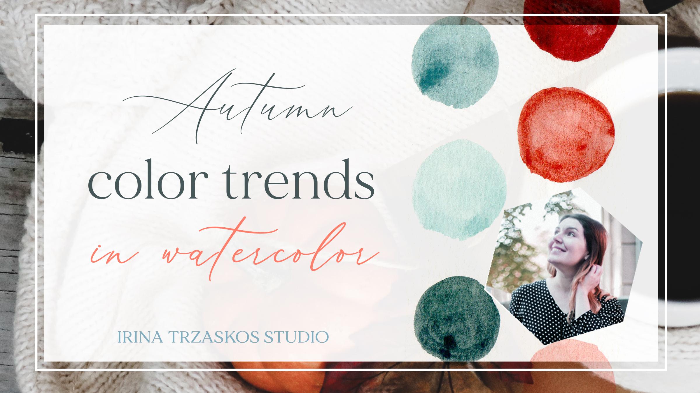
3. Autumn Color Story 1: This autumn color
story will have six columns and they're
so warm and beautiful. I think I'll make beautiful color palette
for your illustration. So for the first color, we'll be mixing orange round here at number Glenn. Been missing an x and
get to a simple orange. I think we need more orange-red. We want to warm it up
with simple orange to it because it's so bright, we need to balance,
add some violet. Just number 34, just be careful. Take just a drop. Editor mix. This is our first color
for this color story. So here we have orange-red. Strong ones, were warmed
it up with some orange, added a drop of violet. Next, I'll mix a warmer shade of orange that we'll be using. Lemon yellow. Mix it with orange. Just simple Orange. Think we need more yellow
because it's too dark. So what I'm doing, I'm washing my brush and when I'm
dragging it in paper towel, and then I bring it
back to the paint. And to make it a
little more muted, we'll be adding a drop
of violet to this mix. To like this. We have a little softer and a warmer shade of
orange yellow here. So for weeks mix we
use lemon yellow, orange and violet. Just to drop. Next thing is they're
very soft color because it's good to
have like software and stronger and medium colors in your palette when you
create a color stories. So we'll be mixing flesh. Flesh. So take some flash, which looks like
orange mixed with some white mixed flash with a little bit
of a lemony yellow. And they can to
make it more muted for autumn color palette, we'll add a little bit of gray, which is number 16. It's a warm like
French gray. Okay. Way to shop. Gray. So we'll be adding
some more flesh to the mix. Some more yellow, lemon yellow. And the column we get wider. The soft, beautiful yellow. Like an autumn day. You can see the real code. So you don't have Flash, lemon, yellow, and gray. So we check some of
these jars so I can keep my brush clean. Next we need to make
some greens and prefers soft green will
be mixed and glide green, flash and adding water to it. So I have light green, which is a very bride. It's way too bright for autumn. We need to balance it
with a drop of Rush. Challenge fresh. Tried to take a softer brush
for this fixed moral color. So again, we have light green, little bit of flash, more green roof flush. The cytosol to get
his luck gone. Muted me into color. You can see how
beautiful it works with the oranges and yellow we have. So here we have mostly
light green and flesh. The next color we have a medium. And again, it's going
to be muted one, because it's autumn
color palette. And her battle take on
grass green, number 44. At some flash sheet or a warm. Some more green
because it's got all. This is a beautiful green. It's grass green with
some flush. Grass green. And we're warming it up
with a drop-off flash. We need a very strong green. So we'll take blackish green. It looks like grass green
mixed with black or gray are some very
dark like this. It will add a leaf green. Just soften it. And
to the same mix, we'll add a little
bit of olive green. Mixing three rooms
for this strong, beautiful dark green color. It's very complex and
has so much depth. So here we have blackish green and tilt it a little bit so you can
see it's not black. It's like your screen like this. I'm going to have light green and the olive
green in the same mix. This is our autumn color story.
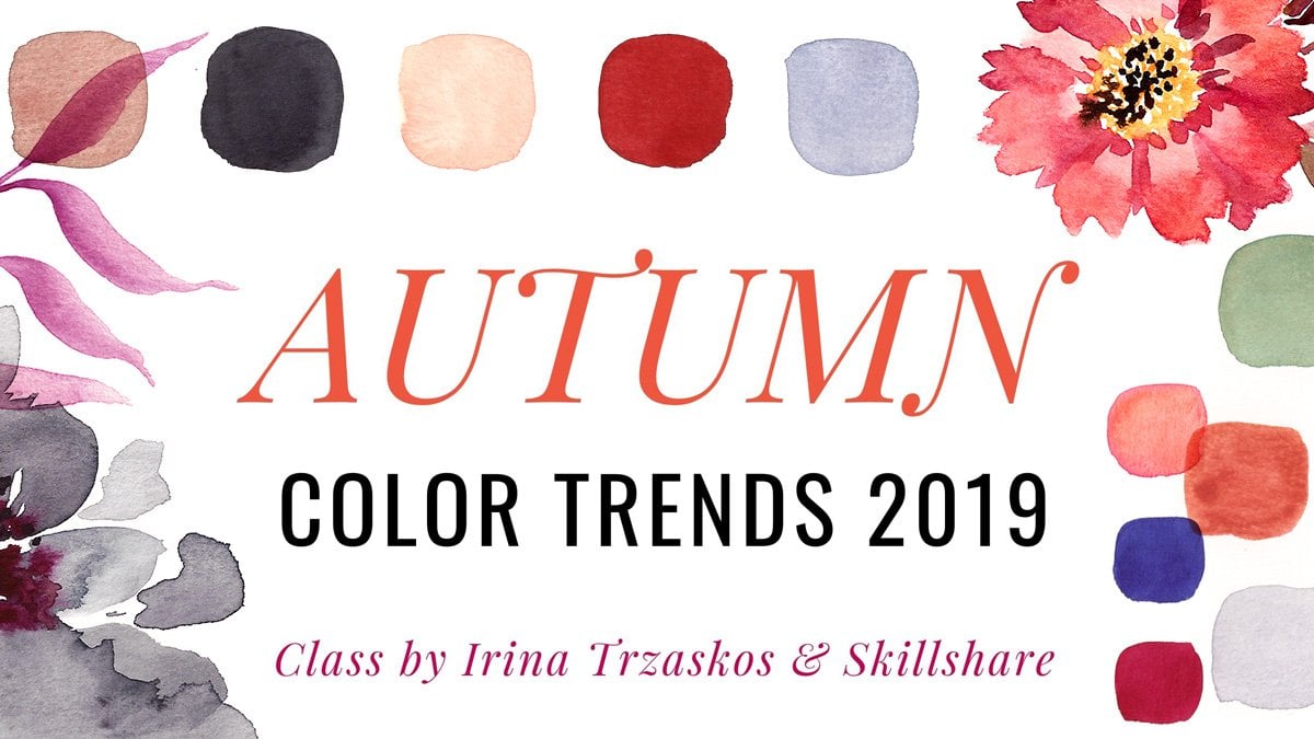
4. Autumn Color Story 2: So this autumn colored
study is pastels and creamy colors and they're so warm and beautiful and
they like it so much. I hope you like it to. So for the first color, we'll be creating
a beautiful gray. And pyruvate will take
some ultramarine, which is number 31. So you first start out like
dreamy, a light colors. We know they have
chat a lot of water to each other after
they're mixed. So we're taking some
ultramarine blue. And then we'll add some flesh to get too much flash content, some remote jump right into it. Next we'll add some cobalt blue. And the citizen could get his dreamy, beautiful warm gray. So here we have
ultramarine blue flash. Like this. Next column will be mixed or using burnt sienna. And we'll drop of cobalt blue and lots of
water, of course. Teeny tiny marble is just add a second color
and this color story. And they see how beautiful
they work together. Probably because
both of them have cobbled blue mismatch
just to drop, but still enough to balance
it with another one. Say here we have burnt sienna. And if you see how loud it is, you have Chad, water. Next little movie
mixing brilliant blue. My chest number 30 here with orange. Number ten. And we need to
have more orange, the ban. But it still has to have
a bit of cold shade into. And again, we'll
add plenty of wire. Gets his beautiful,
beautiful color. A very complex pull up
Deb, sophistication. So here we have brilliant blue. Just two colors. Is beauty and water, of course. Next color we'll
be using orange. Orange really interact,
which is next to orange. So I sent this out to give
this bright orange-red. So we need to soften it, to mute it a little bit. And for that we'll
be using a dropper. And water, of course. Beautiful because see
how nice it works, like cray and other colors. So here we have orange terracotta color for a second job of Tableau. It's like this greenish deep. So next I need blue. So far that I'll be
using cobalt blue. And again, it's too
bright for autumn. So we need to mute it a little bit with
its complimentary. Orange. Too much orange is
turned into brown gray. So let's add some more commonly blue and diluted with
water, of course. And we've got this orange, honestly needs more
water when you'll be mixing it too dark. But it's okay. Just try to mix it with more
water with me. So here we have cobalt blue
and a little bit of orange. Until the last color
will be creating ads for like axons,
like branches. So it's going to
be darker colors. And for that we'll be using
a Van **** brown number 57. Ms. Bennett. I would just use whichever
closest shade you have. And we'll be mixing it
with brilliant blue. And the citizens out
there, little marble. Get this beautiful
brown, grayish brown. It don't worry. So here we have a Van ****
until after the water. So you can see the
brilliant blue. Services are another
allied quiet items story.
5. Autumn Color Story 3: This autumn colors
story is more bright and cheerful like a
sunny autumn day. And I hope you like
it as much as I do. So for my first color, we'll be mixing orange red, which is number 11. And we'll be mixing
it with flesh. Number nine. And it gets more complex,
beautiful, orange. Orange with flesh. Like these. Next color we'll
be mixing flesh. So technically we need to
flash a little bit muted, so I'll be mixing it with a little bit of
brilliant the balloon, Joseph, drop too much. But let's look. Yes.
It's too much blue. Add some more flesh color. He says, Our next, again, warm and beautiful. So here we have flush
drop of brilliant double. Next vignette, some blues, like a blue sky in autumn. So for Global Tech, cobalt blue, it's too bright for autumn, so a drop of flushed it too. I'm Mia suggesting it till it didn't wash my brush. Done. Here is just a matter of cobbled blower and some just a drop of flush
and water of course, but you can make it brighter. It will work. Now have
Chad so much water. For the next color will be mixed cell got some took wives. Way of cobalt blue
for a darker blue. Caltech turquoise
cobbled loan balance, and yet it's edited, it will take a drop of orange. This is our second blue. Anyway. See how beautiful
it works with time. Color story. So far, I have cobbled blue. Again. To watch a drop of orange. Now I need a green
for the grass green, which is number 44. And so these grandmas, a little bit of cobalt blue, I think we need more paint. So it's good to ask green, which is like a
classic, classic green, edging some cobalt blue
shade to cool it down and it gets a little bit. Our cobalt services linux of grass green. Number 44 in this palette. Next to a beautiful yellow for this autumn colors story
that we'll be using. It's the PLO and we'll mix it. Came as well, had so much water. So again, I'll just
add some more paint. And actually it a little bit
of grass green we just used. And then add some orange. I set this out, we get
this beautiful mustard. Yellow. Have less water than mine. I had water in a
world of my palettes. Make it more watery,
but it's okay. You can use fiscal year two. It's the same color, It's
just a different shade of it. So I have deep yellow, we have grass green here, and orange for the access for
that dark, beautiful blue. Forbad. We'll be using tallow blue to soften it a little bit, adding a drop of flesh. He says, the strong darker blue, which works very well
with yellow, orange, blue, dire, autumn colors story. So here we have to tell a blue and a warm did with
a little bit of flesh. So this is our colorful
Autumn color story.
6. Autumn Color Story 4: This autumn color palette, we will be mixing red, orange reds, pinks, and greens. And you'll see how beautiful the variety
of colors could be. So for the first
color will be mixed. Orange-red color is
pretty opaque colors, so make sure you don't
put too much water. So to our orange red, we'll add some cherry set, which is number 22,
and it looks like a very bright magenta. And to add even more
depth to this color, add some patella bloated, not too much, just
enough to add. So I sit assault when it should
gather is like burgundy. Beautiful. Here. Isn't his gorgeous. Most like a cranberry. So here we have orange-red
looked like these. Make some cherries centered, which looks like carried
on a wire like a Magento. And then we added
some patella blue to adapt to have a deep orange. And for that we'll be using
again Orange arrived. Number 11. And once again, to add more depth to it, to add a complimentary
which is blue. So I picked brilliant
blue for this one. Which seemed to
work perfectly to create a right triangle shaped. So you can see here we
have a colder shade of Balkans and here
we have an orange which got for depth from
brilliant a puddle. So those are two strong
colors behave in this story. So this is orange. Some brilliant blue.
And drop off. Bring it. Next. We add some more water
so it can save a shade. So next we'll be mixing
with soft colors. And for that, I think a
lot of water to them. Soft, I mean, like pastel. And perverse. First color we'll be
using flash with water. Add a little bit
permanent tried to it, which is a cold shade of red. And again, we'll add water. And this result, we get this
beautiful beach common. So here we have flash
and permanent red, which looks like Garmin. If you don't have
permanent red color, this one will be cherries
sad to get our new shade. A little colder, pink, peach. So here we have flesh.
Feminine triad. When one shade colder
and edit chairs, they serve God thinks and
that's makes some gradients. Sulfur first green will be used, so cobalt blue. Okay, so now it looks like
blue or to Turnitin, so green. But at first it and we
get this grayish green. See how gorgeous it looks safe, other colors we already mixed. So here we have turquoise, cobalt, blue, and Flash. Make. So add some clean water and life is good
enough to play it. Our next color. This one. Again, you can see how beautiful it looks with other colors. So here we have turquoise, blue one, plush, and the green. Next vignette. Darker
color for our accents. For fat will be USL, grass green mixed
with colored blue. And again, I supposed
to be a dark colors, so make sure you don't
add too much water. So it has grass green. That'll be adding
some cobalt blue. It's already beautiful color
however wanted even darker. So for that, we'll be
using Payne's gray. Added to the same
mix. I said it's out. You get dark, very
elegant greens, which you can see
works great with pinks and oranges and Burgundy. Here we have grass, green, cobalt blue, Payne's gray. This is our another
autumn color story. At Sun doesn't have too many colors and
just a few shades, but so much sophistication. And it should be enough for beautiful illustration
or a heart.
7. Autumn Color Story 5: Item color story is so warm and mustaches because
it has blonde colors, like orange and yellow. It's just gorgeous. For first color, we'll be mixing burnt sienna, orange hue. It's almost like brown, but see how beautiful it is. So we'll have burnt sienna and we'll mix some deep yellow tube. And to mute it a little bit, we'll add some violet just to drop sometimes
a violet or overpower. So be careful about this result. We get this orangey brown color. Just beautiful for pastry too. If you're painting pastry. This is a color. Here we have burnt sienna and deep yellow and violet. Just to drop. Next color, we'll have yellow and we'll
take a deep yellow. And to add even more depth will add its complimentary
to it, which is violet. Just enough. Power is just add some more water to your house or
make it more opaque, but it made him more
paint than water. But this works too. So we have deep yellow here
and you see how fresh it is. So we mute it a little bit with next color we need a more. So again, I'll take a more stretch straight
from a repaint. And we need to balancing and mute
it a little bit. So we'll be adding lemon, yellow and some water. So Citadel togetherness
or sophisticated muted, more suitable for autumn color. So here we have morph. Looks like our violet, with a little bit of magenta and a little bit of white in it. And they added
some lemon yellow. Next we'll have two
valid and plum cars. Base color palette
is very limited, but you can create
a lot of things. So if it's colors,
for first color, we'll be mixing violet. So we'll do pretty much opposite which we
did with yellow. We'll add a drop of
yellow to this violet. Yellow, It's violets. Complimentary colors are
complimentary colors. So to create a mutated version, we need to add just a
drop them to each other. It could be he could paint and I'm not a big shade or leg, which is also beautiful. So here we have five. Let you see how
bright it is without the yellow and the edit depth and richness
and auto filter it by eating the
PLO, just interrupt. Next, we need a plum color. So for that we'll
be using a chair. Just so very bright
magenta with violet. When you ignore terracing here. Very nice. So as a result,
regard this bright, bright violet, but
we need the plot. So I'll be adding some
Payne's gray base mix. And they think it needs
a little more Chair says so it has more red and even a little more Payne's gray because it's still way too
bright or odd. Now we've got this
beautiful color. Eggplant or something like that. So this is our another
limited color palette here. How far terrorists
and Payne's gray? This is our autumn color story.
8. Thank you and see you soon!: Thank you for joining
me in this class. I hope over there just to
make some colors of me, if you like the class, please leave a review
and the blood project, your project section of a class. And if you're sharing your
project on Instagram, please tag me seconds
here, beautiful artwork. And I'll see you
in the next class. Bye.
 Irina Trzaskos, Watercolor Artist & Illustrator