Transcripts
1. Introduction: [MUSIC] If you've taken any
of my other art classes, you know I love to experiment
with art supplies. I basically have a mini art
store up here in my room, and what better way to
come into your room and figure out how to use
your supplies than to say, "Okay, I'm going to
create with this item and these colors today
and see what I get." That's where this
class showed up. I have some acrylic inks that
I haven't experimented with as much as some of
the other supplies that I have and I was like, "We need to play with the inks and see what we can create." I've created a class that I hope you're
going to enjoy. It's going to give you a quick
win here in your art room and make you feel good about
some of these supplies so you can't wait to come
back and create again and I just can't
wait to get started. I'm Denise Love, and I'm a photographer
and artist out of Atlanta, Georgia, and today, we're going to do atmospheric abstract landscapes. We're going to create
some little landscapes that I hope you're
going to figure out some fun things about
your acrylic inks, some colors that you may not
have thought to create with. We're going to just create
some amazing things, and I find if we
create in a series, like if we're doing
one this size, let's create eight
of them at a time. Then we will have better
success than if we just decry, sit at our table and try
to create one at a time. If we're doing the
one at a time, that might be the
one that's terrible. Then we're like, "Oh, this
didn't work for me. I hate it. I'm not going to do
this anymore. I'm mad. I'm going to leave my art table and not come back and
create for two months." [LAUGHTER] I have done that. I figured out if I create a whole little series
at the same time, one after the next, after
the next, after the next, then I may have four
that are amazing. I may have four
that are terrible, but I'm happy with
what I created because the four amazing ones are
amazing and the four that "Eh", I can use those as collage
papers or backgrounds in a future art project and I end up very happy and
satisfied when I'm done. Then out of the favorites
that we create in class, we'll come back and create
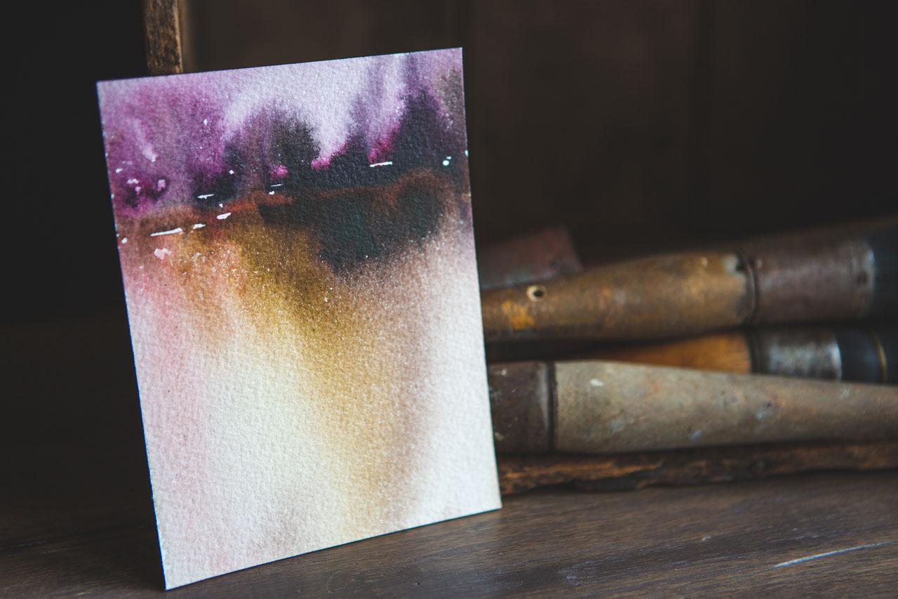
some larger pieces. This is the one that
I create in class. This is the one that
I've created in the past that I thought was really
beautiful and moody and thought, "This is probably
the direction I'll go." But I surprised myself and
I went this way instead and look how pretty and
uplifting and happy this is compared to the dark and
moody at sunset feel. I was delightfully surprised
with the piece that I created from the smaller example pieces that I was getting
inspiration from. I can't wait for you
to create a big one and surprise yourself with maybe a color palette you
didn't even expect or plan on and create something
that you're like, "Wow." I hope that in this class, you'd love the super easy
technique I'm going to show you because this is crazy easy, and then what are you
going to create bigger from the small pieces that
you are making in class. I hope this inspires you. I hope you enjoy
this easy technique. Can't wait to see the
pieces that you create, so let's get started. [MUSIC]
2. Class project: [MUSIC] Your class project
today is to come up with a little landscape with your different ink colors
that you really love. I can't wait to see which
one you really love. This is the one that spoke to me today for the little ones. Then show me the
big piece that you created from that
inspiring color palette. I cannot wait to see whether
you go for dark and moody, the sunset, the sunrise, something out in the
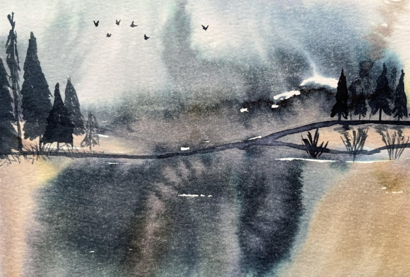
day, maybe the twilight. I call this a little
bit of twilight since I added a tiny bit of
some stars in the sky. I want to see what color
palettes you ended up loving and what your small
piece inspired the big piece. I can't wait to see those, and I'll see you
in class. [MUSIC]
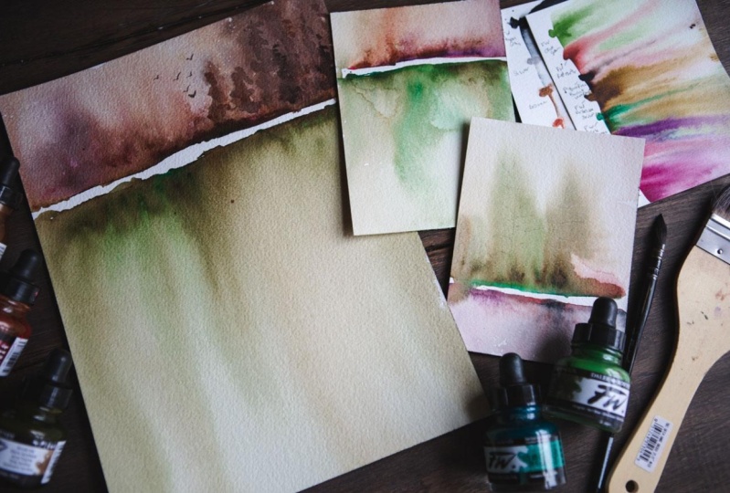
3. Supplies: [MUSIC] Let's take a look at
our supplies for this class. I love to show you
different stuff and experimenting with some
different art supplies to give you an idea how you
might consider using these different things or to
introduce you to something that maybe you
haven't seen before, or just to give you a technique idea so that
later you can be like, I could use this for doing that, or whatever it is that
you get inspired by. For this class,
we're going to be using some 300-pound
watercolor paper. This is 640 GSM cold
press watercolor paper. I have the Arches here
and it is a block pad, so all the pieces of paper
are in this in a block form. I'll show you how
I get paper off of a block pad in the next video. I'm going to be using
these two different ways. I'm going to be using
it cut up into fours. I just put this on
my paper cutter and cut four pieces out of this. I'm also going to be using
it as a large piece. But you can cut these
up in any way you want. Maybe you like long
skinny pieces, maybe you like some
wide skinny pieces, maybe you just want
to cut this in half. You have a lot of
different options. This is a nine-inch
by 12-inch pad, which is 23 centimeters
by 31 centimeters. You can also get 300-pound
paper as loose sheets. That's really nice because a lot of time the
loose sheet will have a wonderful frayed edge, which adds to the piece of art. You can get great
big sheets of this that you can then cut
into smaller sheets. Any way that you happen
to get a hold of this heavier paper,
you can work with it. We're going to cut some
pieces out of that to be smaller and do a couple of larger pieces and just see what wonderful, dreamy, atmospheric little landscapes we
can come up with. Now the reason I am using this very thick paper is because
it holds a lot of water. If you do pieces on a
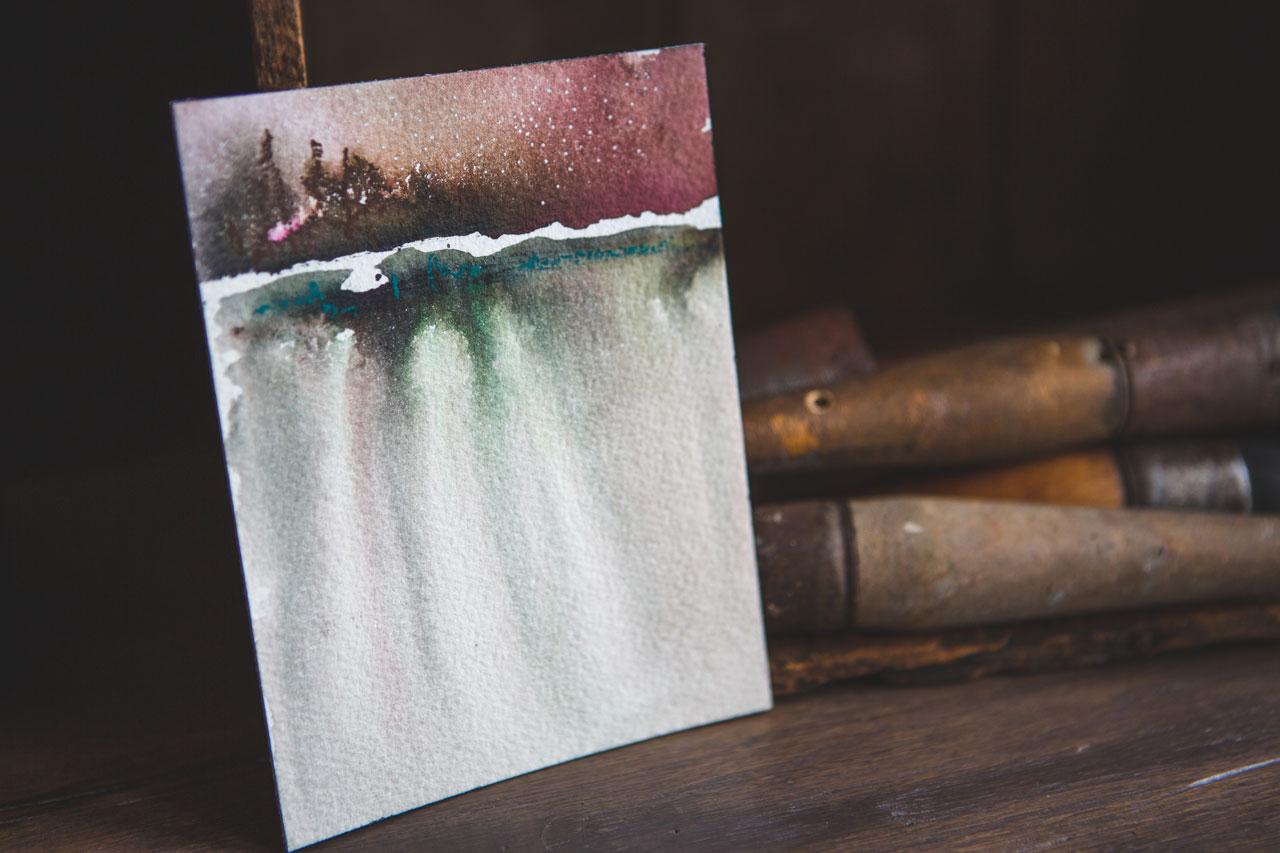
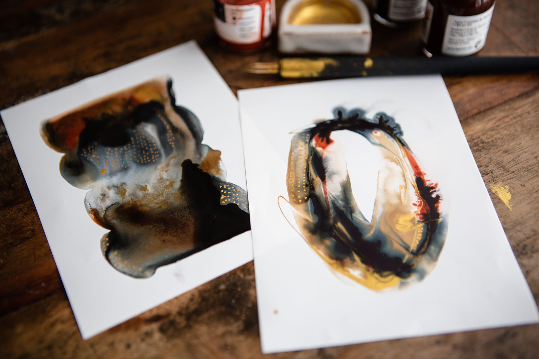
very thin piece of paper, I have an example. Hang on. These are different pieces
that inspired this technique, so these are what I'll be
showing you how to do in class. But if you use a very
thin piece of paper, like the 140-pound, you can tell it's thinner
paper than the thicker ones. Is that they buckle when you
put as much water on it, is we'll be putting on
these pieces of paper and then most of the
color when it buckles, it does this little
thing right here, so most of the color then
rides down the piece of paper and you end up with a very light amount
of ink on the paper, which is really beautiful
in its own right. If this look, you think, I love that and I
can work with that, let me start with that, then try the 140-pound paper. Don't go any lighter than that. We're putting a massive
amount of water on these pieces of paper and
the thinner that paper is, the harder this
technique is going to be to do
successfully for you. If you're doing a very
large piece of paper, it's going to buckle even more so it's going to
make it even harder, so I really do think
the larger you go, the thicker that piece
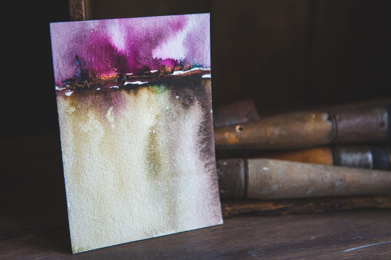
of paper needs to be. I've done all kinds of these quite big and a little
bit smaller just to show you some of my inspiration pieces that
I did for myself recently. Look how beautiful
this turned out. They are so pretty. I'm going to be talking about just the different ways
that I created that. We'll be experimenting with
some different colors. I do recommend the very
heaviest weight of paper for this technique
[NOISE] because of the amount of water
that we're using. I also am keeping my
supplies very simple because they look
so beautiful and dynamic just using the inks
that for the most part, I did not do a lot
of extra mark-making and additional supplies on top of the ink, but
you certainly could. Once you start making some
of these and you're like, this is so much fun, you might experiment
with putting up pencil marks or pastel marks or some other things on
top of your landscapes. But to start with, I just kept it down
to the acrylic inks. I also have a little
tin here of some of the colors that I'm going
to be playing with. I tried to keep in mind different atmospheric
landscape tones that you see. Sometimes we see some brown, and some blue, and some pink in the sky,
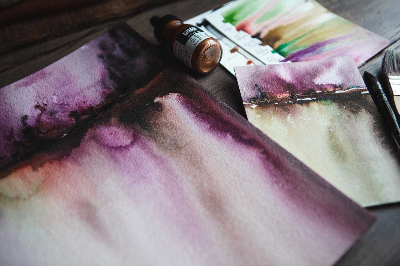
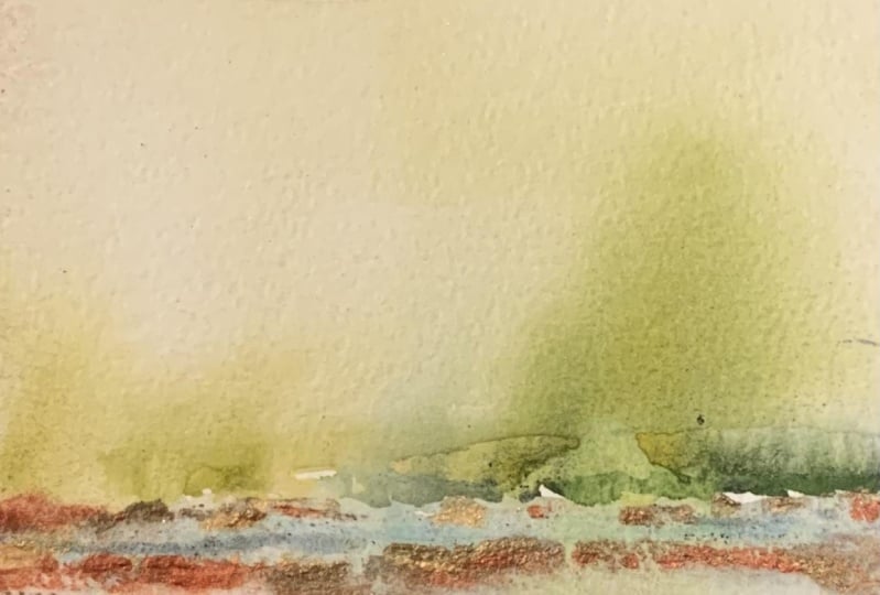
and different things like that. So these are the ones that I ended up loving the most. I've got just a selection
of colors from the F&W. I've got the earth red, olive green, payne's gray, purple lake, dark green. This one is an aquafine
color, this's burnt umber, I've got FW antelope brown, crimson, and then I've also
got some liquid text colors. This was quinacridone magenta, and then I've got some
metallics in the Liquitex; the gold, the copper, the silver, and the bronze. It's really fun to
experiment with the metallics on this particular project
because they just add a little extra bump into our projects so the
metallics are fun. I'm just going to be
picking up and mixing and matching this particular
little stash of colors. [NOISE] Pick out some
of your favorite brown, and blues, and a few greens, and then think in the
lines of purple, pink for the sunset. I've just thought of that when
I've picked those colors. I also have glass
of clean water. As you're making these, you'll want to keep
changing that water out and keeping it clean because the water will get
dirty fairly fast. I've got a couple
of containers of clean water just to have
a little more here. Then I'm using a
watercolor brush. This one happens to
be a number nine, Creative Mark effects brush, which I'm not sure
what this effect was, but I'm not really using
it for anything other than to dab some water, so you could use any brush for an extra little
dab of water, it doesn't really matter. [NOISE] Just one of the brushes that'll hold a good amount of
water because all I'm doing is dipping
and adding extra water to my scene in different spots, so that extra little brush
doesn't really matter. The main brush that I'm
using is a hake brush. I'm using the hake brush because it holds a lot of water, it's very soft, and it's going to
really coat the water where we need it so that our ink spreads
really beautifully. This is different than the cheap brush you get
from the hardware store, that's got the short
tough bristles. If you get the little
disposable brushes from the hardware store, I've got one sitting here versus the hake brush that's got really soft brushes and
they hold a lot of water. Whereas the cheapy one from the hardware store
is really tough, not very soft, it won't
hold a lot of water. It's cheap. That's what it's
got going for it, but it's not really going
to work for this technique. I mentioned that
because this look like those cheap brushes and I don't want you to go
to the hardware store and buy something that's
not going to work. You want a soft brush that
holds a lot of water. If you've got a really large
mop brush for watercolor, you could certainly
experiment with that. But I do like the width
of the hake brushes. This is a
two-and-a-half-inch brush. I actually wish it
were a two-inch brush, just this tiny bit less. But this is what I had
and I didn't want to go buy a bunch of extra
brushes because I use the hake brushes in encaustic wax work and all
of them have wax on them. [LAUGHTER] It was hard to come
across one where I hadn't already put it in the wax.
But this works great. A two-inch one might be my preference in the long haul if you really enjoy doing these. I've tried to keep the
supply list very simple. You need some inks, you
need the 300-pound, 640 GM paper, some water, hake brush and we are
going to experiment. I can't wait to show you how
fun and easy this technique is for making such dreamy
atmospheric landscapes. One other supply that I want to mention for the
supply video because I forgot and when
I started making my sample sheets you'll
see us using this. I like these blue shop
towels for soaking up the water runoff that we're going to
have on these pieces. You can certainly
try paper towels, you can try terry cloth towels, you could try painter's rags. There's quite a variety
of things that you could use for your water runoff. You're going to need
something because these do have a lot of water runoff. But I personally
prefer the shop towels because they don't have
a lot of texture on them and they soak
up a ton of water, and I put two or three
sheets on here together. Then you can see that it
soaks up pretty good, and then by the time it gets
to my surface of my table, we're not going to have
water just everywhere. You might even want to work on a cookie sheet, baking pan, something very large that you can then align it
with like this and maybe keep that off of your table if you have a nicer surface that
you're working on, I'm working on a vinyl, wood look backdrops
so it doesn't really matter if water gets on it. These are great surfaces for
painting on because then one is so ugly and covered
in paint and you're like, oh, I need a clean surface, you could just get
another vinyl backdrop. This is like two-foot
by three-foot, so it's perfect for
my little setup here [LAUGHTER] and perfect for most art projects
that I like to do. It keeps the surface of my really pretty wood
table that's under here. It keeps that surface
nice and clean. Shop towels for soaking up
the water is what I will be using all through class and I will see you in the
next video. [MUSIC]
4. Separating Paper From Its Block: [MUSIC] In this video, I
want to show you how I get this
paper off this pad. Because if you don't know
how to do it and you start stabbing at it, just
trying to get it to separate, you'll ruin your
pieces of paper. There's a very easy specific
way to get these off. It's covered usually in a black, or I don't know if they
use other colors or not, adhesive coating that glues them all together
here on the end. When you get it, you
might think, wait, I didn't order a
black pad of paper. [LAUGHTER] Rest assured that's how it is. If you get to the inside, you've got this
one little section of paper that is exposed. Now what this is
really good for is doing the larger
pieces that we do. Just to show you pieces I did prior to class
for playing myself. These are really
good for creating the larger piece and not
separating it from the pad. Doing that it forces
it to stay flat. If you want to do a
bunch of these in a row, you could do it on the pad, let it dry a little
bit, separate it, and then go to the next piece, or you can have a couple
of pads available. I like it because we're putting
so much water on these to begin with that it's going to help it
maintain its flat shape. I did take mine off before
it was completely dry, so you'll see it's slightly
rounded on this piece. Keeping them on the pad
until they're completely dry would be a nice way to ensure
you have a flat piece. The smaller pieces, I
obviously cut those off and then cut it down
to smaller pieces. To get this off the pad, you're going to have
a pallet knife, you're going to insert the knife right in-between two of
the pieces of the paper, just like that, and
then you're going to just run the knife
along the edges. Then your piece of paper and your going to do that
all the way around the pad, and that is how you're
going to separate this piece of paper
from the pad. That's how we're going to
get that off of there. I might show you real
quick too how to cut these because it is so thick that you're going to be
like, what the heck? Let's go ahead and we'll use these cut up pieces in class. I just have a paper cutter here. I'm going to cut it in half
and cut it in half again. But it's so thick
you'll notice your little blade doesn't
go through the paper. You just score it and then you'll notice
it's still together. But if you'll just do that and then snap it the
other direction, it comes right apart. That's how I'm cutting these because they are so very thick. Pull it out and then snap it. Go ahead and get
your pad of paper and the inks that
you want to use, cut up a few to do
some smaller pieces, and we'll be ready to
go in the next video. [MUSIC]
5. Creating A Swatch Card: [MUSIC] If you've never
worked with the inks before, we want get a feel for
what these colors are, just so that we can know what
we're dealing with later. These have a little
color thing here in the middle with a stopper
and you just squeeze the top and get some color in it and it will drip ink out. We're actually going
to use this to do our little bit of painting on our paper when we're ready to actually paint our landscapes. But what are these colors? Are we even going to like them? I want to do some little
color swatching before I get started just so I can see
what I'm working with here. I'm just lining them
up as I've got it on the paper because we could come back and write these colors later once we figure out
like what we've got. I'm just using the
colors that I called out in our supply video, I haven't added any extra. I do have other ones over here, but that's okay let's stick with this little group for a moment. The liquid texts, it's little dropper is a
little bit larger than the FW. I like the FW a lot. I really love these metallics. I love metallics anyway
I think they're fun. They are especially fun in a sunset or an
atmospheric landscape. Some of these to you need to shake them up
before you use them. All of them, you need
to shake them up. I didn't shake them today
because I was up here playing all week with my different inks, just having some fun. But definitely shake these
before you use them. This will also give you an idea how they
spread with water. Because what I'm doing, it's putting a little
bit of each color here. Then let me put these were
I remember what they are. Then I'm just going to
take a smaller paintbrush. Actually I take that
back. Let's just take the hockey brush. I need to go back, say in the supplies
video, our shop towels. You could try paper
towels and you could try, I don't know, any color, any little
towel that you want, but I like these because they're smooth and they're thick. When I run water on them, unlike a paper towel, they don't completely saturate all the way through
to the bottom, they soak up a lot
of water basically. I'm going to take my little
hockey brush and practice. This is the movement
that we're going to be doing with our landscapes. You see how much water
we put on these. That's important because
now I can be like, that is a lot of water. I can see that metallics
require some extra persuasion. I don't know, extra
little coaxing. Then the main colors do. That's very interesting. I'm having the water
go all the way to the bottom on the big pieces. If we do that on this, we can really see how
they drip and spread. That is this little
set of colors. Then after that it's dry I can go back and mark
what those were. Basically what I'm
doing is putting this hockey brush in
my thing of water, filling it up a lot, and then coming back and just touching the
ink on the edge. Then we'll go back
with some extra water, coat the rest of the paper and we'll let those run
and see what they do. Then here is where we can
either use the hockey brush or our extra little brush to coax any color that
we're like okay, that didn't spread as much as I thought or I didn't touch it. Let's go ahead and hit
that with some water. Then I like to hit that
very edge of the paper on my cloth so that it
soaks up that edge. Look at that. Now
we can come back. We have a pretty good idea what each color is and
how it spreads down. We can come back and
write these colors that we have picked on
this piece of paper. That can be our sample
guide of colors going forward if you're curious on the inks of what they
do and how they work. I'm going to go ahead
and let these dry. You can see how this thinner paper really is harder to work
with that much water. You'll see when we use that
thicker piece of paper why it is just easier
with that thicker paper. We're going to let
these dry. I'm going to write those colors on there. Then we can refer
to that as we're creating our bigger
pieces. I love that. Go ahead and do
your sample sheets, write your colors
so that you have some samples that
you can get back to. I'll see you in the
next video. [MUSIC]
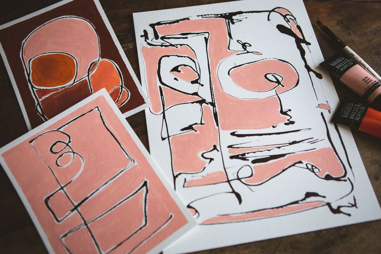
6. Composition & Getting Started: All right. So I've
got all my colors that I've sampled out, so I know what they look like. I really love having
some muted earth tones. I really love having a
couple of tones that could jump out and be a little
extra bit of excitement. That was a really
fun exercise to just see what do I have
and what color is that? If I'm looking at this
and I'm thinking, which green is this? I see it's olive green. I can go, that's
the olive green. Look how beautiful that is. These I'm going to have
available sitting up over here behind my table surface so that I can just
look up and see those. Then I also have a
couple of pieces of my shop towel and our piece
that's ready to paint. I like painting a lot of
little pieces all at once. Because maybe the
first one you do isn't the most successful
piece because it's a first try and you
might let it dry. Then you're thinking,
I don't love this. I don't like this technique. I'm not going to do anything
else with this because this piece wasn't amazing. I know a lot of us do this. We want to sit down
and we want to create one piece and be the
instant expert and have a beautiful piece without
all the years of work that really goes behind
making amazing pieces of art. So to combat that for myself, especially if I'm playing
with a new material, maybe a thicker paper or a different paper that
I normally work with, I will create a bunch
of different ones all at the same time
and let them dry. Just to give you an
example of pieces that I created in the past. These are ones that I had
already been playing with. That's how I
discovered that maybe the thinner paper was
not the right paper. That's how I discovered
that maybe I like white separating
the horizon line and how I liked creating
trees almost in that top part of the
horizon line and letting this be the bottom
part of the ground. That's how I discovered too what the metallics do in there. I did all of these in one
session where I was like, let me try these
different colors. If I had done this piece first, I don't think I would
have done anymore. I would've been like, I don't love it, I'm not
going to do anymore. Then as the same with this one. I don't know that I love it, but the longer
that I look at it, it's growing on me. But if I hadn't done eight of these because I took
two pieces of paper, like this one not my favorite,
but it's still pretty. This one, I'm in love with. I love it and you
might not love it. That's personal preference
when you're looking and evaluating the pieces
that you're creating. But out of this, I got several that I was like, okay, I think I've got
four that I love love. Because look how
beautiful those are. Four that I'm like, that was interesting, Some of these are hit or miss, one or two, I don't love at all. They're really pretty actually, if you look at them
in a group like this. But as you're creating, you're going to have these
thoughts and doubts. If you had created, say, eight of these to
really get good at the technique and figure
out what you liked. Maybe you like white space
in here and maybe you don't. Because you'll see
on some of these, I left white space,
on some of these, I filled the white space
in as much as I could. That's how you figure
some of these things out. Then I thought this was
too much white space. But then again, the
longer I look at it, I've changed my mind on that. But my point is, you need to do a bunch of these at the same time because you'll get into like
a little rhythm. You'll get into a flow. You'll get into a feel for
how the water is working. Make a piece and
set it to the side. Make another piece with some different colors
and set it to the side. If you stick to, say like a set of colors
like what I've got here. Instead of say, every
available color ever available and the inks, which is my tendency when I get art supplies is
I want them all. If you stick to say 10 colors, you can mix and
match and change, then you can more than likely go back in the end and say, well, I think on this piece, I use the Payne's
gray, the gold, and possibly this magenta because you can see
a little bit of magenta in that piece. You could go back and
very easily work out what colors you
probably did if you didn't make note of it
as you are making these. I like that too. So
pick a set of colors, whether it'd be the
same ones I have or different brand
or however it is, pick some that are
reminiscent of some beautiful fiery sunsets or some really wonderful
vibrant sunrises. Take your inspiration from
sunset, sunrise photos. Basically, what we're
doing is we're going to create a horizon line. What I want to suggest
that you don't do is cut your paper in half. Don't make a horizon
line in the middle. It's the most uninteresting
composition that you could create when you're
trying to create a dynamic landscape
type of thing. So I want you to either do a horizon line near the top
third, split that here, or if you want a great big
sky and very little line, create the horizon line
near the bottom third. That's your choice there. If you're wanting to
do them this way, instead of tall, you
want to do them wide. Don't cut that in
the center ear. More interesting is if you do a horizon line a third of
the way down from the top, or a third of the way
up from the bottom, cut it in a third. Go, here's the center. Let's go up a little,
or here's the center. Let's go down a little bit. Don't put it in the center. That's my recommendation
for composing these. Then you can get creative. You don't have to
fill the whole page like I generally do. You can have your
land horizon line. Start like a third
in and go this way. Your sky horizon line go that way and then let the
water do its thing. You can get pretty
creative in how you lay your ink and then let's
see what the water does. When I lay my ink, I'm just use the stopper
that comes in it. I'm just not even
trying to have it full. I just want it to have
ink on the stopper. I'm going to use this to
draw my horizon line. That's going to be the
bottom horizon line. Then I might take, let's say let's try this purple. This is the purple lake. I don't want to drop.
I want to guide the ink into a line and be real careful if you don't
screw these lids on, if you pick them back up, you can mistakenly
spread ink everywhere. On top of the horizon line
that I have built here, I've got a top line
and a bottom line. I'm going to come back and dab some of these other
colors in here. That we then have a very interesting dynamic group of colors that in the end, we end up seeing as
the water flows. Let's put a bit of this red one, this is the crimson. Let's see what
we're going to do. This is the technique that we're going to use for all
the pieces but I want you to just get creative in how you lay the
ink down and how you lay the horizon line
where you set that. I've got the brush in the water, I'm just floating it up, wiping it a little bit so
it doesn't drip too bad, and I'm going to come
at an angle and go in one direction and
letting the very tip of my brush touch the
edge of the ink, and I'm going to
do the bottom and then I'm going to come
back and do the top. I'm going to rinse the
brush a little before in the middle and I want
the whole bottom wet, and then I want
the whole top wet, and we'll end up
with a little bit in the middle that we
can decide whether we like it or not because we can come in and touch up
with a little brush, we can add other little
colors if we needed to, and drip more water on there, you can add other
materials later, you could add some pencil making your trees look like
little branches in there. There's lots of things
that we could do, but I'm going to just get this where the water is
going to start running. Look how pretty that
is right there. That's my favorite part,
just watching that go and then a little
more water here, and I just want to let this come all the way
down and do its thing, and this is why I
like this here. It's going to soak all the
extra water at the end. That was very
interesting that some of my top color just splashed down, so let's go ahead. Sometimes I do the
color all the way over and sometimes
like I did today, I stopped the color short just to see what
it's going to do. Then if I want more
water or I want more spots where
the ink comes down, creating those pho
trees that look, I can come back and drip
more water in there. That's very interesting. You'll notice I've tried a little different
technique here, not taking that
horizon line edge to edge like on the other
pieces that I've done in the past because sometimes I want to experiment
and try something I didn't try before too. This one that leaked in there, I'm going to add some more water in and just get that to run. Look how pretty this is. The serendipitous part of art when you do stuff like
this, same thing, like when I make the big
pieces and cut them out, just to see serendipitously
what we end up with, that's my very favorite
part of creating. It's like I'm not into creating a specific thing sometimes like a specific thing that
you can identify. I want to see what
wonderfully creative things I can create, doing stuff like this, making the water run, and see what we can do. We can also come back with
another little brush, which is why I have a
little brush available, and make the water do
some other things now. Like maybe I want to make the water go up and have some tree silhouettes. This is something
that we can do with the little extra tiny
brush if we want, and we can also, if you
don't like as much, gigantic white as you've left, you can use that little
brush to touch and fill in and make that little smaller. I do like having white in there, but look how pretty that is. Think I'm going
to like that one. Here's why we do a bunch though, because now I've got one piece, and once it's dry, are
we going to love it? Are we not going to love it? I'm feeling like I'm
going to like it, and you saw how
much water that we put on this piece and
it's not buckled, and that is why we use the thicker paper because if I'd done this on the thinner paper, and I know I told you that, but let me just show
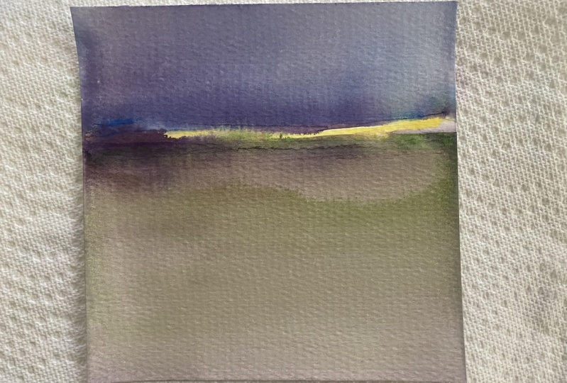
you one of those. Let's just do, I want to do the Payne's gray. I really love that
dark piece I did. Let's just do this. You can do the horizon line, don't
put it in the water. You know how many times
I've put my little dabber in the water accidentally. It's just ridiculous
what I did there. You can also have Payne's
gray as the upper line. Maybe it's after sunset
and we're seeing the deep dark part of
the sky trying to leave a little gap because I don't want the top color
to always bleed down. I think I used some gold before, let's try this bronze, I didn't do this with
the bronze before. I'm just dip in these
colors in here doing this. Now, coming down, I really
liked the Payne's gray, so let's just stick with the
gray and see what we get. We're going to start with
the dot at the bottom. You can start with the top. I'm just starting
with the bottom. That was a lot of
water I had on there. Then I'm going to let that
run down with the extra. I think on the others, I let that run a little bit less because I already
had the top done. But look what that
just created though, I'm really liking it. Let's go ahead and let that do its little runny thing here. Add little extra water to get some more of
that color to do its thing but then you
see immediately my point. Now, this is really bowed. All the paint just runs off, and it makes a neat look, but it doesn't hang
in there like it does on the thicker paper. I don't want to
have a thick line of color at the bottom, so I will come through and soak up that line at the
top and the bottom there because I don't want a real thick lining there
at the top and the bottom. This will flatten back out, but it's going to be a while. But look what that does. That's what I was talking about, it completely goes
round and then all the water and
the color goes off. It's pretty on the
piece that I created, but this is frustrating
to work with because you only
have a moment and then that moment is done. Let me set that one
down on the floor, and we'll do a few more pieces and some different colorways.
7. Experimenting With Colors: [MUSIC] I'm going to do another one on a thicker paper in that
yummy Payne's gray color. [NOISE] Then come back with some other colors in
here for that top line. On this one I'm going to show
you if we do the top and the bottom before we lift it, we won't have the run spot that we had with
the other piece. I'm just picking up some
random colors at this point. Just whatever random
set of colors I have. Then I'm going to run this along the top and the bottom
before I lift it. That way, we are not going
to get a great clump of ink that breaks
away and goes down. Look at that. [LAUGHTER]
That's very interesting. Now we can use our
little spare brush just to help move things along as we are going to
create specific tree lines, and see now if I did
that and now lifted it, I don't have that
breakthrough piece. I wanted you to see that a
little bit of both ways. Let's just take our bigger
one and come back and do some extra water spots,
and we'll see what we can get with that
landscape with some extra. Wow, look how pretty those are. I think that is the
antelope with Payne's gray, but it makes a really
pretty deep color. You want to be real
careful when you're lifting these that
you don't have color on your finger that you're then making
fingerprints out of. I've done that a couple of
times. I was like, oops. Then we can come here and see about creating some trees maybe. We can decide do we
love our white line, or do we now need to come
back and blend that in some. I like it like that. Then we'll have some pretty drip-through from the
top to the bottom but look at that.
That right there, looks like a little forest of
trees that we've got going. I'm just soaking up the edges where I would have a water line, but I don't really want. I love working with
the super thick paper because I can hold it by the edges without really being on the big
piece of paper there. Like without having
my fingers on top of the paper is
what I'm trying to say. [LAUGHTER] Every time
I run more water down, I'm just soaking the water up. Look how pretty that one is. I think that's going
to be beautiful. That was Payne's gray antelope, and then it was the red earth, the crimson, some magenta, and some purple lake. Pretty. We're going to throw
that one on the floor, let it do its thing, and
let's do another one. Actually, I like
this antelope brown. I like that with the
red earth maybe, and maybe a little bit of green, so let's try that. Let's see. We got
antelope brown. Let's do it backwards
because you'll notice on a lot of the ones
that I was doing, I did a big foreground
but a little sky. Let's go ahead and
do a bigger sky. What else do I want? I want
some red and that sky maybe. Once you hit upon one of
these that you're like, I love that kind of thing, then mark on the
back of these what those colors were so that
you can do it again. [LAUGHTER] I'm really bad
about not doing that, but having the color guide sheet here lets me go back and say, this is the colors in that. Let's just try this crazy thing. I've got some air
bubbles in here. Let's just pop those bubbles. This is going to
be the foreground. That's a lot of paint for the foreground, but that's okay. You'll get yourself in a
rhythm and figure out, oh, that was too much, or not enough, or whatever. Look at that. Oh my goodness. [LAUGHTER] We use a little
bit bigger paintbrush here and get that
to go on the edge. That's a lot going on here. You can rock these
back and forth. Then if you're thinking, oh, that's way too dark, or way too much, come back and start adding water in there, and that will run some
of that paint off onto your sheet because I think I
did way too much ink there. [LAUGHTER] That one part. This one I might not like
this one. We'll see. If you do a bunch
of these and then you end up with a few
that you're like, that's leaky. [LAUGHTER]
Then you'll know. [LAUGHTER] That's why I do
seven or eight at a time. Look at that. Let's say you get it to
this and you're like, it's just not doing
what I want in the sky or in the this, or in the that. Let's do some of the silver. What if we came back
after the fact and added some stuff on
and added more water? At this point, you
could do that. You could then dab in
some more paint and then hit it with some
water and just see, what would this
do if I did this? You can keep working
this. That's my point. You don't have to do
one layer ink and say, it's done, I don't like it. You could come back and say, what if I wanted more brown, or more black, or more gray, or more whatever here
in this bottom part? Come back and add some
more water and add some more paint and
you can work it. It doesn't have to just
stop with the one. You've got enough
wetness and water. You could actually,
even when it's dry, you can come through and say, what if I added this or that? You could add marks, you could add other materials
on top like pastels. You could get creative
and experiment here with the different
things that you add. Maybe we do a couple
of drops and try to get some trees or
something growing up here. [LAUGHTER] You
could do that too. You could actually get real
specific and start moving that color around with
your brush to make it look more like a clump of trees, or a tree line, or
something going on, depending on how much you
want to work your pieces. That's really pretty.
There's brown going up. I don't know that
I love the brown, so let's just tap some
of that back down. If we have water tapping
down, tapping up, we'll have some different fun runs in our piece
when we're done. I don't like this one.
[LAUGHTER] I could edit it out, but I'm not going
to I wanted you to see that we all have
days that we're like, don't think this is going
to be my favorite but let's throw it on the
floor and let it dry, and let's do another piece. Don't let that stop
you because again, I did eight pieces at a
time when I was playing. Let's get some more paper towels because I did let that
have a lot of water on it. I did like eight
pieces at a time. Let's do a different
orientation. I did eight pieces
at a time so that I could throw out half of
them if I needed to. Let's just see. If we go this way, will we get something
that we like or don't like? Let's
just test it out. I'm just randomly picking up some colors and
seeing what we get. Once you've done
enough of these, you may get really
specific saying, I like these three colors
and I want to do a series, and just see how you do. Now, be careful not to put too much ink on there
because on the last one, I really think I overdid it and I could
have overdid it here too, but that's interesting
to figure that out. Look at that. Let it
run and do its thing. It might work a little bit with my extra
paintbrush here just to get some of the white spots
if I don't love those. Looks like a rain blue in
the sun in the top there. After we're sure, we've got enough of that spread
out that we're not going to run and bleed. We can then lift it and start tapping some water in here if we want that
to run a little more. See now, I did that. I almost got some pretty
tree line right over here. I can help that
along a little bit. That's pretty like that though. That's very interesting.
I don't know if I'm going to love that one
or not. We'll see. Let's let it do its thing. Let's that one dry. Let's come back in
here with this umber. Maybe some blue in the sky. Less is more on
some of these inks. In some of these, I'm getting way too much
ink on here and I want you to be cognizant of how much ink. A little bit less
is almost better. [NOISE] This is purple. A little bit of magenta. Let's go less ink. Let's switch out our water because that water
is nice and brown. If you're making enough pieces, definitely consider switching
your water out pretty frequently. Look at that. [NOISE] Let's chop the top. Then I'm going to come back
with my extra little brush. If I've missed the edges. You might not want to do that, but I like it to go
along the edges. [NOISE] You might just want to let it serendipitously
do what it's going to do. Then we'll fill that
line in a tiny bit. Let's do it with a big line, but maybe filled in a
little more than I had it. Let's tap a little bit
of water in here and maybe get some trees go in. The reason why I
like the inks is because they are so heavily pigmented but so liquidy. It's not like using a watercolor that's been watered down but when you're all
done, it has a very watercolor-y look to it. Look how pretty
that is. Let's see. Now, don't want to
add any water to maybe get this clump right
here coming down some more. Then I tip it just to tap
it off the very top here. I don't have a real thick line
of whatever. That's pretty. I like whatever this
is doing right here. We must have water come back and then give us a fun
little line there. That's real pretty. I
think I'm going to set that one down and
let it start drying. Don't ever throw
anything out until you're sure that
you don't love it. Let's go with this antelope. Because I've had some
pieces that I'm like, I don't think I love that, and later be like, oh my God, that's amazing. This is the purple lake. Got some red earth. That's a lot of ink. See, I've got to, for myself, I need to be like,
don't over ink it. [LAUGHTER] We'll come
back and do some water. If you don't dip or
water in-between, you'll end up with
color on there that you re-spread like I just did there, but I think in the
end it's going to be okay because we still have
color that we can run down. That'll blend back in. [NOISE] Had a lot of water. Let's get a little
water off of that. I like when things look
like a little forest. [LAUGHTER] I want to get
some more running down here. You can control the
direction of stuff too. If you've got stuff
running the wrong way, tip your paper the other way. That's how we get some
fun directions going. I want those to make
trees there. Here we go. I don't want to overdo it, but I want it to sit and look like a little
forest in there. [LAUGHTER] Then do I like
the amount of white? We want to fill that
in a little lady. Am I going to regret that later? Possibly. [LAUGHTER]
Look at that. I had a little red over
there. I liked that. It's dirty water I've got going, but look with that.
That was pretty. Let's not overwork it. Let's set that one down
to do its little thing. Sometimes you can't
judge where you're at. You got to stop and let that dry because the colors change. Wait until we see that
later once they're all dry. You're going to be like, "Whoa." [LAUGHTER] I've got two more, so let's just go ahead and
maybe do something crazy. Let's do a little
bit of the gray. Let's try not to over ink this. [NOISE] I'm not having that problem with the gray
like I was with the antelope. [LAUGHTER] Then let's
put some crazy color. That's that brighter green. That was olive green and
then this is the dark green. Maybe I want some antelope
in the sky with some red. Let's just see what
we can get here. Maybe I want a little bit of
burnt umber for the bottom. Then this was a lighter batch of color so let's see what we get. [NOISE] Look at that. I'm going to go ahead
and make that line less. I don't know why when
I'm making them, they look so close together
when you're laying your ink, but then when you
get the color on there, they looks so far away. [LAUGHTER] They look
like it's a foot. It's huge. It's like
the most giant gap you could have ever left. [LAUGHTER] I'm just going to
go ahead and tap some water. [MUSIC]
8. Finish Color Experimenting: [MUSIC] Tap some water on that and the dogs started barking. [LAUGHTER] Then I'm actually loving what the top is doing before I even tap any extra
water up there. I'm thinking stop while you're ahead because
look at that one. That one could be my
favorite of the day. You'll notice we did
1, 2, 3, 4, 5, 6. This is number 7. Number 7 might be
my very favorite of the day because I
like how that went down, how that went up. Here's number 8. Let's go ahead and do eight
because two sheets of paper. [NOISE] Let's do one more. Let's do one that's
brighter colored, less of a brown
landscape. Here's purple. There's some green, that brighter green,
that olive green. Here's some teal. Because you never know, maybe a rainbow landscape
would be beautiful and then maybe we'll
have a little bit of this crimson up top with maybe even let's just
do some silver in there. Maybe bronze, I
did notice these. Maybe no, I want purple. I did notice that
these metallics don't quite spread the same way
as the regular paints do. You just got to be
aware with that, it's like a little rainbow. Look at that. Let's do the top. I actually smeared some
of that with my brush. I may go back and stick a
little extra ink in here and tap it with our water. Don't be afraid to add a little
extra ink if you didn't, like you smeared at
all with your brush, you got too close to it. That's okay. Add extra
water if you need to. Look what that one's doing.
Look how pretty that is. Maybe these last
two are going to be some of the prettiest ones. [LAUGHTER] [NOISE] I'm just going to come in with a little bit and tap in a
little bit where our line is. Maybe it's less of a line. Then we'll let that one dry. Now we've used all
of our pieces. We've experimented with colors. Now we can go back. I want you to do a few
that seem a little crazy because in the end,
maybe you'll love them. I actually think, let's just
add some more color in this and just see if we run
that down, what we'll get. I feel like the top I made
more vibrant than the bottom. [NOISE] Look at it and think,
do I got enough? Do I need to add some more? Does it need something
here or there? Do I need to tap and get some more runs or have
some less intensity? Just play a little bit. You'll notice on all of these, I didn't spend tons and
tons of time on each piece. I wanted them to be a
little more organic. We get what we'll get. But you can work
on these longer. This tends up being something
that you truly love. You can definitely
get into each piece, especially after they dry. Add more details and
more things to them. Here's piece number 8. We're going to let
all of these dry and then we'll take
a look at them. I love doing these
as a precursor to our bigger piece because
then we can be like, I love this one. Let's go ahead and make
that a little larger. I'll be back when these are
dry to take a look at them. [MUSIC]
9. Trying Tube Watercolor: [MUSIC] I want to show
you a different material, because they were
just delivered. When I told you in the
last video that we had the UPS man came,
the dogs are barking. The UPS man came and he delivered some watercolors
that I had ordered. These are the Schmincke super
granulation watercolors. The granulation is where
the watercolor separates out into other colors just
as part of its properties. I love that, I am in just sanely in love with watercolors that granulate. Anyway, if you've watched
any of my classes, you know that I'm not like a straight watercolor
kind of girl. I like the watercolors
to do some other stuff. I want them to bloom and separate and create
some interest. Here you are with me, first try of these watercolors, because this specific technique, I think these were
basically made for. The set that I'm using, I went ahead and
got a little set instead of individual colors because I wanted a specific
color, the tundra violet. But this is the tundra set
and it's got tundra orange, tundra rosa, tundra violet, tundra blue, and tundra green. I wanted these because
specifically for this runny, dreamy atmospheric landscape, I thought these colors
would be so beautiful. What I'm going to do is just
tap each color and then see how does that run with the water and
how does it granulate? What color is this? I have some greens
still on there. How would these work? I'm actually going to do
the same thing as I did with the ink and run this
along a little piece of paper. But I wanted to wet these and just see
what color do we get. That's pretty interesting. That's going to
be my sample card where I write the colors on it, and then I can have
them sitting behind me. But because these are
five specific colors and I cut up some more
paper just to try this, so this would be
a good test out. I really want that tundra violet because I saw somebody on Instagram using
tundra violet for something and I
just went insane. I'm like, "I got to have that." I'm kind of using these
like the inks and I'm just spreading some
watercolor on here, and I'm watching what
our little samples here to the side are doing. I can already see that I
love that one right there, and I love what this
green is doing. I love what all of
those are doing. I can already tell that these
are going to be a favorite, but I don't know if they're
going to be liquidy enough. I may have to use more water. This is a test for me and you to see how
could we work with a little tube of watercolor in such a way that we're
doing with these inks. The inks are a lot more watery. You can tell, we might
have to experiment more and just know that,
make them thinner. Thin them down. I don't know. These are drying even more. Look at that. [LAUGHTER] Well, it's a little
bit all these in here. Now let's just stop there. I think I used the purple, this tundra rosa, tundra orange, tundra violet, and I may have used a little
bit of the green. I don't know if I
used the blue or not. Let's just attack these. I already know they're not
going to run as easy as an ink because they're thicker. But maybe if we activate these and then come back
with some more water, we can tempt them
into running for us. Look at that. Oh my goodness! Then let's just keep on tempting
these to do their thing. This is a good
exercise for you to know working with
thicker watercolors. What is that going to
do for this project? It's an interesting experiment. I think what we're going
to have to do is to keep on coming back
with more water. See, we're definitely flooding
this piece of paper with a ton of water on
something like this, just to add enough to thin that down to
run and do its thing. I'm not wanting that
big white spot there. I can already see though
the way these are running that this was a good thing to experiment with. You're definitely going
to have to play if you decide you want to try
watercolors instead of the inks. You're going to have to play
with the watercolors to coax them to move around as easily as the inks
because they're so thick. But see, we can just keep
adding water to these and just tempting them
to spread out. What I like about that
is we're going to get some layers, some bleeding. Maybe we can get depth in, say, like a forest. Because I added so much water, these are not as heavily dark. They're not as dark
as our inky ones, but we're still getting
an interesting look. I think this is
going to be a lot lighter, more granulated. You might need to
go ahead and put some of these watercolors on a palette and work some more color in there
with it on a palette. I've got a palette. [NOISE]
I love my ceramic plates. This is a ceramic plate
from a kitchen store. We might just add more
water to that and then come back and
layer some more in. So if you get too
watery and washed out, then do this on a palette and lay some more color
in if you need to. Very interesting. Let's let that dry and
just see what it even did. I like the inks because they're thick and they're vibrant, but the watercolors
may be fun for a more watercolor-y landscape. I just wanted to throw this in as a tiny little bonus. Check this out if you
try the watercolors, here's the look you're
going to get so that maybe you can see
right up front. Do you love it? Do you hate it? Is that something that you want to try out and just decide? All right, so I'll see
you back in class. I'm going to let these dry. We'll let this one dry with
the other bits and just see what it looks like when they're completely dry. [MUSIC]
10. Evaluating Pieces & Finishing Touches: [MUSIC] These are, I'll call
it 99 percent dry because I did a couple
of extras at the end and then I noticed
that most of these are dry so I did heat some of
these with a heat gun. You can do that if you're in a hurry, but keep the heat
gun pulled back from it and just go over the piece several times, and let it do its
thing. So you'll notice that the one that was on
the really thin paper is buckled and warped but the finished piece
is very interesting. I'm not sure that I
like the texture that the watercolor created
here on this piece but then again, I like texture and granulation
and stuff so maybe I do. This almost reminds me of a
butterfly stuck in a tornado. Doesn't that look like a storm and the tornado cloud,
you're like swirling and it's here's the tornado
itself and it's coming, and you can see it's
anger and stuff up there? I feel like I did a tornado. [LAUGHTER] So let's just
evaluate the pieces. I did a couple of extras
after I turned the film off because I had some
extra pieces of paper so I thought I'm going to do a couple
of these real quick. I'm going to go through the
light paper is a challenge. You could try it but
it's a challenge. The one that I did this way, I don't like at all. So that's probably a piece
I'm going to throw in my scrap pile and
it can be a scrap. This one here that I thought I might like or I
might not like, I like the colors in
it and I like somewhat what it's doing but
I don't love it. It's something I would
need to paint on top of. This would be a piece
that's definitely a candidate for more
work on top of it. I don't love it like it is. My goal with these landscapes
though is to get pieces that I love without
doing more to it. I want that to be the piece. I want to enjoy the ink, so I want to enjoy the drama and the
different things that we created with just the ink. Then we can decide to mark
on top of that or not. This one that I did, I
don't love it either. This is exactly I do love it but I don't love it
as a finished piece, I would definitely need to
come back in here and maybe add some trees and I don't
know, do some other stuff. Maybe it's a good thing
to collage on top of. It's a good background. That's why I don't
throw any of these out. This could be a background for a collage and then I
could collage on top of that and then it would be amazing so that might
come up in the future, [LAUGHTER] the watercolor one. So let's talk about
the watercolor one. So this was super granulating like it said and I do find it very interesting in the texture
and stuff that it gave, but I don't feel like it gave me that finished piece of a
landscape like the inks did. It's too translucent and in the end it's not
my favorite but I am glad that I went
ahead and recorded that video, and then we're
talking about this piece. Because now you know
if you thought I'm going to use my tube watercolors
and try this with that, this is what it's going
to end up looking like. I would say that you'd
probably have better luck with high-flow acrylics
if you're not using the inks but the watercolor, that's iffy. I don't love it. I was going through the ones I didn't love before I get to the
ones I do love. This piece, I love it but it's not finished so
this would be another piece that I'd either mark
on top of or use it as a collage or mixed media piece. After I turned the camera off, I did a couple with just really light quantities
of ink and came up with, I think maybe my favorite
pieces possibly. [LAUGHTER] They're
amazing I like this one like this where this is the sky and this is
the grass below. This one I like where this is the ground and I've got
a forest of trees there. How amazing did that end up? I used the same bunch of colors. I just did some purple
and the crimson and the antelope
and then the teal, the dark green and the olive green, and the
antelope on the bottom and I did both of them with the
same colors. Look at the totally different
landscapes that we got from just those colors
and I love them. They're beautiful. So
these two, I love. These are some more
that we did in class. These are five that we did that I filmed and
I like all of these. This one I love because it's neutral and we've
got some movement. This one I love because of this centerpiece
that mesh together. It's almost like
a forest and this is the ground underneath, look how beautiful
that is and I love the drama and the
deepness in the color. This one I love and I could even look at it and see if we
like it better this way, the way I did the other
one that is fun that way. So this one I thought was really beautiful and that could be the little forest,
or this could be the forest so we've got choices
there. I love that one. This one I liked how
pretty these colors were. I don't know that I
feel like this is finished but it is beautiful. I love the colors. This one, I love the browns at the bottom and the purples
at the top, love that one. So once you find the pieces
that you really, really love, then you can evaluate, do I want to add
more to it and do some mark-making
or is it finished? So a couple of these, I think they're finished. Like this one is finished. I love that one. I would frame it and do it just like that. I do feel like this
one is finished. An interruption. I
may repeat myself, I'm apologizing if I do. This one, insanely beautiful. I wouldn't do anything else
to this I don't think. I actually love it
just like it is. These brighter ones ended up so delightful that I'm
actually really happy with all three of
those also. So in a paint session where you're
doing multiple paintings with the anticipation that some of these are
not going to be your favorite but maybe
one or two are so amazing that you're
like, I love this. That's where I get passed roadblocks for
coming to make art. Because I used to sit in
my art room and get just angry because I wanted
to create a masterpiece. I wanted to sit down and I was looking at this white
piece of paper and I was just wanting a
masterpiece to appear with basically no practice. No idea where I was going to go. No idea of the colors. No idea of how a lot of the
things that I have worked. I wanted a masterpiece and I'd get angry when
nothing will come to me, or I'd put a little
bit of paint on a piece and maybe I'd think this
looks blah, I don't like it. This didn't work,
I hate sitting in my art table and feeling this way and then I wouldn't
come back for a while. I have discovered if you
will do these many pieces, eight or 12 at a time, experiment with the colors
and just play and not get so invested in one
piece that you're expecting amazing things out of. Then you may end up
with seven that you like and six that
you don't like, and the six that we don't
like could go on to be backgrounds for collage
work and stuff like that. The seven that we do like, we could then evaluate and say, okay, I'm in love with these. Do they need any more work? This one, I don't think it needs any more
work, it's beautiful. This one, it maybe could use
a little more work but I'm so in love with the
colors and what it's doing that I'm not going
to do anything else to it. This one I'm loving
just like it is. This one I'm loving
just like it is but maybe it could
use some extra work. Maybe I could do some
pastel work on top of it. Maybe I could get some pencils or let's just grab something. Let me grab, here we go. I'm looking for this right here. You can get your paint pens out if you want to do
some paint pen work. These are just some pastels that I like that they're hard. They're not like my
soft chalky pastels, they're a little harder and they've got all these
yummy colors in it. I could look at this and say, what else could this need? Then maybe I would
come in here with a few lines and some mark-making and then
I could be like, I love it and I think I'm
done, that kind of feel. Maybe in the trees
up here we could put some definition in there
like it really is a tree. Maybe over here with a
paint pen maybe we need some stars to really
make it look like [LAUGHTER] we're
in the night sky. We could do some dots and some stars and sometimes
it doesn't need a lot. Maybe it just needed that extra one thing to finish it out and
then you're like, now I'm feeling it. Like if we just go
through and add some little stars and
we could do this too with splattering paint on it but I don't want to get
a little toothbrush out. I have to go find it to do
some white paint splatter, but maybe we needed
some little stars. That's pretty, and
then we've got a more defined treeline. We've got a more defined, that's the night sky as
the sun is coming down. We've got a little bit of definition there as our horizon, like maybe we're at the lake
and this is lake water. Then I think that
tiny extra touch finishes it off a
little better for me because now I have
some more details. They're very fine,
they're not overwhelming. Now I think it says, I've got the forest
and the night sky, maybe we're at the
lake. I love that. So consider that.
Some of these pieces, especially these two that I did when I turned
the camera off, I did really, really fast. It's harder to go
super fast when you're talking [LAUGHTER] on camera but these two, I did these
really, really fast. Just because I was like, let me lay some
color down before I screw all these lids down. Man, I love it. This one I don't know that it's a finished piece though but I do just love the colors
and the way it's going. This one looks like trees and if you wanted to come
back in with say a pencil you could actually very lightly draw some tree elements
in here like branch wood, different branches and
just make that appear. I say really lightly because
this is really light but if we add in
some tree details, just a few branches and
maybe that center stem. We can make that look more like the force we
were intending visually. See, if we just do
that little bit, now that looks like
a finished tree and maybe you're not going
to see that detail jump out at you until you get closer or maybe it was just enough to define it for you for what you
wanted to finish that off. I love that, so less is
more on some of these. Really love that, I love all of these. I can't wait for you to do a little project and then say, do we need any little details? Which one do we like
enough to use that as our inspiration for
a larger piece? I want you to use these as an inspiration for a big piece. I'm loving the
browns and purples, that might be a really
beautiful big piece. I'm loving the browns
and Payne's gray, that might be a
really good piece. This is a piece that I've done
in the past with the red, and the antelope, and the colors coming through
and it looks like a forest. I do wish I had
left a little white at the horizon line
which I did not do, but that's where we're going
with the next larger piece. We just need to look and say, what color white inspired us the most? Let's
make a big one. This one really inspired me and even though I
don't consider this one completely finished. I think on a bigger piece I could
add in more of a forest. I could come back and
add more ink, and more water and create
the forest so that I get more of that forest-y feel or I can come back
in with some pastels. I really like this
little bit of copper that we've got in that piece
that was very interesting. Even though I wouldn't consider it maybe a completely
finished landscape, I do love these colors. That might be my inspiration for my big piece, we will see. I hope you enjoy creating
these little pieces. Adding in a few
details if you think, it's almost there but I need
that little extra 'umph.' That is a good way to finish
it but keep it minimal. Then I'll see you
in the larger piece where we will create a big one. [MUSIC]
11. Going Bigger: [MUSIC] Let's create a big one. This is number 12. It is the watercolor still on the pad of paper. I
didn't take it off. I've got pieces that I loved, that I found for me were the most finished here
as my inspiration. I really loved the wilder colors here in this lighter landscape. This is a landscape
in the daytime, and some Some these
other ones are more like landscapes in the evening. I'm just going to use
this one, I believe, as my inspiration because I've
not created one like that. This one is the bigger piece I've created in the
past. I really love it. It looks like a forest
and some trees, or at the lake and maybe this is reflections and I'm
going for the same look. I do want to maybe leave some white
in-between the horizon, which I did not do in the past, but I love that look. Let's just see what we can
get as a larger piece. I'm going to set this over
here as inspiration for my bigger piece so
that I can see that I've got the two
shades of green, the dark green and the
antelope, and olive green. Then up top here, I've got the antelope and
a purple and that read, I think that is the crimson, and I've got some of
this metallic copper. Let's go ahead and just start laying some
of those colors. I've got the dark green, olive green, the antelope. That's our base. Then I've got the light purple. Here's that pretty coppery
color. Here's the copper. I also have, I think that is
this one, the quinacridone. No, no. It's this one
here, the crimson. I think I put
antelope up top also. Let's start with the antelope. I'm going to try not to
do too heavy of color because on those pieces that I did after I
cut the camera off, less color really is the secret on some of these
not too overwhelming, but it is a bigger piece, so I don't want it to be
too little color either. Here's that. Then I've got that and the
blue and the green. I want to put down some paper towel under this
before I do the water. [NOISE] Oh, my
goodness, I love having all those little pieces. Always do not get discouraged if you're
thinking this is not working. [NOISE] Do eight or 12 pieces like I did so that
you can then say, these six work and
these six don't. Then you feel you've
made a successful day at your art table rather
than an unsuccessful. My one-piece didn't work
out day at your art table, which I have way too many
of those that I have done. Then here is that
copper and almost think I want to put the
copper on after the fact. [NOISE] Let's get our little
paint brushes in our water. I love how fast these are. You don't have to
be super speedy, but I do like how fast this technique truly
is. It's amazing. Going to get some cleaner water here for this bottom part. Just get that water all over it. I'm probably going to let this one dry on the pad so
that it's nice and flat. But let's start with this. Let's get the top going. Look at that color. Now we can let some of
this color start moving around. Doing its thing. I am still going to use my towel to soak up
extra amounts of color, because I don't want there to be a big bridge of
color at the top. Then once we've got that going, we can come back in now and
start really manipulating some of this color to run down and create some
nice pathways here. At this point too,
you might think, oh, I want more of whatever
color somewhere in there. Now's the time to
decide side while we're really adding water and letting them do their little thing here. You can be a little more
strategic in your water adding. I'm adding water and
letting them run. But if you want to just get a specific tree or
a specific line, let me get the
water off of there. In here, we could use a
smaller brush and be more strategic in how we let that water run and
how far are we let it go? We don't have to let
it run all the way. If I'm trying to get a
nice forest line here, I don't want it necessarily
to go all the way to the top. We could put a little
water on here, maybe do a drop of this
copper and then we can let that mix that
in a little bit. Maybe we can get
some copper accents doing their thing
here a little bit. Just tap the top there. You can control some of this. It's within your control
depending on how much you manipulate and which size brush you're throwing around here. I have a little drop
of water there. Let's just tap it. [NOISE]. I'm being real careful
not to touch the edges. I don't want a big fingerprint along the edges of my piece. Look how pretty that is. Then we can set the
piece down and think. You can even put some
of these inks on a palette if you want to
work on it a little bit more and maybe get a more defined set of
trees out of here. We could just add some drop of ink and a little bit of water
and let it do its thing. I'm doing that with a brown just see and if we can get some trees along the
edge here and what they do. We can keep layering.
You don't have to stop with the one layer. You can keep going a little bit. Add a little bit ink, add a little bit of water, let it do its thing. Test the limits of what
you're working with. I really, really love
the base of this though. I don't want to do
anything else there, but I do like
manipulating here on the top to see what else
can we get this to do. Maybe a little bit
of that bronze. Because I'm thinking in my mind, it'd be nice to
have like thing of trees and come back down. I like that feel. That's what I'm building
a little bit here. Just maybe a little side forest. I don't want it to
be all one color. I do like how we have some of these little variations
and we could come back in when this
is dry and I can add in the pencil tree elements like we did on the smaller
piece that we did. Let me get it. This piece here where I came
back in and I added some very slight
definition to say, look, that's a forest of trees. We could come back in here
and do that once this is dry. I like how this is building up. It's like this is a
little more in front and the other stuff is
a little more in back. That's fun. Then as
we're doing this, some of this is drying. We're getting some really
nice layered elements with the underneath
layers already drying. Then when you think
you're done working it, when you're like, okay, I
think I'm happy with that, set that down and let it dry, and then we'll come back
and evaluate whether we need to add any
additional marks. I do think I'm loving
that right there. I think at this point, I'm
going to let this one dry and do its thing and we'll come back and evaluate in a minute. We'll call this 90
percent dry because there is some still dampness
in this paper, but I wanted to be impatient and dry this a little more
than it was drying on its own. I feel like I lost a
little definition in my trees here that I might want to get that
back a little bit. I thought this would
be a perfect chance to take a look at getting a
little more detail back. I've put a little bit
of this burnt umber here on this pad of
disposable paper. This is the point
where I might say, maybe I'm going to
come back in here and really lightly hopefully create some trees that are
going back in the forest. I'm going to do that by creating a stem and then coming back and creating just like tapping on each side and getting larger and larger the
further we go down, and you can create
atmospheric trees doing this. The further back they are, the lighter you would
make those trees and the closer they
are to the front, you'd come back and maybe
do some darker ones to imply distance
and foreground. If I come back here now and I do this on the more
front area here, and you can spend
some time on this. Don't have to be in a hurry. Create some atmospheric
trees in here, getting darker as you
come further forward. For the back trees, you definitely would
water the ink down. For the front trees
just make them a little darker and you can make
them different colors. They don't all have to
be like a burnt umber, like I just did. You could have some
back there with some copper feel in there. Like that copper is really pretty shining in a little bit. I could add some water to
the copper and I can do some little bits in
there if I wanted to have that showing back there. I really like that little
bit of tree detail. This over here is more in the purply-reddish tone
along with that antelope. I can come back over there. But actually I like that
that's a little softer. I'm not going to do that, but I could come back in
with my paint pen and add in some stars
or dots to say, oh, it's twilight
even though I did the little bit
brighter front here, I think twilight,
we would still see a few stars through
the trees up there and I think that would
be a nice little detail. Look how pretty that is
if I come in closer, I don't know if you can
see the detail that added, but look how pretty
that is. I love it. Just very soft, little
twinkly up there. We could add some birds if you want to have a bird or
two flying out there. You could come back
and just do a little v. If you get a little
tiny paintbrush, maybe I have a little bird here, maybe a little more
water on that brush. You can have a little flock. You can practice
your little birds on a little piece of paper
if you wanted to. If you're not sure that you can get the bird
the first time, do it on a little piece
of paper if you want, now we have little
tiny bird flock up there in our sky at
twilight with our forest. Some fun little details there. Then once we are done and we know that
it's dry completely, then we can take this off and I do that with
my palette knife. If I just get my
palette knife out, stick it right here in
between on the edge, those two pieces of paper, now I can just cut that off of there and we can call
this piece finished. I'm loving it. I cannot wait
to see your big landscapes. These are beautiful,
atmospheric. If you think that it's not done, let it sit for a day
and think about it. If you think that you'll love it and you want to
frame it, that's great. If you think that
you're not sure, then walk away for
a day or two and come back because look how pretty that piece is from
our inspiration piece. I would say, I got
it pretty **** close to the colors that I was thinking from our earlier piece
that we were inspired by. I hope this definitely inspires you to
create a big piece, seeing how easy that was and how beautiful it is when we're done. I'll see you back in class. [MUSIC]
12. Final Thoughts: [MUSIC] I have so enjoyed
having you in class today. This has been a
fantastic project. I love showing you
new supplies or using the supplies that you perhaps already
have in a new way. I hope this inspired you to try a new little project
with your acrylic inks. I've deliberately
kept the supplies for this class very simple; inks, water, paper,
some brushes. It doesn't get any
easier than that. And a project that
hopefully will give you some successes at your
art table very quickly. Because when I
feel like you have some successes at
your art table, you get excited to come
back and create again. That's what's going
to really help you up your game in
your art practice. Practice working with materials, trying new techniques,
figuring out, I loved this or, I
didn't like that. Or this metallic didn't work quite like the ink colors did. Very interesting to see where in the process I need to use that, whether it's up-front or after the fact that
I've already painted. This is how you discover the
nuances of your supplies, your preferences, what
you want to create, the techniques that
you end up loving. That's how you discover
those and hone down into your own
personal style. But this project so super easy that I
hope you enjoyed it. I loved having you in class. I hope you get a
really nice win, when you're in your art
room creating these and you create some that
maybe surprise you. This one surprised
me and I was like, oh, I love this color way. Let's try the big project with those colors
today rather than the dark and moody sunset
that I actually thought I was going to prefer when I
started filming this class. Some of those surprises
are delightful and make me leave my table and
my art room feeling good. So now I can't wait to
come back tomorrow. Whereas when I would
sit up here and look at a blank page and expected to come up
with some piece of art, some piece of
masterpiece with none of the practice and none of
the work, I'd leave mad. Then I wouldn't come
back up here for months and sit at my
little table and create. I hope this gives you a win. I hope you enjoyed
creating these projects. Can't wait to see which ones you create to come back and
share those with me. I'll see you next time. [MUSIC]
 DENISE LOVE, Artist & Creative Educator