Transcripts
1. Intro: Learning about the
specific tools that can build strong
compositions is going to have a long term impact on the illustrations and
artworks that you create. If you're able to understand
not only intellectually, but also in a hands on manner, the power of value, the power of contrast, and the arrangement of
shapes within your designs, you'll be able to
create artworks that have a powerful
impact on the viewer. Hi, my name is Marina. Well worm artist illustrator and top teacher here on skill
share where I've taught more than 80,000 students
to tap into the creativity that lies within this class teaches the power of contrast, value and balance while
practicing the concept of No ten, the balance of light and dark. Master studies and creating
your own artworks as well. I've always been more
of an intuitive artist, picking up skills along the way and really practicing
within my sketchbook and trying to gather the
material and the learnings from my own mistakes and
failings and terrible drawings. And there's so much that you can learn using this
intuitive method. I also think that
if you're really interested in
increasing your skill set in terms of in terms of creating impactful artwork
for your audience, then it's also
important to delve into the principles
of composition. Today, I'm going to be
teaching you exactly that, one of these basic fundamental
composition principles, which is the concept of No ten. The balance between
light and dark and how this contrast will really improve the artworks
that you create. Composition is one of those subjects that
is never ending. Learn about it and
then you realize, actually I thought
I learned about it. But there's way
more to it then I initially thought
that's what happened to me is I thought that I had understood everything that
I knew about composition. And then life slapped
me in the face and I realized I don't know
anything about composition. It was honestly a revelation. Because when I realized
how much I didn't know, it opened me up to a wealth of knowledge that
I didn't know existed. And that has helped strengthen the art pieces that I
create and allowed me to really create artworks that I want to be creating
in today's class. I really want to give
you one of these tools. And of course, like I said, composition is a very
vast subject and we're just going to be
dipping our toes into one of these principles. We'll be doing that by
doing a bunch of value, no tan studies, black and white. Exploring subjects that
we're interested in. And creating a final drawing using all that knowledge that
we gathered up till now. Let's get started.
2. What You Need: What materials are you going
to need for the class? It's pretty simple, since we're going to be working
in black and white, all you need is some
sort of pen and ink. I'm going to be
using a brush pen and a pentel brush
pen specifically, if you'd like to know the brand. But I know that there's plenty of other brush pens as well, and you could even do this with a marker gas or
procreate as well. If you're using analog media, you're of course going
to want a sketchbook. That's all you need.
It's pretty simple. You'll also need a little bit of gumption and a little bit
of compassion for yourself, for the times where you're going to create drawings
that you're not happy with and reminders
that those are all part of the journey if you do decide to use the brush pen. But you've never really explored the brush pen and you wanted to kind of test it out in
terms of how it can work. Before diving into
this exercise then, I recommend my class
on brush pens, which I'll be sharing
here or here. And that really dies into all the different types
of marks that you can create with
that type of pen. And how you can kind of expand your visual vocabulary with the marks that you're creating.
3. Class Structure: If you're curious about the
structure of the class, it's going to be pretty simple. I'm going to give you
a few definitions before we get started. Then we're going to
immediately dive hands on into our sketch book in order to break the ice
and get started. We're going to be doing two
abstract value drawings and no tan value studies and I'll explain to
you what that is. We're then going to be
diving into master studies. Finally, we're going to pick a subject that you're
interested in. I'm choosing owls because
I think that's fun. And you can join in on
that or pick your own, find a few references
of that subject. And then we're going to
be creating drawings of this subject using
all the things that we've learned in the
previous lessons in our class.
4. Storytime & Inspiration: If I think back to some
of the first types of paintings that inspired me, way, way back, Some of them would be Japanese landscape art and
Chinese landscape art. I think the first time
that I encountered pieces like this
was in a museum. I don't even remember
where it was, but I remember that I was just mesmerized by not only the
dream like quality of it, but also the poetry, the spaciousness
and the impression that I could travel
within the piece. What I didn't know then, which I know now, is
that within that art, there's a lot of
emphasis placed on the balance between positive
space and negative space. And that there's a harmony
that is found within those shapes that contributes to those feelings that
I was just describing. Fast forward, a
couple years after I had really started
painting a lot, I decided that I
wanted to focus on this subject of positive
space and negative space. Little aside,
basically, in one of the acrylic painting
classes that I had done, our teacher had
given us a prompt. I think it was maybe traces
or something like that. And I decided to use a simple
palette knife in one color. And to simply work
really slowly with this palette knife and
create a shape on my page, it had a lot of negative
space around it. And that feeling that I got
of slowing down and of paying attention to the space around the shape as
well as the shape, is something that I
really fell in love with when I decided I wanted to create a series and I decided to come back to this idea that had really
sparked my interest, that I found very,
very fascinating. But that I also enjoyed the
process of, at the time, I was also fascinated by jellyfish and underwater
sea creatures. It's always been a huge
subject of interest of mine. And so I kind of decided to combine those two things and to explore abstract pieces inspired by jellyfish and
underwater sea creatures. But that would stay kind of in the realm of the abstract
or the semi abstract. And with this emphasis on
positive and negative space, what I didn't
realize at the time, and which I'm very grateful
to my past self for, is that I didn't realize
that I was actually training a very fundamental
concept of composition, one that really can transform your work once
you start delving into it. And that is honestly at the root of a lot
of beautiful art. The importance of designing
simple shapes that can be built through
contrast positive space, negative space, and through the interplay of light and dark. Now don't get me wrong,
there's actually many other topics and themes that we can develop
within composition. And actually this
class is really only the start of some of
these principles that I want to be teaching you over a few different classes
that I'll have coming up at some point in the future. It's not to say that these are the only elements of
composition far from it, but they are very,
very fundamental. If you've never really taken
time to explore this subject of shape and of contrast and of the power
of light and dark. Then I hope with this
class that you'll get a little bit of
an inkling of how important it is
to integrate that into your practice
and how it can really push your
art making skills a little bit further
down the line.
5. Composition: Composition? What is it exactly? The simplest way of
explaining it is that composition is the arrangement
of elements on a page. If you want to dive it into it with a little bit
more complexity then composition is actually when you use the
elements of art, and that is shape, line, color, texture, et cetera, arrange them according to the principles of design,
contrast, rhythm, balance, unity,
variety, and a bunch of other principles that will
delve into in future classes. If you want to
make sure that you don't miss those classes, you can of course click the
Follow button in my profile, which will notify you the next time that I have a
class coming out. I said that composition is the arrangement of
elements on the page. But if I'm a little
bit more precise, I would say it's the arrangement
of values on a page. As a reminder, value is the lightness or
darkness of a color. If you turn everything into
black and white and you go from white to black and
all the grays in between, all of those are values. Values are the base
building block, any single piece
of art that we do. It's what allows us to know that there's something
happening on the page. It allows us to decipher
what's going on, to read the image, to identify if there are
elements to be identified. Or simply to create a pathway for our eyes to
follow along the page, to travel within the drawing, and to observe what's
actually happening. And some of the most
powerful compositions are the ones that use value in a way that brings your eye on an interesting journey
within a single page. And that's kind of cool to
think of art in itself, just observing a single
piece of art as a journey. I know the word journey is very often misused or over used. Rather it's one that I personally am fond of even
though I know it's over used. But in this case, it
really, that's what it is. It is a journey, a traveling of your eye with points of interest,
points of rest. And what is it that creates that interesting
pathway for our eyes that injects us with a little bit more inspiration and clarity on what it
is that's being shown?
6. Contrast: What about contrast? Contrast is simply a difference, that's pretty much what it is. And you can have high
contrast or low contrast. What that means is
that the difference, if you have a high contrast, the difference is larger than
if you have a low contrast, where the difference between whatever it is is
a little smaller. Here are some
examples of contrast. The one that we hear the
most frequently or the most often is a
contrast in value. White and black have high
contrast between them, right? However, a mid gray and another mid gray might have lower contrast than the
white and the black. But value is not the only
type of contrast that exists. And there are many
types of contrast, as many as you can think of. And I'll just give
you a few examples of other types of contrast that you can create
within your artwork. You can have shaped
contrast between a square and a circle
color contrast. Red versus green
texture contrast, smooth versus rough, size
contrast, big versus small. And these are just very general ideas that
I'm giving you. But again, there are
so many different ways that you can build contrast
within your artwork. Today what we're
going to be talking about is the contrast of value. And we're going to be using
values and the contrast of these very high contrast
values of white and black in order to explore
composition principles. The importance of
shape and balance. The interesting
thing about the type of contrast that we're
going to be exploring today is that it
actually follows how our vision develops
as human beings, from babies to
children in adulthood. When you're a baby
and you're born, you can't really see very well. But there is one thing
that you're able to see more clearly, and that's areas
of high contrast. Something very dark
against something very light or something very light against
something very dark. And that is our first
approach to vision as babies. And that just goes to show how fundamental this interplay of light and dark is
and how we can use that in our paintings
and drawings in order to make things clear
and easily readable, but also interesting to look at.
7. Notan: The term notan is actually
a Japanese term which signifies the harmony and balance of light and
dark in a painting. It's not just the
value structure, but there's also this notion
of harmony or balance is the easiest representation
of that is the yang symbol, which is this perfect symmetrical harmony
between the two. But of course, you don't
need a yang symbol or a perfectly symmetrical symbol in order to achieve
balance in harmony. But no tan is this feeling that you get when
you look at a piece where feels balanced and harmonious. So that's kind of what we're
going to be exploring. Specifically, within the
different master studies, we're going to see how other artists have
achieved harmony and balance within
their artworks using the power of
light and dark.
8. Habit-Building: Are you the kind of person who watches these videos
but then never actually grabs your
sketchbook and does the exercise?
If that is you. I'm not calling you out, but I would like
to invite you to open up your sketchbook
and join me in order to build a newer habit of grabbing your art materials. First and foremost, if you're
someone who likes to watch the video all the
way through till the end and then come back
and do the exercises, that's fine, it's not a problem. Please do as you do. I really just want to invite us to delve into a
hands on practice. Because how do you
want to learn to draw? Better, draw more. That is literally the
single most important thing that you can do for
your artistic practice. And that is why without going into any more details
about anything else, I'd like us to start immediately with our
sketchbook drawing. What we're going to
be doing is creating an abstract drawing
using black and white. We're literally just
going to be building shapes and lines
in our sketchbook. That's it. Nothing complicated. No right or wrong way to do it. Let's grab our sketchbooks
and get started.
9. Abstract #1: Diving In: I just opened up my sketch
book to a blank page. If you're really
terrified by this, I would actually
recommend closing your eyes and creating a mark.
And that's how we begin. Remember here, we're
just trying to explore shapes on the page. I'd recommend that
you work first with shapes rather
than simply lines. You can see me filling this
shape in little by little. But of course, none of
the shapes that you do, especially since it's abstract, are set in stone. You can definitely
modify them as you go. What we really want
to be exploring is just the interplay
of light and dark. And you can do a lot
of separate shapes, but you can also make shapes
that are very connected. Of course, if you're
using pen and ink, the marks or marker as well, the marks that you're creating
will have this texture. I'm sure you can see it
probably on the video. It means that we won't get
as smooth the surface as, let's say if I was using guash where I was
really trying to get that flat surface,
but that's okay. Maybe just integrate
that into your work. And remember that
that is going to contribute to the feel of the
piece that you're creating. But I also want to remind
you that the reason that we're doing this is not to create necessarily
finished piece, but just to remind ourselves that drawing in our
sketch books is really the way to go and the way that we get better
at drawing overall. It's really just a
warm up to remind ourselves that we can just even make shapes
in our sketchbook. And that is an
absolutely valid way of contributing to
our art practice. If you found something that
you think is interesting, you can then start to maybe play around with maybe smaller marks. Just notice how that
shifts the piece. You can try thinking about
balance and harmony. You see, I put a lot of details here and so I thought
it would be maybe fun to add a few more details that echo those somewhere else. Remember to simply
follow your intuition. Even if you don't know
why your intuition tells you to put a mark in this place rather
than another place. Just follow it and
see what happens. Bring you to new places
that you're happy with. Sometimes it'll bring you to a new place
where you're like, oh, maybe shouldn't
have done that. But practicing tuning
into what your intuition says is a really powerful tool to integrate into
your art practice. I recommend it even if your intuition leads you
a little bit astray. Because even leading us astray
is all a way of increasing our art skills and learning how to create art that feels a
little bit more true. I want you to notice
how each time that you add different elements, how that shifts the balance
and the harmony of the piece. I'm actually pretty
happy with this one. I'm done with my first one. I hope that you've done your first one and we're going
to do a second one. You can either continue to
do it on your sketchbook, I'm going to demo
the second one on the ipad for those of you
who are using procreate. And I'll be adding
a little video with the basics of
procreate right after this. If you're not using an
ipad and procreate, then you can skip that video
and meet me directly in the demo of our second
little abstract exploration.
10. Procreate Basics: Right now, we're going to look at the basics of procreate, just in case you've never
looked at it or used it. And I'll just give you a few little ideas of
things that you can try out for yourself in order to be able to just open
it up and start drawing. I opened up a blank canvas and I'll just go
back to show you. You can click this little
plus button here and then click on Screen Size or some other shape if
you prefer that. What you'll notice
here is in blue, we have the selection
of our brush tool, which is what we are going to
be using in order to draw. You can see already
that mine has a color to it and it also has, you might notice,
a little bit of stabilization. What
does that mean? It means that instead of having
my hand do all the work, the computer is also helping
me create a smoother line. This can be useful if
you're doing lettering, for example, but I
have to be honest. In general, I prefer not
to use stabilization. The stabilization is
something that you can pick or not within the
brush that you're using. But a lot of brushes
don't have it. For example, if I go
with my six pencil here, which is something that you can find pretty easily and I'll show
you how to do that. This one does not have
any stabilization. It just gives me what I'm doing and reflects the
movement of my hand. How do we change colors? Obviously, you'll
notice up here we have a little color swatch and this is where we get to
pick our color. There are a few different
ways of looking at color. You can use the disc,
the classic harmony. I'm going to be honest with you, I rarely use this one. But it can be useful if you're trying to
learn color theory. I also rarely use this one. Then palettes,
which you can use. I've downloaded a few palettes and I've created,
of course, my own. This is what I use most
often as well as this one, it's pretty self explanatory. You just move it
around and you see the color switching
there and there. Why don't we just go for
something pretty dark, almost a black, or even just a black?
That could be great. You can get a sense of the different textures
of your brushes. On the left side, you have
the size of your brush, you can really see the
six B really shines here. If you use your pen on the tip, then it has this very
thin pencil shape. But then if you use
it on the side, you really get that shading that a pencil can offer.
That's a really fun one. You can obviously vary the
pressure with which you press and that will reflect on the mark that you are making. Then if you didn't notice
I keep doing this, I'm taking two fingers. By tapping with two fingers, I undo what I did before. If I do this, then I'm like, I don't like that. I can tap with two
fingers and erases it. Alternatively, I can click on this little
return button here, and that does the same thing. If I realize, oh no, I didn't want to erase
what I just made. Well, that's when I can
press this little guy here, which brings me back to the
mark that I just created. Of course, you can play
around with the size here. You can go very
thin or very thick. Each brush will have
a specific range that it can go in a
minimum and a maximum, and that will vary according to the brush that you're using. Then finally, this one on the bottom left here
is the opacity. Let's say I have a big mark, but let me do it with full opacity and then let
me bring down that opacity. Actually, this, you barely
see the opacity shift, which is surprising. Here we go. If I bring it down to 10% I
am pressing as hard as I can, but I will never
get the blackest, black as I did on the
ones at 100% opacity. When you lower the
opacity of things, of course you're going to see the layers that are underneath. That can actually also be fun, like a great texture. A textural element can add also some interesting
depth in your work. That's something to
play along with. But in general, I usually keep mine at
pretty high opacity. Again, all these things are little things that
you can play with, explore, and test out
according to what you want. Finally, this little thing here, which if you click it, it allows you to
select a color here. If I just move
that and I'm like, oh, I actually like
that gray color. Notice how this has changed now, I no longer have
that black color. I'm using this gray color
that I had selected, that gives you a little
sense of everything. Of course, you can
use the eraser, which allows you to really
erase different things. You can change the brush that you're using
on your eraser, so I could use a marker eraser. You see it'll be a little different
than the previous one. Have a little bit more opacity. But then of course,
you can also change the size just like
an irregular brush. Then finally, if I wanted to show you how to pick different types of brushes, you'll see that with
your procreate app, there are a lot of
inbuilt brushes and there's a lot of
options to choose from. It's really up to
you to go around. I've re organized things a
little bit and I've also added a few different brushes that I have gotten
here and there. The ones that I really like are the drawing brushes and
the sketching brushes. I love the HB pencil, the procreate pencil,
and the six B pencil. If you don't want to
go explore outside, you already have so much to explore within
the app itself. The key with procreate
is you really just got to try things out and
experiment with them. And then little by
little, it'll get more familiar to you and
you'll understand how it all works and how it's
all put together. That's it.
11. Abstract #2: Curve to Straight, Ratios, Negative Space: Let's do a second abstract
exploration this time. I'm going to be using my ipad. Procreate, of course. If you want to continue
in your sketchbook, feel free to do that. As you'll notice,
I've just opened up a very regular
canvas screen size. But what I am going
to ask you to do is to make it a
little bit smaller. I just want us to
do that in order to not get lost in
too many details. I picked a brush
which you can find in the drawing section and
it's called Blackburn. I like this one because it's
similar to my brush pen, but you have so
many other brushes that you can choose
from and there's no obligation to stick to one just as long as you
stay in a black color. Because that's the point
of the exercise and because it's also fun to
work in black and white. Same thing as last
time in my sketchbook, I was working in a
vertical format here. I might stay in the
more horizontal format. I again, want to be
working with shape here, since there is a bit of
texture on the edges. That's going to
have an impact on my drawing because
you're going to see those textures, of course. You can also change the
size of your brush. I'm going to be honest here, the reason I went for thinner is making this shape just
made me think of a tree. And it made me want to draw the abstract
silhouette of a tree. Even though we're working
in the abstract realm. You can of course, use inspiration from
objects that you know. If that makes it a little
bit easier for you, I still would recommend that you explore a bunch
of different shapes. Even though I have a
abstract tree here, I'm not going to let that
limit me to just drawing trees and I'm going to explore
with other shapes as well. You can notice here that I made an outline and then
filled in the shape like with my brush pen
in my sketch book. But I do want to show
you that a little trick, if you're using procreate, honestly, this doesn't always work depending on the
brush that you use. So I'm not even sure it's
going to work on this one. But sometimes you can just take the color that you want and drag it onto the shape and
it will fill it for you. That's a bit of a
shortcut if you want. I'm also going to have fun
here playing with a principle. If I'm going to be
honest, I think I'll do an entire class on
this principle. But the curve to straight trick, it's just this
principle that having a balance of curves versus straights can make
for an interesting drawing, you can see that I'll have
like sides that are straight. And then there's more curves
around here, for example. So I can of course, mix these shapes together and decide to extend any sort
of shape that I've made, just like in the first try. One thing I'm going to ask
you to pay attention to. Obviously, we are
drawing in black, But no tan is this balance
of white to black. Don't ignore the white space. Pay attention to
the silhouette of the white space that
is being created as you're making your black
marks on the page. Play around with that.
You can almost look as though it's the white part that you're drawing rather
than the black part. And see if you might want
to change your shapes to make the white shape a
little bit more interesting. I did, I erased one of my
marks by doing the double tap. But it's true that it would be better if you
don't erase too much. Just like in a sketch book where you don't really
have the choice, especially if you're
working with pen and ink. I think it would be
really fun to challenge ourselves by accepting whatever
marks it is that we make. I will do that in
the future and I won't be erasing any of
the marks that I create. For example, one of the
things I'm noticing here in my white shape is that there's
the same distance here, between here and here,
and here and here. I don't know, I don't find
that super interesting. I'm going to come in and maybe modify this shape
a little so that there's a little
bit more variation in the thickness of
the white shape. I might also add that
curve to straight. Adding a straight line here. I quite like the hierarchy, the ratio of black
to white here. But I'm going to add a few
more details because I only have this one
very thin line. I think it could be fun to add a little bit more detail work. I'm going to make my
brush a little smaller. Maybe that's a little too small, but again, I'm not going to erase it, I'm just
going to leave it. I'm just going to thicken
my brush a little bit. Maybe I'll go over it and I'm going to play
with some details here. Do you see how adding
these lines has already made things a little
bit more interesting? I'm pretty happy
with how that looks. I'm going to stop here. This
is my second exploration. I hope that you enjoyed creating your own
second exploration. Even if you're not
happy with what you did, that's totally fine. You can also decide to
continue refining it, Replay this video from the start and just continue playing
and adding to it. I am going to say
that on this one, for example, I have a lot
of black versus white. But I could have
painting where there's mostly black and just
tiny little elements of white that might happen if I'm
working a little bit longer on a piece
and I really want to fill that in and try
to see what it would look like if I filled almost
the entire page. That's it. Let's move on
to our second exercise.
12. Evaluate: Now that you've done two
abstract explorations of light and dark, I'd like us to take
a small moment to simply ask yourself, what it is that you like about your piece of art and what
it is that you don't like. For example, do you like the balance of the
whites and the blacks? Do you think that
there's a good ratio of big shapes versus
small shapes? Bigger areas versus
smaller details? Is there too much of
one or the other? This part of the exercise is
not to be underestimated. Why? Because sometimes we
think that our judgment needs to be a judgment of
our value as an artist, or how good or bad
we are at art, rather than what is it that each piece of art can
teach us for the future. So that's why I want you
to take a small moment, whether with your sketchbook
or with procreate, and really notice what
you like in both of them and what do
you think you could explore in a further session? For example, I notice here
that in both of mine, I have a lot of these
sort of parallel lines. What if in another session
I decided to forego these parallel lines completely and only work with
more organic shapes. What kind of study
would that create? What kind of artwork
would that create? Also, in both of these, there's a higher ratio
of white to black. I think it could be interesting
in a further study to do another drawing where there's a higher ratio of
black to white, just like I indicated at
the end of my second demo. What if I made the proportion of white to black exactly the same? Or what if I pushed it
to the extreme with only the smallest amount of black or the smallest
amount of white? Those are all things that
you can continue to explore. Take some time to work
with your images, look at them, and see
what they're telling you. That you can continue exploring in further abstract
explorations. Now let's move on to
our second exercise.
13. Why The Master Study: For the second exercise, we're actually
going to embark on a vital tool that
should be added to any serious artists tool kit. And that is the master study. What is a master study? A master study is a
study physically, in your sketchbook study of a piece of artwork made
by one of the masters. Someone in art history or
someone who is extremely skilled and knowledgeable in
the realm of image making. And you study that piece
in your sketchbook with your art materials and with a specific purpose in mind. Obviously what we've been
looking at is value. And black and white,
two value studies. So what we're going
to be doing is taking these paintings that we admire or respect and simplifying them into
a two value study. This is a really useful tool
because it forces us to boil down the complexity of an art piece to its
essential components. And also understand what the
artist was doing with value. That helps make it so harmonious and
interesting to look at. I would recommend that you look back at some artists back in the day in art history
that you find inspiring. And it might be
something different than what I've chosen. But if you just want to go
ahead and use the artworks that I'm going to be using,
feel free to do that. Otherwise, I would recommend
that you take perhaps, you know, 20
minutes, 15 minutes, maybe even just five, to
create a Pinterest board and start a little collection
of master paintings. Paintings that you find
are very beautiful and inspiring and were made
with a high level of skill. There's no subject
requirement here. We really just want to learn that this is a tool
that we can integrate into our art practice
and to start noticing the different ways that other artists have used to
build and cut up a page. A rectangle, a square, usually into proportions
of light to dark. That's the goal of
our exercise here. So let's get started.
14. Study #1: Proportions, Silhouette, Simplification: Since I started this class by telling you a personal story of my love for Japanese and
Chinese landscape painting. That's what I've picked today
is I've picked a piece by a Chinese painter
and I'm going to use this as the basis for my
two value not tan study. If you look at this image
that I chose, well, first of all you'll
notice that the canvas itself is a different format
than a regular canvas. It's a little bit longer on the sides than on the
top and the bottom. I'm going to, of course, adjust that within my thumbnail study. But the other thing
that you're going to notice is obviously there's no real pure black here, or there is, but only in a few little areas
in this painting. When we do a two value study, what we're doing
is that we're in the driver's seat of
where that cutoff is, where do I decide that the black stops and
the white begins? For me personally though, a lot of this is on
the lighter value. On the lighter end of
the value spectrum, I'm going to decide that my positive space is the
landscape itself and then the negative space is the areas with little
to no drawing at all. Because that is what I think, at least in a lot of Chinese and Japanese
landscape paintings, that's what really
creates this balance of harmonious light to dark. I forgot to mention it that you might want to use a pencil, but this is where I am going
to definitely use a pencil just to sketch in the
boundaries of my study. You want to try to keep the
proportions fairly accurate, but accuracy is
not the goal here. If it's a little bit
off, that's okay, you can just adjust
as you move along. I'm going to start just with
the outline of this shape. I'm going to notice,
for example, where the bottom of that landscape hits in
terms of proportion, the bottom of my frame. I'd actually say it's a
little bit further there. I don't want to be too fussy, I really just want to get a
sense of the overall shape. What this forces us to
do is also to simplify. Simplification is an amazing
tool when you're drawing. It allows you to get at the essence of other
people's artwork. If you're studying that
artwork or your own artwork, if it's feeling a little
bit too complex and a little bit confusing or lost. I'm going to also notice where the top end of this
landscape comes out, just the overall shapes. There's a lot of organic, round, natural looking
shapes of course. But then I also have
some parts that look more straight than others. I'm going to try to keep those proportions
fairly consistent with what I'm looking at. And I'm going to be
honest, the text, I'm deciding not to
include it here, even though I would say it's
an important design element. So maybe I can add
that at the end. But really, I just
want to be studying this black and white composition now that I have my outline. And I've pretty
much decided that that is where my
cutoff is going to be. That it's really just the
most extreme version. We're not going to
get lost in any of the details of the
different trees or the different mountains. I just want to see and capture the overall silhouette that
is created by this painting. I will say one thing. Depending on the reference
that you've chosen, this exercise might be more
difficult or less difficult. If you're really struggling. A I'd like you to remember that it depends on the reference
that you've picked. The more that you do this,
the better that you're going to also be able to recognize what makes for
an easier reference to work and what makes a more
complicated reference to work from the B. I also want
you to notice that in the beginning this
simplification can be definitely
very challenging, just because of the nature of our brains to latch
on to details. And to not want to simplify
and see the underlying shape. It's really a practice. It's something that's
going to get easier with time the more that
you work at it. And my brush pen
is running out of ink and so I'm going to struggle to finish
filling this in. I happen to have some
cartridges here, so I'm just going to, why
not film this on camera? So you can see how easy it
is to change a brush pen. If you realize that it's running out of ink, take that out, put this in, screw this on, and you should be ready to go. Sometimes it takes a little
while for it, obviously, to trickle down, but it'll end up working eventually
if you really want to. Once you've filled
in your basic shape, you could go in and refine
the outline of your study. But I also would like you to realize that
that's not necessary. But if you think that's
fun and you want to do it, then please go
ahead and do that. And there is absolutely value in doing more precise
studies as well. It'll help you with learning
to observe proportions and shapes and to refine the
subtleties of your shapes, which is always a
really important thing, any type of artwork. Once I have my base
silhouette, oops created, I can go back and look at
the reference and see if there's anything that actually
needs a bit of adjusting. I definitely notice that
here I would take this shape and make it a little
bit longer over here, and I would make this shape
a little thicker as well. I'm going to add a few
more details on my shape, but I'm not going to get too caught up in too much of that. Sometimes I might remove little dips that I've done and simplify it a
little bit more. So I would say this, I'm going to simplify
as a straight line. So I've gotten to the end of my study and I want you
to take a moment to just notice this balance of white and black that
you've observed not only in the painting but also in your not tan study of the
painting that you're using. I might actually, as
a simplification, add a few marks
here to represent the text that appears here. Because I do think it's an
important design element. It's not going to
be totally exact, but you can really
get a sense of how harmony and
balance is achieved here by a really
interesting equilibrium of white to black. But also of big shapes versus
small or medium shapes. You have this big
silhouette here. But even within the silhouette, you have smaller shapes that out and that creates
something very interesting. Then finally, the tiny
little lines of text, which add a little
bit more detail. I'd like for you to take a
little bit of time to observe your own study if you've
done something different. And you can also maybe note
down your observations here. I want you to also notice
again this hierarchy that we talked about or
ratio of white to black. And where they're
placed along the page. And what you might
like about it, or what you might
think is a little bit boring or what you might
think is really interesting. All these things, even
though they're subjective, are absolutely valuable and will really help
you kind of refine your eye and your hand in order to create your
own interesting artworks.
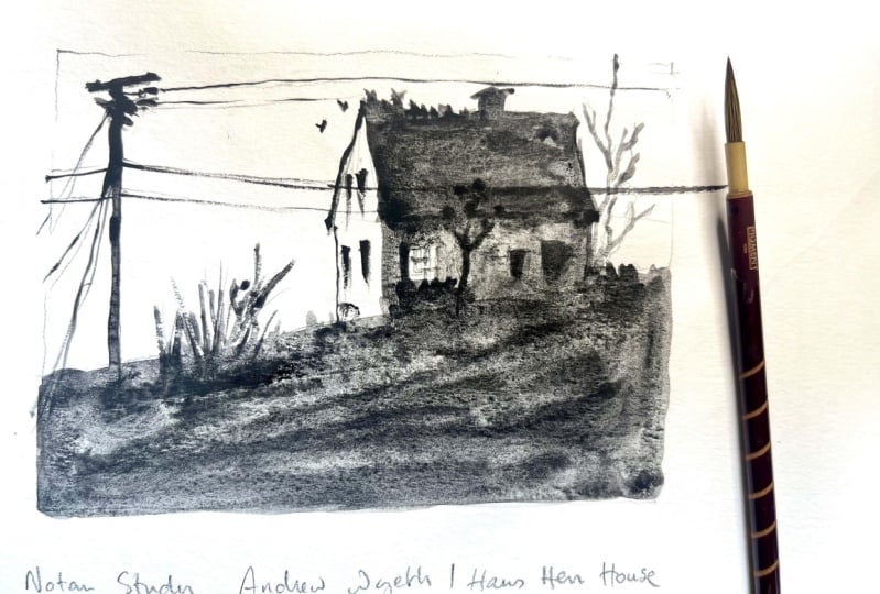
15. Study#2: Picking Refs, Landmarks, Spacing: For this second study, I've picked a painting
by Andrew Wyeth, who's an artist
that I really love. It's a painting of a house. I love houses. I've
often drawn them in my work and I thought that this one would be
really inspiring. To start with, I'm going to be actually switching to procreate, just for those of you who
are using procreate and would like to play
along with me in that. But of course you can continue in your sketchbook as well. I'm going to create a new
canvas though you could also, and this is a fun little
feature on procreate, is if you go into this little
wrench looking thing, oops, and you hit on page assist, you get this little thing here and it's almost as
though you have a sketchbook. This would be the first page of your sketchbook and the second
page of your sketchbook. Instead, you could
actually use that instead of creating a
new canvas every time. I'm just going to
go back on that. I'm just going to be
working directly on here. I'm going to use the same brush
that I was using earlier. The advantage, like I said, with finding or being able to
train your eye to recognize simpler references is also picking references that maybe
don't have too many colors. That already simplifies the
value structure for you. It's easier for you to see where the darker hues and
the lighter hues are. This is one of those
paintings that doesn't have a huge
amount of colors. It's pretty muted, It's
almost black and white. And that will really help
me with the simplification. If you've chosen a
reference that doesn't have a very simple structure like this one,
that's totally fine. One of the things that
you can do to help you if you're really struggling to see the value structure, is to simply, on your computer, switch it to black
and white so that you don't have to do
that work yourself. Or you can also just
practice trying to see the underlying value
by squinting your eyes and to the point where
the colors drift away and all you see is the dark shapes and
the light shapes. That's one of the tools that
I use the most when I'm trying to understand
the value structure of a painting that
I'm looking at. This one I find again, I'm going to make it a
little smaller here so I don't get lost in
too many details. I have a tendency to always move my page instead of my ipad, and that's just a
personal thing, but I'll try to actually, yeah, I'll, I'll try
to keep it like that. If I look at this,
I see something pretty simple in terms of whoa that just
made like a splash. Interesting in terms
of value structure. I'm noting where things
line up on the bottom, on the top, on the sides. That gives me
landmarks or ways of seeing how to maintain those
proportions that I'm seeing. Of course, I'm seeing the
line and it's not that thick of that part of the roof. I notice that the chimney
is really on the edge. Sometimes my procreate
bugs out a little. Again, it might not be perfect, but perfection is not
what we're looking for. We're really just trying to
gain an understanding of what the artist was doing in
terms of value structure, so that it can also
give us ideas for our own drawings
and explorations. Remember that this idea of simplification is really
going to be key here. I've noticed here that
I'm going to decide that, like I said, the first
time we use procreate, sometimes that doesn't
entirely work. I'm going to try it again by adding a little bit
on the edges here. There's no way for
the color to escape, but it keeps trying to escape Sometimes it's really
just in the details, especially when
you're working with the textured brushes
that there we go, then that's simple, of course. What I find fascinating
about this piece is this ivy that's
growing on the house. I noticed here that I forgot or didn't realize
that there was a little bit more of
an edge over here. But on second look, I'm also noticing that I
read this as a triangle. Because I'm seeing
the roof and I'm understanding what happens
underneath this roof. But if I actually
look at the painting, the shape that I
really see is this. Shape that's sticking out. I'm not going to get
into the details. Sketching out the
over underlying, the opposite of
underlying shape, All this detail is
going to disappear. However, I am going to come in with this nice
circular shape here, the chimney, and
another circular shape here that almost hides
the edge of the house. I'm also noticing this tree. Oh, it's not a tree, sorry. It's like a telephone or
electricity pole here. But also some very
important details which are these three birds. Notice the spacing
between objects. I would also simplify
this whole area just by creating a shape like that. I'm pretty happy
with this study. If I look at it side to side, it's pretty accurate, I would
say in terms of this shape. My version is a little bit bigger than the one that I see. I would see a little bit more
complexity in this circle. It's actually a completely
circular shape, if I look at it
really precisely. It's more, maybe like this. I could spend a little bit of
time refining that as well. You'll notice that that makes
a big difference because a circle is very different
than a lob sided circle. But I think that captures pretty well the gesture
of this painting. And it allows me to understand
how the artist built this image in terms of value and in terms of the distribution
of lights and darks. It also allows me to see how you're able to
recognize a house, even though there's a lot
of different elements that are coming in the way of
that very simple outline. And that's actually what makes
it interesting is because our brains are so good at
recognizing house shapes, even though there's all this
supplementary information, we still read this as a
house and little birds. So we've done explorations
of two master studies. But I'm going to be
honest with you, I would recommend that you
do maybe four, maybe five, maybe ten, or rather that you build this into your
art practice as a habit. Maybe once a week,
you'll take 20 minutes, or 10 minutes to do one little black
and white study of a painting that you
admire and respect. Since these are studies, these are not our own personal work. These are here just to help us learn how other people build their images by observing how other people have
built their images. We can also learn how we
might want to build our own.
16. Pick Your Poison: For now, what I'd like you to do is to take a moment to think of a subject that you
are personally very interested in exploring
in your sketchbook. Let me give you
just a few ideas, you could work on
a specific object, such as a household item, maybe even a beloved art supply, of course, the classic
plants and leaves, which is something that
I always love drawing, but there are so many other subjects that
you can explore. It can be a flower. It can be a creature, a specific type of
animal that you love. It could be something
mechanical. Maybe you love cars. Maybe you love chimneys,
vegetables, or instruments. There are as many subjects as there are people
in the world, or stars in the sky. You pick, but I just want you to remember that there's
not a single subject, there are many. So pick one. If you're overwhelmed with
all the possibilities, then whatever, pick the first
thing that comes to mind. So now is a moment
to pause the video. Think about the subject
that you might want to draw or be interested
in exploring. And once you're ready, you can push play again. So the thing that I decided would be fun
to explore is owls. I love all kinds of animals, but owls are really fun
subject to dive into. And so I really
wanted to be more specific and explore that
kind of imagery as well. So I'd like you to
create a Pinterest board with reference images of
the subject that you chose. Just like we did in
our master studies, which may have been a
wide variety of subjects. I'd like us to do just
two simple studies of this subject
that we've chosen. So you can look in art history, I just type on, you know, Owl's art history or on
Google Owls art history, and you can get a sense of different paintings that might have existed with
that subject in mind. If you don't see anything in art history, you can of course, use more contemporary artists as the basis for these
studies as well. You can of course, use the
references that I've found, but I would also invite you to start building your
own Pinterest boards or collection of
images that you'll use as your own food
for inspiration. Why? Because it's also by figuring out what inspires
us that we get to know who we are as an artist and what it
is that we would like to represent in our sketchbooks with our drawing
and painting tools. That being said, if
you just want to go ahead and start
with my references, that is absolutely fine. I'll include them, of course. All right, let's get started.
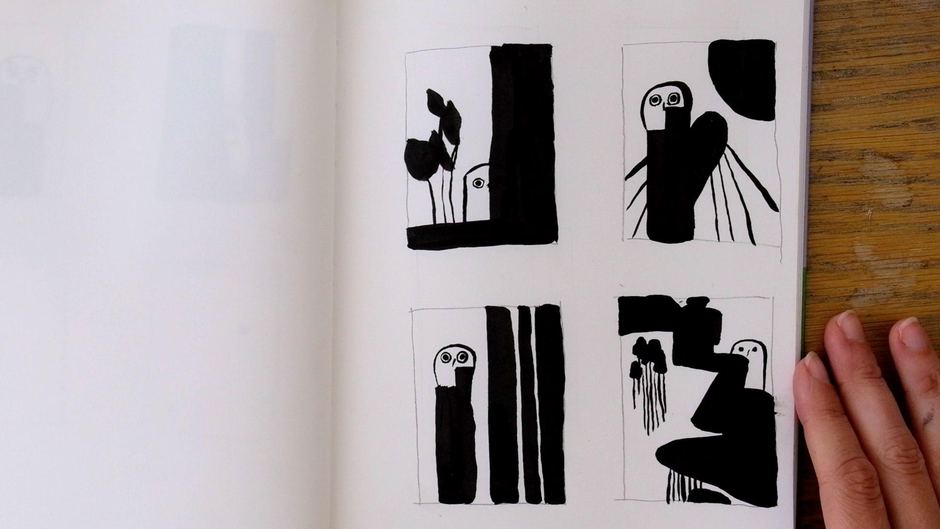
17. Owl Study #1: Value Grouping, Readability, Shadow-Shapes: I am going to be using this image of an owl which was actually
recently discovered. It's a painting by a
pre Raphaelite artist called William James Webb. I found it particularly
beautiful. I really like the shape
language in this one, so I thought it would be a
really fun one to explore. Just for simplicity's sake, I'm going to actually
make both of my studies on this page of my procreate. I'm really just going to use a very thin brush here. This one is called
little pine to create the boundaries
of my frame. And you'll notice that
what I'm doing in order to create
this straight line, if you've never used
that on procreate, is I am creating the line. And then just sitting
there and holding. And it will create a line
automatically for me. I'm going to do my
study within this. I might actually stay with this pencil that I'm using just because I
think it's pretty fun. Obviously, the shape language of this owl is really interesting. It's got a lot of
different bumps in it, but because I'm
doing this study, I want to simplify it again. I'm really going to just try
to observe the basic shapes, the portions to simplify
this shape that I'm seeing. And erasing some of that
complexity that exists there. Of course I see some
of these leaves. I'm also going to simplify
these shapes as well. Sometimes if you
hold down too long, it does that
simplification thing that it was doing earlier. But why am I doing that? Because I think I'm
going to keep white. This part of I need to make sure that my edges are
nice and closed. This might be one of those
brushes where there's just too much of that happening. I'm just going to come in and up to actually keep
this bottom part white. Because I think if I
decide to simplify it, then I would group this midtone value with
these lighter tone values. That allows me to talk
about value grouping. That's just another one
of those terms where basically what you're doing is you're taking different values, but you're considering that
they are the same value. In a sense, I'm
grouping these values together in order to
get at this basic, simple shape that I'm
seeing underneath. Because my brush is pretty
textured on the edges, it's creating like almost
this water color bleed. I'm going to be honest, I'm
not a huge fan of that. What I'm going to do is
come in and use the eraser to smooth that out a little bit. I'm going to also
remove that line. If I was working
in a sketchbook, I wouldn't be able to do that. I just want to
keep note of that. I also realized that I forgot
to include this mouse, but since I'm using procreate, it's a little bit easier for
me to adjust this shape. I can come in and carve a
little bit more complexity, but I'm going to leave most of this actually pretty blank. I do want to notice. One thing though,
is if I look at this owl and I squint
my eyes at it, what I notice is that there is a dark shape around
its eye and beak. That's an important element. That I think contributes
to the readability of this image that I
definitely want to include. I also would say that
there's a little bit of a darkness on the other
eye that's an important one. Then finally, I also
see how there's this very stark straight line down the middle
where his wing is. It's like the
shadow of its wing. I want to maintain that one. There's also another shadow
shape that I'm seeing around the legs and the
bottom of its body. I'm also going to
include that one. Do you see how just using
these small details of the shadow shapes here
really allows you to notice or see that,
that it's an owl. There's one more that
I'm going to add here, around the legs. I would also say there's another one here that
gives a sense of its body. Of course, let's not forget an important element down here, which is a black square. There are many details
around here in the wall, but I don't think I'm
going to use those. The only ones that I might include are some
that I think would enhance the
understanding of my owl. For example, I've noticed
that here there's a claw and there's
a little bit of a black shadow there
that I want to include. I'm going to be honest,
here is one area of my drawing that I think
isn't very successful. I think I got a
little confused with the placement of the
different parts here, the different darks and shadows. Obviously, if I'm
in my sketch book, it might be a little bit
more difficult to adjust it. Or I could simply create
another study right next to it. Since I'm on procreate, I'm just going to go ahead
and use this to correct it. Because I think it's really important to the way
this image is built. I have this line of the wing, but that comes down to here, then it goes down here. If I then look at where
my claw is placed, my claw is actually
mixed in with that. I'm moving that
dark shadow that I had to be a little bit more accurate
in terms of the image. I'm going to add a
little detail here that I also picked up on. But also notice what is
this negative shape? Here's a roundness to that shadow and a
roundness to that one. Finally, there's a
triangular shape here that I'm also going to consider to be part
of that shadow shape. Finally, I'm going to
continue carving out the space here to give that impression of maybe a little bit
more of a claw. I spend too much time on this mouse because also I'm more interested
in the owl itself. But I'm pretty happy
with my simplification. Again, your simplification might look very different than
the one that I did, But it's really important
to just understand, this is where the
learning happens. It's in these details that
you're going to notice. Okay? If I shift my dark and my light this
direction or that direction, how is it going to enhance
the readability of the image or confuse the image? Let's move on to our second one.
18. Owl Study #2: Value Compression, Readability, Form: For this second study, I chose a painting by Jan Mank, who creates these really
beautiful paintings with a lot of poetry to them. I'm going to do the same thing that I
did as the first one, where I create a frame
in my sketchbook, I'll simply draw the frame. If I'm using procreate, then I can use the trick to make the lines a
little straighter. But I often do thumbnails with lines that aren't straight
in my sketchbook, and that's not a
huge problem either. There's, again, a bunch
of different values here. How am I going to decide
where I cut things off? This one might seem
a little trickier, you might think, okay, well, I'm just going to
decide that the owl is white or the owl is dark. The owl has a mix of dark
and very light spots. Instead of just thinking
of the object itself, I'm really just going to
focus on the value structure. If I squint, what do I see? I see a light shape
surrounded by a lot of dark. This one is actually
going to be, I think, quite simple
compared to the other one. I'm just going to sketch in that shape that I
see the light value. I actually see a second
shape that's also light, which is the foot. I actually, just to help me, I'm going to actually
draw the outline of that wing so that I can
better place this foot. And I want to, again,
look at the spacing, try to keep it pretty
accurate though again, it's not a big deal if
you're a little off. Okay, so this would
be that space. I am going to actually
switch brushes to this one so that I
can fill in the rest. You see, I'm ignoring the
details of the background. You the fact that, that
it's standing on a surface. I'm deciding that my black
encompasses those mid ranges, whereas in this one I was leaving the mid ranges
with the light color. In this one, my mid ranges
are slightly darker. And so I'm going to simplify them and put them
with the darker values. As you can see, now that I've
filled in the base shape, you'll notice that it's just a very black and
white simple piece with way more black
and white in it. And you actually can't even
recognize that it's an owl. But that's okay. I'm going to look back at my image and see if there's anything
that I might add. What jumps out at me
is of course, the eye. There is a very, very clear eye here that indicates
what we're looking at. What else do I notice? I also notice the
line of its nose. Even though I had decided
that this light shape, including the forehead was
going to be in the white. In order for the
readability of the image, I'm going to simply
add that line. Maybe this line that I see here that also indicates
some of the face. Now I'm realizing the line
that I created is straight, whereas in the
image it's a little more curved. I'm
going to adjust that. I'm actually going to
add one more detail, even though you can barely
see it in the image. But just this little line
that frames the face, I think that's going to
make it a little bit easier to notice that it's a simplified owl.
Here's another thing. I'm going to adjust the
height of the white space, which I think should be a little bit lower, but also more rounded
on this edge. I think that it's much more
recognizable as an owl. With these added elements, I'm in the driver's seat. When I decide to do
my Note ten study. I'm the one that has to
navigate where I'm deciding to compress values and decide that there are
all lights or a darks. And where I need to add a
little bit more complexity in just to make my image a
little bit more readable. It's a dance because of you're analyzing what
the artist has done. But because you have only these two tools of
light and dark, then you're going
to have to come in and play around and shift
that around a little bit. These are both very different
depictions of owls. And this is what I think
is really fascinating, is that even with just the
simplest amount of lines, you are able to create
something that is recognizable as something else. Why is that? By simply
observing the way that the shadows or the lights and the darks interweave and
interlock with each other. How do they balance out? What do they show
in terms of form? Even though here on
this one on the right, I used this light shape, the shape of that light patch gives an indication
of a round form. And that's pretty
cool to notice. This is why studies
are so important. They give you so much
information on how you can simplify and how
you can use very, very simple means in order to represent pretty
complex subjects. Now I'd like us to work off of photographs in order to create our very own interpretation and black and white study of the subject that
we're interested in.
19. Find Your Photo References: Now that you're maybe
getting a hang of how it's possible to create
two value studies from artists that you admire, I want us to delve into creating our very own two value drawings. Two value drawings can be
studies like we've done earlier or they can be finished drawings in
and of themselves. As we embark upon this
next part of our exercise, I don't want you to
get caught up on the idea of creating a
beautiful finished drawing. I want you to maintain
that sense of exploration, and study, and
learning that we were cultivating in the first
part of the exercise. But I just wanted to call your
attention to the fact that these two value drawings
that we make can absolutely hold their own
as finished drawings. For this next exercise, rather than working
with paintings, we're going to work
from photo reference. I've used Pintert to find these, but of course you always
want to be careful. Images that you find online, you don't want to
copy them too closely because that can create
some copyright issues. And in that sense, it's almost a little
better to go with copyright free websites
such as unsplash. But that being said, what I'm going to teach you today is how to use references in a
way that is not copying, but where it's using
them as a springboard. Even if you're using references that I've
used from Pinterest, my guess is you won't
run into any problems because we're not going to stay too close to the reference. And I'll show you exactly
how we're going to do that. Of course, we're going
to be doing this with our brush pen in
black and white. And this is important because
what we're doing here, this entire class, is training
you to think in value. To think in terms of shape, in terms of contrast, in terms of the underlying
value structure of the drawings that
you're going to create.
20. Owl Exploration #1: Essential Elements Then Play: Now that I have my picture,
my photograph chosen, I'm going to go into my
sketchbook or in procreate, and I'm going to
create four frames. You can decide to keep them a similar size to the image
that you're looking at. Or if you really want
to challenge yourself, you could decide to go with a frame that's very different. A frame that's much
longer or much wider. I'm doing them by hand. Just because this is really
still just a research phase, there's nothing final
about anything that we do. I would even argue that
even your final drawings, there's nothing
final about them. But I really just
want us to maintain the spirit of learning
and of growth as we move forward
on this exercise. I have my image in front of me. If I squint, then I can start seeing the value
breakdown of this image. This one, it has this shaft
of light that's coming down, but the owl itself
is quite dark. You maybe have a little bit of light edge on the outside
edge and on the head. And then maybe in the space between the body and the tree, but the rest of it
is all pretty dark. I could also just see this value structure
if I decided to take the photo and maybe in
Photoshop or something like that switched it to
black and white. But we're not going to be doing a value breakdown or a no tan study of this
photograph in our frames. That's not the point
of this exercise. What we're going to
be doing is we're going to use this reference as a springboard for
our own research, our own no tan, value research. I'm going to try to note
what the characteristics of this photograph and the object that I'm
trying to represent, what are the most important ones that identify the
object as such, since I already did a few
studies in paintings, then I can already note
that for this owl, a few important elements. Might be the eyes, the, the shape of the beak, the placement of the beak
relative to the eyes, but then also the overall
shape of the owl. That's what I'm
going to play with. I'm going to just go
ahead and maybe start with the eyes just because
that's pretty fun. I don't need to place my subject of interest in the same location
as it is in the image. Again, we're using
this as a springboard, not as something that we're trying to copy
or even emulate. I'm going to add
a bit of a pupil, then of course, my little beak. Why not pretty
close to the eyes. I'm going to choose to
maybe only put one side. We'll see how that holds up. I'm going to add the
shape and see if that's enough information
for me to put in, otherwise I'll add more
information afterwards. I'm going to look at
the shape of this owl. I actually quite like how on
the left side it's straight. If I simplified it, then the rest of it
is a rounder shape. I didn't make my straight
line straight enough. So I'm just going to straighten
it a little bit more. Right now, I feel like the beak maybe doesn't give
me enough information. So I am going to add
just a little bit on the left side so
you can see, oops, it's a little tough for
me to draw, honestly, because since I'm filming this, my sketchbook is a little further in front of
me than I would. And when you're working
with this kind of really thin tip, you
know, I don't know, I just find it easier to hold
onto it a little closer and look a little bit
closer, but that's okay. Even if there are fluctuations, I can maybe see if I can integrate it in a
way into my drawing. It creates a little
bit more character, a little bit more liveliness, a little bit more chaos in my drawing. And that's fine too. Now that I've done my
overall shape of my owl, I'm just going to
go around and play with light and
dark, for example. What if I decided that half of its face was
in the darkness? I'm just going to cover that up. If I look at that, honestly, I've lost the readability
of it being an owl. Why? Because I covered
not only the eye, but also the beak. And the only thing you see is this little side part
with an eyeball. It looks like some
sort of character, but I can't really
tell that it's an owl. That's okay. That's
great information for me to take into my next
iteration. My next attempt. I could, if I wanted to
just play around with this, I could just decide, okay, well what if I just added a few more abstract marks
here just for the fun of it. Just some shapes and
maybe see what that does. It's okay, but I'm not
totally convinced. Let's move on to the next one. I'm going to give myself a
little bit more space here.
21. Owl exploration #2: Placement, Mistakes as Paths, Echoes: I'm going to change the
placement of my al, just for fun, maybe. I'm going to put it up here and I'm going to start
with the eyes again. Because I quite like
the, the big eyes. I think I placed
them a little bit closer together than
in my previous one. I'm going to have to
pay attention to that. The placement of
different elements in your drawing is what also creates the mood or
character of that, especially if
you're working with a living being
that has eyeballs. Placement of eyeballs has a huge difference in what it
says about the character. Because of that, I'm
going to actually maybe shorten my owl. I'm going to make it
even more squat to compensate for the
closeness of the eyes. I'm also going to add the beak. But what if I just
tried a line like that? And instead of having one straight line
and one round line, I'm just going to make a
little bubble like that. This time I'm not going to cover the entire half of my owl. But what if I just
decided, okay, well I'm going to take maybe this part of the owl, so I'm going to go
underneath the eye. What does that do funnily enough? And I don't know if
you would agree, but I feel like this
darkness that I added here, it, it's on the edge, but it almost looks
as though it were the wing of the owl. Instead of just being
straight onto us, it's like looking off to the side with the
wing on the side. There is one thing that's
getting in the way is maybe it's a little bit too close to the beak in order to do that, to make it really
recognizable as that. But that's just a
fun observation. I took what I wrong in this one and I used
that to modify it, and change it a little bit
more and see what happened. And I do think that there's something interesting
going on here. That's the value of embracing our mistakes is that we
can learn things from each one of our iterations
and they can show us different paths that we can follow to explore
other things. Just to finish this off, I'm going to just have fun. Maybe I'll just add some
other shapes around here. Like what we did in the abstract
exercise of the session. You don't really need to
overthink it too much. You can just play around and
see what mood that creates. If you like the balance
of lights and darks, I think it would be fun to have a little bit more
dark over here. What if I made it actually like a big round shape that echoes
the roundness of my owl? It's actually fun because
these lines that I had done earlier in
the abstract version, I integrated them here. They to me evoke feathers. Especially now since
I'm working on an owl, it's fun to have
that visual echo. That sounds pretty fun, but I'm going to iterate on
this a little bit more. I really like the fact
that this shadow, which I put underneath the
eye looked like the wing. And I'm going to try to do that again in a slightly
different way.
22. Owl exploration #3: Subtle Shifts, Flexibility, Separating Art From Artist: I'm actually going
to put my owl in the same ish location
as the last one. I need to add a little beak. Maybe I'll do this
round shape again. It's a little bit of a
different round shape. Do you see how the base of
it is a little wider here? And this one is a
little thinner and also the thickness of
my line is different. It's automatically going
to have a different feel. This is something else that
you can pay attention to. Subtle shifts will have a pretty big impact
on your drawing. Let's try to do that wing thing. I'm going to make
that shadow shape a little bit underneath
the eye and the beak. Maybe like as though it
was underneath the chin. I'm going to be careful
since my shape is angled. I want to give him
a little base. But I'm also maybe just
going to add space for as though there was
like a claw or a foot. Let's see how that works. I went a little bit further out than I wanted,
but that's okay. It's almost like he's sitting
on a log or something. You can see that in
comparison to these two, I made these very
straight lines here. But this on the right side, my edge is a little bit wonky. There's like more details. But I actually think that's fun, especially because
it contrasts with the super straight line
on the left hand side. I don't know about you, but this definitely gives me
that impression of it being the wing of the owl and because of the
difference in the shape, it's almost like he's chilling. There's something
fun and playful about this one in
comparison to this one. I'm much happier with this. I'm going to still play
around and add a bit more black to white value structure
just for the fun of it. Also to show myself that
nothing is ever set in stone. If I like something, I can still continue
playing around with it. Maybe I won't like it as much, but nevertheless, I'm
going to learn something. I just want us to obviously, creating drawings that we like is very important as artists, but it's okay to not
be too attached, to not be too precious
with our drawings. And to understand that
even if we like something, it's okay to modify
it to transform it, because you can
always do it again. And it might look
slightly different, but it's not set in. It's a way for me to separate this tension that happens
within us where we think that good drawings
mean that we're a good artist and bad drawings means that we're a bad artist. None of that is
true to pull away all these unhelpful
attachments to our work. It's great to not only learn to embrace
our good drawings, but also to detach a little bit from the
drawings that we do like. All right, so I'm just
going to go in and add, maybe, maybe I'll go
all the way up that if I did another 11 of the things that I'm looking at here
is actually the spacing. This is where no tan
is very powerful, the balance of
blacks and whites. You can look at the spacing, look at the white space as though that is
being represented, not just the black space
that you're drawing. And this is pretty much the
same thickness as this one. This one is obviously different. But why don't I just have fun with maybe something
a little wider? I moved and so it
didn't maintain. I was trying to go for
the same width all over. Instead I'm just going to
go a little thinner here. That's kind of fun. And
then what if I added, you know what, I'm just
actually going to fill this in with black. I have kind of a love
affair with stripes. I just love stripes. That's something that
often will come back. It's all right, I'm
not blown away. So you see, I actually maybe preferred it before
I added these in, and that's totally
fine. Not a problem. Let's do one more
small note here. If you end up creating
something that you don't like that you
previously liked, sometimes you can also allow
yourself to just go wild and continue transforming it until it's nothing like
the initial idea. Sometimes you'll create
some fun drawings that you end up liking even more
than the initial idea. But for the sake of our
exercise and for time, we're going to
continue with our.
23. Owl exploration #4: Refs as Springboards & Drawings in Context: For this last one,
we're going to work in a slightly
different way. You can look back
at your reference. Instead of starting
with the object that we're trying to represent
or include in our drawing, we're going to actually
just start with shapes, like what we did in the abstract exercise
at the beginning. By the way, do you
see how stripe Yeah, I said I was obsessed
with stripes. But I also have like
additional light stripes because of my shutters. So apologies for the
light. But yeah. Anyway, so let's start
with creating shapes. And you can maybe just
try to take inspiration from some of the shapes you might be seeing in your image. For example, I see that there's these mushrooms in
my image that have a organic roundish,
elliptical shape. What if I decided
to just play around with that shape in my drawing? I could maybe even just start it in my image in a similar placement to where
it is in the photograph, but at a different size, like a rounded triangle. A little bit I might add a few more. There's another round
shape up there, but I don't need to
stay too to the image. I can also just play around with the balance of light and dark and
have fun with that. I could decide to
have one up here, but I'm going to change
the shape of that one a little bit because I
don't like that too much. I'm going to make it
a little bit sharper. I can try to see if
there's other shapes within my image that I
think are interesting. For example, I could do something more obvious
like the leaf shape. But if I look in the
background of my image, I actually see that there's
some weird zigzag shape. I don't know, I find that a
little intriguing and so I could with something that is
reminiscent of that shape. But I'm also going
to pay attention to the balance of black
and white here. I didn't like how
symmetrical that was. I'm making this line a
little thicker over here. And then maybe I'll do that diagonal that was an interesting black
and white balance. I'm going to now add my
object or the thing that I'm representing within this
abstract strange landscape. Again, there's no
right or wrong. I could simply just place
it here in a blank zone. But I could also decide to use some of these shadow
shapes that I created, some of the black shapes. In order to use
that in my image, I'm going to, for example, this part looks like a triangle. I've been playing around with this shape that looked
almost like a wing. What if I decided that
that was where the wing of my owl would go and then
the shape of the owl, the rest of its body
would be somewhere here, since I didn't create
too much space. Might actually just decide to do eyes without the white
ring around then, because I didn't give
myself enough space. But I could still have
that little beak in there. That's pretty fun. I actually
think it's pretty cool that this shape becomes
the wing of the owl. I could now if I decided
to add a few more shapes, a few more black and
white patterns or motifs, and complexify the image
a little just for fun. What you're making here
doesn't need to be figurative, like it can just
be shapes that sit alongside and within
your drawing. But if you do want to do
more figurative elements, like let's say I wanted to add a tree in there or
some other element, I, of course can do that and I would invite you to
play around with that. But just remember to also be
thinking in terms of shape. I decided to put
some pattern here because I felt like this white space was a
little bit too empty. As soon as you add a character and you have the
focus on the eyes, then your eye is automatically
going to go there. It almost felt like this
part was too heavy. I wanted to balance that out with a little
bit more details in a space that looked a
little bit emptier to me. But I can of course,
also decide to include that pattern in other
places just for fun. These make me think now that we were talking about
adding figurative elements, it makes me think of
trees a little bit. I'm just going to
have fun with adding a few little tree shapes here. Now to me it's looking a
little bit too confused. There's too many
elements for my taste. Your taste might be different. But I'm just going
to go ahead and simplify some of the
things that I did earlier. This is what's
interesting is that everything that you
do can be modified. It's all really in service of the drawing and your
relationship to the drawing. What it is that you like about it and what it is that you might want to modify and shift
just to experiment, to see if you like it better or to see what you might want
to improve for next time. I'm much happier with that. Now you have four
little thumbnails of four very different drawings using your reference
as a starting point, but not staying
stuck to it in terms of accuracy or in terms
of value structure. And this is one of
the ways that you can use references as a tool to kind of feed your creativity and to explore other things
than you might not have. This is a little aside, but I also think it's
really fun when you create different frames
on a single page, how that automatically
kind of creates like a comic book feel or a
narrative annel feel. And so even this first
character initially, which didn't look like an owl
taken with the other ones, now looks like it could
be the same character. And so that's just a really
fun thing to notice.
24. The Power of Light & Dark: So as a recap, you
can of course, use a reference as a starting point for
creative ideation, using the object as
the starting point. And simply working with
light and dark and simplification in order to
first integrate the object. And then play around with the different values that you
might have in your drawing. Or on the other hand, you can start with abstract
shapes of light and dark, and then little by little, build that up until
you decide to integrate the thing that
you're trying to include. And of course, you can alternate between one or the other, between all those
different realms. And that's the super fun thing with working in black and white, is that even when
you're working as simple as a tool as a brush pen, a pen and ink or procreate, You have all these possibilities that are offered to you by using the power of value of simply two
values, black and white. And also maybe using a
reference as a starting point. Now that you've done
that, you can of course, decide to recreate any one of these four drawings that
you've made as a bigger piece. And within that piece, you can, of course, add a little bit
more complexity, add maybe some midtones, and create a bigger value range. That's of course, a possibility. But also even when we just create drawings in black
and white using two values, you can create some
very, very fun, very interesting and intriguing
drawings for the viewer. I hope you've gotten a sense of the power of light and dark, the power of contrast, and how it's very, very important as an artist to start thinking in
terms of value. To start thinking in terms of the structure of your
lights and your darks. And the balance between the two, importance of detail
versus big shapes, the importance of planning, but also of improvising
and how the two can dance with each
other in really fun ways. And of course, that you also
have understood none of your bad drawings are an indication of your
capacity as an artist. In the case where each one of
your four explorations has created things that you're not very convinced by and you
think are pretty ugly, then I'd actually invite
you to redo the exercise. This is the kind
of exercise that you can do over and over again. And it's in the repetition, the iteration, the exploration, the questioning that
you're going to start honing in
on those drawings that you think are more fun or correspond more to the kind of art that you want to create. I would love to see what you made in the project
section if you feel like sharing even the
ugly drawings as well, because those are very valuable. And I hope you've gotten a
sense of why that is today. Thank you so much for
trusting me as your guide on this really fun black and
white, no tan exercise. I look forward to seeing your drawings in the
project section.
25. Final Thoughts: Thank you so much for
joining this class. I really hope that
you learned a little bit more about
contrast and balance. And also just the fun of working
in pure black and white. And how you can create some really powerful pieces
using the simplest of tools. I'm going to be creating
more classes on different composition
principles in the future. So if you'd like to know
when my next class is out, make sure to click
the Follow button in my profile and you'll get notified when my
next class is out. Of course, we can
also be friends on Instagram or on Patrion, where I host a lovely
little community with live drawing
sessions every month where we get to
deep dive a little bit more in depth into
different topics. And I also do
sketchbook tours and logs and other fun tidbits. I hope you'll also take
a moment to congratulate yourself on all the hard work
that you did in this class. And if you like the class, it would mean the world to me. If you left a review
or shared with a friend who might be interested in this kind of exercise, of course, I would love
to see what you made. So please share what you
made in the project section, even if you feel like your drawings are not up to the standards that
you'd like them to be. That is part of our
artistic practice. This is how we show our inner critic that we
are learning to accept, all the steps and the stumbles along the
way in our art journey. As we increase our
art skills and tap into what true art we can make, please include all the
parts that you made. I look forward to seeing
your explorations, comment on each
other's projects. Also as a way of supporting each other in this not
always easy journey. As always, I wish
you all the best. I am sending you oodles
of creativity your way, and I hope that you take
away the fact that drawing more is always the best way to go in terms of
your art practice. So if you want to do some
more drawing, you know, keep working in your sketchbook, whether it's just with
a black and white pen or with a bunch of
different art materials. I can't wait to catch you in my next class or in some of
the other ones that I have, and I look forward to seeing you around really soon.
Bye everybody.
 Marie-Noëlle Wurm, Artist, illustrator, HSP