Transcripts
1. Introduction: Let's be honest, animation can be intimidating, especially if you've
never animated before. It can be time-consuming,
yada, yada. But don't worry,
that's why I'm here. Hello lovely people. I'm Tyra Washington, I'm a graphic designer, YouTuber and I guess you can call me a
self-taught animator. Today I'll be your guide
in helping you create your very first frame by
frame animation in Procreate. Whether you want to use
animation to market your brand or to add a little magic to your
personal Instagram photos, animation is easier than ever
with tools like Procreate. If you're a complete
beginner who wants to dip into the
world of animation, or you're a pro
who wants to learn how to use Procreate
for your animations, this class is for
anyone who wants to add a little magic to their Instagram
photos using animation. In this class,
we're going to use procreate to create
our animations. You'll learn how to
use Animation Assist in Procreate and
then I'll walk you through a series of different
animation techniques that you can apply
to your photos. For example, I'll
show you how to animate different
objects in your photo, how to animate expression lines, text, lights, and how to
use masks to animate. Lastly, I'll show you how to export your animations
from Procreate and how to loop your
final animation using Adobe After Effects. I didn't go to school
for animation. I'm actually still learning. That's why I believe
that anyone can animate. If I can do it,
you can do it too, so let's get into it.
2. Class Orientation: Welcome. I'm so excited that you've
decided to take this class. For the class project, what we're going to do is
use Procreate to create a frame-by-frame animation that loops on top of one
of your photos. Once you add a little
magic to your photo, the final step will be to upload your animation to
Instagram if you want to. I thought instead of creating an animation completely
from scratch, why don't we add some
supporting animations to a photo that already exists. Plus you'll have an amazing
personalized animation that you can share
with your real friends and real family, along with your virtual
friends here on Skillshare, of which is a bonus, if I do say so myself. I believe this class is
for all skill levels. I'll walk you through a series of different
animation techniques, and based on your skill level, you can choose to apply
one technique or you can apply a few different techniques together with me in the end. For this class, you
will definitely need an iPad and
the Procreate app. I recommend getting
an Apple pencil, but you can definitely use
your finger if you want to. You'll also need a laptop and the Adobe After
Effects program. When we finish our animations, I would absolutely
love it if you guys uploaded your projects
to the class projects. I along with all of
your fellow classmates here on Skillshare would love
to see what you've created. All right, I'm excited
to get started, so let's go.
3. Animation Principles in Procreate: Before we start
animating, there are a few animation principles
to keep in mind. These principles will just
make it so that your animation looks more realistic
and just flows better. In this lesson,
I'm going to cover four of the 12
animation principles. This should be very helpful
for a new start animating. The four principles
I'm going to cover in this class are timing, slow in and slow out, arcs, and squashing stretch. You'll be able to take
these concepts and apply them to almost
anything that you animate. Let's get started.
First up is timing. Timing is basically
determined by the amount of frames you
use in an animation. In this example you see this bird animation
has many frames, in this airplane animation
has less frames. Which animation do
you think will have the faster animation? Let's see. You see that the
animation that had more frames is actually slower than the one
that has less frames. Basically, all you need
to know about timing is more frames equals
slower timing, less frames equals
faster timing. Which brings us to the
next principle which is called slow in
and slow out which, basically talks about the
acceleration of an object. In real life objects
start out slow, speed up in the middle, and then they slow back down
when they're about to stop. To achieve acceleration you start with more frames
in the beginning, less frames in the middle, and then more frames in the end. Here's an example of the ball not using slow in and slow out. Really robots are
the only thing that can move at a constant
speed like this, so it just doesn't
look very realistic. Now we'll talk about arcs. Most objects in real life follow an arc when
they're in motion. Arcs basically make your
animation look way more realistic because it's
following the rules of gravity. If you didn't follow an arc and your animation
looks like this, it will look more robotic, and the dog in this animation
will probably be like, "I ain't eating this tree
because I don't trust it." Next is squash and stretch, which really just emphasizes the way that an object either stretches or squashes
as it's moving. The way that an object squashes and stretches really helps the viewer see how heavy the object is and how
fast it's moving. For example, if you
throw a basketball it would have way more squash and stretch than a bowling ball. Now you have a little
background knowledge on some of the
animation principles. You learned about timing, slow in and slow out, arcs, and squash and stretch. Just keep these in mind as we start animating
later in this class. If you've found these
principles interesting, I really recommend that you
look up all 12 principles. I'm done talking
about principles. Join me in the next
lesson where we'll get a little familiar
with Procreate.
4. Getting Started in Procreate: [MUSIC] Procreate is a digital
illustration app that artists used to create
just incredible works of art. Recently, Procreate updated
its animation feature. Now, artists can
create frame-by-frame animations right
from their iPad. Not going to lie, Procreate is a little more
limited than some of the other apps that are created specifically for animation. One of the biggest drawbacks
being the layer limit, and there's some
limitations with the video, but you can still create some pretty amazing frame-by-frame
animations in Procreate. In this lesson, I'll show you how to set up your canvas to the correct size and
DPI for Instagram. I'll also show you a few of
the basic tool in Procreate. Open up your app, and I'll
show you around Procreate. When you open up your Procreate, your screen should look a
little something like this. Usually, you'll see rows and rows of projects that
you're working on. But I'm not going to lie, my dashboard was looking crazy, so I decided to clean it up to look a little
more professional. Anyways, [LAUGHTER] to
add a new artboard, press the plus sign. You'll see there's
actually a ton of options already available, but we're going to
create a custom size by pressing this icon
in the corner. Let's talk about the
different dimensions for an Instagram post. Instagram has three
different options you can choose from currently. You can choose a square option, a portrait option, or
a landscape option. Depending on the photo that
you're going to animate, just choose the option
that's best for you. For now, I'm just
going to choose the square dimension because I think it will work best for the photo that I'm going to use. I'm going to type in
1080 x 1080 pixels. For the DPI, 72 is good for most social media
and digital use. But just know, if you're
trying to print this out, this will be a pixelated mess. If you think there's
a chance you might want to print this out, definitely set your DPI to 300. I'm not sure why you
would want to print out an animation, but just know. Now that we have all of
our dimensions plugged in, we can see how many
maximum layers we'll be allowed to have. Lastly, you just double-check
to make sure that you have Pixels selected since
this is for social media. One last thing, just make sure your color profile
is set to RGB, and Create. Here we go. A new artboard waiting for
you to create some magic. Now, let's walk through
some of these tools. First things first. Here is the Brush tool. You'll see there are so many
brushes to choose from. Anything from
sketching to painting. There's also just
some cool textures you can apply to your art. I recommend just exploring
all of the brushes. Plus within each brush, you can click on it, and that opens up a whole window of even more options.
We got options on. One thing that might be helpful to adjust is the stabilization. That just helps make sure that your lines
are more straight. Once you select the
brush to play with, we can slide over
to the left side, where we have some size options. What's really cool is you can actually choose a
size and save it. No more inconsistent line sizes, you have them saved right
over here on the scale. For example, if we're over
here drawing some lines, and we're like, "Hold up, wait. What was that bigger
size I was using?" Well, bam. It was
already saved for you. [LAUGHTER] Anyways, you can delete the saved sizes by
just pressing the minus sign. Under the brush size, we have the Opacity settings. You can knock down the opacity, make things look
real, translucent. Make things look transparent. Last tools we have over
here are the Undo button. You can just tap that, and the Redo button. A shortcut that I use
all day all night is the double-finger tap to undo or the three-finger
tap to redo. Let me tell you, this
is the best shortcut ever because I have been
using it all the time. In addition to the brushes, we have the Smudge tool, and the Eraser tool, which the eraser has all of the different options that are
available for the brushes. Just select your brush, and watch it do what
erasers do best, erase. Next, we have the Layers panel. This is the only
layer we have so far. You can slide it to the
left and duplicate it. You can also click on a layer to reveal a whole
bunch more options. I'm just going to rename mine. I'll call it lines for now, or I guess a layer 1 lines. Sure. Of course, you can add a new layer by
pressing the plus sign, and you can delete a
layer by sliding it to the left and pressing Delete. Next up is the color panel. As you can see below, there are a few different
views you can choose from. This first view
is the disk view. Then we have the classic view, which is my personal preference. Another really
interesting way to select colors is
this harmony view. Based on the color you choose, you can click on this corner. There's a whole bunch of
different color palette options. Once you select what the colors, it will automatically pop up
in the right-hand corner. That's where you
can drag and drop your new color palette
onto your artboard. Another way you can view your color palette
is this Value tab. This one's for very
specific colors. You can input specific
hexadecimals, and so on. The last option is this
color palette option, which is where you can create your own custom color palettes,
which is pretty cool. Moving on to the left
side of Procreate, this is where we have
the Wrench tool, which is just a panel
full of actions. In this tab called Add, we can insert a photo. We can insert some text. All that good stuff. In the Canvas tab, this is where we'll use
Animation Assist later, different options for
our reference image and Canvas information. Then we have the Share tab, which just gives you
different options to export your artwork. This is actually where the
Time-lapse Replay lives. If you ever want to export your time-lapse video,
it's right here. Just some different preferences that I'm not going to get into. Next up, we have the
Adjustments panel, which gives you so
many options to change the color of things. To adjust the blur, liquify, clone, just all
kinds of adjustments. Next up, we have
the Selection tool, which allows you to select
specific objects on a layer, and just apply a bunch of
different adjustments to them. While your object
is still selected, [NOISE] you can use the
Direct Selection tool to move your object around. There's different
options below like flip horizontal, flip vertical. Basically, this tool will
just let you distort and transform your
object however you like. I'd say we covered
the basics here. Now, we're all set
up in Procreate. You learned how to
set up your canvas to the correct size and
DPI for Instagram. You also learned about a few of the basic tools in Procreate. In the next class,
I'll teach you all about Procreate's
Animation Assist, which is the secret weapon when it comes to animating
in Procreate. [MUSIC]
5. Animation Assist in Procreate: The major key to animating in Procreate is this thing called
Animation Assist. Which is basically a
visual timeline that allows you to set your
background and foreground image, allows you to see onion
skinning as a guide, and allows you to just play back your animation to see
what it looks like. It's a really powerful
tool when it comes to creating frame-by-frame
animations. What are frame-by-frame
animations, you may ask? Well, basically,
frame-by-frame is drawing frames with slight differences
between each frame, and when you loop them together, it appears like the
object is moving. Get ready to draw some
frames y'all, let's dive in. So to turn on Animation Assist, go to the Wrench tool, go to Canvas, and then just turn on this
Animation Assist toggle. You'll see the new
animation assist timeline pop up at the bottom of your screen and this is
going to be really helpful, for when we start creating our
frame-by-frame animations. I'm going to go ahead and draw the first frame of my animation. Let's just pretend something's going to melt over the screen. The first branch pretty much
done to add the next frame, we're going to
press Add frame in the corner of the timeline. When you do this, you'll
notice you can still see the previous frame
of your animation. This is called the onion skin. The onion skin basically acts as a reference for when you're
drawing your next frame. You can adjust the visibility of your onion skin by going
into the settings. You can choose how many
onion skins you see at once by adjusting the
onion skin frames. I usually like to
set my own at one, because I think it's less distracting to just
have one onion skin. You can also adjust the
onion skin opacity, so I like to set mine
at a low opacity, just so I can see underneath. Another thing, you can
change the onion skin color, which I don't know, if you want to have
an orange onion skin, or a purple onion skin for any reason you
can do that here. But yeah, once you have all your onion skin
settings to your liking, you can go ahead and draw the second frame
of your animation. I'm just going to draw this
second frame a little lower so it appears like it's
melting downwards. Just like that, you've created the first two frames
of your animation. I'm just going to
toggle through to see how this animation
is looking so far. I mean, it's moving. Sure, let's say we want to
duplicate this frame. All you do is click
on the layer, and then when this new
dialog box pops up, just press the word "Duplicate." Instantly, you'll
see that it made a new copy of the
layer we were just on. I want this animation
to continue melting. On this new duplicated layer, I'm just going to use the
direct selection tool, to move it down a little bit and to quickly fill in this
big old space at the top, just click and drag the color swatch in the
top right-hand corner. Wow, this is the fastest
melt I've ever seen. To adjust the speed
of your animation, just go into settings and
adjust the frames per second. I think most animations are set to about 12
frames per second, but honestly just ingest
yours to whatever looks best. I think I'll bump mine up to about eight and just now you can always
adjust this later. So we talked about
this timeline. Now, let's take a look
at this layers panel. You'll notice that all the
layers that are down here in the timeline appear up in
this layers panel as well. That means any new layer or group of layers in
your layers panel, will show up as one
frame in your timeline. That means if you have an illustration that uses
more than one layer, you can group it
altogether and it'll appear as one frame
in your timeline. Now let's say you want to add a background to your animation. Let's just add a new frame, go up to the Wrench tool, add and insert a photo. Let me just go through
my album really quickly and just drop an
image into place. But don't worry, I'll go
into way more detail on how to add a photo to your
artboard later in this class. You'll notice when we play
our animation so far, the photo just looks like
another frame in the animation. But one cool thing
about Procreate is you can actually set
the background image. Let me move this frame
to the beginning, and when you click on
it, you'll see there's an option to set it
as the background. Which means, when you
play the animation, that image stays in the
background the entire time. Just make sure that the image you want as
your background is the very first layer or else you won't be able to
set it as the background. Just like the background, you can also set
your foreground. Let's say that we
want the subject of our animation to stay on top of our animation
the entire time. I'm just going to use
the selection tool to select part of my subject, and once I'm happy
with the selection, just go down to copy and paste. You'll see that it
automatically put your selection on
a brand new layer, just like the background had
to be the very first layer. To set the foreground, it has to be the
very last layer. Let me just turn that on, and see how this
animation plays. The way I cut out the subject
is absolutely terrible. But hey, it's staying in the foreground just
like we want it to. I'm actually going
to turn this off, because I don't like it. Let me just actually
delete this altogether. I'll just click on
the frame you want to remove, and press "Delete". Our animation is moving, and I'd say that's a good sign, and I'd say we covered all the basics of
Animation Assist. In this lesson, you learned all the basics of Animation
Assist in Procreate. You learned how to add
and duplicate frames. You learned how to set your background and
foreground image. You also learned about onion skinning and
how to use them. Make sure your Animation
Assist timeline is visible, and then meet me in
the next lesson, where I'll show
you how to import an image into Procreate.
6. Import an Image into Procreate: [MUSIC] The photo you choose
will make a huge impact on your animation. A good image will inspire
you and just open you up to a whole world
of possibilities. In this lesson, we're
going to select the image that we're going
to use for this class, and then I'll show you
how to import that image into Procreate.
Let's get started. I already know what
image I'm going to use for this animation. To add an image, let's go
up to the wrench tool, press ''Add'' and
''Insert a photo''. Immediately, you'll see
your image gallery pop up. I actually recommend creating different photo albums for your photos so that
they're easier to find. I'm just going to open up
this album right here. My friends and I used to go on photoshoots all the time so here's just a select few
photos from those photoshoots. As you look through your images, just ask yourself, what is the
main subject of the image? And how could an animation
interact with that subject? Is there anything interesting in the photo that
you can animate? Could you change the
color of something like maybe the background
of this image? Could you maybe show a
motion or show motion? As you look through your images, just see what jumps out to
you and what inspires you. For example, whenever
I look at this image, all I can imagine are the
ice cream cones melting. I'm definitely going
to incorporate that into my animation. Now that I have my
image on my artboard, I realize that
maybe I should use the portrait size instead of the square size just because I think it'll fit my
image a little better. I'm going to go to
the wrench tool, Canvas, and then Crop and
Resize right at the top. In the new dialog box, I'm going to go to
Settings and this is where you can change the
dimensions of your Canvas. If you remember, the
portrait size for Instagram is 1080 by 1350, so I'll plug that in and you'll notice it gave us a little
more space on our Canvas. I'm just going to
press ''Done''. I don't want to risk my
image getting pixelated by scaling it up so I'm
just going to re-upload it. Let me delete this image, go to the wrench tool, Add, and then I'm going
to reinsert my photo. I'm just navigating
back to my photo, it was super easy to find
because it was in an album. Now I'm going to scale
up my image just a little bit just to
get it to the edges. Just use these little handles and just adjust the
cropping of your image. Make sure you're
really happy with the cropping of your
image before you de-select your image because
once you de-select it, the edge of your image is
completely gone, like bye girl. [LAUGHTER] But don't worry, you can just use the
two-finger-undo and start again. Just make sure it's cropped to your liking and just
take your time. Make sure it's cropped right. Just as the great Bubba
Sparxxx once said, crop it right, crop it tight. I don't know if that was a
direct quote, but moving on. [LAUGHTER] Let's do some
adjustments to our image. The first thing I like to do
is to sharpen up my image. Press ''Sharpen'' and I really
like to do this because we did lower the quality
of our image to 72 dpi, so adding a little
sharpness will just make sure your image is a little
more crispy for Instagram. Just use your Apple
pencil and slide to the right to adjust the
sharpness to your liking. Now our image is
looking nice and crisp. Some other things you can
adjust are the curves which just adjust the brightness
and darkness of your image. You can also use the Clone tool, which is pretty similar to the Clone tool
that's in Photoshop. When you select the Clone tool, you'll see this little circle
pop up on your Canvas. This little circle
basically acts as the reference point
to your cloning. Let's say I want to cover
up this phone line. Wherever the reference point is, is exactly what I'm going to
paint with my paintbrush. Let's say I have the
reference point over here, you'll see that I'm actually
cloning the DQ sign and that's not what we're
going for here, so undo. Another cool thing
is you can use whatever brush you
want to clone. If this scripting
brush is too hard, you can use something soft like an airbrush at a small size. Just clone it away, making sure that
your reference point is in the spot that
you want to copy. Also, I just want to
note that you can do all of these image
adjustments in Photoshop beforehand and then upload your image to Procreate. Honestly, some of these
image adjustments can be so much
easier in Photoshop. For example, there's this thing called Content-Aware
which removes unwanted things from your image basically just like
magic, so quickly. But just know that
there are options. I just wanted to show
that you could do all of these adjustments right
here in Procreate. I think our image
is looking good. I think we're ready to start
adding some animation. In this lesson, we went
through a few things to consider when selecting
an image to animate. We also learned how to import
that image into Procreate and how to do just a few Image
adjustments in Procreate. In the next few classes, I'm going to walk
through a series of different animation
techniques that would just add a speck of magic to
your Instagram photos. If you're ready, join me in the next class
where I'll show you how to animate an
object in your photo. [MUSIC]
7. Animate Objects (Part 1): Animating objects in your photo is a great way to
bring your photo to life. In this lesson, I'll
show you how to edit your background image to get it ready for your animation, you'll learn how to look
up a reference video, and lastly, you'll learn how to animate an object
in your photo. Let's dive right in. We already have our photo in place from the previous lesson. Now, we just have to figure
out what we want to animate. In this photo, I
definitely think the ice cream cones are
the main subject and I think it would be really
cool to add a little motion to this image by making the
ice cream cones melt. The very first thing that I
like to do with this type of animation is sketch out my idea. We're going to
create a new layer and I'll just rename
this sketch for now. Basically, on this sketch layer, I just want to plan
out what I want my illustration
style to look like. Just ask yourself, "Do you want your illustration to look more realistic or
more cartoony?" Nailing down your
illustration style now will save tons of time for when we're ready
to start animating and bringing our photo to life. To help us get a
little inspired, let's look up a reference
image and one of my favorite places to find
inspiration is Pinterest. Oh my gosh, every time
I open up my Pinterest, I'm just amazed by the things people
create. It's so cool. But anyways, let's go ahead
and use the Search tab, and I'm going to search ice cream illustration and
let's see what pops up. We have some options. I think this one is really fun. I really like how round it is and the way
that it's melting. This one's just pretty
classic like a generic cone, but I really like
the shape of it and I think it would work
perfectly for my animation. One cool thing you can do in Procreate is you can
click and hold on any app that's in your doc and just drag it right beside
your Procreate window. You can also adjust
the size and bam, reference image right
before your eyes. Before we start sketching, just double-check to make sure that you're on your
new sketch layer. Because if you accidentally
start drawing on your background image and you accidentally make a mistake, when you go to
erase the mistake, you'll actually be erasing your background image as
well, which we don't want. That's why we draw
on a new layer. That way if you make a mistake, you can erase just the
layer with the mistake, which is a lifesaver. But anyways, we can go ahead and start sketching
in our ice cream. First, I'm going to go ahead
and grab my favorite brush, which is the Script brush. Another brush that
people really like is the Syrup brush
so maybe try that one out as well and see
what your favorite is. But it all depends on the style of illustration
you're going for. I really like how the top
starts with the little swirl. Let me get this shape right. I'm not going to copy this
ice cream cone completely, I'm just going to modify
and add my own style to it. I definitely don't
think I'm going to add as many ripples to mine. I think maybe three ripples
on each side is fine. It's good enough for me. This is a good basic shape. I drew mine down pretty low, so I'm going to use the
Direct Selection tool and bump up my
illustration a bit. I'm fine with this
basic outline, and now I think it's a good time to start adding in
a little color. I'm going to press and hold on the canvas to eye-drop
this brownish color. I'm going to add
this new color layer right underneath
the sketch layer. On this new layer, I'm going to trace along
the outline that I drew previously and just do your
best to stay in the lines. We're done with that, let's
go back into these layers. I'm actually going
to rename this layer just so we can stay
a little organized. I'll call this Chocolate, maybe base color, so we know what this is. So far we have our outline, we have our base color. Next up, I'm going to
add in the shadow layer and I want this to be right
above our base color. The reason I'm keeping all of these parts of the ice cream on separate layers is because it just gives
me more flexibility. We name this layer Shadows, and what I'm going to do is, I'm going to grab a slightly darker brown color
for the shadow. I'm going to slide it down into the right a little bit
for a darker brown shade. I think adding shadows
to your illustrations gives a nice depth
and realism to them. When I'm drawing the shadows, I'm just pretending that the light source is coming
from this upper left area, which means that
the shadow would fall on the bottom
of each ripple. Also, there are some shadows present in my reference image, so if I get lost I can always
look at our reference. Another thing, when you're
drawing in these shadows, don't be afraid to
experiment with some different brushes that
maybe have some texture. There are some nice
textures under the Drawing brush group
and maybe even Charcoal, so just keep that in mind as an option for your illustration. Just like we filled
in the shadows, next, we're going to
fill in some highlights. I'm going to eye-drop the base color of this
cone and then choose a highlight color
that's a little up and to the left
of my base color. Go ahead and make a new layer right above the shadow layer. I'll rename this
Chocolate highlights, and I'm going to start
drawing these highlights in on the top edge
of each ripple, which is right where our pretend light source
is coming from, this top left-hand corner. I think I'll do
one more highlight and I'll call that good. As I'm looking at
this illustration, this outline is actually starting to bother
me a little bit. I don't like that it's
going all the way across, so I'm going to
erase a little bit. This is actually
a perfect example as to why we use layers. I was able to adjust the
outline without bothering any other layer and now
I'm adjusting the shadows, all without ruining the
entire illustration, which would just be tragic. At this point, I'm done
with my final illustration, so I'm just going
to group all of these separate
elements together. Just select each layer by
sliding it to the right, and then once they're
all selected, press the "Group" at the top. Lastly, I'll rename this
group so we know what it is. I'll name it
Chocolate ice cream. Now that we're done with
our first illustration, we really don't need our reference image
anymore at this point. To get rid of the
Pinterest window, all you do is grab
this handle right here and swipe it right out
of the frame, like that. Now we're ready to start setting ourselves up to start animating. To turn on Animation Assist, go up to the Wrench tool, then go to Canvas, and then turn on the
Animation Assist button. You're probably wondering, "Why does my frame
look like this?" Well, what you need to
do first is go down to the Timeline and make sure that your image is set to background. That way your image stays in the background during
the entire animation. I'd say one good rule of
thumb before you start animating is to find a
good reference video, so I'm actually going to pull up Google real quick just so that I can do a little research on how an ice cream actually melts. One place that I
actually really like to go to is Adobe Stock. I just think that they have some pretty good quality video, so let's go to this website. Make sure that video is
selected in this drop-down. Now I'm going to
type in my search, which I've already
typed in before, ice cream melt, and let's see what
we come up with. Immediately, there are
already so many good options. Let me scroll through and
take a look at a few. Let's just click on
this video for now. The first thing that
I notice as I'm watching this video is that the ice cream shrinks and
gets shorter as it's melting, so I definitely want to
do that in my animation. What's really helpful is you
can actually scroll back through the video and pause at the moments that you want
to look at a little longer. That can be really helpful. Let's look at another
video, maybe this one. In this video, this is a good video to reference
how an ice cream would drip. It looks like the
drip gets really long and then as soon
as it breaks off, the drip snaps back
and shortens again. I honestly recommend looking up reference videos for
anything you're animating, whether it's fire, lightning, and you could probably
honestly look up other animations to
get inspired as well. I think we've gathered
some good inspiration. Let me just go back to
the Procreate screen because I think we can actually start animating this
ice cream cone. We actually already have the first frame of our
animation finished. To add a new frame, just go to Add Frame in the corner
of this timeline, and immediately, you'll see the onion skin of
the previous frame. I want to adjust the opacity of my onion skin and just
bump it up a little more, so I'm just going to do that in the Settings. That
looks much better. I think it would be
helpful if I had my reference video in the
same window as my Procreate. Just press and hold on any app that you want next to
your Procreate window, and let me just scroll down
to the video I want to see. Now, whenever I'm a little stuck when it comes
to animating, I can just take a
peek over here and know that I have a little
backup just in case. Now, we can start on the second
frame of this animation. Based on some of the video
references we looked up, we learned that ice cream cones shrink down and get a little
shorter as they melt, so as you can see in this frame, I'm making the ice cream cone
a little shorter and I'm drawing each ripple a little lower than the frame previous. I'm also adding in some little waves that will
turn into drips later; so I'll add one there, maybe another on this
ripple, right there. I drew that frame
a little too wide. I think I'm pretty happy
with how this frame looks. Now, it's time to
draw the next frame. Just come down to the timeline again and just press Add Frame. On this third frame
of the animation, I'm still just focusing
on the outline, so I'm still making the
ice cream cone shorter, while also making the
drips a little longer. We're just continuing
this downward motion, making each ripple
a little lower than the last one and just using
your onion skin as a guide. At this stage of the animation, it can be really
helpful to just go back through and see how your
frames are looking so far. Let me actually
change my settings so we're only seeing
one onion skin, so it's easier to see
what's happening. We start with our full ice cream and you can see that it's
slowly shrinking as we go. On to the next one. For this next frame, I'm going to make this
drip pretty long, I think it's probably
going to break off in the next frame. It's basically the
same story, new frame, we're just making this
ice cream shrink while also paying attention to
what stage each drip is in. For example, on this next frame, this drip is definitely
ready to break off. I'm just going to draw the drip and if you remember back
to the video reference, as soon as the drip breaks off, the top snaps back and
shrinks to a smaller size. Let's make this start to
shrink back just a little bit, like that, and let me just speed this up as I draw through
the rest of these ripples. Just making these drips
a little longer too. We'll probably have
them break off in one of the upcoming frames. Let me just check the
progress of this animation. I'd say it's always
a great rule of thumb to just check the
progress of your animation as you're going because it's so much easier
to make edits at this stage versus when you're farther in the
animation process. On this next frame, we're going to have
this drip move down a little farther, and we're just going to add a little squash and stretch to exaggerate the movement of
this drip dropping down. With this top portion, we're just going to continue allowing it to shrink back up, and we'll decide if we want to make this drip again later. Again, just continuing to draw each ripple a little lower. I actually wish these two
drips weren't landing up. That's something we
can decide to change now or just leave it. Now, for this drip, I think it's a good time
for this one to break off. I'm just going to draw the
bottom part like this, and then remember
we need to make this top start to snap
back a little bit. At this point of the animation, the timing of each drip might start to get a little confusing, but just focus on one at a
time and you'll be fine. This drip is still
continuing to fall down, and I'm actually going
to have a squash a little bit as soon
as it hits my finger. For the top of the drip, I think I'm going to have
it drip one more time, so let me just make
it a little longer. Continuing everything downwards. For this little drip over here, I'll have it stretch and then snap back a little
bit at the top. Once again, it's always
a good idea to playback your animation to see what
it's looking like so far. Just make sure nothing
is looking crazy and just make any edits
that you need to while we're still
at this stage. As this is playing back, I think it's a good idea
to look at each drip separately just to see how
they animate on their own. I'm just going to add
in a few more frames to this animation, I think I'll just
have the drips land , and then I'll call it good. Let's go ahead and add a new frame and as
this drop lands, I'm just going to
have it completely squish against my finger. Then I'll go through
and just have everything else
shrink a little bit, and let gravity do what
gravity does best, which is just pull things
down to the ground, and I'll go ahead and let this second drop squash
into my finger as well. This middle drop is
looking a little weird, so let me just fix
that up really quickly and let me
see how this looks. Now, it's looking
a little too thin, so let's just thicken this up a little bit and make
it a little longer. Let's look at this. Another thing that
I'm noticing is this top drip is bouncing
back a little strange, it's almost like too bouncy
if you know what I mean. Let me just find the frame that it starts to be a little weird, which is this one, and let me just shorten
this up a little bit. Let's just draw this frame
a little more similar to the previous frame so that
it moves more slowly. When I play this back, I think I need to edit
this last frame as well, shorten this one up as well, and maybe a little thinner too. Let's see how this plays. I'd say that's a little better. Yeah, I'm fine with that. The last thing I'm going to
do is I'm just going to trace an exact copy of this frame just so that
it loops at the end. I'm basically just
going to go through and trace everything
exactly the same. I'm not trying to
make it melt anymore, I just want this frame
to jitter at the end, so I have the option to
loop it if I need to. With my two jitter
frames at the end, I'm going to copy
both of them so that it loops just
a little longer. I'm going to duplicate
this first frame and then duplicate this
second jitter frame. When we play this back, you'll see it shakes a
little bit at the end, instead of just staying still. I like to have this
little shake at the end of the animation so that I have the option to loop it for as long as I need to in the end. For example, I'm
definitely going to animate the other ice
cream cone in this photo. The two jitter frames
will help me time the animations so that
they end at the same time. Now that we're done with
our base frames and we're 100 percent sure that we're fine with how everything looks, we can go into each
frame and start to add in the color and details.
8. Animate Objects (Part 2): Let's go back to that first reference frame and just eye-drop the color that we're going to add
to each frame. Let's move to the first frame where we're going
to add in color. I think it's actually
easier to use the Layers panel
for this process. You'll see we have about seven or eight-ish frames that we need to add color to. Let's add a new layer
for our color frame. Then we need to group this
layer with frame number two. Just slide the layer to
the right to select it, and then just press
"Group" at the top. After you press "Group",
you'll notice that it put our two layers in one
nice and neat folder, and you can just use
this little triangle on the side to
collapse the folder. Honestly, onion skins can get a little confusing
at this point. So you can either turn them off or you can press and
long hold on our group, and isolate just the group
that we're working with. Make sure you're
on your new layer. Then this is the relaxing part. You can just go through
and color in your frame, just like a coloring book. We're done adding color
to this first frame. To turn on the visibility
of all the layers again, just press and long hold
on the check mark again. On to frame number three, we're going to create a new
layer for our color again, slide frame three
to the right to select it, and then
press "Group." Also, make sure for each
of these groups that the outline layer is on
top of the color layer, because we want to be
able to see the outline. I'm just pressing and
holding on the check mark again to just
isolate this group, and I'm just enjoying a
little time to color. I'd say that this is the most relaxing part of animating, because we finished
the hard part planning out each frame, and now we just get
to relax and color. I'll show you guys another
way to group layers together. We're going to add a new
layer for our color, and then just drag the
new layer right on top of frame number four
to group them together. Once again, we just
need to make sure that our outline is on top
of our color layer. Let me just isolate this group and color
this in really quickly. Also, I don't know
if I'm the only one, but is this chocolate ice
cream starting to look like the poop emoji?
Yeah, kind of weird. Just because of that reason, we're not going to isolate
the groups anymore. I'm going to color the rest of the frames with the
background image on. Next up is frame number six. You guys know the drill by now. Create a new color layer, group it together with
the frame outline, and get your color on. You see that it is a
little distracting drawing with the onion skins
on at this point. So just go into
settings and turn the onion skin frames to none. We can just focus on
the frame at hand. This is getting a
little repetitive. I'm just going to finish adding color to these last few frames, and I'll meet you guys
when I'm finished. We back. Let's see what it looks like when we play it back. It looks pretty good. But guess what, the only
thing we're missing are the shadows and
highlights that we included in our
reference illustration. That basically means we
need to go back through each frame and add a shadow
layer to each ice cream cone. Let me go into this first group. I'm going to add
the shadow right above this base color layer. But first, let me actually
go back to our reference so I can eye-drop the
correct shadow color. There we go. Let me add that to the new layer we created
right above our base color. It's really up to
you to determine how much detail you want to
add to your illustration. I like to add shadows just
because I think it looks a little nicer and a
little more realistic. Just know that the more detail you have in your illustration, the longer it will take for
you to finish each frame. Here I am over here, adding highlights to
each frame as well, and I'm adding it right
above the shadow layer. I'm not done adding in my
shadows and highlights yet, but you'll notice that my
chocolate ice cream is starting to poke up
underneath my animation. To fix that, I need to do a little editing to my
original background image. I'm just going to isolate the background image by pressing and holding
on the check mark, and that's just
going to turn off the visibility of all
the other layers. Another thing I want to do
is I want to make a copy. So slide your
background image to the left and just
press "Duplicate." I like to make a copy just
in case I were to mess up. I'm just going to turn off
the visibility of the copy, and we'll work on
this image for now. To remove the
chocolate ice cream, I'm going to go up to the
Wand tool and press "Clone." Just move this circle to
a nice reference point. I think I want to
copy this cement. You'll see when you
start painting, it starts to copy whatever
is underneath the circle. I'm actually going to use
a softer brush for this, and maybe something
a little smaller, so it's not too crazy. Yeah, this looks much better. Maybe I want to clone this
yellow curve a little bit. Yeah, we're just getting rid of the top of
this ice cream cone. It doesn't look perfect, but nobody's going to notice. If you're not digging
the Clone tool, you can use the Selection tool, and just use it to select the
area that you want to copy. I'll select part of the street, part of this curb, and just make sure you
select an area that's wide enough and tall enough to
cover your ice cream cone. I think my area is big enough, so I'm just going
to come down to this bottom bar and
press "Copy & Paste," which will automatically
copy and paste just the area we
selected in a new layer. I'm just going to move this new layer and place it right on top of
my ice cream cone, and this alone is
already starting to just disguise
the ice cream cone. You can also distort
this layer a little bit to make sure that
the curb is lined up. Make sure that
everything is covered. I think this coverage
looks pretty good. The only thing I need to
adjust are these harsh edges. I'm just going to use
this Eraser tool and maybe use a softer
brush like an airbrush, and I definitely need to
lower the size of this, because it's erasing too much. But yeah, just erase the
parts that we don't need, and just soften the parts that are a little
harsh, like right here. Just do your best to blend all of the edges in with
the rest of the image. Just like a magic trick, that is how you make
things disappear. I'm pretty happy
with how this looks. I'm just going to merge it with the copy of my original image. You can either press "Merge Down" or another
way you can merge layers together is to just pinch them together
with your fingers. Sometimes pinching
layers together takes me a little time, but, hey, we did it. Now let's see what
our animation looks like with the
background removed. Hey, it looks pretty
natural to me. I'm not going to bore
you by adding in the final highlights
and shadows. Let me just pull up
my final animation. There are a few differences
in this version. For example, I used a brown
outline instead of black, and I also used a little
texture for the shadows. Just like before, I did include my two ending jitter frames, so that we can loop this
for as long as we need to. One other thing I want
you guys to be aware of is Procreate's layer limit. To see how many
layers you have left, go to the Wrench
tool, Canvas, and at the bottom press
"Canvas information." In the new window that pops up, just make sure you
have Layer selected, and it'll give you
a whole breakdown on how many layers
you have available. It looks like I only have
19 layers available, and it took me about 41 layers
to create this animation. That being said, I will
definitely need to animate this vanilla ice cream
cone in a different file. I actually already animated
this vanilla ice cream cone. As you can see, I have the
chocolate ice cream cone, I have the vanilla
ice cream cone. I even animated this Dairy
Queen sign to melt as well. If we want to take a look at
the vanilla ice cream cone, you'll see that I just
animated it the exact same way as I animated the
chocolate ice cream cone. I created a couple of
jitter layers at the end, so that I can just loop
it for as long as I need to time the two together. I'll show you how
to combine all of these separate animations
into one looping animation, in one of the final lessons. Just stay tuned for
that near the end. Perfect. In this class, you learned how to edit
your background image to get it ready for your
animation in Procreate, then you learned how to
look up a reference video, and lastly, how to animate
an object in your photo. Now it's your turn. Look at
your image and see if there's an object that you can animate or add motion to in your image. Then meet me in the next class where I'll
teach you how to animate lines of
expression in Procreate. Let's go.
9. Animate Expression Lines and Shapes: [MUSIC] Using basic lines and
shapes in your animation is a great way to
add expression, movement, and interest
to your photos. They also just give emphasis to the
subject of your photo. In this lesson, I'm going
to show you how to animate some lines of expression
in your photo. For this animation,
choose an image that has a clear subject that you want to bring a little emphasis to. I'd say that the ice cream cones are the subject of this image. So I'm just going to use animation to bring a
little spark of interest. The first thing we're going
to do is create a new layer. We're going to add it right
above the background image. I think I'm going to
rename this sketch. I'm going to use this layer to sketch out my idea
for this animation. Let me grab a nice
brush really quickly. Most times I use the scripting brush
under the calligraphy but I would definitely
say experiment with brushes to find out
which one's your favorite. The basic idea here
is to have sparks coming off this ice cream
cone, like expression marks. My marks are looking
crooked but don't worry, just use the "Direct
Selection" tool and you can make any
adjustments you need to. That looks pretty good, now I need to add the spark
to the other ice cream cone. To make a copy of any layer, you just slide it to the left
and then press "Duplicate". Then I'll just use my handy
dandy Direct Selection tool to move my second
spark into position. I think this second spark would look better
if it was flipped. So let me press this
"Direct Selection" tool again and just press
"Flip Horizontal", which just mirrors
it horizontally. Now that my sketch is done, I'll just go ahead and merge
these two layers together. You can do that by just
simply squeezing the layers together and then
I want to group this sketch with my
background images, I already have a new group
set up from the last lesson. But basically, just click
and drag your sketch and hover it right on top of your background to
group them together. I think we're ready
for Animation Assist. Come on over to the wrench, press Canvas, and then
Animation Assist. When the timeline pops up, just make sure that your image
is set to the background. This will just make sure
that our image group, including our
sketch, will stay in the background during
the entire animation. That being said, let me actually
just reduce the opacity of my sketch just so it's
a little less distracting. It will also help
so that I can see my animation frames
a little better. All right, so let me just
show you a couple of ways that we can
animate these sparks. With any animation, you want to start by
first adding a new frame. Let's go to Add Frame in
the corner of the timeline. For the first option, all we're going to
do is completely trace our sketch layer. Then we're going to create another frame by pressing
Add Frame again. On this frame, we're going to simply trace the sketch again. That's it for the first option. When you play the animation, you'll see that it just gives
the sparks a little jitter and it just looks like you added a gift right here your image. Now I'll show you another way how to animate these sparks. I'm going to build
this animation so that the first option for sparks and second option for sparks play at the same time so that
we can compare them. Just give me a second
to add more frames in. This first animation
looks exactly the same. I just added in more frames so that I can create this
second animation. Usually, I would create
a second animation in a completely
different Canvas but I just want you
guys to be able to see these side by side. First, let me create a new layer for the first
frame of this animation. Then I'm going to select the first frame of our first
animation and group it together with the first frame of the second animation so
that they play together. Basically, any layers that
are grouped together in the layers panel appear as one frame down here in
the animation timeline. For this second
animation option, I'm going to make
this spark expand outwards and then disappear. For this first frame, I'm just going to draw a really small portion of this spark. That's good for the first frame. Now, let's go to
the second frame down here in the timeline,
in the layers panel, I'm going to create
a new frame for our new animation and just group it together with the second frame of
our first animation. Then let me just
adjust my settings so that my Onion Skin
frames are set to one. Because I think it'll
be helpful to see the first frame of our
animation for reference. Then this popped up.
Since this frame of the animation is in a group, it's basically asking me which
layer I want to draw on. Let me show you, actually, how I got this
setting to pop up. If you want this setting too, go to the Wrench tool, then go to Preferences, and then tap on
"Gesture Controls". There are so many
preferences you can set up, but basically what
I did was I went to this Layer Select
option and then turned on this button plus
Apple Pencil toggle. This option is actually really
cool when you're trying to find a specific layer
in your artwork. Back to where we were. On frame two, we're going to press the empty layer
that we created. Then on this frame, we're just going to extend the spark a little further
than the first frame. I'd say extend it to a little
more than halfway through your original sketch so that there's just a little
bit left at the end. Moving on to frame
three of the animation. Up in the layers panel, I'm going to create
a new layer and group it with frame
number three. Let me turn down the opacity of my Onion Skin so I can
see a little better. On the third frame
of this animation, I want to extend our spark
to the end of our sketch, but at the same time, I actually want to
start shrinking it. I'm going to draw it in
a little higher than the bottom but extend it all the way to the
top of our sketch. If we want to preview
our animation so far, you'll see that it's
starting to extend outwards. I actually think we only need one more frame for
this animation. Let me go to frame number four. As always, we're going
to create a new layer in the layers panel and group
it with frame number four. Wow, it's actually hard to tell the difference between my
Onion Skin and my sketch. Let me just bring up the
opacity of my Onion Skin. Basically, just use the Onion Skin settings to do whatever is easiest
for you to see. For this last frame,
frame number four, I'm just ending with a little dot right outside
of the previous frame. I think that flow
is pretty nice. Here are both of them together. Actually, let me turn off our original sketch
layer so that we can see the animation
in full effect. Here are the two
options together. You'll see we created this jittery spark and then the spark that extends outwards. But just know there are
so many ways you can add lines of expression
to your animations. Just get inspired and don't
be afraid to experiment. In this lesson, you
learned how to animate simple expression lines to add motion and emphasis
to your image. Now it's your turn. Look at your photo
and see where you can add some lines
of expression. Then join me in the
next lesson where we'll do a little
text animation. [MUSIC]
10. Animate Text: [MUSIC] Using words in your animation can give a little backstory
to your animation. It can also give a
little context to the viewer as to what
you want them to know. There are so many ways
you can animate text in Procreate but in this lesson, I'll show you how to make
your text gradually appear and then disappear. Let's go. For this animation,
I'm going to use this photo that I
took in San Diego. I just love this guy in
the background and I think it would look really
nice with some text animation. I already have an idea of what text I want to
add to this image, but if you are completely
stumped for a word, what I would do is start
searching through some idioms. The word that I think
I want to include in my animation is the word dreams. Let me just search dream
idioms and see what comes up. We have things like beyond your wildest dreams,
that's nice. We have things like
broken dreams. You can click farther in and
see what other results pop up but that's just an idea of how to come up
with a word or phrase. But anyways, once you have
a word or phrase selected, I'll show you how
to add some text. We're going to go over
to the wrench tool, press "Add", and then
press "Add Text." Instantly, you'll see
a new text box pop up. While the text is
still selected, this is the time that I
like to choose the color. For this, I think I'm just
going to stick with the color white just to keep the
background nice and clean. Now it's time to
type in our word. Just pull up the keyboard and the word I've selected
is the word "Dreamers", just because this is a really
nice and dreamy image. Make sure your text is selected. To format our text, we're
just going to press this double A in the corner. That's just going
to pull up this font style dialogue box. As you can see, there are several different
fonts you can choose from, so just go through. I'm going to stick
to the DIN Condensed just because it's
nice and clean. Then you can just go through and make any other adjustments. You can choose the size. Just play around
with the settings. If you don't like something, just put this setting
back to zero percent. One thing that I'm going
to do is I'm going to make my text all caps by pressing this little
toggle in the corner. Another thing you
could do is make your text all outlines
by pressing that. Honestly, to be honest, I don't even know
what that tool does. We're just going to undo. [LAUGHTER] I'm pretty
happy with these settings, so I'm going to press "Done". If your text is going
on two lines like mine, you can just use these
little handles on the corner and make your text
box as wide as you need. The text is looking pretty good. I just want to position
it in the center. I'm going to go to the
direct selection tool and I think I want it to
be about right there. We'll scale it up a bit. That looks good. Our text
is looking mad normal. There's nothing too
special happening. I think what I want to do
is make a custom shape, like maybe I'll have
the text arc a little bit just to add a
little more interest. What I'm going to do is I'm
going to add a new layer. Let's just call this
reference for now. On this reference layer, I'm going to just sketch out the shape that I want
my text to follow. The top is going to be straight. I'm just going to drag, hold down with my Apple Pencil
to make a straight line, and then you can hold down
with your finger to make the line snap to a
perfect horizontal line. At the bottom, I'll make an arc. I'll just draw in my arc, press and hold with
your Apple Pencil without lifting to
make it a perfect arc, and then press down
with your finger to make it a perfect circle arc. Then I'll just
enclose this shape. On the sides, click and hold, use your finger to make the
line perfectly vertical, and I'll do the same
thing on this side. This shape's looking
pretty good, but I think I want
to adjust the height just to make it fit in the
space a little better. I'm going to grab
the selection tool and just select the
top of the shape. Make sure I'm on
the right layer. Then I'll use this
direct selection tool to just bump up
the height a bit, to about I think that
looks pretty good. Now that we have our
reference shape created, I'm going to start
adjusting the text so that it follows this shape. Let's go to the text layer. In order to adjust the shape, we need to rasterize the text. First, I'm just going to create a copy so that we
have it just in case. For this other text layer, I'm going to press rasterize, which rasterizing just
means that you can no longer type with
this text anymore. It's just like a shape instead. There are so many ways you
can adjust text in Procreate. One thing I see people
do a lot is use Liquify. Under Liquify you
can adjust the size and just push your text
into a wave shape. You can also twist your
text if that's your jam. You can probably actually do a cool animation with that one. I don't know, just play
around with some of these effects that
are available. But for this class, I'm not going to use
any liquify effects. I'm actually going to use
this direct selection tool. This direct selection tool
has all the tools I'll need. Let me just scale this
up to the edge of my reference and we can begin. Over in the corner, you'll
see this option called Warp. When you click on it, it'll
add all these little grids to your text and you can just use it to stretch
your image around. I'm just going to pull down
one side just a little bit, then the other side. Then I'm going to push
this middle back up. I'm just going to keep on making these really small
adjustments to one side, the other side, and
then fixing the middle. I'm taking my time with these adjustments
because I want to keep the integrity of the font
as much as possible, even though we're distorting it. Another option, if you guys want your text to look
even more perfect, you could actually create
it in Adobe Illustrator and just import a PNG
over to Procreate. Let me just bring down
the crossbars of the Es, and I think this looks decent. I'm pretty
happy with that. We're done with this reference. I'm just going to go ahead
and delete this shape. To finish out my phrase, I'm just going to add a
few more words to the top. Once again, we'll
go to the wrench, add, and add text,
select your color. Then for the top of my phrase, I'm just going to type
in "Revenge of the". Shout out to anyone who
knows what this is. Anyways, make sure your text is selected before you format. Just format your text
however you'd like. I'm going to make
mine all caps again and scale the font
down quite a bit. This time I'm going to use some kerning to the width
of the word "Dreamers". Let me just adjust
these handles a bit. I'm pretty fine with
that, so press "Done". Once again, I'm going to use
the direct selection tool to just scale up this text
to the width of the word "Dreamers" and make sure
that you have Uniform selected or else you'll just be distorting your
text in a weird way. Unless you want that,
I mean, go for it. We have the base structure
of our text set up. Now it's time to
start animating. To turn on the Animation Assist, go to the wrench tool, then go to Canvas, and then turn on the
Animation Assist button. As always, I like to set
my background image to background so it stays in the background for
the entire animation. I think I actually
want this text to stay in the
background as well, but let me just grab "Revenge of the" and group it with
the background image. Anything grouped with the
background is going to stay in the background the entire
time. You know what? I'm even going to put our
custom text that we just created in the background
group as well, because I want to
use that as more of a reference instead of it actually being a
frame of the animation. Let me actually just rename this Reference so that I know to keep referencing back
to this as I'm animating. We have our structure
and everything set up, now let's think
about the animation. My plan is to have an
object shoot in from the left to the right and fill
in the letters as it goes. Then maybe I'll
have it transition out by having all
the letters melt. To start, let's go to our handy dandy Reference
layer and press "Select". When your layer is selected, you'll see all these
weird diagonal lines. If your selection
looks black like this, just make sure free
hand is selected. The selection just
means that we can only draw within the shape
that's selected, which happens to be
the word "Dreamers". Go ahead, add a new frame, and what we're going to
do is gradually fill in the letters from
left to right. But first, let me just
lower the opacity of this reference layer so we can see what we're
doing a little better. I think down to like
21 percent is fine. I also think it would
be useful to just add a sketch layer to sketch out
the path of our animation. I'm just going to draw
this red arrow to indicate the arc that
I want to follow. I just have this
little sketch layer in the background group with
the rest of the background. Select your first frame and lets finally start the first
frame of our animation. I'm going to start
out a little slow. I'm just going to make
a really small bloop for the first frame. Now, this is important. Every time you add a
new frame after this, we're going to press
"Duplicate" so that we can just keep on adding on and build
this animation as we go. Press "Duplicate" again, add a little more length
to your shape. Press "Duplicate" again. Add even more length and
width to your shape. Let me do one more
just so we can see how this is
turning out so far. Duplicate, add even more, and now let's see what
we've created so far. It's coming together
slowly, but surely. One thing that I want to note is now our layer is not selected, so when we go to fill in the E, it's free-range at this point. Basically, anytime you
scroll through the timeline, instead of just
clicking on a layer, it's going to deselect
your selection. What you have to do
is go back through your layers and find
your reference. Make sure it's selected, and when you select a
layer on your timeline, click it with absolute certainty so click instead of scroll. Then from there you can go ahead and continue duplicating. I think you guys get it at this point so I'm just going
to fast forward a bit. Just continue on
duplicating each slide and then filling them in
farther and farther each time. As I go through building
in each of these frames, I'm trying my best
to follow along this red arc path that we created for ourselves
earlier in this lesson. We're a little more
than halfway through our animation and let's
pretend to make a mistake. Let's say I forgot to
fill in the top of the D and I didn't notice it, so I'll just continue
on duplicating frames to fill in the
rest of this animation. Let me just fast forward through a few more frames and I'll show you what happens
when you forget to fill in a little piece
of your letters. I think this is pretty
good for the example. After I made that mistake, I filled in about four
additional frames. Since we're duplicating frames, that means that
the mistake is on the last four frames
of this animation. Let's just scroll
through the timeline to see where we
made the mistake. I'm just going to lower the
opacity of my onion skins. Looks like the mistake
was made on this frame, which means that was copied on all of the frames after it. It's about four or five frames, which is not bad
for this example, I could easily go back and just fill that in on the five frames. Let me just select my reference and then select the frame. Remember select not scroll. Select the frame where
I need to fill in the D and just continue doing that through all of the
frames that I missed. This wasn't a very
terrible mistake, it was pretty easy to fix, but you can imagine
that if you made a mistake in one of
your first few frames, it might be a pain
to have to go back and fix all of the
frames after it. Honestly, depending
on the situation, it might be easier to just
delete all the frames after and start from the frame where the
mistake was made. But anyways, I'm
going to continue by filling in the last
of these frames. Just one more after this
and we can call it done. I'm just going to duplicate this final frame one more time, and let's see what
it looks like. It's looking pretty good, but this red arc is a little distracting so I'm just going
to turn off that layer. Actually, we can turn off the reference layer at
this point too. Now let's see it at
the full effect. I think that looks pretty good, but I think I could add actually a few details to make this animation
look a little cooler. I'm going to scroll
to the point where each letter finishes
like right here, this is the frame where the D finishes and I'm just going
to make a little splash mark. This drip just emphasizes
the end of the D and it acts as a secondary
animation within our animation. In the second frame, I'll just finish off the drip
with a little dot. Next, let me see
where the R ends. It's actually the same frame as the D. I wish that the D, R, and E finished at separate times but I'm just going
to roll with it. Let me just do the
drip element on the E and on the second frame, finish it with the dot, just like the D. I'm going
to skip the A and the M for now and find the point where this E finishes,
which is right here. I'll draw a small drip on the first frame and
then on the next frame, I'm going to make the drip
disappear with a little dot. Here's the R. Once again, I'm making the drip on the
frame where the R ends, and then on the next frame, I'm just making a little
dot to make it disappear. I definitely love how the E, R, and S all end at
different times. I think when animations
are staggered this way, it just brings more interest compared to if they all
end at the same time. Let's take a look
at this animation with the drips added, I definitely like it
on the end with E, R, S, but the beginning
looks a little plain. Let me actually go ahead
and add a drip to the R. This is the frame
where the R ends, and then we're just going
to make the drip disappear. Now let's see how it looks. I did that, but one thing that I noticed
as this was playing through is that the words are overlapping on
top of his head. I think this would
look so much stronger if maybe his hat was
on top of the letters. I think that was the
hat overlapping, it would add a nice
depth to this animation. What's cool about Procreate is just how you can set
a background image, you can also set a
foreground image, which means that the
image would stay on top while the entire
animation plays out. Let me go to the
background image and make a copy of this hat. I'm going to use this
selection tool to just draw around the
outline of the hat. Just take your time with it and follow along the
outline as good as you can until you trace the
entire outline of the hat. I think that selection
is pretty good so I'm just going to go
down to copy and paste, and when I press that, it automatically drops
the hat onto a new layer. I'll just name this hat just
to stay a little organized. The only way you can set a foreground image is to
have your image either on the top of the layers panel or if you look down at your
animation assist timeline, it has to be the
very last frame. Now we have our foreground
image set and look, those letters are
going behind the hat. I think it looks pretty good. You can leave this
animation as is, or you can actually animate the way you want the
letters to exit. This is my final animation, and I actually decided to have the letters melt
to exit the stage. The way I created this
melting transition is actually pretty easy. Let me just scroll back to
where the letters are full. This is the beginning
of the mouth so let me just turn
off my onion frames. Basically what you do is you
just keep erasing letters from the top and just adding
little drips to the bottom. Just keep doing this
and little by little, the space with the drip
will get smaller until eventually you just have these little lines and
then they'll disappear. That's just one of the many ways you can
animate text in Procreate. In this lesson, you learned how to use the text
tool in Procreate, you also learned how to work your text into an
interesting shape, and lastly, you
learned how to animate your text to gradually
appear and disappear. Look at your image and
see where you can add some text animation and
meet me in the next lesson, where you'll learn how
to animate some lights. [MUSIC]
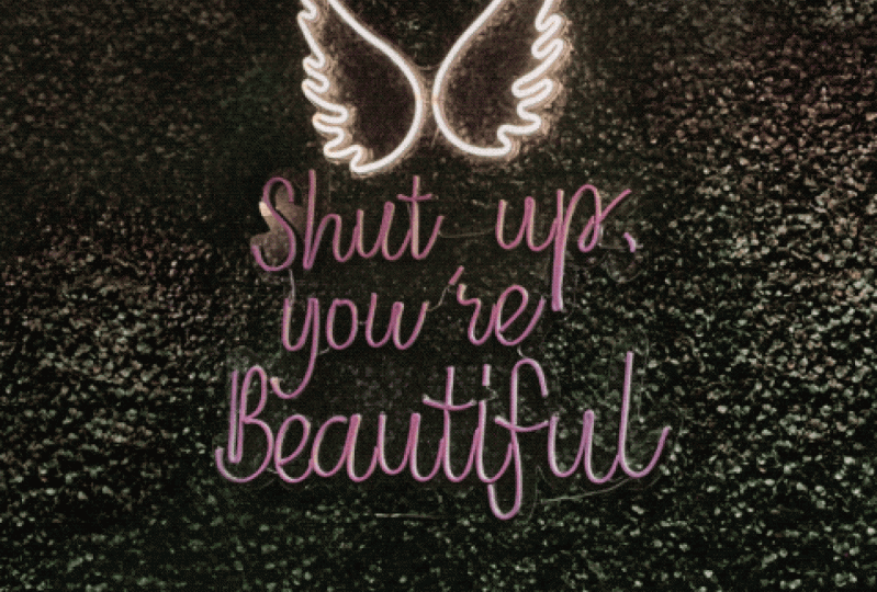
11. Animate Lights: [MUSIC] Anytime there are
lights in an image, that is a great opportunity
to add some animation. In this lesson, I'll
teach you how to use masks to create a nice, dynamic lighting effect and how to animate blinking
lights in your image. For this animation,
I chose this image with this really cool neon
sign in the background. This sign is basically
screaming to be animated. To start, I'm just
going to label this background layer as Normal. That's just going to let
me know that this is the original layer with
no lighting effect. Of course, I made a typo. Let me go back in and fix that. Now, I'm going to make a copy of this layer for the
lighting effect. Just slide the layer to the
left and press Duplicate, and then I'm going to rename this layer and I'm
going to call it Bloom, since that's the
name of the lighting effect we're about to use. Now, we're ready to add
this lighting effect. Go over to the Wand tool and then scroll down and
find the word Bloom. When this new window pops up, all you do is slide your
cursor to the right, to adjust the amount of bloom
that you add to your image. Instantly, you'll see
that now the light looks like it's up to
maximum brightness. When you toggle between the
visibility of your layers, you'll see there's a big
difference in the lighting. With both of these
layers created, let's see what we have so far. I'm going to turn
on the Wrench tool, go to Canvas, and slide
on this Animation Assist. Then the first thing I always do is set the background
image in the timeline. Let me just turn on
the visibility of our Bloom layer and
see what we have. We have nothing. [LAUGHTER] The background
image stays in the background, so it's never really popping
up over the bloom layer. I'm just going to create
a copy and put it above the bloom
layer. There we go. Now, we have something
way too fast. I'm just going to adjust
the Frames Per Second in the settings. This looks much better. I think this animation
looks nice as is, but I think we can
do something a little better and more dynamic. Let me just get
rid of the copy of this normal layer and
I'm just going to turn off Animation Assist for now because it's time to
get a little sketchy. I'm just going to
create a new layer and I'll rename this Sketch. I'm basically going to use this sketch layer to just sketch out the movement
path of my object. Let me grab a nice bright color and let me just do a
nice sketching brush. My idea is to have a little magical light beam come in and activate the lights. Let me just try to sketch
out a path. Not that. [LAUGHTER] It's going
to come behind me here, in front, and activate
the light right here. I think I want the lights
to activate one at a time, so 1, 2, 3, 4. First, the M, then
A, then the K, then the E. Now that I have
my object's path mapped out, now I need to map
out the timing. I'm going to do the slow
end, so our principle. We're going to have the
object starting slow, speed up in the middle, and it's going to slow
down around the corners, beat up in the middle, slow down around the
corners, and so on. Remember, if you want
your object to go slow, you add more frames. I actually want this to
go a little faster there, so I'll remove some frames. Okay, we have a plan. I'm just going to group
this sketch layer with the background and I'd say
we're ready to animate. I'm going to leave the bloom
layer turned off for now, but don't worry, we'll
come back for that. Let's come over here and turn on our Animation Assist again. It's the Wrench tool, Canvas, Animation Assist, and make sure your background image
is set in the timeline. We already set as earlier,
so we're good to go. Just press Add frame and
let's start this animation. I want it to look
like a light beam is coming in to
activate this light. I think this light pen will give me the effect I'm looking for. As for the color, I think this light
has a bluish hue, so I'm just going to choose a color that's pretty similar. Before you start animating, make sure you have a new
frame, I already have one. Let's just create the first
frame of this animation and around the frame
number 2 and 3. As I'm drawing in these frames, I'm just using the tick marks
that I put in place before. I'm also using the
squash and stretch principle to really exaggerate how fast this slide is moving. When lights move really fast, you see a street, and as it's moving slowly
around this corner, I'm just going to
make it smaller. Now, at this point, I want the light beam
to go behind me. This Hushbrush isn't working. I'm going to use something
a little more softer, like this soft brush. I think this soft eraser
just blends the light a little more and makes it look like it's going
behind my hair. It doesn't have to
be perfect since this animation is going to
be moving really quickly, but I think that looks
pretty believable. On to the next frame, just press Add Frame, and once again, this one's
going by in my head. I'm going to use
this soft brush to erase it from behind my hair. Add a frame and once again, we're to the point
where the light is slowing down around the corner, so just try these frames, and it stretches as
it's going faster. That line looks wonky, so feel free to undo at
any time and try again. Just try not to judge me for
the amount of times that I undo because it
gets pretty crazy. Let's make a deal.
Let's make ad deal. If you don't judge me,
I won't judge you. We have the light still
moving pretty quickly and right into this
side of the sign. I think we're done with
our light beam animation, so let me turn off
our sketch and wow, I can't believe I have all these onion skins on the whole time. Sorry if that was
hard to follow. Let me also speed up the
Frames Per Second here. Yeah, that looks much better. Here's what our little light
beam looks like so far. He's pretty cute,
he's moving quickly. I think I actually want to
add a little spark when it smashes into the
side of the signs. Let me just draw that in. See how this looks. Sure. It looks fine.
Let's move on. You didn't think I forgot
about the neon sign, did you? No, we don't do that over here. Right now, our
light flashes once and it's just not that exciting. I think it'd be more
exciting to have one letter come in
at a time until it builds out the entire word and then maybe it flashes
a couple of times. To do that, first, I want to duplicate
our bloom layer. Just slide it to the
left, press Duplicate. I'm just going to name this one Full Bloom because this is where our animation
is going to end. I'll just hide this
for now because we don't need it until the end. For now, we'll just focus
on this bloom layer. I'm going to rename
this Bloom Number 1. Basically, on this layer, all we want is for
the M to be lit up. I'm going to click
on this layer and select Mask and instantly, you'll see a new mask layer added right on top
of your bloom layer. It's time for a slight
intermission because you might be asking, what are masks? For this example,
I have an image, and when I put a mask on it, you'll see it adds
a new white layer right above my image. Since this mask is white, that means I can use
the opposite color, which is black, to erase
part of the image. Now, when we look
back at our mask, you'll see our black
scribble right on top of it. Why don't you just use
an eraser? You may ask. Well, the answer is because erasers can't bring an image back from the dead
after we erase it. As you can see, the part
that I just colored in white reappeared into the image. Basically, all you
need to know about masks is black makes
things disappear, and white makes things appear. What happens if I
invert my mask? Well, the mask turned black, which means that my
entire image disappeared. Since my mask is black, what color can I use to
make my image reappear? The answer is white.
When it comes to masks, the color white
makes things appear and the color black
makes things disappear, and it's as simple as that. With this mask on my image, I'm going to invert
it so that all of the lighting on my
bloom layer disappears. The only thing I want to
show up on this layer is the M. Since my mask is black, I'm going to use
the opposite color, which is white, to make just
the M lighting reappear. Actually, let me
get a softer brush, like this soft
airbrush to do this. I'm just filling in white
to make the image reappear. If you make a mistake and you want to erase
part of the image, just use the color black. I hope this is
making sense, guys. Basically, use white
to make things appear and black to
make things disappear. I think we're done
with the first letter. On the next layer, I want
the M and the A to appear. I'm actually going to
duplicate this M layer. You'll notice, when
it duplicates, it duplicates the layer, as well as the
layer mask with it. That's actually what we want. I'm going to rename
this layer Bloom 2, and I'm going to select the layer mask and
make the A appear. Using which color? The color white to
make things appear. Honestly, if you can't remember
which color makes things appear and which color
makes things disappear, I'd say just go by
trial and error. Choose a color and if it doesn't create the
effect you want, just try the opposite color. We're making progress, we've got the M and A, now it's time for the K. Now, I'm going to duplicate Bloom 2, rename it Bloom 3, just so we can stay organized. Make sure that
you're coloring on the layer mask with
the correct color. We have M, A, K, and for the E, I'm actually just
going to turn on the full bloom layer because that layer already has all of our lights on and activated. Good. Now, let's see what our animation looks like so far. It looks like all the letters
are coming in correctly, but I'm thinking once all the
letters come in at the end, wouldn't it be cool to have them blink off and on a
couple of times? Let's try it. What
I'm going to do, is I'm going to copy
our original layer that doesn't have any of the lighting effect
and I'm going to drag it to the frame after
the full bloom. Hopefully, it looks like it's
blinking on and then off. I think I'm actually
going to copy the full bloom and the original layer a
couple more times, just alternating
between the two. Let's see how this looks. Nice. I think the blinks
are way too fast, so let me try the
Frames Per Second, see if that helps. The light just still
blinking pretty fast for me. The first thing I
notice is I'm not ending with a full bloom layer. Let me fix that, add that to the end. That should help a little bit. That looks much better. But another thing
I want to do is, I just want to hold
the duration of each of these blinks a little longer. I'm going to click on
each layer and just slide the whole
duration to one notch. It's pretty self-explanatory, but what it's going to do is
it's going to hold each of these layers to the
duration of one frame. I accidentally did
two on this one, so let me fix that. Let's see how this looks. Yeah, that's the one. I think we did it. I'm going
to call this, Finished. In this lesson, you
learned how to use the bloom effect to add
lighting to your image. You learned how to use
masks to create a nice, dynamic lighting effect, and lastly, you learned how
to animate blinking lights. Now, look at your image
and see where you can add some light animation
to your image. I have learned how to animate different elements in Procreate. Join me in the next lesson
where I'll teach you how to export your animations
from Procreate. [MUSIC]
12. Export your Animation: We're finished with
our animations. We need to get this animation out of Procreate
and into the world. In this lesson, I'll
teach you how to export your animations
from Procreate. As you can see, I have a few different animations in
different Procreate files. Let's just go into
this chocolate ice cream cone file to start. Our animation is looking pretty good and we're ready to export. To export your animation, we're going to go up
to this wrench tool, then we're going
to press "Share." At the bottom you'll
see several options for how to save out this video. Let's just talk about
a few of these options so you can decide which
option is best for you. The first option we'll talk
about is animated GIF. GIFs seem like a
good option because they automatically loop over
and over and over again. But Instagram actually
does not support GIFs, so we're not going
to use that today. Next up, we have animated MP4. Honestly, if you're happy with your animation and you don't want to make any
more adjustments, you can just save
it out as an MP4. However, Instagram requires that your video be at
least three seconds in order for it to loop. If your video is
not three seconds, then let's do this next option, which is PNG files. PNGs will save out each frame of your
animation as an image. Which sounds really weird, but this gives the
most flexibility for editing in After Effects. This is the option that we're
going to choose for today. But first, we need to come
back into our file and make sure that we turn off any background and
foreground images. Because we want each
of these frames to save as transparent PNGs. We're ready to save this out. Let's go back up to the wrench tool and press "PNG files." Give this a little
time to export, and Right up top you'll
see that this is going to save out 14 separate
image files. We need to send these files to our laptop so you
have a few options. I usually go with AirDrop. Cool. We got that one saved. Now we need to save
out the rest of my files as PNG files. Let me go out into the gallery. Next we'll save out the
vanilla ice cream cone. Just like before, it's very important that you turn
off any background and foreground images
because we want each file to be transparent
just like this. Looks good. Let's save
this as PNG files, Wait for it to export. Then I'm going to AirDrop
13 files to my laptop. I have two more files
to save out as PNGs. I'm going to do that really
quickly and we can move on. In this lesson, we talked about the different video limitations that Instagram has in place. We also talked about
different export options that are available in Procreate. Lastly, we exported our
animation from Procreate. Now export your
animation as PNG files, then grab your laptop and
meet me in the next lesson where I'll teach you how to loop your final animation
using After Effects. [MUSIC]
13. Loop your Final Animation: All right people, we're in the home stretch. Adobe After Effects is the industry standard when
it comes to motion graphics. I'm not going to dive too deeply into After Effects
in this lesson, but it'll be a great
beginner intro. In this lesson, we're
going to import our PNG files into
Adobe After Effects, where we will create our
final looping animation for Instagram. The first thing we're
going to do is create some folders so that
we can stay organized. This first folder,
I'm just going to name it ice cream animation, and this is where I'm going
to hold all of my files. Then I'll just open this up, and we'll create
some sub-folders. First, I want to make a folder for our After Effects file, so I'll just name
this After Effects. Then we also want a folder
to save all of our PNGs in, so I'll create a new
folder and call it PNGs. Lastly, I'll just create a folder for our
final animation. So these are our main folders, but I also want to break my PNG files into
separate folders as well. In this folder, I'm
going to create separate folders for
each group of PNGs. I'm going to save my chocolate
PNGs in this folder, then I'll create a folder
for the vanilla PNGs, another one for my DQ sign, and lastly, I'll create a
folder for our expression PNGs. We're all set and organized, now let me just start dropping my PNGs into these folders. Here we have the airdropped files for the chocolate PNGs, I'll just save it to downloads, and drag all of these PNGs into the chocolate folder like so. Next I'll airdrop the
vanilla PNG files, so I'll save these to downloads, and drop all of these
into the vanilla folder. I'm just going to
quickly, fast forward and save out the PNGs
for the DQ sign, and the PNGs for the
expression lines. Now we have all of our PNG
files all nice and organized. Now let's open up
Adobe After Effects so we can combine all of our animations
together and loop our final animation
for Instagram. Let's just wait for
Adobe After Effects to get nice and warmed up. In this new window, you can press "New Project", and I don't know why, but my new project window pops up right
behind this window, so I'm just going to exit out. In After Effects, the first
thing we're going to do, is press "New Composition", and immediately, it's going to ask us to set up
our composition. I'm just going to name this
new comp ice cream animation. Next step, it's going
to ask for the size. We're just going to
input the size that we used for our
Procreate animation, so yours maybe 1080 by 1080, but for this one, mine is
actually 1080 by 1350. Then it's going to ask for
the frames per second. Once again, we're just
going to match this to what we used in Procreate. Mine was set to eight, but I think most animations are set to 12 frames per second. Next, we need to set our
duration, and for Instagram, our video has to be at
least three seconds, so I'm going to set it to
three, and then press "Okay". Now we have our new composition, and it's just waiting for
our lovely animation. Let's go ahead and import
in all of our PNG files. Let's go to "File", "Import", and then file, and
in the new window, just navigate to where
you saved all your PNGs. Mine is on my desktop in this
ice cream animation folder, just select all of your PNGs. If you don't know
how to do that, just go ahead and click
the "Top Folder", hold down Shift,
and then click the "Bottom Folder" to
select everything. Now with everything selected, just press "Open", and you'll see
immediately all of your folders are dropped
in this project panel. Where to start? Let's start with our
Chocolate folder. In this folder, you'll
see all of our PNGs. This first one is actually our background image,
and then after that, we have each transparent PNG of our chocolate ice
cream animation. Let's just select all of our PNGs by pressing
"Shift" again, and drop them into our timeline. One thing I like to do to stay organized is just change
the color of these. Click on this color chip, and I'll just make these brown to match the
chocolate ice cream. Let's come over here and
play our animation so far. Just press the "Space Bar"
to play the animation, and you'll notice that
nothing is animating, all we can see is our
background image. That's because all of our layers are the same length
in the timeline, so we need to sequence them. To do that, first make sure that all your layers
are selected, then move your play
head over one frame, and then we're going
to press option "right bracket" to trim all of the
frames to the same link. Then lastly, we're going to right-click press
"Keyframe Assistant", and then go to
"Sequence Layers". We'll just press "Okay" on
this little message, oh, and already you
caught me slipping, when we press "Play", you'll notice that my animation is actually playing backwards. If this happens to you, just press "Command Z" to undo, and then select your layers from top to bottom while
holding down shift. Because I think the
order that you select the layers is actually the
order that they will sequence. Let's try this again,
so right-click, go to Keyframe Assistant, and then press
"Sequence Layers", and then just press "Okay". Yay, now it's
sequenced in order, and when you scroll through, our animation is
playing correctly. However, you might be wondering where the heck
is our background image? Our background image is
actually chilling up here, it's this top frame, so let me actually rename this. Just click on the layer, and press "Enter"
in order to rename, and I'm just going to call this background image
so I can tell it apart. Then we need to drag
this down to the bottom, where the background
image belongs. If you want to, you can press this color chip to change
the color of the background. I'll do this nice
and bright yellow, and I'm going to drag this
to the entire length of our timeline because we want the background to be
there the entire time. When we moved our background from this first layer position, we left a little gap, so I'm just going to select all my layers by
pressing "Shift", and just drag them
over one spot. Just press the "Space bar", and let's look at our
animation so far. Well, mine is actually
glitching out, and it's not playing.
You know what? This is a great time
to save our file. We actually should have done
it sooner, but here we are. Just go up to "File",
and go to "Save", and then we'll save this
in the folder that we created for our
After Effects file. Mine is on the desktop, Ice Cream animation
After Effects file. Then I'm going to rename it, I'll call this ice cream
animation as well, and save. Back to the glitch, so usually when my After Effects starts glitching out and
doesn't play my animation, what I do is I
usually come over to this project's panel and just double-click
on our composition, and that should reset
it, and let's see. Yay, now our ice cream
cone is animating. Let me actually
trim my work area by just dragging this
little guy over, and let's take another look. Yeah, it's looking pretty good. So we have our chocolate
ice cream cone in place for the most part, now let's add our
vanilla ice cream. Let's go back over to
the projects panel, and open up our vanilla folder, and we actually don't need this first frame because
it's the background image, so we're just going to select everything except for
the background image. Just like the
chocolate ice cream, we're going to drag these
down into the timeline, and I'm going to
change the color to sandstone because that seems
like a nice vanilla-y color. Let's sequence out these layers, I'm going to pull the
play head over one frame, and then press option right
bracket to trim them all. Let me just pull this
back to one frame, and then we're going
to right-click press "Keyframe Assistant", and then sequence these layers. There they go. Okay, so let's press "Space Bar" to
play the animation so far. As this animation is playing, I noticed that this vanilla
ice cream cone is blinking, and that's because our
vanilla animation is one frame shorter than
our chocolate animation. But thankfully, I created those two jitter frames at the end of this vanilla
ice cream cone, so I'm just going to copy
this second from last frame, and put it at the end. I'm going to press
"Command C" to copy, and "Command V" to paste. I'm just going to
drag this copy to the bottom of my vanilla layers, and then move it to the
end of my animation. Let's see what this looks like. Now the ice cream cones
are times together. They both end at the same time, I'd say we're looking good. Let's add in the next
part of our animation, which is the expression lines. Once again, the first PNG
is the background image, so I'm going to select
everything except for that one, and drag it into the timeline. I'm fine with this color, so let's just trim these layers by pressing "Option",
"Right bracket", and then let's
sequence them out by pressing "Keyframe Assistant",
and sequence layers. Now let's see how our
little sparky plays. I like it. I don't
think that I'm going to make any more adjustments
to this spark layer, so let's just group them
together in one nice layer. Just right-click and
press "Pre-compose". In this new window, I'm just going to name
these Expression, and make sure you have adjust composition
duration checked. Now, you'll see our
expression group is in one nice and neat layer. Let me actually
change this back to lavender so I know it's
a separate object. Now, I want to copy this spark animation onto the chocolate ice cream as well. While the layer is selected, press "Command C" to copy
and "Command V" to paste. Now that we have created a copy, we can just simply go up
into our video preview and drag the copy over our
chocolate ice cream cone. I want to flip the animation, so I'm going to
go up to "Layer", "Transform", and then
"Flip Horizontal". Actually, I'm just going
to flip my animation horizontally. Let me just reposition
it to about there, and let's see what we have. We have our sparks and then let's see. That
looks pretty good. Let's just play around
with timing a little more. Maybe we want the first frame of our ice cream cone to
stay still for a while, then when the spark comes in, then it activates the
rest of the melt. I'm going to select all
of my ice cream layers. Click the top layer,
hold down Shift, and then press the bottom layer, and I'm just going to move
all of these over one frame. Let me move this back. I'm going to make the first
frame of this vanilla cone, last two frames, and I'm going to do the
same to the chocolate. We just have our ice cream paused for the first two frames. Then, we'll have this
spark come in on the third frame and activate the rest of
the ice cream melt. Yeah, this looks pretty good. Let me just adjust my work area to make sure
everything's within, and let's see what
this looks like. Pretty cool. We have one
more element to add, which is our Dairy Queen sign. Let's come over here. Let's open up our DQ
folder and grab our PNGs. I'm just going to drag it
on top of the timeline, and I think a good color
for these would be red. You guys are all pros by now. You know that I'm going to
select all of my layers, trim them to all would
be about one frame long, and then use Keyframe Assist
to sequence our layers. There's our DQ sign all
sequenced out, looking good, but you'll notice that the
Dairy Queen sign is much shorter than the rest of the
elements in our timeline. I think what I'll
do is I'll have the Dairy Queen sign stop melting when the ice
cream cone stop melting. I'm going to drag all
of these frames to line up to the end of the
ice cream animation, and I'll just drag
out this first frame. It'll be still at first and
then start animating later. It actually looks
like the DQ sign starts animating after
the sparks go off. I think I'm fine with
that. I'm almost done. Now, I just need to make
sure that my animation plays for at least three
seconds for Instagram. Let me pull my workspace
back to three seconds, and I'm going to start
pre-composing some of my elements so that
it's easier to loop. The first thing I'm going to
pre-compose is the DQ sign. I'll just select all of the layers and then
press "Pre-compose". Of course, I'm just going
to name this DQ sign. Pretty self-explanatory. Just make sure that Adjust
composition duration is checked. That put our DQ sign
in a new group. I'm just going to
make this group red. Basically, I want to
repeat this animation until we get to our
minimum of three seconds. Let's make a copy of this
by pressing "Command C" to copy and
"Command V" to paste. Let's move this group to
the end of this animation. Instead of having this
animation just repeat, I think it'd be cool to
have this play in reverse. Just right-click, go up to "Time" and then press
"Time-Reverse Layer". Now, let's just see
what this looks like. Our animation starts out forward and right before
it ends, it reverses. I'm going to go ahead and group all of the rest of
the layers together as well and play them in reverse speed just
like the DQ sign. I'm going to select my vanilla, press "Pre-compose", and I'm going to pre-compose it
into a group called vanilla. Here's our new group. I'm just going to
press "Command C", "Command V" to copy and paste and then move it to the
end of the animation. Actually, our animation is past our three-second
minimum now, so I need to give us more
time on our timeline. Go up to "Composition" and
press "Composition Settings", and I'll adjust our
timeline duration to about four seconds. I think that should
be enough time. That looks better. Let me just drag in my
workspace to the end of our animation
and let's continue. I left off with the vanilla, and I want this second animation to reverse just
like the DQ sign. Right-click, go to "Time"
and "Time-Reverse Layer". This is the last one. We're going to do the same thing with our chocolate ice cream. I'm going to go ahead and
pre-compose this into a group. I'm going to name this group
Chocolate, press "Okay". I'm going to change the
color of this just so we know that it's our
chocolate ice cream. Lastly, you just copy and paste, drag this to the end. I'm going to reverse
this layer by going to "Time", "Time-Reverse Layer". Let's see what we have so far. Everything starts out forward and then it reverses to end, and we met our
three-second minimum, so we're basically good to go. We're ready to export, but before we export, I just want to show you guys
that there are a lot of effect options that you can play around with
in After Effects. Let's say that we
wanted to add a glow to the spark on the
chocolate ice cream cone. All you do is come over to the
"Effects & Presets" panel. If yours isn't visible, just go to "Window"
and make sure Effects & Presets is checked. You just come into this panel
and type in the word glow, find glow, and drag it on top of the layer that
you want to add a glow to. You'll see that there's
already a light glow, and you can actually adjust the settings of the
glow in this panel. Let's say we want to
adjust the intensity, just play around with these settings and
see what looks good, but I'm not going to add
in glow to this today, so I'm going to press
"Command Z" to undo. Another cool thing
you can do is, let's say you want to change
the color of something. For example, maybe we'll change the color of this
chocolate ice cream cone. Just select your layer, and over in the Effects panel, we're going to go to
"Color Correction" and then scroll
down until you see Change to Color and just drag this effect onto the layer that you
want to recolor. Once again, this panel full
of options will pop up. To apply this effect
for the From color, you need to eyedrop the color
that you want to change, and then for the To color, you can actually select the color you want
to change it to. I'll choose a crazy red color, and I'm going to mess with these settings to
see what looks best. Hue and saturation makes
the most dramatic change. Look. Now, we have a really weird red
ice cream cone. I don't know why anyone
would want to do that, but this effect would work
perfectly for something else. I'm just going to "Command
Z" to undo all of that. Just know that there are effects available
in After Effects, and if this interests
you, definitely explore. Now, we're finally finished
with our animation. We're happy with it. We have all of the
elements put together, now it's time to export. To export, just go up to "File", "Export" and then go to "Add to Adobe
Media Encoder Queue", which I know that
sounds really weird, but this is what we got to do. This is actually going
to open up a new app. Just give it a little
time to let it think, do what it's got to do. Here we are. Now, just give it a little time to let your video
pop up in this box. Sometimes it takes
a few seconds. Here we go. I'm just going to click on this to open it up. First, just make sure that
your format is set to H.264, so have that set. Match Source - High
bitrate is fine. Output name is
actually where we'll choose the location
to save this, so press on that and navigate to your final animation
folder. Press "Save". Next, let's go to "Video". Your width and height should already be set to
the correct size. Just make sure that
you have Render at Maximum Depth and Use
Maximum Render Quality. Have both of these checked. We should be good to go. Just press "Okay".
Back in this window, we're going to press this
Play sign right here, and that's going to
export our animation. Done. Let's go check our final animation
folder to check out our animation and see what
it would be looking like. Drum roll, and there it is. Look, it's four seconds, which is perfect for Instagram. Let me play it one more time. All right, guys. This is basically ready
to upload to Instagram. Just send it to your phone
and you're good to go. In this lesson,
you learned how to create a new comp in
Adobe After Effects. You learned how to use
Keyframe Assist to sequence your final PNG files. Lastly, you learned
how to export your animation for Instagram. Wow, we made it. Now, save your lovely creations and meet me in the final class.
14. Conclusion: You did it, and hopefully you created
something that you are so happy with and so ready
to show the world. You should be so
proud of yourself. Now you know a few basic
animation principles, you know your way
around Procreate, and how to use animation
assist in Procreate. You also learn a few different
animation techniques like how to animate
objects in your photo, how to animate lines
of expression, text lighting, and how
to use masks to animate. You also learned how to export your animation from
Procreate, and lastly, how do you Adobe After Effects to loop your final
animation for Instagram. Hopefully, you realized that animation doesn't have
to be that scary, and with a little imagination,
anything is possible. Now go into the world and create some beautiful
animations, but don't forget to come back and share those
animations in the Project tab. I would absolutely
love to see what you guys created.
All right, guys. Thank you so much for
taking this class and spending some time with me, and until next time, peace out.
 Tyra Washington, Graphic Designer / Youtuber