Transcripts
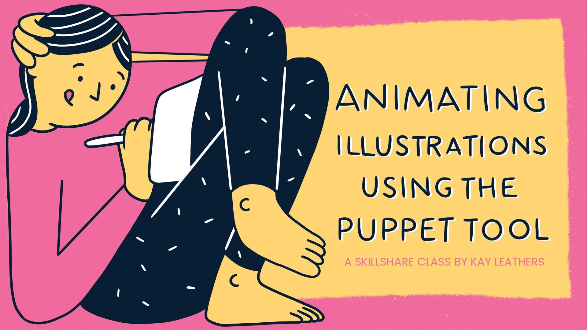
1. Introduction: Would you like to know how to animate your text illustrations? Create some funky stickers
to use on your stories? What would you say to learning three easy techniques to do so? Hi, my name is Kay Leathers, and I'm a designer and
illustrator from London, England. I've been working over six
years now as a designer, working on everything
from children's books to videos to animated GIFs
Most recently, I've been working a lot on social media marketing
with a few brands. And these stickers
are an absolute must if you want to engage
people with your brand, especially when sharing
user-generated content. Learning these simple
animation techniques has been super helpful for me. Not only to add another string
to my illustration bow, but it's given me
extra pull when applying for
illustration projects. Lots of clients want
animation experience now. And these are
particularly useful for social media marketing. If
it's not for other clients. It's also a super cute way of
advertising your own brand. I'm always happy to
share these skills. As I know, it's not easy stepping into the
world of animation. And I love to share my
knowledge so you can have an easy ride rather than the roller coaster of
frustrations I had. I recommend this course
to anyone who wants some simple tips on how to
animate your illustrations. I'll show you three
awesome and easy ways to animate your text in
a matter of minutes. I'll also be going step by step. So whether you're
a seasoned pro or just a beginner, all are
welcome in this class, I'll be using procreate
to design my text. But you can use
Adobe Photoshop, Illustrator or just
simply pen and paper. Secondly, you'll
need Adobe After Effects to animate your text. In this class, I'm going to
show you how I decide on a design, Share a few tricks
I used to illustrate a text, take this into After effects, where I'll use three different
techniques to animate three different text
stickers If you want, You can design just
one on which you can experiment to find your
favorite way to animate. My files are also in the
resources if you need them. At the end of the
class, you'll have learnt three different
ways, maybe more, that you can animate
text and a final design, which you can upload right
here to the project gallery. I'd recommend you show off your new skills on
your own portfolio. And I'll even show
you how to get your design on
Instagram stories. If you're ready and raring
to go, let's get started.
2. Project: For this class project, you'll have a choice of the three different
animation techniques. Applying one to
your illustration, Export it as a GIF and upload it here to
the project gallery! That way I'll be able to see your new animation skills and offer any advice or tips
uniquely tailored to your work. Once you've followed
along with the class, simply choose one
animation technique shown in the class to apply
to your text illustration. Apply and export
the illustration as a GIF, I'll show you how to do
this in the export lesson. Upload it here to the project gallery to the class project. Posting your own project can
help others to do the same. Ask for help and
ultimately improve our skillshare community here in a cycle of feedback
and improvement. It also helps me to gauge how helpful the class
has been for you. Remember to post your
project as soon as you can. If you're feeling
particularly like sharing, I'd love to see
your process too. So feel free to upload your illustration stills
and sketches here too. The first thing
you'll need to get started is your drawing tool, drawing app or sketch pad. So let's get those now and I'll see you in our first lesson.
3. Sketch your text: In this lesson,
we're going to look at sketching out our
sticker designs. This is going to be our guide sketch for later refinement so I want you to feel good
about getting something down. Just as a first design, you can use whichever method
you're comfortable with, Whether it's pen and paper
first before you go digital, or if you're more of a vector
person, use Illustrator. I like to use procreate
because it's so flexible, quick and it saves
out to a PSD file, which is really
good for animating later. So I'll be showing
you how I work there. Feel free to follow along in
whatever method you choose. Now I'm going to do
text-based stickers. So I recommend you
follow along with me. And I'll be giving lots of hints and tips for
illustrating text, specifically using
guidelines and layers. I enjoy free handing this part, but feel free to use
references for how you want your letters
to look, if you fancy. Before we decide what to draw, let's just set up our canvas. To create our canvas, we are going to click
the plus symbol up here. Now we're going to create a
brand new sizing template. We'll add it there and
for the dimensions We're going to look
at GIPHY's guidelines. Eventually, we're
going to set up our GIFs in GIPHY to
go onto Instagram. We need to follow their
guidelines as we do it. Now GIPHY has a few
sticker best practices. And if best practices that
we're going to look at, the things that I
want to highlight is the cropping the canvas
to fit the sticker. Stickers exported with
too much empty space will appear very small. Actually, what we're going
to do is we're going to create stickers which
fill that space. Secondly, we need to have
the source file as a GIF. If we're going to follow the
GIF best practices as well, they recommend no
more than 6 seconds, which we'll think
about in animation. And also that they'll
loop forever. We're going to really focus on that in our animation lesson. That we can use
whatever resolution makes our sticker look best. They recommend using multiples of four for width and height. That's what we're going to
think about for our canvas. Great. As GIPHY said said we're going to do
a multiple of four, but we're going to keep
it in video style. We do 1080 by 1080, then I'm going to keep it
at 300 pixels per inch. You can go down to
72 if you want. I just like to keep stuff
in 300 just in case they need it in a higher
pixel rating later on. Then for your color profile, I recommend going for RGB. If you're going to just
keep the stuff online, if you think there
might be a chance that you're going to
print it at some point, go for CMYK, because
it's easier to go from CMYK to RGB than
the other way round. So make sure you give
that template a name, so I'm going to call
it Instagram sticker, then Create, and that will come up with our nice
blank canvas here. There are two things
you can think about to get you started. The first is the theme
of the design. If you want something
very usable or popular, why not do some
research on Instagram? Just go to make a
story, then add a GIF, See what popular
stickers are there, or you can just do
whatever feels good for you and hopefully
people will like it. I would think about
a word or two, or even a very short phrase
that means something to you. Something that will show off your personality
to your audience. I guarantee there will be loads of people who love it too. The second thing is the
size of your design. Here you can see two stickers
that I've created for Teach your Monster that I'm
trying to use on a story. One started as this
design small and in the center of our
1080 by 1080 canvas. The other filled much
more of the canvas. Can you guess which
made the better GIF? Yeah, one that
filled the canvas. When you're planning your
phrase or illustration, you'll need to consider how you're going to
fill that canvas. For my first sticker, I've decided to do
Happy Birthday. I know it's going to be popular, lots of people have birthdays and it's going to appeal
to a wide audience. First of all, I'm going to
set up some guidelines. Now Procreate does come with
its own guidelines built in. I'm going to use those. If you go into the
spanner and then Canvas, then click Drawing Guide. Then we're going to edit
that drawing guide. At the moment, my grid
size is 34 pixels. We're going to hoik
it all the way up and make sure it's on
something you can see. I've just gone for some
nice dark guidelines here, but you can go for
red if you want to. I'll stick down here
and then click Done. I've decided that
I'm going to make my letters like super boxy, super punchy, and happy birthday is going to be really happy. What I'm going to do is because happy birthday
is quite a long phrase, if I put it across the center, it's going to end up very small when we put it into GIPHY. And eventually our sticker. I'm going to split that
into two happy birthday. And I'm going to use my
guidelines here to do it, but I'm also going to
create my own guidelines. Now to create guidelines, I like to use my sketching
Narinder pencil. It's just really nice and
dark, so I like that one. Now on a fresh layer, what you're going to do is
just set up those guidelines. If you want to follow
along and be boxy like me, I'm just going to
draw a straight line across and hold my finger on
to make it really straight. I'll draw the second
one for the bottom of the letters, and that's looking good. Then using my free
form transform button, I'm going to extend those across and make sure that's fitting
the width of the canvas. Then I'm going to duplicate
that layer and drag I need to make sure my snapping is on with the
magnetics, which it is. And that's just going
to help me drag it down in a really
nice straight line. I'm going to leave a
little gap there for the space between
the two words. Good. Once that's done, I'm
going to merge it down and then rename that
layer guides. You just rename my tapping and
selecting, Rename. Now we're going to move on
to sketching our letters. I always do a rough sketch guide before moving onto my color
just to make sure that spacing is okay with
all the letters and the phrase is looking
good generally in the canvas. To start us off, let's
create a new layer and call that ART. I'm going to share a couple
of techniques with you as I go because I'm doing these really boxy letters
for happy birthday, I'm going to count how many letters
are in each and I'm going to work out
from the center. In 'Happy', we've
got five letters. I'm going to start with the P and I'm going to use
this center line to help me draw that
with my pen selected. Just going to draw that P in, I can always hold
for a straight line. It doesn't have to be perfect, but it's good to get
the first letter right. Just as a rule. Then we can
work out from that one. Now, because I'm
happy with this, I'm just going to
draw in my x height. That's just the height
of this crossing bit. Just to make sure that's
in the right place, I'm going to use my
selection tool to just pick that up and
pull it under the P. Now that's my guide. All
set for the top one. Now very fortunately,
we have another P, so I can just duplicate
that layer and then drag it across there. We have our second P. just
going to merge that down. I'm just going to make sure that P is really
centralized there. Good. Now I'm going to work out from there for
the rest of my letters. There's the A and the H. This bit
can be like super quick. You can do it really
sketchy if you like. It doesn't have to
be boxy like this. Obviously, you're going
to work out the style of your own letters. if
you want to copy along with me and just
do the boxy style for now, I'm happy with that too. Here we've got a style
established for our lettering. Now, I'm just going to make
a couple of adjustments to make sure we've got more
of a consistent width here. And that's fine. Onto my
second word, birthday. For birthday, we've got
eight letters in birthday, but I'm going to add
that exclamation mark. Now, we've got nine,
leaving us that important middle letter H. Again, I'm going to work
out from the center. H is a nice symmetrical
letter that's helpful, helpful for H. Then I'm going to continue with my
letters out from there. Now you might find
it really annoying and difficult to do it this way. This is just the way that
I've come up with to help me balance and keep
my letters even. But you might find it really easy to go from one
side to the other. You can always use
the transform tool to make the adjustments anyway. So find whatever
way works for you, just keep working on
your phrase here. It might be a good time as well to try out different styles, get some cursive going, but generally this is birthday, and I'm really happy
with how that's looking, that's my guide layer, all done. Now obviously this is a really
structured way to do it. Sometimes I do it
really sketchy, for example, just like this. I'll get that in nice and
hand drawn in my own style, then I'll reduce the
opacity on that. I'll neaten that style up
and work in that way. You might find it
really fun to just do your own handwriting and then
go over the top of that. But I'm going to
show you this in one of my other sticker designs. Let's turn the guide layer
off and have a look at that. Yeah, I think that's
looking really nice. So with my guide layer done, I'm ready to move on
to the next step. Coloring. Do take as
long as you need on this initial sketch stage
until you're happy with it. It took me a few attempts too, but I will say, don't worry
about getting it perfect. We'll refine our
sketch together in the next lesson.
I'll see you there.
4. Colour your text: In this lesson,
we're going to use our guide layer as a base
to illustrate our design. I'm going to go straight
into introducing color. So I'm going to be super
speedy in this lesson, using a lot of straight lines and quick decisions throughout. Feel free to pause at any
point and take your time. You may even wish
to do an extra step of refinement to
your design here. But I recommend that
with text based gifts, I think that practice is key. So the more you can
work on, the better. Let's just get these first ones done and out in the world. And remember that
often perfection is the enemy of progress. Again, I'll give you some tips for refining your
work as you go. So if you are ready,
let's get going. So I want my happy birthday
ticket to be super happy. It's going to be rainbow colors and we all know ROYGBIV, right? We're going to start with red. So I'm going to select my
color from my color palette. I'm going to pick a new pen. So I'm going to go for my
studio pen. Studio pen 1. Now this is just
regular studio pen, but it's got the streamlining
up to 66% instead of 47%. So that's all I
changed about it. So I'm going to
create a new layer, this which I'm
going to call art. And then my sketch layer, I'm going to rename Sketch. On the art layer, I'm
going to do my colors. And then I'm going to reduce the opacity on
the sketch layer, so I can just use it
as a guide zooming in, let's make sure my pen
is the right size. I'm going to select size 4 here, then I'm going to start inking
using those guidelines, because I'm going for super boxy This should be quick. Obviously I can just hold the lines to
make sure they're nice and straight and it's
like a quick style. You might want to
take some extra time if you went for cursive
or something like that. But I would say that you
don't have to be super neat. Please take it from me. If you're new or
starting out with illustration the human touch, the perfectly flawed design of your hand is going to
be more than good enough. Please don't spend too much time agonizing over a little mark somewhere that's really not going to affect the
design of your work, especially with these stickers. You can get these out really, really quick and you know people are going to use
them on your stories. They're going to be
quick passing things. You really don't
need to spend hours getting it right like you would maybe with a print or
something like that. Just use your talent, use your perfect mistakes
to just fix those up. Good. Now you can see
that I'm getting along well with my coloring here. Just going to go in and
use that trick again, where I can use the selection tool to cut
out my P copy and paste it, drag that across, and then I
don't need to do it again. It's just things to
speed up your workflow. Now I'm doing a color
fill here and you can see that I'm dragging to get
the threshold up and down. Now this is just the amount
it will fill up the pixels, so you want to go as
high as possible on this one. One nice trick I can do with this as well because I particularly
like my Ps here, just going to duplicate that. Just use it as a bit of a width
guide for my next letter. If you're struggling to keep the width and consistency
between your letters, this is a really good trick for that. On my art layer again now, I can just use
that as a bit of a width guide and use it to continue the
style of my letters. It's even more helpful if you have it underneath
your art layer. Now this is my regular piece, so I'm just going
to merge that down. We've got happy all done here. I can see that my
H is a little bit wide as compared to
the other letters. I'm just going to squidge that down and then move
on to birthday. I've got a couple of
letters which are common between birthday and happy. Again, I can use that trick
just to speed up my workflow. It's going to help me keep the letters consistent as well. Let's do the same for the A, making sure that your
letter is selected. If you just click and hold, that will select the
same one and you can copy and paste and
then move it down. Good. Then you can just merge that down onto
the same layer as well. Let's just do that for
the Y and move it. Here we go, and merge down. So now I'm just going to
get on with the rest of my letters and I'll
speed up the video. Now, you might have noticed that I have made a
lot of birthday red, which is definitely
not rainbow order. Now this was intentional because I thought
it would give me another opportunity to show you trick and speed up workflow. You can actually just build
everything in one color and then go through and just
fill with the other colors. Once you've got it
all figured out, I just finish off
my exclamation mark here and show you what I mean. I do want my B to be red. That's all good. Then I
want the orange in the I. So I can just color-drop that. Now I can really show you here. If you go too high
with this one, it's going to color all of them. You just want to color it enough to color that one letter. Let's do the same
with the R yellow and the T and the green. I'm also going to color the exclamation mark there because they know it's
going to be green too. Then we've got the purple, the H, then we're back, then we've got red orange. And then we need
yellow for this Y. That's my happy birthday. All colored. Let's have a
look without the sketch. Cool, It's looking pretty good. I can see that. Maybe I need
to do some little fixes. Okay, I'm pretty
happy with this. I really like the letters. They made some adjustments to
the general width of them, but we're ready to move on. I like it, but I
feel like it's going to be difficult for
it to stand out against photos and
complex images that you would have
on Instagram stories. We're going to give
it a drop shadow. Now my favorite
way to do that is to just duplicate
that art layer. Then rename the
bottom one shadow. Make sure everything
else is named. We don't have anything
extra that we don't need that looks good. And then I'm going to
turn the art layer off. Now before I add the
shadow color to this, I'm going to just take out
all the color from here. I'm going to go up
to the adjustments here and in hue, saturation,
and brightness. Then I'm going to take
all the brightness out, so it's just this deep black. Then if we go to select our shadow color mine is
my nice navy here, and just drag that in
the threshold needs to be all the way up to make sure
all the letters are full. That's my shadow color. Then we can turn on
the art layer and you can just see a little
outline of the shadow there. With that selected, you can now move that to whichever
position you want. Your drop shadow now
I like bottom left, so I'm just going to
give it enough distance away so that perhaps
when it's small, you can still see that shadow there because our sticker
is going to be quite small. Maybe I'll even move
it out a little more. That looks good now. It looks like a shadow
cast on a wall, but I want it to be
like a boxy letter. I'm actually going to join this, so it looks like a solid letter. I'll show you how to do that with my shadow layer
still selected. Just going to join it with some little triangles
in there to give it the illusion that
is actually 3D If we compare the
H and the a now, rather than being a cast shadow, just looks like it's a
whole one piece. It's got dark sides, a nice colorful front,
which is what I want. I'm just going to
continue with this, just coloring those
bits in and while I'm here. I can also just double
check my artwork is looking how I want it to by going back and
forth between the layers. Just don't forget that you can select a different color
with the eye dropper. Pick your shadow color when you go back to
your shadow layer. So here, I'm just finishing up those boxy letters,
and it's inspection time. So make sure that you're
really zooming in, Just checking all
of your letters and matching up
nicely that you want. Don't worry about leaving some little human
errors here and there. But here I've spotted a missing join. so I'm going to fill that in. Let's make sure we haven't
missed any others. No, that looks good. At this point, we're going to
take it into Photoshop. Now, usually with animation,
I would suggest to have everything
that you're going to animate on different layers. But in this one, because our
artwork is in Procreate, what we're actually going
to do is take it into Photoshop and start
to separate it. Because annoyingly, in
Procreate for some reason when you take it into
After Effects or Photoshop, all of these pixels which
aren't meant to be there, there are no pixels. They come in as pesky
invisible pixels. So we're going to take it into Photoshop where
we're going to cut those out and make it
really ready for animation. We're also going to label it and do some other
things in there. So we're going to take it
into Photoshop anyway, All I'm saying is you
don't really need to separate them here because
we're going to do it later. Now I'm going to take
this opportunity to show you my other stickers, which are my 'love you' sticker. Now this started off
life as a simple, really simple sketch
on a black background, simple lettering, super quick. And then over the top of that I did this kind
of bubble writing, which I really like
doing, it's really easy. Just quick loops over at the top and then you
just fill it in. Then I started to build my
filled in shapes over the top. And you can see that there. Now, because I decided
to overlap them, I moved them around
a little bit. Therefore, I needed to build them on separate
layers to do that. It's still going to have
those pesky invisible pixels around each letter. We're still going to
have to cut those out, but I'm going to show
you a different way to do that in Photoshop later. I also added my water here, Because you know love is gushy, it's cute, you know,
they're all cuddling up. Then my final sticker
is my 'nice one' sticker. It started off life with
just this pigeon sketch, then I added in the nice one. Again, super quick,
really quick sketch, and then I decided to do quite
boxy letters over the top. Those are my three
illustrations. Again, this one is going
to have those pixels. I'm going to show you
how to cut that one out in After Effects as
another technique. Once I've shown you all three, you can decide which works
best for you. But that's it. I've illustrated these three
different text designs to animate throughout the class. By now, you should have at
least one design to play with. At this point, you
can feel free to have more practice creating
different styles of text, overlapping fonts, ones
with small illustrations. But as long as you
just have one, you'll be able to do everything I do in the rest of the class. I've also put my files
in the resources folder. If you'd like to go ahead and just use mine for the next step. Just to mention that
you will eventually need at least five
GIFs if you want to upload to GIPHY and make stickers which are accessible
through Instagram. But you can always
create those once you've got to grips
with this first one, if you like. So now we can move on prepping our file for animation in the next lesson.
See you there.
5. Export and import: In this lesson, we'll
learn how to export our files from procreate
to the computer. If you use Photoshop
or Illustrator, just skip to the time
code below for how to structure your folders
and divide your layers. It'll be really important to pick a place for your
files that won't move and mess up your animations
later. Let's get to it. Procreate is very handy
and easy to export. If you click Select up here, you can export a number
of files together. I want my happy
birthday sticker, my lovely sticker,
and my nice sticker. I'm going to share
those. Click Share. Then we want to select
Photoshop files PSD. It's going to come
up with a menu. I'm just going to airdrop
it to my Mac right here. Let's click Air Drop. You can see my phone and my Mac, it's just going to
pop up on the screen. Then if we go to our downloads
and then opening finder, I can see those
in the top there. I need to create a good
place for those now. My good place for those is going to be on the desktop
and I'm going to create a new folder
with command shift. I'm going to call that
Instagram sticker project. Inside that I'm going to
create a working files folder. And I'm going to create an export folder in all capitals
because that's my thing. Okay, Inside working files, create a new folder
called Photoshop, PSD. Then I'll create a second folder called because we
need after effects. And also in that folder
going to create images file. Okay, so let's just drag
those into the PSD folder. We're going to look at
each of these in turn to check the layers and make sure that
they've come in nicely. Okay, let's tidy
up those diggers. If we double click that, it should open Photoshop. Here we have the sticker
that I worked on. I'm going to get rid of any
extra layers I don't need, I no longer need sketch layer. Don't really need the
background layer either. We've just got these two. Now at this point,
because I know I'm going to be using this for
the positioning lesson. I need everything separate, especially with procreates, all the layers come in
with invisible pixels, which is the nightmare
in after effects. You would see if I drag
this in like this, it would give me
a bounding box as the entire square rather than the bounding
box of the letter. It's better to
just bring it into Photoshop and cut
those out here, matching to merge these two
layers so I can merge down. Then I'm going to save
this as a different copy. I can call it for A
because it's been edited. We always have that
backup file to work on with my last selected, which is this one over here. We're just going
to draw around the H. It doesn't have to
be super neat at all, but make sure that
whole H is luge. And then right click
layer via cut. Now you have layer one
with that H on it. We can rename it here. Now if I transform it, the bounding box will
be around the letter, which is exactly what we need. No pesky invisible pixels. You want to just continue
to do that with all of your letters here? I'm just going to switch to the polygonal lasso tool because I can just
tap and it's much, much quicker to cut
out the letters and then obviously making sure
you're on the right layer. Just layer via cut in
exactly the same way. You're actually going to
want to do this with all of your stickers if you took
them from procreates. If you did it straight
in Photoshop, you might need to do this
because it doesn't have the same issue with the
invisible pixel situation. Also going to show you a way of how to do it later
on in after effects. If you don't get round to
this stage with your process, I'm just going to go through and just label all of these letters. It can be a bit of a FA
in procreate because you have to tap and you
have to rename. And where is this? It's just a double,
quick quick letter in. I just find this much
easier for labeling, speed work around
for your workflow. Okay, with that label, let's just save that again. Obviously in the new file name. And then we can check
that's in the folder. Yeah, so we could make a
separate folder if you wanted for particularly
the after effects ones, But we need to make sure
that this stays here now. So when we take it
into ar effects, it's going to have a place to
always refer to that file. So now we've divided our
illustration into usable layers. In the next lesson, we'll import it to after
effects and install the most important tool of your animation career.
See you there.
6. Installing Motion Tools: In this lesson, we'll import our PSD file into after effects
and install motion tools. An amazing free to
download plug in, which speeds up
your workflow just generally makes animation
so much easier. I'm certain it'll help you out. Let's get started. So first, let's reset to our default
workspace by clicking here. Hopefully it looks like
something like this, but we're going to
fiddle with this anyway. It doesn't really
matter if it doesn't, when you import something
to after effects, it's going to remember
the last composition that you did when importing. You can write click
here and click Import. You can also click Command, which is the most popular
shortcut that I use. You can also go up here to
file and import as well. We want to find that
in our recent folders. Here, we've got
the four sticker. Now to import this,
what we would want to do is import it as layers. We want to select composition,
Retain layer sizes. And we're going to
just open that. This is fine. Just click okay. Then we're going to open
up that composition. Okay, let's put that on. 100% nice. That's looking good. Here we can check our
composition settings. We can see that the
width and the height have come in correctly,
which is great. Then we've got frame rate. Now it's remembering
what I lasted. I lasted one of these stickers. I put it on a frame rate of 12. This is typically sort
of half the frame rate of kind of the old
Disney animations. So the character animations, I put it on 12 just to make
it easier for the gifts. You can even go down to eight, and obviously
you'll only need to animate sort of those
eight frames per second. 12 recommend 12, and Giffe actually recommends just
fewer than 200 frames. So we're well within that. We also want to keep
it under 6 seconds. In my project, I
think I'm going to do 4 seconds because that's
what I work with. Normally, I'm going to
change my background color, which is this color here, to a 50% gray. 50% gray generally is a really good rule because you can see all
the other colors, like white, stark on it. Click okay, and that's
your composition all set. Okay, now what we
need to do is install a really important plug
in for after effects, which is going to help
us complete all of our animations and
really improve your workflow in after effects. We're just going to save this
project in the same place. Let's find that PSD
file this time. We're going to go to the
folder and we're going to call this gram sticker set one, just in case we make
more sets later on. I'm going to put
that one as well, just in case we
have more versions. If the sticker set
one click save, and that's going to be its
permanent living place. Now I'm just going to
quit after effects. I'm going to go to my browser. I'm going to search
for motion tools. Motion tools is a plug in
from motion design school. If you find that, click on it, you'll see there's lots
of information here. You can watch video
about the tools, which I really recommend because it just runs
through everything. I'm going to focus on a few
things in these lessons. I'm going to teach you how to use it with our text animations. But if you want to know more, obviously you can scroll
through the site. Now to download it, just click on free download on the Screen button that should
download to your computer. I'm going to show
it in my finder. Let's open that up by double
clicking. Let's open that. Then what they've done, which is really super handy, is give you an
installation guide. This is actually a
two step process. You will need to, first of
all, download XP installer. If you click on that as well, you can download your
Windows or your Mac there. Let's open that up then. What you will need to do is
you'll just need to drag the XP to your
Applications folder. Now, I already have one,
I'm not going to do that, but that's just going to run you through how to install that. Then after you've done that,
open up your Zx installer. Just drag that motion
tools file into it. It tells you you're about to
install it, let's install. And then it tells you
where you'll find it. Window extensions in the
compatible applications as the instructional
window said. We're going to open up window, find extensions and
then we're going to open up motion
tools panel one. Don't worry about the
other three for now, we're just going to use one. If it's your first time
using motion tools, you'll need to register
so that we'll just take you to the website and
you fill in the details. Don't worry, you don't
have to pay anything. If you already have an
account, just log in here. After you register, just
come back and log in here. Once you've logged in, your motion tools panel
should be all ready. I like to dock it over
here on the right And then just adjust the
panel, it fits nicely. That's our motion
tools in place. We also have the
composition window here. Effect controls. This
is our project panel, and this is our timeline. Now we've got everything we
need to start animating. Join me in the next
lesson to find out how
7. Animating position: In this lesson, we're
going to animate our sticker design using
position animation. Animating the position
of a text can lead to all sorts of wacky
wavy bouncy fun. So I think you're going
to enjoy this one. Let's just double
check our composition. If we click on each layer, it will show us a
nice bounding box around the letter itself, around the big composition. If we go into
Composition Settings, let's just check those. It will remember the
last ones you did yet. The width and the height are at the correct amount of pixels. The frame rate is 12 and
then duration of 4 seconds. And my background
color is 50% gray. That's all good if your anchor point is not
in the correct place. If you select all of them and click this handy middle
button on Motion Tools, that will center it all for you. Another great reason
to have motion tools. Just a note here
that you can change the anchor point position
after it's been animated. So we don't need to worry too
much about that right now. What I want to achieve
in this lesson is a nice crowd wave with the
happy birthday letters. To do that, I'll need to animate the position
of each layer. If I select all of those
layers and click P, that will reveal the position
property for each layer. If I just make an
adjustment to that, you can see that those
are all selected. Now what we want to do at the very beginning
of a Jeff animation, or any looped animation, is we want to set this position
that they're already in. If we click the stopwatch with the playhead at the
beginning of the time line, that will set a key frame
with this exact position. In order to make it loop, we'll need to also set
this as our end frame. If we move that ahead
to eight frames, then click this
little diamond here, that will put another key frame exactly the same
as the first one. Because we haven't
adjusted anything yet. All we've done is
put the position, the starting and
ending position, in for our happy birthday here. This is really good
practice to form a loop. Always start by setting the
beginning and end frames, and then make your
adjustments in the middle. Let's go to four frames,
the middle of the two. Now we can decide
on the behavior or movement of the letters. Are they going to go up
or down, or side to side? I think for mine I'm
going to make them go up. Let's readjust that back down so we can see
the full composition. Then with them all selected, I'm going to click on one of the letters and just
start dragging it up. If I hold Shift, that's going to do that in exactly
a straight line. There we go. I think
that's up enough. Let's see what we've got.
If we click the space bar, that will play the animation. Obviously at the moment,
my time line is far too long and we have to wait
too long for us to see it. Let's just drag that
all the way down to 1 second and
press play again. There we go. We can see very simple movement up and back to the original
starting position. Don't worry at this point that the movement
is quite sharp. We're going to ease it
in a little bit later. For now, I'm going to show you a cool trick to make
it look more fun. We're going to add the elastic expression from motion tools. Before I add the
elastic expression, I'm just going to extend
the work area to 3 seconds. To add the elastic expression, we need to select the
key frames first. To select them all, you
just click and drag over all of the key
frames on the time line. If you go up to the
motion tools panel and hover over the
elastic button, you'll see that a few
different things come up. What we want to do is
create a control layer. Whilst we click the button, we're going to hold
Alt and then click it. What that's done is it's
added an expression to all of the layers and a control
layer at the top here. Inside that control layer, we have these three controls. We've got amplitude,
frequency, and decay. Let's click play and have
a look at what that's doing in contrast to the previous very sharp
movement that we had like this, we now have a little
bit of spring and a little bit of bounce
to our happy birthday. It's working, but we
can definitely adjust this to have a look at what
this piece of magic can do. What happens if we double
the amplitude to 40? We can see that
the elastic bounce or overshoot gets much bigger. Let's add 100 to
really check it out. It's good to go a bit
extra on these expressions because we want our gift
to be super punchy. If I make it very small, we're going to see a lot of
movement there at the moment. The elastic expression is affecting all of the key frames, but generally, I like to just have it on
the last keyframe. So you've spring to do that, I will easy ease the first two. Easy easing is just
the slowing of the move as we enter
or exit the key frame. The elastic
expression works well when there's a lot of speed
going into the movement. Ideally, we'd have the
elastic expression on a keyframe without easing
or a linear key frame. The way to easy ease is
that you can select them and right click and go to keyframe assistant
and then easy ease. Or you can use the handy
shortcut, which is nine. You see now that when I play it, the elastic is only working
on that last key frame. It gives it that
really natural bouncy, playful effect
with your sticker. Make sure you add easy ease to any key frames that you don't
want the elastic effect on. Now we've had a play
with the amplitude. The frequency is how
quickly it bounces. I'm going to put that to
100 just to demonstrate. Now we can see it's
doing that boy motion, which is pretty fun. We'll just reset that to 45. The decay is how quickly
that spring dies off. If you want the spring
to go on for longer, you want a lower
number in the decay. For example, if I put zero, it would infinitely bounce and probably wouldn't
make a very good loop. I generally keep the decay 30-60 Let's put that to 30 here. You can choose obviously
based on your own, if how bouncy and how much
decay you'd want it to have, I'm just going to put
my amplitude on 30. This is the look
that I'm going for. Our next step to make it more interesting is to
stagger this animation. Here in the motion tools panel, we have a section all about
staggering or sequencing. This is going to stagger
the key frames or layers. Depending on what
you have selected. This button will sequence to the beginning
of the time line. This one top to
bottom, bottom to top, and then randomly
the section above. This is the amount of
offset and the steps, If we select those layers and
see it as an offset of one, you'll see that when I click it, it has moved one
frame, every layer. If I put those back
to the beginning and then put the offset as
two, and the steps two, and then we sequence, you'll see that we've two here all moving at
two frame jumps. You can manipulate this
really beautifully and easily and get really
different effects. I'm going to do the offset
as one and the steps one, and I'm going to sequence from the top player. Let's play that. That's looking really nice. I really like the wavy crowd
wave movement of that one. It's really happy, real jolly. The only trouble is I feel like the birthday should be
in front of the happy, because it comes second. It's not quite working the
way that I'd like it to. Fortunately, there's a really
easy way to change this. My quick and easy trick
without changing anything, none of the key frames, is to select from the bottom layer all the
way up to the top player. Leave the elastic control layer. We command X to cut
it and then command V and it will come back in the order
that you selected it. Really cool trick. I don't have any other program
that does this. It will automatically sequence it from the exclamation mark. I selected it first
to the H and Happy. Let's move the
elastic control layer back up to the top so we know exactly where it
is. Let's play that again. Yeah, now the birth
date is in front of Happy and it's
looking really good. Perhaps now we see it
altogether though. We would like to make
some additional changes to the elasticity. It's fine. You can art direct as you go. I'm just going to
adjust the frequency of the bounce here to 40, just down a little bit Nice. I must say though, for me it's looking a little
bit slow for a jiff, usually Instagram
stories pretty quick. It's a celebration. We want it to be more punchy than this. We can make adjustments. Let's select all the layers and open up the position
property again by clicking. If we now click
this button click, and it's all arranged back with the key frames
at the beginning. This is really good
because that's going to help us adjust our speed evenly. Now if I just open this up so we can see them
all at the same time. And then select all of the
key frames holding Alt again, we click and drag those, squeeze in that
time a little bit. I'm going to adjust the
final frame to six frames. Let's adjust the time line and let's check the
animation on that. Let's just adjust that
again. We can see it all. We can adjust them
altogether as I just did. Or we can select just the final frame.
Just the middle frame. We can move those.
I'm just going to push the end frame closer to that middle frame to get more of a more speed into
the final frame. I'll show you some speed
graphs in the next lesson. So you will understand a
little bit more about this, but don't worry
about it for now. All I'm doing is increasing the speed into that bounce and making it a bit more punchy. All right, let's see that
with the sequencing on, with them all selected, this time we're going to
sequence because we flicked it, we'll need to sequence from
the bottom layer instead. Important to remember.
Sequence, then play. It's looking pretty good. Let's make some final
speed adjustments. Because if I look from far away, if I just scroll up, you'll see the size of sticker
you'll be dealing with. It's really useful in a sticker to be a bit more exaggerated
with the movements. Go a bit extra and you'll get
more of an effect from it. Let's crank up the
amplitude to 55, frequency to 66, and then
55 on the decay as well. I like that. Doing doing good. Doing doing good,
yes. Let's check. Yeah, it's probably
very small for you, but these stickers, as I say, go a bit extra, go over the top more than you would
in a regular animation. And you'll find that
it works really well. I'm really happy with this. Now I'm going to save it. Command S, whether you've made yours bounce up and
down or side to side. We're going to leave
this here for now. And I'll show you how
to export the jiff. In the exports lesson, all of the stickers will
be animated in this file. So join me in the
next lesson for animating the scale
of our next sticker. I'll see you there.
8. Animating scale: Now we're going to do some scaling animations
on our next sticker. Feel free to use your first
design again for this, if you only managed
to create the one or use my files from
the resources folder. I'm also going to show
different method of removing those pesky invisible
procreate pixels in Photoshop So that you can
animate these files nicely. For this one I'm going to it, I could write click here command and then the sticker which is the one I'll
be using for scaling. And then create composition, press open and okay. Now if I open this one, you'll really see the effects
of those invisible pixels. If I click the L here, you can see that the L has the entire bounding
box rather than one just around the letter and the anchor point in the center, the other letters
follow this as well. We'll need to take this
back into Photoshop. I'll just show you that again. Let's undo the input. Let's have a look
at it in Photoshop. Here, if I look at the L, it looks fairly normal, except if I press transform, you can see that bounding box. Let's not transform it,
let's duplicate it. You can duplicate
by either going here to duplicate layer L, copy, doesn't matter
what it's called, and then we merge it down. Now if I try and transform
that letter again, you can see that the
bounding box is around the letter rather than
around the whole square. I'm not really sure
why that works, but it does. Hz. Save it. Let's save as four like we
did for the birth, day one, click Ok. Now if we import
that one which is essentially the same file and open it. If I look at the L
again, click it there. It's now got a bounding box
which is just around the L. I'm going to have to repeat that for all of
the other letters. Another way you can
really easily create a new copy of that
letter is to hold Alt, and click and drag
and merge it down. I'll just quickly do that
for all of the letters. Okay, let's save that. We'll need to reload it
because it will mess it up. Let's import that. Remember, we want to
click Composition Open, Okay, and then
double click that. Let's just go
through the layers. We can highlight them all
at the same time to see if those are all present
and correct which they are. Remember, if the anchor
points are not centralized, you can always click on
this Button In Motion tool. I'm just going to
drag this water layer to the back and I'm going to hide it and lock it because I'm not going
to be animating that one. But I am going to animate
the rest of the layers. Let's select all of them. And click the for scale. That will open up
the scale property. Just as we did before. We want to create that endless loop. So let's click the stopwatch
over here this time, because I know we wanted a
quicker animation last time. I'm going to go to six
frames instead of eight. Let's click the little diamond
over here to create that. Now let's go to the
halfway point and try out some changes because we have
all of the layers here. If I adjust the scale
on the top layer, it's going to affect the
rest of them as well. Let's set this x axis to 110. You'll see that all
values change to 110, including on the y axis here. Let's just shorten
that time line to 1 second and play. Nice. It's looking good. It's like
a little heartbeat motion, which is what I wanted to
achieve with this love sticker. Let's try out some other values. Let's go smaller,
let's go for 80. This time it has the
opposite effect. It looks like it's
going in and out, going smaller, and then bigger. Let's try something a little more extreme. Let's go for 30. It goes really, really
tiny and then really big. This probably will be quite good fristica because
it's got lots of impact. I'm going to go for
110 for now though, because I liked the
heart pumping style. But if we watch it, it's
a little bit stiff. So we're going to use
that lovely motion tool, elastic expression again. Let's bring the playhead back
to that starting frame and give those first two key
frames an easy ease. Remember the
shortcut for this is nine with everything selected. Now let's click the elastic
expression holding Alt. Click that will create the elastic control
layer at the top there, you'll see that it's just giving that little bounce to
the end frame there. Now as I said in the
previous lesson, I wanted to show you a
bit more of this effect. If I just click away and go to my exclamation mark layer here, we can start to view
the graph on this. Which is going to be really
exciting for some of you. Technical buffs, for others of you don't need
to do this at all. I just want to show you visually what the expression looks like. If I toggle the
drop down on scale, then you'll see the expression. Then I can open up
the graph by clicking this button and viewing
the graph editor. Now you can really see
that the easing on these first two is coming
out very smoothly. And then because we've got
no easing on that one, it's going to overshoot, allow that expression to happen. Now I can see that actually we're not getting the
full expression here. So I can make my time
line a little bit longer so we can see the full expression
happening in the animation here. If we go back to the
elastic control layer and adjust the amplitude, let's say go up to 90. We can now see that
that overshoot or the elastic effect is much more pronounced
within the graph. We can watch the
graph as a change, some of the other values as
well like the frequency, if I crank that
up to 90 as well, you'll see that the
number of bounces after our ending key
frame here is increased. If I put the decay, remember that's the
death of the wave to one that will shorten
this space between sh, the space here, if
I put it on zero, you'll see that, that
decay just never stops. It would keep going in
the same loop forever. I like seeing the graph and seeing how the
expression works, but you definitely don't need
to know anything about it. Although I'm pretty happy
with this animation, I want to show you guys
some other cool effects using scaling on one axis. Let's bring our playhead back
to that middle key frame, this time with them all
selected the box here, that's our constrain
proportion box that links both the x and the y value and scales everything
proportionally. If I uncheck that and then
change one of the values, let's take the y down to 100. Let's see what that does if we play now we can see it's like sidging
in from the side like, or if I want to do
say, the x axis. Instead it's going to squid
up and down from the top. Which is really cute too. Actually, I quite like that one. But what happens
now if we change the anchor point because it's squidging from the
top and the bottom. Let's try an anchor
point at the bottom. If I click here, it will align the anchor point with the
bottom of the letter. Now we can see that it's
growing from that bottom point, getting taller and returning, which is also quite cute. Let's try it with a
left hand anchor point. Now it looks the same as it was scaling from the side because we're doing
it from the middle. But if we change
just the file use, we can see that it's
growing out from that left hand anchor point and then squidging
back to the center. I think I'm going to adjust the scaling a little bit more, making sure all those
layers are selected. Just so it's got that bit
more of an impact there. I'm just going to adjust
the water a little bit. I'm just going to rotate
it just slightly so it fits better when
it's scaling. Nice. Yeah, I'm pretty
happy with that now. That's my second sticker done, all done with the same effects as the happy birthday sticker, but on scaling this
time, don't forget. You can also experiment with staggering here
using motion tools. Again, here, I'm just going to stagger it
from bottom to top. Let's have a look at what that
does. Another cool effect. You can also put it back to the beginning and try out some different types
of staggering, For example, it's
random staggering. And see what effect that has. Have an experiment
with staggering. You might get some cool stuff. That's our scaling
animated. If all done. Remember, you can
use these techniques on all the other properties too. Capacity rotation. Why not try these out
on some other designs? So make sure this one is saved. And let's move on to our
last sticker animation, animating the color.
I'll see you there.
9. Animating colour: In this lesson, we'll be
animating the color of our text. This can be used for
so many cool effects and I can't wait to
show you how to do it. I'm also going to show you one final method of cutting out those letters
for easy animation, masking in after effects. Once you know this one,
you can pick whichever method works for you
in your future work. Here we have my final sticker that I'm going to
animate in this. It's my nice one sticker with my little pigeon guy
giving the thumbs up. You can see all the layers that I imported from procreate here. First of all, a little
bit of cleanup. Let's take away those two. We're only left with the
nice one and the pigeon. And I'm going to label
them here because it's much easier to
label in Photoshop. Now I could split these out right now using the
polygonal lasso tool, but I'm going to show you one other way to do it
in after effects itself, which is very, very similar
to this lasso tool. I'm just going to save
that as once again. Let's call it for
E and click, okay. Import your file, right
click or command I, and find your four AE sticker. Let's make that composition
and then press open. Okay? And then double
click that composition. You'll see I've got
exactly the same layers in here as I had in Photoshop. Let's just check my composition
settings as always, same width and height. Good frame rate,
12, duration, four, then I'm going to change
my background color to my 50% gray. Okay, cool. So I'm going to show you how to separate the layers, just like this one. What we'll need to do
with this is we'll have to create masks. In order to do this,
we need to duplicate that layer as many times
as we have letters. So we've got 12345678 with my accents there to
duplicate that layer. Press Command D. So
we've got 12345678, and we can label them if I click Enter and then put Enter. Enter. Enter. Enter. Great. Now what I'll do is I'll go through and cut those out. Firstly, I'm not going
to animate the pigeon. We can put them at the back
and we can also lock them. Then we can go
through and select. Now if I'm selecting, that's rather nice because
I can pick that one up. However, if I wanted to say
pick the C as you can see, it's going to pick
everything up at the moment. We need to cut those
out and mask them. This is my eye layer. I'm just going to zoom in and then use the hand
to move the canvas around. Then just as we
did in Photoshop, cut these out really
low poly and mask them. If you want to
move them, you can move certain points
you've got selected. Now if I solo that one, you'll see that the
eye is on its own. I'm going to go right through. Just select the other letters
on the correct layers. Remember to just zoom in
if any letters is super close and move around
with their hand tool. You can always undo
the last point that you did with
command said as well. Great, that's all done. If I now go through and
solo each of those in turn, you'll see that they're on their own layers,
which is great. Now if I wanted to
say select the C, my anchor point
here is over here. Perhaps if I wanted
to animate like some rotation or position, it would rotate
around that point, which isn't very useful. What we can do is we can center all of those
anchor points. You'll see that they're
all congregated in the middle except for the,
that's the exception. We can go over to
Motion Tools and click the center
anchor button there. That will just go through
the layers and adjust it. Now obviously we don't want
to rotate the position here, I'm just changing the color. But for future use, I might want to go
back in and change it. It's always good
to just like keep this housekeeping as
part of your practice. And what's really
great is we can go through and we can
select each letter. We'll accept this bottom line, which is just going to see the top one as the bounding
box is over it. So we'd just have to go to
this one to select that. Now we're going to
work on the colors. If I select and go over
to effects and presets, I can search for
the effect, Phil. You'll see Phil here
under generate number 32. If I double click that one, it will automatically fill
it with its default color, which is this very
bright, lurid red. In order to change that
to match my other colors, because I want to start off
with this nice soft red, I can just click the
eye dropper here and then eye drop from the C or
one of the other letters. Then we've got my
regular color in there. Now what I can do is I can
copy that fill effect, select all of the
layers, and paste. Now if I go through and
select any of the layers, you'll see that has been
pasted on exactly the same. Now, we don't have a keyboard shortcut to reveal the color, but we do have this
search bar here. If I start typing color, you'll see that
in all my layers, the color will start to appear. Now if we key frame that first layer and we
click and drag down, it will key frame all of those, each of these color layers
will have a key frame. Now if I click the drop down, we can see that nice and
clearly in the value bar. And I can click that drop down on the rest of
the layers as well. Now when we're using color, it starts to get a
little bit more complex. We're going to change our
workspace in order to see that. Let's move our layers panel up to where the
effect controls are. We'll move the effect
controls down here. We'll make the composition
bar a bit smaller, just so we can see
the type there. Cool. We can squidged motion
tools in a little bit too. Okay, then I'm going to
zoom in a little bit. What we want to do to create that nice loop is copy
that key frame over. I'm just going to move
that to 1 second. Rather than copy and pasting, I can use this handy tool in
motion tools called clone. And that will just
make a copy of those that are selected
in the time line. Okay, now for the fun part, let's add some color in. So I'm just going to put it to five frames and we're going
to select a different color. If I take the eyedropper here, I can pick from my illustration
or I can pick from the colors panel or the libraries perhaps if
I eyedrop that color, you'll see that that now
appears in that bars. This is really like
handy visual tool for seeing the
colors in real time. Now let's just move that to
the mid Or and press Play. You'll see that it's doing this lovely faded gradient here. Let's just shorten
that time line so we can see it a bit quicker. Yeah, we can see that nice
sunset happening now. This is good and
perhaps what we need, but I would like a
short choppy change. I'm just going to select
all the existing key frames and come over here again
to our handy motion tools. Here you've got the different
types of key frames. So we've got bezier, Lina, and hold frame. We want a hold frame now you
can see that very visually. Again, that choppy change
is going to happen. Yeah. Nice and flashy. Okay, let's just move that closer and get some
more colors in here. With that selected, again, let's pick another
color from our pigeon. Nice blue. Let's go over again. Pick another color
here with the green. Think I'm done with colors. Let's see, they're changing. Nice. We can see a bit
of a long pause that makes sense because that
one's not quite even. I like it when it's even. Of course you don't have
to have it even at Tool, maybe you like one color
more than the other. I like it quite speedy as well. If we make that nice, small, let's have a look at it. Yeah, it's looking cool. This is a really handy tool for creating all sorts
of color effects. You can make rainbows for pride, or you could make flags,
whatever you wish. This is a really nice effect, but we can use our motion tools again to
stagger this animation. Let's just see what the
effect it has on that. We're going to sequence
from top to bottom. Yeah, sequence. You'll see that all adjusts. Yeah, that's cool too.
I like that effect. I think I'm going to go back though to where it's
all changing at once because I think that
just more punchy for me. One thing I noticed that you
may have noticed is that the styling of my pigeon is very different to the
styling of my nice one. It's just a real like
FA to try and change the color and change the
stroke at the same time. Let's add it afterwards
in after effects. I'm just going to zoom
in here and select my letter at one so we can see it nice
and close to the pigeon. What we're going to
do is just create a layer style go down to stroke and we'll
see that stroke is there. If we click down, we can see that that
stroke has been added to the E again in this
very lurid red. Let's eye drop the
black from there. Now the position I'm going
to put it on the inside, it keeps my nice shape. I'm going to ike up the size of the stroke to match
my pigeon over here. Share like it better
on the center. Let's try that out. We can
always adjust it later. Now I can copy command
C and paste command V, that effect on all the letters. Now if we zoom out
and press play, we can see that that stroke
is happening nicely. Let's actually change that
position to the inside again. We'll copy that to
all the layers. Yeah, it looks better
now because it's not touching so much, so
it's not as close. Remember, you can always
go through and just adjust any letters that
you feel too close with V. I'm just going to
move this over. Just a touch and breast play. Yeah, that's looking good. I like my little
nice one pigeon. Let's view him nice and
big. Nice and small. Yeah, I think he's gonna
stand out. So there we go. You've just learned
how to animate the color of your letters and add a non color changing
outline if you need one. I've also used this technique for flashy backgrounds
in the past, so it's a great skill to know. In the next lesson,
I'll show you how to explore all your
lovely animations to It files 0.
10. Export and upload: In this lesson, I'll show you how to export your animations to gifts and upload them
to our project gallery. Once you have your gifts,
in the next lesson, I'll show you how you
can upload them to Goff and get them as usable
stickers on Instagram. So stay tuned for that one. Now that we've animated
all of our stickers, we are ready to render them, to render them as gifts. What we're going to do is a
bit of a two step process. We're going to export them
as a mob file from after effects and then we're
going to take them into Photoshop to
export them as a Jeff. This is the best way
that I found to do it. You can also use media
encoder to export gifts, but I found that the quality
isn't quite as good. I do it this way and I
recommend you follow along to start to render these stickers
that we have here. Here's my nice one sticker, lovely sticker and
happy birthday sticker. We can just click the
one that we want, then go to Composition
and then add to render Q. On here you'll have
some settings. The settings that you'll need
to choose in order to get a transparent mode
is 44 plus alpha. To get that setting, if
you don't have it already, just click on that
output module there, select Quick time from
the drop down list. Then go to Format Options and find Apple Prores
4444 on this list. This is the only one that allows you to export with Alpha. Make sure that's on your list. And then when you
get to the channels RGB might be selected, you just want RG plus alpha. Then we click okay. Once you've chosen
the output module, you also need to choose where
it's going to output two. If you click on that label
and then find your folder, mine on my desktop, Instagram sticker
Project Exports. In that exports folder, I'm going to create
a new folder so I can click here or Command shift. Then I'm going to
create my first folder, which is the mob
file, click create. Let's just save
that without four. A nice sticker. One click save. Once you've selected where
it's going to click Render. That should be super quick because it's a very small file. Let's check our finder
and go to Exports. Then your folder should be in there and you can check
your nice sticker. If you press the
Spacebar to play it, it should just run
through the animation. The second step is to
put it into Photoshop. If you write, click
on the mob file. Should open up this pop up menu. If you go to open with and
then go down to other, you'll need to find Photoshop in this list of applications. Once you've found Photoshop, just click open and that should open up
Photoshop for you. It should open it up
on this time line. If you don't have
this time line open, you can always find it in Window and then time
line on that list. Now when you click
Spacebar in Photoshop, you should be able to
check that animation. You can make a
little adjustments to how long it is in
here if you wish. I'm going to leave
it just as it is, and then go up to file export. And then save for Web. This is what we'll need for
our Fs. Click Save for Web. Then this pop up
window will come up. Now in here, you have
quite a few settings which you can fiddle
with if you wish to. Generally, what I would say for these files is they
need to be small. Now Jiffy recommends
8 megabytes or less our if here
is 136 kilobytes, so it's very, very small. If we want to preview that, we can preview it
in the browser. Just a word of warning here
that it's obviously very big. So you can see some
grittiness around the edges. Also, it's white, so you
have to be very careful. There might be some
artifacting around it that you can't
necessarily see. Back in Photoshop here, you can make adjustments if you want to reduce that file size. Let's say you want to use it on a website and it's too big, you can adjust the
number of colors here. Obviously, a less colors
the lighter the file sizes. Looking at the file size,
it's 136 kilobytes. If they go down to 64, it's going to reduce that
number of kilobytes. It might also reduce the
quality of your if though just word of warning for that
doesn't seem to have here. It looks pretty much the same as the first example.
That's good. We can go down to
64 with confidence. The other thing that
you'll definitely need here is your
transparency ticked. This is the transparency that shows all around the
edges of my jif. And we'll need that to create a nice sticker for Instagram. I don't generally go
for any dithers here. If you want to, you can click a dither again. You
can preview it. You can see the artifacting that leaves on the outside
compared to this one. It's just a little
bit more fuzzy. That's another setting
that you can fiddle with. I'm going to leave
this as it was. I'm going to take the
transparency dither off. It's not a large file
size at this point. I'm just going to click Save. If we go again to our folder, I'll find the folder
this time I'm going to create a new
folder with command shift. I'm going to call it number two, Jeff. Let's create that. We've got nice sticker, Jeff. Perfect. Click Save. Now the nice one
sticker is done. We're going to want
to repeat that with our other stickers
just in the folder. Again, Composition,
Add to render. Go through the whole process
with your other stickers. Now that's done, let's
just check those files in the folder. Here we go. Our sticker on super large and looking at more
of a reasonable size, you can see it in the
preview there as well. And then the love you sticker
and the nice sticker, and I'm really pleased
with all of those. We are ready to upload them. Now the first place
we're going to want to upload is obviously
our portfolio. The second place that we want
to upload is to Skillshare. If you click on the Projects and Resources panel and then
click Submit Project, it will come up
with this window. You'll want to choose
a cover image. Let's upload that image and
navigate to your folder. We can select just one of
those gifts to go in there, and that works nicely. Now, we can call it
Instagram sticker, Project K, and use
a hyphen there. First stickers, if you want to, you can add some questions
and comments here. The most important part though, is to add all of your gifts to this main part of the folder. Once you've done that, just
click Publish at the top, and I will be able to see
all of your lovely stickers. The final thing to
mention is that I always like to save these
also as a PSD file, just in case I want to go
in later and adjust those so you can just
file save As then, because we've already
got PSD files here. I'm going to make a little
new folder and just say it then in there I can label that gift edits to just because it's always nice to have a
save of those things. I'll do that for the
other stickers as well. You should do well done for uploading your gifts to
the project gallery. In the next lesson,
I'll show you how to create a gift account
and get the search plan. Instagram. I'll see you there.
11. Make them searchable: In this lesson, I'll
show you how to upload your gifts to Goff and
create an artist's account. This will make your stickers searchable and usable on Ingram. So if you go to Jiffy.com that
will open up this website. Firstly, you will need
to make an account. You can click the sign up button and just confirm
everything on there. I already have an account,
so I'll just log in. Then here you can
see my channel. Now I have quite a few here, but we're ready to upload
those new ones to it as well. To upload your gifts, click Upload, then
you can choose File. Here, we can see all of those lovely gifts
that I just made. Let's start with
the happy birthday sticker and click open. Then this window will open, and it's really
important that you allow it to be public unless you don't want it to
be published yet. In which case you'd put private, then you want to add some tags. These tags are going to be super important to find your stickers. Later on Instagram, make sure that you have quite
a few tags on there. Here you'll see that
your is uploaded. You can decide whether
that's private or public. Obviously, if you want it to be found by other
people, click public. The next step is
to add some tags. Now, these are pretty
important when you search for
them on Instagram. This is what's going to come up. Firstly, I always
put my brand name, which is my own name,
so K. Leathers. Then we can put what it
is, so happy birthday. Then we can break down the word, we can put associated words. Just to put the full thing in, I'm going to put my name and I'm going to put happy
birthday as all one word. When I go to search
this on Scram, I'm probably going to search
Leathers as the first one. The third section here is Sol. For this, I would add your
own website if you have one, that means that anyone searching jiffy and really liking this Jeff can find you as an artist and maybe
commission you in the future, which is always a
big bonus here. Also, you've got
Add to collection. I've just set up this Instagram
sticker selection one. I'm going to add
this to this folder, the collections just
make it easier to find things I recommend. I've selected that one and
then click Upload to Jiffy. It will tell you
when it's complete. Then there you can see your
Jeff working on the website. Now it does compress
it in a way. Don't worry too much if
it looks a bit unusual in Jiffy when it's uploaded and you've had your account
approved as an artist, then you'll be able to see your stickers looking
perfect in scrap. Don't worry too
much at this point. Now, as I just said, once you have five stickers
on your page here, I've got seven stickers. I'm now able to apply
for an artist's account. If you go to the three
dots here and then FAQ, you can find for brands,
creators and artists. Then you can look at Apply
for an Artist channel. Now this will give you a bit of a guideline on how
to apply for it, which is the next step
that you will need to do in order for your stickers
to show up on Instagram. If you go to this,
you can click here, then you can apply
via the form here. The best one is a creator. If you're working
with a client who wants the Instagram stickers, then they would apply for brand. They will need to do that
first before you can upload for them as a creator. Click Select Creator, and then you're going to fill out
your account details here. Here you're going
to check the box to confirm that your
work belongs to you. That's very important. All of your work that you share
must belong to you. If you've used one of my
illustrations for animating, just make sure that
you don't upload that as your own because that
will get you kicked off. Make sure you have your own artworks that you're submitting. Once you've checked that box, submit the application, then
it will say congratulations. So this could take 24
to 48 hours to approve. So make sure you're patient and just look out for that
very important e mail. Once you've been
approved, you'll get a lovely E mail from Gif telling you that
you've been approved. And then when you log
into your account, again, you will get this sort of
congratulations message. So you can just go through that, find out about
tagging practices, find out about content strategy. And you get different tools
and things like that. So when you go to your channel, you will get a different
looking channel like this. So once you've got this, you can add as many
gifts as you like and these will be
accessible on Instagram. To find your new stickers, just go to your stories and a relevant video,
very relevant. And then go to your stickers
and search your tags For me, it's my name, just
type in my name. And then all of your
stickers should come up. Let's put one on that
we tried in the class. Let's go for a
nice love sticker. Yeah, that looks great.
Test out the others, they're looking really good. So that's how you get your
stickers on Instagram. Now you have
everything you need to create more gifts and stickers. I can't wait to see them on the project gallery and out there in the world
of social media. Do tag me if you share
your stickers and I'll make a big effort to use your
stickers in my stories too. Stay tuned for the final
wrapping up of this class.
12. Well done!: Well done for
completing this class. You have learned how
to sketch out and color a text based
sticker design. How to import into Photoshop and after effects in
animation ready layers. How to animate the
position, scale, and color. Using motion tools to make
those animations cute and fun. How to export those gifts
ready for your portfolio. And how to create
an artist channel and use your stickers
on social media. Don't forget, you can apply these techniques to a whole
world of illustrations. So get animating, I can't wait to see you
uploaded projects in the project gallery and do pop any questions or
ideas in there too. I check each of my classes regularly to offer help where I can do tag me if you
put any work online. I always make an effort to share students' work on my
stories and highlights. Finally, I really hope we had fun creating these stickers. I've gone through
this so many times, marketing for
different companies, and it always
brings me great joy when someone uses
one of my stickers. I hope it does the
same for you too. Thanks again for taking this class and I hope to
see you in a future one, all the best and
happy animating.
 Kay Leathers, Illustrator/Designer for Motion Graphics