Transcripts
1. Introduction: Hi, everyone. It's Larissa. I'm back with another
color schemes shot class. Just so we're on the same page, what you're watching is part of my color schemes class series. In this series,
we'll be looking at seven commonly used
color schemes closely, and we will paint
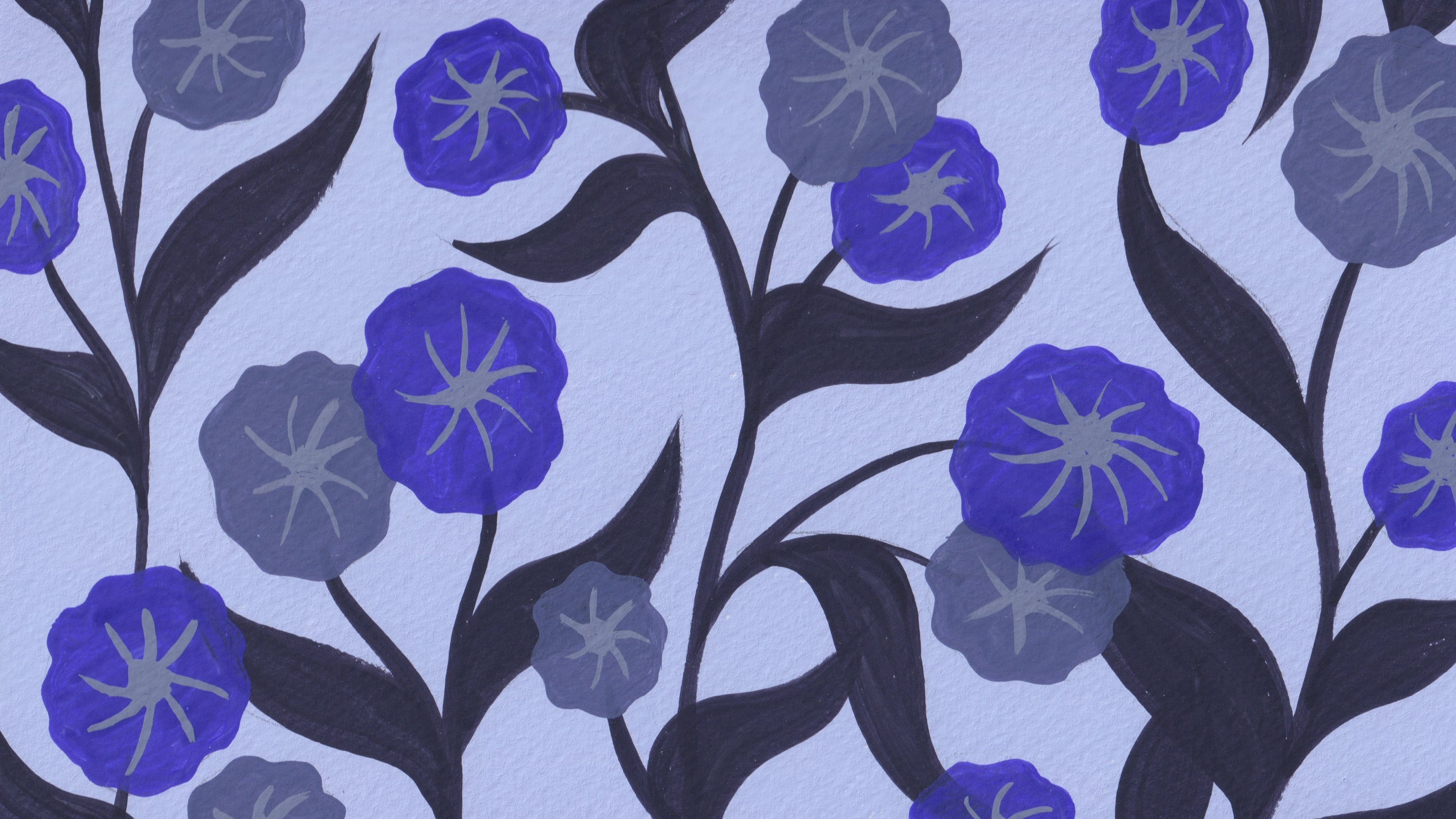
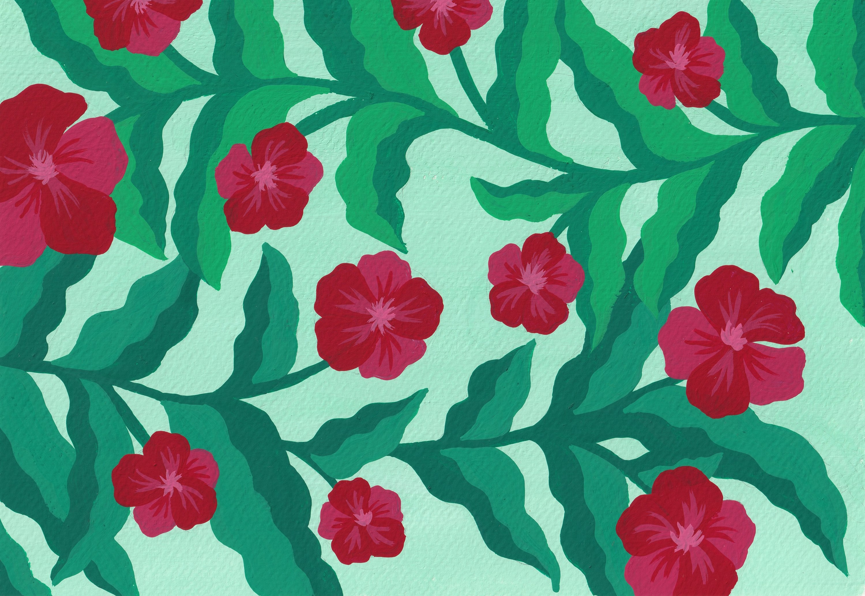
floral patterns using each color scheme. The color schemes I covered in this series are monochromatic, analogous, complimentary,
split complimentary, triadic, square, and rectangle. In my last class, we took a look at the monochromatic
color scheme. Today, we're going to talk about the analogous Cali scheme. We will learn how it works, how to put together an
analogous color palette, and we will use that
color palette to paint floor pattern in gouache. So without further ado,
let's get started.
2. Supplies & Resources: We will need the
following supplies when taking this class. Gouache paints, paint brushes, watercolor paper in A
four or a five size, a pink palette, a
water container, and drying cloth
or paper towels. I have mentioned this
in my last class that acrylic or acrylic gouache
also works for this class. Watercolor, on the other
hand is probably not a good fit only
because the methods I used to mix paints don't
apply to watercolor. But if you know how to
use watercolor and you manage to put together an analogous color
palette in that way, feel free to go ahead. I have created this
infographic with all the possible combinations
of analogous calls. You can use it as a
reference when you put together your
analogous color palette. I will talk more about it
in Lesson three when we do a deep dive into the
analogous Callie scheme. You will find the link to the infographic under this case. I have also created this Pintressbard of images
I have taken over the years. They are part of my
inspiration library showing plants that I find
beautiful and interesting. I do encourage you to
take your own pictures and use them for your flower
painting in this class. But if you don't have
anything at hand, feel free to use my
images as a reference. You will find a link to the Printressbard
under this class. In the next lesson, let's talk about the analogous
color scheme.
3. What is Analogous Color Scheme: Alright, let's talk about
the analogous color scheme. By looking at the
word analogous, you may guess it's
probably about colors that are
similar and exactly. The analogous color
scheme is formed by three color families that are right next to each other
on the color wheel. Let me break this
down a little bit. The term color family
means a group of colors that all have the
same hue on the color wheel. What this hue, can you remember? A hue is a pure color without adding black
or white pigment. When we add white,
black or gray to a hue, we have a tint, a shade, and a tone of that color. So when we say a color family, we are referring to a hue with its tints,
tours and shades. This sounds very similar to the monochromatic color scheme
we talked about last time. In our last class, we
picked a base color on the color wheel and
then created tins, turns, and shades of that color to put together a
monochromatic color palette. This is exactly the so called color family we're
talking about here. Now, back to the
analogous color scheme. It's created by
three color families that are right next to each
other on the color wheel. Let's bring up a color
wheel and take a look. On this color wheel, you can see the colors are
arranged in families. The hues are in the center, including all the primary, secondary, and tertiary colors. Adding white to these
hues, we have tins. Adding gray, we have turns, and adding black,
we have shades. We don't have all the tins, tones and shades on
this color wheel, but I believe you get the idea. So each big slice of colors on this color wheel
represents a color family. Now let's try to find an analogous color combination
on this color wheel. If we pick the red color family, what are the two
neighboring color families? That's right. The red
purple color family and the red orange color family. So these three color families together form an
analogous color scheme. By using the same method, we can locate all the other analogous color combinations
on the color wheel. This is what the
infographic is all about. You can use it as a guide when putting together an
analogous color palette. You can find analogous colors
quite often in nature. If you take a closer look at the images in my printers board, you may identify some
analogous colors right away. They are quite pleasant and
comfortable to look at. Analogous color palette offers
vibrant color variations, but at the same time,
creates a unifying feel. So these are some
of the qualities of the analogous color scheme. If you want to learn more about the color terms I've
used in this lesson, including hues, tins, turns, and shades, feel free to refer to my color wheel
class on Skillshare. I'll put the link to
it under this class.
4. Preparing an Analogous Color Palette: In this lesson, we
will put together an analogous color
palette for our painting. There are two things we
need to do beforehand. First, is just like last time, I would like you to put
all the paints you have on the table and arrange
them around the color wheel. Then bring up the infographic and compare it to
the paints you have. It helps you identify which analogous color
combination you could use for your painting based
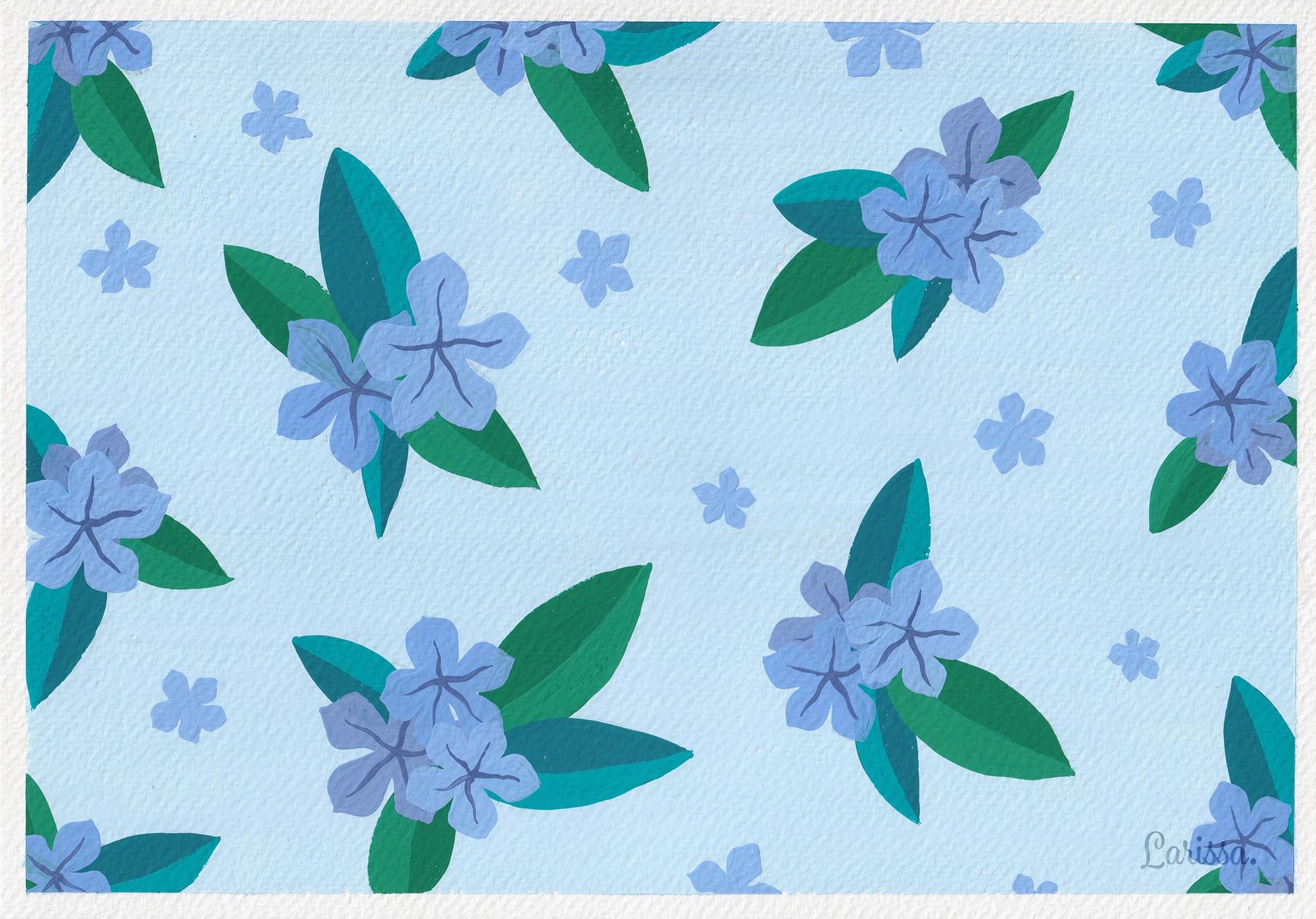
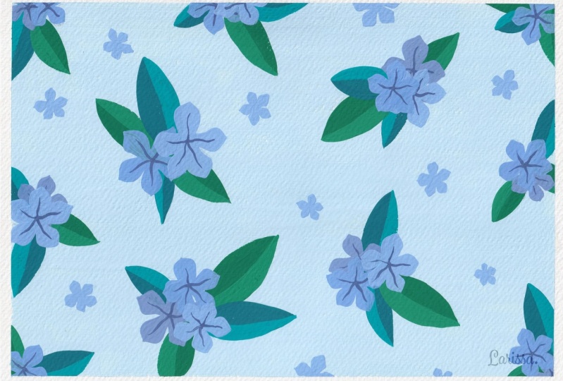
on your pigment collection. I decided to use this green turquoise
and blue combination for my painting since I have quite a few paints
within this color range. And before we move any further, I would like to remind you of the general rules when
preparing your alla palette. Try to limit your calapalt
to about eight calories, because we tend
to get distracted if we are given too
many calor choices. A limited color palette actually helps us stay
focused on our work. Ideally, your
palette should have some saturated colors,
some muted colors, some bright colors, and some
dark colors to make sure your work is visually balanced and there is
enough contrast in it. That's why we need to
create tins, turns, and shades for the hues, so we have enough color
variations for our palette. As I was saying, I decided
to use this green, turquoise and blue
combination for my painting, and these three colors will be the base colors for
my analogous palette. I will mix these paints to
get the three base colors. It's just personal preference. I don't normally use paints
straight out of the tube. I always mix paints together
to create a new color. And since we have three
different colors here, I would like to bring
in the warm and cool colors elements
to my palette. Normally, green, turquoise, and blue are considered cool colors. But as I explained in my warm colors and
cool colors class, the warmth and coolness of a color is not fixed.
It's relative. So a green color can be a warm green or a cool green depending on the
colors around it. That's why I added
this light orange to the green color to make it a bit warmer so my color palette can
look more interesting. With the three base
colors created, I can now play with their
tins, tones and shades. And let me quickly show you the reference image
I will use for my painting so that my color choices here will
make more sense to you. Obviously, I will
turn the blue color to a very light blue
to paint the flowers, and I will use the green and turquoise colors for the leaves. With the green and
turquoise colors, I added white and gray to them both to create these
color variations. With the blue color, because the flowers are
grouped together, in order to tell them
apart in my painting, I decided to add three
different shades of red to the blue just a little bit to create three different
shades of blue. And, of course, I added
a lot of white to make the blue colors a lot lighter to reflect the
real color of the flowers. I also made a dark shade of the blue for the center
part of the flowers, and that's how I put together
my analogous color palette. Now it's your turn to prepare your analogous
color palette. Remember to lay all your paints out so you know what
colors you have. Then bring up my
infographic and pick one of the analogous color combinations according to the
paints you have. And the three colors in that combination will be the base colors
for your palette. After that, you can
play with the tins, tones and shades of
the base colors. Also, think about the
temperature of your palette. It can be a warm
colour palette or a cool color palette
or a mixture of both. And more importantly, try to limit your palette
to about eight colors. Have fun mixing paints. I'll see you in the next
lesson when you're ready.
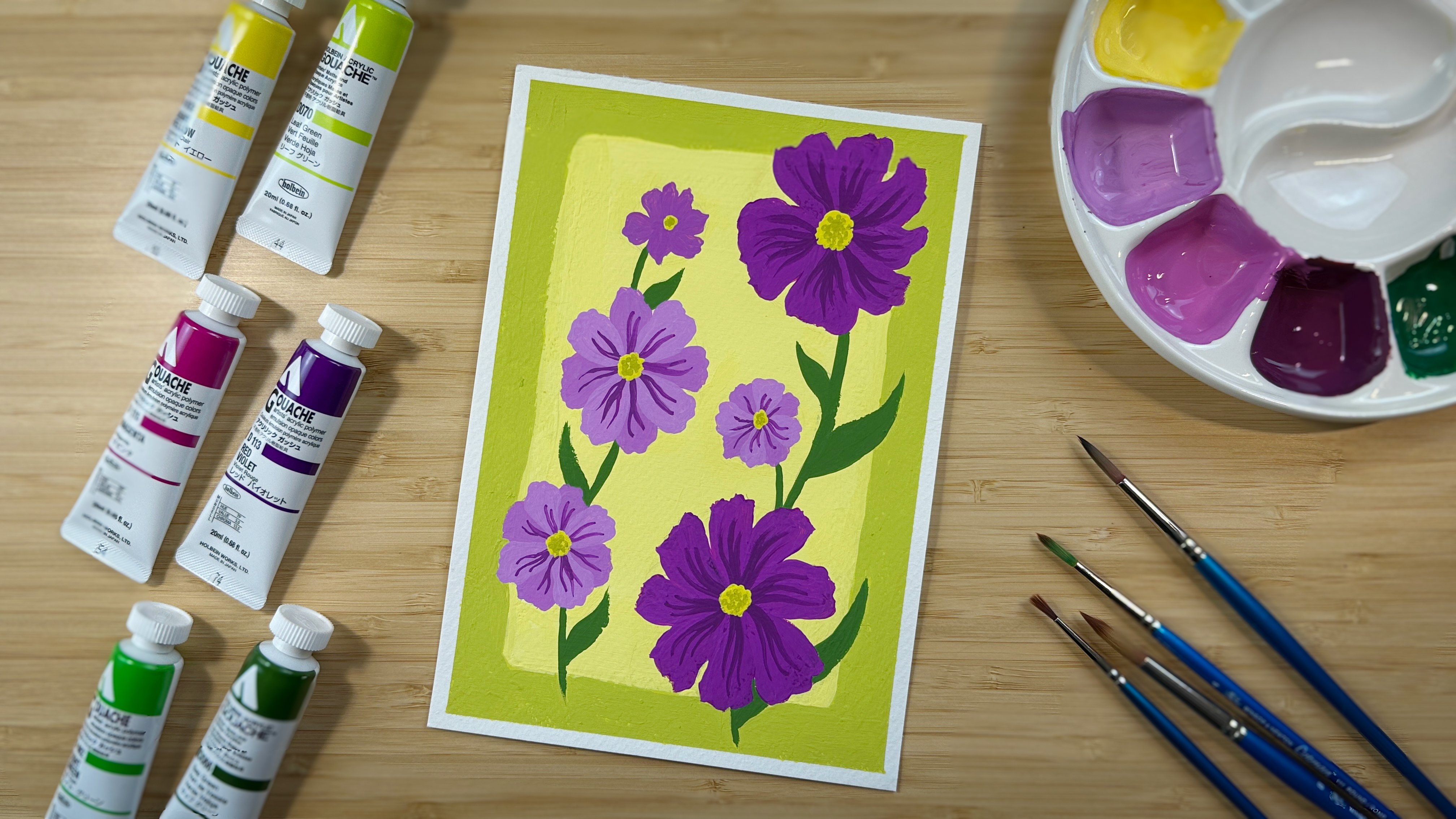
5. Painting a Floral Pattern in Analogous Colors: Now, it's time for us to paint this floal pattern
using analogous colors. Again, I'll use
this picture that I took as a reference
for my painting. You can find it in the printers board that I showed you earlier, and I will use the
colour palette I prepared in the last
lesson for the painting. So that's it for this class. I hope you will have
fun painting and artwork using analogous Kalis. And don't forget to
share your work in the project gallery so I
can give you some feedback. I can't wait to
see it. Thank you, and I'll see you
in the next class.
 Larissa Yeung Fung, Art Educator | Illustrator | Surface Designer