Transcripts
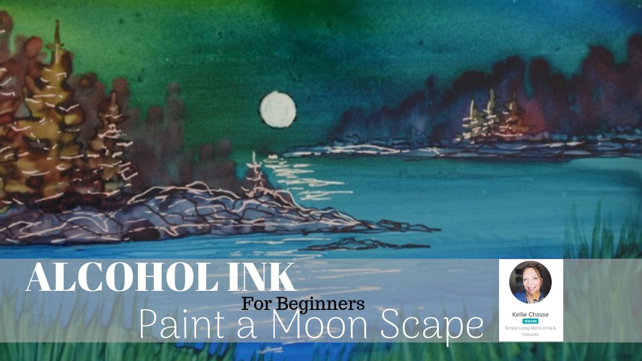
1. Alcohol Ink Seascape Introduction: Hi there Kelly. Here today I want to show
you how to create stunning, colorful alcohol ink, seascape. I'm Kelly chassis. I
am a full-time artist. I started with alcohol inks in 2012 and I was looking
for something that would that real vibrant
look to it because I wanted to be able to have it
move more like watercolors. In my biggest thing was I couldn't figure out
what to use them on. I was trying different
types of substrates with alcohol inks and it
took me awhile to figure out what they worked on. If you are just
learning alcohol inks, this is like perfect
beginner class for you. It's a seascape. A beautiful seascape
is super easy, and this is under 20 minutes. So I'm going to cover the materials in the
course with you. But if you don't
have any art panels, which is what I'll
be working on today. You can use the pulp paper, you can use tiles, you can use any basic
non porous surface if you're new to alcohol inks, there's also an alcohol ink community that I'm part of them, one of the moderators and I've been there ever
since the very beginning. And there's also a free
guide that they give away that really covers everything needs to
know about alcoholics. So if you're ready,
let's get started.
2. Your Seascape Project : So for your project, we are going to be
completing in this course, seascape in a very
short period of time. And I would love to
see your projects, so feel free to
post them in here. And if you want some feedback, I'd be happy to offer
that to you as well. The biggest challenge will be the dry time when you're
working with alcohol inks, I will be using the
art panels again, you can use U-boat paper
or so other substrate, a tile, something
to that effect. And because we'll be doing a
very wet and wet background, the next step is going
to be to add trees. And to do that, you will want your background completely
dry before putting in the dark trees over the top of that beautiful
background that you poured. My recommendation is especially if you're brand new
to alcohol inks, watch this entire project
all the way through from the beginning to
the end before you actually start on your project. And that way you'll have
a better understanding of when is my ink dry enough? When can I begin
to paint my trees without losing a
lot of the shape, they'll tend to bloom
on you if it's too wet. And we're going to talk a
little bit more about dry time. And we'll be going over
how to paint your trees in a quick separate
practice session. So if you've never posted
a project before it, let's just show you how
to do that real quick. All you have to do is go to your main page here and it
shows projects and resources. And it has a little green
button down here on the right-hand side that
says Create, Project. Click that green button. It will take you
to a cover image so you can upload
your image here from your computer or
from your iPhone or your phone or desktop. Then you want to
just go ahead and put your project title in here. So alcohol ink, seascape. Seascape by your name Kelly, you can put your last name
in there if you want to. And then down below that, it's got a little
description box basically. So here you can put
in and you know, if you use special
types of paints, if you use different pens, if you use different
inks and what I use are different substrates. And then below that, it's got a little section here, a box that you want
to make sure it's unchecked will make
the project private. If you want me to be
able to see it, you want other students to be able
to see it makes sure that box is not checked unless you do not want
others to see it, then check that box. And then down below,
in the bottom here, you can add any skill tags
such as alcohol, ink, alcohol painting, seascape
painting, kelly chassis. If you're going to
go back and search for the project under my name. So any type of
tags that you feel would work with your painting, abstract art, what have you? And then once you're done that, then head back up to
the top right and click that green Publish button. And then you will find
your project and all of your information listed
underneath on the page. And I do want you to know that I really enjoy taking
a look at what you've done and I look at each one
of those projects that you post and I always try
to give a comment.
3. Alcohol Ink Seascape Materials : Hi there Kelly. Here today I want to
show you how to create stunning colorful
alcohol ink seascape. So first of all,
let's take a look at what we need for supplies. You need alcohol inks. I'm gonna be using the
T-Rex starter kit. It's the 12th P Started kit. And these colors are in there. It's Bellini orange, dragon
fruit pink, and glacier blue. I also have some arranger
alcohol ink blending solution that's
going to help keep the inks a little
bit wet longer, give me a little bit more time
before they start to dry. Then instead of pupil paper, I'm gonna be using masterpieces, alcohol ink, art panels, and a size five by eight. And these come in
a set of three. And you can actually work
on both sides of these. I have a flat wash brush, just a small one. Something to help you
move the ink Salon. This one has a nice edge to it so it makes it a little
easier to work with. And since we're working
with alcohol inks, I just use some nylon brushes or some synthetic brushes
that aren't too expensive. This one's made by SNR and
it comes in a little kit. I also have some 91%
isopropyl alcohol. And I liked this little
container because I can just pop it open and
push on the top of it. Just get a little
bit of alcohol and then we'll kinda sit in
this little tray here. So it's great for
cleaning your brushes or for lightening some of your ink if you
need it to lighten. And that way it just
sits on the top. You use what you need or
clean your brush and then close that up and it won't evaporate while
it's sitting there. And this actually is a container that they use for
nail polish remover usually works great. Then the last two
things you'll need is some black T-Rex ink space black and also a very
small detail brush. Something like no size one
or a 0 works really well. Again, use something
that's fairly inexpensive. You can just add the ink
directly to the brush. We start to do the details, but what I like to do is
get myself a pallet or these disposable egg crate work. A wonderful Where are we
pouring some of that ink in there and letting it dry and
thick and just a little bit. So when we go to
add the details, it won't be quite as wet
because that's what's going to make your alcohol
inks bloom and you can see that tree on the right
hand side, that one blooms. So when it's dry or it's not going to bloom quite as much. So we'll talk about
that a little bit. So let's get started.
4. Bloom control with inks: Alright, Before we begin, I wanted to practice a
little bit with you. These alcohol inks are
one of those things it's interesting to work with
because the dryer it is, the less anxious
you're going to move. So we want to test the
waters a little bit. So you have just a
couple of colors of ink. So I'm going to use a yellow so it's nice and bright
and you can see it. I'm also going to
use the space black. This is what we're going
to use for our trees. It's a great way
to practice before you actually do your project. I've also got some alcohol here and I've got some
blending solutions. So we're going to try both
of these app as well. Can I have a crate? This is what we're going
to pour inks into. And I'm gonna do
that right now to start putting a few drops
of that black in here. Now you can see that
the black is very wet. And as you let that sit
and dry a little bit, it's going to become thicker. What happens is the alcohol
in their dissipates, which just leaves
you with the dye, will let this sit just
like with watercolors, but let that sit for a
long period of time. It's going to dry right out. Now with inks, that
dry time is a lot quicker than dry time
using watercolors. So as you can see, as
I move this around, it's already
beginning to thicken. The alcohol is already
beginning to dissipate, and that's going to get
thicker and thicker. Depending on where you
are in the countries. This could be quicker
or it could be slower. So you have to look at your environment and see what your environment is
going to do with inks. It's only been a short
period of time since we've been talking
and you can see us getting thicker and thicker. As I move that around
to the outside. That is going to dr and quicker is gonna get a little bit more air in there. So I'm going to let
that sit aside. And I'm using narrow papers. Remember if you don't have
the masterpiece art panels, this is a narrow paper. This is actually from my
alcohol ink art journal, which is part of the
alcohol ink Art Society. They did a little special
name with now our paper, and this was a little
booklet that they offered. So I want to show you here
I've got my little brush. Let's pull the Inca side
and as you can see, it's still wet, still moving. As I test that, there's no inks down there. So this is, I can make
some nice fine lines. It's not going anywhere. I can go very, very skinny. I can push down, go thick. I'm using a very small brush. This is the number one rigor. Alright, let's do the
same thing. Again. This is still drawing
as I'm doing this. Let's put a little
yellow down here, a little Bellini orange. And I'm just going to take my finger and just
slightly move that around. That's still wet. I'm going to take this black
that is wet and I'm going to rob it in here and see, oh, I'm trying to paint a tree, It's not going to happen. You see how the ink in that black color just move
throughout that whole area. Completely different
than it did over here. Again, this is on dry. This is on wet. Let's
do a second one. With this ink. I'm going to spread that out
even more with my finger. I want this to be pretty dry. I'm going to let that
dry a little bit. What I'm gonna do is I'm going
to take that puddle again. It's still wet in there. Welcome to the outside.
This is already starting to dry a
little bit more. Let's go right into the middle, get the big soppy wetness. But a drop-down here. Again, you can see
that is just bursting. Look at that. This is really wet. So let me draw that
brush off a little bit and take up most
of the pigment. When it come down onto the
side where this is more dry. I'm going to test that
same same amount in here. A little look at that. So you can see now it's
still moving a little bit, but it's nowhere
near the balloon that I get with this one. Let's air dries a
little bit more. This ink is now starting
to dry a little bit more. Again, this is real time so
you can see the difference. Let's try it again. Now look at the difference
between this one, this one, and this one. Again, it's not
moving a whole lot. If I'm trying to
do my little tree, I can still see you ever, it's blooming a little bit. But that is pretty good. It's really starting to dry. If I dip into the middle
of this where it's really wet again and try
to make my tree. So again, now this
might be dried, the yellow underneath or
the orange underneath, but this is still quite wet. So that's still going to, still going to move in bloom
a little bit more. So this has a little
bit of blooming. You can see that it's not
a real sharp, sharp line. This is getting a little sharper
over here. Look at that. This is really dry over here. Little wetter down here. See that's what I want
when I'm doing my trees. I want that to be that dry. And you see the difference
between this one and this one. So let's just put
another one right in here because this
should be nice and dry. Now, you can see that
line is not moving, it's not getting
this little bloom, so to speak on the
outside of it. Then if I want to paint my
little trees in here now, again, this isn't really wet. I'm using just a little bit of that wet ink and is pushing
it up onto the side, drying it out a little bit
on the side area here. You can see that I'm getting perfect
little lines in here. There's no none of this blooming timing is everything when you're
working with alcoholics. So you can see with
our first one that we did just bloomed out everywhere. It's out of control. This was pretty
easy because even going with wet ink
onto regular paper, it's got nothing
really there to bloom on because you're only
dealing with one color. But as soon as you put
alcohol ink down and try to place it on top of it, you can see there is
a big difference. Alright, so this is now
almost dry in here. It's getting thicker
and thicker. And if I let that
sit for even longer, that is going to dry rate out. So let's go into this one. This is taking my brush, what I had on there. I'm just going to let that swirl around and I'm
going to let that dry.
5. Blending solution vs Isopropyl Alcohol : Let's go into this one. This is taking my brush
what I had on there. I'm just going to let
that swirl around. Then we'll let that dry. Okay, so I'm back. This is pretty dry on here. You can see they're not
getting much of anything. Because I moved my brush around. It's pretty sticky. Nothing's happening. I'm not getting much
on my brush at all. Okay? Now I can add some blending solution
to that to reactivate. So again, this is like
watercolors and the fact that if you add water
to watercolors, they're going to reactivate. If I add blending
solution to alcohol inks, just a drop in there. You can see that that is
again reactivating it. So once again, I can reactivate. It may be a little bit lighter. The lending solution that you
use, depending on how much, just like the amount of water that you use with watercolor, it's going to thin
that pigment out. Same thing happens with
your alcohol inks. You can thin that out and get
a really nice light gray. So we just take
what's on my brush here and we're blending
solution to that. Wipe off most of
my black because black is a very
strong color anyway. Mix up some of that
blending solution with my alcohol inks. Be careful because
it does flatter. The nice thing
about narrow paper, you can wipe off the
inks and you saw that I almost wiped most of that off. So this is gonna be
much lighter now. I can get a nice light
gray making a little tree. We're also practicing
trees on this as well as practicing dried time. So again, very light. This is going to
sit like this for a little while because I
blending solution is going to keep that a wet for a
longer period of time. And we're gonna do
that same thing. Get a little bit of this. But it didn't here. This is really nice and
thick over here now. Very dry again, perfect
time to create your trees. That is like you
can almost write. With that. Now, I'm going to use some
of that black and this one. But this time instead
of blending solution, I'm going to use a
little bit of alcohol. Let's just pour a
little bit in here. I don't want too much. Again, it's going to be similar
to the blending solution. The more alcohol
you put in there, the lighter your alcohol
ink color is going to be again, wipe off my brush. Let's make some of that in here. So this is the alcohol. And it's going to do basically
a very similar look to it. I've got a lot of
alcohol on here. So the alcohol is
going to normally dry a little bit faster
than the blending solution. Blending solution, we'll keep
it wet a little bit longer. So if you're working with a wet and wet background
and you want to make sure that it stays wet
for a longer period of time. That's when you would use
your blending solution. So we're going to let that dry. Now, the big difference with the blending solution
and alcohol, you will find that as you
tip your paper and tilt your paper sometimes
depending on what kind of paper you're using, you will get a little
bit more sheen and your alcohol ink
so it will be shiny or on your paper with the blending solution
that with the inks, with a budding solution, if you use alcohol base
with your alcohol inks, tends to be a little
bit more dollar, more dull, dull or a word more adult, I'm
going to say more dull. So you can see the
two are in here. They're both again,
just sitting there kind of weight buying their
time, drying out. Again, the alcohol base is going to dry a
little bit quicker. And this is going to be, It's almost more syrupy. It's a little thicker. It's the best way
to describe it. A little bit similar to using
glycerin with watercolors. If you've ever worked
with watercolor, I know I keep mirroring the two are trying to talk about. Both of them are
the differences. If you've your watercolors
and you've used watercolors, you probably know a little bit what I'm trying
to describe here. If you've not tried watercolors
or alcoholic drinks, then I'd advise you to go
ahead and check out some of the watercolor classes
because we talked about a few of those
things in watercolors. I will show you here. Let's use a little
bit of this thick black and this is quite
thick and starts to how when you starts to dry and get some dry skips in here. A little alcohol to
that. Look at that. I can take alcohol and
just blend all of that. Again, reactivating all of that. So first things to do is to test your alcohol inks out on your particular substrate
that you're using. Practice this, see
what it's gonna do. Get a feel for how long
it's going to take for your particular inks to dry.
6. Seamless wet in wet background: Alright, so we have practiced a little
bit of the dry time, and now I want to show you how to get that real seamless
looking background. So we're just going to try
two different colors here. This is a glacier blue
dragon fruit, fruit pink. And again, it doesn't have
to be these particular inks. It doesn't have to be
this particular colors. Use what you have. Because of lose a little
bit darker than the pink. I'm going to start
with that pink first. So obviously these
two colors together, pink and the blue, are going to make a nice shade
of purple in the middle. So you want to keep that in mind when you're mixing your colors. You really want to
have your lighter shades in the center. If you want to do
some trees that are really going to
pop and stand out, and maybe some darker areas
on the top and the bottom. But for this purpose, we're
going to use three in the demo that I do over this one we're just going to use to
just see it again. You can see how the
colors are going to mix. So I'm going to start with
a little bit of pink. This time I'm not going to
use any blending solution. And a little bit of blue, you have to be careful some of the inks have a bigger
hole on the top, so I'm going to pour
out a little faster. So know your bottles that
you're using, that helps. So the two of these, again, you can see how they're drying very fast or not doing
a lot of mixing. So let's get them
to mix together. So you might have to take
your finger a little bit, bring it down the middle. I can see I can mix that nice, All those two colors together, getting a nice shade of purple. I don't want to mix too much. I just want to mix
it a little bit. I can bring it down
a little bit lower. You can see where
this is going to drag across because again, it's on dry paper, right? So if I add a little
blending solution to this, Let's do it here and
we'll do it here. You can see what it does here. It's going to, you're
going to lose some of that when we want to make
some of those together. So this is tricky. It's not as easy as it
might look. Initially. I'm just going to saphenous
little bit back and forth. And you can see
where I'm getting lots of blobs, lot of blotches. So I'm just gonna
take my finger. I've got my purple now. Lost all those two colors. While this is wet though, I'm going to go back
in with the pink. And then you can see that
that's nice and blended now, rocking it back and forth. Now we can add a little
bit of this blue. I'm going to rock
back and forth. You can see how that's
nice and smooth. Now, again, if I touch
these together just really carefully
because I don't want to blend all of those colors. Watching my fingers on the side, you can see where if
you touch it with your glove and just
rocking it back-and-forth, letting the inks move in,
blend more naturally. Now if I have a
third color in here, this is going to
be even trickier. Began rocking it back and forth. Well again, it's wet and coming down the line of blue here. Continue to rock
it back and forth. I'm going to mix
some of those colors together as I'm doing that. Again, this is why
we wear gloves. Taking my finger
and if I need to just spreading some
of that ink out, again, letting it
rock back and forth. I want to make sure I cover up these areas on the side and
I'm trying not to touch that. If you have a hard
time with that, grab a board or
something to actually tape your paper or
your narrow paper. We're substrate you're using down and then you don't
have to worry about that. Because as you rock it back and forth of it's on the paper, you won't get your
little fingerprints on their bring that over. So you can see. And I might want to add a little bit more
pink here again, going into that
blue a little bit, because it's going to
blend a little bit. And I can take my
finger before it dries. Come up here and
soften some of that. I'm going to take
these off here. I'm going to use this
little cardboard that I have here as a way to
move that back and forth. I don't have to touch
the edges here. Let's take some practice. And I do want to show you
as this starts to dry, you're going to lose
some of that movement. If you continue to work
at back-and-forth, see how my fingers coming
through here and it's actually creating a little bit
of texture in there. So you don't get that smooth, seamless look that way. So the trick is to
pour your colors in rock back and forth and just set it down and
let it do its thing. So again, we have
some pretty colors and I'm only using
two colors here. So when you start to use three, it's a little bit trickier. And again, you want
to try to keep them. A separate, as you
can see, you've got those three different
variations in your colors. Can, if you don't want that, you want just two colors you
like the blue and the pink, which make that lovely purple. There's nothing wrong with that. You can see I've got
this everywhere. So it's important again
to make sure that whatever you're using
for your cable, that it's something that's
going to clean off. You also want to make sure
you have good ventilation. We talked about that
before with alcohol inks. I've got my window open here. As I'm doing this. If I'm in an enclosed
area and I'm not getting a good grasp razor fan that
I'm going to use my mask. Okay, so you can see I've got some little textures in here. This tends to happen a
little bit more with Yuko paper and paper. Any kind of Lint
that you got from your paper might show up. And you can see how
shiny that is with a blending solution,
it's super shiny. So we had talked about dry time. So I'm going to add, this is my black ink. This is all completely dry now, all of it that we practiced, I'm going to reactivate
a little bit of that, a little bit of
blending solution is a great time while you're
practicing your backgrounds. Again, this background
is still pretty wet and test it out. What's that Black going to do? Doing pretty good. It looks more that
sheen is in there and it's drier than I
thought it was. So again, this is
always that test. You can see it does is
blooming a little bit here and get a little
bit more black. And I'm making my little trees. So you can see how that
bloomed right there. Again, it's quite wet. So I might wait. So you can see I drag
that across there. I actually pulling some
of that paint off. Wait a little bit more. I'll see it over here and see if that's
going to dry or not. We'll move around a lot. So you can see that
I'm making my trees, I'm just using this little
tapping motion that to left tap to the right
doesn't have to be perfect. A little, maybe
wider at the bottom. You can have a
little skinny one. Maybe he's a little
straggler and doesn't have a lot of branches, but doesn't have any branches
on the bottom is just at the top and it could be crooked. You can layer them. A couple of different
variations of height. You'll see I keep
dipping into my black. Again, testing that out
so I can see this one has got a little star
on the top of here. What I can do is go up a little taller as that starts to dry. Now I don't have all those
little balloons in there. I can fix that, go
right up over it, give myself some more
branches out here. Then that just becomes more or less the
background of that tree. Then I can add a couple more
in here, but I want to, you can see as I'm
making those trees is just a really quick
squiggly motion. Not a whole lot of
perfection to these. Don't make mistake here. I just go up a little
taller branches to think, don't worry about it. There's no right or
wrong with trees. All my classes like
what I have to reason, I say that the messy or
sometimes the better. If you make a tree that's
bringing it stick little, stick down, and then you try to make it perfect like this. I'm going to have
those kinds of trees. But you can see how these look
a little bit more natural. Just tapping it to the left. To the right. You make a tree like this. You can always go back over, mess it up a little bit. It's those perfect trees that just most trees are not perfect. We tried to pick out a
tree for the holidays. You can take you a long time if you're one
of those people that look for that perfect tree. Okay, So you can just
kinda tuck it in there and you don't know where one
ends and the other begins. Okay, So that is how you do trees and that's just an
example of the background.
7. Textured background: Let's try a background now
with using just alcohol. Okay, So we know what it looks like with the blending solution. And blending solution
again, is very shiny and I'll show
you the difference here in the inks are going to
be shiny themselves anyway. The other thing I
want to talk about is never makes it easier
for you take your little topped off before you begin so that you can be
quick to grab them. Again. Some pink, maybe some blue here. And let's add little alcohol
to the center of this. And let's see if we can
get some of that to bloom, rocking back and forth, left to right, some
of that's going to blend in there. As you can see. If you find that colors
are mixing too much, just let that pour
off to the edge. Try to bring it back over. Take your finger if
you need to take a brush to fill some of that in. You can see the alcohol
tends to leave a little bit more of this kind of
space in the middle. You can also just use
more ink if you want to. I don't find alcohol to be as easy when it comes
to blending colors. As blending solution is, an alcohol will dry a
little bit quicker. You can see I've got
some marks in here, so I tried to get it quick
enough so that I'm not going to leave those little
marks as it starts to dry. You can see I have a
little bit mark here. A little bit of a mark here. I'm not going all the way
up on this one either. And then we've got some
excess here on the edge. You can just kinda
wipe that off and let that continue to
rock back and forth. Okay, so what you
don't want to do now is this this starts to dry. You can see I'm not
getting any movement now. The edges of that are dry. When it's really difficult
to do is try to go back in with some more color. If I go back in with this pink, you can see how
blend is going to reactivate that other ink. Sometimes it can
leave a line there. So that's what you see when
you do your background. Try to do a single pore. Unless you feel like you need a little bit more
texture in there, then you can wet the whole
thing and start over again. Or that could be where your
treeline is going to be. So you're not
concerned about it. But you can see that you have a little bit more
markings in here. It's not quite as
seamless and blended. Let's go up here,
do the same thing. We're mixing it a
little bit in here, trying to reactivate some of it. Can take your finger. Let's just go all
the way up here. Get all that blue in there. It and again in here, you can see where you're
getting that more defined area. Where it's not
blending, this is dry. This is wet to get
that line in there. This is not enough
that it's not pretty, It's just a little bit less
seamless than the other way. But if I take my finger
and drag it across here, let's see if we can
reactivate some of this kind of wedding,
the whole area. And this takes practice. It's not easy. I am getting some
texturing here now. I can see how this is wet
enough. Is it going to move? Let's see. It might be okay, but again, it's not that seamless blend. I've got a little
bit more texture. This looks like
clouds, so it's still very pretty and there's
nothing wrong with that. Just depends what
look, you're like. This one is more seamless. This one has a little bit
more texture in here. And again, practicing
that wetness. Wet is your ink because
it's going to bloom still. And if I go in here, ooh, look at that,
blooming quite a bit. This obviously is
not dry enough. You'll find that what
I do is I'll go in and test this area as I blooming and just
make a little dot. Okay, Am I ready to go? Can I, can I put a
tree in here yet? Without it blooming everywhere? And even if I do, it's okay. If you make mistake
and you feel like it's blooming too much, just put it in there. Then as that starts to dry, you'll be able to add some more details
over the top of this. So then this, this
blurry one here, this one has moved on you a lot, is going to become more
of a background tree. You can see how these are a lot blurrier than what these are. This was more dry. I'm gonna let that dry
for a second here. And then we're
gonna go back over it with a little
bit more dry ink.
8. Tree details : So it's pretty much dry and I'm going to again
show you the difference. You can see this is a
little bit shinier. This one has a little
bit more dull area where the alcohol is. Now, my black ink again
is a little bit thicker. Still got some of that
blending solution in there. But are my background
is dry now, so this is dry, this is still wet. Again. We've tested it, test it out, make sure that you've got
the right amount of dryness. And let's go ahead and
place a tree in here. Now. I'm messing tap to
left, tap to the right. And you can see I'm not
getting any movement anymore. Because how much
blurrier this one is, this is a little bit sharper. And that's when I can
go over these areas. Maybe pop in a few
more trees over those in-between so I can get a little bit more of
that sharp, sharper detail. Bring it up maybe a
little bit taller than a few more details in here. And then it lists, looks
less blurry that way. Another thing you can
do is use a alcohol, mercury, or a Sharpie,
a permanent marker. You can also use things like Micron pens,
things like that. And it's easier if
you're painting is dry because sometimes the
alcohol can actually gum up the top of your pen. Then you can bring
in my pen going, they're bringing
in a few details with your pen if you want. And it's still a
little sticky, maybe. Probably wait a
little bit longer. As I'm trying to use my sharpie. But you can see you can
get some nice fine details on the tops of your trees if
you need to with a Sharpie. Okay. That's another little handy, handy tool that you can use. Alright, so we don't
want you to do is practice some of
your backgrounds, practice your trees
a little bit. And then we're going to
start our final project. Make sure to watch it
all the way through. That'll be very helpful,
I think for you. And then dive into
your final piece. If you feel like you need
to practice some more, just grab either a tile, some UBO paper,
some narrow paper. If you have the art panels, those white bright
off so you can reuse those in practice at a couple
of times if you need to. But I like to cut my little
pieces of paper separately or four-by-four
tile works great. And you can do some practicing, wiping it off and
then doing it a few times until
you're comfortable.
9. Project: Background (Wet in Wet) Work fast : Hi there. We're going to start with
our background first. If you are brand new
to alcohol inks, you may want to watch this all
the way through to the end before you actually
start to pour your inks because they do dry very fast. So the art panels
are ready to use. You can use acrylic paints
with this mixed media, but it's mainly made
for alcohol inks. It's a little bit of a
texture to it is non porous. And the vinyl, I guess it's supposed to
extend the open time for alcohol inks and give you a little bit more time so they kinda float on the surface, the lift you can do
layers with this. So it gives a nice
luminous quality. And it is vinyl mounted on
MDF with a pH neutral glue. So the vinyl is a
moisture barriers. It's going to keep that
panel nice and flat. And as I said, it's
actually two-sided. So you could technically do two paintings and flip it
over and share another one. And these are Greeks
will fit right into a frame the way it is, as long as you feel your
alcohol inks on the top, you are good to go, but even if you don't
seal it, it's okay. Just make sure you
keep it out of direct sunlight and don't get anything alcohol
based on it because the alcohol will
react alcohol inks. Okay. So we aren't talking
about the colors. I'm going to use the
Bellini orange first. Then I'm going to
add a little bit of the dragon fruit,
pink beside it. And then we're going
to add the glacier blue on top of that. So those two together
will mix and make a really pretty purple shade. The alcohol inks have
a nice tip to it. So I actually just touched
that tip rate to the panel, just give it a nice
squirt across the top. Then I'm going to
add a little bit of that blending
solution to help my, help my alcohol ink stay
wet a little bit longer. While I blend some
of these together. You just pick it up and do a little bit of rocking motion. You can see it's nice and wet. It's moving across to
you really nicely. You do want to make
sure that you, I'm bringing your inks all
the way out to the edges. So if you need to use your
brush just to fill that in a little bit to make sure that you've got it all
the way to the edge. That will be very helpful
because it's really hard to get that seamless look when you go back in
with alcohol inks, you can see I have a
little bit of excess here. I'm just dabbing some of it off because I'm gonna be
putting my pink in there. I don't want to turn all orange because
that pink is going to blend right in there
if there's too much. So we're going to
add a little bit of that dragon fruit, pink, right up above the top of
the yellow or the orange, blending orange and across
the bottom, I call a yellow. I mean, it's kind of an orangey yellow almost
like a cad yellow. Again, just touching
that tip rate to it, I have a little bit of
a whitespace there, but watch when we tilt this
up and move that around, some of that's going to blend. So I'm tilting to the left
and tilting to the right. And it's I don't want
this to go up or down. I just want them to
go from side to side. Look at that, how that just beautifully blends
together in there. You don't want to overdo
it too much because, because then you'll have
everything all blended together and it will just
be a real vibrant orange. So you want to keep
those somewhat separate. Again, just make sure you
bring all of your inks to the edge of your art panel. Now we're going to add the
glacier blue to the top. I'm starting with a thin
line here because I'm not quite sure how much
that's going to move. I do not have any
blending solution on this portion of it. So I'm going to use my brush just to move that
around a little bit. I'm trying to see what color I'm going to get when
I mix those two. You can bring that blue all
the way down to the bottom. You can see that that's
going to dry a lot faster because I have no blending
solution in there. And I may have to
go back and add a little bit more blue
or pink to this. We'll see how this goes. So I've got a little bit
of a whitespace here, see if we can fill
that in again, because it's alcohol
ink is going to derive very, very fast. I'm gonna go just kiss that little line right
where they meet. I'm going to tip this
and see what we get. So you can see a lovely
shade of purple at that makes tilt it back and forth. It's already starting to
dry down on the bottom. So I'm pretty sure
I'm gonna have to add a little bit more to that. Again, while this is all what we wanna do
this while this is wet or else it will start to
leave these little marks. It's already doing
it a little bit in the blue here where
that's dried. I'm going to let this run
a little bit this way, tilt it back the other way. I'm going to have
to add a little bit more ink to this because I can see it's drying
up near the bottom. And I want this more seamless. You can see it is by holding
down some of that purple is going to come down into
that lighter area. So let's go ahead and add a
little bit of pink up here, get a little bit
more purple in here. Like the purples and the
orange and the yellows. Such a pretty sunset color. And a little more blue while
again, while it's all wet. And I think that's
gonna do I think we're going to have enough
ink there this time. Take your finger and
just drag it across if you need to or your brush. You just want to make sure you
get that all the way over. Do you see a little problem
with this little spot here where that blue came down? So I'm going to tilt
it and see if I can get some of that ink to move. If I can't, we'll just
hide that with a tree. You don't want to go back in and touch it because if you do, it's going to balloon even more. So you're better off if you've got a little spot
that you don't like, just hide it with
something else, a tree, a bird,
something like that. Try and see if I can get it
to move a little bit further, but that is pretty much
dry on the bottom there. So we're going to have to
just go with the situation. So do have a couple
of little spots of white I see on the side here. So let's just take the
brush and see if we can move that over just
really carefully again, I don't want to make too much
of a movement over here. A little bit of alcohol on here. Wipe that blue off and see if I can take care of that one little spot there
where the yellow is, air we go touching it
very, very lightly. Look at that. Isn't that beautiful? It
kinda does its own thing. You don't even have to work. It's just a matter
of tilting that left and right as gorgeous
in through here. It looks like it's real
sunset, doesn't it? So if I take my brush and I just barely touch that
and try to move that off. I can clean it off a
little bit and lighten it. So I think that
adding a tree here, if I go right down the center, almost right below it, maybe we can put a tree in there and that's going to
cover that little spot up. I'm just taking my brush,
just going to draw a line across here a
little bit, wipe it off. That's going to be, I think where my horizon
line is going to be. And then we're going to add
our trees up on the top of this and some rocks
may be down below.
10. Project: Alcohol Ink Seascape Final Steps : Alright, so this is
dried a little bit. I've got a smaller brush
now like a size one. And I have my space black. I just want to show
you how tiny that is. If you have a smaller
brush, even better, you'll get at something
even more fine lines. So I'm gonna take that black and I just want to
show you what it's gonna do in that ink is
really, really wet. If I touch this and this is
not completely dry back here. Boom, Do you see that
bloom that, that creates? So let's kinda a good thing when we're doing a background, because I can add
more trees on top. So you can see down here
it's a little bit more dry. On the top there
it really bloomed. We use the purple
and the blue last, so that is still drawing
a little bit more. Orange is really dry, so you can see down below, it's not blooming out
like it was at the top. So let's go ahead and put
another tree down in here. And I'm just tapping it back
and forth left and right. And because that area is dry, the most part, it's
staying right in place. But I kinda like
that blooming look. I think that's absolutely beautiful as long as
it's not too big. So I decided to get
myself a little palette. And this is a great disposable
pallets just from eggs. And you don't want
the cardboard ones. This is a plastic tray
and you can just drop a little bit of that black
inside of that tray. And if you let it sit
for a little bit, if your background is too wet, let it sit a little bit or
just pull it off to the side, air dry and a little bit. It doesn't take very
long for the ink to dry because they're
alcohol-based. So you should be able to get a little bit still looming just a tiny bit
here up on that top. So as that dries, it's going to leave
you more with a dye and the alcohol is
going to evaporate. So once the alcohol evaporates, not completely because you
don't want it completely hard because then you can't
lift it out with your brush. So it's kinda one of those
right in the middle. You have to test it. So now I can actually
paint with this. And it didn't take me very long, but I can go up into that
blue, it's dry enough. And now I can put
some more trees and without them a
blooming everywhere. It's similar to water
and watercolor. If you have too much
water with your paints, it will do the same
thing. And watercolor. This is alcohol-based and the alcohol will dry even
faster than with watercolors. You can just, again,
just air dry. I'm moving that paint from the puddle Woods is
really wet up until the sides of that
little egg container and letting it dry a little bit. So easily covered
up that little spot that I wasn't happy with. And then we're gonna
go on the other side here and we're going
to create some more. So again, I am very careful
when I first test it, making sure it's not
going to bloom too much. In this one isn't again,
it's perfect dryness, but yet still wet
enough so that it's going to move and you
can paint with it. If you're black does dry out. You can add just a touch of either blending solution
or alcohol very little, Probably not just on the
tip of your brush to reactivate some of that ink and you can continue to use it. You'll notice on
the right side here it's still bloomed a little bit that black ink was
still too wet. So not only do you
have to worry about the background being too wet, but you also have to worry about the color that
you're putting on it because they're going to reactivate double if
both of them are wet. So the black is it perfect spot right now I can actually draw
a little lines and printing the rocks on here
now with using that black and you've seen
the real-time here, how long have actually poured it into that little container? And if, if I just dip in just a little
bit into that puddle of still where it's
still wet and bring it out to the side where
it's completely dry. I've got the perfect texture of the perfect amount of alcohol. Okay. So this is one of the things, again, you have to practice. It's one of the
things that you've gotta get comfortable with. And once you do, once you get it, it's
like riding a bike. You just get right back on. I'm going to add the
rocks a little more here, bring this out a
little bit more. We'll let that sky just kind
of highlight right in there. I don't even have to fill
that in with anything. It's just like they're
wet rocks and it's reflecting those
colors in the sky. We adding a little
bit more down here. So it looks like
we've got a couple of wet rocks down
in the very front. Let's put one more tree in here. It up a little bit taller
just so it evens it out. It brings your eye
to both sides. We are painting
trees and especially these are trees at IC here
in Maine all the time. They're not perfect.
They're out on the ocean. They've lost some
branches and some limb. Some of them are really spindly. They don't all have to
be perfect little trees. So just have fun with it. You can fill it in if
you feel it's too thin, just paint a few
more trees in there, maybe some older further away, some tall and some short ones. And there are no two trees
that are just alike. That is going to be good. Maybe add a little
bit more black here, just a couple of spots. We don't want it too
bright in there. And maybe up at the top here. Some of this is shaded by
some of the trees and we have a little bit more rock up at the top or maybe grassy areas. Okay, so now all we have to do is put a couple of more
trees on this side. So because the other ones
were a little bit wet still, you can see that they lightened
up a little bit more. The ones on the left are
really nice and black. I'm going to pop in just
another one here with a few more rocks just to
bring that one forward. It looks like the other
ones are in behind. And then in the front. We could have left
that, but I'm going to put just a few rocks up here in the front as well. Again, I've just
taken that brush and just dragging it across. And the rocks almost
create themselves. Look at that. Again, just sharing or letting some of that light
pop in through here, maybe throw a couple
of little sprigs of grass that are sticking up. Then I'm going to
bring that down. And I think we are done. Quick, easy, breezy.
One more tree. I love to add more
trees afterwards. And again, just up in the front. So this one looks like it's
closer to us and it's not as blurred as the one
in the back over there.
11. Seascape Outro Thank you!: I'm so excited to see your work. Remember to post your
projects down below. I have a lot of other online
courses with alcohol ink. So if you're just starting
with alcohol ink and this project really
piqued your interest. Feel free to check out
the other classes that I have here available
on Skillshare. I hope you really enjoy
creating what alcohol inks. It is just such a fun. Once you get started with it. It's one of the things
you can use mine, so many other things
you can use jewelry, you can use it in
resin on metal. There's just so many
opportunities with this medium. Alright. See you soon. Bye.
 Kellie Chasse, Artist + Entrepreneur + Educator