Transcripts
1. Course Introduction: A lot has changed in the AI space over
the last few years. When it first came
out, most of us, myself included, saw
it as a novelty. Fast forward to
now, the AI models have evolved to
the point that it can almost replicate a human creative or at least
temporarily fool them. Almost every large
tech company has invested billions
into the AI space, and that has led to better AI models, training
and research. There is this fear that AI will take over a creative
person's job. That fear is very real,
and photographers, graphic designers
and illustrators are allowed to be a bit worried. I decided to create
an AI theory course that alleviates that fear. I spent hundreds of hours utilizing the latest
AI tools and models, and I come away very
hopeful that AI will be a wonderful complement
paired together with our own
creative skill sets. This class is a good
starting point for any creative or designer who wants to learn
about AI basics, like the behind the scenes of how multiple AI models work, like image generation
tools and chat AI models, prompt writing basics and how
to write effective prompts, learning nuanced design
terms that provide us with the right vocabulary to craft
hyper detailed imagery. We will discuss the legal
issues, too, and more. Learning to write
prompts is like learning to write all over
again as a child. We start with basic prompts that lightly describe
what we want, and eventually through practice, we're able to
properly describe in immense detail what our vision is using words we may have
never thought to use. This class can appeal to almost anyone who
has been intimidated or overwhelmed by AI and did not know where to
start learning the basics. This class is designed
specifically for creatives and designers to help guide you
through AI basics, so you can start to
think about how to utilize these amazing tools to help align yourself with the future evolutions in
the creative industry. My hope is this class
will be a springboard for future classes that will go over practical design
projects using AI. But first, we must
understand the basics behind how it works and this class
aims to do just that. I will see you in
the first lesson. My name is Lindsey Marsh, and teaching design
theory is my jam. I've been a graphic designer
for over 20 years and a design instructor to over 350,000 graphic design students. I'm excited to be able to
bring this class to you today.
2. How LLMs Work: Let's generate a red
cardinal on a branch. How did this image generator
know to show a bird? How did it know the bird was
red and was on a branch? How did it even know what
a branch looks like? This is a complex system that runs millions upon millions of precise matrix calculations to produce what seems like magic. To really get a good idea
of how this happens, we have to first understand how AI models understand
human language, to then understand how it
will generate imagery. So what is an LLM? An LLM or a large language
model is a type of artificial intelligence
trained to understand and generate
human language. Tools like chat GPT, Claude, and Google Gemini are
examples of LLMs, are large language models. I'll be using chat GPT
throughout the course, which is also one of the
most popular LLMs out there. They're called large
because they're trained on massive
amounts of text, everything from
books, articles and websites to online
conversations and more. The goal to learn how
humans communicate, our sentence structure, grammar, tone, style, and even intent. So the AI can respond
in a way that feels natural and useful. Sue, why do LLMs matter to designers like us
and other creatives? Because LLMs are more than
just writing assistants. Here's a few ways in how they can help or
design workflows. First of all, idea generation. Need a concept, a slogan
or a campaign direction. Just ask. Copywriting. LLMs can help draft
social media post, taglines, product descriptions, and more. Creative briefs. You can get help structuring or editing client facing documents. Naming generate brand
names, product names, project titles, everything
based on tone and keywords. But more than just
that, learning about how LLMs work allows us to understand the
all important tool for designers in
the next decade. The image and video
generation tools we'll be using
throughout the course. So in the course, we'll focus
on two types of AI models. The first one is the
one we just mentioned, the Large language model or LLM, and that's eventually
fed into another system, which is called the
image diffusion model. And the image diffusion
model is what helps us generate images from text. For example, it can
recognize that Apple relates to fruit without being explicitly
taught that connection. This ability to
interpret language is essential for image
generation tools, which we'll explore
throughout the course. Before an AI can create a
visual of a dog barking, it must first understand what a dog is and what
it means to bark. So the large language model learns and understands
and generates human language by
analyzing massive amounts of text and finding connection
points between them. And then it's fed
prompts into an image to fusion model which generates images guided by patterns
that learn during training. It often relies on an LLM to first understand and
interpret the text prompt, converting it into
meaningful tokens that will guide the visual
generation process. Now let's talk about
how LLMs work. Think of it like a
supercharged autocomplete that does not only
finish your sentences, but can write essays, answer questions,
design prompts, and even help with
branding and copywriting. At their core, LLMs are
probability machines. When you ask a question, they
calculate which words are most likely to come next based on everything
they've learned. For example, it's like a seasoned designer
who's so used to trends, client needs, and layouts, they can almost guess what
the client wants next, even before the client
even tells them, because they've done it over
and over and over again. The next is generating
tokens and context. So LLMs don't see
a whole sentence. They break them into little
chunks called tokens. Words, part of the words, or even punctuation matters. Even the purity at the end
is its individual token. They then look at the context, the text around it to figure out what's likely to come next. And then next, there's
several layers and processes it's run through. LLMs have millions or
even billions of neurons, mathematical units that
process language in layers. Each layer refines the
understanding of meaning, just like a creative
review process. So let's go through that
process in more detail. So let's have an example prompt. And this example is create
an image of a furry dog. So it's good to divide
each word into tokens. So create would be its
own separate token and image of a barking dog. Occasionally, it'll
divide a word. So barking could
be bark and then, and also periods count
as tokens as well. So each word or token is
given a vector point. LLMs don't understand
words the way humans do. Instead, they represent
words as vectors, which are like long lists of numbers, sometimes 12,000 long. These numbers capture the
position of a word in a massive invisible space called the embedding
space or vector space. Each word becomes a point in the space where similar words
are placed close together. In our prompt example, the word dog and barking would be close together
in this map because they were frequently
shown associated together during the
training by the data. This example uses a two D space, but AI models have
50,000 words to map out. So there's not a lot of room. So what it does is
it maps everything out in a three D vector space. This is why each token or word
is assigned a long list of numbers as these pinpoint the exact location on
a three D vector map. These columns of numbers are coordinates that
allows words to find each other and therefore develop associations and human
language with each other. Imagine a giant three D cloud, except it's actually thousands of dimensions large
in this space. Similar meanings equal
closer together. So King is close to Queen, and Paris is close to France. And designer is near other words like creative and
visual and artistic. Different meanings
are farther apart. So King is far from
Apple because King and Apple don't appear together very much in human
text and language. Light brightness is
a different area from light weight,
depending on context. This map of meaning
is built during training as the model learns
how words appear in context. LLMs don't understand
words in isolation. Instead, they consider
the tokens around them. So for example, the designer used light colors in the layout. Here, light is interpreted as brightness because of nearby
tokens, color, and layout. But the backpack is very
light and easy to carry. Now, light means
not heavy thanks to the context words
like backpack and carry. The model dynamically adjusts understanding based on context, and it does this through a
mechanism called attention. So let's talk about attention. Unlike older models that process
each word independently, attention, which is part of
a bigger transform layer, which we'll get to is
another process that is run that lets the model look at all the other words in
the sentence and ask, which of these should
I pay attention to in order to understand
what this word means? It gives the model the ability
to weigh words differently depending on their relevance to the word it's generating
or analyzing. It's like a designer reviewing an entire mood board before making a decision about
a single layout element. Because meaning often
depends on context. For example, the word bank can mean very different things. She sat by the
bank at the river. The attention function
highlights the word river. He made a deposit at the bank. Attention now highlights
the word deposit. The model uses
attention to focus on the words that clarify
which meaning is correct. And then the data
after attention, flows through lots of other
different processing layers. And a lot of these are different mathematical matrices
calculations that you're seeing all behind
the scenes that are happening millions and
millions of times. So the next thing is the
feedforward neural network. So after attention, each
token's updated vector on that little three D map I showed you now is enriched
with more context. It's passing through a
small neural network called the feedforward layer. This network applies a mathematical transformation
to the vector. It doesn't mix tokens
with each other. Each token is processed
independently here. Think of it as a refinement
step that helps distill more meaningful patterns from
the attendant information. It's polishing it up,
it's adjusting and fine tuning and enhancing
it before it's passed on. I wanted to take a
moment and pause. This is a very complicated
mathematical process with lots of layers that are processing data
over and over. You don't have to be a mathematician to
understand how they work. I just wanted to show
you a little bit of a detailed guide of how they
go through the processes, but you in no means need to memorize this or know
this front and back. It just helps us later on when we write prompts to know what's really going on
behind the scenes with how it's
processing our words. The next step is residual
connections, skip connections. This is to make sure the model doesn't forget the
original information. It uses residual connections. These are like little
shortcuts that add the original input vector back into the output
of each layer. It prevents the model
from overwriting useful information with
too many transformations. So it's kind of like
editing a design, but keeping the original version as a backup layer in Photoshop. Once again, you
don't need to know the mathematics behind all this, know that this is a very
complex process that happens and why AI sometimes
seems like magic. There's lots of checks and
balances that happen to make sure what it's coming out
with is checked and reviewed. Another layer is called
layer normalization, and this is a cleanup step. It helps stabilize
the training and keeps the data consistent
across layers. It ensures the model doesn't get too biased with extreme values. For example, it's like
adjusting levels on a photo to even out the lighting before moving on to the next edit. So we're stacking more and
more layers of processing. And transformers don't
just do this at once. They repeat this whole
process multiple times 12, 24, or even 96 times
depending on the model size. It's going to go
through the attention. It's going to go through the
feed for neural network, the residual connections,
the layer normalization, and it repeats over and over. So each layer builds a more nuanced understanding
of human language. So lower layers,
understanding structure like grammar and punctuation,
the middle layers, recognizing meaning
and relationship, and some of those
higher layers of processing that are later
on help with reasoning, planning and completing tasks. So, for example, it's
like going from sketch to refined illustration to
full brand identity. And we have a final output. After going through
all the layers, the final vector
is used to predict the next token for
text generation, token meaning word, classify something like a
sentiment or a topic, or guide image generation, like in a diffusion model,
we'll talk about next. We just scratch the surface
of how LL models work. But if you really
want to get way more technical and dive
into the mathematics, of course, not required
at all for this course. You can check out three
blue one brown on YouTube. This is how I first learned
the details of AI models, and I found him a really,
really good teacher. So we saw this complex
weave of processing. The vectors representing words pass through many layers
of data processing. Eventually, they reach a
probability matrix where the model determines which word is most likely to come out next. While the underlying
math is complex, what you really need
to understand is just how deeply layered
this process is. Each word is broken
down, analyzed, cross checked against each other through multiple internal
checks and balances. The result feels
almost magical like the machine truly understands and interprets human language. This same kind of layered
intelligence is what powers image generation as well through a process
called diffusion, which we'll explore
in the next lesson. Make sure to download
the PDF resource that goes over everything we
talked about in this lesson.
3. How Image Diffusion Works: AI Image and video generators
have wowed the Internet for the last few years
with their ability to fuse together objects, subject matters, and
challenge social norms. The negativity surrounding
these AI tools is slowly dissipating
as creatives start to realize how
critical they may be to keep up with the shifting
and changing industry. Today, we get to learn
how image generators work step by step, so we can see the magic
behind the curtain. So how do these AI image
generation tools work? So from language to images, how understanding LLMs helps
you learn diffusion models. So in the last lesson, we spent a good 12 minutes learning about LLMs and how they
process tokens. They build context,
they apply attention, and they generate predictions. So learning that,
you've already laid the foundation for understanding how diffusion models work. While LLMs generate words, diffusion models
generate images, and they rely on many of the same core ideas like
layered processing, high dimensional vector spaces, token like representations, and probability based outputs. The key connection is
prediction as a core mechanism. At the heart of both LLMs and diffusion models is a
simple yet powerful idea. Learning to predict
something based on context. I LLMs, the model
predicts the next word. In diffusion models, the model learns to predict a
cleaner version of the image step by step
from noise to clarity. Both systems refine guesses based on what they've learned
from massive datasets. One works in the language space, the other in pixel space. So step one, the training phase, it learns by destroying images. So let's take a real example
of a picture of a cat. Let's add random noise
to it little by little, over hundreds of steps. As a designer, you may find
this process familiar looking because it's the Gaussian blur and grain filters in Photoshop. Eventually, it becomes
static, like TV fuzz. The model learns how each step of noise affects the image. This is thousands
of different tiny little pixel additions
and removals. This teaches the model
how images fall apart. Step two, it learns how to
undo the noise or the grain. The model is trained to predict the clean image
from a noisy one. At each step, it guesses. If this is what the noisy
version looks like, what might the
original have been? It gets better by
comparing its guesses to real images and
adjusting its weights. So imagine a sculptor standing before a
large block of stone. At first, it's just noise, a solid chaotic mass with no recognizable form,
a big block of stone. The sculptor begins chiseling
away little by little, guided by intuition,
training, and references. Each strike removes uncertainty. Slowly, shapes begin to emerge, a curve here, a
silhouette there. Over time, the noise becomes form and form the
randomness of the block. A detailed and beautiful
statue is revealed. This is called
reverse diffusion. You start with
noise, you refine it into a coherent image
one step at a time. Step three, generation begins. It's the sampling phase. Now that it's trained
and it's done that diffusion process millions
and millions of times, we can start with pure noise, a blank canvas of static, and we can give
it a text prompt, for example, a golden retriever
puppy wearing sunglasses. Now step four,
denoising step by step. The model removes just a
little bit of noise at a time, guided by what it's learned. After each step, the
image is slightly less blurry, slightly
more detailed. The final step, the final image, and it's a unique creation. This continues for 50
to 1,000 different steps depending on how
fine tuned the model is. After enough steps, the
image becomes fully clear. You now have a photo
realistic image that never existed before, created purely from noise
and shaped by language. And the big question
on everybody's mind is what data are diffusion
models trained on? Diffusion models are trained on massive huge datasets of images, and usually they need to be paired with text descriptions, also called image text pairs. These datasets teach the model not just what things look like, but also how to interpret
text prompts into visuals. Training data often
includes an image, a photo of a dog
wearing sunglasses, a caption or description like a golden retriever wearing
sunglasses on the beach. This pairing allows the model to learn when someone says this, the image probably
looks like that. The model then looks at
image text pairs for millions and millions of images across its image
library it uses. So where does it get these millions and
millions of images? That's another
huge question that brings up a lot of
copyright issues, which we'll get into
a little bit later. But let's talk about
some of these datasets, and different models
use different datasets. So there's the Leon five B, and that's 5 billion image text pairs scraped
from the Internet. So anywhere on the Internet
grabs whatever it can. A image that has a text
description, it's go to grab it. Open Images, that's 9
million images with labels, bounding boxes, and captions. There's Coco, 330,000
labeled images with detailed captions and YF CCIOOM. It's 100,000 million flicker
images with metadata. From this training data,
the diffusion model learns how different
objects and concepts look, what styles, is it a cartoon? Is it realistic or
visually represented, how language maps to visual elements like
furry, glowing, Bow house. And because some of
these diffusion models use training data that is
all over the Internet, there's huge ethical and legal considerations
to think about. And I'm going to have
a dedicated lesson to break down all the
legal issues with image generation tools
and ways to work around it to make sure the stuff that you're using is safe to use. So some training data may include copyrighted or
artist created work, and many artists
have raised concerns about their styles being
mimicked without consent. As a result, ethically
sourced models like Adobe Firefly are being developed using only licensed
or public domain content. We will discuss in detail the legal issues with image generators in the
upcoming lessons. Because each dataset is unique and each model
uses a different dataset, there's different styles
and properties and personalities that different
image generation tools use. Example, Mid journey
was super duper popular when image generation tools first came out a
couple of years ago, and they tend to sample artist work all
across the Internet, not as much just general
Google image work. So they're kind of
taking more from artists and artists work. So they're going to be highly artistic, imaginative,
surreal, dreamlike. It prioritizes
style over realism. And it often looks like
digital paintings, concept art, and stylized
magazine visuals. So if you're looking
for something highly technical and scientific, Md Journey may not
be the tool for you. But if you're looking for a really rough character concept to then personalize yourself, then this might be
the tool for you. But it also has the most
legal headache issues, and it's been the one
that's been sued the most and kind of attacked by
artists community the most. And we'll talk
about how to avoid stealing original creators
work by using these tools. There's lots of different
things we can do to add our own personality to what we generate to make it
unique and our own. And another example is Dali, which is going to be the hat
GPT image generation tool. And I'm going to be using
this the most throughout the course because I've had a lot of great results with it. And it's great at following
complex text prompts exactly, and it produces clear,
coherent, illustrative results. So it's good for
storytelling, cartoons, editorial styles, and I found it really good for logo
ideas and generation. Eonardo is another
tool that's great because it have some free
options for you to use. It's not as high quality as the paid dolly Open AI chat GPT image
generation tool I use, but it is a great
alternative that's free, and we'll talk
about which options are free and which ones are
paid a little bit later. But it's strong at cinematic, fantasy game style or
concept art outpost, often used for product mockups, RPG assets, and UI
game design elements. It's stylized yet high fidelity. Firefly by Adobe is the most approachable one that I like to use because
most design students have an Adobe subscription, so it allows you access to
Firefly within Photoshop, but also outside of Photoshop on their standalone AI
image generation tool. I have gotten mixed
results using Firefly. It could be a little tough to
get it to really understand your prompt it sometimes is
great and sometimes is not. And I will be using
Firefly as an example, but it's kind of
got mixed results. I find there are better tools, but this is the most
accessible one to designers because you guys are
already using Adobe tools. So hopefully they'll
get better and better, and there's a reason why it struggles compared
to other models. It has one of the safest
datasets that it trains on. It uses images that are
all copyright free. They've all been granted permission to be
used on the AI tool. So you can use anything
that's generated on Firefly for client work
or for commercial work. Can't say the same thing for
some of the other AI models. So that's what makes it unique, but it also limits its library. It's got a much smaller library to train on because it only can use licensed work where there's already been
permission granted to use it. But with really good
prompt writing skills, you can navigate
around this issue. As you can see, there's so many image generation
tools to choose from. I'm going to just
focus on a handful, but my hope is to teach this
class so it can be timeless. I'm gonna teach you how to do keyword writing and
prompt writing. And we'll come up with all sorts of amazing creative words that really help make our prompts stand out and our
work stand out. CT. C.
4. Prompt Writing: AI is not magical. It doesn't reach your mind
or infer vague ideas. It interprets what you say literally and probabilistically. That's why the
wording, structure, and detail of your prompt
make all the difference. A strong prompt can be
the difference between a generic result versus
a stylized masterpiece. Cloud output versus something with emotion, texture, or story. M. Versus Wow. T. Prompt writing is
creative direction. Think of prompt writing
as giving direction to a highly skilled but
literal assistant. The more clearly and creatively you communicate the subject, the vibe, the style, and the content, the closer the result will
be to your vision. Prompt writing is not
about hacking the AI. It's about communicating
like a designer. Prompt engineering
is the process of putting together precise
and detailed prompts. Just like choosing fonts or
arranging a composition, there is nuance to
writing prompts. The order of the
words can matter, and we know this by
understanding how LLMs work to predict the next word based on
the words before it. The tone of your phrasing
influences mood. Modifiers like cinematic or hyperreal or dream
like act as filters. We get to dig down into some very specific
modifier words later on. Good prompt writers iterate, tweak and learn the visual
language of the model, much like designers learn
color theory or grid systems. OpenAI's President
Greg Brockman shared a concise four step framework for writing effective
AI prompts. This approach emphasizes
clarity and structure to enhance the quality of
AI generated responses. State your goal clearly. Begin by specifying exactly what you want the AI to accomplish. For example, create
three distinct logo concept ideas for a
sustainable coffee brand named Green Brew targeted toward eco conscious young
professionals age 25 to 35. Specify the desired
output format. Define how you want the
information presented. For example, present each logo idea with a short
descriptive name, a brief rationale, maybe
two or three sentences, and suggest suitable
color palettes and typography styles. Next, set constraints
and guardrails. Include any limitations or specific requirements to
guide the EI's response. For example, avoid overly complex or
illustrative designs. Stick to minimalist, modern aesthetics appropriate for
digital first branding, ensure the suggested fonts are available via Google
fonts or adobe fonts. Provide contextual
information, share additional background
or preferences to help the AI
tailor its response. For example, the brand
emphasizes ethical sourcing, environmental responsibility and a sophisticated but
approachable personality. The design should resonate with young professionals who
value sustainability, but also style and convenience. With this, you'll get much
more specific outcomes that you'll be able to
gain lots of insight from. Of course, detail is a big
part of prompt writing. We learned earlier how
important context is to LLMs. In the last part of
our four part prompt, we were provided
contextual information. We can go many, many steps deeper in our explanation
of brand ethos, target demographic,
and desired look. We still have to do all the
research for brand design, but AI gives us a
springboard of ideation and lets us explore areas we might not have
gone down ourselves. The interesting thing about
AI is how much you have to equally partner with it to produce something
worthwhile and unique. Remember, it is
trained on a dataset based on human neuron networks
and thought processes, so it can emulate creativity, but it doesn't know how to
be creative on its own. It needs your guidance as a trained expert of
design and guide its way. That is why I'm happy to report
that all of our efforts, learning design theory, color, layout, typography, photography, cropping, color grading,
hierarchy, design history, and styles will absolutely still be needed to produce
anything of usable value. We are the art directors. We have to think of AI as a new software tool
to help assist us, but we are still very much
in the driver's seat. Let's move from writing
for LLMs for a moment. We get to do more
idea creation and brainstorming using LLMs in an upcoming brand
design project. But for now, let's
shift into writing effective prompts for
image and video creation. I want to show you the
evolution of a shoe prompt. So what are the
building blocks of a strong prompt? So
here's an example. A futuristic sneaker
and the style of Bau house meets streetwear
fashion with neon gradients, reflective surfaces,
and dramatic shadows, rendered as a product showcase
mockup for Instagram. Let's break it
down. So what's the subject?t's a
futuristic sneaker. We can be very detailed with
what kind of sneaker it is. Secondly, we establish
a style or influence. What art style or
reference do you want? So I talked about Bau house
meets streetwear fashion. Two different styles
merge together. And we break it down
further, we add details. What should it look and
feel like include textures, colors, lighting, and mood. So for this one, we
did neon gradients, reflective surfaces,
and dramatic shadows. We didn't just say shadows. We said dramatic shadows.
We didn't say surfaces. We really made sure
we were detailed. Lastly, format medium. What format is this? A poster, logo, illustration,
social media post. What we said is we
wanted rendered as a product showcase
mockup for Instagram. We were very specific
of the kind of output and format
we wanted to be in. So we start off with a
simple prompt of a shoe. I didn't tell it anything but just generate
an image of a shoe. There was no details,
there's no context, a shoe. So what it's going to do, it's
gonna come up with what it thinks is a shoe based on
all the training data. It's just a white shoe. There's no characteristic to it. It's not a specific
type of shoe. So let's edit our
prompt a little bit. Let's add some more details. A modern sneaker with
Bohuse inspired shapes. So now we have a little bit of shapes and color
coming into our shoe. Okay, let's go a
little more detail. A modern sneaker with Bau house inspired shapes, neon
glowing borders. Put it on a black background. So now we're setting the
background and the scene. We have not done that before. And now we're being
very specific with what the lines need to be, which is going to
be neon glowing, and it's still gonna
keep that Bauhaus shape. Let's dig deeper. Let's do a modern sneaker
with Buhuse inspired shapes, neon glowing borders, put
it on a black background, the sneaker rests on a glossy three D
rendered water with additional Bohuse inspired
shapes in the background. So I'm telling more
detail of the background, and I'm also telling where
the sneaker rests on. It's going to rest
on some water. So we're gonna push
this even further. I am telling it that I want a
specific photography angle. Instead of just a shoe where
you see the full side of it, I want a three fourth angle, so I'm going to add
that to the prompt. I want to add more detail. I want it to be
raining, and I want the rain droplets to hit the water that it's resting on and the shoe
and have it react. I'm telling you, not
just have it rain, but I want the rain droplets to come down and be reacting. Let's layer more and
more detail with this. I want some of the water
to rise above the sole of the shoe and splash up against
it like a wave in a storm. I want the lighting
effects to be back lit with holographic properties. So let's add two more revisions. So I did the same
prompt as before, but I'm adding keep
everything the same, but change the shoe laces
to be gold threaded. Make the gold shiny and bright. But also make it so it has
slightly warped perspective. Make the gold shoe
laces more reflective, add more splashes of water,
lightning bolt behind it. I'm basically saying
more dramatic. So lastly, I want more water splashing
up out of the water. I want the water to
have more reflection of the neon from the shoe. I want there to be a bolt of
lightning in the background. I want this shoe to still
have the boohus shapes. I want the neon glow. I want the shoe to be more
idscent. Me, more, more. I'm adding more details,
layering and layering, and I'm making this way more unique than it started out as. The best way to write detailed
prompts and learn how to do so is by studying
other examples. There are so many
fantastic prompt writing examples you
can find online. Right now, there is creative value for those who can write very detailed effective prompts for visual imagery and videos, so much so that
people can charge for specific prompts to produce
very specific imagery. It is seen now more
as an art in itself, just as creative as sketching
a picture or creating logo. Why? Because it takes monumentous effort to
write effective prompts. The words used, how we
frame the background, the setting is like speaking
a new creative language, and those that know how to speak the language will thrive. That is why I put together some really cool resources for you. Before we head into
that resource, I'm going to show you some real world prompt writing examples. Let's break them down.
5. Real World Prompt Examples: I found this one on Instagram. So this has this
really neat fiber, embroidery, yarn look to it. And they took logos
and they were able to apply this particular prompt
to lots of different ones. So let's take a
look at a prompt. And you'll notice the
prompts that are really, really good are these big, long, chunky detailed paragraphs.
So let's break it down. Create a highly
detailed textured logo for brand name made of
thick yarn or wool. So you're establishing
the subject matter and describing it. Each section of the
logo should be in a different vibrant color matching the reference
image provided, and reference images are
really important as well. We get to do practical
projects using those. The yarn should have a
knitted texture with clearly visible fibers giving a soft dynamic
three D appearance. And sure the logo has a three
dimensional effect with shading that makes it look like a knitted piece of fabric. So we're talking specifically
about what kind of yarn, what color and how it looks. And now we're going to set
the scene and the background. So the background should be
neutral or light colored, allowing the vibrant
yarn texture to stand out while showcasing the
brand's unique identity. So when we break
down that prompt, it has kind of those
four distinct layers that we talked about earlier, where you're establishing
the subject, you're giving it context, you're giving it a
background information, and you're giving it in the format that you
want to have it in. This next one I really
could have used in my graphic design intermediate
master class where I taught you guys how to
create a fast food poster, and I had to go to pexels.com
to find a free photo. But it was very limited. I ended up finding
something that works. But what if I can
create something that perfectly match my creative
vision for the poster? And this would be
really neat to do for any kind of fast food poster or any food related items or any poster you
want to generate. Now you can create whatever you want in terms of using
that photography. So you can also do tacos, different kind of food objects. Prompt isn't as long, but I
think it's still effective. Says, render a dramatic hyperrealistic
image of, you know, whatever food suspended
in midair with crumbs, splashes, particles
frozen in motion. Use bold rim lighting,
macro focus, and a bright, whatever color background to add
energy and contrast. So you notice some of
these creative keywords that when they are dropped, it really gives the AI sense of style to look for
in its references. So in this case, rim
lighting, macro focus. And suspended in midair
and hyper realistic. You might not know a
lot of those words, but we get to go through some really nuanced
words to help us be able to come up with
those really strange words that maybe we don't know
what rim lighting is. But we get to explore
all that here soon. And I love seeing these hyperrealistic
textures being used, especially this inflatable blown up kind of object here
that you're able to do. So let's take a look
at this prompt. We can see it in action.
It's very consistent. Once you develop that prompt, you can just kind of change
out the subject matter, and it's gonna keep that same
style pretty consistent. So how are we going
to create this? This is how they
did it. So let's take a look at the
final prompt. Wow. I'm not going to read all of
this, but I wanted to show this example of how
elaborately written this is and how it probably took a good solid couple hours just to write the prompt,
see the results. It's not what you wanted.
You got to tweak it, change the prompt,
just like we did with the shoe example. We had to go back, add stuff, add stuff, add stuff,
add the details. This is hours, and
this is why writing prompts is a creative
art unto itself. So let's highlight maybe some of the really nuanced specific keywords here that
they're using. So they use inflatable
transparent object. Gently floating in the water, so it's not in rough water, so it's kind of setting
the background. So it has smooth
bulging surfaces, thick, visible,
heat sealed seams. So let me tell you
how specific that is. So you almost have
to research how plastic objects are made
and terms about plastic. So sometimes you have
to go to hachPT, search about inflatable plastic, learn about the process to even know how to write a prompt
on how to emulate it. So that's how detailed
this stuff gets. So you have turbulence,
air bubbles, faint ripples, soft
natural caustics. So we'll learn about caustics in a little bit, but that's
all about lighting. I didn't know about this
until I started to really dig deep on keywords
for writing prompts. Here's another fine
example of prompt writing. This is in a vacuum
packed sealed bag. So let's kind of see
how to do this effect. So create a high resolution
hyperalistic image, and you'll see that
over and over, these same keywords,
hyperrealistic, high resolution because those are these little
keywords that all of a sudden click in the AI
model's brain that goes, Okay, this is the type of
photos I need to look for. But I wanted to go down
into this little area, include condensation
or small creases around the pressure
points for added realism. How beautifully written is that? So at the end, you can see this visual details
with a colon. So it's going to list lots of visual details more than
what it's already done. So crushed, transparent or
metallic vacuum plastic, object silhouette, visible
and extreme detail, harsh lighting to
emphasize texture and form, typographic overlays, skew codes, and branding moody, product display style,
background mood. So it's setting the background
mood, experimental, edgy, collectible post consumer
bright natural lighting, and enhances the
vivid colors and gives a clean, cinematic,
realistic look. Beautifully written
and the prompt, of course, looks fantastic. I had to try this prompt out. This is what I got. So this
keyboard example was really neat because I thought
that they really described what they wanted
with those extra keywords. So in this case, they said they want a
tight two by two grid. They just didn't say,
show me a keyboard. They said, I want
a two by two grid. So two keys on the top,
two keys on the bottom. And also another thing is they talked about isometric angle. So that is the camera
view and focus. It's got this isometric angle. So if you guys have studied, I've taught you guys
isometric design before. So that's kind of really
popular in terms of the view. So uploading reference
images is really neat. So they uploaded
a reference image of a photo they took
of a Coca Cola can, and they added the prompt a high resolution image
of this object floating inside a couple of white clouds casting shadows in
a bright blue sky. The chrome slightly
scratched, dented, but highly reflective,
bright energetic lighting with a surreal,
dreaml atmosphere. And you can see how you can make a lot of really neat mockups with your own products or brand design work that
you're working on. For this last example, it really inspired me to do some keyword searches for similar lighting,
textures, and terms. So this has this iridescent
look to it, a really, really cool effect
where you have almost this rainbow prism,
reflection and glass. And if you don't
know if your prompt, your road is good enough, you need a little extra
boost added to your prompt, simply ask Chat chPT. It's great at refining your prompts a bit
more as it knows the types of prompts it needs to generate the type of
content you're looking for. Obscure descriptions
unlock uniqueness and style layering. Most of us designers
get stuck using the same ten or 15
visual keywords, perhaps bold, thick, bright, geometric, round to name a few. But what if there
was an entirely new world of thousands of different descriptive
creative words that we've never
explored before? It all started when I saw that iridescent prompt
that I showed you earlier, and I thought the effect
looked really cool. I've seen it before. I just didn't know how to
put it in words. I'm going to be
honest. I did not know the difference
between idescent, luminance, bioluminescence, and all these other
different ones before researching this class. What's incredible is I
can type into chat GPT or a similar AILLM and ask it for similar
words for idescent. It came up with a wider
variety of similar words. I was able to ask it to
create visual examples of that particular lighting
on the same object, so I can get a sense of the nuanced differences between the different lighting effects. Wow. I would have never dived so deep into such
specific words before, and now I feel like
a better designer. I can now deeply describe various different
lighting situations when I write my prompts. And also ask Cha GPT a very
specific nuanced art styles, textures and moods, so I can expand my
designer's vocabulary. I was able to take this
list and intensely research so many new varieties of textures and art styles. I feel like a brand new designer that has the whole world
at our fingertips. Of everything I've used for AI, this is the one that
kept me up at night. But in a good way, I want
you to personally go down the rabbit hole of exploring nuance design terms you may
have never heard of before. That way, when writing prompts, you can be insanely specific. We'll go over lots
of examples of nuance design terms
in the next lesson. So get ready. O
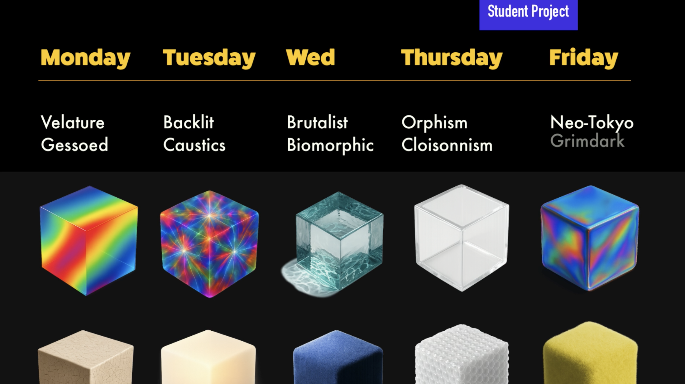
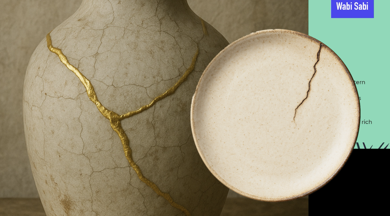
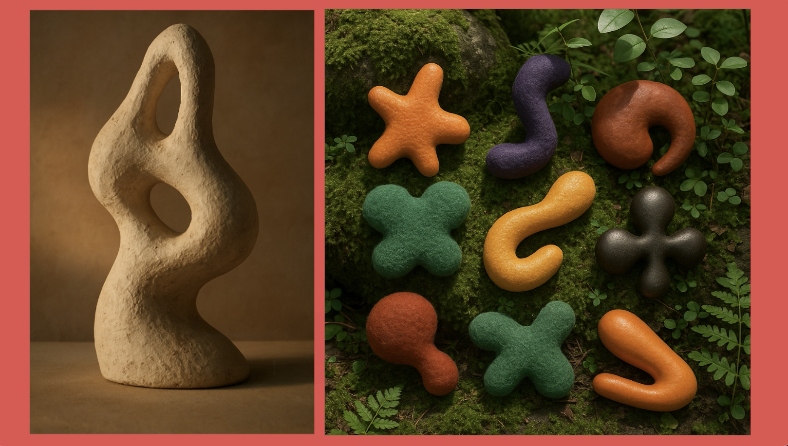
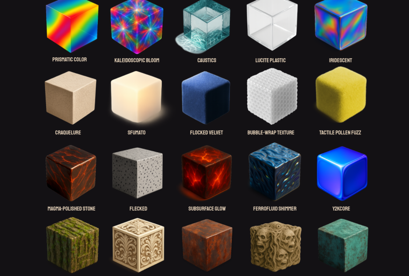
6. Nuanced Design Terms: A biometric sculpture
and a guessoed texture under gloaming light with
Wabi sabi sensibilities. How on earth do we get to
learn what all of that is? I don't even know
half of those terms until now until we
really start to explore some of those
nuanced keywords that can make our prompts
really professional. So I have this
downloadable resource. That's what I'm
going to be looking at with you together
in this class. So when writing prompts or
developing creative briefs, these words reflect lesser known our nuanced
styles, textures, and aesthetics that can
elevate your design language. So let's work on expanding
our design language. So these are some
and, of course, chat GPT and I
really work together to fine tune some of these
very different styles. So I want to talk
about the first one. These are some different
aesthetic styles and movements. So a couple of ones I want
to show you the biomorphic, which is the example in the
beginning of the lesson, kind of this organic, blob like fluid forms
around in nature. And I was able to deep
dive, I Googled it, researched it, and now I know biomorphic design,
which is, Hey, I can develop some three D
biomorphic elements to put on a brand design project and tweak them because I really
like how that looks now, especially in a three D model. And there's y2k core. So I lived through
the early 2000s, so I knew very much
about y2k core. It's a retro futurism
form of the early 2000s, Chrome gradients, chunky tech. So think web two point oh with that glossy kind
of look vorticist. It's angular dynamic abstraction,
industrial modernity. So this was kind of a
popular painting style, and I was going to
look at lots of stuff on Wikipedia
about this style. Really cool. Didn't
know that existed. Dynamism dynamism took me a while to figure out
how to say that word. It's high energy compositions. So let's move on to
different textures and material descriptors. So here's that iridescent. It's a shimmering
rainbow surface, a color shift with light. I thought that was so much
better than just saying neon. I felt like the only way I could describe a glowing
light was neon. But now I have dscent. So you have oxidized, which is when you
have iron that rusts. So it's a rusted chemical
patina with weathered metals. So this can give you that worn metallic look that maybe
you were looking for. There's also fleck,
which is scattered particles or sparkly texture. And then there's de collage. So D collage is the
torn away layers revealing a visual history. And I've seen this in
designs a lot where you have that torn look
and you see the layers, and really loved
how that looked. I just didn't know it
had a name D collage. So unless you took a lot of art history
classes in college, you might not know
some of these, but you can have Chat
GPT help you now. Then there's the
scary, grotesque, intentionally awkward,
distorted and uneasy. This one was kind
of creepy, but hey, we all have different
things that we're creating for our design pieces. So one of my favorite is
lighting and mood terms. Caustics is actually
a very popular term in video and three
D model rendering, talking about how light
interacts with water. And sometimes glass as well. So it's refracted
light patterns, often underwater or glass. I always love this effect. I would hand paint some
of this when I used to be able to do digital painting
and I would paint water. I'd paint that kind of reflected
wobbly kind of lattice, and that is caustics. That's the study of light and refraction in glass and water. So need to discover that and to be able to
put a name to that. Let's move on to cultural
and niche style terms. Retro futurism, which is
a vintage sci fi visuals, imagining the future
from the past. There's Wabi Sabi, which is a Japanese concept of
imperfection and transients. That's why you'll sometimes
see the gold cracked repaired and plates because they want to honor
the imperfection, and it's a very cultural
thing to honor. And I've actually
seen this Wabi Sabi in a lot of prompts lately, so it must be a
pretty popular style. So there's also aesthetic
and visual compositions. So orpism is a
vibrant abstraction using color to express
musical rhythms. So rainism is intersecting rays of light, semi
abstract futurism, and even fractalism, which have you've heard
of mathematical fractals, which just go on for infinity, are recursive geometries, self similar shapes
and complexity. So then one of my
favorites is surfaces, patterns and media techniques. Here's one vertigris
which is oxidized copper, and it kind of gives us
really cool green patina. And then there's color behavior and effects, prismatic color. It's kind of like when
you have the prism, which is basically
the whole rainbow of light kind of being refracted
in kind of a tight area. So you have a rainbow refraction
with sharp transition. So they don't have these loose transitions like
loose gradients. They're very tight, and you see very quick
transition in color. This frenzl lighting, and I hope I'm pronouncing
all this correct, I can always a chat GPT. But frenzl lighting is high energy reflective
gradient at edges. So it's got this cool
gradient just around the edges with
everything else being kind of dark and unreflective. And then we have soap culture
and global influence. So you have desert modernism, which is mid century
architecture adapted for arid climates. So if you ever doing a
prompt for any type of building or a building
in a background scene, you got to them tell chat GPT, or whatever image
generator you're using. Make sure that you put in what type of building everything
is in the background. Be very specific of what
style of building it is. And then another super, super common keyword I'm seeing
everywhere is Neo Tokyo. And Neo Tokyo is this gritty, colorful, anime
influenced urban sprawl. And I'm seeing this a lot when you have futuristic robots. They tend people just
want to put that in a Neo Tokyo setting.
So you know me. I like to go further and
further and further into the rabbit hole because I have such an intellectual curiosity
for all things creative. So I asked ChahPT What
are even more nuanced, rarely known terms
in design and art. So if you find a style
that you're like, What on Earth is that, you can upload a
reference photo to an LLM and ask it to describe that style
with prompt words, and it's good to help
you figure it out. So a couple of my favorite
rare terms was flocked velvet. I just feel like I can
reach out and touch this. Leucite plastic, which is a retro plastic,
kind of this thick, chunky plastic that
was really popular before they started
getting the really thin plastics we see today. But I can see this a lot
in, like, retro products. Bubble wrap texture. I love how this looks on stuff. Subsurface glow, which
you can imagine, like a block of magma and just a little bit of the magma
from inside is coming out, but it's not super bright. It's very subsurface. And ferro fluid shimmer. So have you ever seen
oil spilling on a road, and you see this rainbow kind
of reflection off of it? That is exactly what this is. It's this reflection
that oil gives off where it kind of reflects
a little bit of the color spectrum at you, but still has that
dark, liquidy look. Let's go even crazy deep. So these are probably ones
you have never heard of. And if you've heard of them, congratulations, 'cause
I haven't heard of them. So these are the most
obscure prompt words I could find on the Internet, and the amount I
found was endless. This is just a very
small selection that I personally liked and I thought
you would find useful, but there's thousands
that I didn't use. So there's moon glow
refraction, a soft, silvery light bent through
mist. Very, very specific. There's kaleidoscopic bloom. So if you ever looked
through a kaleidoscope, it's chaotic fractured
light dispersion, photonic bleeding, which is overlapping light sources
with a noisy overlap. There's magma polished stone, which is sleek and scorched, cooled lava meets obsidian. Vitreos bark. I think I'm saying that. I think it's from vitae meaning life. Vitrios bark is tree bark with semi transparent
glassy sheens. And there's these ultra trendy conceptual themes we
can talk about as well, Archetypal glitch core, which is broken,
symbolic language. Forgotten utopia fragments, broken pieces of failed
perfect societies. I mean, how nuanced can you get? And then solar punk ruins, which is echo utopia that
has already decayed. So if you're trying to paint
a dystopian mood board, then these are definitely some words you
might want to use. As a secondary
student challenge, I want you to find the
most nuanced art styles. Pick four different
nuanced art styles, textures or descriptions, and I want you to
explore that intensely. So if it's iudescence, look up iridescence, find out what that is,
learn about it. And I want you to do that
with four different ones. And if you want to
do two every day for the whole time you're learning
AI or doing this class, that'd be great because you
can really start to expand your vocabulary and design
knowledge that way. So now we understand the basic framework of what it takes to make a solid prompt. And also figure out some
of those nuanced keywords. Ix, there's just one
more thing left to discuss the legal
issues with using AI. This has to be talked about
before moving forward.
7. Copyright & Legal Issues : So where does AI source its photos to create
such masterpieces? It's hard not to talk about
the elephant in the room. As we discussed before, Mid journey Dali and other AI
photogeneration tools took a huge swath of photos from the entire Internet to train its AI bots
to generate images. That means that copyrighted
photos, illustrations, and graphics were compiled together to teach the bot what the user might want to see. There is an interesting
article that claims that one of the founders
of MD Journey knew this was the case and admitted to not knowing
what to do about giving proper copyright
ownership to the artists of the images this AIBt uses. When creating AI art, you can also add reference images to help the bot further detail
what you're looking for. And there's no way to
prevent users from uploading copyrighted work from Google Search into the prompts. That means if you're using
images that do not have a creative commons zero license or a public domain license, you could be opening
up yourself to being sued for driving artwork
from copyrighted images. So does that mean AI tools have infringed on
creators rights? This was going to come
to a head at some point. Several artists have banded together to sue Mid Journey in other art portfolio
websites like Deviant Art for
allowing copyrighted, derived AI work to be posted without giving proper
credits to the authors. And it's going to be a
very tricky court case. On one hand, AI tools
have been trained by absorbing data from
most of the Internet, which is a gigantic
source of data. It could be hard to prove individual copyright
infringement from images derived from
such a large dataset. On the other hand,
there have been cases where individual
artists can type the name of an AI
prompt and clearly see how their artwork was used
to formulate the results. Albeit, it's not
ever an exact copy, but you can see the inspiration. Who owns the work created
by AI image generators? If I put in a prompt into an
AI text or image generator, do I own the prompt to create the image or the image itself? It's a complex legal issue, but it's always worth
reading more about this. A human element
has to be present for any copyright
claim to take place. That means AI Tech cannot
claim ownership of images. AI artwork does not really have an owner based on
current copyright laws, but according to the terms of use of some of the programs, it does assign the
ownership of an image to the creator or prompt writer. But can you hold that copyright claim in the court of law would be
the next question, as nothing can stop third party companies
from taking you to court for using
their brand image in your AI generated photo. We are truly living in a
new digital Wild West. So what do you do
if you want to take the safe and high
road and protect a real artist's work and make sure they get
the proper credits? Well, first of all, I
would avoid putting in a specific artist
names into AI prompts. It's okay to use historic
names like Leonardo Da Vinci. He's been dead for many years, but I wouldn't put any new
artists that are still alive and still have
a legacy to build. Another thing you can do
is to make sure you use AI image generator tools that
are from official companies that make sure the library of photos they use to
train their bots and to generate images are given permission by the
people who own them. Outside of using AI tools
like Adobe Firefly, here are some personal best
practices to mitigate against these complexities and
ensure your work is unique. First of all, each AI tool has
different licensing terms, so it's good to review each one. Have an LLM, break
it down for you so you can digest and
compare the different terms. Document your creative input
and iterative steps clearly. Let's say you're doing
a character design. Perhaps you keep a copy of your original sketch that
you uploaded to an AI model. Keep track of the
different prompts you use to edit and
change your character. Use caution when prompting AI with copyrighted characters, famous brands or
celebrity likenesses. This is where you can get into the most trouble and have the highest chance
of getting sued. Avoid using company names
when typing in your prompts. Avoid using Nike logo to
generate ideas for a logo. Avoid saying Pixar or Disney animation style
when creating images. A prominent example of this is when someone
started to copy the famous Ghibli style by
famous animator Hao Miyazaki. His style takes
hundreds of hours just for a few
seconds of animation, and people were
inputting his name and style into prompts to
emulate this animation. In an interview, Miyazaki called AI an insult
to life itself, and he believes that
animation should be rooted in human emotions and experiences
and not algorithms. So when writing your prompts, think about creating
your own mix of styles that will
be unique to you. You can be inspired by
other creatives work. We do this all the
time as creatives. We browse Instagram our
Behance for inspiration. We then go on to
create something, and we find ourselves
emulating some of those styles subconsciously. The same issue
exists for using AI. Finding originality
can be difficult, but that has always been
the case for us designers. This is why we study hundreds
of styles so we can mix, match, and create our own
unique flavor and factor. Ways you can establish
your own style is to upload a basic sketch of your idea, logo,
or character. Writing very elaborate prompts that only could be
written by you. Maintain a specific style
in what you generate, which allows you to take
ownership of that style. Taking AI generated ideas
and modifying them heavily outside of the AI programs and design programs like
Photoshop and Illustrator. I recommend a back and forth handing off of
creativity in your workflow. That means you might upload
a rough sketch into AI. It helps you refine your image. You bring that back
into Adobe Illustrator or another vector program,
and you vectorize it. Then you can tweak it further. You bring it back into AI to add additional details
or refine the ideas. You can even ask the AI for advice on direction for
your logo afterwards. That brings up the
issue of getting sued. How likely are we to
get sued for using AI generated images in our marketing campaigns,
for instance? It's possible but
not very likely. The person or company suing
needs to prove without a doubt that the images you
use copy their style exactly. Since AI generators
are trained on millions and millions
of text image pairs, that means it's impossible for one photographer or designer to claim ownership if your
prompt is unique enough. But one could write a
prompt that describes a famous photographer's style to a T and generate it to be so close in that style
that it infringes on that person's style.
This is really tricky. It will always
remain a gray area as it still does
with logo design. One thing you can
do is regularly check AI generated assets using reverse image search to detect potential similarity or
infringement issues. You can modify AI
generated output significantly rather than
using them directly. So if you ask for a
logo prompt idea, modify that prompt just a
tiny bit to make it your own. Post processing, you can edit AI generated images extensively using tools like
Photoshop or Illustrator. In the end, the big takeaway is the more human
guided interaction there is between the
AI generated content, the better you can
protect yourself, and short clear ownership
depends significantly on how much original
creative human input you add to the AI
generated imagery. Always enhance and adapt images creatively to clearly
establish your copyright. Ensure your final
designs contain meaningful creative
human modifications and are free from
infringement concerns.
8. Student Project: So I have your first
student project, and that's to reverse engineer
a photo using prompts. So I want you to recreate the reference photos as accurately as
possible and you can download these as
part of the resources using only AI image generation
tools and written prompts. No manual image editing allowed. This will allow you to
practice using prompts to create very specific
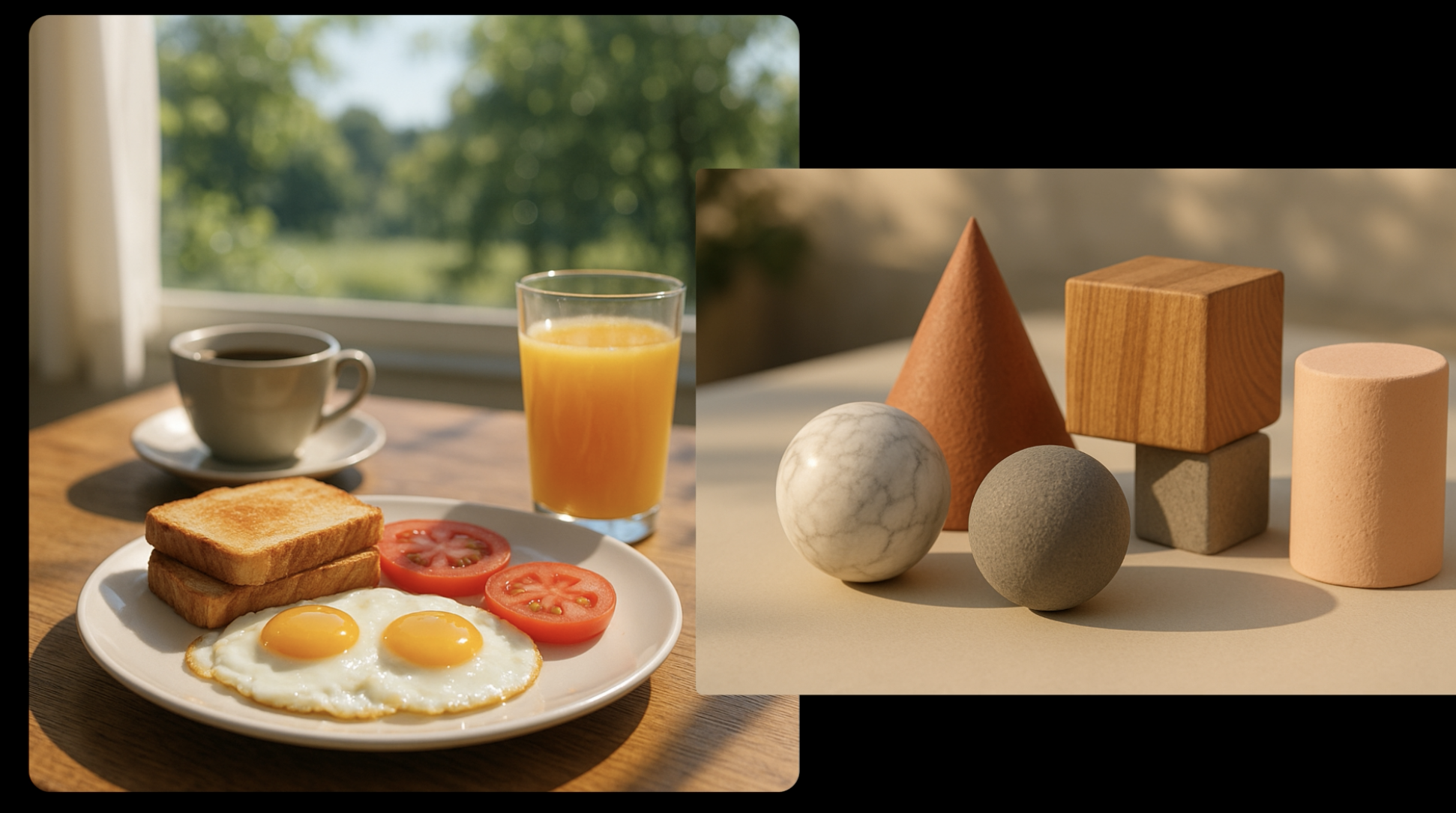
objects and details. So here's the first one,
which is three D shapes. I want you to recreate
this as close as possible. It's not going to be exact, but you're going to be
able to continually edit the prompts so you can slowly get the results that you need. And the second one is
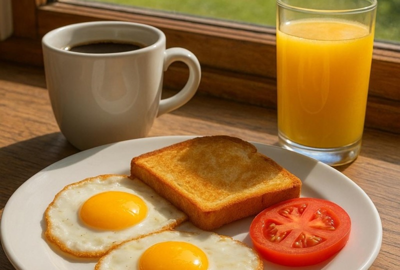
an American breakfast. So you could start
off with two eggs and describe everything
in the background, describe that there's a window, describe that it's
photorealistic. Start using some of those keywords that
we've learned about to be able to describe this
picture and to emulate it. So choose any AI
generator of your choice. It could be Adobe Firefly, Dolly, Leonardo, hat GPT. Use only text prompts and
attempt to replicate the image, so you can't do any
reference images. And I want you to get
close to the composition, the lighting, the subject, the color palette, the
texture, and the style. And you may iterate as many
times as you needed and keep track of your best prompt versions as you were fined.
9. BONUS! Nano Banana Pro - Can You Guess Real Or AI?: Google Nano Banana
Pro just came out, and the results are insane. The ways in which AI
leave evidence that it's AI is slowly
becoming harder to spot. It makes cheating,
changing the past, scamming, and fooling
people much easier. Of course, it has its benefits for those who know how
to use it correctly. For Photoshop 2026, Adobe announced it's
partnering with Google to add Nano Banana as a third party option in
its generative fill tool. Now a new option is available
in its Nano Banana Pro. This is a paid
option if you were to use it in the Google Gemini, but Adobe made it available to use Adobe
Photoshop right now. I've never seen such
amazing results with this option way better than even the already pretty
good first gen Nano Banana. Since it is a premium
option outside of Adobe, Adobe does penalize you a bit for using this
Dano Banana Pro. It costs ten credits
per generation for one to 2000 resolution and 16 credits for 4,000 resolution. Creative Cloud Pro gives you
4,000 generations per month. Adobe Creative Pro does cost
$70 a month in my area, so you're definitely
paying for it. So you might as well use some of those credits and
experiment with this tool. So I want to play a
little game with you. I generated most of these images using Google Nano Banana Pro with the exception
of one or two. I want to see if you can tell
me which one is generated with AI and which one
is a real photograph. I did this with my husband, and he failed miserably.
Let's see how you do. Please write in the comments,
how many you got right. I will let you know how to tell the difference between
real and AI after each. Now, we're going to start off with one of the easier ones. This is one of the only
ones my husband got right. Sorry, honey. So
which one do you think is real and which
one do you think is AI? Just give you a few
seconds to think about it. And it's all about zooming in. So if you're not
able to zoom in, it's very difficult to
tell if it's AI or not. From first glance, I would think maybe the
one on the right. It looks almost too good, but the lighting,
that's really nice. And I'm not an astronaut, so I don't know if her
equipment is correct or not. It seems kind of
complicated in the front. But then again, the one on the left seems very convincing. But let's zoom in and find out which one's real
and which one's not. So if we zoom in to the one that looks like it's
taken from the 80s, it's very believable
because there were women in the early 80s that were starting to train in the
astronaut program. But take a look at this badge. Typography in Texas where
AI still struggles, even with Nano Banana Pro. It's the only thing I
can ever catch it with 100% accuracy is when
it comes to typography. It's not absolutely
crisp and clear. You can tell with a NASA badge. Also, up here, you
could tell there's little holes, almost
like it's worn, but I can tell it just
struggled with the typography, and that's not the
official logo. Also, if you look
at this guy's face, they must be twins because
it's the exact same guy. So if you have the
same exact guy, what are the odds of having
twins in the space program? Probably very minimal.
But it's very impressive. Look at the ceiling. Look
at the wood paneling. The details are quite good. And at first glance,
I would think this was a real documented photo. The one on the right
is a real photo, and the one on the left is
AI. Were you surprised? Let's go to the
next one. Let's get a little bit harder
with this one. So here you have two
standard movie sets, one with Tom Cruise on the left, and the other one
with Pedro Pascal and some other famous actors. Which movie set is real
and which one is fake? And this might be
a trick question. So I want you to
take a look, and they look really convincing. So let's take a look. The only way to
really tell is to zoom in and look
at the textures. So this one's super convincing. Look at this camera work, look at the green
screen, look at the sky. You can't really tell. Look at this building. It's not warped. It's not distorted. This
looks surprisingly good. Take a look at this flooring. There's not any mistakes
in the flooring. If you look at the shoes, you can't really see too
many errors until a ha. Look at this edge here. That's a total AI
generated image. Also, the more you zoom in, you can see this
repeated texture, almost like a computational
texture right here. When you zoom in across all of the tile. That
is not natural. That is not a natural texture. So all of a sudden,
when you zoom in, you start to see all
the little mistakes. Maybe he has a missing finger, but you could just say,
Well, it's bending one way. So when you zoom out, you can't really tell, but when
you zoom in, you can. There's also actually, this
was a photo posted on Red it, like a real or AI red it form. And there was a lot of
professional camera people that pointed out tons of
issues with this camera. So when you are in the
business of movie making, you could see tons of mistakes. Also, someone pointed out that this green screen isn't exactly the same angle appearing here that it
actually is showing. And the biggest giveaway for me, or what most people
would be able to spot is up here in
the scaffolding. There is some really
strange wiring and bending of the wires. So that was a dead giveaway. But when you zoom out,
this is so convincing. But when you zoom in,
you can always tell. What about the one on the left? This one's pretty convincing. I mean, he does
look about his age. Maybe this is a
7-year-old photograph or a 10-year-old photograph of him filming something for
Mission Impossible. Well, wow. This
looks pretty good. The little details left. See this man holding the photo. We have the wires, a lot of natural human like details left. You can even see them
snacking on set with biscuits and coffee and even have this little logo on his
jacket and even a pin. Is all seems super convincing until you realize
this one's also AI. Once again, the camera that camera doesn't
exist in real life. You could do a
reverse image search, try to find this camera, and you won't be able to find it because it does
not exist at all. But this one was probably
one of the harder ones. There's not this Omega
obvious way that it's AI, but as you can
tell, Google nana, banana really rocked this
in almost a very scary way. So yeah, they're both AI. But the one on the left is actually way more convincing
when you zoom in. So really scary. Alright, all you
creative people. Let's do one that
applies to you. One of these is a real sketch, and one of the is AI. Which one is which? I'll give you a moment
to think about it. Look at all the details, and I'll zoom in on some of
these so they can see it. Well, they both
look like sketches. Let's take a look at
this one on the left. It could be AI, but
it's hard to tell. This looks pretty genuine. If it's AI, I'd
be really scared. There's lots of leading lines. There's lots of human kind of experimentation with trying to figure out the shapes
of the typography. I don't know. It's pretty
close. How about the other one? That looks really
convincing with that worn down chewed up pencil. But is it too chewed up? I mean, who actually has
a pencil that's that bad? What about that
looks like a really, really, really, really
oddly shaped eraser. But the sketches themselves
are a little too crisp. I see these leading lines, which makes me kind
of think, Well, maybe this is real, because those leading lines,
how can an AI do that? You know, that's only
something a sketch person does to try to figure
out the symmetry. Either this is a really
talented sketcher or it's too symmetrical. Even the little dust that's left by the little pencil dust or eraser dust is really convincing. So
which one is which? Okay, so the one on the left is actually a student of mine, Amber Axelton, she did this as part of a
branding project. So the one on the left is real, and the one on the
right is absolutely AI. It's got kind of a super
dark tone to the sketches. So usually pencil doesn't
have this dark color, and only someone
who's sketched a lot in their life will kind of
be able to identify that. And that's going to be
the issue with AI is only industry experts in what you're looking at can be
able to go, You know what? I think that's fake. It just looks a little
too polished to me. Who doesn't like a
good game of chess? One of these is real, and one of this is generated by Google Nano Banana
Pro. Which one? I'll give you a few
seconds to figure it out. Yeah. Okay, so at first glance, this one on the right
seems very AI generated. It's super polished and
has this hyper reflection, almost like it was
generated with a really good three D
program like blender. And when I zoom in, I can see some details of the horse
that looks very weird, and it does remind me of AI. And let's take a look
at the other one. The other one seems
kind of natural. I'm seeing kind of
some wood pieces that are kind of chipped off. It just has a lot
of natural texture. And if you see how the light is hitting it and reflecting, it seems very,
very, very natural. And the pieces seem like they have organic natural texture. There's even a background that looks convincing
with some coasters, some stacked books,
and a coffee cup. So which one is real
and which one is ahi? This one fooled
everybody I tried. So the one on the
left is actually AI generated by Google
Nano Banana Pro, and the one on the
right is a photograph. It's been brightened a
little bit in Photoshop, but it is mostly an
intact original image. Does that surprise you? Does
that shock you in any way? Did you get fooled?
So here we have two seemingly normal
pictures of fruit, but one of these is fake AI, and one of this is
a real photograph. Now, which one do
you think is AI and which one do you think
is a real photograph? I promise, they're not both AI. They both look like AI. But let's take a look at
this one on the right. It seems super glossy, almost a little too glossy. It almost feels like it's
glossy for no reason. It just has that extra shine that feels a little
bit artificial. The table itself and the texture
looks pretty convincing. The bowl, nothing else
is really misshapened. This could be real fruit. AI has a hard time with stems and finding out where
those things go on fruit. It's kind of convincing, but that glossiness is
throwing me off. Okay, what about this
one on the left? I mean, I think the way
it was maybe taken in the 80s or the late
90s or something. It's got a very
convincing refrigerator. It's got some medicine
on the countertop. A lot of things you would
just see in a random kitchen. Even the magnets are intact. There's a piece of
paper on there. It all looks convincing. The shadow's correct
cause the light is coming from the
top and shining down. And it even has this
August 14, e 96. It would really match up with
a in 96 kind of kitchen. So let me zoom in and see if I can see if
this is AI or real. Oh, I think I found it. Look, see this little sticker? If it wasn't for that sticker, I would have a
hard time figuring out if this was AI or not. But once again,
stickers, logo, badges, and typography is really
hard for AI to generate. So that does not look natural. But everything else does, and that is really tricky. So the one on the right
is a real photograph, which I found on Wikipedia, and the one on the
left was generated with Google Nano Banana. So which one of these photos
is real and which one is AI? They both seem like they were
taken in the 50s or 60s. They're on a car. The one on the left seems super oversaturated for a photo, but it could have
been color corrected. The one on the right
seems pretty convincing. But which one is AI
and which one is real? Okay, the one on the right is generated with
Google Nano Banana. So it is AI, and the
one on the left is the real photo.
Are you surprised? Did anything about
the features of the faces trick you into
thinking it was AI? So, this one is a
little bit different. This is a real birthday
picture of a cake I took, and it's of my son and
my niece's birthday. Did they turn nine and seven, or did they turn eight and six? That would be the big question. One of these is modified
using Google na banana, where just one
element was changed, which would be the
birthday candles. Now, which one is
more convincing? I think the tricky
part about this one let's zoom into this
one on the left. So you have this kind of weird looking thing with
the nine happening, almost like it's broken, and it doesn't seem supernatural. So my first instinct
would be say, Okay, this is the
AI generated image. And let's go over
to the other one. So this starts to look
almost too polished. If you look at it, there's
almost no mistakes. Not even a little bit of texture from the wax of the candle. That makes me think that this is definitely the AI
generated photo. And if that's the
one you guessed, they were turning
nine and seven, you are correct.
That's the real photo. And the fake one and the modified one is
the eight and six. It is scary how we can change photos from the past and give people an entirely
different narrative of what happened. This could
be really scary. We can say that we dated
people we never dated, or we have a receipt for a
product we never bought. This is the scary part about AI. One more bonus
round just for fun. Is this a real photo, or is it AI generated
by Nano Banana? At first glance, very
convincing reflection. Look at how everything
is reflected. That seems very
authentic and real. Look at how it's
raining outside, and you can see the
rain on the streets. The cars, they look
pretty normal, although is that the same car
back to back? I don't know. I'm starting to doubt myself
whether it's real or not. Her hair seems convincing. The lighting, everything
seems really natural. Look at the detail
of the kitting, too. I can't find a mistake
in the knitting. But as always, let's find any type of typography or
font or text that we can. What is berating sweet grass? Don't know what that
is, but that typography does not look natural. Everything else about it is
too small for me to read, but that is the giveaway. That's honestly the only
giveaway in this entire photo. You can zoom in and
look around yourself, but it is hard to
find another reason. So if she wasn't holding a book, if she was holding
something without text, this would be very hard to
find out if it's real or AI. But yeah, this is AI. I hope you enjoyed this
little deep dive into trying to figure out what
is real and what is fake. So it's getting harder and
harder and Google Nano Banana, the stuff I generated
from there with very simple one sentence prompts was quite incredible
and quite convincing. And I could see in
another year or two, we're going to erase all
those little AI artifacts, and it's going to
be very difficult without having a
super trained eye. So continue to train that eye, zoom in at 800%, and look at those fine details, textures, patterns,
consistencies. Definitely typography. Please leave a
comment below if you enjoyed this and how
many you got right? Or if you got any wrong, are you surprised
about any of them? See you in the next video.
 Lindsay Marsh, Over 600,000 Design Students & Counting!