Transcripts
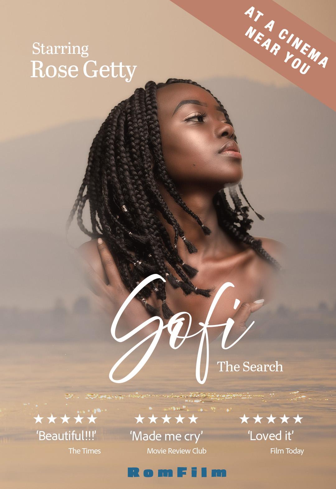
1. Intro to this Class - Create a Romantic Movie Poster: Have you ever wanted to create
your own movie poster and put yourself or your kids or your loved ones
into that poster? Well, in this
class, I'm going to show you how to
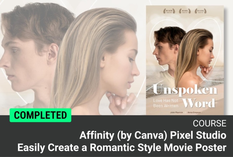
make a beautiful, romantic movie poster.
Have a look here. I'm going to take you
through everything step by step in Affinity. This course is
beginner friendly. So even if you've got very little knowledge
about Affinity, you can still follow along. I think you'll enjoy
the whole process, and you'll come out with
something which is so cool. You'll be able to
put it on the wall, have it printed or framed or send to whoever you've
put in the picture. What are you waiting for?
Let's get started right now.
2. Start a New Document: Now to start this project, we're going to make
a new document. So we're going to go to
file and New up the top, as I'm sure you know already. I would like to use a file
type that I can print out. So I'm looking for quite
a big poster over here. I might want to print mine quite large and frame
it on the wall. So a three size would
be absolutely fine. If you just want to
do something smaller, that's absolutely fine, as well. But really for the poster, the format of a three is
a little bit too square. I want it to be a lot
longer or thinner. So I'm going to go
over here to my sizes, and I'm just going to take
the width down to 250. The other thing that you need to contemplate is that what is
the color format going to be? Now, if you're going
to be printing this out and you're sending it
for commercial printing, you'd normally use
CMYK in there. If it's going to go on
screen, you'd use RGB. However, some of you might be using photographic printers. So those are the
ones that will print you photograph style images. And with those, I would
suggest using RGB because those printers actually print more colors
than you get in CMYK, so you might be
limiting yourself. But just bear in mind
that if you do use RGB and use a
photographic printer, you might find that some of
the colors do change a bit. Anyway, I'm going
to go with RGB, click on Create
document, and I'm done. Get that far and then
we'll take it further.
3. Cut Out Images: Now, before you start
doing any selections, it's important to check that if you're going to be using
the object selection tool, that you've actually installed
the segmentation extra. And now, this is under
machine learning models. What you need to
do is you need to go and find your settings. Now, on a Mac, it's over there
under Affinity in on a PC. I think it's at the bottom
of either Edit or file. I can't remember, but you're
looking for settings. Looking for machine
learning models, and under segmentation, just make sure that you
install that before you do your selections using that
object selection tool. Now, I've gone across to the Pixel Studio because we need some of
these tools here. And the only panel that I've got open over here is
the Layers panel. If you go to the Window
menu and go along, you'll find the layers
panel is down here. And if I go to the
general settings, there is the layers
panel in there. You don't need any of the other. So if you want to
close them down, that's fine. You don't have to. Now, I'd like to bring in
some pictures in here. So I'm going to put a file, and I'm going to use place and I'm going to go and find the first of the pictures that I
want to bring in. So let me go and find these. I've actually got
mine on my desktop. Yours will be in your
resources folder, and I'm going to go in. What I'm looking for
is one of the people. I've got two people.
Now, of course, these people for you, you might be using the
ones that I've given you, or it might be a photograph
of you might be a photograph of a loved one or somebody else. Either way, try
and find an image where the person is
looking to the side, so maybe a sort of
a side on shot. So I'm gonna go and
find one of these. Now, um, this is the picture
that I want over here, and it's the woman looking
down and to the side. So I'm going to take that one, and I'll just click on Open and then I can just click
and drag to bring it in. Now, we want her
head to be maybe, let's say, a quarter of
the height of the page. That'll probably be quite good. And she's going to be on
that side over there. And then we're going
to do the same thing. We're going to bring in
the man. So once again, I'm going to go to File
Place, find the man. That's him over there, Lick on open and once again,
bring him in. So his head is about the same
size as the woman's head, and you'll see I might have
to scale him up quite a lot. It honestly doesn't matter. Let's zoom out a bit. I'm
using command and minus or control and minus depend in with your MacoPC to just
zoom out a bit. And I'm going to move
them across a little bit. Move that up until they kind
of look about the same size. I think you might have to be a little bit bigger than that. By the way, quick tip when you're doing
something like this, what you can actually
do is just go to your opacity and change the opacity slightly so that you can see them
together and go, Yeah, that seems to be
about the correct size. I can also place them pretty much where I'd like them to be, we can then take the opacity
of him back up again. Now I'm going to hide
his layer and I'm going to click on her layer over here, and I want to cut her out. You can go along here and you can use the object
selection tools. That's actually the one
that I'm going to do. If you are really an
experienced Affinity user, well, you know how to do this. So I'm going to move across over here because
I want to cut her out, so you can see, as I hover, it will show me the
different parts. So over there, I can click on that and I can
select her in there. Now, if you're an advanced user, you'll know that you can add
a mask to this very quickly, which will just cut it out.
I'm going to undo that. If you're not an advanced user, you can then just use
copy and paste to copy this onto or
in as a new layer. Now when you try
copying and pasting, at the moment, something really weird is going on because
nothing's happening. But you can see my
opacity is in red. It's showing 100%. Let's just make sure
that's 100% again. Do make sure that your curse is not sitting in there before you do a copy and paste.
I'm on the layer. Let's try copy and paste
again, and there it is. It's copied that and
made a new layer. If I hide the underneath one, you can see we've
got our cut out. We can just go to the menu
and go to Pixel down to Pixel selection and say
deselect over there. Let's do the same
with the man as well. Going to be faster this
time. I'm going to show him. Once again, I will use
the same tool that I used before the Object
selection tool. Click on him. I'm going to use
copy and paste and that will copy him
onto a new layer, and we're going to deselect
OH by going to Pixel, Pixel selection, and Deselect. Now, this keeps on going green and that's because I'm
still on that tool. Let's click Back
on the move tool and Zoom out once again. Have a go, get up to that stage and just copy the two of them. Or if you want to mask
them, that's fine, as well if you
already using masks. I'm going to take the ones
with the backgrounds that I'm not using and delete them.
You don't have to do them. I'm just doing that so I have a nice clean layer because I'm demonstrating this
to you. Try it out.
4. Blend Images: Let's start to blend them out. Now, if you are on if you have used a mask
and if you have, I'm presuming you
know about masks, you can just paint
straight on the mask to hide the parts that
we're going to erase. If you don't use masks and you don't know what
they are, don't worry. We're going to use just
an erased tool over here. So I've gone over
to my arrays tool. If you're not sure of where
it is, keep going down. Make sure you're in pixel mode, by the way. Keep going down. There's a little
brush there, and the arrays brush
tool is after that. Now, what I want to do is I'm going to go to the man layer. And as you can see, when I go over this, it's kind of showing what will erase. So if I go to the top, I've got various controls for the brush. I'm just going to go to this
one here, pull that out. That's the one on
the very left, and you can see how
much bigger it is. What I'm looking
to do is to make a very, very soft brush. Now, that's the
size of the brush. Let's skip two and go
along to this one here. And this is going to be
the softness of the brush. You can see that's a very
hard brush there at 100%. But if I go down to zero, that's a very soft brush there. We're looking for
a very soft brush. And we're going to
start to erase now. And if your brush
is not big enough, just go back in here again. Or I'm going back to
what's that 2,800? And I'm going to start making sure that I'm on
the man's layer, just erasing out
these bits here. I'm just looking to kind of maybe leave his neck
and his neck line. And then I'm also
slightly smaller brush, maybe about the 2000
mark or 1,800 mark, just going to go
down the side of his body and his neck
until you can see it's sort of almost blending into her and maybe his hair
a little bit as well. We just blend that out. So we get the two of them
kind of coming together. Move him around a little bit so you can see that's kind
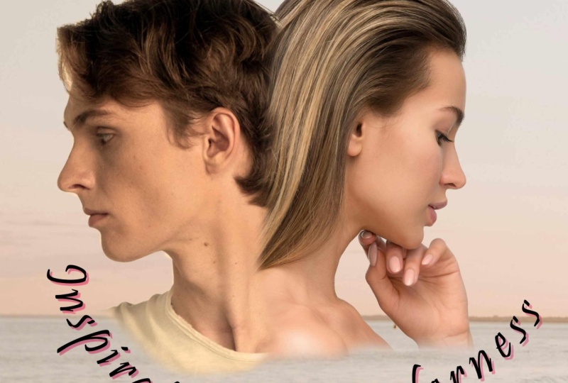
of what I've done there. So as we put him over her,
they'll blend together. Now, let's go to her layer. Same thing again,
use the arrays tool, and we'll just erase out this
maybe down to about here. I think I want to keep
her hand in there. And there we go. We've got
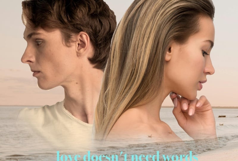
the two of them really nicely blended together.
Do have a try with that. Use the arrays to make sure you change the brush size
and the hardness. 100% is very hard. Zero is very soft for the
hardness of the brush, and you want it to be as soft as possible and make your brush quite big and then
just erase out the bits you don't want
on those two layers.
5. Balance Skin Tones: When you start to look
closely at this image, you find that their skin
tones are very different. She's got a very warm skin tone, and his skin tone is very cold. Now, it doesn't matter how light or dark your skin tone is. This is all about the shade
because of the lighting. He must have been in
much cooler lighting and she was in warmer
lighting in there. We want to get the
two of them to balance out with the tones, the warmth or the
coolness of the skin. So I'm going to do that
by going up to Pixel and the pixel layer of H. And I'm going to
go to the Pixel menu. I'm going to go down
and I'm going to do a new adjustment layer. And the one we're
going to choose is the one called ns filter. Now, it's a really easy one. It's really useful
on skin tones. I'll choose Lens filter there. Now let's have a look at
what this is actually doing. You see, there's an
orange over there, and what it's doing
is it's putting a subtle orangeness
on the image. Now, if I do this, you can see they become
absolutely orange. If I go back down to there, it's back to where
it was before. So I'm just going
to go up and put some orange on probably more than I need, a lot
more than I need. And I'll close that down. Now, this lens filter adjustment is affecting every
layer below itself, so it's affecting that
one and that one there. If I drag it on top of that layer just over there where the name pixel is and drop it. Now, you can see it's disappeared.
It's still showing up. In fact, now there's a little
arrow if I click on that, you can see that this
lens filter adjustment is only affecting the layer
that I dropped it on top of. Now, this will make
life so much easier for me to actually match
the two skin tones. I'm going to just click
on that drop down. Going to go in, and
I'm going to just click once on the
little icon there. That takes this slider or
opens the slider again. And now I can use this to adjust the skin tones
until they match. You can see that's
without the filter. All of a sudden he looks
really cold, doesn't he? I could just kind of
take it up until they've both got the same sort
of warmth on them. And I think it's going to
be something like that. You know, it could be
the other way around. You could think, well,
what about if we made her the same coolness as him? Well, you can do it because you can go to this color here, and you could choose a blue
and then by using blue, you can make somebody colder the skin tones colder as well. I'm just going to undo that. We're going to be using
the orange in there. Now, I got to be honest, I
use this filter a lot for people just to bring a bit
of warmth into the image. It's not changing the
color of the skin. It's just warming up the image, and it warms up absolutely
everything as well, but it gives a really nice, pleasing warmth to
your photographs. Let's close that down.
Have a bit of a go with that and get a lens filter
adjustment on there. Don't forget drag it
inside that pixel lathe of him and make sure that you can then click on the
little arrow in there. If you drag it into
the wrong one, just drag it out again
and try again. Have a go.
6. Add Background: Now, hopefully you didn't
find that too hard. However, that is the hardest
part of this whole project. The rest is easy after that. So let's go in and bring
in another picture. I'm going to go to file. I'm going to go down to place, and I'm going to find
the background picture. So this background pictures
actually got people in it, but we're going to crop it down. Right, here it is, and
let's open that up. And I'm going to click
and drag over there. Now, what on Earth
is happening here? When you try this
out and you think, Oh, my goodness,
what have I done? It's a really cool effect. But it wasn't what
we actually wanted. Well, you see, because we had the lens filter
adjustment selected, when I brought in
the new picture, it put it inside that pixel image of the man
and used him as a mask. We don't want that. So we're going to take this pixel image, and we're going to drag it
underneath both of those. Now, drag it down until you see this little orange gradient appearing underneath
the last layer. Drop it there, and
that will then go behind those two layers. Of course, yours might
not have come in there. You might have
clicked on the man, and it's right at
the top and you've still got to drag
it to the bottom. But either way, have it go
and get that to the bottom. But just before you do, I'm going to make this
a little bit larger, so I want to scale this
bottom image up a bit more. Now I can click on it, grab a corner, and I'm just looking to scale it so it's
about the same height. As you can see, there
are a couple there, but we don't want them. We want this bit over here, so I might have to go
even higher than that. Until we've got that
little bit over there. You can move this up and down
to where you want to go. I'm sort of looking at
them being almost on the horizon like
that. Try that out.
7. Remove Birds with Clone: There's a few little
bits in here that I don't like. Let me show you. I'm going to zoom in a bit, so I'm using Command and plus or Control and
plus to zoom in, and I'll just pull
this around like that. These little seagulls over here, and that I don't
know what it is. I think they're a
bit distracting. I'm not even sure about
this one here as well. I'd like it to be
a very clean beach because we want our attention
to be on the couple. So what I'm going to
do is I'm going to use a tool that will enable me to kind of paint
from one part of the sea over that area there. This little tool is called
the clone brush tool. Now, the way that it
works is, first of all, I'm going to go to
my layer over here and I'm going to go to the brush size and
choose the brush size. I'm using about 500
for the seagull here. Then I move to an area
that I want to copy. So I'm going to move
my cursor over here. Hold down the Alt or the
option key depending whether your Mac or
PC and click once. That puts a little point in, so that is my copy point. Now, you'll see when
I move my brush over, that copy point stays there. So if I move over to
here and click, now, as I'm painting on this area, it's just copying
whatever is under that copy point across
to that side there. Let me keep going over there. Now, this is where it's a bit of a problem because the
C's in the wrong place. So I'll just undo that last
little bit over there. I might need to do it again. If I go over here, hold down the l to the
option key and say, click on this bit of C here. Then let go, move
across to there. And you can see I can
sort of paint that bit of C across that area. We get quite a nice
clean bit of s there. Let's do it again, but with a slightly
smaller brush this time. So I'm going to use
a smaller brush, so I'm going to go down
to about 200 or so, 180. I'm going to start over here, hold down the old key,
click on that wave there, move across to the
seagull and just paint over it and copy those
pixels onto there. I'll do the same over here. I'm going to hold
down the Alt key, click on that bit, and
then copy that onto there. Now, this one is on
top of the wave. So I'm going to go to the
top of the wave here, hold down the t to
the option key, and click, move over there, and then click and start to
paint to get rid of that. This one's going
to be an easy one. We're just going to
alt, click over here. Move over there and click
and start painting in there. Now, although I said
it's an easy one, this is an easy mistake to make, as I do that, it's like, why
can't I get rid of that bit? Well, what's actually happening was when it got to
this stage here, it was painting the beginning of that shape over onto there. So let's try it
again, but with a slightly more of a distance. Hold down the alter
the option key, click. Move over here, and I can
paint that in like that. If it still happens, you could just let
go and do it again, hold down the alter
the option key, click on that bit, and then
paint that out like so. This kind of little boy
out there that I will just click on. To get rid of the boy. I think that's all done, and we've got this really
lovely clean beach now. Do you have a bit
of a go with that. Remember, it is the
clone brush tool. You hold down, and
I'll just do it on another layer
to show you again. You hold down the Alt
or the option key. Choose your brush
size. The first one I did was about 500. The second one was about 200. Hold down the Alt or the
option key, click once. Release the alter option key, move to where you
want to copy it too, and click and start painting. And you can see I can sort of paint his cheek onto his ear. Really don't want to do that, so I'm going to use Command or Control Z to undo.
Have a go with that.
8. Add a Title: Now we could just stop
at this point here. We've got a lovely
picture of this couple, and it's actually because
it's a romantic picture, their heads are actually in the shape of a heart like that. I don't know whether
you can see it. So it's just a lovely
picture as it stands, and I could leave it like that. But we want to do
a movie poster, so we're going to
bring in some text. We'll need a title over here, maybe a strap line, and maybe the main actors
names along the top there. Of course, if you're doing
this for yourself or friends, you can put their names in there and make up your own
text to go in it. Now, what I'm going to
do is I'm going to go in my tools down to the
artistic text tool. And I'm going to
click and drag over here 'cause I'm doing the
main title of the movie here. So I'm going to drag that out to roughly the size I think
I'd like it to be. And I'm going to just
type in the name. I'm going to call mine unspoken, and it's all going to be
about unspoken love between a couple who speak different languages or
something like that. Now, that text is just awful
for this type of movie. It just doesn't shout
romance at all. We want something that
looks more handwritten, something that came from a love letter,
something like that. So I'm going to go
over to my fonts, and I'm going to look for
something that will work. Now, there's this one here,
which is interesting, might look like it's been
done by thick ink pen, but I think something a little
bit more rough and ready. Now, I've got on mine a
typeface called a sigue, which I'm going to use. You might not have that.
You might have other ones. Honestly, just choose
something that you feel is sympathetic to the feeling of your movie. Now we've done that. What you will notice if we
go in and zoom in close to that is that the characters are all weirdly
spaced over here. The kerning, as it's known, the spacing between the
individual characters, it's all over the show. The S and the P are
really a big gap there, whereas the P and the O
actually touch each other. The U and the N,
there's a bit of a gap. The N and the S. Well, this is a weird thing
because they're not touching or they're
barely touching, and it's causing tension, so we need to deal with that. Let's start off by going up to the window menu down to text, and we're going to find
the character panel. Here's the character panel here. What we want is this one
called position and transform. Click on the little arrow, and then we've got
some options here. Now, I used the word
a bit earlier on, but let me tell you a
little bit more about it. What we want to do
is we want to change the distances between
the characters, and that is called kerning. If you change the
distances between multiple characters,
it's known as tracking. So on the text tool, I'm going to click between
those two characters, so between the S and
the P. And over here, I can go along to this
is my kerning here, and I can just
change the distance. You can see as I'm
changing that number, it's pulling those
closer together. So I kind of want them
fairly close together. I can just experiment whether I want them overlapping or not. Then I'll click between
the P and the O, and I'll go the other way to
have a bit more of a gap, but maybe they should be
just touching in there. I think the K and the E Okay, but the E and the N are
too close together. You can see they're
just touching that. When things just touch,
it causes tension. I don't want tension in this. I want the opposite of tension. I want to be nice and relax. I'm going to move that
apart a little bit. Just a little bit like so. Click between the N and the S. Now, of course, you might
not be using this typeface. You might be using
something entirely different yours might require different conning
in there if at all, Let's go between the
U and the N and make those closer together as well. I like that. It looks hand done. I'm going to go to
this little lollipop that sticks out
of this text box. I'm going to just put a little
bit of an angle in there, so it looks like
it's just been very, very quickly written in. In fact, I'm going
to make it bigger. I'll grab a corner,
scale it up because we want people to be able to read this unspoken from a distance. Now, why does this text
change color like that? Well, I'm going to
close this down. It's because it's actually
underneath those two's layer. If I drag it up to the
top right up there, you'll see it then goes black. I don't like this
actually being black. I think it's a bit too harsh. I'm going to go back
to my text tool, click and drag to
select the text and then change
the color up here. Click on that
little A, and I can then pick a color or
I can actually go and use the eyedropper tool there and sample a color
directly from my picture. Let's try a brown over here
from one of their hair. Let's see how that looks.
That looks so much better. It's just a little
bit softer in there. You can then decide where
you want to place this. I kind of quite
like it like that, and it actually
looks really good because mine is actually mirroring almost the
shoreline over there. You can see it sort of almost
like that on the shore. That was absolutely
unintentional. I didn't mean to do that, but it's one of those happy accidents
that happen sometimes. What else do we
need? Well, we then need the names of
our characters above it and maybe a little strap line underneath or over the top. There's no right or
wrong with this. When you look at movie posters, you'll see that text is all over the place, in there as well. But have a bit of
a go and put in your main title
somewhere in your image.
9. More Text: As you can see, I've put in
a bit more text over here, and I've gone with a
different font this time. Also, something which
is very traditional, very classic, like this Times New Roman,
something along that line. I'm not using this type face again over there because
I've used it once very, very big, and I think that's all that it needs to get the feel. And these also need to
be fairly readable. Now that we've done that, the
next thing to do is to put in a little bit of a
description down the bottom. A lot of movie posters have things either about
the movie itself. It could be reviews. It could be just about the movie studio
that's producing it. It's entirely up to you
what you want to put in. So, you know, you might want to do a few reviews in here with five star reviews from
various news sources. I'm just going to put
in a simple little bit of text and then we'll make a film logo at the
bottom really simply. The other thing is,
I have actually moved my two people
up a little bit, just that I had some more room
to put in this bit of text underneath them
because I thought it probably looks best down there. You can move them wherever
you want to place them now. Have a go, get those bits
of text in and then a little bit over here and I'll
do mine while you do yours.
10. Simple Logo: For my logo at the very bottom, what I'm going to do is just
put in some text like that. I've used a fairy
thick type face. I'm going to go to the O because I want this to kind of
be a feature in here. You can do whatever
you want with text, by the way, and I'm going to
make it a little bit bigger. So I'm going to go to the
window menu down to text, over to character,
and over here, I'm going to just
increase the size. Over there, something like that. Now, with that bit of text, it's kind of just
sitting all on its own. I think I'd like to
have a box around it. So what I'm going to do
is I'm going to just take a shape over here like
a little rectangle, put a rectangle
around the outside. And my rectangle, I
don't want to fill, so I'm going to go up
here and choose none, and I'm going to
go to the stroke, and I'm making that black, and I'm going to
increase the stroke width over there just a
little bit over there. And there we go. We've got
our movie logo in the bottom.
11. Save & Export: Do make sure that
you've saved it. Now, I got to be honest, I'm really bad at saving
and it has come back to bite me a number of times because I've crashed out
and lost all the work. So do as I say, not as I do and try and
save as you go along. I'm just going to
choose Save As, and I'm going to call
this unspoken movie. And I'll just save that.
Now, we also want to save this out either for screen
use or to be printed out. And I'm going to go to File. I'm going to choose Export. Over here, and then I can
decide how to export it. Now, if this is just
going for screen use, we could just use a JPEG in
there and click on Export. If it's going for printing, we've got a few other
options in here. Now, one of those is if it was being
commercially printed, you could go to PDF over there, and you could choose press
ready PDF and send it out. Or we can just say PDF
for print over here. Now I'm going to choose PDF for print and just click on Export. In there. I'll click on Save. Now, remember, when
I'm exporting this, I'm doing it for to send to somebody who's got a
photographic printer. I could send them a
JPEG just as easily. But here it is. That
is my saved file. And this one over
here is my PDF, so I can just pass
it around to people. Anyway, do have fun with it and try some
other variations. It's a lovely thing to
do for other people. You know, you could
do it for a couple as a gift, they can
put on their wall. It can make such a cool present. Anyway, do have fun, and don't forget to post
anything you've created. I'd love to see what
you come up with.
12. Information on Your Class Project: Now it's your turn to
make a movie poster. For the project, I'd like you to do the same thing
that we've done. But instead of using
the couple that I gave you, use your own picture. You can just use
one image yourself, maybe a partner, a
child, or a friend. Them out and blend them
into the background. For the background, just find a dreamy or romantic
type of picture. Remember, if there's
something in the way you can just
use part of it. If you find it looks
a bit too sharp, you can go onto the background. You can go up to Pixel, new live filter, blur and
just try some Gaussian blur, which will soften it or
blow the background out. By all means, experiment
with the other blurs and see what you can
do if that helps you. Put some text in it, and more important than anything,
share it with me. I love seeing what you've done. So please share and
have fun with it. This is such a cool effect, and people just love
themselves in a movie poster.
13. Well Done & Thank You: Congratulations. You've reached
the end of this course. I'm sure you're
creating amazing work. Now, don't forget to
leave us a review. It really helps us to help to
build more courses for you. I also do courses in Adobe, as well as Canva and Procreate. Don't forget to follow me and
have a look at my profile. Lots more exciting movie
posters coming soon. I'll see you in the next one.
 Tim Wilson, Adobe Certified Instructor and Expert