Transcripts
1. Welcome to this Create a Car Movie Poster Course: Do you have anybody in your
life that really likes their car and would love to see themselves and their
car in a movie poster? Of course, maybe that's you. Well, you're in luck because
what we're going to do with this whole class is we're
going to build a movie poster, and we're going to take a car, we're going to take a person, we're going to put them together with a graphical background. I'm going to take you
through everything step by step in affinity. In the final project, you're going to take a
photograph of yourself or the person that you want to put into the poster
and their car. And you don't have to have
amazing camera equipment. You can just do this on a
phone. That's what I did. And you're gonna put
this together in your own custom poster. What are you waiting
for? Let's get started.
2. Create a New Document: Let's start a new document. I'm going to go to File and New, or you might already
have this window open. It might look
something like that. If you've never used
affinity before, you can just click on the Plus to get to where
we're going to be. Now, we're going to create something which can
be printed out. And what we're going to
do is we're going to go to the page sizes over here. So you've got page sizes RGB. And page sizes CMYK. Now, if you are creating something which you're
going to be printing at home or you might send it to the local shop around the
corner to get printed out, you can probably use one of
these RGB pages in there. Going to be printing something and you're
going to be having hundreds of them done and it's going to be
a commercial job, then I would go with
the page sizes CMYK. Now if you haven't
done this before, CMYK stands for si Magenta, yellow and black, and that is
how commercial print works. Those are the colors that
they print with the inks. RGB is red, green, and blue, and it's great for screen use, and it also works really
well for home printers. Now, I'm going to choose
A three in there, and I'm going to go and click
Create Document down there, and that gives me my document
ready to be created. Get that far. It's really easy, and then we're going
to the next step.
3. Create Graphic with Pen Tool: Let's start on the background. What I'm going to do is
I'm going to go down to the pen tool down here. And with the pen tool, I want to choose black as the color that I want
to fill my shape with. So you can do that either
by going down here, there's this little
circle of color. And if you click on
that bottom circle, you'll find that you can
then choose different colors from in there. Let me
just do that again. So if you go in
there, double click and we can then pick
black in there, or you can do it up here. You can click on
that it'll square there and choose your
black from there. Now, what we're going
to do is we're going to start right at the
top over here. Now you can see as I move
around with the pen tool, it shows me the center
point over there. It shows me the top.
If I go over here, it shows me where the middle is. There's the middle over there. The smart guides can
be quite helpful. But we don't want to
go from the middle. We want to move just across
a little bit over there, so maybe a third of
the way in there. I'm just going to click once. You don't have to hold down. In fact, you shouldn't hold
down. You just click once. Now, when you move your cursor around, it'll
kind of follow you. As I said, don't click. And we're going to
move down over here. Now, I want this line to
be perfectly vertical. So I'm going to hold
down the Shift key, and you can see how
it just changes that to vertical or 45 degrees. I'm going to go to
roughly halfway down. Doesn't have to be perfect, but if you do want to be perfect, you can go until you get to
that little smart guide. I'm still holding
down the Shift key, and then one click over there, I'm going to let go
of the shift key now and I'm going to then
move down to this corner. Click on that corner, you
can see how nice it sort of snaps into that area over there. And once again, click over there and back to
the starting point. If your cursor and your
objects don't snap, there's some options
along the top here. If you click on that
drop down menu, you got all sorts
of snapping things you can switch on
and switch off, and then just make sure that the little magnet is
switched on like so. So there is our first part
or first half of the shape. Have a go with
that. Use the pen. You can change the color
later if you wish. If you want a different color, you can just go in
there and change it. But we're going to use black
for this. Try that out.
4. Flip the Graphic: Now we need a second
one of these. So I'm going to go and
find my layers panel. Now, I can see my layers
panel up over here, and I'm just going
to pull it out. But if you can't, you can
go to the window menu, and your layers are under the general window menu options. You can go in then you can
find your layers in there. Now, as you can just about
make out on my layers, I've got one little
shape over here, one object or layer. If I just show and hide,
that's it over there. What I want to do is I
want to make a copy of that so we don't have to
draw the whole thing again. So I'm going to right click on the layer and I'm going
to choose duplicate. So I've now got two of them. Now, this top layer
that I've clicked on here, I'm going
to move that across. I'm using the move tool, and I'll just move it
across. To that side. Obviously, it's the
wrong way round. So I'm going to go
to the layer menu. I want to actually use a range, and I'm going to say
flip horizontal, and that'll flip it
around like this. So we've got the two
shapes in there, and at any time, you
can go to a shape. Maybe you've done one version
of this, and you think, Oh, well, what about if we did
it with a red wedge shape? You can just go along
there and change the colors in there to
anything that you like. As I said, I'm going
to keep mine on black. If you do wish to have a color behind this rather
than the white, what you can do is you
can use a little shape, rectangular shape, draw in a shape, over the
top of everything. Oops, got a bit too far there. Change the color of that shape. So let's make that lime green and drag that layer
underneath the other two. Now, if you've never
done this before, be careful when you're dragging, drag it down until you see, can you see that
little sort of glow type of orange under there? Not just that, but a
glow and drop it there, and that'll place it
underneath those two. And likewise, you
can always go to that color and you can change it to anything that you wanted. Like so. I'm not going
to be using that. I want mine to just
be pure white. But if you want to, that's fine. If you want to get rid of
it, just go down here to the bin and click on the
little bin in there. Have a go and get to that point.
5. Cut Out the Car: Let's go and find the car to
bring in in the background. What I'm going to do is
I'm going to go to File, and I'm going to choose place and then find the
picture of the car. Now, I've provided
the car for you. Obviously, if you want
to use your own car or, you know, a member of family or friends car, that's
absolutely fine. Or one that you found online. No problem at all.
Here's the car picture. I'm going to click Open.
And now, what happens? Well, all I've got to do is click and drag to bring that in. I want the car to be big
enough but not huge, it's going to be
in the background. So I'm looking at something
along that size over there. Now that we've got that,
we want to cut the car out because we don't want
all this extra space. So we're going to go along to this little cut out tool called the Object
Selection Tool. Now, you can see
the little clock appears in there while the software analyzes
the car picture. Now, if you find that
you can't use this tool, what you can check is that you
go along to your settings. Now, on a Mac, it's affinity
and its settings in there. On a PC, settings are in
the file menu down here. So you want to find settings. And under settings, you need to go to machine
learning models, and the segmentation
needs to be installed. So make sure you
install it in there. You don't need to worry
about these ones over here. These are all from the
paid for Canva version, or if you've paid
for Canva version, you can get to those, and
they are things for AI. But this is the one that we want. Make sure it's on there. And then as you move over, you can see how it selects different parts of the document. We're going to go to the car and just click on the car and
see what gets selected. Now, it hasn't selected
everything, so let's zoom in. I'm using Control
plus or Command plus depending on whether Mac or PC to move in a little bit here. And if I move over here, you can see that although it thinks it's
selected everything, it hasn't just going to click
again, and there we go. We've got a really good
selection in there. Now, if you're selecting items, and I'm just going to deselect this over here and do it again, if you've selected something and you want to add
your selection, make sure you're on the
Add button over there. If I did that, for
example, this one here, and I clicked on the sky and then I wanted to
add in the ground, you can see it just adds it in straightaway because
I'm on that one. If I'm on this one here
and I click on the sky, go back to there, and
then click the ground, it just replaces the sky
with the ground selection. So anyway, make sure
you're on that second one. I'm going to just deselect, which is Control or
Command D to deselect, or you can go along to the pixel selection and
choose deselect in there. Let me do that
again. I'll hover of my car until I see the
whole thing appearing. I think that looks
like it's about it. Click over there, and if I want to if I've
missed out something, I can use the little Add
button to add that in. Now that we've done that,
what we're going to do is to cut this out, and the easiest way
to do that is to go down here and just add a mask. So right down here, there's
a little mask icon. It's a square with a dark
circle in the middle. If you just click
on that, it just adds a mask and cuts
out your shape. You don't need those dotted
lines around there anymore, so you can go along
to the pixel, pixel selection, and deselect. And then my car is done. Now, we'll change
it a little bit and lighten up a bit and put some
headlights on it shortly. Anyway, have some fun with that. Get your car in there, and then we will take this a
little bit further.
6. Adjust the Car: Now, we can move
this car around, but have a look what happens. If I've moved it,
it's like, Why on Earth is that going so weird? I'm going to undo that,
so I'm going to use Command Z or Control Z to undo. And that's because
I'm on the mask, not on the car. So if I click on the car, now you can see I can move
the whole thing around, although you can see
that bit of land there is not masked in there. So I'm going to place my
car back where I want it. What I'd like to do is I'd like to lighten the
car up a little bit. So I'm going to go along
to the pixel menu. I'm going to do a new
adjustment layer, and I'm going to use a very simple brightness
and contrast over here. And you can see
with my brightness, I can lighten the car or
I can darken it in there. I can change the
contrast to make it very contrasty or very flat. You can see that's contrasty
there or flat there. Now, this whole design is very
graphical, very stylized. So I'm going to go a little
bit more contrasty on that. I'm not too worried about
losing the detail of the wheels into the black over there. That's
absolutely fine. And the lights over here, they'll be covered
up because we're going to switch them on, so to speak, very shortly. But, you know, you can try it out and do whatever you want, whatever works really
well for you over there. So do have a bit
of a go with that. Remember that this is
an adjustment layer, so it affects everything
underneath it. Now, you can't see any
adjustment on things in the background because I've only got black and
white in there. But if you used a color in here, you might find that
this brightness and contrast affects the color
in the background, too. If that happens, you can
take this brightness and contrast and drag it
onto the car layer. Just over there onto
the name is and let go. That will put it
inside that layer. You'll see this little arrow
there if I click on that. It's now inside that
layer over there, so it'll only affect that layer. If you have a black and
white background like mine, you don't have to worry
about doing that. Once again, get to that point.
7. Add Lights to the Car: Let's bring in some lights. We'll a light, and we'll put the light into the
front of the car. So I'm going to
go to File Place. I'm going to find a light. Once again, I provided
these for you, but you can find them
anywhere, as well. It's just a photograph of the front of I'll
just do it like that. The front of something
of a light like that. You could even take
your own if you wished. Now, what I want to do, and I'm going to
zoom in to do this. I'm using Command and plus or Control and
plus to zoom in, is I want this to be, well, actually, about
the size of the light. It's a bit too big,
there, so I'm going to scale it down a
little bit like that. I think that sort of white
area there should be just slightly smaller than the
light, something like that. And then I'm going to
I've only got one, by the way, and I'm going
to end up with four. But what I want to
do is I want to get rid of all this extra stuff. I just want this little
little glowing area. So I'm going to use in
the selection tools, I've clicked and held on the rectangular marquee to go down to the
elliptical marquee. I'm going to move to the
middle of the circle, and I'm going to click and drag, but we want to try
and get a circle, so I'm going to pull
out over there. And I'm making this
circle not that much bigger than the little
white circle in the middle. So something like that. Now, I'm going to go along because
I want to soften this out. So I'm going to go along, and I'm going to soften that edge. And to do that, I'm
going to go to refine. Let me just show you what it'll look like if I don't soften it. If I put a mask on, we're going to get
something like that. That looks horrible. It looks like, you know, you've got the sun or beach ball in the light. I'll
just undo that. So to soften the edge, we're going to go up to the
little button called refine. And over here,
where it's preview, we're going to change
that to transparent so it'll kind of show what it'll
look like on the image. And then we're going
to use a feather. Now, feather will
soften the edge. You can see as I'm
pulling it out, it's just getting
really soft over there, so we get sort of almost a glow around the outside in there. If I'm happy with that,
I'll click on Apply. Now, it's gone back again, and it's still showing the
dotted line. Why is that? Well, that was just
making the feathering. What we now need to do is
to go in and add a mask. This is the mask
button over here. You just click it. And
you got your mask. We can go ahead and
deselect that now. So pixel selection and
deselect over there. Let's move it into
the light position. I'm going to use my move tool. Now, don't forget,
make sure you're on the layer, not on the mask. That's the mask.
That's the layer. So the layer goes orange. It doesn't with the mask.
It's the same as the car. If you were on the
mask and you moved it, you'd move the
mask, not the glow. So now I can move it
into the right position. There it is on there. If you think it's a
little bit too bright, you can always go to
your opacity and reduce the opacity slightly so you can see a little bit
of light behind it. Now we need three more of those. This is where it
gets really easy because all you do is
you hold down now, depending on whether
you're Mac or PC, you can hold down the
Alt or the option key. Sometimes it even
works with control, but I'm going to go
with alter option, and I can just drag a copy
of that across to there. Once again, hold down the
alter the option key, drag another copy to there, alter the option
key, one more copy. On that side there. This one's not quite
in the right place, so I'm just going to click on that layer and move it along. You can actually even
use the arrows on the keyboard to move things
around if they're incorrect. We'll just zoom out a
bit and have a look. Yeah, that's pretty much
what we were after. Do have a bit of a go with that. Just be careful with these masks when you're
working with them, make sure you're on the
layer, not on the mask. And when you want
to copy something, you just make sure you're
on your move tool. Hold on the alter the option key and drag it to make a copy. Try it out. A
8. Cut Out the Figure: Now what we need
to do is to go to the file menu and
choose Save As. Those of you who have done
my courses before will know that I'm the
world's worst at saving. So I'm trying to be good now. I'm going to choose Save As to give it a title
I'm going to call the street car and save it
wherever I can find it again. That is your editable file. So now if you do
happen to crash out, you've still got the
editable file there. And as you're going along, don't forget file and
save all the time. Let's bring in a person. I'm
going to go along to file. It's going to be
pretty much the same. Use place, find the person that I want to place.
There they over there. I'm going to click on Open and bring them in at
the correct size. Now, I only want to use
one of these people, so I'm going to make him
about the right size, I think, something like that. I'm going to use the
left hand person. Over there. And then we're
going to select him as well. Using the same technique
that we did with the car, object selection, I'm going
to move across onto him. Click to make sure
he's selected, Zoom right in to check that all the bits that I want
selected are actually selected. Once you're ready, click on the mask button to mask him out, and we'll deselect him
pixel and deselect.
9. Darken & Desaturate the Suit: If you were happy
with the way that your person looked
absolutely fine. Leave them like
that. But I'm not. I think I would like to have his suit and his clothes
being really dark, pretty much black, actually, to kind of match the background. So what I'm going to do is
I'm going to select them, and I'm going to
use an adjustment to adjust the lightness and darkness and also to remove
any color from his clothes. So how do I select them without actually doing it to his
face and hands as well? Well, the easiest way to do
it is to actually select his hands and face and then
invert that selection, which then means that his hands and face will not be selected, but everything else
on his layer will be. Let's have a look. So I'm going to go along here to
the selection tool and I'm going to use the
selection brush tool. Let's zoom in a bit. So once again, Command plus or Control plus to zoom
into his hands. Now, this little tool
has a size over here, and you can choose the size of the brush that you're
going to be using. And when you click
and start to paint, you'll see that it actually just paints very quickly
over the area, and as you run over it, it floods that area
with the selection. But this should
be using a brush. I'm going to just deselect that and zoom in a bit further.
There, there we go. You can see my brush now. I'm going to change the size, make it a bit smaller
because it was a bit too extreme before, and then click and
it floods that area. Now, his nails over here
haven't been selected, so I'm going to use a
much smaller brush over there to just paint over
them to select them. If you find there's
something like that, which you don't want
selected, well, remember, you can always go back to
your freehand selection tool go to subtract and just
manually subtract that bit. Over there. Let's do his face. I'll just zoom out a little
bit over here or his head. So I'm going to go along
once again to the same tool. I'm going to use the
selection brush tool. Maybe a bigger brush this
time, so I'll click in there, make my brush a bit bigger, and I'm going to start
to paint around. Now, why is nothing happening
with what I'm doing? That selection is still there. It's because I'm on
the subtract option. Make sure you're on the
add option over there. By the way, that was
a genuine mistake. I thought I was on the ad. So go to the add option there, and now you can click
and you can paint in these bits over here as well. So I'll just paint on
there, paint over his ear. It actually doesn't
matter if you slightly go onto the
background, it's fine. Just paint those
in. You might have to subtract some bits
if you've gone too far. We'll zoom out a
little bit like that. So now his hands and
his head are selected. If I go to the pixel menu
down to Pixel selection, can actually invert that
selection over there. So now the opposite
area is selected. And if I were to now go along to pixel new adjustment layer and did some brightness
and contrast, you'll see as I change
the contrast on him, his suit is changing, but not his face or his hands. The fact is the cast
changing behind him as well, but we'll deal
with that shortly. So I'm going to maybe increase
the contrast and take the brightness down so we get
a very dark suit like that. If you want to get rid
of the color over there, while that selection
is still there, you can go along to pixel, new adjustment layer,
and you could use HSL. That's hue saturation
and lightness. And you can just pull
the saturation down that desaturates the color until I get a very almost black suit. Now, that's ruined my
car, but we'll fix it. Let's deselect that. So once again, pixel selection deselect. Remember, if you want something
to only affect one layer, you just drag it
into the layer onto this named area and it will
only affect that layer there. So those two adjustments
are now only affecting him, not the car in the background. You can always click
on this little arrow here to see those extra
adjustment layers, and you can switch them
on and switch them off if you want to make
any changes to them. I know there was
quite a lot in there. You don't have to do
this to your image. I just wanted to darken down his suit and to show you some of these adjustment layers
with an inverse selection. But if you do, try it out
and darken his suit down.
10. Create Your Movieitle: Let's put the title of
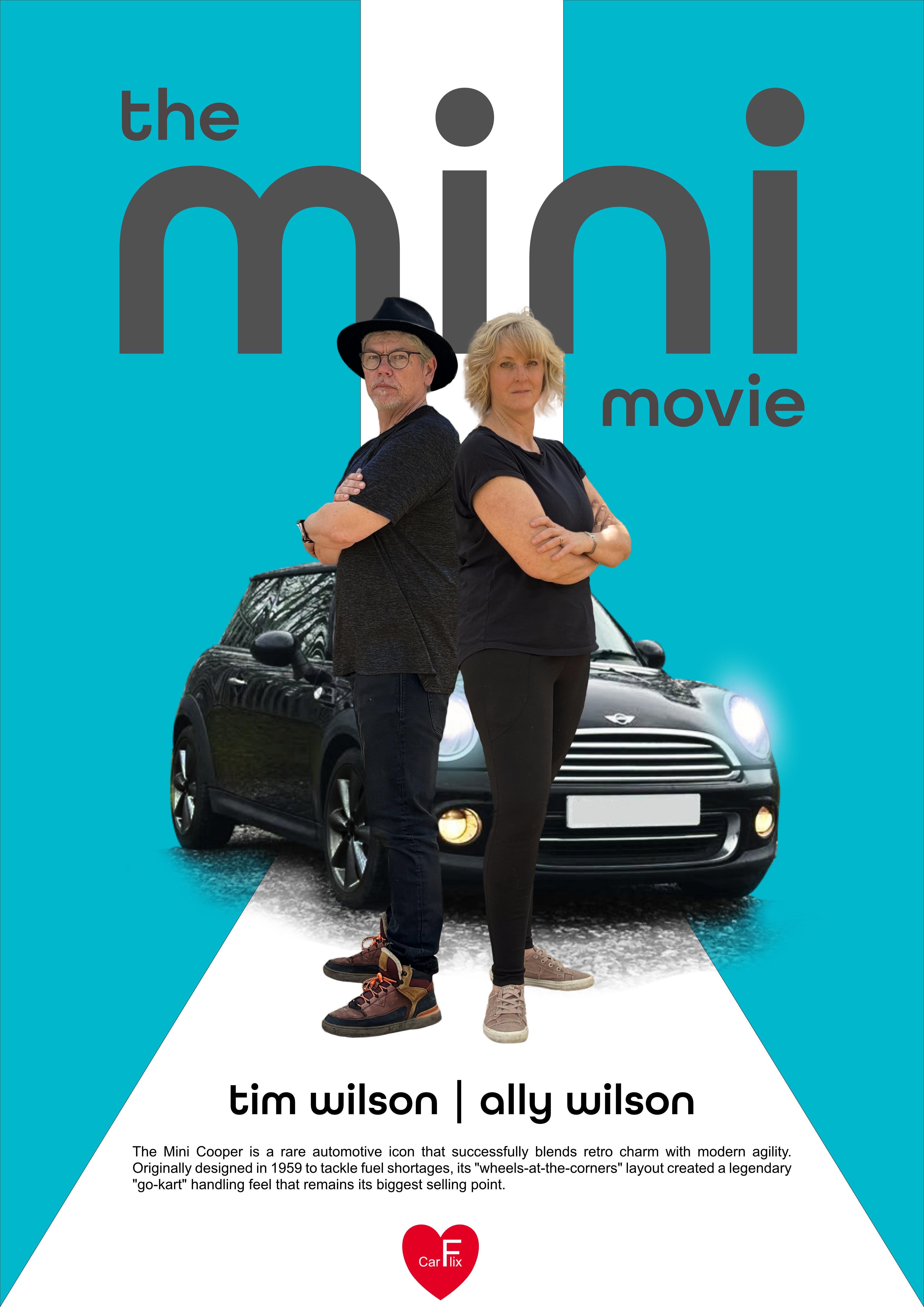
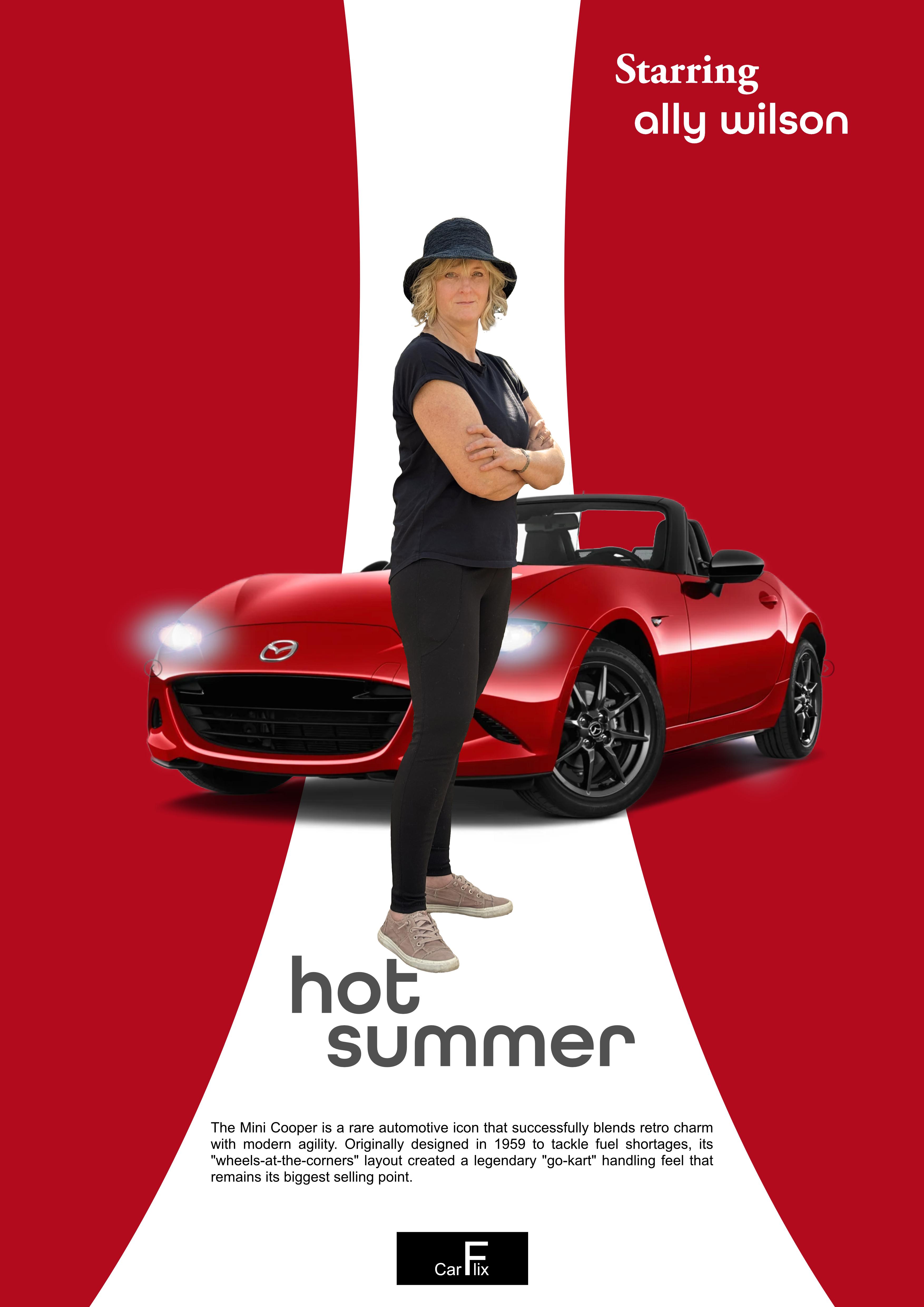
our movie along the top, and I'm going to call
mine street car. You can call yours
anything you like. I'm going to make a
shape to put that on. I'm going to use a rectangle. So I've just clicked and held
on the little shapes there. Go to the rectangle tool, and I'm going to click and drag a little
rectangle in there. You can choose any
color that you like for that. I can go in there. I could even use the
eyedropper tool. Ritzes right at the top there, and then move across
to the car and maybe choose a color directly
from the car itself. And once I've done
that, in here, I could choose to
maybe darken down that color if it was a
little bit too bright. I'm just going to darken
down just a fraction. Now that I'm happy with that, I'm just going to use the
move tool and make sure that it's absolutely in the
right place over there. You can see as I'm
moving it around, it's snapping to the middle of my document really easily because my snaps
are all turned on. The other thing I want
to make sure is that I don't have a little black
line around the outside of this because there is a stroke on there,
which is a black stroke. If you click on
the black stroke, then choose the
little nun button. That's this white circle
with a red line through it, that will make sure that there's no stroke on the outside. Done that, we can get
some text in here. So I'm going to go
down to my text. I'm going to use
some artistic text. Honestly, it doesn't matter
where you put this text, but I'm just going to
go in there and click. Now, by just clicking, it kind of puts in this
funny little line in there, and if I choose you see
my text is really small. Let me do that again, but
I'll show you what to do. So same tool again. Instead of clicking,
click and drag. What that does, it puts
an A in there so you can see the size that your
text is going to be. So I think something
like Streetcar in there. I'm going to select this text and then choose a
different typeface. The typeface you choose
honestly doesn't matter at all, as far as the outcome goes, but it's important for
the feel of the movie. I want something very simple, so I'm going to choose
this all round gothic. You can pick anything you like. And once you've done that, what we're going to be
doing is we're going to be changing some of the
options on here. So I'm going to go
to the window menu. I'm going to go down to text, and I'm going to use character because there's more options in here in the character than
there are along the top. The one that I'm interested in is in position and transform, and it's this one over here. It's called tracking. Whoops, wrong one,
I'm showing you. It's this one over here.
It's called tracking. So with tracking, if I
increase the tracking, what you'll see is that those characters
go further apart. And we get something
which looks far more cinematic than just normal text. While I'm here, by the way, I'm going to change the
color of the text, as well. So if we just move that into
the right position first, so I can see it properly, I
think, something like that. Once again, I'll select the text over there and
go and change the color. You can see we've got
some color in here. It's black at the
moment. I'm going to choose white. Over there. Let's have a look at
see how that looks. That's looking pretty
good, I think. I'm happy with that. Have a bit of a go, get your
shape in the background, maybe sample a color from the car or from the suit or
clothes, whatever you like. Put some text in. Don't forget to use the character panel, which is in the Window menu
under text and character. Open up position and
transform over there, and we're using, the one
on the left this time, which is called
tracking and just increase the distance
between those characters. But I did all of this using
the artistic text tool, you just click and drag to get your character the right size
to start off. Have a go.
11. Add Strapline Text: Let's get a bit more text down here, so I'm going
to click in there. I put in my new bit
of text, Max speed. And let's have a little sort of space between
those. Max style. Now, it is quite long, so I'm going to select it all. Now, I've closed
that window down, so I'm going to go to window
once again back to text, find my character options, and I'm going to just take
this back to zero again. Over there. And I also want a different typeface over here. So I'll go back over there, something not quite so stylish, just a little bit more
normal and easy to read. It's up to you whatever
you want to do with this. I will just choose
something really simple like aerial in there. And I don't want to be bold. I just want to be
regular like that. Now, we can just grab a
corner as well over here and just resize it. Back again. Change the color. Well, we can change the color
down here as well. There's so many ways of
doing the same thing. I'm going to click on that color and change that over to black. If you want different color, absolutely fine and up to you. I'm going to put in
another little bit of text down here and then
we'll do a logo together.
12. Create a Text Logo: I've got a little bit
of text down here. Now, the way that I did this
was I got this from an AI, and I just asked
it for 50 words on this movie poster and it came
up with something not bad. But then to bring it in, I used the little frame text tool, clicked and dragged a box, and pasted straight
into that box. And that way, when
you move this around, the text will just reformat itself and flow into that shape. I'm going back to my move tool and I will just delete that. Let's put in a little
logo at the bottom. I'm going to call
this car flick. For one of a better word, you can make up
anything you like. Pretty much the same
as the main title. We'll just click and drag. I'm going to put in car flick. And I'd like to use
the F over there. I like doing little logos with the middle letter
being really large. I want to take that, and I'm going to increase
the size of that. Now, over here, you can
see I could just pull it up like that. And make it as big or
as small as I like. Do be careful, though, if
you do something like this, sometimes you get these
really big gaps over there, and they don't always
look quite so good. I mean, mine doesn't
look good at all. So if you take it much bigger, then what you can
do is you can click between those two items
between the F and the L. I'm going to go to
my window text character. I'm going to use this
option over here. This is tracking with tracking, I can use a negative. You can see how -50 moves
it in a little bit. But I'm just going to keep going to minus quite a lot more. And you can see how we
can sort of bring it in. So we've almost got the F
being larger and over the top. Now, I'm not saying that
that's a great logo by any stretch of
the imagination, but it's great to
be able to play around with letters like that and make some
of them bigger, some of them smaller, and just
pull them apart, as well. I think with this one, I'm going to make that
smaller like that, and I'm going to put it
into a little circle. So I will just use one
of these shapes here, a little ellipse, drawing
my little elliptical shape. If I'm holding down
the Shift key so I get a perfect circle over there. I'm going to just choose
black for that circle. So I'll go over here and click
on that. Make that black. Move it across in
front of my text. And you can use the arrows on your keyboard to move it
around where you want. Now, I'm going to go
to the layer menu, arrange, and just move that
circle over here to the back. I could have done it
manually like that as well, so we can either
move it back one, which I did or back
right to the very back, which is underneath everything. Of course, this is
still not right. I need to go to my text, change the color of my text. I'll go down here once again, click on that and
make the text white. So we've got kind of the text reversed on that little shape. Now, why have I been putting everything in the
middle like this? Well, I think for this
particular style, the having everything
mirrored just works so well. So we've got those two. One shape mirrors
the other shape. He's down the middle.
The text mirrors each other with Mac
speed Mac style. This goes across both
of them in there, and it just adds to the whole style of this
particular movie poster. If you want to try it
out and, you know, you want something slightly
different and you thought, Oh, what about if we, you
know, moved him over there? By all means, have a go. There's no right or wrong. With this, I've just done it because I
know that this sort of centering objects
works really well. Now that you've got that,
put your text in over there, and then we'll export this out.
13. Export as JPG or PDF or PSD File Types: Let's go to file and save. I hope you've been saving
as you go along, unlike me. And what I want to do
is I want to go to File and choose
Export over here. So if I'm just exporting it around and I want to
email it to a few people, they might print it out
on their home printers. Well, I could use quite
happily a JPEG file in there. As long as I go with the
best quality over there, it should look absolutely
fine when it's printed out. Of course, we might
want to go with a PDF document over here. And from PDF, we can then
choose PDF for print, and this will also give us a
high quality PDF document. The other possibility is that you send it to
somebody and they say, Well, you know, we
don't have affinity. Could you do something that
we can open up in Photoshop? Well, if that's the case, you can just go down here
and you can choose PSD. And with PSD, we will preserve
the editability in there. And that way, they
can then open up in Photoshop and change things
around, should they wish. Whichever way you choose to go about that have a bit of a go, try more than one and
see what you get. But I'm going to go with a
JPEG best quality over here. I'm going to go down, click on Export and just export that out where I
can find it again. In my case, it's going
to be the desktop. So we'll have a quick look
at that and here it is. Finished JPEG file. Ready to print on
my home printer. Try it out.
14. Well Done & Thank You: Congratulations. You've reached
the end of this course. I'm sure you're
creating amazing work. Now, don't forget to
leave us a review. It really helps us to help to
build more courses for you. I also do courses in Adobe, as well as Canva and Procreate. Don't forget to follow me and
have a look at my profile. Lots more exciting movie
posters coming soon. I'll see you in the next one.
 Tim Wilson, Adobe Certified Instructor and Expert