Transcripts
1. Adobe Photoshop CC Bootcamp Intro: Hi, my name is Derek Mitchell and I love getting these Photoshop almost every single day for my career as a graphic designer and a creative director. And but using Photoshop for over 20 years and I've created this photoshop bootcamp course to quickly show you some of my favorite tips and tricks and some of the fun, best projects that I have to show you. So we're going to dive in with projects like how to create a parallel design and then how to mock it up so it looks real to present to a client. We're gonna talk about how to create composite images, which is one of my favorite things to do in Photoshop. That's where you take multiple different images that maybe don't belong together at all, cut them out and bring them together and merge them in a way that looks realistic. So we're going to talk about how to do that. Some of the tools you'll need to make that successful. We're going to talk about how to do packaging design and how to mock up packages like a coffee bag and make it look real. So if you've got a company or a brand or a client that wants you to take their logo and make it look real on a project or on a, on a package design. I'm going to show you how to do that as well. We have a bunch of different projects we're going to go through. If you look at the outline below, you'll be able to see what we're gonna do. I'm also going to show you some of the different tools along the way that are just good to know that maybe don't fit right into a specific project. But that way by the end of this boot camp, you're going to have a well-rounded understanding of everything you need to know about Photoshop to be successful with it. So if you're somebody who's always wanted to learn Photoshop but never really found the right instructor for you are the right YouTube video to get you up to speed. I've created this course, it's more focused to create strategic projects that will really help you learn the program and learn it quickly without being overwhelmed by all of the options that are available. So if you've ever tried to log into Photoshop and I'm sure you've seen hundreds of tools, hundreds of windows that feels like and no idea where to begin. So the way this course is structured is for the absolute beginner to just dive in and create real projects that are fun and also valuable. If you ever want to turn this into a career, you're gonna learn tips and tricks that will help you create real projects that clients could actually pay you for. And that will make you more marketable to the marketplace and help you find that job that you're after. So this course is definitely geared for the beginner for that person who's either never open Photoshop or maybe it's just kind of getting started and looking for that guidance. And so we'll start at the very beginning. I do go fast sometimes, so I'll go through and I'll show you some of the shortcuts and ways that you can become much faster and more proficient with the software if I go too fast because it's a video, you can also rewind it or play it back slower. Can also rewind it or play it back slower. You have lifetime access when you join. So that way you'll be able to go back and rewatch anything that maybe you'd get hung up with. Or you can even join us in our Facebook group and ask questions and get real live feedback along the way. If you're more of an intermediate to advanced user, you're still going to learn some awesome tips and tricks. You can play back the videos faster if you want or skip ahead to the specific sections that you're interested in. So again, my name is Doug Mitchell. I would love to heavy joined the course and join us. We have over a 120 thousand students across some of my other courses as well. And we have an amazing Facebook group at the time of this recording, I think we're at almost 17 thousand people in the group. So you're definitely going to find some awesome friends and some people to help you along this journey to become an amazing graphic designer and learning how to use Photoshop in this course. So if that sounds interesting to you, our love, loved, loved, heavy joined, and I would love to be the guy that gets to teach you about Photoshop and hopefully share some of my love for Photoshop and some of the best tips and tricks that I've learned with you. So hopefully I will see you in the course.
2. Introduction to the Photoshop Home Screen & Interactive Tutorials: If this is your very first time opening up Photoshop first of all, welcome. Congratulations, this is super exciting. I love Photoshop. I've been using it for over 20 years. And it's changed a lot. And what's really cool about it right now is it's easier than ever to learn, but it also has more tools and features and adverb before, so it can also be overwhelming. So I just want to show you a couple of things to help guide you along the way. And Photoshop already does a pretty good job of that. Let me show you what I mean. So we open up Photoshop and if it's your very first time, you probably see this take interactive tour. And again, depending on when you're watching this course and the version of Photoshop, maybe you don't see it. But up here I've got this hide or show suggestions tab, and I'm at the home screen. Okay, so I'm at the home screen. I'm gonna click down on this just in case you don't see that. But we've got this take interactive tour button. And if you click on that, it's going to open up some default layers and it's going to give you an interactive tour. So you can actually follow through and do the steps. Click on the Next button, do what it says to do, right? And you'll be able to kinda get up and running pretty fast with that. So I'm going to X out of this document and this interactive tour real quick, we'll click, don't save. So you could do that at anytime if you wanna kinda step through, maybe skip what I'm showing you and kinda just get up and running real fast. There's also a learn tab so I can click Go to learn, which is the same as clicking over here at learn. Okay? And so there's some hands-on tutorials where you step through interactive tutorials. Let's click on this. See it opens right up and you can go through and get up and running quickly. So super-helpful resource you guys. Again, hopefully you'll find everything that you want and more through this course. And I want to thank you for being a part of this course. But I also wanna make sure that if there's a feature that maybe I didn't cover because it's not something that I use regularly on my workflow. I still want you to be able to know where to find help. So you can also check out our Facebook group. It's got a lot of amazing students at the time of this recording, I think we're up to almost 17 thousand students in the group. So if you need help and you get stuck, it's a great place to go look for help if you need hands-on help. And then there's also more tutorial on the web. So as we scroll down, you can see has all kinds of really cool trending tutorials to get you up and running. And you can even go to Adobe.com is button down here to find even more tutorials on the web. Click on that to check that out. And then kinda hidden down here in the bottom left, we have this, What's New button? And this is kinda fun to if you're familiar with Photoshop, but trying to kinda keep up to speed with things. So again, like me, I've been using it for a long time, but there's constantly new features being added. So if I want to see at a glance what's new, click on that button and you can see we've got lots of cool new features. Awesome new features. Alright, so check this out. Come back, maybe kick around with some of this. And I hope that helps you get up and running quickly and without the overwhelm. Because Photoshop has a lot to offer and it's really exciting if you stick with it. And don't be overwhelmed just one step at a time and don't forget, would love to hear from you. Feel free to comment in the video where you can in the comment section and check out the group at the Facebook group for additional help and resources.
3. Join our Facebook Group for Help and Support: So I just want to take a second and introduce you to our Facebook group that coincides with this course. So this group was designed to be a place where students can get questions answered quickly. They can share some of the projects they're working on and get feedback. And it's also an awesome place that we've set up a mentorship program as well. So if you jump into the group, we've got this mentor-ship tab here where you can actually find a mentor or become a mentor to somebody else. Maybe you're further along in your design, whether it's software-related or, or graphic design related. But you're further along in your career and you want to help somebody out, you could decide to become a mentor. We'd love to have you as part of this as well. And the hope is that, you know me being one person and having so many students, sometimes it's difficult to answer your questions as fast as I would like to. And so it's a great place to get questions answered pretty quickly. So if you're stuck with something or maybe you're going to meet with the client and you've got a question about billing or how to send them an invoice or different things like that. There's lots of really cool people in the group who would love to answer your questions. So definitely check it out and then as soon as you can, maybe say hello, drop a quick posts in there with your name, maybe where you're from or what you're learning, what you're up to and maybe even share some of your progress in this course along the way, post some of your projects and let us see what you're up to. So when you get a chance, go to facebook.com slash groups and then forward slash complete graphic design. And then you can join and we'll let you into the group, but we'd love to see it in there. So go ahead and do that now forget any further signup and then maybe even say hello and start posting some of the projects you're working on.
4. Photo Compositing Skillshare Intro: Blending images together is one of my favorite things to do in Photoshop. And it's actually something that I get asked a lot about from my students. So in this course, what we're going to be doing is creating a desktop wallpaper. Or you can easily create this for your mobile device or even something for print, like a poster, whatever you wanna do. But we are going to be learning how to take multiple images that don't belong together at all, and how to cut them out and Photoshop and put them back together in one image to create a composite. We're going to learn tips along the way about how to create natural lighting so everything blends well, we're going to learn about how to cut out the images in a way that you can't even tell that it's been cut out. How to mask those images and a handful of other tips and tricks along the way. If you want to follow along, all of the images are provided in the exercise files. And it's gonna be a ton of fun. So hopefully you join and we will see you on the other side.
5. Photo Compositing: Introduction and File Setup: So in this lesson, we're going to create a brand new desktop wallpaper. I actually currently loved the wallpaper that I have, but I've had it for a long time, so I think it's time to upgrade and make something new and fresh. So what we're gonna do, we're gonna be learning about photo compositing. So what that means is we are going to be mashing some different photos together to make a really cool composite image when it's all said and done. So what we're gonna do is go ahead and dive right into Photoshop. And I'm going to create a new document. And this is where you're going to have to decide what size you want to make. So for making a desktop wallpaper for your computer, you need to know what your screen size is. So one way to maybe get there quickly is to go to web up here. And you can see we've got some different most common web sizes, website sizes, but this just means the screen that you're viewing. We can also come up to film and video and you might be able to start with one of these templates. You could also jump into your System Preferences if you're on a Mac, if you're on a PC, unfortunately, I am not up to date with the latest update to nowhere to tell you to go look. So anyway, what you wanna do is you want to find your display settings and we can see what different size options we have, right? So if I click on the scale that I kinda hover, you can see down before are down below the screen. Look right here. It's going to pop up with what those pixel dimensions are. Okay? So if I, if I'm right here, I'm at 1920 by 1080, that's a standard HD size k. And I have that set right now because as I'm recording this tutorial, what my screen to look nice and big so you can see it. But if I change the more space on this 4K monitor, it is going to be, everything's, It looks super tiny, right? Very hard to see. So I'm gonna go back to large here. So what I'm going to be making is a 1920 by 1080 pixel document. All right, so let's go ahead and close this. And that's actually a very standard film and video size. So 1920 by 1080, I can click right on that. And it's going to change my settings here. So my width is 1920 pixels by 1080 for the height. Alright, so make sure you're working in pixels as well as for the resolution. So because we're working on a screen, usually 72 is fine. Now though, because we have ultra HD monitors and different things like that, Retina displays, you might want to experiment with this. Maybe double it will make it 144. It's just gonna make the file size a little bit larger and it might look a little crispier and clean depending on what scale you're working with right now are color mode. We're going to leave us as RGB color because we are going to be working on a screen that this was something we are going to be printing. You'd use CMYK colour and I go over this in much more detail in the graphic design bootcamp course. But for now, we're going to be using the RGB color mode to get started. All right, now that we've got our settings set, let's go ahead and click on the blue Create button down here, and our new document is ready to go. Alright, so your screen probably looks a little bit different than mine. So let's just go ahead and do some simple house keeping rent. Come up here to the top right. And we're gonna click on this little icon and we're going to come down to essentials. And we'll click on essentials and then will come and click on that again. And I'm going to click Reset essentials. All right, now that you and I are looking at the same thing, I just want to point out real quick before we go too much further, at any given time, you can come up here to this little drop-down and choose a different workspace depending on the artwork or the project you're working with. And it will rearrange all of the windows for you to give you all the different panels that you're going to need for that project, okay? And if you wanted to, you can create something totally custom by just grabbing these tabs and docking them somewhere else however you want in whatever makes the most sense for what you're working with. You can also go up here to window. If you don't see something you're looking for, perhaps the brushes window and click on that and it'll open the brushes window, right? So there's a lot of ways we can create our own custom workspace inside of Photoshop. For now I'm gonna come back up here to essentials. We're going to reset that real quick. And what I could have done before we said that you actually could save that, right? So for example, I've got this photoshop 20-20 live from a live teaching I did. And all it does is it puts us navigator window up here. And that's where I overlay my video camera, my camera. So you can see the video of me, my talking head. Just, just a fun, easy way to make PhotoShop completely your own and work for you here. Alright, so now that we've got this document open, we're ready to go. Let's go ahead and start dropping in our assets.
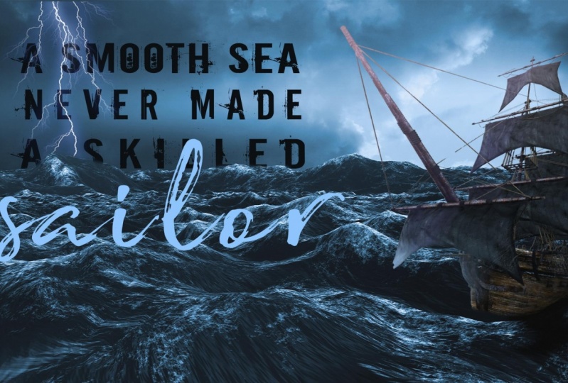
6. Adobe Stock and CC Libraries: Okay, we've got our file setup and now it's time to create our desktop wallpaper Photoshop, composite image. Alright, so as we go through this, you'll be able to follow along with the assets that I provide. I'm actually going to be grabbing them right now and putting them into the folder. But by the time you're watching this, they should be all gift wrapped for you to be able to download. So go ahead and grab those if you want to follow along. And just a reminder to if you do want to follow along, because this is a video, you can play it, pause it, do some of the work and follow along. If I go too fast, there should be a place speed down below where you can slow the video down. Or you can also rewatch it again if you get lost and if it's too slow for you, maybe are a little more advanced. You can also speed it up. So I go faster. So just a reminder, guys, use, use the fact that we're watching this on a video to follow along, to pause it, to do the work in, to make something fun along the way, OK. All right, so as we get going here, what we're gonna do is we're going to be gathering these photos and these assets. And what I'm gonna do is actually leverage the Creative Cloud libraries to do this. So what libraries are, it's a way to gather assets. And you'll see from other graphic design course, I've got some colors that I've sampled, some font styles, some graphics, all kinds of things. Alright, so I want to start doing this for this course as well. So what I'm going to do, if you don't see this Libraries panel, you should though because we reset our Essentials workspace. But if you don't see it, what we're gonna do is come up here into the window, down to libraries. And when you click on that, you'll see your library's. And down here below I want to click the little plus sign to create a new library. I did that wrong. I'm not trying to add a new asset right now what I want to click on this twirl down actually, There we go, down to create new library. So I'll click on that and we're going to name this photoshop bootcamp. I could also name the specific to this project. So the Photoshop boot camps gonna have everything that I make for this course. But maybe I want to make it just a desktop wallpaper library. As you can see, I'll go ahead and click create this real quick. But as you can see, I have many, many, many libraries and I use this for all of my clients so that at any given time, I could scroll through to any one of the clients that I wanna look at here and click on it and you'll see any of the assets that I've created for them. So let me, as an example, let's come down here too. This tough country bumpers. Click on that and you see I've got some photos have downloaded for them as well, some assets for things that I do. So also the brand colors are in here. So anytime I want to just dive right into a project and go, it's just right there for me. Here's another example. I'll click on 0 dark. I've got some, some images as well as a logo that I created for them. And all I have to do is just drag and drop right into my Canvas and those assets are there for me. So that's what we're gonna do right now. Let's go grab some photos for us. I'm gonna come back to the Photoshop bootcamp library that I just created. And right above it in libraries I can actually search for within Photoshop for anything that I want. So we're going to make a composite image. I'm really feeling the ocean vibe here and I think we're going to create, if you took the graphic design bootcamp course, we made a poster that said, a skilled sailor, No, a smooth sea. Never made a skilled sailor. Anyway, we're gonna do that. So what we're gonna do is actually find an ocean image. And right now it's just searching through Adobe stock. But I know I've already downloaded this before. So I'm gonna come down to all libraries and I'm gonna grab this image that I've already licensed and I'm just gonna throw it right into my, my canvas here. So we'll throw this in there. Alright? And you'll notice that I've got a new layer above my background now. And let's go ahead and come back and search for some more. I'm also going to want maybe some lightening. So I'll search for lightening. And this time you'll notice nothing pops up. Well, it's because I'm still set to search for all my libraries. So this is the only searching within the libraries that I've already created. So I'm going to come back and change this to Adobe Stock. And now it's going to search on the actual Adobe Stock website. And you can see we've got some great options here. I'm going to grab this right here. I'm just going to drag and drop it right into my Canvas. And when I do that and I hit Return, you'll notice, will usually you would notice and I don't see it. Usually there is an Adobe watermark across the top and I don't know why it's not showing up on this one, but that's okay. We're going to leave it right there for a second. And here we have this little cloud icon. And what that's telling me, these are Creative Cloud assets and I can license this asset right here. I see this properties window. And again, if you don't see this tab come up to window. And then we're gonna come down to properties and we can see the properties for any of the assets I click on OK. So I'll click on this and if I wanted to, if I wanted to use this, we'll go ahead and keep it. I can either search to find similar. It's gonna open up the web browser and it's going to look for similar lightning bolts if it's not the exact thing that I'm looking for. So I suppose while I've got this open, I might as well just check it out here and let's see. There's some pretty epic lightening bolts on here. And I think I'm pretty happy with this. I think it's gonna be okay. So what I'm gonna do is go ahead and license this asset. So I'll click right on there. And it's gonna ask me if I really want to license this thing. I will confirm that it will use one of my licenses. And interesting, there must be a glitch right now in Photoshop. There we go. There we go. Okay. So you saw the watermark pop-up for a second and then it went away. And also we can notice that this is much clearer now as I zoom in, it's a higher res image. Okay, so I've got that to work with now it's licensed. We're good to go. Now I want to find a ship. So I'm gonna come back over here. I'm just going to search for a ship or going to scroll down a little bit and see if you can find one. This one actually looks like it might be perfect. That might be perfect on the scroll a little bit more just to see, I know this is the one I wanna use, so I'm just gonna drag and drop it right into this. I'll hit the Enter key. All right, and now, same deal. You'll notice it's kind of pixellated. As I zoom in, it looks really bad. So I'm gonna do just to make sure. So what I want, I'm gonna click on Find Similar again and just see if there's any other ships that might fit this scene better. Alright, that's kinda scroll through here for a second. You know, I think I'm pretty happy with the one that I found. And we're gonna go ahead and come back. I think we're just going to license that one as well. Alright, so I'm gonna grab this and I'll click License assets. So one thing that's really cool with working with the libraries and the Adobe Stock. Avoid license this one as well. You'll see that it's got the watermark and then once it updates, it will go away. But what's really handy with this as I could work with this, I could fully create anything I want. And as long as it's linked up with this iCloud or I'm sorry, iCloud with this cloud, that Creative Cloud I can licenses later. So let's, I'm gonna show this to a client and I'm not sure if they want to use it yet, I could create all this artwork. And then at the very end of it, let's say they want to swap it out. I could drop something else in and then update the license and it would license that asset for me to use right now. Obviously, right now I'm using purchased assets and a lot of times you're going to find the best, highest quality assets when you pay for them. However, it let me show you real quick a few other sources that I really enjoy that I think will be helpful for you. So we're using stock, we're using Creative Market. I use at some times as well. Alright? And we'll use pixels, and I use unspliced ash. Alright, so let me talk about these first. Okay, in Voto elements is an awesome resource. It's just a monthly fee you pay. And then you have access to all kinds of items from stock, video, music, sound effects, graphic templates, graphics, photos, fonts, add-ons like for Photoshop, all kinds of amazing things. So if I come here to photos and I were to search for ocean, you'll notice that there's a lot of high-quality images in here as well that I could have used. And the difference between this and Adobe Stock is that you pay a monthly subscription and you get unlimited access to as much as you want. Whereas with the W stock, you have to pay about three bucks per image. You license. So it can be a little more expensive. But I've found that a lot of times it's really nice as you've seen to just grab assets right inside the library and drop it into your canvas. And then a couple of free resources just to get started. And actually create a market is not free, but that's another one that I use as well. Creative Market is an awesome resource for creative graphics and assets, okay? But pixel, Pixels.com and unspliced cash are both really great websites for beautiful images as you're working through things, ok guys, so you might want to start checking out pixels and on splash as you create your composite image.
7. Photo Compositing: Blending Images Together: Alright, so what I'm gonna do now, we need to start creating this composite in blending things together. And so what we're gonna do, let's go ahead and start. We're gonna turn off this layer. So we're in the layers panel. I'm going to click on the little eyeball here to turn off the ship. Okay? And I'm going to come into this lightning bolt, and I just want one of them. So what I'm gonna do is I'm gonna get my lasso tool, the letter L, or come over here and my toolbar, it looks like this. Again, you should see this because of how we reset our our our Windows panel. But if you don't see it, come all the way down to the left-hand side, will click on these three dots. Click and hold, and you can edit the toolbar. And inside of here, you can see every tool available. So you might need to do that depending on what you see. Alright, but we've got our lasso tool. Letter L is my shortcut and I'm just going to click and drag around the lightning that I want. And I'm going to let go and I get these marching ants, this marquee selection, okay? And so now that I've got that, I'm on my lightening layer. And I'm gonna come down here and click on this little square rectangle icon with the circle inside of it. This is a layer mask. So when I click on this, it's going to create a mask over the image. So what we've got going on here, I've got my main image, but the lightning bolts. And then you'll see a little chain link icon, which means it's linked to this mask. So as I move it around, I'll get my move tool up here. I move it around and this mask moves with it. Okay, if I were to unlink that. And now if I were to move it around, you'll notice that I can move the mask. Woops, Or I could leave the mask there and click on the image, and now they move the image, the image moves inside of the mask. I hope that makes sense. I'm gonna hit Command Z to undo that. I'm going to link it back up. Alright, so now I've got this selection, but I know what you're thinking. This is a terrible selection. I can obviously see the black outline that's not gonna work for me. So what we're gonna do is we're going to play with what we call blend modes. So I'm here in the layers panel. Radical Russ has normal. And again, pay attention to where your, which layer you're selecting. We don't want to mess with the mask. We want to click on the actual image. So we see that selected. I'm going to compare to normal and I'm gonna click on that. We're going to play with the Screen blend mode. So as I hover over all of these, you'll notice that it changes my artwork. And what's happening here is it's changing how this specific layer, the lightning bolts are interacting with whatever's below it. Okay, so in this case it's the ocean image. So I'm gonna come back up here to normal. I'm gonna click on that. And as I hover over it, you can see there's different things. But I happen to know that screen is going to be the one that's going to hide anything black. Alright? And it's going to reveal all of the lighter tones. So by doing that, all we're left with is this lightning bolt. Okay? Now what I wanna do is scale it into place. So there's a couple of things we can do here. I've got my move tool selected up here at the top. You'll notice I have an Auto selected to the layer. So whatever I click on, it will automatically start to move. Okay, so as I click, you'll notice over here in the layers panel it is automatically grabbing whatever I click on, which is helpful in handy, but sometimes it becomes difficult to grab things, so you might want to turn that off. And then no matter where you click, it will only move whatever layer you have selected. Okay, so we're gonna go ahead and move this into place. I kinda like the scale of it. As far as how it looks. But let's say that I wanted to, to scale this down so I don't lose some of this up here. So I've got this layer selected. I could with the move tool, click on Show Transform controls. And then these will always be available for you to scale things down. And you'll notice it's scaling the entire image. So it sees if I were to hide this mass by holding down Shift and clicking here, you'll see that we still have all the other lightning bolts were just hiding the mind, this mask. Okay, so that's why we get this transform control over the whole image. So for beginners, it's pretty easy to turn that on and then scale things down, okay? But what you might also want to do is come up to edit. This is called Free Transform. That's what we're doing right now. So the shortcut on a, on a Mac is Command and the letter T on a PC it's Control T. Alright, so we're gonna click on that. And that's how you would get these transform handles and we can scale it into place. Now the next thing you'll notice is depending on if you hold Shift or not, you can skew the image. Okay? So if we don't want it to get skewed and look silly, we will either hold down the Shift key or let go of the shift key to get different results here. Okay, some scale this down. When you're done. You can just hit the Enter key here. And depending on so I've got the show Transform controls turned on. If I turn this off, Command T to scale it. Alright. Hit Return or up here in the Options bar and click on the check mark. Okay, so now that we've got this scaled into place, that's kinda cool. We can do some other things too. But for right now what I'm gonna do is let's come back to this pirate ship. Let's turn this back on. And we need to make a selection with this. So there are lots of ways to make selections, but my favorite right now and the new updated version of Photoshop. And actually there's a few different things we're gonna do here. And what I need to do, because this is a cloud document. I'm going to right-click and I'm gonna click on Rasterize Layer. And that's going to break it from the cloud link and it's going to mash it down as a flat image, which will then allow me to do this in the properties. If I scroll down here, you'll see Quick Actions. I can remove the background or I can select the subject, the subject meaning whatever's in focus. In this case it's the ship. So I'm gonna remove the background. I'll click on that. With one click. It gets me pretty darn close. And you'll notice what it did when I clicked on that. The image is still there, but it added another mask. So Photoshop did a really good job of automatically creating a mask for us based on what it thought was the main subject. However, we're gonna need to clean this up a little bit. So what I'm gonna do is zoom in here. I get the letter z to get my zoom tool. Or in this case, I had my move tool selected. I'm gonna hit the letter, I'm sorry, I'm gonna hit the spacebar, which gets my hand tool, which lets me move around the canvas here. And then I'm going to add command to that. If you're on a PC, add controls and I got spacebar and command held down. Then I can zoom in or I can hit spacebar. Command and option are spacebar control and alt on a PC to change to a zoom out. Ok, so that way it's really easy to use your keyboard shortcuts to zoom in and out on this thing. Alright, so what we're gonna do is we're going to zoom in and we need to clean up this selection. There's a lot of ways to do it. What we're trying to do is just paint with a black colour on this mask to hide the image we don't want. So that could be as simple as getting your brush tool. And in letter B, maybe grabbing a soft brush up here, changing the size and the hardness to match what you need. And you'll notice nothings happening. Because if I were to paint to pass this, it actually reveals the image. Well, that's because we're painting with white on our mask and anything white will reveal if I swap this by clicking on the double arrow or hitting the letter X on my keyboard, I can swap it. So black is on top here, and now we're painting with black to hide. So i could come through and I could paint over the top of this mask to hide that. You can see that's gonna take me a long time. So let's see how much more photoshop can help us out. What we're gonna do is the letter w to get my magic wand tool. And if I click and hold on this, you'll notice this tiny little down arrow. Any of these tools that have a tiny down arrow tells you there's more tool stack behind it. So we've got our magic wand, we've got our quick selection tool and our objects selection tool. Right now I'm going to work with the magic wand. I'm just going to click in here. Let's go ahead and grab the, we want to be on the image layer. I'm gonna click in here and you'll notice as I click, it changes the selection. So what I wanna do is hold down the Shift key while I click and it changes to a plus. So now I can add more to my selection. So I can click in here and click in here. And you're going to have different results depending on your tool setting. So I have this tool selected. You'll notice at the top, I've got this thing called tolerance. Alright, so the higher the number, the more selection it's going to add to it. If it's a low tolerance, it's only going to select, for example, let's say number one. As I click in here, you'll notice it will only grab pixels that are the exact same essentially, okay? And then we also have this contiguous, contiguous. I don't know how to say that. Anyway, we've got this check mark here. That means it's only going to select things that's that is within the selection. If our two Bumpus backups to say 20, and I turned off contiguous and I click here, it's going to grab everything in the image that it sees as the same color, okay, but we want to turn this back on. I'm going to select, de-select or hit Command D to Deselect, but I just did. Alright, we're back on this image layer. I'm just gonna click in here, hold down, shift until I get a pretty good sampling of the part of the image I'm trying to remove. Ok, so hopefully that makes sense. With that selection. Selected, I'm going to come back over here and click on my mask. And I want to fill this with black. So the way we're gonna do that, it's going up to edit, down to fill. And I want to fill it with the foreground. So we've got options here. Foreground background, color content where lots of cool things, or it's black and white or 50% gray. But because my foreground is already set to black over here, this is what's on top is the foreground. I'll click on that. I'll click OK. And it just filled my selection only with black in this mask. Okay, so now I'm done with that. I'm going to hit command D to Deselect or come up here to select, down to de-select. All right, and we're going to start doing some more selections over here. Okay. And again, depending on on what you're working on. You're going to have different tools will be, will be more successful than others. But we're going to just kind of click around here, holding Shift and adding all these little sections to my selection. Okay, we'll come back here on the mask. And we're going to this time another shortcut. Instead of going to Edit Fill, I'm going to hit the option key and the delete key, and that's going to immediately fill with whatever my foreground color is. So by holding on option delete, it, filled that selection with the black that I have on top here into my mask Command D to Deselect. Okay, so I'm gonna go ahead and keep cleaning this up a little bit with my magic wand tool. Given it pretty close. And for the sake of this tutorial, because less than not being, you know, an hour long, we're gonna go ahead and speed this up a little bit and maybe not be quite as picky as I usually would. But we're we're getting pretty close here. So we'll click on that back in my mask alt delete Command D to D select. And that's looking pretty good. Okay, so let's I know I said let's wrap this up but I can't help myself. It's addicting. I want to just keep clicking here and getting all of these selections. Perfect. Alright, we're close, we're super close. All right, alt, delete to fill my mask with black Command D to Deselect, spacebar command and option to zoom out. Alright, that's a lot better. Okay, and you can see down here, we maybe need to remove the waves. Let's do that as well. This time I'm going to do is get a nice soft brush, hit the letter B, and it goes back to the brush I had set here. Okay? Or hardness, that's the edge that we want to be super soft. Scrub this to the left. And I'll do that. And now we are painting with black honor mask layer to hide these. Alright, so we're just gonna kinda scrub around here and just blend this in with the waves from the layer below. Alright, so this isn't perfect, but it gets us really close. Really close. We'll zoom out. All right, not bad. Alright, we can clean this up a little bit more, but this, this is a great first start. Alright, let's grab as lightning bolts, I'm gonna change my selection to auto select with my move tool so I can just grab as lightning bolt and move it around. Maybe scale it up a little bit, maybe rotate it a little bit. To rotate it. I'm just holding off the edge here until my cursor changes to a curved arrow and then I can rotate it. Alright, That's pretty cool. We'll hit Enter to commit that change. Alright, also, don't forget to save guys, I've recorded this entire thing without saving and I totally forgot. So what we're gonna do, I'm just going to hit Command S for the shortcut or you can come up here, file down to Save. And we're gonna save this document before we go any further. And let's save this as ship desktop wallpaper. And I can put the dimensions 1920 by 1080 just in case I need to remember what sides it says. And I will go ahead and click Save.
8. Photo Compositing: Color Grading and Adjustment Layers: Alright guys, it's looking pretty good. Lets go ahead and push this a little bit further. So what I wanna do now is I want to make these colors match a little bit better. You'll notice this ship doesn't quite look like it belongs in this scene part of it, as these waves are very Kevin, HDR feel less stands for High Dynamic Range. So we've got really dark blacks and really light bright highlights here. So what we're gonna do is try and stylize this ship a little bit. So I'm gonna grab this image here and I'm going to hit Command L, which is the same as going to. So we want our levels is the same as going to image adjustments down to levels. Okay, so we're gonna pull that levels up here. And I'm going to play a little bit with this as my dark tones. If I click and scrub this, you'll see that the blacks get even blacker or the mid tones, right? We can make them lighter or darker. And then our highlights or whites, we can make them even brighter, okay, and we can adjust how this looks or even our output levels. So as a whole, this just kinda looks a little bit lighter. So I'm going to scrub the lights down just a little bit too dark, ended up. Maybe bring in the blacks on this and crush up, crashed the blacks great, slide up the whites here. And that is better. That's looking better. Okay, so we're just gonna play with this, which is the eyeball on it. And sometimes these adjustments don't work. Sometimes you'll play with an image and it doesn't quite look right. So maybe what we wanna do is compare the image adjustments and you'll see there's a few different ways we can work on this image. But what we're gonna do now is grab an adjustment layer. So what we're going to click right here on this little circle that's got the line through it. And we are going to put an adjustment layer over the top of everything. So there's lots of different types of adjustments we could do. I'm going to play a little bit with the photo filter right now. We'll click on that and it throws in a layer over everything else. And I can change how that looks. And you'll notice it adds this warming filter over everything. So it kind of makes the whole thing feel like it matches. Now I don't really want to, as I look at this, I really like how it looks. So let's kinda keep playing with it. We're going to click this drop down. Maybe we wanna cooling filter to really make it look. Cool it off here with some different blue tones. Ok, let's click down here. How about CB, a town, right? Make it look a little older and stylized. Okay, so that's one way to work. Let's go ahead and turn off the eyeball here to see it on and off. Let's maybe add another layer. Another adjustment layer will come to hue and saturation, and we'll click on that. Okay, and this time I've got the photo filter tuner off now playing with hue and saturation. And I can adjust how saturated is or what the hues of it are. You'll notice it changes the entire image below. So this is a really quick way to make the whole image look like it kind of belongs in the same scene. Okay, there's lots of other tricks we can do, but that's a quick and easy way to do it.
9. Photo Compositing: Adding Text in Photoshop: Alright, now bad for our first composite image. Now let's go ahead and add some text. So I'm going to hit the letter T on my keyboard to get the Type Tool. And up here in the top color and the Options bar, I can click on that colour chip to select the color I want. So I've got the color picker window, and as I hover over my document, you'll notice that I get this eyedropper tool. So I can click anywhere inside of this to select that colour over here. Okay, so I'm gonna go ahead and grab a lighter blue color from the sky and we'll click OK. And I'm going to click once to get a placeholder text. And you'll notice this is huge up here, so with it's still selected, I've known anything else. I can click on the letter T and scrub it left to make this smaller and fit inside my window here. And now click on my move tool and I can move this text into place. And Lorem Ipsum, What does that if you don't know, this is basically Greek filler text. So if you don't have text to show your clients, you can use this as a way to just see how the design looks. But in this case, let's go ahead and add some text to it. So we'll say a smooth sea and moves up here. You'll notice we've got our text layer here. With my move tool selected. I'm gonna hold down the option key, click and drag down a copy, the letter T at MyType and then Triple-click in here to get it all selected. So a smooth sea never made. We'll hit Enter to commit that letter v Now. So by hitting the, hitting the enter key, I can now use my keyboard shortcut so I can hit the letter v to get my move tool without typing the letter V in here. So a smooth sea never made, um, uh, hold down the option key, click and drag. And we're gonna say a skill, skilled. Hit, Enter athletic video, my move tool, hold on option to drag a copy. And then we're gonna type sailor. Alright, smooth C never made a skilled sailor. Perfect. Alright, so we've got some text in here that we can now manipulate and work with. So because I've got my move tool selected and auto select selected, I can now click and drag anywhere I want, will not anywhere, but I can click on this, on these different text layers and automatically move them around. So it's a nice, easy way to quickly get your texts laid out how you want it. So what I'm gonna do, I'm gonna kinda play around with this a little bit. I'm gonna hit Command T to scale this, will scale it down a little bit. And now if you hold down shift and option, or just Option or Alt, You can scale from the center of your scale point. Or if I don't hold down option, it'll scale from the corners. Okay, so we're going to scale this into place. I'm just kinda playing with sizes and obviously this is difficult to see. So maybe we add some effects to it. Maybe I'll add a drop shadow, so I'll click on this. I've got my text layer selected. I'm gonna come down to effects. We're going to add a drop shadow. But this window open, I can move this to the side and actually physically click right here and move the shadow exactly where I want it. And I can adjust the spread or the size. We're gonna make it pretty subtle. Okay, I'm going to click on the color swatch here. By default, yours was probably over here in the gray tone somewhere, but I'm going to click right into the sky to kinda make it match. And then maybe drag this down a little bit to darken it up. And then I can change the opacity. I can bring it in a lot or make it just super subtle. Again guys, this is just all whatever you wanna do, just playing with it a little bit. Okay? So that's one thing we could do is add a drop shadow to this. We could also experiment with changing the color completely. So let's go ahead and turn off this effect down here. I can turn off this drop shadow. Maybe I want to make this whole font darker completely. Someone hit the letter i to get my eye dropper tool. And I'm going to sample this dark color, the waves below. And now with that selected, I'm gonna hit option and the Delete key to just immediately fill my text layer. You could also come over here to the properties and click on the color swatch right here, and just click anywhere you want and see it as you go. Ok. So there's lots of ways to do things in Photoshop. You'll notice as we get going. So I know I'm throwing a lot of information at you remember, you guys can always rewind the video or play, pause it, do the work, and then continue or speed it up or slow down the options down below. Alright, so smooth C never made, let's make this a little bit bigger. Maybe that's filled up with the same dark color. So option delete to fill it. And you'll notice I have these little pink lines showing up that kind of pop it into place. Those are called smart guides. So if I come up here to view, I could turn on snapping and I can also turn on snap to Guides, document bound layers, all that kinda stuff. And those will help you lay things out and get everything lined up nice and tidy here. Alright, so we're gonna scale this guy up a skilled, fill it with a darker color. A skilled sailor. Alright, and maybe we change this font that something else will highlight this. Oh, let me think about a brush. Brush. I don't really like that very much. How about broadcast matter? That's a good font. Alright, so what I did there without even thinking about it, I went really fast. Let's, let's slow that down a little bit. Okay, so when I click on this, when I go back, I have this whole thing highlighted over here in the Properties. You'll notice our font, we have this right here are tracking. And you'll see it's tracked out to 300. So what I did, I could have just clicked in here and set the 0, but I had the whole thing highlighted. I hit command option and then the left arrow, right arrow. And you notice that adds the tracking by default on a PC, I'm pretty sure it's control and alt to do that. But anyway, we're just quickly adjusting that. And then Command Shift and the period key or the key. So the right character of the left carrot bracket keys. Make it bigger or smaller. And right here, it's just the same as clicking on this text and you can scrub it as well. So like I said, lots of ways to do the same thing in Photoshop, but just trying to kinda show you my workflow at the same time and how I work fast. Alright, so this skilled sailor, This is kind of cool, but you can't really see skilled. Let's see if we can crunch this up a little bit. I'm going to bring, I'm going to turn off the sailor layer so I can grab that, move it up. Okay. So work in progress. But you guys see you see what I'm doing here. We're going to just play with it a little bit. I could even go so far as to add a mask to this text. Brush tool, painting with black. And I could mask over the letter. So they kinda look like they're popping up out of the ocean here. I can't even grab this photo layer and get my quick Selection Tool will make this a little bit larger. And I could highlight the waves that way. Hold down the option key to subtract this part here. Alright, so now I've got a selection just around the sky, but I want to select the opposite. So I'm gonna go to Select down to inverse and now selects the opposite here. So now what I can do is come back to my mask on the words a skilled. And I can fill this with black. So option delete or edit, fill. And now it, if I hit command D or go to select, de-select, it hit the letters behind that selection. Okay, and I can come back here into this mask and I can refine this a little bit more. Alright, looking good. All right, a smooth sea never made a skilled. Let's turn sailor back on. Looks pretty cool. Lots of fun. Awesome. Alright, so that is our very first composite image. I'm going to go ahead and Command S to save it before I forget. And now that I've got this set up in the right file size, well, how do I get it from a Photoshop document onto my desktop? Well, what I can do is come up here to file. And we can hit Save As or export depending on the type of file we're going to save it to. But for now we're gonna go to Save As we're going to change it from a Photoshop document to a JPEG. I'll go ahead and embed this color profile is SRGB is going to make the colors look like they match across most devices, whether you're on a PC or a Mac. And then I'll click Save. We'll go ahead and change the file size dimensions. Make sure it's set to maximum. The large files that weights as crispy and good-looking as we can make it, we'll click OK. And now we have that JPEG that I could go find. And I can right-click on it and I can set it as my desktop wallpaper down here set desktop picture. And if we hide all the windows, you can see that this is my new desktop wallpaper. Not bad for our first pass at Photoshop compositing. Alright guys, I hope you enjoy it and that you learned a ton of information. I know that was a lot and it was a whole bunch of information. So if you've got stuck along the way, don't forget to ask for help or just watch that video again. Maybe watch it a little bit slower. And we will see you in the next lesson.
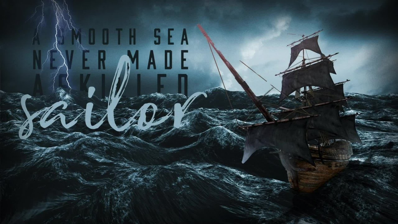
10. Photo Compositing: Intro to Advanced Techniques: Alright, in this lesson, let's push our design further. If you follow it along and you have this and you've created your own first composite image. Just wanna say congratulations. Now what we're gonna do is take the skills that we have and push them further to make this look even more realistic. So you might be wondering, well, what do you mean more realistic? Well, as I look at this, there's a few things we can fix. And one of the very first thing that stands out to me is our lighting. So where is our light source coming from? And is it casting any shadows? And is it consistent with the rest of the scene? So what I'm gonna do very first as just hit the letter F on my keyboard to toggle through my screens. So if I click down here on the very bottom of my toolbar, you see we have three different screens we can cycle through, right? So I'm gonna do is hit the letter f once and it toggles one more time and all my tools go away just so I can look at this full screen with you guys and just kind of analyze this and just kinda see what we can do better. Alright, so the first thing I notice is that this ship right here is just smashed flat right on top of the waves. Alright, so it's not casting any kind of a shadow. We could maybe play with blurring it in certain areas a little bit. And the other thing you'll notice too, the waves, if we look at the light source, it seems to be casting a light hay from this lighter part of the sky right here. So if that were the case with this ship, we would see a little more highlights here on the sales on this side of the ship rather than on this backend, This shouldn't be lit up at all. And, you know, maybe it's coming from this lightning bolt, but if that were the case, then perhaps there'll be more of a glow on these edges. Okay, so just some different things we can do here to try and make this really look like it belongs in the scene. So let's go ahead and dive in. And, you know, I'm, I'm just kinda playing right now when I get warmed up when I'm playing in Photoshop, I tend to do this a lot. I tend to zoom in and move around and you just think about it and think about what I'm doing in the way that I'm doing this. I've got Move Tool selected with the letter V. I've showed you this in the last lesson. Space bar to move around with my hand tool, command and spacebar to zoom in and then Spacebar command and option to zoom out. So I'm just doing a combination of all these things to just kinda quickly zoom in and just, you know, kinda warm up my thoughts and think about where I want to dive in first. So, alright, looking at this one thing that we could try right away that might be helpful and had the letter F to bring back all my tools. Another shortcut you could do is hit tab at the Tab key on the top left to cycle your tools on and off or shift tab to just hide all the windows on the right side seeks to Abby tools on the left. Alright, so just some quick workspace shortcuts to, to. I don't know, just to add to your repertoire. I said that right? Alright, so let's do this. So what I wanna do first, let's play with, let's just play with getting the lighting right. So one thing I could do, and that's pretty much my tools. And grab this layer and hit Command T, T, My Free Transform among or right-click. And then I'm just going to flip it horizontally. Let's just see what happens. Alright. Now it kinda looks like the boat is retreating away off the page. And typically when it comes to just your compositions, you don't usually want to crop somebody's face looking off the screen or in this case the boat looks like it. Just go and write out the screens. If that were the case, you'd, you'd kind of want it over on this side, so the action stays. This is kinda move all this over alpha. It'll let me grab all this text over here, scooted over here. So obviously I need to fix my mask. If I do that all that's what we could do. We could highlight some of this over the love letters that might be cool. So now we can see that because the ship is on this side where the light of the images that it feels maybe a little bit better. Maybe we liked it better on the other side, but let's kinda keep playing with this a little bit. So this is kind of a fun, happy accident. We can, we can mess around with our layers now we can bring this lightning bolt them to click on it and hit Command Shift and the right bracket key to bring it all the way to the front of everything. So what we did is we brought this layer all the way to the top. Or I can hit command and left bracket or right bracket to cycle through one at a time. Okay? So that's under if we come to layer down to arrange and bring to front or back. And so that's what we're doing right here. We're just playing with the layer over here and where it's sitting. So now we need to fix this mask, but we'll come back to that in a second. This is pretty cool. Let's make this lightening bolts. We need to add to this mass because the bolt would probably be maybe behind these waves a little bit. So I'm gonna come up here with a nice soft brush. Run a grab this, make this bigger painting with black. And we are going to just kind of clean this up a tiny bit here. Let's see how it, how it goes. Alright, so that's looking good, that's kinda fun. It comes in front of the letters. Maybe we wrap it through these letters. So let's click on this smooth C. Let's add a Layer Mask. Clicking on that will hit the letter B to get our brush. And let's just paint over the top. That's not what I meant to do. That's not what I meant to do at all. Let's pull back to the lightning bolt layer my bad on this mask. There we go. And I can either brush over it, but you'll notice it's kind of affecting the glow and everything. So I'm going to come back to, I still have the lightning bolt selected as my layer. I'm gonna come back to the words, a smooth sea. And then over the little t icon, when I hold down my command key on PC, It would be control. You'll see my cursor changes to a hand with the little square box. So that means I can click on it and activates a selection K. So the selection is the same shape as my text, but I'm still on this lightning bolt Layer and I'm technically I'm not on the lightning bolt itself. I'm among the mask. Okay. I've got my brush tool selected and I'm going to paint with black. And now I can hide that lightening bolts and bring this letter M right to the top. Okay. I get hit X if I've gone too far and I can paint back in with white on my mask layer. And just kinda maybe bring in some of that down here below and maybe some of that, that glow. Maybe some of this right here, a little smaller, k. So we're basically getting creative with our masking. I'm gonna go to select, down to de-select. And now you can see that it brought that letter M in front of that bolt and we're playing with our depth and so we can, we can play with this further. So I'm going to come back to a smooth sea on that t hold down command on a Mac or control on a PC and click to get that selection back, coming back up to my mask again and non painting with that soft brush. And I'm just kinda bringing back in some of these details. Okay, that's too much. Let me see what I meant to do. And I don't know, I think I'm happy with what it was before, but now you see the process, but you see we kinda have this line where the were the glow starts and stops because we're still that glow from the bolt. So what I'm gonna do is I'm going to mask it back, but I'm going to control my flow a little bit. So up here with my brush elected at the top, I have opacity and flow. You can play with both of these. You're gonna get similar results. But if I dial this back, I just clicked on the workflow and scrub it to the left. I can paint with like a 7% flow, which means it's gonna take a lot to make it actually do anything because it's hardly painting anything. It's hardly think like an air brush right where the flow is turned way down so there's not much coming out of the nozzle. Ok. Kinda what we're doing here. Same thing if you were to scrub the opacity where maybe it's not painting with as much paint, right? So all we're trying to do is just blend it a little bit so it's not so obvious that it's a harsh line there. Okay, I can hit X to cycle my foreground and background and alpha paint with black again, white. To kinda just blend that a little better. Alright, that's good enough for now to get that technique, to kind of play with that. That is really cool. I'm happy with where that's going. Alright, so we've got a smooth sea. Never made a skilled sailor. Alright, let's go ahead and fix a skilled sailor. I click in there and it keeps wanting to click on the word sailor because this font is huge and it's on top. So all I'm gonna do, I'm just going to, well two things. I could lock the layer right here, okay? And then it will let me click on it, or I can just hide it for a minute. And then I can click in here. And now I can adjust the spacing between the a and the S is too much. So I a couple ways we could do it. I'm my shortcut is Command Option and the left arrow or the right arrow to adjust that tracking right or Control Alt on a PC. And then left and right arrow. Okay, if you don't see that, we are going to come back to our properties over here. And I just scroll down and we're just playing with this tracking. Okay? So anyway, I'm just bringing this letter a little bit closer to where I like it. Let's scale it back up a little bit. So it kinda matches how I had it more and click on the waves layer and get my letter WTF, my quick selection tool. And we're just going to quickly grab these waves hold down Option or Alt on a PC, because I grabbed too much of it here. I just want to get a nice quick selection. I'm not working too hard with it. Alright, let's come back to the text, a skilled, which is up here somewhere. There we go. And we want to, right now we have the sky selected. So we want to fill with white on the mask to bring back this letter a down to here, right? So we've got our white on top. I'm gonna hit option and delete the fill k. But now R S and R k are going past too far. So I'm gonna do is go to select inverse. And this time I want to fill it with black. So instead of hitting option delete, I can hit command Delete to fill up the background color. Or I could just swap it and still use Alt Delete. Alright, but I'm going to fill up the background. Somebody command and delete to fill that. And if you're not seeing that, go to image, I'm sorry, edit. Phil. Okay. Now I'm going to go to select and deselect and ASM cruising through this. Just a friendly reminder guys, if I'm going too fast or too slow, just speed it up or slow it down. It's a video so you can adjust the playback setting down below. So I speed it up or so I go super slow. And you can also hit pause and just try and experiment with these techniques as I show them to you. Alright, so we've got a smooth sea, never made a skilled, where did sailor go? Let's bring it back. Let's turn that eyeball back on and there it is. Ok, very cool. We're getting there. Now. Let's, let's try and make this ship more realistic.
11. Photo Compositing: Advanced Shadow Techniques: Ok, very cool. We're getting there. Now. Let's, let's try and make this ship more realistic. So a couple of things we could do is we did a lot of things we can do actually quite a bit. So let's, let's play with some of these options. So what I'm gonna do first is I'm going to jump cut this layer into its own layer so I can work with it, but still have this original To go back to. So I hit Command and the letter J to jump cut that to a new layer. And I've got a new layer right above it. I can turn this bottom one off or I could leave it on. And you can see, hey, there's actually two layers there, but we're going to turn that off for a second. And I, let's see, let's start by casting a shadow. So the first thing I wanna do, if you'll notice, if I hold down shift and click on this mask to turn it off, all of this image detail is still there. Let's go ahead and bring it back. And what I wanna do is I'm just going to grab this mask and drag it down into the trash. And it's going to ask me if I want to apply the mask before removing. So if I apply it, it'll cut it out and then turn it into its own image. If I delete it, it just kills the mask and brings back the whole image. Alright, let's do it one more time. God mask, drag it to the trash. And this time we're going to click Apply. All right, so now I've got an image that is truly just an isolated image without any mask applied. Now, the reason why I wanna do this and the reason why I made a copy so I can keep making more copies. That's come back here, command data jump, cut it again, bring it up in front. And I'm gonna click this one that's behind it. And we're gonna do some things to it. So first, this is where it gets a little technical and a little advanced. So if I go too fast, you can rewind it. But let's, let's do this. Alright, so I'm going to click on the lock. Transparency icon is this little checkerboard looking thing right here. Okay, so now what happens as an example? I'm gonna come up here to color. It's going to grab a random color. And if you don't see this color palette or window tend to color bright pink so we can see what we're doing. And I'm not going to make a selection This time, I could command click on this layer to make a selection was de-selected. I'm not making any selection. I don't have any mask. Only have this lock transparency button clicked. Now what I can do with my foreground selected as pink, I can hit Option or Alt on PC and Delete. And it will fill only any pixels on the layer with paint and you'll notice it even blurs it. So whatever the opacity value is, it will match that with whatever I fill it with, OK, but it locked the pixels. So if there's no pixels filled, it won't get any color and I hold them, make sense. Really cool shortcut. Now here's what we're gonna do with this. Alright, I'm gonna change this back to black. Someone hit the letter D to reset my colors. Black is on top, so we're gonna hit option delete on my Mac. And now at fills this with black. Alright, now this is where the fun part gets. I just actually only hit the letter F on my keyboard. That's why cycled the screen. Cycle it back. Alright, so we've got the ship selected. I'm gonna hit Command T to get my free transform. Okay? And now here's where this is fine, okay, by default is just going to scale the transform. Alright, but what we wanna do is make this look like a shadow. I'm gonna hit Enter because I forgot to turn the top layer back on. Alright, so we've got the ship above it. We've got this black layer below it where we are on this all-black layer. And we're going to do a free transform, edit, Free Transform, Comanche. Alright. This time instead of just scaling it, we're going to hold down the command key first, or on a PC, that control key, we're gonna click. On the top center and drag and we are going to skew this shadow and basically flip it upside down. Okay? And then you'll notice that it's kinda offscreen. So now I can grab this corner, hit command and then click and drag. And I can really manipulate the shadow how ever I want it to go. Okay, so in this case, it's down in the bottom corner and we might have to fudge with it a little bit. Is that a word? I just whatever matte the fuss with it. Alright, and get it look in kind of the right angle and everything like that. And you might be asking, well, Derrick, can't you just do a drop shadow effect like we did earlier and yes, you can. But let me show you where this is headed here. Let me show you, Maybe I'm just trying to match this angle. Alright, and it's a hot mess and I have to start over because I was too busy talking. But anyway, you get the point like you can skew the shadow. So let's do that one more time because I just goofed it up. And while I do that, let me show you something else. So you've got this layer. If I go to drop shadow, like you might think I might be able to do, you'll notice yes, it drops a shadow, but these sales would not be casting a shadow on the clouds behind it, right? None of these jobs, it would only be casting a shadow down here into the water. So we are going to cancel that. That's why we're making our own shadow. Alright, let's try the more time we are going to. This time I'm showing another way to work. I'm going to just command click on the mask to get a selection. Add a new layer, and we're just going to fill it with black. Okay, so just another way to work instead of deleting that mask. Alright, and that's transform is Command T. Now or hold down command click and drag and flip it down. Okay. And then let's, I'm just doing it up here so I can see because it comes off the edge here. Alright, get into close. We're gonna go like that for now. And we're going to bring it down here and you'll notice it's above my ship, so I'm going to drag it down, put it behind Command T, And we're just kinda fastened with a shadow a little bit until we get it to where we like it. Now, another thing to notice, if you look at shadows, you guys, you'll notice the, they look nice and crispy. The lines look good as they're closer to the object, but as they get further away, they get blurry. Well, how are you going to do that? Let me show you up. Alright, so first, let's go ahead and I keep hitting that F key. Let's go ahead and make a selection. So another way to make a selection, I'm just gonna hit the letter L to get my lasso tool, just a regular rope Lasso Tool. And I'm just gonna do a rough selection kind of at the angle. I want it to blur. And then I'll let go and it will snap back. And you'll notice up here in the Options bar of the options to feather this. What that means is right now 0 pixels means it will be a very hard edge. Let me show you on a new layer what that looks like. An option delete and deselect, and you see we have a very hard edge. Okay, let me step back a couple. Do my, my Lasso Tool and this time I'm going to change my, my feather. Let's make it. I don't know. Let's guess. Let's try 50 pixels, okay? And it's not going, I don't think it'll apply it to what we've already drawn c, it still leaves it as a hard edge. So what you're gonna wanna do is before you make your selection. Lasso Tool, feather at first. Okay, so now as we click and drag, you'll notice, see I'll kinda shrunk up a little bit. So now if I were to fill this with his bright pink so you can see what we're doing here. Oops, I was up in the options there. Click on my layer, Alt Delete filled with pink. You'll see where the selection is, V2 versus how far into the image it's feathered. Okay, so what I'm trying to do, let me step back a little bit. I'm going to delete this layer. Alright, so we've got this black shadow from the boat. I've got my feathered selection. And I'm going to come up to my filter. I'm going to apply a blur to it. Specifically, this Gaussian Blur, Gaussian, Gaussian, Gaussian. I've heard it all. I don't know. Anyway, we're gonna click on this blue right here. Okay? And now I can control how blurry it gets. And if you look at my preview, you notice closer to the ship where it's not feathered, not selected, it stays nice and crisp. And as I feather or blur out the rest of it, my selection further down here totally gets blurred out. So that's why we made that feathered selection. Okay, so we're just trying to feather this out a little bit. We'll click OK. We're going to deselect this. And now that shadow looks a lot more realistic and we could push this even further. Another way we could have done this is with the blur tool. What we're gonna do is over here on the left under our tools, we are going to click down on this little finger hand icon. It's the smudge tool. We want the blur tool up here. Okay, we're gonna click on this and you can adjust the strength up here. Right now we're at 47%. It's probably about 50 by default for you. But you can, you can really control how fast this blurs for you. You can change the size of your brush just like any other brush here, hardness, things like that, k. And now we can click and just kind of manually blur these edges a little bit more. That's another way to work. Okay, so we're just kinda blurring the shadow a little bit so it looks a little more realistic down here. And now let's play with our Blend Modes again. So I'm gonna click up here under We're on our list. Just rename this to shadow. I just double-click in there and click chat type shadow. Welcome to our Blend Mode and we'll change it to multiply, which just helps it blend with that background better. And then we're going to click on the word opacity and scrub it left until we're happy with how, how it looks, casting on one's waves. So you can see in the image that it's, you know, the further I go to the left, the lower the number, the lighter that shadow is. We want to enough of a shadow that it adds to the image. Maybe about the same tone or value as these clouds up here. Just to kinda help balance the image out. But that's pretty good. That alone really helps watch turn it off, turn it back on. And it, it really helps make this feel like it's in this scene a lot. And that's all we did. We didn't do too much more to this yet. Okay? So the next thing we can do, we blurred the shadow, but maybe we want it to and I'm going to let me. There we go. We're going to work on a white version of this, this photo for a second so we can see this better so we haven't blurred. That's great, but shadows also kind of fall off soon within this. So we're going to add a mask to this shadow layer. Click down here. So now I have a, a mask. I'm going hit the letter G to get my Gradient tool over here. Okay? And then what that does, a gradient creates a, a blend between two different colours will appear in the Options bar. We want it to blend from the foreground color to transparent. And here's how we're gonna do this. We'll click OK. I'm going to hit the letter X because I had, I had well, well, here's what happened. I had white on the top foreground color and black on the back. But hit D, it'll set it to this default, hit x, it'll swap it. So now what we're doing is we are going to be painting with black using the gradient instead of a brush, the mask layer, ok, couple other options to look at. I don't have reversed selected up here, and I only have the linear gradient selected. There's a couple others that are pretty fun, radial and a few others here. But this linear gradient, and I'm starting with black and i want black to hide from here and fade out. So we're honor mask, I'm going to click here. I'm going to drag towards the ship and then let go. And it's going to fade this tiny thing. See it down here. It's this tiny little gradient that is fading from black to white and hiding that. Ok, So that's what we just did using a gradient to apply that subtle fade from fully opaque to transparent. Now let's turn our background back on and you can see the shadow looks a lot better and maybe you went too far. Well, because we're working with a mask, I can do the opposite and hit g to get my Gradient tool, hit X to swap. So now I'm painting with white, so I want to bring back in some of that shadow. So go from the opposite direction, right? And I can bring in more of that shadow if I took too much away. Okay? So that is how we can use gradients to mask.
12. Photo Compositing: Subtle Details Make It Look Real: Okay, all right, so we're looking good. We've got a really nice shadow. We've got a lightening bolt coming in and out of the text. This is looking pretty cool so far. So what are some other things we could do? Well, this lightning bolt is God, is God has, has got, oh my goodness, this is why I'm an artist, not a, not an English teacher. Okay? This lightning bolt has a purplish hue to it. Alright, and so we could kinda add some of that on to maybe some of these sales and maybe on some of this text. So a few different ways to play with this. We could add another layer above this will just click the New Layer button down here, the square with plus. And let's call this purple lightening cast on ship. I don't know. I'm just making this up as I go guys. Alright, and I'm going to command click on the mask down below. And you'll see that I've got a selection around here. And now I can do is get the letter i to get my eye dropper tool. Let's sample this color. It's actually more of a light blue. Okay? And I can come back over here, hit the letter B to get my brush tool and make this brush much larger. Alright? And then maybe my flow here, maybe I crank that backup but I change the opacity. We'll scrub this down to like 17, 16%, right? As I draw, it's very difficult to see, but you'll notice, I mean, it is it is kind of highlighting that, but honestly, I don't like what it's doing. I wanted to be more purple. I wanted to look more storm. Okay. And then we're just gonna kinda paint a little bit on the edges here. Okay. That wouldn't show up on that side of that mass, mostly just on the sales over here. We're just kinda playing a little bit to adding some depth to it. And, and I'm not worried too much about how fake this looks because I'm just trying to get the color in place. All right, then what I can do is I'm going to deselect this and I have this on its own layer. Ok? And now what I'm gonna do is played My Blend Mode some more. So another shortcut with my move tool selected. It has to have the Move Tool selected on the layer you want to play with. I can hit the shift and the plus or minus keys to quickly cycle through my blend modes. Okay? So as I cycle through these, I'm looking for what gives the most realistic effect, as if that light is really being cast on those sales. And out of the box, you know, none of them might work quite how you expect them to. And so what I'm gonna do is get one that's kinda close to it. Let me see. I think it was color was the blend mode that I liked. Yeah, so here we're using the blend mode color. But now what I can do is scrub the opacity down a little bit just to make that affect way less apparent, more of a subtle cast on those sales. Okay, so we did that and that's one way to work. We have this color layer. If I hold down the Alt key and just click on this one layer, it'll hide everything else except for that term OK, on the background. And you can hardly even, you can't even see it when it turn back on the color. The white background, but you can see it's hardly anything there. So another way to work would be, let me turn all these layers back on by clicking and dragging and scrubbing. Alright, another way to work is Let's turn these off. Alright. I could have just filled this layer so among and make a new layer. And I could just straight up, fill it with purple. Okay, I'm going to turn this one off below it. I'm going to drag this layer right above the ship. And this time I'm gonna hold down the option key and click and click right in between. And now what it does is it uses the layer below it as a mask. Okay, kinda complicated, but if you missed it, rewind the video, but we held on the option kinematic Alt on PC. And you can just click between a layer to make whatever's below it, mask what's above, okay, which this is fine, but the problem you'll see is it just filled the whole thing with it and that's not the effect we're going for. So we'll turn this back off and we'll turn back on our little subtle highlight. Just can't delete to delete that layer. Alright, now that we've got to shadow and we've modified the lighting on the sales to kind of reflect that lightning bolt a little bit better. And again, we could push us so much further. But I'm just trying to show you some of the basic techniques here. Let's try and really make this scene look more cohesive. So a couple of things we could try. One thing I'm gonna do here, I'm gonna add a new layer. And I am going to hit the letter M to get my selection tool, my rectangle marquee. I'm going to change the feather here to 100 and hit return. And then I'm going to click Andrei to get us started. Nominal down the space bar to move the whole selection to the top corner. And then finish clicking and dragging to the bottom left. And you'll notice that as soon as I let go it applies that 100 pixel feather. Now we're gonna do is go to select inverse. So I just have the corners here and I could fill those with black. So I'm going to reset it, option to lead to fill it, Command D to Deselect. And that's one way of about a 100 different ways to add a little vignette to this. So you'll notice we've got kind of a burned edges on this now, I could have just made a new layer, will get the brush tool, will cycle this up and make it much bigger. And you can just even paint in those blurred, I'm sorry, those darkened edges by hand, right? And I'm painting with a 15% opaque brush, so it's a super subtle K. And you don't want to overdo it, but that really adds a lot more mood to the photo and kinda blends everything in underneath it. I'm going to change this from normal to multiply just so it all blends nicely. Okay? Maybe that's too much. But now, now it really feels, you know, ominous and dark and moody. And it even kind of a little bit affects this text as well, and even the lightning bolt above it. Okay, so that was one way to work. Another thing we could do is add some noise to this. And again, there's a lot of ways to do this in Photoshop. I'm gonna make a new layer Command Shift, delete to get my fill or go to Edit, Fill. Shift F5, OK. Another way to do it. I'm gonna click on this drop-down and I want to fill it with a 50% gray click OK. So I've got this gray layer above it. Now I'm gonna come to filter. I'm going to come down to noise. I'm going to click add noise. And there's a few other things we could do as well, but I'm gonna click add noise. And it's very, very, very subtle. I can make it a little more obvious for the sake of you being able to see it at home. Alright, let's this over the top, I'll click OK. And now we're going to change our Blend Mode, the letter v to get my move tool, hold down shift and click plus. So that way we can quickly cycle through these layers right here, this blend mode, and see what does the best here. So we've applied a lot of noise to this too much, way, too much. Again, I'm just trying to show you a technique that you can play with. That's kinda cool. What are we on? Overlay? Okay, so now I'm gonna scrub this opacity down because I want to be that obvious. And a lot of things. One thing you might notice as you're working with a composite image is that little bits go a long way. So in this case it's only a 14% overlay. If I zoom in, you can see clearly it's adding that texture to everything which helps blend everything together. Even the text is getting a little bit of that overlay to it. Okay? So it is looks a lot more realistic. Okay, whew, I see something else we could do with this too. Alright, so this is our, let me just name this noise layer. So let's go to our lightning bolt. And I didn't name that layer. I think it's this one. Alright, let's name that while we're at it. Okay. I'm going to if this was really in the scene, you would see it reflected in the water below. So I'm going to jump cut this command J to jump cut. And let's transform it. I'm going to hit Command Z or Control T on a PC. Right-click and we're going to flip it vertically, alright? And we're going to drag it down. Okay? And we might need to play with skewing it a little bit. Alright, to, so it kinda matches this angle coming down from there to there instead of straight down. Okay, I hit Return. And let's come back into this right here. What I'm gonna do is throw this inside of a group. So right here, this little folder icon, if I click on that, drag and drop that right into the group, or it could hit command G. But now I have a folder currently with just that one lightening. And now I can apply a separate mask to this. So click on the mask. I haven't selected on his letter g to get my Gradient tool again, making sure I'm painting with the foregrounded transparent gradient here, click OK. a linear gradient on a percent opacity is not reverse. Let's hit the letter d And then x to make sure we are painting with black here, alright, on the mask, going to click down here and drag towards the top. Alright, and so now it kind of fades that out. Well, this doesn't look very realistic at all because these waves did lightning would not be straight across them like that. So this is probably, this is, this is going to take some very advanced techniques where we can do some different maps, where we map the, the different textures and make it warp it. But we, that's way beyond the scope of what we're doing right here. So what we're gonna do now is just kinda scrub this down. The opacity may get super subtle, very subtle. Maybe even grabbed my brush tool and kinda paint over the top of this layer, which is the brush just to kinda really make it super subtle. All right, so it's there, but it's a lot less visible. And in fact, we might even push it a little further. Let's go down into this layer, down to this image specifically. Let's go to Filter. Let's go to blur effect to that Gaussian blur. Alright, we don't wanna blurred too much. So here it is without any blur, these lines right here. We're gonna scrub it up just a tiny bit, just the tiniest bit. Okay. So what, what that did is it just softens that up. So it's still kinda casts onto the wave, but it looks a little more realistic. It's kinda make those tough tried up there. And so right there. That's what really sells this. Okay, and maybe we might go in to this mask scrub bar opacity a little more and maybe kinda hide it from the side where it wouldn't show up. You know what I mean? Because it would be kinda curling over that edge. Okay? And just kinda play with how that looks. So again, when it comes to composite images, you can spend hours getting a polished image, but these are the techniques you're basically masking. You're playing with different layers that are going to blend the colors together and you're making really strong selections. And that's how you create realistic composite images. And again, you've got to pay attention to those light sources. Where's the light coming from? Where's the, where are the shadows being cast and doesn't look real. So that I hope was helpful in giving you some more advanced techniques on how to create composite images.
13. Logo Design: Raster vs Vector: Alright guys, we are going to build a logo in Photoshop. Now, a disclaimer before we get too far down the road, I want to point out that if you're going to build logos professionally, I highly recommend you build them in Illustrator and Photoshop. I'm about to show you the differences and why that would be the case, but it is possible, so it's something that's worth covering. If, if you're really comfortable in Photoshop and you need to get something done, it can be done. And there are some export settings that will let you export it in a way that let the logos work in different formats they need to work in. So let's go ahead and dive in and take a look. So we are in, we are in Photoshop right now. And I want to point out the difference between this shape layer. If I look over here, my Layers panel about a shape and you can see in the icon it's got the square with these little anchor point on the edges here that's denoting that this layer is a Shape. And if I open up my properties window, I can see that currently it's a live shape so I can adjust the corners. For example, I could change the pixels of each corner individually or together and round it and do a lot of cool things there. I can also get my direct selection tool. So if I, there we go. Let's try that. There we go. If I get my direct selection tool by hitting the letter a, you can see that I do have anchor points and I can adjust this. I can bend these curves and adjust the Shaped, do whatever I want. As soon as I do that though, you'll notice that it gives me this error that says this operation will turn a live shape into a regular path. So what that means is, instead of a live shape or I can modify all these settings if I click Yes to continue. Now it just truly is a shape, okay, which is not a big deal. We can still work with this. It's still a, a vector asset inside of Photoshop. So if I zoom in real close, you'll notice that it, it still has that pixellated edge and it looks kinda J Good. We call it pixelation. And, and that's because Photoshop is a raster based or a bitmap image based software. So that means that each pixel on the screen is represented by a dot of color or a square of color, a pixel. So there is no on and off between these two. I am sorry, there is only on and off between these two. So it tries to fade these colors by adding extra pixels on the edges here. And if we look at this motorcycle image and we zoom in really close, you can really see the pixelation on the edges as you get closer. So that's, that's a raster based image and that's how photoshop works. Okay? So the reason why this is important, if we jump over into Illustrator and I zoom in and I do the same thing. I've gotta shape over here. And let's say I just start to manipulate this anchor point and do some things with it. Maybe get my pen tool and adjust the curve. Okay, if I zoom in and zoom in and zoom in an illustrator. And notice this stays crispy and intact and completely perfect on those edges are right, because it's vector-based. So vector as in math, it basically says, it's a mathematical equation that, that says, you know, fill this area with this shape or this color, you know, from this point to this point and it doesn't have to go one pixel at a time. So the file sizes an illustrator are much, much smaller. So you can reproduce things and send them to print without it being a huge file. However, in Illustrator, you still can bring in a raster image if I zoom in on this motorcycle image that I pasted into this Illustrator art board. If I zoom in real quick. You'll see that it also pixelate because it's a raster based image and not a shape. Ok, so hopefully this kinda makes sense. The big thing I want to point out really is just inside of illustrator, how you can zoom all the way in and you can manipulate these curves and they stay perfect. Whereas in Photoshop, that's just not possible even with the shape. In this case, it's a perfect shape. I can scale this up infinitely as large as I want to write. I can zoom, I can scale this way up, way up. And it still looks perfect from that perspective. Whereas if I zoom the motorcycle image up, it's going to blow up real quick and look nasty leg of that like how blurry it looks. So I can zoom the shape up, but still, if I zoom the canvas and it still gets pixelated. Okay, so that's the biggest reason why you would build a logo in Illustrator. Because then once you get your logo designed and you're all done with your artwork, you can export these shapes are the logo shape and send it to be reproduced from the smallest size to the largest size, right, from like maybe on the side of a pen or something like that to the biggest billboard on the side of a truck, right? So that's why logos are typically designed in a vector-based software, whether it's Illustrator or something different. Because then you can scale it up infinitely and it stays Perfect.
14. Logo Design: File Setup and Basic Design: All right. So now that we have that covered, if you don't want, if you have no desire to learn Illustrator, that's fine. Or maybe you're just not there yet, totally fine. So I'm going to show you how you can get started in Photoshop if this is the direction you're headed with things, and at the very least be able to create something simple that will then translate later down the road into Illustrator, either when you're comfortable or if you need to hand off the design to somebody else. Alright, so let's go ahead and get started. What we're gonna do is we're going to come up here to file down to new or the shortcut Command N to make a new document. And because we're building an Illustrator, I'm sorry, because we're building in Photoshop. I do recommend you actually started as a print document. And I recommend you start pretty large maybe with a letter based. And ideally, you're going to create this always shapes in a way that will scale. But if, if you do including the raster elements, which I can't emphasize enough that you don't like, don't bring in any images in your logo. But if you do, if you do, you do want to start large enough with their large enough resolution. So 300 pixels per inch, at least a half by 11, you wanna start big enough. And right now I'm not worried about the color mode. We can stay RGB as we designed, but when we export for print, we'd want it to be CMYK. If you start this way, you want to start big enough that It's printable and doesn't get pixelated. If you try to scale it up, you can always scale your artwork down. You can always crop it down, but if you start small, you can't make it bigger. Okay? All right, so let's go ahead and design a basic logo. I'm just going to bust through this. I'm not gonna make necessarily a super creative logo. I just want to show you some of the tools to pay attention as you're doing this in Photoshop. So that's going to get started. Let's just make a, How about a good coffee co, logo? I'll highlight all of this and I'm using the keyboard shortcut Command Shift and the comma key that left carrot less than sign to, toggle the smaller, but you can see it's gonna take forever. So what I'm gonna do is just hover up here over the tea and the Options bar and just scrub it down a little bit. Hit enter, hit the letter v to get my move tool. All right, the good coffee co. Let's go ahead and adjust this a little bit. I'm going to click right in between and hit Command Option and the left arrow four times 1234. That is the same as coming up here and adjusting your settings in the character box. That might be too close. Let's add some elements between that. And instead, all right, how about like the letter t? I'll click once on the keyboard. I'm going to hit Shift Option and the number eight key to get this weird symbol with this font, I can also hit here. It all hit option and eight to get more of an Asterix. But it's because the font I'm using that I have this shape. Alright, so this font is currently abolition. You can get it in Adobe Type Kit. We're just trying to fly through some stuff and make some creative, something creative with minimal effort. Okay? So this is still a font. You can see that it's, it's just a interesting placement here. I'm gonna hold down the option, click drag, and then hold down shift to make it stay in line with its friend over there. That's kinda cool. Could copy CO. Do we want it to be like that to set weird? I don't know. Let's make that a period actually. We'll make sure it's right in line. Alright, so I'm, I'm not getting, and actually I don't like the space. I know it matches. So this is, this is how I do my logo design, right? I make little things and then I play with spacing and sizing and kinda just try and make it custom and unique. And now that I'm, now that I'm I can't turn it off. You guys. I can't help myself. We're gonna back off. We're just going to make this simple for right now because I really want to teach the fundamentals of the process, not so much agonizing over the design. Okay, so what we're gonna do now, this is a font. All of these are font. If we look over here, my Layers panel, I've got a few different layers to work with here. And now let's add a shape to it and hit the letter U to get my rectangle shape tool selected. Alright, and what I'm gonna do with this selection, I'm going to just, I'm going to click and drag on the stem of this G here to get a line that's the same width, so visually it matches. Ok, let's transform it command team, we're gonna rotate it and then I'll hold down shift to make it go. And 45 degree increments actually it looks like it's 15 degrees. Alright, so we just wanted to be like that. All right, and let's change the color to match. So because I've got this light blue still selected, I'm gonna hit option delete to fill the shape that's still selected over here, my layers. Alright, good copy CO, I feel like okay, we should do this. So Command T and depending on your preferences, shift will either make it stay. When you hold on. If you don't hold down the Shift key, it'll try and scale it proportionally. But if you hold down the Shift key, it'll stretch it out. Photoshop recently changed this. It used to be you had to hold down shift to make it scale. Okay, but it's still the same and illustrator, so it's super confusing anyway, just be aware of that. Hit enter, nominate command J to jump cut a second version of this. And I'm just going to sit down with my arrow keys. And if you hold down shift it goes ten pixels at a time. If you don't hold down shift it goes one pixel at a time. Alright? So I've got it down here. I'm going to just kind of drag until I get my smart guides to show me that the spacing between the top and bottom are the same. That's not bad. I don't really like the period here now. So wanna delete that, guys. I told you I can't help myself where you're going to turn this, cut this highlighted command X to cut it. A nudge this back in place where it was. I'm a drag to copy down highlighted paste in that CEO that I had here as in company could copy company. Because I want to manipulate this. I wanted to be a little smaller and a little tighter. There we go. I don't know if I like that either, but we're gonna play with it. Alright. I wanted to add an underline here, but, oh my goodness, here we go. Okay, so that looks good. That's kinda fun. Let's highlight both of these clicking and dragging, making sure didn't highlight anything else. Command t to transform, holding down the Shift key, because I'm in Photoshop right now and I want this to kind of line up with the edges. That looks good. I'm going to command T one more time and Noma hold down shift and then option. So it loops. Again. T shift option, I'm going to click right on the edge here, so that way it scales out on both edges here. And visually, I want the space between the top and bottom to be counted the same as the sides here. So I'm just kinda eyeballing it and not making it too perfect. Alright, good enough to continue on with this lesson. So now what we're gonna do, I'm gonna go ahead and save this. I should have said this a long time ago, but where you're going to call this good, good coffee cocoa logo. And we are going to make sure this is a Photoshop file, dot PTSD. And we are going to put this in our logo design exercise files. Alright. We'll save it. Perfect. Okay.
15. Logo Design: Converting to Shapes & Vectorizing: This is a good coffee code. Now, what we need to do is we need to somehow create shapes and in turn this into a vector logo as-is. Because you're inside of Photoshop still you could you could scale this up. You can do anything you want with it, right? And it's going to be perfect. You can make it as big as you want. So as long as you have this, basically this editable file within Photoshop, you can now take this file or this artwork and put it anywhere else that you want. But there are some better ways to work. So for example, over here, It's just a mass of a bunch of different layers. So you might want to consider right-clicking and converting it to a smart object. And now it's just one layer that you can rename and call it. Good copy co, logo. Alright, so now as you're working inside of a document, you'll see that it makes it a lot easier to center it up to make it work with other artwork, maybe we wanna change the background color. Let's go ahead and jump in here and do something. Good coffee. Oh wow. All of a sudden that looks so much cleaner and fancy. Alright, so look at that. The good coffee go and I just did something here that I don't think I've taught you yet. So let's say this isn't totally centered. If I command a in Photoshop, it's the same as going to select all. And we get the marching ants, the marquee around the entire document. I've got my good copy code logo selected. My move tool is selected. So now in my Options bar, I see the options to align my artwork. That's what this means. You've got to objects aligning to the left edge. Two objects aligning center, two objects along to the right edge, and then vertically the top, center and bottom. Alright, so if I wanted to, I could stack this all within the left side, the right side, or I can make it centered. And then I could start at the top, the middle, or the bottom. So what I did is I just centered in Centered vertically and horizontally. Okay. That's why did now that I'm done, I can go to Select, de-select, and I'm gonna go ahead and hit Save. But this time, I'm going to save this as smart object. I'm just trying to make this so you guys can jump into my artwork and check it all out. Alright, so now that we've got this, let's say we wanted to export this and use it in Illustrator. There's a few different things we could do, one of which is pretty simple and quick. We could come over here and right-click and export this as a PNG. And the reason why we'd want to do that is because then it would let's go ahead and save this. And we'll jump into check that out real quick. That PNG file you'll notice is now transparent. It exported just the artwork and cropped it for me. So what's cool about that is I can bring this into any document, whether it's Photoshop or Illustrator. And you see, now this is the PNG graphic. And you can see it's transparent. That's super cool. If we brought it into Illustrator, same thing. Let's jump over here to illustrate. And let's just drag and drop that PNG file in here. And it's transparent. You could slap it on top of a graphic or coffee bag or something, and we'll do that in a later video. But let's just jump in here. And it works. Now the problem though, you'll notice if I zoom in real far on this PNG, look the edges are not crisp on this image, okay? And that's what we're trying to avoid or trying to make sure that we can export this as a path, not just an image, as a raster image that gets pixelated. Alright, so here's how you do that. Let's jump into Photoshop. And I'm going to double-click on the smart object here. And now it's going to open up a new tab, new file, where it remembers all of these shapes that we've been working with. Ok. Let's come up here to file, down to export. And then we want to look for the path to illustrator. And if you've only been working with shapes and fonts, you should be able to see this. And I want to point out something that is not going to do real quick. So right now, it doesn't see any paths that we've created, even though we have this rectangle and some other steps, let's go in and cancel and take a look at this. So even though these fonts are still editable, technically, they're not a shape yet. Okay, so what we need to do is right-click on each one of these text objects here we're going to right-click. And I want to convert this to a path basically. So what we're gonna do is we're going to convert to a shape. Now it's confusing because we have a work path and we have a shape for right now, just, we're just going to convert it to a shape. We'll click on that. So now it sees this object as a shape. If I get my direct selection tool, this is now a shape that I can modify. Okay? It's no longer a font. Same thing. We're gonna do it here, right-click, we're going to convert this to a shape. So the good coffee text, we're gonna right-click, convert it to a shape. And now you can see that it's no longer a font. If I get my type tool and I go to click in here, the C and the O are still a font, but I can't do that over here on the coffee text. If I had the letter a again on that layer, to get my direct selection tool, you can see I've got anchor points it now I can modify and manipulate, which is actually a cool thing to do if you're making custom logos is to take the time to modify the text and make it customized unique. Alright, let's jump over here to this last text layer we're gonna right-click and we are going to convert the shape.
16. Logo Design: How to Export as a Vector: All right, so now at every one of these is a Shape Layer, okay, I'm gonna highlight all of them. I'm gonna come up here to file. Let's go down to export, path to illustrator. And let's see what happens here. So we have the option now because we've got all these paths, these shapes, I can export any one of them individually, or I can click up here on all paths. We're going to export these to illustrate it, we'll click OK. And it's basically going to take all of this and save an Illustrator file. That dot AI extension is for illustrators. So we're going to call this good coffee co, logo. And we're just gonna leave it like that dot AI will click Save. And now again, I know this isn't an illustrator of course, but it's important to see how to do, at least get it this fire. Alright, so we're gonna double-click on this file. We just made an illustrator and it's going to open up Illustrator. And it's going to ask you, do you want to convert two art boards, right? And what are we gonna do with this? So let's go ahead and just leave us alone and click OK. And it's going to do two things. It's going to create art boards, just like in Photoshop. And I'm going to hit Shift O to give my art board tool. It's this little icon over here, my toolbar. And you'll notice I've got to our Board that about this, our board, and I've got this our board. I'm going to click on this art board and hit the delete key because it's extra, I don't need it. And I'm gonna get my move tool backup here in Illustrator, it's actually called the Selection tool. In Photoshop, it's called the Move tool anyway. Alright, so it looks like this didn't work. I don't see anything. But if I hit Command a, you can see that all of the paths just don't have any colors apply, applied. Okay, so if I look over here, this red line through the stroke and the fill means there's no color applied. Okay? So I wanna make sure that my fill is put in front of my stroke. Because when I select a color over here, I'm using my Libraries panel to just drop it acquit color that matches. I wanted to fill my fill color. If my stroke is on top, if I click on that click, It's just going to stroke everything instead of filling it. Okay? So I want to make sure that I'm filling it. And if you don't see any colors, come up here to window where an illustrator, it's very similar to Photoshop, come down to color and you'll see this color guide here. There's even this little drop-down window where you can show or hide option. So maybe you're only seeing this and your color box. Click over here. Show options. Also notice I'm in the CMYK version. If you change what type of color mode you're using, you're going to see different options here as well. So go to CMYK. And now with this selected, I can actually scrub each individual color, whether it's cyan, magenta, yellow are black and I can dial in the exact color one or I can sample from here to get the color that I want. Okay, so what I want to point out now is we are in Illustrator. Let's go ahead and save this logo Command S to save it. I'm going to save it on my computer for right now. Put it in there, converted. There we go. Click save. We'll click OK. Alright, and now technically this file is good enough. Actually, it's great to share with anybody who need your logo. So they're going to need some kind of editing software. So I'm talking about like a designer or a print company. But if you need to share this with other people and a file format that works also noticed that each one of these is separated. So we're going to do is highlight all of this. Command G to group everything. So I think it's under object. There we go, group. And so now if I click on any one of these, it all stays together as one. Okay? All right, so now that I've got this, just like in Photoshop, I can export this logo a few different ways we're gonna compare to file. We're gonna come down to Save As. And from there, you can save a few different versions. I'd save the PDF, will go ahead and throw that in there. We'll just click save PDF. I'm gonna go ahead and preserve illustrator editing capabilities. That means even if it's a PDF, you could open it in Illustrator. That looks good. Alright, what else we're going to do? And I noticed it looks like I had a white background on there. Maybe it's not okay. So we're gonna come back here to File, Save As and an Adobe and I'm sorry, in Illustrator EPS that instead, that stands for encapsulated postscript. It's a, it's a, it's a vector file that can be opened by other vector editing software besides illustrators, That's a good one to Save As. And I'm not gonna do that right now. We'll go to File down to export this time instead of save as, Export, Export As. And from here you could save a PNG. And I could use art boards. So it's going to export this art board here. We'll use that. An example of why you want to do that. Let's just do this real quick. I'm gonna hit Shift O DMR board tool. I'm going to come up here and I'll DM Option key, click and drag to make a copy of this logo. And then in this one maybe I'm gonna change the color to something different. Okay, so now what I could do when it comes down to file, down to export, export as I'm going to use art boards and we use all of them. Or I could do a range of one to three or one comma three If I didn't wanna do the art board number two, we're going to export our boards as a PNG file. Let's click Export. This looks good. We'll click OK. And let's see what we get over here. So there is an extra art board. I was right, it's this little line over here. Anyway, we're going to delete that real quick. But now I've got two logo exports real quick. And these are PNG files, so they have that transparency as well. Okay, the PNG and then the last file type out export will go down a file one more time. I'll go to export. Export as we're going to do a jpeg. Okay, so we're gonna come down here and the format, change it to a jpeg. We'll use our boards. And we're gonna do a range as time of one comma three because that second our board was, didn't mean to be in there. So I'm gonna click Export Now. Let's see what happens. We'll leave it as CMYK. That looks good resolution. And actually we're gonna put it at high because its footprint will embed this ICC profile, this web coded, that's gonna make it so that way in print it's going to look as close to the same across every device as possible. We'll click OK. And what's that do for us? That's simple rehearing. Now we've got JPEG one, and you'll notice it does not support transparency and a JPEG, so puts a white background behind it and then exported JPEG three. Alright, so I know we kinda deviated a little bit from working in Photoshop, but that's because most logo's really do need to be built an illustrator, but that is how you could start in photoshop, create a logo, convert it to shapes, and then export, remember File Export paths to illustrator to bring it into illustrators that way it can be used in more more platforms and more different, more different and more mediums like t-shirts and all kinds of swag and packaging and everything that needs to work for a logo, our guys. And that is how you create a logo in Photoshop. And then of course an illustrator. But also in Photoshop.
17. Packaging Mockup: Introduction: Our guys, let's have some fun. Let's build out this good coffee co-brand a little bit more. So one of the first things you should build, I think we should build some apparel and maybe build out the packaging for the coffee beans. It's gonna be a lot of fun. So let's get started. What I wanna do, go ahead and check out the assets folder. You can see this coffee bag dot PSD file. And what we're gonna do is create a place to drop this logo right on top. And this is actually a template that I've downloaded from VO2 elements. I really recommend them highly. It's viewed in elements dot-dot-dot dot com. Check out the link hopefully is a link below this video, if not in the description of the course. And I've been able to work with them to get you guys a discount. So check that out. Obviously. I believe in it I've I've subscribed to them personally, but also recently now I'm going to fill it. So that actually does give me a kickback, but I do think this is a great place to start if you're looking for really professional assets to help speed up your workflow. So here's exactly what I mean, here's exactly how I would use that. So I'm going to jump in. I've already done a search for a coffee packaging mockup in the graphics templates. And they do have a lot of other great items you can work with. But we're going to start here, and this is one that I've found. It's a mock-up of a coffee cup and a bag. So I'm gonna go down here to the download button. And I'm going to create a, we'll call this photoshop BootCamp Project. So now I can license it for this. We're going to add in download. So it's going to download those files right here. And my download stack, I'll go ahead and unzip it. Let's just open it up and see what files we have in here. We have a guide which is handy if you guys want to learn more about whatever project or file you've downloaded, how to use it. In this case, I'm going to open up the PSD file right away and let's just take a look. So we're going to work with this as well as this other coffee bag. Oops, I pulled my tab, mountain rocks, but there you go. So you got this bag and we have this bag. And then I'm also going to show you guys how to do the same thing in Adobe dimension where we can create our own 3D editable asset as well. It's gonna be a lot of fun.
18. Packaging Mockup: Using Smart Objects: All right, so I'm coming back over here into Photoshop where I have this one that we just downloaded. So we've got a few different layers. Let's go ahead and turn them on and off to see what we've got going on here. We've got the top color. So it looks like we can change that to match our brand. We have some different elements, okay, so we've got two elements in here. Let's scroll down outside. Okay, so there's a side graphic. There's the front graphic. And I can see right away it, we're just going to blitz through this on this front graphic, we have the smart object. So I'm going to go ahead and double-click on there and see what's inside of it. So it says replace this. Okay, so this is a flat image. What I'm gonna do real quick just to work real fast and it's going to command J to jump, cut this into its own layer. I'm gonna get my rectangle marquee tool. Hey, here's one of those instances where I used the rectangle marquee tool just to get a real quick selection around it. And now I'm going to Control Shift and delete to open up my fill in on a PC and even on the mat is interesting. I don't even know why I have that shortcut because it also shows up as Shift F5. So shift F5, we'll get to that same dialogue box for some reason I've discovered Control Shift. Delete does it for me as well. And instead of foreground color, I want to do a content aware. Phil. So it's going to look at everything in here. It's going to fill it to try and match to content aware. Basically remove that, I'll click OK and it's going to magically erase that whole thing. And like Command D to Deselect. And now let's grab that coffee co logo that we made, the smart object which can hit command c to copy it. I'm on this layer. I could also right-click. And I can come up here to, let me just look at this real quick. It is duplicate is I'm looking for duplicate layer. I'll click on that. And from this menu, I can choose where the destination is. Is it inside of this? Don't just want to duplicate the layer there it is. I'd delete, right-click duplicate layer. What if I want to throw it into a different file? I can, I can do that. So I want to put it into rectangle 2.2K PSB. That's this guy right here. We'll click on that and I'll click OK. Now jump over here and look at that the logo has been duplicated and centered into this document. Let's go and resize that command t to resize. Where's it going to scale this down on the hold down Option to scale it centered. Alright. We're going to drag it up here a little bit. And our logo is a little bit small. You don't. We might need to do is build another version that's stacked. So it's good coffee co, and it's just huge. Maybe we do that right now. But for the sake of just splitting through this tutorial, I'm gonna go ahead and leave it alone. I'm going hit save in this dot PSB file. That's a smart object. I'll go ahead and close it out. Let's jump over here nor a template. Where is that guy at aisle? Where did it go that I close it. There we go. Okay. So there it is. Automatically update it and check it out. This template, they even warped it and made it fit on this to make it look very realistic. Alright, so we've got that. Maybe we should update the side. So I'm going to click on this with the honest select checked. I can see this is a smart object. Let's double-click on that. There it is as well. So let's go ahead and paste. I still have it on my, on my clipboard from command C from when I copied, where we want to copy this hit command c. It's still my clipboards wanna probably hearing Command V and paste it in that way as well. It's another way to work. Let's turn this off for a second and let's remove this. So I'm going to highlight this actually I'm gonna do so I could, I could do that control shift, delete, shortcut. My bad, I gotta be on the right layer there. We'll control shift delete, content aware. We'll click OK. That's one way to work. Command D could also just hit the letter i to sample this color and just hit option delete to fill it with my foreground colors to fill the whole thing with that color. All right, a few different ways to work here. I'm gonna select this layer and I'm going to transform it. I'm going to rotate it, will drag it over here. And because of the bounding boxes, even off my screen up here in the top, when I've got my Free Transform selected, I've got the options to turn on and off the scale. And I can just the width and the height so I can actually hover over the w or the age doesn't matter which one. And you see my cursor changes to those double arrows. So I can click and I can scrub to scroll this down or scale it down. Even though I'm not touching the Handel's over here. Okay, I'm gonna go ahead and enter command a to select the entire canvas. And because I've done that now, I've got my and my move tool selected. I've got this center and vertical alignment buttons, so it's totally aligned. Alright, Command D to Deselect and Command S to save will close. This. Will come back over to our packaging and there you can see it's down the side of this now it's a little big. Let's go ahead and maybe scale it down a little bit more. Let's save that. Close it a little better. Still too far to the top. One more time. Let's go ahead and nudge this down to the bottom. Save it. There we go. And that right there is probably one of the best examples of a Smart Object and how powerful they can be. Because every time I made those changes, it was a quick change in the Smart Object. But then all the filters and all of the effects we've applied or immediately reapplied when we bring it back out. That makes sense. Alright, what else can we do about this cup? Let's click right here and it shows me it's this layer. We'll double-click on that. Let's replace this list, just fill the whole thing with white. So I've got this layer already selected. My background color is white. Someone hit command, delete, so should be controlled Lily on PC to fill it is the same as going edit fill and we're just filling with the background or I'm sorry. Yeah. Foreground-background. Yeah. The background color. There we go. Alright, let's go ahead and paste in that logo. If I hit Command V, It's still hanging out on my clipboard, so it's still there. Command t to transform. I'll bring this center. Will scale it down. Maybe we will rotate it just for kicks. Let's save it and see what that looks like. That's not bad. It's kinda weird. I don't know. Let me let's keep it straight and see what happens. Centered. Maybe we'll bring it down a little bit, save it, close it. There you go. And just like that, you've got a realistic mock-up using an asset from in-vivo elements. Again, check those links to get a discount if you want to subscribe to it. But super cool, really, really great. And I want to show you how you can mark this up and do this kind of stuff yourself in Photoshop. But if you're working fast and you're trying to get a project done and maybe your skills aren't quite there yet. This is an easy way to really elevate your abilities and to get really great projects put in your portfolio. So the next thing you could do is you could take a screenshot of this or export it as a jpeg and upload it to your website, whether you use Wix or WordPress or Squarespace or web flow, there's a lot of great ones out there right now. So anyway, now you've got it basically just go file either save as or export, export as an export it as a JPEG. And you can use this image anywhere or you could send it to your client as a mockup.
19. Packaging Mockup: 3D mockups with Adobe Dimension: All right, so there's one version. Same thing's going to happen here. Let's, let's jump into this other version of a coffee bag that I have. We're going to double-click on the smart object here, and this is where we could throw any artwork in. As an example, I've got my BootCamp coffee I had done for another project. I just turned us on real quick. I'll save it, close it. And now it automatically updates this artwork as well. For the sake of this lesson, that's good and turn that layer off and command V to paste that logo that's still on my our board. We're going to scale it down. Command a to highlight the entire canvas and we're going to center it. And that color is a little more difficult to see on this background. So maybe we need to change the background color and let's see what happens if we make it white and safe. And to see how this template looks, not bad, it still works the way it changes background color. Let's come back here to the background. The background. And let me reset. There we go. We're just going to choose this teal color and fill it option delete to fill the background. Boom, look at that guys. Super cool. So we've got that made. Now let's say you want to push us further and you actually want to create the coffee bag yourself in 3D. We're going to briefly jump over into Adobe dimension. So it's an app you can download from the Creative Cloud. So if you open up your creative cloud, came over here to apps and you see all apps, Adobe dimension, just get that installed. And then you can click Open. And here's Adobe dimension. They've got some really great tutorials if you want to push this further and really learn how to use it. But I'm just gonna show you a 2 second Blitz on how to dive right in some at the home screen, I'm gonna click Create New. Don't save us. I was messing around with this earlier, okay, and then we're in the design mode. We have some starter assets and I'm just gonna type coffee bag. And in fact, I can see it right down here, but I'm just going to type it in case you don't see it. Coffee bag. Move what else we have. We have a coffee cup to our old do the coffee bag for now. I'm just gonna click on it. It's going to throw out right down on my canvas. And then now we want to add that graphic. So there's a few different ways we can do it. And we want to place a graphic on the model. So click this button right here, and we'll navigate to those logo exports. And we are going to find that PNG file, so it's got that transparency and I'm going to open that and it should apply it right to the bag. Okay. Another way I could work, I could come right into my finder window. I could grab it logo. We'll get this out of the way here and I can literally just drag and drop it right on there, c and it is slapped it right on there. And what's cool about it? Look at that as I move it around, it moves in 3D space and blends it around the graphic. I'm gonna go ahead and delete that one now. Alright, so now that we've got this selected, I can modify the size and you can see it's skewing it right now. So if I hold down shift, I can just scale it down, move it into place. I can even click up here to rotate it if I want to. I'm going to undo that though, Command Z. And what's really cool though is this is a physical 3D objects. So if I click back up here on the coffee bag, I have my controls down here. I can rotate this in 3D space on the x, y, or the z coordinates. Okay, so you can stage this to be any angle you want and there's a lot more you can do. You can drop in real backgrounds. It will really apply lighting and everything else. And again, that's beyond the scope of this specific lesson. But I just wanna point that out because this is an awesome way to mock up your portfolio. So let me grab his coffee cup and we'll throw this down here as well. Okay, it's going to load that asset. And I can grab this cup and I can move it in front or behind movement in 3D space. I'm come to my camera and I can change my field of view. And let's go ahead and click on this coffee mug. And let's see what else do we wanna do with this? I think that's good for now. Obviously, I mean, we could throw some different here. Let's just throw the logo on there real quick. Let's go to the one that matches. Drag and drop right onto it. Boom, look at that. How cool is that guys? It looks a little cricket I need digest that. I'm just eyeballing it here anyway. So once you're done with that and you want to render it or export it, basically incorporate a render on the top left. We'll click on that. And then it gives you the option for the export name, the quality. And if you want to PSD like a layered Photoshop file and where it's going to put it right now it's gonna put on my desktop. Let's just go ahead and go for it. I'll actually will name this coffee. Good coffee. Co mockup. I'm actually that's called the good copy co dimension mock up just so we know 21. That is, we'll click Render and that's going to throw all the files on my desktop. It's going to take it a second because it's working in 3D. So it actually is. It might take it a little while depending on how fast your computer is. But once it's done here, we can take a look at that file that it spits out on my desktop. Alright, now that my render has finished and saved, I can go ahead and take a look at that and we'll go ahead and close out of this message. Let's go to my desktop. And here we go. Good copy code dimension mock-up dot PSD. I'll double-click to open that. And you'll notice a difference. Here. We do have all of the layers that it exported. I can even grab my background color and I could change it. Option to leap to fill with my current foreground color. Or I could change it to any color I want. Doesn't really matter and you'll see that it still looks really good. But I can't change the view now it has rendered out this angle and it's flattened that part of it. So this is all, you know, this is all cut out and good to go. But if I want to change the angle, I gotta go back into dimension. And I got to go back into the design. And then I need to come up here too. The scene. Let's go back to the camera and change the field of view and the rotation and all that kinda stuff. So anyway, that's why we render it out. So that way it can be exploited in a format that Photoshop can use. Alright, now that that's done, that's pretty much all I wanted to show you for. The coffee, mock up the actual packaging, and be sure to check out those assets that you can use if you want to use them to create your own portfolio items. And we're going to continue to push this brand a little further. We're gonna do some apparel mock up. It's going to be a ton of fun.
20. Apparel Design: Introduction: Alright guys, we are going to have some fun in this lesson here what we're gonna do some apparel design, which is one of my favorite things to do. I've done it for a lot of brands and I'm gonna show you how to take any design logo. In this case, we're gonna work with a good copy CO and apply it to the sweatshirt and a real in this case, it's a hoodie and weigh it looks real. So this is a logo actually that I've designed for a real client. This is really happening, something that I've done, but before we actually send it to print, wants you to look like. So I actually mocked it up to look as real as possible. So you see it even has this wrinkle on here. And it, it, the, the strings, the pull strings on hoodie come in front of the logo like you would expect. But this is just a graphic that I've placed on top of it and Photoshop, OK, here's another example. Same logo that I designed on top of a white sweater. And these assets I downloaded from Adobe stock, I'm pretty sure it's been awhile ago, but you can get them in the exercise files. I do wanna note real quick. So with the exercise files that have I mentioned this in other videos, you are welcome to play with them and use them for your own personal use. And I'd love to have you use them and post your work in our Facebook group. But unless you buy the licenses from Adobe stock or in B2 elements, you can't use these in real client work. Just a disclaimer to make sure you don't get yourself in trouble, but you are free to play with these as much as you want. Alright? So what we're gonna do is I'm going to show you how to apply the design we made for the good coffee co into this mock-up. And then we're gonna get into some more advanced techniques as well to really bend it around the shape of the shirt as well. Alright. And then one more thing we're going to get into is in Adobe Illustrator, I have this vector T-shirt mockup as well. So the background, you can change to any color you want on this shirt by just clicking over here and click on a color. And this is how I mock up some t-shirts as well. When I'm doing a logo design for our client, I'll use these to do like a first round mock-up as well.
21. Apparel Design: Layer Style Blending Options: Alright, so let's jump over into Photoshop real quick and we're gonna jump over into the green dot PSD file. And I want to point out that if you look at this, I'm just curious, does anything stand out to you? I mean, besides the obvious like, you know, the blackout head part and the drop set. I'm sorry about my art. Let me just show you that. Let me, let me just show you if I turn off this top layer, you'll notice there was a logo on here before from something else from another project that I didn't do. I actually borrowed this graphic from the web just to show you this technique. So what we're gonna do is we're going to remove this logo. And the quickest fastest way to do that, I've got this layer down here that we're actually working with. I'm going to hit command J to jump cut this to a new layer. Just to be working on this copies, we have a backup. I made the letter M to get my rectangular marquee tool. I'm just gonna make a selection around the part that I want to disappear on a Makemake control shift and the Delete key. On a PC, it's go to Edit, go to fill, or Shift F5. Lots of ways to do the same thing and we're going to fill with the Content Aware fill. So it is going to look at everything around it and blend it. A normal blend mode with a 100% opacity. We can play with those. Those are fun options for other things, but we're gonna click OK. And it almost made it perfect except for we've got this little string hanging out over on the side. So we're gonna Command D to Deselect, drop a selection around this and do it again using my shortcut content where Phil click OK. It's close. Okay, well let's make it, let's use another tool, is it j lambda j to get our patch tool, if you don't see that, it's in your toolbar right here, this patch tool. And we are just going to draw a circle around the part we want to fix. So we are going to be replacing what's in the selection with whatever. Wherever I dropped this, I want the colors to be similar. Sums gonna come up here. And it's going to replace it with that texture. And it doesn't look too bad. It's kinda doing some weird stuff. That's better. I could do this all day. It's kind of addicting. I'm not gonna lie. But this is a quick, easy way using this patch tool to kinda clean things up. So we've got that logo removed, looking good, that was pretty easy. If there were other spots that I wanted to fix a problem areas or even like say, blemishes on somebody's face, you could highlight that and remove it if they're having a bad day. You know what I mean? Alright, so let's see here. Let's see here. Alright, looking good. Okay, so we've got our base ready to drop in our logo. Let's go find that logo file. I'm actually just going to copy and paste from this Photoshop document we've made earlier. You can find this in the exercise files if you want. So I've got the smart objects select m is going to hit command c to copy it will come over into the green hoodie file and hit Command V to paste it. Let's scale this thing down. And because my bounding handles are way over here, I can also just click up here on the w and scrub it down a little bit. Well, this could be kind of cool. I could throw it behind the Huddie. We could do some fun stuff of that. Here. I'll do that real quick. I'm just going to double-click on the layer, not on the Word and not on the smart object, but over here on the side, double-click to open up the Layer Styles. And I went to blend the underlying layer. It's dark. So I'm gonna click this and I'm scrubbing it to the right. And as I do, you'll notice that even though this layers on top of it, anything underneath that has a dark value now jumps in front of alcohol and Option or Alt on the PC. And we can break this a little bit more, split these handles to kinda make it fade a little better. So now even though this good coffee logo is in front, if I move it around and here's another shortcut to So you'll notice about auto select, selected, but if I don't click exactly on the artwork, it's going to select a different layer. So if I hold down the Command key or control on a PC, I can toggle this on and off real quick so that the Move Tool selected hold down command line, just toggle that. So now I can click anywhere on my canvas and just kind of play around with, you know, I don't know, just doing stuff. Cool. Alright, we're not gonna do that. Those are just a couple side tips that I was thinking about as we were playing around. But let's go back into this. Let's scrub this down a little bit. And to be honest, as cool as this is, it is very small. And you can't see it right now because our Blend Modes, I've still been changed in our Layer Style. So we gotta double-click over here. And again, if you click on the name, it's gonna turn rename it. If you click on the smart object, it's going to try open smart objects. We want to click right off into the side here. And we have our blending options. So you've got a lot of different tabs, right? We could turn on and off here. You want to be on Blending Options up here to see this blend if box. Okay, so we're going to scrub this back to the artwork comes in front of it. And it can be difficult to see with this color. So maybe we need to change the smart object. We're gonna come up here to come down here to color overlay. And let's just make this white. Just what really stands out. Come back to our Blending Options. And now we want, let's zoom in even further. And I'm holding down the option key and using my magic mouse here. So I'm just scrubbing my the finger up or down on the mouse to zoom in while holding the option key. All right, otherwise you can't really do it with this window open. So what we're gonna do now is we are going to, we don't want to mess around with this layer by layer. It truly means the layer that we have selected, the underlying layer, what's beneath it, if it's white, or as we scrub towards a left, toward the mid tones, they'll start to pop through. So for example, like the zipper. And if I hold down the option key and then drag, you're going to notice we get some interesting effects here. So as we scrub even further, some of the highlights on this start to pop through. And if we do it from the left side, I'll hold down option to click and break this into two, what these are called the handles here. And obviously I can push us as far as I want to go to really make it look like it's a JD On this T-shirt and this underlying layer blending, Blending effects, Blending Options on the layer styles. Those lots say is one of my favorite effects and I use it all of the time when I'm doing mockups like this, when I'm doing t-shirt mockups or if I was going to put this on the side of a truck or do some other things. And I want some of that grit to pop through some of those textures. That's how I do it. Okay, so now that we've got that looking pretty good, I'm going to click Okay, and, but we still need to make this logo look like it's behind these threads here. So what I need to do is create a mask to hide it.
22. Apparel Design: Masking: So what I need to do is create a mask to hide it. So we've got this layer, the smart object. I'm going to click on Mask icon down here to add a mask. Among. There's a few ways we can do this. The first thing that I wanted to try to do, I was going to hit the letter B to get my brush tool. And that brush is huge, but we just want a nice soft brush. I'm using the left bracket key to make this smaller left and right brackets next to the letter P on your keyboard. Alright? And then we want to paint with black, because the black will hide on a mask and white will reveal. So since whites on top, I gotta hit X to swap my colors. And now we're going to zoom in a little bit too far. It gets pretty pixelated. And now when I paint over this, but the black on my mask, it's a quick and easy way to knock this back behind that. Pull string, drawstring, whatever they're called. Alright, and that's not perfect, but zoomed out. It looks pretty darn good and you know what, we probably wouldn't we probably wouldn't have ink on. Well, depends on it depends on who you go to and how they produce this FET chair. But we're gonna go ahead and remove it from the middle here just to kinda show it. Now, a problem I'm seeing right away is this logo does not play nice, cuz you totally lose the o in the middle there. So we should probably nudge it a little bit. So what I'm gonna do If I just nudge this layer right now, or if I just move it, a bunch of men hold down the command key to turn off my auto select appears to toggle it back and forth so I can click anywhere and just move it. And notice the masks comes with, the mass comes with, the mask comes with and it breaks the effect, right? So I'm going to hit Command Z. To undo that. I'm gonna do is I'm going to click on this little lock icon between the two layers. All right, and now the mask won't move. I'll click on the actual Smart Object layer of the logo. I'm gonna hold down command to again toggle on and off this auto select layer. And now as I move, no matter where I move the logo, those draw strings pop through. Unless I go too far, up or down where I didn't actually mask out the object. Okay. So let's look at maybe if I don't know if I'd say a faster way. But, but another way to do this, another tool that's really handy in Photoshop, if we come up here to the selection tools, we want the quick, the Quick Selection Tool. So the keyboard shortcut is w. Alright, and I'm going to toggle this down in the way that this tool works. Let me go ahead and command click. So I'm holding down command to switch from to quickly switch from my selection tool to my move tool just so I can click on this layer. And because I've got my mask unlocked and selected, it's trying to select that mask even though I'm doing this. So let me just physically click on that layer. Alright. So what we're trying to do is, is trying to use this layer with the sweat shirt as my guide. To make a selection with the quick select tool. So I'm going to toggle this down a little bit. And now as I paint over this photoshop is smart enough to pretty much see the edges that I'm trying to select, okay? And it's a little rough around the edges because these tones are so similar to each other. And so this maybe isn't the best tool for this specific job. But that's why I showed you how to use the Brush tool as well. Alright, so let's go ahead and clean this up a little bit. I'm just hitting the option key to remove or leaving it alone to add to the selection. Alright, well I'm do that, it's not a great selection, but what we're gonna do now is click back here on this mask layer. And if I fill this selection that we just made on the mask with black biding option delete. On a Mac. On a PC, it's alt delete. So if I do that, fill it with black, it is going to fill this entire selection with black. And it's really difficult to see down here, but let us see if we can make this larger. I'm going to click on this little hamburger menu. We're going to come down to panel options. We're going to change the thumbnail size to big, big, huge. Click OK. All right, wow. There now we can kind of see what's going on down there. The next thing I could do, let's come back over that hamburger menu, come down to Panel Options. And we want the thumbnail contents. Instead of it being the entire document. We're just gonna do the layer bounds. Okay, so what's gonna do is it's only going to show, if I scroll down here, set the mask. It's only going to show parts of the Mass that are in use which that didn't help me out here. Okay? Alright, lets get back to this here. So, so as we did this and I'm going to, I don't want, I don't want this view. Let's change it back into Options. Entire document that's may get maybe not so big. There we go. Alright, we're on the mask layer. I'm going to change over to the smart object layer. I'm gonna get my move tool. I'm gonna hit command to toggle off the auto select. And as we drag this up, you'll notice on the left-hand side, it pretty much looks like the logo stays behind this string, but on the right-hand side you'll notice where the mask breaks. Okay? So now that we've got that done, and that's good enough for now. The reason why I would want to take the time to mask out the rest of the shirt is if I were to turn this into a template that I'm using all of the time for different artwork. I'd want to be able to apply this mask to other shapes. So let's do that real quick. Let me just, for the sake of showing you another way, let me jump in here. I'm going to double-click to open up my smart object. I'm going to copy the good coffee text. I'm gonna paste it in here as text. Let's scale it down. And because this is actually text right now, I'm going to just hit return to split this into two lines. Highlight everything by hitting command a net going to command option in the up arrow to change the letting on this. If I add shift, it'll go by Illinois, it'll make duplicates. We won't do that. What we're doing is we're changing the letting up here. I could also click on this drop down and go to Auto that's in the character window panel. If you don't see that, go to window down a character. Alright. So we've got our text. Let's go ahead and highlight the word good. Actually I'm going to cut it. Command X to cut it. Basically modifying this logo on the fly. Let's make this text white so we can see it. Let's hide this layer. Will duplicate it. Oops. Holding down the option key and dredging up. There we go. Highlight it. We're going to paste in the word good that we just had. Let's change the color on that as well. And let's scale it up just to kinda make it just because we can't. All right, good coffee, good coffee, co. Alright, looking good. All right, so we've got these two words here. I'm gonna go ahead and click both of these. I'm going to group them by hitting command G over here, so there in one group. And then I'm gonna take this mask right here. I'm just gonna hold down Option and drag it on top of this to apply a mask to anything in this folder as well. Alright, so now you'll notice it cuts through the letter g over here. And because this is not linked, I can click on the folder. Are the, are the contents in the folder. However, I want to do it. And I can move these around. And again, you'll notice on the left-hand side how that pull string drops behind. But on the right it doesn't. It only has a little bit where we brushed out. So all of this to show you that as you build out your templates, you might want to think with the future in mind, alright, so you might want to build this in a way that you could quickly drop an artwork for anything that you're doing. Alright, so that looks pretty good. Let's just refine this side a little bit. Let's come to the mask over here, get my brush tool. And we're just gonna paint, making sure that the black is our foreground color. So as we painted, kind of knocks out the graphic a little bit. And that looks pretty good. And I'm not going to worry about masking all this other stuff right now because it doesn't even across the middle there. Alright? Now, one last thing that we almost forgot to do, it doesn't look very real right now. So I'm going to double-click over here off to the side to pull up my Layer Style. And the underlying layer, we want to hold down the option key and break this. I forget they're called these toggles here. These handles. And Photoshop is very angry with me right now. Okay, as I scrubbed There we go. All done option and break the dark ones down here too. And you can see it start to fade, where it's dark, the dark, the dark shadows pop through, the highlight, start to pop through a little bit. And it really makes us look like it's actually on this hoodie. That's one of the easiest ways that I've found to make it look realistic. Ok, the other thing we could do, we could play with our Blend Modes right now she said to pass through, which means it's gonna do whatever each layer is doing through the bottom. Like it's gonna honor whatever layer the layers are set to down below. But I can cycle through these blend modes as well. So I'm just holding down the Shift and hitting the plus or minus keys because my move tool selected, make sure that moved to select it or it doesn't work to quickly cycle through these blend modes. Okay, so because it's just white text, only a couple of these like overlay and soft light or in a normal are going to work. Some of them, it's actually kind of goal. Some of them like multiply, will completely remove that white text. But like that, there we go. Dark and a multiply. Alright, some cycling through, just coming up with something that looks kind of cool. It's something that I would want to wear. There'd be a cool brand. And in this case, the dark text would be nice or even just the standard white text that we had here. Cool, good coffee, sweet. That looks really good. So we're gonna save that. And then the next thing we want to play with, let's go ahead and take a look at the white hoodie over here as well.
23. Apparel Design: Displacement Map Filter: Then the next thing we want to, let's go ahead and take a look at the light over here as well. So the same principle would apply if we were going to apply this same techniques, right? We would just mask out these draw strings, which I've already done in this file. And because I've already done that, I could grab this good coffee logo. Let's grab the group. I'm actually gonna grab these two layers separately. Command c to copy it. Lets jump over into this document. I'm going to click right here on this logo. So it shows me right in line with where I'm at a command V to paste it. And I've got a transform it up. Okay? And we're going to run into some problems here because it's white text on a white sweatshirt. We're going to have to do some housekeeping. Alright, we've got that in there. Now what I'm gonna do is on this layer, you'll notice that by default this logo had was orange and put a color overlay. So if I want to copy that exactly, I can right-click on this layer anywhere in this layer. And then these layer options, I want to copy the Layer Style. So it's going to copy all of these effects that have been applied to it. I'll go ahead and turn this off for a minute. It's also going to copy these. See this little square and these two squares with solid square in the center. That is our blending layer style that we did here that I did, just like in the other document. Okay. So it's copying that information as well. So I'm gonna copy on the word good. I'm going to right-click and I'm going to paste layer style. Style. The word good gets that effect. I'm going to, it gets the layer style and the color overlay. I'm gonna do the same thing to coffee. I'm gonna right-click and I'm gonna go to paste layer style. Alright, that's looking good. And let's take a look at this. You'll notice there is no mask currently on these text graphics, but that drawstring still pops through a. Why is that? Well, it's because we've got these layer styles with the underlying layer. Anything with a darker value than this gray tone right here is going to pop through. Okay. It looks like I also did a mask on it. Let me see if that pops up anyway. Okay. So what I did because this metal part of this would not follow that rule. Let me de-select this. Let me grab these layers and if I were to drag them down, you'll see it breaks because those are lighter tones. Alright? So what I did is I added a mask. This mask right here. If I command click on the mask, I can see where the selection is and all I did was brushed out physically making it mask that layer. Alright, so that is another fast way to get this mocked up. Okay? Alright. So the next thing we want to look at is an advanced technique, a displacement map. And what that's gonna do so far, it's been pretty easy because these haven't had many wrinkles and them in the text doesn't need to look like it's really bending around objects. But what we're gonna do now is we're gonna take a look at what's called the displacement map, which is going to bend the text and make it look realistic. All right, so in this sample, what I wanna do is I actually want to put the logo on the wall and maybe even on the t-shirt. And you notice the teacher has some wrinkles and the wall does too. So how can we do this and make it look realistic? Well, we're going to use something called a displacement map. A displacement map is going to take a look at the shadows, the mid tones, and the highlights. And it's going to use that as a map to apply to whatever graphic you want and make it bend in certain ways. It's gonna use that as its guide. So let's go ahead and just jump into this. So I'm gonna take this document and I'm not gonna do anything different to it other than, let's create a new adjustment layer by clicking on this little half circle thing. And we're gonna come up to hue and saturation will click on that. And we're going to scrub the saturation slider all the way to the left. Okay, so this is now a black and white image. And we might even want to add, bump up the contrast a little bit. Usually it's fine, but let's just do that real quick. I'll add another layer and we're going to come to brightness and contrast. And this just kinda add a little extra contrast to this and maybe even some brightness. It just kinda depends on we want some of these shadows to stay there. But we also want that to be prevalent here on the teacher. All right, so we've got that. Now what I'm gonna do is I'm going to go ahead and just save this command Shift S to Save As we're going to call this displacement map. Okay, now we're gonna go ahead and open up this document again. So now I've got my displacement map here, and then I have the original file here. And what we're gonna do is actually paste in some artwork on top of this. So let's go ahead and grab our good coffee co logo. I might command C to copy the smart object. Let's jump over here into this stock from Adobe stock command V to paste. Let's move is up here. Okay? And this might be a little subtle. This image might not be strong enough to really show the effect, but if we look at it closely now it just looks straight and nothing really happened in there. I'm gonna change the blend mode from normal to multiply, which will kind of help a little bit. You'll see some of these shadows pop through very, very, very subtle effect. If I move it over on the sea right here, over this dark spot, you'll see it even more. Okay? So we've got that and now what we're gonna do is we're going to go to filter down to distort. And then over here to displace. Okay, we're gonna click on that. And one thing I should point out, depending on the version of Photoshop you're using, you're gonna wanna pay attention. This image is actually, if I see over here in the title an RGB image. Let me just cancel this real quick. We're gonna go to image mode. It's an RGB. If you're in CMYK, not all of the filters were show up. So if you don't see that, make sure that you're working in RGB while you're in Photoshop for all of these filters to work. Okay, so we're gonna come back. Let me try that again. Render filter distort, displace. Ten should be fine. Really been at ten right here. And because we are working with the exact same image went over the top, I don't really need to worry about how any of this stuff right here. So I'm gonna click OK. And now it's going to have me go find that displacement maps. So here's that displacement map. I'm going to click on it and I'll click open. And it's going to use that as the map to apply the filter to this layer. So if I zoom in now, you'll notice right here like how the sea bends out. So if I turn this on and off, you'll see the before and the after. So it's bending this to make it look like it's really on that wall. Okay. And you're going to have different results depending on that number, whether you use ten or larger or smaller number. And if I want to make modifications, I can click down here, double-click on the word displace. We'll double-click on that. And I can come in here and try some different things. Maybe I make the vertical scale b 0 and click OK. Find that displacement map again, hit open. It's going to reapply that filter. And it's very, very subtle. It's hardly even worth it in this document. This maybe isn't the best example, but let's go ahead, let's go ahead and throw that logo in here again. Should be my clipboard stills might command V to paste nor bring it in front of this T-shirt. And I'm gonna change the color overlay. So I'm on this layer, click down here on the effects tab and we go to color overlay. Errata changes, make sure it's on white. There we go. Click OK, scale it down a little bit. And I want this, just for the sake of this tutorial to go right through the wrinkle on the shirt so we can really see this. So I'm on that layer, I'm going to come up to filter distort display. So I'm going to use the exact same displacement map. Click OK. We'll grab that displacement map PSD file. Click open. And it's a little subtle, still little too subtle. So part of this not working out so well for me is actually a good, you know what, I hate it when people use tutorials and they use like the most easy, easy document where you don't have any problems. But this is a good example of real life. So all of these flakes, this shirt, all these highlights there really messing with this graphic on this displacement map. But if this was more wrinkled, like if the, if the wrinkles were a little more apparent, it would it would bend around this and it would look so good. So, you know what, I'm actually okay that this toy bombed right here. And it didn't look nearly as good because this is the real-world stuff I want you guys to kinda see this. So if you wanted to, we could undo that. It's undo that again. And maybe we want to physically bend this and warp it and make it look, you know, we can, we can physically do this ourself. So what we're gonna do is hit Command T to get our free transform. It's a smart object. And up here at the top we have this Warp, Right? This warp button. So when I click on that, I can actually physically grab different pieces of this and I can warp it. And obviously it's gonna take me a lot longer to do. But if I wanted to, I could actually manipulate this text to make it look like it was wrapping around this. And obviously I'm doing a terrible job right now. But the point is this, I'm just trying to show you some real life workflow and my thought process as I approach these designs and try and make really cool graphics. So I hope that makes sense guys, the displacement filter and the displacement map, who've really cool features in Photoshop.
24. Apparel Design: E-commerce Product Mockup: So another way that we can use these mockups, I'm gonna go ahead and make a new file. And we're gonna make a new print document, and we'll just leave it as letter. And we're going to change it to a landscape orientation here, 300 pixels per inch, RGB color, we're going to click create. So now I'm gonna do is juggle friend to illustrate a real quick. So if you've got the Creative Cloud, you can download illustrator as well. I'm going to grab this t-shirt and I'm going to go ahead and copy this color. I'm sorry, not copy. I'm going to change the color. I'm gonna click with my direct selection tool in illustrated with the letter a. I'm just going to fill it with this blue color that I use on everything else. And then come back and copy the whole thing and hit command c to copy it. We're gonna jump into Photoshop. I'm just gonna paste this as a smart object inside of Photoshop. So now what that means is it's not tied to that document I copied it from. It's not tied to this at all. However, it retains its creditability. So if I double-click into the smart object here, I can see the t-shirt and a new vector smart object file. So for example, I don't really like these highlights and how they're looking. So I'm gonna select one. I'm an illustrator now, go to Select Same, fill and stroke. And I can either delete them completely, which I might do, or maybe just make them darker. They look more like a shadow against this shirt here. There we go. That's a little bit better. You know what, I still don't like it. I'm just going to delete it. I'll hit save. We'll close that tab and you'll notice it didn't change this original document at all. But if we come back into Photoshop, there it goes way. Alright, so we've got this t-shirt mockup here. Want to grab the background. I'll click on this color to get it. Similar. Open up my color picker by clicking on this thumbnail. And we are going to make this a little bit darker and then fill that background. Okay, that's pretty cool. Maybe a little dark or maybe not dark enough to have enough contrast. But now what I can do is I could take this layer, maybe add a drop shadow to it, kinda make it stand off the background a little bit. Maybe bump that size up, just a touch. Click OK. We'll come back over here and grab our good coffee co logo. And maybe I'll grab Actually the stacked version where it was at at my open documents. How about this guy right here? The good and the copy text will grab both of those commands S0 and command V to paste it into this document. And they're not going to show up right now because they have this layer style applied to it. So I'm going to double-click over here. I'm going to deselect one. There we go. Double-click over here. And we're going to turn off this blending underlying layer effect. And I'm going to add a color overlay. Now it's already white to begin with, so we're just going to turn them off. I'll click OK. Alright, then we need to do the same thing for the layer below. So we're just gonna double-click over here, reset those sliders and turn off color overlay. And there we go. Select both of these. I can put them into a folder or I can right-click and I could go click on a link layers. So now you'll see a little link icon. And now no matter which one I choose, they both move together. Okay, now let's just scale this down. Good coffee, all right, and then there is another way that I would do a T-shirt mockup. And this little line here, I'm not a huge fan of that either. It's kinda mess with the designs. Let me open up the smart object. I'm just gonna get my direct selection tool up here. The letter a. It's a shortcut or to click once on this anchor point. We hit Delete once and then delete one more time to remove this extra anchor point. We'll save it and we'll close it. And we'll jump back into Photoshop and that goes away. Alright, so there is another way that I would do my mock-up. Now you'll notice if I gotta move the shirt, the logo doesn't stay with it. So let's go ahead and grab this. Let's click on our good coffee. And then I'm going to shift click or actually I'm going to command click on this other layer. The t-shirt is, I'm gonna right-click. And we're going to link this layer as well. There it is, link layers. Alright, so now, no matter what I grab with as the t-shirt or the text, it's all gonna stay together. So I could drop this in here on the side, maybe hit the letter T to get my text tool. And I can click and drag to make a text box over here. Let's make this much smaller. Maybe like, I don't know, 18 points. And I could say, you know, shirt details. Maybe change the font, something else. Helvetica, how's that type? We are going to paste lorem ipsum just for filler. Let's change the size to like, I don't know, 12. Let's change it all the 12 real quick. Let's change our tracking to 0. Let's just delete all this garbage. Alright, there we go. So now what I just did real quickly is created basically a mock up that I could send to a client. There'd be a lot more text than I would ever send to them. But, you know, maybe it's a product description for a website or something like that. And maybe we can bump this up a little bit more. How's that look? Too much space. 14. So I'm gonna hit Command Option up or down arrow to toggle the letting over here 19. Let's do 16, that's better. Okay, cool. That looks pretty good guys. So if I go ahead and move to the Move tool or click on the check box up here will commit those changes. So now I can say sure details. Maybe it's even got a price over here and I don't know. I don't know. Now were just making stuff up guys on a little bit off script. But this is how I designed and I really love showing you my workflow in my thought process as I get into things. So yeah, that's how I would design this mock-up. And I hope you really enjoyed this. Be sure to check those exercise files for those assets that I've provided to give you a a place to explore and design and a quick reminder that those are licensed assets for you to use as a student, but not to use in a real project or to resell to anybody else. So feel free to post them on your personal website portfolios only or in the Facebook group. Otherwise, you'll need to buy those licenses, but hope you enjoyed. Please take a minute, go ahead and create a t-shirt design as part of a project here, and pick any one of these layouts that we've got, whether it's the green hoodie or the, the brick wall layout here that we've got, or maybe the one that we just made, grab one of these assets, created T-shirt design, and share it with us in the Facebook group.
25. Social Media: File Setup and Working with Multiple Artboards: Alright, let's learn how to make some social media graphics. So what we're gonna do in Photoshop, we're going to click on the Create New button over here on the left. And in our New Document window, we could just dive in and create our new document. Or if we look across the top, there is actually a tab here with some mobile blank document presets. So we could scroll through here and pick one that gets us close. We could click View All presets and you can see there's quite a bit here to get you started. Or you could even scroll all the way down and you'll see we have about 12 free templates that we can work with. So right now I'm gonna do, I've got this cool organic social stories set. I'm going to click on that. And it's provided by Adobe stock. It is free to download. So I could click See Preview if I wanted to get a closer look at what we're actually going to be getting our hands-on here and close this preview. And if I'm ready, just click download to download this template. Alright, once it's downloaded, the button now changes to a blue Open button. So we'll click on that and we have a few different, what we call art boards going on here. So let's take a look at this real quick, and this is the first time you've come across art boards before. So basically what an art board is. Let me just grab as layers tab and rip it out over here. And I'm just gonna scale it up and make it bigger so we can see what we're doing here. And you can see that each one of these is basically like having multiple files open inside of one file. Okay, so if I click on this up at the top, I can see this has the width of 1080 pixels and 19-22. So basically a vertical 16 by nine, right? So it's like shoot known a cell phone, right? That's your vertical story. So we'll start with one story, two, sorry, three-storey four. And then we also have post setup for the square grid on Instagram. Okay? And these are setup as interesting, let me see this. Okay, so if you look, if I click on these, these are setup in pixel dimensions and these posts, her actually set up an inches. I have not seen that before. But anyway, real quick diversion here. So if I come over to Photoshop, down to Preferences, down two units and rulers, you can actually control how each document is set up so we can change the rulers from inches to pixels if we wanted to. Alright, so you can do that at any document when you get started. If you are working in print, you probably want it in inches. If it's on-screen, you're gonna want it in pixels. Click OK. And now I'm curious, let's just see. Let's come back to our post to it shows up as pixels. Everything is in pixels now, okay? Anyway, so what we're doing here, if we look in our Layers panel, you'll see we have our, our boards. And I can rename them by just double-clicking like you would any other layer. So I don't know Derek's edit or something. You could name it whatever you want. And if I click the little twirl down, you can see beside it we've got the eyeball to hide the whole thing, like you would expect a layer. We've got our group for folders in here. So this group, we've got our text. Kind of tough to see. I'm going to zoom in a little bit over here. Alright, and then I use that shortcut Spacebar and then hold down the command key to get my, my magnifying glass. And now I'm just clicking and dragging with my mouse in and out. Alright, so we've got to text here, we got a text layer, we've got our placeholders. So this looks like it's where you would drop in your image here. And we've got our design elements. Alright, so as we break this down, this is kind of a great work, great way to work if you're brand new to Photoshop and you're trying to get a handle on what it can do. What I mean by that, if we go to create a new document, coming across all of these templates, if we scroll down whether it's a print or a photo or web, there's a lot of free templates that you can play with that will get you up and running fast and help you kinda deconstruct how you construct your layers. Okay? Alright, so now that we've got our social media graphics setup here, if you wanted to create this for yourself, which is basically create a new document in the width is 1080 by 1920, alright.
26. Social Media: Shapes, Properties, Smart Objects and Text: So we've got our assets over here on our Layers panel, and now it might be time to flushes out. So let's say you, you like, look at this and we wanted to start fleshing it out. Well, let's, let's go ahead and grab a photo. This time, instead of using Adobe Stock, we're gonna get some free stuff over here at pixels.com. And let's just search for How about a bike or something? Maybe you're a bike shop. Alright, let's just kind of scroll. See, we've got to work with. That's pretty interesting. Os kinda cool. We'll jump in with this guy. Do a free download. Special, thank you to the Creator right here. Thank you for the image aright. And we are going to just actually as, as an aside. So because depending on the royalty management of each image, you gotta pay attention to this if you're gonna be using this in the real-world, makes sure that you give credit where credit is due and depending on how they want you to do that, whether it's a link back or tweet or whatever. So anyway, alright, so we are going to jump back into this spot versus your image here. So there's a few ways we can work. You'll notice we've got this little interesting thumbnail here. And if I double-click on that, what's actually happening is this is a smart object. So what that means is essentially I could drop anything I want into this. Do it real quick. I'm just going to drag and drop this photo right in here, just to show you a well, throw this in there, scale it up. I'll hit save. And you notice that the dot CSB file, right? Not irregular Photoshop file a close this completely and you'll notice it updates in here because it's a smart object, it is linked to that. Okay, so what I can do is I can just double-click in here and make any changes I want to it. And then when I update that, save it, whether I'm scaling it up or whatever I wanna do with it. We'll save that, close it, jump back over here, and immediately that size is scaled up. Okay, so we'll work more with smart objects down the road here, but this is just a really quick way to start diving into Photoshop and creating your own social media graphics. Alright, so as I explore this template some more, I can click on this background layer and I've got the auto select features selected on the Move Tool. So now no matter where I click, it'll, it'll show me where that layer is here in this template. So I'll click on here and maybe we want to change this color to match this motorcycle more. So what we're gonna do is grab my eye dropper tool. I'm going to click here on the gas tank. And now with this background shapes elected, and my foreground color, I'm gonna hit option delete on a Mac. It'll be all Delete on a PC or a computer to edit down to fill. There it is. Alright, but we already just fell that so it's not gonna show up anyway. All right. So we've got that filled. We could also go to because it is a shape, right? So I'm in my layer. Let me just read dock this so we can see it a little bit better. Will dock this in here. Maybe. Come on. There we go. All right, so I've got my layers doc down in here again and we are working with this shape layer. And because I have a selected in the Properties window and if you don't see that go to windows down to properties, we can change all kinds of things about this shape. Let me just kinda show you if I move this over a little bit with this selected, you can see that I can actually round the corners a little bit because it's a larger document and use a larger pixel size to actually see that show up. We can unlock that and make it just one corner around instead of all of them. Okay? So we can do a lot of fun things here with these shapes because they're editable. So what I'm gonna do though is go ahead and command Z a couple of times, controls the NPC to step back. But all that to say, what I was doing is I was feeling my foreground color on top of that shape. That's one way to change colors, right? If I had a different color in here, my foreground color hit option delete. And now that shape change colors or right in here into the properties because it's a shape. I can click on that and I can change color that way. All right, we've got that done now. It's just kinda like this. We've got an abstract shape and it looks like it looks like it truly is just an abstract shape and it's a random pixel shape, okay? And maybe you love it and maybe it's a little weird. But remember, in the one thing we can do is up here in the lock barr, I can click on this checkerboard and that can lock the pixels. So now if I want to fill it, let me grab my eye dropper tool and grab a different shade blue that's gonna match for my photo. Now I can hit option delete, and it's just going to fill whatever pixels were in there because I locked the layer to only fill pixels. Okay, so we're going to color that shape. What is this going on down here? What is this watercolor element? Interesting. I'm gonna manipulate this a little bit. I'm gonna hit Command T and I'm going to scale it up. And it's going to get pixelated a little bit. But I don't care because I'm going to throw it back. I just said throwback. That's funny to me. Alright. We're gonna send it down a little bit and we're going to change the blend mode. Just kinda cycle through hitting that shift and plus or minus shortcut with the Move Tool selected. Alright, and that's scrubbed the opacity down a little bit. Okay, so what I'm showing you is ways to take something that's a pre-built template and things you can kinda play with to make it your own. Alright, let's just kinda psychotherapy blend modes and multiply. That looks kinda cool, scalable up a little bit. Alright, that's looking cool. It's different, you know, a little bit random but just making it my own. Okay, and now this text, so let's add this text. So it looks like we've got a missing font issue. Let's see what's going on here. So these fonts are missing in this text layer, alright? So we can either replace it or managed. In this case, I'm just going to replace it with something else. Alright, so let's look at some other fonts that we wouldn't want to play with here. I'm just gonna scroll real quick and not to take too much time finding some cool. And how about that dot looks kinda cool. Alright, let's scale it up a little bit. Maybe want to put something here like weekend sale. I'll hit enter command t, And we're just going to scale this up and hold down the option key. As I do this you'd wanna do on a PC because it just scales faster. So what I mean by that is, if I love this alone and I just start scaling it now, I've got to scale it this way and then I've got a kinda drag it and center it. But if I do, if I hold down the option key or the alt key on a PC, it'll scale from the center. So I'll do both sides at once, which is just a little bit faster. Okay? So anyway, just kind of playing with that, getting it in place and look at that in just a few minutes here using a template to get started as some inspiration. We have a pretty cool graphic. So I'm gonna hit Command S to save this as call it social media post dot PTSD. And what I'm gonna do is click Embed color profile. And we're going to hit Save.
27. Social Media: Instagram Story & Post Design Continued: So now this is saved. And honestly guys, make sure you start saving right at the beginning whenever you weren't getting that habit just so that way when Photoshop crashes because it will crash, you don't lose any work. Okay, so there we go. Now we've got one of our art boards are one of our stories designed. Okay, so let me just close this. Let me pull this layers tab off again so it's a little easier to see. Alright, so as I move across the canvas here we see we have multiple R boards and we just did that first one. Okay, maybe we rename it to weekend sale or something. Keep it nice and tidy everything else in its place. Alright, so if we were gonna do this and apply the rest of us look to the rest of these art boards. Here's how we go about doing that. So I'm gonna do again, I've got my move tool selected and auto select checked up here so I can just click on any one of these layers. And real quick, you can also change this to group. So maybe you want to grab the entire group and move the entire thing if it's all grouped up, right? So moving multiple assets at one time. So that's an option as well, will change back to layer. I'm gonna click on this light blue and actually let me, I want it to match. So what we're gonna do is actually click on this layer. Instead. I'm going to click into that shape. I'm going to click over here. And now it pops up the window or the color picker dialogue box. So down here I can grab this, what we call a hex value. This hex colors, so it's six digits, and that will copy this exact color. So now what I can do is I'm going to select this shape now. And we'll come back in here. And we'll come back to the color picker box window thing for kind of paste that hex code right in there. And now let's, let's, let's nest are layers again. So we can see without movement at all over the place. All right, so now that's starting to look good. Kinda plan with the same changes we made in the other one. Remember I had changed the color of that abstract shape. I'm going to grab this abstract shape. I'm going to lock the transparency and let's just fill it with Codename filled with, to be honest, I don't remember. So it's grabbed the shape and let's change the blend mode from multiplied back to normal. Get the eyedropper tool, I'm going to sample that exact color, will come over to this shape about the transparency locked on this layer. So now I'll have to do is hit option delete or come up to edit, down to fill. And we're going to fill it with the foreground color, which is the colour chip that's over here on top, will click. Okay. So now these colors match. Now I can send this blue, this, and this shape and make the blend mode multiply. There we go. We'll click on this shape. I make the blend mode multiply. Alright, so we're starting to match this text I feel like probably should match as well. And to be honest, I can't render what font we chose. So let's look over here real quick. We did flood STD. Alright, so let me jump over here and we're going to put that in flood. There we go. And let's change the color. We can make it white. I think this is white. Yeah. Okay. That's told me why I was, I wasn't sure if I sampled from the image, which would be another easy way to make all the graphics just match and look like they belong together. Let's just say. Sale. This font doesn't really work so well stacked. Sale. Let me think about this for a second. Let's copy this down and hold down the option key, the alt key on a PC. And then as I start to drag, then I can throw the Shift key in there and that'll stay straight up and down or at 45-degree angles as I scale it down. Okay, so we're gonna change this. Oh, you know, we could do is just go sale, sale, sale, right? Sale, sale, sale. That's one thing we could do. Maybe or not. Delete that. Highlight down this go weekend. And you'll notice it goes past the bounding box. So I can click down here and scale my box out to fit it all in there. And when I'm done, I can click on the checkbox up here in the Options bar, just hit the Enter key on my keyboard. Now let's scale it command t. I'm just going to scale this down a little bit. Okay? And depending on how your system setup, you might need to have the Shift key hold that down, why you scale so it doesn't skew it. Alright, we can sail, that's looking good. Alright, now we need another image here. Okay, so we could do the same thing where we jump into our Smart Object that they've made for us, we could go grab another image. Let's see. Show similar photos. That's kinda cool. Let's grab this guy. Free download. Special. Thank you. Alright. Alright. I'm gonna grab this image and just throw it right in there. And this is the camera filter and I kinda blew by it in the last, last time. Again, your system may or may not open this by default, someone my settings are not stock. So if you don't see this and it just opened up, you should be good to go. If you'd like to see this in and you just your images open write-up, what you can do, it's a filter, so going to filter down to Camera Raw Filter, okay, and that's, that's this window. So you can actually dial in a lot of things, a lot of different color changes, et cetera. So that's beyond the scope of what we're doing right now, but That's what's happening there. Okay? Alright, so we've got our smart object. Let's just scale this up so it fits in that frame. That's trying to crop anything off. There we go. We're going to save it right now. But this little asterix up here that tells me I haven't saved it yet. So Command S to save. And I'll go ahead and just close this dot PSB file and it will automatically update in there. Alright, that's looking awesome. Let's see what else can we do with this thing? Let's change this watermark thing. We're gonna hit Option Shift and the letter M. All right, that is a shortcut on a Mac. I'm not sure how to do on a PC. I think it would just be Alt Shift and the letter m to quickly change your Blend Mode to multiply. Alright, so you can do that option shift and S to go to screen or see to go to color. Or Option Shift N to go to normal. Seem chains right here. Option Shift M goes to multiply. Alright? So if you guys, I should probably take a minute to say, I know I'm throwing a ton of short cuts out there. And the hope is that you would get to see that you can work really, really fast. And the faster you work, the more work you can achieve. And ultimately that's how if you want to make a career as a graphic designer, how you can become more valuable. And make more money. So it's really important to learn the shortcut so you can get comps out very quickly. Okay. So anyway, all right, moving right along, moving right along. This looks good guys. Here's a couple stories, Alright, so we could go through, we can flesh out the rest of these. Let's see here it looks like I must have accidentally deleted one of these at some point. Alright, so that's going to be careful when you're doing stuff, moving things and deleting things, but it's easy fix. So what we're gonna do, I've got my move tool selected. I'm going to click right on post number one. There's a few things we can do. I can click on this plus above or below to copy an art board that is the exact same. Let's stack this over here on the side so we can see it. So I created a brand new art board. Just see there's nothing in this layer right now. Let me move this. Alright. So on post number one down here you'll see there's all kinds of stuff. But this new arbor, which is created as totally blank for us to begin working with. Let's throw this back over here. And let's undo Command Z to undo that. Alright, so that's one thing we could do. Another thing we could do, and that's our, our board to right here. We can just click and drag to make new art board. And I can click on the word art board right here and up in the Options bar, you can see that I've got a custom size or I could physically key and the exact size of want this to be. All right, that's one way to work. So 1080 by 1080. And then to change this word up here, to say Post, to come into my layers, come down to that layer. Our board, double-click in it and we're just gonna change this to say Post, to rearrange this real quick. All right, so we've got post one post too. So there's another way to work. Okay, then the other thing we can do, I'm gonna come back to the Move tool. And you can actually hover your mouse over this. And then before you do anything, hold down the option key or the alt key on a PC, then click and then drag. And if you hold down shift and actually my smart guides on, so it just keeps it right in line. Now if I let go, not only did it copy it, copied all of the layers with it. Okay, so I could actually begin doing whatever I want in this guy, in this little story without changing what happened in post one. Okay? So that's how that works. Now, now that you've got this all done and you wanna make a post and actually send this to your phone. Here's how you can work and what I'm gonna do is do some housekeeping real quick first guys, so let's, let's go ahead and clean this up. Alright, what's interesting that I'm noticing is that, uh, titles went away and I'm not sure if I did something or Photoshop is glitching right now. Maybe whenever you watch this video, I'll notice, but alright, so you'll notice that the titles went away. I've never seen that before, but as we're recording what we're gonna do, I'm just going to turn the eyeball on and off to make sure I've got the right one selected. And I can either hit the trashcan down here to delete it. Yep, go ahead and delete this selected are bored. Or we'll click on this with the sort of the move tool. Auto select, click on those to see which player that is. Use the eyeball just to make sure I could just hit the delete key. All right. What I'm doing right now is I'm just trying to clean up the posts that I'm not going to use. So now what I can do is click on this layer. There's our board and then hold down the Command key or control on a PC and select more layers than one. Or in this case more our boards in one. So I've got these two selected by holding down the command key, and then I'll click on the trashcan and delete those two at the same time. Alright, and now I've got two stories and one post. I'm just going to move this over by clicking on the word post. Just, again, just some housekeeping. So this looks nice and tidy. Checking out my layers real quick. All right, so we've got two stories in a post. Let's go ahead and save this. And then what I want to show you is how to quickly export all of these as separate files at one time. Actually, before we do that, let's let's finish this up real quick. I'm gonna get my color swatch here and we're going to fill that with blue. Let's make this match, will make this normal Alt Shift N To make it normal, I'd give my eye dropper tool and sample. Let's come to this weird shape. Lock the transparency Alt Delete to fill it. Same thing with this guy. Locked the Transparency. I'll delete to fill it. Same thing with this guy to lock transparency, delete to fill it. Alright, so now change the blend mode Option Shift M to blend. This guy up and shipped EM will grab this guy Option Shift M. And again I'm just changing the blend mode right here to multiply. Okay? Alright, so that matches this is the wrong font. Flood. Alright, let's change it to flood. Flood. Oops, gotta have it selected first. There we go. Alright, I'm just going to leave that alone for now. Cool, looks good. I'm gonna change this. Okay, so this is a line graphic, but it's just a shape that they brought in. So I'm going to do that trick again where I lock the transparency. I'm gonna change my fill color to white. Actually, no, I'm going to sample from this. Alright. Now we're gonna fill it, option, delete to fill it, and now it kinda matches the design. Little better. Changes gotta multiply. Okay, we might as well throw an image in here while we're doing this. Let's do this real quick. We'll just throw the same image in there. Click OK. scale it up. That looks pretty cool. We'll save it, will close, it will come back here and it matches. Look at that. Looks great. Okay.
28. Social Media: Exporting Social Media Graphics To Your Phone: Great, okay, so now the filename and we go to export. This is going to be whatever the layer name is. Okay, so Let's just show you what I mean. We're going to come over here to file all the way down to export. And we want to export these are boards to files, okay? And notice we also have our boards to PDF, so we'll make one PDF with all three of these as separate pages. But right now, our boards to files, we'll click on that. We're going to browser, we're gonna stuff this thing. So now we need to change the file name prefix. So every file will have this same name and then this layer name at the end of it. So we'll, we'll say social media post underscore, and then it'll add these layer names as the rest of it. Okay? We want that our board content only. So nothing that goes past the our boards. We want to export, not just the selected our board, we want to export everything. So I'm going to uncheck that. Otherwise it would be, let's say I hit command key and I click on this layer and this layer and I only had two selected, it would only export those two are boards. Okay. We'll include the background, the file type. I want to be a JPEG so I can upload it with my phone. We're going to make sure the quality's all the way up to 12. We're going to include the ICC profile that RGB color. So it looks good on every screen. And let's go ahead and run it. Alright, it was successful. Let's take a look and see how those files look. Okay, so in the folder that we just export it, I bet social media post underscore post one. So that matches. Let's come back to our document as we do this here. So we're post one, story two and then story one. Alright, so let's look at this. Post one, story one and story two. Alright, it looks good. Let's go ahead and I'm gonna hit the space bar to do a quick preview on a Mac. And you can see that these look really good. They're high-quality And they all match their consistent. And now what I can do is a few different things. I can either AirDrop it to myself. So I'm gonna do is hit Command and I'm in Finder right now, not in Photoshop. Ok. So down here under finder I can hit command and open a new window, Command Shift R To go to AirDrop. That's the same as going up here to go down to AirDrop, okay? And then actually a homophone off right now because I'm recording so I don't get interrupted, but it would show up here as an icon. And all I would have to do is literally drag-and-drop that image right on top of my phone and it would pop up in my photos gallery. Ok, that's one way to do it. You could also send it via messages or email it to yourself, or save it and Dropbox, or even throw it into your Creative Cloud files. So again, depending on the level of subscription you have with Photoshop and the whole Creative Cloud, you can actually save it directly into the Creative Cloud files and pull it up on any device. Alright, so lots of ways to work here, but that is how you could go about creating social media graphics using Photoshop.
29. Poster Section Introduction: In this course, I'm going to be showing you how to create posters using Adobe Photoshop. Or actually I'll be creating two different styles of posters. The very first one is going to be for an event. So as an example, I create a rock band concert poster and I have premium assets that you can use to follow along. Or you can follow along with your own assets to create something for an event that might be coming up in your world, whether it's a yard sale or a church event or a family thing, or maybe it's something you're trying to sell, like a car or motorcycle or something. So you can create your own poster with your own assets using the skills, the tips, and the techniques that I'm gonna be showing you. And then the next project is a little more advanced. We are going to be creating a movie poster. So we're going to learn how to take lots of different assets and I provide those as well and how to cut them out and bring them all into one file and blend them together so they would look like they really belong in that scene. We're gonna be working with smart objects and type and adjustment layers and all kinds of really cool things that you could take and use for any project you use it beyond just a photo or a poster. You could actually use these skills and techniques for lots of different projects when you're all said and done. On top of that, once we get a couple of projects to work with, once you've designed both of these posters, we're going to learn how to create a digital mock-up. So if you wanted to, these posters will be print ready. So you could actually take them out and actually have them printed for real and take photos of them and make it look like it's sitting on your desk and use them for your portfolio. Or if you don't have access to a printer or you don't want to go out right now and do that. We're going to create these digital mock-ups. So with a digital mockup, you can drop in your artwork and it will automatically scale it and skew it and add all these cool adjustment layers to make it look like this poster is really on that wall or sitting on a desk. And so you're going to learn how to do that. We've got some premium assets that I provide that you can use to kind of reverse engineer and dropping your own artwork and see how it works. And then I'm going to take that further and show you how to do that yourself. How to setup a file and create your own custom mockup that then you could use to show off all of your pieces or your portfolio or to share on social media like Facebook or Instagram or wherever you want to share them. And then once that's all said and done, you can even go as far as to take that asset you just created and even sell it on places like Creative Market or Adobe Stock or auto elements. There's lots of cool things you can do with this course. So I'm really excited to show you everything that I've learned in over 20 years of using Photoshop and kinda distilling that down into best practices and tips and tricks that have worked for me. So also one more thing to point out, sometimes they get really excited, I'm, I talk really fast. But the cool thing about this course is that you can actually pause the video and rewind it and watch it again. Or if it's, if it's two basic, you can skip ahead to some of the lectures that are a little more advanced. So you kinda jump in wherever you want and learn some of these tips and tricks along the way. I'm super pumped for you to jump in and get started and I can't wait to see what you guys create. So once you get into the course, you start making your stuff. Be sure to share with us in the group. Poster, poster projects, poster, posters so we can see what you're working on and then also be sure to tag me on Instagram at of design so I can see what you're working on. So Alright, let's go and jump into the course and get started.
30. Rock Band Poster: Gathering Assets for Your Rock Band Poster: In this lesson and in this project we are going to be creating a rock and roll poster, much like the one that you see here. Or maybe a little bit like this. It's gonna be up to you to choose the assets that provide to make whatever you want to do. But we're going to be learning how to add text. We're gonna be learning about this cool radial starburst effect you see here behind this hand. You also see it here behind the guitar super trendy effect. You gotta be careful with it though, because it's been used a ton. So we're going to show you how to tastefully used that effect. We're gonna be adding text. We're going to be working with vector assets that you can bring into Photoshop. And also this guitar icon here, not icon, this is a photo, a guitar photo as well. So feel free to follow along. I've provided the assets in the Assets folder, but just a quick reminder, uses this for practice. Only order posted in our Facebook group, but don't use this in the real-world, or you'll get us both in trouble. So feel free to follow along. And if you want to use these assets for real, I gotta do is licensed them. It's super simple. So in this case, this is an auto elements. I have a subscription, I love it and I highly recommend you guys check it out. The best integrate assets here. So if I want to use this, all I have to do is click on the download button and I'll give it a name. I think I already used one for the Photoshop bootcamp course, I did. So I have a project already for this course. I can click on that and I can add and download, and I can download it. It will give me a license to use this. If I had a real project or a client, I can have a license that goes with the project. So that way we know that we licensed it and everything isn't good, good working order. Alright, so that threw it into my download stack. Let's take a look at that. And this is just a basic guitar already isolated forests on a white background. All right, so I'll go ahead and close that. Let's throw that into our assets folder for this project. Let's drag and drop it in there. Alright, now let's go ahead and grab. I found these really cool icons, rock music festival logo. This isn't Adobe Stock, so I also have a membership to that as well. This one though you do pay per image downloaded, so I'm gonna go ahead and licensed this and download it. And this is interesting. It gives me the option to download a vector or a JPEG. So in this case, because I do have illustrator, I have the full Adobe subscription. I'm going to download the vector version and we'll go ahead and click the download button. And if you don't have illustrator, if you'd just using the Photoshop subscription will pull out these assets in a way that you'll be able to use them as well. So I'm going to come back over here into my finder window. Let's grab this downloadable, just throw it in there real quick. And then in the next video, what we're gonna do is actually create a document and get up and running. So you can follow along.
31. Rock Band Poster: File Setup for Print: Now that we've gathered our assets, it's time to start creating our posters. So to do that, I'm gonna go ahead and click Create New. And at the top of my dune document window I'm going to click on the word print to get my print presets. And I'm going to click on tabloid over here, which is going to set up my file as an 11 by 17 inches at 300 pixels per inch. So what that means is when this is all done, you could export this file and send it to the printer and have it really printed at 11 inches wide by 17 inches tall. And it's going to look amazing because our document set up right from the very beginning. The other thing I wanna point out is this color mode. Currently we're gonna be working in RGB. It will allow us to use some more filters and things as we designed. But when it's all said and done, we're going to want to convert this to CMYK. The biggest difference being in RGB, you're designing for a screen. We have a red, green, and blue lights on the screen shining brightly and blending to create those colors. In print, we work with cyan, magenta, yellow, and K stands for black, and those inks mixed together on paper. And so because of that, your colors are going to look much different on screen versus in print. So we're gonna pay attention to this at the end when we export everything. But for now, no, we're working in RGB and when it's all done, we're going to convert it the CMYK, so everything prints how we would expect it to. Let's go ahead and click Create. And now we have our document. And one thing I noticed right away at my rulers from the previous project were set up in pixels. So I see these numbers across the top. You can leave it like that if you want. You might not even see it. If you go to view down to rulers or command R, we can turn those on and off command R to cycle them on and off. Sometimes it's handy to know where things are set up on your document if you're trying to measure things or lay them out. The other thing we could do is come up here to file, I'm sorry, I'm on a Mac. So photoshop preferences, and we're gonna go two units and rulers. If you're on a PC, I believe it's under edit down to Preferences. There we go. But anyway, alright, we want to get to units and rulers will click on that. And we're going to change our units, the ruler from pixels to inches. We'll click OK. And now we can see that this is 11 inches wide by 17 inches tall. So before we get too far down the road and forget to save, let's go ahead and save this. We'll go to File down to Save As and I don't have the option to save yet because I haven't done anything. So let's go and click Save as. And we'll call this rock band poster. And you might even put the dimensions at the end of it. So 11 x 17, so loved by 17. Just an easy way to know if you create multiple versions of this thing. You can know which version this is if it's the full sized poster or maybe it's a tiny graphic for social media. Alright, now that our file is setup, let's get to work and start designing our poster.
32. Rock Band Poster: How to Create a Radial Starburst Background: Alright, now that we've got our file setup, let's get some context for the design that we're going to make. This is going to be a fictitious concert, but we're going to base it on some real-life events. So feel free to do this exactly if you wanna follow along, or perhaps there's a concert coming up that you want to feature yourself or somebody else you wanna do. But if you just want to follow along and need some ideas, go ahead and copy this text. So in the exercise files we have this rock concert details text file and the title. We're gonna make it rock band concert. The location is going to be the George ampitheater. It's in Grant County, Washington, nine miles west of George Washington. This is a real place. Let's go and take a look real quick. So if I open up this browser, you can see that the gourd is actually a really cool concert venue. It's an outdoor event. So maybe this gives you some ideas for a poster or maybe you create something that looks kinda like this stage. Instead, lots of ways we could play with this. Let's jump back into our text edit file. Alright, so the date, we're going to set this at August 21st, 2021. The gates opened at 04:00 PM and the details, it's a live performance by Twenty One Pilots, mus the killers, Weezer, rise against Bishop Briggs and revivalists. So this is actually based off of a real concert that my wife took me to for my birthday. She's amazing. This already happened. It was an amazing event, but here you can see it was part of the iHeart Radio is in Los Angeles at the forum. And these were all the bands that played. So you could do something like this where maybe it's featuring multiple bands and you can see that they have a logo. They've got the date huge here, the location, the formula LA. So you don't really need an address because if you're in Los Angeles, you know where the form is. And then we've got these bands listed here. So one cool way to do that. Now, the other thing I want to point out, if you're going to be doing something for real people or real band or whatever. Pay attention to the spelling. I wanted to point this out because I noticed that in the text here, Twenty One Pilots is not capitalized. But you notice mus is, the killers is rising in spirit, brings all these revivalist right there, all capitalised. And I'm assuming that's on purpose because I've looked at multiple different places. The other thing is alter ego. Look at that too, like their logo, right? So alt is all kept in an ER is lowercase. So just pay attention to that. If you're going to be featuring a band, Make sure you don't miss it or misspell it. A lot of times bands do creative things like that when they're doing their, you know, when they're doing their name. So now that we have a little more context as to what this event is going to be. Now we can start designing. We can jump into Photoshop and start laying out the groundwork. Now, the way that I work, typically, as I gather all of my assets and I start just thrown it in and go into town. But I'm also trying to create this in a way that you can follow along. So let's just go ahead and warm up our creative muscles here. And we're gonna start by creating a radial starburst. And I'm like I mentioned in the previous video, the radial starburst effect is very trendy. It's very overdone. You'll see it all the time, but I still think it's a valuable part of the toolbox. Toolset for you to understand how to make it, because we can do this in a way that adds some, some, some character to your design and some depth to your design. And it's an easy win. So let's go ahead and learn how to create a radial starburst. So there's lot of ways to do this. But basically what we're gonna do is just hit the letter U to get my Shape Tool. And specifically we want the rectangle tool, okay? I'm going to start drawing with a black fill. So when the Options bar, I've got black set up here with no stroke. And the reason why I'm gonna do it this way is because using the blending modes, I can change the color of this later. And so I'm just gonna go ahead and drag a stripped down here. I'm going to zoom out a little bit. And I'm using the keyboard shortcut, spacebar, command and option to cycle between zooming in and zooming out. Just so I can kinda see the edge of this here. And I'm gonna free transform this command t. It's going to scale this up till it snaps. And if it doesn't snap for you, make sure under view you've got Snap turned on, ok. And that should work. I'm just going to scoot this over to the edge here. And now this little technique, I always screw it up because I'm used to doing this in Illustrator. In Illustrator, you can copy something, move it over in the hit Command D to duplicate it. But in Photoshop you can't do it that way. So we are going to hit command option t. There we go. So now we've got this plus at drags a copy does command option t. Now that it's done, I'm going to hit return or enter. And then I'm gonna hit Command Option Shift and T to clone that again and again and again. And I'm holding down Command Option Shift and t as I step and repeat this. So that always screws me up. So if you don't get it the first time, that's okay. Let's just do it again to make sure you and I are doing the same thing. So I don't wanna go that far back. Let's just delete these. I'm gonna get my direct selection tool because it copied these on one layer. So I'm gonna come over here, grabbed my direct selection tool, click and drag. There we go. Okay, so now I've got my singular shape again. Alright. So with this selected command, option t, we're going to click and drag. And then let go when we get it where you want to hit the Enter key. And now this time Command, Option Shift and T to step and repeat that. Alright, so that is up here under Edit transform again. But by adding the Alt key, it's transforming a copy. Alright, so I don't even see that in the menu. I don't remember where I learn that, but it's super handy for stuff like this. And hopefully you're able to kinda follow along. Now something else that this does that I don't fully understand either. And and I say that because you guys, it's easy to think that I haven't all figured out, but as you work through Photoshop, there's so many layers to this that I don't want you to feel overwhelmed if you don't know everything, just kind of follow along. Do your best, but notice that some of these at this time, it set each shape into its own layer. But in the other one that I did, it had grouped like three of them together. I don't know why I did that. But let's go ahead and grab all of these shapes. I'm going to shift click all of these. I'm going to group them together. And I'm going to transform it command t. And the reason why I'm doing this shift is because I don't want these to go edge to edge. I want it to stop just short of that. About like that. We'll hit Enter. Let's go and convert this to a smart object or right-click. And I'll convert to a Smart Object. And now what I can do is come up to filter, down to distort and then to polar coordinates. And then make sure rectangular to polar is selected and click OK. All right, so there's one way to do that. All right, let's go and learn another way to do this real quick. I'm going to turn that off. We'll save that for later. And notice there's not very many of them. I kinda would like, I'd like it to look more like this sample if we come back over here where there's a lot thinner. So the way you would do that or like this one is a lot more of them is just make more strips before you do that polar coordinates effect. Okay? So we're going to turn that off. Let's learn another way to do it. I'm going to make a new document or I'm sorry, a new layer. I'm gonna get my Gradient tool, the hidden letter g. And I wanted to be the default black and white. So let's go ahead and reset it right down here. And we're gonna go ahead and make sure it's this very top left gradient, linear gradient, normal and a 100%. Looks good. Alright, now I'm going to click and drag from the top to the bottom to hold down shift to make it perfectly vertical. And actually I wanna do this the opposite. I want the blog on the bottom. I don't think it matters, but want to do it that way. Alright. Now that we have that, we're on this layer here with a gradient when it come up to filter down to distort. This time we're gonna come down to wave. And you can see the settings that I've already played with to get this effect number of generators I've got set to 70. The wavelength. Again, depending on your document size, you might need to play with these numbers, the amplitude. So just honestly just kinda scrub it around and play with it, see what you get. And I'm going to click, but basically we're looking for is in this preview what we want to turn into these strips here. So I'm gonna click OK. And so one thing I'm excited about showing you is it kinda has this blurred effect in the middle because I didn't have my settings. There's, there's there's a few different ways we get our settings, but I'm okay with that because check this out. If I come back to filter down to distort and back to that polar coordinates. The same effect we did with the other one. It's gonna do the same thing makes you have rectangular to polar selected. But what I like about this that's cooler than the other one is I love this blur that added to it all automatically. So just adds more depth to it. Okay, so there's two different ways to get the same thing. I know that was a little bit technical, but don't forget it's a video. You can rewind it, play it, pause it, do the work, and hopefully follow along. So now that I have this background element, what I can do, I'll turn that off as well and we can start playing with colors and things like that. So typically when I work with color, I don't start working with color until I have a logo in here or an image in here, or something that I can sample from to make it all match. So let's go back into Poland, that guitar asset that I have. So I'm gonna go ahead and grab this guitar and just drag and drop it right into my workspace and my Photoshop settings. I've got a little bit different to have my jpegs Open Camera RA by default, you probably won't see this. It'll just bring it right in. We'll click OK and bringing that guitar. Alright, so now that I've got this guitar in here, we're going to need to cut it out. We'll do that in the next step. But all I wanna do is just sample some of these colors to start working with them inside of my document. So I'm gonna go ahead and click the letter i to get my eye dropper tool. It's over here on the toolbar. And again, depending on which workspace you're looking at, I'm using the painting workspace right now, so I see it right over here. I'm gonna go ahead and sample. I think I want this post would be mostly red, so I'm going to sample from within the guitar so the red tones match. I could jump right into this background layer, but I'll just make a new one on top of it. And I'm gonna hit option delete. You can also go up here and down to fill. Alright, we're gonna fill up the foreground color that's red. You don't see it though, because this is a guitar is in front. So let's go ahead and grab this layer. Let's hide that so we can say we're doing There, we go, turn that layer off. And now I've got this red background. Now I can turn on this radial starburst layer that we have. And I'm going to play with the blend modes. I already know that the Multiply blend mode is gonna do what I need. It's going to knock out that white. So let's go and go down to multiply. And then we're going to scrub the opacity down. Click on the word opacity over here and we're gonna scrub it down quite a ways actually. So it's just adding a subtle element to this. We gotta be careful because now it starts to look like the Circus a little bit, not maybe a rock band. So we're gonna play with that. But now, because I did this polar, the polar effect with the radial starburst thing in black and white. Now what I can do if I wanted to, maybe we turn this guitar layer back on and maybe I grab this orange color from it instead. And I'll make a new layer. And I'll hit option delete to fill it. Now I've got an orange background, so it still works no matter what color I put below it. So you could go through, and if you've got an image, a different image, you're following along with just sample a color from that image to make the background match with your design. Alright, so now that we know how to do that, we are going to take a look at how to bring in this artwork for the rest of the design.
33. Rock Band Poster: How to Add Text and Images: Alright, now that we have our background in place and we're going to play with this further, so the color doesn't really matter quite yet. What we're gonna do is bring in the rest of our assets to finish this project. So if you've been following along, you might already have this guitar image in here, but just in case, let's go ahead and do a quick refresh and how I brought that in. So there's a couple ways to do it. My favorite, typically, I'll have it open in another Finder window. And I've got this isolated electric guitar image in our exercise folder. I'm gonna click and drag and just throw that right in top of my document. Now when I do that and I'll hit return, Photoshop brings it in as a smart object, and I don't know if it's gonna do that for you by default or if it's a setting that I've had set in the past, but for me it brings it in as a Smart Object. And if I do it this other way, if I come up here to file open, and I grab that same image and we'll click open. This time it opens it as a new tab. And so to get it into this document, I can click, drag, hover over the tab for a second without letting go of the mouse, bring it back down, and then let go. And when I do it that way, if I looked at my Layers panel that time it brought it in as a regular Rasterize Layer, not a smart object. So the reason why I point this out is if you plan to use the handy background removal tool, if it comes in as a regular image, you'll have that option right away and click on that and immediately removes the background. Pretty handy. But notice that it cut the top off the guitar because when I did that, it was past the border of my document. Alright, much enough that layer for a second. Let's come back to this one that's a smart object. So in the Properties panel I see I don't have the remove background tab selected or even as an option. So I need to convert this to a layer, or right-click on this layer and rasterize. And now I'll have the option to remove background. And this time because the object doesn't go past the bounding box of the document. If I click on that, you'll notice that it includes the top of the guitar as well, whereas this version cut it off. All right, so now that we've got that, if I zoom in, you'll notice that up here by the tuning pegs, I still have some white that I might want to clean up. So there's lots of ways to do this because it's a mask. I could let a b to get my brush tool with a nice soft brush and black as the foreground to hide. I can just paint by hand to hide some of that. And I notice on this one and even took away too much. So you hit the letter X to swap my fill. So now I'm painting with white on this mask to bring that back. So I could go in by hand and I could bring back parts of the image that it shouldn't have taken away. And you can see is going to be really time consuming and hit X again to quickly swap. So now I've got black as the foreground where I went too far. If you wanted to, you could do that and dial in your settings and your selections. I could even select, use maybe the magic wand tool over here had letter w to get that magic wand tool. And I could choose and just click right on that white background. Right now my tolerance is set to ten by default to yours is probably set to 20. Also makes sure that continuous is selected. So it's only gonna select pixels that are touching each other. It's not going to select anything inside of the image. If I zoom out and look real quick, you'll notice it didn't make a perfect selection down here. So what I'm gonna do with this selection, selected. I'm going to make sure I'm back on my mask layer, dip my brush tool again. And this time I'm just gonna scrub and paint really loosely over the top of that. You'll notice that selection protects me from going too far past. Alright, so lots of ways to work, but hopefully that gives you a good idea of how to kind of refine the selection a little bit. And we've talked about this in some of the other lessons as well. So I'm not going to linger too far on this lesson because the point is just learning how to bring in your asset here. Alright, so I'm not too worried about that. One thing I'm gonna do, I'm gonna bring this backward quick though. So I'm gonna select inverse, and I'm going to paint with white. So we'll flip this letter X. So I'm painting with white on my mask to bring in some of that. Okay. Good enough for now. Good enough for now. Let's go ahead and deselect that selection, select, de-select. So now I've got my guitar in here. What happened to this layer? I must've got turned off somehow, so we have a burst back in there. I'll go ahead and save before I forget, just to make sure we're saving our progress. And now I want to bring in some text for us to work with and I'm not too worried about the placement of assets yet. I'm just trying to get all of the pieces of the puzzle in here so we can start working with it. So let's go ahead and jump into that text edit file that's in the exercise files. And there's a couple of ways to work. You might be inclined to highlight everything Command a on a Mac control and a PC. And we're going to copy it, command C to copy that. And I could get my text tool T right here. And I could click once and paste it. And what it's gonna do is any returns that i had. So all of these new lines, it's going to force returns in here. If it was just one long line of text. When I did that, it would paste it in loops, would paste it in as one long line of text. So something else you could do instead of just clicking with the Text Tool and the letter to get my text Hello, I'm going to click and then drag and then paste it in. And now in my text comes in in a text box and I can resize and change the flow of that text. And both of these ways are fine. But I found that it becomes difficult to be creative with the layout of text if I do it that way. So I'm gonna hit the Enter key and I switched my move to one kind of movies around. So the way that I like to work takes a little more time, but I found that creates a lot more creative results. So that what I do is I'll come back in here and it takes a long time, so I'll go ahead and get started and then we'll pause the video, but I grab each text one at a time. So I'll grab the title and come in here and get my text tool. I'll click once and I'll paste it in there. Then I'll hit the Enter key or you can click up here in the Options bar for the checkmark to place that. And I'm gonna switch to my move tool by either clicking on that, hitting the letter V or holding down the command key to quickly switch back and forth between text and move. Just kinda move that in place. Now the next thing that I do instead of this was highlighted If I triple click in here. And so trying to guess what font size I want, let's click back on the Move Tool or again on this check mark. I'm gonna go to Edit and we're going to free transform this thing up. And then that way I can scale it exactly to the size I want without having to guess what font size it is. If I hit Enter, triple click in here, I can see, oh, well that was what does the 86 points. So I could have guessed or fudged around until I got it just right, you know, kinda nudging things in place. But it's so much faster to bring things in one line at a time because then you can really control your layout. So the next thing I would do, a couple of ways to work. I can hold down the option key and click and drag a copy. Come back into my text edit. Maybe grab the word Location. Command C to copy tea for my text tool, triple click in here and then paste it. And by doing it that way, it brings it in at the exact same size, the alternative would be good and delete that real quick, would be just to hit the letter t, click ones in here, and then command V to paste what's on my clipboard. But at that point, it's not going to bring it in the exact same size necessarily as maybe what I wanted it to. So just something to pay attention to. All right, the other thing I want to point out is currently I'm using a font called Qian. So if you don't have that installed, this is a font you can get with Adobe fonts. So we're just going to click on this little drop-down. And then up here on the top right, it says more from Adobe fonts. So, and click on that little icon. It's gonna open up Typekit and I can search for Qian. So if you want to follow along and use that same font, go ahead and activate that by clicking on the little activate toggle switch, you just turn it on and it'll be available in your system. And go ahead and close that tab from the browser, come back into Photoshop. So we're using Jen for that. So now I'm gonna do, now that I've got these two lines of text and you kinda see my workflow. I'm gonna go ahead and speed this up and bring in the rest of the text just to get it all in here as separate text layer so I can work with it further. And one thing I'm gonna do right now, I'm gonna click and drag and then paste. And the reason why I did that is because the text that I just copied, let's grab that was a longer chunk of text. And so I might like having the option to keep that forced inside of a textbox, but it doesn't look very good right now. I'm not worried about it. I'm just trying to bring in all of the assets into one place so I can continue to push this design further. Alright, so I brought in all of the assets and the elements that I want to use for this poster. So in the next lesson, we're gonna go ahead and push this design a little bit further and refine the text so it's actually legible and is easier to read.
34. Rock Band Poster: Text Shortcuts: Alright, so now we're going to do is refine the text layout and the poster layout in this video. So I, I go really fast if you haven't figured that out already and if I talk too fast, I'm sorry. So don't forget. You can play the video, pause it where you get stuck, do the work, rewind it if you need to, if you miss something. But I'm gonna show you some of the workflow tips that I use when working with typography and fonts. And so I haven't changed what workspace. And so last video, so we're still looking at the graphic and web layout. And I've got my character panel up here. So everything that I'm about to do, you can see the options right here. We even have as tiny little hamburger menu appear on the top right and click on that. And you can see there are a few other items in there that you might find helpful. But what I want to point out now is we're about to start laying out the text. And so a couple of shortcuts that I use all the time and that are just faster to do it this way, I'm gonna tee to get my type tool triple click in here, and then Command Shift and the period key or the comma key so that greater than or less than sign. And you'll notice as I do that, it makes it right here. This is getting bigger or smaller, so it's just increasing the point size, okay? Or I'm clicking here and scrub and make it bigger or smaller. So that's another way to work if you just try to nudge things around command shift in the comic, eat and make it a tiny bit smaller. When I'm done, I hit the Enter key. Alright, hold on. Now I've still got the type tool selected. I'll hold down the command key to quickly toggle it to my move tool to move things around. Or command t typically scale it down. So I'm constantly bouncing around with those shortcuts to kinda move my text around. And maybe like all I want to turn this out, a little bit of tracking out. So I'll click in there with my text tool command a to highlight the whole thing. Command option. And then either the right arrow or the left arrow. And you'll notice over here in my character window, that's the shortcut. To set the tracking. I can also just scale it. Ok. So the reason why I'm taking a minute to kind of point out that I'm using all these keyboard shortcuts is because when I really get into my flow and I'm, and I'm kinda transcend out and just making the design. I'm using the shortcut keys all the time to make my designs. So I just wanted to point that out real quick, fast because I wanna make sure that you can follow along with me, get faster, improve your craft. Hopefully make more money because you're getting faster at things and getting things done faster. And that's the goal, is to show you all these little tips and tricks along the way. So now that we've kinda talked about that a little bit, let's start moving things around and trying to get this in place. So right away and issue with this, with this text. If I click the text tool, click in here, it command a to highlight the whole thing. Probably the fastest way to fix this is to come up here and my character panel. And you can see that we've got our letting. So it's called letting, not leading. And the reason why is back in the day when they would set type, they would actually use physical pieces of lead to separate the text blocks. Okay, so what we're gonna do is click on this instead of it being forced to be 15 points where instead the auto, alright, and so it automatically makes this what it thinks it should be. But in doing that, you'll notice we've got this little tiny plus sign in the bottom right corner because the text is flowing past textbox. So let's go ahead and resize this so it'll fits in there nicely. This is all centered, but maybe we wanna make it left justified. So I'm gonna come up here to my Paragraph window. We'll click on that. And we're going to change it from centered to left. Alright? And then I can refine this further. But this is kinda start flesh and things out. Getting it in place here. That looks good enough for now. And I'm going to click either on the Move Tool or on the checkbox, appear to get that set. All right, that's fine. Let's fix this one same thing, clicking here, command a and highlight it. Come back to my character panel. And this changes from 15 points to auto. If I wanted to add the selected, the keyboard shortcut now command option. And this time set a left and right for the kerning or the tracking. When it command option up or down on the arrow to kinda nudge. That's if you want to stack it really close together. And you can see over here it's changing the letting points where 35, so you can really refine exactly how your text looks or if we wanted to match this other one, we'll just set it to auto. Alright, same thing, but the date, let's come up here to paragraph and change it to left justified. The Move tool and we'll kind of snap is in place and it's lining up at snapping because under view I've got Snap turned on still. Alright. What about this chunk of text? Maybe we should leave it like that. I don't know. All right, it could be creative. Let's fix it though. We're going to highlight it, change it to auto paragraph, make it left line. And a lot of it's getting cut off. So it's going to grab the bottom of this textbox and resize it. Put back on the Move Tool. Alright, so our text is getting better. It's getting a little bit better. So I'm not going to fuss with it too much more yet because overall as a whole, I want to refine some other parts of this design. So let's go ahead and get your texts close if you're following along, I'm going to pause this video, start kinda nudging things in place. And in the next video we're gonna continue our design and push it a little bit further.
35. Rock Band Poster: Pushing the Design Further: Alright, so we learned how to bring in photos, we learned how to bring in text. We've learned some of the shortcuts that I used the keyboard shortcuts TO quickly manipulate the size and the layout of the text. Now it's the fun part. Now we're going to get in and just start refining this design until we're happy with it and it looks cool. So right away I want to start changing some things about this design. I'm gonna change this background color. I'm gonna turn off this cyan look in color that we are playing with. And right away by having that orange that we sampled from the top of the guitar. It looks so different. It looks a lot bolder. If I turn that off and go to the red version of this also read is very, very striking. You want to be careful though, because to me now, between the radial band thing we have in the background and the colors, the red and the orange and the white. It's starting to look a lot more like a circus instead of a rock band concert. So some things we can play with to change that one would be maybe the color, maybe go back to this orange color that's a little bit better. Or maybe I'll make a new layer d to get a reset. My swatches here, hit option delete to fill it with black command and the right bracket key to bring that layer above the orange and anything black. I feel like if you're gonna be in a rock band, you have to wear black t-shirts all the time, right? Everything's gotta be black, all black. So maybe, maybe this is a better approach. Let's go ahead and hang out here for a second. Now, when I do that, that starburst pattern, we had went away. So maybe we want to change the color of this and fade it just a little bit. Let's just see what happens here. Will scrub the opacity down and never getting kind of an ugly brown color. Let's kinda rethink this. I'm going to turn that black layer backoff. We'll go back to orange for a second. Or maybe read, how can we fix this? How about we add a gradient over the top? We'll add a new layer at the letter D to get my Gradient tool. Want black to be one of foreground color. And I want the gradient that goes from the foreground color to transparent. Do linear. And we're going to click down here towards the bottom, hold down shift to make it go straight instead of at an angle. And then we'll let go. All right, so now that we have this gradient, let's change the blend mode to multiply. Will scrub the opacity down a little bit. Okay, just adds more depth to it. Make this guitar stand off a little bit and help us tech standout a little bit better. Alright. So, alright, we're heading in the right direction. Maybe we want to scale this down. I'm not sure. Let's go ahead and play with this a little bit. All right, so maybe let's change the font of the rest of the text to something. Some sans serif have Open Sans or something like that, which is a Google fonts. You can download it from Google. Let's make it semi bold. And this is all kept. Did I bring it in as all caps? I don't think I did. Okay. So all caps was turned on, so command shift k, I don't even know I learned that shortcut will cycle that on and off. So we're back to regular sentence case here. Let's shift in the period key to scrub it down a little bit. What size is that? So this is the posters are twenty-four point is still pretty huge. We could drop is all the way down to like 14. And it's still going to be big enough that if somebody wants to figure out where this thing is at the end, come up here and look at it. So we'll go ahead and hit enter. And once we get that into size, so there's my location, date, time, details. Triple-click, we're going to cut it command X to cut that. Oops. We can snap this into place up here. Details and I want to bring a textbox that matches this one. So I'm going to click on that, hold down the option key to drag a copy and then Hogan shift to bring it straight down. And now here's where it gets a little bit weird. If I just paste what I just copied, it's going to change the size. So what I need to do is jump into something like text edit, paste that text that I had highlighted, and then copy it. And what that does is it strips out the styles because this text editor is just a plain text editor doesn't mean any of the styles with it. So now when I come back in here and paste it, it keeps the same style as what's above it. Alright, so let's grab the details which was live performance. There we go. Alright, so that's one way to do it. We also could just leave all the band names down here. And this lesson, I feel like can get very, very long. But I'm, I'm hoping that as you, you see my workflow, I'm trying to teach at the same time, it can get a little tricky. But my hope is that you can kinda see how you don't just, you don't always just like throw something in here and then love it. Like sometimes you gotta, gotta kinda work it into place a little bit and kinda mess with the layout. So I'm trying not to bore you to death. I'm hoping to give you the opportunity to look over my shoulder and also maybe follow along with your own stuff. And at this point I've shown you the tools. And now it's just a matter of going through and getting things to look exactly how you want it. So let's go ahead and play with that. And maybe we want to align this to the right. I don't know. We're making it up as we go. Location. All the details that stack them over here, Rock Band concert. Maybe let's make these even bigger. So there's a couple ways we could do that. I can highlight all of these. Use my keyboard shortcuts to make it large. Kinda close. Command option down k. I don't like. Let's cut off concert command X to cut it at the Delete key, wants to move this blank space up behind there. Alright, rock band. Now I can have it all this and make it just I wanted to be. And then Hitler t click once and then paste the word concert that we cut earlier. Command T to resize this. Alright, scrub it down a little bit. Alright, we look in, we're doing pretty good. What I don't like is, so the alignment between the K and the d here and the R and the b here. Not quite right, so let's highlight all of that and make it centered and centered. So did the center alignment, that's a lot better. A lot better. Okay, and, and concert that zoom-in close here. How we look in. So if you think I'm going too fast cars and doing all these shortcuts and stuff. Remember, play, pause, do the work. So all the shortcut should be popping up down below so you can see what I'm doing. And at this point, I just want to show you that once you get into your flow and once you know your work, your workspace shortcuts, you can go so much faster to just start kinda getting your designs knocked out. Okay, so that's the point. Don't feel discouraged right now if you see me flying through stuff where you feel lost. Watch that last video, watch the shortcuts. And that's all I'm doing right now. I'm just kinda nudging things in place. And so I've got multiple different layers over here. My layers panelists go ahead and break this tab off so we can see it a little bit better. So you can see that each one of these, you know, all these pieces of text or just in here separately as layers above all this other stuff. So we're just trying to kinda get these details in place. So let's see, let's bring down. And this is why I like breaking up my text because then I can really dial in the layout and get it exactly how I want it to be. Alright, so y now what I'm looking at, if I drag down a guide for my ruler, the ruler's not their command R. Go to view down to rulers. I'm gonna bring this down and snap it on top of that. And now I can make sure that visually I text lines up. Another trick we could do, I'm gonna get the letter U to get my Shape Tool. And I'm just gonna draw a shape from about here to here. And all I'm doing is using this as a way to measure. So I could drop a guide actually before I get that committed to it, let's make sure this is centered. And we've got my guitar. Actually wanna do it this way. I'm going to grab this shape Command Shift and the right bracket to bring it all the way to the front. Command a to highlight my entire board. And that's just center this. Okay, so visually, this, this shape now has been centered into the canvas. And so now I can look at this guitar and if I wanted to get real picky, I could nudge it just a tiny bit, but for the most part it's pretty much already centered on this image. So now I could grab this shape and use it as a way to measure dropdown, a guide or the Option key to make it vertical. And then we'll move it to this side. Same thing. I'm going to drop down a guide and option, make it vertical and snap at there. So now I can delete this shape, turn it off. And I know that the space between this side of the text and this height of the text, if I want it to match up visually, I can just snap these in place. And now my designs gonna look a lot more cohesive and balanced. If I turn those guides off, you can see that it fits really nicely. So again, I know I'm going to go fast, but we got a lot of ground cover and I wanna just show you my thought process in real time as I go through it. So let's go ahead and keep going. So we've got the date we've at the time. This time goes off up there. So let's cut that. Let's see what could we do instead? We could just scrub it down or make it smaller. So Command Shift and the comma key, everything doesn't have to be the same size every time. I don't think I don't know. We're just kinda plan where we're doing whatever we want. We're designers. We have the freedom, creative liberty to just kinda go nuts with it. So now what I've lined up, if we look at our guides, We've got a guide across the top and then also pay attention to the baseline of your lines of text. So in this case, looking at rock band, the bottom here comes across and it lines up with the texts over on this side. So the same thing here with concert. Dropped down a guide. We'll bring up this details text. Okay, so it just feels a little more balanced. And look at this. This was a happy accident. So the cut-out of the guitar down here, visually, let's take off this guide creates more space on this side. So rock band concert fits nicely over here. And if we turn that guide back on, we can bring in our bands. Snap a min up here. Okay, also pay attention to the distance. So we've got two different textboxes. So I'm gonna use that trick again where I get my Shape tool. I'm going to draw from the bottom of this text to the top of the line below it. Just to kind of see visually how far the spacing we did and there's lots of better ways to work. I'm sure like you could use a paragraph styles and make sure that everything is identical. But this is a poster is kind of a one-off deal. And instead of worrying about setting up all of my paragraph styles to match and all have the exact same margins and stuff. I'm kinda going really fast and loose Just to let my creativity do, just, just to kinda go, go crazy. So couple of things Now, let's look at this. So it, this text down here, we've got live performance by 21 and then pilot. So ideally, I don't want the band's name to split two lines. So let's play with that a little bit. Let's change our size box or textbox size. That's why performs a turnaround. Pilots use killers Weezer, rise against Bishop Briggs and the revival is so that makes me more happy, happy. That makes me happy as far as all the texts being together and not breaking at certain points. I can also just click in here and hit the Return key to force it to a new line Command Z to undo that. When I'm happy with it now I can hit enter on my keyboard or appear the check. Alright, so let's go ahead and see how this looks. I'm going to turn off my guides. I'm hit Command 0 to fit it all on the screen. And it, it's not bad. It's, it's ok. Let's go and click down here on this text. I'm going to turn off that. I don't know. It's pretty minimal, it's not bad. Maybe we want to kind of bounce out a little bit though I feel like. So what I'm looking at visually, I see from the nut of the guitar to the top of the text is a different height than actually it's pretty dang close then this part of the guitar. So visually though I feel, I feel like this wants to just nudge down a little bit. So I'm gonna click on it, use my arrow keys holding down shift to go ten pixels at a time. Just kinda to shift this down a little bit. So that looks better to me already. Let's see at the bottom of the guitar we can maybe clean up the selection a little bit. What else could we do? You know, to make the stand off even further, maybe we come back down to this gradient layer and maybe we changed the opacity scrubber backup of tiny bit more to make it even more. What's the right word? Make it pop even more. So this guitar really pops off the background. And that's pretty good. I think there's a lot more we could do to it. There's a ton more we could do to it, but that gets us started. So 11 more thing I would maybe do. And I'm just going to point in the direction. I won't take the time to do the whole thing. Could grab all this text, hold on shift click to get all of that text. Command G to group it. I could throw with this group, I could throw a mask on that. I'll click right there, hit the letter B to get my brush tool. And then I could grab some kind of a grunge texture or whatever. And I could paint over the top of that, make sure you're painting with black. I just said I was gonna do it and here I am, here I am basically doing what I was gonna do. So what I'm trying to do here is I just kind of scuffing up this text a little bit to make it look more like it's a rock band concert. So I'm just painting on the mask that has all the text layers below it. Just kind of add some visual interest. Okay? So lots of fun things we could do with this. Lots of fun stuff. So I'm gonna go ahead and stop this video here. I feel like I've pushed as far enough that you could kind of see my workflow. So what I want you to do now if you haven't already create a rock band concert, feel free to use the assets I provided or compress something totally on your own and then share it to the Facebook group, share it to the course. And I can't wait to see what you've done if you're on social media, share it and maybe tagged me in the design them on Instagram at D. Mitchell design. I'd love to see what you're up to.
36. Rock Band Poster: How to Quickly Create Alternate Versions: Alright, I'm pretty happy with the end result on this. I think it's fun, but let's create an entirely different version. And the reason why I've discovered that sometimes if I'm trying to create one really good idea, sometimes it's good to have a lot of time to put towards one really good idea. But sometimes if you're working for a client, they might see that one idea and not like it, and then wish they had something else to look at. So I like to design two or three versions. And the benefit to doing that also makes it so that way you don't feel like you have to get it right with the first one. You can kind of explore some creative options. And I feel like it helps me design faster because I'm not worried about this one design being the absolute best thing I've ever made in my life. I just kinda throw it out there and if it's cool, it's cool it if not, then I move on to something else. So what I'm gonna do is go ahead and hit Command Shift S or go to File. Save As because I want to duplicate this document. And I'm going to call this, just gonna put V2 as in version two or Comp two or, or round two or whatever you want to call this thing. Bums making a second design and maybe we should take out the word file because technically this really isn't the final, at least not yet. Alright, I'm gonna save it. There we go. Okay, and on the one hand, it's nice because now I have all my text oral already pretty much laid out. But it also kind of nudges me towards this direction. So it might not be as creative as if I started with a white canvas to create the second version. But let's just do it anyway. That's kinda dive in and see what happens. So because I want us to look different, I'm going to turn off the guitar and I'm going to turn off this radio burst layer. And let's go ahead and jump into the illustrator asset that I've included this Adobe Stock file. And if you don't have illustrator, you'll be able to open up the Photoshop document when we're all done and grab these pieces out of it, you only have the Photoshop subscription, but if you do have illustrators to open it up, this specific file, everything is grouped together. So if I go to object, Ungroup or Shift Command Z, it'll break it apart into separate pieces. It actually breaks it apart probably further than you want to you, but let's have fun with it. This iPhone with it. So these wings are pretty cool. I'm gonna grab just this piece right here. And I could, one of a couple of things. I could leave it this color or with selected, I could click in here and maybe change it to black or whatever. I'll copy it commands in the copy. I'm gonna paste it in this document. I'm going to paste it as a Smart Object just so I can scale it up and it stays really nice. So I could use this as a design element. That's, I don't know, that's kinda cool. Maybe I didn't. This is not where I was going with it. Okay. So there's an option where I was going to go with it. Let me commend J to jump cut that. Turn that off. Command to Yeah, I was gonna make it like a background element, like a super huge, just something kinda cool look in bats, actually pretty cool too. I like that. Alright, so that's all black. I could change the blend mode to multiply and maybe scrubbed the opacity down a little bit just to kinda make it blend colors. You know, just more of a subtle design element. All right, so I love looking at pieces of artwork, in this case, backends Illustrator file. We could have just grab this whole thing and plopped right in there. Let me undo that. Let me just grab this whole thing. So I've got the Move tool, click and drag, but it grabs Background Layer two, so I'm holding Shift and click to remove that from my selection. And I'll copy all this command C to copy, jump into Photoshop command V to paste as a Smart Object. So I could, I mean, that's kinda cool. I can just throw it right in there if you want to grab one of these stock elements from Adobe stock or in bought, Oh, that's not bad. You would probably want to change the text. And let's go ahead and turn that off for a second. Let's grab all of our text, which is right here. Let's rename this from group two. We'll call it text Command S to save my progress. And now by default, auto select layer is turned on if all down the command key up at the Move Tool selected honk monkey it toggles at ofs and unclick anywhere. And it grabs all the attacks so I can grab this Holden shipped, drag it down, maybe like that. And let's turn this back on. That's pretty cool. I like that rock music festival. But if we're looking at this beyond just as it look cool, a couple of things don't make sense. One, this has rock music festival, this is rock band concert to different things. So we would want to obviously change that and make it match if we're gonna keep going this route. The other thing is our fonts. So we're using Jin here, we're using something different here. So we want our fonts to match. So if we were going to do this, we would probably want to jump back into Illustrator. And this time I'm going to, okay, everything is a separate layer, so it's gonna be kind of a pain full on Shift and click. I can remove that text. And now we're bringing just the skull and the stars command C to copy back into Photoshop command V to paste, paste it as a Smart Object. I'll scale it up holding the option key. And let's click back on this layer and turn it off. That's pretty cool. That actually is, I love how this is looking. I'm not going to lie. We could even scale it passed like you don't have to just make it go to the edges were the artwork is get creative with it. So that is another alternate version. I'm actually pretty happy with that without doing much more. So I'll just hit Command S to save it. Let's push it even further. So Command Shift S, And let's rename this to version three. Okay, we'll save it. And that is really cool. Let's get past it though. Let's do a different color. Let's see what happens if we turn on Orange, about blue, about black. Okay, how about, let's see that red, that red is working pretty good. Let's not off sample this color. Making new layer, fill it. Ok, so what I sampled was this lighter gray tone and we still have as black gradient over the top, so it's still add some depth and some movement there. I could leave it like that. Let's turn that off. Let's come back into Illustrator and grab maybe this element here. I'll grab this guy. Shift click to remove this background from that selection command C to copy. Paste that in here. And that looks pretty good. And we still have this element in the background is wing element. Maybe we turn that off. Let's go back and grab this lightning bolt separately command C to copy. Actually, let's make it black first. Copy it back into Photoshop and paste it. Even if you brought it in as a weird color. Let me just show you. Even if I brought this in as a weird color, let's just make it pink because it's sitting there commands either copy, paste it. Alright, let's just say, oh, actually you know what? It could be like an all chick band thing. That's cool. Happy accident. I actually really like that. So even if you bring in a smart object as a color that you want to change. Down here under the effects tab. Click on that. When click on color overlay and force it to be any color you want. Okay? So there you go. Click OK. And now I've got a color overlay that I can toggle on and off. Alright, that's kinda cool. So I like what this is going. This was an accident, obviously. Let's see. That is not what I meant to do, but that's why it's fun creating multiple versions because it gives you the freedom to kinda fool around with it and see what happens. So how can I make this match better? Let's see, I could just copy this will come to this later with the pink. Oh, wait, that's a different thing. Okay. For a second, I thought I had this color overlay, but I didn't sort of use up mouse. Click back on this. Come down here to color overlay. We're going to sample the pink from this bolt. Let's see if we can do something to make it match. I don't like where this is going. Okay. So I guess I'm just trying to show you is is more than workflow. Most tutorials, I know it's nice to come in and pretend like I've got it all figured out, but that's not how design usually is. Usually it's trial and error and figuring things out and trying to see what works. And so the faster you can get with the shortcut keys and being able to think through what you want to do fast. That makes such a difference on being able to create good designs. Because now keyboard becomes an extension of your hands making something and you're not all hung up on how to make it really do what you're trying to do. Alright, I hate this. I don't like how this is looking at all, but I'm trying to wrap this up while I'm talking, so let's just put a bow on it. What happens if we do this? And make it go past? Because we can, there we go. Let's grab this text real quick. Nudge it down and we'll call it good. Alright, there it is, guys. So we've got three different design versions and we did it pretty fast. So for your class project, if you haven't already, go ahead and dive in, create a couple of posters and be sure to share them with us either on social media, tag me on Instagram at D Mitchell design posted in our Facebook group, post it in the class. If there's a section for you to post it below, I'd love to see what you're working on and good luck.
37. Rock Band Poster: How to Export for Print and Web: All right, you should always print your work if we're going to do something for print and test it. So in this video, we're gonna take a look at how to export your artwork for print. And also quick little tip here. Sometimes you might be displaying your work in person, maybe at a coffee shop or something else with your client or your friend or whoever you're doing your work for. And so it might be helpful to actually show them what you're doing on screen. And so you might want to just export a JPEG for them to look at it. But something else you can do that's kinda handy. We've got all three are going to all three of these files open right now in different tabs. So I've opened them all up. Vehicle appear to window down to a range. I have options, some pretty cool options. Actually, I can float all in Windows and what that does is it pulls them all out and it floats all these as separate windows. So if you wanted to like quickly rearrange and just kinda look and explore some things. Or up here, one thing that would make sense for this specific project is to have three up vertically. So if I click on that, it's going to stack them all three right next to each other. Now, because of the workspace have opened at kinda crunches on down. So let's reset graphic and web layout. So it kind of goes to the side. In fact, let's do one further than that. I'm holding Shift and tab, and that just cycled on and off all these windows on the right. And so now these all almost fit completely in there. So what we can do now is go to view. And we're gonna go to fit on-screen commands 0. Ok, so to do that command 0 on each document, and it's going to fit them all into the screen. So now I could quickly at a glance, look at all three designs and analyze them together and just decide if I want to hassle with printing all of them or just my favorite layout. So remember at the very beginning was like, hey, pay attention to the color motor using so this one. All of these are currently still in RGB right here I see the tiles is RGB, right? So these are great for showing online. But if we want to make these colors that'll print well, we need to convert these. So before I do anything else, if I go to image down to mode, and I can change it from RGB to CMYK. If I click on that. It's gonna ask me if I want to flatten this or not. If I don't flatten, let's say we use those Blend Modes and we're working with different layers blending together. If I don't flatten this, let's click on that. I don't rasterize. Let's see what happens. And we're looking at this image right here. Okay, so see how read, how this read is more muted and kinda, kinda gross. Actually, it is just faded and it, it doesn't pop nearly as much as this color over here. So that is a great side-by-side comparison of what the colors are gonna do. And again, remember this RGB version that's shining light into my eyes. So it's got all kinds of colors, brighter, vibrant colors that I have access to compared to looking at ink on a piece of paper. So it really dulls down your colors when you're in CMYK. And the reason why we didn't switch to the very end was because I wanted to use some of these filters. Not all of these filters are available in. And RGB document. So that's why I, I tend to design with RGB first. But you gotta be careful. It can bite you in the behind if you're careful with your color swatches. So just pointing that out. So now that I've got that converted, I'm going to save this as, I'll go to File, Save As. And the reason why is because if I go back image mode and that triangle back to RGB with this thing. Depending on the filters and the colors and the settings, a lot of variables, but look, that red color didn't come back as vibrant as the before. So if I wanted to post this on social media and I wanted it to look this rich. I can't go backwards, so I'm going to undo that real quick. Undo all more time. There we go. And now we're back to the original RGB document, and that's the file that we had like that. So let's come back to image mode, CMYK one more time. And if you want to look identical and you're done editing it, you can go ahead and flatten it. What that's gonna do, let me bring back, well, it's gonna flatten all my layers. So if I bring back all my tools over here, windows, it flattened everything into one layer. And where that's a benefit is if you're using Blend Modes and you've got different layers interacting together, do this as a last step. So that way when you go to print, this thing will go to file. And this time we're going to save as and we'll call it final underscore CMYK underscore flat. Okay. And what that does for us, we came to see it as a Photoshop file, but in this case, let's just save it as a JPEG because then we can send it straight to print a JPEG or PDF. Either one of these would do real good. It just depends on where you're printing it out and what their preferences is. But for now we'll leave it as a JPEG. We will click save, believe as maximum. Click OK. And now in our project folder we have a flat JPEG file ready for print. And that's how you export your JPEG. And if you're gonna use a weather was like Staples or any other print service company. Typically, they'll give you an email address and you can email this file directly to them and pull it up in their print queue. Or you can take it to them on a flash drive and have it printed and have it look great. So that is how you export your jpegs for print using that CMYK color space. We see down here the resolutions, high resolution. And if you wanted to save it for social media, you could just do the same thing. Let's go back over here and we'll use this as an example. You could go to file, down to export, tend to export as or save as either way. And what we're looking for is a jpeg format. And this time notice because we didn't convert it to CMYK, we still have this SRGB color profile, and we'll call it, we'll call it V2 screen, okay? That way I know this is my screen version of this. We'll click Save. And this is a much smaller file size. We'll click OK. So now if I compare these two, I've got my flat JPEG and you can look at how muted and all that looks. But that's what we're gonna do in print. It'll look a little more vibrant, but it's going to be pretty true to that. Okay, and then we also have our screened JPEG and look at how rich and colorful that is. So you could crop it down and either send it to your smart phone or email it to yourself or whatever and post this, whether it's on Facebook or Instagram or wherever you want to post your stuff. So that is how you take your poster design and export it for print or social media.
38. Movie Poster: Project overview and gathering assets: Alright, in this project and lesson, we're going to create a movie poster and it's going to be a ton of fun was one of my favorite projects. And we're loosely basing the design off of this demand G poster. So the things I want you to pay attention to, we have four main characters here. We have the environment of the landscape behind them that these are set in. And then we've got the movie logo and the actor names. Those are the main elements that we're going to play with this project. So real quick, as an overview, I've downloaded a ton of awesome stock for us to play with. So we've got some isolated fire. This is fire that's cut out on transparent background. So you can drop this and I'll show you how to do that. I've got some smoke overlays that'll add some atmospheric texture to the poster when it's all said and done. I have all kinds of actors and actresses we can play with, pulled back in those stormy skies from the previous lessons. We've got the lightning bolts. We've got the cyborg. What else do we have? We have movie poster text. And then here is, let's see, let me skip BY that will come out to that. So we've got some netscape cityscape, some more people we can cut out and drop into this thing. So there's gonna be a lot of assets for you to play with n real quick. I just, I just tried to jump in and do something real fast and it has some problems. Okay, so let's go ahead and analyze what we did here. I'm going to hide my, my menu and I wanted to take a look at these two posters. So this is kind of the direction I was going and I just was flying through agenda. Make sure that before I teach this section that I actually knew what I was doing. And then I had an end goal in mind. And in doing that, there's some things here that I've done well and there's some other things that it's like as I look at it with fresh eyes is not my favorite. So for starters, as I look at this, I like the purple color and the orange and I sampled this from his scarf or whatever you'd call that. And, and, and the purple and the lightning bolts and just that bright pop, highly saturated colors like I like how that looks. But everything in this is so busy. We've got the clouds with a lightning bolt cityscape. These, the people here in the front there. They're all about the same size, so there's just everything. Just feel so busy to me and it's too overdone paired with the oversaturation. And the reason why this is so saturated is because I made this second, actually did this version first. So I'd color corrected it based on everything kind of be in flat as far as the same tone. And so when I brought it over here, I could fix it, but rather than do that, I want to step through some of these problems with you so you can just kinda see how I'm thinking and how you could make a poster even better than this. Ok, so the other thing I wanna point out, so we've got some, some actor names. I maybe stuff myself in there, look at that. And then we've got a lot of noise and textures and stuff happen in here. So in this lesson are, in this section rather we're going to dive in and I'm gonna show you how to bring in all these different elements. And it's going to be some review if you've gone through the Photoshop compositing course and the course, but the section where we did the Photoshop composite image, we're going to build on those skills. And we're also going to build on the movie or I'm sorry, on the band, The Rock Band poster. And we just did, we're going to build on those skills to create this. It's gonna be a lot of fun. So go ahead and explore those assets that are available in the exercise files. And let's go ahead and dive in.
39. Movie Poster: Quickly Drop in Main Elements: So in this lesson, I'm assuming you've already gone through the Photoshop compositing section in this course. You've also gone through the rock band poster. So we're going to pick up the pace a little bit. We're gonna go a little faster and get into a little bit more advanced details. So if you're not quite up to speed yet, don't forget it's a video. You can pause it, you can rewind it or watch it again if you get lost. Ask questions. If you're not part of our Facebook group yet joined that Facebook group in case you get lost and you have some questions you want answered or things aren't working quite the way they're working here in my screens to make sure we can get you taken care of and make sure you keep up with us here. So let's go ahead and get started. We're going to quickly drop in the main elements of the poster so we can start creating this thing. So I'm going to close these two samples, but you can see where we're headed with this stuff. So here's how we get there. Let's go ahead and close these. And we're gonna go ahead and make a new document, same as before with a rock band poster. We're gonna come up here to print. We're going to come over to tabloid. So it's 11 by 17 and then click Create. Alright, so we've got our blank canvas and all my tools are gone. Let me hit the tab key to bring all those back. Let's see what workspace we're working in right now. I typically work in the graphic and web, but then I ended up peeling off my Layers panel because I get a lot of layers and I like to be able to see them all stacked up, but let's just reset this as we get going here. Okay, so graphical web reset number. Go ahead and grab these layers and just peel them off over here. And that way, as we worked through this project is going to be a lot of layers and so want to be able to see them as much of them as I can. So let's go ahead and jump into the assets and start populating our project here. So in no particular order, I'm just gonna go through, start throwing things in here. That's just throw some of their main characters. We'll drop this guy in. I'm going to hit enter. And it came in as a smart object. Let's open up our little window. Let's go down to properties. Let's get that open as well. Alright, so here's our Properties tab. So with this layer selected at the Smart Objects, so I'm gonna go ahead and convert this to layers by clicking inside of this properties window will clicky. Yes. They were gonna click Remove Background and I'm not gonna get very fussy at all, but the selections, those by the end of this as you saw, there's gonna be so much going on that even though the selection is pretty rough, you're not gonna be able to notice. So I'm not going to get super picky right now on my selections. Alright, so we've got this guy in here. Let's come back to our assets. Let's grab Let's see. Sure. Let's grab a cityscape. We'll just throw it right in there and maybe zoom it up a little bit. About like that. I'm not too worried about everything yet. We're just trying to get it into the canvas now obviously we don't want this in front, so we're gonna send it to the back. I'm going to hit the command and the left bracket key. To throw that backwards. Let's go find some more assets here. Alright, we'll drag and drop this guy in here. I return. We're going to convert to layers. Yes. Remove background. Boom, there's that guy. All right, and you can see where we're going with this for free to speed up if you don't want to watch me do this, we've got just a couple more here, but same thing. Drop him in there. It return convert delayers. Yes. And remove background. So as I go, I'm just kinda starting to nudge these guys in place. And one thing that I'm looking at, and let's turn off this background so it's a little easier to see part of design theory, how to administer called design theory, but one thing to pay attention to. So. And what's funny is I'm actually doing the opposite. If you have somebody on the page and they're looking off to the left and you kinda looks like you're sticking their noses in the corner. So usually in a design, you would actually have these guys stacked. So they're looking into the page and their eyes guide you back into the page. Now however, because we're making a movie poster, we're kinda doing the opposite here so that it's like, you know, they kinda have their their stance like they're all standing together and kind of looking around at the different I don't know whatever they're looking at. Right. But see, do you notice a difference? I guess what I'm trying to say is pay attention to that. I did that on purpose. I wanted somebody who's kinda looking three-quarter to the left, three quarter to the right, and then dead center, right. So maybe you make this guy your main character and is just huge and these guys are just kinda sub-elements in the back, but it's your poster, you can do whatever you want. So just get everything in there, just start slapping it in there. Don't worry about it too much yet. We've got plenty of time to refine everything. Let's throw this busted plane and business supercool plane. Actually, if you guys are on YouTube at all and you follow Peter MacKinnon, he actually did a supercool vlog about this spot. You should check it out. Maybe I can put a link in here somewhere, but let's keep going. Alright, let's convert this two layers. Yes, let's remove the background. And there's a busted plane we can use as an element in there somewhere. And let's go back to the top because I forgot the kid. Let's throw this kid in there. And as I go back into it, I, you know, I wanted it to be interesting that there was a kid as the main character. Let's see, convert delayers. Yes. Remove background. But one thing that I don't like and there was a few other images of this kid. Maybe I'll throw him in the folder after the fact, but he's got his hand over his face and his eyes are as you zoom out there, just obscured. And typically if you're going to make a poster and you're gonna have the hero beyond the front. You don't want their face to be obscured by something. You know, we want we want to be big and bold and just right up there in front of everything. So something else to pay attention to as you're grabbing your assets, make your main character, your hero, have just an awesome image to be the main thing. Okay? So the other thing to notice is in this poster, even though the rock is, he's basically the man, right? Dwayne Johnson. We also have Kevin Hart. We have Jack Black, Karen Gillan. All these actors are very famous in their own right. So you'll notice that they're all kind of about the same size. It's not like one actor is dominating the upgraded, you know, we've got the rock up here in front. So I guess I take that back. He is kind of a front-and-center, but for the most part they're all kind of relative in size. So with my poster, I'm going to be changing that a little bit. If I go back and open up the demo, let's see if we can open this up here. Open up the demo. I started to experiment with sizing and placement. That's a bad example. Let's open up the other one. So you'll notice this guy here on the left. I tucked him in down here kind of underneath his armpit and these guys kinda fade off in the distance. And the part that was on purpose, I wanted this to be my hero, the main, the main character. So as you start throwing things in and start sorting your layers, start thinking about that like who's your main character and who's gonna be the most important? Seeing start. As I start working through this, I can start scale on these things down to kind of where it makes more sense, right? So we can just start nesting these guys back here. Scale this guy down. I know he ends up down here eventually. Let me put that there. I'm not too worried about it yet. Let's turn on the background. And this background is where things get real busy. I wonder what happens if I just scrub the opacity down a little bit. Maybe we'll play with that a little bit later. Okay, let's keep bringing in the rest of the assets here. Alright, let's see what else do we have? We need those thunder and the lightning bolts rather. Let's throw those in there. And I, I was I was working really fast and kind of lazy if I'm being totally honest, I just scaled them up real quick. Hit return, change the blend mode on this to screen. And I told you guys, if you're, if you're struggling to keep up with me right now, done forgetting, pause, rewind. I told you we're going to pick up the pace if your advanced and this isn't fast enough, the need to speed up the video or, or skip ahead. But I'm just trying to quickly give you guys an idea of what's possible so you can get in there and start going crazy. So what we're gonna do now, these lightning bolts, Alright, I'm gonna come down here and add a Layer Mask. I'm going to hit the letter G to get my Gradient tool and I'm going to be doing so this specific technique I use a lot when I'm compositing images. So I've got a mask. I get the gradient tool and make sure that the black color is on top. And then the gradient is the foreground to transparent. And that way I can click and drag and you'll notice that my mask, it fades it and I can do multiple, I can do it multiple times. And you'll see I kinda have this faded circular thing went on to kind of fade those lightning bolts to fade them into the background. So let me step back a couple spots because I don't really want and let's say it's one if aid that went out from there. And then from the bottom. And I want them to end hard some of the clicker right where they stop and come up with it. So just kind of fades out. So I use that technique a lot to fade things in and out or use a mask to do that. Alright, so we got some lightening in there. That's cool. Let's go grab those stormy skies will the slab it right on top. And feel free if you guys want to grab something different, go to Google Images or go download something from invite two element or whatever you want and check it out. All of a sudden now we go from being a cityscape to being like pirates or something. So makes a big difference, whatever the background images. So let's just grab these clouds. Same deal. I'm gonna throw a Layer Mask or a rate there, but a mountain Add Layer Mask. Go back to my Gradient tool. And this time we'll click just above the waves here to fade that out. And maybe that's a bad idea, but we're gonna do it anyway. So we're going to start blending things together later, but right now we're just trying to get everything in to the document that we're trying to include. Ok. So we've got all of those assets and they think we're just about done. So I know we're flying through here. We're just trying to get everything, everything that we want to work with or at least explore dropped in there and I think we're pretty good. I have this image. We could use that, but I already have a cityscape background, so I'll probably leave that one out of this example. And that looks pretty good. Okay, so what we're gonna do now, if you haven't already, make sure you save your work. So we'll go ahead and save this. And then in the next lesson we're going to start exploring how to align and distribute the text. I'm going to show you some shortcuts that we haven't gotten to yet.
40. Movie Poster: How to Align and Distribute Text: So in this lesson we're going to drop in some text and I'm going to show you some other tips and tricks when aligning the text. And if you want to follow along, go ahead and grab the movie poster, start dot PSD file in the assets, and you'll be right here. You'll have all these assets just kind of plopped in there. So we've got some work to do. Let's go ahead and dive in. And we're going to begin by adding our title down here. So I'll click in here at my text tool and we'll just type in the end and use whatever font you want. I'm being a little bit lazy and I'm just using what we used in the last projects. So this is currently the font called gin, and you can get it in adobe type git. Alright, so we'll drop that down here. And then we need to drop in our actors names. So in the text folder and the text file within the assets, we've got some actor names and you can, you can do whatever you want. This is just in case you don't wanna think about it. So let's go ahead and drop these in here as well. Scales up, paste it in there. Scale it down. Okay? And so we want this to be, I'm going to come down here just so we can see right now, I'm just worried about the title and the the names just to get it in the ballpark. So if we're going to have four names across the bottom, you can see we're going to have to change the sizing, but let's just get one of them started here to get it close. And I'm a skew this down out of the way. And we'll grab this. We're holding the option key and drag a copy up. And then I'll done shift to keep it in line with itself. And let's just see if it's not already makes sure that you've got centered. So that way as you change the names, everything lines up nice. So we're gonna go ahead and make this smaller Command Shift and the comma key to scale this down or come up here and scrub it and the character panel, or just free transform it. Lots of ways to do the same things in Photoshop. Ok, get that firstname, nice and small command option and the right arrow key to track that out. Same thing over here. We can scrub the tracking right there to get it whatever we want it to be. And I think we named this guy Wes West Johnson. All right. Sounds like a great actor's name. Let's see, and let's go back to our text edit. And then we've got Andrew, Nova Einstein. I don't know guys, I'm making this up as I go. Alright, so let's get, let's get this kind of set. There we go. Okay, so there's one name. Let's go ahead and group this over here. And then I'm going to hit command J to jump cut that with the Move Tool selected and hit the command key to toggle off my auto select so that way I can click anywhere in that layer will stay selected, will just drag it over here, drag a copy, matures in line by holding Shift. And let's go copy this other name and drop it in there. And we'll jump back and grab the lastname. Feel free to throw your own name in there, whatever you wanna do. It doesn't matter. Scoot that over and I can tell this is already going to be way too big. So what I'm gonna do is Command click both of these groups. So I've got the FirstName and the second name will command click Command T at a free transform and just kinda tuck those down a little bit more. And I'm gonna hit Command J to jump cut both of those. But the Move Tool selected and hold down command again to toggle off that auto select. And then click and drag and then hold down shift to move these copies over. All right, now they're not totally aligned perfect yet, but we'll get there in a minute. Let's come back and finish fleshing out the names. Hey, Doug Mitchell, I should know how to spell that one. Put in your own name here if you want to guys, have fun with it. And then the last name is Jordan Stella. Paste that in here. Okay, so we've got names. Now, two things I wanna pay attention to is the title here. If I were to draw a guide on the side, oops, jumped out. Let's zoom back in. Kind of a guy down that side and on this side. And paying attention to the title, the, and to the sides here, I want to line up my text above it as well. So two things. I want to line up that text. So this needs a nudge over and I want my space in-between to match. So here's a couple of ways to go about doing that. Let's go ahead and close these folders in my Layers panel. And if I was being really organized and working as organized as I can, if this was gonna be a real client folder, I would actually have Brookline file, I would actually name these. So feel free to do that if you want. You don't have to. But it's definitely helpful down the road as you get to have a 100 different layers in here. So let's go ahead and take the time to do that real quick. And drew know Vince D. Alright, which one is this? This is me. My name in there. Shameless plug and Jordan Stella. So it's just good practice to name your files and try and stay organized. To be honest, I do a really good job when it's client work, when I'm trying to teach, I get kinda caught up in the moment and I forget to do that. But we're going to hold down Shift, run. It will first want to click on the very top folder, hold down shift and click on the bottom one and it's going to select everything in between. And then now what I wanna do with the selected, with the Move Tool selected in my Options bar, I see this little option right here, which will distribute horizontally. So if I click on that, now it distributes all of these so that with the space in-between them is all matching. So now that we've got that done, let's go ahead and with all four of these folders still selected, I'm gonna hit Command T to get my free transform. And it looks like it's pretty good on this side. So I could probably leave it alone. And I'm going to jump over to this side. And I'm going to scale this into place. So now everything is perfectly aligned. Looks real good. And that movie poster lockup looks great, except for it's cut off at the bottom. So let's fix that. Ok. So we've got the end and we've got the names above it. So let's shift click. We've got the n selected Holden shift click up here. And let's group these together. Command G to group, um, and this is called this title and names. Ok, so now everything is in one clean folder. I'm going to again or at the Move tool selected, I'll hit command to deselect Auto select. So I can click anywhere and shift and drag that title up. I'm going to hit the letter F key to change my view because this or I could just zoom out command and the minus key to Z. I want to see how much space is on the bottom of this compared to the side to see if we're close to see it better when it's f once and f one more time. Let's zoom in a little bit. I'm just trying to see if that's too far down or not. Hit tab to bring back in my tools. All right, so I see that still selected. Let's drag it up just a little bit better, a little bit more. Alright, so we're headed the right direction and you've got your text in there, we've got it distributed and aligned correctly. So we're definitely headed the right direction. Now what we wanna do is go ahead and continue pushing this design further. But before we do couple of things I want to point out. One, don't forget to save your work and to something I should have mentioned, as you add tons of layers, if you've got an older computer, you might be noticing by now that it's struggling to keep up. And part of that is because we're creating a large print file. So if you want to start working on this and have better luck, maybe start with a web file instead of a print document. And I should mention that. I'll mention that in the beginning lesson, but want to make sure that just to remind you if, if your computer, by this point and if it's struggling to keep up, maybe start a new project and just do it as a web design instead of as a print design. And that'll help it run a lot smoother.
41. Movie Poster: Blending it All Together: Alright, I hope you're still with me here and keep it up. Just a reminder. I know I keep saying this a bunch, but I really want you to feel free to pause the video, rewind it, play it back slower if you need to. If you need help or you feel and stuck, jump into that Facebook group and post your questions. Otherwise, hopefully been able to follow along and you're getting excited about what you can create and how much fun this is going to be. So let's go ahead and start merging this together and start to arrange these assets in a way where it starts to blend. So what we're gonna do, I'm just going to jump in and click on this main character here. And it's really bothering me that his hand is over his eyes. And if I was taking my time, I might grab a different image, but we're just gonna go for it. I'm going to scale this up a little bit because I want him to be the main focus. I want him to have the most weight and the most visual interest on this poster. So we'll scale him up a little bit. I'm going to grab this guy down here. We're just going to scale them in place. Again, that shortcut just Command T to get things and you can even rotate things. Feel free to rotate things, but we're just kind of nudge in a min right down here so we can CM. I'm also kind of loosely paying attention to my margins and my guide. So where the text ends, notice that I kinda didn't really push them too much past that I could I could put his head right against that and let us arm lead past whatever. I'm just kinda loosely paying attention to those guides and trying to keep it all balanced and look in nice here. Alright, let's, let's kinda scale this guy down a little bit to keep his The End of the rifle from going off the edge here. Okay. And we have a lot of problems. We're going to fix. Some of it is scaling issues, some of its color and contrast and notice they all have different values and Hughes and contrast level. So we've got a lot of things we've got to address and we'll get to all of it here. But we're just trying to start putting things in place and, you know, doing our best to make it make it look like it all belongs together. So there we go. And feel free to totally deviate from what I'm doing. Go ahead and go nuts, go whatever you wanna do, make it your own. And I can't wait to see what you do. So when you make this, what you get it all done and you export it, don't forget to share it, share in the Facebook group, post it to Instagram, tagged me in it at D-Major design and love is what you're up to. Alright, so we've got those kind of in place. You'll notice this guy totally gets lost in the background. This guy gets lost. They all kinda get lost. It's a hot mess. Let's, let's go ahead and start by getting everything on the same page here. And for some reason, I don't know what just happened. I use my spacebar shortcut all of the time to switch to my hand tool real quick. And for some reason, Photoshop is starting to crash on me here. So it's probably a good reminder to save if you haven't saved already, let's go ahead and just save this. And I'm going to pause this video. I'm going to restart Photoshop just so as I continue through this process, everything works smoothly and I don't get distracted.
42. Movie Poster: Blending it All Together 2: Alright, so I just saved my work a closed Photoshop and opened it back up and that seemed to fix it. So if you ever noticed that Photoshop is behaving a little strange, maybe it's time to restart it if you haven't. So it looks like we're in business, we're good to go the hand tools work and again, let's continue on. So I've got these characters kind of placed where I think they look. Okay, Let's just start from the top down and start blending things. I'm going to click up here on the sky. Lots of things we could do to this. For example, we could add an adjustment layer down here. There's a little half circle thing. We could add a hue, saturation. I could totally D saturate those clouds. And you'll notice everything below this layer got desaturated, the background and everything else. So what I wanna do is hold the option key or the ALT key and click right in between these two layers. And now what that's gonna do is mask this adjustment layer just to those clouds and other clouds or D saturated. I could also change the hue. Maybe I bring the saturation backup and I'd change the hue to match the sky behind it. We could have some crazy effects if we wanted to. And that looks pretty cool. Let's go back to black and white. I'll grab both of these layers, group it. And then maybe I'll change this blend mode to overlay or anything else that I want. Play with it and see what looks cool. You'll notice what happens when I go to overlay, for example, it picks up the color of what's below. So the group has an overlay blend mode. By toggle this down, you'll notice we've got this desaturation adjustment layer over the clouds. Guys, there is a 100 different ways to work. So as I'm working through this, feel free to do something completely on your own. Feel free to try something different, whether you try different adjustment layer rather than the hue saturation. Maybe you make it black and white that do basically the same thing. If I made a black and white versus the 2-SAT and dragging a saturation all the way down. So feel free to play with it. And then what I did here, remember I hit the option key or the alt key on a PC and click between. So that way it gets masked with this layer below. Alright. So there's 11 of a million different things we could try and explore so that all that did was made it look like those clouds kinda fit into the image. I could even scale this up. I wanted to, let's grab these clouds directly right here, Command T, and it doesn't have to stay. I mean, I could scale them up if I want to, but I could also skew them. So if I hold down the Shift key, I can just skew them down if you wanted to, you can go crazy. You guys, you don't have to try and follow any set rule. Just go with what looks good or what, what is fun or cool to you. All right, so let's see, we've got the clouds kinda go on. We've got the city skyline. Let's darken this up a little bit. I'm going to grab the cityscape layer, ok. And now I'm gonna hit Command L, which is the same as going to image adjustments down two levels. And I'm just going to darken this thing up. Let's just play with a slider a little bit. I can grab this little black slider. And make it real dark and moody. I can also just the output levels. So maybe it's faded, super faded. So that way our character stand out a little bit better. So again, a million different ways to do the same thing. I'm just hoping to show you a couple of these ways. So you can kind of dive in and explore on your own. So let's, let me see here. I just don't want, I don't want these characters to get lost. So I'm going to compress the blacks a little bit, crushed the blacks by dragging the slider towards the right. So what that means is the blackest level in this image will be, won't get any darker than this midtone, right? Then whatever, wherever I dropped this letter out, That makes sense. So just to experiment with that, again, we're just play with levels a little bit. Maybe I drop the blacks here a little bit. Bring up the whites, play with the mid tones. And all of these combined are going to create some really unique results for you. So have some fun and play with it. Figured out I'm not going to worry about it too much. We'll click OK. And that is looking, I don't know, that looks cool. We'll keep going. We'll keep going with this thing. So the next thing I wanna do is start blending the bottom of this altogether. And I'm not going to have my text be dark, it's going to be a lighter colored texts. So just to get us started, I'm going to get the eye dropper tool and I'm going to click on his scarf. I'm on the Text Layer. I'll had optioned delete to fill that text cuts. Go ahead and grab all of these kind, do that all at once. I've never tried that before. Let's see. Apparently not. Okay, so one really fast way to do it would be to add a layer style to the very top group. So if I come down here to effects and I go to color overlay, I could change this to whatever color I want and will sample from his shirt. Click, okay, so now this Layer Style, this color overlay is a affecting everything in that folder down below at, even though this text, if I turn this off, all this text below it is in black. Okay, so that's one way to work that might get us in trouble later if we want to make these different colors than the other. But that's a fast way to quickly apply a color to everything. Let's go ahead and click down here on this cityscape. I'm gonna make a new layer just above that Metaliterate g to get my Gradient tool at letter D to reset to black. And then we'll click just above here. I'm gonna click and drag up with my shift to make that black. Okay, so now I filled in the bottom portion of that with black. Lots of other things we could do. I could have let's turn that off. I could grab this and actually just scale the entire image down. Maybe that's a better way to work. What I like about doing that instead is all of these details that come in down here. Let's scale it up even bigger because I want those buildings to come back. There we go. And then let's turn this gradient layer back on. Maybe we fade this down a little bit. That's kinda cool. So there's some more visual interest going on down here. And now there's a hard line on this guy right across the bottom. So I'm going to group him because he already has a layer mask when we brought him in and we click the Remove Background. So I don't want to add to this mask. Let's just group him, command G to group him were an atom mask. On top of that, we'll click down here on the Add Layer Mask icon. And the letter G to get that gradient going from black to transparent. Like I told you guys, I use that all the time to fade stuff. So on this mask layer went to click and drag up holding down shift. So he kind of fades out a little bit. That might be too much. Let's try it again and I will go quite as high that time. Just a little soft fade there. And it's starting to look a little bit better. I could probably make him even bigger. Let's go ahead and do it, scaled up a little bit more. Because remember that first, my first try at this, I made it much smaller and I felt like it was just too busy. There was just too much going on. So this time I'm trying to make sure that he really stands out as the hero. And that there's enough contrast between him and the background that you can really tell what's going on. So let's see here, I think read a really good stopping point and take a break and make sure you're following along. And if you have questions or you feel and stuck, again, jump into that Facebook group or comment below and let us know how you're doing if it's making sense, but go nuts with it. Have fun. Explore, explore the colors as you're exploring with the text colors try and sample from within the different characters of the image. And that'll really help your poster blend together in the end. So I'm gonna go ahead and pause it here in the next video, we're just going to continue designing and continue to push this further.
43. Movie Poster: Blending it All Together 3: All right guys, we're getting really close to finishing up this poster. Let's just go ahead and put a couple more finishing touches on this and we'll call it good. So I took a break, I came back to it and as I look at this, I just don't like the face that this kids making a piece our hero, he looks confused. So let's find a better photo of him. And this is honestly a reason why I really like about two elements, is because if I change my mind later, I don't have to buy another photo and spend more money. It's just a flat subscription every month. And so I can download as many things as I want. So I came back in and I happened to find the same model in a different pose that I think is going to fit better. So I can download it already. Did that real quick. And I can bring this photo right back into our document. So let me just click right on him with my auto select checked with the move tool so I can make sure that I'm right, right in the same layer that I'm working in because now we're starting to get quite a few more layers and it can get confusing pretty fast. So I've got this Layer selected. I'm going to come back into finder. And let's go ahead and drag and drop IN, grab on the title and you are here or even on the thumbnail and finder and just drop it right in. I'm going to scale it up. And I'm just kinda eyeballing it here because we're going to end up moving things around a little bit anyway. That's pretty good. Lets go ahead and convert it to layers here in the properties panel. And then we're gonna quickly click the Remove Background button. And let's see how that looks pretty good. Let's go ahead and turn off the layer below. Alright, looks pretty good. And one thing we'll notice, so this new image is actually inside of this folder that we created with that blend. If I hold down shift and click on that mask, and you can see the bottom part of this image comes back, but we had faded that, so it's still fades out and remembered all of that. And now I can play with the sizing of this. I kinda don't mind that worth his arms down on the side to kinda guide your eye right down into the text. But now we need to change the layout of everything behind it. So let's go ahead and play with that a little bit more. Maybe we scale these guys back up. And I hesitate to get real nitpicky on things because I know you guys are watching this, trying to learn all these skills as fast as you can. And I don't want to get caught up in the little details and turn this into a ten hour project. But this is my workflow though, like I agonize over the details. I shuffle things around until I feel like I've gotten it just right. You know, maybe we don't need maybe four is a crowd. So maybe we turn off the cyborg, turn that guy off, maybe scale this guy up a little bit. So again, constantly playing with things until you're happy with the results. And It's just a ton of back and forth with posters like this. But it's a lot of fun. I really enjoy it. And I think because I really enjoy it, it turns into quite a long process because I'm, I'm sitting here agonizing and shuffling details around. So right now what I'm looking at, his face is pretty much dead center. But if we break this into the rule of thirds, it's in the upper third and its large. So as far as visual interest and balance, it feels balanced. We can maybe scale this guy down a little bit. So the rifle kinda comes down in line with this text. And again, it's these little details that we agonize over. Now, let's look at this guy kinda feels faded out compared to these other two. So I'm gonna click on him. And I'm going to hit the levels 21 thing that I haven't even talked to you about yet is working destructively versus non-destructively. We'll get into that later. But the way that I've been working, none of these are smart objects. So let's say I made an adjustment to this and I wanted to go back. I really can't have been working destructively. A smarter way to work would be to right-click on this and convert it to a Smart Object. And that way as I make changes to this. So for example, if I add a Levels Adjustment Command L, and I may be dark and him up a little bit to try and match the look of this guy over here. When I click okay, this turns into a smart filter. So now I can turn that filter on and off. Versus if I had made this, just write on this layer, if I click on him again, hit Command L without it being a smart object. And we make that little change and I click OK. Will it mashes that change down right on top of that layer? It's destructive. I can't turn it on and off. So something we haven't talked about till now, I probably should've addressed that'll sooner. But now that, you know, start working with smart objects as much as possible. So I'm gonna right-click. We'll go ahead and convert this guide to a smart object. Image mode, I'm sorry, image adjustments, levels. It's kinda dark and him up just a little bit trying to make it match. The guy on the right. Just eyeballing it here. I'm not trying to get it to perfect. All right, good enough. All right. So the next thing I wanna do is actually make these guys stand off from him a little bit. Just kinda looks like it's a growth on his shoulder. So let's click back on this guy. And I'm going to command click the New Layer icon. If I just click on the new layer, it throws a new layer above it, but I want to throw new layer right below him. So hold down command while I click to get that layer below in the brushes windows with the letter B to get my brushes. Up here in the Options bar, I click on the brush that I'm currently using and I liked this brush a lot as water, make sure you you had it. So with its elected this tiny little gear icon in the top right, I'm going to click on that. And what you're gonna do is click Import brushes and you're gonna go to that exercise file. And I've included in there what I did is I clicked export selected brushes. So it exported this brush and I had a click on that. And I just named it grunge half tone brush and I stuffed it in with our assets. So you'll see that in there. Let me pull it up. It is right here under movie poster, grunge half tone brush dot ABR. So grab that. I think you can just drag and drop over Photoshop, but with your brush tool selected, you can also come up here, click on the little gear icon and then import that brush that I discussed for you. Alright, now, let's keep going. So we've got this new layer that we made. And we want to basically what I wanna do with it is trying to separate this guy from the guys behind it. But I don't want to just do something like this where I come in and maybe drew like an outer glow or something into it. Let's see what that looks like. Obviously this looks ridiculous because the color, but hang with me for a second while we explore this option. And size. I don't know. So I'm just trying to separate him from the background. Maybe if I selected a better color, obviously I'd have better luck. Maybe drop the opacity a little bit. That's one way to do it. It looks terrible, but that's one way to work. What I wanna do, instead of just having like a solid outline that totally matches. Let's go back and do that. I'm gonna go back to this new layer I created below there. I'm gonna go back to my brush and I'm gonna change the color. I'm going to give my eye dropper tool actually. And let's select this lighter, olive drab green color. And what we're gonna do is go back to my brush. And let's see. We're gonna cycle downward at the left bracket key next to the letter P. And I'm just going to kind of paint a little bit just, and here let's zoom in and get my brush and just kind of paint a little more. Let's see. I'm going to get, let's see, I could actually bring this down right in front of this layer. Hold on option and click between these two layers here. And now this brush work only affects the top of this guy. I don't like that and let's go ahead and undo it. Let's go back. Let's maybe make it a little darker. We could explore our Blend Modes. It's play with multiply. What's that do? That kinda dark ended up a little bit. So it's kind of like a drop shadow, but because of the grunge aspect of the brush, it, it adds some grit and texture to it and it doesn't feel like it's just straight up a drop shadow. So that's one thing we can do. Maybe let's add some over here to this side as well. I'm on the wrong layer. I'm drawing right on top of the kid. So let's undo that, come back to this layer and try again. So, so what I'm doing now is just kind of loosely and you can see it better on the light sky. I'm just kinda doing that. Let's undo that though because I hate what we just did there. Area. Let's try it again. We're just going to add it kinda around the shoulders and we're just trying to isolate him from the background. Alright, good enough. Maybe two, maybe too much. Let's play with the blend mode a little bit, holding down Shift and hitting the plus or minus keys. That's better. We're gonna do Color Burn. That's better. That's better. Maybe too much. Okay, so now what we could do is get my eraser tool and choose that same brush. Or I could leave my brush tool selected and throw a mask on top of the current layer. And some still painting with the same brush but with black. And now I'm just kind of removing some of that extra texture. So I'm actually painting with black on this mask and lightening it up a little bit. Okay, so this you guys this is turning into a really long tutorial. I apologize. Again, just trying to show you my thought process, my workflow, and hopefully showing you that in some ways you can work really fast. And in other ways it's just a trial and error process where you just experiment and you play with things and you see how it looks. Right now we've got a few things we need to button up down here. Maybe this plane needs to move and move it up a little bit. But we're getting really, really close, really, really close to having something that I'm proud of that we could show as our movie poster. So now that I've got this brush selected and we're still kind of in this headspace. Let's come up here to the tidal and names folder. Alright, so everything's in there. I'm going to add a Layer Mask. Two it. We're gonna make this a little bit bigger. Let's zoom in so we can see what we're doing. And instead of clicking and dragging, I'm actually just clicking and the moving and then clicking. So I'm just kinda like sponging some color onto this right here. So by doing this, if we zoom in more, you can see it's adding some subtle details to it. And what's cool about it is when you do it this way, if you, let's say we're using a grunge font, these letter yz would look identical. So down here, you can see there's less texture than on this letter E over here. So by doing it this way, by making a mask and then just kinda like chipping away at some of the corners here and eroding some of it more than others. You can create some really cool natural, organic looking textures, which is really fun to do so again, I could spend all day, I could spend so much time doing this, you guys. So that's my process. That's kinda what I would do. I really like how that's look and we've got some texture going in there. The only couple things I probably need to do before I would call this done for me is I'd maybe make the clouds a little more Moody again. I know I lighten them up, but looking at it now I might come back into here. We've got this overlay. Maybe we cycle through some of the different blend modes to see what we could do with that. I don't know. Guys, I can't turn it off. I get sucked into it and I keep playing, and I keep playing and I keep refining, and I keep going crazy. So I need to probably pause this video, turn it off and let you guys take a crack at it and see what you can come up with. All go ahead and keep pushing this a little bit further. I think I've shown you everything you need to know to create some really cool movie posters. So go ahead, get crazy. And then you can refer to the last, the last section where we had the rock band poster where we exploited the file. So go ahead when you're all done, go to File Export and you can export it as I go to File, Save As save it as a jpeg. Post it to the group, post it to social media. Tag me at D Mitchell design. I can't read sutra guys do. Alright, go get after it.
44. Movie Poster: Blending it All Together 4: Hey, you're back. So I figured I would keep recording myself. For those of you who wanted to stick around and see me keep pushing this further. But for those of you who are feeling pretty advanced by now and feel like you've got a good handle on it. Go ahead and just skip this video. I'm just gonna go ahead and keep talking to you and maybe it'll tell you some stories. I don't know. But let's go ahead and finish this out and see where we end up. So a couple of things that I didn't include in this poster yet is some of that atmosphere. We have spoken back into the assets. I've got isolated fire too. We should play with that. Alright, let's throw some fire in there. I'm just going to grab any one of these. I don't really care. I'm just gonna throw it right in there. I'll Yeah, that's gonna make all the difference. Fire makes everything better. Okay. Let's jump back in here and throw some more fire. Oh, yeah, this is getting real good. Here we go. That's what it was missing you guys as fire. So I'm just grabbing random. I'm not even really okay. I'm kind of looking at it but just grabbing a flame ball and throw it in there. Ok. This is cool. Dig in this, I'm digging this, you guys. Alright, one more, two more, one more, one more. I'll throw that in there. Just kind of nested down there. Maybe. Alright, good enough. That is really cool. I dig it. Let's throw, I lied. So much more fire. Alright, let's click on this guy to see where he's at this kid. I'm going to throw some behind them to see if it kinda separates it from the background even further. Grab another flame, maybe that'll be good for that right shoulder or drop it back here and nest it. Scale it down a little skill down even more. Alright, and then we're going to bring this behind him. Alright, how's this lucky? I don't know. Maybe it's too much, maybe it's way too much, but I'm having a lot of fun. And that's the point. You should be having lots of fun exploring things, trying it out. And then if you feel like you've gone too far or you're not sure what to do different post to the group because we've got lots of amazing students in there who will let you know what to think. And sometimes you'll get great feedback and they'll say you're awesome. And sometimes I'll say, hey, it looks pretty good. But try again. So let's go ahead and play this a little bit. Alright, good, good, good, good. I like it. I feel like we should change the title to something else, but it's alright, let's grab this airplane. Let me see if I can find that down here in this layer and see this is where it gets true. You get in trouble. I've got all these layers and now I have no idea which one is the airplane. I didn't name everything, so it's a hot mess. And I can't even click into it because when I click, oh, just kidding. There it is right there. Let's see if we can bring this up a little bit and make it make more sense. Maybe, I don't know, maybe it looks kinda dumb. So it's really tough when you're designing by yourself, kind of, you know. All alone in an office. It's tough to know if your ideas are good ideas or if they're terrible. So it's really nice to have people to bounce ideas off of. So for now, because I've got nobody to bounce an idea off of while I'm making this. I'm just gonna throw this right here in the middle. It's probably a terrible idea. But whatever, I'm gonna go for it. And we'll look at it later. We'll see what happens. We'll see what happens. Alright. Yeah, there it is. Let's come back to the sky a little bit. I'm not sure what I'm gonna do with that color wise. Maybe we'll throw an adjustment layer over the top of everything. So I'll grab down here, we'll click on this and will go to from has to hue saturation. And we'll click on that and will colorize. So that could really help i click on this colorized button and you might make the whole post or a color. And that really helps with things. Maybe I fade it back on the opacity, we'll scrub it back just a tiny bit. And that really helps everything kind of blend together. Depending on the Hue you wanna go with. Maybe will warm it up a little bit because of the fire. That's kinda cool. Kind of dig in it. That's cool. Alright. Theres before. There's the after. Maybe we need to make it a little more subtle. Oh my goodness guys, don't forget to save. I'm gonna save this one as designed continued. Alright, say that. There we go. I'm pretty happy with as I feel like it's come a long ways, we're headed in the right direction. Now the next thing I want to add it, we're gonna come back over into our assets. We've got some smoke overlays, so I've got a ton of different overlays here. I want one that looks like it's coming from the bottom or the top. So the very first one actually might be a good option. So this is kinda from the bottom. I'll drag it right in here, throw it to the bottom. And I'm gonna hit Command a to give my whole canvas selected and we're going to center it and then throw it to the bottom Command D to Deselect. We're gonna change this blend mode to screen. Alright, so there's the before without the smoke, there it is with the smoke. Maybe that's too much. Let's kinda dial it back a little bit and make it more subtle. Bring that opacity down. And the more subtle effects you have built up on top of things, the more realistic and the more things kind of blend together. So let's go ahead and throw some of that up on top as well. Come back into finder. And now I'm just gonna cycle through and find another smokestack. That kind of comes in from the top. I know I saw one earlier when I was messing around that one comes in from the top. The number was at 2020 would be good. That might be good to 23 because coming from the corner where we can stick it up here behind his head a little bit. I hit return or enter tangible and mode to screen. Maybe fade that down a little bit. That might be too much. So as cool about that is it brings into more atmosphere and texture that kinda comes over his face and it just makes everything feel like it's part of one image. That's pretty cool. I'm pretty happy with that. As I look at this now, this white part on top of the building is kind of annoying. I might, I might remove that. Kinda blended better. Let's see. Let's come down here and let's see how we want to do that. We'll click on that. It's a smart object. So by double-clicking here, it'll open a new window. So what's this building right here? So I think what I'll do is a lot of ways to do it. I'm gonna try a quick and dirty. I'm gonna grab my lasso tool. I'm going to click and drag. I don't even care because it's part of a background that's kinda hidden. Making a selection, I'm gonna go to Edit, Fill. We'll change it to content aware. Click OK. Hey, that's better. That's a lot better. Little faded there. Maybe I'll do the whole thing again. Honestly, it's probably fine. And it fill content. Where? Shirt? Great. I'm gonna, I'm gonna save it Command S to save that smart object. We'll close that. And it's going to automatically update in my file. That looks but I mean, it's kinda weird if you get real close to it, but zooming out with all the other stuff we have going on. I think it's okay. I'm really liking this. I think this is super cool. You guys. I hope you like it. I hope you learned a ton. There's so much more we could do to it. We could spend hours just playing around with it. But I think this is a really great start for you guys to start playing with it. And I'm gonna go ahead and save this. Now, let's go ahead and export it voter file. Well, export, Actually, let's just save as file, save as, as a JPEG. I'll call this movie poster design. Big capital letters. Final. There you go. Will click save. We'll click OK. I'm gonna hit F twice to cycle through command R to hide my rulers command 0 to fill it to screens, I can just stare at it full screen and look at how cool that is our AI guys. I hope you learned a ton. I can't wait to see your work. Post it, share it, all the good stuff. We'll see you in the next video.
45. Poster Mockup Design in Photoshop Introduction: Now that we've created these beautiful posters, LET shut them off to the world. So to do that, we're going to create these realistic looking poster mock-ups. So some of these are assets that I've downloaded from invite two elements and Adobe Stock. And then I'm also going to be showing you how to create your own custom mock-ups. So let me just kind of cycle through real quick so you can see what we're going to be doing here. So we've got this version. We've got this version. What's really cool about this one is we've got the subtle lighting comes over the top of the poster. So it really looks like it's in this scene. We've got this one. We've got this one. This one is cool because it looks like it's really on this wall that's even in the right perspective. It's kinda skewed a little bit. And it looks so real. And this one and this one, check this one out. This looks real to me. All the textures and the subtle nuances like the edge down here, that's got a little bit of a ripple to it. Like all this stuff. Even the subtle blend look at that, how the letters go from totally crispy and sharp to just subtly blurred to give that illusion of depth and space and look and like it was taken with a like a really nice camera too. So let's keep cycling through this one I threw in here just as an example. Based on that demand G poster, that was my original inspiration. And then this one right here is another one that I actually created based on just a still photo. And I did the mock-up as well. So I'm going to show you how to do all of these different things. And if you want to follow along, you can grab these assets that are in the assets folder, and we've got a bunch of assets to work with. So we've got these main elements and lato elements files that you can work with. And inside each one of them, there are different layered PSD files that you can work with and we're gonna be going through that here in just a minute. And then I also have the mockup poster that we're gonna be doing that I'm going to show you how to create your own mockup. So then you could go and you could take a picture of a building in your city or where you're at, and you can create your own mockup that looks real. So that's the goal. And then one more thing I want to point out before we get too far down the road. I do have this poster mock-up source links, text file. So in here, just a quick disclaimer that I'm giving you these assets to use for practice only. So I want you to be able to follow along with me, but technically there are only licensed to me to be able to use commercially. Alright? So if you want to use these, I've provided all the links to where you could buy these or subscribe to get those links. I'm not trying to get you to buy into anything you don't want to. I just want to provide these high-quality assets if you want to use them. With the goal being that everything we do, we license it correctly so we don't get ourselves in trouble. And on top of that, all of these mockups were created by artists just like you. So we don't want to be stealing from them. We want to make sure that we're licensing these assets to be able to support their work as well. So with that disclaimer in mind, feel free to download the assets using to follow along and build up your skill set. And then you can even create your own mockups if you wanted to. And actually sell these on places like Creative Market and invite two elements and Adobe Stock and maybe even make some extra money for yourself as well. Alright, now that we've covered the basics in the next video, we're going to start diving in and learning how to create these beautiful mock-ups.
47. Poster Mockups: Adding Your Poster Design to the Mockups: So in this video, we are going to drop in these posters into all of these templates. This is probably a little bit redundant. You're going to start getting the feel of this almost immediately, I would say so feel free to skip this video. But my hope is that for those of you who are brand new still and still trying to get this all figured out just to make sure that it's super clear and that you understand what we're doing here. So again, feel free to speed up as video slowed down or skip it altogether. But let's go ahead and drop in these mockups into these other templates as well. So I'm going to jump into our exercise files for the movie poster mockups here. And I'm gonna go to this glued poster mockup. We're going to open up this template file inside of here. We'll double-click. And by default, this is how it looks and this specific template has a few different layers on top and you can turn them on and off to kind of see what's going on and see what each change is doing. Some of them are very, very subtle lighting changes, so you might not even see what's happening, but what we're looking for, depending on, again, on the template, they're all a little different. But usually you'll see something that says like your artwork here or your preview here. It says double-click, so it's really clear, it's even got a blue tabs are just going to double-click on that. It opens up our Smart Object. And let's go ahead and go back and find our movie poster. I'll throw that right in there. Feel free to use my my movie poster that I designed. If you didn't make one, if you didn't follow along, or even a photo, you could literally throw anything into here. It doesn't have to be this. It could, it could literally be just a photo. Here's, here's an example. Let's just throw this for my libraries are right in here. This photo I used before. Okay. I'll just throw anything in there, anything just to follow along. I'll save it. Yeah, we should place that, I suppose. Ok, so it saved this smart object dot PSB. We can close it. And now that poster is updated with the photo. It's amazing. I love it. If I changed our mind, just double-click back in there. I can even turn off that layer and I don't even have to delete it. I can just turn it off, save it, close it, and it updates the image. So cool. This one I would say, hey, great, done, I'm ready to post it to Instagram. I'd come up here to File, Save As and then save it as a jpeg. And you're good to go. Alright, that was pretty straightforward, pretty easy. Let's look at some of the other ones in here. Let's go to our next mockup. This one's pretty cool. I like the look of it. Same deal. It's got a big red tab, so I know which one I need to update. We'll double-click on that smart object, will throw something in there. How about this pirate ship? Why not? We'll save it, will close it. And just like that, the posters updated super-simple. Alright, flying through this now, I hope you're starting to see a trend. Okay, so this one, this is the poster mock-up, urban poster mock-up. Okay, and just a reminder, again, all of these source links are right here in this text file. So if you want to purchase these and use them for your own portfolio, go for it. Alright, so we've got this, let's open this one. That's only just did my bad. Next one. There we go. Okay, so this one has a horizontal version and a vertical version. I'm going to go ahead and open up the vertical version just because it would fit well with Instagram Stories and, or the fact that our posters vertical it just, it's gonna look nice. This template is really cool and let me show you why. Let's go ahead and coming here to your poster. I'll double-click on that smart object. Let's go grab my movie poster. Or was at thing. There we go. I'll throw it in their scale it up a little bit, holding the option key, the Alt key. There we go. We'll save it, will close it. And now by updating it in this one spot, look the eyeballs and even turned on. It's just using that Smart Object. And now we've got all these different views so I can toggle this on and off. So just grab any one of these views and look at all these different mock-ups we have. So pick whichever one you want. Turn on that layer and go to File. Save as save as a JPEG, send it to yourself. And then, oops, I didn't mean to do it. Give JPEG, save it, send it to your phone, and then post it on social media and say, hey guys, look at this cool new poster I made right? Look at how easy that is. So let's drill down. I feel like I feel like you're getting a handle on, on, you know, how to update these templates. So now what we wanna do in the next video, we are going to explore a little bit more in depth about all of these settings and how to work with the smaller objects so you can create your own mockup.
48. Poster Mockups: Adjustment Layers and Reverse Engineering Template Files: Alright, let's get a little more tactical. Let's look underneath the hood of how all of these templates are functioning, how they work. So that way we can recreate our own versions of these mockups and start showing off your work. So if you want to follow along, I am currently using the poster mock-up, vertical views dot PSD file. You can find that in the exercise files under the folder called Elements urban poster mock up with all the budget letters and stuff. Alright, so we are using this right here, the vertical views Photoshop file. Alright, so we open that up. We dropped in our, our artwork. We went into this smart object here and updated our poster. Okay, let's explore this a little bit further and something else I want to point out to every template is different, we talked about that, but check this out. Some of them have these little hidden gems that are even just way more than you would expect. So cool. So if we drop this down, hit the scroll down. I have all these filters I could turn on and look what it does to the poster as a whole. We've got a warming filter, cold, retro, and dirty. So cool. So just one more way that we can kinda make this our own, make it all feel like it belongs together. Posted on social media and say, hey, look how cool this is. So let's drill down on this and just see what's going on. So they've got a vignette layer. It's basically just a blink layer where the edges are been kind of burned in its at the multiply and the opacity is 21%. So if I turn this on, its turn off these layers below it, it's, it's super subtle, just kinda burning in the edges a little bit. All right, now we've got a warming filter. Let's check that out. So it's set to normal. The opacity is 13%. If I double-click on this, we can see what it is, is just a gradient map, this purple to orange gradient. So if you wanted to create this on your own file, all you have to do is come down here to this little adjustment layer, this little circle, half black, half white circle here. We'll click on that. And we are looking for gradient map. It's right here. We'll click on that. And then we'll click within the Gradient Map here. And looks like so under the gradient editor, we have this default gradient right there. Literally all they did. Let's turn that back off. Let's see the settings. They have a set to normal and 13%. So if I turn this on and I change it to 13% in theory, and this are some of the setting I'm not seeing. Turn it off or not one on. Look, the exact same thing. So all they did was they changed the title of this to say a warm filter. They did it in all caps. Same difference. Alright, so we added a gradient map to kind of add that coloring to it. Alright, contrast filter. What's this? Well, let's turn that on. Will double-click on this little icon here. And there's a brightness contrast adjustment layer added. The brightness has been turned to 15. The contrast is set to two. So let's turn that off. Let's come down here to my smart objects. Nope, sorry, my adjustment layers here. And we are looking for brightness and contrast. It's right up here. So we'll turn that on. And then what did we say? The settings where on this one was 162. So double-click back on this one. We'll set it to 162. Alright. Let's turn it on and off. Turn this one on and off. It looks the same to me. I don't see anything different. So they call this one contrast filter. So we'll just double-click in here and we'll call it, and this time we'll do it in all caps contrast filter. Alright. So the reason why I'm showing you this is because I want to really break down and distill all the different things that are happening within this document because you could do the exact same thing with your own mock-ups. So you could go take a picture of a wall just like this. Throw your filters on top of it, update your smart object and you're in good shape. Okay, so that's how this filters is working in. Same thing as we drill down into these other layers. Double-click on this, we can see it's just a different color gradient for the cold filter. How about Retro? Same thing. It is a whoops gradient. Ok. And then also double check with the layers doing up here. So it's at the screen and 49%, that's a big deal. Make sure you're paying attention to the Blend Modes. Alright, so now that we have a pretty good handle about the adjustment layers and how that's working out. Let's go ahead and in the next video, let's really drill down into the Smart Objects and learn how we're getting these dialed in.
49. Poster Mockups: More Adjustment Layers and Smart Object Introduction: Alright, let's get into the best part of this whole thing, the smart objects and how all of these layers are working together to create this mock-up. So right now I am drilled down into this horizontal views were in the first view. All these other turned on. It's going to click on one and then scrubbed down to turn the rest of them off. As we mentioned before, these are all just different mock-ups, different angles. We're going to look at this one. So we'll click on a little twirl down arrow and we're gonna look at how this is being built. So right now the next layer that's on as this lights layer, if I turned it on and off the toggle, let me zoom in. Obviously you can kinda see what's going on, but let's, let's really take a closer look at this. So it's just some subtle coloring here. How about the shadows? Same thing, some shadows across the top. Well, these are both smart objects, so let's go ahead and double-click on them and just see what we're, what we're working with here. So this is just an image of a piece of paper that's probably a stock image that they downloaded somewhere or you could take a picture on your desk. And let's see, we've got going on here. So we've got this lights filter, okay, and look at all these colors. So basically it's a levels than adjustment levels. Okay? So if we came down here to adjustment layers and we went to levels and added our own levels. That's what's happening here. I'll go ahead and delete that real quick. And then specifically these levels, everything's being crunched if I scrub them back left. So this was a very subtle paper effect that you hardly even see. So at all these levels were just crunched like this to create this really extreme version here. So when I save that and we'll just close it, actually don't save it. That's what they have here. And notice the blend mode is set to screen and fifty-five percent opacity. So that's just sitting on top of that effect of that smart object right here. We've got the shadows. Same thing if I double-click here, we have an adjustment layer. It's a Levels adjustment, okay. Affecting this base. I think it's the same piece of paper, just a different setting set to it. We'll close that. And this one is set to multiply, so only the dark tones are coming through at about 33%. This top layer is only looking for the highlights because it set the screen so anything Black won't be hidden. Alright, so that's how that's working, that's how they're getting that really cool paper texture to show through. And then the next thing, let's turn off our smart object right here. If we look at the base, they've already photoshopped in a piece of paper. You'll notice there's some subtle drop shadow behind it. And, and they made the smart object fit just exactly on top. And then made a selection around this white piece of paper. And use that. If I select it, it will see with the magic wand is just see what happens if I click in here. Alright, so I have to refine this election a little bit to do a better job. I'm on the wrong layer. There we go. Let's try that again better. So I could use the magic wand tool to quickly get most of this white piece of paper selected and then add a layer mask. So that way the Smart Object, nothing bleeds past it, especially in these little tiny detail areas. If I zoom in up here and you can see how it kinda curbs, let's deselect them, that selection. So there's a little bit of a curve to it. So when I turn this on to my poster back on, right, none of it leads past. Now the next thing to notice, if I turn this off, you'll see we have some shadow right here that makes it feel like this corner of the paper is curled a little bit. What else do we have? We have a little bit of wrinkles to it. Super subtle, super, super subtle. But all these little details as a whole add up to make you think that it's real. Okay, so we've got some wrinkles down here. Well, how are those showing through? Well, if I turn my smart object back on and I look up here, you'll notice my blend mode is set to multiply and 95%. So by doing that, let's just turn them blend mode from multiply it, let's turn it to normal. And you'll notice that those wrinkles pretty much go away. You can still kind of see them because the opacities at the 95%. But if I put this back up to a 100, now, it doesn't look as real. It's still kind of looks real because we have some stuff going on. The actual, this particular poster that I designed. The coloring kind of already matches this scene. If it was something else, it might not fit as well. They would look a little bit off. But by setting is to multiply. You'll see all those details come back into play. We'll change this back to 95. And it's just a subtle, subtle, subtle effect. But now it feels like it's a really in this scene. So that's how, that's how they're, they're really creating this mock-up. Now, let's talk a little bit about the Smart Objects and everything. How would you go about creating your Smart Object to fit in this? How do you even get this in there and make it fit, right? So I promise guys, we're getting there, we're so close. In the next video, I will show you exactly how to do that.
50. Poster Mockups: Smart Objects: Alright, so up to this point, I feel like I'm one of those TV shows that almost gets to the good part and then keeps going into commercial break. But in this video, I promised we are going to dive into smart objects and we are going to be creating your very own custom poster mockup. So to dive in and to follow along, jump into the exercise files. And you want to open up this poster mock-up start dot PSD file. And it's going to look just like this. So let's go ahead and get started. This is just a JPEG image, had just happened to be a Photoshop file because of how I saved it. But you could go take a picture right now if you wanted to, of a wall in your neighborhood or anything else, if you want to follow along with something different, you could download your own stock photo from somewhere else. But the principles that were about to jump into or are going to apply across the board. So let's get started. The first thing I'm gonna do is go back to my movie poster file. I'm going to grab that final JPEG that we've been working with just to show you a few things as we work. Okay. So I'm going to drag and drop this right into here, into my document. I can either hit the return key or this checkmark in the Options bar at the top. And when I do that, it automatically created a smart object for me. If yours is not a smart object, just right-click on it and click on Convert to Smart Object. Now, one thing I want to point out, if I were to double click into this one object that I just created from a JPEG, right? So when I was over here, I had a JPEG file, I dropped it into here. And by doing it this way, if I double-click into here and I try and do any changes to this that are layered like we did in those other documents. So if I jump into this guy, I open it up, see, Yeah, there's two layers in this template file and it's adopt PSB Smart Object. What's interesting about this, when I did it this way and I double-click into my Smart Object, it opens it, but it's a dot J peg. It remembered that this came from a JPEG file and it's trying to save it that way. So if I try to do something over the top of this, let's just say fill it with this bright pink color just so you can see what we're doing here. If I try to save it, it gives me this error message that it can't save as document back to its original file format. I need to flatten the layers and discard extra data and then choose File and Save. Ok, so what they're saying is look, jpegs don't support layers. You've got to flatten it first, so there's a few ways we could do it. We've got to create a layer and then flatten image down here. And then I could save it. Now if I save it, I'm kinda scared to do it because I'm pretty sure it's going to override. And right over the top of my JPEG val here. I don't want to do that. So I can save it as something different, but that defeats the point of the Smart Objects. So let's try and do this a different way. And the reason why I'm showing you all this basically the, what not to do is because it's really easy if you're following along to miss these subtle nuances in these steps, and then things don't work, right? So let's go ahead and close out of this. I don't want to save this right now. So let's try something different. What happens if I right-click? It's already a smart object and I convert it to a another smart object. So it's like, it's like Inception. It's a dream within a dream. Now if I double-click on this, now it's a dot PSB file, and there's this nested smart object inside of that. So I have a jpeg file in here as well. Alright. So it gets really complicated, really fast if you're not paying attention, but hopefully this makes sense. So now what I can do, I can make a new layer in here and let's just fill it with pink for kicks, just because we can, and it's adopt PSB. I can save it and then there's little asterix goes away. So I know it's currently been saved. I'll close this smart object. And now it's updated in here. Ok, so it's a little bit tricky, but just the little things to pay attention to. All right, so the next thing I want to show you, if I duplicate this Smart Object by holding down the Option key on the Mac or the alt key on a PC and I just drag a copyright on over. You see I've got two layers here. And if I double-click in any one of these layers to open up that smart object. And let's just, let's just change the color here too. I don't know something else, something else real quick, so we can just see the difference here. I'll fill it, I'll save it. I'll close it. It updates both of those smart objects. So these are Linked Smart Objects because all I did was drag and hold down the option key and has made a copy. I can also hit Command J to jump cut this into its new layer, or command C to copy and command V to paste it into a new layer. So I've got all kinds of smart objects in here doing all kinds of crazy things. And as at the, any one of these, and I save it and then come back, they all update. Why didn't this one update? Well, it's because which one? I don't remember which one I did because I was feeling fancy and going too fast. What I want, what I'm trying to point out is that if you copy these without going and right-clicking and going new Smart Object via copy. If you don't do that, they're all going to be linked together. So the benefit of doing that, that is exactly how this template works. So if I come back into this template exercise file, this poster mock-up, vertical views and I close this views are one and the turn this off. And we see all of these different. Let's open up. Both of these will turn this one down. I've got a smart object here. And this layer that's got these different settings. And I also have a smart object here. Well, these two Smart Objects, our direct copies of this one that we updated, right? So if I change this one, we've already been over this. I don't need to do it again. If we change that one, it updates all of the exemption of files. Okay? So knowing that you can build into your templates an easy way to have multiple examples and doing the work once, okay? However, if you don't want it to make those changes, let's delete all of these samples here. We have the one here. And if I don't want it to update like the rest of them, like I showed you, right-click and say New Smart Object via Copy. We'll drag this over here. And now when I change one of them, will turn that greenback on. We'll save it and we'll close it. Just that one updated but the one that was a copy stays the same. Okay. Hopefully, you're tracking with me. Let's go ahead and put this to work. So let's just delete this layer for now. Yep, Delete it will come back in here. Close. That will turn out that layer and we'll save it. Alright, so the next thing we want to do is we want to scale this down. So it looks like it's part of this scene. Well, let's go ahead and get started to do that now because it is a smart object. When I get the free transform tool by hitting command t, I can hit the command key. Or if you're on a PC, hold down the Control key. And you'll notice my arrow when I hover over the corners changes from a double arrow to a single arrow with a white fill. And that's because I can now skew this into place. So I'm holding down the control. I'm sorry, I'm on I'm on a maxim hold down the command key. And I'm just going to grab these corners and click and drag them right into place. And by doing that, it makes it look like it's really in the scene. I'm going to zoom in a little bit and make sure I'm getting this as close to perfect as I can. Alright, really, really close here. Do that. Check the bottom. And I'm just letting other command key and then hold down the spacebar key to change to my hand tool real quick. As I scroll over here and then go back and hold down my command key to make sure these are all in place and as close to pixel perfect as I can get them now that that's in place, I'll hit the check box up here in the Options bar. And now it looks not bad, not bad for a first pass at this. And if I double-click on the smart object, you'll notice that it's still when I, when I'm inside the Smart Object, everything is how you'd expect it looks normal, it's squared up, it's not skewed at all. So I wanted to change his poster. I could come back into my rock band poster that we did and I can throw this in there instead. Hit return, will save it, will close it. And now that smart objects updates, ok, so that's the basis, the foundation of how to get things in place and to start skewing things, to get it to look like it's in the scene. Okay, so one more thing we could do, we could get even more advanced with this smart object. And we could click up here. So I went to the free transform. So edit data free transform command t.test. And with that selected in the Options bar at the top, notice this little toggle right here. We can click on that. And now I can start really bending things. So let's say you wanted to look like it was folding off the edge here. I'm just going to do that one for now. Doesn't need to get too crazy. And I hit return, double-click into my smart object and look the Smart Objects Still squared up. It didn't get skewed at all. So I can hit save changes back to the other version and close it. And now that one's skews as well, okay, really powerful stuff when you're working with Smart Objects. So now that you understand that, let me step back before I skewed it and we'll save it. Alright, so now that we have that, the next thing we need to do is basically recreate this template where we've got some filters over the top and maybe even a few different things that make it look real. In this case, this is a poster on a wall with no glass in front of it. So it makes sense that you'd have these paper textures. This version, this is more like a light box in the subway that wouldn't really have wrinkles in it. It would look really crisp and sharp. So let's go ahead and the next lesson, we're going to add some more elements to this to really try and put it in place. And then you guys will be able to follow along and finish your mockups.
51. Poster Mockups: Finishing Touches: All right, let's just add a few more finishing touches to this mock-ups. That way it looks incredibly real and looks like this poster is really sitting in this environment. So one thing I want to point out, this specific example, this looks like one of those glass cases, the backlit posters you see in the subway or in by bus stops and things like that. So instead of doing more of a PaperStyle mock-up like this one here where it's paper texture. This is going to look pretty clean and pretty crisp. But there's just a few more things we wanna do. We wanna just the lighting a little bit to fit this scene and we're going to add a reflection to make it look more like it's sitting in glass. So to show you an example and interesting note on trends as well. So I'm at the Apple website and the iPad right now. The screens, they no longer show their screens with a reflection over them, which I find really interesting because they used to do that on everything. Everything would have a reflection. And to show you what I mean, if I scroll down a little bit on the back of this camera, this effect, so see others is diagonal, faded overlay basically make it look like it's light reflecting off of a glass screen. So I find that really interesting. So they've obviously got this effect here on the mockup of the back where the camera is. But when you come to this screen itself, they no longer show that. They just let the artwork show through. So something to, something to pay attention to as far as trends, maybe we don't even want to do that on this mock-up, but I'm gonna show you how to do it just in case you want to. It's really straightforward. So what I'm gonna do is I'm gonna make a new layer right above our smart object. And I'm going to create basically just a white oval. So there's a couple ways we could do this. I could just get the pen tool to click and drag and really control the angle. Let me hold down the spacebar to change that. Went too far, went off the camera here, off the desktop. But anyway, control the angle here with these BCA curves, these handles to really dial in exactly where I want this to go. And then I can finish drawing my shape here. And then I can right-click make selection. And now I've got, and we'll set this to 0. For now on this feather radius, we'll click OK. And now I've got a selection that I could fill with white will reset my palette and will command Delete to fill it with the background color. Okay, well that looks terrible. I mean, obviously that's not what we're going for here. So how can we make this look better? Well, for starters, let's put down the option key and we'll click between these two layers and will mask it down. Then let's change the blend mode to screen. And let's change our opacity a little bit. Let's dial this down. And that's headed the right direction. We could probably leave it just like that and call it good. Another thing we could do is we could still on this layer come up here to filter down to Blur, Gaussian Blur. And we'll click on that. And we can blurt just a little bit, kinda soften up that edge. That's not bad. I could scrub this opacity down even further. I can even add a layer mass to this. We'll click on layer mask at the letter G to get my Gradient tool. And let's swap this gradient back from that gradient map we were playing with in the previous videos to the foreground, to transparent gradient. And we're going to be painting or drawing or filling with black Essentially. So we wanna make sure that our black is on top. And now when we click on our gradient, make sure, I'm sorry. And we click on our mask layer right here. Make sure on that mask layer, we'll click and drag kind of at an angle and it's going to fade that even more and that might be too much. But that's how you can make this look really, really subtle. That's one way to work. The only thing I would do differently if I didn't do it this way, let's make a new layer is maybe I use the, let's see. Let's grab this tool real quick. It's buried down here. And I've got a selected right now, but we want this Elliptical Marquee tool as hold down shift and M to get that. So I could I could maybe fill this whole thing with white. But now I can't see what I'm working with here. So let's hold down the option key and we'll just mascot with the layers below. And then I can click and drag with that marquee tool. And I'm, I need to zoom out a little bit to be able to see this better. And if you let go before you're done, you can actually right-click and then click on transform selection. So if you're looking for like a really perfect circular cut-out here, you could do it that way as well. You could scale this into place, get it kinda how you want it. You can even rotate it, hold down, shift to change the perspective or even let's see, well, let me do that. Yes, I call it command and I can actually skew that selection as well, well done command or control on a PC and grab a corner. So lots of ways to get to the same thing. All I'm trying to do is get to that. And then I could just delete it. So I've got the selection right here. Among this full white fill layer. I use with my delete key to delete that Command D to Deselect or come up here to select down, de-select. We'll zoom in. And now we've got a few things we gotta fix. Let's turn off this layer below it because it's kind of confusing what's happening. And the other thing I want to point out when I did that selection, notice how it's kind of blurry on the edges, not crisp. Well, that's because when I drew this, my settings from something in the past, up here in the Options bar. It was set to feather it to 20 pixels when I let go. So it's softens at edge if you want to be crispy, set it to 0, and now when I delete from that layer, it should be super crisp. Let me do it one more time because I hadn't changed the settings before I do that. So it'll de-select, it, will draw it one more time. Then when I hit delete. Now that line is super sharp and crispy. All right, so lots of ways to achieve the same thing. This might be a little confusing, but all I'm trying to do if I unmask this, I'm just being a little bit lazy. If I'm being totally honest, I just filled it with white. And then I let whatever the smart object is be what knocks out or masks it essentially. But the other thing I could do to, is I could command click on the layer below, on the actual Smart Object. I could click on this layer two and I could then click down here on the mask icon and I can mask it that way. So as in everything else we've done, right, there's a 100 different ways to do the same thing. So find your workflow, find what works best for you and. Ultimately all we're trying to do is just create some subtle effects here. So now that that's unmasked Again, I gotta hold down the option key and click between these two layers. There we go. And that looks a lot better. Something else we could do, let's click on the smart object and let's go to image adjustments down to levels or Command L. And let's go ahead and pull a with some of these levels is to kinda see if any of them make this feel like it's a little bit darker, maybe we'll bring all the white tones down completely. You don't wanna go too far. It's probably fine as is if this is really backlit like that. But we'll go down just a little bit. Maybe even bring the blacks, crush them just a little bit. We'll click OK. And now that lighting might match the scene a little bit better. The next thing I notice, if I look at the scene as a whole, you can see that there's obviously a light being cast from somewhere because we have this line right here where it's darker above and then lighter below. And we also see that reflecting here on the side of this box. So we might wanna do that in this image as well and mimic that. So I'm gonna do is hit command jaded jump, cut this layer. And then I'm going to grab my levels again. Adjustments as the image adjustments down to levels. And we're just going to darken the whole thing up quite a bit actually. There we go. We'll click OK. I'm going to add a layer mask to this. I'm going to fill it with a zymogen, my Gradient tool, the liturgy. I'm gonna change my gradient to a radio gradient right here in the top and the Options bar. And we're going to click in the middle and drag and just see what happens. So turn that on and off. It's just a really subtle effect. And I think it's backwards. Actually, we needed to be lighter down here so we could do one of a couple of things. I've got my mask right here. I get command i to invert that. Now let's see how that looks. Not quite what I'm looking for either command i to flip that back. Alright, so let's turn that back on. Let's scrub the opacity down a little bit. And basically what we did if I turn off this bottom layer, this top layer is just adding a little bit of kind of like a vignette. Okay? So what we're trying to do ultimately is just trying to get the lighting to match the scene. But what's cool about all of these changes because they're all in a smart object. We copied this instead of doing the Via COBie method where you right-click, remember, on the layer over here, there we go. Instead of doing the new smart object to be a copy, we just did a direct copy. So now if I change this and I decide I want this poster instead, and I save it and close it. Both of these layers updated in all of those FE_Q affects, stay with it. So that's super cool. All right, let's jump over into this poster mock-up. Let's come up here to these filters that they did. We could either recreate these ourself or we could add, grab this group. I'm going to right-click on it. And I'm gonna click duplicate group. And when this duplicate group dialog box opens, instead of duplicating it right inside of this current document, I'm gonna click on this twirl down, and I'm going to send it over to our poster mockup file. And I'll click OK. And now it'll throw it right into there. And if I throw this above everything else right now it put it in between layers. So I'm going to bring it to the top, turn on and off. And when it went in-between, it broke my link here somehow and the Option key and click between these two layers. There we go. So now this warming filter is being applied to the entire image and my poster. Now there's something weird going on. Let's take a look at this. Why is this edge here? Well, this vignette, obviously it was not created for the size of this poster, so let's click on that. Let's free transform it command t.test. We're just going to rotate it, hold down Shift, put it in the top corner and then we're just going to use scale it down here and then hit return. So mentioned that on an off that vignette plays nicely are warming filters work. The contrast filter works. And now this poster looks even more like it said in the scene by adding overlays in those colorings. So I hope you were able to stick with me on that. I hope that made sense. Quick reminder, guys, it's a video. If I missed you on anything, go ahead and rewind it, play it back again. And then when you're all done, post it to our Facebook group. I'd love to see what you're working on. Feel free to use this mock-up sense. We created this one. You can use it without the licensing issues and post it to social media posts on Instagram. Tag me at D. Mitchell design. I'd love to see what you guys are up to. And I hope you enjoyed this lesson.
52. Photoshop Color Picker: I find myself using the eye dropper tool and just about every single project that I do. So I want to show you some of the tips and tricks that I've learned along the way to make my workflow fast and efficient. And speaking of fast and efficient, Did you know that if you click up here in the top left and the Photoshop icon, it will toggle immediately to the workspace here. Or I can click back on little house icon to go back to the homepage. Here are the dashboard, whatever you wanna call it. But what I didn't know up until literally today. I was today years old when I discovered that if you're in the Photoshop homepage, if you hit the spacebar and I found this out because accidentally bumped it, it takes you right into the workspace. So for me, that's a huge time saver. Rather than coming into here and making a new document or dragging and dropping things into here, I hit the spacebar, jumped right into my library, grab a photo, I can double-click on any of these assets. And it immediately opens up in my workspace, supercool, massive time-saver. So hopefully that helps you out. But now let's get into the eye dropper tool. The whole reason why we're even watching this lecture, I suppose. So let's go ahead and jump in. I am currently using the graphic and web layout. And we are going to jump over here and our toolbar and grab the eyedropper tool. Okay, so the shortcut for that is a letter I on your keyboard. So by default, you're probably seeing the little eyedropper icon like this. If you wanted to get the Caps Lock key and change to the precise cursor. If you really want to know exactly what pixel you're selecting from. You'll also notice that as we, as we click on any of these images, any of these layers, we get this coloring or what it calls, what photoshop calls the sampling rings. So up here, across the top, you can turn it on and off if you're not seeing it. I like to have that on because I like to see exactly where I'm clicking. Just having to look down here in the swatches, so we'll leave that turned on. And then the other thing I want to point out is the way that this tool work. So just like any of these other tools in the toolbar and many of the windows here in Photoshop, depending on what you have selected, the options across the top will change. So by default we are using a one-point sample. So literally the exact pixel you click on is the color you're going to get. We can change that though. So let's say you're trying to sample a color, but it's just, you know, maybe like in here we, as we click on this, some of these colors evenly might be trying to pick a blue. Maybe it looks more gray or a different shade than you're expecting. Maybe purple, you know, some of the purples that are in this tone here. So what we can do is click on this and we could start by doing a three-by-three average. So it's gonna take three pixels across by three pixels down, make a little box and figure out the average. We can change this to five by 511 by 113151101. Now, I have no idea why it's a 101. Why isn't at 99 or a 100 wise at a 101? I don't know. But what's cool about it is you'll get a much more predictable result. So as I click on this little tree down here, as I move it around and notice that that green doesn't change too much. Even if I click on this more orangeish yellow gold tree here you can see it's still more of a brown color that it's selecting. So. That really helps if you're trying to be, you know, depending on the, on the image you're working with. If you're trying to grab or sample a color and you have a hard time getting just that one pixel. You can also access that by right-clicking with your mouse. And then you have all the options there as well, so you can change it back to point sample. That's typically how I work. For the most part. I've never had any problems with it. But now that I'm reminded about all these, I should probably five by five might be good to. I don't know, whatever play with it, see what works for you. However, one other really cool thing, especially if you're going to be working with web design or if you're doing any screen-based color sampling for other programs. If you click on, we'll just click on anywhere in this image and I get this blue color here. It loads it into my foreground color. And I can click anywhere. Now, right-clicking you are even over here where it's green and come down to copy killer as HTML. It's going to copy whatever color I just sampled. So even though I right-click over on the green, it's going to remember that I had clicked previously on that. And when I open up my text editor, I can paste in that HTML code. So you can drop this right inside of CSS and it would color that element with that color we sampled. So I can also right-click again, I haven't sampled anywhere near what we saw, this kind of blue color, I can right-click anywhere and this time choose Copy colors, Hex code. And it's going to copy that six digit code for whatever my foreground is. So if I jump back over here to Text Edit and Paste that you see we get the hex color for that as well. So it makes it really easy to bounce back and forth between other programs and sample that color. Speaking of bouncing back and forth, feel the programs, something else you can do to, let's say I wanted to sample colors outside of my viewport here. Well, with my eye dropper tool selected, I can click and I can drag all the way down and grab any color from anywhere on my screen. Now, right here we'll grab this really bright color from the Creative Cloud logo. And now you can see it loaded my foreground swatch with that color. One thing I wanna point out, it didn't do this with the latest Mac update because of security, wasn't letting software see your entire screen. So you might have to go into your System Preferences and go into your security and allow Photoshop to see other elements of your screens to heads up. But that might be the case for you. So the last thing I want to show you that is really cool and at the same time, not something that you might use all the time is this color sampler tool. So I can either select that tool, I can just hold down shift while I click. And it's going to place markers wherever I click. And if I open up my window, my information, my info window, you can see the different samples I have here in my info window. So what's cool about that? There's a lot of things that are really cool about it. Actually, if I come over here and I click on this little tiny twirl down, I can change what it's actually showing me. So right now it's set to total ink, but I could change this to maybe CMYK color so I can see my CMYK values for wherever my mouse is at. I could see Lab Keller's total ink opacity. So total ink, let's click on that. This is really helpful for print. So you can see right now as I hover over these really dark areas, that this total ink changes to almost 300%. And in the printing world if you have too much ink buildup, so you've got cyan, magenta, yellow, and black if all of those ink layers are totally at a 100% coverage and you get that 400%. The ink will actually not dry and you'll get it, get lots of problems with that. So this is something, this is a tool that if you're going to be into the print world, is really handy to see and make sure that your design falls within those printing guidelines. That's obviously a super advanced topic, but it's cool to know that it's in there if you guys are ever going to get into that kinda thing, let's go ahead and click on this drop down again. What else can we look at? We can look at capacity as I hover over this of course is holy image. Everything's a 100% opaque. So that number is not going to change. And then we have RGB colors. And obviously, I kinda mentioned this already, but RGB and CMYK are gonna be the two that you're going to use the most. So if we're trying to replicate this color and another piece of software, you're trying to see the color swatches you've sampled. It's pretty handy. Now, again, this is a definitely a more advanced and honestly a little bit boring window to look at. As an artist, I'd much rather look at my color window. So if I come over here to color, I'd rather look at everything here. And I'd rather see all of my swatches or all of my settings, those changes to CMYK sliders, right? This is where I prefer to work and how I prefer to see all my artwork. But it's handy to know that that's in there. Now one other thing I want to show you that actually forgot to mention earlier, if I come back over here to my eye dropper tool. So if I hold down Shift Control, Shift Control, option and command basically smash your fist on the keyboard, all the buttons, and then click, you're gonna get the color wheel here. So we can actually move right here in line without having to come over and open up our swatches color picker. To do that, we can just get the eyedropper tool, push all the buttons first and then click. And then you can modify your color and get it refined exactly where you want it to be and then let go when you're done. So to see that if we hit Command K or open up or preferences by going to Photoshop down to preferences. We can see, we've got a general, we can see that the HUD color picker, right now I have a set to the wheel which is medium size. I can make it even larger or I can do what they call a huge strip. So if I click on that, like okay, now come back here, hit shift control, option and command. And then click, this is what the hue strip looks like. Okay? So hopefully that's helpful and hopefully that shows you a couple of ways that you can use the eyedropper tool that you maybe didn't know about, as well as just working more efficiently with this and faster in Photoshop.
53. Enhanced Select Subject and Select and Mask Tools: I'm going to show you how with one click of a button you can remove the background of any photo. This is an amazingly feature in Photoshop that is a massive time-saver and actually does a really good job. So as I was talking to you, I click on this one button, remove background. They removed the background, added a mask and this purple layer that I had down below it came through. If I zoom in, we can see that the selection on the hair looks really good. There are some things that we could clean up a little bit if we get real close, you can see that some of that white background is still kinda show in through and on this side as well. So we're going to clean up some of those things. I'm going to show you some things to look out for. But all in all, it's a one-click, one button, one-click thing that is a massive time-saver. So let's take a look at how to do that. I'm gonna go ahead and close this document here. And we're going to start overs. To begin, let's open up this doc Adobe stock photo that I've provided. And when you open it, you will probably see just a regular layer with a locked background and that should be fine. We're gonna go ahead and make sure you and I are looking at the same thing. So I'm gonna come up here to my workspace, make sure we're looking at essentials and reset essentials. And when I scroll down, go to click on this. You'll notice that actually I don't have that button. So what's going on here? Well, because it's the only layer that's locked, I don't have that as an option, but if I command J to jump, cut that to a new layer, all of a sudden my quick actions change. So now I have the option to click on the Remove Background. And if I do that, you'll notice, well, nothing happened. It at least it doesn't look that way. Well, what happened is it added a mask, but the layer below it still showing through. So if I turn that bottom layer off, you'll see that I now have a layer on top that has a mask, masking out the entire background. And so now what I could do is add a new layer and I could fill it with any color I want. I'm going to use the shortcut option delete on a Mac. And you'll see that now I can fill this with any color I want and go up here to the color panel. And I could change this to anything I want. I could even bring in an entirely new background. Let's just jump over to pixels real quick. And this should look for brick wall or something. I don't know, it doesn't matter. There's something that's kinda cool. We'll click on it. I'm going to right-click. I'm going to copy the image. Jump back into Photoshop, pasted in there. Wow, that's tiny, but we're going to scale it up right now. Just for the sake of this tutorial. Boom. And just like that, she's in front of a brick wall. So there's more we could do to this to make it realistic. But before I get ahead of myself, let's just kinda look at some of these things that we can do to make the selection even more believable. So, and one more thing I want to show you two before I forget something to watch out for. So let's say you bring in an object or an image this way. So I'm going to come back to that image that we're working with here. And I'm just going to drag it into this document and this time. And this could be a setting that I have personally, but just something to watch out for when I hit return and I bring this in, you notice it came down here. I'm just going to bring it to the front Command Shift and the right bracket key to throw it all away to the front. You'll notice this came in as a smart object. Again, I don't know if this is a new Photoshop setting or which is something that I've set in the past that's kinda carrying over, but something to look out for is that since this is a smart object in my properties window, I don't have the option to remove the background right now. I can edit the contents. Let's click on that and see what it does. Okay, so that brings in the camera filter for me to refine that a little bit, I'll click OK. How about Convert to layers? Let's do that and see what happens. So now it's changed to a regular layer. If I scroll down, you'll see now under my quick actions inside of the Properties panel, I have the option to remove the background or select the subject. Essentially it's the same thing. The only difference is. If I click select subject, it just selects it. It just does that one step. It doesn't do anything more to it. It doesn't add a mask or anything. If I click Remove Background, it selects it. Let's go ahead and cancel this. Let's go ahead and hit Command Z and start from the top. There we go. If i, with a de-selected, If I click Remove Background, now it selects it and turns it into a mask. Okay? But again, making sure that what you're working with is not already a smart object or not locked to make sure you see that as an option. Alright, now that we see how to use the quick action to remove the background for your photo. Let's go and look at this further. What if I wanted to refine the selection? So if I'm looking at this brick background that we threw in real quick, you know, nobody's going to Zoom In this close. Maybe they will, maybe it's gonna be a huge banner at the airport or something. And people will be walking by and they'll be able to see all the imperfections. Well then you might want to go through and refine that a little bit, but let's just say it's going to be viewed much smaller at a further viewing distance further away. Well, those pixels are going to blend together and it probably doesn't matter. So you're going to have to try and decide what you're going to be using it for. And if you need to go in and refine things like this, I see this right here. It's kinda blended and looks a little weird. So let's look at that. And if I turn off the brick wall and I'm back to that green background layer down here. What if I change this to? Let's just change it to another color. We're going to fill that and see how this looks. So again, depending what the background is, you're going to have mixed results. And if you wanted to clean this up, let's go ahead and look at how we could take this and push it further. So what I'm gonna do, I'm gonna click on this mask that we created automatically. I'm going to hold down the command key on a Mac or control if you're on a PC and then click on the mask and that's going to load that selection again. Okay? Now with that selection loaded, you'll notice the Options bar for me, I have my move tool selection of my move tool selected. And so I, I only see these options up here. So if I hit the letter M and I switched to a selection tool, any one of these tools, it doesn't really matter which one you select. You'll notice that we have the option appear now for selected mask. So I can click on that. And now it opens up the selected mask workspace. So some tools, we've got some tools over here on the left we can change things with. And then we also have some settings and properties on the right that will help those tools work better. So here's what I mean. Let's just say that we really needed to clean up this hair and remove some of that colored background. And this case it's just white background, but maybe it was, you know, in front of a red wall or a green wall and you've got some of that colour cast coming through. What we're gonna do is run him over here on the left, we've got some different tools to work with. We want the Refine Edge brush right here, the second one down, I'm gonna click on that and appear across the top. We can change them options. There's not much to change just to make it bigger or smaller. And what we're gonna do is we're just going to click and drag over these areas. We want to clean up a little bit and see how quickly that really just cleans it up. Alright, so I'm not gonna get too picky on this. You can push us further, much, much further. And if I just clicked on this side, maybe clean this up a little bit before we go, we'll call it good enough. Alright, so now that I'm happy with that, we can either click OK. Down here. But before we do, I should show you a couple more options. Just, just so as you're working through this, you know where to look. So over here in the view mode, I lift it by default as overlay, but there are some other options. You can view it on white or black and white or on layers. So depending on your workflow and what you're trying to see, the visibility of it. In this case, you'll see that some of these hairs may be left out. So maybe I wanted to bring some of that back in by changing which view I am looking at, you'll have an easier time seeing those problem areas. So let's go ahead and close that. We have some other toggles here. I'm not worried about that right now. We have an opacity for the actual mask. So depending on how much of the background layer you want to see through, you can scrub that. So here we can see that the color is red color we're looking at indicates it's a masked area, but I can invert that and have it say that the color indicates what is actually selected. So in this case, everything red is currently being selected. So again, whatever, whatever makes sense to your brain, however you want to look at this and whatever helps you with the specific image are working on. But these tools will really help you refine that so we can change the radius of the edge detection. So right now it's all automatic. The selected mask for the hair. So if I change the radius or if I change it to Smart Radius. And I were to try and paint over this again with the Refine Edge tool. Let's go and do that real quick. You'll notice that we get different results. Let's go ahead and undo that. Now I've got some global refinement. So overall, the entire selection, maybe you want to smooth it out to the tiny bit. Maybe you want to feather it feathering, it just blends the pixels around the edges a little bit more. So again, it really depends on what you're selecting if you feather at too far, we look down here, you'll notice how much of, of the image is bleeding out and how much of the background is kinda cutting into this selection. Okay, so this is really handy depending on what you're selecting and how hard of a line you want it to be. If it's going to be more organic or more metallic, you might feather it out a little more to get a better blended edge. Okay, we can also shift the edge. So again, depending on what you're working with in this case, let's say we had a colored background that was just really bleeding into the hair and it was really hard to get rid of. We could actually shift this edge in a little bit to actually try and cut out more of that color cast we are getting. Okay, so we could shift that edge a little bit. And you'll notice it shifts it on the entire selection that's come back up here and look, we can leave it like that, that's probably okay. And then the last thing we want to look at is our actual output setting. So once we've dialed in all of the properties and we've used all these tools over here to get our selection just right. How do we want to output this? So by default, it's gonna just output this as a selection. And then when you're done, you can do whatever you want with it, whether it's at a mask or paint into that selection or whatever. However, there are some other options down here. Maybe you want to make a new layer with the layer mask. So not only cut it out, but cut it out and put it into a new layer. We can make a whole new document or new document with a Layer Mask. And of course layer mask or new layer, whatever. You get the point, there's a lot of different options here to pay attention to. And one that I want to point out is this little checkbox here called the decontaminate colors. So if I click on that, depending on your image, again, you have mixed results. But let's just say this was on a green background or colored background versus just being on a white background already. You're gonna get some color cast on the edges. So some of that green is going to, is going to show up on the edges. And by clicking decontaminate colors, it's going to change that to match the edges of the photo instead of the background, I'm sorry, of the subject and said the background. So when you click on that though, notice we don't have the option to just export a selection. It's going to export a new layer, a Layer Mask. And if I click OK and just go ahead and do that real quick, we'll click OK. So it has the decontaminated the edges. But if I shift click on this layer mass to hide that layer mask. Wow, look at this. It's a mess liquid has done to this image. It's made a huge mess around the edges, but it did that because what it wants to do is it's trying to decontaminate the edges of anything that was showing through. So it actually paints extra pixels that match those edges. So I hope that makes sense. It's really handy. It's a really great feature if you've got a background color that's just really tough to get rid of. That decontaminate colors is awesome. So now if I look at the hair, look at that. There is no white bleeding through on the edges of that hair selection and it looks absolutely perfect and flawless. So if I wasn't showing you all these steps and tricks, literally a couple of button clicks, right? It's, it's, let's just do it from the top. If we have this image all the way, all the way to the top real quick, we'll duplicate that thrown up top. We're starting over real quick. So we had this original image, we clicked on, it, went a quick options under the Properties tab, if you don't see properties is down under Window data properties. We remove the background. And then all we did was grabbed a selection tool. So that way we had the option to select a mascot here, we'll click on that. We refined the edge a little bit. And honestly, even if I don't refine the edge at all, if i just came down here and click on decontaminate colors, New Layer, Layer Mask and I click, okay. You'll see that the edges look so much better. Obviously didn't do it inside of here because these aren't edges, but that's all we did. So if you are listening to me talk a ton, you could have done this in like 30 seconds. So it's an amazing timesaver, definitely worth playing with learning that remove background shortcut and then of course, a selected mask dialog box in Photoshop.
54. Photoshop Hand Tool: Alright, in this quick lesson, we're gonna take a look at the hand tool in Photoshop so you can open up any image you want and go ahead and hit the letter h Once you have that image open and it should pull up the hand tool. If we look over here on the left-hand side, towards the bottom, I've got it pulled up right here. And the hand tool basically lets you hover over or pan over different parts of an image. Very basic. But there are a couple things to pay attention to. So if I click and drag right now, nothing happens. Well, what's going on? Well, it works best if you change your screen mode. So if I come down here to my toolbar on the very bottom, on the left and a hover for a second. You can see I've got the option to change the screen mode. And in parentheses next to us is f, and that's my keyboard shortcut. So if I click and hold, you can see that there are three different screen mode. So I'm just going to toggle the letter f row quick on my keyboard to cycle through those. So you can see we've got the first default is the standard screen mode. Then we have the full screen mode with the menu bar, and then the totally full-screen mode where all the tools go away. So if I cycle through these right now I've got the menu bar still, but notice now I can click and drag with a hand tool to move around. So this comes in really handy. If I'm zoomed in really close on something and I want to move things around and reposition the artwork on my Canvas. I can do that. Actually. I'm not actually positioning the artwork on the canvas. I'm moving the whole canvas. I'm not actually just moving things inside of that, but that is the thing I want to show you with a hand tool is make sure that if you're trying to use this, you have the right screen mode selected. Now one other thing I wanna point out, if you are in full screen mode and all the tools go away. First, it's gonna give you this many or this dialog box to tell you that when you're in full screen mode, you can return to the standard screen mode by pressing f and also all the tools and panels go away, but you can bring them back by hovering over to the side and they'll come back into view there. Or by hitting the tab key and toggling them back on or off. If I hold down the Shift key and then hit tab, we're going to toggle on and off just the panels on the right-hand side. Okay, so that is the hand tool. Now one more thing I want to show you with a hand tool. If you hit the letter R, you're going to get the rotate hand tool made letter ever quick to bring back all my tools actually I turn them off by hitting Tab, bringing us back in. Alright, so right underneath the hand tool we have the rotate view tool and that shortcut is letter R. Now where this comes in really handy, it's kinda like the hand tool, but in this case it is rotates the canvas. And I use this all the time when I'm drawing with a Wacom tablet, whether it's something hand lettered or maybe I'm editing a photo with a brush and using a Wacom tablet. So that way I can change the angle of this canvas to match the angle of my hand on the Wacom tablet. And it's really handy. So I don't get it handy. Oh my goodness. Alright, so once you get this, maybe you want to reset the view because maybe you've done something and you're done, you're done with that angle. You want to get it back to normal real quick while you gotta do is hit the letter R if you don't already have that Rotate tool selected and an up at the top, we have reset view. So click on that. It's going to reset the view. And then you're in good shape and good to go.
55. Advanced Uses for Shape Tools in Photoshop: In this lesson, we're going to learn about the shape tools in Photoshop. So to get started, we're gonna go ahead and click Create New. And then in our New Document window towards the top, I'm going to click on mobile just to open up my mobile presets. And then to make it easy, we'll click up here on the top left versus iPhone X. But you could choose any preset you want. You can even click down here on View All presets. There's a lot of mobile devices to choose from. So it doesn't really matter what you choose, it's just to get a Canvas going for us to follow along. Once we get that, I'll click Create. And now I'm gonna go ahead and point out that I'm currently in the Essentials workspace. I'll go ahead and click Reset essentials. And you'll notice if I hit the letter u over here, I have all of my shapes stacked under one icon. And the reason why I point this out is one to notice all the different shape tools we have. We have the Rectangle tool, the rounded rectangle tool, the Ellipse tool, the polygon tool, the line tool, and the custom shape tool. And then we also have the pen tool as well which draws shapes. But you'll notice that all of these are nested under one icon in this workspace. But if I come over here and it come down to graphic and web, you'll notice it pulls out each one of those shapes into its own icon in the toolbar. So the reason why I point that out is that you might be looking for a tool that you know is here, but you can't find it to save your life. That happens to me all the time. And so just a, just a reminder that this whole toolbar is customizable. We have these little three dots down here towards the bottom. I can click on that and hold. And you'll see a list of every tool available. Alright, so just wanna point that out if you're trying to follow along and perhaps you don't see the tool you're looking for. Try checking in there and then also make sure you and I are looking at the same thing. I'm gonna go ahead and bounce up here to painting. We'll click on that. I'm going to reset my painting workspace just to make sure it all looks the same. Okay, good. So now all those tools are now nested back under here. So let's talk about the shapes tools and look a little bit more about what we can do with those. So I'm gonna go ahead and click right on the rounded or I'm sorry, red on the Rectangle tool. And also want to point out and remind you that depending on what tool you choose, this Options bar changes it's contextual, which means that it will reflect whatever tool you have. So if I pick something different, it's constantly changing. So let's come back to our rectangle tool. And then a really important thing to point out in this Options bar is What kind a shape are you drawing with? Are you drawing with a traditional shape? Or are you just creating a path? Are you going to create a pixel fill shape? Ok, so I know this is probably a little bit confusing if you're brand new. And I also just want to point out that this is a specific area that can get tripped up. So if you're trying to draw and you're not sure what's going on here. Double-check what kinda shape your drawing. So let's go ahead and get started. I'm gonna go ahead and click on this fill which currently has a red line through it, which means currently there would be no filled. So if I come over here to my layer and let's just fill it with black. If I come over here with my shapes tools still selected and I click and draw a shape. You'll notice that there is no field, that's what that slash through it means. Ok. With it selected, I can actually click and refine what my shape looks like. So you'll also notice that the stroke is dotted and we have as option over here in the Options bar to change what kind of a stroke we have, whether it's a dashed line, this turn this back off so we can see what we're doing here. Dashed line, dotted line, or solid line. We can even modify the stroke width right here, it's about 13 pixels, but I can click on this and I can scrub it down and make it a much thinner line or a very thick stroke. So again, all these options here, you can change either in the Options bar across the top or in the Properties window over here on the side. So that was a shape. And you'll notice as we drew a shape on the our board, that shape is represented by a layer over here in the layers panel. Alright? It also created a path at the same time when we did that. And that's because drawing was shapes. It's like drawing with a vector asset and illustrator, it's scalable. You can come back in and scale this up to different sizes, okay? But where it gets a little confusing, we have our rectangle tool still selected. I'm going to come up here and change it from a shape to a path. Now if I click and drag, you'll notice it didn't add a layer into my Layers panel. And if I come over here to paths, it created what it calls a work path. So that's something that's a little bit beyond the scope of what we're doing here in this lesson, but I just want to point out these different types of paths and shapes you could be drawing with. So with a WordPath, typically how I would use a work path just as a little. Just a preview of where this could go is you can create paths and you can use the direct selection tool over here or the path selection tool to select this path, move it around, or get the direct selection tool to grab a corner and manipulate that path. Are that shaped to be into you want? The way that I use it is I use the pen tool to create very custom paths when I'm cutting out people are different objects and precise selections. And now I'm drawing with the shape that's technically a path. And I can come over here to my Paths window. And I can Command click on that icon and turn this into a selection. Alright, you hanging with me, let's go ahead and push us a little bit further. So let's go ahead and clear out. Selection will delete that layer. To remove that selection is when prey to select down to D selector here, Command D. All right, I'm gonna go ahead and throw a photo into this. We'll click OK. We'll scale it up. There we go. Return. And now what I can do, let's go back into our shapes tool hit the letter U, and let's go ahead and click. And I just did that to kind of see quickly where that wasn't my canvas or I can hold down, shift you to cycle through the different tools in that stack. I'm going to click on that. I'm going to come down to the polygon tool. And you'll notice we have some different options across the top. So I could draw with the path, or I could even go back up here to shape. It doesn't really matter. I say that now actually it does matter. It matters. Pay attention to what you're doing. But I'm gonna draw the path and the sides up here. I've got it set to three, so it's going to draw a triangle. So if I click and drag and get it started now I can hit the space bar to move this shape. Where I want it to go. And I'm just going to leave it right there and I'll let go. And now I've got a path started. If I come over to path, just sees a WordPath. Now what I can do though back in my Layers panel with this photo selected, the path is still highlighted. So let's go ahead and pretend like you deselected everything here. I'm going to click on that layer. That shape has gone. I'm gonna come over here to pass. I'm going to click on that WordPath. Alright, that's I can toggle it on and off. And now what I can do, because this path is selected and I've got the shape tool still selected. So my options across the top show me the option to click on this button right here that says mask. So if I click on that, it now applies a mask that is a, technically it's a vector shape over the top of this raster image. So what I can do it that is actually pretty cool. If I click on this shape here on the, on the actual Mask thumbnail, my properties changes over here and I have a couple options that are pretty cool. So up here you'll notice this masks icon is selected and I've got density and feathers. So let's kinda explore these two options here. If I scrub the feather slider, you'll notice it blurs or blends. The edges here, kind of fades out. So that's feathering my selection. If I change my density, let's scrub this down a little bit. It changes the density of the mask. So what that means is in a mask, black hides and white reveals. So it's changing how dense the mask is. It's going to always reveal the center part here. But how, how, how much is the rest of the mask showing or hiding basically is what the density is doing here. So you can get some pretty cool effects and you'll notice that it looks dark here. The more I go to the right. Well, that's because the layer below it is black. So it's just showing the layer below. If I click down here on this black layer and let's go ahead and swap are filled to be white. And we'll go to Edit, Fill. And we'll fill it with the foreground color, which is white and click OK. Now you'll see that it looks a lot different because it's showing whatever's below it. Alright, let's click back on this shape mask here. And we can kind of play around with this a little bit. And you can even get some pretty cool effects. Let's go ahead and maybe not feather it quite so much. Bring back like a triangular shape when we get further away the heck up here, and then it doesn't even look like a triangle anymore. And what we could do now, we come over here to this layer, might command J to jump, cut this into a new layer. I'll go ahead and delete that Layer Mask. Click OK. Now I'm going to hold down the option key and click right on this square and circle icon. Here's why I do that is because then it will make a mask and fill it with black at the same time. If I just click on it, it'll just add a mask but not fill it with black. Alright, so now what I could do is I could select this boat real quick. We'll go ahead and grab our objects Selection Tool. And I'm just gonna click over this boat until Photoshop. That's what I want to select. And once I've selected here, I can come over to my mask. And I could fill that with white might command Delete. To fill it with the background color here and hit Command Shift I, or that's the same as going up here to select inverse. So we're gonna flip our selection. So now we're selecting everything but the boat. And we're gonna fill that with black just to make sure that everything else is not Tao behind it. So now I've got this image wherever these kind of faded off in the background. But we've got this boat kinda popping out of the front of that. And let's say I wanted to be more dramatic. I could come back here to this shape mask that we have here. So it's just a shape that's applied in a Properties panel up here. We can come back and we can change our mind later because it's editable so I can come back and I could scrub his back. And I could change my mind and make it more of that triangle shape again, I'd scrub the density down this way or all the way up to a 100%. So it looks like the boats just coming right out of that shape. I can even click once on the shape icon here. And my Layers panel will get my direct selection tool by holding hidden letter a right here. And I can click on this shape and I can manipulate it after the fact, so I can modify what this is doing. So that is kind of a, I hope that wasn't too complicated, but that is realistically how I would use shapes, not just like drawing clouds and stuff in the sky you, although you could, but that's how you can use shapes to do a lot more complex things inside of Photoshop. So what else can we look at? What this, so we've got a mask here. Let's do something even cooler than that. Let's go ahead and grab both of these layers. I hold down the command key and click on both. And then this go ahead and command G to group them together. Okay, now let's go back to our shapes. Over here. I'm going to click and hold. And there's a custom shape tool. Now this one's really cool because once we choose that, you'll notice we can draw the path or a shape or whatever. Over here on the right-hand side in the Options bar, we have a drop-down that has all kinds of different shapes, from arrows to birds to different like stamp looking cutouts, all kinds of stuff, all kinds of really cool things that you can do with this. So for right now, I've got an image of a deer, so sound or wild animals. This little gear icon right here. So I can click and drag and you'll notice that I'll do it over here on the sides and see what to do and it can skew it. So what you wanna do is well on the shift key to make it perfect. And then hold down the spacebar to kinda move in place. And my canvas jumped off screen here. So when I hit the space bar to move it back over at the hand tool. And now that I let go, well, how do I scale this shape down again? Well, what I'm gonna do is go ahead and hit Command T, DMI Free Transform. And I'm just going to scale this down. Go ahead and hit return. And the reason why I can scale it down is because it was still selected, if it was de-selected completely come over here to paths of these elected. Use click right on the WordPath and it'll reselect it. Ok. So we've got this selected. I have the group which has these two photos inside of it selected. And with my custom shaped tool, still selecting the toolbar, I'm gonna come up here to mask and I'll click on that. And now it throws everything inside of this folder, inside of this mask. So there's a couple of things we can do here. Now, I'm going to click on this little chain link icon between the two. You will click on that. And now my move tool, I can move the stuff inside its undo that because I want to move the whole group. There we go. So we can move everything inside the mask. Or I can click on the shape itself, not the letter a to get my Path Selection Tool. And now I can move the path wherever I want it to go. Okay? So really cool stuff that you can do, like just beyond the typical, you know, probably tutorials you may have seen in the past where you grab the shape tool, come down the custom shape tool and maybe you grab an arrow or something like the first default thing and just click and drag. Which is cool. I mean, you can use an arrow for a lot of things in C, I wasn't paying attention. I drew of the path. So kind of undo that, come up here to shape. Let's change a stroke to a non color and we'll add a fill. And now I can click and drag and draw a shape. And then once it's done, now what I can do is go to edit down to free transform or command t. And I can rotate that shape. Okay, so I hope that makes sense. So that's how just explore, explore the shapes, especially this custom shape one that you can do some really cool stuff in there. We'll click on that. Come over here to this drop-down. There's even this little tiny gear icon where you can add other shapes as well. But there's tons of cool shapes and lots of cool things you could do with creating that mask. So just a quick recap. If you want to recap again, just watch the video I suppose because I want to explain the whole thing over again, but basically really pay attention. Or you drawn with a shape or a path and your options change across here. And then once you've got that shape drawn up, you can also modify the properties over here in the Properties window. We don't see that come down the window down a Properties. And then you'll see him in the layers panel or you'll see him in the paths. So hopefully that gives you some ideas and some different ways that you can explore working with shapes in Photoshop.
56. Photoshop Zoom Tool: Alright, in this quick lesson, we're gonna take a look at the zoom tool. There's a couple quick features I want to show you just to be aware of that will help you navigate better while you're working in Photoshop. So I'm gonna go ahead and hit the letter Z to get to my zoom tool. Over here on the toolbar, you'll notice it's this little magnifying glass and it says that the Zoom tool magnifies or reduces the view of an image. So pretty basic stuff as you would expect that you click and it'll zoom in. And if you want to zoom out, you can hold down the option key and then click alt key if you're on a PC and click to zoom out. Now one thing that's easy to overlook though, width the zoom tool selected, and honestly, any of these Tool selected, Don't forget that you're Options bar changes based on whatever tool is selected. So as I look at this by default, I've got the zoom in selected. And if I were to change it to zoom out, now whenever I click it automatically zooms out. So if I were to hit the Option or Alt key, now we'll do the opposite. So zooming out by default, if I add the option key and now it zooms in. So just pay attention to what's selected up here if things aren't behaving as you would expect them to. And then the other thing to notice is that we've got this scrubby zoom checkbox. So with that checked or selected, and I've got the zoom in option selected. If I click and then scrubbed left or right. And notice it's scrubbed in and out. So really handy to quickly zoom in and out and it'll go to wherever you're clicking. So if I want to focus on these boats down here, if I click and then scrub, It's going to scrub into wherever I select as the point of interest. Okay? Now if I turn that off, now instead of scrubbing, what's going to happen is when I click and drag, it's going to make a selection around whatever I'm clicking and dragging around. And as soon as I let go, it's going to snap to that being in view. So if I want to zoom out, I can just hold down the option key now and click out a couple times or across the top, we've got some more options here. We can fit this screen where we can fill screen. So just a couple of options that is super easy to overlook. Now, talking about zooming in and out, I also use the shortcut keys. So if I come up here to view, I've got the shortcut key command plus or command minus to zoom in or out. So to do that, I would hit Command Plus or commandment is to zoom in and out real quick. So an example of what I would be doing this is if I was using the Wacom tablet and one to zoom in and out real quick. Or I can also apply those keystrokes to the shortcuts on my Wacom tablet. It's something you could do as well. The other thing that I would do with the views zooming in and out. We've got the shortcut command 0 to fit the screen. So maybe you're zooming in and you're kind of getting out of hand all of a sudden and everything's just all over the place. Just hit command or control 0 on a PC and it will reset that view.
57. Exporting files in Photoshop: In this lesson, we're gonna take a look at how to export your files. And we're also going to explore some different file types just to have a better understanding of what you need to export when you want to export it. So let's go ahead and dive in. You can start by opening up the exporting dot PSD file in the exercise files. And the very first thing we can do is very straight forward. We're going to come up to file and we're gonna take this Photoshop document that currently has all of these layers. We're able to file it down to export. And we are going to export as. And from here we have a few different options. So over here on the right hand side we've got some file settings, the image size, canvas size, left hand side. We can change the scale of our work. We can make it larger or smaller. This is usually helpful for app developers who are exporting different sizes for different screen resolutions, as well as website developers. Now, what we're going to do though, is simply export a JPEG. Or we could drop down right here under this format option and change to a PNG JPEG, GIF, SVG, or that's pretty much it, okay, JPEG, we're going to use that one. The width currently is 1920 by 1080 because that's our current document wit. But we can scale it down from here if we wanted to drop it down 75% or whatever, we wanna do. Metadata. And we're going to leave this alone, color space. We're going to convert this to an SRGB now as RGB color space that has been designed to work across every platform, whether it's Mac or PC, or Android or iOS. All these different devices display colors differently. So by converting it to a limited color space, you have a better chance of this looking the same across every device no matter what you're using. Alright, let's go ahead and embed that color profile while we're at it. We're going to click Export. I'll click Save. And there we go. Now after this is done processing, if I come back into my finder, I can see that JPEG has been exported. I can see the details. It's about 1.2 megabytes. Dimensions are 1440 by 810, so that's 75% of the original image and it has a color profile of SRGB. Alright, so if I do the quick preview on a Mac by hitting the space bar, I can see that JPEG image. All right, so that's the basics of exporting an image. Super simple, simple. However, there are some other things I want to show you. So on the very top right, we have this little share button. If I click on that, I can actually share this to Lightroom photos. If your photographer and you want to sync it up with your Lightroom photos, I can AirDrop it to other Macs in my house or to other phones that are nearby. I got to my photos, to notes or messages. So sometimes I'll use the messages option and I'll click on that. It'll open up a little share too, and you can type in the recipient's either add the plus sign from your contacts list, or even physically just type in a number and click Send. So sometimes I'll send my clients that way if I'm looking to get quick feedback and I want to send them a quick comp. Alright, so let's look at some more ways to share and export this thing. Let's go back to File and asked to move to export. And we went to export as, but this time it's go to Save As. Alright, so in this menu are back in the exercise files here we're gonna be saving this. Currently the format is a Photoshop file. And again here I can embed that color profile. But I can also click on this little drop-down for the format. And you can see there are a ton of options. So typically the few that you're going to be using the most would be obviously a Photoshop file which will keep all of your layers in tact. A JPEG, maybe a Photoshop PDF, a PNG, tiff. Usually these are the files we're gonna be working with the most, and they all have their different benefits and pros and cons. So if you want to save to say a Photoshop PDF, I would click on that from my dropdown menu. I can save it as a copy. I can choose whether to include the layers if I want or I can turn that off so it's one flat image. I'll go ahead and click Save. And then I have the Adobe PDF dialog box from here. So by default it shows up as a high-quality print. I can click on that and if I want it to be more compatible across more devices, I might downgraded to a pdf x 1e. Or if it's too big, let's say it's a huge image and I'm trying to email it to somebody or descend them a comp through messenger or something. I can come to the, down here to the smallest file size and that's going to compress everything and make it as small as possible. But if you're looking for retaining that quality, go to high-quality print. And then you've got a few more options down here as well. So compression, typically I leave this alone output. I also leave this alone security if you wanted to, you could use a password to restrict printing, editing and other tasks. So you could type in a password here and then you can tell it whether printing is allowed or not. Okay. And then when you're all said and done, I'm going to turn this off real quick. Click save PDF. And we're going to click, yes. Welcome back to our folder. And now we have that PDF here as well. You can see this is about 7.8 megabytes. You see the dimensions. Wouldn't double-click on this and it's going to open Adobe Acrobat. And we can see that we now have a PDF of our graphic. Alright, as I've got a few more ways to export this, now let's look at some different file types. So what we're gonna do is I'm going to just turn on the ship by holding down option and clicking on that layer and the shadow. So I'll let go of option and I'll click on that layer as well. So not just have the ship and the shadow. Alright, so few things. Let's say I just want to export this. Well, if I go to File Export, Export As I can export a JPEG and you'll notice if I click export and actually let me cancel this, this turn our scale back up to 100%. We'll click Export. Lets do J peg sample. We'll export it. Alright, let's take a look and see what that looks like. So if I come to the JPEG sample.bcf JPEG and I hit the spacebar to quick preview. You'll notice that it exported a white background with it. Even though in Photoshop, I don't have the background turned on at this transparent checkerboard thing. That basically shows you that this is transparent. So how do you get transparency? Let's say I wanted to bring this into like a Microsoft Word document or somewhere else where a wanted the background to show through. Well, a JPEG by default can only be on or off. It doesn't support what we call alpha transparency, which is different layers of transparency. So if I jump back into this document and let's go back to File Export, Quick Export as PNG. And we'll just export it as a underscore PNG. Test. Dot PNG will click save. Let's check this out now. So now when I hit Spacebar, in fact, you notice it right away and my preview, in the preview you see the white box is flattened with the image, but the PNG supports transparency. So the image is looks like it's sitting on top of the interface. If I hit the Spacebar, you'll notice that it's transparent around every, everything and even supports, again, what we call alpha transparency, which is varying levels, varying degrees of transparency from totally opaque, totally unable to see through it all the way through to the most transparent. Ok. Now, one more thing we wanna look at here is when we export this, maybe you want to crop it down. So what I'm going to show you is if we come up here to image, down to trim, we can actually automatically trim away this image based on the top, left, bottom, and right based on transparent pixels. So I'm gonna click OK. And it should trim it right next to the artwork. Okay. Now when we export DEF at this, if I go to File Export, Quick Export as PNG. And we're gonna do exporting PNGs. Sample. Trimmed, will click save. Now it's gonna take a look at that in our finder. If I hit the Spacebar, you'll notice that the document goes right up to the edges of the artwork here. Right. But it's trimmed off all that excess that we had in this document. Right now I want to look at a few more options that are available to us. We're gonna go ahead and open up that social media post sample file and you can find it in the exercise files below. And what we're gonna do is look at some other ways that we can export things so quick and dirty, what we could do is simply click on the layer, right-click. And we can export the PNG right directly from there. And if we jump back into our composite image sample, let me just undo this for a minute. I could actually right-click on this layer here, quickly export as a PNG. Now, when I do this though, let me go ahead and do that. You'll notice that it only does that one layer and it gives it the name of whatever layer was. We'll just leave it like that. I guess that's fine. We'll click Save. If I go and preview that, you'll notice that it only exported that single layer a did not include the shadow or anything else. Let's jump back over into our social media posts samples. So another thing we can do to export is we can come to file down to export. And there's a few automations down here that are really helpful. So the first one I want to show you is art boards to files. So in this document we have three different our boards that we go over in detail. And in the previous lesson files. And what I wanna do is quickly Batch, Export all of these at once. So I'm gonna come to file down to export. And we're gonna do our boards to files. You can choose the destination by clicking browse and telling it where to export these files. And then you can give it a file name, a prefix. So every art board will have this as the beginning part of the file name. We'll add a little underscore here and then it will concatenate that with each layer name. Alright, now we want to only export the airport content. We're going to do the selected our boards, which will just be post one right now. Or I can undo that and it'll do all three of these layers. I'm sorry, all three of these are boards. And we can choose the file type. So if you wanted to, we could do a PDF. We could do a JPEG PSD. And as we choose, different file types are options down below will change. So for example, if I jump into the pdf as an option, I can do one of two things that are really important to note here we can create a multi-page document. So what it's gonna do is it's going to make three pages inside of one PDF with each our board. Or I can tell it to create a document for each our board. So there'll be three PDF files. If I do it this way, I'm going to go and do multi-page document just you can see what that looks like. We will do a JPEG encoding, will go ahead and crank the quality all the way up, will include the ICC color profiles. So that way everything looks as close to the same on any device. And then we'll click run. So Photoshop is going to churn through all these and automatically export each our board as a separate PDF file and then merge them into one PDF with multiple pages. Let's go ahead and take a look at that enter finder. Here's the PDF. I'll go ahead and double-click to open that. And you'll see that up top we have one of three pages. If I scroll, I can see each one of these smashed into one PDF. Or I could even change the view. Let's go ahead and do that real quick. We'll click right here on the toolbar and the options menu here, and we'll click one, fit one full page, we'll click on that. And now you can see that each our board is a separate page in this pdf document. Alright, the last thing I want to show you real quick, if you go to File Export is export layers to files. We'll click on that and I'm going to browse where I want to stash this. I'm going to click a new folder. And I'm just gonna say layers to files that way everything is contained inside this one because it's about to make a ton of files. So we could click visible layers only. But by unchecking, this is literally going to spit out every single layer in this document file type. We can leave it as a PNG, which would be handy if we want transparency. And in fact, I'm gonna go ahead and do that. And then I'll click Run. And so photoshop churns through every single layer in every single Our board and exports each one as a separate PNG file. Photoshop is done. You'll get this Export Layers to files with successful dialogue box. We'll go ahead and click OK. We can go ahead and jump into finder and take a look at those files that we just exported. And so now when I look inside my finder, I can see that every single layer has been export it as a PNG, which in this specific instance is not super-helpful because I don't need them all separate it out like this. However, if you're a web developer and you're looking to get quickly export every single layer. This is a great feature to be aware of. And last but not least, even though Photoshop has made it incredibly simple for me to export all of these different file types by just simply right-clicking and saying export as PNG. Sometimes I like to send my clients a quick look at multiple art boards all at once. And so what I'll do on a Mac, I hit Command Shift and the number four. On a PC, you've got that Print Screen button on the top of your keyboard usually. And I get these Crosshairs now and I can click and drag across all of these. I can click over the whole screen, whatever I want to show. But in this case, I just want to show my art boards. And I can do one of two things. I can either let go of the mouse and it will create a PNG file just like that, and it will save it to my desktop. Or we'll try that again, Command Shift and the number for click and drag. And this time I'm gonna hold down the Control key. And it's going to take a copy and also copy it to my clipboard. So let's just pretend like I was using Microsoft Word or something. And I wanted to quickly paste that in and hit Command V and it will paste in that screenshot that it also copied to my desktop. So basically this is handy if you're creating something and want to share it with somebody or throw it into a presentation or something. Or in my case, what I would do is literally take that, opened up my messenger and paste it and send it to a client. So the other thing we can do here, if I go to my desktop, which is a little bit of a mess, all right, there we go. There's that PNG from the screen grabs. So what I do is I take a screenshot of this. If I want to show multiple art boards and just give the client a really quick look at my direction without having to export each one of these separately.
58. Photoshop Preferences: Alright, this lesson we're going to take a look at the Photoshop preferences pane. And this is actually something that has a lot of buried features that will be helpful as you use Photoshop. So what we're gonna do, you could've hit Command K or control k to open up that preferences pane, I'll click Cancel and show you where that's at. If he came up to Photoshop, down to preferences on a Mac, you'll see them here. On a PC, I'm pretty sure it's under Edit. And then down at the bottom it says preferences, but that's what we're looking for here. So the general preferences pane, the shortcut is Command K will click on that. And this is our preferences window. So within that down and left hand side, you'll see we have tabs for all kinds of preferences. Alright, but let me show you the ones that I've modified that are the most helpful for me personally. And then when you get a minute just to explore all of those tabs and see what works for you. So right at the top, we've got General and I don't remember making any changes to this personally. So let's kinda keep going through this. Let's go into the interface. So the color theme by default, you maybe have this lighter version or maybe, you know, wow, that's bright. Okay, so we can change our color theme to the very bright Version minus kinda hard on my eyes, which is why I like the very dark default theme, okay? And then we can change all kinds of settings here that I'm not really going to get into. But if you play with these, you'll see you can really refine how this looks and behaves for you. But that's the biggest one for me, is changing the color theme to this dark charcoal color really helps my eyes. It makes it so there's less eye strain as I'm designing. Ok, let's jump into the workspace tab. So we've got some checkboxes here. Just check out all these. Let me just kinda poke through real quick file handling, export performance, okay, performance. This is a preference that you're going to want to closely take a look at. So depending on the machine you're using, you might want to adjust the settings. So for example, my laptop has 32 gigs of RAM right now. And I let Photoshop USE about 27% of my systems resources. So you can just click and drag this to change how much you let Photoshop use and the reason why this is important. So when I live stream and I'm broadcasting cameras and I'm using multiple different applications. If I let Photoshop take up a lot of my system resources, Photoshop will run really fast, but my computer might crash because it runs out of memory to do the tasks that it needs to do. Okay, you can also just click these buttons. Let's say you're a web or UI designer, you can just click on that and it's going to adjust the settings based on what it thinks it needs to perform the best. So if you're just going to be working the default photos, you've got 50 history states. I could change that to a lot more history states. By doing that, it's gonna take up more of your system memory. But that is an option. So if you'd like to be able to design things than undo a bunch of times, check out that history states, right, fifties, probably good for now. Cash levels to be honest, I don't even know what that means, so I leave it as default. And then the cash tile size. So where this makes a big difference for me when I was designing giant banners for print design. These huge pixel dimensions, I'd click on that and it would change. And here's a better description right there. Okay, so if I hover over this, you can see down below the description of what we're changing here. Anyway, just being aware of is if you feel like Photoshop is lagging and not behaving very well, come check out these performance options that you have. You can also use a graphics processor. Let's see what these advanced settings are, okay, the drawing mode, normal, advanced or basic, use OpenCL, use graphics processors. So a lot of computer geeky, nerdy stuff that I haven't really spent a lot of time messing with, honestly, for me, it's just been a matter of setting this, whether it's to default or from doing web design and print design, okay? And then also how much my system resources do I allow Photoshop to use? So definitely pay attention to that. Okay, so those are your performance. Now scratch disks currently I don't have a scratch disk. And what a scratch disk is, it's just a hard drive, whether it's actually physically on your computer or if it's an external you plug in. But you're letting Photoshop use that resource to think basically. So the way that I imagine this, imagine you've got a desk in front of you and it's really tiny. Maybe it's like Maybe it's just literally your laptop. Would you have enough space to have your laptop computer on? But you don't have space to have paper set out or, you know, maybe a coffee mug or other things like that. And the more desk space you have or the more scratch disks you have available, the more tasks you can have going at one time, right? So let's say you have a larger desk. You can have all kinds of things sitting on that desk at the same time. So by having a scratch disk, it might allow Photoshop to behave better and to work more smoothly for you depending on what you're doing. Okay, cursors, let's look at that real quick. So by default, you get your standard cursor. So we can see what that looks like, or we can use a precise cursor. So see the difference here. We can see precisely that little tiny pixel where we're actually selecting the color from VS, the standard, you know, eyedropper tool cursor. Okay. What else can we do here? No more brush tip or full-size brush tip. So notice the difference here, a normal brush tip. You can see the brush tip here, but you'll notice the stroke of that brush goes a little bit beyond the actual cursor for go to precise, it's even more so you see the little dot, the precise, but you'll notice that the brush, the actual soft edge goes past that. Or I do standard, which is just the brush icon, our full-size brush tip. So I think that's currently what I'm using. So I can tell for sure that I'm not going beyond the bounds of this circle because that's just me, the full size of everything that's happening. Ok? Alright, so those are the big change. Ok, here's another one, units and rulers. Okay, so this is probably the last one that I, I've really changed on my system. So units and rulers. So basically, depending on if you're using it print document or you're using a web document or whatever. Or maybe you're in the States or you're working from somewhere else. Everywhere else that uses millimeters and centimeters and stuff. You can change your ruler so pixels, inches or centimeters millimeters points because percent, whatever, you can change all that. Great. Those are the, the system preferences that I modify and use the most obviously there's more in here that you can look at and explore on your own. I'm going to click Cancel because I don't want to change about my file handling. I'm sorry, I've got my performance set just exactly. I don't want someone to click cancel, but just know that this Preferences window is there and it's worth looking at to make sure your system is set up exactly how you want to go. Once you make those changes, click OK to save them. But again, I'm going to click cancel.
59. Photoshop Lasso Tools: So in this lesson we're going to take a closer look at the Lasso Tools in Photoshop. If you've been following along, there's a good chance your workspace looks like this with the graphic and web workspace. So I want you to go ahead and come up here and switch to the photography workspace. Because when you do that, you'll notice up here in the top left, if I click and hold down on the lasso tool, I see all three versions of this lasso tool. And if you remain in the other workspaces, that actually goes away and you have to condense into these three little dots and find them in here and adjust your tool. So let's jump over to the photography workspace. And what I want to point out is first and foremost, we have the regular default Lasso Tool. And when we click on that across the top, we have some different options that are available to us. So whether it's an additive or subtractive selection method or if we're going to use the intersection. So where you can use this tool, this is really handy if you're going to be making some simple selections. And I kinda jumped into this a little bit with the marquee tool, but maybe I want to make a rough cut of this wave and I don't want it to be perfect, but it's so faint that Photoshop might have a hard time automatically selecting those waves. So that might be one instance where I use the lasso tool. And over here maybe instead of it being a hard line, maybe I, I refine that a little bit. So what the Lasso Tool selected, I'm gonna hit option and I can click and drag. And as I get going, I just realized you probably forgot to mention you can open up this file in the exercise files to work with. But really it's just more about how we're using this tool. You can use any image you want. Alright, so what I'm gonna do is going to continue to kind of refine this. Maybe I want to round it so I'm holding down the option key or the alt key on a PC, I'm going to drag, and if I were to let go loops or let go, you'll see just took a cloud in the middle. I'm going to undo that. So I'm gonna hold down the option key with malic acid tool. I'm gonna cut here instead of just letting go where it jumps up and it connects here and makes a hole in my selection. I do one more time with them in a loop it all the way back around. Then I'm going to let go. So it's basically taking a cookie cutter and chomping off that edge there and all of that makes sense. Good visual for you. Alright, we're gonna do the same thing on this enum. Hold down the option key, and we're going to subtract this. But again, if I let go, it cuts up the middle. We don't want to do that. We want to make a complete cookie cutter to jump off the other end. Ok, so now that I've got a selection, there's a few different things I could do. I could make a new layer and paint inside of that, maybe grab a brush, scale it up a little bit. And I could paint and it won't go outside of that selection. And because I'm working with a cloud-based image, I'm going to need to right-click on this. And I need to rasterize it so I can start manipulating, manipulating these pixels. So I've got the selection here on this photo. And with my move tool selected, I can just click and drag right inside of here. There we go. And it takes that whole chunk that I selected and moves that now this is a very destructive way to work. I don't recommend it, but hey, you can do it. Alright? So a better way might be to go to layer. New layer via copies of that command J shortcut, and it jumps a copy of that selection onto its own layer. So it doesn't hurt the one below it. It just makes a selection right above it. Okay? Alright, let's actually go and make another sample of something you might use. Let's go back to our lasso tool. And we're going to actually go to the Magnetic Lasso tool. And what this does, it's super cool. It follows along based on whatever edge it c. So if I just start, let's say I want to cut out these sales, I could click right here and as I drag it snaps, See if I were to kinda wiggle my mouse left and right. It's trying to snap right to that line. And if I wanted to write here where there's a lot of different shapes, but all in the same color family. I can actually click and force it to stay right where I want it to and then I can continue dragging. So this is a really handy way. I'll throw a couple anchor points there to just loosely sketch with a mouse and still get a pretty good result on your selection. So the magnetic lasso tool is really handy if you need like a really quick down and dirty selection. Let's go ahead and refine this a little bit. I'm going to switch to my regular lasso tool here. We'll zoom in a hold down the Shift key. And I'm just going to add by drawing a circle to that edge here, maybe hold down shift to get a plus. There we go. So we're gonna make a nice selection around that. Okay, and then if we wanted to keep going further, let's go ahead and switch back to the Magnetic Lasso Tool. And this time I'm gonna hold down shift when I get started. And then I can let go. And once I get started, you'll notice that this has the plus sign next to the cursor. So it doesn't let go of the selection up top. It doesn't de-select it, it just adds to it. Alright, and I'm clicking every now and then just to kinda throw some anchor points. And then right here, what I did when I was kind of running out of US space, I hit the space bar to change my hand tool, and then I let go of the space bar and then I can continue, whoops, and we're just gonna hit Command Z to undo that real quick. Or actually I guess I'm a mid-scale just OK. Let me do it. But and as soon as I'm done with this, I can clean that up at the Lasso Tool. Alright, this is kinda do this. So you get the point of where they'll Magnetic Lasso tool is really handy, is stuff like this. We need a really quick kind of down and dirty selection. Let's switch back to my regular lasso tool. I'm gonna hold down Option to cut away from this edge here. Alright? And we're going to clean this one up as well. Too far. So now I'm gonna have done shift instead of alt to add it back. That's good enough for this. Alright, so we've got a real nice selection here and I can make a new layer. And again, we're gonna fill it with this color by hitting option delete command D to Deselect. Let's throw a new layer above here, and let's just fill it with white fur now. So I'm hitting Command D. And you can see that it is a very rough cut. There is no feathering or no blurring on those edges. So this is kind of fun if you're going to use like a, like a paper craft effect with almost like somebody kind of that with scissors. Or if you needed to soften this up, this would actually be a really good spot for the blur tool. So you can come in here with this blur tool. And I could just draw over the top of the edges in kind of blur those edges if you needed to. So anyway, that's the magnetic and the regular lasso tool. And now the next one I want to show you is the polygonal or polygonal. However you want to say it. Go ahead and correct me in the comments, but hey, there it is. The, I always say polygonal, but polygon all lasso tool. And what this does is it literally just as straight lines, ok, but where this is really cool is, let's say you have a selection. Let's go ahead and step back and make a quick selection of the ship. I'm gonna come over here to the properties and I don't see it. Oh, it's because I'm in the photography workspace, but I'm going up here to window and come down to Properties. And I'm going to click Remove Background and it's going to quickly cut out the ship here. And I'm gonna make a new layer behind it by command clicking on the New Layer icon to put the layer below it. And let's, I don't know, let's just fill it with a dark color sampled from the ship. I don't like that. Let's do something different. Let's I don't know. Now we're now we're just kind of goofing. Fill it with purple. There we go. Let's say I want this to look more like a sticker. Well, I could do a few different things, but one of them that's kind of fun to do. Shrink this down a little bit, would be to take that polygonal, polygonal, oh my goodness you guys lasso tool here. And we're just going to really quickly and rough. Roughly. Click and then drag and click and drag. Actually I'm clicking and letting go and then moving my mouse to the next point and then clicking wherever I want that anchor to be. Okay, so the, the goal, what I'm, what I'm going for here is kinda that cartoonish scrapbooking sticker stroke cutout effect. Okay? So there's a lot of ways we can use this. But whenever I use this tool, this is kinda how I end up using it. And now, when I'm done, I can do one of two things. I can just double-click and it will close that gap. Or what I could've done. Shoot. Now that I did that too far, there we go. We'll pretend over here. Now, what I could've done is after you get your shape when you get close to the edge here, it turns to a circle next to the icon. And that doesn't mean you're gonna close the gap. Okay? I'm going to undo this. And I'm going to hold down the option key. And try to. There we go. We're going to make, cut that away. Alright, so now that I have this selection, I'm going to go ahead and make another layer down under this. So since this one is currently selected, I'll Command click the New Layer icon to throw layer below. And white is my background color. So instead of hitting option to delete to filled my foreground, I'm gonna hit command Delete filled my background color, alright, which is currently white. And now we kinda have a sticker effect. And I could take this further by taking this layer coming down to effects. And we'll use throughout quick drop shadow on this thing. And we can adjust the size or the spread to make it more or less realistic. Maybe crank up the opacity. Changes size just to touch, change the distance just to touch. And it didn't take too much. And all of a sudden this kinda looks like a little sticker right here on the canvas. Ok. So that is how I typically use the Lasso Tools in my workflow. Another fun thing you could do is to take the Alaska tools, in this case a polygonal Lasso Tool, polygon or you guys, I gotta get this right. Let me know. How would you say it? Alright, and you can draw letters with it, which are really fun. And I wanna do is hold down the option key to cut out ten below that says gonna use my initials and make it d right there. We'll make a new layer and let's fill it. Option delete. And maybe I'll make the letter M. Okay, we're just kinda goofing around a little bit. What I like about this is just kinda how I don't know how unique and kinda cartoonishly says, right? So that's how I like to use the Lasso Tools. I hope that inspired you guys to make something fun with it. Go ahead and download the Exercise Files and give it a try or create something totally custom and unique and be sure to share it with us in the Facebook group.
60. Photoshop Layers: In this lesson, we're going to explore the Layers window in Photoshop. So I'm gonna create a new document. Click new, and will come to web. We're going to click on web large just because that's the size of my screen right now. But it honestly, it does not matter what documents, eyes you choose to follow along with this lesson. Well, what's really important is going to be looking at the Layers window. So if you don't see it in this case, I don't see it over here. I'm gonna come over here to window down two layers. And we'll click on that and it should open it up for me here. Or if you've been following along, we've been working in the graphic and web tab. If I reset graphic and web, You'll see it down here. And I can just grab that tab and click and drag to rip it off here and look at it. Ok, so we've got our Layers window. And on the one hand, there's pretty basic, pretty simple in theory. And there's also a lot of other stuff going on here that I want to explore. So I'm going to quickly create a few layers just for us to explore how this works. So I'm hit the letter u and it's going to pick the most recent Shape Tool I was working with. So in this case it was the custom shape tool over here. But I hold down the Shift key and hit you. It's going to cycle through all of my different shapes. Ok, so I'm just gonna click up on this rectangle tool, click and drag. And as soon as I let go over here and they'll properties we can see we've got some different properties to manipulate this layer that happens to be a shape on my canvas. Alright, so we're kind of working in tandem with the Properties panel as well. So I'll pull this over here too just to kinda have that handy. Alright, so we've got to shape layer here. And then let's go ahead and add some text. So I'm gonna click on the letter T on my keyboard, which opens up my type or my text tool. There's a couple of ways we can work. If I click and hold on this, you see we've got a couple different type options. But once I get it over here, over the canvas, if I click once and just tap it, it's going to put a line of text and it says lorem ipsum, which is just filler text. Put something there. So now that I've got that text on there, I can either click on the checkbox or I can hit the Enter key on my keyboard. And now I have some text. I can also click and then drag and then let go. And now it's going to make a text box. So it's actually going to fill it with text. And this is pretty huge If I were to come up to the Options bar, which changes depending on what tool we have. I'll click on that. And we're just gonna make it smaller. And we are going to come over to our properties. Let's change our letting to auto tracking, set it to 0. And now you can see we've got this textbox, that reef flows the text ok, but in our Layers panel, we still have just two different texts elements. So I've got this text box right here. And then we basically have color more like a title right there below it. And then we have our rectangle. So to make this start to make more sense when it comes to layers and how we are working with things. What I wanna do is show you how this stacks. So let's go ahead and change this color of the shape. I'm going to click on it in the Layers panel. And then over on the properties and click on this color. And we're just gonna pick something different that makes it easier to see what we're doing here. Alright? So if I were to click and move this up, and I'm able to do that because I'm, I'm Move Tool selected and I have auto select layer. So no matter what I click on, it will automatically change to that corresponding layer. Layers panel. So as I click and I drag things around, you'll notice that whatever is on the bottom for this down is actually in the bottom of the stack on my canvas. And if I click and drag to rearrange this, you'll notice that as this comes up, whatever is at the top of the Layers window is also in top of the stack on the canvas. Okay? So pretty simple concept, but that's how we work with layers we build on top of each other. Okay, now let's go ahead and explore this a little bit further. Inner layers panel, you can see across the top row quickly these are the different kinds of layers we can have. We can have this graphic. So this basically photo represents like having a photo or an image, right? Pixel layers, as it calls it, we can have an adjustment layer. So for example, let me click the topmost layer. And I'm going to come down here at the bottom. We've got some more options down here, and I'm gonna click on this little half circle thing. We're going to click on that and we're going to add an Adjustment Layer. And let's go to, there's a lot of different kinds we can choose from. But just for the sake of this, let's play with the hue and saturation adjustment layer. And now my properties window changes because among, you know, again, depending on the layer you're on, will come back to this Adjustment Layer. And I'm going to click on colorize. You'll notice it colors everything that's below it. Ok, so if I were to move this down the stack, as I move it down, this adjustment layer no longer effects the layers below it. Ok, so if I click and doing this backup and affects everything below it. Now if I change the Hue, I can quickly recolor everything down below. Just pretty cool. Alright, so that's an adjustment layer. We can also have the type layer which we just talked about. We've got a Shape layer, and we can also do smart objects. So a smart object is a little bit beyond the scope of this video right here, we're just talking about layers, but these are the basic layers are gonna be working with. Alright, so inside of this we have an eyeball beside each one of these layers. So if I wanted to see what it looks like on or off, I can click on that eyeball to show or to hide that specific layer. And I can hold down the option key to only show whichever one I click on. So let's say they're all selected. I just click at the top and then drag down and let go of my mouse and it just turns them all on quickly. Option if I just want to see only this one layer and click on that and it turns everything off but that, okay, I'll click and drag to turn those all back on. So we've got our layers. Now let's talk about how to arrange those layers quickly. So this is a shortcut that I use constantly in order to come up here to layer. These are other things we can do. This, this menu here, if you'll notice, closely mimics, or basically is the same thing as this hamburger menu here, right? So I'm going to come up two layer and come down to a range. Alright? And then these are basically are for shortcuts that you really need to memorize. So bring to front, which is shift. That's what that up arrow means. Command on a Mac. It's going to be controlled on a PC and then not right square bracket. So if you're looking at your keyboard, you've got the letter P. And then look over 12 keys. That's not right bracket. Okay, so Shift Command and that right bracket, it's going to take whatever layer you're currently selected. And it's going to bring it all the way to the top or to the front of your image. If we just want to bring it forward one step at a time, it's command and right bracket. So we're not gonna use that Shift key. Ok, so just commanded right bracket would step it up one at a time. And then if we want to go down in the stack, so send backwards command and the left bracket, so the key immediately to the right of letter P on your keyboard. So when I click on that and it's going to set whatever you have backwards or sent it back, which sends it all the way to the bottom. So let's take a look at how this plays out. So I've got my rectangle selected and I'm Hold on, command, control. If you're on a PC and that right bracket key, you'll notice I'm not hitting shift. So by doing that, it moved that up one layer at a time. Okay? So I do this all the time. I'm cycling through my layers when I'm adjusting the stack. Now if I hit Command Shift and the right bracket, it's gonna take this rectangle and through it all the way to the top. So Command Shift right bracket throws it up above everything else in the layer. Or command shift left bracket. There was it all the way to the bottom. So that is arranging your layers and that is something that I use all the time. Now what we're gonna do is we're going to copy this layer. There's a few ways to do it. I could just hit command c and Command V or Control-C, Control-V NPC to copy and paste. But you'll notice it just throws it wherever on the canvas, but I want it to be an exact copy in the same spot. So what we're gonna do is hit command J, which jump cuts that item and just stacks it right on top of itself. The shortcut for that is Command J, the menu item for that as underlayer down to new. And then Shape Layer via copy. Okay, so we just did that and it made another copy. So now I've got three shapes here. Alright, now let's explore how blend modes work. We have these three shapes on our desktop, and I'm gonna go ahead and click on any one of these and click on this word that says normal up here. And this is our blend mode. This controls how the shape or the layer that we're on reacts to the layers below it. Okay? So we're not going to be able to see very well with this example because everything is the same green tone. And a better example is going to be if I use an image, let's go ahead and grab an image here. I'm in my library. This is a photo that I've downloaded from Adobe stock, but you could just as easily bring in any other photo. We get in that in other lessons as far as more ways to bring in your photo, but we're going to bring this photo in. And you'll notice that it's below this hue saturation, so it's being turned green. What's above it? Let's go ahead and turn off that hue saturation for a second. Okay, and now let's experiment with our blend modes. So I'm on this new photo layer. The blend mode is currently set to normal. And if I click and I just hover my mouse over it, you can see that I can quickly see what each blend mode is going to do. And that's honestly probably the best way to get a feel for what a blend mode does is just to hover over it and just experiment with it. But I've found that typically I find myself using Multiply screen and overlay quite a bit for most of my stuff. So anyway, again, it just depends on what you're working on and what layer below, what the layer below is and how that's going to react. So a faster way, a shortcut in the layers panel is to have that image selected with your Move Tool selected up here at the letter v to get that if you don't have it selected already. Now what I can do is hold down shift on my keyboard and hit the plus or minus buttons to quickly cycle. You'll see right here versus Color Burn. To quickly cycle through those different layer modes without having to get to my mouse or anything. So I'm just hitting Shift and plus or minus. And so you can cycle through and see how the different blend modes react on that layer. Ok, so that's a fun, fast way to work to get some really cool effects with minimal effort. So you'll notice that if I go back to normal and I'm gonna hit option Shift and the letter N on my keyboard to quickly. It's a shortcut to quickly go back to normal here. You'll notice that I didn't mask or do any complicated selections to make this shape or this photo mask within these shapes below it, all I did was change the blend mode, right? So I could do more complicated things will fall down option and click in between. It will mask with whatever that layer below it is called an option and click again to undo that. I didn't even have to do that. I will just cycling through my blend modes and found a blend mode that knocks out the rest of the image when it's overlaid with those shapes. So I hope that makes sense. Anyway, those are blend modes and those are super fun and you can get a lot of really cool results with hardly any effort really quickly. So definitely experiment with those. Alright, now that we've got some blend modes, let's go ahead and explore this panel a little bit further. So something else we can do in our layers is we can add effects quickly. So I've got this text right here. I'm gonna go ahead and change this color over here in the properties panel to white, just so it stands out on top of this design. And maybe I wanted to stand out even further. So across the bottom we've got some different options. And this one right here with the F and the x, which is short for effects. So we're going to add a Layer Style. Technically it's called Layer Style, but effects Layer Style, whatever. What we're gonna do is we're going to add a drop shadow. So come down here and click on drop shadow. And now you see we have all these different layers styles. So we're still working on his one text layer. And there's so many things we can do in here. So now we've got a drop shadow. And with this window open, I can actually click over here and drag and see. Or basically I can experiment with exactly where I want this drop shadow to go. And you'll notice as I drag this and notice down here the angle and the distance are automatically adjusting, but it's just easier to click and drag. Okay? We can change the blend mode of the shadow by itself. So maybe let's go ahead and play with that for just a minute. So we've got this blue color. I'll go ahead and leave that there and we're gonna change. Let's see if it works. It doesn't work if you hover over it inside of the layer sandbox, but maybe what is Vivid Light do see, I'll kinda makes him like darker blues and purple tones almost like a marker. What about Pin Light? That's kinda cool. What about hue or saturation? And again, depending on the color we're working with, the color is going to blend differently as well. So depending on the value of the color of the tone, the Hue, if it's darker or lighter, it will also react differently. So for example, let's say I make this white screen shows up. But if I change this blend mode to multiply, shadow completely disappears. But instead of it being a white color on multiply, if I make it black or a darker color, it comes back. So lots of different variables we can play with here under this layer style. But that's how you can add layer styles to a specific layer. So it's kind of confusing because you see this effects tab and effects down here, but they call it a layer style. So each one of these is a Layer Style and collectively it's an effect. I hope that makes sense. So it is difficult to see right now because my text is also white. So let's go ahead and maybe change the color and a little bit just for the sake of this lesson. So it's a little more obvious. Alright, let's come back into our outer globes. Gonna double-click on the word outer glow in this layer. And I will play with this opacity. We can play with the noise, with the blend mode, with the spread. So down here is what's going to really change the size and the spread of this Outer Glow. So where this could come in handy is if you're going to make like neon or lightning bolts, things like that, you could use this Outer Glow and we can even change the color maybe to a bright blue or pink or something. And you can have a lot of fun with that to we can change the contour and how it reacts and behaves. Okay, so we can click on this drop-down. So there's lots of options inside of these layer's styles. And obviously there's a lot more we can get into right now. But I'll leave that up to you to explore a little bit further. Okay, so let's go and click OK and just experiment and explore with his Layers panel a little bit more. So we have this text layer. We've added an Outer Glow and a drop shadow. I can turn both of them off at the same time by clicking next to this affects eyeball and all of the effects are removed. Or I can turn them off one at a time depending on what I'm trying to do here. So let's turn off as Outer Glow. I'm not a huge fan of that. I'm still on the text layer, so I can come over here into my properties to change the color. Let's just make this white. Again. I really liked how clean that looked a lot better. And maybe make this drop shadow a little bit more subtle. So we'll click on this drop shadow. And let's change the distance just a tiny bit. And the opacity, let's scrub this down just a little bit to make it a lot more subtle. There we go. And that is a Layer Style effect applied to this type layer. Alright, now just a couple more things I want to point out and then we'll be good to go here. So something else we can take a look at depending on the layer you're on, we can change the opacity and the fill. So real quick, if we modify the fill as a scrub us down to 0, you'll notice the fill only affects the pixels on that layer, but not the Layer Style below it. So if I turn on this afterglow, the outer glow and the drop stat shadow still show up because the film is set to 0 so the text fill goes away. But the other effects are still the same. By crank this backup tool to 11 to a 100%, I can come up to the opacity and if I scrub that down, you'll notice it scrubs everything down the entire layer, even the Layer Styles. Ok. So that's kind of the difference between opacity and fill. Something else we can do that's pretty fun. If I come up here to layer, and I come down to layer style, which is what we're playing with right now, these Layer Styles and come all the way down to. Create layers. We'll click on that. And now what it did is it separated. It actually removed these editable effects and turn them into their own layer. So this drop shadow is no longer a layer and the outer glow, I'm sorry, is no longer a layer side. It's actually its own separate layer now. So I could, I could actually move these around independently of the actual text. So that's really cool if you want. There's some really cool effects we can do with that, that we'll get into later. But that now that we've done that though it's destructive, I can't double-click into this layer and change the opacity anymore. So I'm gonna hit Command Z to undo that a couple times. Here. There we go. So now these are back to regular effects. Alright, so those are some of the main things that I use the most when it comes to the Layers panel. And the last thing that I want to show you really quick before we move on, let me just, let's just make a regular blank plain layer. Clicking down here on this little plus inside of the square. Alright, I've got a layer here. And with letter B to get my brush tool. And let's go ahead and let's see, let me grab a more of a textured brush that I have. And you're not going to have these brushes in your library currently, these are some that I've downloaded, so I'll try and provide something different. But for the sake of this tutorial, I want to show you this one effect here. So I'm going to change my brush size a little bit. I'm gonna change my capacity to 100%. On this layer. I'm just going to actually list change, actually doesn't matter. I'm going to click once and you'll see I've got this texture now on this layer. And if I click and move it, I can move it over the image and everything else. But let's say I want to change that color. Well, a really easy, quick way to do that would be to click on this lock checkerboard icon right here. And now I can only manipulate the pixels on this shape that have pixel data. I can't manipulate anything that's transparent. Alright, so what that means is I could change my color swatch will be here to something else, like a bright pink. And then I could go to edit down to fill with my foreground color. Click OK. And now it fills all the pixels with that pink instead. I could also paint over the top of this with another brush. So you hit the letter B to get my brush tool. Let's scroll up to the top. Get a nice soft brush. Come back into my artwork here. And I could paint over with a different color. So I'm on this layer. It's locked. Just the transparency is. And I could take my brush and I could paint over the bottom of this. So it looks like it's blending from that blue to pink color because it's not letting me paint anywhere else except for where there's already pixel data or information. Okay. I hope that make sense, guys. That was a lot of information. I know that was a long video, but that's in a nutshell. That is the Layers panel. That is most of what we're working with in this course. And as we add new techniques and tips and tricks along the way, I'll obviously showing you those as we go. But that's the Layers panel.
61. Photoshop Marquee Tool: In this lesson, we're going to take a look at the marquee tool in Photoshop. We're gonna begin by creating a new document. And I'm just going to jump into the web, web large template and click Create. It honestly doesn't matter for you to follow along. We're just looking at the Marquee Tool and how to use it. The next thing I'm gonna do is point out that I'm using the graphics and web workspace, so I'm gonna go ahead and reset that. And the reason why I pointed out is because if I have the letter M to get my rectangle marquee tool, which is right up here. It's a box with dashed lines around the edges. By default, in this view, you only see that one marquee tool, but there are in fact four different marquee tool. So we have the rectangle marquee which draws rectangles as you would expect by clicking and dragging. And if I hold down the Shift key, it forces it to remain perfectly square. Ok, so there is that if I hold down the Shift key and then hit the letter m, it will cycle down here at the bottom to the Elliptical Marquee tool, which is helpful for drawing ellipses and circles ellipses by just clicking and dragging circles by holding down the Shift key. If I hit Command Z to undo that with the elliptical selection or Elliptical Marquee tool selected. If I hold down the Shift key, you'll notice I get a little plus sign next to my cursor, which means I can add to the selection. So instead of it replacing the square selection, it actually adds to it. So a way that this might be helpful, maybe you want to draw some clouds and you could quickly and easily draw a bunch of selection shapes here, a bunch of ellipses. Alright, and then I could come over here to my layers palette and maybe fill it with blue. I'm gonna do that by hitting option and the Delete key on my Mac. On a PC, you can do that with control delete, or up here. And actually sometimes that shortcut does not work on PCs, but if it doesn't work for you come up here to edit and come down to fill. We'll go ahead and click on that. So the shortcut is also shift at five, and we're going to fill it with the foreground color. Ok, so either way we're just filling the selection on this layer. Alright, so that's one way that we can use the Elliptical Marquee selection tool. All right, but let's see what the other options aren't gonna hit shift and m one more time. It pretty much just cycles between these two currently in this menu, the way that this toolbars currently setup. So I'm gonna do, I'm gonna click and hold down here. And I want to show you these other two. So we've got the single row marquee tool and a single column marquee tool. To be 100% honest, I can't remember the last time I used it as a single marquee tool, but I'm sure that now that I've pointed this out that be something that comes up. But basically what it lets you do is it selects one single pixel, either vertically or horizontally, depending on if you have the row or column Tool selected. So if I go to fill this, I'm just gonna option delete. And I'll go select down to D select area. You'll see I have one pixel across. Alright, so again, like I mentioned, this is really helpful with some web design stuff that I was doing. But currently I don't use that very much. Or I do end up using this quite a bit actually is, let's say I'm making a mask. Let's go ahead and create a new layer which is going to bring in this image from another project. Alright, I'm just going to throw this in here. And let's say, let's see what would be a good example of how I would use this. I would say I grabbed this layer. I'm right-click and rasterized this to break it from being a cloud document. So that wagon come into properties. Scroll down. I'm going to select the object. Okay? So right over here is a perfect example where it's selected everything that it thinks belongs here, but it actually got some of this stuff over here. So what I would do in this real-world scenario, I would actually hit the letter m real quick to get my rectangular marquee. And then I would hold down the option key to get that minus sign on my cursor and I would click and drag. And all I'm trying to do is just quickly like clean up the selections. I'd click and drag right over here, and click and drag right over here, and I click and drag right over here. And that way, any other stray pixels that might have been selected get removed. Okay? Or maybe you want to add in these waves, maybe I can get it close by holding down shift to change it to a plus icon. So I'm going to be taking this current selection and then adding with the rectangular marquee even more across the bottom. So now I've got a nice straight line across the bottom. So I actually do use it this way quite a bit in certain instances. And then maybe you want to push this even further and refine it even better by getting the lasso tool and hit the letter L. And I'm gonna do now I've got my Lasso Tool MI selection. I'm going to hit the plus or the shift key to make this a plus. And now I can by hand kinda drawing wherever I want this to go. There's lots of ways to make selections in Photoshop. These are obviously more rudimentary, but sometimes they come in really handy with these basic selection. So I'm gonna go ahead and hold down the Shift key and add, whoops, I'm going to hold down the Shift key is traveling more time, get my lasso tool. That time it worked with the letter L. I'm just going to loosely draw my shape in here. And if I goof up or I need to remove it and just hold down the option key and then I draw and remove some of that. Ok. So that is how I would use the marquee tools in Photoshop to make a selection. Now that I've got my selection, I can do just about anything I want with it, whether that's to create a mask by clicking on this down here, this layer or this icon to mask that ship out. That's one way I could work. Let's go ahead and turn that off completely. Let's make a new layer. I'm going to go ahead and command click on that mask that I just made by command clicking right here on this black and white icon. And it's going to reload that selection. And with that selection on my new layer, maybe I want to fill it with a color. So I'm going to go ahead and let this light blue color go to work for me here. So it's gonna hit option and delete. And now I filled it with his light blue color. And that's actually pretty cool. That's kinda pushes further. I'm going to command click on this New Layer icon. And by doing that or control clicking on a pc instead of making a new layer above the lead that command clicking will throw the layer below it. And now I'm going to double-click, or I guess just click once on this foreground color. And I'm just going to select a slightly darker color. And we're going to fill this layer by hitting option delete. And that's actually a pretty cool, I could turn this into some kind of a poster background or a postcard background. And maybe even fade this back a little bit by scrubbing the opacity. And now we're a little bit off track from the marquee selection tool, but that's kinda what got me here. As far as ways to clean up your selections and refine those, I could push this further. But for the sake of this tutorial and understanding the Marquee Tool, hopefully that helps you understand how to use a little bit better.
62. Photoshop Toolbar: In this lesson, we're going to take a look at some of the most popular tools inside of Photoshop. We're not going to look at every tool because a quick Google search told me there was at least 70 tools. That's a bunch. So let's go ahead and look at some of my favorite tools as well as where to find all of them if you're ready to explore more. So first things first, we are currently in the dashboard here of Photoshop when you first started up. A fun fact, if you click up here on the Photoshop icon, you can just toggle right into the workspace without even having a document open. So that's cool, something I actually just learned. But you can just click on the house or the Photoshop icon, toggle back and forth. So maybe you're inside of here and you want to do some quick Photoshop tutorials. You can click on the home icon, come down to learn. And there you go. There's a bunch of tutorials that you can jump right into. Alright, I'm gonna go back to the Photoshop workspace here. And down the left-hand side are all of the tools. And now the first thing I want to do, we've got these little tiny arrows up here, this double arrow, I'm gonna click on that and that's going to stack my menu so they're all sitting side-by-side. Okay, I can actually pull this whole thing off if I want to, and I can move it anywhere I want on the screen. So maybe you're using a Wacom tablet and you're left-handed or right-handed and just, you know, you want it to be on the opposite side of the screen. You can move it wherever you want. Alright, but these are our tools and I can click on this double arrow to make it a single stack again. Again, depending on your screen size and the project you're working on and how much real estate you want this thing to take up. You can do whatever you want. Okay? So I'm just going to hover over on the left edge and I can read dock this to the side, maybe make it a single stack again. All right, but let's bring it back over here. Alright, so what we can do now is as we look and explore all of these tools, they're all going to have obviously different functions and they're always, they're always going to, they're going to have different fun. They're obviously going to have different functions. And depending on the tool that you're seeing here, most of them with, you know, of course the eyeglass being an exception here. Most of them have a little drop-down arrow. So if I click and hold on that, you'll see that there's actually even more tools nested behind those tools. So take a minute. Maybe after this video is explore all the different tools and you'll notice most of them have a letter after them. So what that means is if I hit the letter C, I would get the crop tool. If I hold down shift and hit C, it would cycle between all of these different crop tool. So it actually changed the perspective crop and then the slice tool, slice Select Tool. Alright, so what about the eye dropper effect? Click and hold. You can see there's a lot of other eyedropper tools. And the shortcut for that is, I write here, we can see that that's what that means. Just looks like a line right here, but these are actually the letter I. Put else do we have, how about this Gradient tool, letter g. So Gradient tool or the paint bucket tool, or a 3D material dropped tool, all kinds of cool buried treasure inside of Photoshop. So there's your toolbar, it's really important. And then down here we've got these three dots are going to click on that. We can actually edit our toolbar. So I'm gonna click on that real quick. So with our customize toolbar dialog box open, you can see on the left-hand side, this is our tool bar. These are all the tools that are currently being shown on the toolbar. Now granted, all of them aren't being shown because you'll notice like in this this box here we have the Rectangle tool stacked on top. You can see right here. And then all of these other tools are actually nested underneath it. So we're not seeing all of them at one time, but these are all the tools basically featured in there. Alright, so let's actually build our own toolbar. Let's go ahead and clear the tools. We'll click on this button over here. And now my toolbar basically has nothing. I'm not sure why it still has the lasso tool in here, but let's go ahead and build our toolbar. I can actually grab this, drag it over. And I can start building my own toolbar. I can even nest things. So if I click and drag and then I hold right underneath it, you'll notice that blue line shows me that it's going to be nested or I can hold it down just a little bit further. And it creates its own menu item for that tool. So you can go through if you're overwhelmed and you only want a couple tools available, you can actually build your own toolbar. Pretty cool feature. Down here across the bottom, we have some other things we could show as well. So if we come down here, I can turn on and off. I can toggle the show Mar and edit buttons. If I hover over this guy, this is gonna show me the foreground or background colors. So if I turn this on or off, you'll notice that my swatches are shown or hidden. This is our masking. So this is kind of more of an advanced feature if you just now learning Photoshop, but we can show or hide our masking view. And then this is our screen view, so our screen mode rather. So you'll see these icons here. I can turn those on and off. So with those green modes, it just cycles through how many menu items you see. And let me show you real quick. We'll click Done. It's also F is the keyboard shortcuts. I've got my standard screen mode, which is what you see here. We have our full screen mode with the menu bar. So we'd see everything across the top or full screen where everything goes away, sums k, f to cycle through that. Actually, I might not be able to do because I don't have a document open right now, but that's what that is. Alright, let's now how in the world do we get back to edit this toolbar once you do that, well, in the bottom right, whenever that is, click on that. You'll notice that I still have that Edit toolbar. Right there, customize toolbar. Or I can come up to edit all the way down to toolbar if you get lost and you don't see that anymore. Okay, so now we've thoroughly screwed up our toolbar it. Let's just go ahead and click on Restore Defaults there to get back to the default toolbar and all my tools come back. And that's the toolbar. Okay, so now that that's done, now that we kind of have a better understanding of how we can at least create our own toolbar and make this our own. Let's go ahead and look at some of the tools in general. I'm going to, I'm just gonna come up here and reset everything because I wanna make sure we can see the same thing will come to essentials. And then we're going to reset essentials. Alright, now that our tools are back in the sidebar, go ahead and take a minute to get more familiar with what those tools are. What I mean by that is if you click and hold, you can see the names of those tools. And so just by being familiar with where they are is a big help when it comes time to actually use these tools. So keep in mind, I've been using Photoshop for probably over 20 years now. And I have there are, there are some tools in here that I have never used. For example, the 3D material dropped tool. I haven't used that tool ever. Not that I wouldn't use it someday, but it just hasn't been a part of my workflow. Okay. The Dodge and the burn and the sponge tool actually use all three of those on occasion, the Pen tool, I pretty much only just use the pen tool and then I use shortcuts to do the rest of these things. Okay. The type tool, I almost never use the Vertical Type Tool. I pretty much only used the Horizontal Type Tool. Okay. So again, your workflow is going to be different than mine. And so rather than me going through and showing you every unique Bella missile for each one of these tools. Just know there, here you can change the layout and as you select different tools, the options across the top will change to support that tool, okay, so rather than overwhelm you with every single tool there is, what we're going to do actually is just use these tools as we go through the project. So if there's a tool that you're curious about that maybe we didn't cover. Don't forget, adobe has a ton of help and Google is also a great resource. So what you can do is click and hold on anyone of these tools. And just Google search for Photoshop Eraser tool or Photoshop magic eraser tool, if you want to learn a specific feature that maybe isn't covered here today. Our guys, I hope that helps you understand the toolbar a little bit better and helps you feel more confident using Photoshop.
63. Photoshop Workspaces: Alright, in this lesson I want to show you a little bit about the Photoshop workspaces. So you've probably seen me use this a little bit, but I want to go into this more detail. So to show you, I'm just going to create a new blank document. It really doesn't matter at all what it is. I just want to get into, I can see all these tabs. So a couple things to notice. On the top right, you should see these icons here, and this one in the middle. We're gonna click on that. And you see by default we've got a few different workspaces, right? And all this does, if I click on it, it changes. What tools have you notice on the left-hand side which tools are stacked on top. For example, if I click on the blur tool, by default usually the smudge tools on top, but because I'm in the motion workspace, it changed. If I click back on essentials, you'll notice that now the blur tool it now it's making me a liar. There it is. Ok, well, it's because I haven't selected still. But the point is, as I change these workspaces, these tools down the left change, okay? And all of the windows change based on what they think you're going to need access to the most. So in a nutshell, this is workspaces. What's cool about it though, is you can actually go through and you can nest and move any Tab anywhere you want and put it anywhere on the canvas, on the workspace rather, and create just the absolute perfect layout for you. And then when you get it where you want it, you can click on new Workspace up here on the top right. Well first we have click on this icon, then new workspace, and you can give it a name. And you can capture the locations of this. You can capture the menus, the toolbar, the keyboard shortcuts any changes that you've made and you can save it. So we can call this DM test layout. Whatever you wanna do, it doesn't matter. We're gonna save that. And now up and my workspaces that shows up as an option. So no matter what I click on, let's go ahead and reset painting to what a was. I can go back to that dm test layout and it's going to remember where every window was. And then as you're working, as you maybe move things around a little bit and maybe mess up how it used to look. Well, I'm still under the DM test layout, but if I click on that, you'll notice nothing changes. So what we do is we come up here, click on the drop down and go to reset test layout. And then in this case, I really don't want to save this. So I'm going to just go ahead and come down to delete workspace so I can clean that up. Choose a workspace I want to delete. Well, apparently I can't because it is currently active. So let's change this to a. Another workspace will come down and click delete workspace. And that dm test layout, let's delete it. Yes, I really want to delete it and now it's no longer an option. So this is really handy and here's a real-life way that I use workspaces. So I recently, I've recently recorded a live photoshop thing. And if I click on this layout, you'll notice that I put the navigator window and all that is if I just throw something in here real quick, just a random shape. You'll notice that this navigator is basically just the canvas, right? And it's allowing me to see the canvas and navigate the window. But what I'm using it for right now is as a placeholder. So when I broadcast with stream labs, OBS or with E Cam live from my live streams, I've put my video feed over the top of this navigator window. That's how I use it. Okay? And then I also use it for like my essentials and my graphic and web windows when I reset those. And I have them laid out custom how I like it. So that is workspaces in Adobe Photoshop and that is something that is really helpful for you to get into the flow of things as you're working on your different art and projects that can be really overwhelming to have all of this over here. And what you can do is just start coming over to any of these tabs. And you'll notice on the top right we've got this little hamburger menu. I'll click on it. And you can close the tab or you can close the hole tab group. Ok. So if there's stuff that you don't want to just go through, start closing it layer comps. Maybe you don't know what that is yet. Let's go ahead and close it. Okay. And what are what is this? What's going on here? Color history, swatches. I don't know. Maybe I'm not gonna use swatches. Let's close that. Ok. What does this the history. I don't think I really need that right now. I'll close it OK. And then maybe we'll nest this guy over here. So I'm creating a very minimal works, workspace. So that way, my mind doesn't get distracted by everything else over here. And if you need to bring it back, it's super simple. Just come right over here to window and you can click on any one of those things we just closed. For example, click on color, it's right there. I just clicked on it to close it. Actually, I was trying to show you, but it's already selected, so just turn it on and off by going into your window menu. And then you're good to go. Let's say we want to bring back in our brushes, will turn that back on. And there's brushes and maybe you don't like how it arranged it by stacking this. Here we can click on the flyout menu and that maybe you want to stack them or nest them. So just click and drag and put them wherever you want them. Ok. So once you get them worry alaykum, create your own workspace and then click on this little twirl down and don't forget to save that as a new workspace. For the duration of this course, we'll primarily be working in the graphic and web workspace or the essentials workspace. And if I do something different, but that is how you use workspaces in Photoshop.
 Derrick Mitchell, Designer | Teacher | Artist | Innovator