Transcripts
1. Welcome!: My name is Kara Plitnit. I've been a photographer,
graphic designer, and professional pixel
pusher for over 20 years. I've been photoshopping
since the 90s. And I've been
teaching for almost just as long with classes on everything from photoshop to design, Illustrator, and more. And after all these years, beginners are still my damn. So if you have ever wanted
to get started in photoshop, but you felt overwhelmed
or intimidated, I get it. I have been there. I'll
introduce you to the workspace, give you the no
nonsense low down on keyboard shortcuts and
demystify everything from layers to smart objects and file formats to image
size and resolution. You'll learn how
to work with type, how to take advantage
of incredible font features you might not
have even known existed. And everything you
need to know get started making selections
and using layer masks. Along the way, you'll complete some quirky practice projects. Discover a few hidden surprises and have a fair amount of fun. All the practice files
are included along with a printable cheat sheet of common photoshop
keyboard shortcuts. By the end of this class, in addition to a profound
sense of accomplishment, you'll have a solid understanding
of photoshop basics and the foundation you need to tackle whatever you
plan to take on next. So I'm excited for you and the adventure that
you're about to embark on. What are we waiting for? Met me in the next video,
and let's dive in.
2. Get to Know Your Way Around: Once you get photoshop launched, you'll see a screen
that looks like this. To get started, you can
come here and choose open or from the file
menu, choose open. Navigate to wherever you
saved your course files and open up the
folder number one, lay of the land and select all three files and click open. This is the default
workspace called essentials. You can find the
different workspaces from the window menu by choosing workspace and we
can see we're in essentials. There's a number of other
preset workspaces and if you prefer to have your panels and everything in
a different way, you can also come
down here and create a new workspace to
save your own later. By default, the images have
opened into individual tabs, we can see here along
the top of the screen. You can toggle
between the images by clicking on the
respective tab. The tabs display
some information, including the name of the file, the format, the current
viewing percentage. This one's even telling us the
name of our current layer. It's letting us know what
color space we're in and the bit depth of the image. The more images you have open, the more tabs you'll see here along the top
of the workspace. If somehow your images don't end up in tabs and you
want to put them in tabs, you can do that by going
to window arrange, consolidate all to tabs. All right. Let's talk
about our panels. The panels can be nested and docked together and in groups. So right now, I have four panels up here that
are nested together. They're all in one pocket, and we can switch to
whichever panel is active by clicking on
the corresponding tab. If we want to remove a
panel, say this one, One way to do it
is to come over to the menu and select close. If we choose close tab group, that will close
this entire pocket that currently has four panels. So I'll just close
this one. Now we've got three panels in this
little pocket right here. We have another pocket with
three more panels here and a third pocket down here with
three additional panels. We also have another column over here with a couple more pockets, and we can pop this open by clicking this little double
headed arrow right here, and we can see that we
have the history panel and the comments panel. These things can all
be moved around. For example, I can take the comments panel and click and drag it out
here and drop it. Now it's just free floating
so I can move it around. Or I could close it from again, the menu here, or I can click
the little x right there. Now I have my history
panel here and it's got its own big
pocket right here. So we can adjust the
size of this pocket. Maybe we want to make it
narrower. We can collapse it. We can also take
this panel and drag it over here and
drop it if we want. Now we've got everything
in one column. You can move things
around really easily. The most important
thing to remember, is that when it comes to panels, there's really two
important things to know. One is that every panel
has its own menu. So it looks the same, whatever panel I click on, this little icon
here is the same, but the options will vary depending on which
panel is active. That is the panel menu. The other thing to
know is that all of the panels can be found
from the window menu. If you close something
and you want it back, just go to the window menu
and you can get it back. One of the keys to
working in photoshop is taking advantage of
keyboard shortcuts. That's key to everything. To get a sense of
how that works, let's click over to
this image called Undo. We're going to do a few things to this image and then we'll do those things using
the keyboard shortcuts. Let's come up here to the
filter menu and we'll choose Distort and twirl. You can play with the
settings here and click Okay. Next, let's go back to
the filter menu and we'll choose pixelate
crystallize. Okay. Choose a setting
and click Okay. Finally, let's go
to the image menu, choose adjustments,
and select equalize. We've done three things
to this image now and we can undo those things by
pressing command or control. If I do that, I undo
the most recent thing. If I do it, again, I undo the
second most recent thing. And finally, if I
press it a third time, we get all the way back
to our original image. So Command or Control Z will undo things in
the sequential order, and you can redo them by just using that same
keyboard shortcut but adding the shift key. That's just one example
of keyboard shortcuts, but that's probably one of
the most important ones. Let's talk about tools. Our tools are over here on
the left side of the screen. If you thought that
this was already a number of tools, guess what? Pretty much all of
these have even more nested below them. If you click and hold on any of the tools that have this little white icon in the bottom corner, that means there are more
tools in that family. Whichever member of
the family was most recently used is the one
that you'll see on top. If you want to switch to a
different family member, you click and hold
and then mouse over and release on the family
member that you want. You'll also notice
that when you click and hold on any of the
pockets with family members, you'll see the flyout
includes a letter. That letter is the keyboard
shortcut for that family. And as you click and
select different tools, you will see the
options up here in the control panel will change depending on
which tool is selected. If you're not seeing
the control panel up here, you can find it, of course, from the Window
menu by choosing options. Those are the tool options. Let's get a feel for
how this works by clicking over here to
the Tiger image tab. And let's grab our brush tool by pressing the letter B for brush. So we can see that now we
have this tool active and these are the options for the tool up here in
the options bar. Let's choose the
following settings. Over here for the
size of our brush, we're going to click the
little drop down arrow here, and let's set the size
to somewhere around 500, and let's drag the hardness
slider all the way to zero, and then we can
click up here again to dismiss that panel. What we're going to do
is sample colors from this rainbow and use
them to paint the tiger. To give you an idea of how
keyboard shortcuts work, we're going to switch
between the tools we use using our keyboard. We've got our brush ready to go. Now to sample this
paint color here, we're going to learn
two ways to do this. We can switch tools by
pressing the letter e, which gives us the eye dropper. And if I position the cursor here somewhere in the red area, and if you have
your caps lock on, you might see a
different cursor. So make sure your
caps lock off is off and then click
to sample a color. We see that the color
gets sucked up over here, and now to get back to
our brush, we press B. Then we can come into
this area of the tiger and click and paint, some red. Let's try that again. We'll press for the eye dropper. Come down here and
find an orange color, press B to switch back
to the brush tool, and paint some orange. Let's do that one more time
pressing grab a yellow color, B for the brush and
paint some yellow. Okay. Now, that's
one way to do it. We can straight up switch tools. But there's a special thing
about the brush tool. That is when you hold down
the Option or Alt key. It will temporarily switch
to the eye dropper. So with the brush tool active, we can hold Alt or option
and sample this green color. Let go of Alt or option, and we are back to the brush. So this is called a
toggle keyboard shortcut. So let's try that again. We'll hold Alt or option. And I'm going to get
this blue color up here. Release Alt or option, and we're back to the brush, and we can paint with that color and then I'll
do Alt or Option one more time and sample a purple
for the feet here. So that is called a
toggle keyboard shortcut. We can press B for brush
and y for eye dropper, or with the brush active. We can just hold down Alt or option to toggle to the
eye dropper. All right. Finally, the last thing
we're going to do in this video is learn
how to navigate. Let's switch over to
this cafe image here. Let's practice
zooming in and out, not by grabbing the Zoom tool. No, no, no, we're going
to use the keyboard. We can zoom in by pressing command or control
and then just hitting the plus key over and
over and over and over and over, see
how far you can go. Oh, look at all those pixels, and then we can back
out by pressing command or control minus minus
minus minus minus. If you just hold minus down, look how far out we
can go in that wild. Now, to fit the image
on our screen again, the way it was
just a minute ago, we can press command or
control and the number zero. That will fit it on our screen. Speaking of toggle
keyboard shortcuts. Another handy one is to be able to toggle
to the Zoom tool. So you may have
noticed by pressing command or control
plus or minus, we zoom in just to the
center of the image. But what if we want to
zoom in right up here to the Macha green T sign? Then we're going to hold down command or control
and the space bar, and we temporarily
get our Zoom tool. And you'll notice
when we let go, we're back to whatever
tool we were using. Command or control space bar
toggles us to the Zoom tool. And if we want to zoom in
on this sign right here, I'm just going to click
and drag across it. And that'll zoom straight
in to that sign. Then while we're here, if
we want to move around, you could come over here to the scroll bars and do all
of that kind of thing. But only if you want
to get seasick, a better way to work is to use another toggle
keyboard shortcut, which is the space bar. So if you hold down
the space bar, you'll get the hand tool and
you can just drag around. And then when you find
what you're looking for, you let go of the
space bar and you're back to whatever tool
you were just using. Again, to fit it all
on your screen command or control, and the number zero. Knowing how to navigate
your image is so important that I really
wanted you to practice. To give you incentive, I've
hidden three little reasons why this cafe may not
be the best pick. Practice zooming in and out
and panning around this image and see if you can find the three little reasons why you might want
to go elsewhere. If you find all three, send a screenshot to me at
a at arreplicnich.com, and I will have a little
photoshop treat for you. That's it for Lay of the Land. Join me in the next video, and we're going to talk about
making image adjustments.
3. Basic Image Adjustments: In this video, we'll be
using the two files found in the folder called zero
two image adjustments. The main thing to know
about image adjustments is that there are two
ways to do things, the destructive way and
the non destructive way. To help you understand the value of the non
destructive edit, let's first take a look at
a destructive image edit. Here we have a picture of MQ son when he was
just a we babe, and this image is over exposed. One of several ways that we can try and correct for that is to adjust the histogram of this image using
the levels command. So up here under the image menu, we've got a whole menu
option for adjustments, and you can see there are
lots of options here. And this course would be super long if we went
through all of them. So I'll let you
explore on your own. But right now,
let's just go ahead and together, we'll
choose levels. You can see that the
keyboard shortcut is command or Control L. So that brings up
this panel here. This is our histogram. It's a graph showing the
brightness values of our image. So the dark values are here
on the left by this slider. The mid tones are in the middle, and the highlights
are over here on the right depicted with
this white slider. So we can see that all
the information in our image is basically
mid tones and higher. We don't have any shadows here. So one thing we can do is to take the
slider here and just drag it to the bottom
of the information. And you can see that
the image shadows got darker and I'll spare you
all the details about this, but that's an
improvement, right? So that looks good. Let's click Okay. So let's
say that we save this image, maybe we come back to it later, and then we're like,
You know what? Maybe I want to tweak those
levels a little bit more. Well, we can come back up here and choose image
adjustments again. Or we can use that keyboard
shortcut Command or Control L. And now we see a redistributed histogram based on the correction we
made just a minute ago. So nothing's really
problematic yet. But just to really push the envelope so you can
understand what's happening. Let's get pretty extreme. So I'm going to drag the
shadow slider in even more. I'm going to drag the highlights in and we are just
destroying this image. So this looks terrible.
That's not the point. The point is, let's
look at this histogram. See all this data that's here. Watch what happens
when we click Okay. And then let's say
we're like, Oh, whoops, let's edit that. If we bring up levels again, command or Control L, look what has happened
to our histogram. All that mountains
of data are now squished and the image
is basically flatlined. So no matter what we do here, we cannot get it back. So this is an example
of a destructive edit. The first adjustment
that we made, was fine. The problem is when we try
to adjust an adjustment. So if I cancel this
and undo back to here, where our histogram looked
like this after we just made the first
correction, we're fine. This is a nice nice image
and a fine adjustment. So even though it's destructive, the problem isn't that
we made this adjustment. The problem is when
we try to go back and continue to adjust the
adjustment, right? So We don't want to do that. So what do we do if we do
need to adjust adjustments. Well, then we want
to make sure that we're working non destructively. So let's take a look
at this image here. As we saw, we can come to
the image adjustments menu, and we've got lots of
different adjustments here. But when we do it this way, all of those adjustments are
going to be destructive. They're going to
bring up a window, and once we click Okay, those adjustments get baked in. If we want to avoid
baking them in so we can have the flexibility
to adjust them later, then we want to go to
a different place. And that is going to be from the bottom
of the layers panel. So we should have our
layers panel on the screen. If you don't, you
can always find it, of course, from the window menu. So find your layers panel. And at the very bottom, there's this little button that
looks kind of like a Yinang. That's our adjustment
layer button. So when we click on that, we get this whole
list of adjustments, and you'll see it's nearly
identical to what we had under the image adjustment
menu just a minute ago. But when we choose these
adjustments here, for example, levels, we don't get a panel that asks us to make
an adjustment and click. We get something like this that appears in our
properties panel. So let's say that we do a rather extreme
adjustment to this image. And I'm going to pull
the properties panel out because I don't like
it tucked in here. All right. So here I just
moved to the properties panel. Let's make some extreme
adjustments here. We're going to just beat up this image the same way we
did to the other photo. And you'll notice
there's no okay button because at no point
are we baking this in? I just kind lives here now. So if we're done adjusting it, we just kind leave it there and move on to
whatever else we want to do. The nice thing is that
even if we collapse this panel or do some other
work and come back to this, we can always fix
this adjustment. If we come back to
the properties panel, or in the layers panel, which we'll learn
more about later, we see that this
thing showed up. This is where the adjustment
that we just made lives. So instead of being
baked into the pixels, it lives here in its own layer. We can turn it off by
clicking the eyeball here. We could throw it away by
clicking the trash can, Or we can double click the
little thumb nail here, which will pop the
properties panel back open. And here is this histogram. And we could just come back
and drag these back out. And now our image is
right back where it was. Maybe we want to
make an adjustment, but not so extreme, then we can kind of, you know, finesse it here a little bit. So, of course, we're not
just limited to levels. We can come back down and
click that little ing, and let's try playing
with hue saturation. Now we get another
adjustment layer that shows up here
in our layers panel, and it has a little
different icon here. This icon represents
the settings here in the properties panel. So now, let's try
playing with the hue. Maybe we swing it over this way till we have an image
with a green sky. Again, we can collapse
this if we want. We can go about our business, and if we decide, you know what? Maybe we don't care
for that green sky, we just double click that hue saturation
adjustment layer icon, this little thumbnail
here in the layers panel, and maybe we go for
a pink sky instead. So that is a look at two
ways of adjusting images. The first method here
was destructive. We just went to
image adjustments, and we chose an adjustment, and we applied it. In this image, we
went to the bottom of the layers panel and added
the adjustment as a layer. And we'll learn more
about this later, but this gives us the
ultimate flexibility for non destructive editing. You may notice that
while we're here, if we come to the image menu, we can't choose adjustments in this case because we have an adjustment
layer active here. So as we'll see later
in the layers panel, You options for everything really depend on which
layer is active. If I wanted to make a
baked in adjustment, I'd have to click to select
the background layer, then I could come up here
and choose adjustments, and then I could do it this way. But these would be
considered destructive, whereas these adjustment
layers here are not. Take some time to experiment and explore all these different
types of adjustments, and when you're ready, close
these files and join me in the next video where we'll learn about making selections.
4. Making Selections: In this video, we're going to be learning about selections. Using the images found
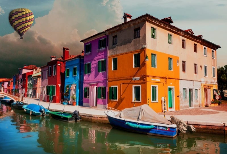
in folder number three, we're going to start with this one of the hot air balloon. Selections allow us to target
certain parts of an image. Whether we're
targeting it because we want to make an adjustment or because we want
to copy and paste something or move something. We need to be able to select it. Photoshop has a lot of amazing tools that automate
a lot of this process. So starting with this
hot air balloon image, we're going to select
one of our wizard like selection tools by pressing
W on the keyboard. That selects this tool
family right here. The tool we have right
now doesn't matter because with any of those
selection tools active, we will see the
select subject button at the top of our screen. This is going to make use of Adobe's artificial
intelligence to analyze our image and select what it thinks
is the subject, and we can have Photoshop
process that information. On our local device
or in the Cloud, which might take a
little bit longer, but that's going to
give us better results. So the Internet
connection you have or don't have at the moment might influence your choice here. I'm going to go ahead and
leave the set to Cloud, and then I'll come over
and click Select Subject. Photoshop analyzes the image and selects the hot air balloon. So now we can copy it by
pressing Command or Control C, and let's switch over to
this sky image and paste it by pressing Command
or Control V. That's it. Our hot air balloon is
now in a new image. If we look at our
layers panel here, which I have moved to the
top of my little pocket, we can see that photoshop puts the hot air balloon
in its own layer, which means if we press
V for the move tool, which is the top tool
in our tool bar. We can now move this
around within the image because it is separate
from this layer. Anytime we paste
something into an image, photoshop is going to
put it in its own layer. Let's move over to this
image called citrus. Obviously, if we tried
to select subject here, there's a lot of
things to choose from. It turns out that there is a
tool that we can use to tell photoshop which possibly many subjects or many objects
we want to select. That is part of
that same W family. It is this tool here, the
object selection tool. With this tool active, we can mouse over
different objects in the image and Photoshop we'll
select them when we click. I'm going to select this
grape fruit slice by just mousing over
it and clicking, which puts these squiggly lines around it just like we saw
in the hot air balloon. These are called marching ants, and this lets us know that our grape fruit
slice is selected. I'm going to copy it
by pressing Command or Control C. Then
let's come up here to the fruit face image and paste it by pressing
Command or Control V. Again, we see photoshop paste
it into a layer of its own, and let's switch back to
our move tool by pressing V for v. And maybe I want to
move this up a little bit. And I also want to
make a copy of it. So let's hold down Alt
or Option and click and drag over to the
right to make a copy. Now we have two grapefruit
layers in the layers panel, and with our move tool, By default, if we have this
auto select option on, we can move them by just clicking on either
one of these layers, and you'll notice
that as we click, Photoshop selects the
corresponding layer and we can move it. So that is auto select layer. It's on by default. But if it starts to
become a problem, you can toggle it off anytime by just
clicking right here. Let's go back to
our citrus image, and we see that the marching
ants are still here. So we can de select them at any time by pressing
command or control D, or we can come up to the select menu here
and choose D select. But in this case, let's leave the selection active because we're
going to go back to our object selection
tool by pressing W. And here we see these
little modifier keys. This tells Photoshop whether we want to make a new selection. We want to add to a selection, subtract from a selection, or intersect a selection. So with this first
option active, that means that if we
use this tool again, it's going to replace any active selections
with a new one. So we can actually just leave the selection here and let's come up to this little guy
and click to select him. So we see we've de selected the grapefruit and we've
now selected this one, and we can copy that
Commander Control C, and let's go back to
our fruit face image, Commander Control V to paste. And if we switch to our
move tool by pressing V, we can click to grab that little piece and
move it down about there. Now, let's take a look
at our layers panel. We see we've pasted in
three different things, so we've got three
different layers. We also have this
group folder up here. Let's twirl this
open so we can look inside by clicking this
little carrot right there. And we see we have a layer here, and then we have this
layer called style holder, which is actually
just totally empty, but it has some styles or
layer effects applied to it. And that means we can
copy these settings and apply them to
these three layers. To do that, we're
going to hold down the Alt or option key. And then we're going
to click right on the little effects in
the layer right here. And we're going to just drag and drop it onto each of
these three layers. So I'm just holding
Alt or option, and I'm coming up here dragging and dropping that onto
those three layers, which gives them a
shadow similar to what this banana has and makes
everything look like. It was meant to be
here. Finally, let's finish this off by coming
up to this group folder. And if we click to put a little eyeball in this
empty socket right here, we have a completed
magazine cover, which is 100% silly. Next, let's move to this
picture of the cat. Images like this
are a little more tricky because look at
all this fuzzy fur. But it's still a piece of cake. So let's press W for our Wizard like selection
tools one more time. And then we'll come
up here and start by clicking select
subject again. So now we've got this
selection around the cat, and we have this
little piece that didn't get included quite right. To fix that, let's grab
another one of the Wizard like selection tools called
the Quick Selection tool. This is basically a paintbrush
that paints selections. I'm going to zoom in here
so you can see better. But we can see that it's kind of missing part of
the foot right here. So with this tool selected, and we've got this plus
option enabled here, all we need to do to add this in is basically paint over
it. And look at that. It just snaps right in. If the tip of this tool, this brush is too big or small, you can change the size. By coming right up
here in the options. I can see right now my
brush is nine pixels wide. If I want to change the size to make it bigger or smaller, I can click this little
drop down and I can drag the slider right
here to adjust the size. Then you just paint over
whatever you need to fix. If you make a mistake and
maybe you paint too much, all you need to do is toggle to subtraction mode by pressing
and holding Alt or option. Now we see the cursor changes
from a plus to a minus, and I can come right in here
and just fix that right up. All right, so now we
have the selection, but we need to finesse it a
little bit to get the fur. To do that, we'll
come up here and choose Select and mask. This allows us to
see a preview of the selection and fenese it. So over here in the right
hand side of our screen, next to view, we can choose different ways
to view our selection. Making it easier to see. In this case, let's
choose on black, and then let's make sure that the opacity for the black that it's going to
overlay is 100%. Now we can see
that this fur edge needs a little bit
of refinement. To do that, I'm going to come
back to my brush settings, and I'm going to drop
the size back down to something tiny like
ten to 15 pixels. And I'm going to make sure
I'm selecting this tool here. This is the refinement brush. So we are in a
whole new workspace now for refining a selection. And in this workspace,
using this tool, all we need to do is
tell photoshop to take a second pass at this edge by basically just brushing
over it with that tool. Look at that. Look how it
selected that hair now. Now, see the fur right here. Let's just brush over
the edge with that refine edge tool and look
what a better job it does. So there's a number
of tools here. They can all be used to refine the selection
in different ways. When we're happy with
it, we come down here and we can tell
Photoshop that we want to output our
refined selection to any number of things. In this case, we just
want a regular selection. So we'll click
Okay. The selection doesn't look any different, but we have refined it. We started by using the select
subject button up here. Then we cleaned up the
selection to add the foot in over here by switching to
the Quick Selection tool. Then we click Select
and Mask to enter that other workspace where
we refined the furry edge. And now we're ready to copy it by pressing
Command or Control C, and let's switch over here to this image called Cater Day and paste by pressing Command or Control V. So there is our cat. And if we look in
our layers panel, we have this shadow
layer that's not active. We have our cat
in its own layer, and we have an empty layer
called style holder. So let's click in the empty eye socket to enable the visibility
of the shadow layer. We'll switch to our move
tool by pressing V. And now let's drag the cat into position on top of his shadow. And finally, let's take this empty style
holder, which again, has a little effx icon here
and we'll copy that effect to the cat by holding Alt or Option and dragging
it like that. Just adds a little shadow And now he looks like he
belongs in the scene. Let's try one more just for fun. We're going to click over
here on this Tiger image. Let's switch back to our Wizard like selection tools by pressing W. That gives us access
to again select subject, and Photoshop selects the
Tiger and once again, did a nearly perfect job. But this time, I Zoom in, you can see it kind of
missed the ear here. So good thing we know about
the Quick Selection tool. With that brush tool selected, and a decent size of 15 pixels. Remember, we can change
it from this little drop down right next to
our brush preview. All we need to do is
brush right over that ear and let go and
photoshop selects it. We can practice
refining the edge again by choosing
select and mask. And in this work space, if we select the edge
brush right here. And we want to brush over
any of the fur we can, although I don't
think we need to. So, now it's adding in
stuff that we don't want. So when that happens, we can grab this tool here, the third tool from the top. And you'll notice this
cursor has a plus in it. That's going to
extend the selection. To do the opposite to
remove from the selection, we hold down Alt or Option. And you'll see we
get that minus, and now we can just paint away anything that we
don't want included. We'll make sure we output to
selection and click Okay. Now I'm going to copy this
Command or Control C, and let's go to our Woods image and paste Command or
Control V. We'll switch to our move tool by pressing V. And dragging him up to
the top of this car. Now, let's zoom in
and look at this. We can see that he came from a very flat
straight surface, and now he's on top of
a car, which is curved. So we need to actually curve him around
to better fit on this car, and we can do that
by bringing up something called free transform. So let's press commander Control T to put a transform
box around our subject. We're going to use
this a lot a lot. So we've entered free transform. Once we're here, we
have this button up here that allows us to warp it. So if we click on
that, we get a grid on top of our selected layer. And now we can take these
handles and actually pull to curve our tiger. So I'm just kind
of wrapping him so that it looks like his tail
is going behind the car. And I'm going to pull the
middle up a little bit. So he's kind of curving
over the shape of the car. You with me? And we'll kind
of have this part come out. I'm grabbing these
control handles. So each of these corner
points has a node, and these corner nodes have these little handles that we can use to kind of bend him around. So I'm just going to
pull ever so gently. We don't want to totally
make him strange looking, but we'll just get
him in here. Like so. Move him around
ever so gingerly. And if we were happy with it, we can press Enter on the keyboard or come up here
and click this checkmark. Now, we have a tiger laying
on top of our slug bug. In our layers panel, we can click to enable this shadow that I
put, not the tiger. Up above, we have another
style holder layer. So we're going to
hold down Alt or Option and drag this
little FX icon. And drop it on the tiger. Finally, we've got two
adjustment layers here. Let's turn those on by clicking
these little eyeballs. Now, these adjustment
layers are like rain clouds and their adjustments
always rain downward. They are adjusting everything. The tiger, the tiger shadow, this stuff, the
background layer. I only want these adjustment
layers to rain on the tiger. So to do that, let's start
with the Hue saturation one. If we click on the little
icon here, double click, that will pop open
the properties panel, so we can see the
adjustment I made here. And down at the bottom, there's this little I
call it the Gonzo cursor. This little button.
If we click on that, it's going to clip
this adjustment in. So you see that. It's
kind of tucked in. So now it's only going to
affect the layers below. So we're going to
do the same thing for this adjustment layer. So select the color
balance layer, click the little gonzo
button. It's very subtle. But now, these two adjustment
layers and they're related adjustments are
only applied to the tiger, which is what I
wanted in this case. And finally, let's go down to this Extras layer and click to enable it
and look at that. We made a blockbuster
of a movie poster. Now, I imagine you might
want to save your work here. So let me show you
how simple it is. We'll talk about more
details of this later. But let's just choose File, Save as navigate to a place that you want to
save it, give it a name, and because we want to maintain all these layers and
the editability of it, we're going to
choose Photoshop for the format and click Save. You're probably going to see
a little pop up that asks you if you want to
maximize compatibility. Go ahead and enable
that option and then tell Photoshop not to
pester you with that again. And that'll save you a click every time you save
a photoshop file. You can repeat that process with all the other images if
you want to save them. If not, that's okay too. Then join me in the next video, and we're going to talk
more about layers.
5. All About Layers: In this video, we're
going to be working with the two images found in
the number four folder. Starting with this one here
called layer sandwich. As you've seen, when
we make selections and we copy and paste them
into other images, they come in as these
things called layers. Here we have an image with a number of layers
that are already here. They are not currently visible. Right now, we're just looking
at the background layer. To help us get a feel
for how all this works, let's click to enable the eyeball next to
the plate layer. We could turn layers
on and off by clicking this little
eyeball socket. If we want to move
the plate layer, we need to have the move tool, but we also need to
select the plate layer. We'll click to make
the plate layer active and now we can
move the plate around. The move tool has
an option in here to auto select the layer
based on where you click. If that feature is enabled, I could then click the
background and you'll see it deselected the plate, but it can't actually select the background
because it's locked. Okay. But if I click
on the plate again, it will select the plate layer. If you like that feature, you can leave it on. Personally, it makes me bonkers because I select
things by accident, so I'm going to turn that off. Either way, In order to
affect any given layer, you have to have that layer
active in the layers panel. Right now, we know that
the plate is active because this layer
is highlighted here. Let's see what else
we have. We have a bottom bread slice, which now is not
centered on the plate. Let's use the move tool. Making sure the plate
layer is selected, and let's put the
plate under the bread. There we go. So we
have bottom bread. And the reason that I have this layer sandwich
here is to help illustrate the concept of
layers as like a sandwich. Just like when you're
making a sandwich, you might start with some bread. Maybe then you add some
spinach to your sandwich. You put some cheese,
maybe a tomato. If you're vegetarian, you might put cucumber for a nice crunch, and then you add the
top slice of bread. That is how the
layer panel works. Just like when you
make a sandwich, sometimes the order of the
ingredients might matter. For example, if we take this top slice of
bread and we drag it down below the cucumbers, you have to be really careful. If you drop it here,
let's do this. Let's drag it below the
tomatoes. There we go. I'm looking for this
blue line here in the layers panel between the
tomato and cheese layer. If I drop it here, Well, now the tomato and the
cucumber is on top of it. So that's a pretty messy
way to eat a sandwich. Sometimes the order is
going to matter here. And if you want this piece of bread on the top
of the sandwich, then you need to drag it to
the top of the layers panel. And you want to make
sure if I drop it here, it's going to go
into the folder that contains all the
cucumbers. I'll show you. If I drop it in there,
and now I twirl open this folder that contains
multiple slices of cucumbers. Now, the bread is
in this folder. To put it out of the
folder and just have it be its own layer up here
away from this folder, I'm going to click
and drag it not here, but all the way up, so we see the single
blue line at the top, and then when we drop it, it lands on top and we can
close the cucumber folder. Okay? So we can hide that bread. Maybe you want an open face
sandwich. That is super. And then if you decide you want the tomato below the cheese, you can click and drag
it below the cheese, and now we see it peeking out from below the cheese, right? So the top of the layers panel
is the top of your image. It's as if you are looking down at a sandwich
you're about to eat. And whatever is on the top
of your layers panel is going to be on the
top of your sandwich. Okay. So play around with this and see how you want
to make your sandwich. You'll notice a
couple of things. I have a folder for the spinach and a folder
for the cucumber, and that is because each of these little cucumber slices is actually on a separate layer. If we twirl this folder open, you can see all the
different cucumber slices. So I grouped them in a
folder just to tidy up the layers panel
that would otherwise have many, many, many layers. This is just an organizational
thing in this case. Go ahead and play with
this, move things around, make the sandwich
the way you like it. Then let's take a little peek
over here at this image. The other thing
that's neat about layers is not only can
you turn them on and off. You can move them around,
you can group them. You can do all kinds of things, including adjusting the
opacity and the blend mode. Here we have an image
with two layers. We have the background
image, which is this, and we have another image on top basically called skyline, and that's this red one here. But let's say we want to
adjust the opacity of this. With the skyline layer active, we can come up here into
this opacity setting, and if we click on
that little carrot, we get a slider and we could
drag the slider somewhere in between so that
the skyline image fades away to about 50%. Revealing the image below. That's one thing that we can do. I'm going to drag
that back to 100%. Another thing that we can do is change something
called the blend mode, and the blend mode
controls the way that a layer blends or interacts
with the other layers. By default, the blend
mode is set to normal. But if we click on normal and we just mouse through
these options, we're going to get some
really cool results. I think this one is
my favorite so far. But there are a number
of blend modes here. Some of them will
knock your socks off. Others will make you wonder what the heck you would
ever use that for. But they're very powerful, and it really just kind of
depends on what's going on in your image and what
you're trying to do. But the important thing to
know is that you've got a lot of options here and they can create some very cool effects. So my personal preference for this image is screen blend mode. And that allows us to view both the skyline image and the background image
at the same time. So they blend together using
The screen blend properties. Those are the basics
of the layers panel. You can move things around and
change the stacking order. You can play with the
opacity and blend modes. But of course, that is far from everything you
can do with layers. In the next video, I'm going to show you how I've
been creating all of those fancy little
effects that we've been applying to our
composites. That's right. In the next video, I'm
going to show you how to create your own layer styles.
6. Effects & Layer Styles: In this video, we'll
be working with the two files in the
number five folder. We're going to start with
this one here, Bloom. So far, we've seen how
we can move layers around and change their
blend mode and opacity, and you have seen some
pre made effects that I created that we've enabled at the end of some
of our projects. Now I'm going to show
you how I created those. In this scene, we have
a gradient background. We have a bunch of greenery bits all these
leaves and things. We have some text
that says bloom, and we have a couple of flowers. Then we have these lines
at the top and some text. Before we keep going,
let me show you something that's really
helpful in the layers panel. You can see that we
have these two flowers. There's a dark purple
one and a white one, and in the layers panel, they're really hard to see in
their little preview here. So to fix that. We're going to go to
the layer panel menu, and we're going to
choose panel options. And we're going to
come down here where it says thumbnail contents, and instead of viewing the entire document in that
little tiny thumbnail, we are going to
view layer bounds. And let's make the thumbnail a little bigger
while we're at it, and now when we click Okay, look how much better that is. I'm also going to rearrange
some of my panels here because I want some more
room for my layer panel. There we go. So I like
to have my layers, channels and paths
all over here, and so we have a lot more space. Isn't that nice? All right. So let's talk about
how we can add some drop shadows to the scene. And we'll start by
targeting the bloom layer. And then we're going
to come down to the bottom of the layers panel, and we have this
little fx button here. And if we click on that,
we can choose what type of effect or layer style
we would like to add. And down at the bottom of
the list is drop shadow. This will bring up our
layer style options. And I'd like to think
of this as a buffet. Over here on the left, we have all the different
things we can put on our plate. We see that right now we've got drop shadow selected
and enabled. So here we're looking at
drop shadow settings. There are lots of other
different effects and styles to play with. But right now, let's just
look at drop shadow. By default, the blend mode for the drop shadow will
be set to multiply. We can see the drop shadow
showing up here in the image. We can adjust the opacity if
we want to make it darker. We can adjust the angle. So we can either type a degree
in here if we know it or we can just move this
around and you can see the shadow moving. So this is basically if you
think of it kind of like a sun dial and this
points toward the sun. So if we have the sun up here, then the drop shadow is going to come and fall off
the bottom right. These settings
control the distance, the spread, which is usually best to keep
low and the size. So that affects how hard or soft that shadow is going to be. Those are the main settings. So go ahead and set this to something that you feel
good about like so. And when you're happy
with it, click Okay. And you'll see it adds a little
effect icon to the layer. And down below, it tells us which effects
have been applied, and we can see
it's a dropshadow. So we can toggle
the little drawer here of effects our
little effect drawer. We can toggle it open or closed by clicking
the little arrow. If we want to make changes, we can just double click
right on the effects, and that will pop
this back open. Right now, though,
we're not looking at the drop shadow settings. So we need to click over
here to target drop shadow, and now we can come in here
and tweak these settings. So I think I overdid
the opacity. I'm going to lower
that back down. Maybe something like so. Let me just click Okay, so
we can always get back here. Double clicking this
means it brings up the layer style dialogue, and then you need to click
to access drop shadow. If you twirl open the drawer and you double click on
the words drop shadow, then it will open with
the drop shadow selected. So that's another option. All right. So now we
want to take these Drop shadow settings,
and we want to apply them to these
two flower layers. So we can hold down the option or alt key as we've done before. And I'm just going to drag on the little effect icon and drop it on the white flower one, and we'll take the same
thing holding down Alt or Option and drag
and drop on flower two. That's one way to
copy the layer style. Now we have all these
greenery pieces, and that's a lot of
clicking and dragging. Another way that we can copy and paste a layer style is if we right click in this empty area of the
layer in the layers panel, right click and choose
copy layer style. Then we can click this
top greenery piece, greenery six, and then shift click greener e one
to select all of them. And then we're going to
right click in this area somewhere here and choose
paste layer style. And now that same
layer style has been applied to all of the greenery. If for some reason,
you decide you don't want these effects
on here anymore, you can right click on
any of those layers, and you would choose
clear layer style. So that's a look
at drop shadows. If we come over to
our neon image, we're going to explore how we
can combine effects to give this applause text a neon glow. To get started, we'll make sure the applause layer is selected, and we'll come down to
the effects button. And this time, we'll
choose Bevel and Emboss. Now, don't panic when you
see all these settings. There are a lot
of them. But it's just trial and error, right? You just want to move things around until you get the
look that you're after. In this case, I'm going to set the style to inner bevel smooth, but I'm going to boost the
depth up to about 230. We want the direction to be up. The size to be six
or seven is good, soften set to zero. I'm going to leave the
shading to the defaults, the default gloss contour, and the default highlight
and shadow mode here. So Mostly, aside from
adjusting the depth, we're not changing
a whole lot here. So here's our buffet
plate, if you recall. We've got Bevel and
emboss on our plate. Next, we're going
to add inner glow. Come down here and
actually click right on the words inner glow. This switches our settings
so we can work with them, and it adds it onto our
plate at the buffet. By default, the blend
mode is set to screen. We're going to adjust the
opacity up to right around 50%. Down here, we want
to change the source from the edge to the center. You can play with the size
settings if you want to. I'm going to leave
mine where it is. I feel like this
looks pretty good. To see the effect
that this is having, we can toggle this inner
glow layer on and off. It's very subtle, but it's essentially strengthening
this highlight down the middle of the text. In fact, I think I'm going to boost the opacity
a little bit more. So it really shows up. So starting to look like neon, but we need to add one
more important piece, and that, of course,
is the outer glow. So we'll click right here
on the outer glow words. And now we're going to
have some fun with this. Let's boost the opacity to 100%. Let's boost the size all
the way as far as it goes, which is 250 pixels. The default blend mode for
outer glows is screen. If we want it to have a
little bit more punch, let's change the
blend mode to linear dodge ad. There we go. And finally, we need to change the color of
this glow, right? It needs to be this
turquoise color. So if we click right here on this little color
swatch that will bring up our color picker. And if we mouse our
cursor over the image, it will turn into
an eye dropper. And we can just click to suck
up this color of the text. So you should see
something like this here. If you're having
trouble grabbing it, You can also enter these values to get what I've got on screen. So you can come down and type R 020040 for the green value
and 255 for the blue. Okay. Then go ahead
and click Okay. We can see we've got three
effects added, click again. And now in our layers panel, we can see that we've got an effect that's been
added to the layer. And down below, if our
little drawer is open, we can see we've got
three different effects and what each of them is. We can also toggle them
on and off individually, so we can see the difference
that each one is making. And if we want to
edit any of them, we can just double click
right on the words to pull the layer style
dialogue back open. And now, I think you should
give yourself a round of applause for everything you've learned so far. It's a lot. And it's just the beginning. But it sure is fun, isn't it? We're gonna keep
this party going in the next video where we'll
be learning about brushes.
7. Brushes: Photoshop brushes
are so much fun. We've dabbled a little bit, but we're about to take
things to a whole new level. As we saw before it, the
keyboard shortcut for the Brush Tool is the letter B. We saw that we saw that with
the brush tool selected, we could come to the options
bar or control panel, and we could change the size of the brush up here by clicking
this little drop down. We can also change the hardness. But a better way to change these settings is to
use our keyboard. So I'm going to
click out of here. We can see right now
that the brush I have is 508 pixels in diameter. And I can tell that it's soft because this little
preview here is fuzzy. To change that,
with the keyboard, we can use the bracket keys. Those are the ones
next to the letter P, and the right bracket key is going to make
the brush bigger. The left bracket key
makes it smaller. So the two bracket keys by
themselves, adjust the size. If you want to
adjust the hardness, you just add the shift key. Shift left bracket key
makes the brush softer. Shift right bracket
key makes it harder. So here we can see, I hit Shift right bracket
key a few times, and now I have a
hard edged brush. What's happening is when you
hit Shift left bracket key, you're just moving the slider. And each time that you tap shift left or
right bracket key, you're moving this in
I forget what it is. It's either 20 or
25% increments. So, you know, once you're
all the way over here, that's as soft as it can go. But that's what's happening. So the left and
right bracket keys are moving these sliders. All right. So what we're going
to do right now is let's make our brush
about maybe 100 pixels. We'll see. And we
want to make it hard. So I'm going to hold shift
and tap the right bracket key a few times till I can see
the preview quits changing. And I might want it
one notch less hard. So I'll do shift left bracket, and let's see what
that is up here. Yeah. It's 25% increments. So then let's zoom in so we
can see her face better. So I'm going to hold down
command or control space bar, and I'm just going to click
and drag across her face. And let's make the brush
a little bit smaller. Maybe 40 pixels is good. So tap that left bracket
a few more times. Now, before we start painting, we want to make a new
blank layer because we don't want to just paint
on our image like this. So in the bottom of
the layers panel, let's click this
little plus icon. This gives us a new blank layer. We're almost ready
to start painting. We need to pick a color. Two ways to do that. We can open our swatches panel, can find it from
window swatches, and we can just
pick a color here. Nice pink, maybe. By clicking on it, that
will load it over here into your foreground swatch. Another option is to just
click the foreground swatch, and that will open
up the color picker. The way I like to work
in here is I like to have the radio button here
set next to the hue value, and that gives us
this giant square and the rainbow stripe. So what I like to
do is drag this around till I get the hue
that I'm looking for rather. Then you can come into
this box and click to select the actual
shade of that hue. So this is setting your hue, and this is choosing
the saturation and brightness of the hue. And you can see the color
that you've selected. Here. It shows what my new
color is and down below, it says current, but it basically means your
previous color. This is the new one,
and this is what we had before we opened
up this window. I'm going to go with
something about like this. You can also type in numbers
down here as we saw earlier. Every color value has a numerical code
associated with it. And when we're happy with
that, we'll just click. Okay. What we're going to do
now is come in here and just paint her lips, and it's going to
look ridiculous. And I'm going to need to
make this brush much smaller and zoom in closer. So, This is like
refrigerator art, right? And I'm doing this
just on my track pad. So if you have a mouse, that's probably a
better user experience, or if you have a Walkm tablet or other pressure sensitive pen, that is also helpful,
but not necessary. All right. So I'm just
doing something like this. That looks pretty not great, but it's going to look
better in a minute. All right, so we've got
that painted on here. Now, what can we do with it? Well, in our layers panel, remember that we can
change blend modes, and we can change opacity. So right now we've got
this set to normal. So this is just paint
literally on top of the photo. But let's change how it blends. So instead of a
normal blend mode, let's click and choose
something like color, which helps, but it's still
a little bit too much. So let's also come up here in the layer panel and
reduce the opacity. Now we're talking.
If we find that we've painted places
that we wish we hadn't, we can just press to
grab the eraser tool. And the eraser tool
is also a brush tool. So the same things apply. You can adjust the
size and shape of the eraser using those
same bracket keys. So I'm just going
to come in here and clean up Some of
my messy painting. If I realize I need more paint, I'll just press B to get back to my brush tool and
correct as needed. That looks pretty
good. Let's Zoom out and view the whole image by pressing command
or control zero. And I maybe want to brighten this color
up a little bit more. I'll raise the opacity. All right. Next, let's make a
new layer again. This time, let's make the brush bigger and all the way soft. Shift left bracket till we
have something like this. This is a 300 pixel soft brush, and I'm just going to dab a little bit of
blush on her cheeks, make my brush a little smaller
and come over here a bit. Like so. Now we're going to
take this opacity and drag it way down. So it's just a little hint. Let's make another new layer. And we'll make our
brush hard again, so shift right bracket. I'm going to zoom back in. So I'm going to make my
brush smaller again. Make sure it's hard or almost all the way at 100% hardness. And I'm going to
pick a yellow color. This is from the
pastel folder in the swatches panel.
Just click right here. I'm going to come over here
and I'm going to paint a curved line right
over her eyebrows. Then I'm going to
show you how to paint straight segments. So I'm going to make kind of a zigzag shape
on the top here. So I want to draw a straight
line from here to here. To do that, I'm going to
click where I want to start. Then I'll move to where I want to end and
I'll shift click. And Photoshop will connect
the lines in between. So I'm going to come back
down and shift click, and it's just going to keep adding these straight segments. And then I can fill this in. Do the same thing over here. I'll click to start and
then shift click to just keep going like that. Maybe I want one
more segment here. There we go. And over here too. Perfect. Because this is
on its own layer, I can grab my move tool if I
want, and I can move this. So I'm going to have
some fun painting. I'll switch to a blue color and make sure I still
have my brush tool, and I'm going to add just
kind of a burst over here. On the sides of her eyes. Same thing over here. Put some purple on the top, each of these points. And going to grab a darker pink, make the brush smaller and put some straight lines in here. This image is so joyful. I just love it. And finally, I want
to paint with white. Now, your default colors in photoshop are black and white. So if I press D for default, photoshop is going to give us black as our foreground color, which means that's what's going
to come out of our brush. But it also gives us white
as a background color, which kind of means it's
like the color in waiting. It's on deck, ready for action. So to spring it from the
back deck to the front deck, ready for action,
you just press X on your keyboard to
exchange your colors. Now I'm going to just add a little white
stripes inside these. So I'm just clicking and shift clicking to do all of that. Awesome. Okay, so that is some fun with just
super simple painting. Now, I'm going to show you
how we can take this round, simple brush and make
it a lot more dynamic. For one thing, I'm going to
increase the size by pressing that right bracket key until
I'm about to 150 pixels. And I've got white
paint by pressing D for default and x to exchange. We can instantly
grab white paint, and now we're going to change
some settings of the brush. We've been messing
around up here. We click this drop down, we've
changed size and hardness. Now we're going to
click this folder here. This is a little
shortcut button that opens the brush settings panel. And in here, we're
going to come down to the brush tip shape settings and down below where
it says spacing. We're going to drag this out till we get
something like this. Now if we come back into the
image and we start painting, we're going to get dots. I'm just going to paint a series of waves that are
flowing around her. Clearly, the wind is
blowing in this image, and so I just wanted to
have some fun with that. Now, there are a
lot of things you can play with in this panel, but spacing is one of
my favorite things to just add some kinetic
energy to our piece. So I encourage you to
explore these settings. It's amazing what
you can do here. Another way to have some
fun with this is to play with brushes that
other people have made, especially if that other
person is Kyle T Webster. To see what I'm
talking about, come up here to your brushes again and click this little preview
to open this back up. And you'll notice
there's a cogwheel here. If we click on the Cogwheel, there's this option
to get more brushes. If we give that a click, it's going to launch
a web page on Adobe's website where you've got thousands of free brushes from brush super genius
Kyle T Webster. Every so often, he
releases new brush packs, and you can download all
his other brush packs. From this page. So these
are just categories, right? Each of these downloads has
loads and loads of brushes. For this, go ahead and
download the spatter brushes. So you just click on
the little button. It's going to launch download. You'll see that it is called spatter brushes and
it's a dot ABR file. So you should be able to
just double click on that, and it should automatically
install into Photoshop. If it doesn't, for some
reason, no big deal. Just make sure you
downloaded it, go back to your brush tool, come back up here
to this cogwheel, and then just choose import
brushes, then click open, and we can see that a folder has been added now
called spatter brushes. And if we twirl that folder open and pull this window down, we can see all the brushes. In the spattered collection
that we just downloaded. And one of my favorite ones
is called Beautiful mess. So to select it, I'm
going to double click and that will select it
and close the panel. Now I'm going to make
the brush a bit bigger. And before we start painting, let's create a new blank layer. And then let's press X. So we've got black as
our top color here, and I've got a
really large brush, and now I'm just going to paint some spatter
on this image. So that's pretty cool. Let's
create a new blank layer. And let's go back
to our brushes. This time, we're going
to scroll down and select the brush
called spatter punk. Double click to
select it and that will choose the brush
and close the panel. Let's make the brush
way bigger with that right bracket key till
we're like one 1,400 pixels. And let's change our color. In my swatches panel here, I'm going to select this
bright bright green color. But you select
something you like. Then We could paint with this and we would
get amazing spatter. But before we do
that, let's enable another magical thing
in the brush settings. Remember the shortcut button. This takes us back to our
brush settings folder. Here, we're going to click to enable something
called color dynamics. We're taking Kyle's brush
and we're going to tweak it by clicking to
enable color dynamics, and we're going to crank the hue slider here
all the way to 100%. We want to have a bright color. Color dynamics enabled,
and we're going to take the huge iter and
crank it all the way up. Then we can collapse this panel by clicking
the little arrow here. Now if we come over in our
image and we click and drag, let go, click and dag
again, look at that. Every time we let up on our
mouse and make a new stroke, we're going to be getting
different colors. How fun is that? So here, we've learned how to change the size and
hardness of our brush. We learned how to paint
or draw straight lines. We made new layers for each
piece of our painting here. So the lips, cheek, all these different elements
are on their own layers, so we can individually adjust blend modes and
opacity if we want to. We learned that whatever
brush we start with, we can come up here to
the brush settings panel, and we can change
all kinds of things. Under brush tip shape, we explored adjusting
the spacing, and we explored
enabling color dynamics and playing around with
this huge er setting. We also learned that you
can download a boatload of free brushes by coming up here to the cogwheel and
choosing get more brushes. And we saw how you
can install them. And once you find Kyle's
brushes, he's very prolific. So once you have a bunch of his things
in here and it gets hard to find what
you're looking for because of the
sheer volume, Okay. You can also come up
in here and search. So if you remember
that spatter brush, that first brush we use
was called beautiful mess. So if you simply start
typing beautiful up here, it will instantly
find it for you. A couple of other things
worth knowing about the brush tool is that if you
have your caps lock key on, your cursor becomes
this cross hair instead of the actual brush tip. So just know that. The other thing is
When you're done with these really wild brushes
and you just want the basic boring
round brush back, come back to your
brushes and scroll up all the way to the top
under general brushes, and then you've got
your basic hard and soft round brushes so that you can get those really wild cursors
off your screen. The fun continues in
the next video where we're going to learn
some basic retouching.
8. Retouching Basics: Next up, we're going to talk
about some super simple, super basic, yet, incredibly surprisingly powerful
retouching techniques. So we'll be working
with the images in folder number seven. Starting with this picture
of the paddle board. In some images, you may
just need to move things. In this case, I want to pick
up our paddleboarder and just move her over to
make room for some text. Photoshop makes that very easy with the Content
aware move tool. So this is part of the J family. So if you press J
on your keyboard, that makes it really easy
to find in your toolbar. And then click and hold on
whichever family members on top and release on the
content aware move tool. Then, all we're going
to do is click and drag around the object
we want to move. Put our cursor inside the
selection and then simply click and drag wherever we want to move it to.
Let's say right here. And when we're happy
with that position, go ahead and press Enter. Photoshop not only moves
the selected subject, but also fills in the
area it came from. Incredible. The only
thing left for us to do is to get rid
of the selection by pressing command or control D or coming up to the select
menu and choosing D select. In the layers panel, click
to enable the extras, and we can see a
finished example of why we might want to move
something like this. Let's jump over here to our stucco image
where we can dream that remodeling would be as quick and easy
in the real world. Let's say we want to
fix the stucco here. From the same tool family, this time, let's
select the patch tool. Because we're not trying to
move the damaged stucco, we want to patch it
as if it was drywall. So with the patch tool, we're
going to do the same thing. We're just going to make a little selection by clicking and dragging around the area
that we want to fix, and I'm just doing
this on my track pad. So if you have a mouse, that's going to be even easier. So we drag a selection
around the problem area, and then we drag
it to a solution. And when we let go,
photoshop fills it in. And we can click anywhere with the same tool to deselect it. Sometimes when you're
retouching images, it's a good idea to work in
steps in little bitty pieces. So maybe once we get that fixed, maybe then we can
select this area, patch that. Remove this. So we're defining
the problem area, and then we're dragging to a solution. Isn't
that incredible? Next up, let's click
this image here, and we'll zoom in by pressing
command or control plus. Holding down the space bar lets us pan around in our image to position it where we want and check out how easy it
is to touch up skin. So this time, back
to that same family. This time we're going to
choose the remove tool. This is a brush like tools. So just like we learned
in the last video, we can adjust the size with the left and right bracket keys. All we have to do to retouch these areas is paint over them. Look how simple that is. Amazing. Got a flyaway
we want to get rid of. Paint over it. Gone. Hair
across your face? No problem. In fact, let's jump over
to this tattooed image. Let's zoom in so we can
see what we're doing, and let's duplicate our layer by pressing commander Control J. And this way, we can always
back up if we need to. And we can also toggle a comparison before and
after, which is pretty cool. Now, check this out. We can use that same tool, the remove tool. To click and remove this
tattoo. Just like that. I'm going to just do
it in small chunks so we don't overwhelm photoshop. We'll come up here, get it from this direction,
a little bit more. And then let's just buldoze
across her bracelet. And Photoshop does a
pretty excellent job. We can toggle this on and off. To see the difference, and it did stumble a tiny
bit on the bracelet. But that is easy to fix. Since we haven't talked
about masking yet, I'm going to do it
a different way. But after you watch
video nine on masking, you'll know a better and more
flexible way to do this. But in this case, since we haven't learned
about masking yet, I'm just going to
grab the eraser brush by pressing for eraser, and I'll make my brush soft by pressing
Shift left bracket. And I'm just going to erase
on the bangle to restore it. Now if we toggle
this on and off, we get excellent results. Once again, we just looked
at three retouching tools. That's a look at some of
the retouching tools. Obviously, there are
more things here. There's also the clone
stamp tool down here. But honestly, for most everyday typical
straightforward retouching, these are my biggest go tos, content aware move tool, patch tool, and remove tool. The important thing to keep in mind when you're working on retouching images is to
duplicate the layer. That way you can toggle your
before and after on and off. And the other thing is to keep in mind that
you might need to work in small bits and use
a combination of tools. Next, we're going to shift
gears and talk about working with type in Photoshop.
9. Working with Type: When it comes to fonts, you can use whatever you want. For the purposes of this lesson, I'm going to be using some
Adobe font fonts because they are free and accessible for anyone with a creative
cloud subscription. So if that's you and you
want to follow along, we'll need to activate a few
fonts before we get started. So if you open your browser
to fonts.adobe.com, log in with your AdobiID and then come over
here to search for NASA ization as
a NASA space agency. Here's the result. We
can click to select it, and all we need to do
to be able to use it in photoshop is click Add Font. That's it. This message
is letting us know that the font is now
available in Adobets. We'll click. The next font we're going to use is
called Ling Flowers. I'm going to scroll up here
and just typeingFlowers. Here we go. We can see that this typeface has three fonts. If we click on it, we'll see
that it has a caps Font, a script font and
a ding Bat font. So we're going to use all three. So up here at the
top, we'll just click Add family. Again,
it's letting us know. It's now ready in the
various Adobe apps. And let's come back
up here again. And the last one we're
going to search for is called Owners text. Okay. This one has 12
different versions, but the only one
that we're going to use is just called
Owners text Black. So you can see, I've
already got mine added. So if you want to add
the whole family, you can otherwise just
add Owners text Black. Once you get those
fonts activated, can switch back to Photoshop. We're going to start
with this image here from the number
eight folder. First thing we're going to do is press T for the type tool. And if we come up here
into the control panel, we can choose a font. So I'm going to type
NASA and there pops up, NASA ization regular, so
we'll click to select it. And now we're going
to create the type. So there are two ways to add text to your
document in photoshop. You can click and drag, which creates a
box for the text. This is nice if you
have lots of text, that's like a
paragraph, basically. I'm going to delete this. And the other way
is to just click. And that creates a
single type line. Now, when you do it this way, you won't get word
text, word wrapping. So if I just keep typing, it's just going
to go on forever. There's no wrap unless I actually hit return
to make a line break. So if you're going to
need multiple lines and you don't want to
have manual breaks, then you'd want to
click to Drawbox. So I'm going to
just hit escape to cancel add and press
delete to get rid of it. So to do that one more
time, with the type tool, I'm just going to click
to insert my cursor. And now I can and Photoshop
will insert some dummy text, and I'm just going to
type right over it with the word ah in all as. Now you'll notice the
cursor is still blinking. So if I press return, I'm going to get a line break. So I'll hit Delete to undo that. So to set the type, meaning kind of put
it down and get our cursor out of here,
we have two options. You can come up in
the control panel and click the checkmark, or you can hold down the command or control key
while you press Enter, and that will set the types. So now you see that
the blinking cursor is gone and the text is no
longer active, basically. So how can we scale this up? Like everything in Photoshop, there's more than
one way to do it. If we want to insert
our cursor in here to highlight or select the text, we can come over here and click and drag to select it.
But you got to be careful. I'm going to press the
escape key and show you why. Right now, I have this cursor that looks
like an open book, or it's like a cursor with
wings like a little butterfly. If I click with this
cursor and drag, oops, I've actually
created a new text box. When that happens by
mistake, which it will, just press the escape
key and then hit delete, and that will cancel
it and delete it. What you want to do is
really watch that cursor. If I get in close to the text, you see that the wings go away? Now, if I click and drag, I'm not creating
a new type layer, I'm just highlighting
existing type. Now I can come up
here and we can scale the size by choosing from the preset by
typing in a number, or by coming over here, and if you hover
on top of the T, you get this little
double headed arrow, then you can what's
called scrub. I'm going to click
and drag until I get something pretty
big, like that. Again, to set the
type now, we need to Command or control enter
or click this checkmark. That looks pretty good.
Let me grab the move tool here and move this in position. I think I actually
want it to be bigger, and don't worry about what
color yours is right now. But another way to
scale this bigger is to press command or Control T
to bring up free transform. And then we just
drag from a corner. If we hold Alt or
option while we drag, we will scale it from
the center outwards. So I'm going to grab something
till it's about this big. And again, just like
with the type tool, we need to commit
this transformation. But in this case, we can press enter because we're
not in text mode, we're in transform mode. So you can press enter or
again, click this checkmark. All right. Let's talk
about changing the color. With this type layer active
and the text tool selected. We can change the
color not here, which is what you might think, but up here in the
control panel. So this little swatch
right here when you've got the type tool active, this swatch is the text color. In this case, the color is
not going to matter much. You'll see why in a minute. But just for kicks and
giggles, let's click on this. And if we want white
text, for example, we can click and drag this
little dot all the way to the top left corner of whatever Whatever
hue you have here, the top left corner will
always be pure white. The code for pure white is either six Fs down
here in the hex code or values of 2505 for each of the red
green and blue channels. Then go ahead and click Okay, and we see that we've
got white text. If we look in our layers panel, we can see that we've got
a layer for this text. So anytime that you click with the type tool
or click and drag, photoshop creates a
layer for that text. Let's say that we wanted
to take this image here and place it
inside these letters. To do that, let's first
enable this so we can see it. So we see that we have this
picture of the milky way. And if we want to put
it in these letters, what we need to do
is called clipping. We need to clip it. It's almost like a shrink
wrap or like a vehicle wrap. So we're going to
take this image and basically shrink wrap it or clip it to the
type layer below. So to do this, the
two layers have to be directly on top of each
other in the layers panel. And whatever it is
that you want to wrap around needs to be on top, and the object you
want to wrap it around needs to be below it. And then, all we have to do is hold down the alt or option key. And hover our cursor in this
line between the two layers. So when we see this
little gonzo cursor, now all we have to do is
click and just like that, this image gets applied
to the layer below. If you want to apply that, you just hold Option or Alt and click again in
that same spot. What's cool is we can also use the move tool now to
move this around, so you can position it for
whatever you think looks best. Let's switch back
to the type tool by pressing T. Let's make sure we have white selected up
here, the nasalization font, and let's add one more line of text by positioning our
cursor up here above, we should see the
butterfly wings, and when we cli we're going to get another layer and it's huge, and we're going to type
in all caps, see a sense. Now, because this is so huge, we can scale it down by pressing commander control A to
highlight the text. Since we are in
the active layer, then it just becomes like
in any word editor, right? You just select the text, and then you can
come up here and scale this down till
something like this. So mines at 92 points. Now, to commit this text layer, I'll come back up
here and hit commit. I'm going to grab
the move tool and drag it into position
about there. If you have this
contextual task bar on your screen and it's in
your way and annoying, you can grab this little
bar here and move it away. You can also click
the three dot menu and either hide the
bar or pin the bar. In the layers panel, we can click to enable the
starburst layer. These are some tiny starburst
that I added to the image, but they may not align with wherever we've
positioned the text. If we need to move
them, click to select the starburst layer,
use the move tool. There they are to position
them appropriately, and then finally enable the
details folder down here, and wow that looks good. I'm in awe and I hope
you are too. All right. Let's take a look at
another image here, burst if you didn't
activate the owner's text, Font? Any similar font
will work just fine. Now we're going to add
some effects to this. So type layers, just
like any other layer, we can add effects to it. So in the layers panel, with the type layer active, we're going to come down
to the effects panel, and we're going
to choose stroke. Stroke is a fancy
word for outline. In this case, we're going
to drag the size up. We can see we're getting an
outline around the text. Right now, this
is set to inside. So we're creating
some outlines inside. So we can choose a size here. If we go too big, it's going to swallow up the
actual letters. I'm going to keep
it around here. And we can change the color
by clicking on this swatch. So when the color
picker pops up, I'm going to mouse my
cursor over the image, which gives us the eye dropper, and I'm going to click to select this orange color right from this type right
here, and I'll click. So we have one stroke
applied, but guess what? Some of these effects can be applied more than one instance. So you'll notice that the stroke effect has a
little plus here. If we click, we've
added a second stroke. Now, this one, we don't
see because right now it's identical and
on top of itself. I'm going to click this bottom
instance of the stroke. Let's change the color by
clicking on that swatch. This time, let's sample this blue color here
and we'll click. And let's change the
position to outside. And now let's grow it like so. When we're happy with
it, we'll click Okay. And now to really set
this off, let's warp it. We've seen the transform
command a few times. We can apply it to text as well by pressing
command or control T. Once we have this active transform
box around the text, if we come up here in
the control panel, we're going to see
this little guy. This is the Warp text option. When we click on that, we'll see some settings change up
here and one of them will say Warp we can apply whatever
type of warp that we want. In this case, we're
going to choose bulge. Here we can set the bend. By default, it set to 50%, which is actually perfect. But just so you know,
you can click on the word bend and
you can scrub it to dial it down or
burst it even more. Choose whatever you think looks good when
you're happy with it, press the checkmark or press
enter on your keyboard. Now, if you change your mind
after the fact, of course, we know we can double click the words here to
edit the stroke, or if we want to edit the warp, we can just pray as Command
or Control T again, and again, press the
little warp button, and we can see that it
remembered all of our settings. So maybe we want to dial
it back down a little bit or try a different
style of warp. And when we're happy with it, we'll just click the checkmark. Finally, let's take a look
at this third image here. So this is the looking
flowers script font, and it looks pretty, right? But we can make it
look even more fancy by taking advantage of
open type features. To see what I'm talking about. Let's make sure we've got
the type tool active. And up in the control panel, we have another little
shortcut button. Just like with the brush tool, when we had the little button up here that opened brush settings. This is going to open up our character at
paragraph panels. Here in the character panel, we have all these little
buttons down here. I'm just going to
focus on these ones. These are toggle switches for some of the features
in open type fonts. So this first
feature here enables any standard ligatures that
a particular font may have. So ligatures are
combinations of letters. So here we see a
special character for a double T. Here we see a
special character for a, a lowercase t, followed
by a lowercase h. So if we toggle
that off again, we're back to just regular
two lowercase Ts and a lowercase t followed by a
lowercase H. So some fonts, the designers have built in special ligatures for certain
combinations of letters. And they give you
a better result. So this is a much
nicer, cleaner, easier to read
double T than this. So those are standard ligatures. Let's see your everyday
letter combinations, double Ts and T H and stuff. This button here enables
discretionary ligatures. These are next level
extra fancy ligatures. If we enable that, we see that this typeface and
its designer put in a special combination
for a lowercase i followed by a lowercase
d. I just love that. Look at that. The ascender from the D swoops over and dots
the. Isn't that just neat? Continuing down this path, we have this option here. This enables something
called stylistic alternates. And if we click on that, we find out that we get extra fancy versions of
some of these letters. So for example, we get an even fancier version
of this liigature. Now, it has a swirl on it. The capital R gets this swirl, the capital N and the P, they all get extra fancy. To make this work, you need a font that has these
kinds of characters. And then you need to know how
to enable these settings. So this is one way to enable some of these
fancy open type features. Another way to access
these characters requires a preference
tweaking in photoshop. If you're on a PC, you're
going to choose the edit menu, and down here somewhere
you'll see settings. On a MAC, it's on here under
the photoshop menu settings. We're going to go to
the type preferences. And here where it says, enable type layer glyph alternates. We're going to click
to turn that on. Now when we click Okay, and we come in here and we choose, for example, this capital B. We're going to get
this flyout menu with lots of different capital
Bs that we can choose from. If we decide we want this one, we can just click
to make the switch. So we can go through and see what the different
options are for all these different characters to make sure that we're getting the ones we like the best. So that's two ways to access
some of these features. One is the toggle switches
in the character panel. The other once you enable the photoshop
preference to do so. Is to select right
from this menu here. One thing that I
want to change is this liigature of
this Double T is crashing into the R. And if I turn off the discretionary
ligatures here, I'm going to lose this
ligature, which I love. So what can we do?
Well, thankfully, there's a third way to
access all of this stuff, and that is Photoshops
glyphs panel. So to get to it, I'm
going to come to the window menu
and choose glyphs. And I'm going to pull it down so I can
actually see stuff. And this is just a running list of everything in this font. So up here at the top, it
tells us which font we're in. Because this type was
selected and highlighted, it automatically
chose this type. We want to make
sure we're viewing the entire font versus
different categories of glyphs. And if we scroll down here, I'm looking for the basic
ligature of the double Ts. So that's going to
be down in here. And you can see, there are three different versions of this ligature that we can apply. And I want the standard one here because this is the one
that's there now and it's crashing into the E and the r. This one would be great
if it was at the end of the word because this will create
another spacing issue. So I just want this one.
So from the glyphs panel, I can just double
click to insert it, and I ended up with an extra T, so I'll just put my cursor
in here and delete it. And can press Enter
to set this type. For now, let's close this
panel and close this. If we target this Extras
layer and enable it. We're going to see all this fun extra stuff
I've added to this. I wanted to show you a fun
way to explore ding bats. With the type tool active and
the Extras folder selected, use the Type tool and click somewhere in just an
empty space right here. Just click to insert a cursor. You're going to see
the Lorm psm type. Let's go back to
our Glyphs panel by choosing window glyphs. And instead of the looking
flowers script font, let's look at the deco version. So same font, same type
face, different font. And here we have all these
fun little ding bats. And if you want to
make them bigger, you can drag the slider here
to enlarge the preview. But the one that I'm looking
for is this one right here. It's a little corner element. So to insert it, I'm
going to double click, and any highlighted text will be replaced with this character, and I'll commit it. Now, what I'm going to do is press commander Control T
to bring up free transform, and I'm going to
scale it and drag it down here until it
lines up just right. So I'm using my arrow keys on my keyboard to
nudge it around. And when I'm happy with
the position and the size, I will press Enter. Next, I'll switch to the move
tool by pressing V. And I'm going to duplicate this by holding down the
Alt or option key, and we get this
double headed arrow. If I click to start dragging, I can drag it over
here to make a copy. And now to flip it around, let's press command or Control T to bring
up free transform. And within free transform, I'm going to right click
and choose flip horizontal. And it flips the
whole thing over, and now I can nudge
it into position, and then I'll press return. See what we're doing. See
where we're going with this. So now we have two
additional type layers. So it's a little glyph, but it's codd as a U. So technically, it's like if you type the letter U
with the deco font, you're going to get
this character. So that's why the
layers panel says. So we have a U layer and
we have a U copy layer. And we're going to select them
both in the layers panel. So with one selected, you can Shift click
to select the other, and with that move
tool still active, we're going to hold Alt or
Option again and this time, we're going to drag up because we've got both layers selected, both layers will get copied. Now we'll press
Commander Control T again to bring up
free transform. If we right click inside
the free transform box, this time we can
choose flip vertical. And then we can nudge it into place using the arrow
keys on our keyboard. And when we're happy
with it, we press Enter. I hope you enjoyed this
little peek into the world of type and type
design and typography. It's so fun. I encourage you
to play, explore, and you will never look at
fonts the same way again. Of course, there are more
exciting discoveries waiting to be had
here in photoshop. And in the next video, I'm going to introduce
you to another one of them called Masking.
10. Masking: In this video, we'll be working
with the two images found in the nine folder folder nine. We're going to learn
about masking. Masking is huge in photoshop, and it can get as complicated
as you want it to get, or it can just be simple. So we're going to keep it
simple in this example, and what you learn
here, you'll be able to apply to any project
going forward. So here we have a
couple pictures of my son when he was I don't know, maybe eight months or
so. He's eight now. It's been a long
time since I got to squeeze these baby cheeks. In these photos, he is modeling a little scarf and
hat that I made. In one picture, the scarf is setting nicely.
Everything looks good. His expression is pretty stoic
and in the other picture, he is smiling, but the scarf
is falling off his shoulder. What we're going to do is
combine the two together. We're going to take
the smile from this image and we're going to blend it in with this So we'll start
with the smile image, and we're going to use this
Elliptical Marquee tool. So if you don't have
that one active here, you're going to click
and hold and then release on Elliptical Marquee. And I'm just going
to click and drag to draw a selection
around his face. It doesn't have to
be a perfect circle. And then we'll copy
Commander Control C, and come back over here
to the scarf image and Commander
Control V to paste. We see that Photoshop puts the little smile in its
own separate layer. And so that we can
properly align things. Let's temporarily reduce
the opacity of this layer. To about 50%, grab the move tool and move this
into position like so. Now, normally, we might
try and line up the eyes. But in this case,
I'm going to move his chin so that his
chin lines up down here. Then we'll go ahead and
adjust the opacity to 100%. And that looks pretty good. But obviously, if
we look closely, we can see this hard
edge around here, we can see the cutoff down here. And what we want to do is
blend this in seamlessly. So you might be thinking, well, let's just grab the eraser tool and start erasing this edge. And that's one way to do it. But with the eraser tool, you don't have the flexibility
for fixing mistakes. So instead of erasing, we mask because masks can be undone. So
how do we do that? With this layer selected, we're going to come down to the bottom of the layers panel. And this little button that
looks kind of like a camera, that's our mask button,
so we're going to click to create a mask. And photoshop adds this
thumbnail to our layer, and nothing changes because our mask is blank,
as we can see here. In photoshop, layer
masks work much like masks that you might
wear at a costume party. Just like a mask
might hide your face, in photoshop, the mask can
hide parts of the layer. Nothing is being
hidden right now because this mask is blank. So, how do we make
this mask not blank? We paint on it using
the brush tool, and we paint on it
with black paint. So right now, I've got
white as my active color, and black is on deck. So I'm going to switch them
by pressing x on my keyboard, or if you're too busy drinking coffee with
your other hand, you can just click the little
switcheroo right here. So now I have black on top. And we've got the brush tool. So just like before, we
can change the size of the brush with the left
or right bracket keys. And we can change the hardness
by adding shift to that. So shift left bracket key is going to make the brush soft. So I'm going to make
my brush about 175 pixels and soft and I'm
painting with black. And rather than trying to paint on the little
thumbnail here, you actually just paint on
the image. So look at this. I'm just going to
paint over this, and I'm able to restore
the original image below. So I'm going to come
down here and blend. You see why I lined up the chins to make
this part easier. We'll come around here and just go all the way around
his little hat. And that's it. We can look at the mask here, and we see that we've
painted on it with black, I can see I missed a spot. There we go. And this black is hiding those corresponding
parts of this layer. If we want to see
the mask by itself, we can alt or option click
on the mask thumbnail here, and we can see this is
where we've painted. So these areas that
are painted with black are blocking this
layer from being seen. Sometimes it's easy to forget
which color blocks and which color shows the
contents of a layer. So I like to think of it like
the lights in your bedroom. If the lights are off, it's black, and you can't see. So the black is hiding things, and the white is like
letting the light shine and you can see
those parts of the layer. So to get back to
our regular image, we just alt or option
click again on the mask. So let's say that we make a mistake and we
paint away too much. Whoops. And there's his
not smiling expression. And now this just looks super
weird. So what do we do? We've accidentally
masked too much. Well, we just unmask it by
pressing x to get white paint, and we can turn the lights back on on this part of the layer. So here's this layer by itself. And now we can see if
I paint with black, we're hiding things like whoops. And if I need to restore
it or unhide it, I'll press X to get white
paint and paint it. Back. That's literally
all there is to it. So we're painting with
black or white on a layer mask so that we can hide or
show parts of a layer. In that sense, it is kind of
like using the eraser tool, but it's much more forgiving because when you make a mistake, you just switch to
the other paint color and paint it back. And to check our work, we can toggle this layer on and off. And we see that we were
able to combine that cute, happy smile with a
good looking scarf. And now you know how masks work. Join me in the next video to
learn about smart objects.
11. Smart Objects: In this video, we are
going to be working with the images in folder number ten. Starting with this cat image. And we're going to start
out by selecting the cat. So I'm going to press W to
grab my wand tools over here, my Wizard tools, which is one of the ways we can access this
select subject button, and I'll give that a click. Photoshop will automatically
select the cat. And we're going to copy it. Commander Control C. And
let's come over here to this scene image to paste
Command or Control V. Now, the cat comes in rather
large, which is a good thing. In photoshop, it's
always much better to have things be big and
you scale them down. That's better than taking
something and enlarging it, which involves creating
imaginary pixels. So we want to avoid that. Now, we need to scale this down to fit this
cat in the chair. To do that, we're going to
press command or control T, which brings up free transform. And before we do anything,
let's take a look up here. Photoshop is telling
us that the cat is currently at 100% scale. So this is 100% of
the cat's full size. Now, let's scale this down so
that it fits in the chair. So maybe something around 33%. C position it like so. So now we see we're
at around 33%, and if we press Enter, we confirm the transformation, and everything's great, and
there's no problem yet. Until we decide, we
want a bigger cat. And then we're like, Whoops. Let's actually scale
it up just a bit. So then if we press
commander Control T, we see Oh I thought it was
at just 33% of its size. But as soon as we scaled it down and we committed
that transformation, Photoshop threw away
all those extra pixels. So this is 100% of the cat's
size now, which is fine, except if we want to enlarge it, now we're going above 100%, and that's not a good thing. So how do we avoid that? With smart objects. So let's undo this, so we're back to our giant cat. And before we transform it, let's come over here
in the layers panel, and if we right click, we can choose convert
to smart object. So nothing really happens here, except we now see a
little icon here. And I like to think of
this icon as a suitcase. And in the suitcase, photoshop is going to store
all of the cats pixel data. What does that mean?
Let's take a look. Let's press Commander
Control T one more time. To bring up free transform. And again, we see we're at 100%. And again, let's
scale it down to 33% or so and commit it, and I'll switch to my move tool and move
him in place here. All right. So now
he's in the chair. And so far, it's no
different than before. But we have the
little suitcase here with all the pixel
data, which means. Now if we decide we want to enlarge the cat and we
press command or control T, Now, he's not at 100%. Now he's at the same 32
33% that he was because photoshop stored and remembers all the pixels that this cat
came into this image with. And those are now
sort of kept in this little suitcase
along with the layer. And that means if we want
to scale it back up again, we can do so not by inflating it and making up fake pixels, but by just using the
pixels that it came with. So that is one advantage of smart objects is
they pack all that pixel data in and make it
easy for you to draw on it. If you need to later, right? Editing and photoshop is
really about maintaining flexibility because you never know what you're going to
end up wanting to do later. There's a lot of experimentation and doing things in photoshop. So anytime that you
can leave yourself that cushion and wiggle
room to come back to, then it's generally
a good thing. So I'm going to go
ahead and cancel that enlargement
because he's here. He fits in the chair, and we see that photoshops remembering
all of that data. So that is a good thing. Now, let's walk
through that again. Let's come to this frame image. And we're going to
select the frame, but believe it or not as clean and simple
as this image is, select subject doesn't
work very well in it. Instead, we're going to
use the magic wand tool. It's part of the W family here. The magic bond works by selecting pixels of
a similar color. So for example, if I click on the black frame
in this image, it selects most of the frame, but it misses some spots. Depending on where you click, you may have different
spots than I do. So let's deselect that by
pressing Commander Control D. And it turns out that in
the control panel up here, we can actually control how picky photoshop is about the
color that it's selecting. So if we want to
expand our selection, we need to increase
the tolerance. So let's set that to
something like 75. And now if we come in here
and click on this frame, we're going to get a nice
selection of the whole frame. And now we can copy that Commander Control C
and bring it into our frame image and
paste Commander Control V. And before
we scale it down, let's make it a smart object by right clicking in
the layers panel and choosing convert
to smart object. Now we can scale it by pressing Commander Control T
for free transform. And we'll just drag this down. Something about like so. And when we're happy with
it, we'll press Enter. And just like the cat,
photoshop packed all that pixel data here in the frame in
case we need it later. So not everything that you
put into an image needs to be a smart object.
It's a trade off. Because now when we
save this image, we're going to have basically an extra large image because it's got all this
pixel data in it. You have to balance
your flexibility needs with your file size
storage limitations. But in this case, it's not a huge difference, so we're going to roll with it. Next, we're going to add
an image to this frame. But before we do that, we need to select where
we want it to go. And for the best results, we're going to use the
rectangular marquee tool. So that is the family
second from the top, and we want the
rectangular marquee tool. And I'm going to make
a selection up here in the top left corner
just a little beyond the cutout of the frame. A like this, I'm going
to click and I'm going to drag like that. Now let's go get something
to put in there. So we're going to go to
this rainbow rooftop image, we'll select all by pressing Commander Control A to put marching ants
around the whole thing, we'll copy it
Commander Control C, and come back over to our scene, and instead of pasting, we're going to choose edit, paste special paste into. And that is going to
paste in the whole image while turning our
selection into a mask. If we hide all this other stuff. Our whole image is here, but the lights are only on in this section, which
is a good thing. Except that the image is too big to fit in this selection. So we're going to transform it. And we want to make
sure whenever you have a mask on a layer, you can select the mask or
you can select the thumbnail. And in this case,
because we want to transform the image itself, we need to make sure that the image thumbnail is selected. Then we're going to press
commander Control T, and we can scale this down. It looks like it disappeared, but it was moved outside
of the visible area. So I'm going to just scale it to about something like that
and then press enter. And we don't need to have those things turned off. So
we'll turn them back on. And because we want this
to be below the frame, I'm going to drag it
in the layers panel below the frame
and then drop it. So now the frame is on top.
That looks pretty good. Let's convert this now
to a smart object by right clicking and choosing
convert to smart object. So that's going to package
up the image with the mask. And you'll notice we made it a smart object after we
scaled it down. That's fine. Because in this case, we are making this into
a smart object not to necessarily maintain
the giant pixel data. But to maintain the
mask and just make it easier to replace this image. So this is another
great way to use smart objects if
you're working with template or a mock up because
it makes it easy to edit. So, for example, let's say that we want to
replace this image now. How can we crack
open the suitcase, so we have access to the image and the mask to be
able to replace it? Well, we just double click on the thumbnail to crack it open. And what just happened?
Here's our image. We double clicked on the
thumbnail on the smart object, and that cracked open
our suitcase and actually put it in
a separate image, basically, almost like
another separate file. And here we can see
the entire image, even what's beyond the bounds of What's visible, and we have
the mask associated with it. So let's say we want to paste in a different image
now, like this lion. So I'm going to go
to the lion image. I'm going to select
all Commander Control A. I'm going to copy it Commander Control C. And let's go back not
to the scene here, but to the cracked open
suitcase smart object that we've got going
on in this image. So you'll notice that because this was
called Layer three, the cracked open smart object, the suitcase is called
layer three PSB. And now we're going to paste in the lion and we'll bring up free transform
Commander Control T, just like before, and
we'll scale this down. And get it so it fits
nicely. Look at that. So incredible. Magnificent, right? All right. So this is in here now. I'm going to press
Enter or return to confirm that transformation. And now we still
see the original down here. We've
got this on top. All we need to do
to get it in here. Is hit Save. Not save as. We don't need to give it a name. We don't need to
choose where to save it because the reality
is it's going to get saved inside this document. So we're taking this
whole suitcase. We're going to pack it
up, and we're going to put it in this document. So all we need to do is choose file save or press Command
or Control S. That's it, and then we can close it
by pressing Command or Control W. And just
like that, boom. It's in this image. You'll see this a lot if
you purchase templates. If you are working
with mock ups, you're going to see people using smart objects because it's
a really easy way to paste in content and have it
update in the main image. So let's try this again. Let's crack open this
suitcase one more time. Double click, crack it open. Let's say we decide we want the cat on the
rooftop after all. We can Hide the lion, hit Commander Control S, Commander Control
W, and here we are. And then if we're
like, You know what? I really wanted the lion after
all, we can double click, turn on the lion, save it, close it, and it updates. So that is a look at two different uses
for smart objects. One, to maintain the pixel
data for scaling flexibility, and the other makes it
really easy to replace content in things like
templates or mock ups. Now, to really finish the scene, I would want to add a
drop shadow to the frame, and inner shadow to
the image within it. And a shadow on the cat as well. So if you want to
experiment with that, I encourage you to
play and explore. And when you're
ready, meet me in the next video where
I'm going to help you make sense of image size and resolution once and for all. It's easier than you think.
12. Understanding Image Size: Let's talk about image
size and resolution. First thing is, how do we know what we're
even dealing with? One way to get an idea is to
look down here in the bottom left corner of our screen and Photoshop has
this little info bar. By default, this
displays document size. So we can see that it's 17 megs. We know that's a
pretty big image. It's not like some web graphic, for example, but we don't
have a lot of specifics. Thankfully, we can
change the display by clicking this little carrot and instead of looking
at document size, we can change it to
document dimensions. Now it shows us exactly how many pixels we have for
the width and the height, and we see the resolution. So don't panic. We'll talk about
this in a minute. But you may be thinking,
that's nice for pixels, but what if I want
to see inches? We can change the unit
a number of ways. The easiest is probably to just turn on our rulers
by pressing command or control R. If we right
click on the ruler, we can choose our desired unit. I'm going to choose inches and now this display
changes to inches. It shows us that this
image is 41 " by 27 " and some change and that it has a current resolution
of 72 pixels per inch. Now, if we wanted to
print this image, we're going to want somewhere
150-300 pixels per inch. So before you panic and
think, Oh, my gosh, that's low resolution, it's only 72 pixels per
inch. That is true. That's how images spill
out into Photoshop. Like, from your camera,
if you just take a photo and you haven't
manipulated it, you just open it in photoshop. Everything's going to
be 72 pixels per inch, which is fine because we have a lot of inches here, 41 by 27. So now we have some better information about what we're actually
dealing with. But how do we
actually resize this? If we're sending this to a lab, we don't have to worry about it. We just send them
the image and we choose the size when
we place the order, and their software
will manipulate the image to the size that you
want and it will print it. But let's pretend you're
going to print this on your home printer. If we just hit file print right now, we're
going to get warnings, because this is currently 41
pixels long, that's huge. My printer doesn't
print that big. I'm guessing yours
doesn't either. Instead, we can
change the size by coming up to image image size. Here, let's make
sure before we do anything, let's check resample. This is the safe
way to use this. By unchecking resample, We
are taking existing pixels, which we can see
here, total number of pixels for the width
and the height, and we're simply
redistributing them. So let's change this to inches, and we can see this is the
current setup of the image. Let's say we want to print
this on our home printer, and we're going to print
this as let's say 12 " wide. The height would be
essentially 8 ", and the resolution would
be 250, which is perfect. This would make a great
eight by 12 print. So how did that get from
72 pixels per inch to 249? Well, we basically scooped
up all those pixels, and instead of spreading
them out over 41 ", we scooped them all in and
spread them out over 12 ". So we've got more
pixels in every inch. Right? The number of
pixels stayed the same, but we spread them
over a smaller area. So I like to think of
pixels like peanut butter. And if you've got only one
spoonful of peanut butter, and you spread it out
over a giant surface, like let's say a tortilla, the peanut butter is going
to be spread really thin. But if we spread it out
over a smaller area, like let's say a cracker, the peanut butter is
going to be much thicker. You're going to get more
peanut butter in each bite. That's how resolution works. So by making the
physical dimensions, smaller, the amount of
pixels in each inch went up. So we still have the
same number of pixels. They're just spread
out differently. So if we click Okay, nothing happens other than this updates. So now if we hit
print and we have the right size paper like eight by 12
paper in the printer, then we shouldn't get errors because printers can
print eight by 12. So that's how image size works. And resolution, right?
They're connected. But let's bring that back. So again, age, image size, and let's say that
you want to take this image and you want
to put it on the web. Like, let's say you want to use this in an e mail or something. You would never want
to put a almost 3,000 pixel wide image
into your e mail. Like, that's way too big or on the web or
whatever, right? So this re sample option, allows us to get rid of
pixels or to make them up. But again, we want
to avoid that. So anytime that you enable re
sample, generally speaking, you want to be doing it intentionally to
downsize your pixels. Before we turn that on, anything we type here, even if we type a width of one, we're going to have a
wildly high resolution. And if we make our width, like 2000 20,000 ", now we've got one
pixel per inch. So now you could you could
play checkers on your image. The pixels would be so big. And that's with resample
turned off, right? So the dimensions up
here are not changing. The number of pixels
is not changing. They're just being
redistributed. Let's take this back
to 12 inch width. And now if we enable re sample, now we see that the link between the resolution and the width and height
has been broken. That means we can now
get rid of pixels. Maybe we want to
change this to pixels. Now instead of total number
of pixels measuring 2,990, let's say we do want to
put this in an e mail. Maybe we're going to use 800
for the number of pixels. So now we see that
up here at the top, our total dimensions have changed because we
enabled re sample, we're now throwing away
some of our pixels. And that sounds bad. But there are times when
you want to do that, especially when you're putting anything on the web, right? So sample is not all bad. It's a good thing,
but you just want to make sure you use it carefully, not by accident, which
is what tends to happen. So now we see that our
image is going to go from 2000 almost 3,000 pixels
down to a width of 800. And we can see that our
image was 17 megs in size, and now it's going
to be one meg. And when we click Okay, we're going to see that the
image gets much smaller on our screen because
it has less pixels. That's a look at image size and resolution and how
they are connected. I'm going to do this, so we're back to our
large eight by 12 image. If we want to change
the shape of this image from a rectangle to a square, we need to cut it, and we do that with
the crop tool. So I'm going to press C on
my keyboard for crop tool. And up here in the
control panel, we have a number
of presets here. They're divided into sections. So here at the top, we have ratio or with height
and resolution. In this middle section,
we have ratios. So we see numbers here, but these are not actual sizes, and I'll explain
that in a minute. And down below, we have some actual presets
for different sizes. For now, let's come up
here to one to one square. And if we select that, we
see a preview of our crop. We can see in the area
within the square, this is what would be
left of our image. If we cropped it, we'd be
cutting away these edges. But we can also drag around
the image within the square, so we can choose which
part of the image gets cut and which doesn't. Maybe we want to
crop it this way. So we can drag to the
crop that we want, and then we can press return. So you'll notice we
cropped it to a square, so we have a ratio of one to one for the
width and the height. We didn't tell photoshop what
size to make the square. So because our image
was 12 by eight, and we cropped it
to a square that was as tall as our image. So if this sides 12 ", this side is eight,
and when we crop, we end up with an
eight inch square. So when you choose a
ratio, just keep in mind, you're not choosing a size, you're just choosing a
ratio. Let me undo that. Let's say we want to crop
this to an actual size. So instead of ratio, we'd want to pick
with height and resolution and set a with
and height of let's say 4 ". We're going to leave
the resolution blank to just see what we end up with. The idea being that
we don't want to give ourselves less resolution
than we would naturally have, and we don't want to generate
imaginary pixels either. So let's just leave it blank and Photoshop will take
care of it for us. Let's go ahead and click Commit. And we have our crop. And now we can see
that we have not only cropped this from a
rectangle into a square, but we've also resized
it by designating not just a ratio but actual
width and height dimensions. So now we have a
four by four image and the resolution ends
up being over 300. So we've got more than enough. Once you get above 300, it's kind of just extra. So this is great. So now
we could print this, we could send this to a
lab, we could do whatever. It's going to be great.
Now, where people get into trouble
with the crop tool. If we undo this, let's
go back to our settings, and let's leave this
blank one more time. But instead of doing a
maximized crop like this, let's come in and crop just
to this little balloon here. Let's say we want
to make this 4 ". So we're leaving
resolution blank, and now if we press enter, we see that to make
this four by four, we're going to end up with
only 81 pixels per inch. That is not going to look good. If I undo that, the
reason that I tell people to leave this blank in most cases is because
if you don't, and you type a number
in here like 300, and then you do what
I call death by cropping, which is ops. Which is again,
to draw your crop really tight like
this coming in. Because I told it, photoshops like a genie. Because I told it that I
wanted 300 pixels per inch. When I crop, I'm
going to get it. Now I've got a four by four
with 300 pixels per inch, but they are made up pixels. That's possible.
Yes, you can do it. It may not look terrible, but it's just not the
way we do things. So I like to tell
people to leave this blank so that you don't force photoshop to
make up pixels unknowingly. If you leave this blank, you can do your crop,
whatever you want, and then you will
see, do you have enough pixels to really
pull it off or not? And then you can decide
if you want to go ahead with it or
try something else. So that's a look
at image size and resolution and
cropping in photoshop. There's definitely
more to know here, but those are the basics. Now that we know how all that
works in the next video, we're going to talk
about file formats and how to save your work.
13. File Formats: Let's talk through
how to save your work and how to save a couple of
the most common file formats. Most of the time, you're
going to be starting your projects with
a JPEG like this. As you work in photoshop, you're probably going to add
layers to your document. Maybe something like this. And let's say we crop this. To a nice square about like so. We started with a JPEG, but now we've got all these
layers happening here. And if we think we
might ever want to come back and make
some changes to this, then we need to
save these layers, and JPEGs don't save layers. So to save this as a
photoshop document, we're going to choose
File, Save as. I'll just go to my desktop
here and I'm going to call it wildflowers, word art. Okay. And Photoshop
is automatically suggesting the photoshop format for us because of
all the layers. So that's a good thing. We'll
go ahead and click Save. This becomes our main
file, our working file, our source file, where
we've got all of our pieces saved forever
with the document. But now, if we want to
let's say print this. We don't want to send someone
our layered Photoshop file. We want to send them a print
ready file like a JPEG. But you'll notice if
you come up here and choose File, Save as. We don't have the option
to choose JPEG here. So what we need to do
is click Save a copy. Now we can choose JPEG. And we can change the
name to let's say Wildflowers Word Art
and we'll call it print. We'll choose JPEG. I'm going to put it on
my desktop and hit Save. If you see a message
about maximizing compatibility with your photoshop document,
That's a good thing. You want to enable that, and to avoid seeing that message, every time you save a PSD, check the box to
not show it again. Once we hit save,
we're going to be confronted with JPEG options. JPEG file formats include
some compression, and you can tell photoshop how much compression
you want to have. Lower amounts of compression give you a higher quality file. So in this case, the range
goes 0-12 for quality. So because this is
intended for print, I'm going to leave
the quality set to the highest of 12
and click Okay. So what's confusing a little bit is we've made the
JPEG and saved it, but we are still here
looking at our PSD file. So the JPEG is nice and
safe on our hard drive. It's not open right now. The PSD file is, and the PSD file
still has layers. So let's say now that we want to make another
version of this, maybe to use in a
marketing e mail or on a blog or some other
type of social post. We don't want to send
a PSD file online, and we also don't want to post our big full sized image
with all these pixels. If we used that in an e mail, for example, it would be huge. So let's come up to image. Image size, and let's
enable re sample, and let's scale this down to just 800 pixels and click Okay. So it's going to get
very tiny on our screen. Of course, if we press command or control and the number zero, it will fit the screen again. But now, this image
has just 800 pixels. So let's save a version of this. Again, we can choose file, but we already know
if we choose Save as, it's not going to give
us the option for JPEG. Instead, we'll
choose save a copy. And we'll choose JPEG. And this time, we'll add a
suffix of 800 on the end. That way, we can tell at
a glance which files for print and which
files for the web. Then we'll click Save, and again, we'll
get JPEG options. This time, because we are planning to post
this on the web, we are more concerned
with the file size, and maybe we want to
compress this a little bit. So I'll drag the quality
down to eight and the file size will
shrink to under 200 K. Now we can click Okay. Again, we've made two JPEGs now, but the file that is open on
our screen is still the PSD. So that's what
happens when you do file and you save as a copy, you're creating that file and saving it on
your hard drive. But then it's not
open in photoshop. You're just kind of saving
it and putting it away. So we're still looking at
our photoshop file here. So now, if I go to close this, it's going to warn me that
I haven't saved my changes. Of course, the changes
that I've made include downsizing it to make
that 800 pixel JPEG. I've already saved my PSD. I don't want to save the fact that I downsized
it to 800 pixels. So I'm going to say, don't save because I know
I already saved it. So I don't want to
save the changes. And now let's open those
files and take a look. So here's our PSD. Here's our print JPEG and
here's our 800 pixel JPEG. We'll open them all up. Here's the PSD with
all of its layers, and we can see its full
size here, currently 55 ". Okay. 72 pixels per inch. So nice, big and healthy
file with layers. Here is our print version, same size, 55 ", 72 pixels per inch. But because it's a JPEG, it doesn't have any layers. And here is our 800
pixel image that we can see because our
display is set 2 ". It's showing us 11 ". But if I turn on rulers, Commander control, and we right click and change
this to pixels. Now we can see down here that
it is 800 by 800 pixels. That's how things
work in photoshop. You usually have your
JPEG source files, your PSD composite. And then, depending what you intend to do
with that image, you might save a print version, you might save a web version. You might save a square version, a vertical version, et cetera. So you want to make sure you're organizing all of this
stuff in a way that's going to be manageable
because when it comes to files and file formats, there is no one size fits all. That's a look at a couple of file formats and how
you save your work. In the next video,
we're going to put everything all together
with a little help from AI, to create a composite.
14. Compositing and AI Basics: Welcome to the last video where we are going to
put this all together to practice what we've learned
and learn about some of photoshops built
in AI features. So we're going to be using these two images from
Folder number 13, starting with this giraffe. To access the select subject
button. You know me. I like to press W for
my Wizard like tools, and then we'll click
Select Subject. To make sure that we are doing a good job
selecting this fur, we're going to come up
here and choose Select and mask that pops up our
select and mask workspace, where if you recall, we can change our view. So we are looking at
the on Black view, and I've got the
opacity up to 100%, and this makes it easy to see the background bits that got left behind in
the giraffes fur. So we can refine that with our refinement brush right here. The second one from the top. And I'll make my
brush a little bit bigger using that
right bracket key. And then I'm just going to paint along this edge
and look at that. Photoshop just cleans it all up. And when I let go, it'll
kind of bake it in, and we can go around here and clean up any other
bits. That looks good. We want to make sure
that we are outputting this to a selection,
and we'll click Okay. Now we're going to copy
Command or Control C, and come over here and paste in this cloud image by pressing
Command or Control. V. Our giraffe is nice and big. Before we scale him down, let's pack up all those
pixels into a smart object by right clicking in the layers panel
here and choosing convert to smart object. So now we can scale it non destructively by pressing
Command or Control T. If you can't see the corners of the bounding box
on the giraffe, a neat little trick is to press command or control and
the number is zero, and that will scoot you
back so you can see it all. And then we can just
drag this down. I'm going to put them
in here about like so. And when we're happy with that, we'll press enter or click
the checkmark to commit it. He's cute. Look at them
in there. All right. So that's it as far as actual source images for
this composite. Next, we're going to play around and let photoshop make up the other parts of the scene
using generative fill. To get started,
we need to define the area that we want
to fill with something. Let's come over here
to the Lasso family. They're the third from the top. And if we click
and hold, we have a number of family members here. We just want the regular lasso. This tool works by letting us just free hand draw a shape. I'm going to just
draw a blob here. Something like this.
So you just start by clicking and dragging
to draw around, and then when you get back
to where you started, you let go and Photoshop will close your shape and you
have a blob like this. This is where we're
finally going to use this little floating
toolbar that might have been in your
face the whole time. This is called the
contextual task bar. And if you don't see
it on your screen, like everything, you can find
it from the window menu. Clear down towards the
bottom, contextual task bar. Here, We can now enable generative fill by clicking this button right here. Photoshop is going to let
us know that there are user guidelines that
you need to follow. If you want to read them, you
can click here to do that. We will agree, and now we
can type in a prompt here. So I'm going to type steam
punk flying machine. And the joy of this is, who knows what we're
going to get, right? This is all being
generated on the fly. So my results will be
different than yours. My results will also be
different from what I did previously when I was
exploring this. So who knows? But when we're ready, we'll
go ahead and click Generate, and then Photoshop
will work its magic. You'll notice that a couple
of things have happened. We've got a new layer here
for our generative layer. Photoshop automatically
created that, and it popped open
our properties panel. And now we're looking at three potential steam
punk flying machines. So we can cycle through
them a couple of ways. We can come to the
properties panel and we can click to see the different
things that it has created or we can
also tab through them using the buttons in
the contextual taskbar. If we're not in love
with any of these, we can click generate again. That's going to generate
three additional options using that same prompt. And if we extend this window, we see that it kept the first
three that it generated, and it made an additional
three options. Maybe we want to try typing steam punk flying Zephyr
and hit generate. I had really good luck
with this one time, and the next time I tried it, it didn't work so well, so I don't know what we're
going to get here. These are fun though, right? Look at that. All right. What we need to know
at this point is that when you type in a
prompt and you generate it, photoshop is going to
give you three options. You can generate more, you'll
get another three options. You can even change the
prompt and hit generate. You'll get another
three options. What's really cool is
they're all here and they're going to stay here
unless you delete them. As long as you save
this document as a PSD, These versions are all going to live right
here in this layer. So even if you close
the properties panel, anytime that this
layer is selected, if you open the
properties panel, you're going to find those different variations
waiting for you. And if you forget what
you used for a prompt, if you click on any
of the variations, it actually saves
it with the prompt. So if you forget or you
want to iterate on it, that information is saved
as well, is pretty cool. So let's just pick.
I like this one. I'm going to go
with this one here. So that's it. There's
nothing to do. We can leave all
of these in here. If there are some we
know we don't want, like, I know I don't
want this one. I can hit the little
trash can to delete it. Don't care for that one or that one or that one. They're
fun, though, right? Okay. So anyway,
I'm just going to delete some of those
because keep in mind, they will get saved with your
document, and, you know, if you go wild here and
you've got 300 variations, that will definitely
increase your file size. So just something
to think about. But I'm going to
keep these three. So it's important to note, too, that Photoshop has filled this entire selection that
we drew with the object. In other words, it's not on
a transparent background. So if we grab the move
tool and we're like, I just want to move
this over here. It's going to come along with
the generated background. So if that is where
you want to put it, then your best bet is to make a new selection here and regenerate something
in that location. Okay, so that is a steam
punk flying machine. How about if we give our
giraffe some aviator goggles? Let's go to the
Elliptical Marquee tool, and let's choose the add
to selection option. And I'm going to come
down here and just click and I'm going to hold
shift so I get a circle. I'm going to drag
one circle there. And because we've got this
ad modifier turned on, I can put another
circle over here. So I've got two circles. They're slightly overlapping
so that when I let go, we get this goggle shape. What's cool is if you want
to move the selection, you can use your arrow
keys to nudge that around. I feel like I didn't
have it in a good spot. I'm just going to nudge
it over to there. Now I'm going to click
generative pili. At this time, I'm going
to type aviator goggles. Oh. Hmm. Well, those are definitely more wild
than the ones I got before. Let's try this
again by typing in vintage steam punk,
aviator goggles. Let's see what that does
for us. Oh, these are fun. Okay. I'm going
to go with those. And lastly, let's go back
to our Lasso tool here. And if this contextual task bar is in your way, which for me, it moves around based on where you're working
and what you're doing, which I really don't like. I'm going to move it over
here and I'm going to pin it by going to the
three dot menu and choosing pin bar
position so that it's just here and it doesn't
get on top of my work. Because now I'm going to draw a area for a scarf to
be blowing in the wind. I'm going to use this free
hand lasso just lasso tool. I'm going to click and drag to draw basically where I
want the scarf to go. And I want to have it
flying in the wind, so I'm going to give
it a shape like that. So while we mostly prompt with the words
that we type here, the selections that
we draw also do quite a bit to hint photoshop
towards what we are after. Now I'll type gender
to fill again, and I'm going to type
scarf flying in the wind. And I'm letting this
render in real time, you get a sense of how
long this really takes. Oh. That's awesome. We got three different versions. Oh, of course, that
yellow is my favorite. I'm definitely going
with the yellow one. And that's all there is to it. You can see that the AI stuff, the generative fill
is super easy to use, and a lot of fun. So now let's see what we can
do to tie all these pieces together and really give
this image a nice finish. So one thing I want to do is tone down the color
a little bit. So remember, in our towards
the beginning of this course, we made some image
adjustments over here. But this was destructive. So definitely want to make
these non destructive edits. So in the bottom of
the layers panel, I'm going to go to the
little Yin Yang and let's choose hue saturation. And this puts an
adjustment layer at the top of our image, so it's going to affect
everything below it. Adjustment layers operate
kind of like rain clouds and their adjustments
in downwards. So if there was a piece of this image that we
didn't want to adjust, we could just drag it up above the adjustment layer and
it won't be affected. For example, if I take the saturation and drag it
all the way to the left, and now I drag the scarf layer above the adjustment layer, the scarf won't be affected. So back to the saturation
adjustment layer. With this active, we see the controls in
the properties panel, and I don't want to
desaturate it all the way. I just want to low
it out a little bit. So I'm going to drag it to -23. The good news is we can
always come back and change this if we want to.
That looks good. Next, let's give it a bit of a vintage tint by adding
a solid fill color. So let's come back to the
little Yang and this time, let's choose solid color. And we get a solid color here and our color
picker opens up. And remember that it's kind
of a two part process, right? The first thing we want to
do is select the hue here. I'm going to drag this
down to the orange section and pick a sepia kind of
color and then click Okay. And now let's change
the blend mode. Remember that we can
also adjust the opacity. So you're not stuck. Like if you like this look, I kind of like the
hard light blend mode, but it's still, you
know, too intense. So once I choose the
blend mode that I want, then I can come over here to opacity and let's
dial that down. The last thing we
might want to do is add some noise to our image. Now, it's funny because
early in digital imaging, we were all about reducing noise because it was everywhere. And now our digital images and generated things like
this are so squeaky, clean that they look fake because they don't
match the rest of the image. Let's add a little bit of noise
to this image by creating a new blank layer and
coming to the filter menu, and we're going to
choose noise add noise. Okay. Just kidding. I forgot that we need to fill
this first with something. Let's go to edit fill, and let's fill it from
the contents here. Let's choose something
magical called 50% gray. Now, before we add the filter, let's make this a smart object. That way, we get a smart filter, and we can edit it and adjust
the noise value later. I'm going to right
click and choose Convert to Smart object. Now we'll choose Filter. Noise, add noise. We want to add
monochromatic noise and a pretty low amount, which is kind of hard to
tell how this is looking. I'm going to drop
that down to 4%. And we'll click Okay.
And now for the magic, we need to change this
blend mode from normal to something magical
that works with this 50% gray, which is overlay. In overlay blend mode,
50% gray disappears. Just straight up
becomes invisible. But because we have
speckles of noise that are darker and lighter
than 50% gray, the noise will stay. But the 50% gray will disappear. And now if we zoom in on our generated image like this
little flying contraption, we can see some noise in it. And if we hide that layer, you probably can't
tell on your screen, but I can see it on mine. So if you're following
along, you should be able to see it
on your screen. But in the video, you
probably won't see it. And what's nice is
because this was a smart object before
we applied the filter, that means our filter is a
smart filter. Which means? If we want more
noise or less noise, we can just double click
down here where it says, add noise, and we get
our settings back, and we can add to it
or subtract from it. So I might boost it a bit. Like maybe I'm going to
go wild and say eight. The nice thing is, we
don't have to choose. We can come back and
edit it anytime. And so that we know
what's what later. Let's double click Layer two, right on the words right here
where it says Layer two, and let's type noise
and press Enter. And of course, we want to save this beautiful masterpiece we've created by choosing file. Save A, and we'll call
it genius composition. And be sure to choose Photoshop
for the format and save. You did it. Bravo
15. Next Steps: I'm so glad you joined
me for this course. We covered a lot, didn't we? I hope you come away from it all feeling great about
everything that you've learned and confident that your photoshop journey is
off to an awesome start. So keep in touch and let me
know how it's going for you. You can find me on social as K Plicnith or online
at Kara plcnith.com. Thanks again for joining
me and until next time. Happy photoshopping.
 Khara Plicanic, Photographer, Designer, Adobe Educator