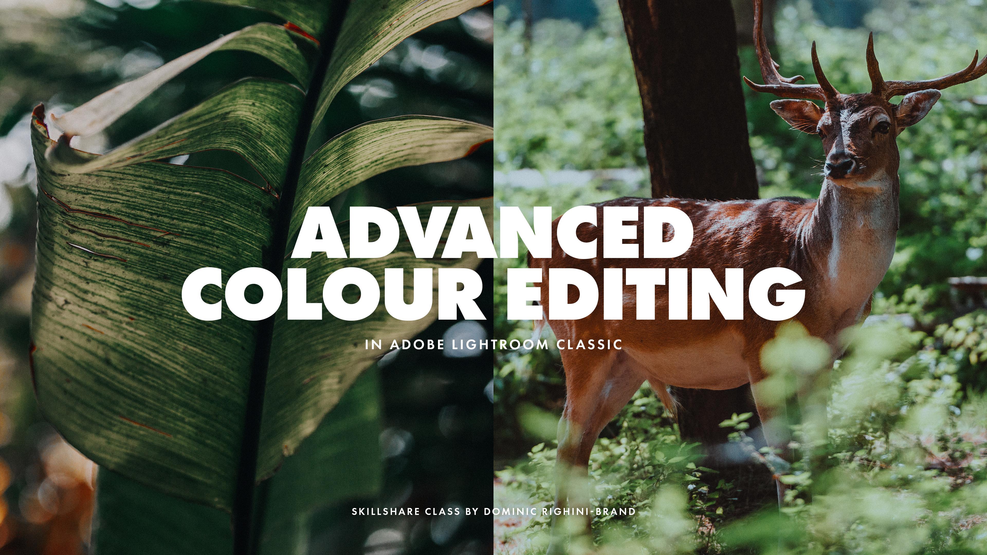
Transcripts
1. Introduction & Class Overview: Taking great photographs
is only half the story. How you edit your
photographs can mean the difference between a good
photograph and a great one. Unedited and raw digital
photographs lack soul and working with
the colors and tones helps to add personality
and character and create exciting and diverse
photo edits that speak. The range of color editing
tools available in Adobe Lightroom Classic can
be a little overwhelming. But learning what
each of the tools does and how it differs from other tools and how
it can be used in combination are the tools
to enhance him look, can make your editing process much more versatile and will help you produce more considered an aesthetically
pleasing edits, hoping you'll images
to tell a story. I'm dominant group
guinea brands, a professional
photographer, designer, and teacher passionate
about photography and recreating filmic looks in
my digital photographs. In this class, I will be sharing with you
my special tips, techniques and workflows for getting the most out
of adobe Lightroom is tall for enhancing color
edits or raw photographs. By developing your
understanding of when and how. You can use various
Adobe Lightroom tools for working with
colors and tones. This class is designed to intermediate and advanced
level photographers, graphic designers, photo
editors, and content creators. And to get the most
out of this class, you will need access to
the latest version of Adobe Lightroom Classic
or Adobe Camera Raw, and have a reasonable
understanding of photographic terminology
and basic editing tools. Whether you are looking to take your photo editing skills and proficiency to the next level and create more varied edits. Or feel overwhelmed with
all of the tools available. And don't know where to start. This is the class for you. For the structured approach
I'll be sharing in this class and looking at
different tools available, their uses, and their
place in editing workflow. You'll be able to enhance your understanding
and better integrate them into your editing workflow to build exciting custom edits. So join me in this class and harness the
full potential of Adobe Lightroom's
color editing tools to create photographic edits, which are full of character.
2. Photo Editing: Then & Now: Since early
photographic pioneers began experimenting with photographic techniques and recording images of our world. Photographers and creatives
have been editing images. Firstly with chemical processes, and now with digital
techniques to present us with visual narratives
that have become an intrinsic part of our
collective identities. Photo editing is
half of the story. And like the sound in a movie, it is sublime, but a very real and important
part of the story. Modern day digital
technology has increased the versatility
in editing techniques. But those techniques
have always been part of photography and often influence today's editing
techniques and processes. In the olden days, a photographer would
often carefully select the photographic
film being used. Consider how the film reacts to the light and it's
photographic grain. Photographers could
also further enhance their photography
in the dark room by controlling the
photograph's exposure. Print medium,
additive processes, and fruit image
manipulation techniques. In many ways, the foundation of what is achievable
and possible in today's digital darkroom was set in the late 19th
and 20th centuries. This is frequently
evidenced in the names of tools in Adobe XD,
digital darkroom, which often named after their
counterpart techniques or processes from the photographic
doctrines of yesteryear. Despite notions that
the camera never lies. On the contrary, photography has always been an unstable medium. This should not necessarily
be viewed as a negative. But like writing,
photography has always been open to the influences
of its creators, publishers, and
ultimately its viewers. And photo editing. However, it is used as
a part of that process. By taking control of the
photo editing process, you can improve your
photography by producing images which better conform to the narratives that
you want to convey. Through the utilization of modern digital editing
tools and techniques. There is a broad range of different photo
editing styles and techniques you can employ to create your
desired narrative. In this class, we'll have a look at a range of
different tool sets available in Adobe Lightroom
Classic, including profiles, tonal adjustments,
curves, calibration, color grading and HSL, and their role in the
color editing workflow. And how you can effectively
combine these tools together in order to create
exciting and varied edits. I'll also share tips for
making local adjustments using masks to get your photographs to look great and bring
the edits together. Whilst will be working with these tools in a certain order. Starting with profiles
and tonal adjustments, and running right through to advanced color
grading techniques using the color grading
and HSL panels. The overall order in which these tools are applied
is not set in concrete. You should expect
to have to revisit earlier tools to tweak
and finalize your look. Ultimately, you just
need to know what role each of these tools plays
in the development process, how it relates to
the other tools. And keeping each tools
potential effects in mind. Go about developing
your photographs using all of the tools you
have at your disposal. In this class, we'll be
working with raw photographs because images
captured in row have more information
saved in the file. Increasing versatility
and the range of stuff you can
do when editing. Technically, you can use the
same techniques when editing positive image formats
like tiff and jpegs. But there'll be some
limitations based on actual information
stored in the image. I would always
recommend shooting and editing enroll
whenever possible. In this class, I'll be using
Adobe Lightroom Classic. But you'll also be able
to follow along in Adobe Camera Raw because it
has exactly the same tools. If you're using
Adobe Lightroom on a tablet, smartphone,
or computer. You will also be able to follow along for most of this class. However, techniques which
involve working with calibration are currently
unavailable in Lightroom. So without further ado,
let's get started.
3. Getting Started with Profiles: My first tip is to make
effective use of the profiles, which are really powerful
tool that can make it easier for you to achieve
the look you're after. Profiles adjust the base
level of tones, colors, and contrast in your image
without affecting any of the sliders are settings in the development
tab or edit panel. Unfortunately, profiles are
frequently overlooked by image editors because
they are hidden away in Adobe
Lightroom interface, but can be accessed here in the Development tab in
Adobe Lightroom Classic, or an edit tab in Adobe
Lightroom and Adobe Camera Raw. When using profiles
in your workflow, they can be used either as a starting point for your edit, allowing you to achieve a desired look at anytime
during the editing process, to modify the look without affecting any of the
development settings. When you develop an
unedited photograph in Adobe Lightroom, the profile will be set to
Adobe standard by default, which has a pretty neutral look. Whichever profile you
applied to your image, it will have a stronger and more noticeable effect on your image. E.g. if you are
editing a landscape, a good starting point is
Adobe Landscape profile, which will give you a more
saturated and contrasty look. On the other hand, if
you're editing a portrait, you might want to start with
adobe Portrait profile, which features more contrast
than the standard profile. But does this without boosting the saturation and contrast in skin tones which are critical when
editing a portraits. But because you can change
profile at anytime during your work process without affecting any of
the other settings. You can explore
different profiles whenever you want to use them to alter or enhance the look of your
already edited images. E.g. here's a photograph
which I have already edited. We'll have a look
at how to create edits with these
colors in general, look later in the class. But at the moment,
let's just focus on the profile which is
set to Adobe color. I want the colors to
pop a little bit more. So I'm going to change
it to Adobe landscape. You can see how the profile
effects that image, instantly increasing
the contrast and saturation in the scene. Using profiles. This way means you
can edit a set of images using the same
development settings or presets, but gently vary the edits depending on the
subject matter by using the profiles without needing to make any other tweaks to
the development settings. Apart from the standard
Adobe profiles, there is also a selection
of creative profiles, which can be accessed via
browse in the menu here, or via this button. Creative profiles
include artistic, modern, and vintage sets for
editing color photographs. And special profiles for editing black and
white photographs. Black and white profiles
are crucial for creating exciting
black and white edits. You can learn about creating
black and my edits and using color filters and
profiles in my class, black and white photography. Using color filters to enhance your film
and digital images. As for the creative
color profiles, they can be fun to explore, to modify the look
of your image and create a slightly different
representation of colors. When you apply any of
these creative profiles. You'll also notice the amount setting here which
you can control. This affects the strength for the effect the profile
has in your image. When you close the
profile browser, you can change the
profiles of Mount setting here without getting back
into the profile browser. So remember that you
can change profile at anytime throughout
your editing workflow. You might want to start
your image edit with a specific color profile or change your color
profile mid flow, or after you've
finalized your images, edit to complete that
look you're after. Also keep in mind
that this is one of Adobe Lightroom is
more obscure tools. So if you're
struggling to create a specific look with Adobe
Lightroom, other tools, double-check that you don't have a specific profile applied, which creates a set and
look or drastically affects the color range
or tonal contrast, and stops you from developing
your desired look. You can also create
your own profiles, which can be used
in Adobe Lightroom, adobe Lightroom Classic,
and Adobe Camera Raw. However, this can currently only be done using Adobe Camera Raw. The process involves
creating initial edit and saving it as a
profile instead of a preset via the presets tab. I'm not going to go
into detail about how to do this in this class, but have created a set of
instructions which you can download from the projects and resources tab for this class. In most cases, the range of profiles provided by Adobe will work well as a starting point
or tweaks for your edits. However, the ability to create your own profiles can be
useful if you want to create a special look or
want to effectively double the strength of some of the settings in the
development tab. Apart from profiles, there are several settings
in the basic panel which determine the overall look and level of detail
in your photographs. And in the next lesson, I'll share my tips for
using tonal adjustments and recovery to get on the right track for
developing your desired edit.
4. Developing the Base for Your Edits: The overall look and colors in your photo edit are influenced not only by the work
that you do with Adobe Lightroom is
color editing tools, but to a considerable
degree by the tonal range, contrast, exposure, and the level of
detail in your image. So before you move on to working
with your images colors, whether it is by adjusting them manually or applying a preset, it is always a good idea to
get your images exposure and tonal levels right for the
look that you want to create. When working with
raw photographs, we have a huge amount of
information available, which allows us to take our edits in any
direction we want. However, to be able to utilize the images
full tonal range, color, depth, and
level of detail. We need to recover
this information using the tools available
in the basic panel. Regardless of how you want
your final edit to look like, it is always a good
idea to start by checking how much detail
that is in your image. The best way to go
about tonal recovery. To start by recovering
the highlights and shadows to their
maximum degree. To reveal the hidden details and see how much
information that is. After recovering
highlights and shadows, if necessary, adjust the exposure to get the photograph
looking just right. Most tonal recovery comes from working with these two sliders. But adjusting the whites and
black sliders can also be useful when recovering details and the lighter
and darker areas. After seeing how much detail
that is in your image, it is a good time to decide on the general direction that you want to take your image editing. This can be based on
your photographs, genre, subject matter, colors, and the mood or narrative
you want to convey. E.g. if you want to
create a high key log, you will need to retain the
details in your image is shadow areas and lift
the darker areas and your photograph
whilst maintaining a natural look in your images
highlights and whites. However, if you are
after a moodier, darker or more natural look, you'll want to do the
opposite and have darker shadows which help conceal the detail in
the image is dark. Areas that have more
details in the images, lighter areas to set the mood. If you're looking to create
a hyper-realistic look, recover more of the information overall, and go from there. When you have decided on the direction you want
to take things in, start playing around with
the tone sliders to find the sweet spot for the kind of look and level of
detail you are after. If necessary, adjust
the overall exposure to compensate for the effect
of the tonal recovery. The main goal of
the tonal recovery is to give you an opportunity to retain more of the
information in the image throughout
the editing process, which will give you more
flexibility and control over your edit when
using other tools later. So do not be concerned if it temporarily gives you a
photograph, a flattish look. At this point, it
is good to resist the temptation to
drastically boost the contrast using
the contrast tool as it changes the contrast
globally and will limit your options whilst
editing and the extent to which you can develop your image using the
other tools later. If you must, you can make minor adjustments to
the contrast setting, but better save it for fine
tuning a look later on. On the other hand,
at this stage, you can play around
with the Dehaze tool to gently increase
the local contrast. Bring out more details
in your photograph. D Hayes is a great
tool to use when you need to bring more life
and character to your edits. And can be moderately
used in the beginning of the process to boost the
local contrast in your image. Or adjusted later on. Especially if you cannot get the contrast levels you want in certain areas of your image using a combination
of other tools. The tools in the Basic panel are pretty straightforward and allow you to quickly establish a base level of
detail in your image. Always start by
playing around with the tone sliders to see how much information
that isn't your image. And then adjust
them depending on the look and level of
detail you want to create. Recovering the
highlights helps you increase the dynamic range of your photographs
and makes them look more film like and cinematic. It can also help you bring out the texture in your
images lighter areas, potentially giving your image
a hyper-realistic look. However, you should also keep in mind that it can inadvertently flattened lighter skin tones and reveal any
imperfections in the skin. The same as with
recovering highlights. Recovering shadows can help give your photographs
of film like look. But watch out for
visible imperfections in darker skin tones and increased noise in the dark
areas of your photograph. Since tonal adjustments
can also be applied to any masked areas
in your photograph. When working with
the tone sliders and adjusting the whole image, concentrate on getting
the right look for the majority
of the photograph. Then use masks with
different adjustments to get the tones and level of detail right in any problematic areas. And we will have a look at mosques towards the
end of the class. Whilst the tools and the
basic panel are great for tonal recovery and working with the general exposure
and level of detail. They're not really designed for developing the tonal look of your photograph or working with contrast in an advanced manner. There are other tools, namely curves, which are designed specially
for this task. So in the next lesson, we'll have a look into the
different types of curves and their use as the building
blocks in advanced image edits.
5. Enhancing Tonal Depth & Contrast: After recovering the details and the different tonal regions
in your photograph. The next step is to develop
the tonal look and work with the tone curve to adjust the contrast and levels
at different tones, which will determine the
intensity and depth of colors you can get
in your image. Curves. So one of
the most powerful, but also the most
fiddly editing tools. And they have a number
of different uses. On their own. They can be used to create
some exciting looks. But when used in combination of other tools available
in Adobe Lightroom, they can be used to enhance your photograph and
create different edits. Ignoring curves and trying
to substitute them with other tools can
make it difficult to achieve the
look you're after. And it also limits
your editing options. And what you can do using
the other tools like HSL, color grading and calibration. If you have been
avoiding curves, I hope that this lesson
will make them a little less intimidating and more understandable and
allow you to unlock their full potential when
editing or photographs. Whilst there are
quite a few tools for adjusting contrast
in your photograph, including contrast,
clarity, and haze, which are great for
fine tuning your edits. Only the Tone Curve tool
will allow you to work with images tonal contrast
in an advanced way, and make custom adjustments to the tonal range and color levels in different
regions of your photograph. In the Tone Curve panel, there are a few different
types of curve available. And each of them can be used for slightly different purposes. And in combination
with each other. And building on top of
the exposure correction and tonal recovery done
using the basic panel. Curves will allow you to enhance your photograph and set you up for effective and
flexible further development using other tools. The parametric curve
allows you to adjust the levels of different
regions in your photographs, including the highlights,
lights, darks, and shadows. You can use it for
boosting the contrast in your photograph and lifting
or lowering certain tones. But it is not the
same as recovery, which can be done with
the tone sliders. By using the sliders
under the histogram, you can control the tonal
range in each region, which allows you to
edit the contrast and exposure in a more
sophisticated way. Making this TO idea of quick
edits and adjustments. Because you're
working with sliders, this curve is pretty
fast and easy to use. However, it does have
several limitations. Working with sliders
means you cannot manually add any
points to the curve. And you cannot move the white or black point to create faded
highlights or shadows. And that's where the point
curve comes into play. The point curve is
available across all of Adobe's image
editing apps and is a flexible tool which
allows you to add custom points to the
curve and manipulate the curve in a more
advanced manner to darken or lighten select
tones in your photograph. You can further boost the
contrast and you'll photograph by creating some
sort of an S curve. Or you can bring certain
tones closer together by having closer output values for adjacent points
on the curve. Which graphically
makes the segment of the curve a little
bit more horizontal. Or you can increase
the contrast between adjacent tonal regions by having a more vertical
positioning between the points. One of the point curves
most useful features is its ability to shift the
black and white points, which allows you to
create faded shadows and highlights by
moving these points along the vertical axis. If you want to add a faded
look to your photograph, you simply cannot
avoid using curves. On the other hand,
if your image is lacking darker shadows
or brighter highlights, as you will be able to see on the histogram and
the curves panel, as well as in the main
histogram up top. You can move the black
and white points inwards along the
horizontal axis, the point where the
information actually begins. As you do so, you'll notice changes in the histogram here. And you'll be able to see
the tonal information you now have in your photograph. Whilst working with the curves, as well as with other tools
which affect the contrast. It is important to keep an
eye out for any clipping, which might not be
apparent to the naked eye. Clipping will result in
having a flattened tone and loss of information specific tonal region
in the photograph. So it's always a good idea
to use these two buttons here to check to see if there's any clipping in the
highlights or shadows. And watch the histogram for
any parts which hit the top. So even if you cannot see any
issues in the photograph, use the histogram
as a reference and adjust the curve accordingly
until there is no clipping. Using the point curve is
great for working with the levels of different
tones in your photograph. Creating a faded
look or bringing in darker shadows or
lighter highlights. And quite often, the adjustments made using the point curve and the parametric curve
enough to create the desired tonal look and
level of contrast, e.g. like in this photograph. But what if the
fading looks great, but you're lacking
depth of color and contrast in the
image in general, in the tones which
you are fading. And the contrast
adjustments done using the parametric and
point curves are not enough to create
the desired tonal look. In this case, you can also throw the color channel
curves into the mix. Color channel curves include three separate
curves for the red, green, and blue channels. Which when used in
combination with each other, allow you to adjust
the tonal contrast and modify the intensity of your photographs
color components. Just the tonal contrast
using channel curves. You will need to create an
S curve, e.g. like this. And then replicate it exactly for each of
the color channels. To make things precise, you can manually input the exact same
numbers for each of the points on each of
these three curves. This way, the curve will
only affect the contrast and it won't change any hues in any regions in your photograph. On the other hand, having different curves for the free channels allows you to adjust the hues and select
regions of your photograph, which can be useful if the
representation of colors in certain parts of your photograph is
not to your liking. To create a split toning
effect by shifting black, white, and other required
points in the required channel. In new versions of
Lightroom Classic, there's this handy coloring
shown in each curve with the channels color above the diagonal and its complimentary color
below the diagonal. Which makes it easier to
understand which color you're adding to certain tonal
areas in your image. Whilst using the channel
curves gives you greater control over the hues
throughout your photograph. Depending on where you place
your points on the curves, adjusting hues in your
image this way it takes some time and tweaking
the curves to get the look just right away
using the color grading and calibration panels is
faster and easier way to develop the desired look of the colors throughout
your photographs. And we'll look at these
tools a little bit later. I'm not going to go
into all of the color mixing nuances of using color channel curves to adjust the hues or create a
split toning effect. But by all means,
feel free to play around with different
combinations of channel curves to see how it affects your
particular photograph. When working with individual
color channel curves, it is a good idea to keep an
eye on the main histogram to make sure that no
colors are hitting the top and getting blown outs, which will create
a clipping effect in this particular
color channel. Whilst boosting the tonal
contrast in your image. Changes done to the
channel curves, intensifies the colors and increases the saturation
in your image. Which might make things
look a little bit over the top whilst
you're working. However, your image being
oversaturated at this stage is actually a good
thing because it is easier to work with
saturated images. And then D saturate the necessary colors
afterwards using other tools, rather than trying to inject color into a desaturated image. If you're working with
the channel curves, your image starts to look
really bright and vibrant. Don't worry about it. And just look at it from the tonal contrast
point of view. Because working with curves, and especially if you're
using color channel curves, is pretty fiddly to
speed up your workflow and make it faster to apply your curves,
two different images. You might want to save
your curves as presets. You can save all of the curves adjustments together by saving irregular development
preset with just the tone curve
setting checked here. Or if you want to
separately save the point curve and
the channel curve setting without the
parametric curve, you can go to the point curve drop-down menu in the
Tone Curve panel. And save the separate
curves adjustment preset, which will then be
accessible in this list. As it is much faster to adjust the parametric curve
and the point curve. You can also consider saving
presets of the curves, adjustments which only have a few changes to the
channel curves and keep the point and
parametric curves unchanged so they can be
edited later as required. Curves are the foundation
of your image edit. So remember that all these
different types of curves exist and use them for
what they're designed for. When adjusting the contrast
in creating a tunnel look, I recommend starting with
the parametric curve. Then seeing how far you can push your image with
the point curve. Then if required, move to the color channel curves to make any design adjustments to the contrast or hues
in your photograph. And after that, come
back to the point curve, further work on the levels
of different tones. But that said, when
editing your photographs, you don't necessarily need to use all of the different
types of curves. It really depends on
what you're working on and the effect that
you want to create. Building on top of the contrast, depth and saturation of colors achieved using the curves
and basic adjustments. Next, we'll have a look
at the first steps in developing a color look
using calibration.
6. Making Initial Colour Adjustments: To develop the color look
of your photographs, you have a number of
tools at your disposal, which include HSL or color mix, color grading, and calibration, as well as the curves. Whilst you can create some
interesting looks using just one or two of these
tools at the same time. Using all of them in a
combined manner will give you a lot more flexibility
when developing edits. And allow you to fine tune
the hues and their brightness and saturation to create beautifully developed
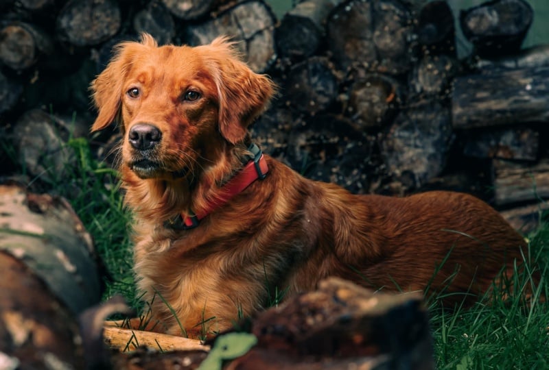
and exciting looks. E.g. in this photograph, the contrast and depth of colors come from the tone curve. The increased saturation from the calibration
adjustments. Slight changes in toning were made in the Color Grading panel. And a lot of work
was done through the HSL panel to create
a deep, dramatic look. All these tools serve slightly different purposes
and the workflow and allow for more precise control over the different
aspects of the coloring. In the next lesson, I will share with you
my tips for using the color grading
and HSL panels. But let's start with
a look at calibration and explore its use in
editing photographs. Unlike all other tools I
have covered in this class, calibration panel is
available only in Adobe Lightroom Classic
and Adobe Camera Raw, and currently is
not available in the desktop and mobile
versions of Adobe Lightroom. Calibration allows
you to quickly adjust the color
balance by shifting the hue of the primary colors and adjusting the shadows tints. And smartly control the
saturation image by changing the saturation of
separate color components. You can use calibration at
anytime during the process. And you'll most likely
need to revisit it a few times to fine
tune the colors. Usually it is a good idea to adjust the calibration
after working with the curves to further boost the saturation of certain
color components. And to adjust the hues
in your photograph to get on the right track for
creating your desired edit. The primary colors produced by digital cameras often
appear a little harsh. And using calibration to adjust the hues of primary colors is a great way to compensate
for how your camera captures and interprets
different colors. Hue calibration can
be used to create more natural or bold
looking colors, imitate the looks of
classic film stocks. Or to reduce the range of
hues in your photograph, allowing you to create
various different looks. When you start working with the hue slider is in
the calibration panel. It is important to
remember that they affect not only specific colors, as is the case with the
sliders in the HSL panel. But the presence of each color component in all the colors throughout
the whole image. E.g. changing the hue of reds will have an effect on all of the other
colors as well. And we'll remove
any peer reds from image and creates a more subtle and harmonious
combination of colors. The same is true with
the other two primaries. And changing them in
different combinations allows to easily adjust all of the hues in the image
and make the colors more interesting,
pleasing, or dramatic. E.g. whilst looking at the
greenery in this photograph, if I start shifting the blue
primary towards the acquis, you can see that all of the
green tones become more yellow because I'm removing the blue components
from the scene. And to compensate for this, I can shift the greens towards cyan to reduce the presence
of yellow in the greens. Together, these changes
allow me to create a different and more
interesting representation of greens in the photograph. The most common
approach when using calibration is to move the
red primary towards orange, Move green towards cyan. Blue towards aqua. Which even with the slightest
adjustments, makes reds, blues, and greens appear
softer and more organic. So if the hues in your
image don't look quite right for the look
you want to create. You can start by gently
moving the sliders around in these directions to create a more natural or pleasing look. Or you can be a bit
more experimental. And move the slide
is further away from zero point to drastically change the look of
your photograph, which can be useful
if you want to create a more graphic look. This approach is pretty
much foolproof because it results in creating a set of blue and orange
complimentary colors. So you can't really go wrong. However, if you want
to experiment with alternative hue adjustments
and different looks, try pushing the hue slider is to the maximum in either direction and in different
combinations to see how these changes affect the
colors in your image. When you've established
what works for you, start reducing the hue shift to create the desired
range of views. You don't really need to
go all out here because even small shifts will
visibly affect your image. Remember that your hue
calibration adjustments can be just a starting
point for your color edits. And you don't need to
do all of the work here because you can work with individual hues after using the HSL panel to
find tune, you look. If you want, you can also download this color
wheel graphic from the class resources
to play around with the different color combinations and see the effect
of hue changes, and then apply the same settings
to your own photograph. So here, calibration is about color mixing and here reduction, which allows you to
create more harmonious, considered an exciting color palettes in your photographs. You can also experiment with the shadow tint slider to alter the color representation
even further. To quickly move towards
creating certain film looks by adding more magentas or
greens to your image. But keep in mind that
you can further adjust the shadow tint in a more advanced way using
the Color Grading panel, which we'll look at
in the next lesson. Generally, shadow tint in
calibration, color grading, and temperature and
tint settings in the Basic panel are best used
in combination with each other to adjust the overall
look of the colors in the photograph before finalizing the look in the HSL panel. Apart from adjusting the
rendition of colors, calibration is an invaluable
tool for enhancing or reducing the saturation of color components in
your photograph. Which on one hand allows you to enhance
photographs shot in poor and artificial lighting
conditions by adding color and increasing their
vibrancy and character. And on the other hand, it can be used to help
make colors look more natural and to fine tune
the look of skin tones. Adjusting saturation in
the calibration panel, more advanced and affects the image in different
way compared with the vibrance or saturation
sliders in the Basic panel. Because you're working with the saturation of separate
color components, which is also completely
different from adjusting the saturation
of individual hues. Using the HSL panel. Increasing saturation of
primary colour components using calibration affects the whole
range of cues in the image. And the strength of its
effect depends heavily on the amount of that primary color present in the photograph. Boosting the saturation this way allows you to smoothly increase the general
saturation throughout the image and avoid any
issues with color fringing, which might occur when you
try to drastically change the saturation of specific hues using the HSL adjustments. In this photograph. If I boost the saturation
of the reds and blues, the whole scene becomes more vibrant and all of
the greens pop. But to compensate
for this and to avoid creating an
overly acidic look, I'm going to turn
down the saturation of the green primary. After working with
the saturation, I'm going to quickly adjust
the hue shifts further to get the colors looking just right for the edit
I have in mind. In this case, the
change is not dramatic, but it helps me bring
warmth and increased saturation to the deer hide
and intensify the greens. After adjusting the tone curve. I'm working with calibration, your image might
start looking very vibrant and overly saturated. But again, this is a good
thing because you can reduce the saturation of
individual hues using the HSL panel later when fine
tuning the log and having increased saturation
at this stage will allow you to create a deep, vibrant look if that's
what you're after. Generally speaking,
if you want to have a photograph with
rich and deep colors, it is best to use
calibration and curves to intensify
the colors first. And then use the
HSL for lowering the saturation of
separate Hughes and fine tuning the look. And we'll get to this
later in the class. Besides using
calibration when making initial adjustments and working with it throughout the process. It can also be useful when finalizing the
look of your edit. E.g. calibration can be used
for fine-tuning skin tones. After you develop the look using the HSL panel and color grading. By adjusting the saturation and hue of the red color components. Or a combination of
color components. You can make skin tones
look more natural. And working together
with the calibration and HSL panels allows you to fine tune the look of skin tones along with all other colors in
your photographs. So play around with calibration throughout the process to adjust the hues and create more
harmonized or graphic looks. And to increase or
decrease the saturation of individual color components to affect the global
saturation of the image. Calibration is one of those
tools which can help you drastically alter or fine tune the look of
your photograph. So whilst developing your edits, keep in mind the
changes you've made using the calibration
panel to better understand what is happening
in your image color wise and come back to it whilst working with the
HSL and color grading panels. As previously mentioned,
you will get the most out of these tools
when using them together. Next, we'll be looking at
the tools available in the Color Grading Panel
and how they can be used to further adjust the
colors in your photographs.
7. Understanding Colour Grading Tools: After working with calibration, but before making any
major adjustments with the HSL panel, it is a good idea to do some initial color
grading and split toning. Color grading will help you
to balance and harmonize the look of different colors
within set tonal ranges. Liven up any tones which
lack color or saturation, tint, warm up or cool down the entire image without
changing the white balance. And get on the right track for the mood that
you want to set. Color grading and split
toning can be done using the Color Grading panel and
the color channel curves, which sometimes you
might need to use together to achieve
a particular look. But in this class, we'll concentrate on how
you can get the most out of the tools available in
the Color Grading panel. The Color Grading panel is a development of
Adobe Lightroom, older split toning tool. And it allows you
to separately tone your images,
highlights, shadows, and mid tones, as well as tint the photograph overall
using the global settings. The Color Grading panel, you can control
and edit the hue, saturation and luminance of each of the free tonal regions. The hue and saturation of each tone are pretty
straightforward. And they control the
intensity and hue of the color you're adding
to a select tonal range. On the other hand, the Luminance controls the brightness of the actual tonal region and not the brightness of the
color you are adding. So it can be used to further refine the levels
in different tones. Contrast between them
and can be adjusted even if you don't apply a specific queue to the tonal
region, you're working on. To fine tune the
way the toning is applied and how it affects
different tonal ranges. You can use the blending
and balance sliders. Here. The Blending slider allows you to adjust how the
hues and the highlights, mid tones and shadows
blend together. By default, the Blending
slider is set to 50 per cent. So you are already
getting some blending, but not the full amount. The lower the blending
value, the more apparent. So the difference
between the hues applied to your images, different tonal regions will be. With higher values. The Hughes will be mixed
together more and have a stronger effect across
all tonal regions. The balanced slider
allows you to shift what tonal areas are
affected by the shadows, mid tones, and
highlights toning. When balance is set to zero, all tones are affected by
their respective Hughes. Moving the slider
to the left will shift the balance
towards the shadow here. And it will become more
dominant throughout the image. And moving it to the
right will make the highlights you more dominant. Instead. There are no hard and fast rules about using blending
and balance. But it's usually
good to start with its default setting and
then adjust them as required to get the
toning looking just right across all tonal
regions in the photograph. Turning the highlights
and shadows and giving them Hughes
from opposite sides of the color spectrum is a traditional approach
to split toning. But turning mid tones can allow you to further
develop the look of different colors and imitate certain photographic film looks. But keep in mind that
wants the effect of highlight and shadow
toning can be very subtle. Toning mid tones can create a much stronger effect
because mid tones are usually the largest
tonal region in digital photographs with
a well balanced exposure. Sometimes it is a good
idea to leave mid tones neutral or telling
them with a color created between the
highlights and shadow Hughes, and controlled using the
blending and balance settings. The intensity of the toning is controlled by the
saturation of the color. And in most cases, to have light toning, the saturation value
should be set quite low. If it gets too fiddly to adjust the saturation by dragging
the point on the color wheel. Or if you want to work with more precision when
adjusting the hues, saturation of select
tonal regions. You can switch to the
separate controls of the selected region and work
with these sliders instead. Apart from the
difference in interface, these free or controls for the same adjustments
as in the main view. Global toning. A new
super useful tool which allows you to create more graphic toning
looks without leaving Lightroom and refine
the look of the colors and balance them by adding
the same hue to all of them. It is a separate control from
the other free and can be used to tint the whole image
to create a particular look. Or to call the photograph down or warm it up
in a different way. And without messing around
with the white balance. Again, the saturation
control here controls the intensity of the effect of this color overlay on the image. And the luminance slider affects the actual
image and allows you to gently increase or decrease the overall brightness. Now that we've looked at
the technical aspects of using the New
Color Grading panel. Let's have a look at how you can use the Color
Grading panel within your editing workflow to further develop and harmonize the
colors in your photographs. And use split toning to help
create the desired mood.
8. Harmonising Colours: Before you start color grading, you need to analyze
your photograph to see what Hughes
it is lacking, what hues you can mix in to harmonize the colors and
create a desirable look. Typically, you'd use
opposing colors to the original cast present in
your images, tonal areas. E.g. if you have an unpleasantly cold
cost in the shadows, you'd need to compensate
for it by adding warm shadow toning,
split toning. It is always a good idea
to experiment with pairing different hue combinations from opposite sides of
the color wheel. Or to combine warm shadows with cold highlights or vice versa. And then visually pick a
combination which works best for the look of colors that you want to have in
your particular image. And the mood that
you want to set. Apart from the technical
aspects of color mixing, you need to keep in
mind color psychology and how different hues can help communicate certain narratives
and evoke feelings. E.g. visually warm color grading will evoke
feelings of happiness, warmth, nostalgia, or romance. Whilst called the toning, can be used to convey
fear or sadness. But it is all about finding the balance between turning in the shadows and highlights and their respective intensity. E.g. applying subtle
blue or green turning to the shadow areas of
a photograph which features a lot of
water or plants, can help deepen these colors
and unbalanced with how the highlights are
toned will not make the scene
look sad or scary. Color grading is a subtle
art, but super powerful. And you'll need to
experiment with applying different combinations
of hues to different tones until the colors start looking just right. E.g. in this photograph, there is a slightly blueish cast in the shadows and mid tones, which makes the image
look a little cold. Even with all these
vibrant colors. The shadow here is instrumental in changing
the feeling of temperature in your image and helps harmonize the colors
and darker tones. And I recommend starting
with the shadows, toning, playing around with
different hues, and adjusting the saturation to get the color in the
shadows to your liking. I want to give my image
a warmer summary look. So I'm going to give the
shadow regions and orange hue, which removes the
blue color cast, make the image more pleasing. As a bonus brings out the
colors in the deer hide. When the darker regions
start to look better. I'd suggest moving
onto the highlights. In this photograph. The
highlights are quite warm, create a sort of washed outlook. Details here lack contrast. Can make the highlights colder, which will mix a
bit of blue into the bright yellowish
greens and helped to differentiate between the
green and yellow hues. And generally make them
a bit more exciting. Because changes in the
highlights hue can help signify different
times of day with clearer bluish light
in the morning and at midday and warmer golden light
towards evening and dusk. This color grading
creates the impression of a late morning or midday sun. After getting the hues in
the shadows and highlights, if necessary, you can adjust the luminance
of these tones. Making changes to
the luminance of separate tones in the
HSL panel is super easy. And it's great for fine
tuning the look and depth of the tones in your image
without going back to curves. So it's definitely
worth playing around with to get your image
looking just right. E.g. to slightly increase the tonal contrast
in this photograph, I'm going to reduce the
shadows luminance to make them deeper and increase the
luminance of highlights. The next step is to fine tune the hue distribution using the blending and
balance sliders. In this photograph, I'll keep
blending set to 50 for now. Shifts the balance a little
towards the shadows. Will most likely
need to tweak these later after using the HSL panel. After toning the
shadows and highlights, have a look at the mid
tones and if necessary, turn them as well to
refine your look. In this photograph, I'm pretty
happy with the mid tones. Which come from the blending between the shadows
and highlights. I won't be changing the hue. I'll play around
with the illuminance to see how it affects the image. And maybe lift the mid
tones to brighten them up. Because at this stage, you will most likely
be working with a bright or overly
saturated image. It can potentially make
all of these adjustments a little tricky and somewhat
counter-intuitive. But doing some initial
color grading before developing the look
with the HSL panel will actually make it
easier to create the look you're after
when working with the HSL panel later because the colors will be more
balanced and harmonious. So to begin with,
just make sure you're adding the right hues for
the look you're after. Then revisit the
Color Grading Panel to tweak the settings if necessary whilst developing
the look using the HSL panel. Whilst the initial color grading done before developing
a look using the HSL panel will make
it easier to create a more harmonious look of
colors in your photograph. It is always a good
idea to come back to the Color Grading Panel
throughout the process. And after working with the
HSL adjustments to further refine the toning, e.g. the colors in this photograph
generally look good after some adjustments with the
HSL panel have been made. But I can further
adjust the shadows here and shift them a
little more towards blue, which helps to refine
the hue of the greenery. Now the image looks a
little colder in general. So to warm it up a little, Let's go to the
global adjustments and add a tiny bit of
warmth with an orange tint. When adjusting image using
the color grading tools, you have to be very subtle. It is worth spending
some time getting it right because it can really help bring all the
colors together. Even if it's very subtle. Color grading will
help you communicate specific narratives
for your photographs. From a technical point of view. Color grading, and mixing the same hue into
different colors in the same tonal
regions will help you harmonize all of the colors and make the image
look more natural. So make the initial color
grading adjustments before you move on
to working with the HSL panel and
come back to it to adjust and fine tune the
look throughout the process. And use it in combination
with the HSL and calibration adjustments to get the colors looking just right. Next, let's move on to the
HSL panel and explore how you can use it to
further develop the look of the colors
in your photograph.
9. Finalising Your Colour Look: Whether you want to considerably change the appearance
of different colors in your photograph and
create strong graphic looks. Or to simply fine tune the
look of different hues, the image and have
more considered an harmonious coloring,
adjusting Hughes, their saturation and
luminance separately from each other using
the HSL panel allows you to further develop the look of the
different colors in your photograph and take them in the direction
that you want. Being able to adjust the
saturation of different hues independently of each other allows you to
balance the colors, develop exciting
graphic looks by making some hues more
prominent than others. And simplify the same or remove unwanted distractions caused
by overly dominant colors. If you have followed the
previous tips when you get to this stage developing
your photographs using the HSL panel, you'll be dealing with quite
saturated and bright images. So before you start playing around with shifting any Hughes, it is a good idea to adjust the saturation of
different hues to make them appear more
natural and work with the general edit
you want to create. Initial saturation adjustments
are just the first step. And you'll most likely need
to further tweak these in conjunction with the hues and particularly the luminance
throughout the process. So to begin with, simply adjust the saturation levels of all of the hues to your liking to compensate for the increased
saturation created with other tools and to get on the right track for the
edit you want to create. Usually, and particularly when developing more graphic looks, it is a good idea to have a varying level
of saturation for different hues and make some hues more vibrant
and prominence. Based on subject matter. What you want to be the
focal point in the scene, and the mood that
you want to set. E.g. this photograph,
I want to make the oranges and the deer hide the most
saturated elements. And I want to have
less saturated greens in the background. I'm going to reduce
the saturation in the greens and yellows, which immediately makes
the deer stand out. I'll also reduce the saturation
of the blues and acquis. To make these areas
appear more natural. Then I can further
boost the saturation of the oranges to make the
deer hide more vibrant. When working with the
saturation sliders, it is a good idea
to check through each color to see where it
is present in the image, even if it's not apparent
at first glance. E.g. it is hard to see any reds, magentas, and purples
in this photograph. But it does not mean that
these views are not present. When dealing with something
tricky like this. Just drag the
respect to slider to the maximum both ways and see which areas are affected and
base your adjustments on it. And a lot of cases, purples and magentas might be particularly tricky to spot, but they'll most
likely be present in some smaller elements are
in a very subtle way. So checking for their
presence this way also helps you learn where
they are, adjust them. You won't end up with
random spots of colors. Especially if you
then want to apply the same settings to a different photograph
or create a preset. Whilst you change the
saturation different hues, it is important to remember that the luminance is a variable which will affect
the presence of different hues in
the photograph. And it can be used together with the saturation to fine tune the intensity of the colors or to create completely
different looks, even if all the other settings
are similar or the same. E.g. after reducing
the saturation, certain hues might start to look a little too
light or washed out. So to make the color deeper and bring back the presence
of certain hues, like the greens in
this photograph. I'm going to reduce
their luminance, which will make these
hues more pronounced. And in this case, I also want to
darken the oranges to intensify the coloring
in the day hide. And then I'll adjust the luminance of the rest
of the hues to further develop the look and adjust the contrast between different
colors in the image. Working with the saturation
and luminance together allows you to fine tune the depth and intensity of specific
cues in your photograph, as well as recover some details. And outdoor photography. This can be particularly useful if you want to have
exciting skies. To do this, you will need
to recover the blues and acquis by reducing
their luminance. And then fine tune their saturation to get
the look you're after. Using saturation
together with luminance, allows you to reduce the
level of detail in the image, creating a more graphic look. This can be used in
two opposite ways. Depending on what
you're working with. With high key images
and light elements, you can reduce the saturation of certain hues whilst
boosting their luminance. So they become a more
neutral elements within the photograph. E.g. in this edit, I decided to create a reduced
look by desaturating, enlightening the
greens, yellows, and blues present in
the plants and the sky. So that the attention falls on the oranges and reds
in the photograph. On the other hand, if you're editing
a low key image, you can combine reduced
saturation with reduced luminance
of certain tones to create a more
intense and moody look. E.g. having dark, desaturated greens
allows to create rich, moody and sophisticated scenes
where the green color just sets the mood and works to support other colors
in the photograph. In some cases, when working with photographs that have
a neutral exposure, you'll be able to use either of these approaches which allow you to create very
different looks. And it's always good
to play around with these settings and
see what works best. Especially if you're not totally set on the look you
want to create. Changing the luminance of separate Hughes
allows you to further increase or decrease the tonal contrast
in your photograph. When working with the luminance
of the adjacent Hughes, it is important to keep an
eye on what's happening in your photograph and avoid moving the sliders
too far apart as it can cause some graphical
issues and noise. This is because an area with a perceived colour
will be made with pixels from the
adjacent hues, e.g. oranges and yellows,
yellows and greens, and blues and acquis. I usually present
next to each other. Even if you cannot see
them in your photograph. To avoid these issues, you can use this widget to adjust the saturation
and luminance in specific areas visually and whilst affecting a number
of hues simultaneously. And then fine-tune the settings
manually if necessary. Also, when working with
luminance and saturation, you need to watch out
for color fringing, which might occur when you pull the settings of the
adjacent hues in the opposite direction
and increase the tonal contrast and difference in saturation
between them. If you spot something like this, carefully adjust the sliders
to eliminate the issues. When working with
saturation and luminance, concentrate on developing
the overall look of the colors in your image. And if your photograph
features the same colors in different areas which you want to look different
from each other. E.g. the oranges in a scene, which are also prominent
in light-skinned tones. Don't compromise yourself
by trying to get these areas looking right
with the HSL panel. Better leave some of
these elements to be adjusted later using masks. Most of the major work done
in the HSL panel is done with the saturation and
luminance as they can drastically change the
whole look of a photograph. The other hand,
working with the hues, allows you to make further, more precise adjustments
to different colors in the image and create a final
look of different hues. Exploring huge shifts
is a visual process. And again, you can try
pulling each of the slide is both ways to see which
part of the image it affects. And then bring it back and
find your desired setting. If you want to
develop more filmic, cinematic or graphic looks. Remember, these
looks usually have very specific and
sophisticated hue shifts. And you will not
see a whole lot of bright primary colors as they
come from digital camera. On top of working with the
saturation and luminance for all of the hues to
develop more harmonious, balanced, and considered looks. You can experiment with bringing sets of adjacent hues
closer together. You can group them in different
ways depending on what you're working with and the
effect you want to achieve. E.g. you can bring
the reds, oranges, and yellows close together by making them a
little more orange. And also bringing the greens and blues closer together
by making them more cyan. And in this case,
you can also shift both purples and magentas. In the warmer direction. You can also work in pairs, e.g. reds and oranges,
yellows and greens. And blues, purples and magentas. Magentas and reds,
oranges and yellows. Greens and aquifers,
and blues and purples. And experiment with
different hue shifts to create the look and the
set of colors you like. Adjusting the hues allows
you to increase or decrease color contrast
in your photograph. While separating
different hues from each other or squashing
them together, helps to create
exciting bowed legs. You need to watch out for
noise, color fringing, and avoid creating solid
areas with the same color as they're likely to cause color clipping and
some loss of detail. If any of these issues do occur, they're best
rectified as soon as possible using a
combination of the hue, luminance and
saturation sliders. So you can have an edit which can be applied
to different images without needing to have a lot of additional adjustments
done to them afterwards. Remember that the
hue adjustments you make in the HSL panel will work together with any other adjustments you've
made using calibration, color grading, and the
color channel curves. So you might need to revisit these panels in the process as well to fine tune the look of the different hues
in your photograph. Hsl is a very powerful
tool which helps you take your edits to the next level and in a lot of
different directions. Amassed in this workflow, it is usually the
final major step. You will most likely need
to fine tune the look by jumping between
different HSL sliders. And going back and forth between HSL calibration and
color grading panels to finalize the log. And apart from these panels, you might also need to go to
the basic panel and globally reduce or increase
vibrance, saturation. Or tweak the global
contrast setting. Or fine tune the look with the D Hayes or clarity settings. The HSL panel is way or edit
finally comes together. So you use it to develop exciting and harmonious
color schemes by reducing the number
of different hues. Edit tricky colors, remove unwanted distractions and pull attention to the desired
elements in your photograph. Whilst HSL and
other tools covered earlier are great for developing the look of the overall image. More often than not, you'll need to make further local adjustments
to different areas, colors, or tones in the image to finalize each
particular photograph. When developing
your general look, you'll need to ignore certain
elements are areas in your image which
might look really odd or don't match
the overall vibe. And then addressed these separately and adjust
them using masks. And that's what we'll be
looking at in the next part.
10. Making Local Adjustments: Creating great image edits is
an uncompromising process. And when editing
your photographs, it is important that you do
not settle for an image edit, which is more or less okay. And to get all of
the elements in your photograph
looking just right, you'll need to make
local adjustments to selected areas using masks. You'll most likely
need masks to adjust the exposure and tones in certain areas to bring
out the details. A frame the subject, and remove
distractions to adjust the hue or saturation of
elements in the same color. And to adjust specific
luminance or color range to make it work better with the images overall color scheme. Working with masks in
the latest version of Adobe Lightroom Classic and Adobe Camera Raw is
now easier than ever, thanks to several new
automatic masking features, which makes selecting
elements, colors, and tonal ranges super-fast and creates new possibilities, editing and fine-tuning
of photographs. With all of these powerful
masks at your disposal. You can use them to select and refine specific
areas in your image. So in this lesson, I will
share a few tips for using different types of masks to effectively define a selection. And several examples of adjustments you can
make which will have a powerful impact on your photograph and help
bring your edits together. You can only use a
limited range of adjustment tools
within the mask. So it is important you
get the most out of adobe Lightroom's other tools first when editing
the whole photograph. And then use masks to
fine tune specific areas, elements or particular color or tonal range
within your image. Good old brush masks, combined with Auto Mask option for defining the
edges of your masks, are still the best way
to work when you need to select a specific
continuous area. E.g. in this photograph, the D is head and
neck are a little too dark in comparison
with other elements. I'm going to quickly brush on a mask in these specific areas. And then generally increase the exposure and
lights and highlights in this area to make the deer
look more evenly exposed. The new Select Subject mask is great when you need to select
person in your photograph. It is a very quick
tool to use and allows you to make adjustments
to your entire subjects. E.g. you can change the saturation exposure or bring out more details
in just a few clicks. Whilst primarily designed
for working with people. This feature can also
detect other objects and subjects in your photograph with varying degrees
of accuracy. The select subject
feature can be super helpful in a lot of cases. But that said, if you
only want to edit, select parts of your
subject or subjects, e.g. the skin tones or clothing. You will need to
refine your mask using the Subtract mode. And then the Brush
tool to remove areas from the selection,
e.g. like this. However, if your automatic
selection includes too many elements which
you do not want to adjust, sometimes it is
easier and faster to draw a selection manually
using the brush. E.g. here, I only want to adjust the skin tones to
make them look more natural. The face, hands,
and arms masked. I can reduce the
saturation in these areas. And to bring out a little
more detail on the face, I'm going to increase
the contrast, boost the highlights, recovered
the shadows a little, and lift the whites. And to make the face a
little lighter still, I'm going to increase the
exposure ever so slightly. If you need to better frame your subject within your
images composition, and so do any distracting areas. You can use a
combination of plastic, radial, and linear
gradient masks. E.g. in this photograph, the bird has already been
lightened using a brush mask. But it is not enough to
shift the focus towards it. There are these areas which are distracting due to their
brightness in detail. To shift the view is
focused towards the bird. I can create a new
radial gradient. In this area, which I want
to form the focal point. And then invert the mask. So it becomes a kind
of custom vignette. Now I'm going to turn down
the exposure highlights and whites a little to make the
details around the edges less pronounced. Now it looks better. And I like the
lighting on this side. So to develop it further, I'm going to add an
additional linear gradient here and further reduce the exposure and make the
highlights darker in this area. These very simple
and subtle changes to the lighting
around the frame have really helped compose
the subject of the photograph and focus
the viewer's attention. When you need to enhance
the sky in your photograph, you can use the new
Select Sky feature, which will save you a lot of
time manually masking out elements against the sky
or along the horizon. However, because it
is an area mask, you might need to
subtract part of the selection using the
linear gradient mask. If you want to apply the
adjustments gradually. E.g. like this. This smart approach will
allow you to combine the best of both worlds
when editing skies. The luminance range mask
is an exciting new feature which makes it
easier to fine tune the look of different tones in your image whilst preserving
the look and coloring of other tones which
are affected by color grading and
other adjustments. E.g. in this photograph, I like the coloring. It would be nice, too dark
and further and D saturate the photos darker tones
around the tree trunks, which will make the deer
stand out a little more. Using the luminance
range mask makes it easier to select
specific tonal areas. The great thing about
this tool is that you can be really
precise and further refine the selected tones and the smoothness of
the selection here. If you want a globally
adjust the look of all the areas in your photograph
featuring the same tone. E.g. the D saturate
the blacks and shadows whilst keeping the color casting in adjacent
tones the same. Then this is a super quick
tool to use and will save you a lot of time masking different areas and elements. In this case, however, I only want the tree
trunks and some of the branches included
in my selection. I'm going to need to
subtract a few areas from the mask which share
the same luminance. These include the deer
and some greenery. Since I need to
remove quite a bit, I'm going to use the brush
with auto mask turned off to remove these areas without leaving anything behind. And then I'm going to
switch to auto mask back on and work on areas where
there are some edges, e.g. around the deer. Now my mask is ready
and I'm going to make the shadow areas a
little less distracting by making them darker
using the shadow slider. I'm also going to reduce the saturation so there is no
color cast in the shadows. All of this helps focus the viewer on the subject
of the photograph, which is the dare. Making adjustments to select color ranges in your photograph, using masks is an important
finishing touch which helps get all of the colors in the image looking just right. And it can be useful when you
need to alter the colors in specific areas or elements, e.g. in products or food photography, or to locally refine
the colors in specific areas in
your photograph. In a similar way to
the luminance range, you can select and mask a specific color range
in your photograph. E.g. to create a more pleasing
and consistent coloring of the water in this photograph, I'm going to use the
Color Range Mask and select this color here. Then I'm going to quickly
refine the color range using this slider to reduce the color range
included in the mask. There are, however,
some areas which I do not want to include
in the selection. I will subtract these
using the brush. Because I want the water to
look colder and clearer. I'm going to adjust it by
changing the temperature. In this case, it is enough
to create the desired look. But you can also use
a combination of hue shift, white, balance, and saturation to
adjust the colors or any of the other basic tools
to get the look you like. Now the color of the Thames
Water looks much better. When you are editing
your photographs. Do not put up with
all of the settings affecting the whole
image and use masks to fine tune different areas and enhance the overall
look of your photograph. And that's it for my tips for using a range of
color editing tools. Of course, editing does
not stop with these tools. And you'll most
likely need to use a few other tools to
finalize your edits, e.g. grain effect, sharpening,
and lens correction. But it is a different story. So let's wrap up this class
with a few final thoughts.
11. Final Thoughts & Conclusion: In this class, I shared my editing workflow and making adjustments in
the order in which I think these tools are best applied in order to allow you to build on top of one another and easily create varied edits. But when creating
your color edits, you will most likely
need to jump between these different tools and
panels to fine tune you look. Do not feel restricted
to working with these tools in the
workflows prescribed order. But understand how each
of these tools affects the image edit and its role
in the editing process. Starting your image edit from
scratch is a great way to create a fresh new look or two experiments
with image editing. But using presets
saved along the way, which capture all of the applied tolls or separate
aspects of an image. Edit is a great way to speed up your workflow and to experiment
with applying different, sometimes unexpected presets
to photographs which you would not normally
think of editing in a certain way in
the first place. This will help you step
out of your comfort zone. Potentially stumble upon some new editing
styles in the process. And also build new looks by
altering the edits created by your presets to develop even more different presets
which you can use in future. Sheriff your team, or even
sellers digital products. For your class project
experiments with editing your photographs using
the complete workflow covered in this class. Or implement any of the
tips and techniques to enhance your personal
workflow and photo edits. Post your photographs,
including their before and after states
in your class project, and share what tools you have used to enhance your images. Also feel free to use the discussion board to share
your favorite tips, tricks. Adobe Lightroom tools, which you've learned
in this class, or use your self when
editing your photographs. When working on your
class projects, or generally practicing editing. I highly recommend experimenting with creating different edits, using photographs
of different genres and with specific colors. And then applying the same
settings to other types of photographs to see how
the edit works with them. And then adjusting
the settings to develop more different looks. E.g. after you develop the
overall color treatment, you can further explore creating alternative looks based on
the same color adjustments. By going back to the basic panel and adjusting the tone sliders, contrast and dehaze settings. I'm making adjustments
to the point and parametric curves to create
alternative high key, low key, or neutral edits. So that's it for this class. I really hope that it will
help you enhance your photo edits and level up
your editing workflow. And I cannot wait to
see your photographs in the projects and resources
tab for this class. If you have found
this class helpful, please leave a review and
don't hesitate to follow us on Skillshare to be the
first to hear about our new classes, updates
and announcements. If you're into black
and white photography, be sure to check out my class. Black and white photography, using color filters to enhance your film
and digital images. To learn my tips for creating exciting black and white
edit in Adobe Lightroom, Classic, Adobe Camera Raw. For Adobe Photoshop. If you are generally
interested in photography, don't hesitate to
check out my new blog, which I explore photography is technological and
anthropological history and its role in
the modern world. Thank you for joining
me in this class, and I hope to see you
in our other classes.
 Evgeniya & Dominic Righini-Brand, Graphic Design & Photography