Transcripts
1. What You'll Learn: My name is a Plichinitch
and I've been a design geek for over
20 years now and I've been teaching for nearly
just as long with courses on everything from
photography to Photoshop, and in design to Illustrator. Before getting into
graphic design, my background was in
professional photography right at home in Photoshop. It wasn't long
before I was into in design to illustrator was a tougher nut for
me to crack though because it was such
a different world. But once I figured out
how to shift my mindset from pixels to
vectors, I was all in. And now helping others to unlock those light bulb moments is part of why I love
teaching so much. And that's what
brings me here today. In this beginning
Illustrator course, I'll introduce you to the
fundamentals of working with vectors and help you understand the core of
how Illustrator operates. This class is for everyone, whether you're a total
beginner with zero experience, or you've poked
around long enough to decide that you are tired of stumbling through
it all and you just want illustrator to
finally make sense. The key is understanding
the illustrator is more about building graphics
than drawing them. So we'll start with the
basics of shape building. After that, you'll
create a custom brush, discover illustrators
incredible tools for experimenting with color, and get to know a foolproof and frustration
free technique for working with the
pen tool by the end, in addition to your
completed illustration, you'll have a solid
understanding of the basics of illustrator. And an awareness of features
and power tips that even some who've been using Illustrator for years
still don't know about. Everything you need to complete. The course is included
along with the guide to the most frequently
used keyboard shortcuts and my silly tricks
for remembering them. I'm so excited that
you're here and I can't wait for you
to take this course. So get ready to learn your
way around Illustrator and have some light bulb
moments of your own.
2. Illustrator Fundamentals: To be successful in Illustrator, you have to understand a few basic things about
the way it works. Unlike Photoshop, where
images are made of pixels. In Illustrator, everything's
made of shapes. Underneath all that
pretty artwork, you can see the outlines that define each
and every piece. It's almost like a skeletal
system for your artwork. The shapes themselves are
made of two things, points. In this case, the
shape has four points. Between the points, we see these line segments
known as paths. This is the secret sauce, the magic that makes
vector art scalable. Because these shapes
are defined with math. Instead of pixels,
they can be scaled up, down, and back again infinitely. And they'll never lose quality, staying sharp as
attack at any size. These points come in
basically two styles. There's corner points,
like what we see here, creating this rectangle, and smooth points like what you
see here in this circle. Smooth points come with these things called
control handles. They shape the path as it extends from one
point to the next. The control handles
work in pairs. Each point has two
control handles, one on each side. Each path segment is directed by a pair
of control handles, one from each of the points on either
side of the segment. Shapes can be closed, like the circle, or they
can be open like this line. Shapes can have a stroke, which is like an outline. They can have a fill,
or they can have both a stroke and
a fill, honestly. They can even have
multiple strokes and multiple fills
all at the same time. Now that you know that shapes
are made of points and paths and that they can
have strokes or fills. Let's talk about what I think is the most crucial thing to
understand about illustrator. For me, this was the hardest thing for me
to wrap my head around. That is that illustrator
is less about drawing and more about
building with shapes. Unlike drawing with
pencil and paper, or even in other apps like
Procreate Illustrator, you build your designs starting from the most
fundamental shapes. Once you can wrap your
head around this, the rest is going to be
easy. Here's an example. Imagine two circles. We can combine these circles in a number of different ways. For example, the blue
one could be used to carve out from
the yellow one, or the yellow one could be used to carve
out the blue one. Or we could merge them
into a single shape. Or they could meet
in the middle and break each other into
separate pieces. Including a third piece formed by the areas
where they overlapped. Or they could simply meet in the middle to create
an entirely new shape. That's the foundation of
all of illustrator artwork. It's just shapes made
of points and paths. In this course, we'll walk through the
process of building this wall clock
using basic shapes. Along the way, we'll explore
different ways to manipulate basic shapes into something
that's anything but basic. In the end, I think you'll be surprised not only
by how it all works, but also by how easy
it can actually be. Join me in the next video,
and we'll get started.
3. Building With Shapes: To get started. When you
first launch Illustrator, you'll see something like this
known as the Home Screen. You can see there's a bunch
of presets right here. You could click on any of these to get started right away, but if you want to be able
to fine tune your settings, then you're going to
want to come over here and choose new file. We can still access all
of those templates, but we can also tweak them. As we talked about, vector
graphics are not pixel based. They are independent
of resolution. The size that we select for our document or our artboard
doesn't really matter. But I find it
helpful for my brain anyway to work on a
standard page size. In this case, I'm going
to come up here and click print from the presets
along the top, and I'm going to choose letter. Then over here on
the right hand side, we can tell Illustrator what
unit we want to work in. You can select whatever
you want here. I'm going to choose inches down below In the
advanced options, which may or may not be open, you might have to click
here to open that up. Let's change this from
CMYK color to RGB, which Illustrator very
kindly points out is different than the default setting for the print template. But everything here
in Illustrator is so fluid and we can
go back and forth, which means we can just say, thank you very much
Illustrator, and keep going. Let's come down and click Create to make things
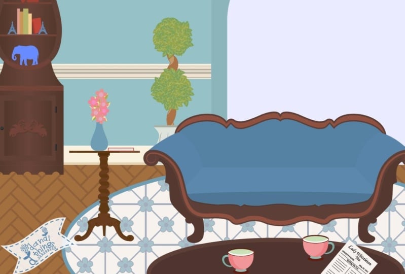
as easy as possible. I snapped a photo
of the clock in my living room that we're
going to use as a template. You'll find it among
the course downloads. To get it in here, we're going
to go to File and Place. Then navigate to
wherever you saved it. And what you're looking
for is called Clock Jpeg. Down here we can uncheck the Show Import Options
and click Place. Now we can see that our cursor
has this little accessory. This is letting us know
that our cursor is loaded with that file and it's
ready to place it. So I'm just going to position
my cursor about here. And click and drag a
frame just like that. And we're going to
turn this layer in Illustrator into a template. And this does two things for us. It's going to lock this frame so we don't accidentally grab
it and move it all around. And it's going to dim it
slightly so we can better see what we're doing when we illustrate
over the top of it. To get to our layers,
we're going to need to open our layers panel. It may be over on the side of your screen represented
by this little icon, which you can just click to pop open if you don't see
it or can't find it. All of the panels can be
found under the window menu. If I ever mention something, and I forget to tell you to
come up to the window menu, you can find it under Window, and then you just
find the name of it. In this case, we're
looking for layers. And when we click on it, it's going to pop that
panel right open here. We can see that we're on
layer one by default. To designate this
layer as a template, we're going to put our cursor in this empty area
and double click. We can give this a name
like clock template. You can see here that the layer
by default is light blue. The layers in illustrator
are color coded. That means that with this
object being on this layer, anytime that it's selected, we see this little blue outline. And that's just a
visual indicator that this object is
on the blue layer, which we are renaming from
layer one to clock template. Now down below here,
we want to put a check mark next to
the word template. You'll see that
that adds a lock. And it's going to dim the image to 50% which
we can't see right now. But we'll see it as
soon as we click Okay. Of course, now
that this layer is a template layer, it's locked, which means we need to create a new layer to
contain our clock. To do that, at the bottom
of the layers panel, we're going to click this
little Add a New Layer plus button that adds a layer. Right here we can see this
one is color coded red. We can rename it by double clicking on the words right now where it
says layer two. If we double click on that, we can call it clock
body and press Enter. So if you're familiar with the
layers panel in Photoshop, it's pretty much the same
thing here in Illustrator, but unlike in Photoshop, where everything pretty
much has to be on a separate layer in order to manipulate it independently
from everything else. In Illustrator,
everything's already independently editable
because that's the nature of vectors. So the layers panel
is really more for organization than it is for
editability and flexibility. Here. We're going to create
the clock on one layer. And we'll put all of
the knick knacks on a different layer just to
make it easier to work. All right, if we want
to collapse this panel, we can click this little
double arrow here. And that will tuck it right back in to wherever it
popped open from. All right, let's start building. You'll find the shaped tools
over here on the tool bar. And your tool bar might
look a little different because it can be
one single long row, or it can be, excuse me, column, or it can
be two columns. So either way, we
are going to find the ellipse tool by pressing
the L key on your keyboard, The letter L, as in elipse. Now, you may not see the ellipse without
actually using the keyboard shortcut because we
can see that it's buried here underneath
the rectangle tool. That's right. So
each of these tools, the ones with the little white
triangles in the corner, that means that they are just one of a whole family
that's right here. So the ellipse tool lives right here with
the rectangle tool. So if we click and hold, we'll get the fly out here and we can select the ellipse tool. But you'll see right here,
this is the keyboard shortcut. And that is really the best way to work
in an illustrator. So that's what you're
going to see and hear me doing as we work. All right, so L
for ellipse shapes are drawn in Illustrator
by clicking and dragging. As long as I don't
let go of my mouse, I can keep shifting
this shape around. And if I hold shift, it's going to snap
into a circle. Into a perfect circle. And you'll notice
that once you let go, if you need to reshape
or reposition it, you can grab it from the center dot right
here to reposition, or you can drag it from one
of the corners to scale it. You still have to hold shift
to keep it in proportion. Or if you wanted an oval, you could smush it
by dragging any of these handles, all
kinds of options. If you just don't like
it at all and you want to start over, hit Delete. The main thing is
don't be afraid of making a mess
because you can always press command or control Z to undo anything that
you're not happy with. All right, so when
we're ready to actually draw the clock face here, let's zoom in a little bit by pressing command or
control plus plus, plus. Let's scoot up to
the clock by holding the space bar to give us the
hand tool and we can drag, we can really see
what we're doing. If we look at the
head of the clock, of the black part of
the clock right here, and we imagine a box around
that circular shape. We're going to put our cursor in this top left imaginary corner. I'm going to click and hold the shift key while I
drag about like this. Remember if you make a mistake, you can press Commander
Control Z or just hit Delete. Here's another pro tip for you. While you're dragging
and holding shift, you can't reposition it, right? You can only scale it if you want to reposition
it on the fly. Then you keep
holding your mouse, keep holding shift, and
you add the space bar. Look at that, and now
you can reposition it. But it's hard to see, right, because it's filled with white. So if we look up in
the control panel, this is where we
tell Illustrator. This is one of the
places we can tell Illustrator what we want for
the fill and the stroke. And we can see right
now that it's got a white fill with
a black stroke, and that's why we can't
see the clock underneath. So while we're
working, let's change the fill color to none. So I'm going to come up here, click this little drop down, and we see all these
swatches here. And boy, they're
tiny, aren't they? If we want to make them bigger, we can come to this
panel menu and we can choose large
thumbnail view, or medium, or whatever you want. I'm going to go with large, that way we can see this
a little better now. These are just some
preset colors, we'll learn more
about that later. But here we see a white square with a red line through it. This means none. If we click that and then we click away to
close the panel, we can see that we have our
circle with the black stroke. But now we can actually see, since we still have
this shape selected, let's re use it by pressing command or control
C to make a copy. But instead of pasting it, which would just put it in
the center of our screen, what we're going to do
instead is paste it in front, which is command or
control for front. Now it looks like
nothing happened, because what it
did was it pasted a copy directly
on top of itself, which is awesome,
because now we can scale it equally from all
four sides inward. To make the interface
of the clock. To do that, I'm going to put my cursor up here in the corner. You'll see that we get
this double headed arrow. And we'll want to hold shift to maintain a perfect circle. And in addition to shift, if we hold the Alt or Option
key while we drag inward, It scales from all
the sides at once. So we know that this
circle is going to be perfectly centered
within this circle. We could zoom out by pressing command and control
and the number zero. All right, now we're
going to switch to our rectangle tool,
which believe it or not, the keyboard shortcut is M
as in rectangular marquee. And what we're going to do is position our cursor
somewhere in here. We want to make sure
that it overlaps with at least the outer circle. I don't want to start
drawing down here. I'm going to put my cursor inside the black
circle somewhere. And I'm going to click and
drag all the way down here. Now we need to flare out
these points at the bottom, and to be able to manipulate individual points of a shape, we need the direct
selection tool. Up here in the top
of our tool bar, we see two arrows. A black arrow here, this
is the selection tool. And this white arrow here, which is the direct
selection tool, this one lets us
select whole shapes, and this one lets us select individual points or
handles in a shape. So this is the one we want
the keyboard shortcut for. This is the letter A, which I remember by thinking
that it stands for A. Just let's come down
here and I'm going to position my direct
selection tool right here on this bottom point. And I'm going to
give it a click. Then I'm going to press
command plus, plus, plus. So we can zoom in and
see a little bit better. This point is selected, and I can see that because
it's got a red fill, whereas this one is
very hard to see, but it's hollow, which
means it's not selected. With this one selected, we can just pull this
any old place we want, but we want to try to
be specific about it so we can do the
same thing exactly on this side with this point
selected all by itself. We can use the arrow
keys on our keyboard. And I could hit my arrow key a zillion
times and move that over, but I'm going to bring it back. Instead, I'm going to hold the shift key while I tap that. Left arrow, Shift left arrow, left arrow, left arrow. That moves it out in
slightly larger increments. Let's do the same
thing over here. We'll click to select this. And we'll hold shift. And then hit that right arrow
the same number of times, which in my case I did three
shift right arrow, 123. And then let's zoom back out to see how it's looking by
pressing command or control. And the number zero, it's what I call home base. It brings us home and we
can see here is our clock. That's looking pretty good. Now, before we do the next part, we want to make sure that all of these three pieces are aligned. Let's switch to the
selection tool, That's the black arrow up here. The keyboard shortcuts
the letter V. So I think of it as being very important. With the very important
selection tool, we're going to click
and drag across all three pieces to
select them all. Now if we look up in the
control bar control panel, we see all these funny
little shapes here. These are the shortcut buttons
for our alignment options. If we want to make sure that
everything is centered, we can click this
option right here, so that all three pieces align
themselves to the center. The next step we're going
to build our first shape. We're going to merge the outer circle of the
clock with the body. We need to select just
those two things. Right now, all three
things are selected. We could click away and then click and shift click to
select both of those, or with all three
things collected. If I shift click on the
interface of the clock, we can see that it
becomes de selected. Now I have just these two pieces selected and we're going to combine them using
the Pathfinder panel. So again, we'll come up under window and choose Pathfinder. The pathfinder panel
is really cool, but it can be confusing. We'll look at it here
and then later I'll show you a much simpler
way to build shapes. But basically these are the different functions we can
apply to these two shapes. And the one we want is this
first one here called Unite. When we click on
that, you'll see that Illustrator joins the body
with the head of the clock. And now we have this
cool keyhole shape that we did not have to draw. Can you imagine how
hard it would be to try and line
all of this up and make a perfect circle if we were just drawing this?
That'd be tough. Let's bring some of this to
life by adding some color. Let's select this inner circle here up in the control panel. This is the fill. Let's set that to white. Then for the stroke, we're going to
remove the stroke. Right now it's black,
but let's take it away and give it none. No stroke. Then we'll select the
body of the clock. Let's get rid of that stroke. Give that a black fill. Now you'll notice that
the white face of the clock seems to
have disappeared, but it's just covered up. Illustrator stacks objects from back to front in the
order that they're drawn. The outer circle of the head of the clock was
the first thing we drew, which put it in the back when we merged that with the
body of the clock, which was the most
recent thing we drew, which means it was in front. Illustrator put the
whole merged piece in the front to reveal the white clock face
that's hiding behind it. We need to move the
clock body back. With this selected, we
can just right click or control click and choose
a range send to back. You may have noticed that in the original photo,
if I hide this, you can see that this is a curve right where the head
joins the body is a curve. We have a very tight,
this is called a cusp, where we have a straight line coming in and turning
into a curve. To smooth out these areas, we're going to go back to
our direct selection tool to adjust. Remember keyword
shortcut A for adjust. And we're going to click on
this cusp point right here. And then shift, click
on this cusp point. When we do that, you see these little
funny things we get. These are called corner widgets. All we have to do
to add the curves here is select both those
points and then pick one. It doesn't matter because
they're both selected. Grab the corner
widget, and just pull. Isn't that beautiful
and awesomely simple? All right, let's review
everything quickly while we make a couple pots for the
plants that we'll be creating in the later lesson. So I'm going to press M to get that rectangle marquee and off to the side over somewhere. I'm just going to click and drag out what could
become a flower pot. Then I'm going to switch to
the direct selection tool, the white arrow, by
pressing for adjust. And I'll click this bottom
corner on the left. And I'll shift, click this
bottom corner on the right. Here we see our two
little widgets. I'll pick one and pull in. And now we have a flower pot. We can easily make
a copy of this by switching to our very
important selection tool. And if we click to select
our little flower pot, and we hold Alt or
Option while we drag, we can make a copy. All right, so you can save
your work by choosing file, give it a name, click, Save. When this pops up, go
ahead and just click Okay. We'll learn more
about that later. What do you think so
far? Do you see what I mean when I talk
about shape building? In this video, you
learned how to draw with a couple
of the shape tools. How to apply or remove
a stroke and a fill, and how to unite two shapes into one using
the Pathfinder panel. We even got to play
with corner widgets, but the funds not done yet. In fact, it's just
getting started. Join me in the next video,
and we will keep rolling.
4. Blend and Shape Builder Tools: In the last video, you gained some experience in
Illustrators workspace and got some good practice using
some of the shape tools and the unite function
in the Pathfinder panel. In this lesson, we're going
to add shelves to the clock, which by now you realize that drawing the
shelves would be as simple as grabbing
the rectangle tool and making some shapes. But rather than copying and
pasting a bunch of rectangles and then distributing them vertically to create
all the shelves, I'm going to take
this opportunity to introduce you to not one, but two awesomely powerful tools because this is a great way to get the hang
of how they work. In this video, you're
going to learn how to use the blend tool and the shape builder tool in
order to see what we're doing. Let's pop back over
to our layers panel. Remember it's under
window layers. If you don't see it,
I'm going to twirl open the clock body layer here. You can see that every
object is on its own, little like sub layer now in order for us
to see the shelves. Let's hide the clock body temporarily by
selecting it here. And then on the left, we can toggle off the visibility by clicking
on that little eyeball. All right, with our rectangular
marquee tool letter M, let's choose a fill
color that's not black because we want to be able
to see it within the clock. Maybe just like a dark gray. And we'll leave the
stroke set to none. And we're going to come
right here and just click from way outside
to way outside here. And just release to make a
skinny little shelf like this. Now let's switch to our
selection tool by pressing V, because it's a very
important selection tool. And let's drag a copy of this down to the
bottom by holding Alt or Option and
dragging straight down. We'll notice these little
purple guides on the screen. They are letting us know
if things are aligned. So we can see here if I
move this out of the way, the purple guides come and go depending on what's
aligned with what. I'm going to drop this here. And I want to stretch it beyond the edge of
the clock body. So if we need to zoom in, we can press command or
control plus, plus, plus. And then if we hover here, we get our little arrows. So I'm going to grab this
point and drag to the left. But I want the right side
to do the same thing, so I'll hold Alt or Option, and then when I drag out
that will extend as well. And then to scooch back and see everything on our
screen, we'll do that. Magical homeward bound keyboard shortcut command
or control zero. So now we have a top
shelf and a bottom shelf. And to create the
middle four shelves, we'll create what's called
a blend between them. Using our very important
selection tool, we can select both shelves by just dragging
across them like this. Oops. And I accidentally
included the face, so I'm going to shift
click to get rid of that. We just want our two
shelves selected. And now we're going
to find something in the tool bar called
the blend Tool. And honestly, I never know
what's wet over here. So thankfully, the blend
Tools keyboard shortcut is W, as in wow, a blend. And when I press
that, then I can actually find it on the toolbar. So before we use this tool, we need to establish
the settings we want. And we do that by
double clicking it on the toolbar here and here. For spacing, we want to
choose specified steps. It allows us to specify
how many steps we want in between here and because we want four
additional shelves, we will enter a value of four. And click Okay. And notice that nothing happens. All we've done is choose
the settings for the blend. We haven't actually
created the blend yet. To create the blend, we're going to click once on this top shelf and click
again on this bottom shelf. And boom, just like that, it makes all of our shelves. And if you forget
all of this stuff, you can also find it
under the Object menu by going to Object Blend, and you would choose Make. But now, because ours is made, if we want to undo that, we would choose release. Now that we have
this finished here, we can go back to our
layers panel and turn the clock layer back on
so we can see it Next. We'd probably want to address the overhang that's
happening here, right? So why don't we just
do what we did before. We'll grab our very
important selection tool. I'm going to drag across the
shelves and the clock body. Let's go back to our
Pathfinder panel again, if you don't see it, Window
Pathfinder, and click Unite. It. Come on, Illustrator
unit, unit, unite. Nothing is happening.
What is the deal? To better understand
what's happening or actually what's
not happening, let's click a way to
deselect everything. Then let's click to
select the shelves. And if we take a peek in the
top left corner up here, Illustrator is really helpful. It gives us all
these little clues. It's actually one of, I think, the most useful things
in Illustrator, and that is that it tells
us what we're working with. So with this selected,
it says blend. But we know this because
we blended it, right? So why does that even matter to show you
behind the scenes, we're going to go
to Outline mode, So you can choose View Outline, or you'll see me using
command Y or control Y on a PC to enter outline mode. As soon as we do that, can you spot what's going on? Here We have a top shelf. We have a bottom shelf, but none of the other
shelves actually show up in this outline
skeletal view. Even though we can see them
in the regular view here. They're actually not real. In other words,
they're basically virtual like a filter or an illusion before we can
interact with the illusion, in this case the blend
in a meaningful way, like being able to saw
off these overhang bits. We need to make our
blended virtual shelves into real shapes,
into real shells. Illustrator does not come
with a fairy godmother, but it does come with a command
that will do the trick. And it's known as expand. So I'm going to click
to select our blend. We can see over here
we've got the blend. And then we're
going to come up to the Object menu
and choose Expand. We'll make sure object and fill are selected
and click okay. Now watch what happens to
our blend when we click, Okay, there it is. Now we can see that there's red outlines actually around
all of the pieces. And if we go back to outline
mode by pressing command or control why we can see, okay, now we have outlines and we
have real shelves which is perfect to get rid of these overhang bits instead of messing around
with the pathfinder, which is fabulous,
but can just be a little confusing To
wrap your head around, I'm going to show you
a way easier method and that is to use the
shape builder tool. So before we do that, let's add the clock body to the
selection by holding shift and clicking
on the clock body so all the shells and the
clock body are selected. And then we're going to grab
the Shape Builder tool, which again, I can
never remember which of these
complicated icons it is. But I do remember the keyboard
shortcut because it is shift M for Super magical. And now I can see, oh yes, here's the Shape Builder tool. The Shape Builder allows us
to combine shapes by default. You can see next to my cursor, there is a plus sign. By default it joins
things and merges them. And that's not
what we want here, we want to buzz
all of these off. We're going to switch
from join mode to subtract mode by pressing
and holding Alt or Option. And you'll see we get
a little minus symbol. Now I can just click and
drag through all those bits. And when I let go,
they're just buzzed off. And then we can do the same
thing over here, Buzz. And we don't have to do
it in one long swoop. We can do one at a time if
we want. How cool is that? And with this tool still active, you can see if we just
mouse over the bits, it sees every overlapping piece as a potentially
independent shape, which just makes this so much
easier than it used to be. I hope you're amazed by how
much you've done so far. In this lesson, you learned
how to use illustrators blend tool in steps mode to create a series of shelves between the top
and bottom shelves that we created ourselves. We learned that
some functions in Illustrator like when we
used the blend tool here, end up working more
like effects and they create virtual shapes that
don't actually exist. And we saw how
that looks when we switched over to
outline mode and we weren't able to see the four shelves that we
created with the blend tool. But we also learned that like having our own personal
fairy godmother, we can convert illustrators
virtual effects into real shapes using
the expand command and potentially
even more exciting. We learned that we can use the super magical
shape builder tool to simplify the process
of building shapes. Now that the body of
the clock is done, be sure to save your work and join me in the next video where we will start building all the fun knick knacks
to fill up the shelves.
5. The Magic of Transform Functions & Effects: In the last lesson, you
learned about the blend tool, the shape builder tool, and one of several
reasons why you might need to expand certain
things in Illustrator. In this lesson,
we'll take a look at another effect type of function that is super duper
handy known as transform. All right, so now that we're
done with the clock body, let's go back to our
layers panel again. If you can't find it,
go to window layers and I'm going to collapse
this to clean this up. So I'm just closing the
little drawer here. And then I want to lock
this layer so that I'm not accidentally messing with it while we build everything else. So if we click in this little
empty area right here, that will lock the
clock body layer. And now you can see we
don't accidentally grab it, so now we'll need to
create a new layer for all of the chachkeys
we're going to build. Again, we'll click
that new layer button. We see it's called by default
layer three and it's green. And if we double click on
the words layer three, we can type in chochkeys, which if you don't
know how to spell it, is T C H O T C H K E
S. How fun is that? And then you press
Enter and boom. All right, so now we're
going to fill up a few of these shelves with a wonderful
collection of books, all by drawing just
a single rectangle. To get started, we're
going to press M for the rectangular
marquee tool, or you can snag it from
over here on the tool bar. I'm going to position it
about here on this shelf. And I'm just going to click
and drag to make a book. And to zoom in on it,
I'll press command or control plus a few times so we can see
a little bit better. Now, we're going to talk
about color more later, but for right now, you can just make this book any
color you want. You can come up here and
click as we've been doing, and pick one of these colors. Or if you have your
Swatches panel open, you can also do it right here. So our goal here is to
take the single book and duplicate it to span
the width of the shelf. But unlike when we created the shelves in the last
video using the blend tool, we don't know how many
books it's going to take. So we wouldn't know how
many steps we would need. And I don't know about
you, but I don't feel like playing Goldilocks to
try and figure that out. So if we come up and poke under the object menu here and
we come down to transform, you'll see that we have this option here to
transform again. And we have transform each. And these are super amazing and powerful and we're going
to use them later. But in this case we're going to do things a slightly
different way. Because it turns out there's another form of transform that
we can take advantage of. And we're not going to find
it here in the object menu. The type of transform that
we're looking for is actually an naturally we can find it under the effect
menu specifically. We're going to come down here
to distort and transform. Over here we'll
choose transform. Now your settings
may vary slightly depending on how thick
of a book that you drew. But down here under copies, if I put in a value of
seven and I hit Tab, it looks like nothing happened. But if we come up here to the move horizontal setting and we start dragging
this to the right, you can see what's going on. This value determines how much each copy is going to
shift horizontally. And a positive value
moves it to the right, a negative value would
move it to the left. It's a balancing act
between how far you want to move the copies and how
many copies you want to make. If I put eight copies
and I hit tab, we could see that it fits. But now I might want to adjust the move a little bit so you
can type in a value here, you can drag the slider, or you can use your
arrow keys to nudge. But I'm going to just
type in actually 2.15 Oh, there it is. Notice that you can also apply transformations to the
scale and the angle, and all kinds of other things. So when you're happy with
it, go ahead, click okay. But what do we do if we want to change this?
How do we edit this? How do we get back here
if we retrace our steps and we come up to effect and we come back to distort
and transform. And we come back to transform. Illustrator is going to
get cranky and say, hey, this is going to apply
another instance, because it knows we've
already done this once. So it says right here to
edit the current effect, double click the name of the effect in the
appearance panel. Interesting. Let's click cancel. Where's the appearance panel? Like all panels, we'll find
it under the window menu. So we'll choose window
appearance here. Here's what Illustrator
was trying to tell us. If you're familiar
with Photoshop, the appearance panel
is kind of like Illustrator's version
of layer styles. So this is where you can add and edit effects and you use
it in an illustrator, to control the appearance of a given shape in a number
of different ways. This is another way where we can apply and change
strokes and fills, or even multiple strokes and
fills as we'll see later. But you can also apply and edit live effects
like transform, which we can see
is applied here. This is why Illustrator
was warning us, hey, you've already
applied transform. We can see that when
we look right here. So if we want to
make any changes, we can double click and
we're right back here. And we could adjust, adjust this to a
negative value or change the number of copies
or whatever it is we want. Also, if we want to
get rid of this, we can just select it here in the appearance
panel and trash it. It really does behave like
a layer style in Photoshop. All right, so now we have
all of these books here, but whose bookcase is made of identically sized
books, not mine. So how can we adjust this? If we press V for the very important
selection tool and we try to select
all of these books, you'll notice, hey, we can't click on these.
What's going on? We can click on this
one that we drew. But these ones, we can
move the whole thing. But these books, we
can't select them. I wonder if they
too are virtual. Let's go to Outline View
by pressing Command or Control Y and they
don't really exist. All right, Commander,
Control. Why? Just like the shelves, these are virtual and that's why
we can't select them. Just as before, we need our fairy godmother in the
form of the expand command. We'll come up to object, expand. Now, this time, instead
of expand up here, it says expand, appearance. And that's because
this was an effect. Remember, we applied it from effect and we went to distort
and transform transform. This is treated a
little bit differently, but it's the same thing. Instead of choosing expand, we'll choose expand appearance. And look at that. Now we have
a lovely shelf of books. For our next trick,
we're going to be randomizing the height
of these books. And this is one of those things that if you didn't know better, you would get really
frustrated because it wouldn't work like
you would expect. And the reason is, again, let's look to our top
left advisor over here and we see that
these books are a group. And you might be thinking, hey, I didn't group the books. And you'd be right.
And guess what? Neither did I. Illustrator did. Illustrator loves groups. And it will group things for you whenever it gets the chance. In this case, when we expanded the appearance of that
distort and transform effect that created all these books. Anyway, when we made them, real illustrator grouped them. An illustrator loves groups
so much that even if we come up here to the object
menu and we choose ungroup, we see that it put a
group inside a group. We've ungrouped this once, but it's still grouped. Let's repeat object ungroup. Now when we look, we finally see path which means just
individual books. That is a really
important thing to remember is that when
things are acting weird, or a function or command
or something you're trying to do is not doing
it the way you think. Always look up here and this will tell you
what you're dealing with. And there are some commands or things you might
be trying to do that will not work at all or will not work the
same way on a group. So now that we have
ungrouped this, let's make a copy of
all of these books. And drag it up here with our very important
selection tool, keyboard, shortcut V. I'm
going to drag across all the books and
we'll make a copy by holding Alt or
option and dragging. We're going to need to
compress these because obviously they're too big
for the shelf up here. I'll hover over the
side. Anchor right here. And I'm going to
press Alt or Option, so that we can scale both
sides at the same time. Now we're going to
transform these and we're going to use a
different transform. Because unlike the distort
and transform effect, which of course lives under the effect menu under
distort and transform, this time we're going
to use a regular, straightforward transformation, not a live editable effect. Which is why I assume that it doesn't live
under the effect menu. It lives under object
transform each. This is such a cool function because it's going to apply to each object individually
instead of as a single unit. Here, we want to make sure
that transform objects is on, not these other things. We want to make
sure random is on, so we can randomize the effect down here for
our reference point, because we want the effect to happen to the
top of the books, in other words, upwards
from the bottom. We need to select this
bottom reference point. That way the books will
grow upwards and down. Then we can come up here to the scale for the vertical scale and drag the slightly to the
right until you like it. Also, if you want to play
with the horizontal scale, you can also try dragging
that maybe to the left, and that will stagger
the space a little bit. Some of them will be a little
bit thinner or bigger. That's up to your
personal taste. When you're happy
with everything. Let's go ahead and click Okay. Now here's another
cool pro tip for you. Rather than repeating
that up there, we can just select
these bottom books. We just go to object
transform again, which the keyboard
shortcut is command or control D. When we do that, we're going to get
different random results. But because this was the most
recent thing we just did, we can tell Illustrator
to do it again. Now we get the same
treatment down here. If we wanted to, we could still take this and just
scrunch it down. In this video, you learned about the transform effect and
how that lives under here. And then you can access it
in the appearance panel, which of course now it's
gone because we expanded it. You learned how the distort and transform effect
is different from the each and transform
again, function again. This trans each option is what allowed us to randomize the different heights
of the books. And of course, in
this lesson you saw that the only thing
that illustrator might love more than an
overwhelming number of transform options is groups. So much so that it creates them after almost every
function that you apply. And even sometimes puts
groups within groups. Which is why it's always so important to keep
an eye up here in your Illustrator Compass to know what you are dealing with. Okay, so enough with
transformations for now. In the next video, we're
going to take a look at some fun ways to work with
color in illustrator.
6. Tips & Tricks for Working with Color: In the last video, we used
a transform effect and later a transform function to create two shelves
filled with books. In this video, we'll learn how to bring them
to life with color, as well as some great tricks for working with color
in Illustrator. Let's start by taking a
peek at our swatches panel. If you don't see yours, you can find it by going
to window swatches. And yours might look
different than mine. I like to have my
swatches big like this. But you can change the way your swatches appear by
going to the panel menu, which is this little guy
hidden way out here. If you click on that, you can choose what kind of view
that you would like. I've got mindset to
large thumbnail view. You choose what works for you, but if yours looks different, that could be part of the
reason why in the panel itself, you'll see some preset
colors you can edit. Let me de select
my book over here, I make sure nothing is selected. But here in the panel, you can edit any of these
colors at any time. If you just double click on it, it will open up this little
Swatch options panel and you can adjust
the dials here. You can enter in a hex code, and of course you can rename it. Just know that if you make changes here and you click okay, you're actually going
to be making changes to the Swatch that was
here. In this case. I'm going to hit cancel to create a new Swatch or
a copy of a Swatch. You can select
anyone in this case. I'll just leave
this guy selected. If I want to make a new Swatch, maybe based on this or I want to copy this with that
Swatch selected, I can just come click the
little plus down here. Now it's going to be
making a new Swatch here. You could give it a name like cool new Swatch and we
could play with the dials, make whatever color we want. Then it's a good idea to enable this option
here for Global. What that means is that later
if you apply this color to your artwork and you decide you want to update
or change the color, it will update all of the
artwork with the new color. So it saves you some time. Now if I click Okay, we'll see
that Illustrator adds that swatch here to the panel for additional preset
color options. We can click this
leftmost button at the very bottom
of the Swatch panel. This will open our Swatch
library collections and you can see there are tons to choose
from whichever you click on, so if I choose Kids Stuff, for example, it's going to
open in a separate panel. Then you can work with these kids stuff,
colors over here. Or if we want to add, let's say this theme right here. If we want to add this
to our swatches panel, we can just click on
the folder right here. And you'll see it just adds it. And then we can
close that panel. But where do these
themes come from anyway? And what do you do if you
want to make your own? It turns out there are loads of different ways to come
up with color themes. But one of my
favorites is to use Color.adobe.com Once you're
logged in with your Adobe ID, you will see loads of
different tools and tabs, and just all kinds
of different ways to come up with color themes. So I encourage you to explore
this at a later time. But right now, I want to show you one of my favorite ways, which can be found here
under the Explore tab. Here, you can enter keywords, so maybe I'm going
to type in Ocean. And now I can browse all kinds of ocean related color
themes that were either generated by other
Adobe users or sampled from stock images with
the same keywords. Once you find a
theme that you like, you can click to add it to
your Creative cloud library. You could download a J
Peg of this color theme. Or if you click on
the color theme, you get even more options, including the
ability to download this as an Adobe
Swatch exchange file, which you could then
load into any Adobe app. You can copy this in a
number of different formats. If you just need to grab
a hex code for something, you can just mouse over the
color you want, Click copy. And that hex code is now
copied, tear clipboard. So you can add it
to whatever Apre in to find that color theme
here in Illustrator. Because I added
it to my library, I can open my library's tab
under window libraries. And if I go into my color themes library
and scroll down here, we can see the
theme that I added. And if I write, click on it. I can say Add Theme to Swatches. And now it's in my Swatch panel. Another option, if you download the ASC file, Adobe
Swatch Exchange. Then from the swatches panel, you can choose the menu. And choose Open Swatch library
and then other library. And then you would
navigate to the file. To check out another
way to add colors, let's add the color theme that I've included
for this course. This is a theme I found on
Adobe Color and I renamed it, Toby, to load that
into Illustrator, you're going to go to
the Swatches panel. And from the panel menu, choose open Swatch Library. And from this menu you're
going to choose other library. Navigate to the course files and find the file called sorbet. Then click open, and
it's going to open in this separate panel
here to add this. Now to our swatches, we again just click the folder. And now we have it in
our swatches panel. Okay, So we can close our
libraries so we can apply the colors by
selecting an object and then clicking on a color. We can also select an
object and then come up here and we will find
that same theme here. And maybe we'll make
this one this color. We can also drag and drop
from the swatches panel here. Maybe if I want to make
the next book orange, I'll click to deselect. Because otherwise if this one's selected and
I click orange, then it's going to become
orange if I click away. But now I grab the
purple swatch, I can drag it onto that book. Maybe I'll make the
next one orange. Sometimes if I'm going to
be doing a lot of this, I might just hold the
spacebar and drag my books closer so I
don't have to go so far. And maybe we'll leave
that one that color and put another purple
here and another blue. Okay, so like that looks good. Then I'm going to do the
same thing down here. So just go about making a nice, fun and colorful collection of books in whatever kind
of order you want. And I'm going to show
you in a minute how we can randomize these to get
some different effects. So let's say we want to
take these colors and do a little bit
of experimenting. We can select all of our books and then appear
in the control panel. This little thing that looks
kind of like a beach ball. This is the recolor
artwork button. And if we click on that, I'll move it out of the way
here so you can see. But we have some
really easy ways to experiment with color. For one thing, we can take these different baubles and drag them around
the color wheel, and you see that Illustrator
updates everything. You'll notice that because
this link is enabled, it's going to maintain the same spatial relationship between these colors as
we move things around. If we uncheck that, then we can move
individual bubbles around. And if we make a mess of
things and we want to reset, we can come up here and
click the Reset button. If we just want to
shuffle the colors, the existing colors,
maybe we just aren't happy with like
the order we put them in. We want to just
shuffle it around. We can come over here and
just click this button. And you'll notice that it just shuffles those colors
around. Very cool. We can click this button here to adjust the saturation
and brightness. The colors stay the same, but the saturation and
brightness levels, we'll randomize again.
I'm going to reset. Another thing that can be
handy is to play down here with this slider and these
two different views. Color is a combination
of three things, hue saturation and brightness. This wheel can only show us two of those three
things at a time. If we click this
button on the left, we can use this slider to
adjust the brightness. If we switch to the second view, here we put saturation
on the slider. Now we can drag this
to the left and we get less saturated colors. Or we can drag it to the
right and get more saturated. I'm going to reset
this one more time. And if we come down here
and click Advanced Options, we get even more stuff
to play with over here. We can apply new colors based on color rules as applied
to our base color here. If I come over and
click this drop down, we can choose, for example, maybe I want to adjust my color theme to be analogous colors based on
this color right here. So I'll click that, and you can see that these
colors all update. So this is the original
color, stays the same. This color becomes this, this color becomes
that, and so on. And now if we move
this out of the way, that's what our books
would look like. Maybe I like that, but maybe I don't want to
apply it right now. But if I want to pocket
this color theme for later, I can just tap the
little new color group. And now I've got one
created right here. One of the handiest ways to
adjust color that many people don't know about is from down here under this sort
of secret little, not very noticeable menu. If we click on that and
we choose Global Adjust, now we can just take
all those colors. And for example,
we could adjust, yes, the saturation and
brightness, but also temperature. So maybe these colors
are pretty warm. If we want to cool them off, we can drag them to the
left until they cross over, as cool as we want. So there is just an endless
way to play with colors and illustrator and the
recolor artwork function is very powerful. So if you like your new
colors, click Okay. Otherwise, I'm going to
tap reset. And then click. Okay. Now, before we move on, let's quickly recolor our
two little pots here. Now you'll notice
I can't select it, because remember that we're
on the chachkeys layer now, and this is on the
clock body layer. So how do we move them up? Let's go to our layers panel. And we'll need to
unlock the clock body. And then let's use our very
important selection tool, keyboard, shortcut V to click, and drag across to select those. It's kind of like throwing a net into the C. We'll select both of those and I'm going to
change the color to just, maybe I'll make my own
kind of this beige color. But if I double click, I'm going to make that and
we'll click, okay. Now we need to move this from the clock body layer
to the chokes layer. And the way that we
do that is so funny, it just makes me laugh every
time. I don't know why. But this is how it works. Because these two
items are selected and they're on the clock
layer, which we've unlocked, We see this little red dot and this represents our selection. If we want to move our
selection from here to here, we just click drag drop. And now we'll see
that the lines around these two objects are green because they're now
on the chokes layer. So we can re lock the clock body layer by clicking right in here.
And now we're all set. So as you saw in this video, Illustrator makes it super
easy to experiment with different color rules and
all kinds of variations. It's fun. Right,
Then the next video, we're going to spit up
one of these pots with some line work courtesy
of the pencil tool.
7. The Super (N)ifty Pencil Tool: In the last video, you saw some fun ways to
experiment with color. So hopefully by now you have some colors you're happy
with in your Swatches panel. In this video, we'll learn
how to use a tool that honestly used to make me
laugh it's the pencil tool. And if you've used Photoshop
as pencil tool before, you know what I mean, Like
who uses this and for what? But Illustrators pencil
tool is fantastic. Let me help you understand why. First of all, the keyboard
shortcut for the pencil tool is because it's nifty and
it's needle and it's gnarly, which doesn't start with, but you know what I
mean, You can also find it over here
on your tool bar. So far, all the shape
tools that we've seen have been used to
create closed shapes. But this time, we're
going to be using the pencil tool to
create open shapes. Essentially, that means we're
going to be drawing lines. When I'm working
with open shapes, especially lines, I'm thinking about the stroke color,
not the fill color. Because in most cases, open shapes have their
fill set to none. So I'm going to set
the fill to none. And for the stroke, I'm going
to choose a light color, maybe like this
beige right here. The pencil tool has some really neat settings that can be super helpful
in Illustrator. One of the ways that you
can access settings for any particular tool is to double click on it
in the toolbar. So let's take a look at the nifty pencil options
by double clicking. Here we can see all kinds
of different options. The one that we're
going to focus on right now is called Fidelity. To help us draw really
nice smooth lines that don't look like we've been
mainlining caffeine all day. Let's take the slider and drag it all the
way to the right. And we'll click, okay. I'm going to pick one of these pots on this
bottom one here. And I'm going to just click
and drag to draw a series of three lines like
preschool level art here. I'm going to click and I'm
going to drag and let go. I'll start here and click
and drag and let go. Click and drag, and let go. We want to make sure
that the lines we draw go well past the pot. Don't try to end
exactly on the pot. It's actually much
easier to just go past it because
as you can expect, we're going to buzz
it off in a minute. Now if you make a mistake, of course, you can delete it. Or you could press command
and control Z to undo it. But remember that we also
have that adjustment arrow, the direct selection tool
whose keyboard shortcut is a. For a, just for example, I'm going to press command
plus to zoom in here a bit. I don't really like where
I ended up with this line. It's crossing this one, so close to the edge,
it's not noticeable. If I want to move this line, I'm going to click
and I'm going to click right on this endpoint, so that this is selected
and the other one is not. Then I'm going to pull it
up this way so that I have some space here and
that is much better. You can always
adjust things with your direct selection tool. All right, now we're
ready for the fun part. I'm going to jump in
really quick to point out something with our open
pencil paths selected. We could shift, click on the pot to add it
to our selection, and grab our Shape Builder
tool by pressing Shift M, holding down the
Alt or Option key to switch to subtraction mode. We could buzz off these
edges and everything looks hunky dory until
we go to scale this. And you'll notice that
if I scale down the pot, we've got two problems. I'll move it over here so
you can see a little better. The weight of our stroke
suddenly looks huge. And also, we just buzzed it off, but now it's overhanging again. What is up with that? The problem is that
we scaled the pot and the open paths that
we drew with the pencil, but we didn't scale the live corner effects or the stroke. So
let's undo that. There's two ways of
dealing with this. One option is we need to tell
Illustrator that we want the corners and the stroke
to scale along with the pot. We do that from the
transform panel, which of course
can be found from the window menu under Transform. Here you'll notice two options, one to scale corners and another to scale
strokes and effects. Now everything looks great. The strokes scale to maintain the same relative width and the corner scaled so that
everything still lines up. The other option is we
can expand these strokes. We don't have to. They're not virtual like our shelves
and our books were earlier. But it changes the way that
Illustrator treats them. So here's what that looks like. The last thing we're going to
do before we buzz all this is actually expand
these strokes. Instead of just an open path
with a stroke applied to it, we're going to convert this into a closed shape with a fill. So here's what I mean. I'm going to select all
three of these lines. I'm clicking on one. And
then you want to shift. Click the rest till the
three lines are selected. Then we're going to
come up to object, and remember our
fairy godmother. We're going to choose expand. So we're going to tell
it to turn the fill and or stroke into shapes. So watch this.
We'll click, okay. See it's a line with a stroke. But once we click, okay, it changes from an open path
with a stroke to a long, skinny noodle like rectangle. That's a closed
shape with a fill. So it looks the same, but it behaves a little
bit differently. So now with our very
important selection tools, let's throw a net over the
whole shebang and we'll get our super magical
shape builder tool. So remember, super magical means shift M for the
Shape Builder tool. And by default it wants
to unite everything. But we're going to go into Buzz Saw mode by holding down option or Alt to get the minus. Now we can just buzz
right there and buzz right here.
That looks great. And you'll notice
if we look up here, this is one of the
rare instances where Illustrator did not group
it. Can you believe it? So let's group it ourselves
by using the keyboard shortcut command or control
and the letter G for group. So now we have this group. I'm going to zoom
out by pressing command or control
and the number zero. Let's switch to our very
important selection tool. And drag this down
here to the shelf. And we're going to need
to make it smaller. At least I do. Your pot
might be a better size, but I need to make mine smaller. So to do that, I am shift dragging from the corner
to keep it proportional, right, because otherwise
it's going to get distorted. That's a look at the
nifty pencil tool, and we just used it to draw
open shapes in the form of lines in order to keep
everything looking good. When scaled, we can either
tell illustrator to scale the live corners and
stroke along with the pot. Or in this case, we
expanded the open path with the stroke to turn it into
a closed path with a fill. We also saw that
here in Illustrator, you can call up the settings for various tools by double
clicking on them, which brought us our
pencil tool options. And we cranked up the
smooth setting under fidelity to make sure that our lines were nice and smooth
and indeed they look good. Right, In the next video, we're going to learn how to take a simple oval and use a combination of
the rotate tool and the transform again
command to create a starfish sansivero plant to go right inside
our beautiful pot.
8. Rocking the Rotate Tool: Now that you know about
the nifty pencil tool, let's take a look at another surprisingly handy
tool, the Rotate Tool. In this example, we're
going to be using the Rotate Tool followed by the transform again
command to turn a simple oval into a
starfish sansiveria plant. If you don't have your little
flower pot selected here, use your very important
selection tool to select it. And then we can
zoom in by pressing command or control
plus, plus, plus. And remember that we can
also adjust the position of our artboard in
our screen here by just holding down the
space bar and dragging. So we just want to have a
little room to work over here. I'm just going to build over here and then we'll
move it over. So we're going to start
by drawing an ellipse. And you may recall that
the keyboard shortcut for an ellipse or an oval is L. So I'm going to press
L to get the ellipse tool. We don't want a fill
color or I mean a stroke. We don't want a stroke,
but we do want a Phil. So I'm going to select this
nice cheerful, bright green. And I'm just going
to click and drag to draw out a nice oval
leaf like this. So if you're familiar with
starfish sands of areas, they kind of look
like a sunburst coming up in the morning
like on the horizon. So it's like a fan shape. So we have this spindle here, and then we're going to have a series of
spindles reaching out like this in a fan
shape to create this plant. So the next thing we want
to do is rotate this. So we can press R
for the rotate tool, which apparently this
is the icon four. This one is easy to recognize, so I can find that one. All right, and with
the rotate tool, you can click and you
can rotate, right? Like we can just spin this
stuff any way we want, but we're going to get a little
bit more precise with it, so I'm going to
undo that rotation. And what we need to do is tell Illustrator where we
want to rotate around. Like, what do we want
the pivot point to be? In this case? I want the pivot point to
be right about here. So I want it to be in
line with the center, but not the center and not
quite the end over here. I'm going to pick a spot
about here in order to open up our options and designate
this as the pivot point. Instead of the default
here, which is the center. I'm going to hold
down Alt or Option and click that's going
to bring up our options. And you can see that it moved the pivot point
to the spot right here. Now what do we use
for the angle? How would we know, right? Like how are we going
to figure that out? Well, like so many
things in the world, the answer is math. And like so many other
things in the world, not my strong suit, but thankfully, Illustrator is going to do the math for us. So like I said, this is going to be
a fan shape, right? And a fan shape is
half of a circle. A circle has 360 degrees. If we take half of
that, we get 180. So I'm going to type 180 and I'm going to say I want 180 divided, so I'm hitting the forward
180/6 for six spindles. And you'll notice if I hit tab that we get this
little preview. And the spindle, the
leaf rotated downwards. It's like an Underworld
starfish sans area fan. That's fine. That's one thing. Illustrator calculated
the result as 30 degrees, so we need to rotate 30 degrees, but I want it to go 30
degrees the other direction. So we do that by clicking
in here and hitting Minus. Now if I hit Tab, you'll see it goes the
other way. So that's good. But I don't want it to just take this circle or oval and
move it, or rotate it. I want it to make a copy and
then apply the rotation. So instead of clicking okay, I'm going to click Copy. Then we see it made a copy. Now we could repeat that whole
process a bunch of times, but why would we do that? When we know under the
object menu there's something called
object transform. Again, what this
does is it takes whatever we have just done that could remotely be considered
a transformation. In this case a
rotation definitely counts because that is the
last thing we just did. We can just say, hey
Illustrator, do it again. Command D transform again. I'll click on that again. We have a third spindle, so now I'm just going to use my keyboard and press command or control D. And again and again and again until we get this perfect little
star burst fan shape. And look at that, we have a cute little sands of a
starfish, sands of area. It's important to point
out that these are all separate little spindles and
so we want to group them. And also, it might bother some people to have this
little bits under here. What we can do, of course, we'll grab our very
important selection tool. Throw a net over all of that, and let's get our super
magical shape builder. So I'm going to press
Shift M by default, remember it wants to
be in merge mode. Let's hold down Alt
or option to get the minus mode and
buzz all that off. I'm going to zoom
in a little further because you can see there's
these itty bitty shapes. Yours may look a little
different because we didn't all precisely set our
same rotation point. So we've got our nice little
starfish, sands of area. We've buzzed off any bottom
bits that we might not want. Now let's group this by
pressing command or control. You can see that it is a group. Now let's use our very
important selection tool to grab this whole thing and drag it over
here to our pot. And now we may see that
we need to scale it, so it overhangs the
pot a little bit. To scale it proportionally,
we hold shift, right. And to scale it from
both sides at once, we hold alt or option.
Now look at that. Healthy little Sansa, starfish, Sandsaia, so cute
while we're here, let's group the
Sansivia plant with the pot that it's in with
the plant selected shift, click on the pot and let's
group them by pressing command or control G. One
more thing while we're here. You'll recall that we've
grouped this, right? We have one group is the pot itself and the
little line shapes, that's a group by itself. And then we have the group
of the San Siveria plant. And then the whole thing
is grouped together. So just imagine, for the sake of learning that you
wanted to get in here, and I don't know, move one of these
little spindles. So you might think that
you'd have to ungroup, ungroup, ungroup,
make your change. And then regroup.
Regroup, regroup, right? And that would be a lot of work. Instead, we can actually
crack open this group and we can get in and
make our adjustments and get out without
having to ungroup it. You can see here,
this is a group to crack it open or drill
down into the group, we're going to just double
click on it and check it out. Everything kind of grayed out. And now we are inside our group and we know we're inside because
everything is great out. But also because if
we look up here, we have this little
breadcrumb menu. So this is showing
us that we're on the chokes layer and
we're inside a group. But you may recall that
this is still grouped. So if we want to move
one of these spindles, we've got to crack
open this group too. So we'll double click again. Now we see the pot grays out. Now we're inside the plant group and we can see here now we're on the chochkys layer
in a group and in another group that's
nested inside the first one. So now we could make our change. Like maybe I'm going to make the spindle taller
for some reason. So we'll do that. And
then to get out of here, all we have to do is hit Escape. And you'll notice if I click
on this, it's still grouped, so we didn't have to
ungroup anything. If we just want to
make a little change like that, you
just double click. And then if I want
to change here, then I'm going to
double click the pot. And then I could move around these things for
whatever reason, but I'm going to undo that because that looks
kind of weird. All right? And then you just hit escape and
you're out of there, and everything is still grouped. It's an amazing little trick
and for whatever reason, a lot of people just
don't know about it. Okay, so that was cool, right? Let's practice that
same exact technique one more time to make
the face of the clock. So let's zoom out by
pressing command or control. And the number zero, select
the white part of this clock, which we can't do because it's on the clock body
layer which is locked. Let's unlock the
clock body layer and click to actively choose
the clock body layer, because we want the face of the clock to be on the
clock body layer, right? So now we can click to select this shape
and then zoom in on it by pressing command or
control plus plus a few times. All right, so this
face of this clock, you can see here's the original. It just has these little dots
and the hands right here, which is super easy to create. Again, we're going
to use our ellipse. Press L for ellipse, let's choose a black fill. And when it come up here, and you'll notice the
smart gride, right? These little purple lines
if you don't see them. You can make sure they're
turned on by going to view and making sure there is a check mark
next to smart guides. And conversely, if they bother you, you can turn them off. But I like them.
I'm looking to put my cursor right here so I know that it's going to be
aligned with the clock. We can always align it later. But it's nice when
you can just do it on the fly and it
saves you a little time. Remember that we're going
to make a perfect circle by constraining our eclipse
using the shift key. And I don't want
to drag a circle out to the side because this
is the center point, right? To draw a circle
from the center, we hold Alt, or option shift
to make a perfect circle. And Alt or option to
drag from the center. And I'm just going to
drag a little dot. Now we're going to repeat
the same exact process. So we'll press R for
the rotate tool. And remember we need to
select the pivot point. And we do that by putting our cursor in the area where
we want the pivot point. And you'll notice because
my smart guides are on, it's telling me this is
the center of the circle, so that's a good place
to put the pivot point. So we'll hold down Alt
or Option while we click to set the pivot
point and open our options. Now here we want to move 360 degrees around
this whole circle. So we'll type 360 forward
slash divided by 12 hours. And we'll hit copy. Looks good. Then we
can just repeat that by holding command or
control D. Do it again. Do it again. Gin, gin, gin, gin, gin, gin. That's it, We just made
a perfect clock face. Now we can draw in the hands, let's switch to our rectangular
marquee by pressing M. I'm just going to draw
a little skinny shape. Now. See, it's not
on center because I wasn't paying
attention to the guides. But I can move it while
I'm still drawing. As long as I don't let go of my mouse and I hold space bar, then put it here And I want it to go past the
center point, right? Like I don't want it
to end right here. I want it to be a
little bit longer. I'm going to have that
pointing right up at the top. And now we're going to
make the hour hand. Let's copy this by pressing
command or control and the letter C. Then instead
of just pasting it, which will put it here, that's not what we want to. It's called paste in front, which basically just
pastes it right on top of the original. The keyboard shortcut
is command or control and the
letter for front. Now we don't see it
because it's right on top of the other, But
we can rotate it. Let's switch to our rotate
tool by pressing R for rotate. And we can see this
is our pivot point, but we want the
pivot point to be here This time we don't
need all the options, we just need to reset
the pivot point. So we can just click, then you can set the hour
to whatever you want. It could be 05:00 It's 05:00
somewhere. I don't know. I think I'll just go with 04:00 That's a fun afternoon time. 04:00 on the nose. And the hour hand of
course should be shorter. So I'm going to switch to my selection tool if
you're having trouble seeing the little grabby point that's in between
the corners here. You just need to zoom in more. I'll hit command
or control plus. Now we can see this point
here which will allow me to shorten it that
is looking super. Let's go ahead and lock that
clock body layer back up. Then let's make sure and click the chochkys layer so
that it is active. Again, that's a
look at how to use the rotate tool combined
with the transform. Again, function to create perfectly spaced and
equally rotated objects around the pivot points of
your choosing. Nicely done. In the next video, we're
going to return to the appearance panel
and learn how to apply two fills to a single
object at the same time. We'll take a look
at illustrators built in pattern swatches.
9. Adding Multiple Strokes and Fills: In the last video, you
learned how you can use the Rotate tool combined
with the transform. Again, function in some
pretty useful ways. In this video,
we're going to look at the appearance panel to add a pattern to our
other flower pot. And I'm suddenly
realizing we don't need this reference
image on anymore. I don't know why
it's still here. We can hide that by clicking this little button right here, and now it's gone. That's super. So this is the pot
that we're going to be applying a pattern fill to. Let's use our very important
selection tool to select it and drag it over
here to the shelf. And I'm going to scale it
down once again by holding shift to keep it proportional and dragging downward like that. So we're going to put another
different plant here later. And it's going to be a
fun spilly kind of plant. So we want to leave
some room for that. And we should be on
our chochkys layer with the other layers locked. Make sure that pot is selected. And let's zoom in. And let's zoom in by pressing
command or control plus, plus, plus, so we
can really see next. Let's open our appearance panel. If it's on your screen and
it's not already open, it might be collapsed down
to a little icon like this. So it looks like a sun. And we can click on that. Or of course it lives under the Window menu
under Appearance, Because this object is selected, we are looking at the
attributes of that object. If I click on something else, then we're going to be
seeing different attributes. Here. We want to make sure
we've got the pot selected. We can see that it does
not have a stroke, it does have a fill, and we are going to add
another fill to it. Remember that the
appearance panel, if you're familiar
with Photoshop, it's very much like
the layer styles. And we can use it to
apply effects and all kinds of things including
second strokes or fill. Down here along the bottom here, we can add effects here, we can add a new fill. And here we could
add a new stroke. In this case, we want
to add a second fill. So we'll click this button
here and we get to say, hey, what do we want
to fill it with? Now obviously if we
just pick a color, then we have two fills, but they're right on
top of each other and we can only see one or
the other when we hide them. We're not going to fill it with another solid color swatch. We're going to fill
it with a pattern from this little drop down. You can see there
are some patterns that are already loaded. At least in my swatches. Yours might look different,
but what we're going to do is go back to
our libraries here. This is the Swatch libraries. It's different than our
Creative Cloud Library, but we're going to click on this and these are just oodles, more of different swatches. And you'll notice one of them is a collection of
pattern swatches. And they come in three flavors. We're going to go
with basic graphics and I'm going to choose
basic graphics textures. Here in this super micro panel, we can almost see
what the options are. I'm going to stretch
this bigger, and remember we can
make these thumbnails larger by coming here to the panel menu and choosing
large thumbnail view. We can see somewhat better. But we can apply these by just clicking on them
and look at this, all these cool fun
patterns are here. Now it's important to point
out that these patterns are on a transparent background
or transparent fill. So if we change the color
of the fill of our pot, it will show through
the pattern. Not all patterns are
created this way, but that's how
these patterns are. So I'm going to go
with this one here. I think this is called bird
feet, which I just love. So I'm going to select that and feel free to explore here
and play with these. There's some really
cool options, but I'm going to
select that and close because I want to show you
how this works over here. As you can see, here's
our fill color. If I change that, we can
see that it shows through the pattern which is on top because the pattern just
contains these black bits. And then these areas
are just empty. If we drag the pot over
here and we hide the pill, we just see white. If we drag the pot down here, we see the books
in the background. So basically this pot is empty except for this like
see through pattern. Okay, We'll set it back on the shelf and give
it a fill color. I guess I'll go back to beige
or whatever I had before. And the other thing I
want to point out is that the order matters here because the pattern
is transparent. We can see the fill color below. But if we drag that solid fill and put it on top
of the pattern, then we can't see
the pattern because the fill is covering it up. You just want to
keep that in mind. That's why I say
it really operates like Photoshop layers panel, in that it has layers
for these effects. The effects are layered, but also because
this is where we can control those
effects and things. We can still control the
fill color out here, but it will depend on what's selected in our
appearance panel. If I select the fill here
in the appearance panel, then we see the
pattern fill here. If I select the color fill, then we see the color fill here. You might notice up here
in the control panel, we now see this little
caution symbol. This is letting us know that whatever fill is selected
right now is not the top one. It's letting us
know that there is another fill up above it. And in order to get to it, you can click on that little
caution arrow and that will switch to the top fill, in
this case, the pattern. But I think it's good to just be in the habit of working with multiple fills and those types of things in the
appearance panel, so you always know
exactly what's going on. The appearance panel is also a great place to do some
investigative work, so if you're ever working
on someone else's file or a stock illustration and you can't really tell
what's happening. You want to look, of course,
look up here in the top left because this tells you
lots of important stuff. But also, if that doesn't
answer your question, then you also want to check the appearance panel because
you might find out that whatever object
you're trying to work with has an effect or
something applied to it. And you would need to work
with it from here first. So in this short video, you got another look at using the appearance panel in this
case to apply a second fill, specifically a patterned fill. In the next video, we're
going to learn how to build a very healthy
looking house plant using a custom designed
scatter brush.
10. Creating a Custom Brush + "Draw Inside": In the last video,
you learned how to add multiple strokes or fills to an object using
the appearance panel. In this video, I'm going
to show you how to create a custom brush and give you a peek at a super cool
feature called Draw Inside. Okay, so we're going
to be creating another plant to fill
up this second pot. In a moment, we'll create the custom scatter brush for
the leaves of the plant. And then we'll use that brush to stroke the paths that
make up the plant. But before we do all that, we need to create those paths. So let's revisit our nifty
friend, the pencil tool. So we'll press for pencil and we want to make
sure nothing is selected. And we'll set this to no stroke, the fill color, you know
what doesn't matter, because it's going to get
replaced with leaves shortly. To make it easy to see, I'm going to choose green. Remember that we
can double click the pencil tool to bring up these options and we can smooth out our
lines if we choose. So I'm going to click Okay. So now we're just going
to draw a little series of lines that will eventually
get filled with leaves. You don't have to draw anything pretty here we are just trying to create some different
paths for our leaves to go. Just draw a series of
lines, something like this. If you don't like any of your
lines, you can delete them. Of course, you can
edit them with our Direct selection tool that we use to make adjustments. So you could click with
that tool and grab any of these points and adjust their handles if you
want to reshape them. But we really can't tell what this is even
going to look like yet, because we have to
create the leaf brush. And then we will
stroke this path with our fancy custom
scatter brush. Let's make that over here
in just some empty space. We're going to make a leaf
using the ellipse tool. Yet again, we're going
to press L for Eclipse. In this case, I'm
going to give it a nice fill and no stroke. Let's hold shift and we'll just draw a little circle like this. Then we want to duplicate this and slide it over slightly. Let's press V to get the very
important selection tool. Then we'll hold Alt or
option to make a copy. Shift in this case will keep the second circle
aligned with the first. It doesn't go in some
weird direction. Up here, Alt tells illustrator
to make a copy and shift tells illustrator to keep that copy aligned
with the original. Now we see we have two circles and what we want is this
leaf shape in the middle. If you want a more narrow leaf, then you might want to move your second shape over.
It might be hard to tell. Actually, with a fill here, if you want to flip flop
the fill and stroke colors, you can click this
little button right here that just
inverts whatever was. Your stroke will
become your fill. The keyboard shortcut for
this is shift X for X change. Here you can see the shape in the middle. Maybe
a little bit better. If we want it to be narrow, then you'd want this
circle to be further away. If you want a wider leaf, you can pull it in closer. All right, but now we're
ready to have our fill. So I'm going to select
these both again and inverse these colors back so
that they have a nice fill. We can use our
Shape Builder tool, or if you want to just warm
up to the Pathfinder panel, we can go to the
Pathfinder panel. Window Pathfinder.
And the option we want is this one
right here intersect, which is going to leave
us with this lovely leaf. Now we want to enter a
special drawing mode, so that anything that
we scribble in here is only going to be
visible in the leaf. So we do that with this
little button right here. So this is where
we normally are. This is draw normal mode, and over here we have
draw inside mode. You'll notice when we
click on that that we get this funny little
box around it. Now if we grab our pencil
tool and set the fill to none and a stroke color to something
noticeably different, like maybe the darker
green right here. Now what we can do is come
up here beyond the tip. And I'm just going to click
and drag a line like that. And when I let go, we
see that the line, even though we
colored outside of the lines, it's clipped. To the boundaries of the leaf. This is one way to
create what's called a clipping group or
a clipping mask. But let's get a little bit
fancy with this stroke here. We could just leave
this, but then I couldn't show you guys some of the art brushes that
are pretty cool. So we're going to
open our brush panel. So window brushes, and this
is just a few brushes. Of course, there
are many brushes. If we go to the little
library collection down here, there's all kinds of brushes
upon brushes, upon brushes. And you can make your
own, and you can buy them and download free ones
from all over the place. But we're going to
keep it simple. And right now,
we're just going to apply this charcoal brush. If you don't see this here, then you want to come
to your panel menu and choose Show Art Brushes. And that will make sure
that this is visible. And then we can click
on it, and you can see that by clicking it applies this brush to our stroke in our selected color.
How cool is that? And then when we're
happy with this, we can back out of the
special drawing mode and go back to normal drawing mode by just clicking right here. And then if we grab the selection tool and
click away and click back, you see that we just have this. And even if we try to
select something out here, we can't get it because it's just not
accessible to us here. And I'll show you how to
get back there in a minute. But this is our leaf and
we're going to use this to stroke all of these
paths that we drew. So we might want, this leaf
is huge for this plant. When we create the brush, it's going to be created at whatever size we make this leaf. I think I want mine
to be a little smaller, maybe like this. And now to turn
this into a brush, all we have to do
is click and drag it to an empty area of our
brushes panel and let go. And then Illustrator
is going to ask us, do we want to turn that into a scatter brush,
or an art brush, or a pattern brush, or there's calligraphy and
bristle brushes too. But we're going to choose
scatter brush and click. Okay. And then it's going to present us
with all these options. So first thing we can give it a name like house plant.
That's our brush. And over here we want to
randomize this brush, right? So it'd be great if
the leaves were kind of just going every
which way here. So to do that, we want
to randomize the size. So we'll choose random spacing, random scatter, random
rotation, random. And we want this
random rotation to be relative to not the
page but the path. Now up here we have
these settings. So here these are kind of like guard rails
for these settings. So for example, for the size, we could maybe say,
okay, Illustrator, we want it to be random, but we don't want it smaller than 92% of
its original size. And we don't want it bigger than 113% So same with spacing. We can adjust the spacing. Maybe we want to just
keep it 91, 96% scatter. I don't even know, honestly. We won't really know what
this is looking like until we try rendering
it for rotation. I'm just going to
let it go everywhere from minus 180 to plus 180. It can just go wild
if we wanted to, we could apply some colorization according to a number
of options here. But we're going to
leave all of this alone and click, Okay. Nothing has happened. We've
simply created the brush. Now we do not have
any idea what it looks like on the plant yet. So let's use our very
important selection tool to throw a net over all of that. Being careful not to
get the pot right. We just want these paths. And then we'll
come over here and click to apply our leaf brush. I think because I drew
such swirly lines, there's not room for all
the leaves to be in there. We have a couple
of choices. We can double click the
brush right here. That will reopen our options. And maybe I want the
spacing to be way less. Maybe I want all of this
like really close together. That looks, looks like a
very healthy happy plant. So here we can
reduce the spacing. So we're compacting
the wiggle room that we're giving
Illustrator for the spacing. And we also might
want to readjust the scatter so we can tweak
that. We can click, okay. And then Illustrator is
going to ask us, hey, you made a change to this brush, and you already had used
it to make this plant. So do you want to
apply the changes to the plant or do you want to just leave
the plant alone and just update the
brush here in the panel? So I'm going to say apply and now that new brush
is applied here, or the edited brush. So that's one way you can double click on the brush
to bring this open. Or you can also just keep
clicking on it here to re randomize and see if you get a result that
you like better. Another option is to use
our direct selection tool. So that's a for adjust. And then of course we
can get in here and click on any of these points. And you'll notice
that as I extend this line illustrators
adding more leaves. So if I want to bring this in, I should probably
do it this way. And let's see, what
else could we maybe expand here if I'm
trying to fill this in, maybe I want to get rid of
this anchor point here. So I'm going to
press the minus key, which you can see gives
me a pen with a minus. And then I can just click
and cut off that point. So if there's any like strays
that you want to prune off, that's a really
easy way to do it. I'm going to use my direct selection tool and just kind of move this guy in so you
can just fiddle with this. You know, you can
play with the brush, you can move entire paths, or you can move just
certain points. You can also change the
design of the brush. So it's tempting
as it is to select this and get it out of here
because we're done with it. But if we wanted to edit
the artwork of this brush, we'd either have to
create something new or keep this bit around. So for example, if
I want the stroke inside here to be finer
and I wanted to edit this, we can break into this clipping group using the very important
selection tool. So I'm going to select that.
And then here's the leaf. But if we double click it, you can see we're in this
isolation mode again. But instead of a group, it's called a clip group
or clipping group. And now we can select
this stroke here. And maybe instead
of a full point, I'm going to reduce that
to a half of a point. And then I'll press Escape
to get out of the group. Now you'll notice nothing
changed over here. So what we can do is
if we want to take this new leaf and replace
the existing one, we just option drag it on
top of the existing brush. And when we let go,
it's going to ask us, hey, do you want to
change any settings? And we'll just say
yeah, it looks good. And now it's going to say, hey, you've changed this brush, but you're already using it. What do you want us to do
with the existing strokes? And I want to apply it. And there we go. We just edited the artwork that was
used for this brush, but we kept the
existing settings. Another cool thing we can do to create some separation here is as long as we've got
all these leaves selected, we can use the appearance panel to add a drop shadow
to these leaves, so we can see the
individual leaves a little bit better because the
drop shadow is in effect. We'll find it in the
appearance panel. Effects also appear under style. Here we're going to go
to style drop shadow. You can experiment with the settings that you choose here. I'm working in inches. Yours would be different
if you're working in pixels or millimeters, But this is what I'm going
to go with. And click. Okay. So can you believe you just created a plant
that is so cool? As for this little
bit over here, I'm going to just grab it. And what I tend to
do with these things is just put them off on
the pasteboard somewhere. And then I don't have
to worry about them. Or if we want, we can select it, go up to our layers, and if I twirl this open, we can see it's right here. And I know that it's this
because it's selected. And that's what
this little button here means, this
little green dot. So if I don't want to see it, we can just hide it. So coming up next, there's one tool we haven't
talked about yet, and it's often thought of as the most iconic
illustrator tool, but for a number of reasons, it tends to scare newbies off, but it doesn't have
to be that way. So what is this tool and how
can you use it without fear? I'll show you in the next video.
11. Making the Pen Tool Painless (For Real!): In the last video, you
learned the basics of creating a custom scatter brush. In this video, we're
going to explore the most iconic tool of
Illustrator, the pen tool. Now, if you've tried your
hand at working with a pen tool in the past and
you found it frustrating, I totally get it. It can be. It takes a lot of practice and it's not everyone's cup of tea. But what if I told you there
was a way to use it that's essentially fail proof so easy that it feels
almost like magic. It sounds too good
to be true, right? But I will prove it to you as we use the pen tool to
draw an elephant. Now, I promised this class was about shape building
and not drawing, and I meant it, but you've likely never tried
drawing this way before. It's not so much drawing as it is a game of connect the dots. So to get started,
we're going to place another image in
here as a template. In the course files, you'll find a text document that contains a free download link for this image that we're going
to be using of an elephant. Once you have the
image, download it, then we're going to come
up to file and place. Then you're going to
navigate to wherever you saved the downloaded
photo of the elephant, select it and choose place. Now again, we're going to see our cursor loaded with an image. Which means we're ready to
place it by clicking and dragging to create a
frame for it to live in. And let's go back to
our layers panel. And we're going to
create a layer for this to serve as a template. Let's click the
New Layer button. And with this image selected, we can transfer it
to the other layer by clicking and dragging
the little dot up here. And now we see it's
this dark blue color. And we can rename this
elephant template, because we want to be able
to draw on top of it. And we want to put the elephant that we draw
on the chochkeys layer. We need to drag this
layer below cho keys. We'll double click to bring up the layer options and click to turn it into a
template before choosing. Okay, now we see it's
locked and dimmed. And if we go back to target
the chochkeys layer, now when we draw
our elephant here, the elephant will end up on the same layer as all
of our chochkeys. Let's get to know the pentool. The keyboard
shortcut is for pen. For us to see what
we're doing right now, let's leave the fill
set to none and also set the stroke to none. Now instead of
attempting to draw or trace over this
elephant with the pentool, we're going to think
of the elephant as a constellation in the sky. So here, imagine that the anchor points we're going
to create are the stars. And just like the
constellations in the sky, the stars do not perfectly represent the image
they depict, right? Like sometimes it's a pretty loose representation at best, so there is no pressure here. So let's just start by
picking some spot somewhere. And I'm going to choose
this little divot right here where his head meets
the top of his ear. And I'm going to click to
set a point, and that's it. We're just going to
work our way around just by clicking to
set points as we go. So contrary to what
you may think, you actually get
better results here the less points you create. So keep that in mind
and also notice that the floor that the
elephant is walking on is slopes a little bit
downhill in this image. So we can take advantage
of this moment to recreate the floor and put it where we want it to be
instead of where it is. Just keep making your way
around point by point. Now when we get back
to the beginning, you'll notice if we
hover our cursor on top of the anchor point
that we started with, we see a little circle appear below into the
right of our cursor. That lets us know that
when we click here, it's going to close the shape. That's perfect,
that's what we want. So go ahead and give it a click and look at our
amazing elephant. It doesn't look quite
so great yet, right? But here comes the magic. So now that our
initial constellation, or our rough shape, is complete, we're
going to switch to a tool called the
Anchor Point Tool. And it's buried over here below the Pen
Tool in our tool bar. So if you forget the
keyboard shortcut, which is Shift C for starry constellation,
you can come over here. And if you press and
hold on the Pen tool, you will find the Anchor
Point Tool right here. And you'll see that the
keyboard shortcut is Shift C. We can use the anchor point
tool to curve the segments, the paths between the anchor points by simply clicking
and pulling them. Check that out. Now we can just work our
way around the image. Clicking and basically just curving in any of these
paths as we see fit. It really is that simple. Just take a minute, work your way around until you get your
constellation, adjust it. Now there's a couple
of things to point out if we decide that we want to move or reposition
any of these points. Of course, we just press a to adjust with our direct
selection tool. And then you click
to select a point, and then you can
move that point. Another option is if
you have clicked away and you realize that you made
more points than you need, you can get rid of
a point by tapping the minus key on your keyboard, which will switch you to the
minus anchor point tool. Then if you click on any point, it will disappear
going to undo that. Actually another
thing you can do, for example, right here, this point, the curve coming in here
is pretty sharp, right? So it's like it curves
down and then up to like a little tip and
then it rounds out this way. So there's a couple
ways we can fix this. One is using that same
anchor point tool. We can just redraw this. So if we click on
it and then pull, you'll see we get the
directional handles. This is what allows
us to make curves. The longer we pull, the more extreme and more dramatically our lines get
pulled in whichever direction. This is one way that we can smooth out this bump right here. Another option, like over here, is the same situation. And I should point out that this line was drawn
going around this way. So if I click on it
and I drag this way, I'm getting a loop
here. You see that? So basically I've twisted the
path, and if that happens, all you need to do is swing it around and pull the other way, and then you can
adjust from there. So we've learned how to
move the points using the direct selection tool or get rid of a point by
using the minus tool. If you want to add a point, you can hit the plus
key and then you can just click somewhere on the path and it
will add a point. And here you see it puts in
the handles and everything. So we can add points, we
can take away points, we can move points, we can redraw the control handles for the curves as they come and go
from the points. And also, of course, remember this little trick, if we click with the direct selection tool on one of these
foot points here, I'm going to hold shift and
actually select them all. So there's eight points here. And what I'd like to
do is round them out. Remember we have these
little corner widgets we can click and drag
inwards on any of those. Look how quickly
we just round it off all of the footpads. And that'll work on
any curved point. If we want to add a little
piece for his tail here. Let's just go back
and get our pen tool. And anytime that you see this little asterisk next to the pen, that means you're about
to create a new path. So instead of trying
to join on this path, I'm going to just come like inside somewhere and
click to start a new. And I'm again just creating a constellation right
here with the pen tool. I drew a constellation
of his tail. And then I'm going to grab
that anchor point tool by pressing shift C for
starry constellation. And just smooth this out
a little bit. Not a ton. I'm not going to worry about the inside parts because
we're going to merge these shapes in a minute to
make this all easier to see. Let's throw a net over our
two shapes that we've drawn. And let's add a stroke, just a simple black stroke so
we can see a little better. Okay, so the next thing
we're going to do is draw the ear in here to
provide some separation. So if you want, you could
use the pencil tool here, but I want to show you
something about trying to draw an open shape
with the pen tool. So if we click up here to start our constellation
for the ear. And we can click our way
around very simply, like this. I think that's pretty good. But you'll notice that we
can't really let go of this. We have this web coming
out of here and it's like, how do we just end this? Good question. You hit the escape key and that
will snip the thread. And now we just have an open, so you don't have to do
that with the pencil tool, but you do with the pen tool. Now if we want to
smooth this out, I'm going to switch to my
starry consolation tool, shift C. Let's just
smooth out this ear, give it a little bit of a shape. All right, so we just want
a line that we're going to use to create
some separation. Now if we want to
thicken this line up, we can select it by switching over to our very
important selection tool. And click away and
click back on it. We can see here the
stroke settings. Maybe instead of a
one point stroke, maybe we want to thicken it
up to a two point stroke. Now we need to combine the elephant body with
the elephant tail. And then we want to
cut out this ear. But it's not going
to work very well as this is an open
path with a stroke. And that just doesn't compute as nicely as we've done before. We're going to put in a call
to our fairy godmother, who's going to come
and convert this. Instead of being an
open line like this, it's going to become a long, skinny rectangle with a pill. So we'll come up to Object, Expand, make sure we have fill and stroke selected,
and click Okay. Now we are ready for
the Shape Builder tool. So let's throw a net
over everything here and press Shift M to get our super magical
shape building tool. And we want to merge
the tail with the body, because the default mode
is always in merge mode. We can just click and
drag across like that, and we see that this
is all one shape. Now we'd want to do the same thing down
here, drag across that, to turn that into one shape, we want to add the head here. So drag through there. Now we want to cut out this. So now we got to switch from
merge mode to buzz cut mode. And now we're going to
buzz that off click to buzz this inside piece
and buzz right here. And we can still
totally edit this. So for example, I think I want the ear to come up
higher right here. So I'm going to press Shift C for my Star
constellation tool. And I think I'm going to
get rid of this point. So I'll hit minus and click to erase that switch
back to my anchor point tool, shift C. And then drag
this up a little bit, but I'm really liking
how this looks with the ear coming up a
little bit higher. All right, Now,
last but not least, this has a stroke applied to it. Let's switch to our
selection tool by pressing V for very
important selection tool. Let's throw a net
over that whole thing and set the stroke two none. The other thing that I
want to explain real quick is right now we
have two shapes, right? We have the head and then
we have the body tail. And we merged them, but we can see that this
one is still a path. And this one is what Illustrator is referring to as
a compound path. We have two paths. We have the outer path,
that's the whole elephant, and then we have this
little inner path that makes the doughnut hole. Those two paths together
make the shape of the body. That's called a compound path. But a compound path can also be when you have two shapes
that are disconnected, but you want them to be
viewed as a single shape. Not just grouped items, but actually a single shape. We need to add the elephant head to the rest of this
compound path. Let's select it by
shift, clicking on it, come up here to object, and we'll choose
compound path, Make. Now instead of saying
mixed objects, Illustrator tells us that this whole thing is
one big compound path. Illustrator sees this
as a single object, not a group of multiple objects, but a single object
composed of three paths. We've got the one
around the head, the one around the whole body, and the one that cuts out
the little negative space, the doughnut right here. And I just realized our elephant is the same color as our clock. So it's going to disappear
the minute we put it here. So I'm going to go to my
swatches panel and choose a dark gray instead of black. And I need to scale this down. So remember we scale by holding shift and we can put him
wherever we want on the shelf. And of course, we don't need this template over here either, so we can hide the visibility of that
by clicking right here. So pat yourself on the back. You just drew an elephant by making straight lines
like a constellation. In the next video, we're
going to learn how to save and export our work.
12. Saving and Exporting: In this video, we're going
to take a quick look at options for saving and
exporting our work. To save it, choose File Save As, give it a name. I'll call this name Three. Down here is where you
choose the file format. The native format
for Illustrator is, I then click Save. Illustrator is going to give
you some additional options. The main thing to know here
really is just if anyone ever specifically requests a
backwards compatible file, this is where you would find those options and
then click okay. So in addition to
saving our work, we need to be able to export it. And there are several
different options. If we come up to file export, you'll see three choices here. Export for screens is
just what it sounds like. So here we would see
all the usual options. The main benefit to
export for screens is that it allows you to
export in multiple formats, at multiple scales all at once. And it includes presets for
IOS and Android devices. You can add a scale,
so for example, if I want to export
this as a ping, a scale of one X means it'll
export at its standard size. And if we click the
Ad Scale button here, we can say in addition
to that ping, we also want to export one
that is three times the size. And maybe that's also a ping, or maybe that's a Jpeg or
any number of other files. So this is really useful
especially for developers and anyone who needs multiple formats at
multiple sizes at once. The other more direct
option is file export. As here, just as
you would expect, you find a location and
you choose a format. The main thing to point out
is this use Artboards option. If I choose Ping for example, and I tell it to use the
Artboard and I click Export, you're going to see in
this little preview that it is going to export the whole document and the file will be sized to the artboard. Here we can choose whether
we want the artboard to be transparent
or black or white, or what if we go back
and choose file export. As we don't use artboards, you'll see that illustrator
basically shrink wraps the final file to
the artwork itself. But you should know that any visible artwork
will be included. If you have crafty
bits out here on the edges and they're not
hidden in the layers panel, they would end up being
included here as well. And that can just get confusing. If that happens, you
just need to hide it in your layers panel or restrict
the export to the artboard. The third option, safer web. This is handy if you
really need to dial in a very optimized file size. You can fine tune the
quality settings, you can change the size, and you can preview it
in your web browser. That's the three
main export options. The other thing that's
really handy is the Export Asset Panel that can be found under
Window Asset Export. So what's super cool about
asset export is that it allows us to export pieces of
our art or the whole thing. But generally, it's really
handy when you need to export pieces because you
can do it all at once. So let's say we just
want to export our plant and the elephant with
them both selected. You can drag them to
the asset export panel. And when you drop them, you see that they each land
as their own object. And we can give them a name too. So I could click here
and type elephant. And here we could type Plant. And then if they're both
selected here in the panel, and we choose export, here in Finder, we can
see elephant and plant. That is super handy
if we wanted to export these two things
as a single unit. If we select them both and we option drag them
to the asset panel, you can see they come in as just as they are
in this position. And then they would be one
single asset like this. That's a look at asset export. In this video, you've
got to look at saving your file three
different options to export under the File menu, as well as a quick peek at
the Asset Export Panel.
13. Next Steps: I'm so glad that you
joined me for this course. We covered a lot, didn't we? From setting up your
first document, to saving and
exporting your work. And along the way, you
learned how creating art in Illustrator is more about
shape building than drawing. You gained an understanding of the general way that
Illustrator operates, including some of its quirks. And you got to know the
core tools, functions, and shortcuts that make
illustrator illustrator. I hope you come away
from this course feeling super great
about everything that you've learned and
confident that your illustrator journey is
off to a fantastic start. I can't wait to see
your creations and how you put what you've learned
here into practice. So be sure to share your work with all of
us in the community. And feel free to
tag me on social to where I can't wait
to cheer you on. Speaking of sharing your work, you may have noticed
that there's still a few empty spaces on some of our shelves for
your class project. Use what you've learned in
this course to add a few more chochkys to the collection and balance out the composition. You could even go
beyond the clock itself and give the clock
a space to live in. Where would you put it and
how would you style it. Have fun with it. And be sure to post your
finished project to the community where you can reach out to me
anytime for help. If you get stuck
you have questions or you just want to share
your latest triumph, I will see you there. Thanks again for joining me and until next time,
happy shape building.
 Khara Plicanic, Photographer, Designer, Adobe Educator