Transcripts
1. Introduction: Being able to find inspiration is something that can take a little bit of time. But the more that you practice looking for inspiration, the easier it becomes. Hey everyone, my name is Amber Vittoria and I am an illustrator who lives and works in New York City. My work focuses on femininity in the female form. It uses bright colors and fun shapes to tell relatable depictions of people. The number 1 question I get is how I go from inspiration to final artwork, and today you'll be able to see my step-by-step process and exactly how I do that. Whether you're a visual artist or a writer, the idea is to be able to see something in a new way and create something new from it. We're first going to source some inspiration, whether it's photos or objects that inspire us. Then we're going to make sketches of those objects, not in a literal form, in a little bit more of an abstracted form. Then we're going to play with color and experiment and see what colors fit the inspiration best, and then we're going to make three final paintings together. None of these will be portfolio pieces and if one of them is, that's great. But please do not put pressure on yourself that these pieces are going to be masterpieces. The purpose is to learn a little bit more about yourself, to experiment, and to have fun. You don't need any prior experience being an artist to participate in this class, but you will need some materials such as paper and acrylic paint. I'm so excited to paint along with you, so let's grab our materials and get into it.
2. Creating Abstract Art: My artwork is a little different than the artwork that you might see on a day-to-day basis. It's definitely a little bit more abstract. When I say abstracted, for me, that means the piece or the painting, the artwork they're drawing is it a little bit more emotional and a little less representative. If I were to do a painting of an apple, it may not look like an apple at first, but it has the emotion and the presence of the time period in which I painted that apple. I might leverage a few different colors, a few different shapes that are inspired by the scene in front of me, but it may not be a one-to-one representation of what I'm looking at. I brought my computer so I can walk through more specific examples of how I take inspiration around me and make it into abstract art. The first set of images are drawings that I made probably when I was six, 5-7 years old, I'm going to average it. The idea was to draw little different colors and depictions within each of the squares to make a final bigger piece. A lot of my projects when I was younger, my art teachers just let us play, which is something that I hold on to until this day and refer back to when I need inspiration from my younger self. Then the next two images are self-portraits that I did throughout elementary school. They started in 1995, when I was about five years old and they ended in the year 2000 was about 10, so from kindergarten to fourth grade, and I really love looking back on these. Actually, they stapled them every year that we did these illustrations. Even though they are a bit more representative of a person, just the way that I drew proportions and the way that I saw myself in these illustrations, they continue to inspire me on a day-to-day basis. Then jumping ahead about a decade, these next set of images are pieces that I made while I was in college. Although a lot of my freshman and sophomore year classes were traditional paintings of still lives into my junior and senior year, I was really allowed and encouraged to distort reality. Here's when I started to take the human form and either scan it in at a different way to distort what those proportions look like. Here's where I started to abstract different facial features and different figurative features and really start to experiment and play what figurative meant and what representational artwork meant to me. Then after I graduated college, these bright digital pieces started to get closer to the work that I make present day. These were made in the last five years, some of them personal, some of them client commissions. But they all play with the female form, and with time started to begin to abstract what that human form meant. Then my present-day artwork is probably the most abstracted I've been throughout my entire life outside of my very young childhood drawings. These to me feel the most accurate to what I wanted to depict within my artwork. They convey a sense of emotion and a sense of urgency and feeling that I feel that a lot of people could relate to. For students that usually make more literal or representational work, it's okay to combine styles. You can have parts of your painting be abstracted and parts of your painting be literal as long as it feels accurate and honest to you, That's really all that matters. In the next lesson, we're going to be talking about how I find inspiration and how you can take that process and apply it to how you find inspiration in your world as well.
3. Finding Inspiration: When I usually look for inspiration, I don't look towards other pieces of visual art, I tend to gravitate towards colors in nature; so a lot of flowers are really beautiful especially the details within a flower and how the colors change within that, also how people carry themselves throughout the world, whether it's in New York or in another city, just how people walk and live their day-to-day lives are really inspiring to me, and then being able to look towards books or quotes, all of those things bring emotion to my work that I then put into my paintings. For students that aren't used to looking for inspiration on a regular basis, I would say a great way is to go for a walk around where you live, bring a camera or your camera phone, and just take pictures of everything that you think to yourself, "Oh, that's interesting." It doesn't have to overly resonate with you as long as you find it interesting, take a picture of it and that might serve as inspiration down the line. It might be a little confusing to understand how my work goes from inspiration to my final painting, so I have a few examples that I'm going to show. The first example is a photo I took at Big Bend National Park. [inaudible] Big Bend National Park I think it's my favorite of the ones I've seen so far, that tends to change. But the beautiful thing about the park when we visited was that parts of it were covered in snow and then parts of it were really very well into springtime. When we first drove in, there were these beautiful mountains with a lot of these stripes of snow going down the sides of them. Even on the photo, it's hard to tell the stripes of the snow itself would change between each of the land areas that were available. That really inspired me, and it was just something as simple as doing a rotating color pattern of a bright color and then an off-white and then another bright color and then another off-white. The way they just naturally swept down the mountain before they melted, was really what inspired the forms for this painting. For this set of inspiration to final painting, this is from Saguaro National Park and the saguaro themselves were super tall. This photo does not do them justice. I have several photos of them and they are like 2-3 times my height, which is really wild. That power and structure within each of them is something that inspired the painting that I made from them. Beyond that, their beauty really lied within their imperfections. Some parts of the plant were rotting, some parts were growing in, so it had this nice color variation and a lot of small blemishes in it that I wanted to put into the final piece. When I made this painting, I made sure to load the brush with a lot of water to allow for a lot of the colors to bleed into each other, and I wanted this figure to have that strength and power that the saguaro's had. In this last example from a photo of inspiration to final paintings, these were small shells that I found on the beach. Just the small details of stripes and how the colors within each stripe change was something that really inspired me. I wish I could take the shells with me, but I'm more of a person to take a picture of it and then leave them where they were and then use the picture as reference. Those stripes directly inspired this painting. Being able to make the painting bend and flow, just like how the stripes did on each of the shells was something that was important to me in allowing that story of where these shells come from and how they ended up on the beach in front of me, I wanted that to abstractly inspire the form of the painting itself. Today, I'm doing three paintings from three different places of inspiration because I want to make sure that it's super clear on how I go from inspiration to final paintings. But with that said, you can find one piece of inspiration and make one painting, you can find five and make five paintings, there really is no wrong answer. Today, I brought three pieces of inspiration: The first are photos that my family has let me borrow, they're really beautiful. I believe this is from my parent's honeymoon, they weren't 100 percent sure, but nonetheless, that's what we're going with. I just love the colors, they were shot on a camera that my mom gave my dad when they were dating and they're just really fun. That's my mom, this is another one of my mom, she's a big inspiration. Also, family gatherings and just the color of this photo just really inspires me. That's the first set of inspiration. The second set are photos from when I've traveled. This is from an airplane, and it's really tough to get a good airplane photo, especially on your phone, but I was pretty impressed with this one. Just the lines and the geometry and all of the circles in this one really just resonated with me. I haven't used it yet, so I'm excited to use it for this class. Similarly to this photo, just the shape of how this plant was trimmed is really inspiring to me, the way that it is growing up on an angle and the way that it has these cylindrical forms is something that I found interest in. Then the last piece from these travels are just this flower. Again, I always like to look for imperfections in things out in the world and put that into my artwork. The ability to take the shape of this flower and the color pallet of this flower and put it into a painting will be pretty exciting. Then my last piece of inspiration usually tends to be from a lot of different quotes, I collect them in my notebooks. But today, the quote I'm going to be using is from Albert Einstein, which is really exciting and it's, "Nothing moves until something moves." I felt that that idea of motion finds itself within these two other inspirations as well, and I want to dive into more of that last painting. Now, go find your inspiration, come back, and in the next lesson, we're going to sketch out some ideas from that inspiration.
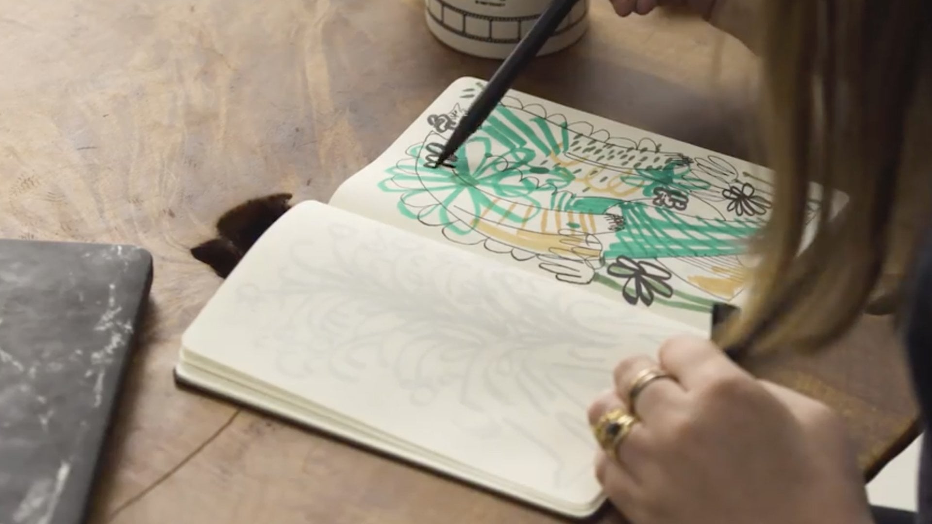
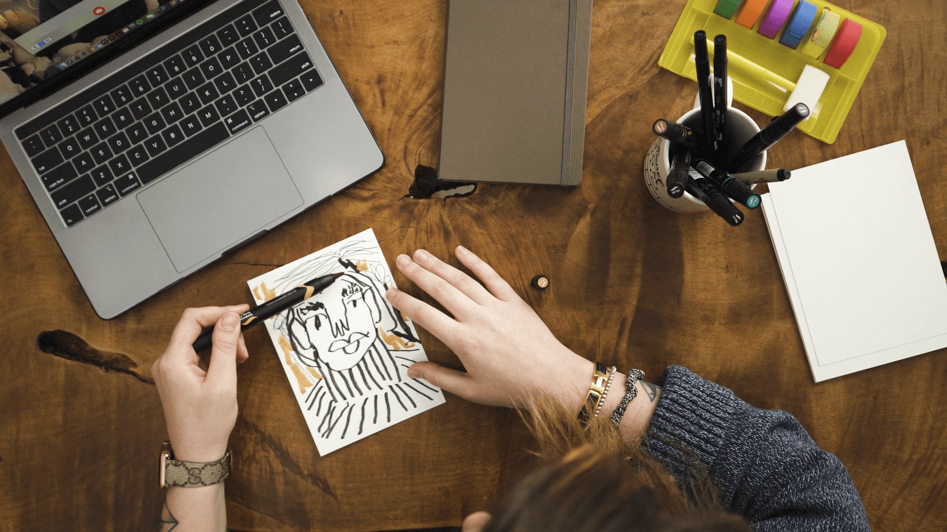
4. Sketching: Family Photo: In this lesson, we're going to go through our pieces of inspiration and start making some sketches from them. For my creative process, I like to approach sketching as a way to get out ideas. I'm not usually making a sketch to then directly make into a final piece. It's more just get out my thoughts and feelings, and then take those sketches and compile them into something that could become final. If you're more used to working in a literal or more representational way, sketching is going to be super important for you. It'll allow you to be inspired by the pieces that you've sourced and push beyond drawing what they look like in more drawing, how they make you feel. This way, you can slowly pivot from making something literal into something more abstract. As I'm sketching, I'm going to be looking for shapes that inspire me, compositions that inspire me. I'm going to start touching on colors that I might refer back to, that I'll use in the next lesson. These are all things I'll loosely keep top of mind as I start putting pen to page. Now, I'm going to start with my family photos and start making sketches from them, and the things within them that inspire me. The goal is to probably narrow down to one or two photos, probably one photo that I'll end up using for the final piece, but I'm not going to pressure myself to pick that right away. The goal is really just to get some thoughts on paper. I pulled this one of this truck, I guess. My dad loves cars, so that's why there's a photo of a car. I pulled this one because I really loved the color combination and the repetition of different shapes. Making some really loose circles in different sizes is something that I really love about this piece or this photo rather. Dad probably didn't think when he took this photo 35 years ago, his 30-year-old kid would be using it in a video. But these photos that my dad used to take when they would travel or even when they we at home are just really big inspirations to me. Then moving into these photos, what I loved about them, again, for my eyes is all the different really lovely abstract forms within them all. Playing off the palm trees, maybe having some really tall lines. The nice thing is, your sketches don't have to look like anything. They don't have to look like what you think your final piece will be. They could, but they don't have to. I believe these are elephants. I'm going to avoid drawing an actual elephant to keep it more abstracted. But I'm going to start playing with these forms that the different colors of grasses and flowers make. Then moving into this one. I love that photo of my mom. But for this picture, the reason why I picked it out besides her being in it, it's a lot of the angular forms within it. As I'm drawing, I'm starting to think of these different sketches, which one feels right to make into a piece. I'm not a 100 percent sure yet. But hopefully, I will find out as I keep drawing. A lot of times, I feel like the pressure of making something that is perfect starts to pop out in me during this phase. I just remind myself that perfection is an illusion and as long as it's something that resonates with you, I think that's the most important part. That's hard to battle. The more I draw, the more comfortable I feel and the less that voice of, what is perfect', goes away. Then in this last photo, similar to this first one, I really love the shape of the birthday cake and the shape of the cups that are repeated throughout. Again, more circle forms. Now, as I've quickly sketched this out, I'm starting to see what makes the most sense for me in terms of what I would take into a more final painting. It's okay if it doesn't jump out at you immediately. This phase could be something as quick as a few minutes. It could be long as a few hours. Feel out whatever makes the most sense to you. But for me, I'm really thinking it's going to be this photo of a curated garden. I really love how I'll trace over it, these shapes interact with each other and how they have different colors. This may be what my final painting looks like. It may not be. Then I'm not going to put too much pressure on myself that these shapes and this color pallet of this piece is something that I'm going to take with me into the next lesson. When looking for different types of inspiration and different shapes within that inspiration, it's comes easier to me with time, but pointing out things that are really simple, things that might repeat themselves, where things live within the frame of a photo, if the photo is your inspiration, are all things I actively think about when I'm sketching. Again, the repeating forms of the circles within this photo is something that I overtime have naturally developed. But if you actively look for things that repeat, if you actively start to look for what different shapes are within each photo, whether it's just a straight line and then a perpendicular striped line, the more focus that you've put into seeing beyond what's in the photo and more of the shapes that compose it, that's how you're going to start to pull out more abstracted shapes for your sketches.
5. Sketching: Nature: Now that I feel more comfortable with the sketches that I've made from my family photo inspirations, I'm now going to start sketching from my travel and park inspirations. For this sketch, to keep it interesting, I'm going to use a brush pen instead. Sometimes doing something as simple as changing the drawing pen that you're using reactivates your mind when going into a new sketch. For this one, in particular, I'm going to start, I really love how loose the shapes are. Instead of drawing the flowers themselves, I'm just going to go along and trace different shapes from them and recompile it on the page. That's a really great, quick, and easy way to start to abstract something that is a little bit more literal in your inspiration. Now that I have a few shapes on the page from this photo, I'm going to switch up over into this one. Because this shape is pretty abstracted in itself, I just love how it creates three connected circles. By making that connection, you pull it out of reality and into abstraction. That's really the main source of inspiration for me in that photo. Then this last one is pretty awesome. It has a few circles that are cut into semi-circles that has a lot of lines, it has a lot of full circles and squares. For this one, taking circles of several different sizes and putting them together with straight lines is something that's inspiring to me. Also playing into the idea of semi-circles cut on an axis is something that pops out to me. The nice thing is you could do all of your sketches on one page, or if you want to, you can branch off into other pages. I like to do everything on one page because it decreases that need to be a little bit precious. I think that the more messy you get the better. Then that way the voice in your head of wanting to strive for perfection quiets a little bit. The other nice thing about keeping all of your sketches on one page if you choose is that the whole fear of a blank page goes away because the page is no longer blank, which I prefer, that way I'm not worried about ruining a new page, even though there's no such thing. Now I'm starting to feel a little bit more comfortable with these inspirations. After going through and making some shapes from each of them. I really feel like this aerial view from an airplane resonates with me. Just the feeling of being so high above the Earth is something that always inspires me and being able to have a bird's eye view is something that has an emotional connection with me, especially when we're in our day-to-day, every day. Taking that and putting it into a painting is the most interesting to me of the three. I think from that, I really gravitate towards these abstracted semi-circles being brought together. It might be something where I do more than three, but I'm not going to pigeonhole myself in that yet. But these shapes are something that pop out to me from this inspiration.
6. Sketching: Quote: My third piece of inspiration is," Nothing happens until something moves," by Albert Einstein. I really loved this quote because it had some inertia to it. I didn't really know what I was going to sketch when this quote came to me, but we're going to find out together, which is really exciting. Given that this is abstract and it's not an actual photo or an object, it's a quote, this should be a quick destruction of barrier to entry into abstraction because there's nothing to reference visually, which is really exciting, but can also be scary. For those of you that are a little bit nervous, the first thing I like to do is just close my eyes and then make a shape. That shape could be anything, and that helps you get over that hump of, "Oh my goodness, I don't know what I'm going to make from this inspiration." The idea of nothing happening until something moves, to me, makes directional lines in that they start to build on each other in a way speaking to the idea of growth and changing and acquiring something to move for something to happen. This might be hard. It might not come to you immediately. You might be like, I don't know what I'm going to draw from a quote or from a thing that's not a thing, and that's fine. I think that if you start making objects, and then eventually as you make them and get more comfortable, some of those objects that you put on the page might refer back to your more abstracted inspiration. There's really no wrong order to figuring out what you're going to make from something so abstract. While you're drawing, if you make something that you don't particularly like, which happens to me all the time, you can either draw over it like I'm drawing over my first mark that I made, or you can turn the page and start again. There's really no wrong answer, and it's okay to make things that you don't like, you're not going to love everything that you put down into your sketchbook. Referring back to the idea of something moving and what something looks like in motion, at least in my mind, is what I'm starting to put down on the page. Again, playing with this idea of line is something that I'm gravitating towards. I don't know what that's going to look like. But now I'm slowly starting to play with dimension as these lines leave in and out of the thicker lines that I originally drew. Again, not too sure if I'm going to take that into our final piece together or into our final piece down the line, but that's something that popped out to me as I read this quote to myself. Now I'm getting to a place where I feel pretty confident that these first few thick lines are something that I'm probably going to take into my final painting. It might change as I start to work on color in our next lesson, but the idea that it looks like something is either growing or falling, is really popping out to me as something that's a bit more emotional. I feel like something, when you're taking time to grow or move, sometimes you stumble upon yourself, sometimes you grow exponentially, and that emotional idea's what's resonating with me in the sketches. As you're looking back on your page or pages of fun, abstracted sketches, the thing that you should look for is things that pop out to you that resonate with you instinctually. You may not really know what they mean or what they represent yet, but if it's something that stands out to you, make note of it as we go into our next lessons. The great thing about these sketches is that they aren't 100 percent final. Some elements from them, whether it's the straight lines, or the half circles, or the building of abstracted circles on top of each other, they may show up in my final piece, they may not, but this is a great starting point to refer back to as we experiment with color and then into our final piece.
7. Color Play: Family Photo: Now it's time to experiment with color and choose a color palette to go into our final piece. Colors have a lot of different meanings to different people. When I pick color, it's more about a personal emotion to me. I like to use warmer colors when I'm evoking something that speaks to happiness and joy, and cooler colors when I'm trying to convey something that might be a bit more somber. But with that said, everyone is going to interpret your color palette differently based on their own experiences, which is the beautiful thing about abstract art. When choosing colors, I tend to gravitate towards the same or similar color palettes, and then focusing on how those colors live next to each other, to create some variation within my work. But these tend to be my favorites. I have a collection of a cooler light blue, a more aqua green color, and then a deeper emerald green color. I really love these three because I see them the most in nature. They're a little bit more vibrant than when I see out in the world, which I like. Then for my warmer colors, I enjoy a light peach color, an orange color, and then a yellow, and I feel like this balances out the palette really nicely. I can put them in ROYGBIV order if I want to, but I don't necessarily have to. Then I also have white if I want to make a clean color blake between colors when I work on my palette. A good rule of thumb when starting to experiment with color is to keep groupings of warm colors together and groupings of cooler colors together, and then as you become more confident you you slowly mix those two and play with how that creates a new and different emotion within your work. Now we get my space ready to paint, and then start diving into color experimentations with my family photo inspirations first. Through my sketching process, I've decided of the group of the family photos that I went through, that I'm going to work with this one. I gravitated towards the shapes and the colors the most. We're going to start playing with color on this. When I experiment with color, I usually will start to pull colors from the photo itself. That's always a good baseline, and then lay them out in a palette form. I like how this is green, red, or white, or green again, and then a light blue color. We'll start there and see how it goes. Usually playing with color, I'm not too precious with how it looks. I'll start with green, and then I'll play with this orange color. This is where I'll play with different proportions too of color. This is where I'll start to figure out, does a lot of orange look good in a relationship to less green, or do I want more green in relationship to less white and orange? This is where that can start to come out in play. Then for this guy, I'll play with the aqua color, and the light blue color. I also love this, I don't know what blurred the ones there, but I also love that pink color. I'm going to throw that in there too. Sometimes I like to start with a lot of colors, and then I'll work my way down from there. Now I'm dipping my brush in the water first to get it a bit wet, just because I like something that's a little bit smoother. It's okay if the paint takes up more space than your brush. This is just the experiment with what colors look like together. I'll start to pull those colors into a curve, see what they look like straight, and then curved down. Then what I'll do about halfway through the page is add a lot of water and see what that looks like. As the brush is already preloaded with some paint, playing with what a lot of water looks like and how that distorts the color is something that I also want to do and make note of. Then once that feels good, I'll clean my brush off a bit. You don't have to fully clean it just because this is an experiment. But once it feels a little bit more clean, I'll go in and experiment with a different color palette. Now that I have this here, I really love how the pink, the blue, and the aqua are speaking to each other. But I do feel that the green might be a little bit heavy-handed for what I'm looking for. I love how this photo is really soft, and it seems like it was taken on a whim, and I feel like the green grounds it a little bit too much. What I'm going to do for this second color experimentation is actually work backwards from my first one. I'm going to start with some of this pink color. Do a lot more of that. Then I'm going to add this light blue in the aqua color, because I really like how those two blended. The nice thing here is it could be really messy, you could paint over colors. There's really no wrong way. Then I'm going to do a little bit of green, to just be a little bit. The nice thing about paint is it has a mind of its own. Sometimes if you're struggling, the paint will solve some of the problems for you just depending on how much comes out. Then I'm going to do white, and then I'll end with a little bit of orange, instead of doubling up on that green, and we'll see how that looks. For my process and my style, I like to pull flat colors like this with a flat bristle brush. But if you want to experiment with a rounded brush, or a bigger brush, or a smaller brush, there really is no wrong answer when it comes to color experimentation. I'm going to do the same thing and pull these colors straight, and then also play with how they look when they start to blend as I pull the brush down. Now I'm starting to get to a place where I feel the colors are a bit softer. They remind me of a warm summer day, just like the photo that my dad took with my mom, I believe that's my mom blurred in front of it, and it feels a little bit more accurate to what I'm trying to portray. But I like to do color experiments in threes just to make sure that I cover all of my bases. With the last experiment, I'm actually going to turn this on its head. I'm going to start with blue, and then I'll work into green, and then I'll add pink, and red, and orange here, and then I'll add green at the end and see where that turns out. The nice thing about inspiration in color is that, it can be literal and you can pull it from a photo, or it could just be more about the emotion of the piece itself. There's really no wrong way to it. I like to add white usually when it's next to a green before I go into a warmer color, because sometimes when the warmer colors bleed with the green, it creates a color that I'm not looking for. Sometimes it does create a color that I'm looking for, but I feel like for this one to keep it a bit more light and airy is the goal. I'm also going to add in yellow, because that's something that I haven't experimented with. There we go. Just a little bit, because this yellow is really bold. Then I'll add some orange, and then we pull. As I'm pulling this one, again, I'm going to start off really slow and steady with my hand, and then I'm going to start playing with how it looks when it's really blurred together. Just because this photo does have a little bit of green to it, it might be interesting to see how that looks as well. Now looking at these three experiments originally, and this is why I like to do three. Originally I was gravitating towards this, it feels nice and cool, and crisp. But this is starting to pop out to me too. As I go into my final, I'm going to probably take these two as a more heavy consideration. Now I'm going to reset my desk, clean up my brushes, and then we're going to come back and do some color experimentation for my second set of inspiration.
8. Color Play: Nature: Now I'm going to be experimenting with color for my nature photos inspiration. Of the three photos that I sketched through, I really gravitated towards the photo from an airplane. That's probably because I just really loved the abstracted circles and the geometry of it and something that popped out to me that was a little bit different than my other travel photos that I sourced. For this one, because the colors are a bit more cool, but if you look closely, you can see where some circles are warmer and then some circles have darker, warmer spots within them. I'm going to try to balance that and emulate that because I like that softness that's within this photo, even though there are a lot of hard circle shapes around it. The softness of the color is something that jumps out to me the most. When picking colors, I'll probably start with the aqua color, do a little bit of that. I'll do some white because I believe that's snow, it might be sand. But I'm going to actually create a few white dots because I want the piece to be pretty heavily spread out with white. Then I'll add some pink and then some light blue. Not light blue, that's aqua. I'll add some light blue. I've done that before. I've mistakenly put down the wrong color and you just go with it and see what happens. Worst case, if it doesn't work out, that's fine to. Then I'll do some orange. Then I'm going to repeat light blue again, just to play with the balance and throwing that balance off a little bit. Just because I feel like in this inspiration photo, there's this line going through and cutting through a lot of the circle shapes and that plays with balance. I want to emulate that for this color experimentation. Now I'm going to wet my brush again, and this time I'm going to wet it a little bit more just because I want to see what the color looks like when it's really saturated with water. I'm going to lightly and put a little less pressure down, pull that paint and let the paint seep through. Then I'm going to put more pressure and see what that looks like when it's really saturated with water. That's pretty interesting. I feel like that creates this nice, light, airy feeling. But I feel like I am missing a lot of the white in that because the colors start to seep into the negative space. I'm going to try something where it's a little less on the water and a little bit more on the paint. I like the color combination, but instead of this aqua color, I feel like that's a little bit heavy for this inspiration, I'm just going to stick with the light blue. Then again play with the white. This time I might play with a little bit more white just to make it a little bit more obvious. Then in the center, do pink. I want this piece to be a little bit warmer than this first pass. I'm also going to add yellow and orange to the mix and see how that looks. It's a lot of orange. We'll just see how it goes. Then I'll end it with a light blue color. I'm going to add a little bit of water to the brush, but not as much as the first time. Then just apply a lot of pressure and pull it straight and then also out of curve just so I know what that looks like. If I were to play with curves like in the circles in the photo. This one I'm really starting to like. I like especially after a while when you do add a curve, the colors slowly blend, but not as much as they did in the first color experiment. It feels more crisp like the inspiration photo which I particularly like. Now I'm going to clean my brush again. Again, it doesn't have to be a 100 percent clean for these experiments, just enough to pull some new color. For this one, instead of adding white, I'm going to try what it looks like with full color and see what that looks like. Instead of doing alternating white, I'll do alternating light blue. Then within that light blue, I'll play with the pink, the yellow, and the orange. Again, I'll add a little bit of water to my brush, but not too much. I'll pull those colors straight. Then I'll also start to turn them just to make sure I know what it looks like curved because I have a feeling based off of my sketches that I'll be doing some cylindrical objects. Now for this one, I really love how this color jumps out more than this. But as the yellow and the blue mix to make green what I might do for my final, just add one strip of white in between there to keep those separate and keep the colors as crisp and original that to their color as they come out of the bottle. But beyond that, I think that this bold color brings that warmth and softness as the aerial view from this photo. But it's still crisp just like the circles, which is something that I'm super inspired by. You maybe thinking, how did they get this bright color palette from such a muted photo. When I took this photo, I was just so excited to see these shapes on the ground as I was just looking out of the airplane. That excitement is what is also a parallel inspiring my color palette experimentation. I'm taking the cues from the more muted colors, but then I'm also trying to bring in that emotion of excitement into the palette as well. That's where these oranges, yellows, and pinks come from. When picking colors that represent how you're currently feeling when you're working through these experiments, that definitely comes from trusting your instincts. Over time you'll get more confident with what your instincts are trying to tell you. But for the sake of these experiments, if you're feeling in a more melancholy mood or a photo is bringing some form of happiness to you, lean into what that color is when you think of that emotion and there are no wrong answers, which is the best part. I'm going to clean my desk again and reset, get a new piece of paper and clean my brushes. Then I'll come back and work on my last set of inspiration.
9. Color Play: Quote: For my last color experimentation, I'm going to be focusing on my third piece of inspiration, which is the quote that I source that says, "Nothing happens until something moves." For this piece because I'm not looking at any imagery, like it's not similar to the travel photos or my family photos, it's just a quote. It allows me to open up what that color palette could be, which is part exciting and part a little bit scary and it's okay if you're a little nervous to figure out what colors to use. Usually when I'm sourcing inspiration that's not visual, I'll just play with all of the colors that I enjoy, and then take it from there. For this quote, I really like the movement within the quote and how it talks about inertia. I'm going to play with what that looks like using all the colors that I've chosen for today. Start with a little bit of green. I'll play with white and in terms of like the order that I'm going in, I'm just trying to keep it loose and not over analyze it. Especially in a phase of experimentation, you don't want to give too much thought especially to the first experiment that you do, because you don't really know what it's going to look like and trying to predict that. To me, it just takes the fun out of it. Then I'll do white again and then I'll do yellow, pink, and orange. Once you have all of the colors that you want to play with on the page, similar to the first two experiments, wet your brush and at this point you can wet it with a lot of water, with less water, depending on what you're trying to go for because this is really swift movement, I don't want the brush to be too wet. I'm just going to first play with what it looks like, just a little bit of water. For this, I'm going to move it a bit more quickly and keep it straight because I feel like my final piece will be straight lines. With this type of experimentation, instead of playing with different colors at first, I'm going to play with what it's like to have more paint on the brush versus less paint on the brush. What it looks like if it's a bit drier and then if you were to redip your brush in water and then pull it again and see what that looks like. I feel like the movement as the color spreads out within each piece is something that's interesting and that to me speaks to the quote and how I feel about it. I wanted to make sure I do my due diligence and experiment with this as well. As you're working through and you're playing with different colors and different levels of water, feel free branch off beyond what I'm doing now and go with what feels right to you for your source of inspiration. Now that I have these two down on the page, I'm going to play with a different combination. Instead of keeping warm colors together and cooler colors together, I'm going to play with what different colors look like in terms of their temperature and how that relationship works in relationship to this quote. Instead of playing with all of the colors, I'm going to limit it to five and see if that changes anything for me. This time I'll use a smaller brush because I'm using less color. I'll pull that pretty quickly and see what that looks like. For this, I do love how with less color I can use a smaller brush and possibly get more lines when I'm working for my final piece, to show that idea of energy and motion. But I really do like how your eye goes from the orange all the way up through the green, creating two directions of motion. Not only is your eye moving upwards and forwards, it's also moving back into the left as it goes through color, which I think might resonate with me a bit more and inspires me more and connects to the quote a bit more accurately than a lot of thinner lines. With my last experiment, what I might do is play with a happy medium and see which one feels the strongest to me. For this last one, I'm going to keep this color order, but I might play with how much color I use in it and remove a few colors as I go. I'll start with a little bit of green, maybe a little less than last time. Same with the white, I'll just do a little dot and then for the light blue, I might omit the aqua and make the blue a bit longer and give it a bit more prominence and then I'll add some white again and I'll do yellow and pink and leave off the orange and see what that does. I'll use my bigger brush again just to make sure that I get all the colors down. Again, I'll pull it in a long straight line and see what that looks like. Awesome. Now I'm taking a look at all three together. One with all of my colors, one with a more limited palette and then a happy medium that starts to play with the amount of color instead of keeping all the colors equal. Thinking about the quote, the number one thing that inspired me about this line is that it reminds me to experiment in worst-case if I make something that I don't like, at least I'm moving forward and learning more about myself and I feel like this last color combination does that. It allowed me to push beyond what felt comfortable to me and that resonates most closely with this source of inspiration. When it comes to picking how many colors I use in a painting, it really depends on what I want the viewer to feel when they're looking at that painting. Using more colors creates a lot of energy, a lot of excitement and allows your eye to move around the page a bit more and then using less colors, it narrows your focus in on the shape of the paint and then when you start to play with colors in different proportions next to each other, it balances that out. The nice thing about picking colors and picking a palette and either limiting it to three colors or making it six colors, it allows you to create a narrative that speaks back to the idea of your piece overall. I know it may feel pretty quick how I jumped from a quote which has no visual color reference to an insane amount of color, but just know that that has been years and years of practice. The more that you experiment and listen to yourself and use the colors that you gravitate towards, the more confident you'll feel in pulling color palettes from future inspiration that may not be visual. Keep playing with different color experiments until you land on a color palette that resonates with you. In the next video, I'm going to go over a few painting techniques that we can then take into our final paintings.
10. Painting Techniques: In this lesson, I'm going to focus on techniques that I use for my style in regards to leveraging acrylic paint. But it's okay if you decide to experiment with your own style. But if you want to follow along with me, these tips will be really helpful. To get to the place that I've gotten to with my techniques in painting, it's definitely happened with trial and error. I'll play with different techniques and if they work out for me, great, and if they don't work out for me, I put them aside. What I'm about to show you is several years of trial and error technique making in the making. The first technique and they build on each other is taping down my paper. I like to use just traditional blue painters tape, especially when using paper it doesn't pull up the edges of the paper as quickly as other types of tape do. The reason why I like to use tape is because it allows me to load the paper with paint instead of loading the brush. For this technique lesson, I'll just tape off the top of the page and the bottom of the page. When you tape down your paper, remember to go over it with your finger to make sure that it is flush with the page. That way, the likelihood of paint seeping underneath it goes down. But if paint will seep underneath it, that's okay too, sometimes you just have to lean into what the paint decides to do for that day. The next technique that I do is a little bit different than what other artists have done in the past. Instead of loading my brush with paint, I actually load the paper and then put the brush down and pull it. I'll show you what that looks like. For this example, I'll do three to four colors. I'll do some orange, I'll do white, blue, and pink. if you notice, I am putting the paint right on that tape line. I just want to make sure that the paint goes over the tape, but then is also on the paper. That way when you pull the line, it'll be a nice clean edge when you lift up the tape. Then I'll take a brush, and similar to how we played with in the color experimentation, I'll load the brush with just a little bit of water, I'll dab it on my paper, and then I'll pull a straight line. As I'm pulling, you want the brush to be firm on the page, but you don't want it to be too hard because then all spread out and not keeping even line. You don't want it to be too soft because it won't get all the paint down. Just want it to be a nice, firm, slow, even line, like that. Then when it's done, you can wash the brush off, load the paint again on the paper, and then make your next shape. Another example that I want to walk you through before I pull the tape off is loading the brush with a lot of water. We're going to do the same exact colors. We'll do a bit of orange, a bit of white, some blue, and some pink. Then instead of just drying the brush off, we're going to leave it really wet. Sometimes your paper, depending on its thickness might buckle a little bit, but if you keep the tape down as the paint dries, it should flatten out and then you can always flatten it with a book. With a lot of water, you can start to see that water allows the paint to mix in a very different and interesting way. It dilutes the paint a little bit, allows the colors to mix a little bit more, and it creates these really beautiful abstracting shapes that dry really nicely once the water has evaporated. Now that we have both of these techniques down, I'm going to show you on the drier side how to pull up the tape. Pulling up tape can be an inhale and hope for the best. Sometimes the paper will come up with the tape, but if you're pretty careful about it, you can avoid as much paper pulling as possible. You're going to pull on an angle like this where the side of the tape that is closest to the paint comes off first, and you're going to pull slowly but firmly away. Even though the paint is still wet, sometimes it'll work. Ideally, you're going to want to wait for the paint to dry for at least 10 or 15 minutes. But if you're in your rush, if you do it like that, it should come off pretty cleanly. The reason why I love to use tape is because it creates that nice crisp line and allows a nice balance between inorganic colorful form and then a nice hard edge. Before we move on to our final pieces, I'm going to reset my desk and show you tips and tricks on how I create curves and different abstracted shapes with my paint. Now that I have another piece of paper down, we'll use the same colors that we did for the first part of this lesson. We'll play with, I believe it was orange, and then white, and then pink, then blue. Similarly to the beginning, just keeping the paint half on the tape, half on the paper. Once you get all of your colors down, playing with curves is pretty similar to that of pulling a straight line, depending on what you want with the curve. If you want something that's a bit cleaner, don't load your brush too much with water, make sure it's a bit looser. Then as you pull, keep it pretty firm, and then you're going to want to put more pressure on the outside than the inside of your brush. Just go slowly and turn your brush with your hand. If you keep your painting hand pretty loose, you could move your fingers to keep your hand comfortable and keep your brush steady, and then pull it back towards the tape like that. I'm glad that they came out pretty great. But sometimes when I make work, the brush will dry out too much by the time it gets to the end. Usually what I do in that case is I'll stop, add just a little bit more water and then I'll go back to that area and then re-pull the paint until the end. Sometimes it will create a line, if the line is not something that I'm looking for, then with a little bit of a drier brush, I'll go back to the beginning and retrace my steps to make sure that it's one continuous line. But sometimes I do like the line breaks in there, shows that a human being made this painting, and I like to have that touches of human within my work.
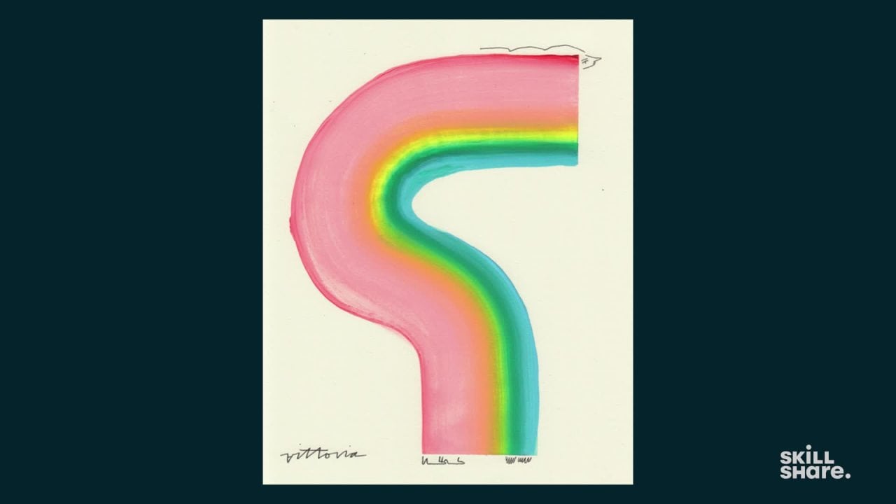
11. Final Painting: Family Photo: We've made it to the final painting. After sourcing inspiration, sketching, and playing with color combinations, now we're going to take everything that we've done this far and put it into a final painting. The best part about this process is even though this page is blank, we're really not starting with a blank page. We've done work to source inspiration, make sketches, and come up with color palettes to all help and inform us in this final piece. As we begin working on our final pieces, a few things to think about are to not be super afraid with the fact that this is final. Whenever I start on a final piece, I like to remind myself that nothing is final and that this is just one other piece in a series of many pieces that you have made and that you'll continue to make in the future. Another helpful tip is to remember to still play and experiment in this round. If you make a piece and you're not 100 percent thrilled with it, you can always grab a new piece of paper and emulate what you just made and improve upon it with your next round. We're first going to start with the family photo inspiration and leverage everything that we've made this far for this inspiration and make our final piece. For this one, as I was working through, I believe it was the sketches, this photo ended up falling vertical to me; which I thought was really interesting. Playing with the verticality of it being on the wrong side, but then also how the color bands are more horizontal. I like that idea of building color, A; because I think that it will make for good composition, but B; because this photo was taken when my parents, I believe, first got married. So it's nice to see how this is the building of their life together, even though it was just an accidental photo. Leaning into that, from my sketches, even though I mentioned that these circular shapes initially jumped out at me, after doing the color studies, I really liked this idea of horizontal bands building on each other. I'm going to go with that for this final piece. For this piece, I'm going to tape it off vertically. I like to leave a little bit of room on the edges, about an eighth of an inch, that way it's about an inch wide plus an eighth of an inch, so I can add my details at the end with ink. It doesn't have to be perfect, it could be approximate. I'm going to tape that down. I'm going to do the same thing on the other side. Because this photo has a lot of angles and leanings, I'm going to probably actually tape this one on an angle. The nice thing about using tape is you can start to build and create an abstracted form even before you put paint down on the paper. Well, that's all nice and taped. We're going to refer back to our color inspiration. I love all of them, but I think the one that speaks most closely to the idea I'm trying to build upon and paint, this idea of building your life and slowly putting together step-by-step, this band of colors, I feel works towards that as it goes from smaller less amounts of color to greater and more amounts of color. I think that that fits the idea that I'm trying to make with this piece. I'm going to start off down here and then work my way up, for there's really no wrong way to do it. Start wherever feels natural to you. I'm going to start with the orange. Just a little bit of orange, and a little bit of white, and a little bit more green, then some aqua color, then some blue and a lot of pink. Now for this one, I'm going to wet my brush just a little bit and dry it off. Sometimes the brushes could get a little narrow at the end after they're wet, so I just like to make sure that that's pretty even. I'm going to just pull this one straight across, which is a little bit of an elevation. Sometimes I like to have excess paint on either side. I feel it can either nicely bleed into the next line that I'm about to make, or creates these nice imperfections that humanizes the painting overall. Because I'm going to do similar colors, I'm going to hold off on cleaning the brush and I'm just going to go in and reuse that. I like that idea of it again building upon itself. Even though the colors might get a little bit more blended as it goes up, I think that leans into the idea that I'm trying to achieve overall. Just going to leave that there. Then we're going to go back; same thing with the orange. This time we're going to have the orange because I have a little excess pink. Then I have the orange just connect to that. I'll do a little bit of white. As I'm working, I noticed that I do love the green, but sometimes the green can be a little overpowering, similar to what I said about that first example, so naturally tone the green back a little bit. It's okay to make decisions that are just purely aesthetic, even if it's not to serve and overall theme. Just go with what makes the most sense to you. We'll add some blue, and then bit more pink. We're going to do the same thing and pull these colors next to each other. To emulate the abstract that shapes within these flowers, I'm going to come down and then back up again with this line. We'll start up here, pull downwards. Once I touch that pink, I'll slowly and firmly take the brush back upwards towards the tape. It's okay if there's a little bit of shake and wiggle in your paint. Again, I think that just leans into the fact that a human being is making this. I'm going to probably repeat this two more times until I get to about here, and then what I'll do is I'll let it dry for five or 10 minutes and then take the tape off. Again, we're going to have that orange touch the pink. The reason why I'm doing four stripes of color, actually is for two reasons: the first is more aesthetic. I feel like with the thickness of the brush that I'm using, four stripes will take up enough of the space to be able to represent an abstracted figure, but it's not taking up too much space or not taking up not enough space. So I feel like four is a right balance for aesthetic purposes. But then the other reason is because this photo was taken by my father when he first started, I believe, either dating or first married my mom. Our family has four people in it, so it's my parents, myself, and my younger brother. I feel like even though somebody looking at this piece without that context wouldn't know, I think it's always important to put a personal element within your work, even if no one else sees it or if it's not overt. Playing with the number 4 is something that I like to do a lot because of that. Now that I'm feeling comfortable with the paint on this final painting, I'm going to let it sit and dry for about 5-10 minutes. I want it to be dry enough where the flat colors are dry to the touch, but it's okay if the thicker parts of color are still a little wet. I don't like to let them overdry, because sometimes if they do and when I pull the tape up, it'll crack. Definitely go with your own instinct. I've definitely learned by trial and error with this fun. But once it feels dry enough where you can do that and nothing comes up on your finger, you should be okay to pull off the tape. I'm going to set this off to the side and let it continue to dry and move on to the next piece.
12. Final Painting: Nature: Now I'm going to start working on my second final painting, which is inspired by my second piece of inspiration, which is this really lovely aerial photo that I took while I was in an airplane. Looking at the inspiration, the sketches, and the color palette, I really am gravitating towards the strength of the circles, so from my sketches, leaning into this semicircle pattern that I've created. Then, for my colors, even though I initially really wanted to go with the bright colors, after having let them dry and having a second look at them, I think I actually might go for the colors with the white in between. That resonates with me a bit more because it feels more closely tied to the actual colors within the photo, and that's really why I was inspired by this photo to begin with. I think my instinct is to go with that. However, the great thing is, if you change your mind as you're working through things and you work with option B and it doesn't work out, you can always make another final painting with your initial choice. For this second painting, I think I'm going to stack semicircles on top of each other. I might just do three of them. Sometimes when I'm planning out my final composition, I'll just trace with my finger, like what I'm doing here, just to get a sense of space. Then, once that feels good, I'll start to tape off the page. When working with semicircles, sometimes I'll do the first painting, and then I'll let the piece dry, and then carefully tape the tape over paint. But for this exercise, what I'm going to do is stack these semicircles so that way tape never touches paint. For this one, we're going to start from the bottom and work our way up. I'm going to tape it for the first time I circle. In this one, I really like how in my inspiration the circles are off-stacked on each other, Some are pretty parallel, but not all of them in that area is what inspires me the most. I'm probably going to start with this semicircle off center. Then, my next one I might do a bit off from that, and then rebalance it back out by going more towards the left again. For the colors, we're going to reference this right here. We're going to do a little bit of light blue a bit more of white, a little bit of pink, some more white, some yellow, some white again. Sometimes I forget the white and I'm like, "It's fine. It has a mind of its own." Some orange, one more stripe of white, and then our light blue. I'm going to add a little bit of water but not too much, and then I'm going to make sure that the brush is flush. Then I'm going to pull the brush into a semicircle. Once that first one is done, we'll let the brush sit for a little bit. Because I have such a little paint on the paper, I feel okay pulling up the tape. But if you have 5-10 minutes to let it sit, that's completely fine too. Sometimes I like to play with taking up the table a little bit early and see if anything happens that's interesting. Sometimes nothing happens, sometimes a lot happens. Awesome. Now I'm going to want to paint that second semicircle here, so what I'll do is tape that off. When spacing out in between circles if you are painting circles like me, it's definitely something that you eyeball. Sometimes you get it right, sometimes you get it wrong. It's just, again, trial and error and experimentation. Now, the most fun thing about making final pieces that are a bit more abstract is you can play with the composition after you've painted it. For this piece, I was originally wanting these semicircle to stack on each other in the way that I painted it. But sometimes after I finished painting, I'll play with the composition and rotate it, and then decide that actually this composition feels more like the movement that I'm looking for, or it feels more closely tied to the inspiration or just in my gut sits better than the original way that I set out painting it. Again, there's really no wrong answer when making these pieces. Just try to listen to your instincts, even if it makes you a little bit uncomfortable. Now I'm going to clean my desk and prep for my last piece that I'm going to paint. But if you're still working on your first piece or your second piece, please don't feel rushed. Take as much time as you need to experiment and play, and get to a place that feels best to you.
13. Final Painting: Quote: For my last final painting I'm going to be pulling from my inspiration that is my quote, which is, nothing happens until something moves. This is by far the most abstracted, if we can rank levels of abstraction in regards to the pieces that I'm making just because the inspiration isn't visual. But the great thing is, like the other two final pieces, we've already made other pieces of work that we can reference as we're making this final piece. For this third painting, when it comes to the prep work that I've made, I really love these really bold stripes that I made in my sketches. I think that that shows a lot of movement and ties back to that idea of excitement and change and moving things forward. Then for my painting experiments, I still really love how the colors in this one have different weights to them, and that creates a secondary portion of movement. I'm going to take those two and put them into my final piece. For this piece, because I'm doing smaller stripes that require a lot of smaller pieces of tape, I'm just going to tape down quickly the top and the bottom so the paper doesn't move. Sometimes if I don't do that I get paint on my clothing, which is fine, but if I can avoid it, I try to. I'll just tape off the top and the bottom. Similarly to our last painting, I just like to trace where the lines are going and how many lines I'm going to use. I think I'm actually going to try to do five and then work with a bit of a smaller brush. I'll just have to make my color lines a bit thinner. For the first line I'm going to emulate my sketch a little bit just because I love how that naturally came out. I'm going to take a little piece of tape and then tape it up towards the top, again, leaving some room for details with pen, when I get to that point. Then a while piece of tape, three quarters all the way down, similar to that of the sketch. The nice thing about going off of the sketch, especially for people that are a bit hesitant on making something so abstract, is that if you're able to reference something visually that you've already made, it gives you that extra boost of confidence that you might need to make something so detached from the visual reality around you. The first color is a lot of pink. I'm going to be mindful that I'm using a smaller brush. A lot of pink, and then a little bit of yellow, a little bit of white, and then a decent amount of light blue, a little bit of white, and a dot of green. Similar to my color experiments, because I haven't used this brush, I'm just going to make sure that it's wet enough, the water, and then I'm going to blot it out on the paper, just so you can see a little bit of a glycerin on it to know that it's wet but not too saturated. Then once I feel ready I'm going to smoothly pull the brush straight down. It's okay if you have excess paint and it's okay if it's not perfectly straight, it add some character to the painting. Great. Now that this piece's portion is done, I'm going to let it dry for a little bit, pull off the tape, and then repeat the same process four more times. For this one, the reason why I want to do five stripes is I feel like it's going to create a lot of visual places for your eye to roam, leaning into that idea of movement and having something happen as you look at the piece. Similar to my sketch, I'm going to add two more small pieces of tape this time on an angle. I'm going to use the same colors here just because I feel like that repetition will allow your eye to bounce up and down the composition. Again, for this stripe, we're just going to slowly but firmly pull the paint down towards the second piece of the tape. My goal is to try to touch the two stripes because then that's how I'm going to start to build an abstracted human form. Once that's dry, peel off the tape for that one and repeat the process. Now let this last piece dry and then play with it again and see what composition makes the most sense for my final details. The nice thing about this one is similar to my last final painting. I really can turn this piece around and see what makes the most sense for the composition. As I'm looking at it I actually think this way feels like an upward forward motion where I might add the head here, add some of the feet here, and then the hands, and we'll see what that turns out like in my final round of adding details. For those of you that are working through your final pieces, if you pause and notice that you've made a mistake, I would say lean into that mistake and reframe it as an opportunity to change your thought process on what your final piece you thought was going to be and push it in the direction of what it is. I love doing that because it again keeps me open and keeps me playful when making my artwork. Whether you're working on one piece or three pieces for your final paintings, continue to work until you get to a place that feels right to you, and then set those pieces aside to dry. Then the next lesson we'll come back and we'll add those final details by hand.
14. Adding Details With Pen: In this last lesson, we're going to use pen to add some final details and finish these paintings off. Although people have asked me why I add details to turn these paintings into human forms, I really enjoy personifying these abstracted shapes and making them into a human with emotions and thoughts because it just feels right to me. Some artists might want to stop here and call these pieces finished, but just adding that extra level of detail makes the pieces feel like mine. I have a really distinct style in regards to how I depict faces and hands and feet and the nice thing is, it's taken me several years to get to that point and I've really been patient with myself to figure out what feels most like me as an artist. I try to experiment as much as possible, putting different ideas in my sketchbook with different shapes for hair and for hands and for feet, and then when I go into a new final piece, I could reference back to this and give myself that confidence knowing that I've already done these shapes before and that I could do them again. If you're a bit nervous about applying those final details, feel free to go back to the sketching round, open up your sketchbook, or take a blank sheet of paper and start playing with different ideas before you finalize those paintings. The things that I think about when adding these final details are, what the forms are saying to me. Is the form leaning more to the left, is it facing downwards, where do I think that the head, the hands, and the feet will go. If you're struggling to figure out if you can even see a form, a few tips that I like to do is either have tracing paper and just roughly trace and sketch out where I might put these forms. If you don't have tracing paper another tip is to take a picture on your phone and then in some quick phone editing app, doodle in where those forms might go and play and erase until something feels comfortable to you and then you could take your pen and apply it to the final piece. Adding these final details, I like to use a finer pointed pen. It doesn't really matter what brand you use. But the reason why I prefer this pen over my brush pen is because I feel like the balance of the larger form that composites the body and the smaller forms that composite the extremities has a really nice balance to it. The fact that when people are looking at these pieces for the first time, they're first brought into the piece because of the color, and then they start to realize that this is a representation of a person. I'm going to start on adding details to the first piece, which is inspired by this family photo of mine. Based off of the way that the forms are facing, I really feel like the head can live here with some hair and the feet in front like a wind is blowing up against the person and then adding the hands back here as if they're like leaning into that wind. The nice thing about this is the first time you do it, it might be tough to draw straight in with pen. If you want you could go in with pencil first and then trace. But with time you'll get more competent with the permanence of pen and lean into any errors that you may make. I'm going to draw their head a little bit more upwards and then because I like that flowy direction of the paint that I've put down, I'm going to mirror that with the hair as well. Then for the feet, I got asked this question recently, like why do you always draw your figures with little boots? It's something that I just do subconsciously, but these boots remind me of a pair of boots that I've worn for several years and they're my favorite. I tend to just sneak that into a lot of my pieces. Feel free to do that with your work as well. Not everything has to have a deeper meaning to it as long as it means something to you, that's the most important thing. I'm going to add the hands here for this last piece. Before I finish any piece, I love to sign my work on the front. Now, artists definitely have their own opinions about signatures. I've definitely been told that my signature is a little bit too big and takes up a lot of room, but that's how I like it. If you prefer to have your signature on the back of the piece or not sign it at all, that's okay too. Again, there's really no wrong answer when signing your work. Usually when I put my signature down, I like to find an area with the most amount of negative space and then take up that whole space. Now, I'm going to switch and move on to my second painting. Again, I'm rotating it to make sure that I want to stick with my decision of this being the composition and I think I do. Now this piece is a little more tricky because it's pretty evenly balanced on both sides. But what I'm thinking is to have the face this way and then not have anything here, and then have the feet again here and the hands that way. It's like this figure is moving throughout life, similar to how I was moving through air as I was on this airplane when I took this photo. Again, I'm just going to add a face and then to mimic the shapes of the painting, I'll make the hair the same and then I'll add the hands towards the back and then the feet in the front. For this one, I'm going to put my signature up on the top left to balance out the entire composition. I really like my signatures to be a part of the paintings and placing them is something that I like to get a lot of thought to before I actually sign the peace. Now, we're going to move on to our last painting, and to lean into the idea of movement and motion and forward motion. I think I'm going to place the head here, and the nice thing about this is I have five areas to put the extremities. I think that I'll probably do the face here, a foot here, a hand here, a foot here, a hand here and a foot here to emulate motion. The nice thing is you don't have to stick to the conventional ways a body is built. Bodies are built in so many different ways and to express that and lean into that is also important in your work. There's really no wrong answer to how you're adding these details to these pieces. I'm going to add the face here. I usually like the hair to emulate the shapes of the painting stripes that I do, sometimes I diverge from that. Again, there's really no wrong answer. I'm going to do a foot, and a hand and one last foot. Then for this piece, I think I'm going to sign it right here and that's all of them. If you're struggling on what exactly to add for final details, definitely reference your inspiration again and see if anything pops out. If nothing does, go back to your sketchbook, go back to your color studies, and really sit with the piece until something comes that feels right to you. If nothing comes, it might take some time. Again, you can always sketch out the rough shapes of each of the paintings that you did and then sketch different opportunities of where you could put different elements. Let that sit, come back to it and choose the one that feels right to you.
15. Final Thoughts: Now we've made it to the end. I've made three final paintings and I really love how each speaks to the inspiration, what inspired me by that inspiration, and how it takes each of the elements from my color experiments and my form experiments and compiles it all into one. Of the three, my favorite is the third one, which is a little bit surprising to me because it's the most abstractive. I really love how through my experiments and sketches, I leaned into the idea of motion and putting that into this piece and making it feel honest to me in my interpretation of that quo. Whether you made three paintings like I did, or one painting, or you stuck primarily to color experimentation or just to sketching, I hope that this class has brought a new way for you to approach how you make artwork in a way that's more joyful, experimentation, and happy. Not only what I love for you to share your final paintings in the project gallery, I'd also really love to see your inspiration and the sketches, and the process that you've put into getting to these final pieces. As you're working through this class, if you have any questions for me, please leave them in the discussion. I'll be checking them and I could help you on these projects as you work your way through them. If you're looking for other ways to unlock your creativity, feel free to take a few of my other Skillshare classes and be sure to follow me to see when new classes pop up in the future.
 Amber Vittoria, Artist and Illustrator