Transcripts
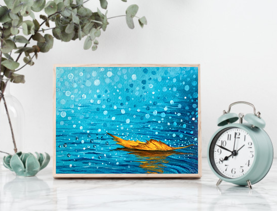
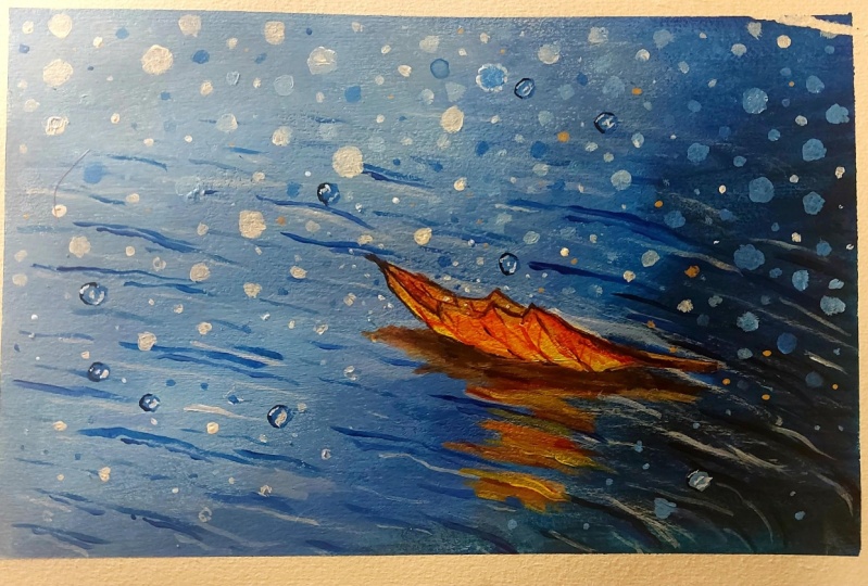
1. Introduction: Monsoon meant different things to different people. Raindrops falling on the window sill creating patterns, fragments, all fresh wet. Fitting of the senses. Cool breezes guessing your fees. Rains bring in such a gush of memories and the spot of joy. This monsoon in 2021, I created a lot of mountain landscapes, different types of fringe of being deemed. And this is the one that was liked by everybody and I was requested heavily to create a class for this. And so I decided to create a very beginner friendly acrylic painting class for the spitting. In today's class, long to capture the magic of Monson onto the canvas. I will teach you how to win to this mesmerizing Monson seen that you can create an hanged up for everybody to see. Hi, my name is Deb and I have been teaching art professionally for the past six years. Since 2016. I have changed my population from a white-collar corporate job to a full-time artist six years back to pursue my interest in art and to educate others about acrylic paintings. I paint from my studio in Puna in India. If you want to know more about me, please visit my website, deaths lay lots.com, or connect with me on Instagram. This class is absolutely beginner friendly. So if you're new to acrylic paintings, you can definitely learn a lot here. I will show you my minimalist art supplies that you need for this class. I'll show you my entire painting process from start to finish. You will see me mixing colors, apply Panes, each and every brush stroke my, every move in creating this painting. And I'll be sharing with you a lots of DFS and tips. Along the way. You will learn how to create water lines, how to create beautiful Bokeh effects, and then how to create a beautiful leaf floating in the water and creating the shadows. So do not worry at all. I'm here to guide you along the way this class is for everybody, no prior art experience is necessary. So I invite you to gather all your acrylic art supplies and join me inside the class.
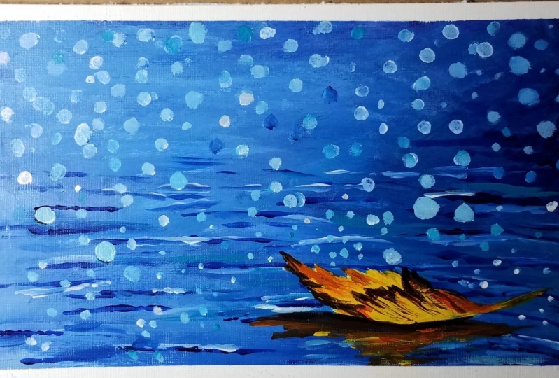
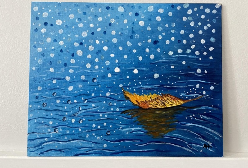
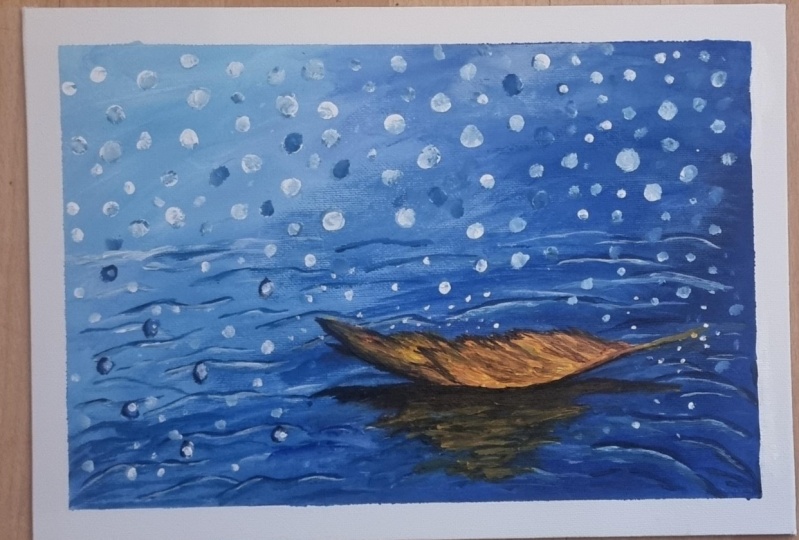
2. Art Supplies: Hey guys, welcome to this class. I'm so glad you decided to join me inside this class. So in today's class, I'm going to be teaching you how to create this beautiful moms on landscaping team. So this is the first one that I did on mine, this small, tiny don't know that I got from Bieber poof. So I had like few landscape paintings done on this one. So as you can see, they don't really stick to each other, but they are a little bit, the peaches kind of stick to each other a little bit. Spread. Yeah, they don't belong. But that's the best part. Okay, So this is where I tried this painting for the very first time and I absolutely loved it. And then I decided to create the plus on this. And this is the main thing that I will be creating inside this class. And you can see how many times I've created this building. So in this one, this one I did in my online painting party. So for those of you who don't know, I take a free online infant d once a month, every first Saturday of the month, and anybody can join in so you can visit my website to know more about it and how you can sign up. So it's start talking about all the art supplies that you need for this painting. So as you know, I don't need a lot of items or art supplies for creating my artworks. So very minimalist art supplies. So first thing you need are acrylic paints. So I will be using this to three shades of blue, but honestly you don't need to appreciate. So if you look at this painting, I created this with only Prussian blue and white. So it's just mix of Prussian blue and white shoes in which I created so many different piece of blue. However, in this class I have used a mix of kilohm Lu, this one, and talk with deep and Prussian blue. So this I did just because I was getting a little bit more experimental. I just wanted to try out this color because I've never really painted with pillow blue before, because I always lose sort of Prussian blue. So the blue is this one, which is fluid acrylics that I use on these and these two are heavy body acrylics. So you just need anyone who you are. You want to experiment like me. You can use a mix of 23 blues and try out. It's always good to experiment Drake. So this is the, these are the shades of blue that you need. I actually recommend the Prussian blue because of the Prussian blue is the darkest ones. I'm going to swatch out the colors and show it to you and then you can decide accordingly by a width, these colors. I did. I decide I saw that, you know, it's not giving me that dark color of the blue that I wanted, and that's why I use this Prussian blue. Okay, so that's all about the blues. And for the leaf unit see colors, yellow, orange, and brown. So this is my chrome yellow. So this is the name of the color chrome yellow from the plan that I used, be delayed. But you might have read as cadmium yellow. Okay. Because it's a little bit more of orangeish yellow, not the lemon yellow. And, but if you have lemon yellow, that's totally fine. Also, it's not going to make a lot of different. And then you need orange, and then you need dark brown. These are the three colors that I'll be using along with little black for creating the leaf. And now this dark brown shade again, I, it's a color that I get it this brand only. Now if you're using any other brand of the common color of alternative for this one is about CNR. So you can use one sienna or burnt umber, anything that you'll find, I think born tomorrow will be better suited for this painting. Okay, so that's about the colors I read it was other colors and show you all the colors that you need for this class. And I'm going to be creating this on acrylic. If I've actually achieved like this. And I'm going to stick it on this foam board. I actually like using the foam board rather than keeping my paper directly on the table that we're I don't mess up my table using this masking tape. I'm going to just tape it down on to this one. So that's the surface that I've already used. But if you're painting for the first time, I highly recommend that you use the Canvas sheet and this board or a stretched canvas, whatever you have. Ok. And for the brushes, I have some brushes or York. And the ones that are going to be using for this class is you need just one flat brush. So these flat brushes, absolutely proportional to the size of this paper. So that is why I'm using this blood blush and you need to small brushes. One is a round brush, this is a 31 liner brush. So I'm going to link down the Amazon link of all the arts of lice. So you can find all these materials over there and you can buy the one that you need. This is a brush that I highly recommend for you to have in your collection. I think it's a set of 79 liner brushes and in find the link in that link that I'll post. And yeah, you should totally get it because it really helps create a beautiful paintings. And you need a plate and a glass of water. So just to summarize all the staff, you need a canvas or actually paper like I am using in this class. Union three brushes like this. Acrylic brushes. And you need a pleat, an eyeglass and acrylic bids. That's it. And probably keep some athlete, God, Sorry. Give some distributors handy to wash off your pens. All right, so in the next video I will show you or the colors that you'll need for this and how each of these looks.
3. The colours you need for this class: Now, let me show you a little bit of the color swatches and help you decide how to use the colors and how to mix them up. So we just swatch out in these two sheets. This is start off with dip. This is Taylor blue. And here is my crushing group. Okay, I'm using this small round brush. Show you guys the color swatches. Okay. So like I said, if you don't have any of these blue, she has just take any blue that you have. So I'm starting off with that Prussian blue. See how dark it is maneuvers for the generic Prussian blue, It's almost as dark as black. I'm not because it's not black and the new tint it down with little bit of white and you'll see how many shades of colors you'll get. Even lighter, more white, you add, even more lighter. You can make this. And this is how you control your color. So see I have a lot of pins, so just wipe it off on the issue paper and you can just brush it up to the desired shape that you want. So as you can see, this corner is absolutely dark, right? So this is the kind of shade we want in this corner of topic meeting. Okay, So you've got a really nice shade of blue. I'm not washing the brush, just wiping it off and showing you the next column. So this is the talk was deep. This is also very dark, but this is a little greenish blue. So what you can do is, so let me write it down and show you how nice the scholar in stock with column. Whichever you like, you can absolutely use that for your shed, for your main thing because that's the shape of the whole color of blue painting that you will get. So if you use just the stock with blue all over this painting, it will be like a beautiful job, ms. Blue shade of the whole painting. So here it is. I'm just bringing it down just to show the different themes that you create. So recently in my membership, we learned a lot about color theory. And it's, those are the towns that we learned to read assembly. So amusing that time we do actually add some white and shades of the color. It's called tinting. So that is what I am doing here to show you the different colors that you can make with S1. Let me do the same thing for this one as well. Okay, let me just wash it off a little bit. Okay, and look at the beautiful colors that we created. And finally my favorite kilo blue because this tail blue is something that I've never used before, but I have recently started to like it a lot. It's as you can see, it's, the name is stable but it looks just like Prussian blue. Sorry. Just like talk with blue. There you go. Now, in this painting, as you would see in the next steps, I have actually mixed both the colors. So that is what I'm going to do here and show you guys how it might look. So here is mine, kylo blue. And if you want to darken it and just add little bit of flashing blue mixed with blue to make that corner really dark. And then you can mix it up with white also. So you get a mix of Taylor blue and flesh and blood. So this is just to show you the different colors that you can use, different shades of blue. Or you can mix two or three colors to create the shade that you want. So that's all. Choose your blue and the blue is totally fine. The shear that you choose, your whole artwork is going to be like that. Okay? And let me show you the leaf colors, okay. So I'm just taking out a little bit of microbial, little orange, and little bit of my dark brown. Okay, So so I am going to mix a little bit of white also with the acromial while creating this alone, while thinking the leaf. So all I'm doing is adding a little bit of yellow. And then we're going to mix it up with a little bit of orange. So you see how easily yellow blends into the orange. And then he's include a blue coming up from the previous color. And then in the orange we're going to add a little Dataproc. Well, so you see how beautifully this scholar's kind of lens into each other. And ultimately we are going to use a little bit of dark brown and mix it up. It just a tiny bit of black. So let me take out little black and show it to you. So just black and brown mixes what we're going to use to create the shadow of the leaf over your butt. I just did this to show you how easily you can mix each of these colors into each other and created really beautiful shapes. So I hope this is all clear to you now, instead of, like I said, if you don't have this dark brown sheet that I used, you can use bond number or burnt sienna, whatever you have. Just the shade is going to be a little different, but it's going to be pretty much close. And as you can see, the amount of brown to have added is really less. So it's not going to make a huge difference in your painting. So having said all that, I hope you understood the color combinations that I have used. You don't really have to do this step that I just did by this is just for your understanding to know which colors that you can use in this class. In the next video, we will dig in and start creating this beautiful painting.
4. Step 1 - Covering the background: I had some starting off with my flat brush. And I want this, but how I'm starting off. So I wind these Cournot to be really, really dark. So starting off over there or look at this shape, I really don't use this color much writing, there's a very, very nice bright color. And I'm going to mix it a little bit of yellow, blue. Oh, it's actually pretty much the same color. It's just a little lighter version of it. That's what I see now after adding the color. And what I'm gonna do is mix in a white to it and just laid it out or that off. So I'm not too much focused on the direction of the strokes that I'm taking. My focus is on covering up my entire canvas completely. I've never used to do for the first time. I'm actually using a cleavable. I've always used a top is Cologne in a leadership. And I've always wanted to try out yellow-blue, but somehow neighbor did it. So it's good to use a different color for a change. And then all I am doing as I am moving towards a left eye and uses a lot of way to tone down these blue colors. Loving, achieved. That's for me. It's just picking up a little bit of pale blue. So as you can see, boldest colors are pretty much the same shade is hardly any difference. So we'll just use one salary. Or if you want to experiment like me, mix up two colors, feel free to do that. I would have when you stop you, it's always good to experiment and find out the color that you like the best. And as you can see, I'm not really following any direction, pretty much focused on covering my entire background. That's it. I'm pretty much done. So convinced that I drew, which is pretty much instead of just doing your gamma. So most people G for the adverse rate before being doing, I don't want to. I generally just use the beamed as the base layer to me, cover up the topmost layer of the canvas. Because I really enjoyed that. Now once this dries, I'm going to put we're worried and I'm going to add a second layer of the color and show you how to blend in all the colors.
5. Step 2 - Adding textures in the background: Okay, my gammas is completely dry it and a little bit of white spots showing through, which is fine, because in this state, I'm going to cover up all the whites. That's not a problem. So let's start by adding. I'll see my brush had a lot of weight and I generally don't wash my brush when I was playing around with the same column. So all I'm doing is taking the doc, darkest shade that I have. And I am kind of lending it out on the right column. So I'm kind of dry brushing. And randomly I'm not really focused on doing it really neat. So I'm pretty much kind of throwing it around. What I'm gonna do, I'm just taking a tissue paper and getting data off or a blue that I had in my for us. And no, picking up really less amount of white. And I'm going to kind of blending in this tool. So I already had the blue on the site. And now I have my brush completely touch the canvas and brushing it jumps to Lee and Genki and C, it's too much white over here, right? So I'm just going to pick up a little bit of loops so that it just blends in with the background. More of light on this. But it's non-white. Okay, It's a mix so-called white and so we don't want to let pure weight. So this is the time he had actually giving the fixture that you want to give in the background. Okay. So in the first layer we just made, we really didn't care how it's coming up and all of that right? Now this time we get this a bit and the of giving them a nice texture to the background. So this thing when we do the water lines, we went to do it without us paintbrush laid out by the while I am with this blue, what I'm trying to do is just create a few of the lines. I'm not trying to do too much. Just a view of the lines, just to understand the look and feel of the building where the lines of me to come and be kind of like a pretty job direction to my painting. What happens when you do this is when you actually agree with a small brush and pleading on the water lines, you have a baseline at the back of it, which is what we're doing now. And because of this baseline, it kind of becomes easier for you to do when I mean, like I said, we don't want to do it very prominent, just a few lines. That's it. So my work with the flat brush is pretty much done in Washington.
6. Step 3 - Create water lines - Part 1: Now the next step I'm taking out just a little bit more of keto group. And I am taking this round brush, so it's not a liner brush, so it's not a very thin but it's kind of round small brush. Okay. So I think no, actually let me use a liner brush. I think that should be much better. So now what we're doing as we are growing and I'm going to use a little water with it. We're going to go and create these water lines. And this is the best part of this video. I love creating these water lines because it's possible to do this. So just watch this first ones before you start doing so that you get a really good idea on how to do this lanes. And then you can start with C. We want to give a little anger through the lines. See the yellow-blue is not very dark. So I, on this corner, I really wonder dark blue. So for that, what I'm doing is I'm just taking out a fluid, acrylic Prussian blue. So this is my ENCO do blue color for it. Might be the, so I pretty much do all my paintings with this color. Today I was experimenting, being a little bit experiment of trying out some other political groups. The reason I like this color is because it's, it can be so dark as dark as you want it to be, so it's fine. We're going to mix our pillow blue with this just for this corner where we are going to add all these. Whenever you are using a fine brush like this, it's always good to use a little water with it because otherwise it just because it cannot be changed right now, is just create a few more lines in between. And I love exploring. It's always good to use an example, a couple of sheets rather than just using one. So at the moment what we're doing is we're adding or not dark shades of the water. I am just going to blame it on the page with my small gosh. The previous blaming that we had done with a flat brush. So the kids are already done. I'm going to go a little bit of the lighter shapes, so I'm just mixing yellow, blue, and white here. So I don't know, 100. So kind of like a lynn out one shade lighter than the other that we have. And then what I'm gonna do is just add one to it.
7. Step 4 - Create water lines - Part 2: When you have too much paint on your brush, this is what you don't get. You don't exist. And what would they go? Somewhere in the middle of all these lines that we created. And just kidding one more. I'm white. It's not absolutely be awake because they saw that I didn't wash my brush when it will be not the white. So I am pretty much my scene as my color. I'll also is getting light. I don't want to go up too high because we're going to create some goofy. This file will be completely. So I'm just going to go blue dots, the dots to the mixer blushing blue because that is the darkest shade that I have. So you mentioned you're doing this until you feel that is because as you can see, there is no right and wrong as much you want to. It's a beauty creating all these lines. And I'm not doing this. Okay, I think that's enough. I think I'm starting to like, oh, it's huge. And I think I'm going to stop it here. Look at that in just a few lines. It under adjusting the nucleus, such amazing ribose. Okay. Just going on a little bit more. And just do that. Oh, I love this process. Once so much weight. So this is the end of our state. And in the next step we're going to create some effects on top of this.
8. Step 5 - Bokeh effects - Part 1: Okay, welcome to the next step. Now, this is the step where we're going to create some amazing bouquet of it. Okay, so I'm using my round brush size three, round fan of small body size. And this is what we do. So I'm starting with a dark shades. Not really lightening it a lot, but I'm going to eventually lighten them quite a bit. So I think we pretty much on the Docs Sheets. Not really making it Okay, so this one, I'm starting to make it look a little bit more prominent, especially the reason I'm starting with these areas because you see the background is kind of messy. It's not really very easily blend, right? So i, with this book, the effects that I'm doing, your going to take care of that problem. Also, one more important thing to keep in mind is I think you see a kind of blended it all in. And I'm going to go on top of this knowledge and do it. One thing very important to keep in mind is do not do them the same size. This going to look really funny like polka dots or something. Okay? So we'll just marry the size of the saga. And you are finding this process and smart really visible. So I have to receive more flight. So if I just put one dot like this, It's not really coming absolutely 100 percent. So what I'm going to try doing is, okay, So this brush has tangled around each end and I'm going to try using the smell. Yeah. Especially for the absolute smaller ones. I don't want us to shovel doing them. And they're coming really nice. Whichever does not come, complete circle, just go where it and make it circle. And then obtain that you can try is this Q-tip. Okay, so let's try this one. Oh, yeah. It's coming lovely with this one. So we're going to go and create some dark first. So the dark is not absolutely dark, or I'm loving it with a Q-tip. So let's go ahead and do it. This complete things. So just press harder to get the bigger ones. So let's say, for example, you need the legal ones. So I'm loving this. This is so fun. This is like almost like it's perfect. We don't want to make it to all of them. So I'm just creating a few little white in Bluemix. See, though we make it look good is just my bidding, the sheep and the catalog. So that is why I don't have a proper mix of color from which I'm taking. That's right. I am kind of picking it up from everywhere. See with just one touch, you create such beautiful lot with this one. So you have to press a little harder to get this complete SOC leadership. So these ones are known to be. So I'm just going over them once again and just make him. But overall I think is the beam sibling. So for the modes one dots, I'm just using the side of the Qj if n is really coming up. All right, so we have to just continue doing this. All right, so now I'm going to actually use a round brush to do a few more because I feel the same. The park is not completely getting. And also I think I have better control. Okay, now before moving forward, I am going to create the leaf. And then we're going to continue doing the book ethics even much more.
9. Step 6 - Leaf outline: All right, so now for doing the leaf, I am going to first thing, I'm using my liner brush and I'm going to make the completely with white. So if you're not comfortable bringing into directly with the brush, like I'm doing. Feel free to use use a pencil to sketch it out and then you can do it. So I'm not getting into the details. I just want to make it white because when I go on double white with my yellow, orange brown is going to be much more prominent than on the blue. So basically making the canvas white. All right, That's all. I'm going to do all the designing of the leaf a little later once it is dry it and do it.
10. Step 7 - Bokeh effects - Part 2: All right, so now we continue with our bookings. So you've seen what the problem is. It's not completely white, so it's white on this side, but it's some kind of bluish in the center, right? And we don't want that. We want a complete solid round. So we use the Q-tip only for the base, more dots mode for all of them. Okay. And I'm feeling that I am actually going to do better around with my liner brush. So I use a little bit of water because of working with a small brush. It's nothing this one. So you see you can do the accident, the tiny ones also with the, with this brush. Absolutely. So if you have lots of water on your brush with nice Stan Lee, we wanted to add Absolutely, right. Just a few more on the top. Hello. Okay. Okay. I'm pretty much done. Just make sure that they are one solid color and then these two not too much of blending and it's just one color. So each subgroup is of one color. But there are different palette sulcus. That is what makes it look good. Okay, Now I'm going to let it dry. And then I probably might add a little bit at the absolute end. But as of now this is really looking really good. Once this dries, I'm just going to paint a leaf.
11. Step 8 - Leaf detailing: Okay, let's finish the leaf now. Okay, So the palace I need for that are white is already there. Just taking out a bit of a yellow, orange, tiny bit of orange, brown, and absolutely tiny bit of lag. Okay, So these are the four colors that we're going to use to create the leap. And pretty much the highlight of the painting, isn't it? So let's start with yellow and white pens as clean the color of the leaf. I'm adding on to this. And I'll see you there. And it didn't background yellow and orange to it. Now I will let it dry and the number on top. And I'm going to do a bit more. But meanwhile, what I'm gonna do is just create the shadow effect. Okay, So let us do the shadow, but I am going to add me as a bit of black to that where it's not great now. I'm just finishing off the bottom of the shadow. First, vena go up and add a little bit of black to it. So now we just follow the course of the water line that we had done earlier. So I'm just going to follow that direction and add some more of this shadow. Okay, that sounds good to me. Just a little bit more. On this side, what I wanted to do is check to see if I can increase the size a little bit more and eat. Pretty much. That when I was a little afraid of doing that is because it's not going on white is going to agree on the blue, so that's fine. It looks really nice. And now I am going to outline all of this with a little bit of black dots up. So not a lot, but a little bit of mix of Latin ground. And we'll add just a little bit hero. At the bottom of this is like a shadow. One of the more thumbs here it just adopt more of the dark and feel more 9s I'm going to add here. So this is going to be more open. We're going to get some of the veins of the hill. So I feel like now is to go between yellow, kind of blend it all out. We solve it tonight. And the financing is, um, those beautiful. Continue this little bit of, you know, I want to add a few prominent veins over here. Nicely. That's all I wanted. And little shadow a little bit over here. So this is what I do. I'm like, I'm soul sucked into the building right now. And I think the leaf is pretty much done. But I'm just going to take a break, look at it after five minutes and see where I want to add what and if I want to add few more of the bouquet effect, so I'm gonna do that. So I'll take a break, come back up to ten minutes.
12. Step 9 - Final Touch ups: Okay. Everything is pretty much dry and it's been quite some time. Now. I am we do first. Okay. I think it's looking really fantastic. I'm just going to add a few dots up and see how it looks like. Okay, so I'm using pretty much my liner brush for everything now I just want to touch on this leaf. Now we're going to create some more of the book apex and some green jobs also falling. Okay, So we'll start with a few more minutes. I'm going to show you how to create the water droplets. So first thing, what do you want to do is use the blue and just make a silicon. So we're not going to do a lot of these by just a few of them. So I have made a few loose, as you can see here we go 1, 2, 3, 4, and just feel more. And then with the house being the wartime going to do is dip a little bit of black on one side of it. And just add that. Okay. We added some white and add on the other side of it. Not so much. This one begins so much and just going through and add some blue light, one to the other side. And finally just a white. Does that look like water droplets rate? And I'm just going to go and add a few more white ones. Hello. Few more minutes. So like I said, you can just keep on doing this as long you feel like doing it. On mostly mandela experience. I think I'm going to finish it. Then the water lines. So realistic, so-called final lots. Okay. I promise this is the final dots. I'm not going to go anymore after this. Okay.
13. Final words and your project: All right, so that's all we finished this class. I hope you enjoyed creating this painting along with me and created a beautiful artwork that you can proudly hang on your wall. And I would really love to see what you've created. So please take a picture and posted you can share it on your Instagram and use my community hashtag, which is depth layer landscapes, so that I can see what you're creating and I can share it on my thesis. Well, I love seeing all the buildings that you guys created. They're just Mickey so much happy that my classes are producing such a beautiful effect. If you're interested in learning more classes from me, please visit my website and please join the free online pain party that I conduct a once a month, every month. And I would love to see you live on Zoom. And you don't get to know you a little bit. So I hope you enjoyed this class and I will see you in the next class. Thank you.
 Debasree Dey, Acrylic Artist & Educator