Transcripts
1. Intro: Here, everyone.
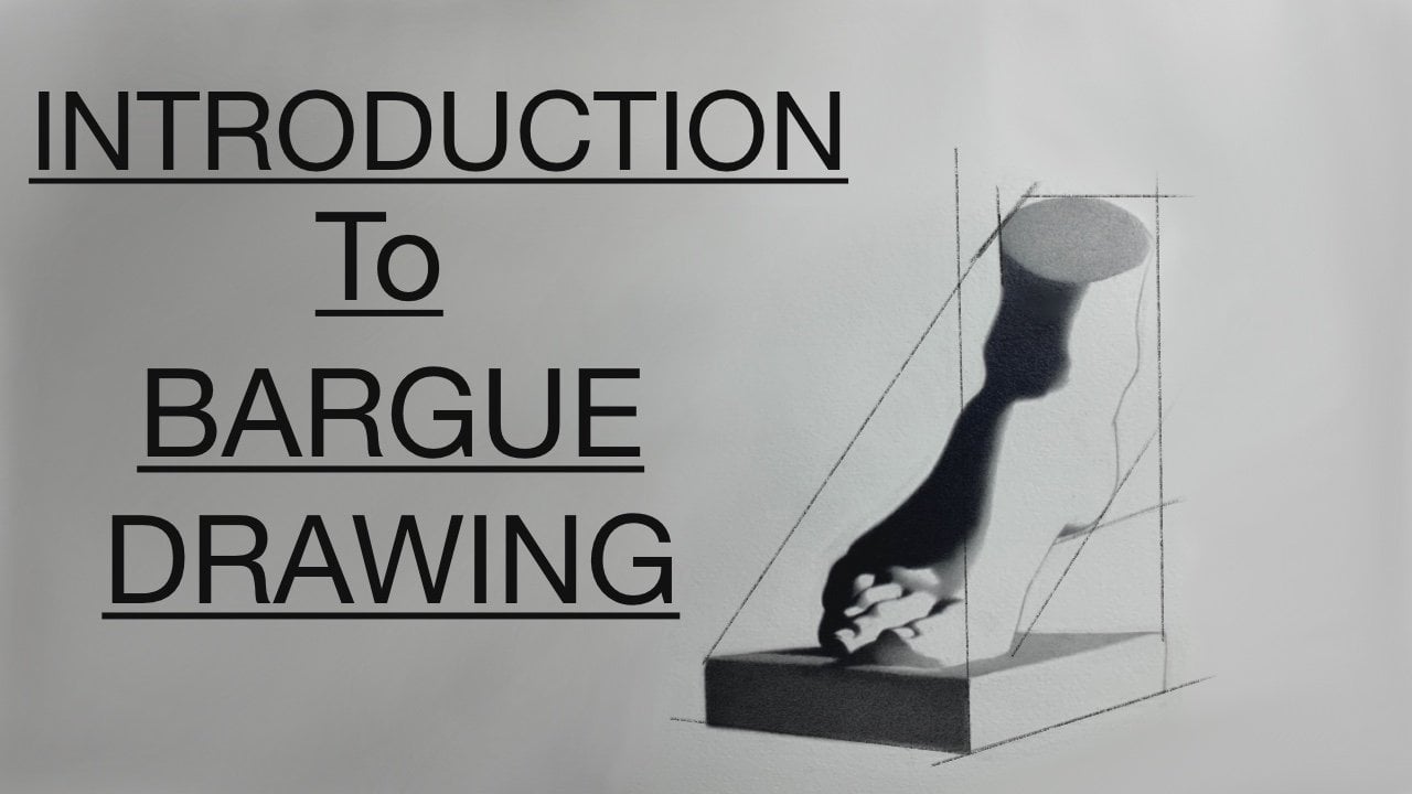
So in this class, we're going to be focusing on a traditional approach
to cast drawing. Now, if this is something
you were to do in a traditional art school
or in a tee style school, these would be sort
of the first projects that you would begin
with as a new student. And really, the ultimate goal is to really just to give you a solid foundational approach
to drawing in general. And the benefit of using
cast is really that you have an inanimate object
that you don't have to worry about shifting or
moving like a model. The other benefit is
that you also have a very high contrast
scenario where we're dealing with a bright plaster cast that is lit with a
single light source, and it just gives you a nice, simple value structure
to work off of. Now, I'll be taking you through a drawing from start to finish, going through all the
different stages in my thought process and how
I get to the end result. Now, the one thing to keep in mind is that,
generally speaking, cast drawings are a
very sort of long sort of approach to drawing where
it may take multiple hours, days, sometimes weeks,
depending on the cast. So in this, of course, you're going to see all of the videos are sped up
for the sake of time. And that way you just
get an idea of how I'm beginning and how I work
through each separate stage, ultimately resulting
in a finish. Now, for those of you
new to this kind of drawing or any academic
drawing in general. We're going to
really focus in on building up the drawing
in separate stages. Now, this will allow us to focus on one thing at a time so that we don't feel
overwhelmed or we're trying to juggle too
many things at once. We'll go from a linear
block in stage to a simplified shadow
pattern stage where we can just focus on
the light and dark effect. From there, we'll move
on to modeling form, and I'll go into detail about my thought process and how I like to think about form turning as light is
hitting a surface. Throughout the drawing, I'll be working on one
section at a time, trying to finish
it as I go along. I'll explain some of the pros and cons of working this way. And ultimately, as the
drawing gets filled in, we'll be talking about how to
make corrections as we go. Some of the things I like to avoid when I do work this way. And Really, by the
end of the drawing, the end goal isn't necessarily to have the
most beautiful drawing, but it's really
about understanding the procedure and the
process and to feel comfortable approaching a
drawing so that you never feel like you're lost or
you don't know where to go. Now, as I mentioned earlier, these kinds of drawings take
a decent amount of time. So you really want
to be patient with yourself and just allow yourself to follow the process and take as much
time as you need. There is no time limit to these, and that's kind of
the benefit of doing a cast or any kind of still life where you don't have to worry about a model that is
going to leave you. So take your time
with the process. And as you work through
each individual stage, it'll become more intuitive and you'll be able to move
a little bit quicker. But for these first
drawings that you do, really just gave
yourself the time and be patient and everything
will fall into place. Now, by the end of the class, the end goal is to have
a completed drawing. And to whatever degree of finish you feel comfortable
with is totally okay. My real goal for everyone
is to not necessarily show you how to model so that your drawings
look like mine, but more so teach you
a process that you can follow that you can apply
to any drawing that you do. How you decide to
finish the drawing is ultimately up to you and
kind of your intentions, as well as maybe style preferences
or anything like that. But really, by the
end of the class, so long as you have something that has a nice light
and dark effect, has a nice sense of form, I would consider that
a very good success. So follow along the best you can and just try and have
fun with the process. Doing these kinds
of drawings can maybe seem a little
daunting at first. But as long as you follow the various stages
that I lay out here, it should be fairly
straightforward, and you'll have a much
better idea about how to approach any drawing.
Thanks for watching.
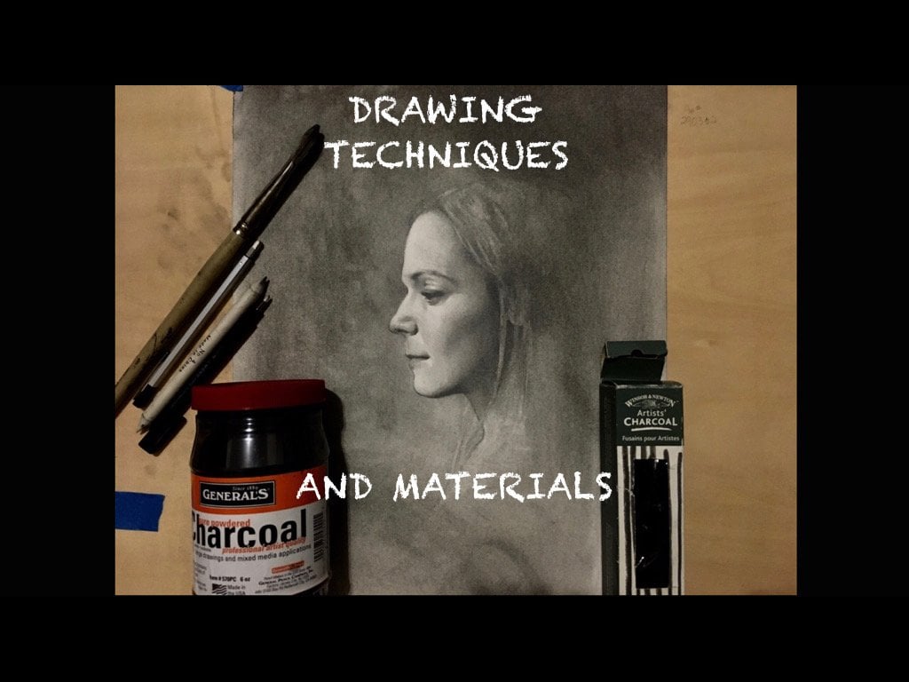
2. Materials : Now, I wanted to just take a
little bit of time to talk about some of the materials that I'm using throughout
the drawing. And these are just going
to be suggestions, and by no means,
do you have to go out and try to look
for any of these? These are just some things that might be helpful
or beneficial to you if you don't already have something you
like to use already. Now, the main thing that
I prefer to draw on is a fabriano artistico hot
press watercolor paper, and that's this large white
sheet that you see here. Now, it's typically sold in larger 2030 sheets that
you can get individually, and then I usually like
to cut them up into smaller pieces so that way
I can do multiple drawings. But It's just a nice
smooth surface. It takes pencil very, very well, and it also takes erasing very well so that if
you make mistakes, you don't have to
worry about messing up the paper too much if
you erase very heavily. So that would be my main suggestion if
you're able to get it. If not, it's not a big deal. There's multiple sort of papers out there
that are available. But I would say you
want to find something smooth and not overly toothy or rough paper as it becomes
harder to model form on. Now, as an alternative, I actually do really like this Strathmore 400
series drawing paper, and it's typically sold
in pads in various sizes. So if you have a preferred size of scale that you'd
like to work on, you can probably find a pad of this in an appropriate size. Now, the nice thing about
this paper is that it's easily and readily available
in art stores online. I've even seen it
in craft stores. So it's a fairly common paper, and it's not terribly
expensive considering you're getting multiple
sheets in a given pad. The other nice thing
about it is that it is a relatively smooth surface, and it takes eracing
pretty well. Not quite as good
as the fabriano, but considering the
cost differences, I think this is a great
all around drawing paper, and it's something I've
used for quite a long time. I've done finished
drawings on it, and it works very well. I usually do my
block in drawings. If I'm going to transfer a
drawing to a nicer sheet of paper or even transfer a drawing from a piece of paper to Canvas, I'll typically do
it on this paper, given that it's not
terribly expensive. So this is a good all around paper for just
about everything, and You know, again, lastly, if it's something that you can't get ahold of or you can't find. So long as you have a paper that is a little bit more durable
and on a smoother side, you should be good to go for drawing for this
particular class. We just want to try and avoid any rough surfaces because
it's just going to be a little bit too difficult
to do any sort of shadows or modeling
in the final drawing. Now, in terms of pencils, I do find that it is personal preference
most of the time. And I would just
say that you would want to use anything
that you feel comfortable with in
the sense of you like how the graphite
feels when you use it. And that's going to be
different for everyone. So I'm not too particular on brands of pencils
by any means. I would just say
stick what feels good to you and kind
of go from there. Now, I will have
some suggestions in terms of the different
kinds of lead that you may want to use as you
are drawing is because I do find that having a few options is beneficial. Now, for those that you are curious as far as
what I'm using, the pencils that I have
here are a Mitsubishi uni, which I've used for quite
a long time at this point, and I just like the
way the lead feels. Then the other is a tomba another pencil that I used
when I was in school. I've stuck with these
over the years. I like the consistency
of the lead. Now, in terms of the
grades of pencils, I would say that realistically, you only really need, I would say an HB, an H, and maybe
like a two H lead, and I find that that is
enough to get everything that you need to make a
full value drawing. Now, if you have a preference, maybe for some softer leads like a B or even a two B for say, dark shadows, that's
ultimately up to you. Now, outside of that. You know, I do sometimes like these lead extender pencils, just because it kind of
allows you to create a little bit of a longer lead than a traditional
wooden pencil. And that's just
kind of a fun thing to have not necessary, but it's something to consider because you can actually get
it to a much finer point, I feel like and have a
longer lead as well. But that is something
to consider. And again, those would come in different kinds of lead
hardnesses as well. Now, mechanical pencils are
also nice to have, you know, just for little small areas where it might be a little bit tricky to get in with a sort
of normal size pencil lead. Having a really
super fine tip can be beneficial for working
in certain areas. So it's good to at
least have a couple of these around and
different size leads. So that would be something
else to consider. But, you know, outside of that, you really don't need
to have everything. It's just have a good set of pencils and you should be fine. Now, in terms of erasers, a standard needed eraser is kind of what I use for the
majority of the drawing, but I occasionally use some of these white plastic erasers, if I needed to take something
out that is very clean, or what's also nice too
is you can cut them into smaller shapes with eraser and make a little wedge
shape and get nice, sort of a fine point that
might be harder with a needed eraser to get a super fine point that
will hold its shape. So these are handy
to have as well. Now, the last thing is
just maybe these sort of eraser pen type of tools. I find that these
are handy as well, but not necessary, but for certain things where you
want to take out, let's say, a highlight, or if
you want to just have more control over an eraser
and a super fine point, those are beneficial too. The last thing I'll
mention is you want to have some sort of
measuring tool. And so my default tool that I like to have is just
this knitting needle. You can get these
at a craft store or just get them online. More importantly, is you
want something that has a decent amount of length on it that will also stay straight. So you don't want
to have something that will bend or twist
or anything like that. You want to have a
nice straight line. So a knitting needle,
a wooden dowel, Something like that just
so that you can hold up and measure to
make comparisons and check angles is absolutely necessary in
the drawing process. At the worst case scenario, you can use a pencil so long
as that it's long enough, but it is sometimes nice to have something a
little bit longer. So I would suggest having
a knitting needle or like a wooden dowel of some kind
to use as a measuring tool. Outside of that,
these are pretty much all the materials you
would need for a drawing. And again, don't worry about having all the
different hardnesses of leads for the pencils. It's nice to just maybe
have two or three. You can do an entire
drawing with them. Now, there are certain obviously
conveniences of having some more tools in your sort of toolbox that you
can pull and use. But for the most part, use what you have
and don't feel like you have to go out and
get a bunch of stuff. We want to just really
make it more about the drawing process and
what that looks like, and the tools are just
kind of secondary.
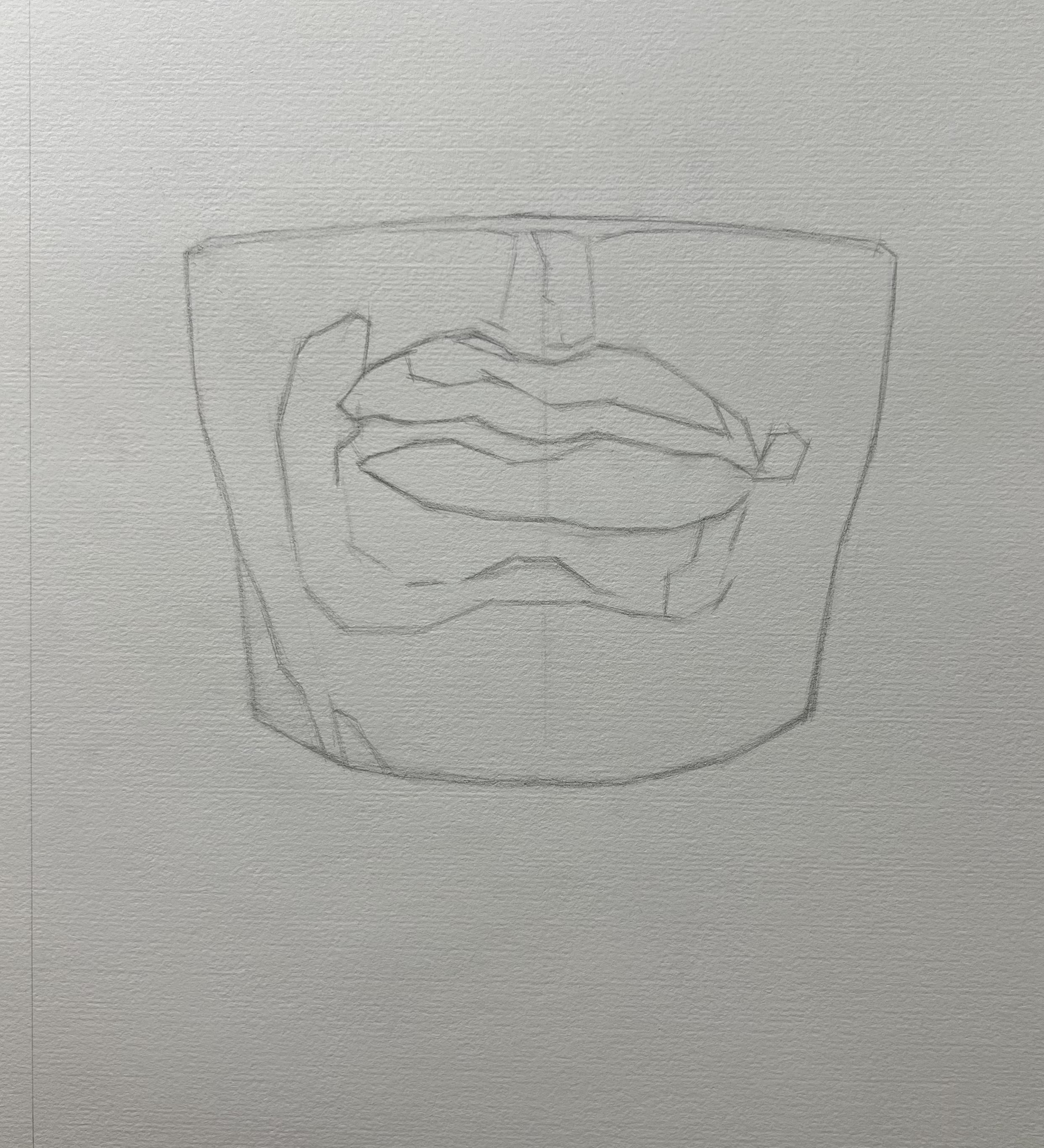
3. Beginning block in 1: So, as we're beginning the
drawing, in my opinion, this is going to be one of the most important steps because the initial marks that
you start making on your page are going to set the stage for the
rest of the drawing. Now, realistically, depending on your distance between
the cast itself, or even if you're
working off of a photo, you want to just keep in mind the general scale at
which you're working. And so depending on the
size of your paper, I would encourage you to
work in a reasonable size, especially if you're
working in graphite. Most of these drawings, you
don't want to go too large, simply because things
like filling in shadows and just general modeling can take quite a while if
the drawing is too large. But nonetheless,
something to consider. So the first couple of things
I want to do is I want to find some landmarks, right? So the thing I want to be
doing is I want to mark off the top and bottom of where I want
the drawing to sit. Now, this can change as I sort of go through this
block in process, but I just need something
visual to give me a guide, and this is just to serve
as a general placement. The next thing, once I
have established the top and bottom is I want
to find some sort of halfway point and realistically what I want
to make a comparison of is I want to find
the relative height versus the width and what
that relationship looks like. Now, the one thing
I'll say is that these early stages is don't be overly committal
with these lines. Try and just get
something on the page because it's obviously one of the hardest things
in my opinion, is just staring at a
blank sheet of paper. So just get something
on the page, try and make a few
quick comparisons, and there's a good
chance that you're probably going to be
adjusting things, and that's okay
because realistically that's what this stage is for. We really before we spend
all this time trying to figure out all
the other components of the drawing, you know, like you know, the details and kind of the general structure
is we want to just get some sort of general silhouette of the
cast that we're working from. And so what this silhouette represents is what we
would sort of call the envelope in sort of the
traditional cast drawing or bark drawing kind of
atelier style of working, this outer sort of perimeter would be
called the envelope. And really what it's meant
to do is it's meant to encapsulate the entirety
of what you're drawing, and then you can work into it. Now, the one thing for
this particular cast, given that it's just a mouth and it's almost like a cutout, not quite a square,
not quite a rectangle, but kind of leaning
in that direction. The envelope of this particular
drawing is fairly simple. Now, depending on the
angle or if it were a different cast or if it were a figure or
anything like that, your envelope would
look very different. But nonetheless, the whole idea behind this is
really just to try and give yourself a perimeter or a border of everything that's going to fit
within the drawing. From there, this is when
I want to start taking extra measurements and finding those height versus
with relationships. Now, you can use a knitting
needle like I'm using here. You can use your pencil
provided it's long enough or any other sort of
tools like a wooden dowel, something long and
straight that you can hold out from a distance and
make proper measurements. And so what you'll see me
do in this early part of the drawing is just constantly measuring against my paper, measuring against the cast, and then slowly starting to
add lines so that I can start breaking this down into some of the simple shapes that I'm
seeing in front of me. Now, I've added a
center line so that I take this large shape
and divide it in half. Now, given the
vertical of the cast, there's the center line is
fairly straightforward. The only sort of axes
shift that I see is really the angle of the
mouth as it's resting on the form of the cast. So there is going to
be a little bit of an angle to the mouth itself, whereas the rest of the cast is going to be
more or less vertical. Now, what I'm
looking for, again, is from that center line, I want to be able to make
left and right comparisons. And so depending on what
cast you're working from, this can change a little bit. But given that this is a relatively simple and
straightforward cast, I don't have to worry about too much because the cast is
facing directly towards me. So in this particular instance, I'm going to be looking for
the nodes of the mouth. That way I can find a
specific axes line and make sure that things are in the sort of facing
the right direction. Things are tilting
the way I need to. And I'm going to go ahead
and just measure before I put down any lines
so that I'm at least, trying to be as accurate
as I can at this point, but knowing full
well that things might shift or adjust
as I continue to work. And so as I find the
corners of the mouth, I can use as a way of measuring and testing
myself as I'm pulling an angle from the
corner of the cast and seeing where it relates to where I think the mouth is. From there with
the two points in, I can essentially
build an axes line, and you'll see me do this a lot where I'll
take one corner of a drawing and try and make a comparison to something
else in the drawing. That way can gradually build up my proportions by checking all these different points
against each other. In this particular instance, with the two nodes
of the mouth here, I can essentially build
that axes line so that I have a good idea about where
the lips are going to sit. Now, that works for
this particular drawing being that again, it's straight on
and the lips are the only axes that I
have to think about. But this is something I would be doing for pretty
much any drawing. When you think about,
let's say, you know, how the eyes on a
portrait relate to one another or the way you know, a set of shoulders
compares to each other or where the hips compare
to each other. So regardless of
what you're drawing, all of these sort of
measuring principles apply. So now, with an axes line for the mouth and a center line, I can essentially use those as a tool to build out
the rest of the mouth, since I'll have a very
distinct division of left and right,
and realistically, if I were to draw the axes of the mouth all the way across, I would essentially
have quadrants. Now, they wouldn't
be symmetrical because of the
angle of the mouth, but that's something
to think about. Any way that you can divide
sections of your drawing. Make it a little bit
more manageable. And this is kind of where
you would see in a lot of, you know, old master drawings or paintings or
things like that. You would often
see grids, placed. And that's really just used
as a placement tool and a way of measuring and making comparisons from all
over the picture. Now, given we're just focused on this one small
element of the cast, I don't need to go to
those sorts of extremes, but it is something to keep in mind depending on
what you're working on. Now, in terms of flushing
out the lips themselves, I'm not trying to think
about it too much. I'm just squinting down, looking at the
relative shapes that I see trying to use straight
lines to construct them. Now, I am obviously ignoring shadows and things like that, and I want to just get the
general shape that I see. But again, I'm not looking for anything too
specific just yet. Again, this is all very general because we're in
these early stages. So we want to just
have the freedom to move things around. If something feels off, I want to go ahead
and analyze it, and if it needs to be taken out, then I can go ahead
and remove it. But for now, I'm just trying
to put down some lines and trying to do my best
to get the correct angles. And then from there, once
I get more information, I can make direct comparisons and make the adjustments
if necessary. Really, the big
theme of beginning the block in is to
start very slow, take your time because this is the initial framework that'll set the stage for the
rest of the drawing. If you rush this step, all that means that you're
going to probably have to go later on and
make corrections, which are going to
be a lot harder depending on how far along
the drawing you get. So if you invest the time up front right now
in this block in, I'll save you time in the end when you get towards the filling in shadows and
modeling form because you won't be worrying
about a lot of the proportional things that can really affect a
drawing early on. So the thing I'll always repeat sort of add asm
in these early stages of the drawing is really
take your time and make sure everything is correct as you can
possibly make it.
4. Continuing the block in: Continuing along. I'm
still going to stay in this general phase for quite a while until I get
more information established. So I'm not too
concerned about getting specific with contours
or anything like that. I really want to just continue and add information slowly, make the necessary
comparisons and the spacing about how everything is sitting
on the cast itself. And if I see things that
need to be adjusted, I want to go ahead
and do those right away and then try and resolve
the rest of the drawing. Now, this will be
different depending on the drawing
you're working from, how large you're working, how much information
you're putting in. But regardless of that, the process is going
to remain the same. So I want to be making
comparisons as much as I can so that it hopefully allows me to dial in the
correct proportions. And so, while, even
though there's a decent amount of shadow
on the cast itself, I want to try and see past that. So if I see forms that
are buried in the shadow, I still want to try and just draw them anyway so that I have a good idea about where things are actually
sitting in space. Now, you'll see as
I'm continuing, there might be little
things in terms of the height and width relationship
that need adjusting. So I want to go ahead
and account for those. But as I put information in, if something jumps out
glaringly, you know, right away to me, just
something feels off, I want to try and address it. So in this particular
instance, you know, making sure that the outside is the right proportion in relationship to
what I'm seeing. In this case, I feel like
it needed to be adjusted, so I'm maybe just
whiting it a little bit, may have to add
things here or there. Now, this will
happen as you kind of continue to add
information in the drawing, and this is the whole reason
that we want to stay in a non committal stage and keep
the graphite or, you know, whatever you're drawing with,
keep it very, you know, light in these initial
stages so that these corrections are
not a daunting task. I think the hardest part, especially as you're learning and just getting started with this kind of sort of process is just trying
to be objective. And if something
just feels right, what I end up doing a lot of the times is if I need to make a correction is
I'll go ahead and make the correction first. I'll leave my mistake in the drawing at the
same time because I really want to see
a direct comparison of what I'm changing. If you just rush in and sort of erase mistakes before
you correct them, then the amount of
information that you have at your disposal to make
an correction is a ti. So I would say that as you work on your drawing in these stages, if you find mistakes,
it's totally fine. But leave those
mistakes in there, make your correction first
and then go ahead and remove that mistake so that you have a very clear idea about
what you're changing. Now, as I start
adding information, and I start to gain a little bit of clarity about
the proportions, I still want to go ahead and
as I add new information, I want to go ahead and
retake measurements, make sure that angles
are sitting properly and make comparisons to other pieces of information that I'm seeing. And I'll continue this
process until I feel really good about the overall placement and proportion of everything. Now, the nice thing
about doing a cast and a simple cast like
this is there's not a whole lot really to make
comparisons because there's only so many elements
that I have to work on in this
particular instance. But if it were something more complex or anything like that, I'd be doing the same thing. It would take a little
bit longer to make measurements and
comparisons for everything. But as I feel good about where I have placed in the
drawing right now, go ahead and start cleaning
up some of the lines, and realistically from here, if I'm kind of removing the shadow as part
of the equation, and I'm just looking at the lips themselves and how they're
sitting on the cast, more or less the key elements of the drawing are on the page. So this will allow me to be very objective making left and right
comparisons and seeing the sort of spacing
between the lips themselves and relationship
to the sides of the cast, the chin itself, which is on
this particular cast itself, it's actually kind
of large the chin. So all of these little things, I can kind of start
making a comparison, and Once I feel good about that, I can maybe add elements
of the shadow in the cast so that I can see how that's going to sit
before I continue along.
5. Mapping shadows: So with the basic
drawing established, at this point, I feel okay to start mapping
out the shadows. Now, realistically, I treat this as another component
of the drawing, and I'm going through
the same process again, except I'm just focusing on the shadow patterns themselves. Everything is still
done in line, and I still want to go
ahead and measure as I place the shadow patterns
on what I have so far. Nothing has really changed at this particular
point because I'm not thinking about tone or
edges or anything like that. I'm simply just looking at
the drawing objectively, looking at where the shadows
are sitting on the cast itself and trying to copy those
shapes as close as I can. Once I have the actual
shadow shapes established, then I still want
to go ahead and review the information
that I've put down, making sure that the
proportions still look correct. Things are sitting
in the right place. And what I'll also do a lot of the times is squint my
eyes down to try and simplify the shadow
patterns so that I don't get caught up
in too many details. Now, this certainly will be different for every
drawing that you do, but again, the process
remains the same. So even if I see something that is maybe
a dark half tone, it's like it's not
quite super in shadow, but it makes a distinct
enough shape as a half tone, then I might actually go ahead and account for that
and make a small shape. Now, again, this will vary
from drawing to drawing and how significant the
light and dark effect is. But again, If there's
any information at this particular
stage that you feel might benefit you by
putting in the drawing, go ahead and put it in there. You know, as long as you're
drawing light enough, you always have the freedom
to take it out later. But if there's something
that stands out to you as a significant shape
or something that looks prominent that
you might be able to use to help gauge other
things in the drawing, go ahead and put that
information in and make that decision later if you decide to keep it or remove it. Now, another thing to consider, and this is more of just
a personal approach where there are elements of the cast where I see
lots of reflected light, and those are the areas where the brightness of the
cast is actually making a reflection in
the shadow and you see lighter portions
in the shadow itself. Now, obviously, I'm aware
that they're there, but I like to sort of keep them out of the drawing at
this early stage because what I really want to
try and capture is the overall graphic effect of what I'm seeing and where
the shadows are sitting. Now, again, this is going
to be a personal choice. If you feel like mapping out the reflected light
is going to help you, then go ahead and put it in. You know, in this
particular instance, the shadow shapes themselves
are relatively simple, and I don't have to really
think about it too much. If it were maybe a more advanced cast or
anything like that, it might be something
to consider. But sort of again, that's a personal choice. But realistically, just think. And again, squinting your eyes
can help a lot to simplify some of these
shapes down so that you get that nice
graphic effect. And then from there, we
can decide to go back in, and if we need to make
small adjustments to where the shape is or maybe
there's more, you know, there's more undulation in the shape or little things
that are standing out, go ahead and put in the
things that you feel are necessary and that might
potentially help you.
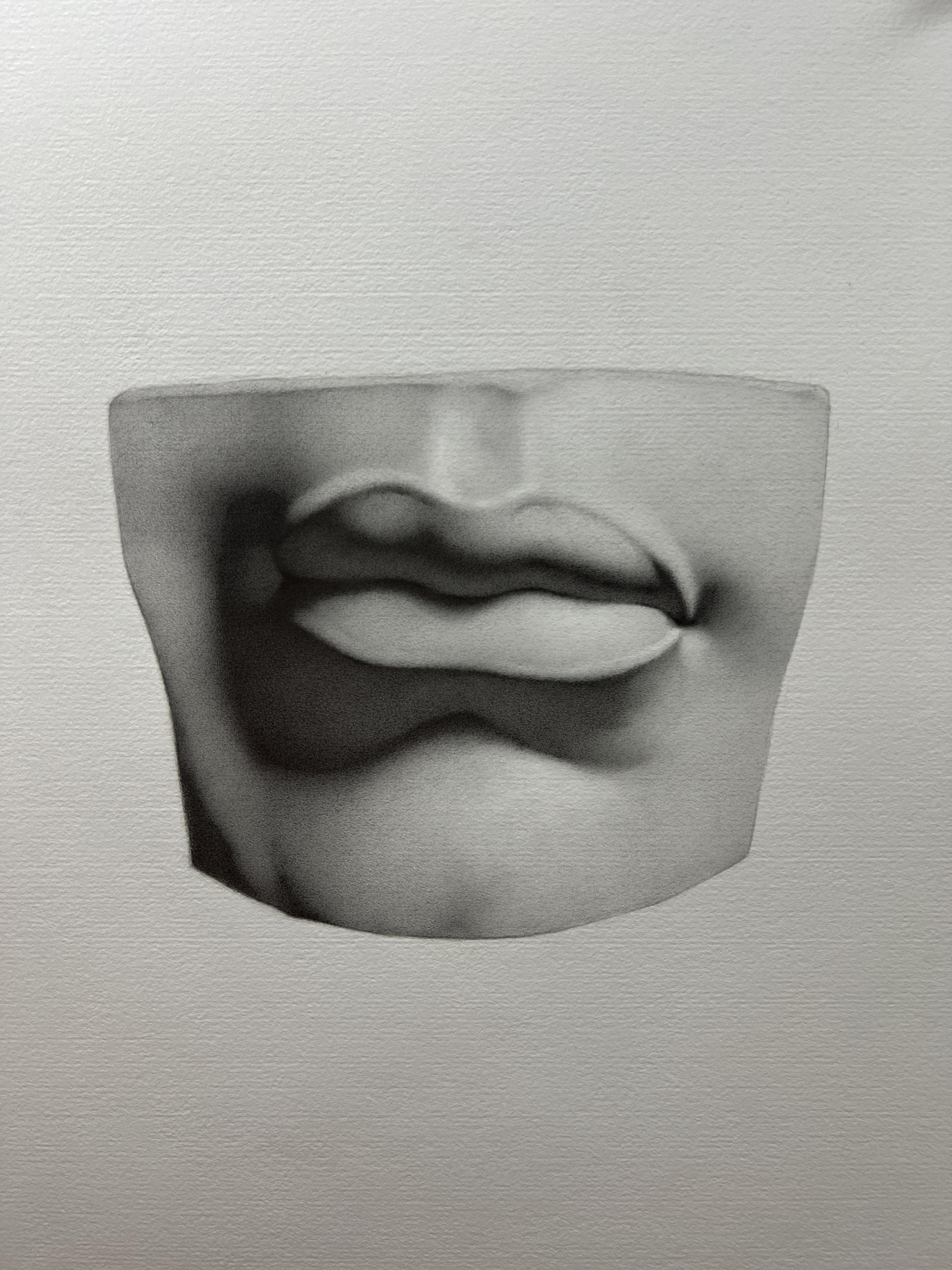
6. Finishing the block in: So now that we've filled
in the shadow patterns, I can more or less start to refine what I have on the page. Now, this can mean
a lot of things, and I would say everyone's sort of finish blocking
will look different. And a part of that is not only just the way you
draw, but also too, what kind of information that
you feel is necessary for you so that you have
a clear understanding about where to go from here. Now, the one thing I'll do
in regards to finishing a block in is realistically start
cleaning up the drawing, and if there's any little bits of information that I put in maybe at an earlier point that no longer need to be there, I'll go ahead and
take those out. If I feel that any
of my lines have gotten too thick where
they're almost kind of like a small edge or maybe certain lines have gotten a little dark or anything like that is I gradually take an eraser and start to
trim those lines down so that I have a clean or as clean of a block in
as I could possibly get. Now, again, this is going to
look different for everyone. So, you know, you can use my drawing here as
an example of what I might consider
a completed block in that's ready to take
to the next stage. But again, this is going to
look different for everyone. Now one thing you'll notice is that I do try and
maintain a lot of angular straight lines
throughout the drawing as for me that always sort of
has a sense of structure. And I find that helpful for me. And the thing is too, is
that one thing I will say is that as you start
adding tone to the drawing, things will naturally
start to soften. So while some people
will see this and say, like, Wow, that's really
sort of angular and, you know, kind of
squarish looking or anything like that,
that's totally fine. Again, there's going to be certain things that are
going to look different for you and how you draw and,
you know, everyone else. But The key takeaways that I would say is
that you want to account for all the
information that you think is going to be
necessary for the drawing. So obviously, at this point, we've measured
height versus width, proportions, angles, we've
mapped the shadow patterns. And I've tried to include
any other information that I feel that is going to be really necessary
for the drawing. Now, again, this will depend not only on
your drawing style, but also the cast that
you're drawing or, again, whatever you're drawing. This is going to be
different for everyone. So as long as you feel
comfortable moving to the next stage and
you feel like you've accounted for everything
that you might need, then you're going to
be in a good place. Now, the one thing I'll
say is that it doesn't mean that there's not going
to be corrections that still may happen over the
course of the drawing. But I would say
an ideal scenario is that you've done
your best to try and account for any
proportional things that are going to
be glaringly off. There's always going to be
little things that sort of pop up as you continue to
work on the drawing. And again, this is also one
of the important reasons why it's sometimes good to
kind of take long breaks, get away from the
drawing, you know, come back another day with
a fresh pair of eyes, reassess the drawing before you go on to the
next crucial stage, because at this point, as we begin to maybe add some
tone to the drawing. We are getting to that
sort of predicament where if there's
any changes that need to be made that
are significant, we want to try and
avoid having to do that while there's any sort of
dark tone on the paper. So that's just something to keep in mind as you're working. I have no doubt that
there's going to be little things that I
fix along the way, but I want to feel
good about what I've established so far and that everything is more or less
in the right place and the shadows are accounted for and any other little
thing that again, might be something that
might give me trouble later or anything that I've
made sure that I've kind of included that in
the block in stage. Outside of any of those
things I mentioned, again, the last thing I'll emphasize is try and make the drawing at this point as clean as
you can possibly make it. So if that means having to trim your lines down
with a very, you know, sort of pen style eraser or
if you have to maybe just pat your eraser down on
certain areas to just lighten the overall look
of some of the lines, go ahead and do that
because at this next stage, we're going to be
adding some tone, and we want to be
able to control everything in a very nice
and organized fashion. So anything that jumps out is too thick or too dark in
terms of line quality, we want to try and resolve that before moving forward. Okay.
7. Block in checkpoint: So at this stage
of the block in, everything should be a very sort of simplistic line drawing. I would say realistically, this is the most
important aspect of the drawing and you'd want to spend a good amount of your time really
perfecting this stage. Now, this is going
to mean different things to different people. But what I would say is
you want to have a very clear and concise
two D drawing that shows all of the plane changes or a little angle
breaks in the drawing, mapped out shadows,
no tone whatsoever, but you really want to make sure that everything is
clearly laid out for you so that as you enter into the next stage of
flattening shadows, you have a very clear idea about where the
drawing needs to go. So depending on, you know, which cast you've
chosen to draw, you really want to just
have as best you can, a nice, clean line drawing. Now, this means you
may want to clear up any lines or edges where
they might be too thick, erase any imperfections and try and just get it
as best you can. This is going to be important
only from the standpoint that this is setting the stage for the
rest of the drawing. You don't really
want to have any second guesses about any of the proportional or
measurement issues that you may have in
the very beginning. You want all of that resolved so that as you move on
to the next stage, you don't have to think about
those things and you can focus on the next stage itself.
8. Values concept: I wanted to do a
short little video about the concept of value
and how I like to bring values up using
graphite as I feel that it might be helpful
for some people who haven't done a lot of
work in the medium. Now, the one thing to keep in
mind is that with graphite, there are lots of
different hardnesses of lead ranging from the middle
ground of I would say, H B all the way up
to 2b3b4 b and, and then also going
in the hardness scale with HHH, et cetera. So depending on how you
build up your drawing, it's nice to have a variety of leads for different reasons. Now, generally speaking,
as I'm working, a lot of the times
I'll be filling in shadows with
initially an HB lead, maybe a B, depending on
how dark I need to go. And then as I continue
to build up the value, I will start using harder
leads on top of it, like an H or even a two
H in some instances. This is also true as I build up values in the lights as well. So that's not including shadow values and
things like that, but this is also including values in the light
side of the form. Now, the other thing
to keep in mind is that value is essentially
a relative thing. And now, because we're using essentially pencils and paper to try and create a three
dimensional effect, we don't have the expansive
range of nature per se. We're very limited
by our materials. So in that sense, we have to work in a finite
range of compression, meaning that We need
to establish a range that we can work
in so that we can create the effect
that we're after. So if I establish a value, if let's say for the
shadows, for example, then that's going to be
sort of a range that I'm establishing for my mid
tones and my light values. Now, the darker that
shadow value is, the more expansive of a
range I have to work with. The lighter that
shadow value is, then the lighter my overall
mid and light values are going to be as well. Now, the important reason
to know all of this is because by understanding
that value concept, it allows you to create
different effects. So if I wanted a really sort
of high contrast, you know, sort of chiaroscuro
effect in the drawing, I would aim for a very
dark shadow value. And that would sort of
expand that range so that I would sort of have
everything in between, let's just say a
black all the way to, let's say, a white highlight. Now, if I wanted to create a different sort of
atmosphere or effect, my shadow values, for example, could be a lighter
overall value. And then that means
I would also have to lower my mid and light values. So when you start
looking at, say, softer drawings or anything
like that, that you know, maybe they don't have
a full value range, but having more of a
moderate value range creates a different sort
of feeling and effect. Now, one of the reasons
you see in a lot of these academic drawings
like bark drawings and cast drawings as you have this full value range is the
larger range that you have, let's say, using, let's say
black as the darkest value. It just gives you a
lot more freedom and opportunity to turn
form as you're working because you have this very dark range that
you can build out of and roll into a light piece of form working up
to a highlight. Now, if it were a more
moderate value drawing, it doesn't mean that you
couldn't necessarily do that. It's just you have less overall resources
to try and create that effect because
the darkest value may not be very close to black. So that's something to keep
in mind as you're working. Now, again, in the context
of what we're doing in this exercise of a cast drawing, we're going to have a full
value range to work with. But let's say you're working on a personal project and you want to have a different kind of
feeling to that drawing. Then, you know, that's kind of where you have some
wiggle room to decide the overall value range
that you want to work in. Now, the one thing to keep in
mind with graphite, again, as I start to fill in
a shadow shape with, let's say, an HB or an H lead, I don't like to go too soft
when filling in shadows, and that's just a
personal preference because the softer the lead, what ends up happening
is that you have all of this grain of the paper
that affects the lead, and it just means you're
going to have to go back over that shadow multiple times in order to completely
flatten it. Now, again, depending on the
effect that you're after, you may want some of that
grain to come through, but it needs to be consistent. So if it's, you know, flat in other sections of
shadow versus the other, then it kind of breaks the
overall effect of the drawing. So what I would be
aiming for is a nice, even flat shadow. And so you can see here and
what I've built so far, there's still some
of that grain of the paper that's
showing through. And for this
particular exercise, I would aim for something
that looks more flat. And so how do we go
about doing this? And then this is where other
leads become important. So for example, a lot of
the times in my drawing, I like to start with an HB and then gradually just
darken as far as I can go. And then If I still see some grain kind of coming
through that shadow shape, I'll switch over to a
harder lead, like an H, and in some instances, a two H. It really just depends. The other thing to
keep in mind is as I'm building up
the shadow value, I'm never pressing too hard. All I'm really doing is
just gradually layering it, but I'm never trying
to force my way into a dark value because
what'll end up happening is if you push
too hard on the paper, you could very well
score the paper, and then you'll see those lines. If you kind of were to hold
your drawing in the light and if you press too hard
to create a dark value, you kind of score the paper, and that's something that
we want to try and avoid. So my general practice
to build up my shadow, to try and get it nice
and even and flat, start with about an HB and then keep going
as far as you can. And then if it's
still not quite as flat as you'd like or
as dark as you'd like, gradually layer in an H, maybe in a two H,
if you have to, but I find for me, I can get fairly close to a black value with an HB
and an H. I've never really felt the need to go to
something like a B or a two B to really get
those really dark values. It's certainly maybe
helpful to have some softer leads
for dark accents. But I find with just
those two leads, I can get mostly
what I need from my drawing to where I don't
have to deviate too much. That's just something to keep in mind as you're building up your shadows and we move on to the next stage
of the drawing.
9. Flattening shadows: So I wanted to briefly discuss
the concept of flattening your shadows from the
initial block in stage. Now, our main goal
here is ultimately just to create a very simple
light and dark effect. I'm not going to
be thinking about edges or anything
too fancy like that. I want to just keep it
very simple so that I don't have to juggle too
many things at once. Now, I do want to account for some of the reflected
light that I see and maybe any details that could potentially get lost. This will vary from drawing to drawing and kind of your
personal preference. So do what feels best for you. But ultimately what
we want to end up with is a nice simple
light and dark. Now, how you choose to build
up the value is up to you. I'm starting off with the HB lead as my
darkest sort of value. Now, you could prefer
to start with a B. And then as I kind of
fill in the shadows, I'm going to gradually
switch over to an H in a two H so that you'll see as you start to fill in
large masses of graphite, you're going to
be left you know, maybe some potential noise
or grain in the paper. And the way we want to
work around that is we want to just keep layering
the graphite slowly. So as I kind of exceed
my range with an HB, then I'm going to switch over to an H and then maybe
in certain areas a two H so that I can get as flat of a shadow as
I can possibly get. Ultimately, I do think there's a personal preference
for how flat your shadows do get and how much time you want
to spend doing it. I will say that
darkening a large piece of shadow in graphite can
be rather time consuming, so you're not going
to see me fill this in from start to finish. So Realistically, though, depending on the
size of your drawing, it could take a few hours just to simply flatten a shadow. That said, I will say that it is worth investing
the time up front because that initial
value that you establish is going to set the stage for the
rest of the drawing. So depending on how light
or dark you go is also going to establish the range in which you're going to
be able to turn form. Now, the nice part
about a cast is that it's obviously a bright
white sort of plaster. And then, so we get these really nice high contrast shadows. So we want to use that
to our advantage. And I would say, try and
aim for a darker value, maybe even darker
than you think. You may not want to go to a jet black because
you want to still have some room for any accents that are deep in the shadow
or anything like that. But get it dark enough
so that you have the nice range to work into as you build out
into your lights. It's just something
to think about. But the next video
I'll show you kind of where we end up with
and then go from there.
10. Shadow values explained: So you can see here after
filling in my shadow, this is ultimately what
I left myself with. Now, you can see that I've
gotten relatively dark, but I've left myself
some room for the reflected light that
I see so that I at least have a little bit
of play so that if I need to make some adjustments
or anything like that, I'm giving myself
some breathing room. So now, depending on the cast that you're
working from, you know, you do want to account
for things like reflected light or any
little potential accents. Ideally, the goal is that if
you feel that there's going to be any areas where you could potentially get lost
in the shadows, give yourself a little
bit of wiggle room so that you at least
have some lines or some areas that you leave a
little more open so that you can work on them later as you get further along
in the drawing. But you don't want
to just completely obliterate the entire shadow
with just a single value, if you do have things
like reflected light or any accents that you
may want to put in later. Now, all of that said,
you can still see that in the darkest portions of the shadow on the left
hand side of the drawing. I've gone relatively dark. And now, even though
this may appear like a black value on screen
in person and in reality, given that it's an HB lead, there's still quite a
bit of room for me to go into if I need to go darker
later down the road. And so the idea is
that you don't want to completely exhaust
your value range and get a jet black value in the shadow right
out the gate. You want to give yourself
that room to have a few more little bits of
darker value if necessary. But you do want to go
dark enough that again, you're establishing
the overall range so that as we begin to work into the lights and start to model the form
around the shadows, we have enough of
a range to really establish the turning of
form to a good degree. And again, the
important thing too, you can see is I've left myself a good bit of room for
the reflected light. And odds are, I'm going
to go back in and make some adjustments to the shapes so that they're a
little bit closer. But the way I look at it
is in this early stage, I'm still being
somewhat cautious, and so I want to
just give myself a bit of play in those areas so that if I do need
to make let's say the reflected light at
bit smaller or larger, I have a bit of
room to play with, and I'm not overly
committing too soon. And realistically for this
particular area, you know, the shadow shape itself
is relatively simple, so I don't have to worry about
too many details per se. If this was a more complicated cast and let's say there was, like, you know, hair or, you know, let's say
if it was, like, a figure related cast, then, you know, things might be a
little bit more complicated. But given that it's a relatively
straightforward shadow, I can kind of keep track of everything in a very
sort of confined area. So again, just kind of trying to make sure
that I'm accounting for any things like
reflected light and just giving myself a little bit of extra room to play just in case. And again, the last thing I'll mention is that this was all brought up with an HB
lead, believe it or not. You know, I didn't really use
a B lead or it actually is just an HB lead followed by some H and two H
in certain areas. So again, you don't
necessarily need to pull out the really
soft pencils like a B or a two B to get
a dark enough value. The whole point of building up the value
slowly is that you can still gradually use an HB
and get a dark enough value, you don't have to really dig in there and use a softer
lead to get this dark. So again, it's really just about slowly
building up the values. You never want to
rush in and just try and push harder to create
these darker values. You want to just
gradually build them up, which is why it can
take some time. Now, all that said, though, given that I have a nicely
established value now, It's less thing I have to worry about as I move forward
in the drawing. So from here on out, we can really start to focus on just building out the forms, and I won't really
have to come back to this shadow too
much at this point. Now, later on in the drawing, I may kind of do some
touch ups here and there, but nonetheless, at this point, we can start moving on to the
light side of the drawing.
11. Flattening checkpoint: So, at the end of the
flattening stage, what we want to have is a nice, simplified poster effect of the light and dark patterns
that you see on the cast. Now, the one thing to keep in mind is that you
do want to have your shadows dark
enough so that you're creating yourself enough range
to work into the lights, and then you can get a
nice rolling of form as you reach to the brighter
portions of the cast. Now, the tricky part is is
that you don't want to go so dark that you don't give yourself any room for
any dark accents or, let's say, reflected
light in the shadows. So it's kind of trying to find a balance where you
go dark enough to where you do set yourself up to work into the lights
and a reasonable pace, but you still want to
have a little bit of room left over to go
back into the shadows, if necessary to hit any
really dark accents. So what we're trying to do is
just give ourselves enough of a base to work
from so that it makes working in the
lights that much easier. But we don't want to go so light that we're going
to have to basically go back into the shadows and basically go further
and further with them. And then it's like
we're working on two parts of the
drawing simultaneously. The idea here is that
we want to complete each stage as its own
individual process. That way we can focus
one thing at a time. From there, once we have
that nice shadow stage, we really just want to
focus our attention on the lights until we get
all of the forms resolved, and then we can maybe revisit certain things after the drawing
is completely filled in.
12. Intial form pass checkpoint: Now, before you begin
your initial form pass, you may want to take a moment
and really decide where you want to begin the drawing before you get too far
ahead of yourself. And what I mean by this is, is you want to find some
sort of strategy in the drawing so that
you're not just jumping around from
place to place, trying to solve different
areas simultaneously. And you'll see how I work in the videos that I
start to strategically work from one area and
try and resolve it from start to finish as best
I can before moving on. Now, the way I like
to think about this is starting
from, let's say, a dark shadow that will ultimately reach to
a brighter passage. That way, I have a
good sense of what the form is doing from a
dark to a light perspective. Now, this is going
to be different on every single drawing. So I don't want to make any sort of blanket rules or
anything like that, but it's something to
consider before you start. So depending on which cast you're drawing and depending on the lighting scenario that you decide to go ahead
and work with, You want to sort of plan out your drawing and how
you're going to model through the various sections of the drawing before
getting started. That way, you're getting a
little bit of a roadmap for yourself and you're not just jumping back and forth
all over the place. In the videos, I'll kind
of talk about what I like to do in the particular
cast that I'm drawing, and you'll watch me go ahead and work that from beginning to end.
13. Beginning the form pass: So now that our shadows
are fully established, we can begin the form pass. Now, the one thing I
want to mention is that there's a couple of ways that you can
approach doing this. Now, one thing that was always explained when I
was in school is that you would maybe want to start the form pass in an area
of the drawing where you would have a darker value shadow that would work all the
way up to a light source. Now, depending on the drawing and the cast and the
lighting scenario, this may not always
be an option. So realistically,
it's kind of what you feel is the best
option for you. Now, my suggestion
and this is more of my own personal preference
is I'm always a fan of working out of a shadow
and connecting it to other areas in the drawing that will gradually
lead towards the light. Now, some people like
to maybe start on the light side and gradually
work towards the dark. It really is a
personal preference and kind of what you
feel comfortable with. For me, I've always felt it a little bit easier
to just gradually build out of a shadow and slowly start to turn
the form as I go along. Now, again, depending on the area of
the drawing, for instance, in this cast, this left side
is rather dark overall. So that's an area that I feel a little bit more
comfortable with, and I'll be able to connect
the lower shadow here in the lower left hand corner
to the shadow in the mouth. So it's going to be a very
easy bridge for me to make. Now, once I get to the right
hand side of the cast, there's a lot less shadow that's available for me to work out of. So, in my opinion, for this particular drawing, the right hand side of the cast is going to prove to be a
little bit more challenging. So as a weight of
just warming up my hand and getting
started with this drawing, I'm going to start in
this lower portion of the shadow and gradually work sort of clockwise as
I build out the drawing. Now, one thing I'll mention
is that as I'm working, I like to stick to one area
and gradually finish it as I go before I start creeping up around to the
next section of the drawing. I try not to jump
around, you know, from one side of
the drawing to the other or skip over
to certain areas. It's just in my opinion, it's kind of just a bad habit. But you know, it is ultimately
a working preference. But for this style of
drawing, I would say, stick to an area and
just gradually work in sort of stages in one area and gradually
move on to the next. And so you want
to try and finish each area as you're
modeling in the light. Get it as close to finish
as you possibly can. Now, I understand that's
much easier said than done, but that is sort of the
mindset that you want to give yourself as you're working in the light
side of the drawing. Realistically, by the time
the drawing gets filled in, you're going to probably
have to go back into other areas you've drawn before and maybe make
some adjustments, and that's totally
normal and expected. Now, the nice part
about working this way is that you're
sort of gradually see the drawing coming to
life as you're working because you're taking that
time to finish off sections, and you're kind of just carving this form out with your pencil. And it's kind of a
satisfying effect because if you were to just
sort of jump around and not really build up an area, you never really get
that gratification until the very end where you're
kind of finishing everything. But by gradually working
from section to section, you're able to kind of see
the drawing slowly evolve to a finish resolution in
small pieces at a time. So it does take perhaps
a little bit longer to see that final effect because you're sort of
finishing as you go. But the trade off is you actually get to see sort of
the drawing come to life, you know, as you're doing it. So what I'm thinking is, as I'm sort of building
this out with my pencil, I'm always asking
myself in my head, where is the light source and this particular
portion of the cast, where is it facing and how
is the light affecting it? So I'm not necessarily chasing a specific value for the light areas of
the drawing per se, but I'm always asking myself in the back of my mind, you know, how is the light source hitting this piece of the cast
in this particular area. Is the portion of the cast facing away from
the light source. What orientation is, you know, is it facing upwards,
downwards, left, right? So I'm asking myself
those kinds of questions so that
I'm not getting caught up asking myself like, what value is this? Because ultimately, we can't necessarily just copy
what we're seeing because we just
don't have enough bandwidth with just pencil
and paper to do so. So we kind of have to think
about what range we've established with our shadow
pattern and realistically, sort of how is the
light affecting the form that we're working on. And if you approach it
from that mindset and you eliminate sort of just
the question of value per se, in one sense
simplifies the process so that you're not getting caught up with what
you're seeing, but you're sort of analytically approaching the drawing from a standpoint of how is the light affecting this object in space? That might sound confusing
at first because most people approach the
drawing process simply from, you know, what
value something is, what kind of edge quality
is and things like that. And that's totally fine. It's sort of a different
approach to drawing. But, you know, as we go along, I'll kind of explain this
concept a little bit more. But the way we want to
sort of approach this is that we don't want to
just copy what we're seeing. We're kind of
interpreting what we're seeing based off of
what's in front of us. But I'm trying to
think about again, how is the light
hitting this area? What is happening in space
in this particular area, and then try and draw that. The other way to think
about it is think about if you were sculpting
this out of clay, except we're just using
a pencil instead. So we're trying to just carve out each little section slowly, and sort of each pencil mark, as we work through
various portions of the drawing is trying
to describe that. And so you can kind of see that maybe concept in
the sense of how I'm just drawing in tiny
little sections as I go. Now, granted, this drawing is sped up significantly
because otherwise, this would be a much,
much longer video. But nonetheless, you know, you can still gradually
see me just sort of chisel away from section to section. And I'm going to
essentially be doing that throughout the
entire drawing. And, you know, towards the end, I will go ahead and have to go back in certain areas and do
touch ups here and there. But, you know, as we get started making this initial form pass, I'm just going to
be working slowly up down this left hand
side of the cast. And again, just trying to finish each little
section as I go. In terms of the pencil I'm
using so far in the light, most of it's going to be done
primarily with an H lead. And then as I kind of
finish through that, I'll use a two H. And
in some instances, I may even pull out a
four H. Now, again, because I'm trying to
finish as I go along, As you start filling
in passages, you will end up with
little specks of graphite. And so you'll see me
take my eraser and just gradually
pick out any dots, and that's just so
that I can keep everything nice and clean. The more noise you
have in the light, very similar in the sense of the shadow is it will kind of break the illusion of
that form in the drawing. A little inconsistencies
as I'm putting the pencil down or
any little dots. I'll go ahead and pick those out so that I can keep
the drawing clean.
14. Form Pass continued: So as I continue to
build out this area, one thing you may
start to notice is that this value to you might appear to be
on the darker side, even though it's in the
light side of the form. Now, again, the thing we're
trying to avoid thinking about is I'm not concerned or thinking
about the value per se, but again, more about where
this piece of form is in relationship to the light and how it's being
affected by the light. The other tricky part about drawing this way is
that because we're working in such a small
section is we don't really have a whole
lot of context about how this area I'm
working on is going to look in relationship to the other parts
of the drawing. So that is something that
you do sort of have to factor as you're working on
the particular sections. However, the one thing I'll
suggest to think about is always be sort of darting your eyes back and forth
across your drawing. So if you know, kind of,
let's say, for example, where the brightest areas, or let's say for example, where highlights are
living on the drawing, you can start to ask
yourself like, Okay, well, relative to this light side of this drawing or relative to
the highlight in the drawing, What is that, you know, in relationship to the area
I'm working on now? Because what I find
in the past is that sometimes students
will make things too light in a drawing
so that they're exhausting their room by the time they get
to the highlights. So for example here, is if I were to make this value, You know, let's say,
significantly lighter. Then by the time I get to the other side of
the drawing where all my highlights are or the brightest portions
of the drawing are, I won't have any room
to go there, right? So that's something I'm keeping
in mind as I'm working, but I'm also again thinking
about, well, okay, this particular
portion of the cast is essentially furthest
away from the light source. And it's also gradually
turning away, you know, where the chin and the
side of the face or the mouth is turning it's turning away from
the light source. So in terms of an
orientation standpoint, these values are actually
going to be relatively dark because of how the light is hitting that top
portion of the lip, you know, and then hitting a
little bit of the lower lip. And, you know, you know, throughout the rest
of the drawing, you can see where the light is hitting and how it's
falling on the cast. So this particular
area of the drawing, realistically from
how it's oriented, is going to be much darker. But again, it's hard to
make that judgment right now because we don't have
a lot to compare it to. So there is a little bit of
a sort of leap of faith, if you will, as
you kind of start the first initial pass,
you know, of the form. So that's something to keep in mind as you're working
and, you know, what cast you're drawing
from that depending on, you know, what portion of the drawing you start to
begin your modeling on. Always keep in mind, and ask yourself, okay, well, where is the most
light facing part of this cast or piece of
form that I'm working on? And in relative comparison, you know, where is the
darkest portion, you know? And so you want to be
going back and forth, even though you
may not be drawing those two different
sections simultaneously, you still want to be able
to look at your drawing, look at the cast, and make those comparisons
so that you have a better idea about how far you need to go in a given
section as you're working? In my opinion, this was one of the hardest parts for me to
sort of come to terms with as I was learning how
to draw this way is because it's very easy
to get caught up in trying to just replicate what you're seeing
and not thinking objectively about how
light and form are interacting relative to what you're seeing in front of you. So it is sort of something that becomes a way of thinking, and you just get better at it by practicing just
like anything else. So kind of just keep that in the back of your mind as you're working that I want to just
objectively ask myself, how is this form turning? How is this area compared to
other parts of the drawing? And what do I need to get it so that ultimately at
the end of the day, I want the drawing
to look round. So regardless of how I manipulate my values
or anything like that. The goal is to just have a
nice three dimensional effect, and I want to get there
by any means possible. Now, even though there's not a whole lot done
yet at this point, you can see how you've just
gradually built up this area, you know, in little
sort of sections. And that's kind of
what I was saying earlier is that you
want to just be able to find stopping points in areas of the drawing where you
feel like you can just connect things
from one to the other. The other tricky part
about this, however, is that as you kind of make these small little areas with the graphite is you have the potential to
create little seams. You know, sort of
it's sort of like you're stitching these areas together to try and
create a piece of form. However, what ends up
happening is that over time, as you're working in an
area for a little bit, you kind of create
these little seams, where you kind of
see where you're attaching sections
from one to the other. So very similar to how
I mentioned earlier, is that as you build up
passages of graphite, you can end up with
little dots or specs, you know, in these large areas, and you want to be able to
pick those out, you know, with your eraser so that everything looks
clean and seamless. The same thing applies
to any sort of seam, as you're working
from section to section and you're stitching
them all together. You may end up with little
linear seams in the graphite, and so you want to
just take your eraser and clean those out as
you go along as well. The end goal idea, obviously, is that we want
to just have this one continuous piece of form happening all throughout
the drawing so that it doesn't
break that effect. So any little imperfections
in the graphite, especially as we get to
the lighter sides of the drawing is going
to be very important. So, you know, continue as you work throughout the drawing, just keep cleanliness in
the back of your mind, and any little thing
that jumps out or sticks out like specs or lines, go ahead and remove
those out with your eraser as soon
as you see them.
15. Dealing with irregularities : So as you're working on
your drawing, again, depending on the cast and the lighting situation
that you're working with, you may come across
irregular kind of instances where you're not
quite sure about the form, how it's turning or you may have a hard time visualizing how light might be
affecting that space. Now, ideally, this is why
working from life is always the best case scenario
because you can actually go up to the object or the cast
or whatever you're drawing, you can go up to it and actually
look and walk around it. Now, if we're working
from a photo, this is going to be a little
bit harder to interpret. So that is one sort of
aspect where if you're able to either invest
in buying a cast or, you know, even just if
it's a regular, you know, still life object that
you're working from, if you can put
something in front of you and light it
and try to draw it, you'll always have the
benefit of getting up, looking at it,
walking around it, you know, and sometimes
we would even put our pencil, you know, on the actual object itself to see what
sort of orientation, you know, the object or
the cast was facing. But. Regardless,
sometimes you'll find these little irregularities
where you'll see the values kind of shifting and you're
not quite sure why. It might be more obvious
in certain areas. Like for example, in
this particular cast, the upper left hand side, there's kind of some
very specific shapes of how the cast is cut, and you can kind of see some of those little form
changes happening. Through the lower
part of the portion that I'm working on right now, I see it happening a little bit, but it's going to be a little bit hard to describe, I think, where it's going to break the effect of the
form that I'm seeing. So I'm going to probably
simplify that down. Now, again, this
is something that will change from cast to cast, lighting situations, et cetera. So but it's something to keep in mind as you're working that if you're having a hard time
describing something, try and simplify it down first. And then if you have to
go back in later and make small adjustments to get it more accurate, go ahead and do that. The one thing you do
want to avoid, however, is you don't want the piece of form you're working on
to sort of look spotty or inconsistent or not really kind of describing the area
that you're trying to draw. So if you kind of find yourself
getting caught up in all of these tiny little
undulations or sub forms, you want to be thinking
about the big picture. So you want to try
and capture what is the overall are form
that I'm working? Is it a flat surface? Is it a round surface? Is it more cylindrical? You know, then again, this is kind of why thinking about how something is facing the
light, its orientation. And again, if you are
drawing from life, having the ability to walk
around it and actually see the depth and the curvature of a piece of form is
very beneficial. But again, working from a photo, if that's kind of what
we have to work with, then that's something you kind of have to sort
of visualize in your head about how this particular piece of
form is working in space? The tricky part, I would say, is that round forms are
generally very obvious, right? Because you can kind of tell as something is turning
in and out of space. When you get two forms
that are more subtle or maybe slightly flatter that
turn into a rounded form, then it gets a little trickier. So you just kind of have to
do the best you can and you see kind of what is going on around the things that
you're trying to draw, and that might give
you some clues about the context of the overall form that
you're trying to draw. But again, I would
say the idea is don't get caught up in smaller
sub forms too soon, try and capture the large
effect first and then come back to those smaller sub forms if they even need to be there. So as you can see here, just kind of keeping
this area nice and even. Again, even though I see some maybe potential
sub forms in there. I kind of want to just
keep it fairly simple and think about the larger overall
form that I'm working on. Again, as I get to maybe later in the top upper
left hand portion, there are some maybe more major sub forms that I'm seeing. But for nail along this sort of shadow area as it's connecting
to this piece of form, I want to just kind of
keep it nice and simple so that I'm not getting
too caught up in any minor details
or sub forms. I know it can be very
tempting at first to try and put in all
of this information. But you end up sort
of sacrificing the larger hole for the smaller pieces if you get caught up in sub
forms too early. In this particular instance, given the overall structure
of this cast is there's really not a lot of
major things going on. It's a relatively simple cast
because we're dealing with just a single feature in
a few surrounding areas. So I don't want to get caught up in smaller sections because the important thing is
going to be the lips themselves and the
overall light effect as it's hitting the mouth, and then I would say even the
large portion of the chin. Those are sort the
dominant forms in this particular
cast that I'm seeing. So I really want to put
the majority of emphasis on that and describe those
forms the best I can.
16. Large forms over sub forms: As I'm getting closer
to the top left of this portion of
the cast, again, you'll kind of see these
smaller little undulations in that flat portion as it's
kind of curving away from, you know, from the mouth
and kind of the lips there. So I do maybe want to
account for those, but I'm going to be very careful as I kind
of work up to that. For the most part, what
I've established so far has been relatively
straightforward and even. But now as I kind of get to this portion where we're getting to where the mouth is sort of coming into contact with
the forms around it. We're going to
start to be seeing some smaller sub
forms take place, a little bit more undulation
in certain areas. So I do want to account
for those because I feel that those are a
little bit more prevalent. But anything that's
smaller than that, so far, I'm not really trying to keep track or take
account of those. Now, if you decided to
draw the ear or the eye, I feel like those
particular casts are much more sub form heavy. And for those kinds of things, you would probably want to
account for them much more. I would say this
particular cast, the mouth, as well as the nose, are going to be much
more straightforward in terms of being larger forms and
don't quite have as much going on as
the ear and the eye. So that's something
to keep in mind, depending on which cast
you decide to draw, or if you eventually
decide to do all of them, there's some slight little discrepancies in
each of the casts. One thing I do keep
in mind, you know, as I'm working is that
I just try not to over think about what
I'm drawing per se. So I'm not really
thinking about how the lips are connected to the mouth or anything like that. All I'm really asking again, myself is is the light source? How is it hitting this
particular piece of form? Is the form rounded.
Is it flattening out? How is it curving around, you know, and, you know,
where is the light? Is the light able to hit this particular portion
of the cast as much as, let's say, the opposite side. And then I'm just making those judgments
based off of that. So again, as I work into the
upper left hand corner here, there's going to be
some smaller sub forms that I'm going to
probably want to account for because they do sort of stick out a bit more to me. That said, though, I still
want to be thinking about the overall larger
structure underneath and then just gradually introduce those subforms as I'm working? So this area right here is
what I was talking about, where you can kind of see
some of these sub forms, you know, they're not
overly prominent, but I do see some of
that information there. So I do want to account for
it because I feel like that's important as it
kind of comes into contact with this shadow
through this area. So if you see things
like this and if you squint down
your eyes and they still sort of stand out as being a more prominent component of the area that
you're working on, then that's sort of
an indication that, well, you know what, we probably want to go ahead
and include that in there. Now, the other important
thing through this area too is also this little
line that I've established, and it's really just
to account for where the shadow is sort of coming into contact
with the upper lip. But that upper lip is also
separating from that sort of side portion of the
mouth too because the lips are actually protruding off the front plane of the face. So if we think about
the mouth itself, is sitting on this sort of cylindrical form as it's coming into contact
of the front plane of the face and sort of the nodes
of the mouth are kind of suggesting where this ball shape is kind of coming
into contact here, and the chin itself, too, is also another form and another ball shape that is protruding off the front
plane of the face. So I've kind of given myself a little bit of a line
through that area, and you can kind of
see the separation that's taking place
in this part.
17. Simultaneous contrast: As I begin to finish up this
area in the upper left hand, I'm going to start
working towards the filtrm above the mouth. And in this general area, we're going to start running into a little bit more
complicated things to tackle. And really what I mean by that is we're going
to be talking about the idea of
simultaneous contrast. And what that really
means in a nutshell is that Things are
going to start to look a little different in the sense that when we're making a comparison of one area
of this cast to another, and in this particular instance, the filter area is a
rather bright area, right? So if we start
thinking about, okay, we're getting closer
towards the light source, we're maybe seeing a little bit of highlights here and there. So we're starting to
see this elevated level of light in this area. But now, in the given context, we also have this
area around it, that I know has to be darker so that the light
becomes more obvious. Now, the question is, well, how light or how dark do I go? Again, because we're not trying to copy
what we're seeing, and we're trying to think
about where things are sitting in space and the
orientation of the light. I know that the light is coming from the top right hand side. Based off of where
things are sort of I'm seeing highlights and
brighter areas of the cast. So that's something that I'm always considering
as I'm working. However, the sort of tricky part is that my eye is going
to want to trick me into thinking that certain areas are either lighter or
darker than they appear because we have these two contrasted areas that are right next
to each other. And so there's a lot of
areas in the drawing. More so on the light
side of the cast, where we're going
to see this sort of simultaneous contrast
taking place. Now, the tricky part is, again, is just trying to get away from the idea that we're trying
to copy what we're seeing, and we're trying to
really just interpret and think logically about what's
happening on the surface, what is happening
with the light, and how is that hitting
these pieces of form. So other areas that we're
going to see this happen are kind of in this little
area in the upper lip, you know, that little pocket
of light that you see, you're going to sort of
want to make it lighter. Based off of what we're visually seeing, but realistically, the only reason that shape looks light is because it's
surrounded by so much shadow. Same thing on the opposite side where we're looking at the
right hand side of the cast. You know, there's a few
dark areas here and there, and our tendency is
going to want to make them much darker
than what we appear, and the only reason they appear darker is because they're
surrounded by so much light, and that's kind of the more light facing side of the cast. So depending on the areas
that you're drawing, this is something that we'll
always have to account for. So you want to be
asking yourself again, Don't think about, you know, the values that you're seeing
and trying to copy that, especially in these
lighter areas that are surrounded by portions. And depending on the cast
you're working from, this can really take
place in a number of areas, always, you know, the light source being
dependent on how, you know, the object is lit. But nonetheless, you know, the same thing can happen
all over a given cast, portrait, whatever
you're drawing. So, even as I inch towards
the philtrum here, you know, the tendency is going
to want to sort of really darken
this area around it, and I kind of have to be
careful because, you know, sort of in the back of my mind, I'm thinking like, Oh, you know, this particular area is
very bright, it's very lit. But how am I going
to convey that, you know, you know,
with my pencil? And, you know, so the first
sort of thing that you might think as an automatic
response is that, a, well, In order to make
something look bright, I need to darken these
other things around it. And that would be sort
of the first thing that might come to your
mind as you're working. But again, I kind of want
to ignore that impulse. I want to a thinking
a little bit more about, well, realistically, what is the sort of the average
of the drop off of light, you know, as I'm kind of
working in this general area. I mean, this
particular portion of the cast is realistically, it is facing away slightly
away from the light source, but not nearly as much as some of the other portions
we've already drawn. So it realistically
can be as dark, right? So these are kind of the
questions I'm asking myself, and As you're working, you want to just kind
of have this sort of inner dialogue with
yourself and try to just objectively
think about what's going on on the surface, right? And that's going to at
least be a little bit of a guide as to where you need to go as you're
developing the form. Now, the other thing
I'm considering too. And this is kind of when we
first started modeling form, and I was discussing whether
or not working out of a dark shadow versus
working from light to dark. The one tricky thing about
working in the lights is that Given that we're sort of finishing things
as we're going along, it can be very tricky
because we don't have enough context to see really how far we need
to take the lights. And one thing I
always found that was difficult is
when we're working in the light side of the
cast and I would see these little half tone shapes or little smaller sub
forms that were in the light and how
I would regulate how much tone I need to actually put down in order for
that to turn properly. So this filter area as
we continue to work on, you'll find at least for me, It was a bit of a tricky
area as I was drawing, and I'll talk a little bit about some of the things I'm going through as I think about
this particular area. And again, we'll
encounter this as well when we get more on the
light side of the cast, where we're dealing with
some more mid tone ranges around the node of the mouth
and around the lower lip.
18. Simultaneous contrast continued: So as I begin filling in a little bit of
this upper lip, again, you'll see this
area where there's this pocket of light that's kind of creeping beyond
the shadow here, and there's going to be
a temptation to make it much lighter than it actually
should be because again, this little portion of light is surrounded by the mass of all
of this shadow around it. But when I start thinking objectively and I
ask myself, well, what direction is this
portion of the lip facing. So I know realistically that A, it's on the shadow
side of the cast, so it's going to be relatively
dark just by that fact. But it's also not
necessarily facing upwards. So if I think about the
relative tilt about where this piece of form is facing in relationship
to the light, It realistically can't be that bright because of those two
things I just mentioned. So this is something
as I'm working closer towards the
light side of the cast. I'm going to be asking myself the same series of questions. But in this particular instance, as we're discussing
simultaneous contrast, this is something that you're going to have to wrestle with in your own drawing because it's going to come up
sooner or later. So this is something that you're going to have to wrestle with in varying degrees depending on the portion of your
drawing you're working on. Now, again, because we haven't really filled
in the entire drawing, a lot of times we're
not going to have, you know, exact context
about where to go. So you want to be
going back and forth, let's say, just
quickly, you know, like flickering your eyes from one side of
the drawing to the other and make those comparisons, ask
yourself, well, okay, well, relative to the light
side of the cast, you know, realistically how bright can this darker portion
of the cast be? And so that's kind of
something I'm always asking myself as I'm
filling these areas in. The hard part is that my eye is going to tell me
that, Oh, you know what? Maybe that's really dark, and it only appears that
way because I don't have the rest of the
cast filled in yet. So not until I see the entirety of the
cast fully filled in, can maybe I make
better decisions? And so what that means realistically is that
there's going to be a portion of the cast that once I get everything filled in, I'm probably going to
have to go back and make some adjustments that I couldn't really see
as I was working. Now, obviously, the
goal is to try and avoid as much of that
as I can possibly do so that I'm trying to get
things right the first time. But again, certainly that is something that comes
with experience, practice and just doing
a lot of drawing. So and I'll say that, you know, even after doing this
for several years, it's something that
I still have to go back in in the end and
just make corrections. And I think that's just part
of the drawing process. So my eye is far from perfect. So it is something that you always have to kind of
contend with in the end. But the mindset and the goal is to try and make things
right the first time. And that's why we really
want to just always be working as you know, slow as we possibly can in the sense that we
want to just be very careful as we're
working and be very methodical so that
we can prevent having to go back and make more adjustments or
corrections in the end. So as I start to fill
in this filtrm area, it is very tempting to want to make this much darker
because again, we have these little pockets of light that are all kind
of scattered within, you kind of see where
the little scoops and some of these sort
of linear passages of light through the
film and there's a few little highlights that are popping
up here and there. And so, because of all of
these little bursts of light all concentrated in
an area that is you know, kind of in a more
middle value range, it's very tempting to Maybe go darker in this filrum
area than is necessary. But again, if we
think about You know, the way this filter,
relatively speaking, if you were to check your
own mouth, you know, and kind of if we think about
the top down light source, the filtrm itself is actually facing at a slightly
upward angle. And that's just kind of again, if we think about the volume of the mouth is being
a rounded form, the filtrm and the upper lip are sort of that top part
of that rounded volume. So that's something
that I have to think about that saying, Okay, if the light is coming
down from this area, then it can only be so dark. So that's something that
I kind of have to keep in the back of my mind so
that I don't go too far, but I also want to be mindful of the lights that are
around it because if I go to light in sort of the value in the
sort of pocket of tone here, then the lights aren't
going to stand out either. So that is something
else that I have to kind of keep in
the back of my mind. And it's just
becoming this sort of balancing act that
you may have to, you know, in certain
areas of your drawing, you're kind of just
pushing and pulling in these sorts of areas where you ultimately may have to get to another portion of the drawing to make a better assessment, but that's something right now, I think, in this
particular area, as I was doing the drawing is, you know, something I
had to wrestle with. As I'm accounting for some
of the light shapes in here, it's still a balancing
act of trying to make sure that I'm
not going too dark in that to shape that's right next to it and
just being mindful of some of the curvature
as that filter is scoping and kind of rounding
around the lips as well. Now, in this particular area, I may have to go and sort of build in maybe some of
the top lip so that I get a better sense
of where this needs to go in the filterm
area because, again, the values are very tight in the sense there's
not a whole lot of range that I
have to play with, but the next darkest
thing that I can sort of use as a
guide is going to be filling in the top portion of that upper lip and just
kind of completing that, and that might give me
some better context.
19. Upper lip: So to get a better
idea about the filter, I'm going to go ahead and start filling in some
of the upper lip. Now, that's going to give
me a better context about where I need to go for
the rest of the filter so that I'm not over darkening certain areas because my
eyes are not very well. So as I kind of continue here, one thing to keep in
mind is that Now, on the left hand side
of that lower lip, we had that really dark portion. Again, so even though we
see that little bit of pocket of light creeping
amongst the shadows, it's still relatively dark given the area that
it's occupying. But now, as it
starts to roll over, we get to the middle
portion of the lip that's going to gradually
get a little bit lighter. And then as we start working
towards the right hand side, it's going to get even lighter because it's now facing
more of the light. And so what I'm thinking in
the back of my mind, again, is that even though
we have some of these sub forms of
the lips themselves, I'm thinking about the mass of the mouth and how
it is a rounded form. And on the left hand
side that you see here, that's sort of in shadow. That's sort of the dark
side of that sphere. And if we think about the
sphere that's kind of rounding, it's kind of rounding
towards the light. So as I kind of work towards
the right hand side, I'm going to gradually start easing up and start
thinking about how these forms are turning as it starts to get closer
to the light source. So now, it's not a
big shift overall. It's a fairly small difference, but It is there. And so that's something
I have to keep in mind. So the lip is rolling you know, from that shadow side all
the way to the light side. And then it's also
rolling vertically in the sense that the upper lip
is also facing the light, and then it's tucking
down under as we get to the core shadow that's connected to the
lower lip as well. Now, as I'm getting towards
the end of the upper lip and getting closer to the
node of the mouth itself, there's kind of a
lot going on in terms of around the
node of the mouth, there's a lot of middle value ranges that are going
to be sort of, I think, deceptive and how dark I may have to go because
this is also going to affect the area just
above the upper lip because that's kind of
the brightest portion of the cast itself. So there is going to be a temptation to sort of maybe darken or lighten
certain things. But again, I want to just think about where things
are turning in space. So as we get to the lower
portion of the upper lip, it's going to be much darker as it's sort of tucking in and coming into contact
with the lower lip. And then as we reach
sort of the top corners that are closer to the filtrum, things are going to get
a little bit lighter, and it's just going to be
a back and forth balance. And so you'll find
in your own drawing, there's going to be
a lot of back and forth in certain
areas where again, you get sort of a
broad mixture of ranges that might
be a little bit tricky to handle
at first. And so I would encourage you
to always, you know, just try and solve each area as best you
can as you're working. But if you reach sort of a sticking point where it becomes a
little difficult, sometimes it's
beneficial to just work around the next area of the drawing so that
it just gives you a little bit more
context to work off and that hopefully
allows you to solve, you know, any
particular problems you might be having
a little bit better.
20. Finishing upper lip: So now with the
upper lip filled in, you can kind of see a little bit better assessment
of what's going on, I think in the filtrm
and then, you know, I'll probably still
have to go back in and refine some
areas a little bit. But you can see now
from where we started. I kind of thought the area in the film was getting
a little bit dark. But now that I have
the upper lip in, it doesn't bother me so much. So having a little
bit more context with the surrounding area is going to help me better
assess where I need to go for that particular
portion of the drawing. Now, we'll probably go
ahead and start building the lower lip as well since
it is really close by. And then I think with the
rest of the mouth filled in, I should have a much better idea about where some of
the other areas above it need to sort of sit in relationship to the
lips themselves. Again, it's just kind
of a tricky area, I think on the light side of this cast and probably the more complicated in terms of
creating that sense of form, you know, because
there's really not a lot going on in terms of I think there's not really a lot of sub
form above the lip itself. It's really just this very
even gradual turning of form, and to try and capture that light effect,
it's very subtle. And so I think that's something
that was a bit more of a tricky problem to try and solve as I was working
in these areas. Now, there's still some
relative refinement that I want to do
through this area, and it's mostly
just kind of taking harder pencil leads and
just smoothing out some of the graphite so that there's
not as much noise and the rolling effect is kind of a little bit more
gradual and subtle. Now, depending on you know, more of personal preference, I think, that's
kind of up to you. But for this particular drawing, that's something I wanted
to try and, you know, get it a little bit on
the smooer side because there's these really
nice forms in the lips themselves that
I wanted to just have a nice rolling effect as best I could kind
of create that. So kind of making the
graphite passages a little bit more even and
smooth is going to help that. Now, as you begin the leg, the one thing I need
to keep in mind is that I compared
to the upper lip, the lower lip itself
is actually more light facing because of
the way it's angled. So realistically,
it's going to have a overall lighter
presence in the drawing. But I do need to factor in a couple of things
because for example, here on the left hand side, we have this strong cast
shadow on the lower lip, as well as the more dominant
shadow side of the cast. So this particular
area is still going to have a rolling effect just
like the upper lip had. But It might start out with a overall lighter value because of how the lower lip
is facing the light. Okay. Now, because the lower lip is a much more simple
form than the upper lip, and there's not as
much activity going on in terms of the
anatomical nuance. The overall gradation
that I'm going to kind of see across that form is
going to be much more even. Now, as it gets towards
the node of the mouth, there's a few pockets of
light here and there, especially as we get
to the corner where the lips are coming into
contact with each other, but for the most part, this lower lip is going to be a much simpler piece of form to sort of resolve because it's a much
more simple gradation. Now, there are some
smaller little, you know, kind of sub forms that I
see peeking out in the lip, but they don't really
stand out too much. So it's not something
I'm going to really try and play up or get in
there because it's such a small
component of the form that's happening that
I'm not going to really, you know, kind of give
that too much presence. This again, just
kind of goes back to the ideas that we
don't really want to overemphasize sub
forms realistically because it's just
going to kind of break the overall effect. Now, if it's something
that, you know, let's say you personally
value in the drawing, that's okay, and
you can certainly put that in there if you kind of feel like
it's necessary. But again, we don't want to
lose the idea of the overall, larger form that we're
trying to capture. And then once we have
that effect going, then we can maybe perhaps go and revisit some of the smaller
sub forms that we're seeing, but try not to emphasize
that and just try and think about the big picture
of the larger form.
21. Lower lip: So as I'm filling out the lower
lip, the one thing again, you'll see is that
it's going to be a much more even transition throughout the entirety
of that piece of form. The other thing too to
consider is that there's not a lot of sort of
rolling vertically. And you can kind of see
with the upper lip, there's a very
distinctive sort of rolling effect from where the lips are kind of
coming into contact, and then it's rolling
towards the light. With the lower lip, it's
actually much more even. There's not as much
of an extreme that's happening in comparison
with the upper lip. So the only thing I really
have to consider is kind of more of the
horizontal sort of rolling of that
particular form because even from where the
lower lip is meeting the shadow beneath it
and kind of some of the sort of the shadow
just above the chin area. It's not a severe turn. So even from sort of
that form shadow where the lower lip is sort of coming into contact with that area, it's more or less fairly even. So I don't really have to factor in this sort of large
turning effect, the same way that I did
with the upper lip. So most of the values
through this area are going to be fairly even
for the most part, because we haven't
reached the extremities of the light side just yet. We're still kind of in a
predominantly shadow area for this particular portion. Now, again, the overall value of the lower lip is
still going to be brighter than the upper
lip because again, it is facing towards the light. Now, there is this
kind of tiny portion. You can kind of see
this linear kind of thing that's happening. It's almost like a
little cut line. But it's very subtle
in the lower lip. But it is prominent. Even when I kind
of squint my eyes, I do see the separation there. So that's something
I may want to just kind of put in and suggest. You can see it carry over more so on the light
side because there's kind of an extreme and
that's kind of just like a little portion that's
cut out in the cast, and it's very subtle, but it's kind of a nice detail in
a relatively simple area. So that's something that I
kind of decided to put in. Now, one thing I did want to mention is that when
you're working in an area where there's a sort
of a larger expansive form, and there's not a lot going on like what's
happening here. The tricky part is really
more about keeping your graphite and your tone even over a large
expansive area. So one thing I have a
tendency to do when I come across these areas is I'll
switch over to a harder lead, maybe a little bit sooner
than I would normally. And I just find that
using a harder lead in these kinds of areas, For me, it feels a little bit
easier to connect different passages
of tone without worrying about too many seams or too many dots in the graphite, because in these sort of larger areas where there's
not a lot going on. There's not a lot of turning
or anything like that. I find that it's sometimes
a little bit tricky to keep things really
clean and even. So using a harder lead
and then maybe going back in and just taking
your eraser and looking for any
little imperfections, That kind of makes it, I think, a little bit easier to handle because when you have a
large expansive area, and you know,
there's no subforms. There's not a lot of
turning happening. It's just a sort of
an even expanse. It's really hard to actually
kind of keep things clean and sort of organized so that it looks like a
seamless piece of form, and it doesn't look
like you kind of took all of this
time to fill it in. So that's something
to keep in mind. And I find that does happen
later on in the cast. When I look around the area
in the upper right hand side, that kind of piece of form
that's facing the light is it's kind of coming
around into the side. And then as we get
to the chin area, there's these large expanses
of form that really just have to be this sort of
very even gradual turning, and there's not a lot of
subforms to lock onto. So, again, for me, that
really means kind of maybe switching up to
some harder pencils, maybe a little bit sooner. And it just allows me
at least for my hand, it allows me to kind of stay
a little bit cleaner and keep the tone a bit more
even from the beginning.
22. Lower lip continued: Now, as I get further
along the lower lip here. This is where I have to
be a little bit more careful with some of the range that I'm working
in because as it's kind of coming into contact
with the upper lip, there's kind of that brightness
effect that I'm seeing. And as that lip is
coming into contact, it's also tilting further up
as it's facing the light. So there is a bit
of a light change or an intensity of light
that's happening in this area. Now, that's also
exacerbated by, you know, the darker value that
is in the upper lip. So that's something that I'm
keeping in mind as well. But there is the sort of the turning effect
is going to be a bit more prevalent in this
portion of the lower lip, whereas the majority of
it that I've drawn so far has remained
relatively even. Now, as I get towards
the end of the lip here, it's sort of the
brightest portion. So I have to kind of be careful about how light I'm
going to end up going. So I'm going to fill in some of this sort of shadow area below it just so I have
a better context of how far I need
to go in the light. Now, this portion
through here is really more of like a
dark set of half tones. It's really it's connected
to the shadow itself, but it's really
not a actual part of this overall shadow shape. It's just kind of you know, it's getting a little mixed
up with some reflected light. So there's kind of this
little shadow shape gets broken up in this area. Now, the one thing to
keep in mind is at least I know that because the lower lip itself
is facing upward, it's going to be very bright. We have this dark shadow
shape that's below it. And so that is going
to be facing down. So even though you know, it's starting to bleed
out into the lights, this overall area through here is still going
to be relatively dark because when I squint down and I look at
the cast itself, it kind of blends together and makes an overall
darker shape. So I'm still just kind of
keeping that in the back of my mind as I'm sort of filling
out some of this area. And so even as I'm drawing
this area through here, it's relatively even overall. So there's a couple
of little things that kind of, like, feather out, and you can kind of see
where he's sculpted little small sub forms in the
anatomy around this area. But it's still more or
less an even transition as it's kind of coming
out of the shadow. Now, as I kind of
feel around it, and I start working on the
chin and kind of the sort of the lower right hand side of the cast that is in light, I'll have some opportunities to maybe get into some of
these subforms here. But for now, I
really just want to focus on this particular
area so that it gives me an idea about where I need to go with the
rest of the lower lip.
23. Node of the mouth: So by having in
that little bit of half tone below the lower lip, it just kind of gave
me a little bit of an idea about where
I can go with, you know, how bright
is that lower lip as it's kind of coming into
contact with the upper lip. It's not a sort of a big thing, but it's enough to just
give me a better idea so that I can move forward with a little bit
more confidence. Now, with that area filled in, it does give me, you know, kind of an idea about where
I need to go as I kind of start building out some of the
subform through that area, and then how all of
that is going to connect with the
surrounding portions of the node of the
mouth and some of the anatomy that's
occurring in that area. Now, as I begin working
on the node of the mouth, there's a lot of, I think, simultaneous contrast
in this area, very similar to what we experienced in the film
above the upper lip. You can kind of see
just below this area. There's that pocket of light right around the
lower lip as well, and that's kind of
where you see that sort of distinct separation
of the lips themselves. Now, the other thing I
have to consider is that there's a lot of mid
tones that live in this area as we get kind of towards what would
be the cheek and as it builds down into the
lower part next to the chin. So there's kind of a
good range of values that I have to sort of contend with in some of
these smaller forms. And then knowing that it
all has to sort of build up to the upper portion where
the cast is the brightest. So the one tricky thing I'll say within this area
is that you know, there's a lot because it's in
the light side of the cast, there's a lot of areas that are relatively sort of
smooth and even. So it's really more a matter of just trying to think
about the subtlety of the forms in that area
because some of them are getting actually cut
off at the end of the cast. So it's trying to create that simple roundness through
that small little area, even though I know
it's kind of getting cut off at the end of the cast. I still want to try and use enough of the range that I have to work with so that I still get that illusion of roundness
and turning in these areas. They're not necessarily
severe turns. It's a very small subtle
turning in some of these areas, especially as the node kind
of comes in to the lip, and it kind of comes into that lower portion just
below the lower lip. It's very subtle curvature. So I just need to really slow
down and take my time and making sure that I'm trying to really get these
small forms in there. Also, while maintaining
a very even gradation through the tones I'm making. So as I'm building
out of this area, I'm still keeping in mind that, you know, it is relatively
even throughout, you know, the majority of this section, but there is some
darker passages as you kind of get
that feathering that's coming out of the
node of the mouth and into that small portion of cheek
that I'm seeing here. So it's not a lot, but it is a distinct sort of darker sort of
tone in this area, and then it'll
gradually rise up into lighter passages in the
upper portion of the cast. And it'll kind of still it'll even out a
little bit towards the bottom in kind of the lower part of the
mouth and into the chin. But right around this
little pocket here, there is some
darker transitions. So I want to make sure I capture that because that's
going to help me get that illusion of sort of a roundness through this area. Even though it ends
at this very sort of abrupt line in the cast, there is that sense of volume and roundness
that I'm seeing. So I want to make sure
that I capture that
24. Starting the chin: With the note of the mouth
more or less resolved, I want to start working downwards towards the
bottom portion of the cast because
it's going to be a lot of relatively even space. Now, again, through this area, there is some smaller
subtle pieces of form that I have to sort out. And there's a small
fluctuation through the chin and some of those
other areas through there. But nonetheless, the
relative degree of transitions through
the lower portion for the most part
are relatively even. So what I was mentioning earlier on when you get to these sort of large even passages is it's a little tricky at
first to try and keep everything sort of nice and even while still
describing form. And so this is where I'll
start bringing out some of the harder leads to kind of work solely
in the light section. For me, I just find that
it's a lot easier to keep things cleaner if I'm
using like an H. Well, I would say even
an H or a two H, and in some instances, even a four H. So at
least that's kind of my personal preference
when I start dealing with the much
lighter areas of the cast. The other thing I have to again, sort of factor in
is that I'm going to be using my eraser
a bit more in some of these passages because
I'll see little dots or streaks or scenes as I'm connecting
section to section. Now, that's something
I entirely expect, so I'm sort of accommodating
for that as I go along. And so that's something
to consider, too, when you're doing
your own drawing when you have these
really large sort of expansive areas where
there's not a lot of tonal transitions from
one section to the next, and it's a large piece of even form where there's not
a lot of sub forms going on. The other thing I
usually like to equate that is think about a
portrait and where you have, let's say, like, you know, the passage through a cheek or you would have the passage
of light through a forehead, where it's just a very sort of even subtle transition of form, and there's not a lot of
subforms to latch onto. So as I kind of start working in this lower
portion of the cast, that's going to be a lot
of what I'm dealing with. And so you can see, as I'm
working along through here, it is really just a matter of gradually stitching these little passages
of tone together, making sure that as I'm kind of connecting one
piece to the next, if I see any sort of
seam line or any sort of inconsistency in the
graph I'm putting down, I'll go ahead and
take my era and just gradually take out any sort of inconsistencies that come up. Okay. Now, as I start kind of
getting towards the bottom, there are some subtle
minor tonal shifts that I'm seeing
through the chin. You can see that,
especially in the middle. And because there is some sort of plane or change in the chin. We don't see the entirety of it, but there is sort of a
front plane of the chin, as well as a more upward
facing portion of the chin. And you can kind of see that in the light passage that's
just below the shadow shape. So now, that's
something I'm going to want to gradually work up to. And so for the time being, I'm going to sort of
circle around that through this lower portion and gradually work up to
that lighter passage.
25. The chin: Now, as I begin kind of getting towards this chin
portion of the cast, I'm starting over at the
darker side of the cast, as I feel again, for me, it's easier to work out of a darker passage and
gradually work into a lighter passage versus
if I were to start and continue on the right side of the chin where I was before, To me, it's a little bit
trickier and the passages through that area are a bit more even overall in terms of form. So, I want to kind of go over to this darker side where I have a little bit more
opportunity to connect where we originally
began at the start of the drawing and start to connect that area and build into
the rest of the chin. Now, as I'm kind of connecting these two portions of the cast, I can kind of see
some areas where from when I originally started
in this bottom portion that I might have to make
some adjustments in terms of how I see some of the
form turning in space, and I think that might sort
of require me to maybe darken down some of
these values a little bit more than what I
originally made them. Now, because I'm trying to connect these two areas
of form together, I can make these
corrections in the moment. Now, For the rest of the cast, I might go ahead and just wait till I have
everything filled in and then make those
adjustments as I see necessary. But because I'm still dealing
with a blank portion of the cast and I'm
sort of tying it together to this
other piece of form, I can make those
adjustments right now and feel okay about them. Now, as I'm building this up
and just making a comparison between the left and right
hand side of the chin here, it kind of has the illusion that it's sort of this sort of smooth form that's just
from one side to the other is there's not
a whole lot going on. But if I really kind of
stop and think about it, there are some very subtle plane changes that
are taking place. If we think about the chin
and if this was more of a planer type of sculpture and it wasn't
as sort of you know, nice and even and smooth and you do kind of see there is a
very subtle indication of a front portion of the
chin that's facing us and then a more upward
light facing portion as it's reaching towards the sort of the
bottom lip there, you can kind of see where it
gets a little bit lighter, and there's that light transition
as it's rolling upward. Now, in order for me to
kind of capture that, I need to kind of think a bit more structurally about the chin itself and start to see some of the planes
and their subtlety. And now, I'm not going to
necessarily draw these sort of, you know, sharp angular
planes or anything like that, but I need to be mentally
thinking about that in the back of my mind so that I can sort of sculpt
the surface that I'm seeing with my
pencil as best I can. Now, I don't want to overstate
these planes by any means, because I don't see
any harsh transitions, but I do need to
be aware of kind of what's happening on
the surface and where I'm seeing the little bit of light in the upper portion
of the chin and what is the gradual roll
off of light as it reaches more towards
this front facing plane. Now, this is something
depending on the cast that you're working on and the lighting situation. You always want to be
asking yourself, you know, kind of what changes are taking
place and what degree is the light rolling
off from one plane to the other because this is
going to give you an idea, About how either severe
or subtle transitions you make as you start to rule a form from one
portion to the next. As I continue to
build this area up, I'm really just trying
to keep everything nice and even
keeping in the back of my mind that there's a lot of opportunities for these areas
because they're so tight, the transitions are so even
that I could potentially have a lot of seams as I kind of
connect one area to the next. This will become more
important as I start working into the light
portion of the chin, given that the range is significantly more
compressed and I don't have as much sort of value or wiggle room
to play around with. So that's just
something, you know, while I'm still
trying to think about the planes and the surface
of the form itself, I'm also trying to keep
in the back of my mind to keep everything clean, keep all of the transitions
very nice and even. If I have any excess seams
or anything like that, I want to clean them
up as I go along, so I don't have to go back
and revisit these areas.
26. Continuing the chin: Now, as I'm getting towards the center portion of the chin, there's going to be some slight variations
because now we're kind of creeping on into the light
side of the chin itself. And then as we start to go up, you know, vertically
in the chin itself, there's going to be a little
bit of a plane change from this front facing portion as it slowly and gradually
starts to turn upwards, and you're going to
see a little bit of transition into some
lighter passages. Now, this is going to be
even more extreme as we get further right towards
the brightest portion, which is just going
to be just below that lower lip shadow that
we've already established. But Again, as I kind of
get through these areas, the more important
thing for me at this point is going to
be just to maintain the cleanliness of a lot of the transitions so that I
don't end up with a lot of streaks or seams or little
dots in the tone itself. Now, there is going
to be a little bit of a slight variation in the
center point of the chin. And you can kind of tell
that if we were to think about if we saw the entirety
of the head in the cast, there would be that little divot in the center point of the chin, and you can see it by some of the fluctuating
form in that area. It's something that I'm keeping in mind because I do want to indicate it in there because
it's very obvious to me. And so I want to make
sure that I'm accounting for that subtle
transition and subform. But I don't want it
to stand out too much relative to the larger
form of the overall chin. Continuing along in this area, the transitions through
here are still going to be relatively even
for the most part, even though there's going to be a little bit more
of a drop off as I work towards the bottom
center portion of the chin. Now, the one thing I have to be careful of is that, again, when you're dealing with these large areas where there's
not a lot of sub forms, there's not a lot of very
specific plane changes or I would say abrupt plane changes
that are very obvious It can be very tricky to kind of keep all
of these passages clean. Now, this is why I'm using still kind of a harder bit of
lead is mostly two H, and in some instances, some four H to kind of
make things nice and even. But that's something to keep
in mind is if you're working on these broad passages
and there's not a lot of turning
that's taking place or any subforms that are
sort of very obvious. And if there's kind
of just a little bit more subtlety all
across the board, I want to just make sure that
I'm maintaining this neat and sort of even passage
to this large area. And it really is more
just a matter of Taking your time to build
up these areas slowly. And again, maybe using some harder leads so that you
don't have to really worry about a softer led like an HB or anything like that that can get
muddy really quick, but those harder leads have
a tendency, in my opinion, to stay a little
bit cleaner as you kind of continue to
work and build them up. Now, as I mentioned earlier, I kind of have that
little tiny transition in the middle of the chin, where you see that kind of very small sub form that again, I do want to account for it. I just want to make
sure that I'm not overstating it because
it is very subtle. So I do want to make sure that it's in there
because I feel that it's necessary and it's part of the character of the cast. But I just want to make
sure that, you know, things aren't
overstated, and it's not a very abrupt transition. It's kind of just a
nice gradual subform that you kind of see
transversing across, you know, sort of the
entirety of that chin area. And then as it kind
of reaches over into the light side of the
chin itself, you know, you can kind of see
just the passage from the left hand side that was very dark as we
kind of built that up, and then it just
kind of gradually transitions over
to the light side. And it's a very
even tonal passage through that entire form. Even though there are some
very subtle plane changes, when you kind of look
at it at a glance, it should read as like
a nice even form. And so, again, depending on the kind of cast that
you're working on, you may have some of
these passages that even though they may sort of
encompass a and large area. If there's not a
lot of sub forms or any sort of abrupt
turning of form, you want to make sure and
try and maintain just that nice and even passage
through those areas. And this might mean using some harder leads so that you don't accidentally go too dark. But also, too, that, you
know, you just want to make sure that you're keeping
everything nice and clean, watching out for seams
or any little dots that might potentially break
that nice even passage.
27. Finishing the chin: As this portion of the cast
is almost fully filled in, you can kind of see
now in this area. We're getting closer to that most light facing plane
that I see in the chin. Now the thing that
I'm keeping in mind is that it is a
brighter portion, but it is relative. So in comparison to the
upper portion of the cast, it's not nearly
as bright because it is further away
from the light source. But nonetheless, relative to
what I'm seeing in the chin, it's probably the
most bright area for this particular section. So what I'm keeping
in mind as I'm working is that I know
the front sort of facing plane of
the chin has to be relatively darker as it's
turning and facing towards us. And then as it kind of gradually rolls into the upper
portion of that chin, it does need to get a
little bit lighter. Now, the tricky part is as well, how much lighter and realistically because of the form that we're
dealing with, and there's really
no abrupt turns. It's a very gradual transition. So I just want to kind of creep up onto that
lighter passage, and it needs to be very subtle, which is why again, I'm
kind of using some of the harder leads for pencils and just slowly
building up to it. Now, I find for
me, it is, again, going back to what I've said previously is starting
from a passage. And in this case, in the chin, it's more of a
middle value range. It's not necessarily
building out of a shadow, but it is a darker area, nonetheless that I want to build out of and just gradually roll that form slowly into
that lighter passage. Now, with the majority
of this filled in, I'll probably have to
go back and revisit some little sections and just kind of look for
little inconsistencies. A leftover seams I may have, or even little specks
of graphite that are kind of breaking up
that expansive form. And again, that's one thing, you know, as I mentioned before, when you're dealing with
these large passages where there's not a lot of abrupt turning of form or the subforms that are in
that area are very subtle. It's really hard to kind of keep those things
clean and even. So You may decide at some
point where you've worked on an area maybe too long or you kind of just
get a little burnt out. And so you may want to move
on to another section. And then once again, we have everything in the
drawing filled in. We can revisit those areas, kind of clean them up
a little bit and make sure that all of those
transitions and, you know, maybe minute sub
forms or what have you are all working together
a little bit better. But as much as you may try and want to get
it in the first past. Sometimes it is really hard to just nail it on the first time. So it is, you know, a
very plausible thing where you may have to revisit some of these areas
in the end just to kind of do some little
finessing and touch ups. And this is actually
where getting to those sort of final
sort of build up of form, we're all actually pull out
maybe like a four H pencil, and if it was, like, a
really light section, I might even pull
out something like a six H because I find
that those harder leads just really allow
you to smooth out an area. And I almost treat those kinds of lead as like a
polishing lead. So we do the
majority of the work with an H and a two
H led and kind of I can more or less do
everything with those pencils. But if I run a really sort
of refine and finessin area without really adding
too much extra graphite to the paper itself. But just kind of nudge
things here and there. I do find for me personally
that pulling out a four H or a six H in
certain instances just really allows me to make very subtle changes without
feeling like I'm adding a ton of extra information or layers to the graphite
or anything like that. So that might be something
to consider if you don't use those pencils currently
or if you don't have any, it's worth having
maybe one or two, of them just around for, like, little finishing things
as you're working. Getting back to the upper
right hand side of the cast, I'm going to begin
from the node of the mouth and just
gradually work that area as it slowly builds up to the brightest area towards
the above the mouth. Now, there's still
a decent amount of things I can kind of
work on in this area because from that
filterm we do get a little bit of a light passage that's connected
to the upper lip. But we also have some
of the rounded forms that are sort of sort of spreading out from the
node of the mouth, and you can kind of see some of those rolling effects as it gets towards the edge
of the cast there. Now, as it gets towards the top, it does sort of flatten out because of how the cast is cut. But there's some
opportunity here for me to kind of play in the range in this area so that I
can try and get this to look as rounded
as I possibly can, even though it's a very sort
of small confined area.
28. The node and upper cast: Okay. As we're getting to the point where the cast is completely filled in or getting
close to being filled in. This particular area is going to be a little tricky from
the standpoint that I don't have a lot of
room in terms of a range to work in because it is the brighter
portion of the cast. So the amount of range I have to play with is going to
be relatively small. So in this particular instance, the more important area for me, as I'm building this up, is going to be the
node of the mouth and the surrounding area because
it's one of the last sort of areas of the cast
where I'm going to have an opportunity to have
a nice sense of form, and you can see that around
the node and as it spans out across a little bit
above the upper lip there. But as it gets to the
top portion of the cast, it does get a little more flat, not only because of the form of the upper cast and how
it's kind of connected, but also because of the range of light that
I have to deal with. So as I get closer to
this brighter area, it just limits my range
and kind of gives me less opportunity to create a sense of form in
that particular area. So you can see as
it kind of keep going back over this node of the mouth and kind of staying in this particular area
because, again, I really want to emphasize this particular
portion because it's sort of the last area that I can emphasize some turning of form. And it becomes to me very obvious as that node is kind
of tucking into the lips. Kind of connecting into
the edge of the cast. There's a very distinct turning
effect that's happening, and I want to exploit that
as best I can because I feel like the more I can emphasize the turning that's
happening on this area, it's going to be a
lot easier for me to build up to the upper
portion of the cast, and I feel like
I'm going to have a little bit more
flexibility in the ranges of compression that I have
to create so that I can try and really get that
bright effect that I'm after. Now, this doesn't mean I want to necessarily
overstate anything, but I do want to take advantage
of what I have left in this particular area as I kind of start working
towards the top here. The other portion I can kind
of take advantage of is that little sort
of strip of light that's just above the
upper lip there as it kind of is kind of
creating a small subform. So that's another
opportunity that I can use to my
advantage to kind of gradually work towards the film as everything starts
to get a bit brighter. Now, the rest of the
upper portion of the cast is going
to be fairly even, almost similar to the chin, but just in a brighter
overall range. Now, realistically, there's not, you know, any sort of subforms
or anything like that. It's kind of a nice gradual
passage through there, and you only can really
see the curvature in a few areas from this
particular vantage point. If you were to view
it from the side, you can kind of see the
roundness and the depth of the mouth that's protruding from that front
plane of the face. But from this particular
vantage point, it's relatively even. Now, the other thing I'm going
to consider is that again, there is kind of
this transition area that is for the most part, fairly light, and as it kind of creeps over
towards the filterm, it is going to get potentially
brighter and brighter. And it's not reaching a sort of high point again in
terms of a high light, but there is a few small little bright
spots in there that I can kind of take advantage and just kind of gradually
work towards.
29. Finishing stages: As I'm getting to the top
portion of the cast here, I'm being really mindful
again that we're getting close to the brightest passages
in this particular cast. So the range that I'm working in is going
to be very subtle. And while I'm
keeping in mind that there are a few small
highlights here and there, It's not this super
bright passage, but it has to be bright relative
to the surrounding area. So there are things before, like simultaneous contrast
that I'm still keeping in mind because we have
the darker passage of the upper lip that
is really influencing the brightness that I'm
seeing on this top portion. Now, again, there's not a
whole lot in terms of form that I have to think
about because it's relatively even
through this area, and it's only really
going to change around the upper lip and
that small little passage, and then also the filtrum as it gets to the
brightest point. The other thing I'm
keeping in mind is as I'm putting down little
passages of tone, I have to be very careful
in terms of how and kind of how any of these marks might potentially get because now
that this is a bright area, I'm pretty much forced to
using some harder leads for me just because I want
to be very careful and mindful of how
I'm building it up. But any sort of little area
that gets a little too dark too quickly or anything like that is going
to jump out immediately. So when you're working in the brightest passages
of your drawing, it's something to just
be very mindful of, and you can kind of just
put something down, check it against everything
else in the area and just make sure that nothing is
jumping out too abruptly. And that's sort of the one
thing you can rely on in these lighter areas is that if something
doesn't feel right, it's going to stand out because there really
shouldn't be a whole lot of fluctuation in
the passage and any sort of dark mark is really
going to jump out at you. And so that's just a reminder
that you'll have to go back in and maybe clean up some
passages as you're working. As I built up the area, you'll kind of just see me
going back in and filling in spaces and taking my eraser and just cleaning things
up because again, this whole area needs to just be very even and subtle because just the turn effect that's happening is very sort of
it's very even, right? And so the only time it's really jumping a little bit
as it kind of gets close to the filtrm
it's reaching a sort of a high point as the filtrm tucks in and then transitions
to the other side. But for the most part, in the upper corner
through here, all the way working towards the filterm it's very
gradual and very even. So these total passages
need to reflect that. Now, one thing I have
a tendency to do in these lighter
passages is that I find myself going back and forth where I'll add a
little bit of information, check it, maybe
remove something, and then go back, add some more, and it just becomes this
back and forth process. And I feel the reason I do that is because I
know that I have such a limited range to work in is that I have a
tendency to slow down. Maybe observe a little bit more, ask myself questions
about, you know, again, you know, what
is most light facing? How is the light dropping
off in this area? How is it getting brighter
or darker or what have you? And I want to just become maybe a little bit
more analytical because I really just want to make sure that things are
looking the way they should, and I'm getting the proper turns and form that I'm looking for. Now, obviously, this is very much a case by case scenario, depending on the lighting,
the drawing, et cetera. But in certain instances
like this where I don't feel it's a super high contrast cast. It is dark. There are very obvious light and dark
passages through here. But again, because we don't have this super dramatic highlight, certain areas are a little
bit more even and they don't have that super high
contrast that you might see, you know, in other drawings or other casts you may have seen. And that's just kind of
what I'm working with. So I'm just keeping that
in mind and really just trying to slow down as we're getting towards the
end of the drawing. I still know that
once everything is fully completed
and filled in, I am going to go back in and reassess everything,
make some adjustments, maybe add some information,
take some away, look for areas where I could potentially
smooth things out. If I feel like there's any particular area
where there's a lot of grain that maybe is creating a sense of
noise that I don't like, or maybe one of the light
areas isn't as sort of smooth and even as I feel
it could potentially be. Those are going to
be the things I'm looking for as we
start to wrap up.
30. Finishing checkpoint: Now that the drawing
is all filled in, this is the time
to really start to nitpick at what we've
established and decide whether or not
we need to refine certain areas more or
if we need to clean up areas of the
drawing or any sort of final details that we really
just didn't quite get to. Now, as I mentioned
in the videos, the hard part about sort of working section by section
is that as we work, we don't have an entire
context of the drawing because we're so laser focused
on one area at a time. So once we get
everything filled in, then anything we
may have missed or things that we just kind
of didn't catch at first, we can now hopefully
better see what we've established now that we have the entire
drawing filled in. So what this means for us now is that if there's anything
that feels unresolved, or for example, the
overall form effect isn't quite reading as, you know, round, or let's say your shadows are still too noisy and they
don't have a nice, perfectly even tone on them, and it's creating this
noise or you have little specs or dots in the
lights of the form itself, and that's kind of breaking
that turning effect. Any little imperfections
like that. This is where we want to
sort of slow down and just isolate any little thing that we can and try and
refine the drawing. Now, this can mean a lot
of things, you know, so this doesn't
necessarily mean that we need to take things out
or anything like that, but we're just looking
for small refinements. Now, ultimately, this is kind of a personal opinion
and to what degree, you know, a finished
drawing means to you. But in the context of what I've done in the videos themselves,
I was trying to get, like, a nicely refined, even sort of tonal passages
through the drawing. And that's why you'll see
me throughout the videos. I was kind of trying to take out many little imperfections
of graphite, making sure that my shadows
were nice and even, and that kind of
involved me using some harder leads to go
back in and refine areas. So, Again, once we get
everything filled in, it's kind of up to you to
decide where you want to spend that extra time to try
and refine your drawing. And then from there,
then it's kind of just, you know, when you decide
the drawing is done.
31. Finishing: With everything filled in, I can really start to begin
aother passive refinement. And like I mentioned
at the very beginning, when we begin working
and we start off with a single area and just gradually work from one
section to the next, the hardest part about
working this way is the lack of context for the
entirety of the drawing. So now that I have
everything filled in, I can start to reassess
everything that I've done so far and start to ask
myself some more questions, whether or not, you
know, for example, there are certain areas
where maybe there is a little bit too much noise
or texture in the tone, and I can clean that up and refine that a
little bit more. This could also include
passages in the shadow that, you know, maybe when
I first put them in, I thought they were okay. But now that I have
the lights filled in, they might feel a
little bit noisy and I can make another
pass through them. And so what I would be doing at this point is just going through the entire drawing again and just kind of
going back and forth, comparing one area to the next and see how they
kind of work together. If there's any particular
portion of the drawing that maybe feels a little
bit disjointed to me, and it doesn't feel like it fits in with the
rest of the drawing, and this could be a
number of things. So every time you kind of
do a drawing this way, you know, there's new problems
kind of present itself. But what I'm looking
for really is maybe areas that either
don't transition well, or maybe I feel
like the passages in form could be a
little bit smoother. Maybe something feels like
it's not quite tipping downward or tipping upward
as much as it could be. So there's all these
little variables that I want to
start looking for, and you're just kind of
scrutinizing the drawing. Now, this doesn't mean
that we're going to be making radical changes
or anything like that. It's really just small things that we want to be looking for, and we want to be asking
like, what could we improve? Like, you know, what little things are
kind of not working. And so this is going to
vary from person to person. And again, the idea
from the beginning is that we want
to try and finish each section as we go along so that by the time we
get to this point, we're not really
having to do much, and that's sort of the end goal that you want to keep in mind. Now, obviously,
that's sort of easier said than done,
and realistically, there's probably going
to be things that you're going to have to go
back and make adjustments. And this, you know, I find happens for
every drawing. But the goal is to try and mitigate that as much
as we can by really working slow in each section as best we can and
try and resolve it. One other thing to consider as you reach this stage
of the drawing, you may have invested at
this point, several hours, maybe even days or weeks
into a given drawing. And I feel like at some
point you do reach that kind of end
where you really don't know you can't you're not quite sure where to go next. You don't know what
to change or adjust. And that's totally
okay because I feel like as you do more
of these drawings, you kind of take away
something new each time and you kind of reach another
stage of development, and it kind of just prepares
you for the next one. So I think that after a
certain period of time, you know, you've
gotten, you've done the best you can.
Everything's filled in. There is a point where
I feel like, you know, it is okay to stop
and just say, like, you know, this is where
I got in the drawing. And that's going to be
different every single time. But I feel like the
end goal of doing a drawing or an exercise
like this is to really teach yourself
the fundamentals and kind of just be
patient with yourself and giving yourself the gift
of time to really develop these ideas about how to bring up a drawing
from beginning to end. A Now, I could easily spend
another several hours just nitpicking every
little square inch of this drawing and just
trying to refine it to whatever degree,
you know, I saw fit. But again, I think
at some point, it no longer becomes a
benefit of doing that. It does kind of just
become, you know, spending extra time, just
nitpicking little things. And, you know, sometimes that could be to
your own detriment. So that's something to
keep in mind as well. Ultimately, my goal for
you would be to again, think about the concept
and procedures that we went through as we kind
of built this drawing up. And You know, for most of us, the goal is really
not to be able to draw these casts per se. It's really to take
those ideas that we applied in this drawing and
go and make art, right? Ultimately, that is
the goal to, you know, whether it's a
portrait or a figure, still life, et cetera. You know, the end goal
is to go and create and make something
that you feel good about making or something
that inspires you. And these are just kind of
tools that we need to learn, especially if we're coming from a beginning standpoint where we maybe don't have a whole
lot of drawing experience. This just allows us to sort of encapsulate all
of those ideas in a very simple object that is a little bit easier to
draw and break down, and then we can kind of take those ideas and use them
to whatever means we want. Now, for those that
are interested, if you were in a
traditional kind of art school or tee
style art school, this kind of would be
your first year of study doing these kinds of cast drawings, linear block ins. And I would say if you kind of like this approach to drawing, it's probably a good
idea to maybe do a handful of these cast
drawings as just a good sort of practice foundation to sort of gather these
skills if you really haven't done this sort of
approach to drawing just yet. A lot of people may already have a bit of
drawing experience, but perhaps maybe they haven't approached drawing in this sort of methodical manner before, and they kind of just
maybe free handed a lot. And so, I find
that going back to these sort of fundamental
components of starting off with that
linear block in and working in a very step by
step procedure really just allows you to develop a way of working so that every stage has its own purpose
and you never feel lost because you kind of
know where to go next. And I feel that the more you can put things in a
very procedural manner. It just allows you to
work a little bit easier. It removes some of the
guesswork and then you can really focus on each
stage at a given time. And so my recommendation
would be for, you know, those who are interested
in this kind of working is do, you know, maybe two or three of
these kinds of drawings, and I think that it gives you a nice set of
foundational skills if you follow this procedure. From there, you can kind of decide if you want to do
something a little bit more advanced or
you start moving on to things like
portraits or figures or anything like that that
are maybe a little bit more involved and have
a lot more things to manage in terms of, like, features and anatomy. And you know, there's more
aspects of, you know, knowledge that come into
play when you start tackling more difficult
subject matter. But as a means of starting out, this is probably my favorite
way to teach people how to draw because it just gives us something that is inanimate. We don't have to worry about it moving or blinking or
anything like that. It's a single light source. So it kind of works
in our favor, and we can spend as much
time as we want on it, and we don't have to really
worry about too much. So I hope you were able to follow along with each stage of the drawing and that
everything was sort of clearly explained
and made sense. I know it is a lot
to sort of manage, especially if you're new to
this whole kind of procedure. But I'm hoping
that by working in sort of separate stages
that you can just gradually build
up the confidence to take on each aspect
of the drawing. Once you start to isolate everything to its own
individual stage, it's a lot more
manageable and you don't feel like you have to
juggle everything at once.
 Mark Hill, Fine Artist