Transcripts
1. 1 Class Intro: Hello, I'm Daniella melon and author and artist. Today's watercolor class. Abstract floral clusters, focuses on the simple technique of adding paint too wet shapes, also known as wet on wet technique. One of the beautiful things about watercolor is the way the pigments move and blend when suspended in the water or on the wet paper. But this is also an area that can cause some challenges. The more water involved, the less control you have is the artist. And there's also the challenge of combining colours that are pleasing to blend. Today's class show simple ways to practice these techniques by creating shapes that allow pigments to move, harmonize and still create contrast with the paper. They end result abstract floral clusters. So gather your water color pigments, paper and brushes. And let's get started.
2. Class Supplies: The class supplies for today's abstract floral clusters or just your water color pigments, any colours that you choose that you like, your favorite watercolor brushes. I'm just using a number six because it comes to a nice sharp point and a number one pencil eraser, completely optional. And then I have my watercolor paper. And today I'm cutting it down to five by seven, but you can use any size you wind. This is really about the technique. Next chapter, I'll show you the two basic shapes we're going to use today. And then we'll get started painting.
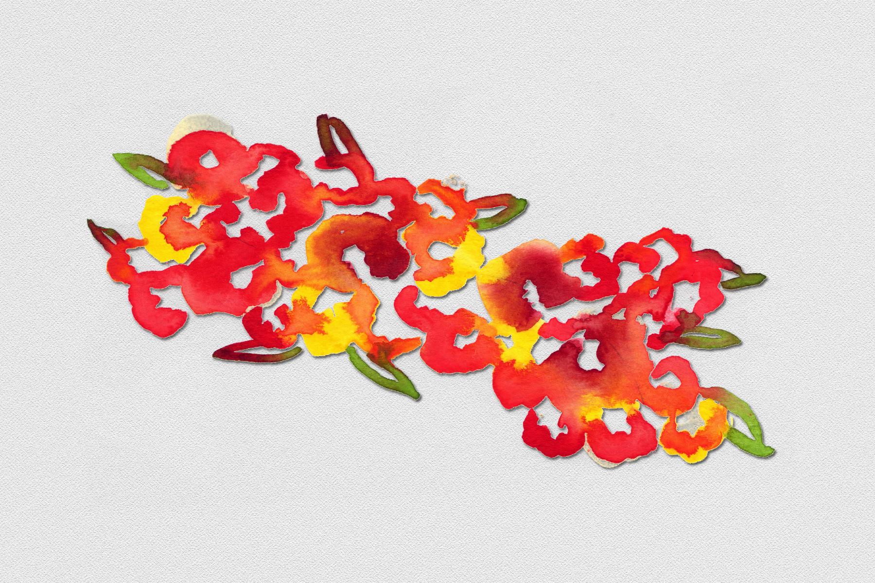
3. Two Basic Shapes: So for our abstract watercolor floral clusters, we're just going to use two basic shapes and any variation you come up with to make the shapes more pleasing or more personal, use them. So we have just basically one rule with our shapes. We're not going to make an enclosed shape. So we're going to keep it open. So for example, when we do our flour, and I'll choose a nice bright color here, crimson lake, just for demonstration purposes. Here's a closed flower shape abstract. You have a definite line here, a center and an opening and close shape can be filled in as well. Well, we're not gonna do that. So today, if we want to make a somewhat scalloped flower, We're going to keep it open like that. This would be acceptable as well. Just a little couple of pieces. But we keep it very open and very loose. And because the way we're going to design it and we're going to use wet on wet. It's going to look a little different than this, but that's the gist of it. We're basically just keeping an open shape for our flowers. It can be more square, rounded, partial. It's up to you. And now, the same thing. When we do the leaves. We want to keep that shape open. So if we normally have a leaf that looks somewhat like this or closed like this, or where we use the brush to taper it off. We're gonna keep it open just like that. So you see, even if we want to make a really thin one, we're keeping it open. And that's going to add an element of intrigue and interests to our piece. So with these two basic shapes, the opened Flour and the open leaf, we're gonna create our clusters. In the next chapter, we'll start by making our S Cluster.
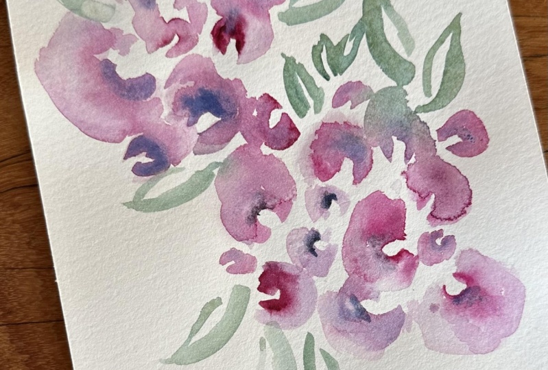
4. Painting #1: The S Cluster: Now to start with R s cluster, first thing we keep in mind is that because it's abstract, nothing is with strict boundaries. So the S is just an example. So for that, I'm going to take a pencil and with a very light hand, I'm just going to create an S-shape. So Ss can be any, Just when you think of the different fonts, it can have elongated loops or it can be very slim. I'm gonna try and just create just a line like this. It's not a sharp S, but it's got the loop here, no loop down here. And where I ended, I basically choose based on the paper. You could even make one top heavy. It's up to you. After I have my line, if it's too thick or too heavy, I'll just go over it with a little bit of an eraser to break it up. Once I cover my image with paints, the pencil mark usually doesn't come off. So I want to keep it so that there's not too much pencil mark to remove. So first thing I'm gonna do is I'm going to start and I create my first layer. We're going to do this entire painting in one session. But I want to keep the paper wet where I want my, my paint to go. So I'm going to mix a very light color. And ahead of time I consider what colors I want my mean Florence to be. I'm going to have them be red, orange, and yellow shows the three colors together on the color wheel. And then I'll add green leaves at the very end. And I will turn the green down to coordinate with our colors. The first thing I wanna do is mix a very pale yellow. So I'm taking some of those deep yellow and I'm mixing it with a lot of water. So three brushstrokes of water for every brushstroke of wet pigment. So I have a faint image and we know it'll dry lighter. So then I'm gonna take my brush and you can see it here. And that's one of the reasons I'm using the colored water here. And I'm going to just create a series of my abstract flowers or on this line. And I'll make some spaces first. And I'm not closing any of the blooms here. I'm just creating those flowers. And I'm using my S line as a guide. So from there, I'll add a little more water to my piece, and I'll just throw in a few more small shapes. I can always go back in and add more shapes as I want. If I feel that I don't have enough. So while it's still wet, can start with my most vibrant color. So I'm going to take a little of this powerline red on my palette. And I'm going to mix just a little deep green in with that. Just changes the shade a little bit. And so now I'm going to click here on some of my flowers. And the area that's yellow is damp. And I'm just going to try and create my pigment by putting it down at the very edge of where it's yellow and damp and white and dry on the paper. And as you can see, when I put it down, the color gets whisked into that area where I already wet my paper. And I'll do this on a maybe three to five. I usually stick to an odd number. These tend to be my larger shapes. My more vibrant corals. And I can really play with the shape. And as you can see, the contrast between the reddish pigment and that white center creates its own little shape. And then how it fades off into that yellow flower is also very interesting. I'll rinse my brush and now I'm going to take some of this vermilion hue. I'll mix it on my palette. I have a little of that yellow left on my palette and I'm going to just work with that. And I'm going to continue to mix more flowers in the same manner that I did. And here I closed it off. I didn't mean to, but I did close it off. So I'll just make an effort not to do that, but it's OK, it's abstract. And so I have seven here. And now rinse my brush and I'll take this lemon yellow. And this time I'm gonna go on the outside of those flowers that we originally created. Just like this. Now the color is bleeding in between and if it's not bleeding, I'll help it out by just joining it with some more wet pigment. And I'm liking the way that's looking. A comeback here with a little less powerline red. And I'll just make a few little more flowers. And this is where it's abstract. So you look for balance where if there, if there's a little bit of a space here, I might add some more of a flower or if the color is not enough contrast, I'll add some as well. And because I didn't have the Green, I have a slightly different version of this red than the original one we put down. Then I'll go back and see if I want to add more of the vermilion hue or the yellow, Just as we go along, I can even mix some of the vermilion hue with the red to get a different color. So it's a very playful process. And again, my shapes are all open, relaxed. I'm letting the paint work together, the wet on wet to create its own reactions. If there are some here that they don't seem to be reacting because I didn't let the paints touch. I'll just come back in and deposit a little bit of color, a little pigment to help it along. Or I can leave it completely blank, gets totally whatever the, you as the artist decide to do. So I kind of like that shape. I can come back in and see that I want to maybe add a little bit of heaviness down here. So I'll go back in with a little bit of color and maybe a little bit up here. And now to offset that, I'll come back in with a little bit of this deep yellow and combine it while it's still wet because I like that blend. That's one of the key features of this painting. I'll come me with my leaves. So now I'll take some of those deep green on my palette. And I'm gonna mix a little of that yellow, lemon yellow in with it. It turns it down quite a bit. And then I'm gonna create my shape for the leaf. And I think this time I'm going to stick with very skinny leaves. So I'm just going to pull my leaf shape and I'll just do a little bit of overlap. And I'm gonna use the direction and the points of these leaves to help create my S-shape. So I'm pulling my leaves. Gotta turn my paper around. Pull a little one here. And again, leaving it open and yet encouraging some of the color bleed. In there, I have my first abstract cluster following the S-shape.
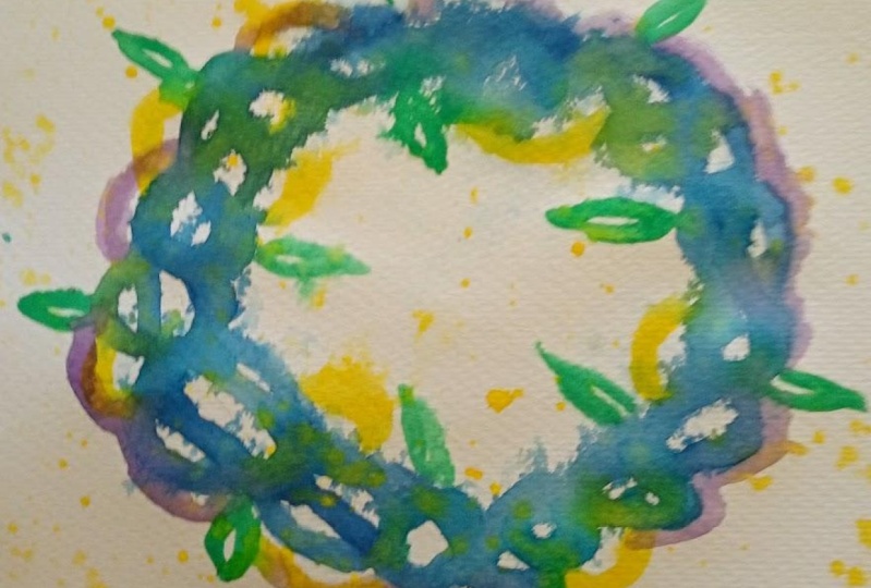
5. Painting #2: The O Cluster: So for our second floral cluster, instead of the S shape, I'm going to make a circle like a wreath. So the first thing I'm gonna do is I'm just going to roughly sketch my circle and this is my guide. You can do an oval if you prefer. You can do a horseshoe shape. It's up to you. But when I have my circle more or less the way I want it, I'll just go in there and remove some of the pencil marks. Just again for that same reason. So I don't have a lot of pencil marks to erase, but yet I still have my reference point. I'll choose my colors and I'm going to choose yellow, greens, and blues, just working my way down the color wheel, it would seem since I like to use green for leaves, I'll do yellow, blue, and a little bit of purple. So I'll mix my color first. And again, I'll just take a little water on my palette and a little Cyrillic and blue to get a very light color. So I'll try and get a nice heavy ratio of water to pigment. And then again, I'll just come in here, put down an odd number of these large flowers. Again, I'm keeping them open. And this is not going to be the final color of the flowers. I'll come in at a few more here and there. This is just my first guide. And now I'll start my painting. I'm going to start with my bright color here. So I have my purple and I'm going to mix it with some Prussian blue. So I have my purple and my blue together. And I'll just keep adding until I get the color that I want. Here we go. And with a sharp point, I'll create my open shapes. So I have five open shapes here, but I think I'm gonna go with seven. Add one here. Then I'm gonna come back in and really deposit pigment in all of those open shapes that I created. Because I went over the area that I went originally with, the very light Cyrillic in blue, color bleeds and runs a lot. And I really like the way that's looking good. It come back in with a little purple just so that it's a little more purple. And this little spot on my palette out a little bit more water. And then I'm just going to add a few small flowers, again, keeping my open shape. And as I have them here, I see that none of them are touching. So now's my chance to go in there and create them in and really forced that color bleed. Rinse my brush. So now I have a wet brush and I'll remove some of the pigment and some of the water. So it's more of a damped brush. And I can now just pull from this the shapes, creating more open shapes. And really unjust pulling those pigments around. The colors that I put down originally are very strong and dominant. And now I'm just kind of blending the mountain some areas and helping them to run. Again, I'm keeping those open shapes very lacy looking. I'll rinse my brush and now I'm going to take some of that lemon yellow. Get a nice sharp point. And I'll go in and create just a few here in their open flowers. I'll do some on the inside and some on the outside. When I'm happy, I'll take a look and see what I want to add. I think I want to take that colour we worked on originally, that nice deep blue and add some here. Again, leaving a little space so that there's open and laziness. I'll rinse off my brush. And would this deep green, I'm going to mix it with the yellow that we have on our palate. And then I'm going to mix it just a little bit of that blue we mixed in with that green. So it changes the shape of that green very nicely. And then I'm going to create some leaves touching the existing roles. And that's making the color run. Now I'll just go back in, deposit a little bit of this green and really work those shapes right where we have them. And then to finish this off, I'll take my piece and I'll take the colors that we use. And I'll start with my yellow first. Solve, rinse my brush, pick up a lot of yellow pigment, and it'll just spatter it around. And because this is the lightest color, I feel I can really spatter it. They'll rinse my brush. I'll take just a little of that blue. I'll go back and remove some of the water, take that purple. And then lastly, I'll go in with that green. Looks mix a little more color. So I have a lot of green and my brush. And there I have are abstract watercolor, floral cluster, reef. In the next chapter, we'll just wrap up the class and I'll show you a couple of variations.
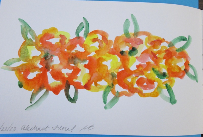
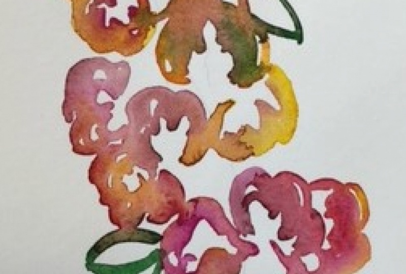
6. Class Wrap Up & Variations: So here we have our completed projects. We have our painting with the S curve here, and these are the colors that we chose. And then here we have our wreath with the colors we chose. Even though we only chose four colors for each, the blending of the wet on wet pigment creates a different result. And it's very abstract and interesting. You get a totally different feel with the spatter at the end. It kind of emphasizes the loose strokes, the blending, but I call it the watercolor, having a mind of its own that takes place over here. And that's really the beauty of watercolor. I wanted to show you just a few variations, again, using the S curve here as well as the circle form. So here's our original and here's a variation. So instead of the S coming from the top on the right, it comes the other way around. And again, I use the spatter. The different feel of the colors gives a different result. And then here we have our original Would the spatter. And here I introduced more colors and got more of a contrast. But again, same technique seen blending between the colors, seem running of the colors and the spatter remains the same. You can do this with any shape here. I did this with almost a figure eight and a backwards S, I guess you could say as well. And I use muted colors here to create that pretty, pretty shape. So it gives you a bunch of different effects using whatever shape you want and the same technique to get that abstract floral cluster. I hope you'll try your hand at creating an abstract watercolor floral cluster. Snap a photo of your work and post it in the project section. Think about different colors to try whether you coordinate it with something that you already own or you just love those colors together. Thanks for joining me today. Please be sure to follow me here on skill share to get notified of future classes and please consider leaving your review. Thanks for watching.
 Daniela Mellen, Artist & Author