Transcripts
1. Introduction: Hi, everyone, and welcome
to Abstract Art challenge. How color dominance
changes a piece. I'm Denise Love, an artist
who loves exploring texture, color, and creative
play in the studio, and I'm so excited you're here. In this class, we're
going to explore a really fun abstract
art challenge that focuses on one of my favorite
creative tools, color. We'll be working with a limited color palette and creating two abstract paintings using
the exact same colors, but with one key difference. In each painting,
a different color will take the dominant role. It's amazing how
the simple shift can completely change the mood, the movement, and the
overall feeling of a piece. This is a great exercise, whether you're new
to abstract art, or you're simply looking
for a fresh way to experiment with color in
your own creative practice. So gather a few paints a
favorite journal or paper, and let's get started.
2. Class Project: For your class
project, you'll create two abstract paintings
using the same palette, starting each one with a
different dominant color. By the end, you'll see
just how dramatically color balance can shift
the feeling of a piece. This project is playful and
experimental and a great way to build confidence with color while filling the
pages of your journal. Grab your paints,
choose a palette, and let's explore
the possibilities.
3. Inspiration: Video, let's take a
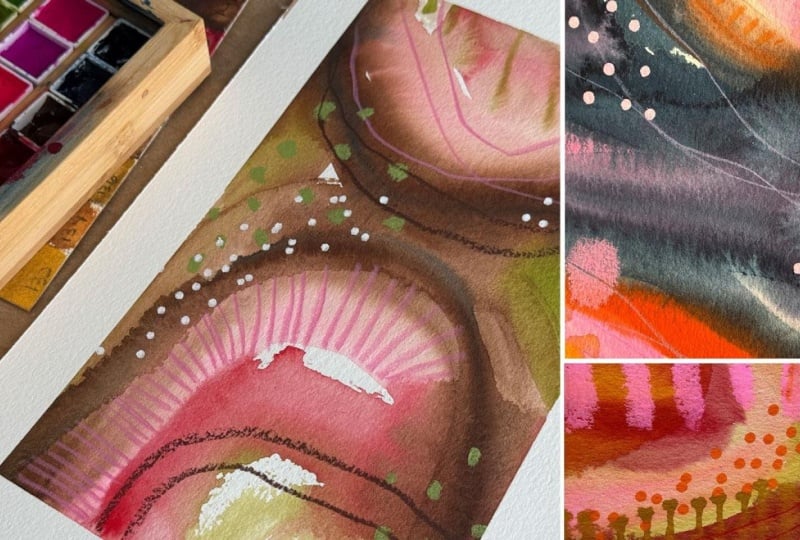
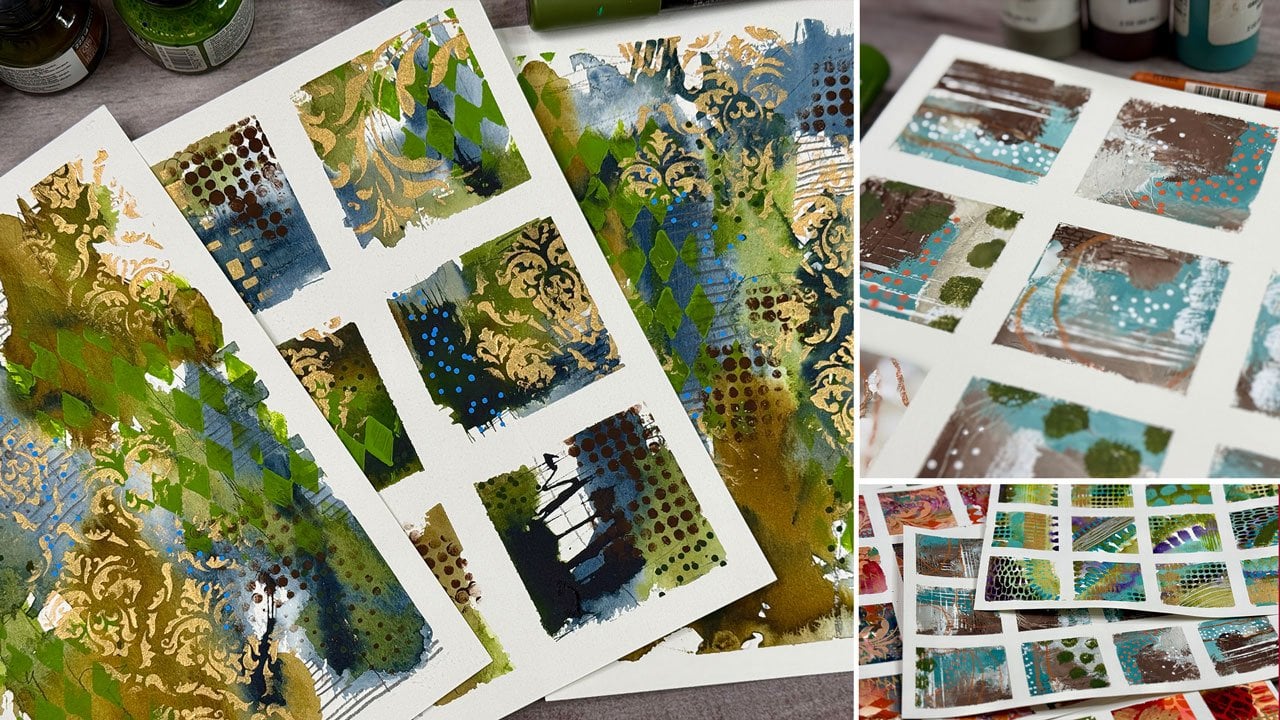
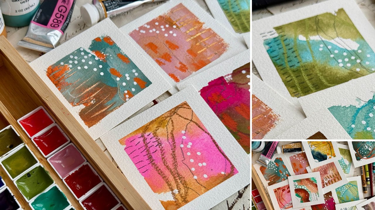
look at my inspiration. So all of this started out with my art challenges where I was doing the little
mini paintings, and I was so inspired
by some of these. And you can see how
I made a lot of these in the tiny
paintings class. And then also these come out
every week on my socials, little mini reels
of painting these, and I got so inspired by these that I wanted to
kind of take that a little bit larger and create in one of my handmade journals from the Bar Spine beauty class, which is one of those with
the open spine that I love. I thought, let's do my one
material being a gouache. What I did with these
was I picked a paint. I picked a handful of
art supplies to mark with and I put them all on
my desk with this journal, and I said, I'm just going to show up every day and create. I used color palette
from the color cube, which I absolutely love using those. Let me
grab one of those. That's the color cube
by Sarah Renee Clark. I love using these
because it gets me past my initial color
anxiety and getting stuck right up front with
what color am I going to use? That's my very favorite
art tool that I use, and I used them all through
this book to give myself permission to relax
a little bit with color and then decide on
some color dominance. I thought it would be
really fun if I picked a different of the
selected colors, a different one on
each page to be the dominant first
color and then filling around it with
all of the other colors. What that did for me was gave me the opportunity to see how a set of colors might react with a different one being
dominant on each page. Over here, I started with that greenish bluish
color there and over here it was more the
oranges and the pinks. It was just interesting to see the differences I
could get out of one color palette by picking a different dominant
color for each page, but using the exact
same marking tools and colors and paints
for every page. I started off this one with the Holbein artist wash.
That was my base color. Then I had pencils
and colored pencils and some gelsticks and
then some pasca pins. That was my dominant mark
making tools for this. You could use Neo
Color two crayons. This book is the one
that I have created. These paintings will be
coming out every week or two on my socials as videos. I'll put that playlist in your supply PDF so that you can continue on this journey
with me after this class. But yeah, just a little
sneak peek here of this book and how I have
gone with this project, and then I thought that
we could create or get started in your own book
doing something similar. I'm going to pick some similar
supplies is what I did with this one and then get ready to create every day
a different set of paintings with a different
dominant color for each page. This is one of my very
favorite art books that I've ever created. All of these are lovely leveled
up, beautiful abstracts. If you loved something
and you were going front to back like I am, you could scan these in and
make larger prints out of them because some of
these I really love love. What I thought we would do
in this class is get started on our own next book,
just like this. But we're going to create. We're going to
start one together. That's the inspiration
for this class. And I'm going to show you in the next video some color palettes that I've
created for you. So join me in that video and
I'll see you back in class.
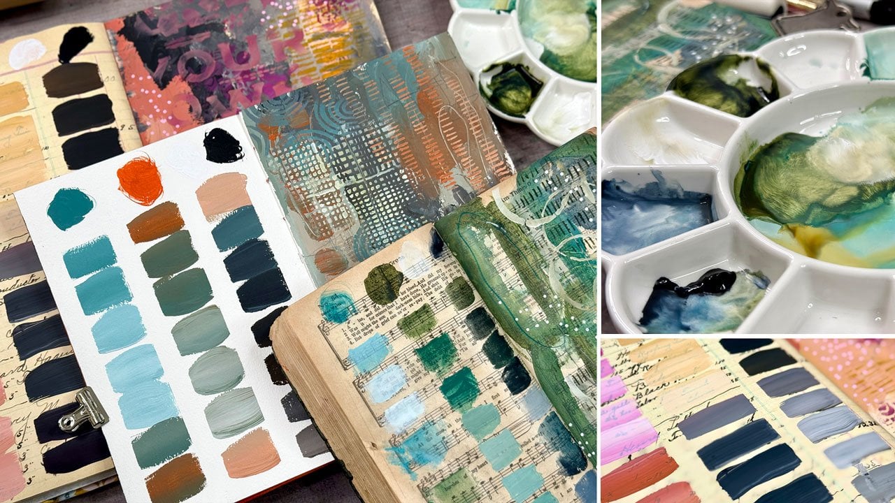
4. Color Palette Inspiration: So you're welcome
to in this class, come up with your
own color palettes. You could use the color wheel
if you wanted to stick to some tried and true
palettes. That's one option. Another option is you
could do the color cube, which I really love. There's four volumes now
and let me tell you, my absolute very favorite
art tool out there. It just makes everything easier
for me to choose and get past the initial anxiety of color I don't
know where to go, or even with me, I tend to go off the
rails and I'm like, oh, I like blue and orange. What could I put with
that? Then I'll come up with some crazy
color to go with it. And we just kind of went
off the story there, and I get so upset with
myself or just I don't know, I like all the colors and then I'll throw something
in there and I'm like, oh, that was a bad choice. And that keeps me in line and helps me enjoy the whole process
better because I'm like, I got five colors, six colors, whatever is on that color card, and I try to stick within that color range and
not go too far off. From those, and I have been much happier
in what I create. So what I made for you guys, if you don't have those, you could also look on Pinterest, look up color palettes
in the search bar on Pinterest and tons and
tons and tons come up, so you don't have to have anything that I've got
that I'm showing you. But I did create some color
palette cards for you. This is on your page, your resources downloads page
and I created these from stock photos that I
purchased and then created a color palette with it just
to give you some options. I printed this on my
very cheap printers. So you can print
these as nice as you want and cut them
out and have your own set of color
cards as you want. Or you print out a cheap
copy just like I have? Because the goal here for me is not to match these exactly. The goal here is to give
myself a direction. Oh, I've got a blue,
I've got an ochre, I've got a lovely
gray a dark purple, a tan, an orange and a blue. I can get close with all
my different materials. It's not meant to be exact. It's just meant to point
me in a direction and get me unstuck from the front. I want you to take
a look at those. You're welcome to use these
color palettes in your book, or you're welcome to search
Pinchurst for color palettes. Or if you have the color
cubes, definitely grab those. You can watch the
videos that I post. It's probably going to be
like every other week or so through 2026 depending on
when you're watching this, but I will put that playlist
for you in your supply PDF so that you can go and view
some more of these videos. But I thought at least having
a few color palettes to start with might be a
fun option for you. So download that PDF if
you want to try those out, and I'll see you
in the next video.
5. Supplies: Video, let's take a look at the different supplies
that I'll be using. These are just
things to consider for things that you
might be using. If you've got some
of them great, if you don't pick things
that you already have, this is not about
using anything at all that I have got for this. You'll definitely need
some type of surface, and I'll probably be making another um book of one of my handmade books
that I've already got. These are the Bar
Spine beauty books, and you can go over to the classes and make one of these for
yourself if you want. What I like about these,
I like the open spine. I like that one book is
made from one pit of paper, which just kind of
boggles my mind. I can pick my very
favorite paper, which is the HymilPaper for me. And one pad of 12 sheets of
paper made this whole book. There's 12 sheets that
are made into signatures, and then the back cover is what the front and
back is comprised of. And then the only thing
I needed on top of that was a few bookmaking tools, a needle and some thread, and an owl, and then some glue. And I have some pretty
handmade papers. And so I have just decided that making art books is the very best use for
my handmade papers. I love them so much. That is what I did with
our inspiration piece. This was another book
that I've made in that class and that's
exactly what I did. With those books, I think that's such a beautiful
use for those. You can make a book if you
want and create in that. I love that idea. You can
also use commercial journals. A journal that you've got. Some of my favorites are the perfect sketchbook by Etcher. It is a little pricier, but it is nice paper. It's very high quality made, and they've got
lovely deckled edges, and it's 100% cotton, that would be something
that you could consider as a nicer sketchbook
that's already made. You could also use
less expensive ones. I have been making all of those lovely little
pieces that I created, all my little minis and stuff. All of these were made
on some hot Mule paper, but then some of the
bigger ones were made on some flatto FLN
BRATO cotton paper, and these are already in little pre cut pads that I could then paint and
remove that off of there. They come in several
different sizes and I loved that paper. They just came out with some sketchbooks as of the
time when I'm filming this. And so I bought two to give
them a run for their money. So these are 100% cotton also. They come in a couple of sizes, I'm sure that they'll
keep adding to it. This is a newer company
that's out there, but I've got a six by six, which is this green one. I'm sorry, 6.5 by 6.5, and then this bigger
one is 8.5 by 8.5. I thought that because I liked those little squares so much, I thought I would
like these also. What I like about this is
you could paint one per page and then I can see that it has a
perforated edge here. So if you loved it, you
could remove it fairly easily with that perforated
edge. That's super nice. Then I like how these have a pocket back
here. That's nice. I like this closure. That's what I was
going for back there. That's a nice choice
and that's a nice book. That's another choice for you, flan Bratto FLUNBRATO for a reasonably priced
cotton journal compared to the little bit more expensive eta one,
good choices there. You also, you don't
need a book at all. You can just paint on pieces
of paper if you want. You are welcome to just do your projects on
whatever your favorite paper is. My two favorite papers
are the Hnomule and the Academy watercolor
paper by Bao hong. This one being the
better priced one. It's about $21 for 20 sheets. Whereas this one's,
maybe it's $25, $26, but it's for 20 sheets. This one's $21 for 12 sheets. At least where I've
been able to get them. You could take
either of those and split your paper in half and do your two paintings
on one paper. You could take two different papers and do your
two paintings on different papers so
you don't feel that you have to have an
artbok to work in. The reason I like working in an art book is because
when we're done, we have a finished art
book that we can then brag about and show off
and do stuff like that. I do like that aspect
of painting in a book if you're not
going to be selling art, which I don't sell art.
I like to make art. I need a reason to make it, and this is my reason
and putting them in artbok make them extra
fun to share around. Okay, so you need to decide
what's your base paint? That could be watercolor,
that could be gouache. You could do acrylic paint, but then your mark making
options might be limited, so you just have to experiment
and play with that. I like using watercolor and
gouache as a base layer and then things on top
of that because I like the opacity differences. I like the texture differences. I like the options that I've got with the different
watercolor paints that I have. I've really leaned into that full on mixed media
experience with color and gouache being an initial layer and then mark making and fun
things on top of that. That is the direction
I am going. This is all about do
whatever you're inspired to do with the paint
supplies that you have with the ideas that
you're seeing in class. That's kind of my motivation is, what can I create with my
favorites and color challenges, and let's just see
where we can go. This book that I already
finished that we'll be rolling those videos out all year is the
Holbein Artist squash, which I really like the
Holbein Artist guash. They're nice vibrant colors. That's a Shin hon.
This is the Holbein. These are my two guashes which are a little more opaque
than a watercolor, but this is made just
like a watercolor, so I treat it like a watercolor, but the gouache
usually is made with a little bit different pigment
size than a watercolor. The watercolor is finer and
they're usually a little heavier pigmented so that
they're not as transparent. This is a watercolor
set that I have, the holbin granulating
watercolor. You can see it's a little more transparent than the guases. The guases are a little more vivid and a little more opaque. I love that about gouache. I've really leaned into
having some fun with guash. Because I did a whole book in
the Holbein, Artis gouache. I'm going to do this
one in this class in the Shin Hongas I
like the differences. They look very similar
here on the color cards, but you'll notice that
these look a tad punchier, a little tiny bit brighter, a little tiny bit
more saturated. It just seems like
the colors are just a little bit
more and I like that. I thought that I would do
my class with the gouache. You don't have to have
anything that I'm using. I'm just trying to
give you some ideas, but I do like these.
They're very punchy. If you like very punchy
and bright and vibrant, Shinhn is a good way to go. If you like some very vibrant, but a little more muted colors, like you saw in the book
I showed you there, the holbin is a good choice. Um, there's lots of
gouaches coming out. Gouache seems to be
having its moment with all the different companies coming out with a gouache. That's silly to have tried, but these are watercolor guash, so they do act like watercolor. There's also acrylic gouache, and it will act more
like an acrylic paint. The watercolor ones,
you can put in a container and you can rewet them and
continue to use them. And the acrylic
guash, you cannot. It's like an acrylic paint. You'll notice on these, especially compared
to a watercolor, that they crack
and the watercolor tends to crack less and you can use the guash in tubes and just squirt out
what you want to use. I like having them in pans
because it's convenient. But they do dry out and crack.
They still work just fine. I just soak them down
with some water when I get started setting
up for the day and then it gives them
time to let that water sink in and
activate that paint. So don't worry
about the cracking. These have worked fantastic
after they've dried. I'm going to be using
the shin hon guash. Pick a base paint,
whatever that is for you and that's leave it
out on your table. Like, I just leave all my supplies set
up and ready to go. A couple of paint brushes. I like a little square brush, half inch Princeton
Neptune is a good one. And then I like the half inch Princeton Neptune oval Wash. It's one of my favorite brushes. You could also do a round brush. This is a 12 inch round, and that's just some of my favorite ones to
paint abstracts with, which is what I will be doing. You also want some mark
making tools. I like my My Pit graphite mat 14 B pencil, which is a little bit more of a black pencil and I like
my black wing mate pencil, which is a little
more of a graphite, but they're both super bold, which I love for mark
making, maybe a pencil. I like paska pins,
paska markers, I tend to use this, five millimeter bullet
point the most. That's one choice. You could also if you wanted
even finer dots, you could use the three millimeter bullet point
as another choice. Then you could also
use the 1 millimeter little tiny a point there for some really
fine dots or line work. Those are good choices. I also really love No
Color two crayons, that's always a good choice
if you have some of those. I've got a whole
bunch of these in a tin and I can just dig through and pick
the right colors. That's a good choice. I
also like gold and silver, I have my Kuratoki gold
and my Kuratoki silver. In a fine line bottle so that I can make lines and
dots with those. The easiest way to put the ink from the
original container into a fine line
applicator is a pipe. You just squeeze some in
from this and squirt it into that and it's the easiest way to get that ink in there. I like the one that's
the blue label because the other one that they make
also, that's not fine tip. It's just a tiny bit larger. This ink is so fluid. If you get the
bigger tip, you'll just have no control at all. I like the one that's
fine, 20 gauge. I like getting the gold and
the silver. Just my choice. I'm just showing you
what I'm putting out. I do like to tape
off my paintings, and so I either have a
Scotch painter's tape, which you can get
from the paint store, and I really leaned into loving
the Holbein artist tape, which seems to really give me a fine line but
not tear my paper at all, but it's the paper I've picked. If you're having trouble
with tearing your paper, more likely it's the paper, not the tape that is
the problem and I tend to I lean towards papers that don't tear when I peel tape and I've tested tons of them out
and decided like, I love this or I
don't love that. The HnomulePaper and
the Bao hong Academy both work really
well and don't tear usually with the tape and this
tape has been exceptional. I do like having the three quarter and
the inch and a half Holbein tape for these because they worked
fantastic and not did any paper tearing. I also one of my favorite favorite
favorite mark making tools now is the favor Castle
Black Edition pencils. Person in my community
recommended these to me because I like those
bold graphite, the 14 B, as bold as
you can get pencils. Let me just grab a
piece of paper here. They're just really bold and
easy to get some good marks. You can see that one's a tiny bit more black
than that one. That's the Faber Castle one. They were like, Oh,
you love that so much. I think you'd love these.
I got them and I'm like, Oh, my gosh, new
favorite, new favorite. This is the black edition Faber Castle pencils and it comes in all of
these lovely colors. I put them in a pencil thing
that goes in a binder, but I don't have the binder. I just wanted the
pencil thing so I could see the colors easier. And they mark so lovely
and vibrant and vivid, and they are of a similar
boldness as those 14 B pencils. So it is my favorite
mark making pencil now. And so that is I'll have these sitting on my desk
for some mark making. And when I want to
get away from just doing graphite because
if you know me, I'll get stuck on a rut and I'll be using the same thing over
and over again. That has helped me get that
bold line, but in a color. Those are my favorite. The other favorite thing
that I have leaned into are these King art mixed
media gel art sticks, and I had the
pastel set and then recently I added the
larger 48 piece set. I like these a little
better than the Marbu art croyns just because
of the color choices. I have leaned into the king
art wins being my favorite, we'll have these
little gelsticks to mark make with out
on my table also. I want you to look around
at everything that you've got on your table that you could set out
all your art supplies, pull out things that you might have forgotten
that you've got, have them out there on
your table available. That's what we're
going to use to create today. I think
that's everything. I might throw something else in there if it occurs to
me as I'm creating, but I think that is my list of stuff that I'm
just going to crowd around me and have it ready so that I can just show
up every day and create. I'll see you back in class.
6. Getting Started: This video, let's talk about the front page and
the back page. I decided in the original
one that I created that I would do something like a color swatch page
for the front, that would be a super
fun front and back page, if that interested you. I basically just drew a grid, painted all the
colors in the order that they were in my palette, and then drew a little
gold frame around it. I got a little crooked
here at the very end, but I don't even care.
It looks beautiful. Then I wrote what I was using and that's what the
whole book had in it. That's a super fun way to start. Another way that you could start is with these
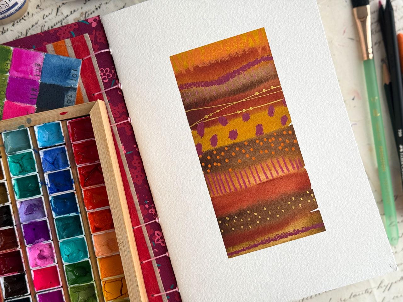
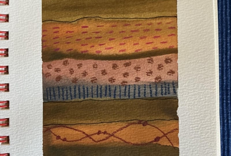
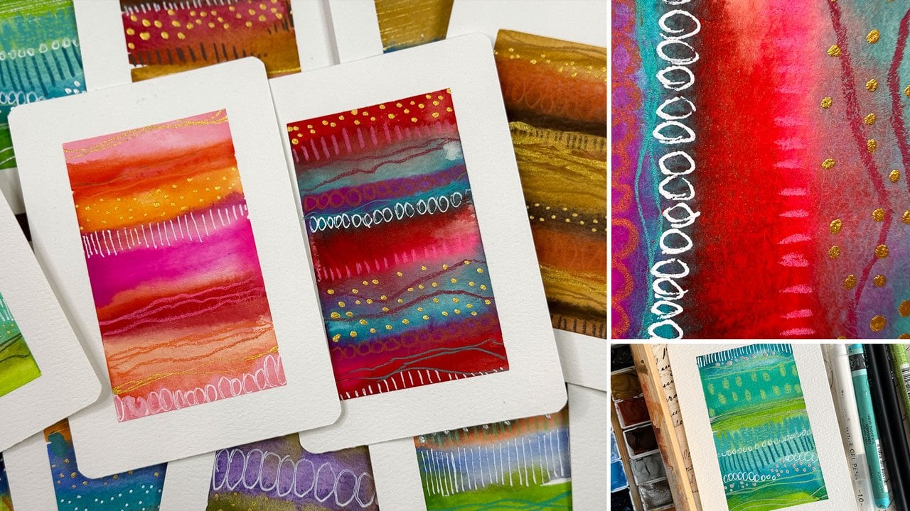
lovely stripes. This was just a color
palette that I striped all the colors from the top to the bottom and then did
some mark making on top. This is actually one
of my favorite pages. I think that I think it would be fun to
have stripe at the front, stripe at the back if you didn't want to do a
color palette page and if you wanted it to all be abstract art is
where I'm going there. I think I'm going to start
off my next book with the stripes because it's
gorgeous and I loved it. I'm going to go ahead and work in another handmade journal. Just because I love them. And I'm going to use the
fatter Holbein tape. But you can work on
plain pieces of paper. You can work in any art journal
that you've already got. There's nothing saying
that you have to do anything at all
that I'm doing. I'm just trying to give
you some fun ideas for your art practice and getting started and just seeing
where you can go with this. And another thing, too, now that I've got started, is I have another book. Oh, you know what I
might work in this one. It's the exact same book. And what I did I just got a different color
cover, which I love. Actually, I think I'm going
to work in the one I pulled. And what I did I just love
these, so I've made several. I'm obsessed with the
lovely handmade books. What I did was took a paper bag and stuff that on my wet paint. Don't do that. But I want
to protect the cover. I did notice on the original
one that I tend to get messy and I kind
of want to protect the cover of my book
getting started. So I just taped together the paper bag and made
myself a book cover, kind of like if you're GenX, Generation X, this is what
we had to do in school. We had to take paper bags and make our book
covers and cover our books that we used in school so that we
didn't ruin the books. And that's when grocery stores
still gave out paper bags. This is some brown packaging
paper that looks like a paper bag that came in a package order
that I just kept. Yeah, so I just kind of
made it where I could slip the book covers
and stuff. There we go. That one got wet, but it'll dry. But that'll keep my
cover protected as I go from anything I get paint wise on the table because
I'm messy sometimes. Then I might go ahead and
have some deli paper handy. Actually, I think I want to
stripe bigger than that. Now that I started that, I
wanted to be the bigger. I'm going to save this tape for another page and do a
little bit bigger stripe. What did I do on the original? I love this one so much. Oh, I did the fighter
tape on that, didn't I? Let's just go ahead and, let's keep it up
because that was my favorite painting
of the whole thing. It just looked a
little bit smaller as I was going, but
we're going to do it. So this is half inch 1.5
inch tape that I'm using. Give you if you want to write
a little bit at the bottom, put a year, sign it, whatever, does give you some space to
be able to do that if you have a little space
that you've created. You don't have to
write on it at all. I'm just throwing out ideas
there we're going here. Then we're ready to paint. So what we might do after
we tape off to get started, and you could do the front
last page at the end, you don't have to do
it at the beginning. Kind of feeling like
something like this, though, because I really liked how
beautiful those colors were. So if I'm looking at
the Shin gouache, I've got the in this container, there are a couple of
different shin Hons. Let me tell you what these are. In the Shen hon, and
those prices have gone up so you might just check if you're looking at that later. I've got the professional
designer gouache, 15 mil tubes, 24 colors. I've got set A and set B in here and I had a few dopes black and maybe
white, something like that. I didn't put the dopes in here. I might have the doops from some other a sketch box
that I got or something, but those are the
colors that I have put in here. I'm
just looking here. I've got the little
swatch card that I drew. I'm thinking right here
134 and right here 132. Then this could be a gray. It could be any
color really that I picked out of here that I decide I want to
throw in there. We'll leave that in the air. Then I've got a black
and I've got a tan. We're looking at neutro colors. I don't have to stick
directly to this exactly, but it is my inspiration. It's the direction
that we're going. And that's why I like these, it gives me a direction. I'm looking in here, and I think I'm going to use
the square wash brush. I've already wet these down and I like these natural colors. I might stick in this row. It helped me narrow that
down and just go from there. With the stripes are so easy. I'm just going to stripe it out. And then do the next color and I'm going to run
that right up to it. I hope that they mesh
and blend a little bit. I don't want to be dry on dry. I want to be wet on
dry and I want to see those colors,
do some fun things. Yeah, we're just
moving down this line. If you see a color that
you're like, I love that. Maybe I want a little
of that up here. Don't be afraid to go back
and throw some of that in and let that do its thing while
everything's still wet. And we can use some of those that grayish
color could be mark making on top so I don't feel like you got to stick
to everything exactly, all in paint or all in
pencil or whatever. You can go back
and forth and add other things. Look at that. Oh, my gosh, I'm already
getting excited. Super fun. I love the stripes. I love doing stripes. Yes,
I love it. I love it. Just because they're so lovely looking at how the
colors mesh and blend, moving gives you something
interesting without it being complicated, which I love. You can leave white
space if you want. You don't have to. That's a
choice that you can make. But you see how
these, they just re wet lovely lovely way, just like a watercolor and
they look like a watercolor. I treat gouache like watercolor. All right, so we
need to let this dry and then we can come back and mark make
on top of this. I'll be back in just a moment. All right. See how
vivid those colors are. They are super lovely. And the stripe painting at the end of my sample
book that I showed you, this one, it inspired a whole
bunch of stripe paintings. So I just thought I'd
show you these from my stripe class because that's basically
what we're painting. And this sample and the other book is what this
one's almost right on. Look at that. But just
to give you an idea of how fun and lovely stripe
paintings could be, I mean, I could just
paint these all day. Stripes, lovely mark
making, vivid colors. I think these might be
the Shinhan gouache, too, because I
loved them so much. I like that lovely pink in here. Now I want some pink in there, maybe with some mark making. Yeah, these are so much fun. It's ridiculous with all the different
color ways and stuff. Thought I'd show
you some samples, and I think I could
have got even closer to my book cover if I really wanted to coordinate
that even better. Now we've got our stripes. They are basically dry. I'm going to do
some mark making, so let's set the
gouache to the side and then let's just see
what we can do. I do like gold, I do feel I need some gold. Maybe I'll do the
gold last though. Let's do some colored pencil. I'm thinking something bright, maybe that'll give
me a little bit of that feel of that one. It doesn't have to be
anything outrageous. I'm just doing some basic
marks on stuff like this now, lines, dots, maybe some vertical as
well as the horizontal, I'm letting the
stripes themselves dictate where I stop and
start the different things. And so you could do just different
shades all in there if you looked at
that and thought, I really like adding this
tone in with those tones. It's a little bit
different pink. It's not as vivid
on this dark brown, but I do like how bold
these colored pencils are. I'm thinking, maybe we
need some dots and we could do that in a color that's in here or we
could pick white. But I do want something
that'll tend out and be like, punchy. I like punchy. Saw that
word recently and I'm like, that's the word
I've been missing in my vocabulary. It's punchy. Okay, I like that. I'm
definitely thinking some gold, let's go ahead and do some gold. This is kurtokiGld mica ink
in my fine line bottle. I do like to get these started on another piece of paper
because then it lets me get the ink into the
needle and it lets me gets any air bubbles that might be stuck in
there, lets me get those. Oh, I like that. Maybe I want
some gold dots down here. And you don't have to
fill every stripe. You can be very strategic with
where you put your marks. It's not about filling
every single one of them. It's just about adding
some lovely interest. Okay, I like that. You could
do it in threes if you want. Let me just dry that
gold before I smear it. Definitely feel I should
have taken my cover into consideration with
that front page. So just FYI. You might look at
that and think, what could I do to keep
that in the right colors? I like doing stuff like
this and then making observations like that after the fact so that you can see, what did I do and
how would you do it? That's a neoclor two crayon
and a random orange. Because then if you're
out there doing stuff, how would you creatively problem solve something that you've done by showing you things that I would do and then
thought after the fact, maybe if we had done
pinks and oranges, the front page would have
coordinated with my cover, then that'll trigger you
to think of that later. I'm thinking one of these king art crayons and then I feel like I could be
there with the cover. Now, everything I'm
using basically dries. The shouldn't be anything
left that's super smudgy. But I found in my
first book there that still things rubbed
against each other, especially if I was doing
piece of art piece of art. I've decided that having
some some deli papers, some of that dry wax
paper that you wrap sandwiches in is going to
be a nice protector page in between my pages
so that I can keep any of those still
wet until they're dry areas and just really
anything that wanted to smudge against each other because they're
still going to rub and they're different sizes. I've left white
space that could get dirty on some of
those inner pages. I've decided the deli
paper is a good decision, but I'm not necessarily
going to seal these because there's
nothing smudgy. The King art sticks
take 24 hours to set up and dry completely, but they're not wet.
They're just sticky. These take 24 hours to dry. Everything else is basically
dry when you're done. All right, so let's
see what we got, then that's how I'm going
to protect the book. I'm not going to seal the pages. I am just going to have the deli paper in there so they don't scrub
against each other. Look how fun that is. Oh, my gosh. And I want
to keep the white edges, and I just need to
be nice and careful. Actually, though, now
that I've got that done, pull the book out of the cover so we can admire it real quick. Now that I've got it
done, it does match. It does match, 'cause
there's orange in this. And I pulled in that purple, which really pulled
that in nicely. And so now that I've got the front page done,
it does not clash. The way I thought
it was going to cause I was kind of
thinking it was clashing. But look, we did a good job. And then you could if you
wanted to sign this down here and date it,
your choice there. So there we go. We got
the first page done. I just wanted to give
you a good idea on what you could do there
to get that book started, and then we will do
a color dominance set on the next page, so I will see you
in the next video.
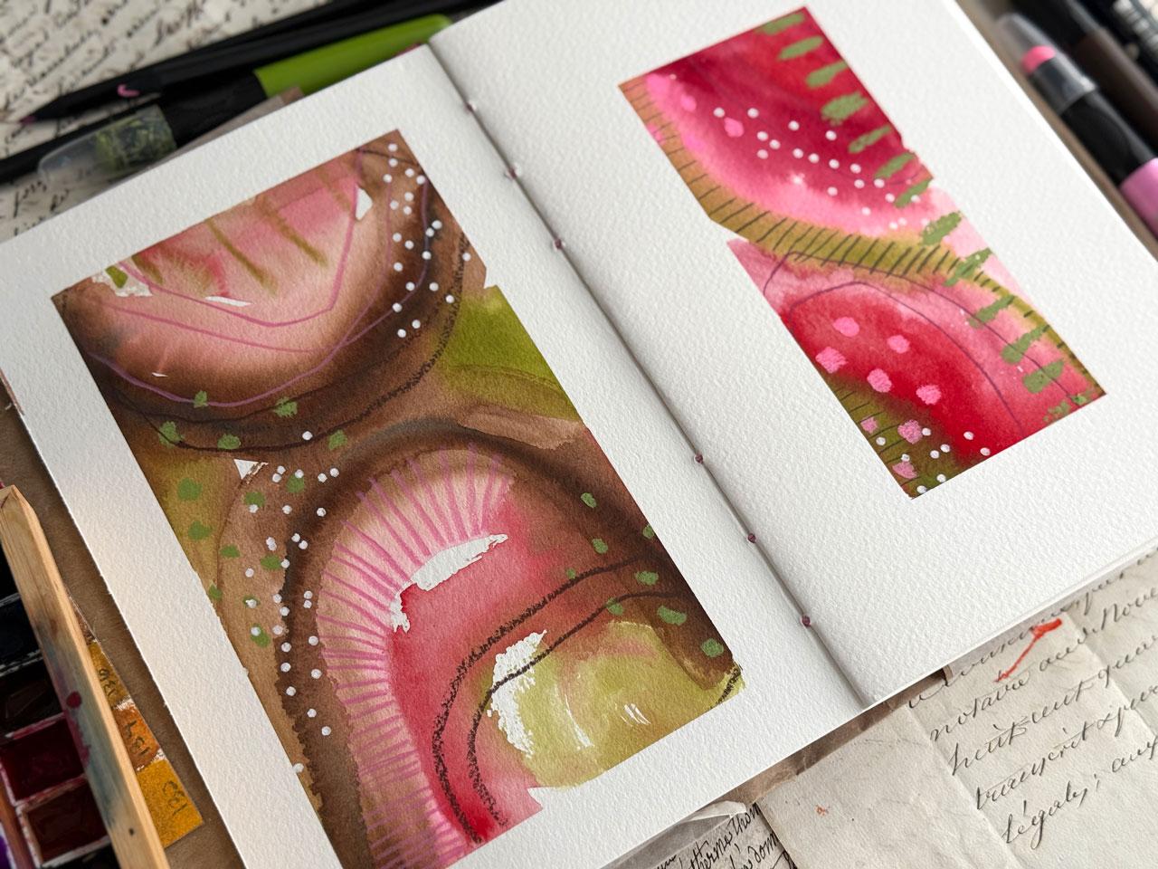
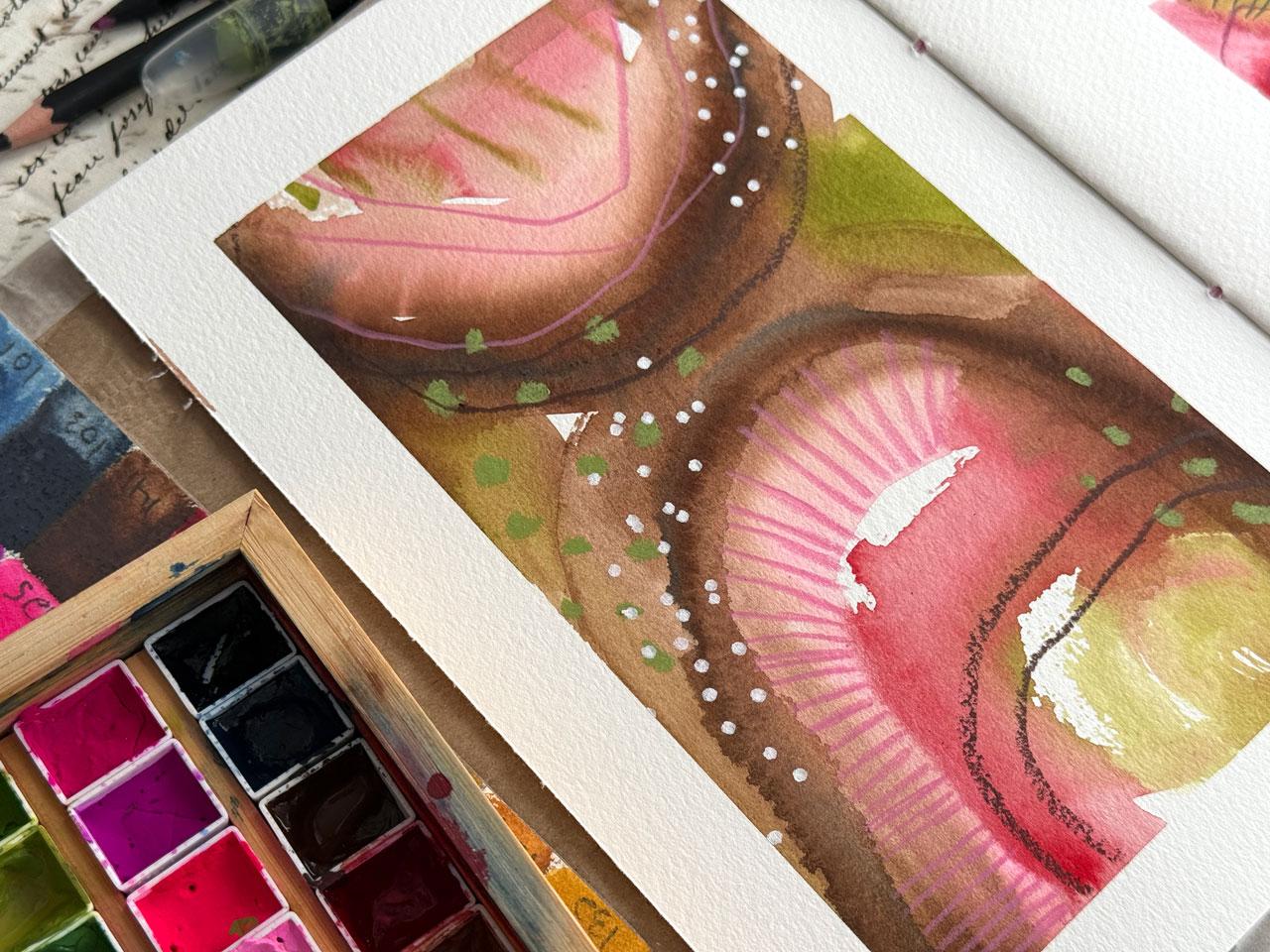
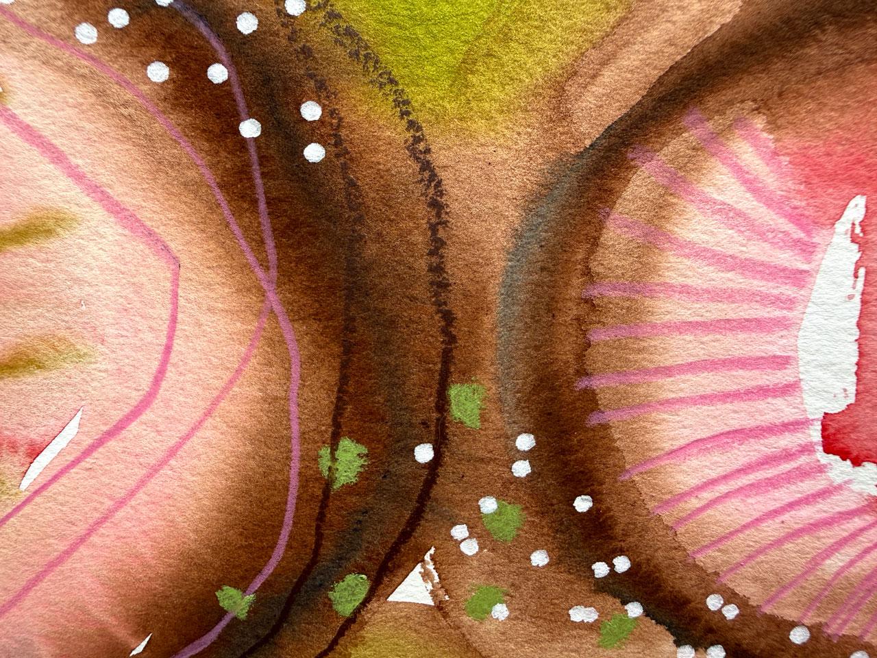
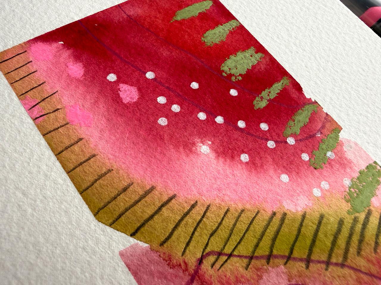
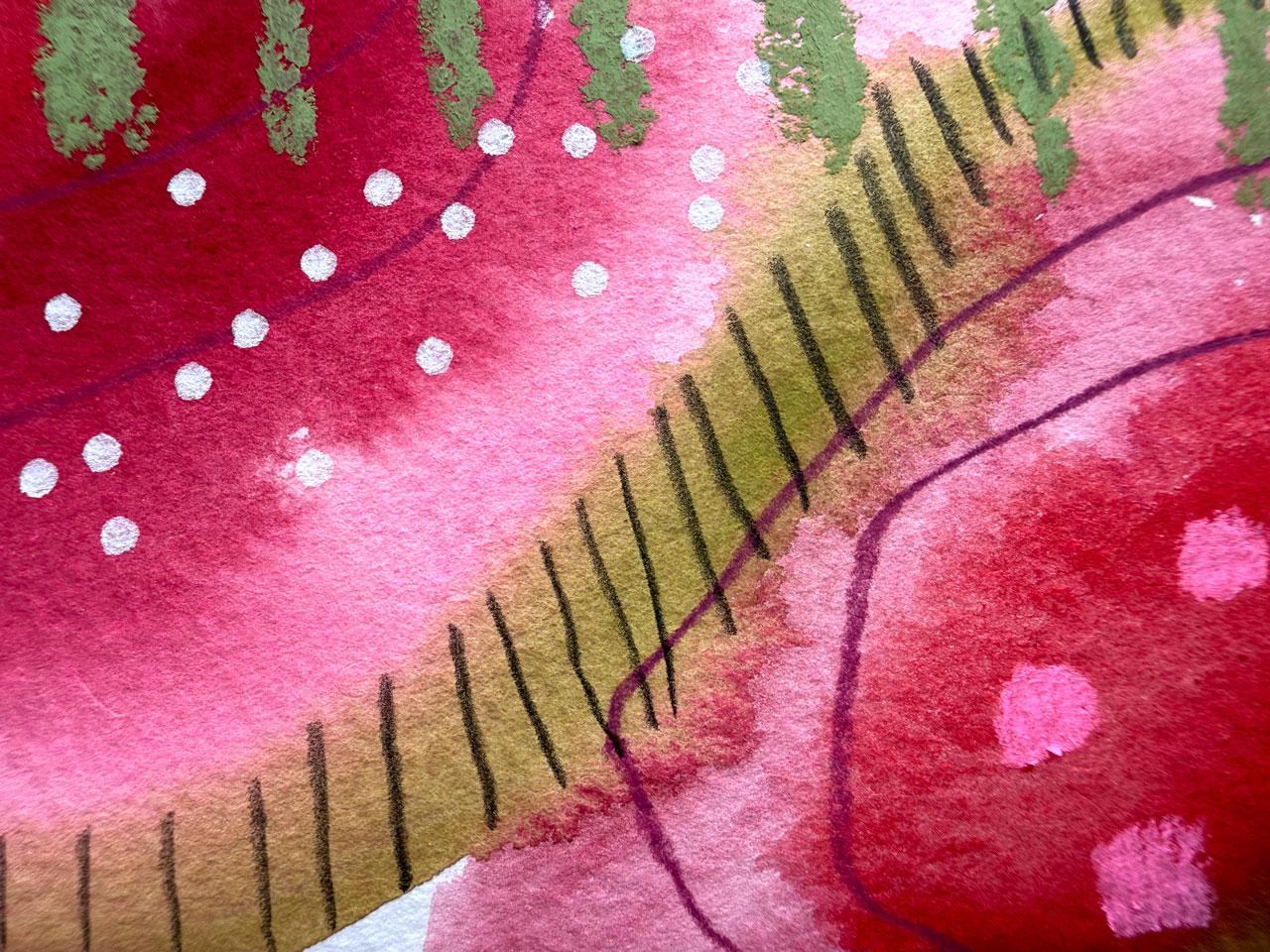
7. Pink, Green, Brown Color Palette: Hello, everyone. So in this lesson, I thought we would
start our next set, which is I got paper on that
for some color dominance. And so I just wanted to
get that front started, and I've just got a piece of
deli paper that I'm going to just type in here to make
sure that I'm not scrubbing that page on something I didn't intend to
and scrubbing that. So right on in here
to the beginning. And I want to do, again, in my original inspiration
book that I did, I thought it was fun to have different sizes on each
page just as an experiment. I did the big tape here and then the little three
quarter tape on this side. I was like little big, then I came in and I was like, big, little then little big,
and then big little. I like that format that
I had come up with. You could do something like
that if that interests you, or you could do same
size on each page. Or you can do one painting on this page and one
painting on this page, but still keeping the color
dominance theme in mind. Because I started the
stripe on the front as a big fat tape page, I think I'm going to do
a little tape page here and keep on with
that little big, little big because I liked it. It worked out well
in that other book. It made me happy. Anything that makes you happy in your
art journal, do it again. Keep it going. That could be something that if it's not straight,
it doesn't matter. I'm getting it straight, but I'm not worried about perfect because we're doing abstracts and it's not going to matter. It's not going to be obvious. So don't get hung up on did I get that tape
exactly perfect. Uh, 'cause I know some of us
will get hung up on that. And so I have just given up on perfection for some of the
stuff in my art practice, and I'm much happier
making stuff. So these for me, are
going to be abstracts. I like the lovely colors. I like texture. I like
pattern. I like mark making. And so that's what I lean
into my own art practice. You can do this in any way that feels good to you if
you like to draw, if you like to paint, if you like to be more
precise than I am, whatever it is that you
enjoy in your art practice, that's what I want you to lean into when you go to do
something like this. We go. Let's pick up color palette. I've got some bright weirdo ones in here because sometimes
that's the most fun and some Pastel fun ones with a little fun odd
color thrown in. Yeah, so now it's if none
of these oh, I like this. Let's do this one. A. None of these inspire you,
then look on Pintrist for color Pillots then
or pick your own. But we're here in this
Burgundy, number two, we've got a little bit of
this maybe a little brighter, so maybe number six, maybe. I mean, it's really bright, but I'm just saying we got choices or maybe 123, that
one and that one. We've got that bright green,
which could be like this 44, and then we've got some
kind of tone down pinks, so maybe we'll
pull in that pink. I'm not trying to be exact. Again, I am trying to just point myself in a direction
and stay focused. I'm thinking those pinky colors, that burgundy color, and then
a surprise bright green. Which I can already see. Got a king art crayon. In that bright green color
that I think would be lovely. So let's just have that ready. Okay. Alright, so
I'm thinking, wonky. Let's just pull our wonky
half inch oval wash out. Let's get some water over
here, feeling good about this. My goal on these, there's something weird under
the tape there. My goal on this is to do one color dominance over here and a different color
dominance over here. I might even get a bigger brush. Oh, yeah, let's do
a bigger brush. This is the three quarter inch Princeton Neptune square wash. I like the Princeton Neptune
brushes because they hold a lot of water. All right. So if we're going to start one page off
with the burgundy, ooh, and there is
a brown in here. So we've got brown. I could be dominant burgundy
on one page, dominant brown on
the other page, and that's different enough to give me a little
bit different look. I mean, I could be
dominant bright green, but I. I knew about that one. All right, so let's
do Domit Brown. The goal here for me is just to cover the page in
some lovely mark making. It doesn't have to be
anything specific. It is all about the play, the interest, just
having some fun. I let's throw that
pink in there just because it's a fun weirdo
kind of color there. I'm still looking
back and forth at our colors on there
so I can stay. I think I said the red, Oh my goodness. What
did we just do? Holy cow. That is a color there. Oh, my gosh. All right. Let's pick up this
green. Why not? Okay. Look here. Just throw some
lines. Look at that. Okay. That's wild actually, in an interesting way. I'm feeling like
maybe I want to do pink as the base on this
one, because why not? Even though it's brighter than the pinks that were on our page, I'm feeling pretty
good about it. I'm not really thinking
hard about composition, but I'm not starting
in the middle. Because that for me
is intuitive and natural in a way that I tend to create is not starting
in the middle. I tend to start things
off to the side, work my way to the middle. Just a I don't know. That's just the way I
intuitively do it now after doing photography and
stuff for so many years. And then I love it. I
love how that works out. I like that a lot.
Look how different those are super different. I almost want some more
brown in this one. Maybe we'll come back in. I somehow got some blue,
but that's interesting. Look at that. I picked
up a little edge there, but now I'm just adding
on to the layer. I'm not trying to do
anything specific. Again, I'm just playing and being intuitive about it
because we peel that tape, it'll kind of shore it up into being a piece of art for us in a way that we never
even expected, which I love in doing this
method painting like this. So let's let this dry and
then we can come back and do some mark
making on top of that. So I'll be right back. All right. Now I'm just
wiping up some of this that still might be wet just so that I don't scrub
my hand across it, which we know I will do. Okay, look at this. This
one is so exciting. Now I think we need to
do some mark making, and we can either do that with pencil or King art gel crayon. We could add some gold.
We could add some silver. I mean, there's so
many choices here. I am definitely feeling
maybe some I don't know, do we want some of this pink in there as maybe some
lines? Why not? Oh, yeah. I'm using the colors that are there as my guide
mostly as I get off. Let's just go up to the brown. Of course, now that changed
the way my line was doing, but I'm not trying
to be perfect here. I'm not looking for perfection. I just like to have fun,
do some mark making. Doesn't have to be exact. I'm not trying to not trying to have perfect in between the lines and
things like that. More of I'm trying to just be have some interest in
marks and things going on and just appreciating and don't get hung up on
things not being perfect. I look at things like
this as Let's do some. Yes. I like that. I like things like this just as experimentation.
I like wonkiness. I still like a burgundy
one over here. I'm feeling it now that I
just did this thing here. I like to twirl my pencil when
I'm doing stuff like this. It helps me not be perfect
and stuck in perfection. I like this green, so I'm thinking maybe
some of this green. I could add a little more green
on here because I stopped in a way that looks off balance
with the two that I did. I could fall some of that back in with a stripe or something. It's a tiny bit different color, but I think I'm still
okay with that. I like it. I like it. Let's do some over here. It's definitely a
different shade, but it's still okay.
I'm okay with that. I like to come into a
piece when I'm doing something like this or offset that mark that we just made. I'm not looking for it to be lovely and exact and
perfect in my pieces. Your goals might be something completely different
and that's fine. I want you to follow that inspiration
wherever it leads you. What about a pink?
What about this pink? How big? How bright
is this pink? That's a neon pink. That's fun. I mean, I could. I could do some neon pink over
here. I'm feeling it. Good choice. Good choice. C I want some up here, maybe a little bit How
about a little bit. Good choice. Oh, yeah,
that one was super fun. I think it might be too
bright for this one. Perfect for that one. I think it needs one more
thing. Maybe we got a brown. Yeah, yeah, let's see. I like how big and
textured these are. That's why I like these so much. Look at this dark brown. This one right here,
I'm feeling that one. That one is basically m this one. All right,
let's go for it. I feel like I need I don't know, something else or or Oh
my gosh, I don't know. Could be there. I left the brown out of
this side, though. Kind I just want a little
more of a texture. Just a tiny bit
in there somehow. Oh, okay. Yeah,
I'm feeling that. Okay. Might have been a bad
choice, but I like it anyway. Okay. I'm thinking that I need
something more over here. I'm going to pull out one of my 14 BT's the Pit
mat graphite one. I think what I'm going to
do is follow green stripe. You just to look at that and just whatever thought comes
to your mind, follow that. Follow that down that road that dirt road gold road
that gold brick road. Don't get stuck. I
don't want you to get caught up in Is this perfect? Did I get that line crooked? Did Did I ruin it? I don't want you to get
caught up in any of those. I want you to follow an idea. Maybe it works,
maybe it doesn't you learn what not to do next time. That's what a lot of
this about is for me. Did I learn something
and what did I learn? Did I learn something
I loved or do I learn something that I didn't like at all or maybe I
shouldn't do again? That's all part of
the process for me. I like that learning in
there. I liked that a lot. I still like that
just like that. I feel like I kind of
feel like I'm there, but maybe some dots.
Ooh, let's do it. Totally felt that. Do I want it a white dot or do I
want, like, a color dot? I think on this one, I'm
feeling a white dot. Sometimes, for me, the
dots complete the piece in a way that I felt like
it was kind of missing. Okay, I like that a lot.
I like it. I like it. And it helps you bring back
in like a white or a black. If you felt like you were
missing some contrast in there, it helps you bring some of
those tones back if you're of the mindset that every P needs a little bit of white and a
little bit of black. That helps you
bring that back in and is a little bit of whimsy, what I'm going for
a lot of times. Okay, I feel like I'm there. All about just having some
fun. And enjoying it. When I'm all done, I got a book. I mean, I get kind of giddy looking at some of this stuff now.
Like, I made that. And if I had not
showed up for, say, like an art practice like this, I never would have made it. Oh. Look at that. Oh, my gosh, look at that. Oh, and starting off with
a color palette has helped me have better paint days in the end because I
used to just get mad. And most of the
things that I get mad about would be the colors, not doing what I
needed in the end. Who look at that. Oh, my gosh, peeling
the tape is magic. Peeling the tape is magic Woa. Whoa. Look how cool that looks. Alright, I hope
you enjoyed seeing how I used the little
cupcake color palette and picking a different
dominant color on each piece and seeing how the same color
palette could give you such different pieces
when you were done. But at the same time, they blend in and still work
in the same family. I did pretty good. I know I got off of the colors, but we still stayed within the idea of the colors,
which is my goal. So if you had fun
with these pieces, can't wait to see what you do with that
particular color palette, and I'll see you
guys back in class.
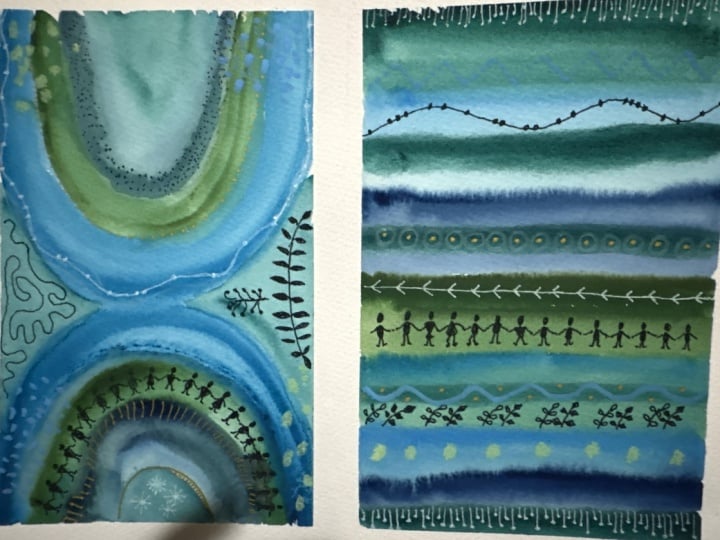
8. Blue and Green Color Palette: This video, I thought we
would do another layout, and I just thought we would take a look at the ones that
we've already done. So there's our one
where we got started. And then here's the
one that we did with the cupcake inspiration photo with the kind of maroons and
pinks and greens and brown, which could be like
a new favorite for me and kind of has a little bit of a look
of, like, watermelons. So I really like
this one. I've got the uh wax paper in here just to keep them from scrubbing up
against each other. I don't have anything in
here that needs to be sealed with a fixative, but you could fix it if you
wanted with an art fixative. The King art crayons do take
24 hours before they're no longer coming off and scrubbing it takes 24 hours
for those to really dry. But after they're dry, they
don't smear off anymore. But now that I've
got some oil on my fingers because I
put lotion on my hands, I do notice that the Shinhn does get on my finger
just a tiny bit. You could seal it,
or I'm going to put little pieces of
wax paper in here just to keep them from scrubbing
up against each other. My own personal preference.
No reason other than that. Then I thought we would go
on and move to the next one. Let me just get that
to lay flat for us. Then we had big, little and I'm alternating
it so little big. I'm going to tape off um, just for composition,
interesting composition is what I was going for there. So they alternate. You could do it all the same
if you wanted to. They could all be the same size. They could alternate
in a different way. I just was thoughtfully thinking about how would I
want my book to flow? That's how I decided
I wanted it to flow. Again, I'm using the whole by an artist tape to tape these down. It's the thickness
of a washy tape, which I really like
the thickness of that, but mentally, I have
a problem with using my pretty washi
tapes for taping. I don't know why. This
makes me feel better, but it's not the really lovely, beautiful washy tape, even though it's
about that thickness. So that's three quarters inch. This is an inch and a half one, and you could just tape it further in if you wanted
with the little tape. You don't need multiple
things of tape. I just like it and I have
it, so I'm going to use it. Um, what I have
discovered, though, if I leave gaps on the outside
of where I'm painting, I always get paint on the paper. Like right here. I had a
little tiny bit of a gap. There's a little bit
of paint on the paper, and it's not distracting
me and it's not terrible. But if I leave a 1 " gap on the edge to come in an inch with the tape if
I'm using the smaller one, I'm going to paint outside that tape somehow.
I'm just that Bessie. We're just a miss it person. When it comes to
paint or clumsy, I'm always dropping stuff. So we could say clumsy person. One of my dogs is so funny. I got a little Yorkie
and a little Murky, which is a Yorkie Maltese mix. And the Murky. Even
though I've never, ever dropped anything on her, she now stands outside the kitchen and looks in
the kitchen door at me because I randomly drop
things in the kitchen and she thinks I'm gonna
drop something on her head. She's so funny. I'm like, I've never dropped
anything on you. What are you doing out there? Alright, let's see what we got. Let's see what we have.
Oh, I kind of like, oh, I like this one.
Let's do this one. All right, so we
have a lovely blue. Let's look at our
little swatch card. So I'm thinking this
number one oh one. Is that in the right? Yeah, I'm thinking,
whatever that is there at the end is that, supposedly, kind of looks
black in there, though. I went ahead and activated it with some water, so they are. They do have water in it.Guah
just gets very thirsty. It dries out more
than watercolor does. And then it cracks, and a lot of people
are like, Oh, it's cracked. It
must not be good. It's fine. Just really saturate
that down really good. I kind of saturate it down once. When I get started
when I sit down to make stuff and then when
I'm about ready to paint, I calm down and
saturate it again. And then they are
perfect ready to use. I'm thinking this
number 44 for that. This is a random grayish
color. We'll see. I might do silver because that's that stone
and stuff in there. I could do whatever I'm
feeling. We'll just see. We've got a pretty
peachy color in here, so something in this
peachy family up here, and then a red, let's see, no, no, sorry, a gray. Do I really have
any gray in here? We've got this blue. We've got this lavender. I'm thinking this
blue, this green, maybe this lavender and
possibly that's 111, possibly that o15 as that even though it's
a little more vivid. I use these as a direction, not as an absolute. Even though I've selected to use a super vivid color palette, a set of paints, doesn't mean that I
can't figure out what I might like to use from that
even if they are brighter. It is a way to just calm
my color anxieties. What I think I'm going to do is because we're doing
color dominance. I like this little challenge where we're going
to make one color. We're going to start off
with one color over here and a different color over
here and just see how using the same set of colors alters the
look a little bit. I really like this. I really like this color too
for some reason, but I we'll stick we'll stick with the
ones that we picked. I'm going to do this
one with this blue. There's several ways that
I like to start these. I like to loop around things now where I do some loopy loops and we'll
look at that in a little bit. I like to offset things so
I don't start in the middle or I like to come
in from the edge and work my way towards
the end diagonally, so you're drawing your
eye through the piece. But we'll take a look at that's
brighter than I expected. We'll take a look at some of
the ones that I've already done in a little bit and see like how is some of the
ways that I like to start? We can identify
some pretty easily. That totally went off of
the reservation there. I'm going to use that
lighter blue because I thought of it because we already we've already gone off where I was even
thinking I was going to go. I'm going to throw
this color in. A. Totally went off on that one. Let's start the yellow one with the green and I may
veer a little bit. Don't feel like even
if you pick colors, don't feel like you have to
stick with them forever. It's okay to play and change your mind and just see where could I go
with this if I did, whatever it is you're thinking. Here's some great
big ovly shapes. I'm going to go on with this
color. I want this color. We're going to call this the
blue that I really wanted. Look at that. Let's come
back. Do we want the orange? Let's do the peachy color because it's a little
bit lighter than the orange I had there.
It'd be different. It'd be like a surprise, something that I
wasn't even expecting. We're just totally just got
off of whatever we were even thinking here cause why not? Throw that color
over there, so it wasn't just totally
out of bounds. Thinking this darker
blue that's by the vibrant blue instead of, I don't know,
is it too much? What color is this? I know I have the yeah, I kind of like that
better. That was just two. Two. That was more
than I even expected. Some little shapes
in there. Why not? This is different. This
wasn't exactly where in my mind I was going today,
but still it's fun. A good lesson in what can I do after this dries to
pull it all together. Creative problem solving. That's how I look at these now. I don't look at it as I
made a mistake or uh oh, wrong color, uh oh. That wasn't where I
intended to go and then get upset,
which I used to do. Now I look at it as Oh, didn't expect to get here. Where can we go from here? Let's let these dry and
I'll be right back. All right. Now we're dry, we didn't actually get
too far off on this one. That would have been the better color than
that bright one. It's I like doing too also because if you did something over here that you're like, Oh, no, no, no, you could
change it on the other one to be like,
Oh, yes, yes, yes. That ended up being
almost that exact color. We really didn't get too far off of our intended
destination here. Now I've got we've got some No coolor two crayons
that we could use. We could use our pencils over here. We wanted
to use those. Definitely feeling
mark making is going to be what pulls
this together for us. I'm just glancing here
at the different colors. But I've got in the pencils
and kind of thinking. I feel like we need, like, a green gold which
I know I've got. Maybe we'll use it in the Maybe I'll get it out
of my other one here. Oh, yeah, yeah, is. I feel like I need this
color out of here. The King art gel crayons. Kind of feeling that, kind
of feeling something. Maybe I'll do, like the
bold stripe coming down. You know, I really
have gotten to wear um this bold set of lines is becoming a favorite
on things like this. It gives that color some an anchor when you
come all the way down. I like the great big line. Sometimes I tape it
off to make sure it's nice and straight, but you got to be
careful taping things down on your paint and stuff. Then I also like big dots. That anchors it for
me sometimes also. Just making it these continue off the page there by going
over here to the edge. I feel better about
bringing that in there. Not feeling those
for some reason. That's just not doing it for me. Let's see what else do we got. This is kind of a fun color. Maybe we'll come in here
with some blue line. Maybe not the right color blue, but it's a metallic
blue in those. That's still fun,
kind of like that. I'm kind of feeling maybe maybe a little bit of
the green, possibly. Pull that in. Maybe I'm
feeling some marks. It's all about there's
nothing specific. There's no hard and fast rules. There's some things that I enjoy doing like the mark making, but there's no
hard and fast rule on what that mark
making needs to be or the colors that you got to use or the
way that you do it. It's more for me intuitive. I'm looking at this thinking, maybe I will go this
direction or that direction, so I've got maybe this teal and we can come in here
and do some lines, maybe. Yeah, let's do some
lines. Let's do that. Kind of feeling like blue lines. So these are those Faber
Castle black edition. What I love about these is they're like my graphite pencil, they're nice and bold, but they're a color instead of gray. This is definitely turned
into my very favorite set of pencils for mixed media work
because they give you that boldness in a mark that you're sometimes just not
getting in a lot of your other mark making tools
and it's the same size as the pencil marks I like
so much. Yes, that's fun. I like that. Thinking in this
lovely greenish color, maybe we could do something. We could add two green
then it could be a color on color
rather than it's not quite the green I was thinking now that
I'm marking with it, but now that we've started,
we're going to keep on going. I just don't get hung up
on the details anymore. It's just intuitively
having fun, not getting stuck on things
working out perfectly or not. I mean, it's just about showing up and
practicing and playing. That's how you discover things that you like
and don't like. Each piece doesn't have to turn out to be a
masterpiece. They used to. When I was younger, I wanted every piece to be amazing
and a masterpiece. Now it's about the exploration
and the fun is showing up. I feel like I need maybe some
dots, some filling dots. If you let go of
the expectation of whatever you were
sitting down to create, I used to everything needed to be a masterpiece, but I
didn't know what that was. I'd get so mad that
whatever it was I was doing would just be frustrating because I wasn't
getting anywhere, and then I'd be frustrated. Now I'm not trying
to get anywhere. I'm playing with color and
texture and marks and just enjoying hanging out and not even knowing where
we're going to end up. I have created some of the best art ever by doing
that because it's like, look where I ended up today. I made that rather than, I didn't make whatever
expectation was in my mind. So let go of the expectations. Just show up and say,
What can I create today and have some fun
in that exploration. Because now every day
is a good paint day. Even days that I'm like, I don't know if this
is my favorite. There are several that are like that and it usually
has to do with color more than what I created. But those days are even good days because I'm like,
Okay, I've learned that. Maybe I don't like
this color combo setup this way as well
as I do this way. You learn something
every single time. I'm really loving this. Do
we feel like we're there? I could be there. Let's peel the tape and
see if we're there. Sometimes peeling the tape
gives you another perspective, and then you can see,
Are you finished, or did it need some more marks? You don't have to
stop mark making or adding to it just because
you peeled the tape. Sometimes it lets you really
hone in and see like, Okay, this is where I'm at and
I can see what I need, or oh, I like how
that turned out. Usually, it's the second for me. I like how that turned
out a look at that. Once you peel the tape,
that looks pretty cool. I just I just love the way that these work
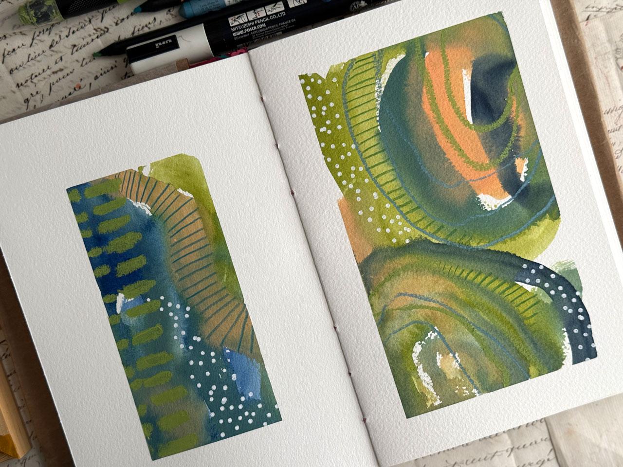
out playing with color. And you can see here we've
got color dominance, mostly green versus blue and how that changed the
look of the palette that we were doing.
And I love that. I love seeing how the
same palette can be utilized differently
depending on where you start, what
color you start with. And what you choose
to mark make on top. Oh Look at that. Oh, my gosh. Super fun. Alright. And we didn't get too far off
our color palette. We actually stuck
to it pretty good. I'm proud. A. Hope you enjoyed hanging out and doing this color palette today. I'm looking forward to seeing your version of this one
if you try that one out, and I'll see you
in the next video.
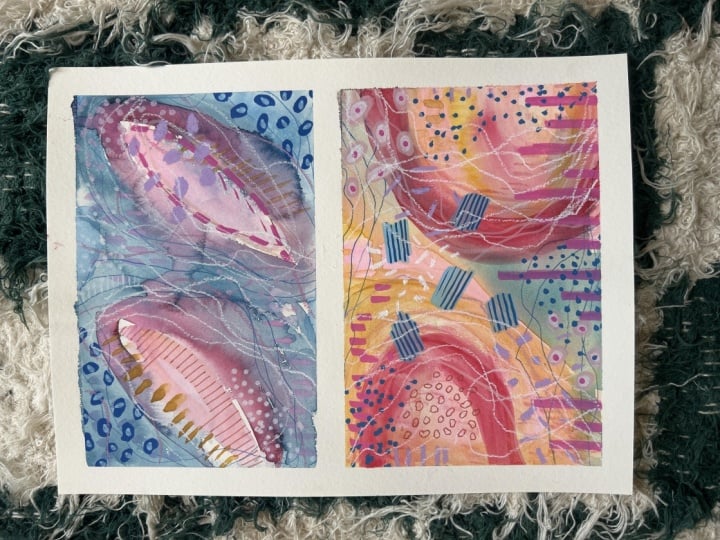
9. Blue, Orange, and Pink Color Palette: This video, let's do one
more color palette one. Let's just look at
where we started. I've got the lovely
stripe at the beginning, which I love love. This lovely green brown
and pink palette, which I love love. We've got this fun blue
green palette, which I like. I wouldn't say it's my
favorite, but I do like it. A lot of times when you're
doing these, especially, and this is why I like a
color palette challenge. In addition to say dominant color challenge
like we did on these, is because then
you'll figure out color combinations that
will surprise you. These surprised me in a
good way and I'm like, oh, I'm really drawn to those. If I had just looked
at the picture or just looked at those colors, I would not have just
naturally pulled those out, I don't think, just because
I wouldn't have thought of. And I love this one a lot, too. And I wouldn't have normally thought to put that
purple in there. That was like an afterthought, like, What if I added that? And I kind of got that from looking at the
cover of this one. And so it's a way to kind
of see things that you're just not going to discover any
other way unless you play. And so, these are all
about play for me. Look at this one.
Let's do this one. Let me tell you, I
don't like yellow, but I love yellow ochre. I don't like bright yellow, like that bright one up there. Like this really well,
actually, I do like that one. That's more of a butter yellow. So thinking yellow ochre. We'll be right here. I think that one actually
we'll do that one up top there, that number 39. Then we've got how about
this number six in here, and then we got pink. I might pull that pink from that brighter pink just because it doesn't
have to be exact. We're just getting close
and then we've got some dark color here which I could pull in in
the mark making. Or we could pull
it from our card. I might make that this
lovely Paine's gray. That's what I'm feeling. Pain's gray, yellow ochre, that lovely orange,
maybe throwing the pink. See how much easier
using one of these. I mean, we didn't get exact. I'm not looking for exact. I could pull in
these colors with those gel art sticks because there's some pretty
colors out here like that. But yeah, you see how that
helped me right up front in 30 seconds decide on
a color direction. I've already taped it off,
still doing the same big little little big, big, little. That's my composition game
that we're doing here. I'm thinking start off
one with the yellow, maybe the little one
and start off one with maybe I don't know, maybe the pink orange over here. Let's totally do it. Let's start this one
with the yellow. I really like these with these odd ovally shapes
when I start them that way. That's how I'm going
to go. I'm going to start these maybe add some water so that I get some really thin color in
there. How about that? Then maybe I'll throw a little of that pink in
there while we're right here. That's super fun in a way
I didn't expect there. All right, maybe I'll go
here to the reddish one, which I decided was this
one here, number six. What? Oh, my gosh. See? Discovering we discover weird stuff when we go
off and just experiment. Look at that. Oh, my gosh. Let me H mole. I wasn't quite thinking. Let's go with this
lovely blue over here. I'm getting into my own
little color I don't know, almost where I'm coming in with the same shapes and stuff
like the ovals and stuff. If that's not your thing,
just experiment and play, look at that. Oh my gosh. That was rather let's just now I feel crazy because
that's oh my goodness. We're going to throw
this pink in there. This is some of why I like doing this
then once you're like, I don't know about
that, you get brave. You're like, What if I did this? Because then you're no
longer invested in it being something amazing and
you're like, what if? Now I don't know about that. Now I'm in the what if?
What if I did this? Because now it's just crazy. And that's what I
like about doing stuff like this
because you know what? Some of the craziest ones have been my very
favorite later. So it's definitely worth just following the crazy train
when you kind of get off get off the story there because I feel
like we got off the story somehow
there. Oh, my gosh. That's crazy. Now I want to
throw something else in here. What do we want
to throw in here? I'm thinking. I don't know. What am I thinking, Oh,
how about an orange? Oh, yeah, let's
just do this one. Whatever this number 22 is, just a little more of an orange, something, we're
just going to throw that on there because why not? I like it when you can let go
and be like, Yeah, why not? That's when you start to have fun and you look at things
like, that's crazy. Did I expect that? Maybe not. Let's throw this
why not here over here and mark make a
little bit. Why not? Because then you
start getting brave and doing crazy stuff. That's when you make really
cool discoveries and you do things that maybe you
wouldn't have normally done, but look how they
turned out when you did it. Yeah, that's what I like. Because we have a yellow
oak or thing going, maybe if we throw in some
yellow oak over here. Again, just like, why not? Because I don't know. We went a little crazy with this definitely the best lesson out of all of them
on color dominance. I mean, look what
happened when we started off with that
light yellow versus starting off with that
Pain's gray kind of color. That's crazy. But in a good way. We did mostly stick
with our color palette. I mean, look at that. We pulled the dark dark from over here. We pulled the light
light from over here. I didn't get too far off of it, even though I felt a little bit crazy there with that.
Let's let this dry. Then we'll mark
make and see where we ended up some of
the craziest ones, the ones where I
finally was like, Yeah. Cars, let's just see
what happens if I did this or that or some
of my very favorites. This might surprise us and be one of our
favorite in the end. Let's take a break and let that dry for a moment and
I'll be right back. Alright, we've got these dry. I'm actually feeling pretty good about these weirdly enough. This one's pretty cool. I'm feeling like you get a little piece
of scrap paper here. I'm feeling like I need some pink dots with the posca
pen. I'm just feeling it. So if you have a little
thought, What if I did this? That thought runs
through your mind, ride that wave, do it, pull it out and think, Okay, I just had that thought. Let's intuitively
follow it and do it. Look how fun that
little tiny pink dots. I'm also feeling over here, maybe a little orange dot. What do you think? Wah. And I'm just random
with the dots. It's nothing specific. We're not going
anywhere with them. It's just a little
bit of whimsy. I do like to off center stuff, so I tend to not put things right in the center
with my compositions. That's just a
personal preference. I think it comes
from all the years I did photography where I
naturally centered up something and shifted
left or right or up or down to off center my subject because the least
interesting composition usually is dead on center to
spice that up a little bit, you shift a little bit
left or right or make that feeling like
this bright pink. What do you think?
Oh, my gosh, should we do a bright pink bigger? This is the king art, gelsticks and this one just came
to me, what about this? I'm feeling like we could
either do a line or we could do some more lines like this or we could do some gigantic
dots. What would you do? I'm feeling like a line though, because for some reason on
these tall skinny ones, doing the line,
thing feels good. I don't know why. Just
visually composition wise, it just makes my mind happy
seeing that in there. We could always continue it off. It could be a little
dash line set, continue it off to the side. When we peel the tape, you can see that it kept going. It visually lets people imagine what is
outside the frame. Yes, I'm liking that. Now I'm feeling
something over here. Should I do a great big? Let's just do it
since I thought it, it doesn't look as good, though. We can see what's underneath it. Um, a little bit.
Still fun, though. What I've gotten in
the habit of doing is if I do it somewhere and I'm like, oh, I don't
know about that. I don't want it to
just be one spot that says, Look I
made a mistake. I want it to be like
I did it on purpose, do a little more and do something
somewhere else similar. Then it was on purpose. It was not a mistake. A, let's see what we can do. I feel like I need a
little something else. Maybe I'll do some little
fine lines in orange, possibly. Oh look at this color. Who look at this color.
Ooh, pretty pretty. We could do something
like just some abstract extra
mark making lines. I'm feeling that. Oh
I'm feeling that. I looked good. Yes. Alright. Seeing that's
kind of a fun surprise. It's not just pencil colored. Kind of thinking that we could do a few
of these over here. Like, what if we
pulled this kind of going off color
palette a tiny bit. But I feel lavender.
Can you feel lavender? I think it's because
the pink and the blue kind of blended in there and gave us
a little bit of another color that
might not have been in our color palette but became part of our color
palette we'll say? Okay, I like that. That
was a good choice. That was a good
choice. Let's pull. I like to keep these out just in case I want
to do it again. Okay? I feel one more thing. What one more thing do we think? Feeling like this is there. Um, maybe one more or are
we there? I could be there. I could be there. Maybe we like this kind of pinky
orange, maybe not. I'm looking around
at the options. I don't want a little
dot. I don't want a big dot. I might want a line. Like, can I get any color
showing if I do a little line? Let's do it in an orange. I'm kind of thinking a little bit. Doesn't
have to be a lot. I just feel like I need visually a little extra
texture in there. Yeah. Yes. I like
it. Okay, good job. Good. Good job. I like that. Alright. That's super fun. Let's do it down here
just 'cause I just like enough stuff to
move me around to give me some interest to
be like, what is that? You get closer to observe
some details. I like that. I feel like I'm
there. This could use a little line in here maybe, but I feel
like I'm there. So we're going to
say we're there for today and just see
what we got because sometimes peeling the tape reveals if you really needed
something else or not. Man, look how nice that is. This whole bin artist tape
is my favorite clean line, look how gorgeous does not tear my paper and really sets that off and
gives it some framing. Look how cool that is.
Alright, I like that. I do feel like
maybe I could take this orange and
sharpen it a tiny bit because I just had a
thought of this orange. Maybe filling in right here
where we've got I broke it. We we've got that space, that white kind of that white. Okay. And this is exactly
where I was saying. This one's so soft,
I'm breaking it. This is exactly
where I was saying that now you can kind of see
what else might it need, and you can tweak
it a little bit without disturbing your boundaries that
you created. Okay? I feel good about
that. I Love it. I got my little count
chocolate laugh going today. You eat that when you're a kid? Oh, my gosh, I feel my giddiness at how much
fun I've had today at my art table kicking in because
this has been fantastic. Oh, yeah, look at
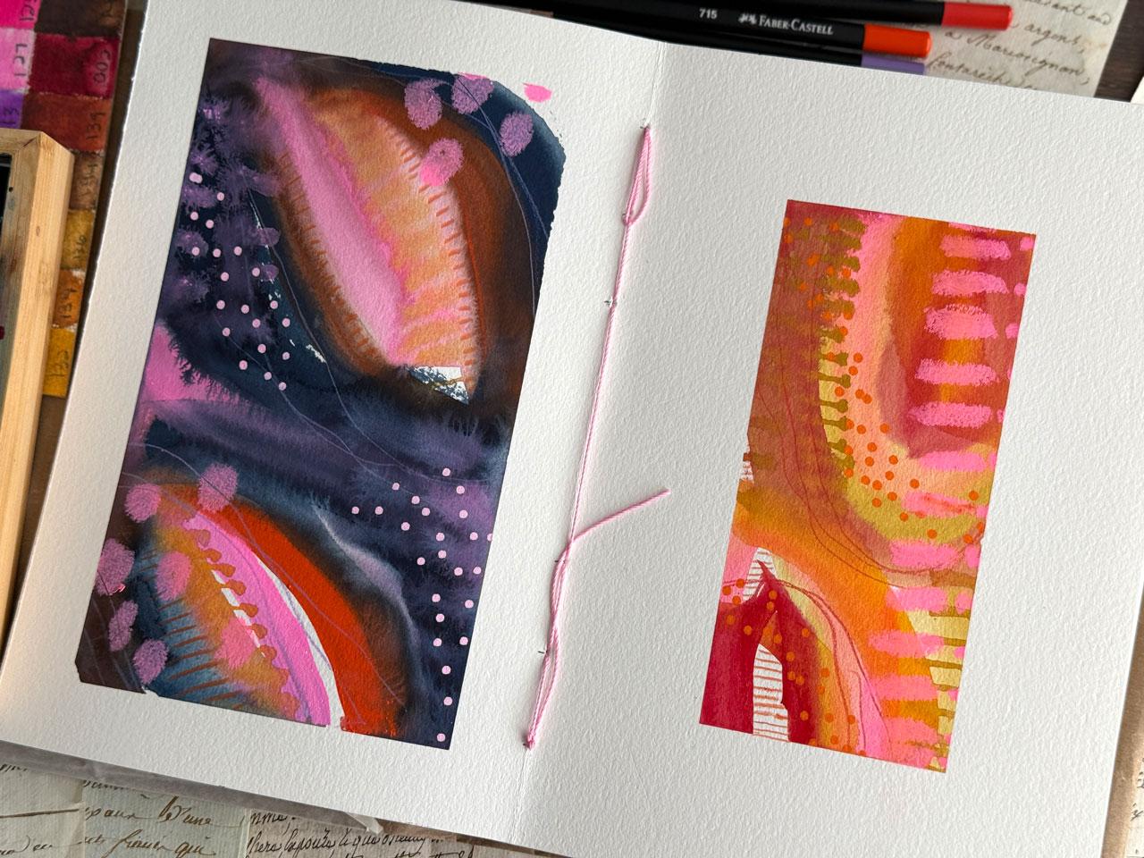
that. Oh, my gosh. Look at that. Oh, super fun. This has been the biggest
lesson on color dominance, starting off with a yellow
or ochre versus starting off with a Pain's
gray or a deep blue. Same color palette I didn't put any of
the blue over here, but we still had basically
the same color palette and got such drastically
different looks. I mean, I almost
feel like I could come in here and throw in a blue dot and then we
would pull that over. Ooh. Kind of don't
want to ruin it. At the same time, if you
had that deep blue pasca, you could pull
that deep blue in. I'm going to leave it
for today, though, but just throwing thoughts
out there as they come to me. Yeah, that was super fun. And we didn't get too far
off our color palette. We kind of stayed in this range versus this range
for the most part. So that was kind of
fun to at least give ourselves a direction,
and that's not at all. What I would have expected this color palette to
give me in the end, which is why I love
doing these super fun. Hope you enjoyed this
particular color set, and I'll see you back in class.
10. Evaluating and Mark Making Ideas: Let's do a little bit
of evaluating and chat about some of
my favorite ways to do these abstracts. You can do a book like this with color dominance in any way that you feel good about
whatever your art is, but I just want to point out a few things that I enjoy
in doing abstracts and so these have turned into a lovely abstract pieces that
I never would have created otherwise that I've
enjoyed experimenting with and growing
with and creating. The first book I did,
these are coming out now. I put a playlist to
this book's layouts, which these videos I'll be posting every week or
two throughout the year. This is 2026 that
these will be posting. If you're watching
this class later, you can go back to
this playlist at any time and get more
inspiration for your books. These just happen to be
whatever current style that I was painting in
and having fun with. Some of the ways that I
enjoy creating these is to start with one color and flood the page
with that color, whether it be coming
through, at a diagonal, you're creating that
natural eye movement as you go through the piece or coming in from the sides towards the middle but not starting in the middle. Then I like to fill
in with other colors. Another thing that I've
enjoyed doing with these is picking a color
to make as lines. That could be neoclor to crayon, could have been the
favorite castle, black addition pencils
because they're very bold. Could have been graphite
pencil, which I like a lot. Also like these big
giant art gel sticks. You could have done
something like big marks with some type of larger
mark making tool that could have included the
king art sticks or posca pens or tempera
paint sticks. If you've got those, that
would have been a good choice. These shuttle art temper sticks
are some of my favorite. These are a child's
craft paint though, and these are more of higher
quality art materials. For this book, I went
with the higher quality. Um, gel art stick in here. I limited it to a certain set of supplies and then that's what I created the
whole book with. That's what I want you to
do. I want you to pick out one base paint type like
watercolor gouache, whatever, and then pick out three or four
different mark making things that you
can use as staples for mark making all the
way through your pieces. That's how I started that. Another thing I like to do
is start the colors with big oval circles because that
gives you areas to fill in. It gives you areas to
create white space, it allows the other
colors room to come into. I like that. You can see some
of the overwork going here. Some of them, I created this
one like a great Big C, just to give me
overall coverage, but give my colors places to
shine and do their thing, and then mark making
on top of that. Again, big loose mark making
to get those started. Here I did two US and that was super interesting and then come through with some other
colors leading the eye. I like doing big circly shapes. You might like square, you might like straight lines,
whatever it is. Then I like starting with the circly things and then
breaking that up with other lines and directions gives your eye somewhere
to move around the piece, and then a great big ovally
see shaped over there. Then here's some where I've bled the color in on the diagonal, it's just interesting to see how flooding the page with
color and then mark making on top of that gives us such interesting
different compositions and paintings when we're done. This is one where I flooded the page a little
bit differently and we've got a little
more choppy look to these and that's super fun. I want you to experiment with different large swashes of color somehow and then get into what it is that
maybe you would like. Here I've got the
swashes of color we're doing a U shape and then
straight on the bottom. Then this is another one and
then this was two ovals. This is another one
where I was like, I don't know about this one and I doubted the whole time I was painting it and then when it was done, one of my favorite. Some of this experimenting oh my goodness,
has been amazing. Here we've got great big started with a great
big swash of color, came in with some other
color, and again, made the color and
you can see how that leads your eye
through the place. This is why I'm using the new book because this one
I was a little sloppy with. On the new book, I'm covering
the cover and putting my wax paper pieces in there and leaving them
because I've got bleed through, and it just is what it is when you're
painting a book where they're facing each
other and even though all these materials dry, maybe they still smudge it off on the other side
so you can fix it. But I still feel like even fixing it, it could
be questionable. On the new book, I'm putting the wax paper pieces in to
keep all my pages clean. Because they've come out so
amazing, I love them so much. You could also scan
these in your computer and clean up the edges
and make prints. I mean, look at this one. I love this color way too. I have discovered
so many color ways that I just never expected. This one's coming
in at the angle. This one's starting
with the big ovals and then coming through the piece. This is an excellent way to discover different
compositions that you prefer, just the play and the trying out different loose movements with the paint as you're going. And it's the perfect
way to discover color and color ways that you would like that
maybe you didn't think. Then the stripy one
is always good. If you wanted to do a
whole book of stripes, couldn't go wrong
with that and one of these may turn
into a strap book. I love them so much. That's my inspiration. I just thought I'd talk about
different compositions. And in this class, I started
the first page off with a stripe and instead
of the color palette, which either way would be a
really great way to start. But I love this one
the way I started it. I'm also going to end it off on the last page with a stripe. You could also go
backwards on what I did. Color palette stripe
on the other book, and you could do stripe
and the last page be the color palette.
That could be fun too. Look how pretty that that is. Even though I was
thinking, Oh, no, I should have
matched this better. So it kind of went together. I think I did pretty
good actually. So I'm not hating it at all. Then we did this lovely
piece and I'm kind of stuck on the rounded shapes. That's where I realize now
that I've done so many that I am loving that roundy roundy, but this one kind
of went through. And then this piece where we just shocked
ourselves with how dramatically different this
dominant color challenge was. We started with
the yellow versus the Payne's gray, bluish color. Amazing how dramatically
different those are. Now, if you think, I don't know how to
do the mark making, or I don't know what kind
of marks that I would like or or you're confused on
that or you need some ideas. I do have a couple of different classes where
we have done mark making. I've got the mark making
library class where we made these lovely sheets and then you can hang
these on your wall, and then this could
be your ideas for mark making these sheets so that you're not
painting and then going, oh no, I don't know what marks that I might
like in my piece. Something like this and
hanging on your wall would be an excellent reference
library for you. You can go check out the
mark making library class. Also have the Rolling
Stones class where we do a mark making
sheet like this. I just did mark making in Great Big Squares and
took a shaped punch and punched don't think this
shape is available anymore. It's like a Moroccan shape
punch, but it's pretty. Then also in the master classes, this is the Gustav Klemt class where we study old
masters paintings and then come up with different mark making out of his paintings
that maybe appeals to us. This is one of my favorites, the little squares and squares. So I just want to give
you some ideas where you can go look to get
mark making ideas. You can also look on
Pintris and search out doodle inspiration because
it's basically doodling. And then that could
give you some ideas for doodles that maybe
you would enjoy putting in your pieces and make this process a little
bit easier for you. All right, so I
hope you enjoyed. Painting with me in this class, I'm going to continue
in this book, adding to my playlist
that I've already started with paintings that
I've done in this book, so I'll continue adding to that playlist so you can
keep referring back to that and getting new ideas for your book after you've taken this class with the
layouts that we've done. Hope you enjoyed
doing some of these with me and I'll see
you back in class.
11. Final Thoughts: Before you go, I hope this
project has helped you see just how much impact
color balance can have in an
abstract painting. Using a limited palette is
such a playful way to explore color relationships
while keeping the process simple and playful. I encourage you to keep
experimenting with different palettes and see how many variations you can
create in your journal. Each bread becomes a
little color study and a record of your
creative exploration. If you create a
pair of paintings, I'd love for you
to share them in the project gallery so we can see all the
different directions a single palette can go.
 DENISE LOVE, Artist & Creative Educator