Transcripts
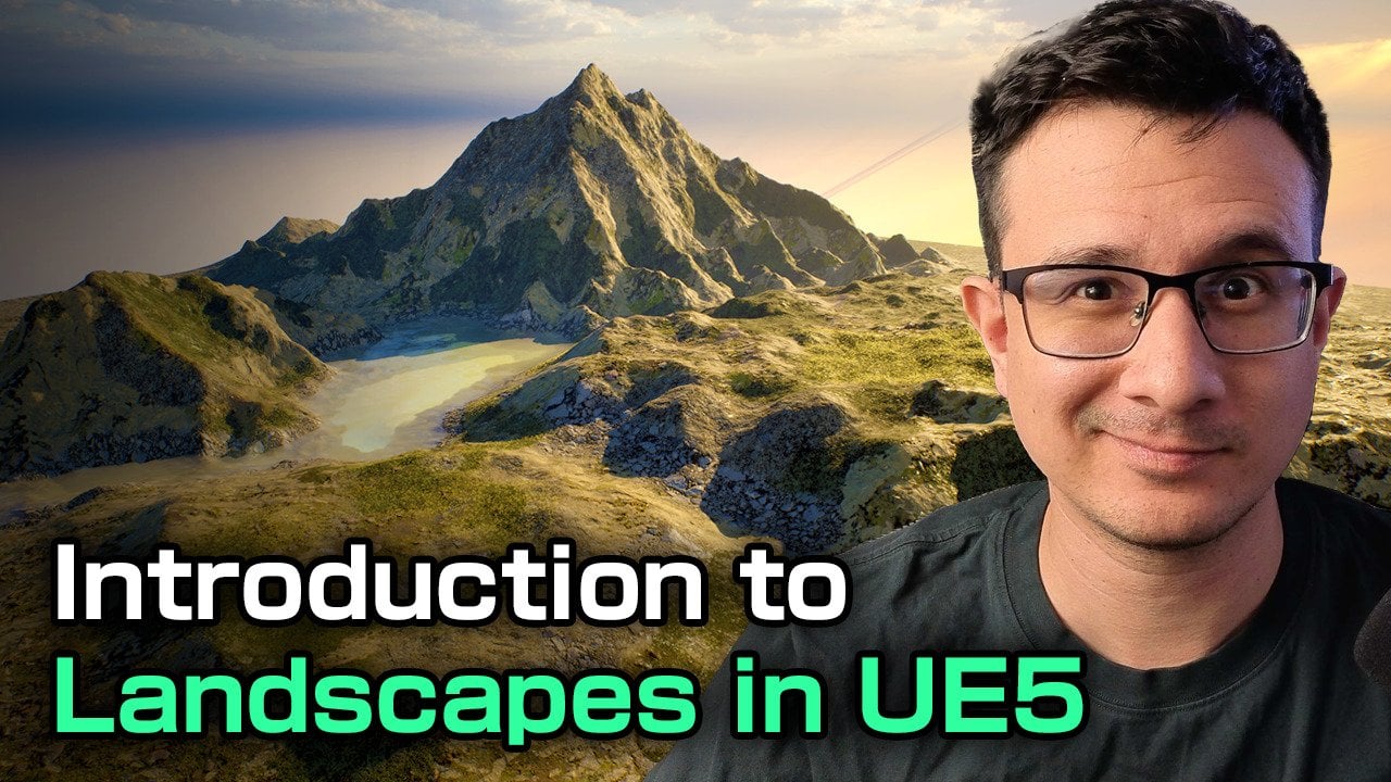
1. Creating AAA Environments in UE5: Have you ever tried to create
an environment in A Real Engine five to realize that
it just looked very bad? Well, you're not alone. And a lot of people that
try to do the same as you, they fail because they
don't know there is a secret language that artists use to create
beautiful pieces. And I will show you what
this language is about. My name is Mao, and I worked in the game industry
for over 13 years, work as an environment
artist in AA Game Studios, creating those
beautiful environments that you see in games. In this course, you will
learn how to create game environments in A Real Engine five that look beautiful. You see, most people
fail because they think environment creation
is just drag and drop. And there are plenty
of tools that real engine provides
like nanite, mega scans, a lot of fancy tools that make you
think, You know what? Maybe I can just go ahead and create an
environment just like that. And that's why most people fail. I will show you the
secret language that artists use to
create beautiful pieces, no matter the medium, painting, sculpting, treaty, game
environments, film creation. All of those principles apply
to different disciplines. And we will talk
about all those in this course, lining,
design principles, color harmony, color
contrast, design shapes. There's so many things hidden
that most people don't see, you will be able to see
them after this course. I have made tens of environment
art courses in the past, reaching millions of people. And I can say with
confidence that this one is the best I've done so far.
I'm really proud of. And I hope you can join
me in this process in this journey to help you
become a better artist, a better person, a
better professional. And if you want to increase
your environment art skills, join me, and I will promise
you you will improve.
2. Viewport Navigation and creating our level: Welcome to another
environment creation course. This is the beginning
where you will just start creating
your own environment, and this may look a
little bit intimidating. If you are new to
unreal, don't worry. I will guide you
through step by step on everything that
you need to do to create your own environment. So if you open up unreal
for the first time, you will see that you have
this big window here. This is called the viewport. So this is where your
environment will be, and this is the
final representation of how your game will look like. On the right side, you
have the outliner, where you have all the
objects in your sin, and also below it, you have the word partition
tab or the details panel. So if I click on one
of the actors here, you will see that I
have some details such as the location, rotation, and scale of this
actor and a bunch of unique properties that
comes with it. All right. So very quickly, if you
are very new to unreal, I will show you how to navigate. Right click to move around
your mouse, just like this. It's kind of like a spaceship. You know, so far, we cannot move, but I will show you my preferred
method of moving. By holding the right mouse
click and holding the Aw ASD, I can actually move like this. Now, you have
noticed that I have increased the speed
of my camera. I will show you how
to do that later. But for now, middle
mouse click to move around the camera like this in two dimensions up and down. And left mouse click is kind of like you're flying spaceship
where just move around. So all those methods
are valid for you. Use whatever you're more
comfortable with for me, I use the right mouse click and then use the WASD
to move around. And you will notice here
that I have a camera speed. So the camera speed you can
adjust by clicking here. So, for example, I go for 0.33, and now you will see that
my camera is much slower. Now, this method is very slow. So instead, what I like to
do is while I'm moving, I can actually scroll wheel with my mouse with
my mouse scroll wheel. I can go down and up and you will see how this
number changed at the top. While going up, I go faster, and when I'm going
down, I go slower. So that's it for the navigation. The next thing you need
to do is to press F to focus on an object and if you want to rotate
around the object, just hold out and the left
mouse click to move around. And then if you don't
want to do that, you can always go back to
right mouse click and WASD. So with that being said, I'm not going to
cover everything. We're going to cover
everything step by step here. No, you don't need to worry
about all those buttons yet. What I want to do is to
actually go to file new level. And here, I will create
just an empty level here. Go for empty level,
click Create. Okay. And with this empty label, what I can do is to actually start adding more
stuff to the label. So the first thing
that I want to add is you will go to Window
Environment Light Mixer. And you will see
that you have a tab here where you can
add some lights. You will notice that
here on my outliner, my outliner is empty. That's because I don't have
any actor in the scene. So what you can do is
actually is very simple. You just click all of them. So click the skylight, click the directional light, click the atmosphere, Bloometric clouds
and the height fog. And just like that,
you will see that you have all your actors
here on the right, all the necessary lights. We're not really going to
touch the lights right now. It's just a good thing to have at the
beginning. All right. So click X, so that you close the
environment light mixer. We don't need these anymore. And we're going to
save our level. So this is a project
that I use for all my courses and
coaching sessions because you will see in the future that it
takes a lot of time to download assets and
import them into unreal. And it's really just a simple
process, but it's long. So I use this project
for every course. So what I will do is to press Control S to
save the label, and you will see that
you can just put, for example, you will have
this empty, not like me. You can just create a new
folder, for example, here, right click, create a new
folder and call it levels. And then you can go here
and go for let's just call it my first level. There you go. Click Save. Now your level
it's ready to be used. You don't need to
do anything else. What I'm going to do next
is to show you how you can start adding things
to your environment. So let's do that now.
3. Object placement: So for creating our level, it's a good idea to, you know, start putting some
actors into your scene. So if you click the
green plus icon, you will see that you can
have a bunch of actors here, such as, you know,
character, pun, a point light, different
types of lights, different kinds of
shapes, cinematic actors, visual effects, and, you know, you can actually see all the actor list that is
available for you here. You can also type which
actor you want, for example, like a cube, and we can just
drag a cube to the scene. So I want to just drag
a cube from here. Just going to drag it
and put it in position. And you will see here
that on the right side, you will see the properties. So you have the
location, the rotation, and the scale, you will see that you actually
have a gizmo here. If you don't see this gizmos
because one of those is not activated here on the
top corner of your eper. So press here for move press here for rotation
and press here for skill. So if you move it like this, you will be able to move
it into axis across the C and the Y axis across this is
the Y axis and the X axis, and just like this
across the x axis. So obviously, I don't
really like to click here. It's a standard to use WER to
tagle between those modes. So if you press W, you will
be able to move the object. Q is just for select
mode so that you make sure you don't move or rotate
your models accidentally. So you will see that
you can actually go to the properties
here and start rotating. I mean, moving the object to
the location that you want. So you can actually
type the value here. For example, I can go
for a location of zero, zero and zero, and this will
be on the origin of this. Okay. And I can also
press W to have my move gizmo and I can just
move it around like this. You will notice that
I have a value that is not as not a
very pretty value. The reason for that is I haven't put the snapping tool on. So let me turn those on. Okay. So the snapping tool, you will be able to
snap in values of ten. And unreal, all the units
that you have here, it's based on centimeters. So every unreal unit
is 1 centimeter. So if you move by ten, you
will move by 10 centimeters, 10 centimeters like this, and you can just put
it wherever you want. You can also press E to
rotate just like this, and you will see that it's
snapping every 10 centimeters, press R to scale, and I actually want to
scale this quite a bit, just like this so that we can
have a floor or something. And that's all you need. So we can hit play, and by the way, before I move into that,
this is the play bottom. So if you want to
play your game, if you have a character
or something, we're just going to hit play, and you will see
that by default, the actor that goes
here is the actor that has the camera. You can just fly
around with WASD and just move around with
E and Q to go up and down. You can also do that in
the viewport as well. Forgot to mention, up and down. So what I want to do is to always start at
the same place. But I don't really need to do that when I creating
an environment, maybe you are creating a game, maybe you're creating a piece
for cinematic or a movie. So you don't necessarily
need to play the game, but I would like to
add a character here. And the reason for that is it's going to be useful
for our scale. Scale is very important
for environment, so I'm going to go here, go to AD and go to at
Seture or Content Pack. I'm going to go for the
third person character. And I'm going to
click at to Project. And what this will
do is just import my new assets here in
the content browser. Now, the content browser, it's pretty much the
folder structure that you have in your project. Everything that
you have inside of the content folder will
be inside your project. So by default, these new
folders, third person, and pretty much the blueprints and all the new characters. So for example, the
label prototyping also goes for I get a
bunch of new meshes here, and, you know, they come
with characters as well. You come with meshes
that we need. So what I want to do is to
actually drag this mesh. And actually want to play, you will see that I don't have that third person character here. I will show you how
to get one soon. But for now, I'm
just going to drag these meshes here from
character meshes, drag money. You can either drag from here and move to the other top of your level and just
put it in position. The first time is going to load a little bit, and there you go. There is money. And we're going to leave it there so
that we can have scale. So click here and there you go. Now, if you really want
to play your game, you can just go to
world settings. If you don't see
the word settings, go to Window, and should be around here word
settings there you go. And you'll go to game mode overwrite our default
value is known. We're going to go for
third person game mode. And if we hit play, you will see that our
character spans here. Now, the problem is if I move
the camera and I hit play, my character will span where my camera is and we
will keep falling. So maybe that's
not what we want. So just to be sure, if you really want to
put a character here, we're going to add a new actor. This actor is called
the player Start. So I'm just going
to drag this here. And obviously, this
is a direction where you want to put it. Maybe you can rotate
this around just like this 180 degrees
and put it here. Click Play, and now you will see that you have
your character, and you can use WASZ to move. You can jump, and maybe
that's something you want. I'm going to I show you
this just in case maybe you want to run in
your environment and play a little bit with it. If you're making just
an environment and you don't really want to
play with it, it's okay. Just put this into non. This is what I will
do for myself. And I will just keep
this mesh here so that I have a nice reference to start blocking
out my environment. So with that set, let's move out to some
blockout techniques that you can apply into
your game environments. I'm going to go into
modeling tools. So I'll see you there.
4. Starting to block our composition: So for making our environment, there are multiple
choices that we have. And the first step on making your environment
is the blockout. It's called like this, lockout. So the blockout is pretty much the foundation that your
environment will have. And this is very important because this is
your composition. This will be your composition, and if this looks
right, don't worry. The rest of the environment
will be piece of cake or going to show you more detailing
techniques later. But the first thing that we need to do is to block
our environment. So we're going to apply
a lot of art foundation. I'm going to teach you
more art fundamentals here because the blockout phase
is quite easy to understand. But what most people don't get, and this is why you are here on this course is to learn
the art foundation, the hidden things that most people don't see that makes their environment pretty. So let me just go ahead and
just delete this because what I want to do
is to actually have a a model based from
the modeling tool. So if I just click
here from Modeling, I can just click on box, and you will see that it's pretty much the
same except that I can just change the subdivisions
and everything here. So I will just go
ahead and put it here. So this box will serve me
as an example of how you can manipulate the modeling
tools inside and Reel. So I'm just going to
put it in position, and I'm actually going to
make it a little bit longer. So I'm going to go to model. And by the way,
if you're looking to know how to model inside and reel I have also courses on that where I will go through all
these tools. Do not worry. I will not touch
very deep on this, but we will go through the most important tools that we need for
making our blockout. So we can go to polygraup Edit, and you will see that you actually have a
selection of the face, the edges, and the vertex. Okay? So all these are components that basically
compose the treaty model. So what you want
to do is to just drag one of these faces
and move them here, just like that, and just try to play with it,
put it in position. And you will see
that you also have a lot of flexibility
here. All right. When you are happy
with what you have, let's just say I want to make it a little bit larger here, if you're happy,
click Accept here. Press Enter, and you will be
able to update your mesh. Now, this mesh is also
in the content browser. So if you go to Details panel and go to the box, click here, you will see that it has created a folder
called generated, and this is the computer name, and now this is the new
model that you're using. Now, every model
comes with collision. So if you play from here, you will be able
to just walk here. Every model comes with
collision, so don't worry, you will be able to walk if
you model inside unreal. So let's talk about
the next step. How would you go about
making your seam pretty? So the next thing that you want to do is to think
about your composition. I'm thinking about
something like a cave where it
goes up like this, and it also goes down, and there is like a lake here, and there is some kind of like a empty hole where the light is coming
through and we have some gut rays coming from there. And, you know, it can
get quite complicated. So in order to block
things out quite easily, we're just going into
the modeling tools. Just going to box here and click Accept and instead
of modeling like that, we can just go ahead
and, you know, try to scale things
with R, just like this. We can just scale
things like that. For example, just like this, and I can just scale
things like this way, for example, I can move it. I can think about a shot first. So let me just go
out of this mode by pressing Shift one or go to the modeling mode
and go to selection. So let me try to get a
frame here like this one, and I will press Control one. So every time I move, you
will see that you have safe bookmark here, I
can just press one. And those bookmarks
are around here, so you go to bookmarks
using bookmark, one. If you move it,
bookmark bookmark one, and you can have multiple of those like book Mark
two, for example, press Control two, one, two, one, two, and you get the idea. So this is going to be
our main composition. So we're going to
just do it like this. Make sure your scale
on local mode. You will see that you have a gizz mode that looks like this. For scales always in local, but for rotation, you can actually put it into local
mode, so it can be easier. So we can just go ahead and just rotate things a little
bit. There you go. We can also scale
things up a bit. You can see that this is
creating a line for us. It's already giving us
quite a nice composition. Let's not exaggerate
things a lot. We can actually remove the
snapping here so that we can have more control
over our or assets. There you go. Something
like that will be fine. I find that I want to scale
this up a little bit, just like this to have
some room to work with. And actually, what I want to
do is to add another box, and I will do the
same for going down. So I will just scale
things put it like this. Notice that I'm not
modeling anything, it's just rotating and scaling. This is a very fast way
of making environments. So you can just go ahead and go for something like
this, for example, and just go for scaling and put it in position,
just like that. And you will see that
I'm losing my line. Like from this angle,
I don't really see it. So let's try to actually move things like this
and just like that. From here, we're actually going to move it a little
bit like this. Let's go to the
word coordinates. We can move it just like this. Okay. And we can actually
try to go to model here. Not this one, go to model. PolygroupE dit, and start making something like
that, for example. So we can see both lines. And here, maybe I rotated
a little bit too much. That was kind of like a mistake. Let's put it here in position. Okay, maybe that's
still too much, so we will rotate it again, and she's like that. All right, so now things are starting to work a
little bit better. Let's scale this up, and let's just go back down. Beautiful. And you can see that my composition is
a little bit different now. I can move it if I want
it, just like this. And I can change
the bookmark one to Let me just shift one
to get out of this mode, and let's go to control one. And maybe I don't
need this to be, you know, super thick, so I can scale things up a bit, scale things down, as said, and maybe just
something like this. Alright. Keep in mind, this is only a blockout. So we can keep continue
working on this. For now, what I need you to understand is that we are
creating those lines. We're going to work on
lines at the moment, and then we're going to
add more foundation. Like, your eyes are
going to look at this, and then you're
going to look down. You can play with the shapes with any kind of shape you want. This is a very creative process. You can just play
with different shapes and see what works for you. So I'm going to wrap up this video and we will
continue in the next one.
5. Visual guidelines and simple forms: So one thing I want to add
is actually the end of our environment before moving into trying to
change these assets. So I'm going to go to modeling, go to box, put one here, except. And what I will do is to
actually scale things up a bit, just like this so that we
actually have like, you know, pretty much a position where we are actually telling the
environment, you know what? This will end somewhere. So we will just scale
things up a bit like this. Okay. And then we're going to go ahead and
do the same here. We're going to move
it just like that. Okay. And we can go ahead
and put it like this. We can also rotate
it a little bit. Can have a little bit
of a slope stride out. You rotate things up a bit, the lining can change, and it can be like a much
more dynamic environment. So we can go for that. And also, I want to
scale things up a bit. I will just scale this
up and move it down. Just like that so that I
still see the end here. And now that I have this, I also want like a
ground to play with. Actually, this composition more, so I will press Control one
and I will move this guy here so that we know how
the scale is working. We're actually going to
rotate this just like this, and we're going to we're
just going to move it around so that we
have like a wall. Now, you will see that this wall actually is not
really helping us. The reason for that
is we are basically, let me hide this by pressing H. We have a nice shape
that is happening here. This is called negative space. So if we go here,
you see this space, you will see that we
have a negative space. And by putting this acid here, just control He to just
put it back again. You can also click here on
Toggle so you can on and off. You will see that we are
losing all our shadows, and the lines are a
little bit like clear. You can see that this shadow in this area and this
shadow in this area, this lead area, sorry, will create a line. This shadow in this area and this lead area will
create another line. So we are creating areas
with shadow and light, and by putting this wall here, we're actually blocking it. So what I want to do is
to not put it everywhere. I'm just going to scale this
up a bit just like this. So maybe we can have
something like that. Maybe some part of our environment we're having the light coming
from this direction, for example, and we can also scale things like this
if we want it just like that. You can also rotate the light. So if you don't really
like the light, you can go to your
directional light and change the rotation here. So the rotation, you can change it very easily by
just rotating around. You will see that we're having so many interesting
shapes with this, right. So we're going to
move it up a bit. And we're going to actually
move it just like this. There you go. And I'm going to actually I could
leave it like that. I could leave it like that,
but I want to try what happens if I duplicate this. And let's go ahead.
And definitely we're having so many interesting
shapes here, right? So we're going to
move this like this. And you can see all
that you're creating. You press Control L
to move the light. Control L will move
the directional light. We can have, for example, a light is coming from this direction or maybe
from that direction, and we are creating a very interesting
composition already. Just using blocks. You don't really
need to you know, if this is interesting to you probably is also
interesting to others. So just move it around a bit. You know, maybe this part, we can rotate it a
bit, just like that. And again, all these artifacts, we're going to deal
with them very easily later when
we add some meshes. But I start liking it. It's very it has a
lot of potential. Maybe I can just move
things like this. So it has a more dynamic
shape or maybe not. Maybe just like that. Maybe this one can be we
can leave it like that. And also, I want to
add some floors, and maybe you can just alt and click to duplicate this one. Remember, you can
duplicate by holding Alt and move it so you
can have a new object, and you can just put
it on the ground. Just put it on the ground just
so that we have, you know, a place to, you know, it's like it's ending
here, you know? This is where it ends, and we're actually going to actually going to
go here modeling, model polygroupE dit
and go like that. There you go. And probably want to I want to
move this up a bit. Yeah, just like that. Yeah, I want to put some water there and also this wall here. I want to actually move
it just like this. See how it looks like. This
wall is the same as this one. So what I will do is to create, sorry, transform,
duplicate, click Okay. Looks like we duplicate
from this one. So now that we have this, we can just polygraph
edit, go like this. And now we want affect
the original one. So we can just go
ahead and try to see those shadows and lights. There we go,
something like that. Maybe we can go for
something like this. Maybe we can even have
a hole here where I will show you a new technique later where we can try
to play with some holes. We can also definitely do that. But let's take a look
at our composition. It looks very dynamic.
I want to just rotate this around
just like that. It already looks
very interesting, in my opinion, and we haven't even put any kind of detail. So I want to step back and reflect with you what is the things
that are happening here. We're creating shapes, and these shapes are creating
shadows and light, lead areas and shadow areas. We as artists, we
only look at shapes. We only look at shapes
that we can see here. Even this is one shape
because it's one lead area. And all this block here, it's one big shape
that is in the dark. Now, this can change if
I actually move my light with Control L and
just rotate it, you will see that my
composition change. Now, my composition is
looking way different. And if I go for
something like this, my composition will also
look very different. So let me try to
find something like I actually like the light that I had before,
so I will control L. I kind of like it. And that's
without adding any detail, but it's really
important to have these shapes working
on very early on. Now, what I want to do is to actually before we
wrap up things, we're going to go to
transform, duplicate, so I don't want to affect
anything from other models. I will go here. I will show you a new techniques
called the extrude. So I can just extrude things
like this, click Accept, and now I can go to polygon Edit and I can just
move it just like this. So I can have another path, someone's coming from there and someone is coming
from the right. Very, very cool. So with this, hopefully you understand
more about composition. We talk about visual guidelines and the importance
of shapes and forms. And this is a good start
to start thinking, you know, about what kind
of assets you want to put. So we're going to go
ahead and do that next.
6. Downloading Assets from Fab: All right, so during the
making of this tutorial, real got upgraded to 5.6, and I did it for this project, and you will realize that the interface has
changed quite a bit, but it's the same things
that we saw before. It's just that they are
in a different position. For instance, the lead
mode and all the types of viewport visualizations
are in the right corner. Also, you have also other types of visualizations here which you don't
really need at the moment. And real time Viewport is here. If I click it off, then you
won't have the real time, which is great if your computer is not that good like mine. And then here you have the
snapping tools like scale, rotation, and so on and so on. So it's really all
you need to know. What I want to focus on this video is on
importing assets because on real engine 5.6 now
fives included on it. So if we go here, you will see that you have
a fab bottom here. You can also go to AD
and then go to Fab. And what is Fab is
basically the marketplace that Epic has for many stores, not only the marketplace
from Unreal Engine, but also many other
stores like this one, for example, you can see the stores that are
available here. For me, I'm interested on the Quixel assets which
were free from last year. So you should have them. If not, you can
just follow along with the free assets that
are available for you. Because creating these assets
can take quite a long time, and I will create a course on creating assets
in the future. For now, please just
stick with this. So how do you download
assets from Quixel? Well, you can just go
type Quicksel here. And you will see that you
will have all the products that Quickss are
available for you. If you have them for free, you will see that they
are safe in your library. They have thousands of assets. So let's go for Type and Quixel. And what you want
to do is to click Include Treaty
compatible formats. Just check this so
that you will see, all the treaty assets
that are available, not only real projects. And when you click on search, you will actually look for the assets that
are within Quicksel. So for example, I go for Clif, you will see that I'm
already filtering all the other stores that
are paid assets or whatnot, and I'm going to actually
use the ones for free. So for example, I
also want to go for T D. So I don't want to
check materials yet, and I can choose
any one of them. So, for example, I
want to look for something a little
bit horizontal maybe. Let me see. Let me see here. Probably we will be using
some ground assets as well. So maybe this one
can be a good one. So just click here and you will see that you
have the quality. We want to go for
the raw quality, which is the Nani version. And just like that,
just go at the project. And what it will do, it will
just start downloading. You will see here in
the bottom right corner that is actually downloading. As soon as it
finishes downloading, you will be able to see your asset on the
content browser. So I already imported one asset, so you don't have to wait
for the asset to download. You will see that you have
a fab, fab folder here. I actually going to
change the color. You can actually change the
color by right clicking and then just go to set color. I'm going to put
something like light green, maybe like that. So it's easy to find. And then you will see that
you have mega scans, treaty. And this is a folder that I
actually use for this acid. So you will see that
I have my acid here. So if I drag it, you will see that
I have my asset on high quality like that. You can also double
click on this to open up the static mesh editor, and you will see that
Nant its enable. And for now, we won't
care about the materials. We're going to worry
about the material later. For now, what we're looking for is just to import some assets. So what I'm going to do on my side is to
download a bunch of assets that we're actually
going to use in our project, and after I download everything
so that you don't have to seem downloading every asset, we can just continue with the environment
creation process. We already have the base
for our composition. Now we need to go into shaping the forms a little bit better
other than cubes. All right. So with that set, I'll see you in the next video.
7. First pass of the environment: So I already download all the assets that
we're going to use. We're going to
continue adding as we continue to create
this environment. But I'm going to
show you what I add, and you will see that I have a fab folder with
mega scans and treD. So these are all my assets. And in order to
find them easier, you can just go to
the filter tab, click here, and then
go to static Mesh. This will give you a list of static measures that
we're going to use, and you don't really need
to go through each folder. I'm mostly concerned about the rocks because
what we need to do now is to block out our area. So we're going to start
with some of them. Like, for example, this
one, scrap this one, and let's try to put it here, try to put it in position, and let's just scale it
with our there you go. And we can start putting it, for example, on the corner here. We can even make it bigger.
Something like that. And we can start
putting those into the areas where we
have our blockout. Now, if you want, you
can just click here and click here to remove
the snapping options. I find that whenever
working with natural environments is better
to remove the snapping. So you can go for this one, for example, make it a little bit bigger or just
something like that. There you go. Something
like that will work. Okay. And the idea is you
already have a shadow here, so it doesn't really
matter that much. We can always change it later. But the idea is not to change
or blockout that much. We're going to add, you know, interesting silhouettes here. So The idea is our
blockout is are very good. We just need to, you know, play a little bit with this. Now, I'm going to duplicate
this one a few times. And what I can do
actually is go for one of these big rocks
we usually have. And, you know, just
try to play with it. Now, you will notice that the
rock is a different color. We're not concerned
about the colors for now. Not for now. So you will see that
actually put it here. For example, maybe that's
something I want, maybe not. But if you don't like
it, just remove it. And we're going to keep
drag and dropping. Now, we're only following
our composition. This is what's so good
about this methods that you don't really need to think too much about what
are you going to put. Now, for example, you're
going to put this one, and maybe these ones can
serve as pillars for us. Like we can just
put this one here, and track them
here. There you go. Can even put it a
little bit smaller. Something like that. Okay. And we can I don't really want to
rotate this one that much. Just make sure you have
a solid plane here, and in order to do that, we can just move it like this. Eventually, we will remove this. We will remove the blockout as we continue to
add more meshes. So let's continue to
add some of those. So, for example,
you have this one. So this mesh here, you can
try put it here as well. And this mesh is actually really good because it's a 360 mesh. It means that you
can actually use it on very different angles. So for example, if I wanted
to put this one here, I could just rotate this
one, put it in position. Just like that. I can make
it bigger or smaller. It doesn't matter. Going
to put it in the position where I'm going to just
remove the blockout. So I can just go ahead
and put this one here. I can go ahead and grab one of my columns if we want to call
it that way, or columns. We can always go for
out six or out five, just to have the you go,
something like that. Alright. We can also go for another one here.
Can make it bigger. Actually, we can start
making it bigger like this. Yeah, so we're just
going to duplicate it. Sorry, just scale it. And we don't really care about the resolution because we're using a lot of
resolution for now. Just care about
filling as much as we can our composition
with new meshes. So we also have this
one, for example. This one is quite good
for a lot of things. It can be used for ground,
so let's try it there. So we can just put it just
right here on the ground. There you go. And we can even go for another one of
this. S if it works. Not really. Now, obviously, our player will start from here. We don't really care much
about the part from the back. If you press one, Control
one is our composition. You can always save those with
Control two, for example. Like, I think this was my
second shot like Control two. Then press two, and you
will go back to this. So you don't really
need to worry about the other areas
unless you really want to. But it's not necessary. So we're going to continue adding
some of those, for example. This one is quite good for this. And actually, I
really like this one. So what we're going to do is
to move this one right here. And we're going to
put this one here. I think it's a really nice one. We're gonna go for this
one. And let's go for one. There you go. And obviously, you can
make it bigger, as well. Taller if you want. Alright. And now we can go for
some filler meshes here. Like we can go back
to what we had. Okay, and actually remove this. These meshes are really
good because you can rotate from all the angles. You can always hide this one,
see how it will look like. Okay. So this form is
not really that cool. So we're just going to
go back and actually, we can try to put it like this. Like this is kind
of like the roof. We could try to
make it like that. And the roof kind of, like, we'll need some support for it, so we can just rotate this. Just like that. And we can even I don't know if we
can make this one bigger. Not really a fan of
making it much bigger, but let's see how it looks like. Alright. We can even go for something more flat
here. There you go. You can already start
seeing the process. You can always go
for lining only, so you can see everything
with the same color. And here, what you need
to do is basically cover all these parts that
are here, there you go. You can rotate it as well. You can see it's a
very simple process, but we're using it in a way that we're following the
composition that we had before. There you go. And let's press this and probably we may
need another one here. There you go. It's like that. Like for some reason,
you don't really like, you don't really like
decomposition or whatsoever. You can always you
can always change it. But for now, Look at this. We're now we're let's
actually remove this part. You don't really want it.
I also looks like I had my F ten press, so you don't see
the details here. You can always
press press ten or press F 11 to have a
bigger space to work with. And let's just say this area is the one that, you know what? I'm very happy with this.
You can hide with H. Okay, so let's go ahead
and remove this one. And now we have removed this
area. What about this area? Let's press H. So this area still needs
a little bit of love. We need to go back here
and something like this. So it's still quite a
bit of whole skeer. So what we're going
to do is to continue the placement of these
meshes in the next section.
8. Adding the side rocks: Alright, so let's continue. Our task is basically
make sure that we don't have these
blockout meshes. So what we're gonna
do is to just stretch this a little bit
just like that. You go and see the details. I only stretch this by 1.29. If you want an
accurate number like, what is the number that I
can use for this kind of, you know, the kind of messes. There were many studies
many years ago, that said that the magic
number for scaling things without the brain
noticing you have scale it is 1.7 around 1.7. So one of the
things that you can do is that just scale things non uniformly to have a little
bit more variation. Now, you will notice
that actually, I do have like several measures combined in the sense
that you will see that, Oh, this is the same rock, and this rock is
repeating itself. What can I do about
it? This is not really a concern, to be honest, because we're going to do is to add more
meshes on top of it. It's normal that at this
point in our composition, everything feels like, you know, a little bit more modular. But worry not, you
don't have to. Now, I want to actually I
don't want to delete this one. I actually want to
move it like this. Just so that the light
doesn't go through, just in case nanite and lumen don't work very
well with open meshes, such as these ones, for example, that are open here and
the light may go through. So just in case we
can have a blocker, this is called a light blocker. And what we can
do actually is to make it a little bit
longer just in case. As long as you don't see it, I think you are fine. So the next one is this part, we're going to worry
about this roof. So we're probably going to
use our mesh here for this. And let's start putting
this just like that. I wonder if we had, another one. Let's go for static mesh. And let me see if I have
another mesh that we can use. Probably this one. Probably this one. So,
this one is the FAA. This one is another one.
So let's go for it. All right. Looks
like it's working. We're gonna put this one here. And we're gonna keep putting those and we
can always scale this. Remember 1.7 is the
magic number for us. And let me just duplicate
this just like this. Not really a fan of
these flat areas that we have here.
Not a big fan. So what we can do is actually move one of these
meshes and try to break try to break
the silhouette by adding some more forms. Try to combine these ones. I don't really want the flat the flatness of this mesh here. What you can always do is
actually duplicate this like this and scale it
just like that. Always put it in position. A little bit better.
I actually like it. I actually like it. Let's go ahead and keep
duplicating these. You will notice that you can start seeing a
pattern already. So in this case, we're just going to
move this one here. Just like that. And also, here, you
can start thinking about rotating those
100 180, 180 degrees. Great. So now that we have
this area, control, H. All right. So very
happy with this. Let's remove this. We
don't really need it. You'll see that
actually our light, it's changing a bit. And that's because we
already have this one here. So let's try to actually duplicate this and
put it in position. All right. Let's do the same here. And the same here. Basically, our rule is, if you don't notice,
it's the same mesh. We don't really
need to change it. And in this case, because these are far away
from my angle, I just really want them to block the light, just like this. I don't really care if I scale
them like that because I won't really notice something
you need to keep in mind. Now, if you do, Please do not duplicate
them like this. You will obviously have some
problems in the future. But for now, because you
don't see them from here, especially from this angle, our only goal for these
messes is to block the light. And with that, now we
have the second part. Now obviously, the colors
are not really great. We're going to work on the
colors later. For now. If the colors
really confuse you, go for lining only or yeah, just lining only detail lining tends to not work very well. Sometimes, you will have a
gray color for everything, which is great because
at this point, you only want to see the forms. So with that set,
let's go ahead and work on this mesh here.
9. Working on the Column: Alright, so let's continue
with this pillar here. So I'm going to do
something really fun. So I can just go to
the content browser, and, you know, it's mixing a lot with all other measures
that I don't really need. So I'm going to show
you a cool thing. You can actually create
a collection here. So if you click Plus,
Local collection, you can call it rock collection. Rocks. And now what
you can do is go to Fab and select all the
rocks that you want. So for example, this one, this one, all these. I'm just going to
click on all of them. All right. And now I can
just move them here. And now you will see
that my collection only has the meshes that I selected. So now what I can do is just easily just control space to
select the mesh that I want, and I can start
creating those meshes for my you know,
for my environment. So this pillar is a little bit of a challenge
because it's very tall. It's very tall, and
you don't just want to put any rock here because it
will mess up the silhouette. So what we will do is to slowly work with the
biggest messes first. So for example, this one,
we're going to put it here. And we need to make sure
we need to make sure that these measures are
somewhat imposition. So let me just hide this. Okay, so that's too much, right? So let's move it here. There you go. Obviously, here you don't see it
because I have it here. And now you will see
that it's right here. So I kind of like this, but we really need
to cover this area. So what I need to do is to probably look
for another mesh. So let's try to look for let's
try to look for this one. If we make this one a little
bit bigger and like this, I think it can work quite well. So what we can do is to actually duplicate this and try to put it in position, just like that. You don't really want to
duplicate too many of them. At first, we're going to start
working with big meshes, not not smaller ones. And then we're going
to start adding smaller ones because what
you will feel later on is that your environment
feels a little bit weird like your You meshes, everything is so big and
you will feel like an ant, and that's not what we want. So let's go ahead and
put this one here. I'm gonna also scale
this up. Is a tiny bit. Not too much. Not too much. And we can start moving
this right here. There you go. Now, I don't
really like this one. We're gonna remove it. We're gonna add another one. So let's try with this. No, not this one. I want something kind of
flat. Kind of flat. Probably this one
will do the work. Nope, this one will
not do the work. So let's go try another
one. Probably this one. Okay, it looks like this
one looks promising. So we're going to keep it here. Just right here. Now, I don't really
like this part. If we can actually rotate
it to have a little bit of, you know, something
like this, maybe. Scale it like that. Mm. Really really feeling it. But to be honest,
I like this I like this area that is actually
going inside like this. Like, usually you
will have, like, concave and convex parts, and this will create
some shadows. I think this one is really good. And we still have the original, you know, like the let's just call it the
original shadow. I'm going to rotate
this a little bit. So that we have some verticality going into this direction. Not so much straight. Straight lines usually
are for you know, a little bit more have more
order, things like that. We're going to go for a
little bit of chaos here by rotating this quite a bit. This will give us
a lot of choice. And now that we have this,
probably we can close this by adding this
just right here. Something like that. Yeah.
I like it. I like it. And obviously, we can close
this roof if we want it. Let's see how it looks like
if we actually close it. If you want to
actually try it out, just make everything bigger. Okay. So for now, we're going to keep
it open like this. Probably we're going to
work on this roof now. And probably we're going
to close everything. Obviously, you don't
want everything open. We want to close this part. So the next thing we're
going to do is to work on this roof here if
we can call it roof. So we need to block
the light from coming from that
angle. All right.
10. Working on the Cave Roof: Alright, so for the roof, we're going to grab
one of these meshes. I have a few cool ones here that we can use,
for example, this one. We can actually place it in position and make it
like, really big. Hi, really, really big. We can just go here.
Try to play with it. Try to play with it. You go something like that,
see how it looks like. All right. So not bad. Not bad. Let's by the way, I'm using the local
space coordinates. You feel you will see if
you see this world icon, it means I'm using
the world position. If I'm using the local, I'm going to change
the coordinates bats on the rotation of my mesh. So what I can do is just
repeat this just like this and actually rotated 180 degrees
or something like that. All right, I can go ahead
and keep duplicating this. All right. So let's
remove this one. Okay. Almost there.
Almost there. We can go ahead and probably try and try
a new one just in case. Let's see how this one looks. Alright, I like this
one, to be honest. Let's see how it
looks like this. A that we have this, it might be a better idea to just
duplicate these ones and, you know, just put
them in position here. There you go. Now I'm going to block the light that is
coming from the top. So, you know, let's try it out what will happen if we
actually block this out? Is it going to look
better? Take a look? I think so. I think so. What we can actually
do here is just put this in position right here. And we can use this mesh to
maybe a little bit confusing. I'm feeling like a spider
man right now where just try to work on the
roof for this part. All right. Cool. Now I can just go ahead and put
something like this. Wonderful. And we need to take care
of this silhouette. This silhouette doesn't
look very appealing to me. Alright. So what we can do is to actually duplicate this one
to see what it looks like. Actually, the bigger ones
go for the bigger one. It's gonna be easier
to work with. So if we actually put
it in position here, we're going to start
changing the silhouette. So actually, I'm going to
go for world coordinates. Start playing with this with
a little bit more precision. Actually, I'm not going to use this mesh. I'm going
to use this one. And I'm I'm going
to move it here. Let's move it just like
this. There you go. Yep, that's a little bit better. Because I don't really
want this square that you're seeing here. I don't I don't like this. This is very unnatural. So what I'm gonna do is to
just keep duplicating this and probably just kind of go for
a diagonal type of shape. There you go. You have this. Make sure
you close all the holes. There you go much much better, much better, in my opinion. Now, this area, it's
very, very smooth. We're gonna keep it
like that for now. We're gonna keep it
like that for now, but in general, I really
like how things are looking. Obviously, when
you put the color, you're going to feel
like it's kind of messy. We're going to deal with
the color later on. But for now, just bear with me. Trust the process,
go for lining only, so you can only see
the gray scale values. A that we have this, probably would be a good idea
to work on the ground. The ground will require a little bit more thinness because it's going
to be more accurate. So let's do that next.
11. Working on the Floor Assets: So for the ground, I want to actually grab all
my flat meshes. I don't really want these
tall meshes that are here. So, for example, this one,
the ones that we use here. I'm not going to
skee it that much. I'm not going to ske it that much because
that's something that probably will need
collision in the future. I'm not sure yet, but
what we will do is to actually just start
duplicating those. And just like
everything we're going to we're going to start
with very simple. And we're going to just, you know, remove the
blockout as we continue. So we have this part. This part are actually
very, very nice. We can actually try
to put it right here. Try to put it in position. Now, you can already see
the power of the blockout. Hopefully, it's something that
many people underestimate. They just start dragging and dropping meshes here and there, and they just don't
have the base. And we do have a
very solid base. I really like how
things are looking. I really like how things
are slow but steady. Everything is coming together. Everything's coming together. Okay, so this part. I
really want this one. Okay, so let's go for this
one and just duplicate it. Now, there are several
ways that you can actually make this.
You can group them. You can you know, you can create
splines, if you want. I find in my own experience
that those tools, they come at a cost. At the cost is you're
working on the tool. If you're going to
use it in the future, probably it's a good idea. If not, probably
not the best idea. So we're going to just
keep duplicating those. Um, I'm not going to work on
these small meshes first. We're gonna pretty much
remove the blockout first. This mesh is really
good. We're gonna keep using it, I believe. There you go. And we can continue
and you can rotate it. So you don't notice
it's the same one. And if you want to
add more variation, you can always break this by putting another
mesh on top of it. So you don't really notice
it's the same mesh. Same here. All right. Gonna scale this. I like this a little bit. No one will notice, remember? Now we can go ahead
and finish this off with another mesh
from this angle, right? Great. We can make it a
little bit bigger if we want. Really concerned
about these areas because we're going to
put some acids there. For now, we're going to see that the floor is actually fine. Let's duplicate this one. Okay. That's great.
That's great. And let's hide this. See. Okay, so maybe we need
a little bit of help here. So we're going to track this. We're going to just put it
here. Put it in position. Now obviously, you can hide those messes and we can start putting those in the
correct position here. There you go. If the light really bothers you, you can go for unlit mode. It doesn't really bother
me, so I will just go for t six to keep working on those. Okay. And let's keep duplicating this. It looks like we need a little bit of a
better angle here. All right. That's better. And I can just keep
duplicating and rotating. I can scale things up. I can remove this.
Okay. Looking good. Looking good. Actually,
let's go for our collection. I'm not going to
use the same one. We're going to use this one. Probably. Yeah.
This one is okay. We're going to fill in
the gaps with this. All right, so we can start
duplicating like this. All right. And we're going
to keep duplicating this. Now, as I said before, I'm going to repeat it again so that this concept
is really clear. We are using modular pieces, and modular pieces
by its own nature, you can see them repeating. That's why they are modular. You're duplicating them. We're not concerned about if it's really clear or not that we're using modular
pieces at this point. What we're concerned, I'm going to show you
a cook trait here. I'm going to multiply
this by minus one, and this will give me a
mirror a mirror mesh. We're concerned about just
removing the blockout filling. Okay, so we have this. Now, you can see that it's
actually very evident. I'm going to put this here. You don't really need
to fix those areas now at this point in time.
You don't really need it. But if you want, it's
right. It's right. So we can go ahead
and put this one here. And let's hide this. And now we have a a
little bit unnatural, to be honest, but
we're gonna fix it. For now, I think this one
is too long. That's why. If I hide this, let's actually go for something
like this a little bit more of a curve if you say so a little
bit of a curve here. And that will look
much more natural. And let's go ahead. Yeah. That looks better,
in my opinion. That looks better. So
now that you have this. We're going to work
on the sides of this floor so that we have something to support because
if we remove the blockout, you will see that we
have an empty space, so we're going to fix that now.
12. Filling the Ground empty spaces: Alright, so to work
on these sites, we're going to use
another type of mesh. Well, we can think
about one of these, for example, let's
scale this down. I tend to like okay, this one is not really good, but maybe we can try to find
its place somewhere here. Maybe here. We're going to leave
it there for now. Let's go for lining only. So that we focus on
what's important, which is the The
forms and the lights. So for this, I really
want probably this mesh. This mesh actually, I think, yes, we're going to
use this one a lot. Oh, yeah. So, this
mesh is actually 360. No, this is not 360, so let's try to find
something that is 360. Maybe this one. This is 360, but the forms are quite simple. So let's go ahead and work with this one,
like I said before. So this one we can actually
start putting here. And obviously, like,
we can try to find some places where
that makes sense. And also, let's hide
this so that we can start placing those
like this. Okay. We can duplicate it as well. We can go for this one. And put it here. I
think it's okay. Let's duplicate this
mesh and try to find an angle where Yep, something like that. It's cool. That
can actually work. Let's take a look at
this. It does work. So let's go find another mesh. Probably I should try this one. It's actually a boulder,
it should be 360. So what we're gonna do is
to find a place for it. Try to find a place for it. H. It's not bad. It can be better. So let's actually
move it right here. Yeah, that's better. That's better. And
also, this one, we're going to
move it like here. All right. That's good. We can start placing this here. Now we can probably move
this one here as well. Now for areas like
this where we're not really going to pay
too much attention. It's okay if we don't pay too much attention
to the detail here. Obviously, we can continue do this it's like this. And probably, probably we'll have to
use this one once again. It's a very smooth surface, so I don't think it will
work very well for us. Yeah, it's very smooth for us. So probably what do you want
is something like this. Maybe that may be a
little bit better. Yeah, it could work.
It could work. So let's try it out. Let's try it out. Does
look quite promising. It. We can scale this
up like this and scale it this way and scale
it this way. All right. Not bad except this area
looks a little bit funny. So if we could potentially remove this
part, that would be great. We're going to deal
with that with other measures in the future. For now, we can just
block this like this so that no light
goes through here. There you go. And that will be this area. So let's hide it. Look at that. Beautiful. So now
we're going to work on this area in the next video.
13. Finishing removing the blockout pieces: Alright, so now let's
do the same for this. So we have this site. Probably can think of
using the same mesh here, you can go for this
and put it right here. There you go. And we can duplicate it just a few times and also can think of
rotating it a little bit. That's great. Now, let's go for
world coordinates so I can have a little bit more
precision in this angle. And now we can I think probably we can get
away with the same mesh. We don't really
know until we try. So what we can do actually, is to multiply
this by minus one. Sorry, let's go for local. Yeah, we're going to
multiply Y by minus one. This will give us a mirror mesh. You can get away
with duplicating a lot of meshes just
by mirroring them. A lot of people won't
really know this. And we can just continue
with this like this. There you go. Looks very nice, right? Okay. And the last one. We're gonna we're gonna
go for this probably. I don't really like this part,
so we're gonna delete it. And we're gonna just continue
like this. Or you go. Much better. Much better. So now that we have this. We can delete this
ones. Look at this. Now we have very
nice solid rock. Now, obviously, here you need to close this up probably
you can get away with this. It's not something
really that bad. We can start closing
these areas. Let's take a look at this,
something like this. All right. We can also
duplicate this one here. And if it's too obvious, we can always multiply
by minus one. Et's delete this one. We
don't really need it anymore. And look at this. Now we are having a
really cool composition, if you ask me. We don't really need
this roof anymore. Just make sure no light
is coming from here. So we can just
duplicate this one. It's here. It's like that. Actually, I like
it more like that. It has a little bit of an angle. And now we have pretty
much almost everything. Now, the only thing that we
may need is the roof here. We can potentially put
water here. We will see. For now, we can just make
this one, really big. Yeah, something
like that. And we really need to fill the area. So for now, we're going to
use this one, just like this. All right. And then we're gonna go for some
smaller measures. And we're gonna I probably
can get away with this, like, making it bigger and
duplicating it just like that. Hide it. And there
you go. Now you have. Now we have our ground, and we still have the
same composition. Let's take a look at
how it looks like this. I it looks great. I also go for F 11, especially like our main
composition here, like, we still have the main
parts such as this one, for example, this hole, this one, this one, you have this light, and you have all
these shadows here, and you have these lines, and everything is just
working beautifully here. And it all comes for having the blockout
that we had before. So with that done, we are ready to move
on to the next stage. This stage is called
removing the blockout. We still have a lot of issues. Look at this. This doesn't
look very pretty, isn't it? So what we need to do
is to actually work in the color harmony of our sin and start putting more
and more stuff on it. So let's do that next.
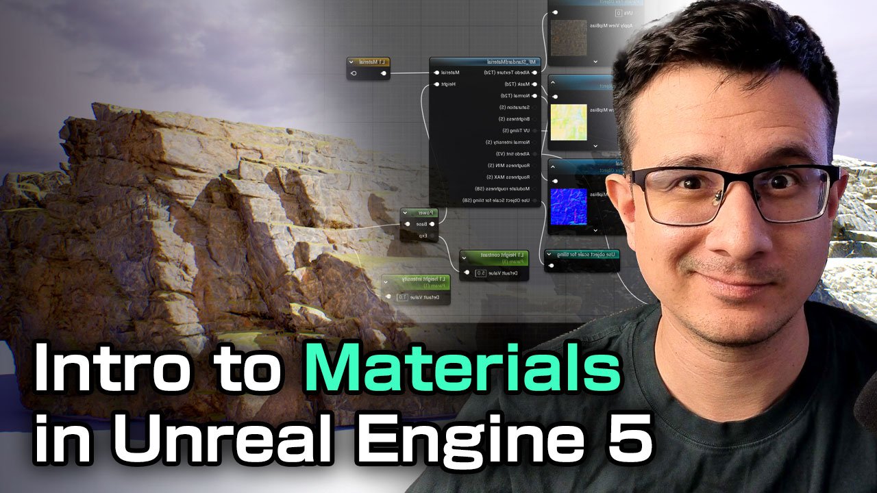
14. Color Harmony for the rocks: All right. So now that
we have our composition, and it looks quite good in black and white
without the colors. But if we put a color
here, go to lining only, go to lead or put out four, you will see that the colors
are pretty much everywhere. It's like a complete
different scene. So we need to check which
colors are we going to use. And I want to go for a kind of like I want to choose one of these colors
and go for that one. So let's just say I will choose this type of
color. I believe. I think I could go for
something like a gray dark. So I'm going to start with the red one because the
red one looks kind of, you know, you kind of be unseen. So these materials
from mega scans come from with a simple setup that you can do the
adjustment for the colors, the saturation, the
brightness, the contrast. We're not really going to touch
materials that much here, but just so you know,
this will control the color of the surface. So we're looking into saturation brightness and the tint color, and we're not really going
to change the normal or the roughness or
whatever for now. So for that, we're going
to go for the base color, and I'm just going
to move this here. Okay. And what I
need to do is to go for saturation
and desaturate this. Now, if you want to take a
look at how this looks better, I recommend you to either go on lead mode or go here and go for buffer
visualization and go to base color to make sure it this is exactly the
color that you are seeing. So saturation we're going to
go for something like this. And also we can increase or decrease
the brightness depending on what we want. Obviously, we're
going to still change the color tint to have something like something like this, maybe. Maybe this can work. Let's take a look at how
it looks with the light. Okay, so it's going to take
some time to load. All right. So as you can see, it's blending very nicely with our ground and, which is great. So we're going to do
the same for this. We're going to open up this
material for this one, we're going to go to base color. And again, these
red things a bit. You can see that all
of them are changing. Let's go for this one. Let's
go for this tint here. I just a tiny bit of tint. There you go. Also, we're
going to the brightness, we're going to get
a little bit lower. Here you go. Okay. I got this. Now we can play with
this a little bit. Let's let's not change that saturation that
much. It's a tiny bit. Okay, next one is this. So we're going to click here. I'm going to start with
the most obvious ones, and then I'm going to refine
the ones that I feel like. Okay, so we have this. And we also going to have a choice that we're going to go for a yellowish tint here. It's going to help a lot.
Let's go for this one. And we're going to do
the same saturation. I think brightness can
be a little bit higher, and we go for this. And I think we can
increase the brightness a bit a tiny bit. There you go. This is great. Let's
go for this ones. We can close the ones
we're not using. So let's just right
click middle click, sorry, to close the window. Let's see how it
looks with this. It's not bad, but
it's getting better. Let's go for this red one. Let's change the most
obvious ones first. So saturation. Let's saturate it.
Change the color. Change the brightness,
obviously. There you go. Great. So let's
do the same here. So go for I don't
think we really need to change the saturation.
A little bit of tint. And the brightness can be a
bit darker. There you go. Let's go for this one.
Open the material incense. The idea is to unify
all the colors. So for this, for
example, brightness. There you go. Now, this one here looks a little
bit of reddish. First, we will unify the colors. And then we will take a look at more color variation
in the future. But for now, we're going
to keep it simple. We're going to keep it simple. So don't worry. Gonna go for this. There you go. Next one is gonna be this one. This one is kind of reddish. I could potentially
still have the reddish. Uh like the reddish ground. If I want it, what
I'm going to do here is the brightness
can be a little bit, or this one we're
using quite often. Actually gonna go
for kind of like a reddish tint and saturation
go to decrease it. You got that's a
little bit better. That's a very nice blend. Okay, let's take a
look at this. I don't know if this one
we already used. No, we haven't this
one is going to be our It's going to have
the yellowish tint. Just a tiny bit and
decrease saturation. The brightness a little bit
Yeah, something like that. We can go for this one. We're about to
finish. Don't worry. Saturation, brightness. I think we can just
go for a little tint. Not too much. Not too much. And then I think just go to decrease the
brightness a little bit. There you go. This
roofs reddish. I don't know if I like
that. To be honest. I don't know if I like that, but definitely I want
to keep the main color. I'm going to unify all
the colors actually. Let's not go for a reddish
tint. Let's go for this. Saturation. It's better. Okay. Now this one. Actually not gonna
go reddish tint. We're gonna go this one. Okay. Just like this. And this
is kind of helping. Now, let's go for this one. This one should be
quite an important one. Let's go saturation,
redness, color. Base color tint. It's like this. All right. So it looks like everything
have more color harmony now. So let's take a look
at how this looks. Look at this. Now, we don't have these crazy colors that
are happening everywhere. We just have a solid color. It's kind of like a
color palette when you're painting. Is
going to be great. So next time next
thing we're going to do is to break down the
colors a little bit.
15. Adding a Slope Mask: So I want to add a little
bit of greens to this, and a good way to
accomplish this is actually going to
put a moss texture. So I'm going to go to
Fab and I already find this nordic moss
that is for free. You can add it to the project. You can choose any
texture you like. I just like the green
because it's going to have a nice little tint
for our level. So what we're going to do
is actually open any of these material instances
and open the parent. Close this one. Just
going to move this here. And we're going to change
it in the final color. So this is going to
be the base color, and this is going to
be the final color. So it looks like the final
color is combined here. So what we're going to do is
to add some moss texture. So we're going to go here, right click, go for
slope mask. All right. So for the slope angle, we're going to right
click vector parameter. We're going to call
it slope angle. By default, we're going
to put it on blue. Just going to go here
to color picker, put one here, you're
going to have blue, or you're going to
put this one here. Go to have the fall of power
and the chip contrast. So in order to do that, you can go to the palette
and grab a constant. Just like this. Or you
can press one and click, and you will have a constant. Again right click,
convert to parameter, call it slope fall off. I think it's weird, right?
I think so. Slope fall off. And then right click,
convert to parameter. Slope contrast. I'm
going to go for one. And one for both. I'm just going to connect this
just like this. All right. So now that I have this, I need to group this
because this material has quite a few parameters
that I need to change. And I want to be able
probably going to name a number seven and
call it slope. So I'm going to go here, grab everything, and group. You can choose one of the
groups that were created, or you can go for 07
slope. Just like that. Now, this is the final color. So what I'm going to do, I'm going to drag this rewrote at name
rewrote declaration note, and I'm going to call
it slope Alpha mask. And what I want to do
is to actually make this one a little bit higher. Actually, I should change
the color of this, like, call it like color with FS so that this one
is color with FAS, and the final color
will be another one. So the final color is
going to be very easy. We're just going to
put another Control B, and this one is going
to be my most color. I'm just going to put
it I'm just gonna put it green like this for now, so it can be very obvious.
And what we're gonna do? To actually larp this. We can go for color
with bus with going to be A and B is going
to be my most color. And in the Alpha, we're just
going to put the Alpha mask, can actually connect this one, but slope Alpha mask
can just drag it here. And now this can be my rewrote declaration
note, call final color. Now this is my final color. Now I can go final color here. And just put it right here. Click Apply. What you will see is that you actually
seeing it here, you have a green color on top. Now, we haven't put a texture, so it's going to look
a little bit funny. Now, this has pretty much
affected only the acid, but I want to be able to
apply to a lot of them. So one thing that I need to
do is to actually instead of using a color I actually
need to use a texture. And in order to do that, I will need to apply this to, you know, a lot of
other measures. Now, you will see that
some of these do not have the slope because
this is a fast material, and this is a base material. So they're pretty
much different. So what we're going to do is to work with the fast material, and when it's ready, we're going to put it on
the base material. So we're going to
continue working on this in the next video.
16. Blending Materials in the Slope: Alright, so in
order to fix this, we need to organize
ourselves a little bit. We have our Alpha mask. The problem is we need
to use the larp for all these textures if we want to larp all the
material properties. So what we're going
to do actually is to remove this for now, remove this for now, and remove
the final color as well. Color with faz will be here, just like we had it before. And we just have the mask.
So this is the mask. We're going to call
it slope mask. Okay. So it's back to normal. Nothing has changed except
this is the color with FAS. And now what we need to do is to add another
set of textures. This is the most
texture that I grab. So we're going to go here
and just put it right here. Now, one thing you
need to make sure, grab all of these textures. I'm just going to
grab them like this. I'm going to grab
these textures, and we're going to
change the properties from texture acid
to shared wrap. And what this will
allow us is to actually have more textures
inside the material. If you don't do this, probably your material won't load.
So first things first. The second thing is we're
going to create a parameter. We're going to create
slope Alvedo slope normal. Right click, convert to
parameter, slope mask. Don't worry, guys.
Probably this will be the hardest part of this course. We're going to go here, and now we're going to
create a material. We're going to go make
material attributes. And what we're going
to do is to select the base color and put it here. Roughness, we're going to connect the slope
normal to the normal. The red one, we're going to
connect to the aminocclusion, the green one to the roughness, and the blue one to
the displacement, although we don't really
use it just in case. All right. So the next thing that I want to do is to
change the tiling of this. But before we do that, let's
take a look at how it looks. So this is my slope alvedo, so I'm going to slope material. And I'm actually going to make sure all of these are
in the same group. So go for slope. All right. And in
order to blend this, we need to create a material. So what we're going to
do is to create a node here called make
material attributes. And what we're going to do is to connect the base color here. The metallic, specular,
the roughness, the normal, and the
ambient occlusion, and the displacement here. And now we don't need
this. So we're going to click on an empty
space on our material. And what we're going to use
is use material attributes. I'm going to show you
what will happen. We're going to connect this
here. I'm going to hit apply. And what you will see is
that nothing has happened. We still have our material, and it's working quite well. However, they are all
connected here because it's used material
attributes from here connected to the main output. This will make our life much easier because now we have this. We have our slope material. So what we can do is to create a name reroute at name reroute Declaration node
and call it slope material. So this will be the
connection between our slope material and
our main material. So how are we going
to blend them? We're going to go to blend material material,
layer blend, standard. We're going to go with standard, the base material is
going to be this one. The top material is going
to be our slope material. So it's going to
be slope material. Go here, and the Alpha's
going to be the slope mask. Not this one. Is the one we created. It's called slope
Alpha mask, sorry. So it's slope Alpha mask. We're going to
connect this here and then go to material attributes. Now, you will see you're going already see in the
preview what's going on. What's happening
is that I actually have most material on top of
these ones, which is great. It's actually giving
us quite a lot of, you know, a lot of
color into our scene. Now, the problem is, if we want to change something like the tiling and everything, we're going to have to add a lot of another material and
change the properties there. So if I click on this, I'm going to double click
on this material, you will see that
I have my slope, and I have my slope
contrast and my fall off. So what I can do is to
actually change this. For example, I can
change the contrast. I can change the fall off a little bit have a little bit of a blend here if I want it. I can also be very harsh
or just leave it at one. Just like that. I can change
the contrast if I want it. For now, I'm just going to
leave it at one for now, and I can also change the angle. I can change where is
the angle coming from? If you take a look at this, it's a little bit hard to see, but it's the bottom left corner, you have the Y axis coming
from this direction. So if you put green, you will see that it's coming it should be coming
from this direction. Actually, you can
go for minus one, and what will happen is it will come from the other
direction, right? So you can go, actually,
you're going to do that. You can just multiply on
the material, I believe. You can go for one. You
can also go for red, and the red one is
going to show from this angle from like
from here to here, whereas the C axis is going
to go from top to bottom. Now, the cool thing
about this is that you can actually
duplicate one of the and depending on the slope, let's have the slope
on the default value. Depending on the slope.
No matter if you rotate, the slope will always
follow the top. You'll see that in this
area, we don't have. But as we continue to move it, we will have the slope
on top, which is great. This is what we want. All right, so we work on this
for one single material. Obviously, we have a
lot more to cover. So let's go and do that next.
17. Adding a Slope Material: Alright, so one thing I want to change about this
material is the tiling, because you can see
the resolution is quite low compared
to these ones, you can see that
resolution is quite high. So we need to match it up.
And in order to do that, we're going to go
for our material based fast that we have created, and we're going to actually
add some UV coordinate. So this is going
to be quite easy. We're just going to go
for texture coordinate, right click and type
texture coordinate. And then we're going to go for
multiply connect this one, and then we're going
to go for a constant. We're going to put one as a default value and
actually right click, convert to parameter and
call it slope tiling. G to go here. And just put it there in
position. It's great. Now we can go ahead and try to change the
material instance of this. So if we double
click on this one, which we apply the
slope texture. We need to put it in the group, so let's go ahead
and do that now. Otherwise, it's going
to get quite messy. It's a lot of parameters. So slope tiling, we can
go for four, for example. I think that's a very
decent resolution. Probably can go for three. Probably three maybe a
better number. All right. So now that we have this, we need to make sure that
we actually apply this to other areas of our you
know, of our material. Now, we do have this here. If we want to use it
on the other material, we will have to copy it. Now we can create a
function for this and I will make
everything look cleaner. I want to keep things simple. So I will just go ahead, copy this, go to the
material base, paste it. Right. And now that I
have everything here, I can just go ahead
and do the same. Make material attributes,
and I can go for base color, and you can just connect these ones to the one they belong. Normal ambioclusion, displacement, click
on an empty space and then use
material attributes. And then we will do the same. You can actually even copy this. Copy this, go to
the material base. Put it on base material,
and this should work. Let's go ahead and hit apply. And this will apply
to all the meshes. And there you go. This is exactly what we
were looking for, which is great, which is great. Now, obviously, you can tweak things a little
bit if you want. For me, I feel like
this is good enough. All the moss is
coming from the top. And I would like to
put some of them here. There are a couple
of things we can do with vertex painting
and whatnot. I do have a complete
material course. If you want to check it out, you can take a look at
other courses I have. I go very in depth
into making materials, and we create a master material. For now, I feel like
this is good enough. I was thinking of, you know, making a global parameter to
change, like, everything. I don't think we
need it for now. So with that, we already
finished our slope material, and everything's starting
to look a little bit nicer, a little bit with more color. You can always change this
to sand or snow if you want. It's up to you what you're
going to do with it. I feel like it does give me quite a lot of beautiful
colors to work with. So I'm going to just
keep it like that. So with that set, let's move on into other things.
18. Creating a Switch to disable the Slope Material: Now before we move
into other things, we actually need to change
this material because we're going to use
other assets and not everything
needs moss on top. So we're going to open the master material
here, click on this. And we're just going to go for
a static switch parameter. And we're going to call it
uses the slope material. By default, it's going
to be true. All right. If it's true, we're going to use the material with the slope. But if it falls, we're going to use the
previous material. All right. So
nothing will change, actually. Nothing will change. But if we go for
another material, let's just say, let's
just call this one. And we're going to go for the MS base. We're
going to do the same. Copy. Actually, before we copy, we're actually
going to put it in the group slope because we're going to use
more assets in the future, and we
need to change this. We're going to copy this. True, you're going to
use the material with the slope and folds, you're going to use the material attributes you had before. Connect this, and there you go. Now, nothing has happened, but in the future, when we add more
assets, for example, I'm going to add just go
for this broken wood. You will see that it
has the moss on top, I don't really want that. So I can just go here. Use the slope, falls,
and there you go. So that's what we're going to do to finish the
slope material for now, and we're going to move on to other areas of
the environment.
19. Creating the first wood asset Kit: Alright, so now that we
have the base of our cave, we need to add more elements. And usually when you get to this stage in the game, sorry, in your environment
process creation, you usually have one material, one element, two
elements, three elements. This is typically what you
do to make it look great. So the first element
obviously is the rocks. You could argue that also a second element
is the moss here, but we're not really
going to count it. Second element can be
as well like wood. Some wooden acids
that we can put here, some man made elements. And the third one, we're going
to figure out what is it. But for now, we're going
to work on the wood, and this is basically
a framework that you can have for every environment
that you are creating. So let's start
creating the wood. First I'm going to duplicate this. I'm going to
duplicate this. Actually we have like like
a ground or something. I'm going to I'm
going to put it here. All right. And I'm going
to duplicate this. Alt and click. We're
going to put it here. Press end to snap it to the
ground, and there you go. This will be very useful for us for grabbing our wood acids. So what can you do now? Well, like I said before, I went to Fab and I download
a couple of wood acids. So let's take a look at
them. So we have this one. All right. We have this one. Look, it looks
quite a bit small. Let's try to scale it up. Have this one. All
right. I got this one. Some reason, Oh, so they do
have the moss on top, right? That's why this is why they
all look very similar. All right. So first
things first, we need to change this. Remember we create the
switch for our material. Going to change it here, like use slope
material and check. And there you go. We're
going to do the same here. Use slope material and check. Same one here. Uses slope material and check. And this one uses slope
material also and check. In case you want it, you
can always duplicate the material instances
and you will be able to, you know, have some
of them with moss, some of them without moss. So what can you do
with that? Well, we can start creating some path. Like, for example, I can
let me move this one. I don't really really like it that much. Let's
start with this tree. And let's see how big they are. So they are like this size, quite okay, to be honest. And what we can do is actually
duplicate them like this. And in order to create
more variations fast, we can rotate them. And obviously, we can
put them like this. Can also go for this one, for example, put it again
like this and go for 180. Let's go for this
one, and also 100. We can go for 180 here and then 180 in the other direction. Notice that I'm not using
the snapping because I tend to not like to
snap objects where they are placed
more organically. So let's go for
180 here and 180. There you go. And let's do a couple more. So this one, for example, let's do a 180 here. It doesn't have to be exact. This is exactly what
it's going to help us to actually create new a better
composition for this. And the last one probably
let's go for this one. Let's try to rotated 180
degrees. There you go. This is the pattern
of the floor. And the pattern of the floor, it's actually whenever
we design something, they all into this
direction, right? Maybe that's something you want. Remember, everything
creates lines and whenever we will place this, you will be able to see
these lines like this. So in order to make our
design more interesting, we need to actually make
some of them like this. Maybe some of them a
little bit rotated. Maybe there's a hole
there, you know, and something like that, or maybe even some of
them in some directions. So let's start doing that. Let's move this. Maybe we can rotate
this just like this. All right. We can also
scale some of them. Start rotating. And notice
that as soon as I rotate, everything starts
looking, you know, much more organic,
much more organic. So we're going to move this
one here and also, you know, also put some of them, like, a little bit shorter, maybe, some of them a
little bit longer. All right. Let's see what
happens if let's not do that. So let's just say this
is our first wood. What I'm going to do is
to go ahead and I could actually make this into Let's go for world and Alt
and click to duplicate. And I could go ahead and create a pack instance level blueprint. But for this kind of case, I don't tend to use
for each asset. What I like to do
is go to modeling, go to Transform,
then go to Mesh. And this will be a new object. Make sure you don't put
the first input object, or otherwise, you will
replace the existing one. And this one will be
my SM wood floor 01. And what we can do
is click Accept and it will create a new mesh
exactly in the middle here. If you want, you can always
change the Pivot point, Edit Pivot, put it on
the center just in case. And now you will have this. Now, the other thing
you need to do is to make sure your
complex collision. Double click on
this type complex. Leave that project default because it can get quite heavy. Notice that we are having
100 111,000 triangles. So let's enable nanite for this. And obviously, we can
always reduce the number of polygons that we're using,
if this is too much, you can always go for modeling, go to mesh, simplify. You will see that you
can simplify the mesh by 50%, by 25%. You know, it's up to you. For me, I'm going to
leave it like that. And now that we have this, let's create more kits
for our environment.
20. Using horizontal elements with our wood planks: Okay, so now that we have
our wooden floor kit, let's see how we can use
it in our environment. So let's go ahead and drag
this. Put it in position. Let's try to put it in
places where, you know, let's try to blend it with
some human made elements. So, for example, here,
it's a good spot. Let's go ahead and
put this here. Something like that. And even
move it down a little bit. Something like that,
you can always go ahead and duplicate it and put it somewhere here, for example. Here you go. So now you have a like
a floor for some areas. And notice that I just
check this part is open. Let's not have that. All right. So let's put
it here, for example. Let's start using the normals. One thing I noticed is
that maybe we will need other directional elements
for our wood plants. What do I mean by that? Everyone is actually
pointing into, you know, this direction, and we may need
another kit for this. And maybe a good
idea to build one. Let's say in the future.
Let's see in the future. So for now, let's grab this continue to build
those those here. And in the future, we just like we did
with the rocks, if we see that we need more, we can create another kit. So, for example, this one, we can actually
rotate it like this. All right. Start duplicating. Start rotating a little bit. A little bit of rotation
wouldn't be bad. All right. We can
do the same here. I think those wood
elements really helps the sin to break out different materials.
So it's really nice. It's really nice
to have. So let's try to put it in position here. If it's overlapping, it
doesn't really matter. The important thing is
that it feels believable. Actually, overlapping can help
quite a bit to to remove, you know, the rigidness of these assets that
sometimes they have. That is nice. Let's
put a couple more. D you here? All right. And let's start
putting another one. Okay. Let's make sure
it's on the ground. I actually don't I'm starting to see the
pattern repetition. So that's not good. That's not good. Always
like this tiny bit. That's a little bit better. That's a little bit better. I don't know if I can
put it here as well. We'll see. We'll
see how things go. We'll see how things go. But just, just how things are. We actually it feels
like we're placing them like this is the ground and we're just placing
this like this. Like, imagine this is the
circle and this is square. We need something to
blend between these, too, something like
small circles. So it can blend quite nicely. And what I could do
what I could do is to grab one of my wood assets
from mega scans, type wood. And I can start, like, putting these these food
acids like this, for example. I can go ahead and put
it something like this. And this actually help us a lot to blend
between these assets. Does help a lot. And sometimes the direction of this
can be quite important. So maybe we can put
this ones here. We can do the same here. So do you like that? Notice how having different directions
actually helps a lot. It is helping quite a lot
to break the same lines, you know, like
everyone like this. Actually, we could potentially just rotate some
of them like this. Yeah, I think I can do that. I think that would
be nice. I think that would be nice
let's rotate this. Rotating those can
be quite good. There you go. Rotate
this one as well. Look at that. Now, obviously, our wood already comes
with a reddish tint, so I don't think I need
to change the color. In the future, maybe we
can adjust the color of these wood planks. For now, we worry about
the horizontal elements. We're going to talk about a
bit on the vertical elements.
21. Creating extra wood kit assets: Alright, so one thing
I want to create is, let's go back to
our kid bash area. And actually, I want to create a vertical type of segment. So this one is
already quite long. Like, let's just
say it's this long. But I want to do something
a little bit like half. So I'm going to I'm going
to go for maybe this. I'm going to rotate
them. A 90 degrees. And what I want to do
is to just go down and maybe maybe just
have some kind of support beings here
so that we know, like, hey, these
things are placed by, some kind of support behind,
something like that. We can always push this here.
I can do the same here. We can rotate those. And I think we can just go
ahead and put this one here. All right. Later on, we can put the ropes. It's going to help us a lot
to make it more believable. For now, this is going
to be my next asset. So I'm going to grab all of it. Make sure you have everything. Now we will go to modeling. Go to transform, merge. Is going to be my new object, and the name is going to be static mesh with kit Vertical. 01. Click Accept. And also, we need to change
the Pivot point. Probably maybe a
good idea to put it. Actually, let's
just leave it here. Let's just leave
it on the center. Let's go to Edit Pivot. I was thinking about
putting at the bottom. But let's just leave
it at the center. This is quite important
because in the future, if you want to change
the Pivot point, it's going to change everything. So make sure you
have the Pivot point on the place that you need. So now that I have this. Let's go ahead and
duplicate this. Let's try to play
with it a little bit. So one thing I can do is
to create a scaffolding. So let me just
Oops, not this one. We go for this. Let's
try to put it like here. Let's try to put it here. And it's good that we can create those on the editor so that we can see in
context how it looks like. So we can just put
this one here, for example, we can
do the same here. Not that I see, it would be pretty
cool to have some kind of support on these measures. Actually, let's we can
we can try to do that. Let's go ahead and and
put this one here. There you go. There you go. And now we can duplicate
this, put it here. There you go. Now we can go
ahead and put this one here. There you go. Let's
put this one. There you go.
Something like that. We can also do the same
for, like, these elements. We can start putting
those here as a support. Let's try to put it in
position, obviously. So this one we can
rotate a little bit. N a little bit of fineness
for these things, a little bit of patience. Move ahead and put it like this. Something like that, and
we can do the same here. All right. And we could
potentially go for our Wokit here that is vertical. I don't know if we're gonna
use it for this case. I don't think so.
I don't think so. Um, You can continue to put this one here, maybe. And duplicate this.
There you go. And now you can go ahead and
also duplicate this one. There you go,
something like that. Let's put it in position. Alright, so now that we need to do is to select all of it. Select all these pieces. Let me just move it. Make
sure everything is selected. Looks like it's the case, and we're going to go
and right click Level, create Pack level actor. And let's call it,
creating a cave. Sure, I just noticed
I didn't show you how to create pack leve
lectors and what they are. So PAC leve lectors are basically prefabs that you
can use in the future. So let's go ahead and create
a mass folder and create mass wood heat Large 01 and call it BPP
here, another folder. So this is great because now this is a blueprint
as you can see here. We don't need those.
And what we can do is actually put it in other
positions such as this one, for example, maybe you
want to have it here. You don't need to do
all those things again, if you want it, for example, you can put it pretty
much everywhere you want. So duplicate this one. Move it here. And maybe have, like,
another one of this. I don't think that's a good idea because they look
pretty similar, but you know, does
help quite a bit. It does help quite a bit. Actually, I like it because you actually can notice they are
the same. They are the same. You can see they're a
little bit twisted here. Obviously, every kit won't be available for you
in every situation. But, you know, you
try your best. You try your best. Yeah,
something like that. Actually, I want to move
it up a little bit. Alright, we can exchange
the position later. Yeah, let's exchange
the position later. For now, I think it's okay. Let's go ahead and continue
creating more kits.
22. Creating a wooden vertical element: So now that we know what is
a level incense blueprint, let's create another kit
for our vertical elements. For example, I want to
put something here. So I want to start with
my maybe this one. I want to put it back rotation
for I leave it at zero. For now, I want to have
something like more vertical. So I'm going to put
something like this. I'm going to start putting
some wood wood planks here. Probably this one
will do a great job. Oh, yes, it is. So we're going to put some of these like this. And whenever you duplicate
things like this, you can always rotate
180 so that you don't really feel it's
the same one. All right. So we can go ahead and put it All right, you go. Something like that. All right. And we can start putting some
vertical elements as well. So we're going to go
for our wood kit. And we're going to
just place it here. There you go. And now we're
going to add another floor, for example, maybe here. And we can go ahead and put
something like this and maybe can even put it like that. I can start duplicating those. All right. I can go ahead, put this one here and always
make it a little bit larger. Rotate it a little bit. The same here. There you go. And the same here, we can even make it a
little bit thinner. This one, rotate so that nobody notices the
same one. All right. And let's go ahead and duplicate this one and put it like that. Maybe something
like that can work. Also, this vertical acid
can use it in one of these to have some kind of blocking the silhouette
of our new acid. So we can just go ahead and
put this one here and you can always go ahead and
move these ones. Something like that. So you can start putting
some vertical elements here, and you can always, like, scale this into minus one to make it more have a
little bit more variation. You can have it like that. I don't know if I want to put this one here, to be honest. I really like the the
negative space that we have. I'm I'm going to make this one a little bit a
little bit taller. Alright. And this one may be like this a little bit longer. A little bit longer rotated. It's all about having
some assets to play with. And also, I can start putting like some assets here to
break it down even further. For example, this one can
be a support for this. Definitely we need the support. So let's go ahead and
put the support here. There you go. Leave the support there. Awesome. And we're
gonna do the same here. And we're gonna rotate it 180. And move it. Make it connect with
our assets. Same here. Make sure it's connecting. We don't want anything floating. It will break the immersion. All right, we're going
to do the same here. All right. And we're going
to duplicate this one. Put it right there. You can always go ahead and play a little bit with those
support elements. You can have something
like this if you want. Have a little bit of
silhouette breakdown. Can always make this
one a little bit taller, something like that. Let's just say this
is we want this. Actually, I want to I want to close this like
something like this. Yeah, I can I can
try to do that. And let's try to create a new
leveling sense blueprint. This will be our
vertical element. So let's just go ahead
and select all of those assets You
can always create them in context with
assets where you create, let's you say you
want to create it here to make it a
little bit more clean. I do find that I do find a little bit more easy to put it in
the context of my label, and then I can you know, I can change it looks like this is everything. I notice there is a
hole here. No worries. I'm going to show you
something really cool. So let's right
click, go to Level, create Pack Level actor,
and then click Okay. This will be my Large
two. Go to VPP. Same name. And now you may
ask why are we doing this? Well, it's very
simple. Let's just say I want to put
it somewhere else. Said I want to put
it here. All right. Just say it that way. And also, I can rotate
things a little bit. So I can have a little bit
more of a chaotic feeling. I can also scale it if I want. But let's just
leave it like that. Leave it like that. Okay. So let's say you realize,
Hey, you know what? This is not connecting. So what you can
do is right click Level edit what you can do
is to scale it a little bit. What will happen here is that
this one will also change. So if I save you don't
see it because I have it. It was here. You will see that
this one also was updated. So whatever change
you do to this, it will change all
the instances. So this is very, very handy, very, very handy. So also you can
play with it with a rotation and everything until you find
something you like, and you can start
putting it everywhere. So with that, let's go
ahead and add more meshes.
23. Adding extra wood elements: All right. So before we move
on into other elements, we need to make sure that we use the kits that
we have created. Now, we only have two of them. It's not really like a lot. In a project in a big project, you may have ten or 20. The more you have, the better it is because you can
have more variation. For us, I can just play with this like different, you know, different rotation values, things like that
that that I can try. I can even scale this like
this, put it in position. Try to well, like, put it somewhere else. And that's a good thing, because I'm using the same one,
but I'm rotating it. I can use it in very
different ways. So, for example, I
can use it like this, and you will notice this part. So I can go ahead and
do something like this, something more
chaotic, more dynamic. Used to have the same visual language that
we're using where every piece is dynamic,
like this, like this. This one is rotated. You know, this one, we
may need to change it. Let's take a look later. Like, for example,
something like this. That may be the case. For now, I like it just how it is. Not all the things need
to be super precise. So we can also use this
one here, for example. Something like that. And if
it's too obvious, obviously, you can create another one,
for something like this. I used to have
another silhouette. We can even go for something
like that, for example. There you go. And we can
also go for this one. And I feel like these are
in the same positions. So we can just go ahead
and move it a little bit. So it's not that obvious. Something like that. All right. And we can also create some
kind of vertical wall. So let's go ahead and do that. Like, for example, we
can grab one of these. Actually, we did
create one of these. We just didn't create,
like, a blueprint. So let's go ahead and
put it like this. And actually, what I want to do is to just move
this one here. Just like that. Probably
put another mesh here. So let's go here, go
for wood, static mesh. Probably we can go for this
one. That's too thick. Let's go ahead That's too
thin. I think this is the one. Yeah. We can go for this one, for example, make it
a little bit thinner. Just a tiny bit and Y C. There you go. And now
we can try to put it in position. Something like that. There you go. And now we
can duplicate this one. There you go. Try
to place it there. Beautiful. An that we have this. We can create, like, a new level incense
blueprint for this. You don't necessarily
have to do that. You can also merge
it into a new mesh. When I ask, some people ask me, When do I create a new kit? When do I create a new mesh? And the answer is it depends on the project.
It depends on the project. For example, if
you're making an RTS, probably you're not really
worried about the tiny detail, so I will make this as a mesh. If you're making like a first person
shooter or something, like maybe you want to have control over
the tiny details. So it really depends
on the project. Both options are right. It's not so much
about performance. Both are pretty good. The thing is you want to use, you know, you want to use make good use of your
time to put it like that. You want to make good
use of your time. You want to basically
have, like, you know, kits that allow you to save time
more than anything. B in terms of performance, you don't really need to
worry that much these days. That's something that Aria
handles very well, right? So you don't really
need to worry. Alright, so I think I
like this now that we put a couple more wood elements
here. I kind of like it. This is giving us a
nice silhouette here. Always look for the silhouette
here in your environments. Like, look at this.
Very nice, very nice. This one is a little bit empty. We're going to work on
that. This one as well. So now that we have enough
wood made elements, let's go ahead and add
another element in our sink.
24. Adding Broom Creepers part 1: Alright. So one thing
I want to add it some vertical elements
for our green area. So as you can see, we
have the moss on top, and it's really flat, you know, it's giving us some nice colors, but it feels very two D. And what I want
to do is to actually blend the ground with the
top or with other elements. So this is the ground.
These are other elements. We need a way to blend
these two together. This is green and why
this is completely, you know, not green at all, and how these two
relate to each other. We do that with similar
assets of same category, and we put them in
different places. So if you go to Fab, you will see that if you
go to nature and plants, I find this broom creeper you can just download the I think I
download the medium quality. Yeah, the medium quality. I don't really need to
download anything else, and I already have it here. So what I'm going
to do, actually, I'm going to save
everything just in case. What I'm going to do
is to just place them. I want to place them in
positions where I feel like we could make
good use of them. So, for example, here, I could
make something like this, for example, there you go. Alright, look at that.
Just by only placing one. We're going to
keep placing more. So let's go ahead and
put this one here. You can also create, like, a ible instance
blueprint if you want. So it's really up to you. I like these long
leaves that are available. I really like them. It really helps so much to help the composition with some lines, something you need
to keep in mind. So look at that. The cool thing is that
they already move. So that's something
to keep in mind. We can just keep using
this one and rotate. There you go. And we
can go for this one. This one's a little
bit taller, longer. There you go. Let's try
to put it in position. There may be some overlap, but it's alright. It's right. Now, you can also play with
these ones that are very, very dry or it does give you
quite a nice silhouette. Like, you can just go ahead
and put it here, for example. And we can also
play with it here, especially in this area
where it's such a, you know, such an empty space. We can just play a
little bit with it, like, kind of play
with the veins here. And maybe this one
grow from here. There you go. And obviously, you can rotate it. I look what's happening,
we're actually adding some small
silhouette changes, and we can definitely
use this one, for example, put it here. And by doing that, we're changing the silhouette
a little bit. So keep doing that. Can copy another one, and maybe we can copy this one. And another one that
can be very useful is this like the dry ones. And we can make thing
even bigger like this, and what will happen is something that you
will not expect. It's like you will have
to silhouette here, and we can even exaggerate
it a little bit, like this kind of, like, big
plants growing from here. Let's go ahead and put it here. And we can do the
same in other areas, for example, this one. We could, for example, place it on top and put
it something like this. And you will see that you have this wonderful silhouette
that is happening here. Let's continue to make those. Now, this ones we want
to put pretty much everywhere in our scene. It's just such a good asset, you know, such a good asset. We want to put it pretty much, in a lot of places, you
know, a lot of places. Here, for example,
I think here is a very good example of
where you can put it. Just start putting those here especially in places
where you can break the silhouette,
things like that. They are really good are
really good at this. So let's just keep putting
those here, for example, and just rotate it and
we can even scale it a little bit like this
just to make it longer. We can also play with this one, for example, we can put it here. There you go and also we
can grab a really long one. Really long one, and, you know, just place it like
here. Look at that. It's working really good. I want to put this
in other areas, and you get the idea. You can start putting those
everywhere in your sink. It does help a lot.
So what I'm going to do is to keep putting
those in the next section.
25. Adding Broom Creepers part 2: Alright, so let's keep
putting these plants. Kind of ready to see like
it's helping a lot, right? So let's start
putting those here. It's really a small. It's really just
a simple process. Whenever you put these plants, you just want to
make sure like you are pretty much adding into the silhouette,
into the shapes. And the other thing
you want to make sure is that you are pretty much it's like grouping
together different things like why we're adding
this type of plants is because we do have
some moss on the ground. So how can we blend our environment with
those that ground, how can we transition? One of my instructors, many years ago, I
think it was 2017, sorry, I think it was like 2018, Anthony Bacaro he worked
at Naudi Doc at that time. He just finished
work and charted. He told me a phrase
that I still remember. Many after many years of
working in the industry, it was Transitions in
environments make it or break it. Transitions are everything. Transitions are extremely extremely important,
extremely important. Like, you can't have whenever
you don't have transitions, you start noticing
and it does show. It does show. So make sure the transitions that
you have are actually, you know, working in your favor
or working in your favor. And you notice exactly when environment doesn't
have enough transitions. You know it. The
audience know it. Everyone knows it. And it's just a pity where
you see all this, you know, all these amateur environments
that are being made, that they don't know the
concepts that I'm teaching you and they don't know why
their environment looks bad. They're not working
on the transitions. They're not working on different
elements of the scene. You know, one of the errors that a lot of
people make in this industry, especially when they come from a very technical background, people who tend to draw don't really have
this issue that much, but they tend to be
very logical about it. They tend to be put
a lot of logic, like, why is this hanging here? Like, is this the
right species to put? You know, logic has
its place to put, but it's not everything. It's not everything.
And one thing that you will learn with time is
that the foundation, the critical foundation
of art, like composition, lights and shadow, form,
silhouette, toolor theory, blending, transitions,
different materials, and forms. What makes this form
really interesting? What makes this form
not look so good? Like, what is going on here? And it's really just, you know, a lot of practice,
a lot of practice. And a lot of it you
can learn by painting. A lot of it you can learn by just painting your
environment, you know, just working with copying
different pictures, one of the best ways to
learn how to paint it to just start copying real life
pictures in black and white. I recommend you to start
in black and white. So you only take a
look at the values. This will train your eyes, but also will train your taste. I will train your taste because these images
already look really good. So whenever you have
something like that, you want to you know, start making something
look pretty. You already have a
really good foundation. So I highly recommend
you to do that. It's really not that
hard. It's not that hard. You can start today, and you can start copying. And at the beginning, it
won't be that accurate. But if you stick with it, many hours, you will finish it. Sometimes it takes
like six to 8 hours. And but the more you do it, the faster you become and you will get motivated
to do it more. Let me safe just in case. So this is a very, very good way to
actually like it say, very good way to to increase your artistic skills without actually
going into Unreal. And, guess what? When you go to Unreal, you will notice that, Hey, my skills are actually very good now. I like what happened. I don't know what happened, but, you know, they're
really good now, and I'm really happy with that. And you will feel like
you're kind of wasting your time but you're not. You're actually, you know, learning a lot, learning a lot. So that's what I recommend people to do. It
does help a lot. It does help a lot. It does help especially when doing environments because you will just make them
look prettier. It's just easy for you
to make them look nice. And it's not so much
about the drag and drop. You know, this may look a little bit this looks easy, right? It is. It is. Dragon
job. Guess what? Some jobs pay to do this. But what's the
difference? Why will a job pay you to drag on job? Anyone can learn
to drag and drop. Differences, you have
a set of skills, and your eyes can see
different things. Artists see different
stuff from other people, and they usually see way more. They usually see more than
the average person does. So whatever they do,
it just looks better. There are just Have you met some person like that
where just somehow, whatever they do, I don't
know how they do it, but it just looks good. It just looks good. For example, I don't really like
this one that much. Just remove it. Why? Intuition. Intuition is something that you develop over the
years of practicing. And that's why you get paid.
That's why you get paid. You don't get paid
for drug and drug. Don't be mistaken.
Don't be mistaken. You don't get paid for drag
and drug. You get paid. You get paid for your
critical decision making and analysis. So let's take a look at this. Start looking really good.
Start looking really good. I don't know about you,
but I think we are in a solid spot to start, you know, just
doing more things. And obviously, this lighting
is a little bit annoying, but we're going to
work on that later. For now, let's take a look at our composition, our grains. Just by putting
these greens here, you can tell that our sin looks way more balanced
because the grain of this ground is blending with areas on the top that didn't
have any sort of greens. So this is called
transition and blending. Take a look at your
sin. Look where you can apply it and have fun with it. So let's continue
in the next one.
26. Adding Plants to our scene: Alright, so just like we work
with the vertical elements, the ground feels
really flat to me. And the reason for that is it doesn't have any
props other than the moss. And the moss is two D. So we need something
that pops out. So if you go to Fab, you go to Quicksil and you
actually go for plants. You will see that you have a lot of choice, a lot of choice. I recommend you to get
some of these like the palm like these ferns, like, they're really
big and also, yeah, like this one, and
some other small ones. Also, manage to
get some red ones. Let me see if I
can spot the red. Like some like
these with colors. Like this one, for
example, is really good. I don't know if I
actually import this one. This one also very good because red will
balance the greens out. So I will show you what I have. I have all these. You don't have to necessarily
use the same ones. Now, what you can do with this
is go here, go to foliage. And what you can do is to
actually drop the foliage here. So what do you do with this? Well, you can wrap all of this. You can grab pretty
much let's go ahead and Grab,
for example, this. For this one, the more you
have, the better. Okay. So don't be afraid to. Oh, I'm dragging too much. I'm going to go to the high.
We don't really want this. This is hand place. You
can go for this one. Actually, you need to pull the type here, rag
and drop here. Otherwise, it won't work.
Let's go here. There you go. Let's go the purple ones, right. Let's go to these
ones. All right. See, we have a lot
of different types. Now, you don't
necessarily need to use the foolish system. You don't have to. The reason I'm doing it is just to show you what
you can do with it, but there are some
parts that maybe you want to do it manually. This is also very
good for, you know, for not just playing with things and then
figure out by your own and how to place
them manually. That's also the case. But in general, you just want to select the
ones you're going to use. So for example, let me select
a bunch of those like this. Hit click, click here. And with this, I'm going
to start painting. Now, where do you paint? Static mesh, BSP landscapes?
That's by default. Everything here is a Satic mesh. We don't have any landscape. And we don't have any BSP. So let's decrease
the brush size. I'm just going to show
you what it looks like if I paint like this. Just like that without
changing anything, I'm gonna paint and
you will realize that, Oh, my God, these things are so big and they are pretty
much like everywhere. What are we doing, Tim?
What are we doing? So first things first, uh let's shift click to erase
something you want to do. And how do you know if
everything is erase? You can see the number of
things that you have here. Now, what we can do is to actually
decrease the intensity. Let's go for something like
three, and click here. Maybe that was too little. Let's go for ten. And let's go here. Alright. Now look at this one. Now, now, what we have is
some plants that are just, you know, randomly
spawning here. Just great. Let's erase
this. What else you can do? Well, you can change the scale. Look at how they are already giving you quite a
lot of flexibilities. So it already give
you like from 0.8 to 1.2 will be will randomize
the scale. Which is great. I can go for 0.6, for example. And I can go for a uniform. So everything has the same size. I can go for 1.2. There you go. There are se ones, I can
obviously random Yo. That's what you want. And see offset, maybe
that's what you want, as well, maybe a little bit. Set a little bit, so it's under the ground. I don't
really need it. You can align to normal or not. For example, if I align to
normal and I just put it here. Things will be
growing like this. Maybe you want this,
maybe you don't. So for example, if
I put this here, this will be aligned
to the normal, which is somewhat like
in diagonal direction. This is not what I want for now. So I'm going to start
painting the ferns, just like this and start putting those different places of my
environment just like this. Already see like we're having quite a bunch of different different plants here
we're playing with. And here, we can remove it in
places where we don't want. Alright. What else you can do? Well, you can start
blending these plants. So let's start painting
a couple more. Just so that we add more
volume into our scene. You can even put
some plants here. It doesn't hurt. It
doesn't hurt at all. Now, I don't really
want to put too much. Like, I don't want to put
like this, everywhere. It's not my intention.
My intention is to intentionally put them on areas where I can guide the player to look at
my main composition. That's my main purpose. So for now, I'm going
to delete those, and I'm going to actually
go for smaller brush size. I'm just going to start
putting those here. There you go. Let's
take a look at our main composition
like this one. All right, beautiful. So
now that we have this, we need a way to
blend these two. So we're going to do that
in the next section.
27. Big Medium and small theory with plants: Alright, so we have these
big plants that we're using. Let's check this, and let's actually go for the
grass that looks like this. All these ones here.
Let's check those. Let's take a look
how it looks like. Let's increase the
brush size a little bit so we can take a
look at what's going on. All right. So first
things first, I'm going to decrease the upset minus five and
minus five, as well. Okay. All right. So I kind of like it. Just let's decrease
the size of this. I'll start painting
this. That's right. And because this
grass is very small, it will actually
blend really nicely with our plants here
because our plants are big, you know, Our plants are big. And these small plants are
just going to pay off, like little plants here. If it's floating,
doesn't matter. As long as you don't see it,
it really doesn't matter. You can even put
some of them here. There you go. Now,
you won't be able to paint here because never mind. This is actually
considered a static mesh. You could put those here. Now, keep in mind when you have a static mesh and
you paint foliage on it, you say, paint on this. And then you want to
move the static mesh. When you duplicate, you will
also duplicate the foliage, which is really nice, to be honest, so you don't
have to do it again. But you know, just something
something to keep in mind. You can also start
adding these ones. You can even, like, you know, do all of them at the same time because you are already
painting this one, might as well paint
the small ones. So go here, small ones, and bam, get a big one. And big, medium, small. That's the name of the game here. That's the
name of the game. Big, medium, small.
That's what you need. Just a bunch of
plants that are big, a bunch of plants
that are medium size, and a bunch of plants
that are small. Just keep doing that. Just keep adding those.
Notice that here, maybe like a little
bit of a big one ban. I that's too much. I
don't like this one. Shift click. Why
don't like this one? This one is really
close to this one, and it mess my grouping. Actually don't like
this one either. Alright? So let's go back. Actually have a couple of
those that we could use. To add more variation. I don't like this one either. It messes up everything. It changes the I
want a clear line. You're going to go here.
You're going to go here. Whever you're looking at, I'm not going to block you. If I put something
in the middle, I'm going to block your
view. So let's not do that. I'm going to start
putting some here, start seeing some
of these plants. We have a little hole
here, but it doesn't matter because player
not going to see it. Look at that. We can start putting some smaller grass here. Not here, maybe. This is the moment where you can actually say, You know what? I'm gonna I'm going to go here, control, and I'm going
to align to the normal. Remember, these
properties are safe for each for each one of them. So this one is aligned
to the normal. It doesn't really work
quite well here because the normals are kind of
like all over the place. Lo works quite a ca here. Stight here, for example. Not in this area,
but probably here, you can think about putting
that not align to normal. That's what we want. And
let's keep painting here. All right. Let's
keep painting here. And we can also go for
other types of plants. The more variation
you have, the better. Now we have quite a lot of this. Let's try this ones. See how they look like. Actually like medium sized
plants. I kind of like it. So let's go ahead and see
how it looks like here. All right. So now we have big, medium, small, big,
medium, small. That's what you
need. It's perfect. When everything
starts, you know, falling into the right pieces, when you apply these concepts
that I'm teaching you, like, big, medium, small, I really want to have this
Never mind. I think it's okay. Like, these medium pieces,
totally okay for me. Totally okay. This is too
much. This is too much. Let's take a look
at our composition. Maybe that was a
little bit too much. Let's remove some of them. There you go. And we can
start putting some here. I think here needs
a few big ones. So let's go ahead and go for our big firms and start
putting those here. Especially in these areas. It is. Beautiful. Beautiful. Obviously, scrubs may
not want to have, so let's go ahead
and remove those. How do you remove those
hit click. All right. We can start putting like
this, a lot of them. And we can increase the
density a little bit. Actually, it's already
have 100 density, so let's just keep it like that. Yeah, I think it's fine now. And look at that.
If you didn't have faith in your saying at the beginning, it's
perfectly normal. It's part of the process. It's part of the
process. All right. So now that we have this, let's go ahead and add a little bit of color
contrast, right? So let me remove this. And we will do this
in the next video.
28. Color Balance with foliage: So we have a lot of greens. And in color theory, red
is the culture of green. So we need to add a
little bit of red. However, you need to think
of this as a balance. Let's just say you
have the balance here, and here you have, like, green, and you have like
100 kilos of green. And now our balance it's pretty much like
this, you know, nothing. So if you want to actually
put it on balance, you need to add red. But you won't add 100 red that will actually make it
look here balance. What you're going
to do stat maybe ten a little bit because
such a strong color compared to green that
it's going to feel that is actually much more heavier. So now that we have this let's try and paint, see
how it looks like. Now, let the shaders
compile for a moment. You will see what's
going on here. Actually, Wow, we're
actually having some color. Look at that. Let's go ahead and by the way, 0.8 and 1.2 is working
perfectly for us. And look at this, just
by adding some reds. And now we have like, Wow, so much color. So much color. Now, you don't
want to add it everywhere. Just, you know, here and there. Here and there. Not too much. Not too much. There you go. Whenever you see green, add a little bit of red. Take a look at our
scene. I think this area needs a
little bit more red. So we can go for this one. Flowers like, you know, growing here already giving us a little bit
of color balance. There you go. Especially here. I like this one. And
should click here. It's especially useful to paint when you have
your main shot angle. Like, you can just paint like an overview of what you're
going to look like. Then you can think
about small details, but this this looks so good. This looks so good. We're not adding much, but it's enough so that we actually feel. Actually, this feels better. And this is what I'm trying
to teach you in this course, to show you with words. In a way you can
apply with a formula, moments where you feel like this feels better,
and I don't know why. My objective with this
course is to show you why, to show you why it looks better. And why it doesn't look better. So you can be on your own after, and you can start
creating environments. Look that. That's a little
bit too much. Maybe not. Strike. It's a beauty
of randomizing. Awesome. Start
putting some here. Let's take a look at the color. Look at that. Just by
putting these colors were actually blending
with our environment. Now, the green
certaintly are not that green because we have reds here. And it's actually working
quite well for us. I really like how
things are looking. I can't wait to continue
working on this piece. So let's go ahead and move
on to the next stage.
29. Adding Storytelling elemetns and water: Alright, so we're
reaching a point where our environment
feels kind of, like, complete, but something. And I think it's storytelling. Storytelling is like the
cherish on top of the cake. It's something that you
add on top of everything. But in a way, we have been telling a
story. This is a cave. There are overground
plants here, and definitely
there is wood here, which means there has been some presence
of men around here. In this case, it may be some good idea to add some
man made elements, right? So what I'm going
to do is to first import this wooden boat, right? You can just search for
wooden boat and Quicksil. If you don't have it, don't
worry. There are plenty of resources where you can
get those assets for free. If you are learning,
the important things to experiment with the tools
that I'm giving you. You don't necessarily have to
have the same assets as me. Just try to apply it.
The next thing is I'm going to go to plugins
and I'm going to go water. And I'm going to click
Water and Water Advance. I believe it's Water Advance, but I'm not super, super sure. In both cases, just click
on both of them. Alright. And what I'm going to do
is to put a plane here. I'm going to go here, go
to shapes and put a plane. And this plane, I'm
just going to make it really big like
this, really big. I'm actually going to
move it up a little bit. What I'm going to do
is to actually go for here and go for
engine content. Engine content is the content
that you're looking for. And in engine content, you're going to find it here. On the top on the bottom,
it's called engine. You will go to leave it here. On the filters, you
got to go to filters, material and go to
material incense. You'll see that I
already have it here. Click on this. And now
you will see that you actually have a lot
of material incense. I'm going to go for water. And I have a bunch
of options here. But what I really like is this HOD water that comes with the engine,
and it's really nice. And a lot of people thinking, Oh, I need to create
my water material, whatever, and re already provides you with a
very, very good one. Let's take a look at this. All right. So now
that you have this, look at this. Now we have water. Now the problem is, this
looks like a pool, right? So we're going to make it
down a little bit, like this. We don't really want
to have it like, Oh, like, it's What is this? Maybe the guys coming from here. Maybe that's the case. Or maybe the guys
coming from here. Which one would you prefer? I think I will go for this one. Let me just go back
to what I had before. Yeah, I think I will
go for this one. So let's go ahead and click on the plane and
just wrote it a little. Just rotate a little
bit and move it up. There you go. Make sure the plane is pretty
much all over the. It's like, super big. Alright. So now
that we have this, let's try to adjust
into position. We really want to have, like, a we don't want to make it
like this a little bit. It's like the water was
flowing here, but it stopped. And anyway, the water
is coming from there, so something to keep in mind. So that's it. And now, what I want to do is to
add a boat here, probably. So maybe the boat
came from there. So let's go ahead and
go for fab for boat. And just like this, we're
going to say everything first, and let's wrap this boat here. Now, the position of the boat is really important because you don't really want to block
the player from actually Ira. Our composition is
already very good. One thing we need
to keep in mind, of course, is to
change this material. We don't want this. So go ahead. Probably I should use
slow material off by now. But any case, it looks
like this boat didn't come with a really they didn't
have the textures here. Let's take a look at this.
Something's going on. So yeah, we are
using these ones, but we're not using those
textures in our boat. This are really good
opportunity to fix it. So if we double click on this, you will see that you have
a bunch of properties. The base color texture is
the one you need here. So let's go ahead and
put it. There you go. That's the base
color. Let's go for the normal normal texture here. There you go. Normal
fix and the ORM. Let's go ahead and
put this one here. There you go. Now, obviously,
you can play with this. Let's first put
it into position. For example, I want to put
it maybe here, maybe here. And also, obviously, the
rotation is very important. Like, maybe I want
to put it like this, for example, maybe
a little bit up. We can put it like
this. There you go. And we can even use some wooden planks to
sell the story better. So we can go for wood
and go for static mesh, and probably can use
this one, for example. I mean, it's not exactly
what we're looking for, but it does help. It does help to sell the idea that he's
using these things too. You know, on the boat. So let's go ahead and
move this thing here. The other one, let's
just put it here. And maybe the other one is just, like, here, for example. It's resting on top of this. And actually, I'm
going to rotate 180, so you don't know
this is the same one. I'm just going to put it here. Now, look at that.
Now we have a boat, it's like telling
a story, you know. Almost like, Wow. It's
actually something here. There is something
here, and I like it. So this is a really good
way to polish your sins. Obviously, we need to take
a look at the lining now, but this storytelling is
something that you want to you want to add at the
very end this kind of details because you have your composition, so you
know where to put it. Like, I'm going to just
put it right here. And obviously, you
can even increase the composition by adding
those leaves here, probably. Maybe I'm not going to do
that. Maybe that's too much. Everything points into this
direction, so it's fine. It's a nice little detail. So now that we have this, I think it will be a good idea to work on the lining
because our lining, we have been using
the default settings, and that's not good. So we are in a good
position where everything is placed
in the right position, and then we can play with
the lining a little bit now.
30. Adding the Lightning pass base: Alright, so now we are
in a good position where we can talk about lining and how we can
improve our lining. Our lining right now, even though we have used our composition method where we know where the
lining is coming from, that's pretty much like the foundation that
we're going to have. Obviously, you can use it
for many other things. You can change the
angle if you want. But that's only the foundation. We also need to control
the intensity, the color, and a bunch of other
cold things that we can actually use if we if we actually
change the properties. So let's go here to the search bottom and
type directional light. And one of the
things that I want to change here is exposure. So before I do that, I want to I want to go
here to the light shaft. And here in the
light shaft section, you're going to go for
light shaft occlusion. You're going to click on that. And you will see
that automatically, you're having kind
of like a shadow. Like, before, like, the light was coming from everywhere here, but now the light has, like, a shadow where it's kind of like occluded because
of these objects here. Like, if I remove this, you
will see that it's actually, like, very, very lit. So the other cool thing
that I want to show you it let's go to Light chef. Use Light chef bloom, and you will see that we
actually have this Gotra coming. Now, this is a
little bit too much. You can obviously change it, change the color like
this if you want. It's actually quite
cool, to be honest. You can always change the where the light comes
from, if you want. If you find that after
putting your meshes, it's, you know,
not looking great. For me, I'm going to change
this bloom scale to 0.05. I don't want to overdo
it just like that. Probably probably
should change this to maybe something like this. Maybe something
like this. We can always change it in the future, but for now, I think we're fine. Let's take a look
at our lining only, and it does look quite cool. It does look quite
cool, our lining only. So let's go ahead
and actually add a post process volume because we need to consistency
with the light. So let's go ahead and go
here to pause process. You will see you have
post process volume. I'm going to click
here, Truck and Jup you will see that
I have a cube here, and the cube is where
it's going to be activated whenever
my camera goes by. So if I don't want this, I want this pause
process to actually happen on all the world. I'm going to search here, go to bundfinite extent here. Let me go back to the
previous one, right? And now I can apply my
post process volume here. So what I need to do
first is go to exposure. And this exposure Instagram histogram Instagram
exposure histogram, I'm going to go to
manual, and I'm going to have to change this
exposure compensation. I will have to play
with this until I find a value that I want. For example, I believe 15 is what we had before, not really. Very similar, very similar. I'm going to tone it
down a little bit. Something like this. Now, the cool thing is whenever
we look somewhere else, our exposure will be the same. Whereas before,
if I remove this, you will see that
eventually we have eye adaptation and the light will go through and
it's very inconsistent, you know, it's
very inconsistent. So what you can do is just
go for this manual mode. And just, you know, you know, play with this a little bit. Alright. So we're going to touch the post
process volume later. For now, this is
a good foundation for our next lining pass. So let's go ahead and work
on it in the next video.
31. Changing the Sky tint: So whenever we work with lining, it's a combination of
lights and pause process. So we do have our pause
process in place. We can change it
more, of course. I'm going to start
changing the lights first. So let's go to our
directional lining. The first thing that I want to change probably
it's the intensity. I think it's too much.
So probably let's go by seven or five it's actually
not that bad, okay? I like it more. And also, I want to change the light color to
have a tint of yellow. Not like this. This
will be too much. Okay? So let's have a tint of
yellow, just a little bit. This will actually help us to make it a little bit more
real cause in reality, lights are not entirely
entirely white. Just a tiny bit,
can go a long way. All right. You can also change the
temperature if you want. Like, make it cold or warm. That's something that
you can play with. Like, if you want to
make your sink a little bit hotter, definitely,
you can do that. Any kind of value you want you play here, don't overdo it. So let's go ahead
and put three here. If we put zero, this
is what it looks like. It's only, like, we don't
have any light source coming. So let's go ahead and put two. Okay. There we go. To maybe a little
bit too little. Four or four. All right, let's leave
it at four for now. Look at the lining here. Start working very well. Indirect lining
intensity, obviously, we can change this to two
or if we put like sifty, you will see that
everything starts being lead just like that. So be careful with that. Can put a value of one for now and in the future,
we can change this. The other lining source that we want to change
is the skylight. So for the skylight we're going
to use real time capture. Also we can change the tint of the sink and the intensity. So for the intensity,
for example, if we go zero, we will
have very harsh shadows. That's not really what we want. One looks like a
very decent color. What we can do is to put the color of the sky
a little bit bluish. So our shadows will
have a tint of blue. So if we can go for
this, for example, and we can change the intensity to let's just put five to
see what is happening. There you go. So everything is starting to have a tint of blue. It's a little bit
too much, obviously. So I'm going to go for one. And I can change the indirect lining intensity to maybe three, see how it looks
like, and maybe 1.5. Okay, so I'm starting
to have tints of a little blue,
just a little bit. You can see especially at the distance like
the shadow color. Let me put this
back to real time. There you go. So let's go
back to that's too much. Tree let's go to I don't really want to I
will leave this to two. Maybe 1.2. That's
all I want to do. But I want to have very
bright areas as well. So, the other thing
that you can change, obviously there's a bunch of things you can change here,
but it doesn't really matter. Um occlusion masses. You do have the Cloud amine
occlusion, which we do have. So if we put it, we'll have some amine occlusions
from the clouds, but we don't really see them, so it
doesn't really matter. All right. So let's go
to the sky atmosphere. Sky atmosphere it's
another important one. So obviously, we can change
the atmosphere height, we can change this
one change a lot. So if you change this one, everything will look
like kind of like alien, you know, this one as well. The default values
work pretty well. This 1 atmosphere does
change quite a lot. So if you go for
something like this, it will have less tint of blue, which is not what we want. We're looking for
shadows to be a little bit blue, just like that. You can just play with
this absorption scales, one of the most important ones. Like, you can see, if I
put it all the way there, it's kind of like changed
the color quite a bit. And these ones I don't
really touch that much. I don't really touch that much. So the next one should be
let's go for the post process. So for the post process, I actually want to
go for the shadows. So if we go for the shadows, and we can put the
saturation here to something like let's just
put it like for example, you will see that our shadows
will be more saturated. Okay. And also, I think the You can even
put it like this. Or let's just put up default
body of one for now. You can put the
shadows like this or we can go for the tones. Actually, the tons is one
of the most important ones. So let's go for the saturation. And then pump it up, and you will see that everything just looks more saturated. And that may be what you want. I mean, not with two obviously. Whenever you go for this, go for just a little bit. Just a little bit. You
don't want to overdo it. A little bit of saturation,
I think it's good. All right. Contrast, you can decrease a
contrast, actually. If you increase a contrast,
it will look more cartoony. And when you
decrease a contrast, it will look a kind of like
a more realistic take, so we can decrease the contrast a little
bit, just like that. All right. We're going to play more with the post process settings
in the next video.
32. Post Process settings: Alright, so let's keep working on the post process volume. We're going to go
for a temperature, and let's take a look at what we can do with
the temperature. So we can make it even colder
or a little bit warmer. This will have, kind of like a global effect on everything. I tend to go for
small values here. You don't really want
to go all the way here. Like, that's not a good
that's not a good strategy. You also don't want to
go all the way there. Sorry for showing
you that color. So you can just bit. Just a little bit of
everything goes a long way. For the tint, we can
play a little bit, like, even a little bit more
green or a little bit more into the magenta color. Just a tiny bit. It's just small little things, you know, small little
things. All right. So we can go for the
global saturation. This is pretty much everything. This I mean, just like
the temperature now, it's going to be like global. So now, if you go
all the way here, it's going to be like
black and white, right? Which is really cool. I tend to use this
to check my lights. So when I do Control L to move the light and move it
into another position, for example, what's
a bat lining? Probably probably this
one. I don't know. So whatever whatever lining
that I find appealing, that's where I go for. But saturation, I tend
to leave it at one. I like to work with the mitons. Contrast, like we said before, you can decrease the
contrast if you increase it. It's going to be very contrasty. I don't
really want that. So let's just go back a little
bit with contrast shadows. We can decrease the contrast of the shadows if you
want. Not really. Not really. Actually, a little bit of contrasting these
shadows may go a long way. My go a long way.
It's a little bit. Not too much. Let's
go for gamma. So actually decrease those. Actually, this is for the
shadow, so don't mind. Let's not touch this. Okay. I'm going to actually
touch the gamma here. Lower, we have, obviously darker values.
We don't want this. So we want to go for maybe this. This will be too much. So we want to actually, at one, it's okay. It's okay. Let's
go for the game. We can lower it a little bit. Actually into one
is actually fine. So Mtons we already
touch highlights, actually, that's
kind of important. So highlight, you can
decrease the contrast. You will see that the
highlights are pretty much in this area here. These are the highlights
where the highest values are. So whenever I decrease
the contrast, you will decrease the
contrast with this. So let's see. It's just go for let's
just go for this. Gamma. Once again, you don't want
to go all the way there. But you go to the streams to
check what they're doing. It's it's very clear. So let's not touch this one. Gain. Okay. This one doesn't
really affect that much. Now, slope. Actually, to split correction. Everything can be quite cool. Let's take a look. I actually
never played with this one. I don't think it really
matters that much. Yeah, that's what
that's what I thought. So film is pretty cool. So what you can do is just
move the values a little bit, and you have a little
bit more contrast. So for example, if I go for
tow, I will have obviously, the more contrast, the more unrealistic, it will look like. So I can just go for actually want to go for
not so much contrast here. Not so much contrast.
And like this, for example, you
will break your sin. You will break your sin. So
just a little bit Notice that changing a little bit here, a little bit there can change
the whole thing. All right. Go illumination, we're
not really going to touch this Megaltes actually using megaltes which is kind of cool. Film grain intensity. I mean, there you can add
some graining to your sink, you know, but it's
not really necessary. Sometimes when you want to
go for a nice screenshot, it can be cool, depending
on the atmosphere. Depending on the
atmosphere, of course, but in our case, it doesn't really
affect that much, so we're just going to
put that a little bit. All right. And that's pretty much it for
the post process. I think one of the
most important ones is the post process values. These post process values can be quite important,
quite important. So if we go like this, everything will change here.
Everything will change. So let's move to the older value that I think it was working. The
next is the bloom. So obviously, the more bloom, you will see that everything
is kind of like shiny. You can also go for
convolution bloom and take a look at how
it looks like without. So it has a bit of a tint here. You may or may not want it. You can't really see, like,
what's going on here, especially with the
emissive things. We can leave it like this. We can leave it like
this just a tiny bit. Just like that, I think we have pretty
much almost everything. Obviously, the last
one is the depo field, but I don't really want
to put it here that much. I don't really want to
put it that much here, but feel free to play with it. Has a bunch of actually has
a bunch of new options. So I will go ahead and and see if something cool
can be played with this, and I will show you, right? Because this one is
quite new to Unreal 5.6.
33. Depth of field: Alright, so for the depo field, the new features in
Areal 54 and six, what's this Pets Val book fall
off and pretty much like, it's a different
type of depo field. I'm going to show you some.
The most important features for the depo field is
going to be these two. So focal distance,
we're going to start, like, putting like a lot. And also this one, we're
going to start adding more. So the more like the
bigger the number here, you will add, like, more like
kind of like a blur here. So for example, I can
just go ahead from here and maybe you want the
blur to be at the front. So let's the focal distance
should be like around here. And the sensor, you
need to change it based on the distance
you want it to apply. So for example, if I
wanted to apply from far, I cannot put the focal
distance too much. I can just go for something
like maybe 400 and the sensor can go for 100. And you will see that it's the background that
is getting blurred, not really the front. So if you want, like
the far distance to look a little bit blurred, you can go for the sensor and the shorter the sensor like
you will lose your blur. The longer it is, it's kind
of like it's coming from afar and going into
the scene. All right. But it goes hand
to hand with this. So the other one is
this one is quite new. I find it quite
cool, to be honest. Like, you can just go
ahead and play with this. You have, especially when
you have values like this. Like this, for
example, you can see, like everything is blurred here. If you want to play
with extreme values, you can definitely do that. So you can just play with a fall off and broke effect.
It looks quite cool. I will say these kind of applications work best
when you're creating a game and maybe they
hit your character and you change these values
that will work pretty well. For now, for the sync creation, I will advise you to just work with the focal
distance and the sensor. So for the focal distance, probably can go for
something like this, and the sensor we can
change it like this. So now we only we
only have this, and obviously we can
change things a bit. Now, the blur actually
helps a lot to The blur helps a lot for
composition type of purposes. So if we remove this, you will see that it looks
more SG with this one. It kind of like more
artistic, you know. So it's up to you if you want
to if you want to have it. So that's it. For lens, I don't I don't
really think we need. So you have some lens here.
I don't really want it. So it's pretty good when
you have some gameplay. You can put it there to
increase the immersion. For now, I think it's fine. A little bit of chromatic
aberration can help, not too much, just a little bit. It does help quite
a lot. All right. So don't overdo it
just like any setting in just like any setting in the post process
volume, don't overdo it. At this point, now that you
have your post process, you can actually
change, for example, the bloom thing, you
can put something like change the color or if you want to
change the intensity, you can definitely do that. If you want, for example, like ten is what we had before, I think that was
too much, right? So I like four, I
think I like it. I think it's right for. So now, we have a decent
decent environment here. So now what we're going to do is to keep working on the
atmosphere of this. This is just the
base of the lining. This is okay, I'm going
to sunny day a sunny day, like, you know, with
some very warm feeling and tropical, whatever. That's what I'm going to go for. If you want to go for something different, you can
definitely do that. For us, this is
going to work well. And with that, we're going
to go to the next section.
34. Artificial lightning: So another important
thing about lighting it's the artificial lights. Not everything will be set and done with the
lights that real provides. So we need to change some
lights on our own as well. I was playing with the
directional light a little bit, and I found that actually, I found this value here that
I actually really like. I like this one a lot. Like, sorry, it does have, like, interesting
lights and shadows. I like the shadow
that it created here, and the shadows create here
on the path and everything. I think it's, like, really cool. I think it's really cool. So
probably I will go for that. What we had before was
something like this, for example, that's
actually fine. There's no right or wrong way. Like if you want to
have something like this, you can have it. For me, this one, compare if I just
trust my intuition, like which one is
more interesting? Is it this one or is it
going to be this one? I will be inclined
to say that probably this one has a more
interesting lining setup. But in any case, you can
choose whatever you want. I tend to go for the lining that give me more
lights and shadows. What I'm going to show you some cool tricks that you can use. For example, I want
to add some lights. To an area that I like, and I don't really want to, you know, maybe my
directional light is not really helping that much. Like, for example, this area, it's a little bit too
much in shadow, you know? So I can go for something
like this, a little bit. I could even taint
it if I wanted. But for now, we're
just going to go ahead and just put it like this. Okay. And you will see that it actually creates some
interesting shadows. The idea is that
you don't really, you know, you don't
really allow to be like, Oh, like, this is a light. And obviously,
it's a light here, and I don't know, I don't see the source. So one of the tricks that you
can use it to cast shadows. If you remove casting shadows, obviously, it's going to remove
the shadows that it has. But it will actually give you quite a lot of flexibility where
you want to put this. So, for example, maybe this
area it's a little bit, you know, too dark
for me, too dark. I want to have I want to
find an interesting shadow, like an interesting shadow. For example, here looks looks like a cool place
to have a shadow. I want some rim lights going on there,
something like that. I can obviously decrease this. I don't really need that much. Okay. And also go for this area. Let me increase
the radius again. I can go for this area. I have a feeling this area
is going to be really good. Yeah, I think we
can go for this. So let's just say you want this. You want this here. Obviously, you don't
want the shadows. So let's just decrease a
little bit, just like that. You don't want to
put it like this. Otherwise, it's going
to be very obvious, just a tiny bit,
just a tiny bit. And this will give you a lot of opportunities to play with where you want
your lights to be. So, for example, I can I can do something
like this to have a little bit of tint here. I can also do
something like this. Actually, I really like that. I really, really like that. And now, this is not natural obviously because the light
is not coming from there. But giving us this design, first, we have like this
black area here, very boring. I like this light, but this
shape is not really cool. Can just go back here. And there you go. You can
play with the indirect line and intensity to make
it like, for example, if I put like six or it will actually lead
all the area for you. That's not what we want. A
we want to put like one. Let's decrease obviously
we don't want the shadows. Let's decrease the
intensity here. Just a little bit so that we can have some
interesting designs. Where else we can put
some interesting shadows? Probably probably
here at the top, at the top of our probably
at the top, maybe. I want this ring light
here. I really like it. I want to put it, so
I'm going to go ahead and increase the
intensity of this. There you go. So I
can have this shadow. You can already tell
like intensity zero. It's just shadow,
intensity five, on the other hand, you
have some forms going on. Beautiful. Where
else we can put it, we can try to put it somewhere around
here, probably here. Let's take a look maybe
a little bit too much. Maybe the shadows here. What do you want? A little bit of a tint here wouldn't be
bad. Won't be bad at all. I can also play a little
bit with the spotlight. Go for the spotlight.
Put it here. And what we can do is to go for advance and
inverse fall off. Let's put it just right
here and let's put like a something like that. I'm going to make
it really obvious. Really obvious, just like that. I really like the shadow
that I have here. But what you can do with this, I'm not going to put it,
but in case you want, you can have some cool rim
lights happening in your sink. So for example, I
can let me just decrease the radius so you
can see what's going on, and I can put it
here in position. Increase intensity, obviously. So what I can do is to create create these rim
lights that are really cool. Let me see if I can
find a place where, for example, here, here
is a really cool example. So I can put it here. And obviously, that's too much, but I can go for
something like this. And I can go for a
little bit of a tint. Just a tiny bit. I can decrease the attenuation
radius, you see. H. And just like that, now we have our
artificial lights, which is actually
helping us a lot. Probably this area is a little
bit too dark. We will see. But let's take a look at
how it looks like without those artificial lights
without width, without width. So you can see it does
make small difference, but kind of it's kind of cool. It's kind of cool that
we actually have this, especially because we can
control the intensity, we can decide which
areas have more impact, which areas have less impact, for example, like this one here, I think maybe that's too much. Maybe let's go for six. Maybe seven. I can decrease the importance
of these lights. That's the power of it. So this is a power of
artificial lights. That's it. Let's go ahead and continue
to work on our scene.
35. Atmospheric Fog: So one thing we haven't
touched on yet, it's the fog. So what we're going to do is to first let me rotate
this a little bit. I feel like. Yeah,
that's much better. I feel like this wasn't blending very well if I put
it in this angle, like, it's too much. So if I just rotate
it a little bit, it's a little bit more
hidden, more blended. I like it better that way. So let's go for the fog. As you can see, we already have the fog from the very
young very beginning, and, you know, it comes
with some default settings. But we need to apply some
really cool features. So the first one
is volumetric fog. So when we click on this, you will see that
you actually have a lot of volume in your fog, which is great, which
is great, you know? Obviously, everything came with a a little bit more of a
tint now that we have this. So it depends if this is
what you want or not. But obviously, we can
change the **** density. So, for example, we can
put something like this, like the fall off to make it, less obvious, like,
more blended. The more fall off you have,
the more blended it will be. Okay. So secondary fk
density, obviously, that's more even more
intense fk density, fog scattering color. And you also have the Alvedo. So if we go for I don't
really like the normal one. If we go for something
like a tint of a blue, not green, but
something like this, I think will be really cool. Yeah, maybe maybe something
like this can be really cool because this one is
already too yellow, in my opinion, too yellow, we will need to change the We will need to change a
bit our post process. So let's take a look at how it looks like
with and without. Like, obviously, it
does help quite a lot. Probably **** density may
be a little bit too much. Decrease it just a tiny
bit, just a tiny bit. You don't want to
overdo it like this. That's too much. So let's
go to the default value. Decrease it just a tiny
bit, just like this. Also, you have the
scattering distribution. So the more you have, obviously, the more volume it will have, and also you have the emissive which will give a
bit of a tint here. I find this is a little bit
too much, to be honest. I don't typically use emissive unless it's
very necessary, like going for a very artistic stylized
type of environment. Extinction scale. This
one is very important. The more you have, obviously, the more impact it will have. The bio distance also will impact since when you
start having this. So obviously, extension
scale of very little. It's almost no flock, right? So we can go ahead and
put something like this. Yeah, there you go. Near fake distance, we
can change it as well. We don't want to overdo it, obviously. We don't
want to overdo it. Start distance,
obviously, if we change the start distance,
it will change like, how much of our folk like
the higher the value, it will have less
impact in our sin. So I will just leave this, like, almost at the beginning. Don't change that much. Let's go ahead and change
the color a little bit. Actually, this kind of
tint can be quite cool. If you go for some reddish
or things like this. I don't really want to
go yellowish or reddish because it does have quite
already too much color there. So play a little bit with this. I think the color we
had was pretty good. Scattering distribution.
All right. And I think it's
working quite well. Let's take a look
without the fog with the fog and without
the volumetric fog, you can see that we're adding
a little bit more volume. You see that there are some
areas it's kind of like a a little bit of
light here at the top. The reason for that
is when using lumen, I believe there may be
some properties here. If we use two sided material, it can help. It can help. One of the ways
you can fix this, this is a nanite kind of thing. It's to actually make a
mesh here, a mesh for this. So if I go for a go
for this, for example. Actually let me
just model a mesh. So I will just go here
not aligned to normal. You will see that when
I put it right here, I can start scaling things
up, and you will see that. I actually makes
a big difference. So what you can do is you start putting
those things here. Just make sure you don't you don't break your
shadows or anything. Yeah, that's much better, in my opinion, much,
much better, obviously. That's when you really
want to go that way. Just be careful with that. And obviously, you can start putting those pretty
much everywhere, like here, for example. And that's a problem with
nanite and open meshes. The light just doesn't
go very well there. Doesn't go very well.
Doesn't do a very good job. And you can already see, without the lining
going through, it's kind of like a big deal, you know, it's kind
of like a big deal. So probably we should
have made this change before because it's actually it does actually
affect quite a bit. It does affect quite a bit, especially like this area. Yeah, I believe we
put something there. I believe. Yeah. I believe we
should put something there. For now, we're gonna remove it. And let's see if we can
deal with this later.
36. Fixing the interior lightning: Alright, so one of
the things we can do to fix the lining issue with the open faces without using these boxes,
let me delete those. So you can see that lining is
kind of like going through. That's why I have this
beautiful lining here, but it's not really real.
It's not really real. So we want to go for this
mesh as a workaround. You can use the boxes.
Definitely, it's the best option to use. Actually, not this one.
Let's go to material. And let's go for two
sided two sided material. Click here, you will see that automatically I
already have some shadows. Now there are some
areas like this one that also need to be dealt with. Sure, this is the same one,
right? Is this the same mesh? It's not the same mesh.
So let's close this. All right. Let's
double click on this. And now we will do the same. Go for two side it. Actually, we already
have to side it here. Okay. So if there is anyone
that needs to side it, we'll take a look like this one. Let's go for material
properties, two sided. Yes, we do. Yes, we do. Okay, so that's great. I think our scene
looks more realistic. However, we did miss
quite a few things. Now, the beautiful thing about
our artificial lighting is that it's actually
working quite well. There are a couple of
ways we can fix this. The easiest way
is just to change the directional light to kind of make it come from this
area. That could be. Or if you still want to use the same
lining that we had before, you can use another spotlight. And you can go for a
similar value here and let's go for
inverse fall off. And let's increase the
intensity a lot so that we know All right, so we can go from here. Actually, let's put it right here and let's make it like
really just like this. Very bright. Obviously,
this is not Actually, let's make it come
from here. Yeah. One of the things that
you can do is you can actually piload this.
So you can pilot. You can pilod the spotlight. You can directly move at
where you want to point at. There you go. I want
to point from here. So with that, click Eject, and you will have your spotlight exactly in the right direction. So with this, I'm going to first decrease the
attenuation radius. This one, sorry. Actually,
I don't want to do this. I want to Yes, I want exactly this light. I want exactly this Okay, and also the angle can
be a little bit higher. Okay, so now that we have this, we don't have to use this value. That's too much. We
can use actually likes a little bit
like this, maybe ten. All right. It's like, you know, you know, the
lining is coming from there. It can actually come
from here as well. A let's tint a little bit. Have a little bit of
a tint. Beautiful. So now, when we go to our
scene now we have this, we can always go to
the pause process and you already saw that this is
a very iterative process. We can go for for the exposure, for example, think
that's too much. If we go for ten,
that's too dark. So let's I think the
value we had before, like, 14.5 pretty
it's pretty decent. What we can actually do is
to go ahead and change, for example, the
global saturation, maybe maybe maybe I was a little bit too much
with the saturation, so we're going to
leave it like that. We're going to change the
the contrast of the shadows, we're gonna leave it less
contrast. There you go. And also the mid tons, we're going to decrease the We go increase
the saturation, actually, to see
how it looks like. That's too much.
That's too much. So let's go ahead and
leave it like this. And yeah, I think it's
working quite well now. I like the I like
the composition. I like how things are looking. What I do want to change is the intensity of
this directional light. Maybe four, three. Stick look. 'cause that may
be a little bit too much. That may be a little
bit too much. So let's go let's go for three. So let's go for five. Never mind, let's go for a value of a value of one
could help here. Let's go for it. For
what we had before. I think it's working well. Let's go for our skylight. We can increase the
intensity of our skylight. I think I had it in one before. Like, that's
too much, right? So if we go for five, I think that's a bit better. I think that's a bit
better, definitely. And also, let's go
to the post process, and let's go to the Gamma. In global gamma, we can try to So let's just leave it there. It's all right. We can
go for the film section. There you go. So if we will
increase the intensity. You go. Alright. Okay, so let's take a
look at this. Not bad. Let's I think it's
working better. Let's take this guy
out. Look at this. We got a beautiful scene, and we don't have the light
bleeding and everything. We're using artificial lights. We do have quite a
lot going on for us. And yeah, so let's
continue, guys.
37. Adding logical elements to the props: Alright, so one of the things
that I want to add it's a little bit of logic and a
little bit of color balance. And we're going to do that
by modifying this mesh. This mesh only has, like, wood planks here, and
just like we did before, where we add different types of materials and different
colors and shapes, we also need to
do the same here. So I went to fab and download quite a few
acids like barrels here, and also I went for rope and I download
quite a few of those. I think I load this one,
this one, this one, this one, and what I'm
going to do with that. It's basically update
the original one. So let's go ahead and find it. So it's going to be
my wood kit here. Okay. So I can actually
I can actually move it. Now what I can do is just
work on this control E, or you can just
go to Level edit. And now what we will
do is to go to fab, go to let's go static mesh. And let's go for rope. Okay, so the first rope, it's gonna be this one. So let's try let's try and
see where we can put this. So for example,
like this one here, maybe a good idea.
Something like that. Alright. So we can go ahead and put these
things like this. We can rotate it. Make it a little bit
thinner as well, just to make it more standout. All right. So this is where
the two woods overlap. So let's go ahead
and do that here. And let's put it in position. All right. Beautiful,
so far so good. Let's not have any hole here. Actually, let's scale this by Y and X and just moving around. We can have like
the perfect spot. Let's try to scale it again, just a tiny bit there you go. We're going to do the same here. We can just go ahead and
put this one like that. And we can also do like the
same here for some of these. For example, this one, we
can scale it just like this. Just so that we have, like, kind of, like, you know, an area of our mesh where we can connect these two
ones just like that. That's beautiful. Let's
do the same here. Let's do the same here. Let's go ahead and put this ones probably
here at the middle. I usually don't like to
put things in the middle. It tends to make things
very symmetrical. For now, I think this can work.
This can work quite well. Let's go ahead and do the same for some of these meshes here. So let's move it like this, put it in position, and we can just scale
this just like that. All right. Beautiful. We
can do the same here. And also, we can scale
it like this if you want. Just rotate it. Try to put it in position. Let's just put it
here. There you go. That's not what I want. Let's go ahead and
let's just put it here. And we need to flatten this. There you go. I would
be a good idea to have, another mesh for this one, but for now, I think it's fine. It looks a little bit roundy, but I think from the angles of our mesh people not
really going to notice, if it's too noticeable,
we can always change it. So you can go ahead and
put these two here, for example. There you go. And that's too Rondi. So let's put it like that. There you go. And
also the part Yep. That's what we need. All right. Now that we have
this, let's save. And let's take a
look at our map, now that I have this.
And look at this. Now we have a rope and
it does it is helping. It is helping quite a lot, especially because
you're going to actually see the changes here
where we put the ropes and everything is much more logical where we are tightening
the the wooden planks. The reason I put the robes is
not only because of logic, but also because of color. You can see that it
does help quite a bit. What I can do is to actually
change the color of this to see how we can balance
the color of our sink.
38. Color balance with Decals: So one of the things
that I want to try is to actually change
the color of this rope. So I'm going to go
for right click, edit, and I'm going to go
open the material instance. And what I will do is to actually I think I
will do a duplicate. So let me go for
duplicate and put it, like, it's just
saturated. There you go. And what we can do is to
actually not change it yet. Let's change the original one. I want to just go for
brightness saturation. So this one is going
to be a little bit hard, a little
bit hard to see. But if we go for usually when
I like to do these things, I like to go for a
shot where I can see the overview of
the map of the label. I don't want to
just focus on this. I want to see the overall color. So what I will do is to go ahead and increase the
saturation quite a bit. Right, you can see that it's getting a little bit yellowish. Okay. And what I
can do is to change the colour to something
like a little bit like red. Like, if I put
something like green, it's not going to blend
that well, right? But if I put something
like like red, like a reddish color, suddenly, it starts feeling quite Like it's kind of balancing
the environment a bit. Like if I put green, like, it doesn't really
make any sense, right? So let's go ahead and put
some red like this, maybe. Let me see which color. This not science. It's just based on
personal preference. You can go for this
one, for example. And obviously, you can
increase a saturation, but not overdo it.
Do not overdo it. All right. So another thing
is you want to make sure, like, the brightness is right. So you can increase the
brightness a bit if you want. So I think that's a
little bit too much. Maybe that's a
little bit too much. So I'm going to decrease
sauration a bit. Let me see how it looks without
changing this value here. Yeah, it does add
quite a bit of color. It does have quite a
lttle bit of color. We just need to not overdo
it, something like that. And let me see if I
can change this color. Something like that
could be good. Let me crease this. And it's almost like
it's invisible when you don't put the color here, right? So one of the things
that I can also do to balance the ink
out is to use decals. There is a very I think
it's Rom or Roman. Let's go for decals. And it's this one here.
Roman fresco. Broken ornate. Now, obviously, this is something that you
wouldn't put in this ink, and I really like
the colors of this. So when you import
this into fab, we're going to go for
mega scans decals. And let's go for
material incense, and you can see
what I have here. I have my Roman
decoration decal. And when I put this, I'm actually going to put it
somewhere maybe around here. Let's try it. So let's go
ahead and put the decal. Now, the deck needs to point at the direction where you want
to place it. So just rotate. Just like that. And just move
it around just like this. Now, go for world coordinates, so it can be a little
bit easier for you. Now, what you will see is
that you are actually having some colors here,
which is great. I'm going to try to put it here. I think it can work quite well. Alright, so we will scale it. And now we can even just
start putting it like this. And you will see that
it starts blending. If I put too much like
we're gonna break it. But for now, like, look at this. We have this It's kind of
it's almost like a painting. You don't really know like
someone came and painted here. You can always
decrease the size of this it's all about the color. So if we take a look
at the color now, you will see that we
are having this color, and just a tiny bit. It's kind of like a balance, like I said to you before, where we have, like, a lot of green here. And let's just say that this
is the rest of the colors. So by putting a
little bit of red, just a tiny bit, you're going
to balance it out, right? That's a terrible illustration, but you get a point. So they need to be even. And because red is
such a strong color in contrast with green, then it's almost guaranteed that it's going to
blend very well. Now obviously, you
can just go ahead and put this in other
positions like this one, for example. It's like this. You don't have to. But for
me, what I want to do, what I like to do
usually is go ahead to those decals, those decals. And What I want to do is to actually just
increase the saturation a bit. It's a tiny bit. There you go. So now, it's even more obvious. Now, you don't want
to be like this. Otherwise, it's gonna
break everything, but you want it to be like
popping out. It's a tiny bit. Just a tiny bit. You
can do the same here, just to balance things
out, a little bit of red. Just a little bit. You can go ahead on put
something like this. Maybe put it in a
position where we can actually we can actually see it. Something
like that, maybe. Look at that by having
I really like it. Now, this one, the
reason we duplicate this material is because
maybe just maybe. Let's go ahead on. Check
the materials here. Maybe we don't want all
of them to be like this. So what I want to
do is to actually, it should be the
other way around, saturate it, it should
be the other one. But anyway, it's already done. So I just want to put
some of them like this. Otherwise, I feel like it's
going to be like too much. So I'm going to
put this one here. Let's save it. See if
it looks weird or not. It's kind of a
little bit better. Before it was like too much
before it was too much. But now that we have this,
let's take a look at our sink. And Beautiful. Et's hide this guy for a moment. Let's take a look
at other angles. You can really tell,
like how putting these saturated colors is
actually helping you a lot, actually, now that
I think about it, gonna just gonna change
the for this one. I feel like it is
working quite okay. It's working quite okay. You know, not amazingly good, I feel, but it's right. It's right. I think it
wasn't as bad as I thought, so let's go ahead on. Yeah. Just by putting the
reddish colors, we are able to balance our sin, and look at that. It just looks beautiful now. Now, there is a critical element in our sin that we
haven't really touched, and that's the background. So we're going to work
on the background later. And with that, we're pretty
much done with our sing. So let's go ahead
and do that now.
39. Adding Background and final thoughts: So an important element of our composition is
always the foreground, the middle ground,
and the background. And those ingredients
are essential. You can see that I have
my foreground here. It's almost like a
first person view. The rest of the area
is the middle ground. And in the background,
there's nothing. It's just horizon. And why we want to put
something there is because it really feels
like something is missing, and it feels like, Yeah, this is an infinite world, and you just put it
there and that's CG. We want the player to think,
like, Hey, you know what? There is actually
maybe an island there and someone came
here with a boat. So we're gonna we're
gonna show it. Alright? So, one way
to do this is by, for example, I have this
gigantic Sandstone terrain. So if I go to Fab, you will see that if you put
terrain and go for a treaty, we'll see that there's a bunch of terrains that you
can have like this one, I think this one
is the one I took. It could be anyone, to be
honest. It could be anyone. It doesn't really
matter that much. And I didn't even
grab the nit version. I just grab the low resolution one because you are not really going to see it from close. So let's just track it here, and you will see
that it's very big. So we're going to just move
it around. There you go. So now it's here. Now it's
here on our background. And we can use, we can use X value to
change it and everything. Just by doing that, it's
actually very helpful. We can actually go for 0.5. Now what you will see is that
I have my background here, and I want to put it
a little bit closer. I don't want it to be so
far away, so far away. Also I can think about
rotating just to see if I actually like some
other versions of this. I can think of making it even smaller and grab it even
closer, just like this. Put it smaller. Grab it closer. See it starts getting some kind of shadows
or things like that. So now that I have this, I have my I have my
background here. I kind of like I kind
of like to be honest. Let's just put it like this. And when you go out, you will see that you have
something in the horizon. But from this point of view,
you don't really see it. So it's totally fine. Another thing that I
might want to put is, like, some silhouette
breaking here. Like, if you take a look
at our composition, we have some kind
of shape like this, which is at the
best, to be honest. We can break it down a little bit by adding some
negative space. And we can do that by putting
some trees, for example. Let's put this tray
here. And what I actually want to
do is to bend this. So I'm going to go for modeling. And what I will do is
to go for transform. I will duplicate, and I will
call it bend it. All right. So output type, delete inputs. There you go. And there you go. Accept. And now this is our duplicate object.
You will see it's here. So now what we can
do is to actually go to deform and go to rap. And what you can do with rap, you will see you have
some handles here. What you can do is to play a
little bit with the handle. So for example, this one like this and you can play with
a handle just like that. You can even do it like that and start playing
around with this, how many degrees
you are bending? Go for something
like this, you know, and also maybe we want to change the bottom Maybe something Yeah, let's just lets just leave
it like that for now. Let's just leave it at zero. So click Accept. And let's try to
put it in position. So let's go for our environment, and we can actually try
to put things like this. And we can move it around to find a position
where we can put it. Uh, in a position where I can look for many
different types of angles. Yeah, there you go. Maybe
something like this. Okay, so let's take
a look at how it looks like with Okay, so really have it yet here. Let's go ahead and
put it right here. All right. So now we have
some background to work with. Let's take a look at
this. There you go. Something like that. And
we can do the same here. Like, we can actually
duplicate this. I almost looks like
a hand, right? So we can put it here
in the background. And it does help a lot to
change the silhouette. It does help a lot to, you know, just to have something there. Let's take a look
at how it looks on real time. Beautiful. Beautiful. So now, what
you can do with this? Well, you can take a
screenshot if you want. So for example, you can
grab one of these shots. Go perspective, high
resolution screenshot, and by default, you can use one. For me, I have a two K monitor, so the resolution
will be quite high. If I capture this, you will
see that I have a folder. And open it. And you will
see that I have been taking screenshots
of the process. So you will see that we
had this at the beginning. You can already
see how everything starts working together, right? So this is our last screenshot. Let's take a look at have some
other screenshots as well. So let's go ahead and probably this one.
Probably this one. And then maybe this one as well. I think this one's
one I already had. But anyway, there you go. And we are having a you can always go and
play with different, you know, just different shots, maybe here because you have
the foreground and go. So let's go ahead and I really
like this one that much, but it doesn't it doesn't hurt. And now you have your
environment, which is amazing. Look at this. It's
really a work of art, like what you have done here. If you manage to get
into this point, it's really amazing what you can accomplish with just
art fundamentals. We learn about color theory. We learn about composition. We learn about silhouette,
forms, lining, color balance, how to set dress using different
types of props, different types of materials. You know, it's such a it's such a powerful toolset
to have when you already have these things
to your advantage. Like, you're already
already having, like, a very nice environment that you can apply these principles to everything that
you want to create. If you want to
create a Sci Fi map, you can still do the
same color theory, balance, lining,
composition, set dressing, different types of elements. We have touched everything here in this
environment tutorial. And if you manage to
get to this point, I hope you enjoy the
process of creating this. It's been amazing to
see this, you know, this project grow little by little to show you what
you can do with this. This is just an example. And you know, there's been
quite a few hours making this, and when I explain it, obviously, I will
make it slower. When you get more experience, you can do this type of
environments really fast. So with that set, I
hope you have enjoyed. If you like it, let me know. Comment wherever you can, leave a review if
you're so inclined, it will help me a lot to
keep making these courses, and I will see you in the
next one. Bye, and take care.
 Mao Mao