Transcripts
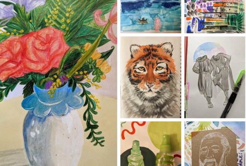
1. Introduction: Working in my sketchbook
always makes me happy. Over the past year, I've been trying to
find my favorite kinds. So I've experimenting with different types and brands
and over that process, I realized how many beautiful
and interesting ways they're for a sketchbook. That the more I'm working
in my sketchbook, the better all of my
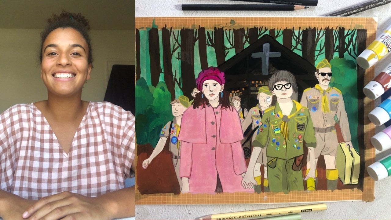
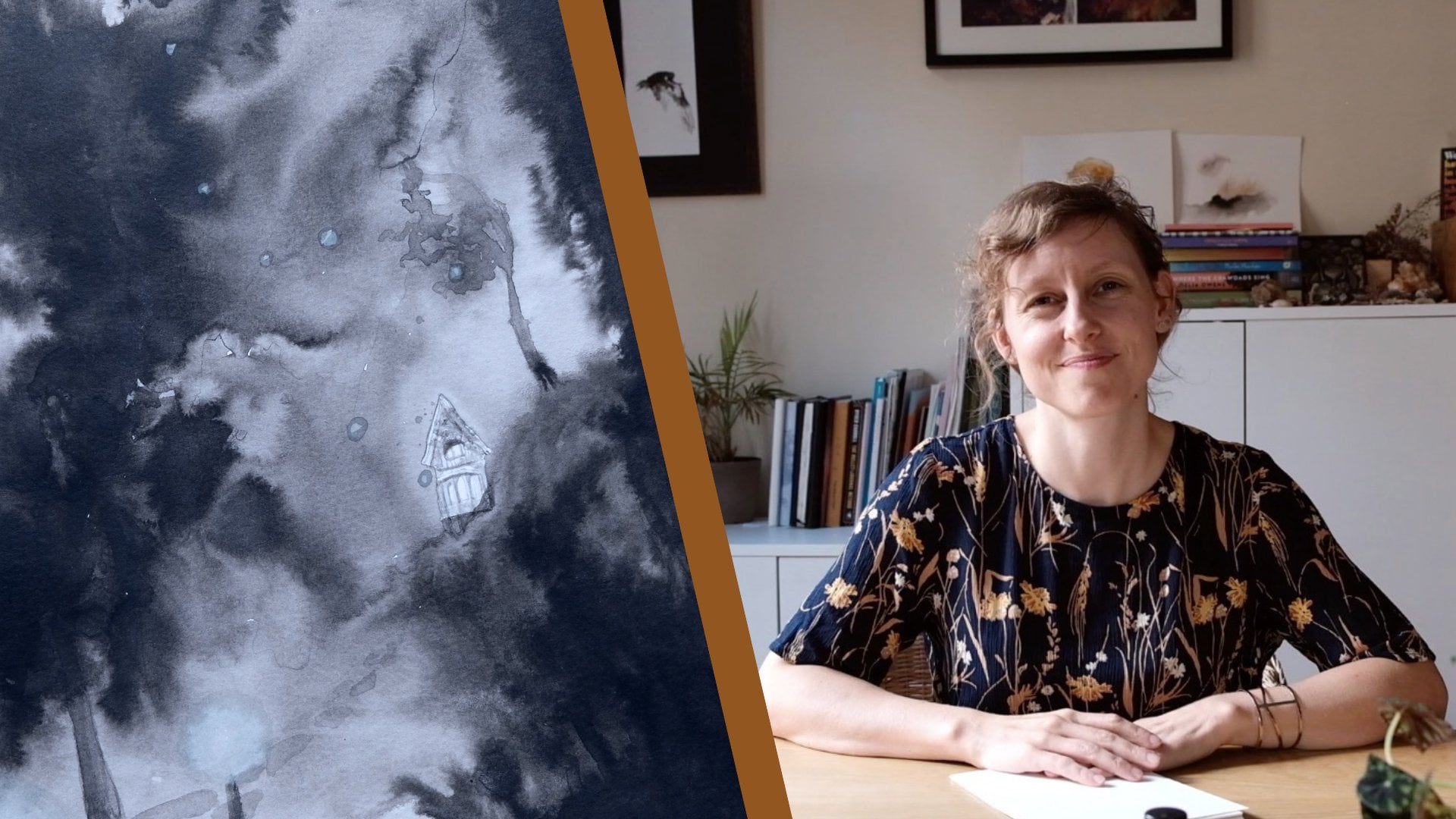
illustrations are. Hi, I'm Madison Moore. I'm an illustrator working
primarily in gouache, but as you'll see in this
class also markers and colored pencils and graphite and sometimes even digitally. I'm also a crafter. I'm very interested in
ceramics, textiles, dying, garment making,
quilting, you name it, and I'm also an author. My second picture book is going to be published this fall. This is my second
Skillshare class. My first class is focused
completely on gouache. So if you're interested in
learning more about how to use it and how to construct a full scene from
start to finish, I recommend you check
out that class. As an artist working in
sharing on social media today, I've always felt a
lot of pressure to develop a style and stick to it, but it's never been something
that I wanted to do. I love working in different mediums and
covering different subjects and it really
doesn't bother me if the work doesn't look
good on my Instagram. Good. But that pressure is definitely still
there and I've had to develop a practice
that pushes against it and sketchbooks have been a really big part
of that for me. Every day I spend
30 minutes drawing my sketchbook and just using and drawing
whatever feels right, whether it's just a pencil in graphite and a
picture I saw on Instagram or I'm using a full pallet of gouache
to take on a still-life. I broken down that
sketchbook practice into a one-week session
for this class. It's open to all skill levels. You don't need experience
with any of these subjects or materials to be able
to take on these lessons, and you also don't even need to have every
tool that I have. I'm going to, for example, draw landscape and
markers this week. But if you don't have
markers or even if markers just aren't
feeling right that day, pick-up colored pencils,
pick up a pencil, pick up a pen, do whatever feels right
for you in that day. The point is that you're pushing your boundaries with how
you use your materials, the subjects that you take on, and trying to use a variety of different things over
the entire class. In the next lesson, we'll talk a little bit about variations on materials and tools and how to find and use what you have. There are no real
rules to this class. The point is to push yourself to make work that looks a
little bit different than how you expect your
work to look and that might be even a little bit
uncomfortable to make, and also to find some joy in
making something every day. Making every day is
really important to me. Fear of the blank page and worry about how a piece is
going to turn out, both fade away when
I just started to making it a habit
every single day. I encourage you
to try to take on this class in a one-week span. I'm really excited you're here, and I can't wait to get started.
2. The Class Project: The class project is simple, each day and less
than four through 10, we're going to be creating
a sketchbook illustration. Please take a photo of
your illustration or take a scan and then post it
to the class project, especially, if you do all seven, I would love to see all seven. Don't forget to pick
your favorite one for the cover image of your project. There's also a downloadable
file in the project and that contains all of the
reference images that I'm going to
be using each week. So if you'd like to draw
the same things as me, make sure that you
download it before day 2. You are also always
welcome to find reference in your own life or online and use
whatever you want. But I just made it
easy for you if you want to draw the same
thing that I'm drawing. There's also a bonus lesson
at the end of this class, we're turning a
sketchbook illustration into a portfolio piece. If you complete
that bonus lesson, please add that onto your
project and show the before and after from your sketchbook
to in your portfolio. That's it. Let's move onto
our tools and materials.
3. Tools & Materials: The tools or materials in this class are
strictly required. These sketchbook
illustrations don't need to be precise or perfect and so you really don't need any perfect set of tools. I'm going to spend some time exploring what I'm
going to be using, but make sure you adapt this to your own practice and materials. The important things are that
one, you have a sketchbook. It's pretty hard to
get around that. You can use loosely paper
if you want but there is something really special about having an actual sketchbook. Two, you need to have at least three different
mediums throughout the week. The point is that you're pushing yourself to explore
different things. Make sure that you're using at least a few different
kinds of materials. Three, make sure you're
making an effort to use things outside of
your primary material. For me gouache is my
primary material and so I just don't want to be
using gouache every day. Let's go ahead and jump into the things that I'm
going to be using. Let's first start
with sketchbooks. Like I mentioned, I've
bought a bunch of different brands trying to
find what my favorite one is. While I think I know
what it is now, I still have all of these
different sketchbooks to fill. I use them a lot for different
things and you'll see me switch between them
each day of the week, just doing different things. But let's run through the brands and what
I like about them. First, this is real talent, art creation sketchbooks,
I have it in two sizes. They had really creamy mixed
media paper. It's off-white. I like that these sketchbooks are pretty inexpensive
and I just feel really comfortable working
in them like I never feel bad for just
scribbling across the page. I just liked that they are
really casual sketch books. Then I have a
handbook sketchbook. This is also mixed media paper, but it's a little bit stronger than the art creations paper. I really, really like
working in here for all materials from
gouache to just graphite. This is just a really
versatile sketchbook. It's a little smaller
than I prefer to work, but I still really like it. This is a Fabriano
watercolor sketch book. If you watch my first-class, you'll see that this
is where I have painted most of my screencaps. It is watercolor
paper so it's great for gouache and
painting generally. I've got this at a
local stationery store. The paper is heavily
textured, but pretty thick. I don't know exactly
how to categorize it. But it's great for painting and it's just like a really
beautiful little sketchbook. I like just working in here for full gouache
illustrations usually. This is a Strathmore
drawing sketchbook. I draw In here. This is what I usually draw in every morning. I usually use graphite in here, but it even takes
a little bit of water if I want to use
my liquid graphite. I also just really
like this sketch book. The pages are plain white. It's just great for drawing,
just simple drawing. This is a Strathmore
mixed media sketchbook. It is good for all
kinds of materials from marker and
pencil to gouache. I use it for all
of those things. For some reason it's
just not my favorite. I don't really love the soft cover and I don't
really like the binding, but the pages themselves
are really nice. This is a render lay
flat sketchbook. It's really big, which I like. Crescent render paper, you can draw on it with any
kind of marker, Sharpie, whatever and there's
no bleed through, which is pretty amazing
and paper is crisp white. I usually draw in here
with pen or marker. Finally, this is a [NOISE] more skin
watercolor sketchbook. I usually just paint
here with gouache and I actually don't think
I'll probably use this one this week,
but maybe I will. Yeah, I also liked
that it's pretty big. The paper is watercolor paper, so it is a little bit textured. Those are all of my sketchbooks. You're going to see me use
most of them this week. Next, let's talk about gouache. I love gouache so much. When I am working on my regular illustrations I
usually use acrylic gouache, but when I'm working
in my sketchbook, I like using just
traditional gouache. I have some premixed palette that I like using
in my sketchbook, so that's probably
what you're going to be seeing me use this week. I also have my ceramic palette that I just usually don't clean off and then the
paint lingers here. Sometimes are just
like pulling from this as well so I have that. Then I have one premixed
palette from Artesia. All of the gouache in
this palette is dry. Using it is a little bit more like using a watercolor palette, because you'd have
a to add a lot of water to it to get the color. [NOISE] Then I also
have this watercolor premixed palette that is
full of Holbein gouache. Holbein is my favorite brand. This gouache is in an airtight
container so it stays wet and you'll probably
see me use this as well. Holbein is definitely a
more expensive brands, so especially if you are new to gouache and
you're just working in your sketch book I would
recommend starting with something a little bit
cheaper. That's what I did. When you're working
with gouache, make sure you have a palette of some kind. Like I said, I'm going to use
my ceramic one this week, but plastic will work fine. You'll also need a jar for water and you will
need some brushes. I don't really have any
brush recommendations, but just getting a few different
ones at different sizes. I usually working with a smaller brush and
having with like a larger round one for if things are getting a
little bit too fussy. You'll also need some
colored pencils. For colored pencils, I love Prismacolor that's
what I mostly use, but I also have a
few random brands when I just pick
out random colors. I also like using luminance colored pencils
that are very expensive. I only have like
five or six colors. But yeah, just a selection
of colored pencils. For markers in my sketchbook, I love working with
both Tombow dual tipped brush pens and
then Ecoline brush pen. They work really nicely
together. You can blend them. An Ecoline brush pens give out so much ink and so
much color there, so lush and I love
working with them. Those are basically the
only two marker brands that I use and they're
both pretty affordable, which I also love about them. I'd recommend picking
out colors that you work instead of buying an
entire set of either of those. You will also need a pencil. I like using HB
pencils of any brand. I think I have Prismacolor brand and Mitsubishi brand right now. Then I also love using liquid
graphite with my pencil. You'll see me use
it later this week. You just need water
in the brush and then the actual liquid graphite. Something really cool
about it is that after it dries,
it's also erasable. That's my favorite tool that I've just got
rid in the past year so I use it most mornings
in my sketch book. If you're looking for something
new to experiment with, that's the tool I'm going
to tell you to go for. You're also going to need a pen. I actually don't draw
with a pen very much. I feel intimidated by
dragging this pen, but part of this class is
to push our boundaries so I'm definitely going to be drawing with pen
one day this week. I have a Uni-Ball Sigma pen, but you can really use any pen, a brush tip pen, a felt-tip pen, a ballpoint pen, whatever you want to use. Then finally, just a couple of miscellaneous tools
you might see me use a neo color crayon, these are wax crayons
that are water-soluble. They're very fun sometimes I just throw them in for texture. You can even use
a Crayola crayon or any other wax crayon or pastel to get a similar
textured effect. Sometimes I also might just
use a pencil that's softer or harder if I need it.
I think that's it. Let's do a quick rundown
of all the tools that I'm going to use this week. One, a sketchbook, two gouache and all the tools that you need for gouache
like a palette and a brush. Three, markers. Four, colored pencils. Five, a pen. Six, a pencil, and seven miscellaneous
things like liquid graphite or
watercolor crayon, or anything else that you just want to
throw into the mix. Remember that this week
is a little bit about pushing your boundaries
and trying new things. Even if you don't like drawing
with pen, like I don't, please still take on one of
the days this week in pen. I'm not saying that you have to keep drawing with
pen every week, but I have found that
drawing in a place where I'm uncomfortable has unlocked some really cool things for me. I think that's it. Then we
can go ahead and jump into the first day of illustration
in our next lesson.
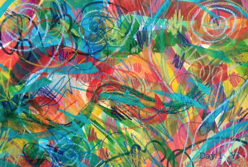
4. Day 1: Mark Making Warm Up: Hello, and welcome to Day 1
of our sketchbook challenge. I'm so excited that you're here. We're going to start
with a warm-up today, something that's just going
to get you a little bit more comfortable with
all of your materials, that's going to let you connect to your creative
center and let you just move really freely before I'm jumping into
actual illustration. That warm-up is going
to be mark-making. Mark-making is something
I do all the time on my own just for those
reasons I just listed and also because I think
it's fun and relaxing and a great way to experiment
and discover new things, new marks, new color
palettes, etc. I've done this exercise
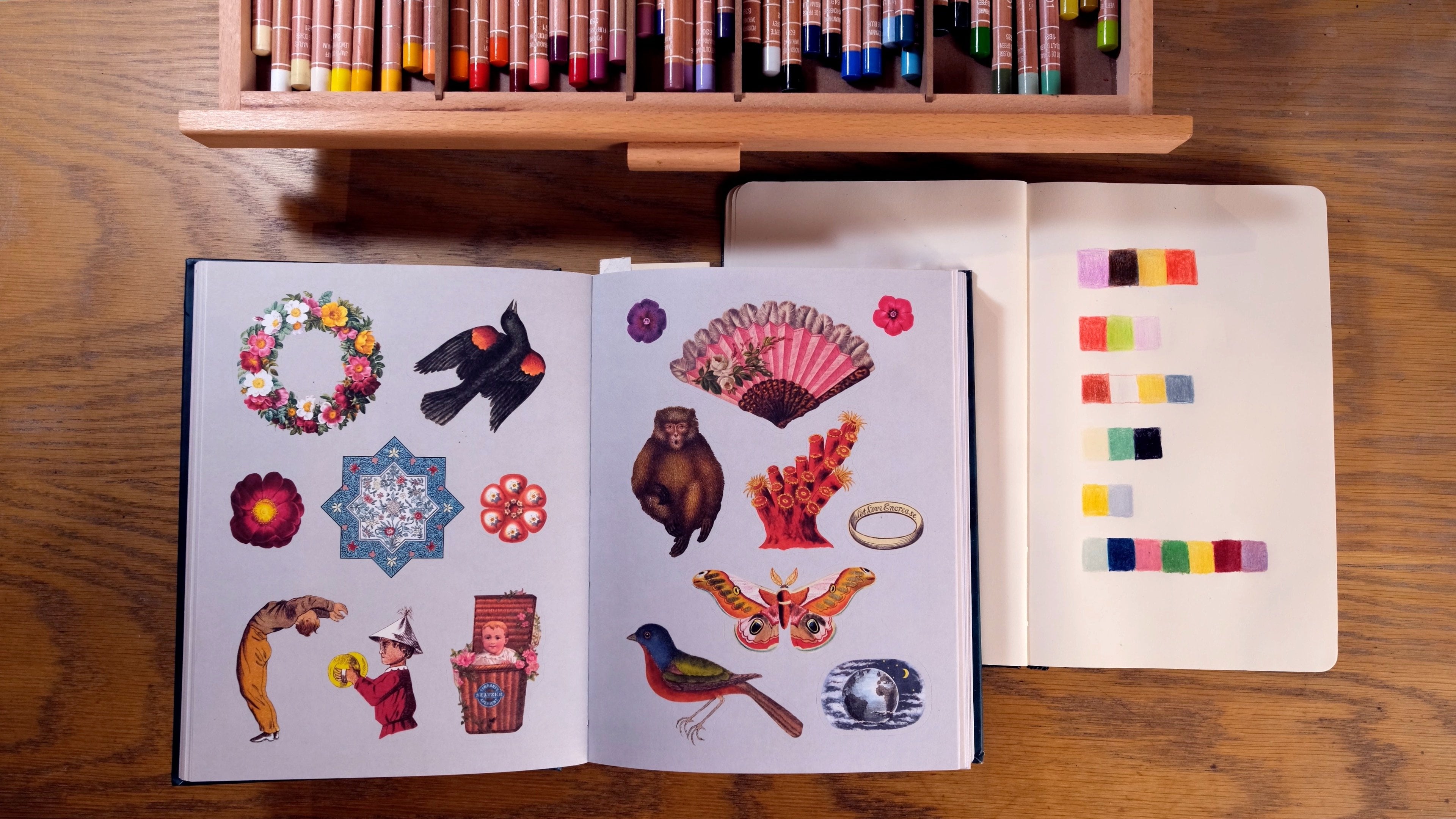
just so many times. Something else I also do is that when I have extra wet
paint on my palette, I just lay it down onto
scrap pieces of paper. I have a bunch of
those here just to show you how that works. Whenever I have wet
paint instead of just letting it dry and letting it go to waste especially
if I'm using [NOISE] acrylic gouache which is going to dry and not be
able to be re-wet, and I just lay it
down here [NOISE] and something I really
like about doing this is that I put together
colors that [NOISE] I would never really choose to
put together on my own, [NOISE] but that end up providing me with really
inspiring new ways of working, and some of these are
palettes that I truly love and I have inspired work and paintings that
I'm really proud of. I took this palette
and turned it into maybe one of my favorite paintings that
I've made in the past year, and I don't even remember where it
originally came from but it became so inspiring to
me in that painting all just lead from this
color palette. Having these around, like
hanging them up in my studio, just having them
here to refer to is just a really fruitful
thing for me, and mark-making generally
does that same thing. I'm going to be
doing it today in my royal talents occasions sketchbook, it's pretty large, it's like around 9 by 12, and this sketch book
is pretty inexpensive, so I just feel pretty good about just scribbling in it and it feels
really comfortable. Then I also have
my gouache palette that just has some
Gouache dried on it, and I'm just going to use
what's already on here, I'm not going to get any
new paint from the tube. Then I just have a random selection of
colored pencils and markers, and it just one of everything that I'm going
to be using this week, I didn't think
about which colors, I just grabbed random ones
from all of my drawers and cups and stuff and I
just have them laid out and I'm just going to
choose from them randomly. Go ahead and do that, grab a little bit of everything that you're going
to use this week, grab a sketchbook, and let's settle in to get
ready for our week. Hello, this is voice of Madison. Every day for our challenge, I'm going to show you
a few examples of this sketchbook illustration
in my own sketchbooks, just so you can have a sense of the different ways
that I've done this in the past and maybe
help that inspire you as you take on
each challenge. Here are just a few different
ways I've done mark-making. As you can see, it's going to be a little bit different every time depending on what
materials you use, what colors you use. Honestly, even just what
sketchbook you use, and it's all going to be really valid no
matter how you do it, there's honestly not a
wrong way to do this. Today, I'm not going to be giving as much like
instruction as I might give in some of the
other illustration days just because this is
something you do on instinct and you do on intuition and you do with
what feels right, and I can't tell you
the right way to do it or a better way to do it
or an easier way to do it, it's just you sit
down and do it. Hopefully some of these examples will show you that you can really just taken on
however feels right, because it doesn't need
to look any certain way. I even particularly
like this last one in the handbook quite a bit
because it's so dark and graphite heavy and just knowing that you don't
have to make something that feels pretty or
feels like sharable, you can just scribble, and that's really the point. I also just finished up a blog post with more
about mark-making, so if you're interested
in knowing a little bit more about why I
love this exercise, you can also read
that blog post, which is up on my website, and that is linked
in the description. After we have finished
going through all of these mark-making swatches, just so you can get
a closer look at the ones I was
showing you earlier, we're going to open up our Royal Town
sketchbook with all of our materials around it
and just get started. I started with graphite
and as you're going to see through this drawing, I really was enjoying using
graphite during this, I kept coming back to it, I really liked how the
marks were looking. It just felt very free and versatile and it was just it
felt right for that morning. I also had a really good
time putting water on stuff that I normally
wouldn't put water on. Like for example, these markers, you don't need to put water
on them to make them work, but I found that just
like adding water to them and getting them to
blend and getting the color to extend was really fun. That's something I
don't normally do, but I ended up being a really
fun part of this piece. You can also see I
was trying to hold my pencil in different ways, I was trying to hold it
really close to the lead, I was trying to hold
it really far back, I was changing away my fingers
were wrapped around it. Just doing things a
little bit differently. Also obviously this is sped up, but something that is important is that I'm moving pretty fast, I'm not taking time
between strokes, I'm not taking time
between picking materials, I'm just picking the next
one and starting to mark and just letting it
feel instinctual. Really don't hesitate
when you're doing this, just put the marks down, there's no wrong way to do it, and whatever you're doing is
going to be great and it's going to offer you something that you can use
later this week. I think something that's
also really great about mark making is that you
are combining materials, and that's something
that we're going to eventually do this week too. Just getting a sense
of how some of your materials might
come together is really great because that's something that you want to have
experienced for later. If you do that
regularly in your work, that's awesome,
but if you don't, this is a great way to
just see like okay, how are my markers in my
color pencil is going to interact and how
my crayon is going to be able to completely cover a space that my markers
have already filled up. After I finished mark-making, I just wanted to zoom in a
little bit here and show you some of the details
and some of the marks, some of the water stains that ended up really beautifully, like I said, I never
would've chosen them, but they worked so nicely. In the graphite marks
like I mentioned, I just was really happy with
how they were turning out. They were making
me really excited to use graphite
later in the week. I love this purple, green, and pink combination here with the hint of orange coming
in from the sides. I just thought this
was really nice, it suited my work well. It's also very possible
that when you go through and you start looking at
these detailed moments, you don't love a lot of stuff and that is
totally fine too. This is just one little
exercise and it does not need to be the
be-all, end-all, and you can mark make as
many times as you you, and you're always going to
get something new from it. Don't feel disappointed if
for some reason you just don't feel connected to this
piece, that's totally okay. After you've finished,
go ahead and take a photograph or a scan, just because I want
to make sure that you have something to post for your class project so you can lay out your
materials nicely around it or you can just go straight together and get a scan taken. That's all we're going
to be doing today, and I will see you tomorrow
for Day 2 of our challenge.
5. Day 2: Landscapes in Marker: Hi. Welcome to Day 2 of
our sketchbook challenge. Today, we are going
to be taking on landscapes in primarily markers. Landscapes are so freeing, they're so fun to draw
because you can push their limits to our space and they're still going
to feel like landscapes. You can use any materials, you can use any colors. You can approach them however you want and they're still going to maintain that really
wonderful vista feeling. For that reason, I
really do like going full mixed media
with my landscapes. But today I'm going
to try to stick to primarily markers just for
the sake of this exercise. You might see me sneak in and
pencil or a colored pencil if I feel I really need
it, but we'll see. But I just encourage you pick
whatever colors you want, you can use whatever mark-making
techniques you want and just let yourself be really
free on the page today. I think that doing this
right after we did the mark making is a
really great way to get more abstract and free-flowing
marks into your landscape. I'm going to be drawing in my
handbooks sketchbook today. It's really wonderful
mixed media sketchbook. It takes all kinds of materials really well from gouache
to just graphite, and it's not too expensive, so I feel great working in
it and really comfortable. It's small so today I'm going to draw over both
pages, which is fun. I like using the centerfold
sometimes in my drawings. That's what I'm
going to use here, and then I'm going to be using these ICO line brush pens
and these tombow brush pens. I'm just going to try to
stick to these two markers. I have a bunch of colors of each and I'm
not going to pick any pallets up before we start. I'm just going to go
for what feels right. But I think that's all we
need to talk about today, so let's move over to the desk. Hello. This is VoiceOver
Madison again, we're just going to run through some of the
landscapes I've done. I also do take landscapes
as a very broad definition. I think just drawing, this does in any way
whether it has buildings, whether it does
have some people, whatever those all fall into
the same category for me. But something really great about them is that you can also draw landscapes or
[inaudible] does from life. This big one was drawn from life at Glacier National Park. This small one here I
turned into a sticker. This greenhouse I drew from a photo that I took
when I visited France. It's just the opportunity
for finding inspiration for these drawings is
all over the place. This upcoming one
here is something I drew from life in
a park in Chicago. It's just something that's super fun to do and something
that you can, like I said, have no limits for. You can choose any
color palette, you can use any
materials and it's still gives you that same
landscape impression. I just love that freeness. This one was also drawn from life when I was
on a camping trip. It's just something that
there are no boundaries. This final one here is
probably my favorite of the recent bunch of which
I've just drawn from a photo. This is the last
reminder real quick, but if you want to draw
the same landscape I'm drawing to download the project file that has
the image that you can see, the reference that
I'm working from. But basically I just chose this farming landscape that I thought was really beautiful, mountainous, but it's really about the fields and the colors. I decided to stick with
greens just because I really like working
with green and I think something I really liked
about the initial photo, which was the blending of greens and yellows
and dark and light, and so I wanted to maintain
that in my drawing. You'll also see today
that I'm not going to do under sketches with pencil
unless I'm using gouache. I'm going to encourage
you to just stick with the medium the whole
way through if you can. I know it can be a
little bit uncomfortable to draw just right away with marker instead
of having any warm-up with pencil or with whatever material you
feel most comfortable with. But I think that's
also a way to get some really just
more fresh drawings when you're not trying
to just build on layers. You're just going with what
feels natural at first. I laid out the different kind of fields within this drawing, and then I started
closest to me, and I moved further away just
filling in color blocks. As you can see, I
didn't just choose one color for one
area of the field. I tried to do a
lot of blending to capture differences of light,
differences of distance. For example, as you move
away from the camera, the vista is going
to get desaturated. I'm using really
rich yellows and really rich greens up close to the camera at
the bottom of the page. But at the other end you'll
see I'm going to use much more desaturated colors and give a little
bit less mark detail because it's in the distance. Just keeping stuff like
that in mind will help to make your landscape a
little bit more realistic. But generally, you don't have to do exactly what the reference
is telling you to do. You can choose the colors
that feel interesting or that are calling to you
for any of these things. I don't think that my drawing
is an exact replication at all of the
reference and in fact, I don't want it to be. You'll also see that
on the reference photo there are a lot
of little houses. As I was going, I
couldn't really decide if I wanted to include
any of the houses. I thought they were fun, but I didn't want
to draw them in marker because I
thought they would just blend a little bit too
much into the fields and I wasn't sure that I
wanted them there at all. But you'll see
eventually I do cheat a little bit on
the materials list and I draw them in with pencil. But I really am glad
that I did that. I think it offers some nice little details when you get in closer
to the drawing, you honestly can't even
see them that much here just because
they are so tiny. But if you look at
my project file, you can see them with a
little bit more detail. I am really glad I added just a few of them in to
give a sense of space and the sense of distance and even a little bit of
a sense of narrative, just knowing that this is farmland where
people are living. But you can see, yes, as
I'm moving backwards, the colors are getting
a little bit lighter and a little bit
more desaturated. You can also see that a lot of the fields are converging at this point in the
middle of the page before things go up into
the mountain range. I was a little bit
intimidated by that section just because I think trying to
achieve that effect can sometimes be a
little bit difficult. But just taking it field by field really helped
me to be able to get a sense of the whole
scene and figure out what's close
and what's far and what's converging
and what's not. But I think it was
really effective and I ended up really
liking this drawing. I also was really
glad that I did this right after mark-making
because as you can see, when I'm drawing my
trees and my brush, I'm working on holding my marker and a little
bit of a different way, a little bit less controlled. I think that very much came from my mark making experiments. It ended up having a
really fresh effect. Then a lot of my
greens and yellows are really well blended here. I think that also was a big part of what I took from
my mark-making, just like figuring out new
ways to blend my materials. I think this was
the perfect follow up for me and I hope
that you're finding some of those through
lines from Day 1 to Day 2. That's just about it. Go ahead and take your photo
or you scan when you're finished and let's
move on to Day 3.
6. Day 3: People in Graphite: Hello and welcome to day 3
of our sketchbook challenge. Today we are going to be
drawing people in graphite. I'm really excited about today because I love drawing people. I spend a lot of my
sketchbook time just drawing people in their cool clothes
and that sort of thing. It's just the day
that I feel really comfortable with and
really excited about. I'm going to a be using a Strathmore drawing
sketchbook today. This sketchbook is almost
completely full of people. It's just an endless supply
of inspiration for me. I selected a reference
image that you can use if you'd like to
draw the same thing as me, it's in the project
file that you can download or you can go
ahead and look on Pintrest, look on Instagram, find an
image that inspires you. You can even dress up in your favorite outfit and take
a picture of yourself and draw a self portrait
which I love doing and I do quite often. But go ahead and either
find your own reference or download the reference
that I've given you, pick a sketchbook and
then you're just going to need a pencil, an eraser, and I'm also going to use liquid graphite that we talked about in the tools and
materials section. That's all you need
to get started today. Go ahead and gather
your materials and let's move to the desk. There were so many different
examples of drawing people that I could have shown at the start
of this video. I felt like I really just
needed to focus in on some just because
it's the thing that I draw so often. There's
a lot of examples. These images come from screenshots from music
videos or TV shows. They come from
Instagram accounts, they come from Pintrest, they come from photos
of my friends, come from photos of myself. It's just whatever I
feel inspired to draw, whoever I feel inspired to draw, and you'll see a lot of them
are in graphite but I also like taking them on
in color sometimes. Graphite is just my safety zone. When I'm warming up
in the morning or when I just want
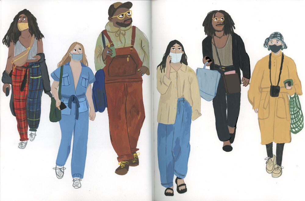
something quick and easy, that's where I gravitate to. But this whole spread, I did in colored pencil and
then I followed up and did it in gouache and I was really happy with
how it turned out. All the figures came from
an Instagram account. You know that this one is
a photo of my partner. It's just the people all around us [LAUGHTER] obviously and it's just something that's
really inspiring to me and I never get
tired of doing it. This week for the
reference photo I found this photo from, I think it's from the
'60s or the '70s. It's fun to draw photos from different eras because you get
to draw different kinds of clothes and use different kinds of colors or if
they're black and white you get to impose your
own color schemes onto them. I also really like drawing
one person multiple times. Choosing one
Instagram account and drawing a bunch of
the outfits from it. I think it's very fun
to try to practice that consistency or see
what changes over time. But anyway, let's go ahead and jump into the drawing today. Again, you're going to
notice that I don't do an overall sketch of
the whole figure, I don't like place where
the head is going to be, place where the figures
are going to interact, place shapes for the
body and the legs. I just choose one part of
the image and start there. It's different for every person. It's usually just
whatever is standing out to me about their
figure and their shape. For example, in this
drawing it was the scarf. Just the shape of
the scarf was really well-defined and I felt like if I drew the scarf
first it would be a really good reference point
for the rest of the body. I choose that starting point and from there I build
the shapes around it. I could draw the arm
coming over and then I could draw the boat which
lead to the other arm and just letting itself
fill out like that as opposed to asking myself to have the whole shape
from the beginning. This is how I always
take on drawing people and I have found it to
be really successful. It's not always going to exactly replicate the image
that you're drawing from but like I
mentioned already, that's not ever my goal. I want to have something that feels true to my work and not
just true to the reference. For example, the
figure on the right, her pose is a little bit different than it
is in the photo. That's totally okay and it's something that
I'm happy with. I also don't really ever erase much in these
drawings and that's because I'm just okay with whatever overlapping lines or whatever redrawing I need to do. Sometimes I just redraw how the shape should look on
top of how the shape looked the first time I drew it and build from there
and I think that those extra lines really add character especially
in your sketchbook. Just don't be afraid to mess around and just keep working
on top of your work. Don't doubt yourself,
don't second-guess, don't feel like
you need to start over if you make a mistake. You'll also see that I'm
drawing pretty quickly. I think this is something that is going to show up in all
of these sketchbook days. When I'm in my sketchbook
I don't want to be fiddly, I just want to be
drawing and so most of the work I do in there
is pretty quick. I don't want to spend time hesitating or that's
not the point. The point is just making the
marks and doing the work. I'm going to encourage
you to do that as well. Don't spend too much time deliberating on if
we're doing a good job, just keep putting
the pen to page and you'll figure out where
you need to go next. I also really love
working with patterns. I think they just give drawings
especially drawings with people so much dimension
without patterns. I think especially
when you're only drawing with graphite it can just get a little bit boring. I'm often gravitating towards photos where I'm going to
get to work alone patterns. In this instance I ended up leaving both of
the figures faces for last but that's
not always what I do. Also the figure on
the right is smiling with all of her teeth showing which for me is a
particular pain point. I think it can be really
hard to draw teeth. I was intimidated
by doing that and I thought about
just like closing her mouth and having
a closed mouth smile but I thought no, I'm going to try it like
that's how she looks and it's worth giving it a shot and I ended up actually
loving how it looked. Don't shy away from things
that seem difficult. They might not always work out but you're going
to learn something and sometimes you really
will like the result. That's what I'm going to
encourage you to do all week. Then after I had the
basic artwork outline, I had the lines for everything I brought
in my liquid graphite. Let me tell you, liquid graphite is
just my favorite tool. It is so fun to work with. I feel so loose when I use it. I think it just completely transforms my
sketchbook drawings. You can get it on
really thick and really dark and you
can also get a really, really light wash
that's just barely tinting your page
with a light gray. I think using a combination
of these ranges is something that is really
successful about this tool. Pushing things into
the background with darker color is
accentuating patterns, adding shadows, figuring
out what's going to be completely white and therefore
are going to stand out. I love using it for hair
because it just adds so much more depth
to hair than you can usually get with
just your pencil. It's just really
a versatile tool. Just like with the
pencil itself, I'm going to be really fast and loose with it when
I'm in my sketchbook. I don't wait for it to dry, I'm okay if it blends
into different areas, I'm okay if shadows and patterns are one and the same and I think that is something
really characteristic about these drawings is just
that they are that loose. Really keep it moving
if you are using this and if you really dislike something
at the end of the day, it's erasable after
it dries which is another really awesome
part about it. Like I said, if you are
looking for a new tool, I would really suggest
you consider this. I've had this same tin
for like six months. I've barely made a dent in it. It's really cost-effective. It's just a really, really fun tool and I absolutely love using
it with my graphite. But that's all I have
to say and I will see you tomorrow for
sketchbook day 4.
7. Day 4: Faces in Pen: Hi, and welcome to Day 4. Today, we are going
to be drawing faces and expressions in pen. I like drawing faces close up and larger just
because I think it really helps me make more
interesting characters when I am making illustration. I think it's a really
challenging subject, but it's also a really rewarding
the more you work on it. I feel most uncomfortable
drawing with the pen out of any
illustration medium. This is also a way
for me to push out of my comfort zone and do something that feels new and fresh. Usually after I do it, I also feel really rewarded for trying to grow in a new area. I'm really excited about
today for those reasons. I've selected two
reference images from an Instagram account
that I really like. It's here you can follow the account and if you
want or you can just go ahead and download
the two images that I chose in the project file. You can also take photos
of yourself, your friends, find other phases
online however, you want to find
reference for this. But we're going to
draw two faces today. I'm going to be drawing in a
render lay flat sketchbook. It's pretty large,
white flat paper. There's no bleed through
between these pages, whether you're using a
Sharpie or a pattern or any marker.
That's really nice. I'm going to be using
my sigma unit ball pen that I talked about
in the tool section. I also like to use a
black colored pencil with my black pen just
for texture and shading. That's all I'm going
to have today. I might pull in, I
guess a Sharpie or something if I want to
fill a lot of space, but probably not, is just going to try to
keep it simple today. So let's go ahead and head
over to the sketchbook. I approach drawing
close-ups of faces very similarly to how I approach drawing bodies in
people more generally. That's just choosing
something that is defining the shape and using that to build the rest
of the face from it. I don't do an overall
view of the head or blocking where the nose and the eyes are going to
go compared to each other. I just pick a feature and work from there and build
everything around it. For this first face
that was glasses, and I think glasses are often a really good
place to start. I like when a character
is wearing glasses, I think it makes things
just a little bit easier. I also really like choosing
faces to draw that are not super glamorous photos. I think it's really
hard to draw models and people who have very symmetrical faces
and stuff like that. I think it's just
a lot more fun and interesting and your results
are often more fun and interesting when you're
just drawing regular people or people making funny
faces or whatever it may be and also just trying
to draw a diversity of people from age to
race to gender, etc. Though I definitely
do draw more women. I also really like using
colored pencil for hair. I think it's really hard
to draw hair with a pen. I just never really get
the fullness that I want, so I almost always bringing
the colored pencil for hair and then
again for shadows. I think these drawings, they both turned out
a little bit funny, just because both people are
making funny expressions. But I also really like them. I think they are nice reflections of
the reference images. They're nice references
of just people. I like doing this in my
sketchbook where I fill the whole page or
even a whole spread with just different faces. Just finding them online, taking photos of myself, taking photos of friends, like I said. I think something that is challenging about using
a pen, of course, is one that it has
a really thin line. It's really hard to get a more lush line with
a pen and then two, of course, you can't
erase or change anything. I think those are the
two challenges I'm fighting against every time
I'm drawing with a pen. But I also find that
both of these things are beneficial when it comes down to it not
being able to erase, just it makes your
drawing stay fresh. You can't really keep working or overwork
something too much, you just do it and
that's how it is. That's why also bringing the
colored pencils that I do have a little bit more
variety of line with. But there's something
really nice about the preciseness of a pen to that I don't really get
in any of my other mediums. That's another
reason that I like playing around with pen
because it helps me think of new marks
that I don't ever get with pencils or paint
or markers, etc. I think that is all. Today's a little bit quicker, but go ahead and take
a picture or a scan of your finished work
for the project file, and I will see you
again tomorrow. We are over halfway
through the challenge, so thanks so much for
sticking with me and I can't wait to see
all seven drawings.
8. Day 5: Florals in Colored Pencil: Hello and welcome to Day 5. Today we are going to be doing some florals in colored pencil. I love drawing florals just
because I love flowers, I just love them. I love growing them, I love
having them in my house, I love seeing them, they're just something that
really inspires me and their colors and their
softness and whatever. Today we're going to do flowers. I have a reference photo
from a bouquet that I got on Valentine's Day this year
that I took a photo of it, I'm going to draw
that, but you can also choose any
flowers that you want, something that you've
seen, something online, wherever you want. But if you want to draw
the same bouquet as me, you can go ahead and download
that in the project file. I am going to be drawing in my Strathmore mixed
media sketchbook. This sketchbook is great for
a lot of different things. I use it for a lot
of different things. These florals are going to
be technically a still-life, but you could also draw a floral pattern or draw
individual flowers. There's lots of ways
that you can do this, just like everything here. Do what feels right and let
yourself be free on the page. Let's head over to the desk. Flowers and still
lives or something that I like working on. I think they're just really
good practice in general because they ask you to
consider the details of things. I think flowers really ask you to do that because
they are so complicated, but they're also so simply represented in a
lot of our media. Whenever I draw them, whether it's a pattern
or a still-life, I really try to focus on
detail as much as I can. Obviously there are
exceptions like some of these sketchbook
drawings are looser or sometimes patterns
are meant to be more graphic
instead of realistic. But as I came into this
drawing specifically, and in general, when
I take on flowers, I try really hard to
draw what I see and not what I expect to be there because I'm
drawing a flower. For that reason,
this drawing took me a really long time, probably more than any of the other drawings
that I made this week. I just was really keyed into every little
petal, every leaf, every stem as much
as I could be, and also the colors that they
were being represented in. It ended up taking
me quite a long time to do this
finished drawing. I think colored pencils are also just a slower medium for me, which I like because they
obviously don't cover as much ground as
paint or markers. When I'm going full color and
using only colored pencils, I'm just spending a lot of
time thinking about layering, thinking about choosing
the right tone. Obviously, you can
mix them on the page, but you can't premix any
colors with colored pencils. Color selection is pretty important to getting
the look that you want. I think also one of my
very favorite parts of this drawing is the vase. This vase is a vase that I
hand-built from clay and fired and all of that and I really
love it and then getting to draw it and represent it with a little bit of negative space. I really liked that
part of the drawing. That's another
point to show that giving detailed to all
parts of the drawing, even the vase, which was not
meant to be the centerpiece, ended up really paying
off for me here. I think when you look at a dense bouquet of
flowers like this one, it has a lot of leaves, it has a lot of flower types. It has a lot of different things that are all melding
together into one big shape, it can be really intimidating to break it down into
its individual pieces. But I think breaking
it down is what is key to making it look good, or at least for the look
that I'm going for. I just try to move
really slowly and work one part of the
bouquet at a time. First the vase and
then I thought about all the leaves that were
coming down around the vase. I thought about the
colors that they needed, how they were darker
on the underside and lighter on the front side, and the way that the
light was hitting them in the photo made some look more of a mint green while lots of the other leaves
were olive greens. Even though I knew these
were like fern leaves, I didn't want to just base the leaf shape on how I
know fern leaves look. I was just trying to
make sure that I could really look at one leaf in the actual bouquet and translate that into
a leaf on my page. I think, especially for these first two stems that are hanging out by
themselves at the bottom, it was really
successful in that way. I really do encourage
you to try to take it one piece at a time. Things did definitely get a
little bit more complicated and abstract as I moved
into the entire bouquet. Drawing every single leaf, it's really hard
and so if you don't capture everyone,
it's totally okay. The way things start falling
in front of each other and the way you have to think about background,
foreground, and middle ground
and what's on top of what and what's
connected to what, it gets very confusing. Just like everything
else, this is not an exact replication
of the bouquet. But I did my best to keep
on with that same process. Pick one leaf at a time, use tones to represent it that reflected the
variations of light, the variations of leaf type, etc, and not just
generalized as I went. At the same time, I didn't know that the bouquet
was really full. There wasn't any white space between the flowers
or the leaves, especially through the middle. I had to make sure I was
going in and filling in backgrounds, and
that sort of thing. That was more just
general shading and not necessarily connected
to a specific leaf that I saw in the bouquet. Colored pencils, I think, are the most versatile medium. I think they can do so
much and I rarely do an illustration where I don't include colored
pencils of some kind. But at the same time, I also rarely make
an illustration that is completely
colored pencils. I think they hold a weird
place in my practice, but I had a ton of fun
using them on this drawing. I think having a variety of colors with colored pencils
is really easy because they're pretty
cost-effective and it's also pretty necessary
unless you want to work with a limited palette
since you can't mix them, but blending them is unlike
blending any other tool. You can put down really light layers and
cover it with dark layers. You can cover dark
layers with dark layers, you can do only light
layers and it's very much going to be affected by your paper because
paper shows through. Unlike layers of colored pencil, it's very much going
to be affected by the colors around it. It's just a
straightforward medium in a way that a lot of
other tools are not. I think this stage just felt
like a simple reset for me. I think because I don't
do it very often, it felt so fresh and
exciting and new and it's definitely something I'm going
to do more moving forward, like just draw with
only colored pencils. I think honestly this might be the only drawing in this whole sketchbook
which is almost finished, that is only colored pencil. I would really like
to revisit this. That's something I'm personally really proud to have
gotten from this course, is that in finding new ways for you all to be creative
and find new ways to work, I've also done that for myself, which of course I knew I had colored pencils
as an option, but I wasn't ever really thinking about just
taking them and using them by themselves and now I really am and I think I
definitely will do it again. I hope that you have had at
least one moment like that this week or you're
recognizing, wow, there's really a lot of value in doing this thing that feels obvious that I wasn't
doing much of before. I also did include
this one small clip of me drawing at regular speed. I realized that sometimes
it's nice to be able to see how it actually looks and how much time
is actually being taken, as opposed to the
sped-up version. I did include this short tiny
clip just to show you that. Finally, I guess one
thing I like about these colored pencils is
that they do have a bit of a shine to them because I've applied them pretty
thick in most places. They really stand up off the page in an
almost glossy way. Gouache is so mad that I rarely have illustrations
that have that effect. That was another thing I
was really excited about. Overall, I really did
like this drawing. I think I'm maybe
went a little bit too heavy with line work
at the very end, trying to define some petals, especially on the
rows on the left. But I'm really proud of
it and I hope you had some fun slowing down with colored pencils
and flowers today. We have two more
days left and I will see you on the next
day of our challenge.
9. Day 6: Tiger in Gouache: I'm going to use that.
I'm also going to use my Strathmore Mixed
Media sketchbook, which works really
nicely for gouache and I think that's about it. I have my brushes, I
have a couple of water, and I think that's all you need before heading to the desk. Don't forget to check the
reference file if you want to draw the same tiger
that I'm drawing, but you can also
find your own online or even any other animal if
that's what you want to do. Let's head over to the desk. Even though I have been
intimidated by drawing animals, I've spent a good
amount of time in my sketchbook trying it out. I really like drawing birds, which is funny because
I don't really like birds very
much in real life, but I think they're
very fun to draw, and I don't know, just something about
their colors and their shapes so
it's really nice, so think that's a
good starting point. Also, this is my foster bunny that I had for a few
months last year, her name was Moose, and I drew her for a while, which is pretty fun, and I also like drawing fish. I think fish are really
fun in a lot of ways, I just relate to
them as an animal, so sometimes I
like drawing fish. But the first time I
started drawing tigers, I was definitely intimidated
because big cats are just very intimidating. They have really serious faces, they have really
intimidating body shapes. I think they can just be really difficult animals to try taking on for
the first time, so that's why I started
with just drawing tiger faces that ended up
working out really nicely, and then I've tried tiger bodies a couple of times
and that's fun too. But I really do like drawing their expressions and their
faces and their stripes. Just like I said,
because it's really easy to get that general
round head shape right, and then from there you can
just start adding stripes, start mixing up the colors, start doing all these really interesting things
to make the tiger have more personality and
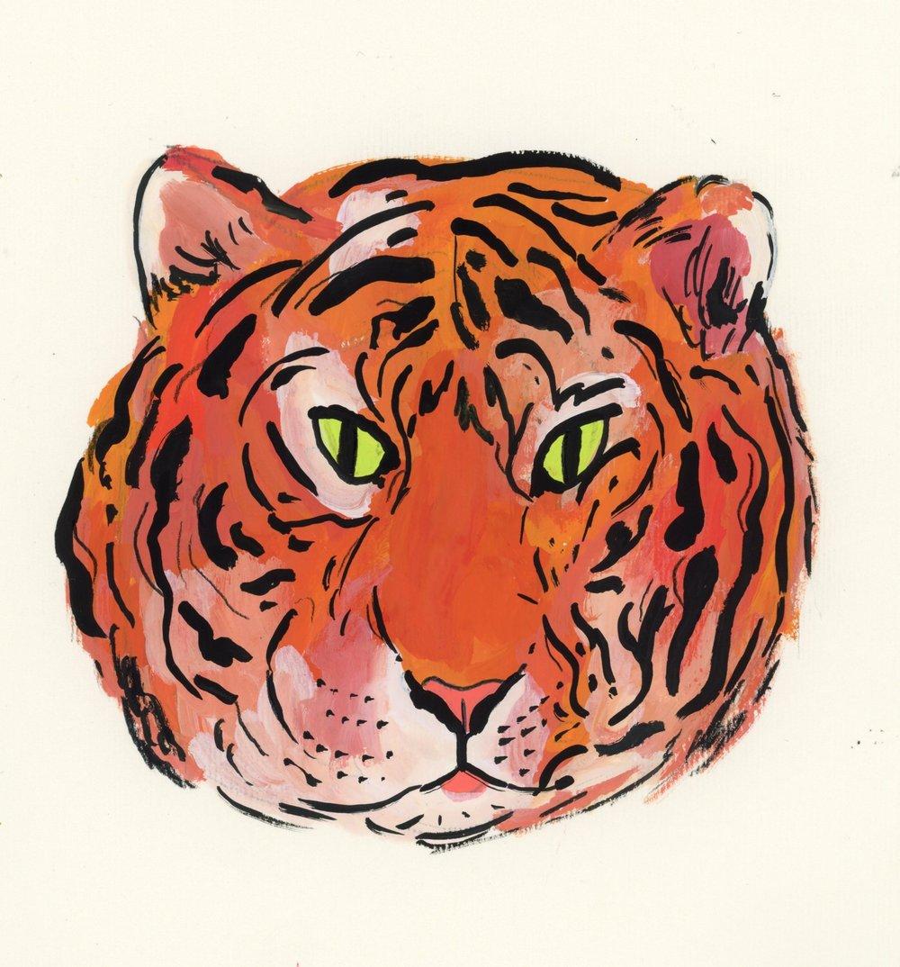
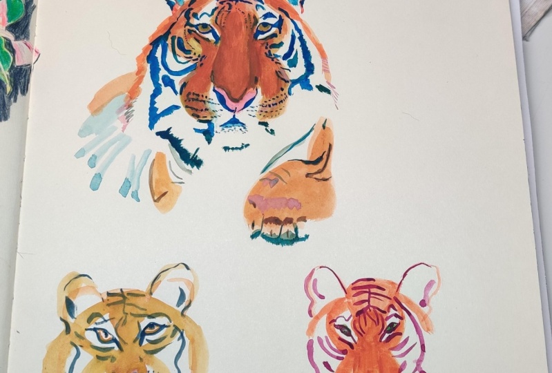
express something different. This tiger here is
in colored pencil, the ones on the right are in mostly graphite with
a little colored pencil, and then this last
one is in gouache and the first one I
showed was in gouache. Also like I mentioned, whenever I do work with gouache, I start with an underdrawing. Some people do underpaintings
with the actual paint, but I just like doing it
with a pencil instead, and I also realized you can't
see this pencil very much, but I'm just getting a very basic outline
for the head shape, for the eyes, and for
the nose and mouth. I'm not being precise
about any of that really, it's just a general outline and I'm not drawing
any of the stripes. I'm not really putting a lot
of detail into any of it, it's just a basic shape that
I can use with my paint, and like I said, what
I really like about painting tigers is that you
can do so much color play. I can just get in there
and start adding oranges, adding yellows, adding reds, even pushing the boundaries of what colors a tiger is
and add whatever I want. It gets iffy, it's one of these times
where you have to trust the process of what you're doing and that it's
going to work out. You'll see that as
I start filling this tiger just with different oranges and
different whites, it just looks funny honestly, and then it's not till the
end when you really bring in the eyes and you bring in all the stripes and all of that, that it starts to truly look
how it's meant to look. I think trusting the
process is something that can be really hard for
me when I'm painting. You know that middle
phase where things just aren't looking how they're
going to look in the end, and where things are
just a little bit more unshapely than
you want them to be, it can really make
you want to give up. It makes you wonder if you really are going to get to the place where you want to be. But something that I
always tell myself is that you can't judge yourself
while you are working. If you do that, you're giving
yourself a chance to fail, you're setting yourself up to do the wrong thing if you spend all the time that you're making, evaluating what you're
doing and thinking about if you're doing it
right or doing it wrong, or how it's going
or any of that. When it gets into this stage where I'm not really sure
how I'm feeling about this, I try to just block
all those voices out and keep going
because I know that putting in the work means that you keep going and
you keep figuring it out, and then eventually you'll find a way to make it
work out in the end. Talking a little bit
about technique, I started off using
a small brush, but it felt just a little bit
too finicky and I wanted to be filling space with just bigger and
bolder brushstrokes, and so I ended up picking out this rough round
brush that I have. It doesn't have
very soft bristles, they are very rough, and I actually don't use it that much because I haven't really found a great place for it or it's just like
it's a texture brush, and I found out that it worked so well for this idea of fur. I had so much fun
working with it and I wasn't using too
much water either, so the paint was thick
and just getting to lay down that thick paint with the really heavily textured
brush was super fun. I really liked using it, and it ended up being
a great choice, so if you're feeling you're trying to get
every little patch of fur or you're trying to
get every variation of color really perfect, try switching to a
larger brush and that might take some of
that pressure off of you. Then after I had laid down the different oranges in
the really light orange, I also wanted to
get some pure white onto the tiger just because
I see that in the reference, I really like how that looks. I switched to a new brush and I wasn't going directly out of the palette instead of scooping it into my ceramic palette, and just added white around
the eyes, around the mouth, around some of the
edges of his face. I think his face shape
ended up being a lot bigger than the tiger
in the reference, it makes him look a little bit chubbier and maybe even
a little bit older. But I think he's really cute. I think that just gave him
a lot more personality. At first, I was
like, this is not really how the
original tiger looks, but it's totally fine, I ended up just liking
it that much more. Because I'm someone who works a lot with narrative in mind, I was excited to have
a character that felt like he had
more personality and more narrative to him. I think the larger
head shape and the big jowls is also just fun. I was overall happy with
how the shape ended up. I also had a harder time deciding what color eyes
I wanted to give him, but I think that the green
just is really striking, and so I decided to just stick with green
and I'm glad I did. I think it helps with the
striking classic tiger look. Then I just started
going in with the black. Just starting immediately
with the darkest color can be really intimidating also, but I think one cool thing
about tigers is that you can put the stripes anywhere and it's probably
going to be fine. This is one place
where I would say pay attention to the
reference and don't just paint what you think a tiger stripe looks like
because really they come in all of these really funny shapes and now they connect
in these weird ways, and they change directions based on where the fur is going, and I think that is part of what will make your
tiger look like a tiger, so make sure that you are paying some attention
to the shapes from the reference photo if you want your tiger to feel a
little bit more realistic. But this is honestly
the most fun part. You just start seeing all of it come together and all
of the marks that you need underneath start
making sense when you add all of the stripes. I also had some trouble deciding
whether I wanted to have the short eye like I have currently in the
tiger's right eye, or if I wanted to have
an eye that reached down the entire length of
the eyeball and I ended up doing that and changing on both eyes
and I liked it better. But I think this tinier eye, this tinier pupil, also gives a more serious
look for the tiger, so that's an option too, making those changes and variations and I think
the shape of the pupil is a really big indicator of
expression for this animal. I didn't end up giving
my tiger whiskers, but I still gave him
whisker marks on the space around his nose
so don't forget to do that, and you could also give him actual whiskers
if you want it. But I think that
is just about it. I had so much fun painting this, I think this is definitely one of my favorite
days of the week, and we only have
one more day left. Thanks for being here, and
I will see you tomorrow for our final day where we
put everything together.
10. Day 7: Still Life: Today for our final day of
our sketchbook challenge, congratulations you made
it here, that's amazing. We are going to start just
directly on the desk and talk a little bit about still lives and the goal for today. So first, the goal for today is to use everything that you've used this
week in one drawing. You don't have to literally
use every single tool, but you're going to take a very mixed media approach to complete your
still-life today. The second goal is to
just start thinking about things in your life that can inspire you to
draw from them. For example, this first
spread in my sketchbook, I drew it off a couple
of friends who were playing chess while
we were on a trip. I was just sitting and
watching them and yes, they were moving and
doing different things, but I really love
both these drawings and just getting a little bit of time to sit and study them and study what they're
doing and then translate that into my
sketchbook as a memory honestly and in a
way to remember that time really distinctly
and in my own way. This one is done all in liquid
graphite but like I said, for the still-life I'm
going to choose today, I'm going to use all
of my materials. I want you to start thinking about
something in your home. Obviously, you can draw from
life outside of your home. A lot of these are. This one is from a greenhouse that I visited a
couple of summers ago. At this point, I really
liked this drawing. It's marker and colored pencil. Both of these are gouache and colored pencil that
were drawn in my house. One is a desert that
I baked last month, and one is a scene
in my kitchen. Both of these are from
online life drawing classes, which are also great
resources for drawing. Finding a live drawing
session is so fun. I haven't been to a live one
since before the pandemic, but they're really
fun to take on, another great way
to draw from life. But beyond all of that, I just want you to
draw something simple. I want you to look around
your house and think about something that might inspire
you in your own home. Something that you
just find beautiful, that maybe you see
every single day. This is a painting from my old apartment before I
moved just in my kitchen. That was the vibe I
wanted to capture, just like how it feels to be
in this place before I move. For this drawing, I've chosen my jacket every
day this winter, I've come home and taken
off my jacket and my scarf, and I've hung them up on
the back of my door here. I've always thought about
how beautifully it looks, just draped together and the scarf looks a little
bit different every single time and it's just
a really nice image. I've chosen to draw that. I just draped it really
naturally and then I even moved away from my
regular workspace so that I could
draw it directly. Because I'm starting
with gouache, I'm going to start with
an under pencil drawing. When you find your subject, set yourself up so
you can look at it directly instead of
taking a photo of it. Choose your sketchbook, this is my Strathmore mixed
media sketchbook again. Gather a little bit of
all your materials. I have gouache, I have colored
pencils, I have markers, I have crayons, I have graphite,
I have all that stuff. Then just get started and try to think about all the
stuff that we've done today. Think about all the stuff
that we've done this week. Think about playing with color. Think about using all of
your materials in a new way. Think about freeing yourself up. Think about capturing
a narrative or a memory of this object that
is a part of your life. I think that's what makes
these drawings special. It's just that no one else could have done it because it's you, it's your perspective,
it's your life, it's coming so closely
to who you are. Technically speaking, I'm using my pre-mixed
gouache palette. I love using these magenta,
pink, lavender colors. These are some of my favorite
colors in the world. I just had fun. Anytime
I paint with them, I have fun doing that. I started there with these
colors and filling in the jacket and trying to do a lot of color play and thinking a lot about how the light was falling on the
jacket at the time. Also, just pushing
it a little bit, I'm really definitely bumping up the colors compared
to the colors of the actual jacket just
because that's how I want it to look and
that's totally okay. You, as we've said,
lots of times, don't have to directly
copy the reference. You want to make your
own version of things. I also do apologize, while I was painting this, my camera turned off a couple of times and I didn't
realize it so, there are a couple of
sections missing here, but I think you're still
going to get the main idea of where I'm coming from and
how I built these colors up. The scarf itself,
it's a white scarf, but I decided to
push that further and use more browns,
use more yellows. Then try to bring out some of the brighter parts
with actual white. I also love drawing scarves, I guess two of my days this
week included scarves. [LAUGHTER] I just think they're really fun accessories
and way they drape and change in pattern
and all of that is really fun to play around
with in terms of color. I just had fun with this
because there was a lot of stuff that I like drawing. I'm most excited to see
everyone's drawings from this day because everyone's going to have a different drawing
from this day. I just can't wait to
see what things you choose from your own life to represent and I think they
can feel mundane as subjects, but when you actually
start taking them on and creating from them, you'll find that they
are really special and maybe the most special drawing
that you do this week. I started with gouache, I think gouache is my
favorite base layer. It's just generally a great
place to start for me. Then I started to add in more
of the mixed media things. I like using graphite
more recently, it's muddier, it's darker. I think I used to be scared of using it on top of gouache, but it's actually
just really fun. I added some graphite and I
let it smear a little bit and I let it do a little bit of line work and I
really liked that. Then I started with some
colored pencils as well. I was thinking about
how I wanted to push my boundaries and I decided that I wanted to
do it with color. Adding in color that isn't
quite there in the shadows, but just like punching
it up so that it was a little bit more
pronounced than more dramatic so hot pinks. I think I even eventually use some purples
and some greens. Just for the fun of it, just
to see how it would look, just to not be afraid of trying something that
feels a little different. The white colored pencil
on the scarf was actually a really fun way to
add highlights to, so just more and more. I was like wow, this drawing, it's fun to do and
I hope that that is what you take
away from this week. It's like drawing in my
sketchbook is fun to do. No matter what I'm doing in
my home, how I'm doing it, no matter how it turns out, drawing my sketchbook
is fun to do. That has been an art
changing revelation for me. I hope it can be
one for you too. We have two more bonus lessons
that are going to come up. It's a little bit more building on sketchbook play
and I think they are both really valuable
lessons that I've learned while dedicating time
to my sketchbook. I hope that you will post your project with
all seven days from this class and then you'll
head to the bonus projects and think about how you can keep expanding your
sketchbook practice. See you next lesson.
11. More Ways to Fill Your Sketchbook!: Hi. There are so many ways
to fill your sketchbook. We covered seven in this class. We covered mark-making
and abstraction, we covered florals, people, faces and expressions,
drawing from life, animals, and landscapes. Those are just seven categories
that you can draw and I recommend that you dive
into ones that you liked. If you really like
drawing landscapes, pine through photos,
and look through photos you've
taken, ask friends. Take pictures of
your friends and their faces and their outfits and draw from life when
you're hanging out with them. Just whatever categories
you really liked, dive into them within
your own life, in your own neighborhood, in your own communities,
and relationships. But if you're also getting
tired of these categories, you can also branch into the millions of things in the world that there are to draw. I'm just going to
provide a few more ideas here so that if you
ever are feeling stuck, you can use this class as
resource for getting inspired. Let me pull up my list here. You could try drawing vehicles, you could draw cityscapes
and buildings. You could draw children, especially if you are
interested in picture books. You could draw still lives. You could do master
studies of famous artists but make sure that if you are doing this for someone
working today, you don't share it publicly
without their permission. You could focus on
one part of the body, like hands or feet or noses. You could choose one activity and draw a bunch of people doing it like a bunch
of people playing tennis or a bunch
of people dancing. You could draw public spaces like greenhouses or
grocery stores or trains. You could either take
photos of these places or even go there
and draw from life. You can draw from imagination, you can draw a pattern. You can follow prompts
from social media or take courses on
Skillshare or on Patreon, other platforms just to give
you step-by-step guidance, if you're ever feeling stuck. You could draw food, I love painting food. You could also draw
trees and plants. Really the list
could go on and on. I can do this all
day, but hopefully, this just gave you a
few more categories to explore if you're
feeling a little bit stuck.
12. From Sketchbook to Portfolio: Sometimes what you draw in your sketchbook is
the final thing. It doesn't need
anything else and it filled the role that
it needed to fill, whether that was
bringing you joy, or helping you practice, or whatever it was, and you can just leave it
in your sketchbook as is. But sometimes something
that you draw in your sketchbook is
asking to be more. Basically, everything
in my portfolio came from something in my
sketchbook asking to be more. So I just want to talk through the process of taking something from my sketchbook and
putting it into my portfolio. One day during one of my
morning sketch sessions, I was drawing for 30 minutes
in my Strathmore drawing sketchbook and I came
up with this character. I had just been sketching
from a reference photo and suddenly these character's face really stood out to me had
something interesting, I felt very narrative. At the time, I was really interested in working
on book covers, which I still I'm, and so I just knew that this character could
fit as a book cover. So I played around with the face a little bit
more in my sketchbook, just in pencil, and then I was picturing in my head how could
this turn into a cover? What would it be called? What colors would I use?
What's the narrative? So I thought that this felt something like
a detective novel, and I wanted this one
character to stand apart from any other figure
on the screen. I actually took this digital, that's what felt right for me in that moment and I ended up
with two different covers, one for hardback,
one for a paperback. They're both really simple, and in fact one of them is just a colored scan directly
from my sketchbook. But they both show that something that really
draws you in that you drew just really simply
or really honestly like a doodle in your sketchbook can become a full piece
for your portfolio. I think both of these covers are really nice, and stand out, and have something special
to offer about them, and they have narrative, and they have a
cohesiveness together. I want to really
encourage you to take something that
is asking to be a little bit more from your sketchbook and turn
it into your portfolio. Then don't forget that if you do this and you take this exercise that I want you to add
it to your project file. Please let me know if you have any questions about
how this process worked for me and let's
jump into our final lesson.
13. Class Wrap-Up: Congratulations. You have
finished this class. Thank you so much for sticking with me
through the whole week. It really means a lot
that you were enjoying yourself enough
that you wanted to be here with me for seven days. We covered a lot in this class. We covered a bunch
of new techniques. We covered pushing
our boundaries and we also covered making
art a daily practice. I hope that you can take something from that
both how art can be a part of a habit in
your daily life and how you can use what
you have to push your boundaries and try new
things and not feel locked into one identity or one style. Please don't forget to
post your class project. I would really love
to see what you make, it helps to inspire
other students to share what they made as well. Even if you only completed
one day of the course, I would love to see one
of your illustrations. I'd also love it if you
can leave me a review. I really like making classes on Skillshare and I would love
to make them better as I can. So if you have any feedback
for me, please share it. Finally, if you want
to hear more from me, you can follow me on
Instagram @thegirlandthelamb, or sign up for my
newsletter that I send out once a
month with a bunch of exclusive writing and just updates on what's going on with me and you can sign
up for that in my website, which is
thegirlandthelamb.com. I'll link all the rest of
my social media down in the class description
if you want to find more places
to follow me. I want to say thank
you again for taking this class and
I'll see you next time.
 Madison Moore, Illustrator / Writer / Maker