Transcripts
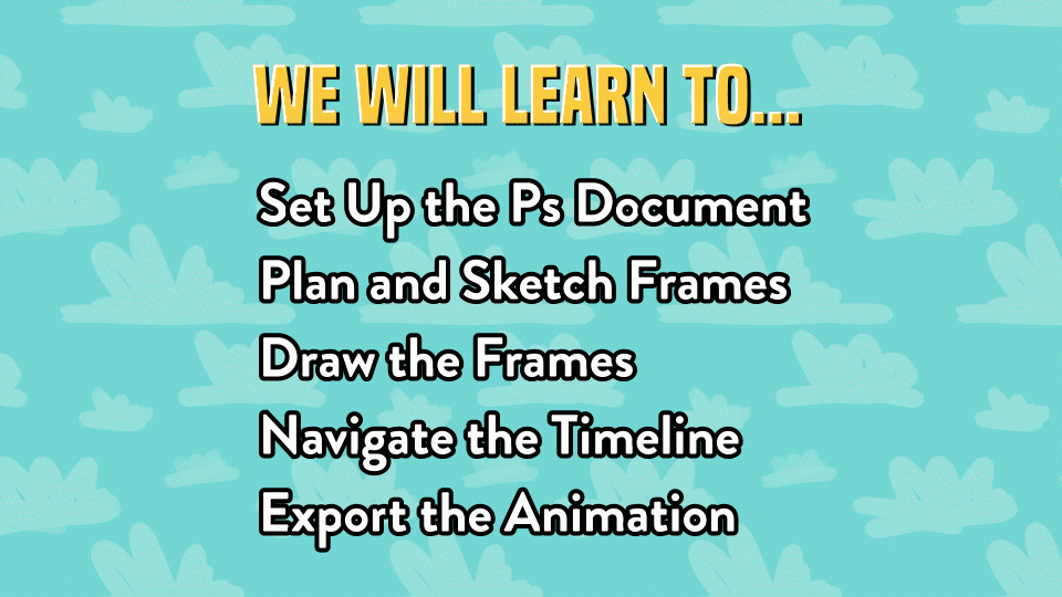
1. Introduction: If you're new to animating in Photoshop or new to Photoshop in general, some of its tools can be pretty overwhelming. But with enough practice and with the knowledge from this course, you will have no trouble making your own animations. Hi, I'm Sam Concklin, and I'm a freelance animator. I've been streamlining my animation process over the last few years, and I finally found out how to make it the quickest, most efficient workflow that it can be. I'm happy to share that with you in this class. The key is staying organized and knowing your workflow. That way you spend more time animating and less time wrestling with the software. In this class, we will use Photoshop's timeline feature as we draw on the Canvas to create our very own animated GIF from scratch. I will show you the entire process from start to finish. The lessons in this class will cover how to start up your Photoshop document, sketch out what you want to make, draw the frames, organize them in a timeline, and then export all of that as an animated GIF that you can share on social media. This class is perfect for any beginner animators or Photoshop users. All you need is Photoshop and a drawing tablet to get started. Let's make something awesome together. This is a beginner's guide to animating frame by frame in Photoshop. Thanks for watching. I look forward to seeing you in my class.
2. Getting Started: Set Up the Document: All right. Let's animate something awesome. Of course, we always want to start by creating a new document. I like to go by pixels. Now, we're going to determine the size of our canvas here. This depends on where you want your animation to end up. For me, offers most social media, I like to go with a square canvas. 1800 by 1800 or maybe 1200 by 1200 would be great. Alternatively, if you want your animation to end up in a film, for example, if you're working on an animated film project, it's pretty standard to go with 1920 by 1080 pixels. I tend to not pay too much attention to resolution unless I'm actually printing. When it comes to the color mode, again, since this is digital, we want it to be RGB color. I'm actually going to make my canvas 1200 by 1200 pixels. This all looks good, so let's create. Wonderful. It looks like I already have my timeline open and I was already geared up to get ready to go. I'm excited. The next step will be to draw our sketch.
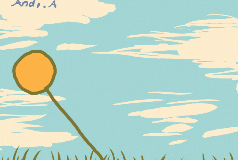
3. Plan the Concept and Sketch it Out: At this point, in animating, we want to ask ourselves, what are we animating? How do we want that to be framed inside of the Canvas? Are there multiple things animating? But the most important part about all of this, we want to figure out where do we start and where do we end? What is the first frame going to look like and then what does the end frame going to look like? I'm going to put this all in a folder. Of course, it's always good to stay organized. I'm going to label this sketch, Sketch. I'm going to create a layer beneath that. Then for my brush setting, I could pick any color I want, but I'm going to go into my brush settings and I'm going to turn on Transfer because I want this to be a little bit opaque. There we go. Now when I draw, I can draw over. If I like the way one of the lines looks, I can draw a little bit more over that and it looks a bit darker. For my animation, I'm going to draw a flower animating from side to side. Now for sure, I want there to be some sort of baseline here. You can actually click and then hold down Shift and drag to get a perfectly straight line. Of course, this is just a guide. This is not going to be showing up in the final animation at all. But I'm going to draw maybe doodle some grass here, maybe some parts are longer and some are shorter, just make it nice. Then I want to draw the flower hanging out here. The center is going to be around here. Then we're going to have a similar thing over here. The first frame it'll be here, and the last frame it will be here. We'll say five frames. If you want to get even more technical with this, we can even draw some in the middle frames here too. I know I want the [inaudible] That would be the third. I know I want the second one to be a little bit closer to the first, and what the fourth to be a little bit closer to the fifth, that way we'll get this nice effect that makes the whole thing looks like it's slowing down when it gets to the ends and speeds up when it gets to the center. I have a pretty good sketch of what I want this to look like. The next thing I want to do in addition to having my sketch already to go before we actually start animating, I want to create a color palette. I do this with all of my projects. I want to make sure that everything looks nice and for this one, I'm actually going to turn off the Transfer, the opacity situation. We want this to be nice and solid so we know exactly what color were working with. Actually I really do like this yellow color and I'm making sure I'm on the right layer over here. I really do like this golden color. I'm going to zoom in here. If I zoomed in here and I'm going to actually grab a few more colors, I think make a nice green. Maybe a nice light green that will look nice with that. If I don't like the way that looks, you can only set the Wand tool, click the Color, hit Command U for Macs. We can take that and adjust it a little bit over here. We can adjust the Hue. Actually I really do like that. That's a really nice green. We can adjust the Saturation, we can adjust the lightness. You can make any adjustments here that you want to make. Actually I do really like how that green turned out. We'll go with that and then Command D to deselect. Then we will go with media darker green, that's a little bit more bluish to give it a little bit more dimension. This will be my color palette. Of course, I always like to use the darkest color to serve as the line art for what I'm making. You don't always have to have liner art if you don't want to. But if you are making line art, you usually want your darkest shade to be the outline. For this you can use any colors you want but since I'm making a flower that's going to be going back and forth. I want to have this nice little color palette right here. With all of this, it looks like we are ready to go and start animating.
4. Draw and Organize the Frames: We are ready to start animating, but we're not quite ready to touch the timeline yet. We are going to start with the frames. We have the sketch on the bottom, we have our color palette on top and between those, we're going to create a few folders. In fact, I'm actually going to put this all in one folder called Flower and then each frame is going to go right inside there, and each frame is going to have its own layer. Each frame is going to go right in there and each frame is going to have its own folder with its own layers inside of it. We have, of course three, we have four, and then we have frame five, and so we're just going to make sure these are all labeled beautifully. It's important to label these notes. Sometimes I will give these different labels instead of numbers. Sometimes I'll put percentages. If I am drawing something very complex, I will draw percentages through the motion to see if something is about 50 percent through the motion or 75 percent. But we're going to stick nice and simple right here with a nice, beautiful five frames and we're ready to start drawing. Let's create a layer in here I want to eyedrop and click the dark green mixture brush tool. But I have that selected and ready to go. This is the first frame which I know is over here. I'm going to draw my nice circle there and it will do my best to draw straight line doesn't have to be perfect. This looks good and now I have a few options here. Of course, as we're drawing, one of the most important things is to make sure you were drawing on the correct layer. I like to do. My personal process is to draw the first frame and then the last frame and so we will draw that. Let's draw circle over here and then draw that line going down and the best part about this is if we don't like exactly where it is, we can hit V. That actually adjust things to make it a little bit more precise if we want and we can move over our other layers as well and, so I think that this is looking pretty good. It's nice and centered. Command click that to unselect it and then we're going to go through with the rest of the frames and make sure they look nice. I really like the way these circles are. I'm trying to keep the circle around the same size as these other ones, and again, I said, it doesn't have to be perfect, but I'm just doing my best to make sure it looks how I want it to look and then we're going to go this frame Number 2. You see as I'm drawing this, I like to start with the first and last and then go to the center and then work my way inside here. The first and last parts you draw are called your key-frames and everything else that goes in between is called your in-betweens. We want our in-betweens to look good and makes sense. Communicating emotion between all of these frames. we're at Frame 2, and we want to put that a little bit closer to the one than we do to the three. Put it right there, and then we're going to go to Frame 4, create a layer there. Draw a circle here. It's a little big. I want to make sure this looks the way I want it to. That seems pretty good and then we will draw a line straight down there. With more complex animations, your lines tend to just overlap and they tend to mesh together and it might look really confusing. If you're drawing your animation and that happens to you when you draw your first frame. You can actually highlight the folder, turned down the opacity and then you know, for sure were that frame is. Then let's say you were to draw another frame that's right nearby and we don't want that to be in a folder, we want that to be separate. If you were to draw another frame, if this for frame 1.5 or something, then you'd want it to be just that and you can see exactly where the line is that you just drew and you can see where the first frame actually is and since the sketch is a completely different color, then we know for sure that that is not part of our final animation whatsoever. Those are some of my heady tricks when it comes to animating. But it looks like we're already ready to go and put this together in the timeline.
5. Bring it to Life in the Timeline: So we've got all of our frames of Animation ready to go. We've got frame 1 and 2, 3, 4, 5. I also want this to go back. So it's almost going to be like a pendulum, but upside down. So we're going to do is create a Frame Animation. If that doesn't appear, it might say create video timelines. So you click this little arrow here, say "Create Frame Animation". If you don't have the Timeline here already, you can go to Window, Timeline and it will appear. Let's create our Frame Animation. So we've created our Frame Animation, and there's only one frame so far. Each of these, we're going to get a bunch of these. Each one is going to be a frame of the animation. We want them each to look different, as they go through and everything. So just to show a little bit of what this is about, we're going to create some more frames; frames 1, 2, 3, 4, and 5. Something we can do is we can actually turn on and off layers, the visibility for them over here to the right, and that will change what we see in the frames. Now if you take a look at these, we have Frame 1, shows the Frame 1 folder, Frame 2, since I just switched, that shows the Frame 2 layer. But if we go back to Frame 3, it actually goes back to Frame 1. Here's a nifty quirk of the Timeline that can be very frustrating at first if you're not quite sure how it works. Whatever you set the first frame to be will carry through the rest of the frames. So for example, if I were to turn off the sketch in this Frame 3, it appears in all the other ones because I just turned it off in Frame 3. But, if I went to Frame 1 and turn off the visibility, it would turn off that visibility for the whole thing. So the first and foremost, if you're ever making an edit to your animation while you have the Timeline open and all these frames ready to go, you always want to remember to work on the first frame. Because something else you can do here if you want, is you can actually highlight this folder, "Press V." We can actually move this around if we wanted to. That's another way to animate if we want. It's not something I like to do because things get messy. Because now this Frame 1 folder is over here in this frame, but in the first frame, it's still here. That can get very confusing and messy if you want to be precise with what were your frames are. If you do want to have this frame be exactly moved over here, then what you can always do is duplicate your frame and then have that one moved over. So here I have two of them. Obviously, this first one is going to be located over here in just this one frame and so basically what I'm saying is, you don't want to move things around in the different frames unless you were completely positive. You know where you want them to go. It can get pretty confusing, especially at first. I've done it by accident before and I thought, "Why is this over here? Why is this weird, and when you're drawing a bunch of really complicated drawings for a frame-by-frame animation, it's really easy to get lost and so we always want to keep things labeled and we want to animate things one frame at a time. So let's try this again. We want this sketch to be turned off for all of these frames, so I'm going to do that. We're going to turn on and off the visibility for these frames. So we're going to go this first one here, second, turn off Frame 1, turn on Frame 2, and you're going to have to turn off Frame 1 for each one. We're going to turn off Frame 1, go to four, and then turn off whatever frame is on there and go to Frame 5. Now we have an Animation and it looks great. You can test this by pressing the space bar and you will see exactly how it looks, and it's looking pretty good. If yours isn't looping like this over and over again, but you can do that by going down here and saying "Forever." You can also have it just display once. You could have it display three times if you want to get a preview that way. Personally, I prefer to have it say "Forever." You can actually control how long these frames last. On the final frame, I'll do something like 0.5 seconds. We'll see the whole animation and then it stops. This is a great way to get a feel for your animation that there's a solid beginning and there is a solid end. We can also do that with the beginning while we're previewing. This is looking good. One final trick I want to show you with the timeline that I find extremely helpful is you can actually copy and paste your frames. So we can hold onto number 4, drag it to the new frame button and now I duplicate it right next to it. This is number 4, and this one also displays frame number 4. You can take this now and drag it over. We have that frame duplicated. I'm going to do the same thing with number 3. We're going to do the same thing with number 2 and now if we play it, it goes back and forth like this. Now I do you find this to be a little bit stiff. So I'm actually going to change this to 0.2. Normally, I do like to make the rest of these be 0.1 so make sure you're going to hit number 8, shift click number 6, say 0.1. Four shift click number, that one will be 0.1. Let's see how this looks. That looks very nice. Now our basic Animation is done. All we have to do now is add some fun extras to really make it pop.
6. Tip #1: Add Color Like a Pro: Fun extras. What I always like to add to my animations is of course we want to color it in. We also might want to add some shading, and we might want to add a background. Finally, we might also want to add a signature, if we're feeling like this is a portfolio piece that we're really proud of and we want to make sure we got our name on it. Of course, we can put our signature on there. Let's get started. I'm going to show you a few different ways you can color this in. But one of them is a trick that I use all the time. I'm going to click on this layer. We're going to command click new layers to create one beneath that one. Then I'm going to drop this color, hit B, and now we can color it in. But this is going to take a while if we do it this way and it might not be precise. First of all, always make sure you can zoom in with your mouse pad if you're working on a laptop. Then there is actually a trick I use. Looking at our brush tool up here, it's only 40 and that's just not going to fly, is not big enough. You could click up here to make it bigger, or you can press the right bracket key a few times to actually make that brush bigger. Now if you're wondering why my brush looks a little bit funky, it's because this is a custom brush that I created myself. If you're interested in learning how to do that, let me know. If we zoom back out here, we can see that we have the first frame and then we're moving back through. None of these other ones are colored, but that one will stay colored. That's one way to color things in. I'm going to show you another way now that's a little bit faster. For a more complex animation, you're going to probably not want to sit there and color in the whole thing. I mean, coloring is relaxing and fun and I do enjoy doing it sometimes. But other times you're on a schedule and as a professional animator, you want to streamline your process and make things as efficient as possible. One way to do this is we're going to create that layer beneath. We're going to select this layer, hit W for one tool and click outside. Right now we have everything selected outside of the lollipop flower we have. Now we can go to select, modify, expand, I will expand mine about four pixels. As you can see, the selection now is slightly inside of the green. The reason why we do that is because when we select the outside, there's a teeny tiny bit here that isn't quite selected, so we want to have that selection not be, we want it to be a clear distinction between the inside and the outside of what we've drawn. Now, we can go to this extra, this layer beneath here. I want to hit Command Shift I, and that will select the inverse. Initially, we had the outside selected, but now we have the inside. We can press G for the bucket tool click right in there and it's colored in. Now, keep in mind that if we make this layer not visible, we actually colored in the whole thing. Keep this in mind that it will color in everything in your layer here. Another reason why we want the line art and the color to be separate is in case you want to make a change to the color if you want to hit you and just change the color of that, you don't want that to mess with the liner that you have spent so much time drawing and making look absolutely beautiful.[MUSIC]. This looks good. I'm going to do the rest for all of these guys. We are going to select, make that more and then Command Shift I G, color that in beautiful. As you see as we're going along here, this has the art for frame too, its also colored in here that you get in here and it's colored in here. That's another advantage to having this system where you have folders and everything. It's just a really great way to stay organized as you are animating in Photoshop. Now we have all of our layers colored in. It's looking wonderful. That was the first step, we have everything colored in. Now if we go back to our sketch, I had some grass I wanted to add in here, but I'm not going to put that on the frames. In fact the flower, I can collapse that folder and now the flower is its own thing. If we wanted to, we could turn off the entire flower animation and it's not there. Then we could turn it back on and everything's fine. That's another great reason to stay organized as you can do something like that where if you have a bunch of things animating on screen at once, and you want to export individual layers one at a time, then you can just easily turn off the visibility for those layers and work through them one thing at a time so that when you composite them in software later on, like After Effects or something, then it will be a far clearer process and it would be the exporting process, will be a lot more streamlined.[MUSIC]
7. Tip #2: Create a Lovely Background: So now I'm going to create my background, I'm going to hit command folder to create it right beneath the flower, I'm going to call this BG for background and then we'll create a nice, beautiful layer in there. I'm going to select that color and just start drawing some grass, we're going to make it about 40 or 45, the same brush size that I was drawing the flower with. So we're going to just draw some nice happy grass here. Maybe pace and special attention to cover up the middle there. Maybe add some more, just using a variety of heights and brush strokes here just to give this more dimension. This is looking pretty good. So let's see how that looks. Excellent! I'm going to colorant the grass a little bit more, I'm going to create another layer just in case, in fact I might even make this be the nice light green color we have, we're going to color this in nice and quick here, make it look nice and filled in so that we have a little bit of something more solid to work with in terms of a background, and then of course, we want to color in a beautiful sky. So let's create another layer beneath that and I'm going to go with maybe a turquoise, kind of blue color, and we'll see how this turquoise Sea Foam green color looks. I think that looks pretty nice. However, it does clash with the yellow, green color of the grass, so I'm going to hit command U and we're going to adjust that blue sky so it looks a little bit nicer. I think this looks good and then I think the ground needs a little bit more to it, so I have a few ways to adjust that. I think I could move the grass down and the flower so I'm selecting a flower and then hitting Command, click, Command click to select those, move it down, and then we have this nice animation. Wonderful! I do feel like it's missing something, so I think I'm really quickly going to add in some clouds here. I'm going to make this a lighter color and I'm just going to add in some clouds really quick. I feel like this could use some clouds by brush, nice and big and then I'm going to draw just some rounded bits and maybe have a straight bottom there and then there we go. Adding clouds however you feel, and this is looking good. So this is really coming together. The very final step before we export this is we want to turn off that color palette, if your sketches coat showing through, of course you want to turn off that sketch and the animation is basically done.
8. Tip #3: Sign It with Style: If you wanted to sign your animation, a great place to do that is just on its own layer right on top. I'm going to go with a dark color and make my brush nice and small. I'm just going to put it in the corner over here. I'm going to say Samc. That's how I like to sign my things. Then, if you feel like this is a bit too much, you can always change the size of it or you can go to your opacity and change that. What I like to do lately, is I've been making my layer blending mode and overlay. Of course, it doesn't look in the grass, but you can see in the sky or in the cloud, it ends up looking pretty damn good. I'm probably going to stick mine over in the corner, so it's out of the way, make it a little bit smaller, and let's take a look at this one. Looks very good.
9. Export as an Animated GIF: Now, for exporting, what we're going to want to do is if you want to export this as a GIF, you can say File, Export, Save for Web legacy. This is what everything looks like. This is your animation. You can preview it by hitting play and you can see what it'll look like. I'm thinking it looks pretty awesome. The thing about the internet is we always want to optimize the size of our files. We want them to be big enough that it's beautiful, but small enough that it doesn't take up a lot of space in terms of file size, which would affect the download speed of what we're working with. We want to make our file be just the right size. We can check this by going to our colors and choosing just as many colors as you need. I could choose eight and technically I think that would probably cover it. You can double-check though sometimes where the colors overlap, it might be a little bit pixelated because of that. It only has eight colors to choose from so it's going to be a bit tricky with how it does the transitions. For mine, I'm going to go with 16 and you can see it's a lot smoother now. Even if we went to, let's say 128, it would look even smoother. But that's a lot of colors and I don't think my animation necessarily needs all of those, so I'm going to go with 16. You can feel free to go with whatever colors you want. Again, the more colors, the more beautiful, the less colors the smaller size your file will be. If you have transparency, that's up to you but I'm going to turn transparency off. Transparency does count as a color. Keep that in mind. Then the last thing to pay attention to is the size. Depending on where you're putting your GIF. Maybe you want it to be a big, beautiful GIF at 1200 pixels or however many pixels yours is or maybe you want it to be smaller, in which case I would recommend using the percent, to make it 50 percent. However, I do like mine the way it is so I'm going to say a 100 and this is ready to go. This is what it looks like and I'm very happy with it. I'm going to go to save and we're going to save this as, Happy Flower-SAMC. Boom, there we go. We've got this beautiful animation going.
10. Export as Individual PNGs: Now, alternatively, if you do want to export your animation into individual frames, you can do that very easily. This is for if you want to export your animation for an animated project that has lots of layers and you wanted to animate them separately and then put them together later on, then we can totally do that. We are going to turn off my signature here. The goal here is to have everything be transparent, just everything be not visible except for the frames of this guy. We're going to turn off the background and we're going to make sure we turn off the default background layer that appears here. We're going to turn off that lock that it comes with and then turn off visibility, and here it is. Now, keep in mind this is while down here it does say eight frames. The last three are just in between to have its cycle back through to the original frame. All we really need to do here is export frames 1-5. We can save File Export, Quick Export as PNG. I'm going name this flower-01, and I'm going to copy the flower part, hit Enter, say Save. Let's move on to the second frame, file, export, a click Export as PNG. We're going to paste what we already typed and then we can do 02. This is my trick for quickly exporting these guys, and then we're going to go flower-03, and then we're going to go File Export. Then we're going to do this for all over frames here, and we're going to make sure we put them all in the same folders that you keep nice good track of them, 05, boom. Then we have all our frames, I'll separate and they are ready to go with a transparent background, and then we can turn off our flower layer and go to the background, and then we can file export this background, flower-bg for background. Now, we have all of the layers we need to put them together in some of the software if we choose to do that. For example, after effects is a great piece of software for animation. If you want to combine frame-by-frame animation with digital animation, where you just move one or two key frames instead of drawing them all individually. I leave it up to you what you'd like to do, and next we're going to talk about our class project.
11. Review & Class Project: In this class we learned how to set up a Photoshop document, sketch out what the frames are going to look like, draw the frames, organize them in the timeline, and then export those frames as a GIF, or as individual frames that you can use in a future project. Now, it's your turn to make something. Follow the steps provided in this course, and I would love to see what you make. You can animate anything you like. I always like to recommend start with something simple and then work your way up from that. It could be a bouncing ball, it could be blinking eyes, it could be whatever you like. Then whatever you make, please be sure to post that in the project section of this video. I would love to see what you have, and if you like, I would love to give feedback too. Finally, thank you so much for watching. It means a lot to me that I can share this knowledge with everyone and if you could do me a favor, I would love if you could write me a quick review. Let me know how I did. Let me know what things worked well for you and let me know what things I can improve on, for the next class. I'm glad we could learn together and I look forward to seeing your animations in the project section.
 Sam Concklin, 2D Animator | Comic Artist