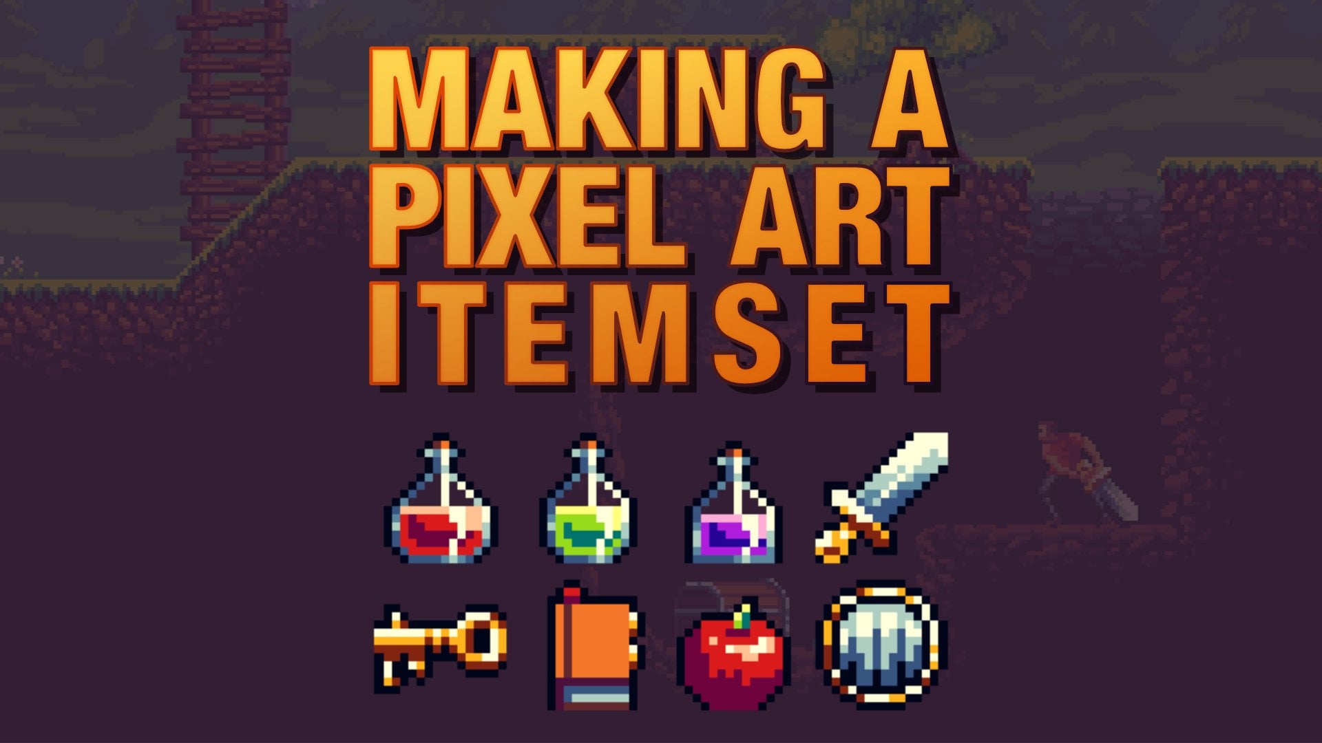
Transcripts
1. Lesson introduction: welcome toe pixel art master course or, if you want to put it, Bixel Art Master Lesson. Now this course is a lot different than from the rest of those available, because I will teach you the core basics for pixel art, starting from different South First Call to create basic lines. Then we go into shading different geometrical shapes, the color theory, color harmony, creating different objects, designing your backgrounds, characters and even animation. This lesson is just part one out of three. I will upload an intermediate, and the advanced part of the course is well, if this one goes well, so jump on the train and let's start learning.
2. 0.1 - Getting started - Which software to use for pixel art: welcome in this video. Explain which pixel art softer should you use. Please do. Keep in mind that all of the suffers here on the list and in this section have all the options you need to do everything in pick slot. So they have the options to create sprites, toe export sprites. You can create animations and house in all of them. Now, certain software do it better than the other, so they're stronger in one field way and they are weaker in another. Some are free summer paid. So let's go. And let me just quickly run over the four that I've picked for you. 1st 1 is the free one. This piece, Kal. The main advantage E off this program is that well, it's free, but it's also browser based. You have everything you need, You have layers, you have animations. You have all the tools that you need to create nice pixel art. When it comes to pixelated. This is a paid salt, for it costs $9.1 time purchase and you get an access to this extremely useful salt when it comes to tiling systems. Now, yes, you can do animation here, but pixel edit is really loan for he for its tiling based system. You can create tiles really is limit, and that means creating very, very fast games. Now, when it comes to a spread, a sprite is probably the number one tool. When it comes to pixel art, you can pretty much of anything you want. You can animate. You can talk, frames the onion skin. You can create your own color palettes. You have custom brushes exporting, importing pretty much everything you actually need. But it doesn't have a very nice styling system as pixelated as long. Like I said pixel, and it is the best when it comes to tiles. When it comes to everything else. A spread is number one now a sprite. You can bite, and I believe it goes to steam, and it costs $15. These are three men pixel art tools that I personally love to use. Physical is the free one and is the best one I intended. You include Preta and a gimp in the in this entire section. But however, those who suffer are not really that beginner friendly when it comes to creating picks lab , especially when it comes to animation. It's not intuitive, and it's very, very limited. But fiscal is doing the awesome job for being a free online editor for pixel art. And I highly suggested, if you don't have currently the option to buy picks late or a Sprite now, the last one on the list is 40 shop. I included this one on Lee for existing artists that use Do the digital art beat for animation for concept art or for design doesn't matter. Yours for the shop. Four peaks a lot only, and only if you already have. What shop please do not purchase for the shop if you are doing the pixel. Art on Lee for the shop is mainly used for 40 manipulation and creating different designs, and two did digital art. But it's not intended for Big Star because right in the start first you need to make your tools work for ticks large. You need to actually tweak them a little bit, and even after that, the animation in photo shop is really, really horrible. I will explain how to do it in the dissection, but I highly suggest that you avoid for the shop if you can. But yes, I included it here just for those off you who already have for the shop and don't want to switch anything else. What do I personally use? Well, I you speak so add it for creating tiles and I use a sprite for creating characters and animations. Occasionally I will use photo shop for creating high resolution backgrounds and are talking about 320 pixels by 160. So kind of high resolution but yes, pixel, I don't use because Ace breakfast everything that pixel her fiscal has and even more. But again, this isn't free. You have the trial version, the free version you can try out. Same applies to pixel at it. So if you don't want to invest currently in any extra pixel art program, please go with physical, it will be more than enough. I ensure you can go all the way to expert level with fiscal. But once you get to the highest level, you certainly will want to go to picks. Let it and a sprite, because they will just fast on your workflow. Okay, so this is it for this video. I will see you in the next one. Well, I will start actually explaining how to use these. Suffers
3. 0.2 - Photoshop basics: welcome. In this lesson, I will show you have to use photo shop for pixel art, for the shop isn't mainly used for picks large, so we need to prepare it for picks. Lots specifically because for the shop is widely used for photo manipulation as well. A Studi digital art You can get on adobe dot com, and it's a subscription based model. Minnig you pay. I think it's $20 each month or 21 U. S. Dollars. But you can get this concept, your student and stuff like that. Anyways, you can go here in the creativity and the design tab, click and photo shop, and then you can buy it. Keep in mind that you will need to sign in and give your credentials to it so you can actually download the Adobe Creative Club. If you have an older license like adobe for the shop CS six or something like that, that means you already have a permanent license, so you don't have to have a greater anything because any version of what the shop pretty much will do the work for pixel art. Let's going toe for the shop and start creating our first big slot in it as a few examples here. Another file tab you can create new and here we have the document that you want to create with height, resolution, color mode and background within height are self explanatory. You can choose the written height of your canvas. Let's say it is treaty by treat you resolution will always be 72 pixels per inch and color mode is RBG, unless you want to specifically create big so art for printing than you want. You seem like a color, but I think almost all pixel artists created in RGB color. Then you want the bigger contents to be transparent. You can choose between what background color if you have specified it and transparent, we will use the transparent one. You can keep this UN aid, but no need to go up or down and click OK to create our canvas first tool that we need to use to actually see our canIs Or here is the zoom tool you can click and find it over here . Whenever you hover your mouse over a specific tool, it will show you the shortcut in this case it Z or is that depending on when you live. Then when you click, you can go and zoom in by scrubbing left to right. If you have these options, crab ism checked on. If not, then you can just left click tourism in. Okay, essentially picks locked in photo shop is quite easy, but you need to set it up for the shop. Can be intimidating to beginners can be intimidating, but since we won't be using most off the tools anyways and their options, you don't need to be scared. I will explain to you have to set it up immediately. Essentially with a few different groups, First Group is dropping cures. We can use drawing tools to draw stuff in the race stuff. Second group are the selection tools so we can use them to select. And the 3rd 1 our miscellaneous, which you can use to move stuff or zoom in and zoom a zoom is one good example off it. If we look over here to the left, we have plenty or default different options. By default, you will have the brush option. Over here, the shortcut is B, and if you use brush tool, even if you put it on one pixel. It won't work because look, what happens whenever we draw it creates this anti alias effect which we do not want for big slot. We want hard square pixels. Do managed. If you manage to create this, you need to go to pencil toe. We have four different ones. We only use the pencil tool. Nothing else. Here you can choose the size off our pencil. Let's keep it on one pixel. You have different bones. Keep it always a normal capacity on 100%. And you don't need anything. Anything else. So essentially, just choose the pencil toe, choose the size, and you are good to go over here, you can choose the colors, or over here it all depends on your but I will stick to this one. When you left click, you can choose your colors and let's keep it on black. You have many different options for the color modes, but keep it here on age, which means Hugh. So you want a huge will to be here and you have the value and saturation over here, right? So how does our pencil work? Well, you can see we have easy, hard edges as we wanted them to. If you increase the size, it becomes bigger and by default are pencil tool is around it, so it has around edge. So this is the first. Driving to the second drawing tool is the feel, too. If you create, click over here, which is the G, so we have two places down. This is the paint bucket, too, and it has a few properties over here that you want to make sure you adjust first. Tolerant. Must be zero dollars means that whenever you are trying to paint bucket a certain color. And if you put dollars, let's say 20. That means the sort for or for the shock will look for 20 values up or down that are closest to our current color, so it might paint over 20 different colors. We don't want that. Next one is anti Alley. I think that is the thing that creates those feather ages that I show you just now on the brush toe, not something that you want. So keep the anti Ellis unchecked, contagious and all letters depends on the situation. All layers. It's self explanatory. When you paint buckets something it will put that color on all layers. I usually keep this off because I don't want it. Contagious, however, is something that you want to understand. So let's create a simple, simple shape over here with our pencil tool. And let's go back to our pocket, too. If I keep this country's juice checked on, that means that it will only paid in until this ship is interrupted by other color in this case, are shed got interrupted by this black color or here. If I keep this contagious off, it will paint everything on the player in that new color, like So let me give you another example. If I put it to of these black shapes over here, and I want to pay them in a let's say right color. If I keep the contagious on as long as this letter doesn't change the color, it's all fine. However, if the contagious is off, it will paint all of that under player. Very useful. Very useful toe. All right, so what is the next one? Well, we have the shape stool. Allow me to erase these shapes and you have a few different ones Over here you have the rectangle rounded rectangle Ellipse polygon line. Ah, lot of them. Each of those has his own properties up here, and we need to be very careful how to use them. Let's go over the 1st 1 which is the rectangle tool. If I created just like so you can see what happens. We create a rectangle with a feel feel, which is the red color. Or here is what will be painted inside off our inside the fire rectangle Stroke is the color of the stroke, which you can see. It's currently this gray one, and here is how many points we want our correct angle to be dick. When it comes to EADS, it's line for the outside, meaning the outline. You want to keep it around soul. It's a one or two or three, etcetera. Quite quite easy to use. All right, let me just create new layer. Now, if you don't want anything, you can just click and choose this option. This means it won't have any feel, so it can create a simple rectangle like so quite quite nice if you want to. If you don't want to mess around too much when it comes to creating everything by frequent . All right, moving on, we have the around the direct angle till which create again a rectangle but with rounded edges. And this is the one that you want to avoid. I usually don't use this one because it creates that feather effect. Okay, going on, we have the Ellipse store. Allow me to put everything on one pic so And this ellipse still is very also because it creates the's kinds of circles. Now you can hold shift to make sure the circles is always the same size. So like this, Or you can hold out to make sure you have you have it pointed and being down to the same location. And if you combine that with shift, you can choose wherever you want to create your new circle. Now, if you can notice, our circle also has this feather aunt entire less effect. You can use these tools to practice drawing circles over them. By no means should use this in pick slot because whenever you have this feather effect, you can job just skip them altogether. So when do we use this tool? Well, you can use it to practice so rectangle till you can use it actually drove rectangles. But the rest of these, like a lip still around the direct angle tool, just isn't for practice. Nothing more. Nothing else. So if I go over the line to here, I will create a straight line again. You can see this feather effect, not something that we want. If you want to create straight lines, there's a much easier way to do it, and that is using the panto. So let's go back to the pencil to meaning this one. And now when you draw a straight line, you can hold shift, and it will automatically draws strength line. Even if my mouth goes left right, it will keep that line straight if you want Diagonals. Threat line Click wants Hold shift peak wherever you want. Your lying to to end and click again, and you can create a straight line very, very easy. This is really awesome. Okay, moment gone. Now that we have discovered, let's go toe erasing our lines. If you have the eraser tool over here, you want to make sure your mode is on pencil more because if it's on brush mode, you can see this entire less effect. Once again. If you pick pencil mode, then you erase as you should again, you can choose the size over here. This is all there is to droving tools. Now let's got jumped, Uday. Selection tools. Let me draw here. Different shapes. Okay, Selection tool number one is the marquee tool and you have different options. You have the rectangular, elliptical single robin column. I usually use only rectangle to because pixels are also rectangles. What happens? Well, you can select any particulary made. You can even move this election, and then when you want to move it anywhere else, you can use the move tool, which is the fish or cut, and you can move with away. If you want to paint in only within that selection, you can do so very easily. So the selection tool is used to put boundaries around something that you want to paint. Or if you, if there's anything you would you would like to paint in or erase Onley with it within that border selection tool. Easiest for that, especially if you want to select a certain part and move it away. Okay, The 2nd 1 is the last little Now this one is something that you should be careful off las. It'll has this property anti Alice and Feather. You want the feather effect to be on zero pixels and you want the anti anti Ellis to be off . So now if you want to select a custom shape, you can do so with the last two. Very, very nice When it comes to magic, Want to allow me to create different color for the background? Okay. Magic want toe essentially picks a certain color on your canvas and it's quite simple. You have the sample size you want it to be unp oin to sample because if you choose any average, it will average out those colors. Appoint sample is used for pixel art tolerance. We have this once more. We wanted to be on zero and anti unless we want to be off contingents depends again on what you want to achieve. So if I go over here and select this red color, you can see I selected everything on this layer. Why is that? Well are contagious is turned off. If you want to have this on, then we will only select the color until it ends like so, Like the same thing like it was for the paint bucket tool. Okay, One thing that you should not, but for the shop that you can combine those tools together So I may choose directing all for this one. Then I might switch to the last little, and then I will need to hold shift, hold shift to select extra stuff, as you can see or hold out two un select certain parts this shift and all short cuts in combination work for every single selection. Totally. So it doesn't matter. I can go with Marcato rectangular and I can on select. All right, This is how we can make extra selections very, very quickly. The one tool which is outside of these that I certainly want to cover is the speaker toe eyedropper to this one. Essentially, pigs the color. I never use this shortcut or here, which is? I believe I That's right. I always click just on hold out for temporary color picker. As you can see, you can very, very easily switch between colors. So this is the miscellaneous. Still another miscellaneous stole is the move tool which I showed you before once we select something, we can move it around and zoom in and zoom out. And this is it for the tools. When it comes to photo shop, nothing else is needed. The stamp tool, the clone tool, the mental. We don't need any of those. I showed the heart to create lines, shapes for practice, how to choose color, everything you need to know. Now we are still not finished for the photo shop. I still have a few things to explain, and that has something to do with animation. Animation is done using the layers layers you confined over here, and they work the same way. They do in pretty much any digital painting. Softer layers. You can think of them as sheets of paper stacked on top off each other. Say fight completely, erased this layer and create very, very simple shape on later below it. And let's say I want to create another way above it in green color. Now look what happens when I drove something about it. It's also above it. On canvas, it's the blue color is not erased. It's just behind are currently er, so you can combine layers in many, many different ways you can e erase layers by clicking delete. Once you select them, bear in mind. You always need to have at least one layer, so you cannot. You raise the last one. You can combine them. So if I have multiple ones, you can duplicate layer by control J or right clicking, click, duplicate or even copying it. And then you can murder Jim by selecting them together so you can hold control or command and left Click all the way to to the ones you want to combine. And then you can click control E or commanded to merging together while you have this option March layers. You will readily use this in big slots, so but this is still something that I wanted to point out. Now let's go to the animation that we need to actually open up our timeline window and we can do that by going to the vendor tab and clicking Timeline. We need to create our animation by clicking creativity Timeline over here, and what you will notice immediately is that over here we have the same layers we have over here, so layer to layer to copy, you can see Larry thew and later to copy. This purple color indicates how long does that does that layer lost in our animation? So if you want to create a background layer, let's say we want to rename this to background. You can double click on its letters, and it will immediately rename it over here. Let's put our big on a player in this green color completely. And if you want your current layer or frame to last you live. I mean last less. You can just simply drag this purple bar to whichever length you want. One F It's usually like one second. Okay, now, how do we create an animation? Well, first, allow me to create a bit lighter. Don't for the backgrounds who can see this one better. All right, now you can see this little arrow tool, which we used to slide over our animation. And if you want to create a simple animation, we need to create another layer, and each layer will be a different frame in our animation, so each layer is another frame. Accepted the background one if you use it. So if I create click here to create new layer, you can immediately see that I get a new layer now, bear in mind, you can Onley edit frames that you can currently see in the animation. So if I go over here, you can see the layer to copy or the first frame. As soon as I go over to the other frame, I can no longer edit this frame. It will put out an error that I cannot use the race serenity else because the current time is outside, the range of the target like this basically means if you don't have your if the time on the timeline is not on that frame. Currently, you cannot edit that layer. So let's create simple animation. I will pick this blue color and on our layer after I will create a different position and different shape. Now, if I try to play this animation, you can see it changes quite nice. Now do keep in mind that for each and every frame you need another layer. This is why people don't you support the shop for animation because it can get very, very hard very quickly. As soon as you have more than, let's say, 10 frames. It gets really complicated to follow everything along. That's why professionals use tools like Adobe Animating said. A photo shopping becomes animation that its previous Adobe Flash or Turnbull Harmony, etcetera for pixel art. Unfortunately, this is the only option, and yes, it will be a bit harder. But what you get used to it, you can create very, very nice animations again. If you want to create animation that last for like 40 50 frames, which is only on high resolution professional level, you will have. You will have to need a lot of patients. Do you create something like that in for the shot? At least? All right, Many cups. The Tiling System Photo shop. Unfortunately, it doesn't have it. Darling system is something that we can use to create doubt. Sets in town maps very easily, very quickly. But if you want to create something similar, you will need to create a bigger canvas. Let's they want 20 by 1 28 and then we have this nice little canvas, and on it we can create different, different styles. I'll just create a few different ones very, very quickly just to prove my point so very quickly I created well. These are tiles is. These are just shapes part the, but the principle is the same, so you can use the selection tool like this. Then you can hold control and out or commended out and just drag it around. This guy, you can replicate tiles very quickly. This is quite useful, but again, it's not styling system, but is the closest thing that we can get to in for the shop. One more thing about photo shop is its size, but more specifically, it's re sizing. So if I create a simple spread over here and I click control T, I can resize it. But if I keep it by default, which over here is usually billionaire, look what happens. It automatically creates this anti alias effect, which is not something that we want. So whenever you have this option off cree off picking interpolation, you always want to keep it on the nearest neighbors. So wherever you're resize, it will always keep those hard edges. Even when you save for the Web, for example, you can you should always speak the PNG file because it's ah lossless format, and the quality should always be nearest neighbor, especially if you want to restart it, too. High resolution. So keep that in my quality. Or interpolation should always be a nearest neighbor. Okay, so we covered everything I covered. What are each of these tools on how you can use them? How you can use the animation we think with combination of flavors and how you can copy paste very quickly. A tile again. Keep in mind, for the shop is not primarily used for pick slot. So please use it on Lee. If you already have for the shop for other usage or you want aside from pig struck, learn about digital painting or design. If you are planning using only big start and picks up on Lee for the shop is probably not the best option, especially because of its price. Okay, this is it for this lesson. I will see the next one.
4. 0.3 - Pyxel Edit: welcome. In this lesson, I will show you heart years. Pixel edit. This Sutter is specifically made four pixel artists for pixel art. Okay, so where can you get it? You can get it from pixel edit dot com. You have these, get stab and you can bite. Very simply. It costs only nine U. S. Dollars, so it's really shape, especially for what you get out of it. It's extremely useful when it comes to tiling systems, and it works on both Windows and Mac. Let's go into our pixel editing. Let's start doing something so I can explain how everything works. All right. First, you have the file tab where you can create well, new document, and you have two different months. You have single image document, and you have tiled document or animation. I will get to each of those in time. But first, let's create single image document, which is self explanatory. You choose the width and height for far canvas and click created. Now use clipboards. Size means if you have copied a certain image from the Web or anywhere else, you can use the clipboard size, and it'll automatically adjust width and height based on that at image. Okay, so let's great a canvas. You can hold space bar that left click and move our canvas around. This is the first thing that you should know. Now we have only feel tools to go through, so this will be quite easy. The 1st 1 is the mental. Whenever you are interested in a certain shortcut, just hover your mouse over the tool itself, and then you can draw very, very simple. If you want to choose a color, you have the color picker here, which is quite standard. But what is very interesting about big slide it and is very beginner. Friendly is shifting hues or creating shadows. Now, usually when people shake things. If you are a beginner, they only use the only shift on the value and the saturation When you actually want to move the hue. Billa's Well, this is okay for beginners. But if you want to create your nice entire color, palettes you should try to avoid is completely but okay, so we chose the color, and now we can simply go and use our mental to create stuff. The 2nd 1 is the eraser tool. It's self explanatory again, you can erase things that you have drawn previously. Now what? What is interesting with both of these is that you have properties off each tool above here , so the shape off our planet can be a circle. So if you want to increase the size to, let's say, 12 you can create a nice a ball very, very quickly. Same applies if you want a rectangle again. Very nice. You can use the size. You can use the line, which can be dotted or not. I usually use the full one the size you have the scattered option, which is the randomness off your brush. I usually don't use this at all, but it's It's over here. The A passage and density. The pass. It is quite easy. The lower the capacity, the more transparent your your entire brushes. Second, see, it paints only part of it, until against the full color, you want to avoid capacity. All together, density is the similar thing, So if I reduce the density, you can see how it creates this entire Elia's effect, not something that we want a big start so you can avoid both of these with scattered altogether use only shape and size. You don't need anything else. Same applies to our eraser. You can use the shape and size that's completely enough. Next one is the bucket stool. You you can use it the same as any other softer, so essentially you can just spent in entire field off the same color. Wanting to keep in mind is that you can. You have three options. Feel outside style. Use all airs and contagious you. Zoeller's is quite simple. You have layers here on the bottle, so if you have multiple layers, it will paint in the color on all of those layers. I usually keep this off. Contagious, however, is something that you should be aware of. Let me create a simple in the front, and I want a black color for my fan, too. Look what happens if I keep my contingents on and off. So when the contingency is on, it will paint on Lee the closed areas until they change the color. Like so essentially, it looked for this empty space, and it's only this change color to, let's say, black. It stopped painting in the direction, so it's very useful if you want to paint closed closed Object. If you want to paint the entire color then you want this off Now if I paint inside, you can see our entire color on that layer has been replaced. Very, very useful. If I wanted to let you change these black color to a little, I changed everything because I kept my contagious off. So I want this to be on if I want to pick and choose by myself is specifically what I want to change the colors from now Before I get the color Repressor, I will keep this very much for the last. The color picker I never click here to use it all is the temporary shortcuts. You can just go and pick colors while you are using your mental. Okay? Selection tools. We have two of those. We have the magic want to again We have the contagious user layers and select outside Tel Those mean the same Select outside the tile. I will keep that when I get to the style document again. If the contingencies on I will select only this part. Very nice. If I select with the selection tool which is the other one then I get this rectangle mark two again. This is only the selection. If you wish to move the selection anywhere else, you can hold control left, Click with the mouse, and you can move this anywhere you wanted. Selection tools are used when you want to paint in Onley inside off our selection. So if I trying to paint all over it, you can see it doesn't work. But as soon as I come inside our selection, it paints in it. Same applies if you want to erase only a certain part of your image, so magic want tool and the selection toe all do the same. They select things that you can then paint or move. Now we get the color picker. I mean the color. Replace off when you want to replace a color. You want to use this tool, and essentially you can see the primary and secondary color or here at the top, and your color replacer essentially swabs them on the campus. Let me give you an example. We have this black color over here and I want to replace it. So I wanted to be behind it and then the new color. Let's say red. This one will replace it. Now, if you can see if I paint outside, nothing happens. It will only replace this black color and nothing more. This is very useful. If you want to swap out colors in a color palette for your entire image, you can use either this color replacer till, or you can use the pain bucket to with the contagious off and unusal layers. All right, so we covered all of these. If you want to reset your primary and secondary colors, you can simply click on this. I can. Over here next. We have the tile tools. I will keep those off for now. I will explain them in just a few moments. But the fan tool or the mental, which is the space again, You can move these your canvas wherever you want to the zoom tool. You can use the zoom in or zoom out again. I only use my mouse wheel to do so so you can zoom in with your mouse wheel. Okay, The rest office is this is this maximized center frame. You can see what happens, or you can maximize it like so, and you have this left zoom to fit image when it again it centers in on your current canvas . We have the under two and read the tool, which is control Z and control. Why quite standard? And there we go. We covered all off our options for our tools. Now let's get to the interesting part. We have the layers. You can create new ones. You can delete them, you convergent together. You can duplicate them. So if we want to duplicate this one, I can easily duplicate it. If I want to merge it with the one below it, I can do so like this and apply to the next Donald. When it comes to map, things now essentially will mostly just be creating new layers and erasing them. So don't worry too much about the specifics. Now we can get to something else. I will close this entire image, I don't know, and let's create a new canvas. This time I will create a tile document or animation. You can choose the number of tiles in width and height because each tile has its own written height. So let's say tallit is 16 by six and pixels and we can click. Create and now you will see something very, very cool about big. So edit. You can see this great over here, which you can hide if you go to you and show tell a great very nice and essentially, this is used for both our animations and our tiling system. Very awesome. Before I get to creating some example tiles and animations, I want to point out that you have the color palette over here so you can make your own color palette. If you want, you can add a car and color is this war. So if I think a specific color, Aiken just added here, as you can see or I can erase it. All right, you can even choose the palette settings if you want them to be in specified in a different way. Okay, that's it. That's all for the color palette. Now, when it comes to creating tiles, you can see the tiling system over here. And these are these two these two tools. If you click tab, you'll immediately notice these little red rectangles in the left corners off each specific tile. This means this style doesn't have any tile added to it. If I click A and select. It's automatically selected, but this empty color and I hold the left, click and paint over it. You can see that this blue number zero we'll replace this red rectangle with red zero number. What this means is that these nine tiles are all the same, so if I paint anything inside one, it will automatically replicate it to the others. This is extremely useful for creating tiles extremely useful. Now let's say you created a certain tile. Let's say something like this and you want to add it. Do your style palette. Then you want to use this tool. Hold control and left click and you can see it over here. So now I competed wherever I want. And if I want to quickly select another tile from from our Keenest, I can just right click with our mouths and then you're a city if I wanted to. Again. Our towels are not lost. Our tells our over here so you can see them, and I can access them wherever I want. Very, very useful a lot. This about big sled. It's my favorite Salter for tiling, and the section about thousands will be shown especially in this Saturday. Okay, so how does, uh, the animation work? Well, animations use tiles. If you want an animation, you want to click here this plus button to add the new animation. And it will automatically add this do lies the blue line, which in the case, the beginning off our animation frame and our this orange color for the last frame. So we essentially have four friends to work with here. But if we access the settings for our animation, we can even change the name. We can increase or decrease the friend oration. In milliseconds. We have the best style and the length the base style. Since this is a starter it uses, and zero as let's say, the first ah is the first number. So the first style is not one it zero, and the length is how long will our animation lost? So this is four frames and are based. Style goes from zero and well, essentially for so 0123 Those are the three tiles at the 4000 that we are going to be using for our our animation. Okay, so let's go and create. You have this framed edit and you have this play back over here, allow me to increased them both the same size. Let's use the black color. If I paint anything on our first frame, you can see how it looks. I can edit it from here from this window, but not from the playback. Playback is only used for seeing how your animation looks. If I click here, play button, it will go through our entire animation and keep repeating if I have this playbook option on so I will go over these animations And why is this quite nice? Because you can just speak this style with it, alto and replicate them on all the friends if you want, then you can move them with tools if you again, if you wish so and very, very easily can create a certain animation. Now, As you can see, our polemic keeps working quite nice of each and every frame. Each and every tile is a frame in our animation. Now this is quite nice. You can create complex animation with pixel edit, but it's kind of hard because there is no option when it comes to creating onion skin, meaning you can see the previous. And the next frame, um, place right on our current Claire that were drunk. You will see they spread what onion skin is. But yes, nonetheless, you can create certain animations. I've created hundreds off character animation that special effects in picks. Let it so I ensure you this will be more than enough. But if I were to pick pixel edit, I would use it for tiling systems only. Personally, I you speak so edit for creating tile based game. So when I want tiles in my game tile sets and tile maps and I use a sprite for animating characters and special effects. And I used for the shop for Sprite based game. So when I want high resolution backgrounds, when I talk about, like, 300 by 150 canvas Okay, so there is one more thing that I want to cover when it comes to pixel at it. And when I when I talked about, uh, these do bucket tool, which is feel outside the tile by default, it will only be inside inside off that certain tile like so, if you want to feel everything outside, just check the scene and it will feel everything as a one canvas. Quite quite useful. Scenting applies to this a magic wand If you want to, let's say resize your canvas. You can click here on the document in the precise canvas. You can decrease the height and width off archaea unless you can click resize and you can see it's smaller. All you can increase it. Same thing applies to house. If want to resize the tiles go to document and the resize starts by default there 16 by 16 pixels. But ask your says this cannot be undone. So if I want to increase the size, I can re simple tiles, Oregon center tile content. So if I clicked that I want you resemble thous, it means it will take what was previously and automatically scale it to our new size. This is quite useful if you are keeping the same ratios, but otherwise it won't work. As you can see, I cannot undo it. So please be careful when you use this option. When you want to create your import, your own color palette, you can go to color and import from image. I quite useful if you want. If you want to use the let's say a bit or 16 bit old color palettes. You can just click import, then choose it from your PC and it'll automatically create pallet over here. Sending applies. If you want to export palette, it will export these current palace over here. Okay. This is everything you need to know about pixel edit. I hope you enjoy this video. I will see you in the next one.
5. 0.4 - Aseprite: welcome. In this lesson, I will show you how to use a sprite. My personal favorite pixel are stool. Now you can get a sprite from a spread that orc or you can bite even on steam. So even if I click here by now, it would transfer me to the steam store. So probably all if you have steam. So no worries about it. I will jump into a spread in just a few seconds. But since a spread has a lot of features and all of them are pretty decent actual, pretty awesome for pixel art. But I will not be covering all of them as well. Just like I didn't cover everything in photo shop because I want to give you everything you need to get started on pixel art. But not exactly all features to you that don't get confused with all the possibilities. When you scroll down on their official site, you can see all of the possibilities. And yes, I will show you the most important ones. But I just wanted to point out that you might want you go through all of this. Once you finish the beginner part of the course and once you get comfortable with a spread , if you choose a spread as your main tool. Okay, so let's go into the software itself. Here we have file and we can click new here. We can choose the width and height off our canvass. The color mode. I usually leave it at RGB A, and background is transparent. You had the advanced options, but I usually leave that by default. All right, so what do we have here? Well, on the right side, we have our tools on the left side. We have our colors. On the bottom part, we have the animation and the preview, and in the middle we have our canvas. So let's go over the tools. One by one, I will be skipping, skipping them in a certain order just so it makes sense. The 1st 1 is rectangle marquee tool. This is used for selection, which are showing a few seconds, but the most important one is the pencil tool. This pencil tool enables you to actually drop pixel art. Now, over here, you can choose what type off pencil we won't use, whether it's around village or a square ridge. So if I pick a color. You can see this is a round edge. If I choose to create a square, here we go Now also, you can pick the size off your brush anywhere from 1 to 64 pixels, which is honestly, more than enough. And there you go. The next one on the list is Eraser Tool and this one we used to erase things. One more thing that I forgot to say about the pencil toe is that you can pick a point, hold shift and then create a straight line anywhere here on the campus. You can do the same thing with the light tool which is here at the bottom. You can just hold any create strict line. So those are the two main ways Where how you can create strict lines. OK, moving on. Now, I want to go back to the marquee tool to show you what it actually does. So if I have a certain shape over here and I pick this tool, you have a few different options. You have the rectangular marquee to you have the elliptical. You have the last little polygonal and magic want toe mark when you go to the rectangle. You can see that it automatically select in a four off a rectangle, and here we have our selection, and then we can move it around as we want you. The political tool is pretty much the same, except it selects an ellipse, or you can select like circles. Lasso tool is used for, like custom selections. Something like this. You have the polygonal lasso to this is pretty much like last little, but you can actually drag and click to select certain polygonal ships. And the last one is magic want toe? This one is really cool because it selects one color that is on your canvas. But for each of these tools over here you have a certain properties off each of these tools so you can see they change depending on which tool you choose. And the most important one for the measure. Quant tool is the tolerance. You want to keep that on zero because if you increase it, it will catch other colors aside from the one that you've chosen. But the most important part is the contagious. If I have different spots, let's say red spots are here and here at the side now, if I use the magic, want tool. And if the contagious eastern on that means that we will select the color all the way until it ends, so it will select only this part. It will not select this outer part because the contagious is still on. However, if we were to uncheck contagious, it will select this color on this entire layer really useful for selecting colors. Now let's go to the next. This is the eyedropper tool, which, well, as you cannot it select a certain color on your canvas. This quite useful when you're trying to draw, but honestly, you can. Just when you're using the brush tool, you can just hold out and it will automatically prop up, and you can use it immediately. Temporary. And when you release off, you go straight back to the brush tool, which is the pencil tool, which is quite quite useful. The next one is a total. I don't zoom in with my with dizzy, even though you actually can. I use always my mouse wheel. You can hold space bar to move your canvas around, which is the move tool, and here we have and the moved all itself, so we can actually move our entire layer. The next one is pain bucket tool. You can see the Grady into, with or without deterring. So this is very, very nice to have, especially for pigs largest. But when we go to the paint bucket tool, you will notice that tolerance is against zero and contagious eastern down. So if I were to keep this contagious and paint bucket, I will have to go each and every separate spot by themselves. But if I turn it off, I can simply paint over everything very quickly. Now, if you go over here at the Grady into you can see that it creates these deterring effect. Now. This can be used in certain gains that combine high resolution with low resolution. But I suggest you don't try to take anything like that, that thing you until you have a few big projects behind you. Now, deterring is very nice. I will be explained what deterrent is in certain lessons, but essentially it is a Grady in between two colors. Next one I already called, which is the line tool. We had the rectangle tool, and we fell four different ones we have the empty rectangle tool, The field one and same goes for the ellipse ellipse empty and filled lips. Now, if I were to create a square, you can see it's empty. There is no feel whatsoever. However, if I check the field one, it will feel in the color inside as well. The Ellipse stool is pretty much the same, except it creates ellipses. If you hold shift while picking, you will create a front circle and again for the field. One. It will create a field circle. All right, so here we have a counter tool, which, honestly, I don't use much. But essentially, you draw a line, and wherever you end your point, it will automatically connected with the first point and feel in the rest off the image and the polygon. It'll is the same except you keep clicking until you get what you want and we have the blower toe. Please stay away from this one, uh, quite easily the jumble tool. You can use it to jumble around well, but it's too chaotic and brutal creates anti Alice, which we do not want in our picks. Lock, at least for the first year until you become a really high level. All right, so these are the main tools over here, So let's jump here on the left side because our color palette, which we can increase or decrease. So if I were to if I were to want to import my color palette or hide this one, I can do that, which is very, very useful. And essentially, if you keep creating different, different color palettes, that is really, really useful. So let me show you how how we can create a certain color palette. So if I were too big, a few colors, just fuel and the ones I'm not very too much about. And I think and we go over here, we have we can we can actually edit the palate itself. But right now we can go and create palette for in the car from the current sprite. This means a sprat will take whatever colors we have here on campus, and it'll create palette from those colors. You can click OK, and as you can see, those three colors are over here. Yes, we have the black one over here, but we can simply delayed it if we wanted you. This is very, very nice, because you can very easily create your own color palettes. Or if you already have a finished work and you want to know what is the color palette for that image? If you have an artist that you like, you can just import that image in a spread and click here and see what type of color palette here she used. Very nice. Now we get to the fun part. Ah, the And that's the animation. So we have the option of creating multiple layers and multiple friends. We can add friends over here on the bottom, or we can simply use the shortcut, which is all plus N. You can also create new layers if you want to, which is shift. And when it comes to the shortcut, we can create as many layers as we want. This is really important when it comes to animation, and this is why I love love a spread. So let me just erased these layers. You can also switch layers when you click on them. You have this move till that pops up, and then I can switch the layers around. If I want, I'll just arrest all of them for now, you could. You can also select more of them, as you can see. But let's great a simple animation, and you can also delete the frames themselves. And let's go and create something really, really fast. So here I have a simple shape, and if I go to the next layer to the next time you can already see it disappears. Now, the previous over here shows also our animation. If we click this play big battle, however, as you can see it automatically playbacks our entire timeline if you want to limit this timeline and let allow me to show you how this would actually work. If I create a few different shapes in different colors, you can see it goes through all of these colors. However, if you want to specify which friends you want to show here in the playback, you can select them over here, right click, click New tag. You can name the tag over here. Let's say example. You can choose the animation direction, which is the forward reverse or being punctuated. It goes from one point to another and then it reverses it. We will keep the forward for now and you can see if I reset our playback and start playing it over here. You can only see it goes between these two. It doesn't go through all off the four. If you want to delete the tag, you can just right click and deleted the tack. Medical. Now, one very, very, very nice thing about our animation. Yes, Pratt is using the onion skin tool so I will just go and explain what this actually is. Let's say on first and third frame, I have few different shapes and I want something in the middle. So I want to create an in between something in between these two ships instead of trying toe eyeball it, I can use the onions kill toe. So if I were to click over here, I could immediately see where is the first prayer first frame and the next friend. So the previous one and the next one and now I can easily drop in between. And if I threw it off, you can see that I successfully created. And in between, onion skill Tool is really a key feature when it comes that to animation, the I can't stress how important this is. So please do keep that in mind. One thing for beginners I would like to say for the pencil toe is that you have this option pixel perfect. When it's turned off, you can see you can create these jag lines. However, if you turn it on, it will automatically correct your lines. However, it won't be 100% correct. So I suggest you avoid it until you can create colored lines by yourselves, which are in the first few lessons off this course. So just hang on to that. Okay, So what do we have left? Well, we still need to cover the tiles. So if you go over here in the view, you can see the tiled mode option and we usually were accurate tiles. I want to click here, tell in both axes. Now what This happens, it takes the original position off our tile, and then it generates the same tile around it, so similar to what we can do pixelated except with less flexibility. But essentially we can now create tile without any seems. Now I'm just scribbling around, but yes, this is one very, very nice option. And once you're done with your tile, you can just go back to the view and you can just do it off. So we go to the tile model, click non and here we tell our title. Now, this isn't something that you can use for let's say tile sets, but for creating a singular tells it's really, really nice. Personally, I use a sprites for animation and designing characters. But when it comes to tiling, I prefer to tile in pixel edit. Okay, so this is it. And this is everything you need to know about a spreading out. Once again, I will repeat, I didn't cover 100% features or face pray because that would take at least two hours. But I covered all the basic wants that you actually need to start doing pixel art. And when we move out to the advanced stuff, you can also again research something from their official website. If you think you actually need to use a certain feature. But in my opinion, you really don't need anything. I even showed you a little bit of extras. Okay, this is it for this video. I will see you in the next one
6. 0.5 - Piskel: welcome. In this lesson, I will show you hard to use Fiscal piece. Skull is a free online tool available for pixel art. Specifically, it's really nice. You can even download it as a desktop version. It will work on Windows or six and Lennox, so it will work pretty much everywhere it can. It can also be used in the browser itself. So if you have like a chrome, you can just going and create whatever he wanted. You can even sign it with your Google account if you want. A If you want to have an account over here, but it's not necessary. If you want to just practice, let me show you how you can start. Well, simply click create Sprite and here we go first. I will go over these tools. 1st 1 is the pento, which is self explanatory. Use it to create our pixel art. This is the main one that you will be using. Next one on the list is our mirror pen. Whenever we draw something, it mirrors it on the other side. Off the image we had the paint bucket stool which feels in a closed area. So if I have closed their like solar, and I want to spent on Lee the inside or the outside. I can certainly do so. We have the paint, all pixels off the same color. This means when you draw different colors on chemists, and if we have a few different ones or even one, it doesn't matter. And if you use this tool, we can easily replace a color on the entire canvas, just like so very easy, very quick and very, very useful for switching color palettes on big images. Next one is the restaurant door. Quite easy. It erases stuff. Next one is a stroke till this is like up straight line to. So if you hold your mouse bottle, you can create a straight line from point A to point B. Very nice. Next is directing. Until now. If you are interested in any shortcuts, toe any of these tools just hover over them, and you will be also given an extra option when it comes to using that tool. For example, if I hover over my rectangle tool, I can create rectangles, but if I hold shift, you can see it will keep 1 to 1 ratio, meaning it will create a square always very nice. Same thing applies to circle tool. This is a lip stole. But if you hold shift, it will always create around the circle. Next we have the move to mortal is used well to move things so you can move your well image around or the part of the mentioned next one is the shape selection very useful because you can select a certain part off your image. Allow me to give you an example. So if I paint everything completely in black like so and I create a certain shape with our mental like this one, I can use this shape selection toe. Select this entire piece. Click control, See to copy. I can go over and a new frame and you can already see this ship is ready to be pasted in. And just like that, we have our object over here Now, each frame you can see it automatically replicated. I would get the animation in just a few moments. Moving on. We have the rectangle selection again. This is used for selecting certain parts of them so you can see this light blue tone which indicates what is the selection part and again. It's quite I still want to copy based things onto another layer, like so really, really useful. Next one is the last selection tool. It does the same thing, but you can create custom shapes, as you can see for the selection. We have the lighten, too, which you used to a lighter up colors. If you can see how it works, I holly subjects you to evade this one. Don't use it really, really not needed. If you want to lighten colors, use your color palette to do so. Deterring tool again. This one paints a paintings on Li like. If you can see only the second pixel you fight. Actually use another color. You can see it only paints every other pixel. This is 50 by 50 ratio. It's quite nice, but again, and not something that you should overuse. And we have the color picker, which we used to big a certain color on our Panelists very easily and very quickly. As you can see over here, we have our color still want to click it. You can have the Huell will on the side, and you have the saturation and values over here Very, very nice. Now, when it comes to creating animations, you can probably see that over here we have frames. Each and every frame is a new animation. So let me go over to the default one, and I will use my pen tool to create a straight line. You can look over here and zoom in if you want to. To our animation each and every new frame, we get another effect. As you can see. If I had another frame, I can move in Mawr and each and every friend. You can see that we can very easily make an animation, so each and every frame over here is an animation. Overall, you can decrease and increase the speed in which our animation is going. You can usually keep it to 12 frames per second. You might want to decrease it up to four frames per second. It all depends to the Mexico. 24 24 frames per seconds are used in traditional to the animation, so it's probably not something that you should be using for pick slot unless you're going for extremely high resolution. Here you can see the pallets, and it automatically finds colors on your canvas and you can see it added. If I add a blue to my canvas, it'll automatically add blue over here, which is again quite useful. And you can create new Palace by going over here. So what do we shall? Well, if I want you add a new color. I can simply click plus, and if I want to edit certain color, I can click on it and change it like so I can save it. And now you can see I feel my new color palette. Let's create ballot new color palette very easily. You can even import one if you already have your own or you want to use, like, a bit color palette and what not so I can create a few different colors. I could create glow. I can create light blue. I might even go a bit lighter. We can go over to the green, and then for the last time you can go into the yellow. But if I click say we have our color palette ready to be used, really also. Okay, what are the other tools? We come over here? Well, we have the transform tool, and we have the layers. These are very important because layers are essentially well. You can use them to create, to stack things on top of each other. So if we have two layers, for example, you can see the bottle one. And as soon as we click on the top one, the bottle one becomes a bit transparent so we can essentially draw on top of it. But you can see in our animation Let me slow it out that it still appears over here because the current layer that you're working on has the full transparency and any beloved are in lower transparency. Very useful for animating. Because when you have both layers and frames on separate files, you can animate really easily. For example, in photo shop, even though it is expensive, softer, you don't have this option. All right, what do we have else? Well, we have the transform tool which is flip vertically or horizontally if you called out extremely useful when you are creating characters. So you've met you so you can make sure their proportions are correct. You have the rotation to again really, really useful. You can clone the current layer toe all frames So if you want you clone this letter to so this blue part toe are all there's, you can see it already apply them. If I undo it, you can see it only appears on one, and then we have a live image to center, meaning this layer will be aligned to the center of this image. Those are the basics or how to actually use. Basically, if you want to save your work, you can click or here save you. Can you can resize drawing area If three to battery two pixels is is not enough or any starting point, you can simply go in the resize city so you can increase and decrease the canvas. If if it needs me and you can export it as a spreadsheet, GIF or Jif or even as an image, you can even import existing image or give or any preschool other file. So if you're saved this file by default, you can always re open it later on. Okay, what are the pros off this softer? Well, first of all, it's free. Second, you can access it from pretty much anywhere because it is browser based as well. Stir it. It's especially made for pixel art. You also have layers and frames for animation available. Those three are the main waas. What is the cards? Well, the cons are you don't have a tiling system like pixel at it has, and you don't have the advanced options like pixel perfect that you have in a spray. But overall, if you are picking a free softer, the school will be more than enough. Really? For Let's say, if you want the mental to be bigger, you can simply increase this size. Really? Uh, if you want three starter piece skull is the one to go. That's all I had to say about it. This is it for this lesson. I will see you in the next one.
7. 1.0 - Intro - Lines and shapes: Hello. In this section, I will show you how to create clean lines and pick slot as well as shapes. This is a core skill for pixel artists, as it is fundamental thing to know I will keep things as clear as possible as the shortest possible, because this skill is something that you need to practice in order to develop, so let's jump into it.
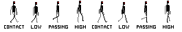
8. 1.1 - Lines: Hello. In this lesson, I will show you how to create simple clean lines straight once and Kurt wants in pixel art . Now creating threat lines is really is you just use one simple rule. Using ratios Creating horizontal or vertical lines are pretty easy. There isn't much to explain. However, diagonal eyes use ratios. For example, want to one ratio will result in 45 degree angle straight life like this. However, if I change ratios due to one meaning I put two pixels before moving one up. So, like this, I create a lower angle. Same applies to the opposite direction. If I used treat what I go even lower than that and you can just go on and on until you get the angle you're looking for. Now these ratios are using whole numbers. If you try to use ratio is like 1 to 1.5, meaning something like this, you will get a strange line. Now it does have its uses in high resolution big slot, but for Nam, try to avoid it. You don't need it, actually. Okay, so that's all four straight lines. And what about curved lines? While curved lines are a bit. Three care because you need to make sure you aim for the curvature is to be correct. Let me give an example. I'm going to copy paste this curve line and cleaning up so you can see how it looks when it's clean and when it's full of what we call Jag is what makes Jagged Line. All right, so But look for the corners. Firstly. So where are the corners? Usually the curve around the corners. If I take a look at this part over here, you can see there five pixels and we can clean them up in Cuba's. I can either be raised these two or I can arrest these three. In this particular case, I want to raise this too, simply because it will make the line look clearer. No general rule is that you should always try to clean up the pixels that are neighboring to the core pixel and do not continue in the same direction. What I mean by that well, if we take this same shape over here and you take a look at this big slower here. So this one, the neighboring pixels meaning this one and this one don't continue in the same direction. They move in the opposite directions. So we need to clean this up. However, if they did continue the same direction meaning they continued here and here and not here, this would be a 90 degree angle line. And this might be exactly what you are looking for. However, when you're trying to create curved line, this is something that we should try to write and clean up. So let me just go over this entire on very quickly so you can actually compare this to again. I do not want 90 degree angles if I want completely curved line. So I'm going to be erased this part over here again. Just taking a quick look at this entire line. And when you go and see stuff like this when it suddenly turns scorers and we have double pixels over here, well, I can just erase this bottom part and if needed, I can even add a little bit off curvature like so. So feel free. Just relax and have fun. We have similar situation over here, so I want to add something that will escape this 90 degree angle even though this pixel is missing this quarter pixel. It still looks like a 90 degree angle, so I can just soften it up like so Same applies to this part, and I can get even sometimes off the edge. Even if I rotated, this will be 90 the Grandal. So I can even raise this part and keep it like so and repeat the process until I get the curvature I want. And here we go. So you can clearly see the difference between this line, which I cleaned up, and this one which I haven't cleaned up, which is full of jackets following this fear. Simple rules using gracious for straight lines and cleaning up your curved lines will result in clean lines for your pics. Luck, which is a core skill for pixel artists.
9. 1.2 - Exercise - Lines: hello. In this challenge, I will show you to exercise is one for each type of flying where you can practice during threat lines and curved lines. Please don't use features off your software to create lines for you. For example, a sprite can create both straight lines and curves lines for using this feature pixel perfect for curved lines, and it will clean up your lines 80% of the time so you can already see this guideline is not as clean as it should be. So even Sartor will make mistakes. So please develop your skills freehand. And then you can use these tools later on. Soap to exercise is number one for straight lines. Big Q spots under canvas. This canvas is 50 by 50 pixels. Doesn't matter where you pick them as long as you are comfortable creating lines like so and if once I pick them, I should already try to see how they should connect. Now the stolen this two spots on the canvas. I can already see if I try to use whole ratios. I won't be given straight line. For example, if I go to bite you, I can already see I will miss by one role. Yeah, one role. So I would just want and go with three Dent you and then I will end on three pixels again. So 123 As you can see, creating curved lines is a simple A speaking five different points. You can even go further than that if you want to. So pick five points and try to draw just curved line between them onto those points and then clean those lines up. However you want to just relax and have fun. This is all part of the process. There you go. Now, when you're trying to create curved lines, try to avoid que big jumps when it comes to pixels. For example. Over here, if I create five pixels than one than five again, this might be que sharp off a turn. So I might want to take this number of pixels, meaning for then I have one. Then I have 1234 56 totalling 11. If I divided by three, which is the number of rows I have here, I will get something like 3 to 4 pieces so I might start for these four. Then I will expand this toe another four and then a tree in the last, and then I get a slight curvature. Okay, so this is just another tip that you can use to create curved lines. These are two exercises. Please give them a try. Post your progress in the discussion panel, and that's all for now.
10. 1.3 - Shapes: Hello. Welcome to the lesson about shapes. Shapes are extremely easy to figure out because they are nothing more than a closed line. Let me give you an example. So this is a line for now. It's still a line in the right here, when I close it in becomes a shape. This is a square, of course. Now the basic shape that people have trouble within pig slot is a circle. So let me show you how to draw a circle in different sizes. If I try to go in one by one resolution, I can just put one square, one Mariah, meaning one pixel height and want pixel off week. So there is nothing us toe work with. If I go to buy two again, I can only put a square, even if preview this 11 pixel might look like a dot, but it's Neil, not a circle. However, in three by three resolution, I can already get something that will resemble a circle. I can just erase the edges from square, and I get something like a circle. Now four by four are where things get interesting again. You can start with the square, then erase the edges and you can already see this will resemble a circle. When you look at it from far away off course, It does depend on what resolution you're working on. But generally this is the closest possible circle you can get in for before resolution. If I go in further than that again, I can just erase the edges. And now you can already see. This is quite OK. If I go even further that I will need to use more steps than just you racing the edges because of right now this looks like a rounded square when you look at it in the preview. So once I erased the edges, I would again erase the edges and connect these two lights. So I erased the edge and connect them with the closest possible life. And I repeat this process for this entire square, and then I will get a circle again. When you look at it from far away, it is a circle. So you can go on and on like that, creating different types circles, and please do practice
11. 1.4 - Exercise - Shapes: Hello. In this challenge, I will give you a few exercises that you can do to practice your shapes and pick slot. In the lecture, I over the shown you how to create different sizes of circles. Practice those and then increase the size of circles even more. Try creating different shapes. For example, this is a square. Try creating a rectangle. Try creating them in different shapes and sizes, so even custom shapes are completely okay. As long as you clean up the line, try to create bigger and even try to create them at the angle. So if we try to create this square under the angle, I would do something like this. So try to recreate stuff under different angles. For now, keep it under 45 degrees. After your practice that here is exercised. Number two. Try to create real life objects using Onley shapes and lines. Don't use forms. We will do that in future lessons. Let me give you an example. What I mean, if I try to draw just a simple let's a candle. This is it. This is a close ship. Maybe just one or two pixels for for like a flame And that's all the rest of this might be . Even a dynamite If I try to draw a same thing but using forms meaning three D objects, then I will already get something very different. And I don't want you to use forms for now. I will show you that in the future lessons. So don't frighten. There are three D objects. Keep it Do the so only clothes lines and straight and curved lines. Nothing else. You don't mean anything for now, I don't show. You have to do everything later on. So remember, keep it simple, keep it relaxed and have fun.
12. 2.0 - Intro - Shading and lighting: in this section, I will explain what is value and contrast. What is negative and positive space? What are the basic geometric shapes and how you can shade them using normal shadows as well as differing. And at the end, I will also give a challenge where you can practice your skills to develop them even further.
13. 2.1 - Value and contrast basics: Hello. In this lecture, I will explain water values and what is contrast. Values are nothing more than how dark or light your calories. I will go into more details what value is in the next section. But for now, this is all unity. No, regarding contrast. Contrast is the difference between two colors on the value Specter. Let me give you an example. If I create a dark background, something like black, what is the highest possible contrast we can get using White, of course. So something like this, this is the biggest possible contracts you can get. Why is this important? Well in games when you are making backgrounds and four grounds and players using colors and color palettes, which I will cover, and in the later section it is extremely important to keep the contrast high enough so players can different and shit between the foreground and the background and the characters . So let me give you a bad example. If this is our color for the background and I want to create a foreground with just slight difference in the color like so you might be, you might be able to see this under screen and maybe will not. But there is difference here. If I increase it more, you can see it more clearly because the contrast is higher. So there's something you need to keep in mind when you design your game, keep the country's higher naps off. People can be free agent, the background in the foreground, but not too high. So they split. This is something that you will discover in the later sections.
14. 2.2 - Positive and negative space: Hello. In this lesson, I will explain what is positive and the negative space and how we can use it now. There was are extremely simple terms. Positive space is what our object is. And the negative space is what our object isn't. So, for example, if I put some kind of an object here, let's say this is some type for rock. Everything else is negative space, whereas our object is positive space. Let me give you a good example how this can work. You might have already seen this picture somewhere because in the last century believes some Sahar tourists made this picture. So this is a good example of positive and negative space. If you see the ways in the middle meaning the white part, this is what some people might perceive as positive space and black is a negative space. However, if you see the faces here on this side, then that is your positive space and someone else's negative space. Why their status? Well, each and every person has a different perception. So we should try to create a design where things like this won't happen unless you really minute, Teoh. Okay, so positive. Negative space is something really simple. Positive is what your object is. Negative is everything else
15. 2.3 - Basic geometric shapes: Hello. In this lecture, I will explain what are the five basic three D geometric shapes? This entire world can be simplified into these five geometric shapes, and if you know how to shade all of them correctly, you can shade and create any object in this entire world. For example, human arm is nothing more, then a simplified cylinder once you try to shade it. A sphere, for example, can be an orange or an apple, modified a little bit. Put on a texture. Put on the colors, but you shade. It is a sphere. Okay, so what are the five basic geometric shapes? Those are the cubes. This fears the cylinders, the cones and the pyramids. Now, as you can see, this fear, for example, is nothing more than a circle. If it is unshaded, shadows and lights and highlights are what gives us three. The illusion that something is a treaty. We are looking. Everything on the screen are screen is Studi if there's only heightened with, but the correct colors and shadows are what creates the illusion off treaty. So if you just put a few different colors, we can already see these are three D shapes, and I will teach you over the course off next few lectures how to shade each and every one of these five geometric shapes.
16. 2.4 - Shading a cube: Hello. In this lecture I will explain how to shave a simple cube simple through the geometric shape that has all the sides completely straight. And that means we don't have to introduce Grady INTs in tow are shading. So I already prepared in a PNG file Exactly this template where you can practice shading yourself so you can follow along. Or you can watch the lectures first and then tried yourself in the challenge. All right, so we have five colors ranging from completely white to completely black. I will already put the black color as the outlines and we won't be using it for anything else. The white color is going to be our highlighted tone and everything in between our Mittal's in our middle Maidstone is what I put on all off these shapes by default. So let's jumped into it. First, we need to discover where is the light source. The life source in our case is going to be from the top left corner. This means that our top plane off the Cube is going to be in the light and our side is going to be in the shadow, whereas our left side is going to get just a little bit off light. So you can either choose to put the highlights first or the shadow first. It's all up to you. I prefer to do it shadows first. So let's go that way. Pick this shadow, Don't and put it on this side. In this case, the right side on the top plane where the light is hitting the most. I'm going to put this color and I will keep the middle for the left side. Now, I will repeat this process on this cable here because we shall one extra step that we can do to make this even better. Using our highlighted color the most highlight account, which is completely white. I'm going to shade this left corner over here to indicate that our light source is coming from the top left corner. In this case, I will also have to shade this corner over here like so and I also have to erase this blackout time. I can use this simply by putting our midst down all over here. And if I want to soften it up, even bit more on every second pixel, I can put this light color like so and that's pretty much it. We can go into further if we want to erase black outlines. But for now, it's not necessary. Right now, you need to think about where the light sources and which colors to apply. I put on Lee five colors here to think about four. If I subtract the black one that he was only four outlines This is it for the Cube lesson. I will see you in the next one where we will shade us fear.
17. 2.5 - Shading a sphere: Welcome back in this lecture, I will show you how to shada sphere a trade, a geometric shape that is completely round. That means our shadows need to be around it as well. They need to follow the curve off our object depending on where the light source is. So let's do this again. We'll grab the shadow part and let's try to share it in again. We need to create a curve if you do something like this. This is not occur. You can clearly see it. This is not a sphere. So we need to make our shadows Kerr with our object. All right, so let me just quickly put and give you one quick tip. If you want to share a sphere easily in the beginning, you can use this simple technique big one side and start shading from that part and then replicated on the other side. For example, if you see or hear these three black pixels, I start from the middle one to the side. Then I find the exacting on the opposite side and replicated. So if I put pixels to this line over here, I can do this on the same side And then I can just keep repeating the process until they meet in the middle. Like so. Then I share this part in and just like that, we have a shadow, and this already resembles a sphere. Weaken, Go! Human step fel. So let me just copy faceless entire object. And we need to put our highlights again using this same technic weaken. Just replicate what we did over here. So we start from this part over here, which is this one over here. Put one pick, select so and then just continue on from there again. You want to be sure to match these parts over here because we are replicating one side to the other, and then we can just slowly push them together. This already looks a lot better now if I put the pilot, I can do this two ways. I can just pick a high resolution like so and put the highlight like this. And that's okay. Or we can do this manually, going one by one, pixel. It's all up to you. You can use this entire sphere and then put the Sheraton first. Then the Maidstone highlights. And that's all there is to it. So one key thing to remember about US fears is keep the shadows around it because the object is around. Our shadows are what keeps the illusion off a three d object I'll see in the next lecture while I will explain how to shake a cylinder.
18. 2.6 - Shading a cilinder: Welcome back in this lecture, I will show you have to shake a cylinder a three d geometric shape this kind of a combination between a cube in the sphere meaning it could stop and bottom parts or planes completely straight while the rest off it is a rounded like a sphere. And that means we need to combine our shading techniques from the cube atmosphere in order to successfully and correctly shade our cylinder. So let me do just that again. The light is coming from the top left corner, which means the bottom right corner is going to be in the shadow, like so and our entire top part because it is straight. We need to put it in a light. Now, if I repeat, this process were killed just quickly and they want to go in further that we can take what we use here on the Cube. We can take the highlights and shade the edges between the top and mid plane, like so and we can even you raise this black line using this lighter tone like so this by itself is okay, but we can go a step further because the light is coming from the top left corner. We need to put the light part on the left side off our cylinder as well. So we can use this simple color from the top. And we have a shaded ceiling again. Same thing applies to cube, the sphere and the cylinder and the rest. We can always add more tones in order to have more, Grady. And look. But for now, this is enough. I will see you in the next lecture. Where are we? Show you how to shade a cold.
19. 2.7 - Shading a cone: Welcome back in this lecture, I will explain to you how to shade a cone. Cone is a simple three, the geometric shape that is similar to our cylinder except with one big difference. It's tapers all the way to the top edge instead of being the same with all the way around. This means we will have to use the shiny techniques between the cylinder atmosphere. So let's dust do that again. Since this is a cursed object, we need to follow the curvature. I will put it the shadows first again, following the curve. Remember, this is very important and we can already see This is something that is skirt. If I did the shadows all the way to the middle, you can already see it doesn't have the same effect. So let me just copy paste this middle cone, put it over here and let's add the highlights. So for the lighter tones, we can just go all the way straight to the middle and shade the left part. Before we put the highlights, which is completely white color, we can put it all the way here on the top, and then we can just replicate what we did for the shadows, meaning we can just follow, like so being this part over here, we can shade in like so we can just keep going until we completely copy what we did for the shadows. OK, like so. And just like that, we have a cylinder. You can see here on the preview how it looks again. We could go even a step further if you wanted to erase the outlines. We might even add highlights over here to indicate the curvature even a bit more if you can see. But for now, it's not needed. You need to be aware of that. Our cone, the bottom plane or the bottom part is the same as for the cylinder. It's completely around it and flat completely straight, just like the Cube has fled. Planes just like that has the cylinder and our corn as well, and our pyramid in the next lecture, where I will see it just few moments
20. 2.8 - Shading a pyramid: Welcome back in this lecture are we show you how to shape a pyramid. The pyramid is a simple three D geometric shape that this kind of a combination between a cube and the cone meaning it tapers all the way to the top edge. However, all planes are completely flat, completely straight, so we can share them like so we don't have to worry about courage. Cher's we can share it more like a cube. But you do need to be aware off the date paper all the way, the top edge. Now we can take our share a tone and just put shadows on this entire right plane. We can do the same thing for the light stone. And as you might know this, we lost the middle in the middle, the most middle one color, and that is completely fine. Then we can put our highlights here in the middle to indicate where are line between these two cross sections are, and that's all the rest of it again. We could go in front of that, but there is no need for now. That's all there is for the pyramids, and all off are five basic geometric shapes and their shading
21. 2.9 - Dithering: Hello. In this lecture, I will explain what deterring is Deterring in. Its common most sense in pig slot is creating Grady INTs between two colors, meaning when people had to small off a color palette, they could like eight colors or 16 colors. Decades ago in the game art, they wanted to find a way to blend the colors so they used to colors and using deterring meaning. Putting common patterns like these once they would be able to create. Ah, shadow deterring is a very commonly used in old games, but nowadays it's used on Lee for a certain visual appeal. And why is that? Well, the old monitors in the eighties, seventies, even nineties, the CRT monitors the way they worked and function. When you used the drink, you wouldn't actually see all the individual pixels as you see them Now on led Elsie Discreet. It's they would blend in very easily, but now you can see them very clearly, and that's okay. So if you want to use them in your picks life, it's completely funny here if you have a limited color palette. So if you want you create a Grady in between two colors you can use deterring, or you can use more colors in between. Deterring is nothing more than creating those greatest. Let me show you an example how we can achieve that. So right here we have our cylinder that we shaded in one of the previous lectures. These are the two colors. If we wanted to create a great in between and we can use the calmer checkerboard pattern, meaning we just put on every second pixel, we can put one color and then the other, so they interchange. As you can see, we can repeat this process to create a smaller look and a smoother transition between two colors. We can go and put it even here and just like that very quickly, we created credence. Now we take a look between these two, and you can look even here on the preview. Using dithering enables us to create a smoother transitions between two colors. Deterring is something that you should practice. If you want to achieve that certain appeal again, you can just use more number of colors. But if you want to keep your color palette clean and small, you can use deterring to enable you more shading
22. 2.10 - Exercise - Shading: welcome back in this challenge, I would give you want simple exercise that you will practice and develop your skills have to shade all of these five geometric shapes under different light sources. So exercise is simple. Under my previous lectures, I should everything where the life source is in the top left corner. I want you to try different angles off light source of top, right That left as well. Bottom right bottom left the middle in front behind and anything and everything in between . Whatever you can come up and think off. Just practice it, for example, are sphere when the light is completely behind our objects. So let's say the light source is behind our object completely in the middle. We wouldn't be able to see our sphere at all any shadows. We will only see the edges going on like so, so only the highlights and that is completely fine. Our object is still three d. It just so happens that the light is completely behind and you need to think about these things. If you're not sure, you can always google and find reference images that you like and use them as a practice to and remember keep it relaxed and Father
23. 3.0 - Intro - Colors and textures: Hello. In this section, I will explain what is the color? How do we get to the color? What are the main properties off? A color like hue? Saturation value? I will explain. A few basic color theories and color harmonies have to get to them. How can you create your own color palette, how to create fewer different textures and how to apply those structures to two D geometric shapes?
24. 3.1 - Hue: welcome back in this lesson, I will explain What Hugh is here is one of three main properties off a color, the others being saturation and value. When you combine those three properties together, you get a color. So why is this important? Well, when you try to talk to other people, especially artist, you will marginal this terminology. But even more important, that is, this is the way we talk to our PC. PC needs those inputs in order to understand what color it needs to render. When I opened this color picker over here which is available in every digital art program, you have four values here situation and value and off all free, just transparency. And this is not ah, property for color. This is just ah certain feature that problems usually have but it is not a property color, but here saturation and value are so what issue? Well, when a shift the here you can obviously the color is changing because it is one of the properties. It is not the only one. And this is the most common mistake beginner artists make When they think the color is the hue. Let me give an example, this is an orange color. Okay, So if I dark and a little bit and reduce the situation, what is this color? This is brown color, but the here is identical. You can see the huge 24. So this is orange hue. You can say this is an order shoe, right? You green hue, blue hue, etcetera. But this is not the same list color you want. Say the color is orange over here because it's not. It's a brand are it's a brown color. So if I increase the value and saturation to the max, which are the other through pop artists, which I'll explain, you get this orange or here because the hue is identical, this is really important to different in shit. Hue and color are not the same. All right, so once we got this out of the way, how does RPC calculate? Well, it goes in degrees, 3 60 degrees, so to speak, in a full circle. When it's the saturation of value, they go from 0 to 100 base under intensity, but here goes from 0 to 3 60 And if you are looking for the main colors, for example, RGB for our monitors. Red, green and blue. It jumps in sections off 120 degrees. So let me give an example. Zero is a red hue. 120 is green hue 240 is blue hell. And when you become against 3 60 we came full circle and we're back to the red hue again. Now remember, I'm not seeing red color but Red Hugh. All right, so if you want to go, let's say for operating type off style for so four seam What came out? Not algae. Rgb Najib is for digital out Sam Work A is for pretty stuff because printers use ink in science in so mark a sign Yellow magenta Kiki is the black ink so we can just ignore that. So if I start on 60 I get yellow here. If I jump 1 20 again, I get Ah, sign here and then Magenta Hue on 300 again. If I added another 1 20 I would come back to the yellow again. So this is quite easy to understand, So he'll is not the color. It is one of the main property suffer color. I hope this clears things up
25. 3.2 - Saturation: welcome back in this lesson, I will explain what saturation is. Saturation is the second of the main properties off a color and it is the intensity off a color. For example, if I put this red over here, you can see here on the color picker. This is the maximum saturation, meaning the maximum intensity. If I decrease the intensity and I d saturated the color, you can see what happens. And if I keep going, it will become greater and greater. Like so Now it is important to understand that the way saturation works is not by adding white and black colors. This is the most common mistakes beginners make. The way this saturation happens is by introducing the color on the opposite side off the color wheel. For example, If I take this red one and you see this color wheel over here, this is the red. If I wanted to de saturate this color in a traditional manner, I would use the opposite color, meaning the science and the more Sinai introduced the closer are red color would go towards the saturation, meaning this great color. Now, for as digital artists, this really isn't important because we don't mix colors like that unless you go into digital painting, in which case you want to know. Understand this. But for now, it is just important to know if you add black or white to your color, you won't get the saturation. You will get different values which are covering the next licence. All right, so saturation is just the intensity of her color, and it is really important when we come to the color theory to understand this.
26. 3.3 - Value: welcome back in this lesson, I will explain what value is value is the last in the third main property off a color. And it is the information how much black or white tent we have in our color. So the darker the value means the dark of the calories, the light of the value. The writer are calories. So let me give an example. If I take this threat and if I add a lot of black to it, it will become darker. If I add a lot of White Street, it will become whiter and we can go in between to see how these colors look as well. Now, the more black ink you put it, it the morning to become to the black, and if you overdo it, it will eventually become black. Same applies to the wife, which you can see right now because of the canvas. So this is all the rest of the value
27. 3.4 - Color theory: welcome back in this lesson, I will explain the basics off color theory. So we all learned in our elementary school that the main colors the primary colors are the red, yellow and blue that we can get all of the other colors by combining these primary colors. So, for example, if we combine the red and yellow, we will get the orange. We will get the green by combining the yellow and blue. We will get the purple by combining the red and blue ther sherry colors, we would get by combining primary with the secondary. So if I combined this blue one with the green one, I would get this color over here. That's all fine and well. But why is it like this? Because here in digital paintings in digital art, we don't have these three as men colors We have read green and blue. So rgb red Grampa. We don't have red, yellow and blue. We have red green and look So why is it like this? Well, it has something to do with how first of all technology works. So the monitors and second of all, how our eyes work. And of course, the world in general, So let me just quickly explain how things work. So how do we see the red apple has read? Why do we see it is red? The light, in its purest form, has a full range of frequencies. When it comes to colors, meaning it's translucent, it's white. But when it hits an object, this object has its own frequency, and it will absorb all of the other frequencies of flight. And it'll bounce off just one frequency, and this one frequency is what we see. So if we see a red apple, that means that red apple absorbed all of the other frequencies off the light except the red hue. So it burns off the red color. All right. Orange fruit, for example, Or banana. Let's say banana banana bounces off on Lee the yellow color. The orange bounces off only the orange color, and it absorbs all of the rest. Now, why is this important? Well, you have to general and most important ways how colors work around here in digital art and traditional art. We have the additive colors, which is the RGB spectrum, and we have the subtracted colors, which is the same why Ah, spectrum keys, Mr. Here, which is the black color, but not important now. All right, so the RGB look at this. When you combine a red with the blue, you get magenta. When you combine green and blue, you get the steal color or sign color more to be precise. And when you combine the red and green you get this yellow color. Those three same colors are the same ones over here on this real if you can see and if you combine these you get these colors. So signing magenta. When you combine them, you get blue colors of this one over here. Sign and yellow. Get the green and magenta Neil, you get the red. Why is that? Well, quite simply because the way things work and how they work well red, green and blue. When you take your monitor, for example, it generates light meaning it adds and combines spectrums to get a certain color. So if your monitor has three types of pixel and it has so red pixels, green pieces and blue pixels, and if your monitor only turn on the red and blue pixels in the maximum capacity those spectrums would combine and would generate magenta color. If all three of those so all the red greens and blues on your skin would be turned on, you will get white color because your monitor generates like, however, when it comes to see him, why this is yours in printing and digital art. So when you want to print something on the paper or you want to take a paint and paint on your cannabis, you are putting layers upon layers off colors to get a sitter color. For example, if you want to print Ah green color, you would take the science color and the yellow color and apply them first. It would apply sand color. Then you won't apply yellow color if you want to green. And when you combine those two, they would reflect the green spectrum, meaning the green color. But if you get too many colors on so you get the same mark a full spectrum, and you just put layers upon layers in your paper. Essentially remember what I said. Objects reflect one light, meaning one color, and they absorb all the others. And if you have such a declare off different colors, well, they would absorb all of the others. Meaning they would nullify each other in a sense and they would reflect nothing. Meaning you get the black color. So, Sam, why is yours for Didn't do so to speak traditional art as well. A sprinting. But RGB is used here on our monitors. So for our color theory, we will need it. The RGB mostly because we are working with digital art. However, this is important to know because later on, if you want to print your art, you would want to know to tweak settings a little bit. So it looks correctly on the same white case victim. Okay, so this is all the rest of it for how colors and made and perceived. The next lesson will be about creating our color palettes and creating a color harmony. I'll see you there.
28. 3.5 - Color Harmony: welcome back. In this lesson, I will explain what is color, harmony and how to achieve it. Color harmony is what makes our art beautiful. If the balance between colors is disrupted, then our our suffers. So the color harmony ensures that that balance is well kept there three commonly used techniques when it comes to color harmony using analogous color harmony. 2nd 1 is monochromatic, and the 3rd 1 is complementary. Complementary is probably the most commonly no meaning. You use complementary colors, so let's just go over all of these three and see how they work. So the complementary is when you use the colors on the opposite sides of the color wheel. For example, if I use the blue, complimentary color to the blue is orange. So using these two colors is pretty nice, However, what you should be aware off that balance between these two colors is kept with saturation . Let me give you an example. I'm going to quickly create a certain piece. Let me put this orange color like so, and let's find ah, blue color. There we go. Now look what happens. I'm not putting anything else except the color, so your focus is correct. If you look long enough into this, your eyes are going to start to hurt. They are complementary to each other. But if the saturation is too high, the balance is ruined. So the way you achieve it is by decreasing saturation. And remember, we get this saturated color by introducing the complementary color into it. So the way I d saturated blue is by adding a bit off orange into it and see what happens if I add just a little bit off this situation. In both of these, I'm going to create a new layer, apply the same blue, but a bit the saturated, maybe something like so And then for the rest, I'm going to use orange again just a little bit. He saturated. Now when you compare this to your eyes, don't hurt as much. And that is a very good thing. Now I haven't drawn anything specifically here, which is the reason why except this little blob. But when you're trying to make your player look into something with somebody is playing your game. If the balance isn't there, their eyes are going to hurt, and essentially subconsciously, they won't like her game are, and they will quit it. So you need the saturated colors at least a little bit. Maybe not as much, but at least a little bit when you are using complementary colors. Now, when it comes to monochromatic colors, this is even easier. It's just picking one color, one Hugh off a quality, so to speak, and sticking to it. Nothing else. So we take, for example, red hue, Let's see completely red. And now, if we want to change our colors, we want to use only the shades off that Hugh so we can decrease the saturation, decrease the value increase that we can do whatever we want you as long as it is in the same husa monochromatic. Use one hue and one Hugh on Lee so we can go ahead and scraps of fun in different shades again, not creating antics special. But just so you can see what was gonna happen, using something like this is really nice, and it makes sure that there is only one color used Now. How do you approach making monochromatic pieces, especially when it comes to gamers? Well, you need to make sure that you are using contrast so the Contras between light red color and the dark red color is huge, so you need to master the contrast. All right, so what is the 3rd 1? The 3rd 1 would be analogous, and that is using picking one color on the color wheel and then using the tertiary colors next with or rather any two colors next to, for example, if I pick this orange color, then by the analogous color harmony, I would be using this one as well and this one as well. So these three would be my main color steals in my piece again. I would. This saturated them a little bit to ensure the harmony is there, but you don't need to be as careful when it comes to complimentary car. So each off this tree has its the techniques. New can pick and choose, whichever you like. And please experiment with all of them. Google, your maybe your favorite artists and see which off these they used. There are also other color harmony techniques, which I haven't mentioned, but these are the three main one that you should be using right now. That's all for now. In the next lesson, let's jump into creating our own color palettes
29. 3.6 - Color palette: Welcome back. Now that we covered basic color theory and basic color harmony, we can start creating our own color palettes. Now. There is one essential thing that you must remember when you're trying to create your color palette, and that is Hugh Shift IQ, meaning when you are trying to create shadows. Unity. Shift your Hughes as well as when you're trying to add highlights. You should again shift your Hughes. I will show you an example. What will happen if you don't shift their heels. And what will happen if you do? Shooter Hughes. So I have a very basic blue color over here, and first I'm going to share it like beginners usually do, which is the incorrect way. First, I'm going to put my midterm down then and here regard. I'm just going to create a little color palette here so you can follow along a bit better now when they are frank, you and I'm talking about beginner's. When they are trying to add shadows. They either just darken the color, that's all, or they put a layer about it off a black collar under 50% transparency or a bit more or less so something like this so they would go and darken the color. Then use that color or they would use this same color. But then, on a layer above there, be completely black. Reduce the offer and color, or word like so both of these results in the same thing and the in correcting and you'll see why. So I will go here in my color picker and I will usually use hue, saturation and lightness instead of value. Lightness basically just influences on Lee the white and black in our color. I will be using the same Hugh for now. I won't be missing that. And same situation. I will be on Lee moving the light. All right, So if I let's say we want to create a shadow, I would decrease it by 20. So on 29 here we go again. Remember, this is the incorrect way. So just follow along to see what will happen. And if I want to create a delight the lighter part I would pick the Maidstone again and add 22 are lightness, so 69 will be here. Oh, sorry. Wrong color. So like this this is without are here shifting So these are the colors we have. Sorry. And you will notice. The difference is huge when it comes to shading with Hugh shifting. All right, so this is the bad example. Let's go over the good one. I will be using the same Midtown. Okay. Like so. But this time I will be using here, shifting with the same amount when it comes to light. So if I go over here, I will decrease the value on 29. But I will also shift my Hughes. So when you're trying to shift Hughes, you need to remember what type of flight Terry's. I'm going to assume it's a daylight. So if I want to increase the hue meaning I want you go towards the shadow, I would want to put my hue a bit more towards the blue and purple color. If I wanted to be highlighted, which we will do for the lighter part off our Cube. Then I want to put more towards the yellow color. So right now we are making the shadow, So I will shit my shield just a little bit. The words the dark blue and purple just a little bit Not too much. And now I will do the same. But for light, I will increase the lightness to 69. So about 20 and I will shake my you, Hugh towards the yellow color. Just like so. Not too much. And now you will be able to see what we actually get. Actually put them on the same piece. You can notice the difference immediately or here like so. But you will notice the difference even more when I turn this layer off even just a few seconds. Thank you. All right. So see what happens with your shifting and see what happens without this is without. This is with especially here on the preview. You can see the difference is huge again without here shifting. And with your shifting, the shadows are much deeper. The highlights are much brighter and look more natural. So you should always do your hear shifting when trying to determine what is the shadow and what is the heart? It another one good tip that you should be careful off is when you are shading. Be mindful off the surroundings and off the environment. For example, Descent Cube, the same bloke you wouldn't do the same. If it is the midnight or in the middle off a day in a desert, it would look a lot different. Right. So you need to take that into consideration when you are trying to determine your color palettes. All right, so that is all for color palettes. Feel faith to create your own hair fun. And remember, you're shifting.
30. 3.7 - Wood texture: Welcome back In this lesson, I will show you how to create a simple wood texture for wood planks. Now, usually, if you want you re create a certain texture. You will go online, google it, see how it looks in real life and try to replicate it in big threat in simplified for So let's go and create a simple with style. Let's say 32 by authorities should be just fine. Now the wood is usually in a brown color. So I will go into my orange here and create my metal which will be something like this, that this should be just fine. Yeah, All right. So first I want to find shadows and I will show you helped to make blanks, so just wouldn't blank simple with blacks, nothing else. And then I will later on show you how to apply this to, let's say, a certain three to the geometrical shape. So first of all, make a shadow and that should a wheel decide where our planks will go So we can go and do something like this. Maybe some are a bit particular. Maybe that overlap. Yeah, you can put it whatever you want to. Okay, let me clean this up. And right here we have something that looks more like a brick, and but which shading and with picturing, we will be able to achieve that. It looks like it would. So we will take the same color and apply just near the edges on nearly bottom edges. So, like so you don't have to go too far. Just something that resemble it. Now we can take and create Pilot, take the Maidstone and create some highlight. Remember to hear shift, not too much. And then we would want to put highlights on the top part. Now I'm putting this under the presumption that the light is coming from the top. And it's getting this little plank from the top. Remember each and every plank it's it's a student to the geometric shape off Cube, but it's distorted, all right? It has Ah, flat plains. And we should share them like so. So, like this. I'm just using Magic one still right now, so I can easily select the rest of these. And I'm trying to get that warm outlook. All right, so now if you look here in the preview, you can see this already looks like a but however, if we want to go even step further, we need to introduce more colors. So let's take this shall atone and darknet even a bit more. Now this color is going to be What will separate are blanks from each other. So, like is this gives it more dimension? Remember, the more colors you have, the more options you have, which can be a good and a bad thing. But right now it shouldn't be too much of a problem. Then we can take the highlight color and do the same and create even bigger and even brighter highlights. So something like this maybe a bit too much of a here shift here? Yeah, just lily and go over only off for go over only on the parts that are already highlighted. Don't create new ones. And remember, what has the texture, grainy texture, which goes in one direction. We're have the would actually gross. So we can add those texture just a little bit here and there. Remember Half Pond. You shouldn't follow too many rules right now, so it please the experiment. All right, start to increase the number of textures. So we will take the Maidstone and find a color between the mid stone and this shadow told So you can look on the color real where those two are and just find something in the middle something Michael and I will go over this Maidstone, creating those streaks that I've talked about just like this. And there we go when you look for far away. This is definitely a wooden texture. Quite easy to do now remember, Please the experiment. You can try your own colors. You Maybe you don't want a blank. Maybe want something else. Feel free kid who? So it's all fun and games. That's all for now. I'll see you in the next video.
31. 3.8 - Metal texture: Welcome back in this lesson, I will show you how to create a simple metal texture. Let's create a simple metal plate so I can explain to you have the reflective surface off a metal works Now metal usually is in the blue hue. So we will go to the BUE, look here and pick at this saturated color and a bit light. Yeah, that's fine. Let's say this square is actually a metal plate somewhere on a war. So I want to make an invitation for that wall. And for that I need shallows. So let me created those. This will be our darkest shadow. Seen the light is coming from the top left corner. I want to keep my shadows darkest in the bottom right corner. Let's say this metal plate. Here's our flat top plane, and then it tapers towards the bottom, where it connects with a wall. All right, so I do need a softer shadow. That's something like this, and I will use the same one over here. Now the way I will indicate the stock plane is completely flat is by taking a highlighted color and putting highlights where it begins so summer around here. Like so. All right. Now, the way you do, the reflection is quite easy. You create horizontal straight streaks across this entire plate, or rather, the entire top plane off this plate. Now, let me show you what I mean. So I could go and do something like this. Remember, by this point, you should already know how to use shortcuts and using your tool to your advantage. Because if you know how to draw threat lines, Freehand, please feel free to do them using your shortcut tools on your bigs. Large software. All right. I will need another shadow soil. Create one, like so, picking the middle, creating something darker. Yeah, this should be just fine. And then again, putting some streaks as a shadow, something to contrast this reflective surface again. I'm going to put this streak now. If I were toe animated this, then these lines which are the highlights with more from the top left to the bottom right corner. But right now they are not, so we can keep it just like it is. And here ago, just like this, we created a simple metal plate. It really is. Just remember that when you're dealing with reflective surfaces. You want to indicate that that light is reflecting. It is going and following the curve off our object. Since our object is flat, those tricks are also flat. So when it comes to Sphere, it would be rounded. Okay, so that's all for now.
32. 3.9 - How to apply textures to shapes: Welcome back in this lesson, I will show you how to apply textures to your shapes. This is a really important skill tohave because this is what will complete your objects. So let's be qualities they are. Cylinder would be the best for the wood first. Once you shaded in major object, we can start applying color to it. I think the midst down over here and I'm going to put it on the mid stone over here. Then we go for the shadows and after the shadows, we can go for the highlights. My bet like so. And you can already see these objects look like they're made out of wood. But we still need to add more texture to it to give it some more context. So let's go and do that. Since this is a tree trunk, we can put in the middle over here. Bit of texture. So let's do that really quickly. Okay, so I want to clean up these lines just a little bit because I do want a certain curvature out of it, because this pretty much tells how much the three is old. But yeah, maybe not so important here in art All right, so maybe something like this. Okay. I said, this is good enough. No, not everything has to be just one pixel wide as long as the whole picture looks good. But the tree bark is a lot different than the three course. So I will add a bit electricity and you should try to follow the highlights in different parts of the three bark. So, for example, if I wanted to put harlot here, I won't be using this car because it's too bright. The contrast is too high. It breaks the balance between this entire image. However, if I, for example, if I use ah highlight here, it's much better than using this one. So let me create just a few simple pictures, something like so and again when I'm trying to create shadow. I'm always using one tone darker than car color, meaning for this color, I'm going to use one tone darker, which is this one. But for this one, I'm going to use this one over here and again for this one. I might use this one. Let's say if you want to add a bit more three more than three dimensions to it we can break away from our simple of just and we can add a little bit more of it. Hell, if we wanted, we could even add a little branch. Like so. All right, Now let's see. He wanted to add highlights. And this color, I need this one. If I want a bit more curvature, I can do it. Like so for this one, the highlight can be either this one or even this one, depending on what type off image you want to achieve. All right, I'm going to be using this one. And I could just repeat the process until I get the look I'm going for and in just a little bit of texture, I can put a few highlights here and there, even a hit on the branch. And here we go. Just like that, we have a simple tree trunk. However, if we do want to break out of Q flight off a surface, we can certainly do so. So let's create it with some deterring. So we are combining different techniques right now. Just try and have fun. I mean, really, there is no wrong that you can do right here. Then we can use this as well to create different highlights like so and already just like that, our image is starting to go together very nicely. So adding a few highlights here and there just make it a bit more fun. And here we go. When you look in the preview, you can already see our would is really texture. I can even go into more details. If I wanted you here in the shadow again, adding a bit more did drink. And here we go. Just like that we have are three trunk. You can go on and on adding more details, correcting the shadows if you want softer outlines like so it's all after you. You can do whatever you want to. You can darken this middle part of the bark to create Ah, bit one off. A contrast If you wanted you, it's all up to its your canvas. Do whatever you want to do. But yeah, this is how one can make a simple three truck just like that. I'll see you in the next lesson.
33. 3.10 - Exercise - Color, textures and shapes: welcome back in this challenge I want you to do if your simple exercises number one create different textures. So like it in the lesson with a metal texture and what structure may be created Those maybe create something else, whatever you feel like it, but create different textures. Then after you made those check pictures, go and look for the three D objects and try to apply those structures to your shapes Big, different shapes for different textures. Or use the same picture on all of these objects. Keep practicing and remember, relax, have fun.
34. 4.0 - Intro - Creating objects: welcome. In this section, I will explain simple principles like creating objects from geometric shapes. How reflection works on bottles. And I will give you several different examples on different objects and how to create them . Keep in mind that this is still a beginner part of the course, so I'll keep things as simple as possible. And the end I will give you off course a challenge with an exercise where you will polish your skills.
35. 4.1 - Principle of creating objects from simple geometric shapes: welcome back. Before we start dropping different objects, I just want to explain a simple principle where you should draw objects from simplified geometric shapes. So, for example, an apple. What geometric shape would be the closest to an apple sphere? If you take an ice cream cone, it's closest to a cone. If you take the human body, for example, and are it's a cylinder and you should try to shed everything. Think of those objects. If you have trouble shading any object whatsoever, just think about okay, what is the two D geometric shape that is the closest to that object or that part of the object? Then you can share it just like that. Okay, so right now, let's jump into creating some different objects.
36. 4.2 - Orange: Welcome back in this lesson, I will show you how to draw a simple orange now bear in mind. Did during this entire section are canvas size will be the same. It's going to be truly two pixels wide and 32 pixel stall. So if I go over here, you can see if I created three to battery to fix us. This will be our canvas. Now we do need the background. You don't want to draw on something like this. So let's create a simple background, not completely white because it messes up with your perception. So just something slightly greyish and I'm just going to rename our layer toe back around. I could just put BG I will lock this layer. And on top of this letter, I will keep creating new layers for new objects that I will be creating for you during this entire section. 1st 1 on the list is an orange. Now here is a little trick that I talked about in one of the previous lessons, and that is creating shadows. But by using the same brush, but in different sizes. So usually pick slot programs and sufferers have this option that you can pick between ah square in the circle for your brush. So if I increase the size, you can see this is a circle and this is a square. Now here is a little streak. We want to begin with shadows instead of myth does in order for for us to perform this trick correctly. So since this is an orange, let me create a simple color palette. Maybe in smaller. Yeah, I will create the midst on first. So something like this should be just fine. Then I won't highlight all the right lighter tone. This should be okay. And then I want a shadow. Okay. Now I want you to begin with the shadow. He was the circle brush. Since this is a sphere, oranges, a sphere. So we need to think about it like that. And let's increase size to let's say you're 20. Should be just okay. Now we can use the magic want selection tool to select these colors. If you have contingents turned off, you can put it on. So it's elects only this part. Now we select the middle with same brush size, and we can just decide where our shells will be and paint overlay Flexo. And just like that, we can our shadows We didn't have to go pixel by pixel. This is a nifty trick. But again, only you can use it on Lee when you learn how to apply shadows normally like freak And so we need just simple highlight highlights are usually extremely small, So I'm just going to pick few pixel skin there and this should be just This should be just fine. Now, this is a simplified orange without textures without any drop shallows, etcetera. So let me just add a few more things to make it a bit more interesting. I can add leaves. For example, if I erased this part, I can actually create some leaves using green color. You can put them on if you want to. You have to. It's a lot to you. Maybe just once you belief will do. I put just one simple shell were here like so And there we go. Now this is an invitation, usually in the orange. So we do want to I say this with shadows. So something like this should be okay. Yes. And if we wanted Teoh, we can actually create Ah, highlight around this entire part so we can take our solid color over this. And usually if I turned this peaceful, perfect, unjust a concert, quickly. This would be our highlight, usually, or our line of highlights. Now, since our light is hitting more from the top than from the side, I just want to put one highlight like so and maybe just one very small over here. And here we go. You can see in the preview we have a nice orange. If you want to put pictures on to it, we can do that very easily. We pick the mid stone and just I am something between the highlights and the midst. Um, so something between these two colors you can see here under color picker tool how this looks indium something in the middle. So something or here should be just fine and shifting. He would just slightly So this is our minuto. And here we can put just a few simple Texas to indicate that this truly is an orange. And here we go, just like that. Now, if you want it to you, you can put a drop shadow. And this is where beginners make that mistake. Using the black color with Alfa, let me show you what I mean. So they would take the black color so completely black color and they would reduce the capacity down. So let's say 50%. And this is what you would get something like this. But what you should actually do if you know the color of the background won't change. Then you take the color off the background and reduce its value. And if it has any color in it whatsoever. So if the background had higher situation, you can shift the few as well. But right now there is no need. All right? And then we can simply do something like this to give a clear example. If our background wants to have a color so something like this, then look at the difference between adding just black color with all fun meaning with capacity. All right, man. And between picking the background color and adding some here shift like so Now, I obviously didn't managed to aim for the same size of the shadow, but nonetheless see the difference between these two colors next to them next to each other and the correct one, the more correct one would be. This one where we didn't use often pass it in black color, but rather taking the color from our environment and adding shadow, too, because the floor itself is also a colored object. Same marched him like an orange. So if you want to share that object again, you need to use here shifting, decreasing the values and decreasing or decrease saturation based on what you want to achieve. So the floor is object like everything else. You shouldn't actually shade your floor or background on the entire environment. LA with black color with capacity just shaded talk you would share your orange or any other object. All right, so this is it for this simple orange. In the next section, we go to the next object and then we will keep moving on. Remember to relax and have fun
37. 4.3 - Potion: Welcome back in this less I will show you how to create a simple bottle and maybe even a portion. So how did the liquid to it now? I erased the unnecessary layers just ahead my orange over here. I will hide it and create a new layer which we can call fortune. Perhaps. Now, each portion has its own little vial or a bottle. So let's create a glass bottle. I won't be using something in the blue hell, so this should be just fine. She's just a little bit. Okay. And now let's create a bottle. Now the bottle is usually cylindrical shapes, so that's how we want to shade it. Maybe the goes a bit tickle, like so again, you can create any type of bottle you want using the few tricks I will show you were here. Okay. All right. Let me put it down a little bit. Good. No, this is the shadow tone. So this is what we will be using as an outline because, you know, glass is since this will be our glass material, glass is transparent. I mean, translates, it reflects the light. And this means that we need to be careful how we share it and usually pick slot for the glass. We are using something in the blue hell, highly de saturated and like in value. So this is why I picked color like So now for the mid tone, I won't even something lighter. This would be just great. And I will feel in the middle parts. I will live only one pixel for the outline. And here we go. So we have a simple bottle. Now there are few things missing for is the cap. So let's take something in a brown color like so, and we can put even a little bit off highlight on it. Like so. All right. No, we need to put highlights on our bottle itself. How do we do that? Well, we can either take pure white color, but I usually like to live it just a bit saturated in the blue hue, something like this. And then we go and create our highlights on a partisan bottle that we know the light is getting directly from now, since this is a cylindrical shape. So when you look at it from bottom or top, it would be a circle. And if the light is hitting on this side. So this is where we put our highlight. The light will go through the bottle and hit the back side as well. But not so much light would get there because it already went through some material distorted and then hit the bottom side. So if you look from the top view, uh, or the butt of you, actually, and let me just give you clear example. Okay, So this is filled in this light source over here that we put So this skylight over here, this one if the light is getting that bottle like so that light would come and hit this part of the bottle. This is our highlight, but, ah, light would travel through the bottle and hit the back side as well. But since we have no liquid in the right now, there is nothing more to reflect off. So we do want to put something in the back as well. And that same highlight, but not so much on Li Little because only part of the light will go through. So something like one or two pixels in this low resolutions to be just fine. We also want to put it here on the bottle. Like and same thing applies to this. So we want to put just a little bit of college there. Okay? We might want to add a bit more shut up to the bottom to get more body. And here at the bottle cap, usually we have It is also a cylinder. So when it comes to shading, so you can think of these bottles to slanders, But we might want to add a bit of shadows, like so that indicated that it is a cylinder on top. So something like this should be okay. I want to put my highlights just a little bit further down. And here we go. We have a simple potion bottle. Now, if you want to add liquid to it, you would pick a color. So the red color is quite popular for the health potion. So let's go with that. I wouldn't go with Holly saturated because it would break the de saturated color here, So I do want to light it up, are red color and the saturated a little bit. So we get something like so maybe a bit more saturated. Yeah. This should be just fine. And then we can put it here on the bottom like so Now if we wanted to, I could even add a bit of shadow toe are liquid, so it has more depth to it. Now, remember, if you can see our Halid goes over our ocean liquid. And why is that? Well, because the light is hitting the glass itself in front of the bottle. So the glass comes first and behind it is our liquid. So that try to make mistakes and do something like this. Because then the highlight is only behind. All right, We can maybe even use just a little bit of deterring. And here we go. We have a simple health potion. Now you can change the color for it to be mal apportioning. Wanted to be blue, maybe speed portion like something like yellow or green, depending on your game. So feel free to experiment and have fun. This is all for the potion bottle. Let's go on to the next object
38. 4.4 - Book: Welcome back in this lesson, I will show you how to create a simple book. Book belongs when it comes to to the geometrical shapes. It belongs to the cube. Off course it distorted. But the planes are like a cube. So let's go and create one like that again. I'm going to create new layer in the name of the book and I will use the black color is an outline to show you how it's made. Easiest. You can create straight line like so and this will be the cover off our book. So, like this. Now you want to copy, paste or replicate this part like so And this is going to be our bottom off the book. So what? We're going to see if we can put it here on the top if you wanted to. Well, let's go like this. Now You want to connect these lines like so now this might be a bit confusing, but in reality you won't be able to see this bottom. But you can just erase this entire line. And this is what you would get here. On the top part is our color like so? And here is our paper. So our book pages, I will put this in the middle, like so negating. Okay, So, like this All right. And for our book pages now, usually people put them right, but its paper completely white. Well, sometimes it is, but usually it feels a bit off yellowish color to it. D saturated light yellow. So I'm going to use that color and then I can use for the color pretty much anything I wanted you. So let's say a dark blue would be a nice contrast. So something like this I'm still using the outlines completely black. So I'm going to erase them now and use different colors. So, first of all, I want my blue color to have a simple, lighter tone to it Notice. And now I'm to go over this entire part and shaded like so for the darker parts of the blow . This current metal, I want to go this bottom part which will be in the shadow. And there we go. And if I wanted to, I can even shade the papers themselves So I can just be a bit darker color, not too much and go over it like so maybe even a bit darker. Yeah, this looks nice. And we can, in the break apart, the heart outlines. If we wanted to do something like this, it's quite easy to do nothing complicated. Just follow the cubicles initially. Five. Now you can put all sorts of things here on the page. You can put like this. This is a total something. If you wanted the Black Book, you can create completely black book. So for, like, necromancy or something like that, Maybe off a red book for, Ah, fire tomb. This would be maybe a water tone for a spells and magics. So let your imagination run wild and feel free to experiment.
39. 4.5 - Arrow: Welcome back in this lesson, I will show you how to create a simple arrow again. I'm going to create a new layer. Rename it to arrow. Now, arrows are usually bit three key when it comes to games. Because you need to think about how big other characters and how big you want your editors to be. If there are part of a trap, are there projectile of the enemy projectile the player etcetera In the low resolution picks, large arrows are usually made extremely simply using one line for the body of the arrow. Then you would use a tip off the arrow. Something in the blue hue, de saturated and really light. When you create the background color to be something in the red hue and a bit darker and this saturated so you can see it better. Okay. And I will lighten up the body off our aero so you can see it easier. All right? Yeah, this is too much. All right. So this by itself wouldn't be in Arabic because it still needs the feathers in the back so we can create those, like so And believe it or not, this is completely enough for the game we can when you animate it. These feathers would actually rotate so for one party to the next. But this by itself is enough. You can even add more feathers if you wanted you in different directions. It's all fun against, but it breaks apart of the balance. If you wanted to create a bit high resolution, then you can create a bigger tip to something like this. You can extend this entire body of the arrow, and then again, you can just create the feathers. There's something like this. If you wanted to again, you can even shade in and create reflection on your Arab tip. Convict. Completely white color. If you wanted more contrast, you can certainly do so to something like so Same applies to to the feathers. You can actually share them in as well to something like this. It's all up to you. I mean, just relax and have fun now if you wanted to create an even bigger arrow, so we needed even Tekere body do something, let's say like two pixels. And this, by the way, already can be something a spear if we wanted to. Created in Laura's Lucien pick slot. Now the arrow tip or the air ahead. You can credit in all sorts of different shapes. You don't have to stick with simple strangle. You can extend them down. If you wanted to do something like this, it's all up to you to experiment. So let the just that, in this case, to create just a little bit of difference. Well, if we wanted to, we can create something like this. Now, believe it or not, the errors like this existed in the history they would have. I mean, this is a curve that I can get in this sort of resolution. But essentially they had something I don't head, which is Kurt, like So they would use it, you know, to aim for people's limbs and even ropes etcetera. So creating more off our feathers here on the back, something like this. But if you don't want to congest create a simple letterhead like so and here we go, This should be just fine enough as it is Now again, it's all about picking the right colors and shadows. So for the tip, I want something in the blue hell again. Highly the saturated and light so something like this and for the feathers. I can even put some colors onto them. If I wanted to indicate if they are the enemy air or or your own errors or something in blue or red. There's a role he was in game design. People usually used to make things easier for the player to recognize. If I wanted to share the scene, I can use white color. And again, I just put some reflection to it. And if I would to animate this reflection would again rotate or the tip of the arrow. All right, so this is it for a simple arrow. In the next lesson, I'm going to show you have to create a new object.
40. 4.6 - Sword: Welcome back in this lesson, I will show you how to draw a simple sword. I'm going to repeat the process, creating a sore layer. Now you can make all kinds of different sorts. And this is really the part that you should just feel free to have fun as much as possible because most of us want to create games like fantasy games, RPG and stuff like that. Especially RPG games where you have swords and shields and medieval medieval weaponry in general with magic. Also, there are people who like scifi stuff, So I will be showing those as well in later lessons. All right, so I'm going to color in our background into a bit lighter. And let's start with the outline off. The sword now essentially sore, has three parts. You have the handle, which is the part? Very hold sore on toe. You have a guard even though this is isn't necessarily a part of the sword, but they usually have it. And then you have a sword edge. So something like this. Now, this is just the outline or the very minimalistic sort. So I am going to create something bigger. But you should know these are the three parts of This is the handle. This is the guard and this is the edge. Okay, so let's start creating something now. I want my edge to be all the way to the top. Now I'm going to do something differently. I'm going to create a sword here on the diagonal because people have the easiest way off creating sore completely straight. And you know they can just shaded in justice easily do something like this again. I just want to make sure everything is like so. All right. It's quite easy to create a straight sore because these shapes are extremely easy. So if I wanted you again, metal should be in the blue here, usually de saturated in high in value. Say, if I wanted you, I can just go over the middle and add a bit of cross section and this is it. Believe it, right. This is it for extremely low resolution picks. Luck. However, I could again make this a bit different. I can create a different edges for our sword. If I want to do erase those hard outlines, I can create bit off reflection on our on one side, the middle could be cross section to something like this. If our reflection is in motion, it would be something like this, etcetera. But as I said, I wanted to create a diagonal sore because people mostly have trouble with that. Straight ones are extremely easy. So let me create a diagonal sword. First time creating the outline. And then if I wanted to create a tip that I would just go like so Just like that, creating the hilt is easy. Is this going few pixels here and there, following the bottom edge and whatever I'm doing on one side, I'm instantly or replicating it on the other side. And here we go. We want to connect these two lines and then again, we need something to hold our soul unto. All right, so we have three parts now. The part of the handle can be a pommel, which is this bottom part of the handle which is used to hit enemies usually but also, but also not to let your hand slipped from the sword. You can add that family or you don't need to. It's all up to you. You can actually do whatever you want with your source. Now it's just more of this sort up a little bit to the middle. Now we're picking a color again, which is a blue, the saturated for our metal. Okay. Now, for our handle, we want to make something if its leather maybe want something to be in the Bronx. You in the orange hue, but brown color. Okay, All right. Now let's go over the middle. So from the pointy tip, we can go with a darker hue. So with a darker color, I mean, all the way across the middle. And now I want to take this same color and go over the stop part over here all the way. Like so? Because this is where our light will be hitting from meaning We will have you on darker color for our bottom part. So let's create one like that. Here we go. This entire bottom part can be in shadow. The stopper can be Well, we can put it in shadow as well, if it's rotting in a certain way. Okay, so now we want our highlights Weaken B, which can be pretty much almost completely white color. There's something like this now. You want. You basically have two planes off a sort since we divided it by on the middle. Those are flat planes that cur or taper to the edge. So they're pretty straight, so we can just color them in in the same color like so. But when when we come to to the cross guard. Now here we can put a bit of highlights or old all over the top. We can fix the shading very easily, like so. And there we go. We can put even more highlights on one party who wanted you now for the door handle, we can go and create a simple shadow and just go over this entire offline, including the top part. And we can create a simple small highlight in just a few places to indicate where the light is coming from. Now, if we wanted Obama, if you wanted it, feel free to you can just add it here on the bottom like so. And then, of course, you need to share it in a swell. So let's it's erase part of this bottom part and create something like this. All right? Just like that, we have a simple sword now again. You can make all kinds of shapes of sword. The straight ones are the easiest. Once the curl wants are a bit tricky. But since this is still a beginner part of the course, I want to keep it simple. All right. In the next lesson, let's jump to the next object.
41. 4.7 - Gun: Welcome back in this lesson, I will show you how to create simple gun, both current ones and futuristic months. So let me create a new layer. Name it gun. Now, guns usually have too many parts in three main parts. You have the handle again. You have the barrel and you have the trigger. Now, if I too want to create something which belongs in the current time period, let me create first we need a barrel. So something like this should be just fine. Maybe something for us to have to have the same with. And let's see, we need a handle. And we need also to extend this battle just a little bit. Okay? This would be too much. Now, handles are usually curved. A little bait to the back when it comes to handguns. So let me create. I'm in a slight curvature and then I congest come back just like so. And here we have our handled. Now we do need our trigger. So this could be something like this. We can even erase the trigger itself if you wanted to keep it more simplistic to something like this. But you know, it's all fun and games. You can do whatever you want to. And here ago, I believe this should be just fine. Now I need to color this in. So let me take something in the blue hell again, since this is a metal. So we are working with a lot of metal Hill, right? So I want just a little bit off highlights. Not too much. So something like this and I want more shadows than I have right now. So something like this I would take this myth down and just color this part in, like so and keep the black outlines now, just like that, which are very simple handgun. Now, if I wanted to create this in a futuristic manner, futuristic guns in games usually have, like, neon lights. So that means we are going to use extremely saturated colors. So let me take something in red here this time. So this might be a different material and we can create something without black outlines and then something that just resembles a gun again. Remember to have our handle our trigger. Which are these points over here? These pixels. This is our handle and our trigger at the same time. Then we want something extremely saturated so we can take green, for example, or even neon blue. And put some of that here like so scifi stuff are extremely fun to design, so feel free to have fun as usual. And if I want to create just a little bit more depth to this, I would create just one slight shadow color to indicate where the battle is. There's something like this. Here we go. Just like that, we have to simple guns, and I'm talking extremely simple. Now you can create rifles. You can create bazookas. You can create whatever you want to. But when it comes to SciFi stuff, you want to use highly saturated colors. And when it comes to simple can guns in today's era, so to speak, you want to use metal. So this saturated blue colors I will be creating some near stuff later on in the advanced lessons, with more details. But for now, I just feel free to care fund, especially with SciFi stuff. Great, all sorts of shapes. You want to feel free and just remember to have fun without fun. There's not much point right
42. 4.8 - Exercise - Objects: welcome back. In this challenge, I will give you one simple exercise, which is really important to practice because you will gain the advanced skills you need to create things from your head, so to speak or from your imagination. So we created different objects, like orange potions books and does soared guns. All of them are extremely simplified and in low resolution because the high resolution, the more details we can put in and for this beginner part, we don't need too much details. We need to simplify things as much as possible. So the exercise is this. Pick an object from real life. It can be a picture of frame, a keyboard, a mouse, anything and just try to draw the mean pig slot on this canvas. Trey. Two pixels white three to pixel store make them a smallest possible when it comes when it comes to resolutions. Don't try to make a bigger canvas than this one just tried to fit them in and try to find the details that are important for us to recognize that that is indeed that object and reduce the amount of details as much as possible. Toe on Lee, those core ones. All right, please post your results in the discussion panel so we can comment each other and see what we can improve.
43. 5.0 - Intro - Tiles: welcome. In this section, I will explain water tiles and what is styling system and how you can create your own tiles and tile sets in order to create a bunch of different maps in your game very easily and very quickly.
44. 5.1 - What are tiles: Welcome back in this lesson, I will explain what are tiles Now you might know this. I'm using a different softer called pixelated simply because it's easier to 2000. But remember, you can do tiles in any software that I mentioned in the first section off this course. All right, so what? Our house, well, tiles are used mostly in RPGs and platform er's when it comes to the game design, and they enable us to save enormous amounts of time when creating our world. Creating towers is a simple as creating a certain pattern that we can repeat using copy based method, so to speak. So here I have a simple screenshot from Zelda and you can see the patterns over here. And those are all tiles. For example, if I zoom in quite a lot over here and I select canvas by 16 by 16 pixels, you can see this is one pattern. So if I were to put this outside and I want to copy paste this part, you can see I create this pattern. This is how they created this entire roll off. Well, I believe those air something like statues or stones they created all of that very quickly . This also applies to this. See, over here, this water, it applies to these waterfalls. These waterfalls are also tiles you can see. They repeat, they're completely the same. So the tiles are basically used to create worlds extremely fast with limited resource is, as you can see or hear on the grass 16 by 16 pixels. You can again see different types off tiles that you can create and combine to create different patterns so you can see how they introduced some variation to them quite easily. Same thing applies to this grass over here, and you can create entire games using certain tile sets, and I will be showing you how to create those in the upcoming lessons.
45. 5.2 - Tiling basics: welcome back in this lesson, I will show you have to create very basic tiles and how the talent system works. So let's create a new file. Each style will be 16 by 16 pixels, but our entire canvas will have 100 off those tiles. Don't worry. If your softer doesn't have tiling system, I will show we have to create these tiles and nonetheless so let's go first. I want something for my background color, so but have something like this just so we can see it a bit easier now if I create a tile, something like, I take Ross with a bit of dirt on it and I want this style to be I want I wanted to be able to stack next to each other without any problems. So far, there's something like this. If I stick them next to next, each other can clearly see the pattern, which is bad. This is what we don't want, but you find to be careful. We need usually if you know unity. Introduced recently. Nine Spies feature, which is quite useful, and it's kind of similar what we're doing with the tiling system. So if I were to take this green color and replicated over here on the outer side like so And then I think this brown part, which is the dirt and I just paint around it to keep something like this. Now I can take these nine parts and replicate them very easily to create whatever I want. It can be bigger circles. They could be smaller, etcetera. But you can see how using Onley these nine parts I can create bigger circles because they stack next to each other. Now, this is one part off off telling system. Now the next one is creating just one tile and from it creating a pattern. So let me show you how that works. That's great. A simple their style. And I want something to have shadows over here. Now I will be creating in the later lesson a bit more detailed one. But for now, this is just enough to show you how you can fix seems all right. So let's say this is the A Z you can see from this point if I were to replicate this, you can clearly see the seams in between. So these over here is what we don't want these empty spaces. Those are called seems and the way we get rid of them is here. One we can think And be careful how we create this piece. So something like that would just create another one and everyone. So if I were to created this one replicated, I would take and just paint in. So I overlap with neighbouring once. Now this is a telling system. If your stuff doesn't have it, I will show it in just a few seconds. But I would overlap between two tiles and that is how we get rid of those seams and then put it as well here in the middle, just like that. So now if I were to replicate this part, you can clearly see there no seems whatsoever now the other way. How we can achieve this is you can take this this teller here as it is and we can cut it into four equal pieces. So we take it by half horizontally. Then we take it apart vertically again by half. And then we would change the sides. So the top left corner This isn't my under middle Sorry. So it would take the top left part. So this one over here and we will put it on the bottom right side and we will take the same part and put it over here. This means the top right part will go in the top left corner in the top left corner. We go to the top right corner, so we just swap their places like so. Then we connect them together like So Now if we don't do anything else, we will get the same results. We'll get those seems again. But this seem right now is here in the mill, so we can fix it by simply, I think more material in here and now if we replicate it, you can see we lost most of the seems. Now you can even go over here like so. And here we go. We don't have as much of this seems anymore. Those are the two ways you can fix it. You can either use a styling system or you can use cutting them in half, two times swapping the places, putting them back together, fixing the same and then creating something like this
46. 5.3 - Grass tile: Welcome back in this last. Now we show you how to create a simple grass tile. Now, tile is just one of these which we can replicate it. The nine of these make a tile set. So I will be making tiles. Not entire thous. It's right now. Okay, so let's take this green color and we can put something in a darker hue. Now pixelated has this automatic shading system where he shifts the Hubei itself, which, honestly, it's nice to use for beginners. But I don't use it too much in all honesty. So let me create a simple tile. Now I would want to put some grass here like so maybe in different directions. Just put fear of these. No need to put him too much. And now if I can replicate it like so you can already see, we get something that looks like a grass, but we're still not finished. I'll add this to my towel said here, so I can replicate it, Meaning whenever I create something, it's going toe overlap. And this way I can fix my towels very easily. I do want to add a bit of highlights to my grass over here. So I'll take the mid tone and create a highlight something like this, and put it on top of these shadows, just like so Be sure to get all of them. Then I can create even darker shadow if I wanted you. But for now, these three is all winning. And just like that, if you can see here in the previa, we have something that resembles across just like this. Okay, so this is a simple grass style. If I wanted to make a different one, let me just change this. So to something like this, I can create a bit lighter tone. And then I would just take one shadow color, nothing else. And I would create a different patterns just like this. This one doesn't look, actually, grass. I'm going to delete it. I'm always looking here in the preview how they look. So if you're perhaps wanted to grass with less amount of details, you can always created that one as well. And this pretty much it. So if I take this again, I need to figure this Seems I need to overlap things. So I'll take this part and put it over here like so And here we go just like that. If you see here in the preview, we have another simple grass style. So you can create all sorts of different grass styles because they're quite a numerous different types of grasses here in the world as well as your fantasy world. So this is all for the grass styles.
47. 5.4 - Dirt tile: Welcome back in this lesson, I will explain how to create a simple, dirty style. So we already did this in one of the previous licence in very basic form. So we're going into more details right now. We're going to use three colors on Lee. So the 1st 1 is mid tone. The 2nd 1 is going to be our shading meaning or shadow. And we are going toe also have one simple highlight. So it may add this one to my tiles here so I can replicate it, just like so, And I can fix the seams right away. So all of these are just simple rocks. Maybe this one is a bit of it, so I reduced its size. Okay, maybe this one break this one up. I want to create generally but very small Iraq's in the dirt or rather patterns. Okay. I'm happy with this. Now. I want some highlights. So let's take this Maidstone and create a simple, small highlight. Like so. Okay. I want to go over all of these. I'm going on, Lee, Over the shadow part is that will be coming back to this later on. But for now, I'm just creating bit of highlights. Okay, I believe this is good enough. Now I will take this shadow part again, and I will just increase it, but I think it's needed. So I had to fill in these empty spaces a little bit. I don't want to much of the Middleton visible, so I'm just trying to get the balance right again. I'm always looking here in the preview how it looks from far away. It's OK. Do you want a little bit more of these? Okay, now I will take another color, even though I said we will take only three. I'll just create another darker tone and go over certain parts to create an illusion off an extra depth to it. And you can be kind of random, but try not to erase the highlights, if you can. Like so Okay. I'll just show the tele Great. So I know where I met and try to connect them. So these hardest shadow tried to connect them with each other. Okay, I'm going to break apart. Known it okay, Just like that. We have a simple there tile. Very easy. So you try to replicate this. You can already see how it looks just like so. If I wanted to erase some of these hard outlines are meaning these deepest parts I can easily do so so something like so even over here I can erase them like this, and I can soften them up. I can see this top left corner is a bit darker than the rest of it. And this gives it that nice Contras. But if you don't want that, you can just very easily change it. Like so no need to worry about too much again. It's all fun and games, literally games. Okay, so this is it for the dearth style. In the next lesson, I will show you how to create a simple water tile.
48. 5.5 - Water tile: welcome back. So in this lesson, as I said, I will show you how to create water tile. Now, this is something in the blue hue, of course, And I will take a nice blue color like this. I will add it to my towels over here, and I will replicate it. Now, water is a tricky material to get a grasp on for the beginners. So I will try to keep this a simple It's possible. So I'll show the tell a great first. I'm going to create a certain shadow. So something like this and this should be fine. And I will create waves. So something like this. Now I can either create bunch of waves or I can create a certain pattern putting lines like so and connected them like this. Now, bear in mind, this doesn't have to be anything, anything by the rules, because water always moves its Floyd, so it's kind of chaotic, but it does have its funerals. So once he put the shadows in and those shadows are basically the bottom parts off those many waves now we want to put some highlights. I'll pick the mid stone and create a highlight color and I will go over this entire part like so. So I'm aiming for my sunlight to becoming from the top right corner. And of course, if the baby's like so it will be hitting the top part off the way first. And this is our highlight. So let's go over this entire piece and create highlights like so. So we are putting the highlight first and then below it is the shadow town. So, like this, we also need it over here. It's a bit of thick. Okay, All right. So now we have three basic colors in We need two more one for the brightest highlights which we're going to put on Lee here. So on our lighter tone. So let's go and pick that. So we are only using this color. We are not changing anything else like this. We are only aiming for these top of the waves and we are going to use them just in few places to indicate the highlights like so nothing too much. But it adds a nice depth to it. All right. And the fifth color, we're going to take our shadow color and we can create even deeper shadow, but not Q tip. And we can go over the mid stone and try to create even higher contrast if we wanted you. If you want, you can just leave it like so you can already see how it looks. It looks quite nice, just as it is. However, if you wanted to add a bit more, turn to it. We can just add are deeper tones to it. And where do we put them? Well, you can see the highlights than the shadows. And then it would come our doctors shadow like So now this creates quite a bit of contrasts , as you can see, like a deep sea, which is relatively calm. But yeah, this very simply is our style. I'm going to remove the tele greats. You can see it a bit better, and here we go. Very basic water tile. Now what if I wanted to create a different type of tile and it contains of Abe's, So I'm going to create a new tile, take this one and create waves that just erased this part? I'm going to use the same colors. A. Let me create simple rapes. So something like this, even a bit more. Maybe again. Just try out a few different things until you find what you what you like on top of this again. I want my highlights. Now, since I have your ways, I can use a bit thicker line for for my shadows again. I want to my highlight and use it on Lee on few places and not too much like so. All right. And here we go. We have simple waves. So if I compare this to you can see the difference. We use pretty much the same colors. If I wanted to edit his largest shadow, I could do that as well. You can already see how it changes over here. And I think this looks really nice. It's really is it to do? It's going to suit you very well for our bridges. And if you create some top down shooters, maybe with something like that. And here we go. We created simple and easy waves. All right, so this is it for now. This is it for the water tile. In the next lesson, I will explain how you can create a simple tile set
49. 5.6 - Tileset: Welcome back in this lesson, I will show you how to create a simple Tallis. It's something that beginner scared a lot of trouble with. So let me create a totally new canvas where we're starting from scratch. And if you remember my example from the previous lessons when I did something like this and show you that you actually can use this Oops, my bad. The create different styles, different patterns. But this isn't finished. Why? Well, because if I try to create something like this, I don't have a lot of trouble creating this middle section over here. So we're missing two tiles on Lee on this side. So if I try to take any one of these, you can see they don't connect correctly. This dude do not connect at all. So we need some type of a tile that will correct this mistake. And then we need another one that will connect these. Or we can use this same one if we want it. You. But we need to connect it nicely. All right. So let's go and see how we can create a tile set that works. First of all, you want to create a plus sign in the middle from this. You want to go Onley on one side? Because we will be flipping and the rotating for the rest of these sites. For example, if I create a tile over here like so and the rest is green, I can take this same tile, but I'm going to rotate it and created Duplicate over here. Then I'm going to do the same thing for the rest of the edges. Now, what does this mean for us? Well, it enables us to create a quick and easy tiles, but also the same time it sures that are thousands will match each other when we try to connect them in the future. All right, so what are we missing next? Well, we need these edges over here so we can try to imagine how it would look from over here. This won't be an entire piece, so we need something like so this would be just fine. And then again, I can take this piece and again I can rotate it to put it over here. Like So if I wanted to, I can go again and do the same thing for the other sides. like so or here and as well on the rest of these like so, as you can see, we are just copy pasting the same one and only rotating them. But this ensures that all of this will match nicely later on. If you try to create it in a different way, you will have a lot of trouble trying to get all of these styles correctly. So here we go. Now we're missing just one more tile, and that is this one. And we can connect this deal with something like this again. We are taking this same tile and just rotating it so it can match it to the other sides again. This is really simplified. Just you can see how the towel sets are made before adding details. And here we go. Just like that, we have a tile set which will actually work. Now, of course, we can go and clean up this to lick to look a bit better. Maybe add more details, but this is a tile set that works. Just one more is missing. And that is our pure green style. That's all injuries. Now, if I try to create something like this let me show you. So I will increase my canvas size to subject 2020. So we have a lot of space to work with Now look at this. I can create anything I want. Then I can close them off by picking the right size. If I want to cause the right side I have over this. If I wanted to close it, I can pick this one over here. If I wanted to close it like this so suddenly, without using this middle one. I can do this by using by skipping this one and just collected them because remember, we rotated them and ensured they connect nicely. So going over this one over quickly and even like so you can already see how very easily we can create all sorts off different patterns if we wanted to. Let's say I want to erase these parts like so I can take this part. Then I can take this part and this one and this one, and you can create all sorts of different types of 1000 just using a tile set. And this is why I said our pitches and top down to the games most after news house because you can create many different things. Especially when you create fear. Different tile sets. All right, So this is it for how to create your own house. It you can added the details. You can mess around with it, so feel free, relax and have fun.
50. 5.7 - Exercise - Tiles: welcome back. So in this challenge, I want you to do one simple exercise. Create your own tiles and create your own tile sets. Be sure to ah, what seems and be sure that you can create whatever you want you. Then after you created few tiles and futile sets, create a big canvas and try to create a simple map. Then show your map in the discussion panel so we can see your progress.
51. 6.0 - Intro - Backgrounds: Hello. In this section, I will explain how to make simple backgrounds and how colors and shapes are used to create debt to our image. I will also show you a nifty little trick, helped to add reflection on your water surface off your surroundings and then at the enamel off course again, give you a challenge and exercise to improve your skills even further.
52. 6.1 - Making a simple image: Welcome back in this lesson, I will show you how to create a simple background. So we are going to be using a simple canvas, pretty small one for backgrounds. But I do want of it to be bigger than the heart. So 60 before this should be just fine. Now we can approach this in many different ways. For example, if you remember the color harmonies for creating our color palettes, we can go with monochromatic, analogous or complementary colors. Now, since people have the hardest time wrapping around the monochromatic color harmony, meaning using only one here and then shading in different ways, I'll be using monochromatic. So let me give you just one example how that could look bearing minded whenever you are doing Bagram's, especially in the low resolution like this one. You would want to watch your preview and how it looks here because you might think there's not enough details in this image when you look it from the close up. But actually there are plenty of details, so let's go into this. First, we need to decide on the hue. Let's go with something blue and see how it goes. Okay, this should be justified now I do want to create my palate now. And this time I will be using the A sprites feature for for these pallets. So let me just clear this one up. The way I create policy states practice quite simple. I will first create a image or here like something like this. And I will divided into different colors. And that s bright will automatically big those colors and put them here in the palate. And let me show you what I mean. So, like I said, I want something in the blue hell. Okay, this could be our midst on again. I will be only using five colors. So three meet stones. One holiday in one, doctors shadows. So we are keeping the hue the same. So we are not doing the hue shifting right now, Meaning we can only use shadows using darker values and harsh saturation or even decreased situation again, depending on what you're looking for. And this is probably the easiest way to create a color palette. And I want really, really dark, almost black, but not like entirely. And then I want something in lighter tones and something almost completely white Okay, so this will be our color palette. Now, I can just go over here and I can click this create palette from current Sprite and just click OK and automatically it will put all of these five colors or here I can just erase this black one. And now this carpet, What doesn't have to take space on my canvas so I can just use it from over here. Now, let's see. What can we do with blue colors? Well, weaken do well sky water or pretty much anything if you use them correctly. But let's go with something as a sky up here. And let's divide this blessed by this into three portions so we'll have sky will have water and we will have like, a landmass. So let's now, this is the line for the sky. Maybe a bit less again. You can just try and miss around. Don't worry too much about it. You can always erase stuff and add more to it. We can say the ground can be well, the ground could be here like something like this. Okay. And then the water maybe not the same color. Okay, how about the switch? These two colors right now. Okay, so this looks pretty good for now. Now you can see here in the preview, this will be our hearts incline, meaning the way. Meaning the line where the sky and the land connect in the 1st 5 possible way. So let's see, This is our highlight. Okay? Now I don't want to create like a son. Or maybe a moon would be a bit better scenes. I can use blue colors to indicate that it's not equities there. So let's create a moon. Simple shortcuts. So just big the circle one and increase the brush size until you're happy. There's something like this, all right. And then, as usual in the water, we have those reflections. So we want to add those in Israel. Okay, Like this looking pretty nice now. Usually when you're creating backgrounds, you would want the things that referred away from us to be light ring tone and things that are closer to us, higher in value. So high contrast, meaning we want the first thing, a way to be in a lighter tone and the closest thing in Dr Stone. So right now, as you can see, we have sky in the moon. In the two lightest owns, we have our mid section, which is the water in the reflection in our midst terms. And then we will build our land over here using two doctors colors. No, due to composition. I just want to create a simple three over here because I want the focal point, meaning the thing that will automatically drag your eye in the image to be this moon and this reflection off the water. So I just want to quickly blocked out of the V over here, like so this could be our three. We don't have to add anything more to it. It's fine, just like it is. And maybe sort of a brush brushing like a bush are here. Might be a bit too big. So yes, this will justify and not to differentiate between the land on the water. We need to have more details because right now it looks like they connect like this is some kind off a beach, which it can be. You can certainly do that. But I want this to be more sort of a cliff. So I want to add this higher contrast to this piece is over here just so I can create the illusion that this is indeed a cliff again. Using hard contrast in this case means that things are closer to us. Dressed like that. You can already see here in the preview. This looks much better now. You can do all sorts of things. You can add a little. People are here. If you wanted to, maybe they're sitting. Maybe you can add more of them. Maybe they are waving to the moon. Who knows? You can do whatever you want to, but yeah, this is called You can use monochromatic colors, color harmony to create something as simple as this, but yet pretty nice.
53. 6.2 - Examples of using colors and shapes to create depth: welcome back In this lesson, I will explain how shadows, colors and shapes influence your background image. Now, in the previous lesson, I made this really quick and simple image. I pull up a few images from one of my old works, so I can explain just very quickly what I mean without too much hassle. So as you can see, the more details we have here in the front like parts of these, I believe flowers. Yeah, it's it's better because we are closer to them when we are looking from this perspective. When you look at these flowers on the ground, which are the same colors as these ones, you don't see as many details. Of course, same applies to the grass. When I look at it from close up, I have more shadows, more tones, more myth tones. But as they go more and more away, the amount of details becomes less and less. The focal point off this image is of course, this three, which in that game for the client have made, is real important for quests, and yet this is pretty much it Now. Another example is this image or here now, when you look over the heels, so heels in the background you can already see we have sort of our three layers, and each of those layers is a bit different than the previous one. So this do so. The 1st 1 is high in saturation. The 2nd 1 becomes a bit darker, and the turn one even more blends in with the atmosphere. So when you think about objects and how far away they are from you, you need to be aware of that. They will become influenced by the atmosphere, and you should just share them correctly. But even though this is a high resolution sort of its 3 20 by 160 when it comes to small resolution like these ones, you still need to be well aware of that. The still functions in low resolution as well. So if I put something like this phallic contrast color over here, you can already see how it influences our image. So this might be aborted. We wanted to. But if I wanted and cloud, for example, if I wanted a cloud So something like this, the contrast is too high right now. We can use lower shades just indicated those clouds much easier. Okay, So be careful when you are using different colors and especially shades and shapes. Now, for example, when it comes to shapes, you can see this flower over here is quite big, But these these ones are already quite a bit smaller. So there, what, five or six pixels in total, whereas these ones are a lot more. And if I go even further, you can see there are only two pixels, and that's fine. They're here. Just wait a bit more color to this entire image. But overall, you should be careful that the closer the object is, the more details it will have. The foot of a is the less details. This applies to the ground, to the grass, to the objects toe everything. And when it comes to the same principles, the further something away. It is from us, the lighter it will be in the colors, especially because it becomes influenced by the atmosphere. Okay, so this is it for this lesson. I'll see you in the next one
54. 6.3 - How to add reflection on water surface: Welcome back in this lesson. I will show you how you can add to your water a reflection off the surroundings. And it's quite simple using transparency or Alfa when we come when it comes to colors. Now let's say I want something extremely simple, like so I want a water. Let's say let's both here like So now I won't be going into too many details, especially not predicts example because I just want to show you the trick. So let me create something for for the land mass, it could be something like green. Maybe we have a few shapes or here Does it matter? Really, Just so you can see the effect, then I need a sky, which is, of course, in the blue hue. Something like this. Maybe I can even add some sort off the mountains behind again. I won't be shedding in anything. This is just so I can show you the trick. But it's quite useful trick. All right, so what if I want to project them here onto my water now what? What? I wanted you. Well, I can pick these these ones that I want the projection to be underwater. So I want the landmass, these few shapes, which can be like trees or bushes or what not? And I wanted the mountains, so I used my magic want tool if you have put them in separate layers, too congested late layers. But essentially I want to copy paste them so you can see over here. And I do want to put them, at least in this after on another layer. Now I can go here, and I can flip them vertically so upside down. And now we have something here on our water. Now I do want to reduce the transparency so I will take my layer and reduce the capacity down to let's say something like 73% and that's pretty much it. You're old down. You have your reflection off the water. Now, if you want to go a bit further, you can even distorted the image a little bit. You can if you want to introduce a bit of waves t the image that's completely fired. You can do it just like so, with few simple straight lines, you can create that, and here we go. You have a very simple Aaron. Very easy way to replicate whatever your Surana gates onto your water surface, especially if it's a calm water separates. If it's like a big giant waves, then it's something else. But, yeah, this should work for pretty much any of your beginning backgrounds.
55. 6.4 - Exercise - Backgrounds: welcome back in this challenge, I will give you one simple exercise. Draw images, nothing else so you can go online and search Google for your favorite artists. Beat digital or traditional, maybe in a photographer's. If you don't have any favorite once you can just google whatever you want, it draws so it would like castles. You can go castle images and then try to use those images is a reference to create your picks locked, Of course. Try to simplify that image as much as possible and in the lowest resolution possible as well, using the smallest possible color palette. Now, if you want to draw something with a focus, I will give you two or three simple images. 1st 1 Is this one a simple forest. Now all of these three images are a part of my portfolio, so you're not allowed to use them commercially. But you can use them for research in education. Purpose, which we're doing right here. So use them is a reference reference image only now notice wanting. When we go into our background, our colors become darker and darker, instead off lighter, even though it is their light, and that is because that the further away free we go in the forest, the ticker, everything becomes and the less sunlight we get and we can barely see what is actually in the background scenting applies to this next image, which is elaborate. Now, of course, this is a closed room. So the four away we go, the darker it becomes. In my previous lessons, I've showed the examples where our environment with influence our colors and that is because it was daylight and we could see everything clearly. But in these two cases, it can become darker. So depending on the situation, we can camp different results. And the last image is Stuart's. Now this one is kind of easy to make because it has really small color palette. But at the same time, it's kind of holiday. It'll so I will post in the one of the next sections more advanced. One. The speed paint off this entire process with my commentary. So if you want to replicate this one, use smallest amount of possible color palette. When it comes to it, don't try to make everything just as it is, because you will be creating in lower resolution, so you won't be able to put as many details as you would like. Scenting applies to these ones. If you want to take your chances and be brave, uh, the entire picture off all of these three images is the same. The resolution is 320 by 160. So 320 by 16 This is the width and height all of these images. Now remember to have fun and relax. You don't have to get everything correctly used reference reference images online, and please remember to post your images in the discussion. I'll see you in the next one.
56. 7.0 - Intro - Characters: welcome. In this section, I will show you hard to draw different big slob characters. We will start from low resolution like it by a pixel. Scandalous. Then we will move on to 16 by 16 and then 32 aren't treat you Bixler characters ET and I will give, of course a challenge where you will have to create different characters, different resolutions so you can polish your skills.
57. 7.1 - Creating 8x8 pixel art character: welcome back. So we finally got to creating our first characters. Now this part is really exciting. Now I want to start with extremely low resolution. So in this lesson I will show you how to create eight by eight Bixler character, meaning it will be under canvas that is eight by eight pixels. So let's create just that. Now these characters are one of the Q tips ones you can possibly create. So let's try and have fun. Okay, so let me just Oh, it's a little like that Anyways. We will go and create our character very simply. First of all, you need Citic about what you want to create. I want to put some eyes onto my character. So let's do that. We can put two pixels like so, or we can even spread them apart a little bit more. Now you didn't have have in mind. This is extremely simplified character. If we are going by the basics and realistic human anatomy, you won't be able to achieve this on this canvas, which really isn't important because this is game and it doesn't have to be a realistic. So let's create a body for our little guy over here we can create maybe something like something like this. Now I will just create a background layer, which I will put in a lighter tone. Just you can see seeking a bit better. All right, so we need legs and we can put something like so this sort of looks like a minion if it around. But hell, it's just, Let's just ignore that, all right? So this is pretty much it. If you want, we can add a like a few arms, maybe something a bit darker for the color, like so if you wanted to create a certain different, let's say arrest your game or a platform. This is really nice. Now look how we can simply achieve ah little character using just a few pixels. Let's go in more. Let's say we want to create a good home. For example. We want to add I feel more pixels to our feet, just their fighter. We can keep the eyes where they are. We can maybe, um changed the color off our skin to something like this. And then we can maybe put some sort of a hat. Ah, like so. And we create maybe giving green. I bet you right. So something like green we can give him, like few arms. We can maybe put our eyes little here at the bottom. And here we go. Just like that, we have something that looks like a no. Now, all of these characters are really easy to s. Oh, please, Please have fun with them. Let's go from scratch. Let's try to create something else. Then we can start either with eyes, we can start with the feet. We can start with the body however you like to. So let's create different eyes. This time we there there will be more spread apart. So something like so we can then again add our skin tone. Let's put our character a bit to the left. All right now each of our body we have our huge head for our character. We just completely find we are not doing anything realistically. Now let's say we want you make. You can make him a night. We want to have something like an armor. So something like this, we might want to have a simple let's, say, a shield. It's gonna be in brown color. It doesn't have to be completely square. We can do something like so we can give him a sword if we wanted to. Again, this part is completely created. So just relax and have fun, especially these low resolution. Once you can create a bunch of different characters in such a short amount of time. And sometimes games like this that developed really quickly can sometimes be extremely fun to play as well. Now we want to maybe yes, let's make a bit more space. So I'll put my character over here. We can give him a sort of a helmet of something like this, and then we can give him Ah, simple sword like so. And he can hold on to that sword like this. And just like that, we have a simple character, even with a sword and a shield. It's such a low resolution now. Isn't that cool? We can create reserves. We can create Rangers. You can create all sorts of things, So feel free to have fun. In the next lesson, I will show you how to create a character on 16 by 16 pixels. Canvas. I'll see them
58. 7.2 - Creating 16x16 pixel art character: welcome back. So in the last last on my show, you have to create it by a pig slop character. Now we will go on to 16 by 16 pixels. So let's create a bigger canvas. And here we go. Now again, I want to just create a background that is a bit lighter. And this time I'll be using Onley the shapes, so I won't be adding the facial features like here, meaning the eyes and then the body. I'll go only with the shapes itself. Now usually you can, when it comes to art, you can take and make ureter character into eight pieces, meaning our entire body height would be off eight heads. So when you go and create it, heads like so we would get a fool full height of our character. Now, if you are introduced in art, you may already know this is like a perfect former few minutes that Greeks wanted or whatever, but we can use. This is a guideline to create our character. So since your Fae only 16 pixels off height, then we can divided by eight and we can have like two by two pixels off our head width and height. Now, after replaced our head, we can place one pixel for our neck. Then we want our shoulders and then we want to go and pretty much find 1/2 point where our legs will begin. So on our eight pixel, which is over here, this is where our legs will begin. Let me just change the color to something else. And here we go. We can you put it like So now we have already something that resembles a human using only shapes. If you wanted to add arms, which would be kind of should we can go from the shoulders like so and the arms and a little bit here, where the hips are now we can create something like this. If we wanted you, we can keep him like the square, and that's completely OK. Now let's try to use this one and see what we can come up with again. I want to put my skin tone in first. You can use whatever you want. You can even start with the clothes straight on notice wanting. When we are keeping this shape, we don't have eyes. So if we try to put ice here We simply don't have the space to do so because we need at least one pixel apart in order to create eyes. Otherwise, we confab like serve up visa or something like that. But one by one, I we won't be able to achieve that like so unless he's Ah, booby, I or something. Well, let's go with something really classic. We can Yeah, we can have fun like something in blue colors. Maybe something complementarities of something in the in the orange. I want to de saturate the bit like Okay, now you can We can add sleeves to our character and we don't have to. We can do whatever we want. We can add a mask to him, to his face. Like so, if he's a ninja, we can completely up with him. Like so in the black. Who will know? Um, maybe he's a burglar. Maybe he has, like, a like a bandana. Maybe we want to give him a red color or here. So perhaps we want to use blue and blue and white colors are in black and brown colors too . Maybe we can make him a pirate. Who knows? You can add a bit of textures like so over here. Maybe he has something over here. Maybe he even has a sword on his back. Who knows? Because we can pretty much create whatever we want. You like some sort of fantasy sort like huge big one, Like a pilot is a huge two handed sword. Haven't ended fund. All right, so if you consider very quickly, we can create different characters. Now I will be showing you have to create animations for different types of characters. But for now, you know, just relax and have fun. You can start with this body, which we've done at the beginning, and then you can go from there. You can start with shapes, then you can add different shapes to them if you want to. Now let's say you don't want a realistic one. We can create even Ah, even bigger one. So, like Vita character, for now, we are keeping our perspective for, like, platforms. So we're looking straight onto the people. When we're going to top down an RPG view, we will be using something different, like poke amounts, for example, Zelda, etcetera. But for now, let's keep it in a platformer again. You can create a huge head. Just put a giant square. You can decide where you want your legs to be like, so they can be tickled. Every kid that can be Tina, our character can be de crack, so this could be his arms. We can around even up his cat a little bit. Since we are looking him at decide you. We want to add something in such a big hair that real indicate that he's looking to the side you have. These are where the whether Chin begins. We want to indicate that part so we can just erase one pixel again. We can add our skin tone again. You can use anything for skin tone. If he's an alien, you can use like green blue. Whatever. Just feel free. Adding a little bit off clothing like this convenes something like Neanderthal. Maybe if you want to keep it. Ah, it's like so we can We can go and even erase a bit of the clothing we can help if we wanted to. We can even make like a cute little dress like so if you want, you can even add Ah, let's say Ah, here we can add like a purple share with a huge ripple here, going all over the body like so. And we are not using any shells here. We are not using. We're using just one color for one to know we're not telling skylights, shadows, anything. We're just having fun with characters. Remember, Pixel art is something that should be simplified. We cannot shadows if you wanted to. So if we take this stone, I can darken it up a little bit. And then whenever our here is falling, we can add a bit of shadow. We can take this same color for our dress and wherever it folds, we can give it like few fuel wrinkles again. Whatever the shadow is falling, we can create it like so just like that, we have a simple character. We can add eyes if you wanted to. You can keep the eyes away so you can add something this. If you want to create something really funny, you can go see something like this. I mean, it's all up to you. Just kept fun. It's It's your canvas. It's your world. You can do whatever you want to. I'm just showing you guidelines have you can create different characters, but this entire canvas has enormous amounts off possibilities. So relax and have fun. I'll see in the next licence. Well, I will show you how you can create a treaty by three to pick slot character.
59. 7.3 - Creating 32x32 pixel art character: welcome back. So in this last I will show you how to create 32 by three to a pixel, our character. Now this candles can be a bit intimidating to beginners, but it's really not that scary. Yes, when you move to buy 32 by three to get 1024 pixels, that's quite a lot of possibilities, especially when it comes to millions of colors that you have available in your RGB section . Let's just jump into it and show you how to create fuel. Simple characters. Now we can use the guideline off eight heads, which is quite simple. So let's say you want to create a head which is four pixel stall and on some around the half we want to find where our hips begins so he would have the 16 pixel, and this is where our hips will be. Now let me just He raised these ones as I want them under next layer. Okay, the neck is two pixels, then with him, our torso, which could be like two pixels at each side, and we can just go over at the bottom and then we can put our legs all the way to the bottom. We can even increase our hips by one or two pixels if we wanted to, quite is. Then we can use our hands and arms to create a Mac so we can suffering things up if you want to buy erasing these two pixels here on the shoulders. Now, this is only shape off our character as we can create all sorts of different things with him. Let me Sure, if you're different things, you can do one you can put colors in for Let's say, uh, skin tone. Now, with this for an alien, you can put any color you like. It could be purple. It can be green, whatever you want. So we need clothing. We can put somewhere over here like, very simply. Maybe he makes his bare feet so he doesn't have any and shoes. Maybe we want to give him some sort off a shirt with long sleeves. Yeah, long sleeves and short sleeves here on the on the legs. Maybe this is a sweater, so let's give him a hood in the back. Just like that, we have a very simple character. Now, if you wanted to create him, me and let's a different body proportions. We conserved like there. So let me duplicate this character and let's say he's legs will be a bit ticker and this is completely fine by itself. Now I just want to now, since our bodies hiding this time our arm, we can't really see him. So this is a bit bulkier character. If you want to create someone that's a fat weaken, just increase the size off off the belly, like so we can increase also the size of the legs. Maybe he doesn't have a hoody. Probably not. And here we go. Just like that, we have more fat character. Now, if you want a skinnier character, we can certainly do so as well. I can duplicate this character again. I will put it the legs a bit closer. So, like so I can erase this entire part and we can already see he is quite a bit skinnier because we have, like, less pixels to work with. Then I can raise this part and here we go. If he is, like, really, really skinny, we can even erase these parts over here, here on the hips. But this is like exploration or something like that. Okay, so using something like this, we created normal character, skinny character, fat character again. Even here we can put maybe a bit of chin, maybe even a ticker head, but yeah, remember to have fun. I mean, the canvas is just a tool for your imagination to create something, so use their imagination, see what you can come up with and just feel free toe experiment. This is really important, because by experimenting you practice your imagination. Let me give you just one quick example. We can go with bigger, a lot bigger head. I'd say it's a square on a new layer, a bit too vehicle. It's a bit smaller. Okay, let's go with Let's go with Let's say, a circle completely find its 19 pixels off. It's a 20 pixels just around it up. Nothing more. All right now, you don't have to use full width and height of your canvas. 32 by 32 pixels is just your hand canvas, and you should just use it as much as possible. But you don't have to use it entirely, so let's you we can have like, body of the legs. Why does this remind off sign of happiness he had never mind. Um, okay, so if I go with some kind off, I'd say so kind of fans. Maybe some kind of a shirt. This might be a green one again. You can create reserves, you concretely nights. You can create anything, really anything. So let's say our character is watching a bit to the side and his arms are like, so a bit stiff, everything giving my sleeves. And let's say we want to give him some big eyes like really, really big eyes bit too big, like so maybe some creepy smile and just like that, I mean, it's funny, but just like that, you have, like, a character for, ah, horror game, for example. Mean or something like comedic? Never mind, but yeah, the point is, just have fun. Relax, Experiment. So these are just few ways you can create different characters in this canvas. But really, if you want to even expand your knowledge, you can always go online and just Google 32 by three to Pixar characters. Because there are many of them. There are thousands upon thousands of styles off different characters. I just show you a few different ones over here. Okay, so this is it for this lesson.
60. 7.4 - Exercise - Character design: Welcome back to the challenge, so I will give you one simple exercise. I showed you have to drop it by eight. Pixar Character 16 by 16 Pixar Character and that 32 by three to Pixar character. The exercise is very simple. Created 10 different characters in each resolution, so 10 characters in eight by 8 10 characters in 16 by 16 and 10 characters in 32 by 32 pixels. Remember, you don't healthy Great Onley 10. This is really the bare minimum for practice. You can create hundreds if you want. You want to finish your characters, please post them in the discussion panel so we can all check them out.
61. 8.0 - Intro - Animation: welcome. In this section, I will show you how to create a very simple animation and explain what animation is. I will also show work and run animations on eight by eight pixel characters 16 by 16 characters and try to buy three to pixel characters. I will also show you attack animation and fuel different motion blurs.
62. 8.1 - What is animation: welcome back In this lesson, I will explain what is. Animation. Animation is a technique where we combine static images to create the illusion off moment movies do it. Game industry does it all the times, so we need to understand what exactly it is. Those single static images are called frames, so each every single friend is important in our animation, especially big slot, where we are animating mostly frame by frame. So let me give an example. You can see this little ball bouncing around in low resolution, and this is animation. You can see the moment clearly, but each of these frames each of these single images, is static by itself. If I were to pull out this single frame out of the context, it was just be a simple image, however, by combining those images together, especially when they are similar to each other. And the only difference in that image is what creates the illusion of moments so you can see the background itself is always the same. But but the only thing that changes is this little bar, and when it moves, it creates this illusion. So the things that are changing from frame to frame is what creates the illusion off moment . Okay, so this is it for this lesson. In the next lessons, I will surely hard to simply animate different things as well as our characters.
63. 8.2 - Simple grass animation: Welcome back in this lesson, I will show you how to animate a simple grass moving. You can use this grass and platform er's to the action shooters pretty much whatever you like. So let's go and create a simple canvas. Let's say it's three to battery two pixels and let's say we want to create something like a markup for platformer. So let's create our sky beneath our dirt and we need our grass. But remember the objects that we're going to animate. We'll need to be different on a different player. So let's go and create a new layer. So this will be our background left that we won't be animating. You can think of them as tiles so we can put VG. We can love that layer and create a new one, which will be our grass, which will animate. Now. Let's create a simple grass. We can use just a few pixels. So let's say it's going to be five pixels stall and we can put it like this. No need to add shadows. Nothing like that required for now. I might create it a bit. The darker Yeah, keep it light like so. Okay, so how to animated well, when the wind hits the grass, it will move and then bonds back. So first we need to decide where is the wind coming from? It's going to be come from from the right to the left, so it's going to be hitting from this side like so let's animate. So this will be our first frame. Then we can add another frame and change it just slightly. Since the wind is hitting, we need to start moving our grass in the direction off the wind. Then we can create in duplicate this layer and create another layer. I mean another frame and then pull it back even more. And then we can take this little one or here and pull it as well. Then on another frame, we are going to pull this entire grass like so I met this stop part and now what happens? Well, when the wind has passed our little grass, it will want to go back and then bounce, so let's put it back together. You can do this either by duplicating these three frames, or you can simply go and animated towards the back. And let's do this frame to frame, So I want to go back and on the next frame. I wanted to be in the default position like So Now if you take a look at the first and seven frame, they're completely the same. But if you look at the animation, it looks a bit off. It looks a bit too stiff, so we want to add a little bounce to our animation. So when the wind has passed, our grass and seats are grass is flexible and really thin, it will bounce back. So let's create. It's on the last frame, a little bonds to the back like so And you can already see this is quite a bit better if we had just another frame when we come but our entire grass and then we need to bounce it again. Just a little back towards the first friend, which is this one. You can already see how our grasses animated. Now, if you want to animate more of these, you can put this in unity like is a prefab or something. But if you animated like so you can actually take this entire layer and you can duplicate it just a few seconds and once it duplicated, you can actually take this entire layer and move it to the side. And now you have Q grasses animating at the same time. Now, while keeping to think about this is, well, the wind one be hitting the two of these grasses at the same time. It will go in different ones, so we can just extend our first frame on our duplicate just a little bit like so let's see . Like we could create another one over here like this. So I created another just another frame and I'm going to take They stopped one. So our grass copy, which is the left one, and I will pull those those frames just to the side like so. And I do want to keep so our position here. So I'll want to just copy paste this position as well as this one. Now you can already see our grasses are moving in different time periods just but just by one frame. But it's it gives it a better illusion Now you can do this in 100 different ways, but this is a way you can very, very simply animate a grass. So this is it for this lesson. I will see you in the next one
64. 8.3 - Exercise - Simple animation: welcome back in this challenge of leg, you want simple exercise. Choose an object that you've done from one of the previous challenges. When we do objects from simple geometrical shapes and just try to move them, move them left to right up and down, maybe rotate them and see how it looks. But keep it very simple. We will go into animation principles later on. And that is when the real animation will take place that the more complex one. But for now, this is enough. And the point of this exercise is not only that you start developing your eyes for the animation by the most important one is that you get comfortable with animation in your software. So once we get to more serious animation, you can work a lot more quickly. Okay, So give it a try and let us know in the discussion how it went
65. 8.4 - 8x8 character walk and run animation: Welcome back In this lesson, I will show you how to create a walk cycle with eight by eight Big So our character as well as an attack animation. So let's go and see. What do we hear here? In our timeline, I prepared to very, very simple animations, so you can just first watch and then we will replicate it. So here we go first the walk cycle. We have only four frames. When we increase the resolution of our character, we will have more frames to work with. But for now, for is enough. I will just go and show you how it looks. You can see here in the preview as well as here on the main canvas. I colored in my arms in orange color and my legs in the green color just so you can see how they interact with each other. When we go and look at the frames themselves, we have only four of them. In our first and third frame we have this idol post, so nothing has been changed. However, on our second and fourth frame is where the movement is happening. When you look at the second frame, you will notice. The difference between the first and second frame is that the leg is now in the air and are are has also moved up. You can try to imagine that when you're walking in real life, when you put your your right leg in front of you, your right arm goes behind. Same applies of the left arm and left leg. There they are always in the opposite directions. So this is what we replicated here when our leg is moving in the front. In other words, up then our arm is going to go back a little bit. Try to imagine this little character character like in real life. So when we go on the girlfriend, we just put it back on the ground and on the fourth friend we do the same thing, but for the other arm and like so we put the other like here in the air and our arm goes in the back and since we are looking at our character from a certain angle, then we won't be able to see this other arm. And also, when you put one leg in front, the opposite arm goes in the same direction, so This is why you can see this moment. We put our leg here in the air. We put our arm also in the front and we hidden this arm over here on the second frame. We only did this. There's nothing more that that we need it now. And when you look at this works, I click and see how it looks Pretty nice. Now, what if I wanted to change this a little bit? Well, we certainly can do. So let me duplicate this entire layer like so I'm going to hide this one. I just show you a sneak peek off attack animation we get. We will get to that in just a few moments. Now, when it comes to walk cycle, we can simplify things. We can erase the arms altogether on all of the frames and we can have our character move Onley with his legs. Now I do want to create this moment and this is it. This is all you need if you if you want your character to be entitled black in color, we can do so very, very easily. And you can see how human so the first and third frame are the same ones. They're static. Their idol, the second and fourth, is where our legs just switch. So if you look, if I put my character all four poses in default one, you'll see this simple idol post. On the second way frame. We put one leg in the air and under four friendly. Put the other. And just like that, we share our moment. If you want to emphasize his moment a little bit to make him more jumpy, so to speak, you can put his entire body one frame up on four on second and fourth frame. So when he put his like in the air, and already we have this bouncy movement, which is quite nice. When are these types of characters used? Well, we use them in platform er's, mostly especially in platforms where we need very, very precise controls. I mean, in general, you want to have a nice control and precise inputs from your player to your character. But in these types, off work cycles when they're really, really short platformer is really fast. You want this character to move really fast on your map because otherwise it won't look it little good. It's all up to you. If you want arms, you can put you can put out here. If you don't want ours, you can live the mouth. You can put some clothing. It's a lot to you. Pick any character from your eight by eight character collection and just try to animate a simple walk cycle. This is all you need. First and third frame are the idol poses. Second and fourth are where the moment happens. You put one leg in the front or in the air, and that same are in the opposite direction. Then you do the same thing for the other leg in our that's all. For now. I'll see in the next lesson. Well, I reassure you how to make this attack animation.
66. 8.5 - 8x8 character attack animation: Welcome back In this lesson, I will show you how to create this simple attack animation and what are key frames. So in previous lesson, I showed you this walk animation which can also be used as around animation. So on low, really low resolution, we don't need anything else. Walk in the run Animation on these types of characters are the same. So when we come to this attack animation, you can see here how it looks now let me break this down frame by frame to you On first frame Our character is in his idol Post Afghan army Simple shield. So this is this is our character in default and a simple sword on second friend he puts his sword in the air just by one pixel. This is cool anticipation and it can be used very, very carefully In these types of games where you are making an action platformer or an RPG , you want your response between input off the player and the moment under screened many the animation you wanted to be very quick and snappy. So anticipation is something that you can use, but only on one frame and on the later lessons I'll show you why you should try to avoid anticipation. But for now, let's stick to this example. Now, as you can see, on our second frame, our culture prepares for the attack. This is called anticipation. On our third frame, our character strings down and create this motion blur. And our four frame is exactly the same as the second is This one is the 7th 1 or the 3rd 1 In this case, they're completely the same, but without motion blur. So when you create motion blower, you want to make sure that at least one frame after the motion blower is when you have your entire character settling down. All right, this is quite simple. So what is key framing? Well, if I were to create a key frame pose for our attack, it would be like this. So we have our first and four posts, and this is all there is to it. So I can even duplicate like so we have only two poses. Those are called key frames. Key frames are the most important poses in your animation. Now, which are the key poses in your animation is something that you develop over time. But when it comes to walk cycles around cycles, attack animations there quite simple. So basically, the 1st 1 is your from your idol pose. The second can be pretty much where you attack. That's all the res. Then you can add a few frames in between, which I've done. I created this anticipation frame and then the motion blur frame just like that before friends, we have very, very simple attack animation. I made my character really, really simple, so you can pretty much replicate it very easily. And if you want to try this out right now, please do so again piquant character from your eight by it character portfolio and just put like a sword on him or any other weapon you'd like and try to recreate this type of animation. This is all for this lesson in the next one will jump onto higher resolution character
67. 8.6 - 16x16 character walk and run animation: welcome back. So in this lesson, I will show you how to create a walk and run cycle for our character, which is on 16 by 16 pixels. Canvas. So you can see our pretty design off our character, which is quite similar to the previous one. And here in the preview, you can always look at how the animation looks. Now I will explain all of the key poses which are in this animation. Don't worry about it now. We have essentially for key poses first. What is the contact pose? Which is this one? You can look here on the man canvas. After the contact post, we come to the down pose after down pose. We have the passing post than up close. And then we repeat those for so contact again, down, passing up. Those are the four key poses and we repeated them for each side of the body. Now, if you're not too sure, we feel if you will remember, keepers, don't worry about it. I've given you a PNG file with the sequence off the entire walk cycle with each off those key poses so you can just download it if you want to look at it as a reference, but I will also show how to use that reference in the next lessons. Before we go into creating our animation, you want to make sure you have your character. Pretty is right. So pick any character from your 16 by 16 Pixar characters Portfolio and try to recreate this works actor. But be sure to watch this video first. Our first pose is the contact post. Why is it called like that? Well, before each contact pose comes the oppose and in our up close, our character is on one like his on the toes and on the other. Well, the other leg is in the air. It's not touching the ground. So when we touch the ground and make contact with the ground, this is why it's called the contact post in the contact pose. The most important thing is that our legs and ours, our most lee, spread apart from each other when in comparison to the other posts. So you want to make sure that our legs and arms are opposite to each other, but really, really spread apart. And remember, when we are walking on or running, he doesn't matter. We want to make sure that our leg makes the opposite moment off our arm. For example, this leg over here goes in the back. But this arm goes in the front. Same applies to the opposite side of the body. When this leg goes in the front, the arm goes in the back. This is the moment did you that you really need to remember. I also want easier three kids to remember that well, the opposite leg from the current arm is in the same direction, meaning when our arm goes in the front, are opposite leg goes in the front as well. Qualities same applies to the back. When our one leg is in the back are opposite arm goes in the back as well. Quite easy. Okay, so what happens after the contact pose? Well, we have the downpours. Also called the recall posed by some animators in this position our character. After he contact with the ground, he went down a little bit to settle down just a little bit in that position. We want to move our arms and legs towards the middle off our body so you can see the difference are left arm is coming from the back off our character again in the front. Our army is going to swing in the opposite direction and same applies to these legs. So we want to prepare our character for the passing position, which is the next one. This is when our current leg well, which was in the back, starts passing our front like carbon from like so you can see in this position. We put our entire leg in the air because it's currently passing the car in front one. And when you look at the arms, their starting to go to be spread apart a little bit. Now on the fourth friend, which is after this passing post, our character goes on his toes and goes up a little bit. You can keep the arms almost the same. You can just prayed him apart just a little bit more. Not too much if you can see this. But the most important thing when it comes to these four positions, apart from the position off our legs and arms, is the height off our character you can see on the first and third frame. The fight of our character is the same. But when we come to the down pose, our character goes down by one pixel and are four posts are character goes up by one pixel which is also why you could easily remember down and up post on down, are quickly goes down with the head height and are up pose Our character goes up a little bit So what happens after these four keepers? Well, we repeat them, but for the opposite leg, so you can see it on the fifth position. This is still the contact balls you can see The first and fifth frame are both of the contact position You can see how are you are arms are again spread apart as much as they could be on first and fifth And if you look at the body will know this one simple Think when you look from our angle at our character Look at his ours They are really, really spread apart. And our first frame it's same thing but for our legs. When you look on first frame the position off our arms You can see how they how they made on our fifth same thing applies to our legs one is hidden behind the other, just like our arms are misleading behind our character here. So this is the contact pose for the opposite leg. Be sure not to draw them identically, because here's what will happen. Look here at the animation. This is only 44 key poses for one side, not enough. It's not finished, so we really, really need to add the rest of the key poses after our contact pose What comes again? Well, comes the down position and again our character is in the recall position before he goes into the passing position and our opposition. So it basically just repeated the process. So I don't have to repeat the same things that I've said. And if we go through this entirely, we have this nice walk cycle. You will notice that if you look only at one leg, let's say this one, and you can see that we have eight different positions for that light before it goes full circle, and that's OK, but you don't need to remember eight positions. Just remember for key poses and that you need to apply them on opposite sides of the body. That's OK now, how about front animation. Well, run animation is quite easy. It's like work animation when it comes to keep poses. So we have the same months, but you emphasize the moment. One also little trick to make your animation look better is that you lean your character for hurt a little bit so you can see the difference between walk and around cycle quite nice at around cycle. Again, we have our contact. Those we have down, we have passing up, and in our oppose, our entire character is in the air. Not only one, like the entire character, jumps off the ground, because when you are running your both feet, get off the ground at some point, then repeat the contact down, fasting and up. And we get this really, really nice animation Now. What happens really, really often in in run animation is that when you go in the up position between the up pose and our passing posts, we put another frame in between. If you want to smooth out the transition, or you can increase the length when the character is in the air for, let's say, by 50% and look what happens to our animation, you can see how he spends more time in the air. Then before this is just a little street that can help your. But when it comes to run and walk animation in the games and you create characters like these, it's quite okay. It's quite all right. For example, Super Mario. He uses this similar resolution for the character, but he only has three key poses for his run cycle, and he doesn't repeat for the opposite leg. So he has on Lee three positions. And after those three, they only repeat, which is quite nice design and quite minimalistic. But if you want to learn the full walk cycle, this is watching it. In the next licence, I will show you how you can create walk cycles with less frames using different key poses. But for now, this should be it. Okay. In the next lesson, I will show you the attack animations for our character.
68. 8.7 - 16x16 character attack animation: well, come back. So in this lesson, I'll show you an attack. Animation for our system by six. And Pixar character. Remember, our canvas is 16 by 60 pixels, not the our character in its entirety. Okay, so here we have do a different attacks. One that can be used in the games and the other one that can be while also is against but different types before I go into explaining each and every different frame. If you remember in our previous lesson, when we created attack animation for it by eight character, we had the anticipation frame someone he prepare his sword in the air and then attacked again. This is something that you can dio but extremely limited. When you go to the high resolution and you won't pay responsiveness from your character, you need to completely skipped that anticipation frame completely. Just ignore it because you don't actually want to use it when it comes to those types of games. Now, here you can take a look. Allow me to like up this beggar on a little bit. Okay, here we go. So our first Canada, when you look at him, you can see this is his default position. Nothing. Nothing special about it, However, on the next frame immediately, he is already in his full attack position entirely. We also created a nice blue effect. Again, Honest on his are just to create a nicer effect. More impact to his intel attack. Now, after the second frame on third frame, this one is identical. But you can see the body is more than just one pixel to the back, nothing more. The body is in the identical position, but he goes just one pixel back it. This gives this animation this sloppiness, and when you look at the motion blur, it starts to disappear. It starts to move away from our character, like some sort off a sound wave on our next frame. We want our character to settle in after the attack. So he goes a little bit towards his original position and you can see our blower is still here. But almost completely God. And on our last frame, our character transitions. The worlds are idol. Frame the beginning one. Now you can see there's quite a lot of movement in our character. He goes away and then he travels back a little bit. This type of animation is completely fine when it comes to games where you have turn based combat and you have static like characters on one side of the better fit and the other And they after the attack animations is finished. He goes back to his original position. So turn based attack animations completely Okay for that. However, if you have your character in a platformer or an action RPG, you want something similar to this? So after he attacks way have again the same he attacks fully, goes back where one pixel. But this time he settles in right on the same spot. He doesn't move back. You can see in the 1st 1 he goes back a little bit the words his first position. But in the second attack, he stays right where he is after this snap, feeling right on the same position. And he doesn't return back to back to his original position because if black former section refugees after the attack in the direction in which you are attacking, you want your character to stay exactly there because it would feel strange if he suddenly went back. In any case, we have again just for your simple friends. The attack frame. You want to slap him back a little bit and then slowly transitioned him to the isle position. When it comes to motion, blur immediately under first friend, create the motion blower in its full effect. Then you want to basically erased part of the motion blur but moving away from the character and on the last frame, we want our motion blur to be almost completely gone. And just like that, we share very, very simple animation. Another thing that you can notice look at our back are immediately It's gone. It's got completely gun. And our leg is a bit in the air just to create that nice, nicer effect. And when we go back, we still don't see the back car on Lee. When we go back almost back to the opposition, we can finally start seeing are left arm in our image. Okay, so this is it quite simple to do an attack animation. This time we are using fists and not source. We I will show you in the next lessons on even high resolution pics like character, how you can create different types off motion blur for let's say, attack with a sword. For now, this should be enough
69. 8.8 - 32x32 character walk and run animation: welcome back. So in this lesson, I will show you how to create a walk and run cycle for our 32 by three to Pixar character. You've probably noticed this reference file or here which I've shared with you in the previous lessons. So we finally get to the familiar design. Essentially, we have four different work cycles. Well, three that can be used. The 4th 1 is really here only for a bad example. So let me show you what I mean. Again, we can are four key poses, contact low passing high. And then we repeat them for the opposite leg. Let me show you how full walk cycle looks like. You can see very nice, very fluid. Now what happens if we erase certain key frames? Certain key poses? Well, if we erase low and high so we leave only the contact and passing positions, you can see what we get. There is no bounciness to our character which is needed. But try to think about this on our eight by eight character. We used these exact for frames, so the contact and passing one. But it was more than enough for our run and walk cycle because our character was extremely simplified with no details, while extremely low amount of details and that was enough. But when we increase the resolution for our character, he needs more frames. But eight framework cycles, so contact low passing high repeated two times. Those eight frames are enough for any higher resolution characters, so you can create a character like 16 by 16 pixels. It can be treated battery to it can be even 500 by 500 pixel. Our character doesn't matter. These eight poses these eight frames. Four key poses are enough to convey a walk and a run animation cycle. So yes, march, you learned these eight and your master that that's all you need and you'll be able able to create any type of walk and run cycles in the intermediate lessons. I will show you how to create different walk cycle. So how the character walks when he's happy when he's sad, etcetera. But for now, this is the default one and should be more than enough to explain what happens. All right, if we add to our contact and passing positions, just one of these two, either low or high look what happens here. I will add the low position. You can immediately see that our animation is much more fluid and it's quite snappier. This is quite quite a fast moment Now. If I reverse the situation, if I use the high position instead, off law, you can see the effect is almost the same, but not what they're. There are slight differences, but you can pretty much use whichever you like. Personally, I would use contact, love and passing instead of high. But it's all up to you now. If we complete the picture and use all four of these, you can see how our animation is quite nice and fluid now. It doesn't matter what type of character you have in this resolution. If you have certain long limbs like character over here, you can just replicate the position of the legs and arms and the height off our character, and you'll be just fine. Now. What is the difference between our walk cycle and ransack? Well, look what happens if I add on our high position I create. Our character just jumps a little bit. You can see his well, quite jumpy like, let's say ah little girl. Who knows why is that? Well, look here. The first the contact lo and passing are identical to the walk cycle, but on R four frame, we have the high position, the hype, beekeepers, which is different from from this one in a matter that he jumps in the air. And just like that, you have a very happy character. Now, if you want to create a full, round cycle, local happens quite easy, right? You want now in this specific case because in previous lessons I showed you what happens when character, more skis, a bench, skis entire body a little bit to the back, to the front, I mean, and what is the effect now? Look at the effect. If our character keeps his entire spine completely straight all the way through, we can again create a brand cycle to conceive how our legs are much more emphasized, especially the arms in comparison to the work cycle. When we walk, we keep our arms and legs close to our center of the body. When we run well, they go further away, and this is what we replicated over here just like that, A simple brown cycle. So This is all the basic knowledge you need to create a walk cycle again, the most important thing is to practice. So after I cover the attack animation for this character with the different types of motion blurs, I will give you finally a challenge and exercise.
70. 8.9 - 32x32 character attack animation: welcome. In this lesson, I will show you how to create a motion blur on the attack. Off are simple three to betray toe pixel character. Now you should notice that in the specific case we are using more than 32 pixels off height and that's completely fine. As I said in one of the previous lessons, when you are creating animations for your character, you want to make sure you have enough space for items, weapons, special effects on your canvas for your animation. Because when you exported and imported in a game engine that won't matter. All that empty space will be irrelevant. So I created very, very simple sword attack. We have one key pose, which is where our character is preparing for the attack. And the 2nd 1 is the attack itself. And this is older. Is this simple? Has three same frames. We won't be adding here that snappy effect where I put my character one pixel to the left or or down. Maybe you certainly should do so if you want to create a whole animation. But here I want to point this out just so you can see a few different motion blurs because when we start creating our first hole beginner level project, we'll be creating the character with detail, attack, animation, walk, animation, everything. So let's see how this attack looks without an emotion blur. Really simple, right? Not much to it going on. So let's see. Motion blur number one, See how it looks now, what happens here? Well, when our character attacks, we want to create emotion, blur from our first position, do the second and we want you created this courage chur to our motion blur because this essentially is saying that this ark is the arc off our movement off the sword quite visited you. Just big, the same color as your as your source. So if you wanted this to be a like a metal, we can choose a lighter, the saturated blue tones. But for now, this is completely okay just to demonstrate. Then on the second frame. Remember, our body is always completely still. Nothing else is happening on what your focus to be on the motion blur. Then on the second frame over the motion blur. We just erased certain parts off our motion blur and you can just experiment. You can literally. Just go and erase some of them and then move them one pixel down and you will get something like this again. This isn't anything specific. You can just mess around, play around and see what was the best for you. After that, we want to race even more off our curvature, meaning more off our motion blur. And again, we can just leave it as it is. And when you see this is a pretty nice and easy to do motion blur. Not much to it. But yet, Then again, it gives that nicer feeling. Let's see. Motion blur Number two. This one is even shorter. This one only has two frames. I see it. What happens here? Well, you take your sword and the arms and you just duplicate them on one layer. And essentially, you just want to create, like few duplicates off your sword, and you can see what happens. Then we can take this same frame and just leave it there for one frame extra. So basically, we have one frame that last twice as long, or you can have two frames in normal duration. Just like that, we have very, very simple motion blur. Now, this isn't something that you should use without extra moment on your character, the supplies very much to all of these. But you can see it's not as Floyd as there is the rest of these. So motion blur Number three, What happens here? Well, these kinds of attacks are used when we have really well, of course, real quick motion. But I've seen this effect in a lot of R. P G's as well as action platformer. This is really, really nice effect, and it's quite simple to do. We have only two frames and again, we want to make sure that we create a certain arc from position one off our sword to position to with our motion blur. Okay? And we wanted this to be extremely straight, so we don't want motion blur where it's really, really Kurt. We want straight once, meaning we want really, really nice straight lines when it comes to creating something. Are this so we don't want a slow cooker? We want nice, sharp edges. This is the first friend, and the second frame is the same. You just erase this longer tail off this entire motion blur effect and then you shade it in with darker colors. That's all you need. And you can even create this shadow on this top part. And just like that, we have a very, very nice and simple motion blur. Let's try different colors. You don't have to put red just because while I could, What if you wanted a green effect? Well, you can certainly do so and then just on first friend, this is the green, then that second, we already want something darker. We don't want to live for in this example of red, but we don't turn in purple. We don't leave it as red. So if this is green, then we can certainly go and darknet up into a darker green and then even darker for our tail or here, just like so we shall again very nice simple color palette. Now, if you want to create something even different, you can go with, let's say, yellow color. The reason why I have picked yellow is because you can barely sit in the background, but nonetheless, I will show you, and you can see how this looks. Now you can combine, let's say yellow with the different colors it doesn't have to be ordered. It could be even read for all intensive purposes. Now you can even put a little they'll in purple color like so, maybe darker. And here we go dust like that. It's quite easy to do. You can just mess around. So these are the three easy ones. Motion blur. Number one is when we have a really nice car, full motion blur. Then we gradually reduce its size and its detail. Then we have the emotional number two Very essentially. Just duplicate the sword and certain parts of the hands You create this easy motion blur. Then we have number three, which create this sort of our sci fi look to it. Okay, so this is it for this lesson. I hope you enjoy it.
71. 8.10 Exercise - Walk, run, attack animations: welcome back. So in this challenge, I want you to do one simple exercise, but this one is really important. Please do practice it until you feel really comfortable with creating walk and run animations. The attack animations aren't so important in this case because we'll build doing advance attack animation in the future lessons. But for now, walking around animation are extremely important. So go back to your old characters that you created previously, all of them eight by characters. 16 by 16 32132 You should have at least 10 of those from each resolution. If you've done the challenge is correctly and then pick three of those from each resolution . So three characters from a bite resolution three characters from 16 by 16 and three from three to buy three to pixel campus, then for each of those characters, create work, animation and create run animation and create attack animation so each specific character should have three different animations except eight by eight pixel characters. Those can only have two animation, one which is attack, and the other one beaches the walk and run animation at the same time. Please post your results in the discussion panel so we can all see your progress
 Mislav Majdandžić, Pixel Artist & Game Maker