Transcripts
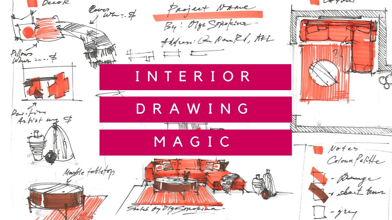
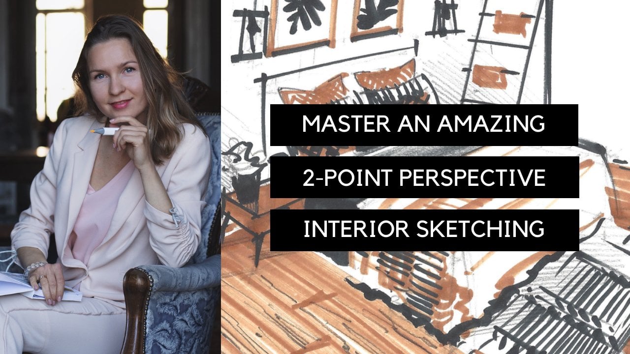
1. ✏️Intro: Hello and welcome to my new class. Interior drawing made tick here, UN-HABITAT sheriff here may best interior drawing Thebes practices and experience. And of course, we will dive deep into secrets of a one-point perspective and Margo sketch techniques basics. So who's this class for? It is perfect for interior design architecture students, as well as interior designers and architects who want to refresh up level their perspective drawing skills. This class is suitable for complete beginners in interior sketching and perspective drawing as well. You will learn here how to make agreed to scale for frontal view of an interior. How to quickly draw interiors in a one-point perspective. With the use of this grid, you will learn how to work with it furniture loud and how to draw with markers. And I've got it, how to make a beautiful presentation of your project. So in a nutshell, in this one hour class, I will cover the basics of a one-point perspective. The simplest and one of the most important for interior designers and architects and your class project will be to draw an interior sketch to scale by using the one-point perspective principles. I will show you step-by-step how to accomplish it by first introducing you to one of the methods ability for one-point perspective grid. And next, by making a pencil drawing of a stylish living Chrome with an orange cell phone. And finally, a quick Marco technique to colored, but for very limited demand of colors, Actually, I'll use just three colors of miraculous plus nu that claim. So as far as the materials for the class, you will need a pencil and eraser, Bruner and blood liner, a couple of markers, two sheets of A4 format paper. Already excited without further ado. Let's begin. I'm all this iraq, Anna, and new. Welcome to my class. Interior drawing.
2. ✏️Drawing a Grid for Frontal View: the Secret Behind Quick Interior Sketch: Hello Ahmadiyya creative. In this tutorial, we will be dealing with a greed for one-point perspective. You can download this as a PDF file below this video. And in terms of the materials, all you'll need is an A4 piece of paper, areolar, a pencil, and a black liner. Let's begin by locating common piece of paper horizontally and approximately here to the center, but slightly to the left. We will place our back wall. So we take our ruler and we put ten centimeters from the loved border of our piece of paper. So ten centimeters, and that's good. One mark and second mark to make sure that our vertical line will be nice and straight and will be strictly parallel to the border of the piece of paper. Next we're going to show two horizontal lines, the bottom line, the floor line, and the ceiling climb. So for this, we'll take our ruler, place it vertically, and take seven centimeters from the bottom border of the paper. So let's again make two marks. So this will give us nice and straight horizontal line, which is strictly parallel to the bottom of our piece of paper. For this frontal view, we are working with first scale, one to 50, which means that one meter in reality, he calls two centimeters on paper. So let us assume that the width of powder rooms going to be three meters. So we should put six centimeters, sell three times. We put two centimeters, right? And then we simply show this nice her articles. And right after that, we are going to show the hide a power interior. But first let's check if everything is correct with the width. Because there's greed is going to be really important for our future drawing. So we want to double check our ink at this first essential states. Let's make everything simple and assume that the height of fall interior is also three meters, which will be six centimeters on paper. Remember Alice scale of one to 50. Actually we will show two heights for the interior. But later on that for now we're focusing on three meters high ceiling. And let's complete these back wall. It's always great to double check all the big hides. And let's take these hides from left side and put them to the right. And after that, all we need to do is to draw three horizontal lines. And this is wonderful because now we have a beautiful, beautiful greed. For the back wall. So as you can see, we have three meter high ceilings, are interior is three meters wide and our backhaul consists of nine squares. Each of them is one meter wide, one meter long. Wonderful. Now it's time to locate the horizon line. Normally, the height of the horizon line is at the level of approximately one meter of 50 centimeters. This is the most average I level. So let's put it to scale. So in our case it's going to be three centimeters from the bottom line. And draw and nice, the long horizontal line which represents the horizon or eye level. Now we can locate the vanishing point. So we can take one centimeter and six millimeters from the left vertical line and food our vanishing point. So as you can see, our vanishing point is slightly closer to the left corner, which means that our ride wall will open more. And now all we need to do is to draw four lines starting from the vanishing point and running through the corners of the back wall. And great, now we can see side walls, the ceiling, and the floor as well as a backhaul. And now let's show the greed on the floor. So we'll continue using our vanishing point. And we simply want to draw nice, starting from eight and running down through our meter marks. Now we will do a little trick. We will lead in halves or meters. So now we can see that we divide each meter into two parts. Each one is 50 centimeters. And now we add some extra lines starting from the vanishing point. Why do we want to do it? We need it in order to show the depth in this case. Well, there are several different methods of how you can show that depth of the space. But in all of them, there is a secret point, the distance point, which we located on the horizon line. And there are different methods available of how you can locate this point. So here I will explain one of the math. So we take the distance from the viewpoint. So in this case, let's assume that we are tending four meters fast from the back wall. So we want to take this four meters to scale and place this distance on the horizons starting from the vanishing point. So we place, in our case, eight centimeters starting from the vanishing point to the right. And this is how we find the point D. Next, we connect the distance point with the bottom right corner of our backfill. And now you can see that There are some intersections that appear with these lines starting from the vanishing point we did previously. And this intersections, they are so helpful because they help us to define metres in depth. So all we want to do now is to draw four horizontal lines through these intersections. Please make sure that your horizontal lines parallel to each other and parallel to the horizon line, line three and the final fourth line. Remember that the distance from viewpoint, in our case is four meters. And it's really important that these lines are strictly parallel to each other. For this purposes, I will double-check everything and I will rotate my piece of paper vertically. And by using a ruler, I will check the distance from the bottom line of the back wall. And I will check if the segments, because it's really important since this is agreed for frontal view that we will use a lot. And it's really important that everything is nice and parallel here. Now, take a look at it because thanks to these lines and intersections here with the lines of the walls where we can continue drawing of greed. But now on the side walls. So it's really simple. All we need to do is to draw a bunch of vertical lines. Starting from the intersections of these new horizontal lines. We, the line of the wall which is running to the vanishing point. And this is so interesting, we can even do it agreed on. See who wanted to be three meters high. But since this is greed and we can use it as a template for future drawings. I went to make it a little bit divers to give you more options. So let's say that you want to draw an interior which is maybe four meters high ceiling. For these purposes, I'm going to add an extra meter to the back wall. But for now as it can see, I'm finishing my vertical lines. It not it's not necessary to draw them up to the very end of the ceiling if you just want to have an impression of where exactly they are. And as I promised, I add an extra meter. Let us assume that maybe in future we will work with an interior which is four meters hides. Pretty unusual, but it's really interesting and you can meet this type of sitting in Loft interiors, for example. We can even add 2.5 meter high CD, which is read irregular. I will show it with the dotted line. So we simply take two meters. And on the third square, we split it in half. And this is how we get this very regular ceiling height for the majority of the Interior is 2.5 meters high sitting. So note that the height is not restricted, afraid you can make it the height you want, the height you need. Let's continue to show this. Height. On the side walls is 2.5 meter. Hide. And always remember please, that's instances frontal view. So we have only one and only vanishing points and all the lines will be running down or up to these point, right? So for this purposes, I will even continue these lines. So they hate the vanishing point in order to make everything more visual for you on this and greed. And even though the frontal perspective, they one-point perspective is the easiest type of perspective since there is only one vanishing point that we need to keep in mind to focus on. It's very often then beginners and sketching tend to forget about this point and forget to draw all the lines into it. So lead very, very busy shell. Maybe you want to add some greed on the ceilings. So in this example, I continue working with our ceiling, which is four meters high. So again, we can use our vanishing point in order to see this meters on the ceiling. Now let's add some more markers. Biomarkers CE mean these dotted lines which indicate Haidt's. So very often we can see tables, office tables that any table tops. And normally the high deferred is approximately 60 to 70 centimeters. So to scale, it is approximately one centimeter, five millimeters. So let's put it on our back. And it's really very, very helpful if you can see these markers. It helps you to imagine your interior even quicker in your mind. So first I did a horizontal line though decline, and now I continue using my vanishing point in order to show this marker on this side walls. Another important molecule, height we want to introduce is the height of the cell phones, of the chairs, right? So it is the height of the city and it can range from 40 to 50 centimeters. But here, let's show it at the height of eight millimeters, starting from the bottom line of our back wall. So it's approximately 40 to 45 centimeters in reality. So in my opinion, this molecule. These dotted horizontal lines are extremely useful in interior sketching. So remember studying from the bottom, they indicate the height of a chair or a bank or so far than that of table top. The top marker, remember, it indicates 2.5 meters standard tide of sealing. And my congratulations, we are done with a pencil drawing of our grid. So for now, the lines are predicts theme in pencil so they don't really show up under tracing paper of 60 or 70 Brom. Basically meter marker paper, mercury paths and we really want to make them thicker. I'll be using for my copy pointed to lie under black color and thickness is 0.5. You can use something similar like like Kleiner or it can be even black marker. It can be even black individual PAL, it's very, very normal. The idea is to make the good read the lines of the Greek thicker so we can use it. So we can use this greed by means of a scanner and printer. Oh, for the copy. And the lines will be thick enough so they can show up under the tracing paper. Another benefit of making this aligns in black color and thicker is that they will not fade out. All smite was encased with regular pencil lines, which may be if you, you know, if you use an eraser, it can quickly erase all the pencil lines, but it can't erase binds created by lacking Japan and black marker some, any permanent lines. So this greed that year, we'll accomplish it can serve you for many, many years. You can even scan and make a photocopy or you can copy it several times. And please remember that you can download this can of this drawing femto in Christ. Now, below this video lasts and you can download it as a PDF file and print it and photocopied. Wonderful. So we are almost done with this tutorial. The very last things we want to do is to finish all these vertical lines. So it's always a little bit quicker if you do all the vertical lines in one go or for example, all the horizontal lines in one goals for your batting. And he assessment time by not rotating your ruler horizontally, vertically. Alright. So final theme is, they forget to show this verticles on the sidewalls. And as you can see, it's okay to just show the basic directions known to draw them until the very end, until they hit the ceiling. It's OK just to show that they exist. The very final things we want to do is to, of course surely horizon line and to put a name on our great, so we will call it the greed for frontal view. And integral will be so useful for our future drawings in 1 perspective. It will save us so much time. And actually in one of the next tutorials, build patrol, wink and interior with an orange soft vine one-point perspective by using this greed and showed that scan of this tutorial in a second. So we, as you can see, we just did our horizon line we showed for D. And finally, we proved a name for our reheat. Let's call it agreed for frontal here. And it's always a great idea to put your name. And of course, as you can see you think by around name greed for frontal view, August sara cannot create. Now it's really interesting moment because they take a piece of paper and we take look of homage batter this nice and bold black lines we can see through. And that's exactly what we need for our next class sense. Where are we going to indeed throwing this beautiful interior week, orange so far. So I country decile the. Alright, so that's it for this lesson. My congratulations, we've completing this tutorial. You mustard, building agreed for frontal view and great job senior. Very, very soon. Bye for now.
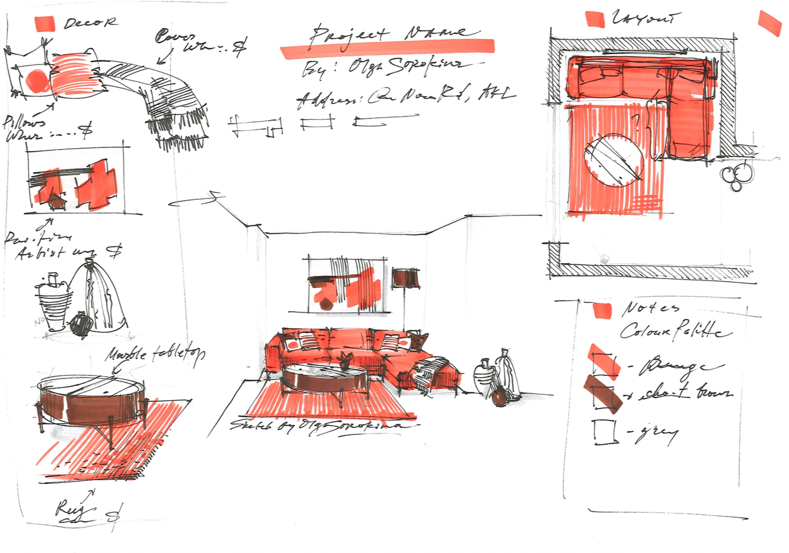
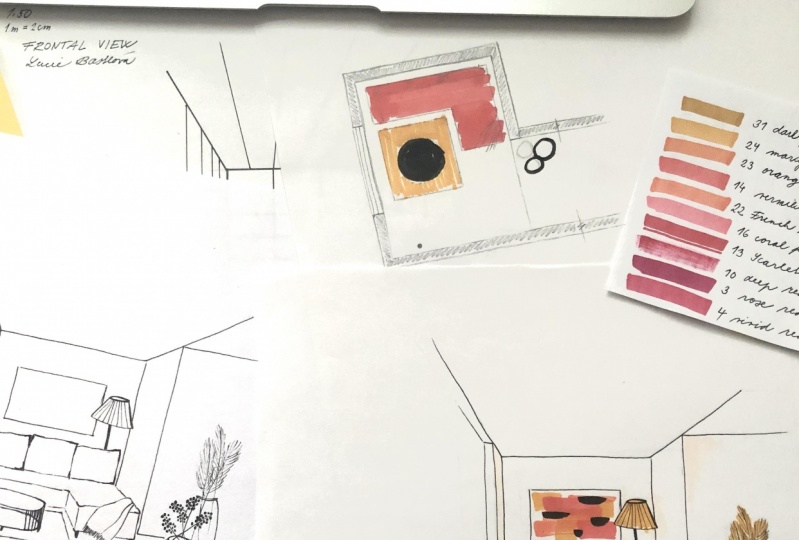
3. ✏️Using the Grid for the Sketch: Pencil Drawing: Hello, my dear creative at solvers that are coming here and welcome to this tutorial where we will be drawing out when false gauge of an interior in one-point perspective. This lesson will consist of two parts. In this part, we will be drawing perspective and drawing all the furniture. And as in terms of the materials, all you will need is a new piece of A4 paper and pencil and black Kleiner and our greed from the previous lesson. Alright, so let's get started. We will be drawing computable orange interior here in one-point perspective. And we will be using our greed for frontal view that we already did in one of our previous tutorials. So please prepare a new piece, self molecule of paper, A4 format. This is the preliminary sketch that I was doing before starting this lesson. So let's get started. The very first thing we wanted to check if we're drawing from the right side of marker paper on not because on the wrong side your marker will smite. Then we combine two pieces of paper together. The one with the grid and new, fresh piece of paper. So as you can see, Mercury PPAD has such beautiful qualities as transparency. So we can see through our greed and it will really help us to build our interior, the geometry of how interior faster. You might want to use a clip or tape to fix your 24 pieces of paper. But Allenby drawing collect that. We began with a back wall. In this case, it's going to be three meters wide and the height of the ceiling is 2.5 meters. Probably you might want to use a ruler. It's a key. You can use it if you want to. But I always recommend to train your hand. Plus we can see through these nice and straight lines self, our greed. So I do recommend that you make all this lines freehand plus it who give such a beautiful quality of frequent skate to your final drawing. At the end you will see that thanks to free hams, getting, your drawing will look more lively, more thrash compared to draw wink way you use the ruler. So as you can see, we just build the geometry of our rooms. I showed the sidewalls by simply drawing convergence mines which converge to our one and only vanishing point. Okay, now let's define the composition of this A4 format because we also want to include the layout plan, as you can see here. So we'll put it in the top right corner. And again, we'll be using our greed because there we can see this nice and clean squares. So our room is three meters wide, remember, our back wall. And it will be four meters long. And it's really very important to see this connection between our perspective drawing. And layout plan of this particular room. Because by doing that, you can see how you locate yourself in this space. And how do you perceive this space through the perspective drawing? So we have this nice orange. Sulfur is going to be orange very soon. Next to the back wall in front of it. Let's say that we will have fact carpet and nice marble coffee table, which will be represented like a circle on the layout. But on our perspective drawing it will look like a cylinder forum. For now, I want to show this corner. Maybe it led to the corridor. And we really want to show the thickness of the walls on our layout plan. Because it helps to perceive this layout, to see where are the walls, barriers this piece, or is it furniture? We can make this walls four or five millimeters wide. Please notice that we add this thickness to the outside of the wall. So we draw outside, not the inside of our space. Here we can crop the walls by showing a zigzag lines. And let's say that we have three beautiful ceramic vases show with three circles and to the window. So windows, except for French windows, are usually shown by two perpendicular lines on the wall, which we already have. Our showing, the reached there itself, the ledge. And I show two long lines for the window glass itself. Wonderful. Well, later on, or we can add some hedging to the walls in order for the viewer to read our layout plan better. But for now we will locate the viewer itself. So here we are standing guard watching at this interior. So we are gazing at these wall and we have angle off for you in books, it's described something between 6090 degrees wide. So this vanishing point that we have, it refers to our position in space. Maybe for you, it will be easy to imagine that we have a laser beam coming card from our forehead. And the end of this laser beam is pointing right on this back wall. At this point, the vanishing point. Great, it's time to define some major elements like windows and wool corners. So let's begin with the window. As you can see, we have one meter from the back wall and our window of stance here. So thanks to our greed, we can show it really quickly. And then we show the thickness of the wall. In my case, it's four. Millimeters. And then I continue wave adding some convergence lines, I guess are we are done with their window and now it's time to show this corner here. According to the plan. It's tied to the second meter starting from the back wall. So again, we can see through our greed within quickly defined where the second heater 0s. And this is how we show this vertical line of the corner and continue with the two horizontal lines. In order to show this beginning Kafir corridor, we erase all the unnecessary lines. And now when the geometry of space is done with switching to. So first, we can show the projection of our self on the plot. As you can see, it's tense right next to the back wall. And there is little space between the wall and the self itself. So it takes all this pace from left side to the right side also we let a little bit of space and as you can see, it ends where the windows targets cell. Let's mark it. And I'll for and Gary here, the left part takes almost two meters and then we see the angle. So again, remember to use our vanishing point and finish this line of this sofa with nice horizontal line and the protection is done. So the next part is fun part because we'll be dealing with the height of this sulfur. So first, I want to draw short vertical lines from all the corners of our projection. And remember, we did these marks on the wall which indicates the height, regular height of furniture. So I show it here is nice horizontal line and right now I need your full attention. So this is the mark on the back wall. And since our sulfur stance a little bit far away, a couple of centimeters away from the wall. It will affect the height of the sulfur because it's in perspective. So we draw a vertical line. We already did a vertical line of the back of the wall. And now we want to improve your lines starting from the vanishing point and connect the mark of the height and the back wall with the actual hides, this little verticals of our sofa. And one lane, as you can see, leads to the other. One entails the other. So now we are accomplishing this box off the sofa while working Griffith sad of horizontal lines, vertical lines, and converging clients which run to the vanishing point. And this converging clients, they aren't the lines which are perpendicular to the back wall. Alright, so now we can erase some unnecessary lines to clean up our drawing a little bit. Wonderful. So the sitting carrier, the box of the basement of our sulfur is done. Switching to the carpet. Again, we'll be working with the converging lines. So take a look at how loud plan fleas. And as you can see, this nice carpet, square form. So it's ten stars next to the surface or around the area of the window. And it finishes one meter before. So it's like three meters far away from the back wall. We find this three meters mark. We use our greed, of course. And the next thing we want to do is to draw two diagonals in this square form of a comfort. Because this will give us the center at the very center of the carpet. And this is how we can locate our coffee table. So it's a K to draw by the width of our coffee table. We enroll wink rectangles, crab forum in perspective right now. And up to that, we draw a Beautiful circle. In perspective. It looks like an ellipse. So let me show it to you in a little bit bigger scale here to the left. First, we draw a form, square form in perspective. Next step, two diagonals, intersection of diagonals to lines. One is horizontal, the other one is running up to the vanishing point. And when we have these additional lines and marks, we can draw in this nice little Alice. And I can say that very, very soon you will be so familiar with all this Sarah Gulf, and he'll be able to draw them by hand. Okay. Back to our Greet. Do you remember we did this mark line for the height of the city, including, say, the tunnel coffee table has the same height. We find this mark on the sidewall. So starting from the corner or in line from the vanishing point, then we've prolonged these horizontal line on the table until it hits the fluorine line. And then we draw a vertical line until it hits the hide of the coffee table, slash sulfur in perspective. Let me show it to you. I'm a time and a little bit slow motion. So we find this mark on our back wall and we draw a line starting from our vanishing point to indicate the height on the sidewall. Next step, we prolong this horizontal line from the center of your table. And when it hits the line of the fluorine Karen, we draw a vertical line until it hits this height of the table slash sulfur on this side wall. That back to our coffee table now it's time to draw its top. So for these purposes, we extend this line. So we draw four vertical lines from the corners of the projection of this coffee table on the floor and the conquered. And maybe let's assume that it's tabletop little bit. Why Dam, but we will see in future drawing an ellipse forum according to the same principle we did the bottom ellipse, but here please make a mental note that the top clubs opens a little bit less so it's a little bit narrower because at it's closer to the horizon line back to sulfur. So we have a box for it sitting area and now it's time to show the hide of back. Again, we can refer to our read. Remember we did this mark which indicates the regular hides of the furniture like an office table told dining table top. And also it's quite regularly for the heights of the self backs. I think for this sulfide design, it will be at slightly below where it's also a good idea to start focusing more on the details at this stage when the basic forms, the basic boxes and elements for our main orbiter already made. So you can see focusing now on the side handle's. It's also time to show the back of this. So far as it can notice, I'm making all my corners more rounded now. I tried to avoid this rigidity of the boxes. I add, oh, feeling of selfishness. Since this is furniture, we want to feel comfortable here, right? I really love the stage of drawing, even though maybe you already know that my absolute favorite firms is the final part, the very end where we add some details and accents. But here I really loved that we already have some boxes in place. We already mastered some proportions and perspective. So we can just enjoy editing and specifying our drawing. For example, this back part of the sulfite converts three seated cellphones. So I divide the length into three parts. Maxed who can add some picture hanging on the wall and a floor lamp. By the way, it will be important to tell you now what I noticed. So some unconvincing 300 drawings usually have two main weaknesses. So number one is usually deficiency in perspective knowledge. So here we deal with that by having agreed. And number two is deficiency in proportion. And here we addressed this very common weakness. Oh, we've already predefined square meters now, agreed. So it's really hard here to make mistakes in terms of proportions. Again, we continue perfecting our ometer and add in some new ions. Let's say here we have a set of three vases. So let's quickly sketch them. By the way, freehand draw wings, particularly useful for initial presentation. When it's more important to get insight into a client's preferences. And developmental sketches. Preliminary sketches retains so much energy. And I think that's the main reason why they're so near to my heart break now we will be adding some lags to the soft far and to goanna. Soften all the corners of the soul for cell. It will look, even in pencil. It will look like it's a fabric remembered to use our vanishing points or all these fines, they are running to the vanishing point. So back to the types of presentations that I've already started. As you can see, we are drawing here the quite small piece of paper, right? So it's not a3. And I really recommend you to draw your first sketch at small or normal scale. Scale. So it can be a full format like we're doing right now. And you can place in this A4 format, not only this cage about the land plants and details, I'll show it to you later. Or for your initials case, it can be even a 5-4 A6 page, even since large formats that say A3, they require so much more detail and really credible perspective. And it's not a good practice to draw lodge in the first instance, rate back to our coffee table and perfecting all these ellipses. And please remember to avoid number one mistake in drawing the ellipsis. It's when you make the corners of the ellipse very, very rigid. So they should be like a nice little curves. Alright, so maybe adding some lags to this coffee table. And now we will be erasing some unnecessary lines. So you can use very soft eraser because even see-through some basic construction, you can still see this construction lines. So I'm erasing. My pressure is really very light. And right now we will introduce our black liner. So please don't be afraid that it might look like we erased all the construction lines is okay because we can still see through some basic construction that we did. And we will add some nice, precise lines with a lag cleaner. At this point, we even don't need our GREP so we can. Take it off. So they claim there isn't places in our hand. And do this. Because if you put your blade Kleiner on top of your regular pencil, it's a K. But pencils, their lines can smite. And here in this tutorial, I really want to create a very nice, clean and Crisps cage. So that's why we erased the majority of fancy lines here. If you like the design of this table, you're welcome to draw the same cup table as I'm drawing great now. But if you want to introduce another design, very welcome to maybe find some inspiration on Pinterest and draw in the coffee table you absolutely love. When default we're switching, tear ourselves. As you can see, first of all, I'm focusing on the frontal part of the sulphur and on its corners. So I do this nice and soft corners. Philos, I went to enlivened my sketch. That's fine. I'm adding this beautiful confirm this cloud. It adds so much softness and call centers conferred to the interior. Nags stem switching to itself as peels. Please take a look, noticed the technique I'm using here. So I'm focusing, first of all, on the corners of the fields. So it's not necessarily an interior escapes to draw an entire hour climb for the object. It's the key to focus on its edges, for example. And it's really wonderful, isn't it? Since we know the proportions of failed jokes, we already have this preliminary line made in pencil, and now we can quickly go over and emphasize the most important parts of the objects and make our sketch really very bold. Because in my opinion, black lay there. It makes your drawing very recognizable, very bold. By the way, we are almost done with this part of the last sense. So all we need to do now is to finish the lines for the walls for the corporate and to add this three forces to make them in black liner. By the way, when we will be done with this stage of our draw week, ugly liner drawing. I recommend you to scan it. And so you have this can of initial drawing may be your and try and future some other color palette that we will be using in the second part of this drawing. By the way, in general, for presentation purposes and command you to scan and not photocopy of sketches. Since in my opinion, computers can encrypt, produces more accurately the quality of line, the torn in color and texture of your drawing. So final minute of part one. By the way, the second part will also take approximately 15 to 20 minutes to accomplish. So, be prepared for the second part. And I'm adding some final lines. I'm doing them freehand eminent, using your ruler because it's really a wonderful exercise to train your hand. Please always keep in mind our wine and undef vanishing point for the one-point perspective, for the frontal perspective. Because freehand lines, they add so much liveliness to your drawing. And finally, I'm adding these vases. So let me remind you to please scan your drawings at this stage, or at least make a photocopier or afford healthier drawing. Because in the next part we're going to be coloring, skate and then country. In part to please prepare your material.
4. ✏️Colouring the Sketch and Presentation Tips: a Quick marker Technique : Hello and welcome to part two of your tutorial where we are going to work with color and composition of your interior sketch with orange sulfur. As you remember in part one, we did a prospective of this interior by using greed. And here we will need a couple of markers. So for example, I'm using orange marker of gray marker, chalkboard one. And of course we'll need again black liner without further delay. Let's begin. Ok, so today we start with the brightest color in our color for lad, and it's amazing, orange, beautiful color. Even though you will notice in my future tutorials here that I really love to start with the lightest color in tones, and step-by-step, adding more and more darker and brighter tones. But today, our focus is on this really bright Carlos Kim. I went to begin with this orange color. Right now, I'm using the brush NAEP of the molecule in order to show this softness of the sulfa. And now I just opened the chisel NAEP to show the nice outline around the table because rationing it gives, gives you two soft lines. So sometimes when you need to make an outline, it's better to use to sell nibble. Also, I'll be using this and chisel need to show this abstract painting on the wall. Plus, I'll do this converging lines on the rock, which of course run up there, the vanishing point. So as you can see, I'm playing with the needs of the Mercury. It's really great to irritate your mercury in your hand in order to achieve different. Most of the lines. Plus you can retake the piece of paper, how allied feels more comfortable for you to create nice, beautiful straight lines. Right now it's sent introduce our second color, which is great. So we have our light source coming from the window, from the loved, which means that all our drop shadows, we'll drop to the right and they will happen. And under the objects, that's why I'm showing this shadows below the self far and under the table. As you can see, I'm using, again brush NAEP, cell specific and really good that make this shadows and quite solved because rigid edges of the shadow will appear only if it's afternoon bright. Some may be some way in Italy or in Spain. And to interior escapes its bad to teachers. Very soft shadows, very light in shade. As you can see now, I am kind of spreading the color throughout to draw week I edit to the corners of the walls. In particular the upper part of the walls. Because if you will. Take a look at your interior where you're sitting right now. In case you have white walls, are really light colored walls. You will see that the closer the tone off the wall to the ceiling, and the darker it appear it happens because our light is coming from the window and the majority of light comes in particular to the flooring area and the ceiling. It's kinda upper plane of the box, so normally its darkest in tone. And the closer your wall to their flooring, the lighted appears and the calls that you're wall to deceiving the docket will look good now as he can not. We added gray color to the table tone to the painting. We showed it on the vases. And we made some drop shadows, grade. It's time to switch to our darkest color, which is beautiful chocolate drown. Notice that I'm using, it's chisel NAEP, and it is one of my favorite tips for lively, energetic interior scapes to combine different types of NAEP. One dropping. So as you noticed, we used here brush NAEP and also used here chisel NAEP, all-in-one dropping. Can I rotated my chisel NAEP in order to achieve either white lines as you can see on the backside of our table, coffee table. And when I rotate it in my hand, I can make a really nice thin lines as for example, we did with our orange color on the carpet. Probably it's one of the reasons why professional markers, Sony and dear to my heart, threat architectural hard. Because if you can play with its Neves, so one marker, two different nibs usually brush NAEP and chisel nib or the NAEP and chisel need. And you can retain it in your head. You can achieve. So maybe in different kind of lines, thick, bold, wide, region, Berry solved. In order to render textures. I love it about markers. Meanwhile, I switch my black until I ne'er, from Capex, its thickness, its 0.5. it's one of my favorites, and I call that Kleiner's The King of interior sketching because they add some mice precised. They add this feeling of final touch to this cage. And it's actually my favorite stage in sketching, where we details and making some accents. Basically in this final stage, we are fine tuning our drawing. Alright, so now I will sweet gained my red marker from Tim bold because I went to add some extra shadows, for example, from the painting. So we can see that it's not like a piece of paper on the wall that this frame, this picture, it has some thickness and it will create. Very small shadow. Again said, it's also a good idea to add some refraction to the table to say that there is refraction. It's happening from bees loved Intel bars. And now I'll be switching again my black liner and our create short vertical lines in order to show the shadow part of the sulfur. So the lightest part of the sulfide is the part where the majority of light comes cell sitting carrier, right? So we want to differentiate these different planes of this sulfur. So the horizontal planes we'll get the majority of flight and the vertical planes, they will be a little bit dark I into one. Plus hating. It always enrich the entire loop of your sketch. So it's another little tips and some hedging regarding black Kleiner's. I always recommend to my students to use permanent waterproof liner is multimillionaires, since sometimes we want to add some extra color on top of the liner. So in order it not much, it's better to use permanent or waterproof liner. For example, if you use black ink, child pan, it's possible that it will smite if you put some color on top of it. Wonderful. For now we are done with coloring and we'll speech to coloring, layout plan. They can look in total. It took us only eight to ten minutes to color our drawling calculus that, and yes, we will come back to our sketch to fine tune it. But for now, let's leave it for awhile and sweet to coloring allowed. The very first thing we're gonna do is we're going to define our walls backend. For this purposes. Let's make an outline of the walls and then make some hedging. We will do some dab and all hedging at 45 degrees. And goal. It's considered to be like classical type of hedging for the walls. And it will give us this fitting that our walls, they pop up a little bit from our drawing so we can better focus on the furniture. Right after we are done with the walls, we are switching to, let's say coffee table first. Let's do this three little circles for the buses, and then proceed with our protagonist tell with our beautiful orange. So far, as you can see, I really love to focus first on the edges because it saves you some time. And then for the same time, you can clearly see the outline of the furniture object. And then I'm taking my vid felt orange marker. I'm using his own NAEP and filling in this outline and it's a K. If you let some whitespaces B, that's totally fine because remember, this is sketching. And I really love work in parallel. So while this marker is in my hands, I take a quick look at the sketch and I'm thinking, what can I add here? Maybe some gradation in orange tone on this so far. So the planes can be seen defined better. So I switched from time to time from the layout plan to the sketch. After that, I met in vertical lines for the rocks pattern. So remember that we and our client will perceive our drawing in total. So this k to the layout plan and later I'll show you how to add some nodes and Decker details on the sides of our composition. So this is like a little logistics of our sketching process. So we're switching from their plan to these cage itself. As you can see, I added picture hanging on the bowl. And now we will be focusing on the notes section. So here in the notes section, you can actually include everything you want. For now as an example, I'll be using color palette. So I'll show three squares and I'll fill in. We've colors that I'm using here. I think this color planted all within reach the entire load of composition. What could we include here? For example, exact numbers of markers, exact colors of the markers, or exact colors of paint for the wolves in this interior. Or special number four, the fabric design here. So it's like plenty, plenty of things to include in the nodes. So this was knowledge section, this is layout section. And finally, we'll have a Decker section, every allotment. Because here you can see in slightly more details some of their objects or all of the objects that we've, as interior designers decided to include in the design of this space. For example, here it can be pillows and converse. It can be this painting hanging on the wall. This can be vases and table. Plus. It's a great opportunity to sketch textures. For example, sketch on my time some objects that are really important in this interior design. We could also include here prices for these particular objects or website around. We're going to order them online. Or some actual design of furniture stores and warehouses, which you're going to visit with your client. Plus this Dekker section a, it gives. More complete look to this presentation, even though in total, it will take us about 40 to 45 minutes to accomplish the entire sketch. So the first part here, remember, we did the perspective drawing for this interior and took us about 20 minutes. This bond is also about 20 minutes long. So you can see how in 40 minutes, under one hour, we can make a beautiful, beautiful little presentation for a client. And not only include now some quips cage, but also includes some details and side nodes and explanations. As for the painting, we can include not only the price for it by adults, self goes the artist, the dimensions for it. So all of this gives his beautiful final touch to our presentation. And even if you want to focus just on the perspective drawing, on the interior escape as an exploratory drawing. Just remember that of course, every project begins with an idea which must be defined and redefined during the sketching process. So right now, we can say that we are refining our idea and jump off the very first drawings. Of course. The first is to simply record ideas, to examine ideas, to communicate ideas to clients, of course. And maybe even to describe an atmosphere in general of this interior style. To capture the essence of the idea or interior motif. Okay, here, I think it's a really great idea to include some colors as well. In case with a coffee table, I don't know if you've been following the same gov table design that I used for this sketch. Or maybe you've found your inspiration on Pinterest. So make a drawing of a coffee table you've chosen here as well. Well, we can add some little orange squares for this sections like Decker notes layout. And of course, we will add name of our project. You can include here address of the project you can include. Please do your name, maybe your client's name. Because as you can see, we have plenty of space above our cage. So of course, we want to fill in this space with some beautiful mods and with the name of the project. And finally, what I always recommend to my students to do when they think that they accomplished their drawing is to have a little tea break or coffee break on gold for short, 10-15 minutes walk, and then come back to the drawing, rotated because these gear will give you the effect of fresh I, you will see what you want to maybe add to your schedule. So in general, it's a great opportunity to have a fresh look at your drawing. And my congratulations, media creative because we are done with this lesson. Let me remind you what we've done already. We did a perspective drawing in part one. We used black layer for details. And in this part we worked with coloring and with composition. So my congratulations with a great job you did and I'll see you very soon.
 Olga Sorokina, Artist, book author, teacher