Transcripts
1. Introduction: Surface pattern design is one of the most popular creative
career options today. With the help of design programs
like Adobe Illustrator, Photoshop, Procreate and more. You can create
repeating patterns at home and license them to
companies around the world. You can even
earn commissions by selling them on print on demand
sites like Spoonflower. Hi everyone. I'm Geetanjali, an artist, illustrator and surface
pattern designer. and Thangka painter based in goa the beautiful
southwestern coast of India. As a self-taught surface
pattern designer, I tend to experiment a lot with my technical skills to get the best results in the
smartest way possible. Even though I'm a tech geek, I love traditional
mediums equally. And that is why you will see a wide range of
style in my artwork. I started my surface
pattern journey in 2016, when I found Spoonflower, a print-on-demand company
that sells fabric, wallpaper, and home decor. Today, I have over 1,400
designs in my shop. And I have also licensed
my prints to companies. This course is going to
be a series of classes, starting with the basics of
surface pattern design and slowly moving on to creating
simple to complex patterns. And finally, how to
customize your own workflow. This class is suitable
for all skill levels. However, some basic knowledge of surface pattern
design is helpful. I'm really excited to work
on this project with you. So let's get started.
2. My Journey & Class Overview: Hi everyone. I'm Geetanjali And I welcome you to my class a little bit about me before we move into the course, in 2011 I completed my graduation in fashion design and started
working at a retail company. But I guess I was always drawn towards the art and
painting career. So I quit my job and
I started freelancing through websites like
people per hour and upwork. As a fashion illustrator, I designed technical drawings, line sheets, illustrations, and sometimes wall art
and graphics. These projects really
helped me hone my Illustrator and
Photoshop skills. I also got the opportunity to work on a lot of coloring pages. And in 2020, I got my own book, mindful and meditative
coloring published. It was a dream come true. As I always wanted
to do painting, I started learning, buddhist thangka painting in 2015, last but not the least, in 2016, I got to know about
Spoonflower while watching an online video and started participating
in the challenges. And that's how my surface
pattern journey started. Today, I have over 1,400
designs in my shop, licensed some of my
prints to customers. And I've also been featured
a few times on their blog. I'm a tech geek and
during all these years, I have developed
a unique workflow for my surface design process. I decided to create
this class so I could share my knowledge
and tips with you all. Before we begin, I
would like to talk a little about what you can
expect from this class. As I mentioned earlier, that this is the first
class in the series. And it's all about the basics
of surface pattern design. We will learn what is
surface pattern design? The different file formats, size, resolution,
and color modes. Then we learn different types of layouts and the ten most
commonly used repeats. Next, we will see what is a building block and
a pattern swatch. Then we'll move on
to understanding the pattern options
tool in Illustrator. The final two lessons are about the different repeat options and the uploading
process in Spoonflower. By the end of this class, you will have a better
understanding of patterns. You will be able to create
repeats in multiple ways. Whether simple or complex. You will also be able to set up your own Spoonflower shop and start your print
on demand journey. If you're as excited as I am, grab your favorite
cup of tea or coffee, and I'll see you in the next lesson.
3. Class Project : Do you ever feel
intimidated by looking at other designers
work and wonder, how do you even start
creating something like this? Well, there is always a start. And to reach that level, you need to have a very
strong foundation. And this class is all about understanding the basics of
surface pattern design. For this project, you will
need the illustrator software. If you don't have it.
The link to free trial is included in your project
and resources section. We will create a simple
motif in illustrator. And then create multiple
repeat and layout options using that one motive and the pattern options
tool in Illustrator. Once you have completed
creating the patterns, you can upload them to the project gallery using
the templates provided. If you have any
questions or doubts, please feel free to drop them in the discussion box and I'll
be more than happy to help. I can't wait to see you get started on your
creative journey.
4. What is SPD or Surface Pattern Design?: Surface pattern design is
an artwork created either by hand or digitally
or a combination of both to be used
on the surface of an object or product to
enhance its visual appearance. This could be fabric,
wallpaper, home furnishing, stationary gift wrap, and a lot of other things
we see around us. Surface pattern designs
can be both stand alone or repeating patterns depending
on what the final goal is. In this class, we'll be focusing
on the repeat patterns, where we use a single
motif or a set of motifs and create
seamless repeat patterns. Today there are multiple
career opportunities for surface pattern designers. You can sell your
patterns online, license them to companies. You can do freelance projects
and commission work, print them on products
for your own business. You can sell digital
design assets, or you can even sell them on print-on-demand sites
and earn commissions. There are a lot of terms
that you will come across while learning
to design patterns. And here are a few to consider. Motifs are the individual
elements in a design. And all patterns are
made by combining either a single motif
or a set of motifs. Depending on the motifs
you chose to draw, the patents can be classified
into different themes. Geometric designs are made using basic geometric shapes
in a grid like format. Floral design is
made using flowers, nature, and other
botanical elements. Ditsy design is a small-scale
non-directional pattern made by using very tiny motifs. Conversational designs
are made using recognisable motifs that are fun and usually tell a story. They can feature anything
like animals, rockets, to chairs, novelty and children print are a
part of this category. Animal print includes
animal as the main motor. Nature prints, has
motifs that are inspired by nature
and its beauty. Historical patterns
include motifs inspired by history
an event or a period. Folk art patterns have motifs featuring popular folk
art culture and stories. Abstract patterns are made
using shapes and marks. Whereas, seasonal patterns have motifs featuring a certain
occasion or event. Apart from these, there
are various other themes, such as contemporary, which
represents the current trend. Toile de Jouy,
which is a type of conversational patterns
that depicts everyday life, usually illustrating a
colonial or country scene doodles are patterns including hand-drawn or scribbled motifs
that are fun to create. Also, we have
textures that can be used as a background
for another motif, like a floral, or they
can be used on their own. Similar to themes are styles. There are many different styles of pattern which represent a specific time period
or artistic expression. Some examples include art and craft movement, Art Nouveau, art deco, Bauhaus,
mid-century modern art, pop art And various ethnic
cultures like Islamic, Indian, Asian, African,
Japanese and more. Composition is putting
together and arranging all the motifs to create
a cohesive pattern. It is also the layout
of a pattern with a good balance of positive
and negative space. As you can see in this pattern, the motifs are placed
really close to each other, which results in showing
very little background. Hence, this design has
very less negative space. Whereas the next pattern shows a lot of negative space as the motifs are placed at a
good distance from each other, showing a lot of background. The next pattern shows alternate
packed and spaced areas as the motifs are
arranged in such a way that it shows similar
positive and negative space. While designing a collection, it is recommended to have a good balance of these
three compositions. So it gives an overall
balanced look. Color palette is a group of colors used together
in a design. Choosing the right colors
is very important, as it will give your design
a certain feeling or mood. Understanding the
color wheel is one of the basic steps that will help you choose an effective
color palette. The color wheel shows the
relationship between primary, secondary, and tertiary colors. The basic color
wheel has 12 colors, including primary, secondary,
and tertiary colors. Color harmony is the basic
color theory technique for combining colors. It is the art of combining colors in an aesthetically
pleasing way. Another thing we
need to consider this hue, tone and shade. As you can see in
this color wheel, this outer circle
includes the hue, which is pure color. The second layer is the tint, which is achieved by
mixing white to the hue. Then the next layer is tone, which is color
mixed with grey. And finally, to get the shade
of a color black is added. When you are picking
your palate, it's safest to
start with a set of colors which live in
the same neighborhood. On the tints, tones,
and shades scale. There are multiple models for choosing an effective
color palette. Here are a few to consider. Monochromatic model uses
a single color with varying shades and tints to produce a consistent
look and feel. Here is an example of
how it can be used. Next we have is the
analogous color scheme, which is formed by pairing
one main color with the two colors directly next
to it on the color wheel. Complementary color scheme
is based on the use of two colors that are directly across from each other
on the color wheel. Pattern collection is a group of patterns that are used together, including a main pattern, which is also called
Hero pattern, or the star of the show. And coordinating patterns
that can stand on their own or be used together with other patterns called
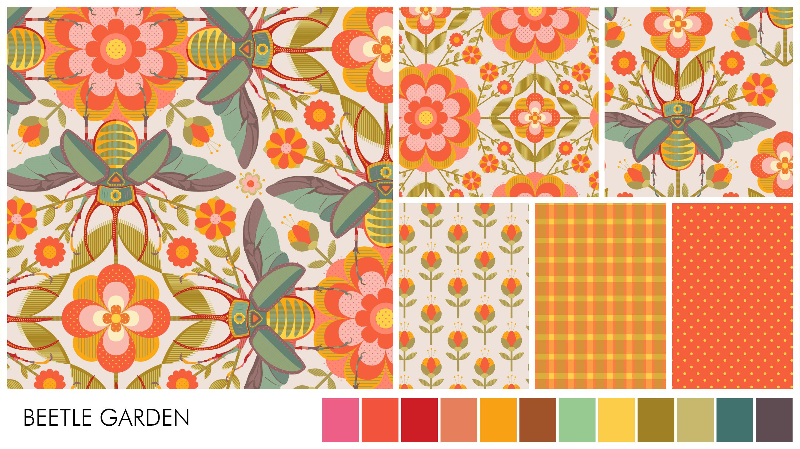
blenders in the collection. Here is one of my
pattern collections called beetle garden, using a warm and retro
inspired color palette. This is the hero pattern, which has the most
complex composition and uses all the colors
from the palette. Next, we have two coordinates that are little
less complex than the hero and uses some of the elements from
the Hero pattern. Finally, we have this simple
patterns called blenders, which hold everything
together and provides a good balance to
the overall collection. So to create a good pattern, start with choosing
a theme or style. Then create a good set of motifs that
represent the style. Spend some time on
the competition so that the pattern
looks cohesive. Then choose a harmonious
color palette. Make sure your pattern
is technically correct. And finally, create a beautiful collection
around your pattern. A quick recap of what we
have learned in this class. What is surface pattern design? How you can make a living as
a surface pattern designer? What our motives, pattern
themes, style, composition, color palette, color harmony,
and pattern collection. I hope you found this
information helpful. In the next lesson,
we will discuss about the different
file formats, document size and color modes.
5. File Formats, Document size, Resolution and Color modes: Broadly speaking, there are two kinds of artwork
in the digital world, raster and vector.
Raster artwork means that an image is made with
individual pixels, e.g. this pattern, when we
start zooming in, eventually we can see these
pixels and after a point, we start losing the details. so The biggest disadvantage of a raster image is that you cannot scale it up
after a certain point, or it will start looking pixelated. Photographs, scanned artwork
are all raster images. Whereas a vector artwork is a mathematical
representation of shapes. So when you zoom in, the image
still retains its quality. And you can always
change the size regardless of the
original artwork. Vector files need to be created using shapes
and anchor points, so which is the best file format
for surface pattern design. Well both have their
own properties and are designed to serve
different purposes. What is important is that both are acceptable
in the industry. So choose the program
depending on your style. Just make sure the final print ready file
should be high-res, as it will always be
exported as a raster file. If you'd like to
draw freehand style, use a lot of textures or
hand paint your motifs. Raster based
programs are ideal. If you like flat illustrations, graphic art illustrations with sharp edges and even rendering. Vector-based programs are best. Application on iPad
or tab with pencils gives the digital
experience that feels like you're
drawing on paper. But they have their
certain limitations, such as restricted
number of layers or file size due to the limited storage as compared
to the computer software. If you prefer raster format. Adobe Photoshop is the most commonly used
computer-based program, and procreate is the
common choice on iPad. These are also the ones that I use for my pattern
design process. Few other alternates are
GIMP and Coral painter. If you prefer Vector
Format, adobe Illustrator, Affinity Designer,
and Corel draw are the most commonly used
programs on computer. And affinity designer and Adobe fresco are the
preferred ones on iPads. I have been using
Adobe Illustrator for every single
pattern that I make. Because of the
pattern options tool Scale is an important aspect
of creating and presenting your surface
pattern designs. Some pattern elements
might look good as a small-scale or
extra small scale. Whereas some elements
will look good on large scales like
bedding and wallpaper. Now talking about the
document size and resolution, there is no such ideal size, but I would like to
add that it depends on the program that you are
using to create the pattern. If it is a vector file, you can always scale it up or down so you don't need
to worry about it. But if it is a raster file, you can scale it up to
only a certain size. After that, you will start
losing the quality. Resolution is the number of pixels in dimensions
of height and width. Resolution of 300 pixels per inch is the industry standard
for high-quality prints. Whether you design,
the artwork in Illustrator, photoshop, or any
other software. You have to export it
as a high res file in JPEG or PNG or other file
format for printing, uploading it on print
on demand site. Another thing that I keep
in mind while deciding the size, is the wallpaper
size setting on Spoonflower. Spoonflower prints
wallpaper rolls that are 24 inch wide at 150 dpi. If I want to offer my pattern as a large scale repeat
for wallpaper, my basic repeat swatch
needs to be 24 inch wide at 150 DPA or 12 " wide at 300 DPI. I prefer to keep
my document size at least 12 inch wide at 300 DPI and 24 inch
wide at 300 DPI. when I'm working on Photoshop, I would say anything
above 10 " at 300 DPI is a decent
size to start with. Unless it is a
ditsy or something specific that only
works at a small-scale. Next thing we need to
consider is the color mode. The two most common color modes that are used in pattern design, are RGB and CMYK. Rgb stands for red,
green, and blue. And this profile uses an additive process to produce
colors by blending light. It is the color scheme
for digital images and is used if the project is to
be displayed on any screen, such as LCD camera
scanner, etc. Rgb color scheme offers
the widest range of colors and hence preferred
in many computer softwares. Cmyk stands for cyan, magenta, yellow, and key,
which is also black. The CMYK model is a subtractive type that
combines the colors cyan, magenta, yellow, and black in different extents to
get different colors. It is the color model used
for projects including printed materials
like business cards, posters, flyers, etc. Cmyk has lesser
range of colors than RGB. Now Which one is best for
surface pattern design? Well, the answer is both. Many artists prefer using CMYK color mode and exporting
the final file as RGB. For web or digital
portfolio purposes. If you're designing for a
particular company or client, make sure to check for the final deliverable files
and their requirements. It also depends on the type of printing method and machine
that is going to be used. Today, we have high-quality
inkjet printer that can print really
bright and vibrant colors. So some print on demand sites will ask for the
RGB color profile. You can change the color mode of a file even after you
have created the pattern. So you can start with
whichever color mode you are comfortable with and change
it later if required. To change the color mode
of a file in Illustrator, go to File Document Color Mode and choose the required mode. If you wish to convert an RGB document to
CMYK in Photoshop, you get a more accurate
conversion from the edit convert to
profile command. Now what happens
when you convert a bright colored
pattern designed in RGB color mode to CMYK and
then convert it back to RGB. Well, the vibrant color
you lost is lost. The color number changes slightly as you convert
back and forth, but the color never
comes back to original. So keep this in mind. I like to design my artworks in RGB as I sometimes use
all the three programs, Adobe Illustrator, Photoshop,
and Procreate for one file. And it is better to keep
it same everywhere. There is one more option
that is Pantone. The Pantone color system is a standardized formatting
system which is widely used around the world
by standardizing the colors. That is done by allotting
them a name and number. Different manufacturers in different locations
can all refer to the pantheon system to make sure colors match without direct contact with one another. You can convert your CMYK or RGB values to the nearest Pantone code by using the Adobe Illustrator
re-color tool or convert on Pantone website using the current
RGB or CMYK value. Now a quick recap of what all we have learned in this lesson. Different file formats,
raster and vector, document size,
scale and resolution. Document color
mode, RGB and CMYK and Pantone. I hope you found this
information helpful. In the next lesson,
we'll discuss the different surface
pattern design layouts.
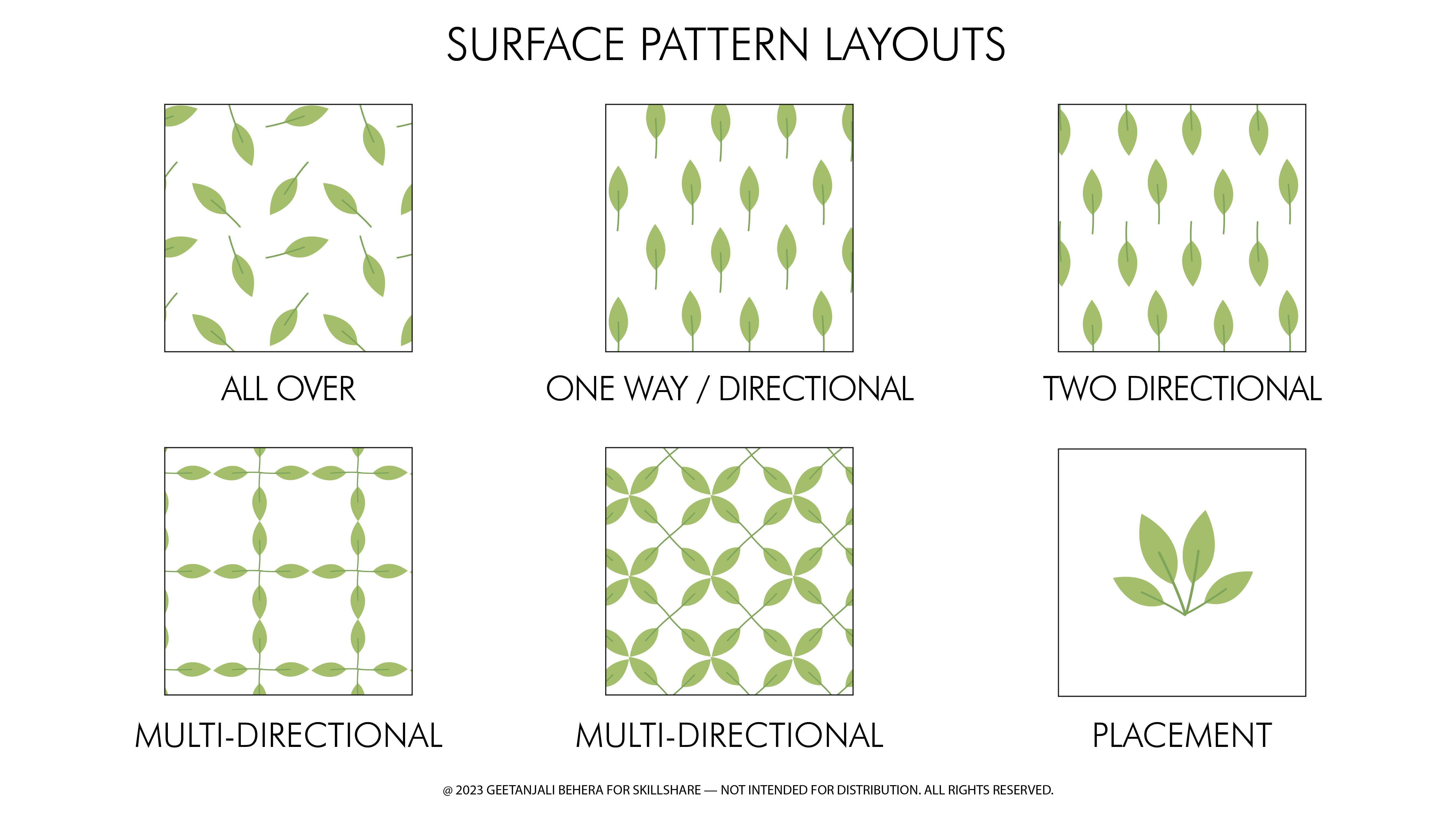
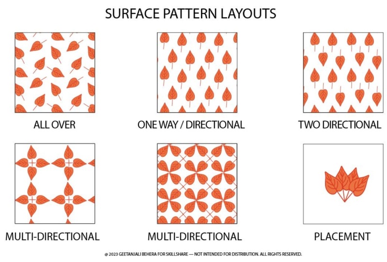
6. Surface Pattern Layouts: A pattern layout is
simply the way in which motifs are arranged
within the pattern. It can affect the overall look and feel of the final pattern. There are many
different layout ideas, but here are some of
the most common ones. All over pattern repeats are
designs where the motifs are placed within a repeat unit, and
then repeated seamlessly. That means that they repeat
without showing a join. They can consist
of multiple motifs that are sparsely placed or closely packed on a single continuous
motifs that flows around. One way or directional
pattern repeat, use elements or motives that indicate a strong horizontal, vertical, or diagonal direction. These designs can be more
limited in their use as they are intended to be
used in only one direction. These are most commonly found
in curtains and wallpapers. A two directional surface
pattern design uses elements or motives that have either a strong horizontal
or vertical direction. A two-way design has
a consistent design. But the design in this case, can be flipped upside down or sideways and still
looks the same. It minimizes waste. When cutting the pattern out. Multi-directional repeats can be viewed from any direction. By placing the elements or motifs in different directions. The pattern does not
appear to have a top, bottom, left, or right. Multi-directional
designs are great for fabric rolls as they can be
cut and used from any point. Therefore, avoiding
fabric wastage. An Engineered, or placement
print allows you to control the dimensions of the artwork and where it is placed
on the product. T-shirts, greeting
cards, tea towels are a great example of where engineered prints
are commonly used. To summarise, these are the most common surface pattern layouts. In the next lesson, we will discuss about the
various surface design repeats.
7. Surface Pattern Repeats: A pattern repeat is simply
the amount of space from where the pattern begins
and then repeats itself, both horizontally
and vertically. There are multiple ways in which a pattern tile
can be repeated. And here are the ten most
common ways to consider. Basic, grid or full drop is the most common and simplest
of all the repeat systems. Well, the pattern
swatch is created by arranging repeat block
in a grid format. It is also called tossed
surface pattern repeat. As the elements of
the designs are scattered within
the repeat unit, then that unit is
arranged like a grid. The unstructured nature of a tossed repeat results in a very organic and
cohesive design. Another very commonly
used surface design repeat is the half drop, which consists of the tile being stacked vertically
in a column format, then drops exactly half of the vertical repeat along
the horizontal line. Next common repeat option
is the brick repeat, which is very similar to the
half-drop pattern repeat, except instead of
the repeat unit being stacked vertically
in a column format, it is stacked horizontally. The repeat unit
is then offset by half in the next horizontal row, resembling a brick wall. Next we have is a
diamond repeat pattern, which is created by repeating
diamond-shaped unit. This therefore results in the elements being arranged
in diagonal rows. Hexagon by row is
a pattern repeat offered in the Illustrator
Pattern option tool. And it's best to use
when the tiles are hexagonal in shape
and arranged in rows. Here, centres of tiles in the rows are
horizontally aligned, whereas centers of tiles in alternate rows are
vertically aligned. Similarly, we have
hexagon by column, and this is also offered in Illustrator
Pattern option tool. In this case, centers of tiles in the column are
vertically aligned.and Centers of tiles in alternate column are
horizontally aligned. Another interesting repeat
is the OGEE pattern repeat, where the title is similar
to the diamond shape, except it has rounded. edges at the sides and
pointed at the top and bottom. Arc repeat is another variation
of diamond repeat. And it's best to use when
the tile is an arc shape. It is also called scale as it
resembles the fish scales. Next we have is the
stripes repeat. This layout has a very strong vertical or horizontal format. Stripes could be
made up of color block, floral motifs, shapes, and more. Finally, we have
diagonal stripes repeat, I have put it separate from
stripes as the process of creating a diagonal repeat is quite different
from the straight one. This layout has a
strong diagonal format, and these could be made
up of color blocks, floral motifs, shapes, and more. Let's have a quick recap of all the repeat
options we learned. These are basic half-drop
brick, diamond, hexagon by row, hexagon by column, ogee, arc repeat, straight
and diagonal stripes. In the next lesson,
we will discuss what are pattern tile
and patterns swatch.
8. Pattern Tile and Pattern Swatch: Every pattern is made of
a tile or building block, which includes either a single
motif or a set of motifs. When we place these blocks together using a
set of parameters, we get the pattern swatch in a square or
rectangular shape, which repeats seamlessly over and over again in a grid format. In some cases, the
Tile and swatch would be same dimension. E.g. the single flower
can be arranged in multiple repeat layout to
create different patterns. Similarly, this set of motifs is the building block
for this pattern. Let's see how we can create different repeats
with the same tile. Here the tile results in this pattern using the
basic repeat layout. The same tile when used as a half-drop repeat
results in this pattern. Another option is the tile
combined with brick repeat, resulting in this pattern. We can also use the same tile and rotate it to get
the diamond repeat. As we can see, our
building block is same for all these patterns, but the spacing and layout
are different for each, which results in
different end patterns. Now let's understand
what a pattern swatch is and how it
is different from the pattern tile. A pattern
Swatch is the tileable, rectangular unit of
a repeat pattern. To understand this better, let's check all the pattern
that we made earlier. For this basic pattern repeat. This is our pattern swatch, which is also the pattern tile for the half drop
repeat pattern. Here is our pattern swatch, which if repeated as a
grid or basic repeat, will result in the same pattern. Now for the brick repeat,
the swatch is here, and this again will work as a basic grid for this pattern. Lastly, for the diamond repeat, here is the pattern swatch
that repeats in a grid like format. For any pattern, the
final deliverable file is always the pattern swatch. Now let's have a quick
comparison between a pattern tile and pattern swatch. The pattern tile is the smallest repeating
unit in a pattern. It is generally in grid
format, but not necessarily. Only for the basic repeat
it the same as the swatch. The building block
or pattern tile, when combined with a repeat, gives the pattern swatch. One tile, can create
multiple patterns. Whereas, The pattern swatch is the final repeating
unit in a pattern. It is always in rectangular
or square shape. Only for the basic repeat. It the same as the
building block or tile. One pattern has only one swatch. If you have any
questions or doubts, please feel free to drop
them in the discussion tab. And I'll be more
than happy to help. In the next lesson, we'll
create patterns with different layouts and repeat
as our class project. It is going to be a lot of fun. And I'll see you in
the next lesson.
9. Understanding the Pattern Option Tool: Hi everyone. I hope you're finding
these classes helpful. Today. I'm here to help you
with the class project. I know how difficult it is to start something new on your own. So to make it easy for you to
complete the class project, I'll guide you
along the process. If you want, you can
join me and complete the first 14 patterns in
just next few minutes. It's going to be a lot of
fun. Let's get started. All you need for this
project is your computer or laptop and a subscription
to Adobe Illustrator. If you don't have
the subscription, you can get the
link to free trial in the project and
resources section. We will start with
opening Illustrator. I have uploaded to Illustrator files called Class
Projects and worksheets. In the project and
resources section. You can download the files and then open it in Illustrator. The class project file includes the surface
pattern layouts, repeats, and the
worksheet templates. So you can fill them and
upload to the gallery. Now open the worksheet file and create a new layer
in the layers panel. If you don't see it, click
on the layers from window. First step is to create a simple asymmetric motif so that it is easy to show
the directional patterns. You can use simple shapes or any drawing tool in Illustrator
to create this port. I'm creating a simple
leaf as my motif. Before we start, I
would like to check the size of my motif in
the Properties panel. I will set it at 1 " height. You can keep yours close
to nearest round number, so it is easy to remember. Now we will be using
this one motif to understand the pattern
option tool features. To create the pattern, select the motif and go to Object, Pattern and Make or go to
Window pattern options. A new window will pop
up with a message saying the new pattern
has been added to the swatch panel and any changes made will be applied to
the swatch upon exit. Click, Okay, now we will
go through each feature. You can choose to
give your pattern a name or update
an existing name. Next is the tile type. There are multiple tile types or repeats that we have discussed
in previous classes. Namely grid or basic repeat. Brick by Row, Brick by Column, which is commonly
called half-drop. Hexagon by column
and hexagon by row. You can use these
options and create the other repeats like diamond
ogee, scale and stripes. The little thumbnail here, gives a preview of
the pattern swatch that is going to be saved. Break-offset is
applicable only when we choose the brick by
row or column option. Width and height
are the dimensions of the pattern tile
or building block. We can click here to change the width and height
in proportion. Select the Size
Tile to Art option. When you want the title to be exactly same size
as your artwork. Select this move tile
with art to ensure that moving the artwork causes
the tile to move as well. I'll try to explain
it with an example. You can choose any width
or height for your tile. It can be bigger than the motif or artwork, or even smaller. And in that case, the
motifs will overlap. To increase or decrease the
space between the tiles. You can select this
value and then click on the up or down arrow on your keyboard to increase
or decrease by one unit, which is 1 ", in this
case, hold shift. And then down or up arrow. When you click on the
Size Tile to Art, it will bring the
tile size back to the original motif
for artwork size. In this case, to make the
motifs overlap or distant, you have to use the horizontal
or vertical spacing the same way as we did
for height and width. Another thing to consider is that if your motif
has a stroke, and you'll want two motifs to overlap just as much as
the stroke width is. You can put the width or height to your artwork in
the width and height, whichever you want to overlap. And it will result that way. It's good for geometric patterns. But in case you choose
Size Tile to Art, it includes the stroke
within the tile edge. And hence the pattern
looks different. And it will be confusing to use the horizontal
and vertical spacing. As I motifs are in inches and the stroke
value will be in points. Horizontal and Vertical spacing are enabled when you select the Size
Tile to Art option. As the artwork or tile
become one unit. We can only adjust the space or overlapping
between the two tiles. Next we have overlap. When two adjacent tiles overlap, you choose which tile
to appear in front, both horizontally
and vertically. Copies lets you determine
how many columns of tiles are visible while
modifying the pattern. With dim copies, you can
adjust the opacity of the copies of the artwork tile previewed while modifying
the pattern. The show tile edge
option displays the building block or tile of the pattern that is repeated. Whereas the swatch
bound will display a unit portion of
the pattern that is repeated to
create the pattern. It is also the
swatch that will be saved in the swatch library. Once you're done, click
here to save a copy when you have a pattern
already saved in that name. Click Done to save, and click Cancel to discard. I will cancel it for now. And in the next lesson, we will start with our first set of patterns with
different layouts. I'll see you in the next lesson.
10. Creating Multiple Pattern Layouts: Now that we have understood all the features of
pattern options tool, Let's create our first real
pattern for All over layout. To create this pattern we
will make four copies of our motifs and
place them randomly, like motifs in a tossed pattern. We don't need to worry about the dimensional spacing for now. Select all motifs
and now click on Object Pattern and
Make click OK. Start by naming the pattern. We will save it as All over. Keep the tile type as grid. Width we will make it 2 "
and height also 2 ". This is our tile size
Uncheck the Tile to Art. Now you can zoom
in and rotate and resize the motifs to
make a balanced pattern. You can add more copies
of motifs if you want, but make sure to stay
within the tile edge. You can enable or
disable it here. Get a better preview
of the final pattern. You can adjust the
Dim Copies opacity to 100% and change the copies
two more rows and columns. So the entire screen is filled. Adjust the direction or
spacing between the motifs. Once you are happy, click
done to save the changes. If the window closes
by mistake don't worry, you can open this window
again by double-clicking on the Swatch named all over
from the swatches library. And we have our first
pattern ready. To check, make a rectangle bigger
than the repeat size, which was 2 by
2 " in this case. Fill it With the new repeat.
Now, we'll create our second layout using
the same four motifs. This is a one-way or
directional pattern. So make sure all your motifs are facing the same direction. Now select everything
and go to object, pattern, make, and click OK. This time name it as one way. And keep the tile type as grid. Will keep the sizes 2 by 2 ". Make sure to uncheck the
Size Tile to Art option. Now, move the motifs around
to adjust the spacing. Check for any uneven
or unwanted line by increasing the opacity
of the other copies. Once you are happy, click Done. And we have our
second pattern ready. We will repeat these same steps for the two directional and
multi-directional layout now. Using the same four motifs go to Object Pattern, Make. Name this file as two-way
size for two-by-two inches. Now turn half of the
motifs upside down. so we have a reversible pattern. Adjust the spacing and
layout and click Done. For the multi-directional. We will create two options. Repeat the same steps. Name it as
multi-directional one. Size 2 by 2 ". Not turn the four motifs in four directions adjust the
overall spacing and layout. And click done. For the last option. Select all motifs. In the pattern
options dialog box. give it a name multi direction, and size it to
two-by-two inches for now. Turn the motifs
in all four directions, but this time rotate them
by 45 degree. Now, if you want, you can
adjust the width and height to reduce the
gap between the motifs. Select Size Tile to Art. And this will bring the
tile next to each other. And this completes your
five layout options. You can arrange this motif like a standalone design for
the placement print. Let's fill our templates
with these patterns. Select the rectangle and fill it with the Swatch named All over. Similarly, fill the rest of the rectangles with their
respective patterns. If you want to adjust
the scale of a pattern, select the rectangle and go
to Object, Transform Scale. Select the uniform option, and enter a value less than
hundred to scale down. And make sure to
de-select the transform objects as we only want
to scale the pattern. Check the preview
and click Okay. Repeat the same for the
rest of the patterns. We will continue working on the project in the
next lesson as well, where we will create patterns using the ten most commonly
used repeat options.
11. Creating Multiple Pattern Repeats: I hope you enjoyed creating patterns with different layouts. In this class, we'll be creating patterns with different repeats. Will start with basic repeat. You can choose the same motif or create a new one if you want. I'll make a small
floral motif this time. I'll put a tile shape behind
it. In the properties panel, I'll check my motif
size and keep it 1 by 1" and change the stroke to dotted
lines to see the Repeats better. For the first basic
repeat option. Select the motif
and go to Object, Pattern and Make click Okay. Name the file as basic repeat. And select the
tile type as grid. Since we are using
a tiled motif here, we can keep the tile
size same here. That is 1 by 1 ". If you want, you can add space
between the tiles. We could also choose
Size Tile to Art. In this case, since I have
put a stroke on my tile, I'll be avoiding that. If you want, you can create your patterns without
these strokes. It's the most simple repeat. So click Done and it saved. We will continue with the
Brick by Row or brick. Repeat, select the
artwork and go to Object, Pattern Make. Name it as brick repeat. This time, select the
tile type as Brick by Row. And as you can see, the
brick offset is enabled now. So right now the
value is set at half, which means the
tiles are shifted horizontally by half
as we move upwards. You can change this value to one-third or
one-fourth and so on. But keep in mind when
you change this value, this little thumbnail that shows the Swatch Preview also updates. The more complex
value you choose. Thumbnail becomes
smaller in scale, which means the
pattern swatch becomes complex and the elements in the pattern also
becomes smaller. I would recommend keeping
this value simple. Unless you are creating a very small-scale or ditsy pattern. For now, I'll set it at half and I'll set my
tile size at 1 by 1" Click done to Save. Next we'll repeat the same for half-drop or
Brick by Column repeat. Select the artwork
and in the pattern option, name it as half-drop. Now select title type
as brick by column. You can change the brick
offset if you want. I'll choose one-third this time. And keep my tile
size at one-by-one. And click Done to save. Next we have is the
diamond repeat. For this, I'll make a copy
of the tile and rotate the tile shape behind by 45-degree to make
a diamond shape. Remember the size will
change after rotation. So check the new size and
change it to a round number. So it is easy to remember. Now in the pattern
option window, name it as diamond repeat. As you can see when
the tile type is grid, the alternate titles are empty. So we will change the tile type to brick by row or column. Depending on the tile
type you choose, you will have to
change the height or width value by
half respectively. The offset can only be
half for diamond repeat. Since our tile size is one-by-one inch and I have selected brick
by row as my tile type. Width will still be one, and the height will
be reduced to half. And you have the
perfect repeat. In case you're using
tile without stroke, you can also select
Size Tile to Art and then reduce vertical
spacing by 0.5. Click done to save.
Next repeat type is hexagon by column. For this will make
a hexagon shaped tile and place it
behind our motif. Keep the width of the
artwork one-inch or a round number. In the pattern
options tool, name it as hex by column
and choose the tile type. Now, lock the proportions
and put 1 " as width. In case your title
doesn't have a stroke. just click, select Tile to Art. Now click done to save. For the
hexagon by row repeat, select the tile and rotate it by 90 degrees so the edges
are aligned vertically. In this case the
height becomes 1 ". In the Pattern Options window, give it a name,
select the file type. Keep the proportions locked
and change the height to 1 ". Now click Done to save. Next we have is 0gee
Repeat, I will share a simple way to create this tile
shape in just few clicks. Draw a circle with
one-inch diameter. Now cut path using top, right and bottom anchor points. As you can see, there
are three shapes now. Select the bottom
right shape and move it to the top to
match the left half. And move the top to the bottom. Use Transform tool to keep
the changes exact. Now, join the three shapes. Select and make a
copy and reflect it. Join both the shapes. and resize it to 1 by 1 ". Place it behind your motif
and align it in the center. Open the pattern option tool
name the pattern as ogee And as I said earlier, this is very similar
to the diamond repeat. So select the tile type as
brick by row or column, and adjust the height or
width to half respectively. And click done to save.
For the scale repeat. Start by drawing a circle
that is 1 " in diameter. Now cut the path using left, bottom and right anchor points. Turn the bottom
two shapes inward. Select the three
shapes and click Join. Place it behind your motif. Now, open pattern option tool.
name it as scale repeat, and repeat the same
steps as for the diamond. Keeping the title type as
brick by row or column, adjust the width or height
to half respectively. And you have the
scale pattern ready. The last two repeats are
straight and diagonal stripes. For the straight, stripes
it is quite simple. Just select the motifs in
the pattern tool window. Keep the tile type as grid. Now adjust the width to adjust stripe width and height to keep the
motif close or distant. Click done to save.
For the diagonal stripe, make a few copies of the
motif to form a line. You can do that in the
preview mode as well. Now select all the motifs and rotate them by any
angle you want. If it is 45-degree, it will be easier to adjust
the size and distance. But if it is a random rotation, you might have to scale and adjust the width
and height till you find the perfect repeat. Once you get it,
click done to Save. Now it's time to upload our repeat patterns
to the worksheet. To do that, click on
the previous layer, select each rectangle and fill it with your
respective swatch. If you think the scale
is too big or small, you can adjust it by clicking
on the Rectangle and go to Object,
Transform and Scale. Once completed, export these
files as JPEG and click on the Upload File in
skill share and share one or more of the
pages you wish to share. In the next lesson,
we will learn how to save, resize and export
a pattern swatch.
12. How to Save, Resize and Export a Pattern Swatch: In this lesson, we
will learn how to save, resize and export
a pattern swatch. Let's see the pattern swatch from a bird's eye point of view. Every pattern swatch
has three layers. A top layer where all
the motifs are placed, then we have a background layer. The bottom most layer has the bounding box with
no stroke and no fill. This is the rectangle
that defines the swatch dimensions
or boundary. Everything that is inside a bounding box will be
included in the pattern. This is the usual
way of creating patterns and saving them
in the swatch library. Another way to save and export a swatch is by using
clipping mask method. In case of a clipping mask, the bounding box is on top of motifs and
background layer. To create a clipping
mask of an artwork. Select artwork along with
the top bounding box. Go to object, clipping
mask and make everything that is inside the bounding box will be
included in the clipping mask. But the only thing is
that even though what you see is exactly same as
the pattern swatch, there are hidden
elements which are still outside the bounding box
and can be edited anytime. You can check that by going to Object Clipping Mask
Edit contents. If you just drag it as it is and save it in the
swatch library. When you try and fill a
shape with this pattern, it will show gaps in-between. And that is because there are still elements hidden there. Now, if you just need to
export it as a JPEG or PNG, you can change the artboard size to match the bounding box. And then select Use
Artboards file exporting. And this will exclude
the hidden elements. To save it as a pattern
swatch in the library. So you can use it
as a pattern fill. You will need to crop
the hidden elements. To do that, select the artwork with the
mask and go to Object, edit contents, and then expand. It is very important to expand the artwork before
cropping or else you might lose some
elements which has special properties like
stroke, brush or patterns. Once the artwork is expanded, click outside the box, it will return to the
Clipping Mask Mode. Now select the artwork
and go to Pathfinder. You can get it in the windows
as well and select Crop. Once all the hidden
elements I cropped, this can be saved as a
swatch in the library. There are two ways to
resize a pattern swatch. One way is to double-click
on the swatch. The button option
window will open. In the preview mode, you can see the measurement of the tile. If it is a simple dimension, you can calculate the size of the swatch based on the preview. For example in this
case, The title size is one-by-one inch and
repeat is grid. So our swatch size will
also be one by one. Now when it is
changed to halfdrop, The swatch bounds doubles. So our swatch size will be two-by-two inch, draw a rectangle to check. Now there is another
way to do it, and this works regardless
of the current tile size. Select the swatch from the pattern library and
drag it to the art board. This is the layered pattern
that we discussed earlier. Now we will ungroup
everything. It has motifs, A background. And the
bounding box at the bottom. Select the bounding box
with no fill and no stroke. In the Properties panel. You can check its dimension. And you can also convert
it to art board and export it as a JPEG or PNG while keeping select
Artboard option. To convert the bounding
box into an art board. Go to Object artboard, and convert to artboard The way I normally
resize my patterns is after ungrouping
the pattern swatch, I bring the bounding
box to top of everything and then convert
it into a clipping mask. Now, I can rescale it to any size using the
art lot properties. Once final, I change my art
board size to match it. Then finally export my file. with select artboard option on. I'm sharing all the
possibilities so you can choose and decide what
suits your workflow best. In the coming classes, they will create more complex
and layered patterns. And all these information
will be really useful then. Now that we know how to
create an export a pattern. Let's explore the print on demand market
through Spoonflower. I'll see you in the next lesson.
13. Spoonflower Repeat Options: Today we will discuss
the different repeats offered by Spoonflower. Spoonflower offers five
repeat options for displaying and saving
any designs you upload. Basic repeat. Just create styles of your
designs, straight up and down to fill the available
space for your order. Half-drop repeat staggers
the tiles vertically. This is like the basic repeat, except the design shifts
a half-step vertically, as you move to the right. Half brick repeat is also a
staggered repeat. but the design shifts half-step
horizontally to the right. As you move upwards like bricks. Center repeat, prints one
single iteration of an image right in the middle
of whatever size and length of
fabric is selected. This option is available
only on fabric. Mirror repeat, will
mirror the design, both vertically
and horizontally, like the four quadrants of a graph. The design layout window
allows you to toggle back and forth between the layout
options in real time. You may toggle between
the layout tabs for fabric and wallpaper on
the design layout page. And you may save different repeat options
for these two products. There are some limitations for the layout of wallpaper designs. Designs on wallpaper must repeat once or an even number of times across the 24 inch width of the rules so that it
will properly install. This means that certain
repeats and blocked at certain scale sizes for
wallpaper designs, e.g. half brick and mirror
repeat options are not available when a
design is saved to repeat once across
the 24-inch width. But once the design
is made smaller, such as 12 " repeats per panel, these repeats become available
for the design layout. Spoonflower produces a good
quality print at a minimum of 150 dpi or dots per inch. Therefore, you can create
your design files at desired dimensions and
save at 150 dpi. If you change the DPI on the design layout page
for redesign from 150 to 300. The new physical dimensions will be halved in both
width and height. In case you prefer using
the metric system, save your designs at the
appropriate metric dimensions with a resolution of at
least 59 DP centimeter. Before uploading to the site. Sizing and saving designs for wallpaper is
a bit different. Every design must
repeat an even number of times across the 24 " roll width. If your original design is not occluded at 24 " with, the system will re-size
it accordingly. So it prints correctly. For exp if your design is 23
inch wide and 150 dpi, it will scale down
to 12 inch wide. with the new resolution
value to fit two repeats across a roll. Consider the following when
creating wallpaper designs. Option one, if the design
should repeat once, create your design Canvas 24-inch
wide or 3,600 pixels wide. Option two: make a canvas
size 1,800 pixel that is 12x150 the design will repeat two
times across each roll. It can be any height. Option three, create a
canvas at 900 pixels wide, which is 6 x 150. To repeat four times, DPI must be always
150 or higher. The scale of the pattern
is very important. For exp, large elements can look good on beddings
and wallpaper, but not on a small purse. It is always better to offer multiple scale
options of a design. I usually upload three to four scale options
for my designs. You don't need to export
each scale separately. You can upload the
same file and just update it to a higher resolution to save it at a scaled
down version. The file that we uploaded at 150 dpi is going to
be the large scale. Now that we have all the important details
about the features, Let's get started with setting
up our Spoonflower shop.
14. Uploading Designs on Spoonflower: Once you're done with the
basic account set up, go to this little person
icon on top right corner. And in the drop-down menu, choose View my shop. You can update your
shop data here. Start with choosing
a profile picture. I would recommend having
your own photo so people can feel more
connected and familiar. Now, I like to keep my
profile and interests public. You can choose a
screen name here, which could be your name
or your brand name. Write a small intro about yourself and take
this opportunity to tell the customers if you are willing to make custom
changes to designs. You can also share links to your own personal store
and social media. Once you're done, click Update. There is a small banner
layout which you can update with your patterns
or any illustration. Now when you click
back on view my shop, you can see all these updates. Let's see how you can
upload your designs. You will find the
uploaded Design button in multiple places. It's right on the top. You can go to this
person icon and drop down to
upload your design. or If you add in your
design library page, click on Add design. Once you are on the
upload your designs page, check all the specifications. On the right you get to know the possibilities
at spoonflower. And on the left are the details
of required file format. So the acceptable file formats
are tiff, JPEG and PNG. And the file size must
be less than 40 Mb, at least 150 dpi. It could be more than 150 dpi, but not less than that. And Spoonflower will process
it at 150 dpi, regardless of the resolution
value you upload. As I mentioned earlier, the preferred color mode is RGB. Now choose the file from your device and click on
the copyright confirmation, and then click Upload. It will take a few minutes. Once the upload is completed, you will land on this action
page where you can make or change all the important
settings and actions. You can choose to keep
your design as private. Make it public. But this
view all products button, you can get a preview
of your design on multiple products
in real time. and this will help you decide
the scale and size. If you find some error on the pattern and want
to replace the file, you can choose Upload
Revision and make sure the new file is not named
same as the old file. As it might not work. Sometimes you might need the repeat tile that
you had uploaded on Spoonflower maybe a
year ago or something. You can download that
original file from here. And lastly, you
can delete design if you want to remove
it from the library. At the bottom, you will see enter in design
challenge option, where you can see all
the upcoming challenges. And if you think your
design fits the brief, you can enter a
challenge from here. You can find them on the
top right of the page. Make sure to read the challenge
guidelines thoroughly. Now coming back to our design, here you can see the preview of the pattern as
fabric or wallpaper. It has a ruler
setting which helps to visualize the motif sizes. You can also change
the preview size from fat quarter to test swatch and yard. When you switch to wallpaper, the settings changes
and instead of ruler, now you have room
and design option. When you choose design, you get the ruler settings back. And as I mentioned earlier, the wallpaper roll
with it set at 24 inch width and height
scroll downs to 144 and more. You can choose different sizes and see a change in real-time. Let's discuss the repeats now. We will go back to
the fabric option. We have discussed all the
repeats in the previous lesson. The only thing you need to
consider is whether you are uploading the pattern
tile or pattern swatch. If you have already
made the swatch in Illustrator or any
other design program, you need to choose the
basic repeat always. If it's a tie, then you
can choose half-drop, half brick, center, or mirror depending on your
design requirement. Next about the design
size and resolution. As I mentioned earlier, that spoonflower processes
the file at 150 dpi. So if you upload your
design at a higher DPI, it will automatically
change the resolution to 150 and update the
size accordingly. To change the size
of your design, there are two ways provided. You can either click on the
smaller or bigger buttons, which will resize it. Another way that I normally use is by clicking on the
change DPI button. You can write a
value higher than 150 and check the new
size update in the preview. Once you're satisfied, click
on the Save Changes button. For the medium and small
scales of my design. Sometimes I prefer to offer a scale down wallpaper
size as well. Like 12 inch or 6" inch wide. Spoonflower offers peel
and stick wallpaper. And I think the
small-scale designs can be used as stickers for
shelves and cupboards. The next option, which is about choosing a fabric or paper. It's more relevant
to the buyers need. Make sure to save any changes you want to keep moving forward. In the next lesson,
we will discuss about the steps in marketing
and selling your designs.
15. Marketing and Selling on Spoonflower: Next step is the
marketing and selling. Starting with the details. Once you have a good number
of designs in your library, you can start creating
collections of the designs that fall
under the same theme. Or if you have designed a
certain pattern collection. It's always nice to keep
designs in collection. As sometimes, when
a buyer is looking at one design which is
a part of a collection, they can also find other designs
of that collection under the main Shop page through which they can find
that entire collection, which eventually will
help in promoting and boosting sales for
the other design as well. Next tab is for
the name of design. I usually try to put maximum
details in the name. Like the theme with the
prominent color and scale. In this case it
is Retro Floral If I have multiple color
options of this print, I'll add the color name to it. If I'm offering multiple scales, I'll add slashed large scale. In the Description tab, there are limited characters, so you can either write a simple description
about your design. or some people also share
the link to the collection. It won't be clickable
link so you can choose. In the additional details. I try to give more information of the collection, available scales along with the link to my social media and websites. Next, you can choose
the thumbnail that you want for your design. On the right side you have tags. As it says, these are words or phrases that describes
your design. So keep them relevant, but be creative
at the same time. For updating multiple designs
with descriptions and tags. There is another way
In the design library, You will see these
three display icons. with Show large View, Grid
View, and list view. With large view, you get the
actions for each design on this right with grid view and you can edit
them individually. With action button on the
bottom of each design. You can set the number
of designs previewed here and the order in which you want
them to be previewed. Next is the page out of
total pages of your designs. Now with the list view, you can edit multiple
designs at one time. Select the designs
you want to edit, and now go to Edit
Selected designs on top. And from the drop-down menu, you can choose the
action. In the window. You can write one description for all the selected designs. And click update. And The page
will update with new changes. Similarly, you can choose different actions
like edit tags. display references, changing thumbnail, and adding to a
particular collection. It is a much more
efficient way of updating the actions when you have
a good number of designs. To go back to the
design edit page, click on the design thumbnail. And the last step is to make your design public and
available for sale. To make your design
available for sale, you need to buy a proof first, It could be a swatch fat
quarter or any signs. But the most common
and affordable way of proofing your designs
is through fill a yard. You can prove 42
designs at a time. You can follow the instructions given in the fill a yard
information page. We will first create
a collection of the designs that we
want to be proved. To create a new fill a yard. go to your design library. And on the left you can see add collection, the
just under add design. Now create a private collection and you can name
it as fill a yard. In the design library. You can select different designs and add them to the
fill a yard collection. Once you have 42 designs
ready to be proved, go back to collections. And here you can see the
private collection fill a yard. You can see a small
Fill a yard icon on top of that collection. When you click on that, you will see multiple options
available for fill a yard. Choose the layout with the 42 designs, choose the fabric, and
then design your project. As you can see on
your designs are on the right and on the
left there is a grid. Select each box and fill it with a pattern
from the right. You can fill and arrange,
this entire grid. and Once all the 42
designs are filled. You can select, Add to Cart and then you can
complete your purchase. After the product
has been shipped. You can make your prints
available for sale. I hope you found this
information helpful. Thank you for joining me.
16. Final Thoughts: Congratulations, you just
created 14 different patterns. Isn't it amazing? This project is not about
creating beautiful patterns, but how efficiently
you can make them. So go ahead and create your student project and
share your progress. I would love to see them. Thank you so much for
joining me in the class. I hope you enjoyed it. And the lessons helped you get a better understanding of
surface pattern design. If you have any doubts,
please feel free to drop them in the discussions page and I'll be more
than happy to help. Please leave a
review if you liked my class and do follow me on Skillshare to get updates
on my new classes. This is the first class in the series, how to take a creative
approach to patterns. In the upcoming classes, we will learn the in-depth
process of creating beautiful patterns
in Illustrator, Photoshop and Procreate. either using one software at
a time or combining them. Once again, thank you
so much for joining me. You can follow me on
Instagram at geetanjali.b Hope to see you in my
next class as well. Till then, happy creating.
 Geetanjali Behera, Surface Pattern Designer | Illustrator