Transcripts
1. AD 18 New Features and Valentine Project: Hi guys and welcome. My name is Dolores and
aspirin and I'm coming to you from sunny,
Manitoba, Canada. Sunny and cold. Last night the
temperature went to well below -30 degrees. That's Celsius, so that would
be about -22 Fahrenheit. Either way, it's just
too cold for me. I do not like it. I wanted to produce a
really cheerful project. And the project I decided on
was a Valentine's project because it's
something that I know that I can use for
art licensing. Very soon. I've created a
Valentine hearts that incorporates the use of
all of the new tools. The ones I'm going to
feature are the knife tool, the shape builder tool, and the vector work tools. Those are all things
that I have had available to me in Adobe
Illustrator in the past, but never in Affinity Designer. I'm pretty excited
about that because the more and more I
use this program is, the more that I'm actually replacing the use of
Adobe Illustrator. So for me it's a win-win. Now a lot of the
functionality that I had with Adobe Illustrator
on the desktop, I now have on the iPad. The iPad version of Adobe Illustrator hasn't
got those features yet. So that's something that
everyone's still waiting on. But meantime, Here we go. Affinity designer. I'm really excited about that. And there are a few
other little things that I want to show you as we work our way through
this particular project. So we'll be going through
each of the tools first. And then I'm gonna be showing
you that the project, and hopefully at
the end of this, you're going to have a
beautiful Valentine heart that you can use for your art licensing or a POD
or whenever you use it for. Now if you haven't
done so already, I'm going to ask you to hit
that follow button up there. That way you're going to
be informed of any of the new classes I
post as I post them, I plan on doing a lot more
Affinity Designer classes. I already have a series
of about 15 of them. So be sure to check
out my profile. On my profile you'll find all the classes
listed that I do. And there are tons in every different software
program that I use. So that's like Procreate,
adobe Illustrator, Adobe Photoshop, of
course, Affinity Designer. And there are a bunch of art business courses
there as well. If you don't know me. I've been a teacher
for over 30 years. I taught in the
high school system and taught graphic
design as well as a bunch of other classes like theatrical
design and fine art, and a few other things, marketing and promotions
thrown in there too. What my goal is here is to provide a complete
continuum of learning so that you
have everything you need to make it in the business. Also, if you add your name
as one of my followers, then you will receive any of the discussion posts
that I send out. And I throw out a lot of little
freebies here and there. So make sure that your name
is on that list up there. Follow me. Are you ready to get into
the project? I sure am. Let's get started.
2. Lesson 1 Overview and Reference: Hi guys, welcome to lesson one. Lesson one here is
kind of an overview. I wanted to go over
the interface. And I also want to show you where you could find a
bunch of reference videos and all kinds of written information that
might be helpful for you when you start learning
Affinity Designer to, Let's get started. I have using Affinity Designer to now for a couple of weeks, I have had some issues
with a couple of things, but overall, I'm really quite
liking this new version. I've kind of hesitated to create any sort of classes
with version too, but I've had a couple
that I have released and have posted covering some of the different things are
things that are new. This class in particular, I'm going to focus on just a few of the tools so that
I can go over them. I've already reviewed
a few of the things that I've been using in my other classes
that I've posted. This class is going to
be a little bit more specifically geared towards
showing you the tools. I'm probably going to start
with the combination, I think, of the vector Warp tool and the shape builder tool. And then I'm also going
to cover the knife tool. So the project that I will eventually be doing in
this class is going to combine all of those things to create something
quite interesting that would've been way
more work had I been doing it in
the older version. So that's what I've come to. The conclusion of, is that you
can do everything that you normally used to in Affinity Designer one
in this new version. So everything that any of the classes that I've
had or anything I've showed you previous
classes with version one, you can still do all of the
same stuff in version two, It's just that now
the location of some of the things are a
little bit different. So I'm gonna go through those
tools that I just listed. And I guess as I'm going
through the class, I will be showing basically all of what is being
reviewed here in this video. I will give you the
link to this video. This one is a video that has
been put together by Sarah, and it's just talking about
the changes in the interface. So all of these tools and things that you see at the
top are shortcuts. These are all things that
always been available to us, but have just been a
little bit more hidden. Which is one of the things I really like is that
these are up here now. Some of those simple things
like just flipping something, you had to go two or
three layers deep into a studio to get to them. But now they're listed up here. So things like flipping
horizontally and vertically, you're up here and the
boolean operations are here. So those things
are, like I said, have always been
there, but they have just been a little
bit more hidden. One of the things
that I have missed is the trash can that's usually
down in this lower corner. But I have been keeping up
with a bunch of the changes that have been talked about that are going to come
out in and update. And one of the things
is the rumor has it anyways that that trash can
is going to reappear here, which is fantastic
because otherwise, you could only access
the trash if you had node something selected in your image area than
with the node tool, if that was live, then you'd
see the trash can up here. And the only other
place I have found it is in the Layers palette. And that just adds
an extra step. So I'm glad that they're
going to be putting it back. So this is the main difference
that you're going to see is this toolbar
here on the left. And what you will see and
what will be different are the two or three tools here that I'll draw
your attention to. So what I'll do is I'll go
into Affinity Designer on my iPad and I'm going to show you and explain to you
some of the differences. But first I want to just
kind of draw your attention to a lot of videos that
are now available. If you go to YouTube or whatever provider that you can find that has some
of these videos. I would suggest that you
watch as many as you can. And even on the
affinity or Sarah, Sarah is the company that
produces Affinity Designer. You will find a bunch of videos. And I went through all of the videos that I
could find literally everything I found that
I could kind of get an overview before I started using the program
every single day. And it took me probably a
week before I was like okay, with using affinity to as
opposed to affinity one. There are still some things
that I love about affinity. One that needs to be
addressed for affinity to one of them is some glitches
with the color panel, which I've talked about
in a previous class. But overall, I think that
I'm pleasantly surprised and I feel a lot of optimism
towards using affinity to, and I think you're going
to find that too once you kinda get the
hang of it and you break the habit of where
the tools and shortcuts and things were before and wrap
your head around what's new. We're going to switch into
the actual program now. And I will walk you
through some of the things that are
different in the interface. Once we're done
with this lesson, then that'll be the
end of the interface. We'll go straight
into trying some of those new options like
the vector Warp tool, which is completely new, the shape builder tool, which is completely
new here too. And of course, the knife tool, I found that using
the shape builder and the knife tool was
actually a lot easier. All three of those
different things, the vector warp,
the shape builder, and the knife tool. Those were all things
that I have used in other vector programs,
namely Adobe Illustrator. So I'm quite used
to what they do, but this is the first time doing them in Affinity Designer, and I am thrilled that
those are now included. So let's get into
the actual app. I will caution you that when you are watching some
of these videos that sometimes they're
featuring the version of the app that is
on the desktop. And there are some
significant differences between what you have on
the desktop versions of these programs as to the iPad version, so
significant differences. So make sure that when
you are searching, that you search for the
iPad version so that you get videos that are only
relevant to use on the iPad. I'm not going to be covering the desktop versions yet because I have not been
using them enough. So let's just switch
over to the iPad now, I thought the best place to
start would be right here in the initial interface
when you open it up. So if I didn't have this
open, I click on it. Of course we see this
screen and then this is the new look of
the landing page, I guess you'd call
it or gallery, however you want
to designate it. There's a bunch of
things I like about this and there's a bunch of things
I don't like about this. I think the main thing is that I wish the
thumbnails were a little bit smaller because
then I could see more at once. You can see here
all the different projects I've been working on. One of the things that was a
question posed to me by one of my students was
where things are saved. I'm going to also point
out something here, if ever you see with the name of the document here that
it has the letter M. That means that some changes have been made and not saved. So in order to ensure that
you don't lose anything, you might want to, as a habit, save periodically
throughout the process. And this was the next thing
that I wanted to point out is where my projects are going. So if you want to control
where they're going, you would go into the
preferences here. And on the very first screen, the general screen
that comes up, you're going to see this. And this is where it's savings. So this is your
default save location. At the moment, I've
got it on my iPad, but you can go in here and
change to iCloud Drive. So it depends on the projects
that I'm working on. So if I was doing, let's say, a bunch of surface
pattern design and I wanted to add it to my
main pattern folder. Then I would designate that as where I want it
to go and hit Done. It would allow me to save a document so if it
had never been saved. So let's see if I can find one here that has never been saved, just one who's never been saved. So if I was to go
here and hit Save, now, this is the
name of the file, so I'm going to rename it
to something like test. I could have hit that X there, but I do want the suffix
to remain the same here. So I'm going to say Save, and that one's called test. And you can see here
on my iCloud Drive, I've got a folder
called Affinity assets. And this is where sort of general affinity
documents would go. I have a ton of my other
folders accessible here, so I've got my pattern
design if that's what I was working on and
that's where I would save all my pattern design file. So here I would just hit Save. And then if I wanted
to locate it, I would go into iCloud Drive, Affinity assets,
I think is what I was saving it in
affinity projects. And here are two test documents that I've been working on today. I guess one was the other
day, but one was today. That's the first step. Now, as far as the
other preferences here, I'm not sure if I've
changed really much else. You can definitely
make alterations to just the general
interface, how it looks. You can switch to right
or left-handed mode. I like having my texts and
points like most of these, I have not changed. You can go in and change
your color modes. Myself. At this point, I have not
changed any of these. A wise, again, you can go in
and read all of these and decide what it is that will affect your
current work situation. Things like the magic distance that would be useful
for me if I had a keyboard and I'm
definitely going to start experimenting with having
a keyboard as well, because there are some things
now that we can do with a keyboard and the iPad that we were never
able to do before. So that's something that
will come up at some point. These are all just preferences,
your own preferences. So I'm not going to tell
you how to set those. You would have to think
back on how you use your tools and what your
preferences were inifinity one, if you're transitioning now and you go into
Affinity Designer to, and something is not
working the way it did in Affinity one for you, then definitely go and check your preferences and infinity
one and then go back here into preferences
of affinity to and just throw in all of the
settings that you prefer. So again, like I said, I'm not gonna go through
all of these at the moment because these are literally, you have to set them and you know what your
preferences are. Fonts. I have done some installation of some additional fonts here. And I did notice that one of the things in the new
interface is that you get the actual look
of the fonts there. So this is representing
exactly how the font looks. Shortcuts is something that
we'll get into more and more as we use the
software more. And that's something that can be and will be important
to efficiency. And I'm going to
show you why when we get into the projects. And I will talk to you about
the new shortcut menu that exists there and then why certain ones might be a preference for you
to put in there. Now, linked services
will allow you to save in other places or access files that you
have somewhere else. So Dropbox, I know it's very
common and you may want to link it so that you can
save your files on Dropbox. You can reset everything here if you make a bunch of changes
and then you realize, oh my gosh, I don't
know what I'm doing. You can reset it here
and go back to normal. So that kinda covers what I wanted to do in
the first lesson, which is just kind of
give you some overviews. I will be attaching some supplementary
reading material and some links so that you can do a little bit
of experimenting as you are learning
this new software. Alright, I'll see you
in the next lesson.
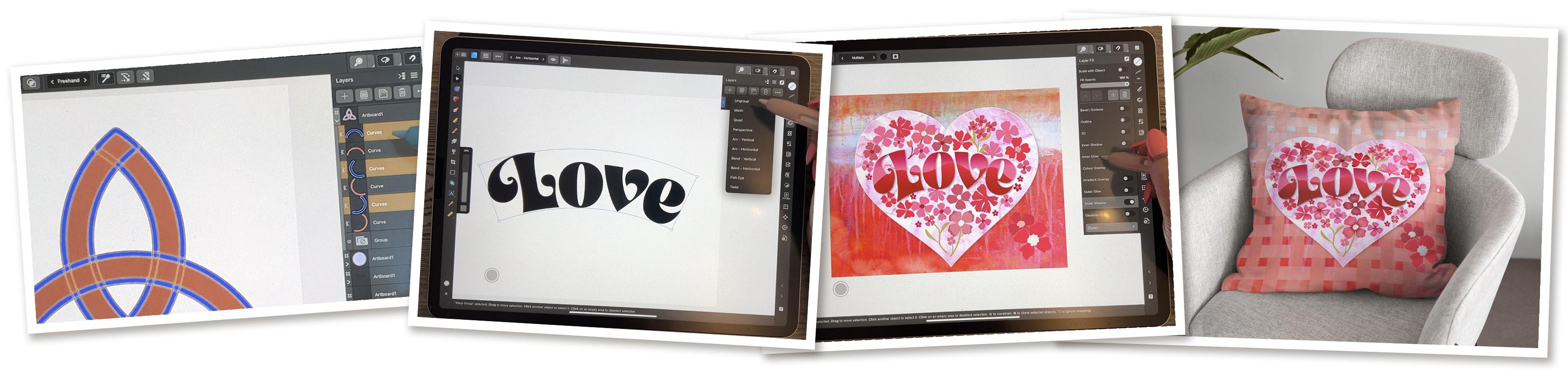
3. Lesson 2 Vector Warp Tools: Hi guys, welcome to lesson two. Let's until here is all
about the vector Warp tools. Let's get started. I thought it might be good
for me to just show you the finished project that
we're gonna be working on, which will help us
to get to know all of those new tools that
we have to play with. Kind of excited about it
because of course you can see starting to work ahead
into Valentine's Day. And I'm excited about it because there's a lot of
things that I'm doing now that I was
completely unable to do in this program before. So the first thing I
wanted to talk about is the vector Warp tools
that we now have. This lettering, the word love is done using that function. So I'm going to take you just into a new blank
document that will work with and I think I have to actually add a new one
here, so we'll go to New. I have cleaned up this giant list that was here to know if you have
done that yourself. But I've gone through and
I've taken off most of the presets that I don't
think I would ever use. So in order to
take off a preset, what you do is you just
slide to the left there. You can hit Delete and
that will get rid of it. I am going to be compiling my
own master documents here. So anything that I save, I will save into my
master documents just to make it faster. Just like in procreate
where you've got the presets that you
can quickly choose. It doesn't matter actually
at the moment for me, the size I've got here, eight-and-a-half
by 11 letter size, and I've got it in
landscape form, so everything on
here is fine for me. I'm just going to hit Okay. I'm trying to record these
lessons as I have time. And at the moment, I've just dropped my mom off at the hospital that I've got my sister to pick
up at the airport in about an hour-and-a-half. So I've got this sliver of time to do some of
this recording. Now as far as the type, now that you have
to type tools here, if you hold down because there's that
little triangle there, you can see that you have
either the frame tool or the art Text tool. And art texts is basically
a display typeface. So display face or you're just basically doing one word
or a couple of words. So that's what I'm gonna do. I'm gonna pull out to
approximately the size. I think I need my lettering. So you see the
letter there but it doesn't populate with that. Then you can go into your
typography studio here. And this is where
you would be able to choose the font
that you want. All of these fonts are showing sort of a preview
of what they look like. So I wanted to pick
something nice and bold. And I had this font from another project that we
did a few months back. And so I decided I would use it. And I'm going to
type the word love, nice and bold and juicy. And I'll just kind of size
a little bit smaller. And if you have
your snapping on, you will see that your lines will snap and tell you if
it's right in the center, which is neither here
nor there because I'm not actually going to
be using this document. I don't think I wanted
to point that out. Now, the most amazing thing, and I am so excited about this, is all of these
different options that we have available
for warping the text. So a lot of them are
self-explanatory. This is the fisheye, so you can see that
the middle part of it expands a little bit. There's a horizontal band, there's a vertical blue hand. You can do an arch. Horizontal doesn't exactly work. So what I'm doing is
I'm applying these to each other so they're getting
even crazier looking. But okay, let's do
the horizontal arc. That would be quite
pretty and usable. And that may have
been the one I used, but the other one that I
really like is the mesh. You see that it kept
that initial bands. So the first work
that I applied, and sometimes if you open
up your Layers group here, you can kinda see some of the
things that are going on. And can you see here that
the word is still there. So this is non-destructive. It has not destroyed
that original lettering. So I could actually go back at any point to that
original lettering. What I wanna do now is
just use the mesh and just make some additional
adjustments here. That corner down a
little bit and you can grab any of these to move them. Just remember that at times
you're gonna get distortions. And I have noticed a couple of times that
glitches a little bit, sometimes where
the actual outline or whatever is just not
really showing properly. But if you don't overdo it, it's usually not too bad. I'm thinking that I am not actually we're going to use too much of what
I just did there, so I've undone it. I'm just making ever so
slight adjustments here. You can add extra
points anywhere. If you need to just make
some smaller adjustments, you could literally end up with a mesh that's broken up really, really small where
you're making like really small movements
and adjustments. I'm just going to undo
those last few because that's not exactly going
to be what I want. Yeah, so that's, that's one of the things that's
really cool about it. Now, if you ever needed to
go back to your original, you can just undo
up until that point and you can get your
initial word back. So it's 100% non-destructive. I'm gonna go back, I'm
going to apply that. No, that wasn't the one. It was the horizontal
one that I applied. I think really that is likely
going to be my favorite. You can see that I can still do things like
this to expand the word, can add intermediate
points if you want to. And I think this one's a little
bit better than the mesh. For me, it's working more
to what I had in mind. Now, at this point, we can still recolor
the text if we want. But what I wanna do in the next lesson is to show you
how to use the knife tool. So I'm going to be making some
cuts in my lettering here. So I actually need to
have these as curves. So what I would do at this
point would be to go to my Operations menu here. And I'm going to
convert to curves. And then you'll see that
each of these letters is now an individual curve. And if we go into
the Layers palette here you can see each of
them is an individual curve, and yet it's still all
part of one group. Kinda funny how it's
actually backwards here. Now, with these curves
that you can do, all of the same things
that you've always done. Let's select the whole thing. And you could do things like
fill it with a gradient. You could bring
in a bitmap fill. So when I'm on the
gradient tool here, I have these choices
now in my context menu. And I could continue to
the bitmap fill here. And it's going to pop out
of the program here and into textures or whatever it is that I'm thinking that
I want to put it here. Now, I'm actually
going to end up using this in the background, so I don't need it here, but I just wanted
to show you that all of that same stuff is available to you as
it was in the past. So in the next lesson,
what I wanna do is show you the ins and outs of
using the knife tool. Alright? So I'll see you there.
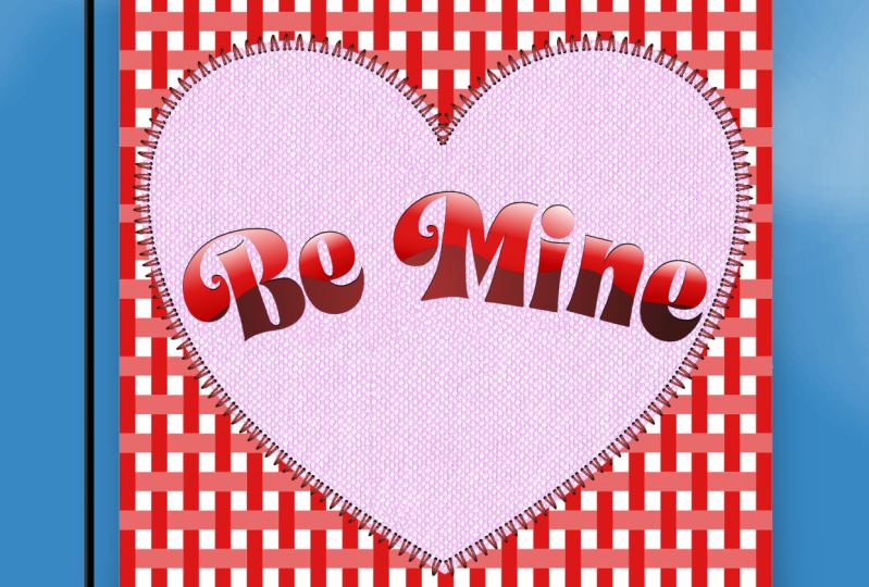
4. Lesson 3 Knife Tool Versus Clipping Masks : Hi guys, welcome
to lesson three. And less than three
here we're going to be using the knife tool. I wanted to kind of a cool
effect with the lettering. And we're gonna use some fields like the gradient
fill and whatnot. Let's get to it
with my lettering. I'll show you back
on my sample here. What I did was that kind of a slice through the middle that was just kind
of a wavy lines. So that's what I'm gonna
do here to show you. And as long as you have a
curve or a set of curves, I'm going to select all of it. Why is my L naught selecting? Okay, there we go. And you grab the knife tool. What you wanna do is start
a little bit to the outside here and then just run
your knife through. Now, I have a stabilizer on. I've got the rope stabilizer, which I really like. This can extend the
length of your rope. You can see the little rope
icon here at the bottom. And I find that using
the stabilizer gives me a much smoother line if I
didn't have it on there. So if I went to note
stabilizer here, you can see that
it's a lot harder to get a nice wavy line. Every little tremors
shaking your hand shows up. You can experiment with
the different stabilizers, whether you prefer
the rope stabilizer or the Window Stabilizer, they do the same thing,
like they stabilize. So either whichever
your preferences, that's what you want to use. So I'm just running
that line kind of roughly through
the middle there. And now you can see that I have effectively separated
the top and the bottom. What I wanna do is actually
put gradients in those and I want to do
the top half first. So what I'm gonna do is
use my marquee selection, but I'm not going to
go all the way down. If I went all the way down,
I would select everything. But as long as I'm
only selecting just over that section,
it works great. I'm going to grab
my Gradient tool, and at the moment
it's set on solid. I want to put a linear
gradient on it. I mean already that looks good, but I'm gonna pull this
way so that the dark edge is at the bottom of
my little curves. So that little section
both from light to dark, you can of course, make all the same
changes that you could in Affinity Designer one, you can add additional
colors or shades. I could go to have kind of a pink glow
in the middle there, which is also really pretty, or I could this down so that the gradient
is a lot shallower. So you can make any of
those sorts of adjustments. This is different
than what I did on my other one, but I like it. I'll just leave it.
And then again here, I am only dragging to
enclose that bottom half. And then again, I'm
going to fill with the gradient and let's try
something different here. Maybe what we'll do is
a at the top we'll do, let me just select
that top one first and we'll do that brighter
and then at the bottom, we'll do a deeper color. So it's not pretty like how
easy and how quick that was. And it didn't have to be done
with all kinds of stuff in the layers palette like making clipping,
mask and whatnot. That's why I brought these
flowers out because I thought that I would show you
what I mean by that. So if I had wanted
in the past to create some areas that were
lighter or darker in here, I would have had
to go in and draw, make an actual shape. Let's say I was trying to
make this bottom part darker. I would have to make that shape fill it with whatever color. Take off the stroke, of course, but let's say fill it with a slightly darker color than I would have to go in here and then drag it into
the sheets so that I'm giving that
area of darkness. One of the advantages
of doing it that way is that it's
non-destructive. In other words, if I now
were to get rid of that, my initial shape is still
exactly the way it is. That's something to keep in mind because what we're gonna do here with the knife
tool is destructive. So it would actually cut
and divide up that section. So now I've got
basically the same idea. I've got a section here
that I can color darker. But remember now that it is
a completely separate shape, I still have it in a group, so I'm still be able to move my image around if I wanted to. But I kinda like the
expediency of it. It's just really a
lot faster at times. Just go through
and be like, Okay, I'm going to, let me select this first switch
to my node tool. Well, what's happening here? All selected here,
but I could go to my knife tool and
just kind of as, just imagine this as at the end we've got some little
folds on our flower. And that's quick, like now I can quickly in
my layers palette, see which ones I just
Create and darken them up. And in my opinion, that's a lot faster
than going in and doing that whole thing
with the clipping mask. So you'll have to ask yourself
what your preferences, whether you think it's
going to be saving you time or costing you time
or that sort of thing. But I personally quite
like this idea of being able to just cut a section
and this time it didn't work, I think because those weren't
grouped and on 1 s, yeah, I think I didn't
select those three, so let's select them here. Grab the knife tool, and in this case I'm
going to move my stabilized or down quite a bit because I want to be able to
have a lot of control here. I'm not perfect, but I am sure from this you
will get the idea. I'm cutting. Now you can see in my layers palette that I could
go in here now and grab all of these little
funny shaped areas and I could color it
a little bit darker. Just remember that
that is destructive. So if I, let's say I wanted to adjust this little
triangle here, that when I do, there is
no color underneath it. So what's happening here is I have to adjust both of them, which is I guess not
the worst thing, but if it was a half or
a shape that I had used, created a clipping mask, then I could move
that shape around and it would be not cut into
these other petals. I'll just give you
a quick demo of that just so that you
can see the difference. So back to this shape here, we would have to merge the
curves so that I would be able to put a shape into all
of them at the same time. And I'll just quickly
use my pencil to draw a similarity in
Nevada shape there. I should have had fill on there just so that
you could see it. But now you can see the
color fairly closest, but you can see it's a
completely separate shape. And so now if I were
to drop it into this one because this would
be the clipping mask. I would be able to
move this shape now and there's nothing
cut out of the bottom. So that would be the basic
difference between using the knife tool and
using a clipping mask. Okay, so that's now we've done quite a few things
with the knife tool. And we're getting to like at
this point you're going to have two-thirds of the skills that you need for
the other project. And in the next lesson
I'm going to be showing you Shape Builder, which is the third tool that I wanted to introduce you to. All right, so I will
meet you there.
5. Lesson 4 Shapebuilder and a Weave: Hi guys, welcome to lesson four. This is a tool that I think
I'm the most excited about with this new release
of Affinity Designer. I want to use the shape
builder tool to show you how to create a really
interesting weave pattern. I'll cover a couple of
things in this lesson. Let's get to it. Our onto the shape builder tool. And I wanted to show you just an overview of some of the things that you
can do with Shape Builder. I've given myself a little
bit of a sketch here. We'll go into the layers here. And I'm going to just make some slight adjustments
here to this so that you can see
what it is that I am going to be trying to achieve. So I'm going to switch into
the pixel persona first. And I want to just do
some erasing here, which is going to be useful
for us when we're trying to figure out certain things like what's gonna go behind and
what's going to go in front. And I've done this
super simple one here, just so that you can visualize what it is that we need to do. So I've drawn this, which is a duplicate of this, and this will just
give you a way to wrap your head
around what I'm doing. So what we're gonna be
doing is dividing this up using Shape Builder and then combining and making
the lines appear to be woven underneath
and above and below. So up and down. Sorry, I should just start and then I think you'll
get what I'm saying. So I'm going to select
my entire shape here. I mean, I don't have it
all, even in everything, but it doesn't
matter to show you what I need to show you. And you can see that this
is all of my shapes here. So they're all selected
and they're all part of this group with the shape builder
tool and go back to the vector persona here, you can see that shape builder is literally the brightest
thing on the side here. So if you were to
unfocused your eyes, that one just seems
to stand right out. It's new and it's useful. It's telling you,
come on, try me out. We're going to take a look
at how this tool works. So you can see that as soon
as I hit the Shape Builder, showing me where I could
take away or add to. But remember, they
were originally just a bunch rectangles. But now that I've got them all selected and I've got the
shape builder highlighted. It's showing me all of the different things
that it could do. So can literally divide this up into all of these
little squares. Also, you probably
know it was here that the taskbar has changed. So there are a bunch of different things that we can
choose to work with here. I'm going to focus first
on adding and subtracting. Those are the simplest
ones to explain. They all have a
different purpose. I'm going to explain each
of them as we go through. So at this moment, what I want to do is create
these longer sections here, which are a combination of
several of the squares. So I am going to hit the plus. I am going to slide
over those three. And you can see now it's
created a new shape here. And those are all together. I'm going to keep going around and I'm now
gonna do this one. And then I'm gonna do this one, and then I'm gonna do this one. So you can see now that I have created exactly
what you see here. To see it a little
bit more clearly, you might wanna do things like change the color on
some of them or whatever. I mean, this is here to show
you what can be achieved. So I'm going to
select these two, is go back to my move tool and then you can see that
it makes more sense. Now you can see how that
woven section is working. So if I were to then take this one and this one
and also darken them, you get that idea of how
the wave would work. So that explains padding. So let's move this
whole thing up here. For subtracting. What I wanna do
is show you with, I'm gonna grab and draw
another rectangle, and I'm gonna put another
one over top like this. What I'm gonna do
is select both of these by dragging
over them completely. And in this case I'm going
to add a stroke and let's make the stroke a really alternate colors so you can
see what's happening here. So I've got a thick line and I want you to
imagine that what's going to happen is
that this thick line is going to become the space. What I've got here or
start the strokes. They have not been expanded. So I am going to
select all of it. You can see that it's selecting the shape and not the stroke, which means that it
has not been expanded. And here I will
expand the stroke. Now you can see that there
are separate shapes here. You can see that
whole thing here. And I want to now use
the shape builder. So once I select it, you can see it separates out all of these different
little shapes. At this point. Maybe it'll be easier
to just select it here. That would be all of it there. I want to make sure
that that is expanded. I'm gonna do Expand
Stroke again. It looks like it's separated
and select all of these. Use my shape builder again, you can see all
the little shapes that have been created there. And now I can just
take them all away. And you can see that
that line ended up creating our nice
little space there. I think I'll go back to Add
and I'll add these together. And now I've got the
two separate shapes. So we could have done
that as well if we wanted to do a strange weave pattern, but with a bit of a release
in-between the spaces. So that was kinda fun
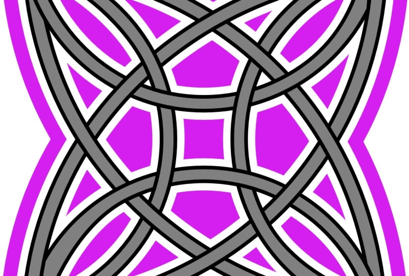
and that shows you a very simple thing that you can do with the shape builder. I also challenged myself to
try doing a Celtic knot, which was a little bit
trickier because, well, it just requires a little
bit or brainpower. So depending on the time of
day for me, it's like, well, I can't even figure
out what I'm doing, but right now, I
think I can do this. So I've got three
extra large circles drawn and they're off the page, but that doesn't
matter because this is the area that I'm looking at. I have added a stroke that's 33 points approximately on these and I'm going
to select them all. I've got them in a group or
on that separate art board. I've selected them all. And then what I'll do is first
I'll go to Expand stroke. Okay? So that makes these into curves. You saw that name just
kinda flip there. And so these are all shapes
that can now be removed. So let's go to shape builder. And what I wanna do is subtract. And I'm going to use that to just kinda clean off all this
stuff that I don't need. So that leads me what I
need for my Celtic naught. And I know that, you know that a Celtic knot does
that weaving things. Some of it goes underneath
and some of it goes on top. That's what I'm going to
first of all deal with. So I'm going to use the
combined this time and I am going to combine and you'll see that the way I'm doing this, let me start this again. I'm going to take the left
side on the top here, and then down the right side, but all the way to the middle. And then I'll take the this would be the
left if I turned it, this would be the left
side of this one. I'll do the same thing, so
I'll do that all around. So you'll see what I'm
talking about here. So I'm gonna go at
partial section, but then this time
I'm going to go all the way down to the middle. This one here, partial section and then down to the middle, and then here partial section, and then down to the middle. And that's given me my overlap
the way I want it to be. So you can see that right there. I could do some really cool
things with shadows and whatnot to create that
look of dimension. Or what we could do is a release just like what we
did a minute ago. On the other we've thing
that we were doing here, what I would do again is put
a stroke on it and let's just change that stroke to
be what's gonna do white, but let's do a
yellow or something, a bright color so
that you can see. And let's expand that stroke
a little bit or widen it. And that thickness is what's going to end up
being the little space. So what I wanna do here is put that on the outside of the line. And I hope that's not going
to cause an issue here. Just wondering if
it will or not. You know what, maybe
I'll go back and before even combining
these sections here, I am going to add that stroke. So let's put that on there. Yellow. We will expand that a little bit and I can put it on the outside. And then now I think we
can expand the stroke so that the stroke itself
also becomes a curve. So if you look at it here
is just saying the curves. These are curves with a stroke, but if I expand it, you're going to see this change. And you can see what it's
done here is it's given us all of those strokes
as separate curves. So that's what's
going to help me to do this Celtic knot that I want? And I might have not gone quite far enough back
before doing that. I think I can save this. So I'm not going to
worry too much about it. Let's just go for it. So what I wanna do here now
is select all of my shapes. And I'm going to be on
the shape builder tool and I'm going to
use the add and I'm going to do exactly what
I did in the first place, which was to take those
sections and combine them. I just had to tap that again. I'm not sure if it's
because I've got free hand selected here or I'll
keep it on freehand. But see what I'm
doing is I'm dragging those sections together and
then I'm tapping on the ad. I don't remember having
to do that before, so there's probably something
that I've changed here. I just wanted to carry
through and just kinda show you what I'll end up with
if I do it this way. So you can see that I've
got that over-under thing working properly and now I can use the subtract to get
rid of all of this stuff. So basically anything
yellow I'm getting rid of and also the big
interior sections here. So I can just tap to get rid
of things or I can drag. And you can see that
you don't want to drag where you
don't want to drag because that's
going to take away things that you don't
want to have taken away. I know that as I do
this more and more, I will get more comfortable
and faster at doing it. But I just wanted to just kinda show you another thing
that can be done. So that ends my coverage of
the Shape Builder for now. The other things that I have been thinking
about showing you, this isn't really
part of those three. Mean, like it's not part of the vector warp knife tool
or the shape builder. This is a completely
different thing that has to do with the
appearance studio, which is right here. So I'm going to cover
that in the next lesson.
6. Lesson 5 Appearance Studio, Styles and FX: Hi guys, welcome to lesson five. I haven't covered this before, so I thought this would be
a good time to work with the effects and with
the appearance. Do you Let's get started. Alright, so this was the next thing that I just
wanted to show you real quick because it's just
something that I think will be quite useful in the long run. I have created this circle here. Obviously, that's this one here. And you can see here
that I've got actually, you can't tell from
this, but I've actually got two strokes that
have been applied. So that's something
that you may or may not have ever seen before. But normally, you can
create a shape of any kind and then just apply a single
stroke to it, right? You could fill it, let's
say with the waffle. No, this is not bad. Coral color and this, you could have a
deep yellow stroke, but there was really no
way to add or not that I knew of adding an
additional stroke to this. Maybe this is something you've already used before,
but I haven't. What I can do here is I can
add an additional stroke so I can use the plus sign
here and I can add, let's color it something different here that I've
added a second stroke to it. The cool thing is that both of these strokes have now been
applied to this shape. So that's what you can do
with the appearance panel, but you can go one step further, which I think is really cool
and that's to save this as a preset in your effects. So if you go to your
effects panel here, and I know it's kinda hidden, It's too bad that
they just don't add. The style is down here,
but the styles are kind of a subgroup of
the layer effects. But now you can go
into the styles here and you could
save this one. I've got it selected still, all I have to do here is add the style from
the selection, and that's it here. It doesn't look to me, it doesn't really represent
what I have there. However, it does work. If I now use that style, I can draw another
shape and apply that style to it and get the exact same setting
as I have here. So I haven't really thought
of too many things that That's going to be
useful for me to do, but I figured that
it's worth knowing, so I just wanted to mention
it real quick here. It doesn't take long to
cover some of these things. And the only other thing
I don t think I covered, I talked a little
bit about the warps, but I thought I could cover
one other thing here. And that's with using the like, grabbing all of this stuff here. I'm going to put it into
a group and then I can go back and I can apply any of these meshes or any of these vector works and go in and make
changes to my lines. And I pick these two colors
for an actual reasons. So you're probably wondering what the heck that reason would be because these aren't
very great colors together. But the other night
I was coming home from the hospital
after visiting my dad. And the moon was
this amazing color, kind of a Goldie, I don't know, orangey,
quarterly color. And then there were clouds
in front and the clouds actually looked very
correlated as well. So it's just, it was
just such a cool effect. I've never seen that before, but that's why I thought I
experiment with those colors. I suppose they probably could
be a little bit lighter, but it doesn't really matter. What I wanna do is just
demonstrate to you the use of and then putting it within
a shape to have it clipped. So that was the other
little cool thing that I wanted to show you. So between those three things, using the shape builder
to create a naught, adding the extra
stroke on and then saving it as a style
and then doing that. Those are three little
things I wanted to add. And just for the fun of it, for the rest of this lesson, why don't we just think
about different ways that we can affect
this lettering. So for one thing, I would be able to select that lettering and of course I can warp it
and do all that stuff. So maybe let's do that first. Let's do the actually
let's do the horizontal, just the horizontal and make
a slight adjustment to it. Let's pull that middle down or up a bit and
then the sides down. Then we'll go in and
expand everything. So we're going to
convert to curves and make sure that
they're expanded in. You see here that each of
these is now a separate shape. What we can do is
use Shape Builder. We're going to select all of
it and we're going to use Shape Builder to
add these together. So they become, hang on, let me select them first. We're going to add all of these together so they
become one shape. And I'm also see how there
are two curves here. I'm gonna go in here
and I'm going to merge the curves so
they become one curve. Now, I could go in and I
could go to the Effects, and I could go to that style that I just created
and apply that. So that's one really
cool use of it. I could see myself
creating a style where I have maybe a gray
kind of a drop shadow or a white release around it so that I could
take this lettering and put it on another background so I could select
all of this now e.g. and copy it. And let's go back to the
document that I was working on. I could hide. My lettering here. So let's just hide this
one and then I could paste the one that
I've just created. And you can see that if I was
to have this up at the top, like that other one was, that I could have a really nice release
around the lettering so that it works well with all of these other
little components. Those releases, like
a white release is something that I think is really quite useful
to create a style for. I wonder if I could go in now, and I wonder if there, I guess there's no way
of editing that one. I would have to go and create a new one completely
with the white. But I mean, it it works
like technically it works, it does what it, what
I'm describing to you. But I'm going to
actually delete it because I like my
lettering better. So the way that one goes
with this one back on, and that brings us pretty
much to the end of the really cool things that I was going to show
you in this class. I have also done things like added drop shadows and whatnot to create some depth like around the heart and around
the lettering. That is something that you
can do in the effects. No, it's in the
regular effects here. So the drop shadow, you can see the outer shadow. I can select that again. And then of course all
my controls change here. This is the offset, so that's how much it's pushed away from whatever I am putting a shadow on this kind of expands it makes it
a little bit wider. And this one is transparency, so I can make it quite dark or I can tone it
down a little bit, which is what I've done here. If I wanted to completely
get rid of it, all I'd have to do is
toggle that switch. That's on, that's off. You can add multiple
things to it. You could add things
like a, an inner glow. If you wanted to make a change, you would just make sure
you highlight that one. And then you could experiment with how that one would look. And I don't know if that
one's going to work honestly, in this case because
It's like it's working but it's not it's
not making it look good. So I'm just going
to take that off, but I just want to show
you that you could put multiple effects on there. Now as far as this design goals, what I did is I just
imported a background here. So that was just a basic
bitmap that I had. I just went to place
and place from files. And then I've got this
watercolor papers and textures. I could import anything here. Let's just grab one. I'll grab something
different here to show you. And I can just pull
to position it and I could rotate it
and then of course, slide it into the bottom
underneath everything. Now what I did for the
heart itself is I was able to drag that background or a background into
the curve here. So I had the curve
and then I used the clipping mask method
that we always use where I dragged it into the curve here and then it became
embedded within the curve. But that already has one. So I'm just going
to take that off, but I just wanted to show
you that's how you do that and we'll take this off. And what I'm gonna do in
the background here is create weave with that
technique that I showed you. So that's what we'll
do in the next lesson.
7. Lesson 6 The Large Background Weave: Hey guys, welcome to lesson six. Now that you know the
concept of what you could do with the
shape builder tool. I want to create with you that full background we've that you see in my title slides. Let's get to it. So I'm just going to
color that one pink and then I'll put my two
fingers down and drag. And you can see that I'm making the duplicate and it's
staying perfectly aligned. Now that I've drawn one,
rather than continuing, I could continue
to do it that way, but then I have to keep in
mind that spacing there. But the other thing
I can do is go to Duplicate here and
you'll see that it will continue to duplicate and it
exactly like I had it there. The other method is
to do a long hold or tap on your screen and you
can hit Duplicate here. The only thing I don't
like about it is to me, this seems like two steps, 12. So it depends on what
your preferences. It's definitely a matter of preference when
it comes to that. Now what I wanna do is use this also for my article lines. I can just select them all. I can either drag
select over all of them like this as long as you
go pass the selection. And I can see that I actually didn't keep it
perfectly aligned here. Can you see that? Flaring
out a little bit here? So before I do anything else, what I can do is align
them and thank goodness, that's really handy now, really easy to access. I'm going to duplicate this and then I'm going to rotate it. Did I duplicate it? Duplicate? Yes, there we go. And then I'm going to just
rotate it 90 degrees. And did I do at 90? I don t know. So let's go
over here and let's just type in 90 to be sure that we
have it perfectly aligned. And I could have had an anchor in the
middle, but I didn't. So now I want to duplicate this whole thing so that I
have all of that space field. So in this case, I just
did the drag method and I'm doing the highly
technical eyeballing method. To position it there. I am going to delete
these extras here, the layers palette
and I can delete, and I'm so excited that the new update that's
coming out for this is going to actually have the garbage can back
here because I am actually really missing it that it's not where I'm used to it. Now for the fun part, what we're gonna do is
start creating that. We've, I'm just thinking maybe it would be helpful if I were to select all of these vertical ones and actually make them
a different color. Whoops, what am I doing here? I am going to just slightly
darken it because I think that's going to
help me to visualize. And already to me it seems
kind of weird because of this. Some of them are behind and
some of them are in front. So I think I'm going to
group all of those for a second and bring them all to the top just so that they're all
lined up the same way. I think that would save
confusion in the long run. And I can still select, I could actually group
all of these as well. So double finger
tap and group it. So I've got to
complete groups here, but this can still work
for shape builder. I would now select the Shape Builder tool and then I'm going to do the adding. What I'm gonna do
is have this be the above part and then it'll go underneath this one and then we'll
go above this one. And underneath this one. The very first couple of combinations are really
at first confusing. But once you get the
pattern in your head, it's not so bad. So I'm going to use
the add function here, and I'm going to add
those two together, but I'm going to skip that
one and then I'm going to add these two together
and skip that one. See what I'm doing here. I'm doing it in groups of three. I guess that one
would be included two doesn't matter about this one because it's off the screen, but now it hit Add and you
see how I've got them. Now, if I de-select here, you'll see it easily, but you see how I've
got it over under, over, under, over under. So having that alternate color makes that a lot easier to see. It's hard when it's
all selected like this to actually see
what's going on, I am going to now alternate. So instead of combining
these two, now, I'm gonna go and I'm going
to do the same thing. But in the alternate column, I guess you'd say, hey, so then I would
get the plus sign. And then now I'm going to
shift back to this one. And you see how that first one know it's hard to wrap
your head around, but once you get going, you get into a role on it and
we can hit the Add there. And then this time
I'm switching. I'm sure as you're
watching me do this, It's like watching paint dry, but when you're doing
this, it actually gets, it's actually kind of relaxing, even nervous at the beginning because you're doing
so much thinking. But then once you realize that there's a pattern
to it or a rhythm to it, it doesn't seem so bad. And I can just continue
doing this now and then just do the addition or hit that plus sign right at the very end. So you can see that now you visually can see a
pattern forming here as I go through and put those three little
sections together. And I'm almost
there, almost there. And when I hit the
plus sign here, I will be done. There's my wave and
I can clean this up a lot by adding another
rectangle here. Let's have no fill
and no stroke. And what I can do is have it pretty much right to
the size that I need it. I guess I could go with actually right to the very edges there because of course it's
snapping to the very edges. And now, if we take a look at this here and select all of it, we could take all of
this and group it, and then take the
rectangle and this, and we'll use the shape builder to subtract all of
this on the outside, you can see how you can just
kinda do a continuous path, whatever you're selecting, you can see a red line as
you're going through it. So that's with the freehand. We could also have
switched here to line, which could have drawn a straight line all
the way through. Or we could also switch to a marquee where we could
just drag to select it. And then of course it's deleted. It's really as simple as that. And I guess off-camera
maybe what I'll do is experimental little bit
with blending modes here. And I'll come back to you
in the last lesson and we'll wrap up with a couple
of other little pointers I have for saving the documents and anything else that I can think of that I
haven't thrown in there. Alright. I'll see you in that
last lesson then.
8. Lesson 7 Bits and Pieces and Saving Overview: Hi guys, welcome
to lesson seven. So as I was finishing
off the project, I had a couple of instances where the software
shut down on me. So I'm going to be reviewing
what caused those things. And then we're going to just
do the finishing touches. I'm going to cover a few bits
and pieces in this lesson. Let's get to it. I just wanted to show
you my finished product with the we've pasted in here. Now, I have run into a couple of glitches,
believe it or not, with the layers and also
with the blending modes. So both of these
things just came up. Now, I decided that what I
wanted to do was to merge the curves so that
they would work better with creating the transparency or whatever blending mode I had. So I was selecting, I'm gonna do all the
cross pieces here. So I'm selecting the top one and then two finger tapping there. And now that they're
all selected, they're all curves
you can see there. And what I'll do is
merge the curves. So that is all of the ones that are horizontal,
as you can see. And then these are
the vertical ones. And I've tried this
three or four times. When I take and
voted combine these, I'll go to merge curves. And this time of course
it doesn't happen. But twice it happened
or three times that it actually just
close the program. So I don't know what
that's all about. I'm going to pull that
out of that group. So this group will be empty
and I can get rid of it. I'm not really
sure what this is. I think I can just get
rid of that as well. So now I've got a clean, just the basic two layers, the cross bits and
the vertical beds. And I'm going to use
a blending mode here. So I'm going into
the blend modes here and you can experiment if you're going to create
something like this, to experiment with
your blending modes. And the opacity can be controlled
here just like always I went and the one
that I found that I liked the best was hard light. That's why I really
liked this hard light. You can see that it's
working right as I flipped through
all of these things, but as soon as I
click off of it, it, it's not there anymore. So I've tried it
several times again, that's another one
of those things. So hard light, which it
should just apply it, there should be no issue here at this point, it shouldn't change. I've done this 1
million times in other classes and with
tons of projects. But the moment I do anything
else, okay, forget it. Now this time it works. It's so embarrassing
when that happens. But honestly, I did try it
three or four times and every time I went through Let's go
back and check Hard Light. Okay. This time it worked. So never mind. You can
do, you're experimenting. I ended up also
going in here and adding a bunch of pixel details. Actually I like using
those pixel shaders, so I'm selecting this layer. And in this case, I also have to go in and make sure that these are
all one single curve. So I'm selecting all of these. I'm gonna go to merge curves. What's wrong there now,
this one's a group, so I got to open this up, take
this one out of the group. I have no idea why that
would have been in a group. This will now be empty so I can get rid of it
and there you go. So this has happened
several times today, so I'm not sure if
it's the document. I'm not sure if it's
just something new That's just there to out
or what, but I don't know. It's kinda driving me
nuts because like I said, I've tried to record
this and tried to do this move several times. And every time I do something happens and the
program shuts down. So it seems to be when you take something and you try
to merge the curves, which is what you'd have
to do this time it worked. Thank goodness. Okay,
Now, in this case, what I'm gonna do is grab
one of my pixel shaders. Looks, let me switch
to the pixel persona. The pixel shader brushes. I'm just really finding
them easy to use. So I'm going to pick
probably this one here, and I'm going to
darken by just pulling down on now that's not working. I don't know what's
going on today. Like look at that now. I can click anywhere in here. I know it's not. My style is I've been
using it like crazy, so it can't be that. And let me just see if that k notice it's
created the layer. I just wanted to see if it
had anything to do with that. So no, it doesn't. So I'm going to pick
up more textural one. And here I'm just kinda
airbrushing around the outside. It created that layer automatically so you
can see it here. It's automatically been clipped to that set of curves there, those merged curves
that I just did. And I can just go in and add a little bit
of dimension this way. So I did that with a bunch
of them, as you can see, and pretty much all of them are done except for
the little tiny ones. Then I have taken this
into Photoshop and of course finished it up
and made it into my title. Okay, So four or five things
there that did not work. But another thing I wanted
to also talk to you about is the gallery
just so that you know, you can just like in procreate, you can create folder structure. So you can see here that
this is class projects, and I've got all of that
stuff in that folder. And to create a folder is the same way as you
would in Procreate. You. Hold down on one
of the documents, bring it over another one, and you'll see that you can combine them or put
them all into a folder. Then you of course, can go in and rename
the folder just also. So you know that remember there was a little
menu down here that you could go into for saving
or renaming your project. Now it's like this. And then also when you
swipe to the left, you get these other
options here. So this one is to duplicate, this one is to save it. And that would be something I would of course do frequently. It's going to take me into where I have specified
that I want to save the project which was these affinity projects in
my Affinity assets folder. I would just rename
it and save it here. At this moment, I'm
going to cancel it. This one here deletes it. It looks like I'm not sure
what that little symbol is. I've actually never
seen that before. I mean, it looks like
it's deleting it. So those are a couple of
things I wanted to show you and also when you do go to Save. So if I were to hit
just the Save here, so I'm going to
backtrack a bit here. First of all, we're gonna go to the new documents setup here, and I want to show you a
couple of things here. Here you can add a new category. So let's say you had something like your master documents, which is one that I have. So that's something
I would name here, or it could be by its size, let's say ten by ten, which is something
I commonly use. So I can have a preset there. So I do have that right here. In this case, I have my
ten by ten half-drop. I don't have any of
the other ones here, but I will eventually bloated up with all the ones
that I use commonly, this is for adding
the new preset and that's where you would put in your name of it and then
whether it's for press, whether it's for print, it could be your standard files. This is to enter a
name for the presets. So you can see
that the one I had selected here is legal if I wanted to go back and let's
say rename this one here, I could highlight it and then go to this and I could rename it. This one here is
what would allow me to get rid of
some of the presets. So if it's something
I don't use, let's say this before. I don't really use, I could hit delete and
that would be gone. So I just wanted to show
you those things there. And then I am going to
make a new document. And here if I was
to go to Export, I just want to show you
here that of course, all of this is
something that you're familiar with is exactly how it was with the
previous version. You could hit Okay, you can preview it. You could also share it. And sharing is a good
way to just send it to yourself or save it to your files or send
it to a client. If you go to save to files air, you could choose anywhere. It wouldn't be into
that preset folder. So you could e.g. this would be a pattern design. I would go into my patterns. I would go down and
create a new folder, name it whatever the name, the particular pattern I was creating with a
course and number. And I would be able
to save it in there. So I just wanted
to show you all of those extra little things that you may not be
too familiar with. And I think that actually
wraps up the class. In the wrap-up, I will
definitely show you a couple of mock-ups done with that artwork that I created. I know I'm also
going to go back and do a vertical
version of it so it can be used on something like
a flag or greeting cards. And yeah, I'll see
you in the wrap-up. Bye for now.
9. Lesson 8 Wrap Up: Hey guys, welcome
to the wrap up. Now that's a class where
you learned a lot. I hope I haven't
overwhelmed you. I really want to encourage you to do a bunch of experimenting
with those new tools. You don't have to
produce this project. You can produce anything
that you'd like. But I think it's good to try to experiment with
all of new tools. The knife tool, the
shape builder tool, and of course, the
vector work tools. Now with the vector Warp
tool is you can do so much. So I really hope
to see something really fun and interesting, something that you have
really thought about and added your own twist to. I'm sure there are gonna
be other things that I discovered about the program. And of course, as I start
teaching on it more and more, you're going to have a
bunch of projects that I think are gonna be
really fun for you. Now, if you haven't purchased Affinity Designer to
please don't worry, you can do a class
like this without having any of new tools. A lot of the shape
builder functions, e.g. you could do with
Boolean operations. It just takes extra steps. Of course, I wanted to show
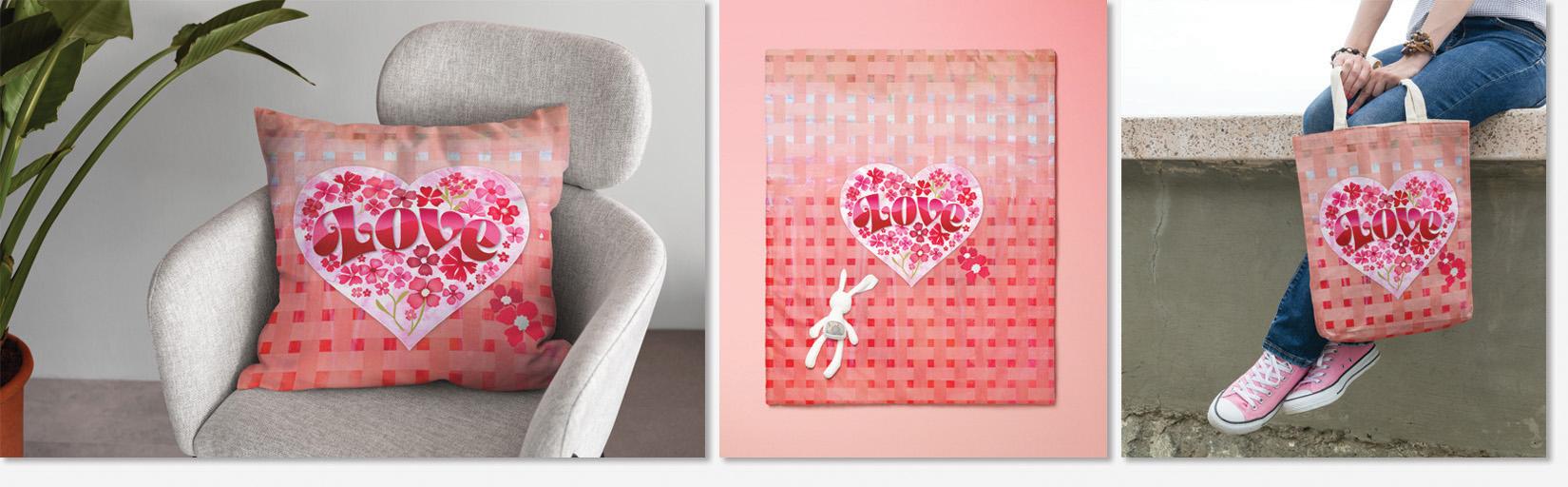
you a few mock-ups that I've created with
my little project. And I hope that you're inspired
to create something fun and use it for whatever
purpose that you have. Just yet using it and
you're going to find that and easy to
use these tools. They aren't as scary
as they sound. Now if you didn't do
so at the beginning of class and you like
my teaching style, then please definitely hit
that follow button up there. That way you'll be
informed whenever I post a new class and
you'll get all of the discussion posts
that I send out. Also, if you have time, please leave a
review of the class. And I definitely
encourage you to use the discussions area if you need to ever contact
me or you want to get some opinions,
anything like that. The discussion area
is for students to interact with
me and you know, I love interacting with you. Remember that you can always do the older Affinity
Designer class is using the new Affinity
Designer program. And everything that
the older classes explain or teach can be
done with this new version. I also discovered that when
I installed the new version, the old version stayed absolutely intact
with all of my files. So remember that as well. Thanks so much for
hanging out with me and I will see you next time. Bye for now.
 Delores Naskrent, Creative Explorer