Transcripts
1. Introduction: You've got your new iPad and your pencil. You venice felt procreate on it and you can't wait to start lettering. But which brushed your use. There are so many options and yet you have no idea which one to choose. In this class, I'm going to show you a basic procreate brushes that are great for lettering and industry. You don't have to spend money on new precious, yet he does. These pressures can create different lettering styles. In his class. I will also include tips on how to create quick patterns. So grab your now, let's get lettering.
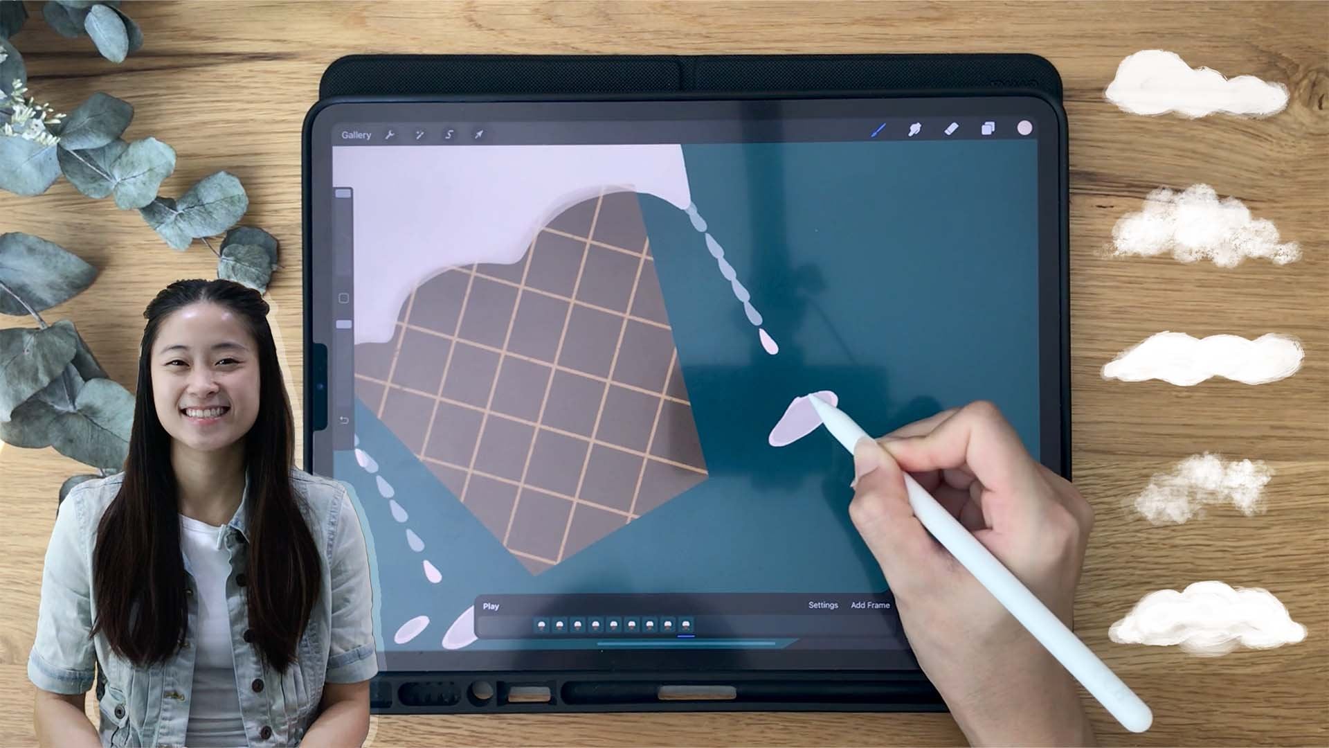
2. Setting Up: Let's set up the cameras for this class. For all the videos, we will be lettering on a 3 thousand times 3 thousand pixel canvas, which will give you ample layers and will be perfect for uploading on Instagram. Next, forever brush, we will set different guidelines which ranges from Sony pixels to 200 pixels to cater to different lettering styles, design, and brush sizes. For every video we will be using the 2D grid for our guidelines. But I will also show you some cool features using the symmetry guide, you can change the color of the grid lines according to the background color that you said, or whichever you prefer. The next important feature is the streamline function on the brushes. So let's pick a brush and I'll show you where the streamline is. Tap into a brush and under stroke path you have this green line and then allows you to change the stream line from 0 to max. This function is really helpful and procreate to create smooth lettering. If you want to keep the original settings of your brushes, just swipe left on the brush to duplicate it. You will see a little icon on the top right of the duplicated brush indicating it is a duplicate or creative brush. For most of the brushes, we will increase a streamline between 90 to 100%. I will show you the difference in a brushstrokes when it is at 0% versus a 100%. When you streamline is at 0%. However you draw on the canvas you'll brush will draw lines exactly the way you move, even with all the crookedness and shakiness of your hands will be seen through the strokes. But as a streamline increases, it helps you get better control of the brushstrokes and smoothing each stroke. There is no right or wrong to where you set your stream line, as long as it helps you have control over how your letter and what you're comfortable with. But for this class, we will use all brushes with its streamline at 90 to 100%. You can see the difference between the left and a right eight, The right a is clearly smoother and rounder. The left a is raw and unpolished. But this also gives it a distinct design if that's something you're going for. Now let's take a look at our brushes.
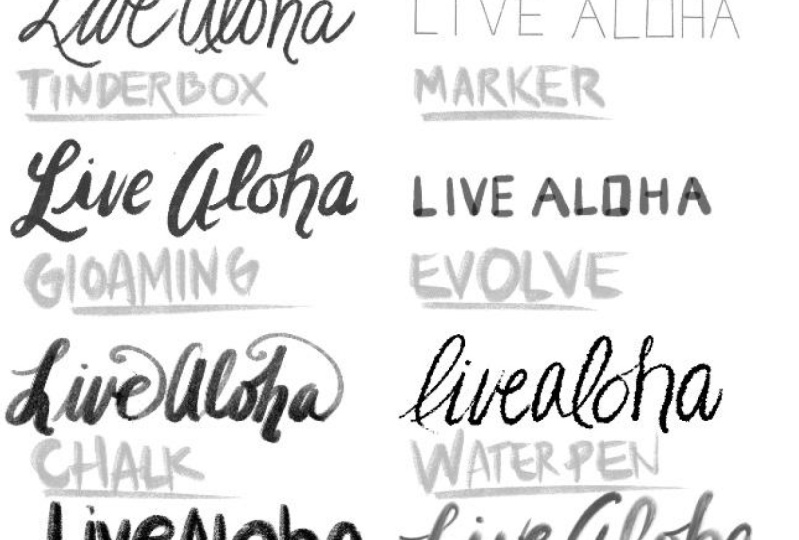
3. 6B Pencil: Now let's go ahead and open a canvas that we have set up earlier. Go and pick your background color that you like. And we're going to just pick a base color. And under brushes, go under sketching and picking 6B pencil. Make sure your stream lines up all the way between 90 to 100%. Now, I'm gonna select my color palette so that I can pick colors for details of this piece straight from this pellet. And let's set our drawing Guide to 70 pixels. I like to keep my pencil size to the max. So you can see it's texture. If you're writing a lot more words, you can reduce the size. For this brush. It skews towards a monoline looked, but it has a slight variation in size. When you put less pressure on your stylist. It's easier to create a monoline pencil. Look. If you tilt your stylus, you will get a shading effect that you can use. If you want to draw a sketch, a pattern around your lettering. But we're just going to focus on using this rush to letter stream line is all the way up almost to the max. You can see how it creates a smooth lines and loops. There are around and tails that fits really nicely. Using those brush to create a really simple lettering piece. Like if I just want to letter a inspirational call or a scripture. This is my go-to. So now let align our words. I'm pleased them in the middle so we can create a simple pattern around the words. So it's not just plain words. And there are tip on alignment is you can turn on and drawing died again and made sure that between your letters, Happy New Year, there's the same distance in between. So you can use two boxes, for example, to make sure that the distance from the bottom and a top of the next letter. So once you're set on the distance, let's just go ahead and take all the letters and put it in a middle, align them into the middle, and we're going to open a new layer. Procreate has a great feature that helps you create rotational patterns. In this video, I'm gonna show you a radial rotational drawing and a quadrant. The difference is just that radial repeated eight times in a quadrant repeated four times. So you can see now, I am drawing just $1 and Euripides eight times already. It creates a really quick pattern with just one simple design. So you can see that in this one simple artwork, I'm using one brush to create an entire artwork with letters and a simple pattern that you can post on your social media. Create a greeting card, purchase anything, you know, create a wallpaper for yourself. So to create a nice color scheme, you can focus on one color and vary its saturation and vibrance. For instance, the colors of my dollars are somewhat within its color range from a saturated orange to a muted Brown with some past obeyed to try picking a color and change up its saturation to create your own color scheme. So now I'm showing you an example doing a quadrant rotational drawing. So you can see it only repeat four times. And I'm using the same color palette. Maybe this time I'm using just a darker orange that is a bit more red. I'm just simply using one shape here to create a pattern. It's like a tear drop or a rain drop. But what you can do is some ideas are using circles or squares or triangles. Look around you and find some inspiration in the simplest. And like your TV, your boxes, any patterns on the things that you have that could be an inspiration of what you can create as a pattern. So now you zoom in and you can see how the pencil texture comes up really nicely. It creates an unpolished look. If you want the lines to look less, move to create more of a ragged look, just reduce the streamline of your brush. Here's an example of how you use the pencil brush to letter, creating this mountain effect. The brush aside for the White Mountain pat behind the word wonderful is made using the evolved brush, which I will show you later on how to letter using that brush. Now, just check which pattern you prefer and realign the lettering until you're satisfied with the placement. And let's move on to the next brush.
4. Narinder: So the brush we're gonna be focusing on in this video, it caught Marriner pencil, scroll down under sketching and find it. And make sure stream minus up to 90% to 100% after select their background color. Let's set our drawing by 270 pixels. For this piece, I'm going to show you a minimalist piece where we're going to leverage on the grids we have set using this. And this brush is really thin, even though my size already at the max, it gives off a very minimal look. So you can see that I'm just falling there grids to create my letters so that they have the same effect. So because the grid boxes obviously, so I'm just drawing according to the lines, according to the grids to create this boxy, minimal lettering feel. You can also turn on Asus drawing to pray a smoother and straighter line. But I did not want it to be so small as I want more hand-drawn like, like it's written on a note. Because later I will use this drawing to show you how you can create a reflection. This brush can also be used to create a modern calligraphy look. Just that. You won't have that. Pick good downward strokes and then they're upstroke. It's just gonna be a really like a monoline calligraphy. Monoline lettering with some loops. Sound joins in lettering, but it can also create a pretty nice look. So as you let her zoom in and out periodically to check on the size, because once you letter it too small and you want to resize it to make it bigger. It can look a little pixelated and just not as clear as what, how you like it. So make sure the sizes alright with what you want to letter. In this part. I am not really editing out the number of times that I am redoing a line just to show you that even lettering and just to draw one letter. But that's the beauty of it because you are actually drawing a letter. This is definitely not my real handwriting because Henry lighting looks really different from this. You are drawing a letter you are creating and resign. Once you're done lettering, go-ahead and rearrange all your letters. This is why I had it on different layers so that I can easily select them and move it around so that I don't have to draw VR then and move it one by one. And once you're happy with its placement, opened a new layer and turn on your drawing die. Under symmetry, select vertical so that we can have a duplicate inner drawing vertically. Here, I'm going to draw a box to create like a little notepad look with a little line on top. Now because you are duplicating it across the line in the middle. Make sure there is no gap in between. Make sure you're aligned to our connects it. Here's an example of how we've used this pencil to create another minimal lettering piece that focuses on the letters and its shape for the background texture. And they're sketching to light all pesto. And you can create a texture background to enhance your lettering so it doesn't look like a flat piece. Zoom in to check out the intensity of your background. If it's too dark, too heavy, simply adjust the opacity of that layer until you're satisfied.
5. Tinderbox: After you've selected your background color, let's find our tinderbox brush under inking. Make sure your streamline and all the way for this brush, I really like it all the way to the max because this brush is great to create a modern or folk calligraphy. Look. For this grid size, we're going to set it higher at 250 pixels because we want to create a larger print. Now test out your brush size and set it somewhere almost to the middle. As you put more pressure on this brush, you will get a heavy weight to create a full calligraphy look, you want to create thicker downstrokes and upstroke. I won't go through the basics of creating this look in this video, but I have another class on hand lettering and creating three modern calligraphy styles here on skill share, do check out that class if it's something they're interested in. The fish streamline at the max, you can create a loop Bu looked with this brush. But if you maintain pressure, if your brush, you can create a monoline look as well as you can see how I'm lettering the word new. Now adjust the placement of your letters until you're happy. You can see I'm questioning the way new is slanted, so I just want to move the w upwards a little bit. And you can just simply do that by selecting the W or whatever letter that you are not happy with and just move it. So I'm just gonna go ahead and letter the last word, year and end the R with a nice flake off the top of the R. A tipping using this brush is you wanna make sure that you have that difference in your downstrokes and your upstroke. There are other brushes whose sensitivity to the pressure is bigger and more significant. But this one, this brush gives a really balance. Feel, unbalanced pressure in how much you put pressure on your downstrokes and how much less pressure you put to create a thinner upstroke. So this brass is actually one of my favorite and creating a modern calligraphy and look. Now adjust the placement of your lettering. And then we can go ahead and create a textured background for this piece. So fine and brush under texture and for light Parkin. This is another brush. I like to create a background texture because it gives you a rough woven look. Now if you zoom in, you can see the brush effect. The sides are not super clean, but not super AIG or messy. Combined with the textured background, you can create a pretty nice lettering, P, C. It looks even greater when you zoom in, when you can see a significant center downstroke, upstroke. Better example of how I use this brush to letter is this ornament using a circle to create the shape I wanted for this bubble ornament, I letter within the circle to create a bubble. And a hanging string is done using the 6B pencil, which I went through with you earlier.
6. Marker: We're going to use another cool brush that procreate provided under textures, which is the grit brush, to create a grit look like you're writing on a notepad. Jump, we swipe back and forth to great your grit back ground, ultimate pressure of your brush, and use one continuous stroke so that it doesn't overlap with each other. If you lift your brush up and press down again, your grit will overlap. Now select them marker brush under inking and make sure you're streamline is up between 90 to a 100. Checked on the size of your marker. I'm going to set it to about 11%. For this brush, the colors will overlap, creating a deeper color when you overlap the lines. Just like how you would expect a marker to be when you draw on a piece of paper. Some people might like it, some will not. It creates a very distinct look. So depending on your style, this brush may not be for everyone, but I think create a very nice look. You see how when the ends join, when the strokes join, it is really like a darker brown. It is as though at those points you create that you added a multiply blend. As you load it with this brush, you will find it creates more of a round and fat effect, more round lines. And as you press down and feels like a lot of ink is flowing out. But there could be a little bit of difficulty in using this brush because it's sensitivity to pressure. It's so significant, like just a slight deeper touch in your pressure or your stylus. Or if we lift so little bit, it changes the entire brushstroke. Blake. You can get it to be fatter is like when you press your martyr into a pan a little bit too much and suddenly there's a big ink spot on your paper. Unless business, a look that you're going for. It is a great brush to create lettering, especially when, when the line overlaps, you can create a pretty nice design or even, or drawing with this marker. So if you have a piece that really emphasizes the look of how this brush goes way, show me, I will love to see it. So once you're done lettering, let's go ahead and realign the letters. Putting it in a meadow, you can make it smaller if you want. And let's zoom in and check out the texture of the smarter. If you can see it has little fuzziness on the sides of the line. The mixin look like the Inca seeping into the paper you are panning on. So this marker really has its own texture and it's a great lettering tool.
7. Gloaming: So for this brush cop glomming, it is under Drawing. Select the glomming brush and set your streamline to max. This is another brush that is great for modern calligraphy and texturing. Your brush and seeds thickness and the texture of it. So we said quadrant rotational drawing to create a background with this brush. So I'm going to use a range of blue to create the background so that it ends with a small box in the middle to letter h and y for Happy New Year. As you can see, as I am just going left and right and an angle you can see the quadrant really helps to get a quick pattern going. And you can already see there's a really nice texture that you can later on in the background. It won't be just a flat lettering piece with a solid color. So open a new layer, pick a color for your brush and readjust the size of your brush so that your brush isn't too fat when your letter within your box because you only have a minimal amount of space. So it really depends on how big or small your boxes and how thick you want your downstrokes to be. So just readjust and try it out. The more pressure you put on this brush, the thicker the lines are going to get. The best way you can leverage on his brush is to control the thickness of the downstrokes and Yup strokes. So you can create a prominent difference between the strokes to get your modern calligraphy look. And the streamline on Macs helps to create loops at the beginning or the end of your letters. I'm going to show you in another time when the Brush size so a little bit bigger so that you can create that prominent difference. And it comes out with a different style and the Euro letters. So you can see after I have a new layer, this brush is a little bit bigger and psi. So when I put more pressure and a downstroke, it becomes really much thicker than the app's strokes. And I can do the loop, zoom in texture for brush to understand how it looks. If you notice, there's this one line on the left of a stroke as though you have a brushless not fully way. But it has this one thin hair sticking out the rest of that didn't quite pick up enough pain. So just try using a smaller size and a thicker size while controlling a pressure to letter with this brush.
8. Evolve: Under Drawing, select the brush, evolve. Notice brush also becomes very thick as you put more pressure. But with the right pressure, you can create a very nice modern calligraphy look because the sides of the brushstrokes are very edgy, giving you a rough texture to set your drawing Guide to 70 pixels this time. And we're going to letter within two boxes for the main body in the previous one and we're restarts I showed you, I will extend the bottom or the top to create a loop. So this one, we will keep it to look more clean and cohesive. Practice using this brush to get a better hold the pressure so you can create really thin obstructs and thicker downstrokes. You can always also choose to change up your goods so that you can get a different drawing, a lettering guideline to create the frame lettering styles. So once you're done, let's adjust its placement to place the metal. This is the brush that was also used to create the White Mountain cabs and the 6B pencil video. If you don't remember, it can go back to that video to look at it again. So because of the really great edginess that Jagger rough lines and the texture is really great to create a drawing as well. So this is what we're gonna do. We're gonna create an abstract line to signify a son for a new year, new beginning. So go ahead and put heavier pressure and the beginning and just lighten up your project to get the, the narrow line across, separate that arm. Take a closer look at how the brushstroke is. It really creates a simple drawing on its own. And even at pretty cool lettering tool.
9. Chalk: Now let's move on to the calligraphy tab and select chalk. This brush is great for drawing, creating textures and also lettering to create a queue chalk on Blackboard feel. So that's what we're gonna do in this video. We're going to try to create a chalky feel. I've set my grit to 200 pixels for this piece to get bigger boxes, to create bigger and around letters. So follow along the grid to create one alphabet. So imagine you have four boxes to create a square. And that's where you want your main body of your letter to be. I've actually drew my letters really close to each other. But if you let some spacing between yours, feel free to make your letter smaller. Put them within the four boxes there creates a large square. Now if you can see that the light side of the brushstrokes are not as saturated as the right size see-through, but really in, creates a nice chalky, powdery field to the brushstrokes. Doing IS brush tip is created, is not like the other modern calligraphy brushes where when you press down, then you get a thicker downstroke and if you lighten up, you get a thinner upstroke, but it is more slanted. So if you can see that when you press down and you end, it ends with a slant. Once you're done lettering, let's just realign all the letters and put them all in the middle. A great tip for using this brush besides lettering, is to create texture in your drawings. So for example, you can, even, after you've drawn a shape, you can use this brush to create shadow wings and highlights. And it really gives the illustration and new feel.
10. Water Pen: I'll find out brush as the water pan. This is also another really nice brush for a modern calligraphy look. But this brush gets extremely thick with pressure. Its sensitivity is higher than a tinderbox brush. So make sure you check on your size. Test out the pressure to see which size is best for you. As you present a brush, more aim comes out of it. And as you release the pressure, your strokes becomes thinner and lighter. Like how this brush really gives you the water effect. And when it overlaps, you can see it being drawn over the other parts of the letter. Take the P, for example. At the end of the P, where it's round it. You can see that it overlaps the leg of the p. But because of the weight of brush and it, it creates some mixture of ink and water look that enhances the entire look and feel of this alphabet. The varying strokes gives it depth. When you use this brush to letter. By itself, even on a plain background without texture, it can create a really nice lettering piece. Take a look at how thick the downstrokes are and how much thinner the upstroke ps can be, especially the ones where you flick off the end of the alphabet. One thing I really like about this brush is when it's at its max streamline, it can create a really nice loop. And how you can vary the thickness and thinness. And because the intensity of the color comes with how much pressure you put in, it creates a really nice gradient between intense and vibrant color versus a light and the saturated field.
11. Class Project: Once you've gone through all eight brushes, It is your turn to letter. For your class project, you're gonna letter the same work eight times in all different brushes. Now, if I seem a little bit difficult or tricky to letter the same word in eight different designs. But if this is a good practice because you will challenge you to think outside of the box to find inspiration around. Even in this list is things like your couch to design at a pattern of your couch or leaves or shapes around you. So look around you for use this time to practice your lettering and whatever you've come up with. These shared with us in the class project gallery. I would love to see them. If you are an Instagram, you're free to tag me at five bags and see you in the next class.
 Voni Lim, The Pupil of Stuff