Transcripts
1. Intro: You have some colored
pencils lying around and 5 minutes to
spare, then bear with me. Hi, I'm Gabriela Shel, an illustrator and
concept artist. And today's class
is all about quick, fun thumbnail sketches
made with colored pencils. Most of us already have
colored pencils at home, and there are so many
practical benefits to painting quick thumbnail color sketches without the pressure
of longer painting. Just 5 minutes a day can help you break from the
perfectionism trap, train your eye for composition
and color harmony, teach you how to simplify
complex subjects into loose sketches and help you effortlessly build a
consistent art habit. And most importantly, they
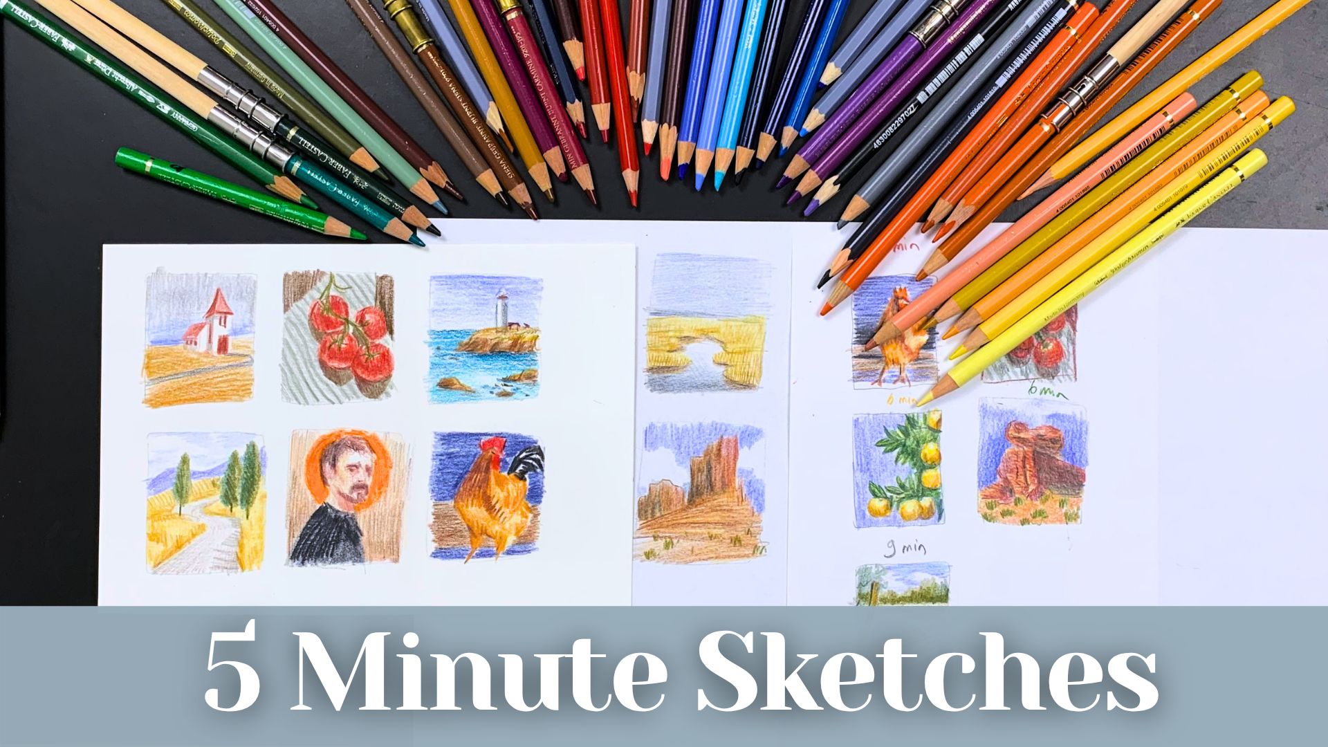
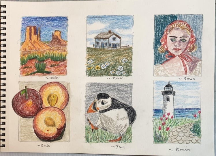
are really fun to paint. This class, we will be creating quick and fun five to seven minute color
thumbnails together. You can choose to
commit to doing one sketch per day as a
quiet morning ritual, or you can sketch several at
once in a signal setting. I will walk you through how
I organize my materials, how I work with references, and my dot process while I work. So grab some pencils, a piece of paper, and let's start building your
art habit today.
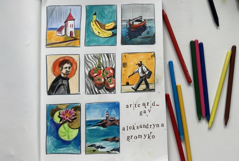
2. Class Orientation: In this class, our main focus will be creating a series of quick thumbnail sketches without the pressure of producing a
complete or perfect painting. We want to have fun with these quick solor sketches and in the process steadily improve our art skills by building
a consistent habit. For the class
project, I encourage you to create your own
five minute sketches. You can choose to
create one per day as a part of building your
daily sketching habit, or you can paint all of
them in a single setting to make things as easy as possible
for you to get started. I have put together a Pinterest full of beautiful vibrant
reference photos, which you can find linked
in the resource tab below. So you're also more than welcome to use your own
photos if you prefer. I want you to grab
a piece of paper, quickly draw six
rough little frames, and tackle these
studies one by one. One of the most important
things here is to avoid getting caught up in details
and overworking your art. For that purpose, make sure
to have a watch or timer on hand to keep the sketches
at five to 7 minutes each. Remember, the goal here is not to create a
polish masterpiece, but to train your eyes,
simplify the shapes, and actively practice letting go of that
perfectionist mindset. So go ahead and open
that reference board, and let's move on
to the next lesson to talk about our materials.
3. Materials and Preparation: Let's take a short
moment to talk about all the materials you
will need for this class. Colored pencils are a
medium which is oftentimes put away in the category of
children's tool right away, apart from some
excellent artists who use them for
realism style artworks. I wanted to get away from that and start using colored pencils more extensively because they offer a certain freedom
from perfection, which we oftentimes fall
into with other mediums. I grew quite a big selection of colors over the
last few years, as I've been buying
additional colors separately from the sets, and I use them extensively
to do quick sketches or as an additional tool to other mediums such
as watercolor. I use mostly polychromos
for fiber castle because I think
they're wonderfully pigmented and easy to work with. What I also really
appreciate about them, especially when working on
speed paintings or thumbnails, is that you can see the
color right away because the whole body of the pencil is colored and the color
of the lead itself. But I also use other
brands or series which I have at hand as long as they
have the right color I need. So for example, I will use
watercolor pencils alongside normal pencils or even
some cheaper sets I found among school supplies. That being said, for this class, you can use literally
any colored pencil brand you find because this class is not
about perfection or high pigmentation or
the end result per se. I have successfully used school grade colored
pencils for my thumbnails, as well as high end
professional pencils. So just use what
you have at hand. What I do recommend, though, is to have a wide range
of colors available, since we will be
working quickly, and it's quite useful to have
the colors at hand without having to layer
too many different pencils to achieve
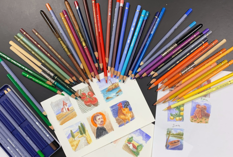
the tone you need. I like to organize them by color groups, so I
have them ready, mostly grouping them by yellows, reds, blues, browns,
violets, and grays. I also like to use a utility
knife to sharpen my pencils, as it gives me a
better point than a normal sharpener by allowing
me to create a flat edge, which is great for quickly filling in bigger
parts of the sketch. I also use an eraser to remove some excess
colors if needed, and I also have a normal pencil
for my outline sketching. I'm not really picky
with my paper either. I've sketched on
normal print paper and even on bigger school
grade paper rolls. For this class, I'm using this Canson mixed media paper because I like that it's
somewhat thinker at 200 grams, and it has a nice texture which makes it easier
to layer color. You don't need fancy
paper for this class, but using a somewhat
ticker paper will definitely make the whole
process much more enjoyable. For this class,
you will also need the reference board I prepared
for you on Pinterest. To you're also welcome to use your own reference
if you prefer. I like to open them on a
computer or my tablet nearby, and I actually leave
the whole board open without clicking
on the single images because keeping the
reference images fairly small forces us to
ignore the tiny details. Since we want to
paint thumbnails, we want to just focus on the
main parts of the image, such as the overall composition, the colors, and the big shapes. Also really recommend having
a watch or time nearby to avoid overworking and spending more time than necessary
on the sketches, as I usually recommend spending around five to 8
minutes on each. So grab your favourite pencils, sort them out to make it as comfortable as possible,
and let's get started.
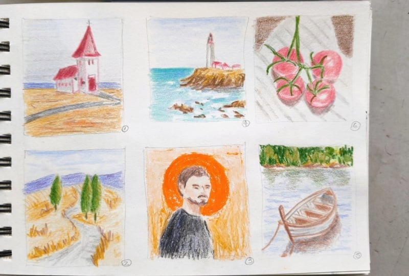
4. Demo 1: Coastal House: So let's start with
the first demo, and to begin with, let's
start with the simpler one. I have my reference image
open on the computer, and I will also add it here to the screen so you can
see exactly what I see. I have all my materials ready
and my colors organized. And while you can pre
select the colors you plan to use for a certain
image in advance, I personally prefer
having them all at hand. I'm going to quickly pre sketch the frames of
our thumbnails today, and of course, you could use a ruler to make it
all pretty neat. But usually, I just sketch
it free hand like that or even start right away
without any framing at all. Once you have the frame, you can use a graphite pencil or just a light colored pencil to sketch your rough
outlines of the image. I like to make a very rough, quick sketch before I dive into the coloring
process per se. So I have some basic
outlines to guide me, mostly focusing on
the horizon line and the overall structure
of the objects. A good piece of
advice I learned when I was in art school is to try and see the shape
of the object by focusing on the outline
against the background, basically, as if you were trying to paint a
negative space. When sketching buildings, it's also important
to pay attention to the perspective lines
as nothing can break the believability of your sketch quite like bad perspective. Once I have sketched
the outlines, I continue right away with
filling in the color, and in this case, I'm using a brick red color
to paint the roof. As you can see, I'm placing the marks following the
direction of the roof. Following the form with
your line placement is a very useful trick to instantly add texture and emphasize the form of the
subject in your painting. Then to put the colors directly into relationship
with each other, I'm coloring the soil, which consists of several
different shades of ochres and some oranges
to add some warmth. Here again, I place the line horizontally to further
accentuate that plane. The great thing about
colored pencil is that you can easily layer them to achieve the exact
colors you need. The sky is somewhat grayish, so I am using a mix of blues and grays to capture
that feeling. You don't have to have the exact same color I have at home, and I really recommend you just use the colors available to you because this is all about training your eye and choosing the colors that speak to you. If you add a color and see
that something is off, you can either erase
it or just layer a different tone over it to create the hue you
need for the sketch. And we can also see
a little bit of the sea behind the
building on the horizon. So I'm using my
blue to add that. A few more touches,
and we are done. So let's move on to
the next one. And
5. Demo 2: Tuscany: For our second demo, let's paint a cozy Italian landscape. I will use my gray pencil
to sketch the outlines. It's generally a good
practice to quickly determine the main colors of the scene and use that one for
your initial outlines, although you can also
just use a normal pencil. The scene has quite a
few more elements and a very nice road that kind of disappears into the horizon. So I am taking a little
bit more time on the initial drawing in this one in comparison to
the last sketch, as we have a very interesting
composition to capture. For one, we have this S
shaped road that disappears into the distance and some very interestingly
shaped trees, while in the background, we
have different layers of fields followed by mountains
and beautiful clouds. I use ochre to lay
down the fields. Since we have a lot of
vegetation which naturally points upwards like
fields or weed or grass, I am using an up and down
movement when adding color so we can create the texture naturally
with our strokes. We have some horizontal lines in the background,
which I add as well. And then I use a cooler brown
tone to sketch the road, using the same principle of
following the direction of the road with my line to strengthen the feeling
of perspective. Uh, Let's also add the shadow on the road
from the vegetation. I use an olive green to paint the lighter parts
of the trees that catch the light and a darker
green for the shadows. Though in hindsight,
I'm actually not too happy with the color
I chose for the shadows. Which is why I am just
painting right over it again with my olive
green to soften the hue. That's actually the
exact reason why I keep a piece of white paper
lying next to my canvas. So I can use it to try
out colors and see if I like them before adding
them directly to my sketch. I use a darker ochre to add more definition to the
fields and the grass, and I like to
imitate the texture of the fields in
the background with some lines that also help to
show the depth of the scene. Now, moving on to the mountains, they have a very distinctive
blue tone in the distance. And since I don't have
that exact color pencil, what I like to do in this case is to start with a color base. We have very beautiful
clouds in the background, and since we cannot actually
paint white on white paper, the best thing you can do is just leave the white
of the paper as it is and paint roughly around it to add the
feeling of the clouds. I layer an additional color to my mountain range to
create the hue I need. I also add some more Acrashadows to mark the road and Walla We are done in a bit over
5 minutes for that one. So let's move on
to the next one.
6. Demo 3: Tomatos: Change the subject somewhat and paint the still
life for a change. In this case, a beautiful
photo of tomatoes. I am using my pencil to
sketch the outlines first. We have several elements here, including the spherical tomatoes in themselves with their stems, the white striped
kitchen clothes, and a warm brown background. Since it's quite hard
to fill in color while maintaining a perfect
circle when working fast, I like to draw out
the outline of the tomatoes before I start
laying down the base color. A good practice is also to determine the lightest
parts of the image. Apart from the lighter cloth, we also have the highlights
on top of the fruit. You can sketch little
circles on the spot to remind yourself to keep
them white when coloring. So now I'm choosing
a matching red tone and paint the tomatoes with it. Being very careful to leave the highlights areas
completely white, being very careful to leave the highlight areas
completely white. Ds After that, I choose a darker red tone and start adding darker values, especially in the parts
of the shadow area. This is a really great exercise in learning to see
colors and shapes. And if you pay close attention, you can actually
see reflected light bouncing back into the
shadow side of the tomatoes. I use olive green
to paint the stems, which for some reason, I love using for most of
my greens, but anyways. For the cloth, I use my light gray pencil to make the bright tomato
stand out more. And luckily, I have a
green pencil for that. It's very similar
to the reference image to paint those stripes. I I also paint the background of the
image with a brown. But right now, the image
still looks quite flat because we or cast shadows.
So let's add those in. The shadows falling below the tomatoes have
quite a warm tone to them because the red from the tomatoes is actually
affecting the hue of the shadow. So I use a brown next with
red to add a warmer uter. I also add some more intense
reds to the tomato itself, especially on the
edge where the light transitions into
the shadow because it instantly creates a
more t dimensional look when combined with those
shadows underneath, because it instantly creates a more three dimensional look when combined with those
shadows underneath. I could keep on working on the clothes and
adding more details, but that is exactly not the
purpose of this exercise. So I will call it done, and
let's go for the next one.
7. Demo 4: Portrait: Let's see how you can apply the same speed painting
principles to a portrait study. I really like this reference
image because it has some cool geometric shapes
and great color contrasts. So I'm taking a bit more
time to sketch the figure as we need to take the proportions of the head into consideration. I just want to remind
you again that it's really not important to
be perfect at this stage, because this is all about training your eye and your hand, learning about
color combinations, and learning to let
go of perfectionism. After sketching the
outlines of the figure, I like to fill in the
most obvious parts first, which in this case,
is his shirt. I use Payne's gray as a base and add a bit of
a darker blue to it. Now I go for the orange
circle in the background. As with the tomatoes, I outline the circle first
with my orange color and then painted in carefully as orange is not the
easiest color to erase. Now I add a yellow tone to the wall in the background
as a first color. To darken it and to
make it a warmer hue, I add a flesh colour tone. I do this because I don't have the right color for the
background right away, so I have to get a little
bit creative mixing it. I use the same flesh color to add a color base in the face. The shadows are quite
warm in the tone, so I use a brownish red to mark the parts where the
shadows of his face are. It's somewhat like
a brick color, and I use it quite a lot. I like to quickly map out the major shadow
areas of the face, which are the eye sockets, the nose, and the mouth area. And if, by the way, you want to learn more about portraits, I actually have
quite a few classes with the portrait focus here, so feel free to check those out if you want to learn
more portrait basics. Portraits are generally
considered to be more complex subjects
because you have so many different subtle
hues and shadows and shapes working together to create an illusion of a person. But again, the whole goal of this study is to keep
it loose and quick, so I will actively avoid
overworking it at all costs. After the brick
color, I am slowly deepening the darker
parts of his portrait. I chose a brown to
paint the hair, beard, and also marked
the eyes and eyebrows. I also like to layer different intensities
of colors when I work. So, for example, I first
left the shirt rather light and then added more
strength and darkness later on, always making sure to
compare how my image looks in relationship to the
other colors of the page. Since I used mostly warmer
colors for the portrait, I added some darker
shadows with my dark blue, especially in the eyes,
eyebrows, and the hair. I strengthened the
oranges as well, and also added some more shadows on the background itself. I also decided to add some
more colors to the skin tone, but in my opinion, the okra
wasn't the best choice here. So I will leave it as it is, since I'm already at
seven minute mark, and I don't want to
overwork the sketches. So let's move on to
the next sketch. Oh
8. Demo 5: Lighthouse: Paint a beautiful atmospheric lighthouse for our next demo. I again use my pencil to
draw out the horizon line, the outlines of the lighthouse, the rocks, and the sea. Here you can see how I'm using my additional scrap
paper to test my blue colors before
I commit to them. I have so many
blues and there are so many different blue tones
in the reference image. So I wanted to make sure I am choosing the most
matching colors. I start by filling
in the sky using horizontal strokes to sketch
the blues of the sky, keeping it super light
at the beginning, because I will be
continuously adding more and more strength to the colors as I
keep working on it. For the Sea, I am using
a different type of lu. I use ochre for the
base of the rocks, and it's generally a good idea to work from light
to dark when you use colored pencil when you
use colored pencils. So since we have quite
a few lighter browns and aqua tones in the
sunlit part of the rock, I make sure to sketch
those in first. Now, I switch to a
darker brown and start defining the heavier shadow
areas of the rock formations, varying the direction
of my lines when I do so to help create some
additional rugged texture. I use horizontal strokes
to paint the water, paying special attention
to the whiter spots in the sea where the foam
breaks against the rocks. As I paint, I'm switching between three
different blue colors, adding more color variety,
and depth as I go. I leave those foam areas
mostly untouched, and instead, I use different blue shades to darken the sea around them, and you can really play around with different colours here to see what turns out and which combinations you like the most. I am also adding some vegetation using aqua and greens
to the rock formation. Oh. The lighthouse
itself is white, so we will preserve that
lightness of the paper and only paint the shadow side of
it, as well as the red top. I'm not even sure
the top is red, since I keep the
reference image so small, but I don't actually
care that much about it. I think red will do great on this color composition and add another colorful
element to the sketch. The lighthouse also has a nice little house structure
sitting next to it. So let's add that as well. And remember, it's your
sketch so you can be creative with it and add and remove elements
exactly as you like. I feel like I left too little white where the foam part is, so I'm using my utility knife to cut a sharp piece
from my eraser so I can easily
erase smaller parts of my sketch to bring
those highlights back. I could have left the parts completely white as I did with the tomato sketch by marking the area with
my pencil beforehand. Another way to make
the white send out more is to darken the
area right around it. So since we have a
darker area below the rocks where the shadow
falls on the water, let's darken that a bit
to push the contrasts. We are nearing 7 minutes
already, so I will call it done. I think I captured
the likeness nicely, and it was also quite
enjoyable to paint. So let's move on to
the last sketch. Two
9. Demo 6: Rooster: Change of pace, let's
paint an animal, and I found this really gorgeous
reference of a rooster. Before you start painting, it's always a good idea to analyze the reference
image for a moment. And here we have
all those beautiful orange hues in the body of the rooster with some reds and dark blues and
grays in the tail, all set against a
bluish background. This is a really
nice color contrast, which is naturally going to make the image pop. So
let's get started. I use a pencil to sketch the outline of the
rooster, and here again, it's a great idea to focus purely on the outline
of the shape against the background rather
than trying to decipher the complex
anatomy of the bird. Just pay attention to the shapes the rooster creates against the frame of the image and the background and
sketch those in. I lightly erase a bit
of my pencil line art as I don't want it to be
visible under my final sketch. I start with the background
using a dark blue color, and since we have horizontal
lines in the background, I add those using
horizontal strokes. Below the blues, we have a browner patch where the light has fallen
behind the rooster. So let's add that as well. Now moving on to
the rooster itself, I am adding a yellow undertone under the whole animal first. With an orange pencil, I'm marking the shape of
the wings and the breast, using the same directional
principle we talked about in the other drawings by trying to follow the natural direction of the feathers I'm painting. This painting is basically a
rich mix of oranges, browns, and reds, which we just have to layer until we reach the
depth or color we need. Tail, I use paints gray, which is my absolute
go to shadow color. And with a warm
brown, I'm painting the shadow area of the
breast and under the body. We have some really
nice reflected light in the shadow area
of the breast, which is light that is being reflected from the
brighter spot on the floor and bounces right back against
the rooster's belly. I darken the background progressively, and
if you look closely, you can see how the oranges
and the yellow start popping out more and more as soon as I darken the
space around them. As I go, I add some darker and more intense browns and
oranges to the rooster. And that's it, or
last one is done.
10. Final Words: Congratulations on
finishing this class. You can be really proud of yourself on having
started something today. I hope you found this
little class useful and encouraged you to
create your own sketches. By setting a limited time frame and choosing to work small, you've captured the essence of six completely
different subjects without letting yourself get
trapped by perfectionism. Throughout these demos, we practiced how to
simplify complex shapes, how to find color relationships quickly without
overthinking them, and how to use our
pencil strokes to add texture to our sketches. I hope this class has
shown you that you don't need to have
hours of free time to create beautiful
art or to improve your observation
skills because doing those five minute thumbnail
studies is a fantastic way to warm up your hands and train your eyes before a
longer painting session. For your class project, I would love for you to
create your own page of five minute colored
pencil thumbnails using either the reference images I provided or any images
that inspire you. Remember not to worry about
the final result and instead, just focus on the process, playing with the
colors and sticking to that time limit so you can
really embrace the process. Please make sure to upload
your thumbnail sketches to the project section because I absolutely love
seeing your work. If you enjoy drawing
with me today, please leave me a review
as it really helps out. Feel free to check out
my other classes here, and thank you so much for
joining me. See you soon.
 Gabriela Shel, Illustrator and Concept Artist