Transcripts
1. Introduction: Hi, I'm Tabitha. In this photography class, I'm going to be sharing with you my top five editing tricks in Photoshop. As a product and food photographer, I'm doing the bulk of my editing in Lightroom, but having Photoshop has saved me on several occasions and so I put together the biggest ways that I use Photoshop in my workflow. I'm going to be guiding you through some tutorials on how to invent a little bit more background in your images for more dynamic cropping and to reduce any tension from objects getting too close to the edges. I'm going to show you how using the cloning and healing tools in Photoshop can make your workflow faster and more clean. I'm also going to help you push reality just a little bit by showing you how to do a seamless head swap in a portrait, as well as crafting that perfect coffee splash for shot by doing a mix of different photos in a composite. This class is for intermediate to advanced level photographers. Ideally, you know your way around Photoshop. I'm going to be calling out a lot of the keyboard shortcuts and working in real time so that you can see how I'm putting these techniques to use. My name is Tabitha. I am a lifestyle product and food photographer and a teacher here on SkillShare. I'm really excited to share my Photoshop tricks with you. Let's dive in.
2. Inventing a Background: Thanks so much for joining me for the class project. I would love to see your editing before and afters. It's so fun to me to see where your photo started and where it ended up and how you're going to use these techniques that I'm about to teach you in your workflow. So don't forget to share this in the project section here on Skillshare. With that being said, let's jump into our first technique which is inventing a background. That's what I like to call it. That's basically where if you accidentally shoot a photo tall and you end up needing it wide, like for a YouTube cover image, or maybe a Facebook ad, something that's going to be a banner shape, you're going to either have to crop in really small on your image and not see the whole thing, or you're going to have to make up a background, which is what I'm going to show you how to do. So let's dive in. I am in Adobe Photoshop 2021, and my first example is this orange color flatlay. This is just an example photo I took in my color flatlay class. But as a flatlay, it's going to be a pretty good example for showing you how to apply this technique. This picture is a four by five, or eight by 10 sized for tall for Instagram, which is what I typically do. Sometimes people want a square, so we are going to make this a square, without cropping in. We want to crop out. So I'm going to drag my square crop box and then hit "Enter" to accept. Right now I have these big white bars on the right and left of the image. I am going to use the Marquee Tool. Select those. Right-click "Fill". This will bring up the fill menu. I have content set to Content-Aware, and I'm going to hit "Okay". This is just the basic fill. But I use it more often than not because it's simpler than the more advanced Content-Aware Fill which we will talk about in just a minute. So that has already gone in and filled that, Command D. It looks amazing. I'm going to go ahead and repeat this on the other side. All right, command D. There is our finished image beautifully square. For any square applications, the same technique works. If you need to do a video thumbnail and you need it to be 16 by 9, we're just going to change this to 16 by 9. Stretch the crop box to include our entire image, and then go ahead and fill in those sides as well. I'm going to show you the advanced Content-Aware Fill tool. I'm going to select this whole thing. Right-click, and instead of going to Fill, I'm going to go to Content-Aware Fill. This brings up its own separate menu and you can get a really good idea of how it's going to fine-tune. So what we can see on this left panel is our image and then there's a green mask. The green mask is just a representation of what in the image is going to be sampled for our fill. So if it's sampling some of the items in the frame, it might copy those there, and if you've ever used Content-Aware Fill in the past, you're probably very familiar with the fact that it has its own mind and it will copy and paste random things in a way that doesn't really make sense. If you haven't used Content-Aware Fill since Adobe Photoshop 2021, I highly recommend it because they have done amazing improvements to it and I barely have to touch these images. That's great. Anyway, we have our selection box, and our little preview gives us an example of what we're looking at. I think that this Content-Aware Fill job looks awesome. One more thing before I hit "Okay", the output settings are by default set to output to a duplicate layer. This puts your changes on another layer. I think most people like that, but I don't like that. I want to output to the current layer because I don't want to have to merge it later. I'm going to merge it later. Command D to de-select. That Content-Aware Fill did exactly what I would've wanted. Now I'm going to select on this side, go into Fill Content-Aware and do the exact same thing. Whether you use the full dedicated menu, or you trust the program to do it on default, or auto mode, I think you can get great results either way. But this was a really easy example. You're probably looking at this like, "Yeah, it's easy to fill in a white background." Let's go into something a little more complex. This image, I I these dipped salted almonds and we have it cropped to a square. If I wanted to give this image my tall treatment, I'm going to go into my crop box. We're going to go up to four by five, or 8 by 10. This one I could just crop in and the almonds would really fill the frame. But, just for example sake, we are going to make it have a lot more space around the edges. This is also nice because if you're creating content for Instagram, it's a good idea to make sure that your image fits within the square because the square is what's going to show up on the grid, even though the stat it pulls as it rolls in is going to fill the screen if that makes sense. So if you plan to fill the screen and then when you get it posted on your feed, it will be cropped into a square. So it's nice to just make sure that everything fits in the square. We are going to go ahead and use the Marquee Tool again, select this area, right-click, Content-Aware Fill. This one I'm a little worried it's going to do some weird stuff on the top there because we've got some fun smudges. Man, it just does such a great job. I think it looks awesome. There's a weird little smudge happening right above this right-hand top almond. I want to figure out where that's coming from. What I'm going to do is I'm going to actually brush into my mask. Right now it's set to negative. If I click on something I don't want it'll take it out, and then I can hit the Alt key. I can hold down the Alt or Option key to go back to positive. Right now I'm seeing this strange dark smudge. I'm going to change the size by using the left bracket key. Then I'm going to click around where that dark smudge is and hopefully it'll take it out or fade it in. There we go. That looks good. One thing to keep in mind, if you touch the edge of your selection box, it's going to produce a really harsh line in your final image. Let me zoom in so we can really see what I'm talking about. You can see it's not so harsh. You wouldn't really know unless you were looking for it. But I do see a nice stripe right there that is not going to work for my picture. So Command Z, I'm going to undo where I touched the line and the rendering looks so much better. I'm going to hit "Accept" making sure I output to my current layer, and that looks awesome. Command D to de-select. I'm going to go back to the Marquee Tool and I'm going to select the bottom and do the very same thing. Right-click, Content-Aware Fill, double-check my fill that it looks good and super happy with it. Let's hit "Okay", and Command D to de-select. So here is how I would convert a square to a tall. Let's just take it all the way to a 16 by 9, which works awesome for a YouTube thumbnail. A lot of banner ads are this way. We're going to hit "Select". We have a much bigger space to work with. So Marquee Tool, let's go ahead and tackle this left-hand side, right-click, Content-Aware Fill and see what we got. This is an awesome example of when it doesn't work out very well. Let me zoom in here so you can see what I'm looking at. This right-hand side has this really blush smeary fill to it because we have one smear on our main image and it is just repeating that over and over. So I'm going to come over here, change my brush size to make it smaller. I'm going to take out that smear that naturally is in the main photo, and then hopefully that rendering will be much cleaner. Perfect. I love that. I'm also going to give it a lot more sample space to choose from. I'm going to go ahead and select using the plus tool a lot more of the white space in the image. Because if it can sample from a bigger pool, it's going to be able to render a better-looking image. So I'm just going to go ahead and grab a lot more of this, and I check as I go because I don't want to spend more time doing more of these selections if I don't have to. I like to select quite a bit and then look over and see if the rendering did a good job or not. Let's take a look at that. Awesome. We're getting there, but I'm hoping to get a few more salt granules, so I'm just going to get even closer to some of these almonds so that I can incorporate the texture that the salt has. I feel like if that part of the picture existed, it would have a little bit of a salt trail in it, just by nature of the sprinkling of the salt. Let's go ahead and give that a go and see how it looks. We do have a little bit of that salt texture. I'm going to go ahead and adjust this little smear a little bit more. That looks good, but now I can see my stripe in there, so I'm just going to make sure that I grab more of that edge and fine-tune it, get it just right. Okay. I'm happy with that. We're going to hit "Okay", and then let's tackle the other side, Command D, and from our key select, right-click. Actually, before I do this Command-D, look at this little crinkle in the paper. I'm just going to grab my little spot heal brush and heal that away really quick because I know that's not going to play very well with my clone stamp, so let's just block that out. I'll talk more about healing in the next section. From our keys select and jump right into my Content-Aware Fill menu. The way that this tool works is it does a really good job selecting from the same area so that the lighting looks continuous. I really like that. I went ahead and added just a little bit more on the top and bottom just for variety. I'm going to go ahead and hit "Okay", command D. The salt speckling looks really, really nice, but the sites don't quite match up. I'm going to apply one more Content-Aware Fill on this edge just to see if I can get it to smooth out really nicely. I'm going to have to remove that smear again. It loves that smear. It just wants to feature it throughout the whole photo. Awesome. Hit "Okay". I just feel like redoing that one. Sometimes I just play with it. I do it again and again, just till I get it just right. But I love the way that this turned out, Command D. If you didn't want this center anchor, obviously you can create a lot of fill on one side or the other. You can duplicate almonds to fill in the space as well. It gets a little harder because they are all different, and so it becomes obvious that you copied it. But I'm really happy with how this turned out and I feel like this would make a really effective cover image. One quick example. This is a picture that I shot vertical. Obviously, if you're going to be doing content for a lot of different applications it makes sense to do vertical and horizontal just so you have a lot to work with, but I only shot this vertical for Instagram and I had to do a Content-Aware Fill to get it to work for my cover photo for Skillshare, which is my concrete backdrops class. But nobody ever looks at an image like this and thinks, "I wonder if she Content-Aware Filled that background." Now you might. Now you're going to question everything that you see that I do, but that's just a practical example of how I use this technique a lot with what I do. Then the last time that I would invent a background is if my subject came too close to the edge. This is an amazing picture of doughnuts. But the fact that the bottom donut almost touches the edge of that frame makes me so nervous. Once I see that I cannot unsee it. Basically, it creates a lot of tension for the viewer to have things too close to the edge without enough breathing room. So for this image, I'm going to do the exact same thing. I'm going to get my little crop tool. I like to just clear out the crop that's in there and just go with the crop, the images, but add a little bit of space at the bottom. Hit "Okay". For Marquee Tool, I'm just going to grab the bottom strip of this image, Content-Aware Fill. This one is going to be a little trickier. I want to fine-tune it really well because I have a lot of depth of field in this image, so I don't want it to sample any space that's significantly out-of-focus because it's going to look fake. I want everything in that front strip to be the same level of focus as the surrounding area. I'm just going to make this brush tool quite large and I'm going to brush out any of the out-of-focus background, and this donut. You don't need the frosting in there. That helped quite a bit. I still have a little smudgy, blurry spot right here in front. I'm going to see if I can figure out where it's sourcing that from. Maybe it'll take out even more of this just to see if I can get that to sharpen up a little bit. There we go. That looks good to me. I'm going to hit "Okay", and we're going to take a closer look, Command D. We do have these like denim looking textures, these weird stripes. I'm just going to fix those with the Patch Tool. Just drawing them in seeing if the Patch Tool can natively make those look normal. I love that. That looks awesome. Now, looking at the whole photo, you don't really bat an eye at that bottom edge, nobody's looking at that. But giving your subject a lot of space around the edges really helps not have that little bit of tension between the image and the viewer, and it makes your photos more effective. In the next section we are going to talk all about the cloning and healing tools that I use throughout Photoshop.
3. Healing and Cloning: All right, let's chat Healing and Cloning. For the most part, I'm going to tackle a lot of this with the clone stamp tool in Lightroom. But there are cases where I can just know that a photo has way too many spots that I'm going to need to edit, that it just makes sense to pull it into Photoshop. Lightroom does a really good job, but it tends to slow down the program when you're constantly cloning all these little dots, whereas Photoshop seems to be able to handle it really well. I am using the Spot Healing Brush Tool which you can access hitting the J key. I adjust the size of my spot using the left and right brackets on the keyboard. You'll see me going back and forth adjusting sizes, but I like to just go in here and just click away. I should time myself and figure out how quickly I can edit this stuff in Lightroom versus Photoshop, because it's just so much faster here in Photoshop. A few quick things to note. I have this concrete backdrop, but it's not perfect, it's hand painted. You can see there's a scratch here and it doesn't make sense to clone this out bit by bit. With this spot healing brush, it makes sense to just click and drag and it's going to sample an area nearby. I tend to just click and drag, click and move around. I just go wild and I'm paying attention to what I'm doing to make sure that where it samples makes sense. Like if I sample something that's too close or far accidentally, clip another object, it's going to look a little bit strange. I'm just paying really good attention while I'm doing this, but turn on some good music, click away. This is one of my favorite tools to use because it's just really satisfying to go through and remove all of these distractions. This image is a great example of that balance between having it look messy and intentional versus messy and chaotic. I'm removing any of the specs that are not necessarily the ingredient, they're too far away, the scratches and dents and things. Keep that in mind. I'm not going to meticulously remove all of the little sesame seeds that are not in the pile because that's part of the photo. For me, anytime there's a chocolate smear or maybe a drip on my background from when I painted it and it's causing a distraction, anything that stands out to me, it's really important to, before you do this, to clean your screen because you will drive yourself nuts, like clone out spots that are actually adjust your monitor dirty. That's just a little fun trick. Okay. I'm really happy with how this came out. I do have one paintbrush smear that I want to address using the Patch Tool. The Patch Tool lets you grab a whole selection and then physically move it and choose where it takes a selection from in the photo. You can fine-tune your results Command D to get it just how you want it. I would use the patch tool for larger things because I don't want to take my clone stamp tool, make it huge and then have it sample from another space nearby and mess it up. The Patch Tool is what I would use to fix large areas. This image is really easy example because it's a flat lay, so I don't have to worry about certain parts of the image being out-of-focus and in-focus and dealing with that. But this image turned out super great. Let me show you another example where I can show you a few more tools in action. This is a picture of my multi chrome rainbow gradient flat lay that I took for a previous class. I threw this together pretty quickly. I mean, obviously it took me time, but there's a few items in the frame that aren't quite straight. I ran on a few objects. I'm really happy with how the image came together, but I think I can fine tune this photo to look just a little bit better. The first thing I want to address that you cannot do in Lightroom is rotating an object. I wish you could. I would do that so often. Let me just zoom into this orange washi tape and show you what I mean. I'm going to hit the L for lasso tool and I'm going to select this little washi tape. I am going to right-click Layer via Copy. This puts a copy on top, command T for transform, and I'm going to rotate it to straighten it out. This is all good and well, and it works out really nicely. Well, I have a little bit of a mistake right there, but that is made so much easier with this new tool that I'm excited to show you. Undo, Command D for Deselect. The new tool that I want to show you is called the Content Aware Move Tool. I'm going to click on this. I'm going to do the exact same thing. I'm going to select this little tape that I want to move. I'm going to move it down just a little bit and then it creates a transform box. I'm going to rotate this tape sideways till it's nice and parallel with the background and hit Enter. It is going to automatically Command D, move my tape and fill in the background so that it looks beautiful. This blew my mind. I did not know this existed, and I have been playing with it for hours. It's been so fun. Let me show you. Right now it's set to move. If I have these three little way goes, I can select them and then I can grab them and I can move them over here. I can hit Accept, and it literally shifts them across the frame Command D. But now I'm like, Oh, I really wish I could have had two of those. What happens when you select it and you change it from move to extend? Well now it's going to copy and paste them. I line them up nicely, hit Enter Command D, and I'm duplicated. All of those cute little Legos and it makes it look more filled in. I could sit and go in here. I can grab each of these little items and straighten them out to look exactly how I wish I had done it in camera and nobody will know. Nobody will know. It's going to be amazing. I just like to sit in here and select stuff, move stuff around, make it what I want. It's like the program knows what my brain wants to do and it just does it. I'm really, really excited about this tool. Anyway, I'm going to be spending a long time playing with this. This is the Content Aware Move Tool. It looks like two little arrows, and it's just so awesome. Anyway, grandes. It also works with larger objects. Let's say I wanted to adjust the angle of this pen, I'm going to be really careful when I select it and make sure that I select its whole shadow. It's going to need a little bit of finessing. I can tell already, but we're just going to move this. We're going to lift it up and move it over and rotate it so it's nice and parallel with the horizon, and we're going to hit Select. It fills where the pen used to be, Command D, and it didn't do a perfect job. I'm going to come in here and use the Spot Healing Brush to just fix those little spots a little bit. That will require a little bit of finessing, a tool that you can use to help out with this, but it's right underneath the spot healing brush. It's the healing brush tool. For this one, it works a lot like the clone stamp, where you grab an edge and then it'll copy that edge and it brushes it in. It's does the job of both tools, if that makes sense. I like to just work that in a little bit to try and get these spots to look a little bit better, and then I would actually go in and tick the clone stamp tool, adjust my brush size, alt, grab a source spot, and then fill that in slowly just to get it as close as possible and then go back with the Healing Brush Tool, grab a selection and that just blend that in a little bit. You get the idea. You can basically just fix everything that you couldn't do in camera, or if you find out later that the photo that you took wasn't quite right and you need to adjust it, there are limitations obviously. If I wanted to rotate this little object right here with the Content Aware Move tool, I can grab it and I can rotate it all the way around and hit yeah. But what happens now is I have an inconsistent shadow, it's going the wrong direction. Now it looks like I edited it. We just want to make sure that it looks as true to life as possible. Keep that in mind. You can't rotate something all the way around unless you're willing to mitigate its shadows as well. Absolutely love that Content Aware Move tool. In the next section, I'm going to show you how we would address a photo like this, but on a very bulky scale, and I'm excited to show you how it goes.
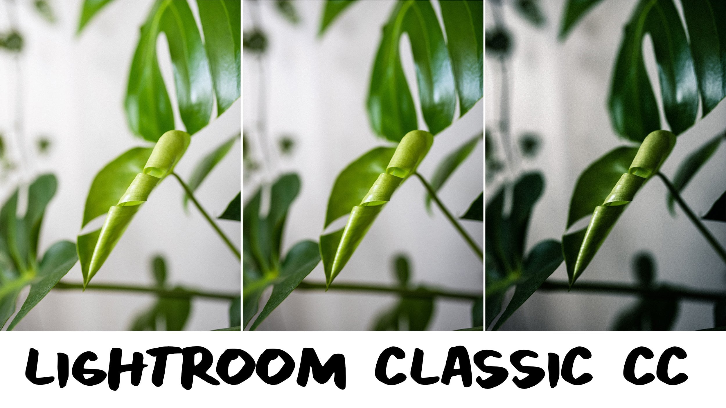
4. Dust and Scratches Bulk Cleanup: All right. For my Dust and Scratches demo, I picked a photo that has a lot of little bits everywhere. They're teeny tiny and they pretty much cover a lot of the image. It's still a point where I would spend a really long time cloning them out. Even in Photoshop, it's just not going to be ideal. I want to show you how you can apply a filter in bulk and just paint your way back to a really sharp looking image. For demonstration purposes, I took this screenshot from Lightroom. You can see all of my little teeny tiny circles. I did actually spend time in Lightroom editing out all of the little specks and dust bits in this photo. It took forever. I don't know if it was worth it. It was worth it. The photo looks great but let me show you a faster way in Photoshop. To start out, we are going to double-click our background layer to make it its own layer. Then, we are going to duplicate that layer. We are going to be editing on a layer above the photo that way we can use a mask. Let's go into the filter menu and go down to Noise, over to Dust and Scratches. This is going to pull up a little preview window where you can see just what's happening to our sliders. Just for example sake, I'm going to show you what it looks like when we pull the sliders up, quite a lot. Really strange things are happening. I recommend you go through and just play with these sliders and just get an idea of what's happening here and why it looks so strange because I'm going to show you how to make it look good. The first thing we want to do is adjust the radius, make sure your preview is selected because you're going to want to watch as it goes. It also helps to adjust this window to focus on the spot that has large dust. I'm going to adjust the radius very slowly, go up a few pixels, take a look. It's going to make the photo look hazy and blurry but what we want to focus in on is how it's affecting the little specs and dust. I pulled it up to eight and I can still see these little dust marks. Nine, they're almost gone. I'm going to go up to 10 and see if they disappear, basically disappear. At 11. We want to go as low as possible on the radius but we do want all of those little dust spots to disappear. I feel pretty happy with 11. I'm going to start adjusting the threshold. We're going to go up slowly and it's going to bring the photo back, basically. It's going to give us more detail and make the photo look more like how it was. Now, you can see, we can see the water. The water has come back in the image but those dust spots are gone. If I hit "Preview", you can see in the image that a lot of the dust is still in the frame. Then, when I hit the "Preview" button it disappears. That means that this is working. We're going to go up on the threshold just a teeny bit more and get that perfect little sweet spot. What I'm looking for, let me show you, if the threshold is all the way up to like 50, for example, it starts to bring some of that detail back in a way that is ineffective. We still want it to be quite blurred on this table top. I feel like 25 is good. I'm really happy with this. Don't look at the coffee part, look at just the table because we're going to fix that. I'm going to hit "Okay". This is where we're at so far. Right now, I want to work on a mask. I'm going come down here to this little rectangle with a circle and it's going to add a layer mask. I want to start with it all dark. I'm going to hit "G" for my paint bucket tool, and make sure black is my active color. I'm going to click on it, this basically turns my whole mask off. Now, I'm going to individually turn it back on using the brush tool. B for brush tool and then actually X to switch the colors, I'm going to adjust my brush size using the bracket and I'm just going to start painting in. I'm going to paint over all of those little dust and scratch marks and they are just going to disappear right before your eyes. It's very, very satisfying. The fine tuning does take a minute, but let me zoom in to this coffee scale where you can see all the little flecks of coffee beans. I'm going to adjust my brush in a little bit and just paint those all away. See you later dust and scratches. This tool is very fun to use as well. Keep in mind if you draw over something that you don't want to be blurred out, it's going to look like that, command Z. We are just going to just get close but not too close. Just going through cleaning up all these little distracting speckles. Then I know I have one up here on the neck. Right here, we've got some little ripples in the paper. I'm just going to smooth those right away. Smooth out this little bubble here. Okay. Then, there we go. We've cleaned out most of the dust and scratches. I obviously still have this big stain right here that I want to get out of the frame. I'm just going to clean up this side a little better. Awesome. Then, once I'm happy with that, I like to just go ahead and merge my layers. If you want to edit a little safer, obviously, edit on a new layer, that's the best way to do it, but I just like to edit all main layer. That's okay too. I am just taking my spot heal brush and I am just healing out any of the last little distracting pieces. I like the little patch of water here, so I'm going to leave it, but, anyway, that is how you would make those adjustments on a major bulk scale using the dust and scratches painting in. This is really effective if you have an image that has just all over dust and scratches, maybe you're shooting on a dark table and the light is coming in at a low angle and it's catching every little bit of dust [inaudible] or cat hairs, anything like that. This can be a super effective tool to use. Let me show you the before and the after, really excited about that. In the next section, we are going to tackle head swapping.
5. Seamless Head Swapping: Head swapping. This example is from a family photo session. This is probably the most common case when I'm using this, but it will also apply if you're working with models on set and you are shooting them in a lifestyle feel and you need to make sure that you got the shot. It's really stressful to get to the end of your shoot and feel like, I hope I got the right picture. So being able to do a head swap takes away that stress, for me at least, or being able to tell the family or the models that you're working with. If their stressed that we aren't getting the picture, whatever, being able to be like, "It's fine, I can just do a head swap." It makes everybody less stressed out because we can fix this, we can work with this. Let's jump in. Here is my sample photos for my head swap demo. This is my cute cousin and her family. I have two really pretty good shots, but they're not that perfect winner photo. This first one, mom, dad, and older daughter all look awesome. They're looking right at the camera and the baby is looking at her sister. The second photo, the baby's looking at the camera, but the sister looks a little uneasy. The parents look great in both pictures. So I have the choice, I can either edit the baby into the shot where she's looking away, or I can edit the sister into the shot where she doesn't look super good. So I can be flexible, which is really nice. I'm going to try and use this as my main photo. To start out, we are going to zoom in here. I want to take a copy of the baby's head. So we're going to take the Lasso Tool, and I like to select pretty liberally because I want to make sure I match it up just right. So I'm just going to make a larger selection. When babies turn, they tend to turn their shoulders too. So I like to include the shoulders in that, and we may need to take another selection, but I am going to right-click Layer Via Copy. That cuts it out and puts a copy on top. I'm going to hit the V for move tool, grab this picture of her and put it over on top of the main photo. Now it looks like it's going to be pretty close. I took these right in succession. I wasn't on a tripod, although that does make your life easier if you use a tripod. I was just holding pretty still and I'm shooting from the same angle. It's trickier when you're trying to do this adjustment with different scenes or if we've moved significantly, so it's best to get it in the same little burst of shots. Let's go ahead and zoom in here and take a look. I like to take this top layer and put it at half opacity just so I can get the backgrounds lined up appropriately. To get the mom's hair lined up, let's get that right in here. I feel like that's pretty close, and then I also want to look at the baby's shoulders. It looks like this one's going to be pretty simple. So I've lined this up pretty well. I'm going to turn the opacity back up just a little bit so I can see the layer that I'm working on. I'm going to turn this layer into a mask. I'm going to apply the little mask on here and then I'm going to adjust my brush size. I'm going to get the edges and I want to make sure that my brush is really soft, so I'm going to turn the hardness all the way down just so I don't have any harsh edges that are really obvious. I'm going to hit X so that I'm using the black layer which takes away from the mask and I'm just going to draw this in. I usually edit destructively, but it's very good practice to edit using a clipping layer, a clipping mask because then if you make a mistake you can undo, or if you get too close to someone's head, the edge, instead of being like, oh, I wish I didn't erase those pixels, you can just turn them back on or off. So highly recommend clipping masks if you're not already using them. Hair can be a little tricky. See, that's exactly what I'm talking about. I just cloned in the back of her head where she was looking over, so undo that. We're going to have to just keep really close eye on that part of the image. That's why I like to have it at half opacity so I can see the layer underneath. I think this should be pretty good. I'm going to turn the layer on all the way and then just go through with a fine tooth comb, making sure that all of these edges look really nice. So I'm just continuing hair lines, making sure that those contour correctly. Anything that's on the very edge radius of the selection, I want to just make sure that disappears because the further it gets from the center, the more off it tends to be. Zooming in to this little polka dot, it looks like it's going to be a little bit tricky. It duplicated it. So if I erase it, actually that wasn't that bad. I'm going to zoom in a little closer and do it on a finer level just so that I'm only getting that polka dot. That looks great. Here we go. Here's some little polka dot shadows. Let's just take those out. You have to trade one for the other but it's not too bad, and it's nice that you can offer people this flexibility, I think. So many times I've been like, "Oh, yeah, I can just swap it and post," and people are just like, "What? That's amazing. That's incredible." You're like, "Yeah. You're welcome." It looks like we've got a little bit of trouble in paradise here, but it's in the wrinkle. I don't think anyone's going to zoom in that close on that wrinkle, but it does help to just stop looking at it and then look at it again and be like, does this look like I lied? Then another thing to do is to turn that top layer with the new head position on and off. That's going to help show you any spot around the frame where maybe you missed making those changes. It looks like we have a little bit of a seam on the front of mom's shirt, but I really don't think it's that distracting. I can try and edit that out though. Actually that does look a little bit better. The lighting on that looks better too and maybe I'll just bring it in because it is on the edges of this shot here, and fix some hair. At this point we're getting too close to the baby's face, so we're going to undo that one and we're just going to go right along this scene. Perfect. I think that looks great. We actually have one hair that's floating out of nowhere. Good, perfect. There, awesome. I'm going to do the on and off again, on and off. I've got a piece over here that I need to adjust that's calling out to me. Try it again, on and off. I'm going to take out some of this on her neck. We'll do it again. I think that looks totally seamless. You would never, ever, ever suspect that I have swapped this here, and so this is our before and here is our after. This is a pose that did exist. She totally looked like this in this frame. She just happened to glance over in the photo that we liked of everyone. So it's nice that we have the flexibility. I can just be like, "Here's your perfect picture. Everyone's looking and everyone's smiling and it looks great. Christmas is saved." So there is that head swap demo. In the next section we're going to do a lot of the same things, but we're going to be building a composite using many pieces of photos to make one grand photo.
6. Crafting a Composite: For my final demo, we are going to roll a combination of these techniques together to get the perfect coffee swirl splash shot. So this second example has a really beautiful coffee swirl, same with this third one, but the pouring part isn't very good. The first photo has a really great jubilant pour that I want to include, and then I also have a few photos of me throwing ice cubes into the coffee at the end to get a splash effect. What I'm hoping is, I can create that perfect sensational photo that is just, captured it just the right time. It's very common to get a shot where you've really liked the pour, but you don't like the swirl or vice versa, and feeling like you have to choose. No. You don't have to choose. You can totally make your own picture. Start with a tripod. It's so much easier to use a tripod for this shot, especially if you're working on your own, and you have to do the pouring, so I definitely recommend using a tripod. But creating these breathtaking images where you push reality just a little bit, that's what's going to get people to stop in there, and scroll, and spend time looking at the photos that you create. I'm trying to choose between image 2 and 3. I'm naturally really drawn to two, but the watch line where the liquid hits the top is a little bit low as compared to this third image. I'm worried that it's not going to pair well with splash, but we are going to just see what we can get here. I'm going to start with this image, and let's go ahead and put the pour shot that I like the best on top. I want to select this image. We're going to go grab our Lasso tool and grab the neck of the jar as well, and then just make sure I'm selecting that whole top image. I'm going to layer via copy, V for the move tool, grab it, and throw it into the image that I like better. The swirl, we're going to just place that right on top. Because I used a tripod, it matches up perfectly. I love that. The background has a little bit of a scene, but we can fix that. Here is our before and after. You can stop here and call it a day, honestly. Having that really strong fluid pour with the milk and having the beautiful swirl, this is great, but we can take it a little bit further, and I'm excited to show you how. First off, I'm just going to touch up that little spot, so let's grab our mask. We are going to hit "B" for the brush tool, change the size a little bit, and I'm just going to mask out that line a little bit just so that it's a really smooth transition. Let's take a look at what we can do with our splashes. For my sample photos, I have this big splash that has a lot of scattered speckles, and then I also have this splash which has more of a vertical. I think that the pour is going to interrupt that, but we might end up using some of these splatter pieces for the background, but let's start with this guy. I want to actually just grab the whole layer, so let's make this a regular layer, V for move tool. We're going to grab this and put it right on top of our working composite. That's this one. My camera shifted a little bit while I was editing, so it's off just a tiny bit. I tried to get at it as close as possible, but that's going to be great. It can see the layers and the pixels, and it locked that up nicely which is awesome. I'm going to turn the opacity back up on this layer. Now, I want to turn it into a clipping mask, and I am going to mask my hand into the shot and mask the speckles in as well. I'm actually going to turn this whole layer mask black, so I'm going to hit "G", and then I'm just going to mask out the whole image to start and then mask in only the parts that I want, so B for brush tool, X to switch back to white, and we are going to dive right in. I'm not sure how this is going to go. This is my first attempt at this, but I'm hopeful that we can get some splash happening because the splash rolled up the edge of the glass and because the coffee is mixed at this point, we may have to mask into some of our beautiful swirl just so that it looks realistic. We'll just get what we've gotten here, and then we'll mask that. Milk splash back in. This is so fun. This is like a paint by numbers where you just do the work that someone else already did. X to switch back to my black, and then we're just going to paint that milk stream back in. I change my brush size to be nice and fine so that I can work on a very fine level. I'm going to add some mask, this part and back in, and then I know this layer has a whole bunch of speckles up here, so I'm just going to change my brush size to be quite large, and then mask in some of these fun splatters. This is looking so fun. But I do have some inconsistencies with my background. My background layer on one of them is a little bluer than the other, which is casting a browner tone, so I'm just going to finish this out and just get it to look as realistic as possible, basically. I'm even going to come in so that it looks like my coffee is mixing a little more, just so it's more believable. We do still have these beautiful swirls, but it's like this top half of it is getting significantly more mixed. I'm just going to play around with this layer back here and see if there's any more of the splashing. No. I didn't really miss anything. I think I'm happy with that. I do want to blend that in just a little bit better, and then I have this really distracting line up here where my camera wasn't perfect. I actually do want to keep that full shot. I might crop it out later, but I don't want to crop too much of my hand, so I'm going to shrink my brush size and then hit ''X'' to go back. I'm just going to blend out anything that's too close to the edge here. At this point, I also want to just go over the whole image in general, and make sure that there isn't any speckles that are way too distracting, like this one's a little bit distracting, but if I mark it out, and then you can see the background doesn't match, so he stays. I think this image turned out really fun. It's believable because the milk is pouring and it splashes, maybe it pushes reality a little too much, but this is where we started. We changed the milk bottle, and then we changed the splashing. It did eat into some of our swirls. You could probably play with bringing some of those back in here, but then you're fighting with the milk color versus the cream color, so it's this fun balancing act. But anyway, I really like how this came out. I had a couple alternate images where I was pouring ice back in the shot. Here in Lightroom where I organize my files, I have this image with the ice falling in, and I thought it might be fun to do one where I have ice cubes everywhere and it's making a big splash. I have a bunch of alternate shots where there are different speckling, and drips, and spots in the shot, lots of messiness on the table. You really can use this technique to craft the perfect image and just push that little bit of reality, and I think may as well. It's more fun this way. Hopefully, this was fun to watch, and you can find a way to use this style of crafting a photo, this composite in your work as well. Thanks so much for watching.
7. Final Thoughts: That's everything. Thank you so much for taking my class. I hope that you enjoyed it. I hope that there was something here that you feel like you can utilize in your workflow to get your photos to be better or to make your workflow faster or easier for you. If you enjoyed this class, I have a bunch of other photography classes here on Skillshare that range from creating your own hand painted backdrops to photographing coffee and donuts and pancakes, photographing people, I have a class on how to tune in your photographic style or making content for an Instagram feed. There's a whole bunch of fun stuff over there and so I hope that you will take a look. If you decide to share your photos here on Skillshare, I would love to see it. Seeing the before and after is so satisfying to me, it's great to be able to see right there how your workflow is being improved utilizing these techniques, and if you decide to share them on Instagram, feel free to tag me, my handle is just Tabitha Park and I love seeing your work. Thank you for hanging out with me. I will see you in the next one.
 Tabitha Park, Product & Food Photographer