Transcripts
1. 0: Oh, hi. You caught me putting the finishing touches on my blender photo shop class. We're gonna take some cool stuff that three D has to offer and some good old fashioned digital painting and mash him altogether. The class comes in three chapters in Chapter one. We're gonna do a basic overview of Blender. All the things you need to know to use these techniques. Navigating the interface, working with geometry, object mode, edit mode, cameras, lights, grease, pencil rendering. All that stuff is Chapter one in Chapter two will be using those tools in conjunction with digital painting to create a painting that truly exists in three D space. In Chapter three, we're gonna look at a different way of combining free D and two D in a common technique called projection mapping. This is kind of, ah, Hollywood standard matte painting technique that creates really stunning 2.5 D art. So we've got a lot of work to get into. Let's get to it
2. 1: Okay, This first chapter is for those of you who are new to blender. If that describes you, the first thing you'll want to do is start off at the Blender website, which is www dot blender dot org's and grab a copy of the software. As of the date of this recording. December 2018 Blender 2.8 is in beta release and quick note. Here. There are earlier versions of Blender 2.8 out there, and if you already have Blender, chances are you might be using one. I'll talk about that in the next section. Okay, so stay tuned. More importantly, though, Blender 2.8 has made some significant changes from Blender 2.7. So I'm happy to say we will be using the latest version of the software in this lesson, and I imagine that blender 2.8 and versions of it will be the main release for probably a few years to come. So anyway, when you're at the website, make sure you're clicking on Blender 2.8 beta, not 2.79 Okay, so blunder 2.8, and then from here, it's simple. You'll just click this download button again and you'll be prompted to choose your operating system. So go ahead and choose whichever one you have and Blender will immediately begin downloading. So go ahead and get that running and we'll get started.
3. 1: Well, everyone, this is it. This is blender. Can't you just feel the power at your fingertips or are you completely distracted by the confusing interface? Don't worry. I have some good news because we're only using blender to augment or enhance R two d work. Remember, R two D is still the most important part of this process. We actually don't need to learn most of blenders features. Also, thankfully, most of what we do need to know involves, like the basics of blender which provides foundation for all those more advanced things. So when this first chapter of the lesson, I'm going to go over all the basics that you need to know when it comes to navigating and using the program. Okay, Important notice here, folks. As I mentioned earlier, there are multiple releases of Blender 2.8, namely an Alfa release and a beta release. I recorded this entire chapter, Chapter one Interface Essentials using the Alfa release. Then the Beta came out. I did some double checking and sure enough, the interface had changed. Not significantly. But there are a few things that are slightly different. The changes were not significant enough to make me re record this entire section, not to mention that some of you out there will be probably still using the earlier version of 2.8. So what I decided to do is that whenever there is a change important enough to mention, I will interject with this breaking news soundbite and quickly show you the difference. It will always on Lee be an interface change like a button that used to be here is now hear things like that. The functionality of the tools are the same. Okay, thanks for that. Now back to our regularly scheduled program. So you've already seen me orbiting my camera view around this cube? I'm holding the middle mouse button or my scroll wheel on my mouse. If you have a scroll wheel or a middle mouse button, it's the same thing. Hold that down, and that is what you will use to orbit your view around the three dimensional world. Here. If I were to holds the control key and use the middle mouse button, I zoom in and out in a very fine way. If I rolled my mouse wheel, I also zoom in and out. But in a more step e aggressive way. So again, control is away. Holding control with Middle Mouse button is a way to go. Finally, and then you could describe the mouse wheel for quick zoom. If I were to hold shift and use the middle mouse button, I pan the camera laterally like this. And then, of course, I can always go back to regular Middle Mouse. You know, move this around, zoom in and out and those are your basic camera functions. If you ever get into a bit of trouble like I'm getting here, See, I'm going away from my cube. If the Cuba selected, I could just hit the num pad period key and the camera snaps back to my selection. So now I can, you know, go back to my regular camera motions and, you know, fixate on this cube that I happen to be working on here. Blender by default loads up a cube. It's become a funny thing that blender users do. The first thing you do in your scene is delete the cube. Anyway, we'll get to that in a moment. Let me bring that thing back. Another thing that blender is infamously weird for is it does not use the left mouse button to select objects by default. I'm sure most of us watching this video are used to things like photo shop or painter or other painting APS and, you know, even like just regular Internet browsing, we use the left mouse button to click. But in blender, if you use the left mouse button, this weird little icon follows you around and is very strange. Like if I want to, like, select that box or select another object in the frame like this light here, I can't do it. It's not selecting anything. So what's going on here? Well, blender by default makes you use the right mouse button to select things, which to me is just weird. And I'm not sure why anyone ever made that choice. But you can change it. Just go to edit user preferences right here, select with left and then hit, save use or settings, and you just x out. And now, if I wanted to select things, I'm clicking my left mouse button like a civilized human being. And, of course, it's now the right mouse button that moves this little cursor around quick interface interruption here, folks, and later releases of Blender 2.8. By default, you'll notice I'm not moving around that cursor. That's because Blender has swapped the top two tools you notice on the left. It's this tool that's on top, whereas in later releases its that tool. So if you're looking to work with the cursor, which I'll explain in a moment, just make sure you're clicked on that tool. Also, the user Preferences window is now just called preferences, and it looks a little bit different, but the contents are the same. Also in 2.8 beta left Click Select is the default okay back to the regularly scheduled program. Now you might be wondering, What is that little cursor? Well, in Blender, it's something called the three D Cursor, and you can see it is three D. As I move because I orbit the camera around it, you can see that it has three axes here, X, y and Z. It's useful for modeling. It's useful for positioning things in space, and I will talk about that in the future chapter. But for now, if you are ever annoyed by this thing, I just recommend snapping it to the center of the universe, which is where all these axes converge. Right In the origin point here, the shortcut for that is shift s and then you can just click cursor to center right here. Cursor snaps back to the center. And you could just leave it there for the time being In later versions of 2.8. Shift s now brings up a circular menu, and that option is called cursor to world origin. All right, just want to show you a few more cool interface things that are very handy notice. As I orbit around here, I can always look up at this icon here to orient myself in terms of where the X Y and Z axes are in three d were obviously looking and thinking in true three D space x y z axis not just X and y. This can be confusing for us to de people. This is where three D's, you know, a little technical, because if you're moving something, you have to know, Is it our along X wires? E blender 2.8 has a little handing diagram there to always remind you where those are and they're color coded for our convenience, and this is universal to the program. In its entirety, the X axis is always read. The easy access is blue, and the Y axis is green. You can see, though they correspond here in the three D View port as well as the little diagram up here . So if you're ever confused like, oh, which access do we need to move in? You know, just just glance up there and I know the Z axis is not showing in the view port right now. It will come into play later on as we begin modeling. Let's talk about more interface stuff, though I can obviously drag windows like this to make them larger or smaller. If I want an entire other view port, I can hover my mouse up here and you can see it changes to a little cross hair. If I drag that now, I have opened up another window. This is another initial source of confusion for people because, you know, if you don't know about this feature is very easy to like. Open windows like you think you're re sizing them like you think you want to do this. But You know, suddenly you're opening windows and it becomes a little crazy. And, honestly, you should practice. This is weird. As it sounds, you will get yourself into those conundrums I did all the time, so I just started a new file just by going to file New General. It opens our basic Cube seen again. Let's bring back just one window again. Click here, drag that window in. Now, instead of getting into a big meyer of Windows here, let's just figure out how to close it the way to close it. It's a little tricky. It's not that intuitive. For example, I want to close the right screen here, have your mouse so it's over the left screen. That is the screen you'd like to keep, drag it and then just drag it in and it'll you'll see this arrow. Release the mouse and it's gone. So if I were to let's say a word to recreate, let's say oversee. I'm even me. I still screw up here. Let's say I were to recreate this mess by making window here, making a window there. Okay, if I want to get rid of this top window that I just made Click this window Drag up, Boom. Quick. This window. Make sure your mouse is on the window. You'd like to keep dragon boom And there you go. You can get yourself out of any mess that way. All right. Next thing to talk about is the different views that three D programs offer us. Right now, we're just looking in basic perspective. You This is kind of a nice default view, but you can look through things differently. Let me make a new windows we've just learned. And on this window, of course, the cameras act independently. I haven't mentioned that, like, I could be in a different spot here in a different spot here. But one thing that's useful, I probably don't want both of these used to be in perspective. Maybe I want this one to be like a front view to do that. Hit the num pad one key and the camera snaps to an Ortho graphic front view. Now what does Ortho graphic mean? Ortho graphic in layman's terms just means that this is a flat view. This is no longer three D. Now I can still use my shift key with Middle Mouse and go up and down like this. I can use my control key to go like this. I can scroll the mouse wheel and I'm still in perfect two d view. If I were to accidentally just use my middle mouse, it snaps me back into perspective. So if I didn't want that, I could just hit the num pad one key again. Go back into front and do that. If I wanted to use a shortcut key to go back to perspective, that is the number pad five key. I'm back in perspective here, but honestly, if you're in a front Ortho graphic view or any Ortho graph if you and you want to switch back to perspective, just use the middle mouse and there you go. Now you can do more things than just front view. If I hit Numb pad three, I'm in the right view. You can see I'm reading it up here. See? Right, Ortho? Right. Ortho graphic. If I had numb pad seven, I'm in the top view top Ortho course. It looks all the same in this Seems we're just looking at a cube which is equal on all sides. But when you're modeling or working on a scene, you know, you might have several windows open each one set, two different views if I hit the num pat. Nine key. I'm on bottom. Ortho graphics. So we've covered all the sides, you know, front side, top bottom. Oh, and if I use control in conjunction with any of those I switched to the other side, so I hit numb pad one to go to front view. If I hit control Numb pad one, you could see it switched me to the back. I can hit seven and go to top Ortho if I hit control. Seven. It goes to bottom. Ortho Ortho Graphic mode is not only useful for two dimensional views, but you can use Ortho graphic mode in conjunction with the three D View. This is our basic three D view, which I've already said you can access with Numb pad five, but press numb pad five again. It switches to Ortho graphic three D and this is interesting. What what has happened here is it's it's flattened out the depth work to d. People here we know about horizon lines and vanishing points. Right? Well, if we're let me go back to my regular three D view by hitting Num pad five again. We have our vanishing points. Things vanish into our horizon here. If I had known Pat five, I have eliminated the vanishing point and that completely flattens the scene. You notice a few weird things have happened like the scale. Relationships between the boxes has been changed. The verticals are purely vertical. The diagonal lines are now parallel. It's just a different way of interacting with a three D view. Now, at first, you might be like, Well, how is this useful? Um, I actually do think it is useful. We will explore reasons to use this as we model our scenes. But for now, I just want you to be aware that this is also an option. And again, pushing numb pad five gets you back into regular three D view. Now, I have been using the num pad quite a bit here. For those of you who are using a condensed keyboard, you may not even have a numb pad. Well, blender has you covered? If you go to edits user preferences, you can click this handy little button here that says emulate numb pad hit. I'm not gonna do it, but it save. Use your settings there and you can. You know you can use the regular numbers on your condensed keyboard or laptop keyboard. Sometimes don't have numb pads, and you know it will do the same thing as a numb pad on a larger keyboard. Great, and I recommend again you sit down with Blender and just practice moving around the interface. Obviously, if you're brand new to Blender, this won't be easy. I even have some three D experience before I started Blender and I still had to do this for my own good. So I recommend that another thing that's useful, you might have seen this little plus sign here if you click that and drag it out or the shortcut key for it is the N key. We get this handy little window that displays information about the selected object. So right now our Cuba's selected and I can see information about it. I can also see information about our general view and Cameron stuff. If I selected the this is a camera. If I selected the camera, the transform stuff here switches to the camera position, so I can always go back and forth with different objects and see that And over here on the left, we have tools that will allow us to move or rotator scale or objects. But that's something we'll cover in the next chapter. The shortcut to hide or run hide. This is the T key, and these shortcuts or universal, with any view like you could be in a front Ortho graphic view and the same shortcut supply and the one thing I should mention if I would open the window if I were to press the end key. The window I'm hovering over gets the command. So if I hover this window, I press and it does that over here. Does that. So just hover over the right window. And that is true for many of blender shortcuts that are the same per window. It's where your mouse is hovering. That window gets the active shortcut. Another quick interface tip with this tools menu on the left. If I press t toe, hide it, I've got this plus arrow. If I drag that out further, you can see that blender updates the display and you'll get actual words that tell you what these are. And this will apply to any view port and blender that contains a tool bar on the left. And again, if I press t to hide it than t to bring it back, it respects my scaling, or I can just press tea and then, you know, re scale it to whatever setting I want. Okay, so we've been talking about views, and there's one critical view that I have neglected to mention, and that is the camera view already mentioned. This little object right there is the camera, which when we're modeling a scene, is not so important. But when it comes to rendering a scene or later on in this very lesson, we're gonna talk about something called camera projection mapping the camera becomes critical for that, but right now we're not looking through the camera. We're looking through a kind of sort of God's eye view, or we can kind of see anything. If you would like to look through the camera, hit the num pad zero key, and now we're seeing are seen through the camera. The odd thing about this view that tripped me up originally is if I started to just use my camera tools. I snap out of the camera and that was always were didn't know what was going on. One way around that is to hit the zero key, get back in a camera view, create a new window here in this view, go back into regular mode And you can you have both. You have the camera. Here are regular godlike perspective. Here we have the n key to get rid of that and you can do this. But if you're like me, I find it annoying that in this view, if I just move the mouse, I snap out of camera view. So one handy tool with our little window open here, this little button right here, lock camera to view. Click that. And now if I use my middle mouse button, I am moving with the camera and you can see in this window I'm getting live feedback. You can see that camera updating based on my mouse movements by zoom in and out actually can see this is not a zoom. This is a true three dimensional move. That camera is moving in and out in space. It is not zooming. This is an actual dimensional move there, and there is a difference there. I can pan orbit and we can see that feedback happening. So that is the camera, Of course, just like in real life are three. D Camera has many settings like you can change the lens. You can change the dimensions of it. We're gonna talk about that in a later chapter. The last thing to mention is just the various kinds of information you condone display in these view ports. We've been looking through what's called the three D View Board here, where you can view your three D geometry, as we've been doing with our regular perspective. You. But we can look at other things rather than just three D geometry. One window that's important is over here on the top, right? It's called the outline Er, if we unfurled this, we can see the objects in our scene. We have a camera, we have a cube and we have a lamp, which is just another word. What's blenders? Word for light. They're called lamps and blender. That is what our basic scene is comprised of when we opened the program and, of course, clicking on them in the outline er selects them in the view port. Now each window, the outline er in the view port has a little button here it's in the top left hand corner. We have a bunch of options here. So of course, what we're looking through now is the three D view. If I went back in here, I could switch to the UV image editor, which is something we will look at a little bit later. I could make this entire screen the outline, er, if I wanted Teoh or another handy thing, Let me switch this back to the three D view. Let's make a new window and switch this view to, let's say, the UV image editor or the outline, er, whatever you want so you can cut. You can totally customize how you interact with Blender, which is one of the program's real strong suits. If you ask me so, yeah, we'll be using this view port switcher or editor type, as it's called in Blender to change the way we interact with our scene to close out our little discussion of the interface, you probably noticed these tabs here at the top. We've been completely in the layout tab and will be in the layout tab for 95% of this entire lesson. But the different tabs just give you kind of preset looks for different kinds of operations . For instance, UV editing. What this does is just simply opens. It gave us by default a UV editor over here, and it gave us a three D view port over here. It just kind of starts us off in a environment that might be favorable to certain processes . But yeah, like I said, for our purposes, most things we want to do will be accessible via this layout tab. So if you are new to Blender, I recommend spending some time here, set aside half hour, play around with these features, and when you're ready, let's start looking at how to create and edit three D geometry.
4. 1: Okay, let's talk about creating and editing objects and blender. Three D objects like this cube here are referred to as geometry or professionals will just say Geo and one of the most elemental things will be doing in Blender is creating and deleting and editing. Three D geometry already showed you how to delete the default cube push X hit, delete. And now we have no geometry in the scene to add some basic geometry into a scene. You quick ad, you go to mesh and to get that Q back, you can just hit Cube. When you create a piece of geometry and blender. We have a little dialogue here. You can increase the size of it. You can change its position in space. You know basic things. It's rotation. If I were, just delete that. Let's add a mesh. Let's go to UV sphere. We have a few more options here, so it's increased the size. You can see how it's made up of these faceted planes, right? If we just increase the segments, we get a higher resolution sphere in both in two different directions. We can increase that the second you alter the object like if you were to move it, you no longer have access to the initial creation tool. Instead, you can adjust the parameters of the last thing you did in this case move. But you can still edit all this stuff in other ways. But let's let's actually talk about moving objects around. Let's just delete that. Let's bring back. Oh, by the way, the shortcut for creating things and blender is heavy on shortcuts. If you haven't noticed already, and I do recommend learning them, it makes your experience with Blender so much faster again it takes so it takes a day or so of training. But you can do it. It didn't take me long, and I am not a above average computer user. Trust me. Eso If I hit Shift A. I have the same menu here, and I can hit Machin. Let's just grab our cube again. One thing to note is that geometries created where the three D cursor is. So with the three D cursor tool selected, which it currently is, I could say click over here and then shift A was at another cube. It's added there, this gun, you know, come in handy if you have a big scene and you don't want to always have toe navigate back to the origin of the universe here, every time you create something, you could just position the three D cursor in space on mesh Aiko Sphere, which is just a different kind of sphere. And, you know, there we go if it puts it where the three D cursor is so on a broad level, Blender has two main modes. Object mode and edit mode. We've been entirely working in object mode so far. You can see it right here. They can switch right here, the first to object mode edit mode. You will be spending 99% your time, at least in this class. In one of these, so object mode allows you to edit the objects on a sort of let's call it a universal level By click on the object. I'm just using left click to select right. Let's click on this basic cube. I can use the tool menu on the left here to move, rotate or scale it, so the move tool is here. You notice when I click that the the three axes pop up, which mirror the axes up here. I can click on the said and move it on z Z. I don't even know which one said Zia. Which one should I be saying? I don't know. Um I can go on the y axis. I can go on the X axis. Pretty simple, right? There is a shortcut key for this. I can use the g key. Why you pushed G I'm It just sticks to my cursor and I can kind of move it everywhere. And if I click it just locks it in So again, G move your mouse, click toe, lock it in Or if I wanted more precision Aiken hit G then X and I could move along x Or if I don't like X, I want why it Why move along? Why don't like that hit Z move along Z and that is how you can precisely control the you know, the directions Your objects are moving in three D because if you're working in the general three d view like I am here and I press g and start moving this thing around freehand, I can't be really precise because I don't you know, I'm looking at a two d monitor, but I'm working in three D space. It's very difficult for me to control. Like if I want to push this box back in depth in space, I can't really do that. Like I'm kind of pushing it up, not back. You see, you get into all kinds of problems here, so I'm gonna undo that Control Z is undue, by the way, like any other piece of software. So instead of moving it freehand like that, I would rather probably push G and then X. And again, how do I know it's X? Well, I could just see It's the red axis, which I know is X because of blenders. Handy little reminder up here, you know g X. I can push it back in space very easily without having to switch views. Because traditionally, you know, older software. What you'd have to do is like open a new view, maybe switch this over the top view, press G in this window and move it around. This actually is useful, though, because the top you hear, this Ortho graphic view is flat. I can now click and freely move. And I know because this is a flat view. I know that in top view, it's impossible for me to move this cube down and up in space. That or in other words, along the Z axis, it's impossible. This view does not have a Z access, so I can freely move this around a two dimensional view and you can see it live updates, obviously, in our three D view on the left. So this is helpful. I could go into front view, and in this case I can only move it in, you know, in either back and forth in space. In this case or up and down, I cannot move it side to side. If I want to move it side to side, I would go into the right view, and now I can move it side to side and up and down, and I cannot move it in the X axis. Quick note. Here, folks. You just saw me clicking the object in moving it around Freehand in later releases. I can't do that like I can't click the mouse and move the Cube. Instead, it just moves the three D cursor around. Or if I'm in box select mode, it's It's trying to select things. If you would like to move the box Freehand, you can either press G like I've already explained. Or if you want this simple click and drag functionality, you have to be on the move tool. And now, if I just click anywhere because the move tool selected, I'm able to do this In previous versions, I did not have to be on the move tool. That's it. Okay, back to the lesson. So the Ortho graphic views are nice for, you know, that kind of control. But honestly, what I usually will do is I will usually be in a view like this. This is just preference, though, and I'll just, you know, hit G and X and just move things this way. And then I can, you know, evaluate how far in depth I just moved that It all depends on you know your own workflow, what you like to see at any given moment. It's completely up to you. The rotate and scale functions very much operate the same. So let's click our cube. We can hit, rotate here we have Well, if you just freehand click it, you can rotate it on all access randomly. If I undid that, you can just click on the X axis, rotates it across the X Think of ah, rotisserie chicken on a spit. The spit in this case is the X axis, and I'm rotating that cube around that you can change, obviously, which access? The spit is on. And, um, I don't think I've ever used that analogy before. The shortcut key for rotating is are appropriately enough, and we can go our X just like the translate tool. Or we can click. Why are we can click Z and we have fine control over those things and you can see as I'm rotating this cubes yo quickly gets going, and that could be annoyance if I hold shift. I now have fine control over the exact degree of rotation there. Or, if you want control to the decimal, bring up the transformed box with our end key, and now we can adjust. The rotation here is well, like I can drag, click and drag these little areas, or I can simply type it in, you know, 13.2 and we get exactly that. So there are times and modeling where you do want to use math like this to get precise value in there. And that's how you can do that. The scale control, as I'm sure you guessed, is right there. We have the exact same thing. Scale up scale, wide scale on X or the shortcut key for scale is the S button. And we have the same thing. If you just press s drag your mouse, it scales equally on all axes. Are you go s ex? Why? See? And you notice as I do that it deletes like if I'm scaling on Z right now, right? If I hit why it deletes my Z scale. If I want to keep that, you have to click The mouse hit s again, Benzie and you can, you know, scale it. Additionally. But if you just change it without clicking your mouse toe, lock it in it deletes your scales If I scale way up and I'm like now I don't want that you can change it, you know, And it deletes what you've just done. If you want to lock that and you got a click and then hit s again and you can keep scaling and that's the same for translation or rotate. All right, let me clean up the scene and just go, New General, to start with a fresh slate here. There is also this universal tool which I really don't like. It's jumbled to me, but you can scale, rotate and translate all with one tool. So this is translate. We got rotate scale. You know, again, I just think it's a little bit unwieldy looking at all that stuff. I'd rather just go like this. Or better yet, I rather just used the shortcut keys, which I favor in general. Okay, let's get another cube back in shift. A mesh cube. There we go. I'm gonna talk about something called the Pivot Point, as you've been seeing, if I were to hit s for scale and I scale it, it's scaling outward from the middle of the object. So it's scaling the object equally in all directions. This is the default action of blender. It's accessed up here. You can see it set. The pivot point is it's called the Pivot Point menu. It sets the pivot point by default at the median point. That means when I have an object selected like this cube it searches for the middle of the Cube and its anchors, its transformation in the middle, which is why it's scaling out aggressive scale there. I could hold shift a little smaller, so it's scaling outward from the Pivot point, which is set to the middle of the object. And no matter where the object is, like, if I moved it up here and, you know, just hit scale again, it doesn't change. The ITT's looking for the middle of the piece of geometry that is selected, and you can see it's put that cursor right in the middle, right? So rotate. Same thing with with all of them. It's rotating around. You can see that spit is bisecting the object right in the middle. There, this behavior can be changed by altering where blender looks for the pivot point and one useful thing you might want to set the pivot point to be the three D cursor. This can open up different possibilities, and I just want to show you in this overview section, you know what the different behavior is. You can think of your pivot point as like the hinge. In fact, why don't I make this little cube into a door and I'll imitate door hinge. So if I hit S and X s x Aiken, scale it down to be more door like in Dimension s why scaled down And there is our door right now. If I were to rotate that door by just dragging here, you can see it's not. It's not rotating like a door because the hinge is in the middle of the door. Well, if I want this to be like a real door, I want the hinge to be on the side. So just hit, undo. You can see blender is set to use the three d cursor is the pivot point. But, you know, the three cursor happens to be right in the middle of that object. If I just moved my object by pressing G why and just moved it, say here. Well, now the three d cursor is where our door hinge should be. And because I already have the pivot point set to three d cursor, you notice the rotate widget now is where the hinge should be. So if I rotate this door, it rotates as if it were on an actual door hinge so this can come in handy in all kinds of ways, and we will no doubt explore them when we start modeling geometry for our actual scenes. And this setting is applied to all the transformation like scale. You know, it's scaling out from that point, you know, it's it's no longer scaling equally in all directions. It's going out this way. If I want to switch away from that, I can go here, go back to median Point and boom Blender has found the middle of the object again. So just a second ago, I was scaling this object, right? And you noticed this little box here it says, resize or scale. In other words, blender brings up a box just showing the last operation you did. And I guess you could just, you know, further refine you notice that it's switched back to as I drag this, it switched back to the three cursor mode, and I'm able to just refine what I did. I don't use this box that much, but I think it is pretty cool that you can, you know, blender prompts you for fine control if you need it and then here I'll have to go back to meeting point once I'm done with that, I don't use that feature that much. But it's there, and we're almost done here with object mode. Let me show you one more thing. Shift A. Let's create another cube. It must just put that cube. You know, somewhere over here they're just like that. Okay, this is called parenting right now are cubes air completely disconnected their independent objects. We can move them independently, right? That one moves there. This one. I could move separately. Let's say we wanted to connect them. That's an operation called parenting. What you want to do is first select the child, which, in this case, let's say I'm gonna select. This is the child and you'll see how this works in just a moment. Hold shift, then select what you want to be the parent. So this object you notice the colors change. You noticed the parents selection is a brighter orange. The child selection has changed to a slightly darker orange color. If I'm happy with this, I could push control P and Blender brings up a menu, says Set parent to Let's just click object. You notice that draws this dotted line between the two objects, indicating that there is now a relationship between them. If I were to select the parent, which is this cube here and move it, it moves the child with it. If I selected only the child, I can move the child independently. This could come in very handy. If you're modeling, say, ah, house and you. You know you're modeling a roof out of different boxes. You want to be able to move the roof all at once. You can parent, you know the different boxes together and you can move the roof as one unit not only move it but rotated scale it etcetera, a common method people use for this. Let me just undo all this parenting that I did get that dotted line to go away. There we go. So these objects are no longer in a relationship there separate. You just bring this closer just for ease and now we can see things a little bit better. I'm going to create a custom object to be the parent of these two things. I'm gonna go shift a and I'm gonna create something called an empty and I'll just click plane axes, so an Empty is aptly named because it has no geometry. It's Devo. It's empty. It's devoid of geometry. You can see I've created there. If I just push G Z, I can move it up here. It's just this little no and other software you might. It's called a No. This Empty has no visual information, but it can act as a parent to my objects. So if I click this than I shift, click that and then shift click that the parents is selected last. I can push control P and click Object. And now you can see it's apparent of both of these Children. I can now just d select things. By the way, the shortcut for that is the a key a has de selected or if I push again, it selects everything. So a is both select all and de select all s If I d select all and then selected the empty I can now move this and it is moving our objects together very useful when it comes to organizing a lot of objects in your scene. And of course I don't. You can't just move it. I can rotate them and things like that. And you notice it's treating the axis where the empty is that the spit has been drawn where the empty is and its roe it's orbiting around that and very useful stuff and again, stuff I recommend just playing around with to get used to it, you know, before putting it into actual production because you will undoubtably run into irk some little things that delay production. And you kind of want to work those out beforehand. For instance, I have a cube here, right? I go to rotate and I rotate it along the Z axis. Okay, great. But now, if you see my rotate icon, it's kind of wonky now because if I want to rotate it now back along, why, that's not the rotation I want. I want this face to rotate like I want it to rotate along its local access. Now, this is a global access. I'll show you the difference If I just go up here and switch from Global, which is on by default to local. You notice it switch. Let me go back Global Watch it switch now. Two local. Now I can rotate this the way I intuitively want Teoh by default objects air created in harmony with a global access orientation. But when you start moving your objects around, you'll be moving them into localized positions like this. So be careful with global and local you'll probably be switching back. There are other ones, too, but for our purposes there so rarely used that I'm not gonna cover them in this section. If I do use them in production, I will be sure to mention it. Okay, so that is an overview of object mode. Let's now take a look at edit mode.
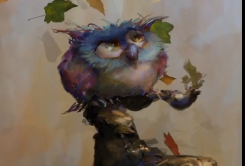
5. 1: All right, let's dig into edit mode. Edit mode is where the rial heavy lifting serious three D work is done. It's almost like the object exists in two different worlds. Object Mode is deals with things that affect the entire object. Edit mode is when you can go into the objects kind of like lifting up the hood of the car and really making some changes to get to edit mode. We just go over here edit mode, and immediately you can see our object is displayed differently. By the way, the shortcut is tab. If I hit Tab, it switches me from object mode to edit mode. You can see it here. So now that we're in edit mode, also, we have a whole bunch of new tools here. Now that we're in edit mode, we can see what the object this piece of geometry is really made of, and that is it's made of vergis. Ease, edges and faces those. There are three main terms that will be using now what those are fighters pushed a to de select everything. See those little points? Those air, called Vergis, is an individual. Verdecia is called a vertex. This one and I'm switching up here. You can see there's three different things. So this is vert vertex mode. This is called edge mode, and edges are just the lines that connect to Vergis is this is called face mode. Face mode is well, these they're called faces. Another word for the Miss Polygons, but blender calls them faces. Those are the three main ways we can interact with our objects in blender So we have minute control here. If I go to Vertex mode, I can click a single Vertex and all my tools that we learned all my translation rotation scale tools that we learned in object mode totally apply here. So if I pressed G and Z, I can move that Vertex up and down Or if I had just press G, I could have moved it freehand If I went to say edge mode and I selected that edge, I pushed G and Z. I can I can do this if I went to face select mode and selected that face and pushed s for scale. I can scale this face and you can see the you know, we're obviously change. We're making some serious changes to the topology of the object. Now, on again. Once I'm done with that, I will just push a and just remind you. Let me just do that again. I'll select this face. Push s scale it. I am just moving my mouse freely. And I could hold shift for more fine control over this. And when I'm done, I just click the mouse again and it locks it in OK on. Then you still have the face selected. Just push a to de select what you have selected. That's the heart of edit mode Now in edit mode. Like I said, we could make some pretty serious changes to the geometry in our purposes here as kind of basic three d modelers. I mean, we're not we're not modeling the next Star Wars character here. We're modeling basic geometry that it's gonna help us with our two D paintings, right? One of the primary tools will be using is the extrude tool extra too. Oh, and that cameras annoying me. Let me get rid of it. And let me go on a quick tangent here. I want to get rid of this camera, but I can't click it. Hear me clicking. It's not selecting. Why is that? Well, it's because I'm in edit mode. In edit mode, you are only allowed in one object at a time. If I want to select that camera to say, get rid of it, I have to push tab to get out of edit mode back into object mode. Select the camera ex, delete it, select the cube tab back into edit mode and there we go. So when you're in edit mode, you are only allowed in that one object. So this should put you at ease. If you're in edit mode, it's impossible for you to accidentally ruin a different object. You are Onley in like the world of this object here. Okay, so I was talking about extrusion. Extrusion is one of the main tools that will be using and one of the main tools that modelers in general use when it comes to shaping geometry, Extrusion works with faces. So, in face select mode here I will click that face and that will press the e key for extrude. Alternatively, you can find the extrude button in the toolbar right here, and blender gives it kind of guesses that the access that I might want to extrude along, which in this case, is the Z axis. And there you go. I've extruded this. I can click my mouse toe lock that in. I can push, say s to scale it and then I can push he again extrude. This looks like I'm making some kind of like wood stove or something. Maybe that's what this is. It's a wood stove. This is gonna be the chimneys. Let's extreme this again. This time I want to rotate this face. So push are and it's rotating randomly. I don't want that. So what I'll do is push Thea, choose which access I want to rotate along in this case, the y axis. So I press why and I can rotate this face along. Why left click toe lock it in at any point, I'm free to orbit around my model just like in object mode. Let's get this chimney, you know, moving backwards up. Push e again. You see it extremes along its local access. Like you know, blender does a good job guessing you know which direction you want extruded So it's extruding along its local access here. So I can lock that in push are rotated a little more and let's extreme one more time And there we go. We have our wood burning fireplace with the chimney, you know, going into a wall there. So if this is a wood burning fireplace, we have to have a little, you know, outlet here for the actual fire to exist in. And we can use the extrusion tool for this as well. And we'll use it first to add some geometry to this area because we don't currently have enough geometry to make a hole here. So what we want to dio is let's just select these two shifts electoral select more than one face, and that's true for edges as well. I can shift select, you know, multiple edges that can make a face. But we go back to face mode and let's just ship select those Let's push p for extrude. Now let's push s to scale that extrusion in left click to lock it in with push e again and this time will just slide back, push a to de select. And now we have our little fancy fireplace three D model. See how our model is intersecting the grid here. I don't particularly enjoy that. So what I might do Just go tap back into object mode, push G Z and just move that up a little bit. And I love you can hide the grid and blender. If the grid is a knowing you just goto overlays and just unclip grid and the grid goes away And you can also hide these axes. Remember earlier I said that Z exits didn't show up. You can You can make it show up by default is turned off. But you can hide all this stuff. I enjoy having them because, you know, just clues me into the perspective. You know, the depth of the scene I'm looking at, but I just don't like when the object intersex it so I'll just raise it up here, tab back into edit mode. Also, I should mention that all the things we've been doing like extrusion zand stuff, are available up here. So if I were in face mode and I had that face, I wanted to extrude it, I could go up to face and click extrude faces and do this as well. But I really, really recommend learning the shortcuts. They're just so much faster. Also, if you click on face mode, you can see you know how many more options there are. I am covering the things that we will need as basic three D modelers for our purposes. And once we get into modeling are scenes. I'll probably do, you know, one or two things that are beyond this introductory lesson. So don't worry. We'll get to some more advanced stuff as needed. But this is really the essential things that you'll do day in, day out and blender. And in fact, as I speak to you today, honestly, I don't know what half of these do because I'm not a professional three D model er I just use it as far as I need to use it. And I learned things all the time. You know, there are so many tutorials and courses out there that are specific, like advanced blender. Please don't take this course as the be all and all of lender. This is getting you guys into using blender for the express Purpose is of painting. OK, so with that aside, out of the way, let's move on with edit mode here now just undo a few stages. Another critical, very useful modelling tool is the bevel tool. What a bevel does is it takes thes perfectly unrealistic Lee digitally hard edges, and it turns them into something that's a little more realistic. You know, in the real world, we don't have perfect geometry like this. You know, things were weathered and they're a little bit rounded just from being used a lot. And a bevel can help emulate that. Beveling works with edges, so what I'll do is I'll select this edge here. I could go up to the edge menu here and save bevel edges, and it gives me this line here. And if I just move the mouse and the right way, I can start adjusting my bevel. It's a little finicky sometimes if I have just undo that against, like, the edge of the shortcut for that is controlled. B. It's the same thing. For some reason, this works a little nicer with the most sliding. I'm not sure why that is, but anyway, control be bevel the edge and we get you know we can We can really go minute there. In fact, if I just put the camera in a little bit. This is where I can use that. The last operation tool here. You could see that even though I unclipped the mouse, I'm not done. I can go back in here so long as it was the very last operation. You didn't do anything since that you always go back into this menu and you can really Finally, I can just click these arrows. I can really adjust this bevel for, like, a little micro bevel. Let me just undo that and we'll try beveling more than one edge. If I hold shift and multi, select these edges and push control. Be Aiken bevel, all of them at once, and that's gets a lot of work done very quickly, right? That's kind of nice. And then whenever you're done with an operation like this, you always have to push a to de select Now, because three D models consists of a fairly continuous flow of edges, you know, edges connecting Vergis is you can select edges by the loops they belong to, so you see this edge loop there called edge loops and blender. See this edge loop that's, you know, surrounding our fireplace entrance. If I held the Ault Key in edge mode held the all key and push that it selects the whole loop, I could select that loop that loop. I could select a horizontal loop. This goes all the way around the back of the object. This is handy because if I wanted to select that, you know, if I were holding shift, I'd have to, like, go around the object and select each one. This gets really annoying, right? Holding out clicking. Any edge here will select its loop. I can click this one and will select the entire loop across the model so you'll probably be using Ault Edge Loop selection quite often. You will also probably want to add edge loops to your model toe. Add more geometry. Let's say I needed an edge along this vertical plane of the fireplace for whatever reason. For modelling purposes, I need to add more geometry for this Blender has a loop cut tool, and the shortcut is control are or its corresponding icon right here, and you could see as I move. My mouse blender is showing me where I can add loop cuts or edge loops, and this is the one I want right here. So when it's active, I'll just click the left mouse button, and now I can slide that edge loop exactly where I want it. You notice it's spanning the entire three D model. Sorry, it's a bit cut off at the top, but you can still see it. Let's say I want it right in the middle. I could just go there, or if I just under that, if you want it right in the middle, it by default puts it in the middle. So if I just click click, it goes right in the middle between those other two edges. Push a to de select and there we go. I've created a new edge loop, which I could now all select. With that, um, I could do something else here. Let's say I wanted more geometry. Push control are and I find this. If I wanted more than one, I can roll my mouse wheel and add all kinds of new geometry. Let's see if add three edge loops, click it and slide them into place, and I should point out that this edge loop goes all the way around the model so it's at an underneath right. It's all connected. Edge loops, by definition, are connected with adding that edge loop all the way along the model. Push A to de select. I go into Vertex mode. Of course, it's also adding verses you can't have edges without ever Toussie's on. Also without faces. These are all individual faces, right? And I could say, Take that face. Extrude it. You know all kinds of possibilities. Open up. You know, I could make an airplane. Now leave. This is it's now a fireplace airplane. How's that for creativity? And there we go. We have our basic model in this is that this all started with the Cube 10 minutes ago. It's amazing where you can end up when your three D modeling the potential is huge. That all select trick is not just applicable with edges, but in face. Modi can hold all too and select face loop. I'm not actually sure what Blender calls these, but it's, you know, essentially, it's a loop of faces. It might be called face loop. I'm not exactly sure. And, um, or I can, you know, if I just click that held shift click that I could just like those two. Let's say I wanted to extrude these at the same time. Just push E for extrude and scale it in, or there's another tool that's common. Let me just undo that is the inset tool. So that's shortcut is I or you just go to face and you can go to inset faces and what this does, is it? It just scales them into themselves like this. You can do this with the extrude tool as well, but the insect faces just specifically keeps those. It keeps the face on the same plane usually what this is good for. Ah, quick to lock that in then. Usually this is coupled with an extrusion, you know, to make a hole in an object or something. Allow me now to direct your attention over here. These options, if you recall, did not exist in object mode. If I tab out of edit mode, the those options are gone. Get back in here. These air, just all the things we did. There's extrude, There's inset. There's bevel. There's loop Cut. The knife tool is something we haven't looked at yet. We might do that later, but there's just a few different tools in there. They all do the same thing, so you can find him here. You can find them here. You can find them with shortcuts again. This is up to you. It is to play around with the interface, and you'll find many different ways of doing the same things. One thing that tripped me up a lot when I was first learning Blender is I would create new objects while in edit mode. So let's say I wanted a new cube, right and I have the three cursor there. I would push shift A and I would add a cube and there's my Cube. The thing is because I added that cube in edit mode, Blender considers it part of this object. So if I tap out of edit mode, I'm in object mode. You can see that both are selected like it's one object. And so if I go into edit mode, I'm editing, You know, the faces and stuff on both of these objects. Even though they're physically separate, Blender considers them one object. This is often, in my opinion, not the most desirable things. If I just undid that because it could get you into trouble because all of a sudden you can't edit them separately, which is something you probably want to do sometimes is edit them separately. So let me just undo it and just get rid of that cube. Make sure that when you're adding new geometry, you get out of edit mode tab out of edit mode, then add shift A. Add the Cube, and now it's two separate objects and I could go into edit mode on each of them separately . So I'm now in edit mode on the Cube, and if I tap out of that, I can type into edit mode on my fireplace airplane, and they're both separate. So just be careful when you're adding geometry that you're not accidentally convoluted ing your same object now. Sometimes you might want that like, Let's say we want let me delete this box. Let's say we want a box to be attached to our little fireplace. Here I go into edit mode and I add my box. Okay, I had my cue back and just for the occasion, let's open a new window. Switch into right view with all my face is here selected whips and OK, here's a problem. I want to select all those faces. Well, I could just hold shift and, you know, rotate around here and select them all. And that's cumbersome. Another thing I could do is push be and this is the box select mode. Now the problem with the box like motors. It does not select faces in the back, but it does get a lot of work done at once. I can go back here, push be again and select those. That's a fast way of selecting things. So now I have my box selected in this window. I can press G for I guess it's grab. I can move this around right and position it. Let's say I want to put it here. Let me just switch this view over here and pushed g again. Let's move it here, See if I didn't push G. By the way, it would like select the face because I'm in face select mode and that's not desirable. So make sure we under that make sure you're pressing g again and then you move it. It will trip you up a little bit at first it still does for me again. I'm not a seasoned professional, so I still get tripped up by this. But anyway, so now we have our box here, and let's just push as scale it down just a little bit. What I want to do is I want to connect physically, connect this box with my little fireplace thing. You push a to de select. Essentially, I want to connect that face to that face. And believe it or not, there is a proper and improper way to do this. The proper way to do it is to delete the two faces that you are going to be connecting. So if I click this face and this is helpful for other things, too, and push X, it will bring up my delete menu just like an object mode. Except now I can delete many different things, right? I want to delete that face so I'll just click faces. So I've now made a little hole in my box. Same thing here. I will quick, this face pushed X delete faces and I've cut a hole here in both of my objects. Okay, This this is going to be helpful in the future as well. But in this case, just follow me here as I connect these two things, I now need to make a new face or four new faces as I connect this piece of geometry to this piece of geometry. What I can do here I can go toe edge mode, probably the fastest way. Click that edge shift. Click that edge and push F for Phil and Blender calculates the exact polygon to fill it with the exact face toe ad. And then I could do the same thing. Click this click that pushed F Go Here, click this click this F Go around. Click this shift. I'm holding shifts to click multiple ones, right F. Now the reason we have to delete those faces before we did that is because if I didn't do that, the geometry would become oddly duplicated in here. And Blender just doesn't like that. So just be careful when you're joining faces to delete the previous faces first. And so you know. Now we have our cube connected physically in with our crazy chimney fireplace airplane thing, and that is the usefulness of adding a separate object, a separate piece of geometry to another object in edit mode is when you want to connect them like this, Go back out and you know we have our object. It's now looking more like a duck with arms yelling Hooray or something! Fireplace duck, airplane yelling Hooray! So you thought you were buying a painting class? Little did you know. Okay, another couple of handy things. This one actually has nothing to do with edit mode. It's more of an interface thing. See how I have two windows here? I've kind of crowded my top displays. There's there are actually options beyond the frame that I cannot see toe access those you hold the middle mouse button and drag, and you can get at those hidden ones, you know, same over here. Also, I want to make a slight addendum or correction to something I said a few minutes ago when I was in edit mode and I pushed the be key for Box Select, and I selected this. I noted that it does not select what's behind it now. While that is true, if you would like to select what's behind it, you can do that by going over here as I've just shown you these buttons here control how you see the model. These 1st 2 are particularly important by default. It's on this one, the solid shading view. You can click wire frame, and now we see through our model. If I pushed B and Box Select now and then went back into this mode, we can see that it has selected what's behind it. So that's a way I could have avoided a few minutes ago. I could have avoided orbiting around my entire box to select that, so that's helpful. Another option is this one here. This is a mix of the two. It's not quite why it's not quite wire frame. It's not quite shaded. It's It's a mix these air all modes that you might enjoy working in. Be careful, though, because you can see through the model that you're basically doubling the amount of geometry you can see, which is confusing. So usually I'm editing in this mode here, but I've just given you a case for the box electoral. Sometimes it's helpful to go in here box select, and even in this hybrid mode it does select the box Electoral goes through the geometry helpful stuff, another very helpful thing that you will use all the time is called proportional editing. By default, proportional editing is turned off. Its menu is accessed right here. It's currently on the disable option. So let me show you what that means real quick. I can go to Vertex mode here, click this Vertex push G and move it and it moves a singular Vertex, as we would expect. But oftentimes you don't want to edit your geometry this way cause it's to non intuitive. Maybe like, I want this point to like, if this were a clay model and I were, you know, moving some stuff around, you know, other stuff would be affected by the pressure and by the pull and push of things. So this is where proportional editing comes in. So I'll just undo that. I can turn this on by simply going to enable The shortcut for this is Oh, by the way, and this is a connected menu. But right now, let's just leave it on the default of smooth. What happens now? If I select that Vertex, see that circle that pops up that is showing me the radius of influence of the proportional tool and you can see neighbouring points are moving along with my alteration here. Now I can increase or decrease that amounts of influence if I while holding my mouse button , moving this point around. If I scroll my mouse wheel up or down, you can see the circle gets bigger and the influence gets greater. So now it's almost like I have this thing on like an armature, and I'm moving an entire arm of it or, you know, I go the other way, go smaller. It's going back to essentially just moving this one point around. And the cool thing is, this whole thing is interactive. This whole time, I have not clicked the mouse toe. Lock it in yet. So I'm moving this in real time and you notice that, as I like go to smaller on it, un does what the movement is so you can kind of audition movements like I could go really big and just squish it around like this and say, No, it's way too much and then just scroll the mouse and it under does the editing that I had done. Now, the second you click the mouse button like if I did this and then clicked. It locks it in. And then, of course, you're free to select another point and continue editing just to demonstrate what the different proportional modes look like when editing ago. Head push. If they create a mesh plane, I'll just scale it to a good size tab into edit mode, moving it up so the grid is not in our way. Push a to de select. Now let's push control are for the loop cut tool and scroll my mouse a few times, so we have a bit more geometry. Let's click that click to lock it in. Let's push control are again. Scroll the mouse a few times. Click twice, locked those in, push a to de select things. All right, so now we have a mesh that can support a lot of editing in Vertex mode, which we have up here. I will click this middle point push G and Z to drag it along the Z axis, and of course we have our limited editing it. Let me push Oh, turn on proportional, G said. And now we have this. Now this is where you can see the different profiles, the different curve profiles that Blender offers. This is the default one called Smooth. I go back down here, we can go up here and let's say I go sphere Well, G said. And now you can see that the Taper is more like a sphere, like a spheres trying toe punch through this plane here. And it's a simple is that there are different ones, like sharp. You know, it'll make up more of a point. Constant feels more blocking. So depending on the geometry or the object that you're modeling, you might use different proportional editing modes. And, of course, at any point you can scroll the circle and alter your radius of influence, and you're often running like a professional three D model. Er, okay, I think that's all four edit mode. For now. Of course, in our actual art production, which will get into after this chapter, we will be using these tools more fluidly, and, you know, some uses might come up that go beyond what I've explained here in this chapter. But these air the basics of how you'll be modeling your stuff in edit mode. All right, let's move on and look at another essential tool in blender
6. 1: So there's another area of blenders interface that we have not probed into yet. And it's this area full of icons right here. Just a quick release version. Discrepancy, folks in Blender 2.8 beta. That same menu is now vertically aligned here. The icons are basically the same, and they're in the same order. So should be no problem to follow. Along in this section will be looking at this particular icon called modifiers. You can see when we do this. We have an ad modifier thing and you click that and there's a whole slew of modifiers we can add to our objects. So you can see here I have a cube that I just scaled into a shape like this. And you know what? Before I do anything here, the best way I can describe modifiers is actually linking back to photo shop. I'm sure we're all super familiar with photo shop, or at least with similar painting APs. If I made a new layer and painted, you know this in my layer window, I could go here to the adjustment layers and say, make a exposure adjustment layer, and in that exposure, I could affect the entire, you know, painting that's underneath it, right? The exposure is not changing these in a destructive way, meaning if I just hid that I still have my original painting. Like if I painted a few more colors in here, if I just painted some random colors and adjusted the exposure, it's not actually changing what I did. It's simply overlaying an effect on top of it, right? And at any time I could click back into my adjustment and, you know, go and change things as I see fit. This is called nondestructive editing. Of course, if I then wanted to commit to my changes, I could select on my layers flatten it down, and now I have essentially committed to the effect. But if I didn't do that, if I just undid that I always have the effect on this layer that I can adjust blenders modifiers are just like that. If I went in here and say, added, an array modifier are Cuba's been duplicated? Now I can adjust this. I could change the offset to say, Go here. I could change the number to say three. I could do all kinds of stuff. I could change this value, which kind of offsets them on, and you can see that our cube is interacting with this modifier. If I tabbed into edit mode, you notice that on Lee, the original Cube is edit herbal. And that's because only this original cube exists. These are created by the adjustment layer. Or, I should say, by the modifier, If I edited a point, you can see that all the cubes update to reflect this change. And, you know, in this case, Blender is trying to preserve the spacing that I've told it. Teoh. That's just a particular feature of this modifier. Or if I went back into object mode and hit, rotate along Why, you know every object inherits the translations and rotations and scale ings and edits of the original model. If I were then happy with this and I wanted to apply it, I could just hit the apply button and there we go. Our object is now fully edit Herbal independently because I have applied it just like in photo shop. When I flattened down that exposure adjustment layer, I can edit these boxes fully independently. They are separate pieces of geometry. Not that you have to flatten down your modifiers. You could keep them forever. Edit herbal if you wanted Teoh. Okay, I think you get the idea. Let's go back to our basic seen here, one particularly useful modifier that modelers use all the time. Like any any Pixar Disney Sony movie that you see like every character would have this modifier on it. It's called subdivisions surface. So again you click the modifier thing, which is under this button. Click it go down two subdivision surface. I'm in object mode. By the way, subdivision surface, it basically takes your object and rounds it out. And of course, we have our modifier window coming up here. This is the smoothest adjustment here. It has two different ones. The view, which is what we're looking at now in the three D view and the render, which is how the object will render, which will cover later. But in the view, if we went to say two or three, you can see the object gets more finally smoothed out. I like a value of two or three. Usually. Now this is a very crude rounding because our original model had so few points, the more definition your original model has, the more you can control the rounding, so I'll show you what I mean. If I tabbed out of object mode into edit mode, we can see both my original model, the control mesh. It's sometimes called or the control geometry. And we could see our rounded object as a result of our modifier. If I pushed control are for the loop cut tool, and I added some geometry. You can see I have a live update of the newly smooths result, and you know, the more geometry you add to your model, it affects the waiting, I guess, of the smooth results. If I put this particular loop cut there and let's say I did it again, control are and put that Luke cut their. Now let's say I pushed a toothy select went to face select mode And let's say I grabbed these faces holding shift and again I'm using the amusing the see through options so I can select faces through the models. I don't to rotate around right and then pushed I to inset it and then pushed g to extrude. Walk it in pushed s to scale it. I can edit my model. This way you can see it updates. If you ever want to see just the smooth, you can tab out into object mode and see the result. Looks like I made, like a bullet or something. If I go back into edit mode, you can actually change the way you interact with this with these buttons here. If I turn this off, I only get my control mesh if I turn it back on to get this back. If I turn this one on, then it's almost as though the control match doesn't exist anymore, although it still does. But I get to see the points as if this were the actual model. You know before, if I turn that off, I can Onley edit the points. If I went to Vertex, Modi could only edit the points of my control mesh right, which is which is great. But if I went into this mode, it's as if these points now stick to my newly rounded surface and I can edit this and I can use all the same options before I could turn on proportional editing and do you know the circle thing we talked about in the previous chapter. All these things still apply. This is an extremely powerful tool because it allows you to get high. Resolution results with low resolution models will be using this feature in our first art demo. Coming right up now, if I were happy with this model and I wanted to flatten it down and work with it like this , I could always hit the apply button. And there we go. Our model is now existing as the result of the modifier, and you can see that there are many more points added. The reason there are more points at it because more points means smoother geometry. This could be a downfall because now we have so many more points to work with so often I don't like to flatten this down. I like to keep it in the modifier stacks. I'll just undo until I get this back, you know, Now this allows me to just maintain Ah, nice modeling, workflow. But I just don't have to worry about so many points. But yeah, you know, if I went back into Facebook, this is tons of funds like that. Face extruded up, screwed up a little more a to de select go back to object mode now is actually one more thing I wanted to show you. If I get out of this mode, you can see that our object is round, but it's still faceted. We can see every little face like I want this to be smooth. This is not a matter of simply increasing the smoothing here, because even as I increase the smoothing, it's still faceted like should. Shouldn't this be smooth? Let me go back to two, because increasing this too much will really slow your computer down. And that's we don't want that right? So what you can do this is actually not a problem with the resolution of the model. This is actually the way blender is choosing to display the objects. All you have to do to change this to a smooth, shaded version is go upto object and say shade smooth and there you go. Blender basically calculates the angles between faces, and if it's under a certain angle, it will just show it to you as if it were totally smooth. And this is usually how you'll want to view rounded models. And if you want that back. By the way, you can just go shade flattened. It brings it back. So shades move This something you'll use quite commonly, one last little thing about the modifier window. You can stack them. So if I now put an array modifier just like it did before, we have both our subdivision service modifier. Here are array modifier. Here you can collapse these for handy viewing. You can turn them on and off. So if I didn't want to see my subdivision service modifier, I just click this monitor button. This is the hide and unhygienic button. Essentially, You know, I could go down to this one and hide that so you can get quite complex with the amount of modifiers you're using and you always have the option of hitting apply and flattening them down. So that is the modifiers window. We will be talking about a few more of these modifiers as we work specifically this UV project modifier, but that will be covered later in this video class. For now, let's move on to the next thing
7. 1: All right, folks with grease pencil. I'm gonna go out on a limb here and say that the grease pencil is probably what brought most of you to this video in the first place in Blender 2.8, the grease pencil has dramatically changed from previous versions of the software. In fact, just a quick history on the grease pencil blunder that team a blender never thought the grease pencil would be as widely used as it is. It was originally just implemented as an annotation device, and in fact, that annotation is still in Blender 2.8. But it is now separate from the grease pencil, the annotation tools right here, and it's very easy to use if I clicked on it and use my right mouse button. I can messily scrawl out little notes like Grease pencil, And the reason this is handy is because for those who are actually working in three D software, like on a film or something, you can make revisions and just have your revision notes implemented in the actual scene. If I simply orbit the camera around you see, it's just a flat two d piece of writing in three D space, and it's very handy. And, of course, to D artists like us. We took this tool, saw possibilities beyond simply annotating things, and we would draw our own scenes with it, kind of expanding on three D geometry. This is the technique I briefly showed in one of my YouTube videos, modeling some basic geometry than adding to it with the grease pencil. And, of course, in the following chapters, I will break this technique down more thoroughly as well as expand on it. But in this initial Blender overview chapter, I just want to show you what the interfaces like and then we can probe deeper. Later, While we're talking about the annotation tool here, there's a few different options. You could go toe line and draw various straight lines. You could annotate, polygon and draw various polygons with the left and right mouse buttons. Not totally intuitive, but it's there. And of course, you have an eraser, which does more or less what you'd expect. Let's just start a new scene here. Blender has, ah whole new custom tool set for the grease pencil, so let's dig into that. First thing we'll do is conduct the old ritual. Deleting blenders. Default cube. Let's push shift day. You might have noticed there's a grease pencil option here. Let's bring in something called a blank. A blank is like an empty, which we looked at in a previous chapter. Except this. Empty tells the grease pencil where in space to draw two D objects and like creating any other three D geometry, we could go down here and changes location. You can see that little empty object moving around. That is Thea again. It tells Blender where to draw something. So let's just say Let's just plop it there. Now that we have this object in our scene, you can see if we go to our collection here in our outline. Er, it's their G pencil. Um, now that we have this object here, I can go click on this menu and go to draw mode. This was not there. Before Blender detects that I have ah, grease pencil objects so it adds the draw mode. Click on draw mode, and I have a bunch of different brushes. Another release discrepancy. Note. Folks, If you have the beta version of Blender 2.8, those brushes air no longer listed here. They're right here under this little icon to see all of them there. It's the same brushes. As far as I know. They're just listed there. OK, the fill bucket and the erasure are still listed in the toolbox. Okay, Back to our regularly scheduled program. So anyway, you have a selection of basic brushes, your pen, pencil marker, eraser, etcetera. And remember what we learned in the previous section. If I pushed t, I get the plus sign, I can drag this out and, you know, I get the names of every tool and now you can just draw. I'm using my tablet just like you'd expect. It is pressure sensitive to see if I press soft that press hard. We have the response you'd expect. The option for that, by the way, is up here. If I turn that off, it's no longer pressure sensitive. I turn it on. It is. Every tool reacts the same, and every tool has the same kind of top options. The brush size is here, or the shortcut for that is the F key. You see, I can drag my radius now it's a little weird. The radius, like that looks like a huge brush, and it does not correlate to the actual brush size. In fact, it's not even close, but it's still intuitive enough. You can just hit the F key, set the size and find the stroke. With that you want the's strength is up here. This is, you know, simple opacity similar to what you'd find in any digital painting software. Just grab the eraser tool and just get rid of this. Someone to show you something. Okay, I'll go back to the pencil tool. I'll just increase the size a little bit and you notice as I draw. It's a bit choppy, and when I let go of my tablet right now, it's smooth. The object. There's a bit of post processing done to the strokes. This is something that strikes me as annoying, and I don't like it. Thankfully, we can turn it off. You can just go to any all the tools of the same. You just go up to the options button here, and you can turn off post processing now. If I do it, it doesn't do any post processing. However, The brush strokes are a little bit jagged. There's these faceted edges. I kind of want that to be a little smoother. As far as I know, the brushes are a little bit in perfect. It's not. It's not. The same is drawing in photo shop, but you can get a little closer to what you'd expect. So the default settings air like this. I just tooled around with some of these settings and came up with something more like this . I don't know if those were the ideal settings, but at least for me, it seems to enable me to draw in such a way that the software retains the original brushstroke pretty closely. It's still a bit faceted, though, and I don't think this tool is perfect. Thankfully, this shouldn't bother us too much because we're only using this to interface with our objects on a kind of ah initial sort of rough past level. Any serious painting or drawing work we do will be done back in photo shop, so we're not looking for the perfect brush set here. And who knows? There might be some improvements happening to Blender as we speak. The software development team is always on this, and maybe it's just a matter of me experimenting more, but I have not found a way to totally eliminate the smoothing issues, at least not in Blender 2.8 Alfa. But if you're watching this video and you have a better solution than when I'm doing, please do not hesitate to email me. But back to the grease pencil interface. We have a little drawing here that I did. If I orbit around as you saw before, this is simply a two dimensional drawing that exists in three dimensional space. And the key thing to understand here is that blender, by default, makes the drawing perfectly perpendicular to the view that you started drawing at now, that was a mouthful of words. Let me explain what that means. For instance, if I were to orbit the camera to a very different location, say, here and I went back to object mode where I could push, shift a, make another grease pencil blank and let's just move this one there and over here, and just like before we go into draw mode and I draw something and I orbit the camera. Now you notice that the drawings have very different orientations. This drawing my initial drawing faces this way, whereas my second drawing faces that way. Because I was drawing these from two different perspective views. Blender oriented them to two different orientations, and that makes perfect sense. I mean, we don't want three D perspective skewing our drawings, but the problem is in this perspective, you you know, we're always moving the camera and, like once you have drawn something and you move the camera, it's very hard to get that position back perfectly. So what I recommend doing is when you're using the grease pencil to draw, I would recommend using the camera, which is this guy here as the view port through which we see the drawing. So what I'll do is I will just delete our grease pencil drawings so we have a blank seen once again, and I'll do the thing I did in an earlier section where I'll select the camera. Actually, I don't even need to select it. I'll just press the num pad zero key, and it snaps me into the camera view. In this view, here I will hit the lock camera to view Button. Then I'll just move the camera to something that's kind of flat and just looking into space , just something that will give me a sort of a basic perspective that I could draw into. And now what I can do is lock this camera down so it no longer has the possibility of moving accidentally. And to do that, you just click these lock icons here so quick. All 63 for location. Three for rotation. You can't scale a camera, so don't worry about that. And now, if I click, click my mouse and try and move. I can't move. The camera is totally locked, so this is a good start for our grease pencil drawing, so I'll go shift a grab grease pencil blank. Just open this little guy up and let's move. Let's put one right up close to camera. Say, right there. Okay, I'll go back into draw mode and with my pencil, I'll just just keep this really simple the straw house with the chimney. It's important in the door knob. Now. I'll go back out into object mode, make a new blank, and let's just move that one. Say back, they're back into draw mode and I'll draw another house. All right, so if I slated a new window here and just got rid of these unruly dialogue boxes. And on this view will hit the num pat five key to go into just regular perspective mode. Actually, I'm in perspective. Ortho five again to go into regular. You can see that you know, my objects have been drawn apart in space. Also noticed that they are oriented just on a slight die on a slight angle which matches exactly perpendicular to my camera view. So in here what I can dio is if I were an object mode I can select any one of my grease pencil objects in C. I could select them here in my outline, Er and I can apply any operations of them like I can hit s and scale them. And my, you know, they are treated just like any other object in blender scale You can you can rotate. Maybe I want to go along the local access for that Or if you want to bring in your tools, rotate you can, you know, get your visual icons back, which is always handy. I do like the visual widgets. They're also let me just kill this window and go back here when I have a grease pencil object selected this foreground house. In this case, I can go into sculpt mode, and I have a whole bunch more tools here that I can use. And this reminds me of the liquefy tool in photo shop. If I had the grab button and used my right mouse button, I could, you know, liquefy things around and again. I can push f scale up the brush and grab these lines and sculpt them around. I could do the push tool. You know, it just they just do different things, just like And if you've ever used photo shops, liquefy tools, it's pretty much the same thing. You could also smooth out your lines. This one's kind of nice. It just applies a bit of smoothing two things. So even though my drawings are very crude in this introductory chapter, don't worry. We'll be doing half decent art later. I swear you can see the potential that you have with the grease pencil. The grease pencil also gives you the option of layers. If I went back into draw mode and clicked on this pencil icon here, I have my layers window. So if I just let's say I wanted to draw windows on this house, but I wanted to do it on a layer I could just hit the plus button. I have a new layer and draw window and, just like our modifiers have the monitor button here, hides and unhygienic layers. So this is nice. Not only do I have to different grease pencil objects existing in two different levels of depth, each one has its own layer set. So it's really like Photoshopped in three dimensions and another really cool thing I could do. I can select my camera up here, go back into object mode. Actually, I have to unfurl it and click this camera, and I get you see my lock icons that I set right. If I just unlocked them, I now can move my camera in space through my little scene that I've created. I could go into the scene out of the scene over orbit around the scene. You know, pan around it. I can interact in three dimensions with my two dimensional drawing. This is something called 2.5 D. It's become the visual effects standard in modern day Hollywood films. Now we are really going to explore the potential of creating art in 2.5 D later on. In this lesson, this chapter is just an overview. I want you to become familiar with the interface first. So then I could just talk about doing the art later. But just while we're here, let me just show you one cool thing. I'll make another window again. Kill these menus. Let's switch this to a top view. I will make a new blank grease pencil switch myself over to draw mode. You just move this in so I can see and we'll draw a little wind. The road that connects these houses just something simple like this. Let's switch over to a front view back an object mode. I can move this down so it shares a ground with the houses in the switch to another view. It's moving a little bit over here now in camera view. I could start dahling through the scene, and because that road was drawn in top view, it actually spans the depth between these two houses, so I don't always have to draw perpendicular to my camera view. I can combine different perspectives and truly have drawing in two dimensions. Meeting movement in three dimensions really, really powerful, and I hope you can see the potential here, my crude drawings notwithstanding. So we'll be using this tool extensively to plan out our illustration and Chapter two. But for now, we have a few more essential blender tools to familiarize ourselves with, so let's move on.
8. 1: If you are a new user to blender, you might look at a scene like this and say, Wow, that must be kind of complex to set up Well, no, actually, it's dead simple. I'm going to show you how to do in just a moment. Blenders, rendering engines air Really amazing. Not only in my senior rendered preview, I can orbit the camera around the scene like this. I could move objects if I wanted to and get really time or near real time feedback from the rendering engine. I can select a light, move it around, see the shadows increasing based on the angle of the light. As somebody who paints light, it's really cool to have a computer kind of calculate this for you and just see the possibilities. It has lightened shadow. It has reflected light. It has ambient occlusion. It's really quite amazing. So let's start a brand new scene here and look at how to set up our own lights and materials to get started with our scene. Let's just take this box will scale it up a bit, go into edit mode and then now switching to edge select mode, let's just shift select some of these edges control. Be bed with them a little bit to give our box a little edge that can catch the light. Push a to de select that selected these edges and control be and bevel them a little bit again just to give the objects some kind of definition that will help catch the light just because the default perfect edge of geometry is very unrealistic, So this will give us something to work with. Now let's tap out of edit mode and just push G and Z to bring this box up along the Z axis . Shift A to create a plane, and you can see it there. Let's push asked to scale it up a little bit, and we have, ah, little basic seen. What we can do is we can duplicate this box with Shift D and that will duplicate it. If I just click, then asked to scale, I could just make some smaller ones. And here's where some other views might be handy. So let's just go into a front view and I could just Well, that was a mistake. I didn't mean to drag the box, and now I can't see what's behind it. So what I could do is I could go into a wire frame and pick the object of their then pushed G. And you know, now I can move it that way. Or I could always go unfurl my collection and select objects here, which is I recommend getting used to this view. Actually, it's very handy, but in general, if I just clicked and dragged, I could do this. So now I could just make sure my boxes are placed on the floor And if I wanted to move them in perspective, I can go, you know G X g. Why? And this Move them here. I can rotate on ze ship This box shift d Let's duplicate that hit Z to shift it up here. I'm looking at my right view, Teoh, see if I can put it right on top of that box. There we go. Rotated on Z just toe offset a bit and then in this window just for I get back a little bit , just just to give our seen some kind of interest and get some shadows that actually define some different forms here with push, shift A and add a sphere, because why not? Let's scale it up just maybe a little bit. In this view, Let's move it out and maybe I'll switch that view over to the the right view. Hit G and just move the sphere. G X, Bring it out here. Let's scale it down just a little bit and then position it on the ground. Schiff D duplicate scale position. Just have a few objects in our seen here. Let's just do that one more time and put that right there. Okay, great. We have our little basic seen here. Now the next thing we want to do is something fundamental to how blender will display are objects. First of all, remember these little buttons up here? Well, this one displays it with lighting. It's called a rendered view. What blenders doing now is using its internal rendering engine to show us a rendered view. And the thing to know about Blender is it comes with a few different rendering engines, and in this entire video class will just be using one. And it's not to the default one to switch it, go over to this camera button and right here it says render engine by default. Set to E V. E. V is a brand new rendering engine. Comes with Blender 3.8 exclusively and well, guys, I don't know how to use it yet I have never used evey blender. 3.8 is pretty new, so I have not delved into this, but we don't need it. Dropped down the rendering engine box and go to cycles cycles has been blenders, tried and true, rendering engine for years. Now it's extremely good. You notice the moment I click into cycles. It's calculating very realistic light. Just like before. I instantly have shadows. I have ambient occlusion. See under that box, there is a bit of ambient occlusion under the sphere and be in seclusion. It's really amazing. Now if I just selected this box, pushed G. Zed moved it up a little bit just to raise it above the floor, then hit a to de select. You can see that Ambien inclusion is just so suddenly calculated. It's really beautiful, and I could orbit the camera just like normal full modeling capabilities here. I could tap into edit mode and change the box if I wanted Teoh. You know I could do all my modeling activity here. Now, when you switch into rendered view with this button up here, blender will slow down a little bit, depending on your graphics processor in your CPU speed, everyone's gonna be a little bit different here. My computer is not a powerhouse, and it still manages rendering basic geometry pretty well. Obviously, if you plan to become, you know, professional three D artists, you'll want to trick out your computer in the optimal way. But I just have a basic and video video card. Nothing special. All right, this grid is kind of bothering me. So what I can do is just select everything in the scene here by holding shift. I don't want to move the light. We're gonna talk about lights in the second, but just gonna select everything that's not the light and not the camera. And just push in the screen. Just pushed G. We just move these all together, this moving above the grid, just push a to de select everything. And while we're here, let's just get that box kind of back on the ground and okay, let's start with materials by default. You've no doubt noticed that everything is this basic, dull grey material. We can see the materials box by clicking on the object in question and going over to this button right here and by default were presented with a whole array of options, most of which we will not be using. In fact, I don't really like to look at all these things the bit overwhelming. I just switch the surface from this principle be SDF, which is the thing that includes all these options. I just switch it over to diffuse for now. This will give us what we want. If you want to change the color, just go into color. And you know, we want that box to be read. Go ahead and pick your value and saturation here and we have a red box notice all three boxes got that material because these were these two little boxes were duplicates of the big one. So their material also got duplicated to change that click on the box. You'd like to change the material on there's click this minus button that will delete it and kind of give it this default grayness again. Click the plus button. Now we'll add an empty slot. Click this plus a new box, and now it's created material 0.1 and you can rename the Sioux new box material and then in that new box interior by default again, it loads up this principle be SDF, and I'm going to go ahead and switch it back to defuse. And now we can change this to a blue color or whatever we want while we're at it, let's just pick the sphere and this is weird. There should be a material there, but remember, I deleted it. Every primitive object you make comes with that default gray material, and just a minute ago I deleted it. So the sphere has nothing, so I could just go ahead and click the plus button, which will create a blank slot. Then click and you, which will create a new material. And I'll just click this And you know what? Let's just make this a glossy glossy just makes it reflective. So with glossy, you can change the roughness from like chrome to see the updates here, Low roughness gives it up like almost a perfect reflection, like a mirror ball, and change the roughness up will reduce the mirror effect and break up that reflection to whatever degree you want. And then let's just give this another color here, okay? Those other spheres did not update because again, they're material slot was deleted. If I wanted to give an object any of these materials, I'll just click on the sphere and then in here add the plus box to create the slot. And then in that slot I can pick from my existing materials instead of clicking the new set of clicking here. I can click here and go to you know, my new box material, which was the blue one, if you remember, or I can go to my sphere material, which was called material 10.1 You know, you might want to start naming these things and we'll get into that in our future. Demonstrations in this class will will be diving way deeper into materials than this. This is just the overview. When they grabbed this sphere, add the slot, add the material. There we go. OK, great. So one more thing weaken Dio is tell blender what the environment color is again by default . It's this basic gray color and just like real life, blender will use the environment to create bounce light. If our world was just gray like this, there'd be a lot of gray coming in from our environment hitting the shadows. And that's what blenders doing right now. It's using that gray to provide ambient light into the scene. This graze very dull, though, and completely unrealistic, so you might want to change that. To do so go into this world tab, and I like to click the use nodes button. It comes in handy later, but you can click the color box and you see it's this basic default gray. And as I change it, it changes the environment of the view port as well. And you notice is, I just added more more lights to my environment. Blender calculated an increased level of ambient light, which is exactly what you'd expect in the real world. So you know you can set this to let's say, bluish to imitate kind of sky or something, and you could just change the strength to whatever value you want. And we'll play with combinations of this balanced against the light source in just a second . And if you don't like seeing the background being completely blew like that. You can click back over to the camera buttons, scroll down to the film tab and click Transparency. This will still use the ambient light, but it will keep your background just flat gray. This is all just based on how you'd like to preview your scene. Oh, yeah. Just to recall something we talked about before. See those faceted spheres? I can click on that, go up to object and shade smooth. Right. And I could do that for every sphere. Okay, let's look at some lighting. Now. Lights and blender are called lamps, and this is a lamp, and a lamp is an odd word. But anyway, quick note here, folks. It would appear that the Blender team heard that comment because lights are no longer called lamps, they're just called lights. This is a default scene. You can see it's called a light, not a lamp. Also, if I pushed shift A, I could go down here and add a light, which in previous releases of blender, this would say lamp. So if I ever say lamp, it means light. Okay, Back to the lesson in the outline er, here you'll see our lamp or lights in later versions. The controls you'll use to control these lamps is also in this section. It's this icon right here and again. The first thing I do is click the use nodes button. It gives you a few more options that are just handy. You might be wondering what nodes are that will come into play later. For now, just click. The use knows box and we have some more options, including one option we would expect, which is the strength of the lights. If I click this and say Change it to 200 our life has increased. That didn't do much less. Change it to 500 see what that does. OK, now we're talking here. Now we have a light. I can go and change its color. Let's imitate sort of a yellowish kind of sunlight. Something like that. Now we see we have a light that's strong enough to impart. It's yellow nous to the things that it hits and are blue. Ambience is more or less relegated to the shadow, which is how you'd expect things to work in real life now, by default blender gives you a lamp that's called a point lamp. You could see their different options here. Point Sun Spot, Hemi and area Ah point lamp or appoint light is like a light bulb in your house. It emits raise in all directions, and it hasn't quite a significant fall off. You can see that the area of the ground more less directly underneath the lamp is lit with the most concentrated yellow. And then as we go further away from that light, it falls off. You can combat this by increasing the strength, but it's the same thing. It will create more or more or less a hot spot in the area that's close to it, and it will fall off just like you'd expect a regular tungsten bulb toe work. If you'd like to swap the light from points to something else, you can do so down here. So if I click son Wow, we have something very different here. First of all, the sun strength 900 is way too high for a sunlight and blender. Let's switch it down to, say, 200 knots still too high. Let's go down to 50 and even that's too high. Let's go down to 10. You can see that I have not memorized every little setting and blender. I kind of flail around as I go. Okay, We're starting to get something here that's more or less acceptable. But we can go down. Maybe if I decrease the value of the light, something like this, and decrease the strength even a little more. This is looking pretty good. This looks like a sunlight hitting a scene. If I wanted to change the softness of these shadows, I could decrease the light size. If I want to say 0.1 those shadows become very hard edged. The other thing that's interesting about a sun lamp is you can change the direction of it. So if I just say, click the rotate button and if I just rotated it, say on X, I could change. You know the direction of the sun. Another tip on the sun lamp is moving. Its has no impact. See if I move it up and down the shadows aren't changing it all on Lee. The rotation of the sun matters. This line that you see indicates to you the angle that the sun is coming in. So if you wanted, like high noon, you go to you know, something like this, something more or less top down. You can change it, however, which way you like, but only the orientation matters with a sun lamp. If I switch back to point, which is where we started with a point light, the position does matter because it's a very localized light again. It's like a light bulb in your house. It really matters where it's positioned in space, whereas the sun is it. It's what's called an infinite light. A son blender does not give the sun like a fall off like this. So only the orientation matters with a sun lamp, but with a point light. Look at this. I love this update. I love seeing the shadows change as I move this lamp around you. Can you get live feedback there? Okay, let's bring it back up, and there are more lights to explore. Let's switch it over to a spotlight. This acts more or less exactly how you'd expect a spotlight toe act, and you can, you know, rotate the spotlight around you, have some fine control over here with that, of course, just like always, you can increase your strength. And because this is a spotlight we can open or close the spotlight down here in the size box, just click and dragon either Open up the spotlight, closed down the spotlight to whichever value you like. Of course, these lights just give you different options. Clicking over to Hemi Hemi is currently not, support says down here, not supported, interpreted as sunlight. So Hemi is just the same as a sun lamp. I can prove it to you if I hit G and moved it, you notice If you look at the shadows, it does not update the shadows. But if I just switched its rotation, then it does affect the shadows. So heavy is currently being treated just like a sun lamp. So you know it's the same thing. What? There's one more light, an area light. I really like area lights. If I click on that, let me just move my view up here so we can see this. What an area light is doing is it's imitating a light that comes not from a single point, like the sun or a light bulb. It's imitating more of a light that comes from, well, an area. I just Googled Kino Flo. This is a popular lighting system used on film sets. This is what an area light is. It emits light from a designated space. It's different from a sun lamp or appoint lamp in that it's softer. Film sets use these because of their softness. You don't get such harsh shadows with them, so we can play with area lights in blender. And the first thing you might want to change about it is its size, which has changed here. So I just drag this up. Look at the perspective. You here, you can see it changing. Obviously you have size on X and y so I can change the amount of area this is covering. Now. Let me just increase the strength here, perhaps to something like 800. And essentially, the larger the area were working with, the softer the shadows. That is something that is true in real light physics as well. And by the way, you can always turn off and on cast shadow, but we'll just be leaving it on for now. Area lights, of course, can be rotated and just for just for the occasion. I will switch from global to local, which is more friendly because the light is it's on its own local access. Aiken. Rotate it. Let's just get like a light that's coming straight down from above or something. You can click this move tool and just move it here. You know, just get some nice feedback as we dio. So area lights air really, really nice. I like working with area lights as they give you just kind of a general sort of soft rendered look, which can help us later on is we're painting are objects, and remember that at any time we can go back into our world tab and change the strength and color of the background. If I just decreased this, I just wanted some say, more harsh shadows. I could go down toe nothing. And now blender is not. It's a strength of zero. Blender is not considering the world. Therefore, the shadows, you know, are just more apt to be pure black. There is some bounce light still bouncing from the original light, bouncing back up into the shadows. That's why the shadow of the box is not pure black because there is some bounce light coming down from the light bouncing up, so there is still some ambient light. If you wanted to change that, go back to the light. C. Max bounces change that to zero, and now you have no bounce. Light is just either on or off. This is very unrealistic, but it may have uses. For instance, you can tell exactly what the light is hitting when the max bounces is at zero, and that holds true. Like if you went back to a sun lamp, change the size back to 0.1. Say we change the rotation a little bit, we can produce some real clear shadow passes. You might be wondering why I'm showing you this. I will show you a very practical application for these shadow passes in Chapter three. And speaking of shadow passes, there's one more thing I want to show you something very useful. This is just a basic seen the exact same stuff we just looked at. If I clicked on this world button here, I have access to this ambient occlusion button. Now watch this. When I click this button it on Lee shows me the ambient occlusion. It's as though this lights doesn't exist. Actually, that's not quite true. You can still see the remnants of a cash shadow coming from this light. But if I just simply went into my collection, turn the lamps visibility off. Now we're on Lee getting the ambient occlusion, and this is independent of any other lighting we've done with the scene. We could just flick on ambient occlusion if I just unfurled the Ambien occlusion part. I can play with different settings, just the factor in the distance. Factors like how light the non included parts are against the occluded parts. You can play with different values, but I like it so the objects are pretty white compared to the ambient occlusion, which is darker and distance. We won't be playing around with a whole lot. In fact, I'll just leave it at 30. We might play around with this value later. It basically tells blender how far something has to be away from the object for it to be included. I find 30 to be a perfectly good number, and obviously to get out of ambient occlusion mode, just unclipped the box. Let's bring back our lamp and we're back to a regular scene. And just to be clear, our regular scene has ambient occlusion. Blender calculates ambient occlusion with regular lamps, but it's also calculating everything else. It will come in handy to us as painters later on, to use this ambient occlusion pass in photo shop again, we'll be doing that in Chapter three. For now, you know how it works. You know where these options are. Great. Let's move on to one final bit of blender essentials.
9. 1: So we've already covered quite a bit about cameras in general, rendering. So in this section, I just want to officially show you how these dialog boxes work when it comes to camera settings and render settings, because we will be using those later on. We already know that that's a camera, and we already know that if I push numb pad zero, it flips into the camera view. We also already know if I hit the end button I can click lock camera to view, and now I can move the camera just in the same way that I could move all my other views with the middle mouse button or shift middle mouse button, etcetera. So clearly this box represents the frame of the camera or, in other words, what the camera is seeing the cameras, not seeing things outside this box, and we can change that. If we click the border button, it ghosts out the rest of the scene, and we only see what's in the camera view. This is the view that I like the most. The other thing we can changes the dimensions of the frame or another term for that is the aspect ratio. That is over here. I'm in the camera box here. It's over here. The resolution, It's called in blender. I could just scroll this and it changes. In this case, I'm increasing the X, which gives me a wider frame. And blender gives you a nice live update as to you know, how all this stuff interacts with the resolution. It's nice. You don't have to really look at the numbers. You just look visually. You can kind of see like, Well, I want a vertical picture. So I will, you know, just play with these options. Sometimes, depending on the project you're working on, it will be very clear what you want. Like if you're working on a film, you might want HD resolution, which is 1920 by 10 80. So you get a you know, a film screen here. So depending on what you want, you just play around with those values. If I wanted to officially render this scene into a file that I could save on my hard drive , I go up to render and render image and blender will sit here and and render. Now it's set to Well, we just saw what it said to It sets in 1920 by 10 80 pixels. That's that's quite a big picture. That's HD resolution. So let me just hit escape to stop the render. I can x out this window. And if I wanted to see this scene without having to wait for a render like I wanted just to see a quick preview and for some reason, my life preview here was not enough, I wanted to see a full quality render. I could change this percentage box. Right now it's set to 100% which means it's going to render 100% of these pixels so 1920 by 10 80. If I said that to 50% it's gonna cut that size in half. This is a nice setting because it keeps the aspect ratio but only renders half the size. So if I push render image again, you can see that my render boxes much smaller and therefore the render goes quicker. If I just x that out, set this to 10% render image and you know we have this little tiny little render window that renders, you know, lightning fast and that's great. Now, if you want to save these images to your hard drive, just go to image save as and ah well, if we just maximize this screen blender gives us its default dialog box where we can change your folder by default saves. It is a PNG, which is nice, and we can just save it just X out of that and render a slightly larger version of this just so we can see what we're doing. The shortcut for Rendered, by the way, is F 12. One thing you'll probably want to do often while you workers have different renders that you can compare, you know, side by side. Blender has a handy little way to do this. It's up here in these slots. So by default slot one. If I just went to slot to its blank if I just x that out and let's say in my scene here, I just, uh, wanted to say, Take down the material or change it to blue or something and say, Okay, I want to render that and test it against my other render hit F 12 again, and you notice it's now rendering into slot to so I won't make you watch this render in real time, I'll speed through it. And here, just as you'd expect, I can go back to slot one, see my original render, go to slot to see that one, and you know you have a bunch of slots you can you can fill up there. The other thing that's very handy about rendering is blender takes into account the transparency. So I have no background in this scene is just a blank world, and you notice that blenders put a checkerboard pattern there, which is the universal language for transparent that's controlled Over here in this dialog box, you can see it's set to RGB a a means Alfa, so it's rendering red, green, Blue Channel plus the Alfa, which is the transparency. Back in rendered view, we can preview the different channels right now it's set to color in Alfa. If we just looked at the Alfa Channel, we can see that indeed it's cut off are seen in the exact spot where the scene ends. This will become useful to us later on in actual production. Quick warning about that, though it's only transparent because I had the transparency button checked under the film tab. If that were not checked, Lender fills in the background, which is what we saw in the last section on materials, Remember? So if I rendered that with the transparency button unchecked, you can see that blender has filled in that background with that flat color. And if I went over to here and check the Alfa Channel, it's completely filled in with white. This is not what we want. So when you render, just make sure you have that transparency button checked, and it will make every blank part of your scene into simply a transparent segment, and we can then work with it back in photo shop. Anyway, let's go back to the original render with transparency and save it out in our dialogue box . We can choose the file format. P and G's usually nice. I'll just save it off to my desktop, and I'll bring it in over here in a photo shop. A PNG file actually saved the transparency in here. It's like saves it as a photoshopped layer with transparency and tax, so I don't even actually need the Alfa Channel when I'm saving out of PNG. It's handy that way if you want to save out like a tiff file, you'll have to deal with the offer channel, but that's getting a little technical for now. Let's just save it out as a PNG file and will work from there. And this is how we can get our images from blender into photo shop that is, through the official rendered view. Okay, that's about all you need to know for this section. And that also concludes our general intro to Blender. Congratulations. You now know how to use the software. You don't know how to use all of the software, and by the way, neither do I. I don't use all I don't use half of this software, but you should now have a grasp on the essentials of what will need to start combining three D with two D. I'll be expanding on many of these tools as we go, but with this fundamental knowledge, I'm sure it will be no problem for you to keep up and continue adding tools to the ones we've gained in this chapter. All right, I'm excited. Let's get into some actual production
10. 2: So here's a painting, but it's not just any old painting. This one exists in three D space. A camera can travel through it. We can pull focus in and out. But despite it living in the world of three D, it's still preserves that appealing to D look. I designed this project to reveal the vast possibilities this technique offers, and we'll build our skills with the variety of three D and two D tools. So I hope your appetite is wedded because we are now going to go all the way back to square one and build this project from scratch. So give your knuckles a crack and we'll get going.
11. 2: All right, let's get creating because I'm doing this project with three D in mind. My first step is kind of odd. I'm painting flat versions of leaves, which I will then mawr for around in three D. So what I did for this I went outside and just picked up a few leaves off the sidewalk. I chose a few different species of leaf. I tried to pick the ones that were in the best condition. Then I just laid them out on my desk, and here I am, doing little quick sketches from them. Now I'm speeding up the process a little bit on these leaves. But don't worry. The entire lesson will not be sped up like this. I just don't feel like you have to sit and watch me paint leaves for 20 minutes. Anyway, you notice I only painted half the leaf. I'll select it and hit Control J to copy it onto its own layer, then hit control T right click and say, flip horizontal. Then once I'm happy with the positioning, I'll push Control E and merge those layers together. Then I could do a little resize ing and continue painting another handy tool because this leaf is on its own layer. I can lock my brush to Onley those pixels with this box right there. And when I turn it on, photo shop will only allow me to paint in the leaf area. So turn it on and I'll get big hairbrushes and big texture brushes. And just hammer those in, you know, madly scribbling. The tablet and photo shop will make sure I'm on Lee painting inside the leaf shape is pretty handy. All right, so just like that and moving on to the next one, I want to keep these leaves feeling painterly. This will help our three d work later on to feel more painterly as well. So I'm not being too precious about the brush strokes. I want it to look like a little bit of a mess, knowing that three D tends to have the capacity to overly clean things up and you'll see what I mean. So here I almost want to air on the side of mess as kind of a forethought to counterbalance that this leaf here had a very intricate shape, so I spent the first little while making sure that that is appropriately drawn. Then I'll go through my old trick where I select it and flip horizontal to maintain symmetry, scale it down and continue painting up. From here. I use a pencil brush to get those fine, veiny, characteristic leaf shapes. And then for the color, I just make sure I have a few different hues in there. So even though that's a green leaf, I still have, like reds and oranges to provide, like, near compliments. You know, I just noticed that my riel leaves that are sitting in front of me have that characteristic , so I want to make sure I emulate it. So we move on again, make a new layer. All these leaves are on their own layers, which comes in handy in the next section. My 1st 2 leaves were like orangey reds. My 3rd 1 was pretty strongly green. I'll make this one kind of somewhere in the middle, kind of a grayish orangey greenish mixture. This leaf, I noticed, had a lot of those veiny shapes, and I really enjoyed drawing those in with a pencil brush. I think it provides just enough fine texture to offset the otherwise very painterly nature of the leaf. I just added a touch of saturation to that. Okay, Lets just do one more. I'll start with some pretty heavy greens and then change my mind and overlay some strong reds over it now red and green or complementary colors and overlaying them like this is probably something I wouldn't do in an overall painting. But in its tiny object like this leaf, which won't be too large and frame, I think something like this can really be interesting in a small way. I'll just make sure I use it judiciously and not draw the viewers attention with it so much again, get in those vein shapes. I found that those veiny shapes really sold the idea of leaf. Alright, so I've got five nice leaves toe work with before we could move on, though, I have to do one further step to prepare these for Blender. So let's take a look at that. I'll begin with giving you a look at our final export. This is what we want to export to blender. Two different pictures, and you might look at this to be like, Whoa, what happened? And I'll back up and explain it in just a moment. But before I do that, let me explain what these two are. This is the painting of the leaf. You just saw me Dio, although just with a different background. And this image here is going to tell blender where toe look to cut out the leaf. It's called the transparency map and this black and white transparency map was generated from my painting. You know, if I just selected this map and pasted it over here, you noticed it lines up perfectly. I can show you with the transparency lines up perfectly with the leaf. So this is what we need to give blender. Now I'll show you how I created those starting here with my master leaf painting collection . I just picked the first leaf here on the layer. I hold control and click on the layer icon here, and it selects the painting that's on the layer in this case, the leaf. And by the way, you're Photoshopped might not give you the layer window looking like this by default. You can go up here and click panel options and it gives you these icons I like to click the medium box and then I like to select layer bounds, but I think by default it's on the entire document. And what happens then? Yeah, Each layer shows you the entire document, which is not that useful. You still get a sense of what's on each layer, but I like it better, you know, like I had it before when I click layer bounds and it crops to only what's on that layer, so control. Click the layer. You get the transparency control, see to copy it. Then just make a file new, make a new file, just it create. The default settings will be identical to the size of this leaf. If I push control V now, I get the leaf isolated on its own canvas. This is a good first step. What I'll do now is to go back to my master layer. I'll just minimize it to get it out of the way, because I will use this one as my new texture map for this leaf. Now the thing we're looking at, my painting of the leaf is called a color map. This will tell blunder what the colors of the texture is, but if you recall, we also need that black and white transparency map. Now I'm gonna use this file to generate both of them. First thing I'll do is just name this. Let's call it color map. And when you have things isolated on layers like this, creating a transparency map is very easy. Again. I'll control. Click the layer, make a new layer and just go at it, Phil. And let's set it to black hit OK, and Photoshopped fills in our leaf painting control de to de select it. So let's finish our transparency map. I'll make another layer, but put it behind the black. Leave this layer. I will shift F five, which is the same is going to edit. Phil and I will switch this to White and fill it with white. Now I will control E emergent. So now this is its own layer. This black and white leaf Now blender actually works the other way. The leaf should be white and the background should be black. So that's easy. Just control. I invert that and you'll probably notice something kind of funny. The leaf is not pure white against pure black. There are these little weird gray strokes. This is a problem because blender will read gray as semi transparent. We don't want a relief to be seven transparent. It's gotta be fully opaque, so I'll just grab my tablet. Just grab a brush. Said it toe whites and just go in and clean up. This area is painting white right over this leaf, making sure that I stick within my silhouette here. Like I don't like. I'm not doing this. I don't want to disturb the shape. Because remember, the shape of white is what blender will use to cut out our color map. So I'm not going to sit here and make you watch me do this. I've already done it here. It is even noticed. This is not totally perfect. You could you could make it absolutely pixel perfect. But, you know, a little bit of mishap here and there is. Okay. These leaves are gonna be small in the frame after all. But this is where you'll want to do final sign off, like all the little undulations of the leaf. You know, I've purposely kept it a little messy, but if I wanted to, you know, put a little bit more work into the silhouette. I could do that. So okay, we have this. Now, at this point, what I like to do is duplicate the entire canvas because I'm gonna treat these to a little bit separately. So I'm gonna duplicate the canvas and put that here, Put this here on this one. I will just delete that layer and keep it my color map on this one. I'll delete the color map and keep it the transparency map. Of course, these two canvases are identical in size and I have to keep it that way. Now I'm committing to this texture. Might as well finish the Transparency one while we're here because the transparency map is black and white. In other words, there is no color data here. It's useful to go to image mode. Gray scale. What this does is now when we go to save this image out, it will not save the RGB channels because there is no more rgb. It's gray scale. And that cuts down on the file size, which is handy, you know, over multiple in multiple textures. So simple task file. Save as I like to use the tiff format, it's one of the many industry standard file formats. The thing I like about the tiff format is you can save it as un compressed, so it saves full data. So what I'd like to do is call it leaf underscore Transparency map. Something like that. It save this dialog box comes up when you're using the tiff format. I like to go here and go discard layers and save a copy that will make sure just in case you had any layers here, it will discard them. It just put it all down to one layer and then an image compression. Just make sure that none is checked. I believe that's on by default and hit. OK, and you've got your saved. Transparency map, Good stuff Now going back to the color map. You probably remember from before it was not a white background. Was this weird reddish color? The reason I did that is when blender cuts out the leaf, you don't want it to accidentally cut out some of the white pixels because then it will look like there's a leaf with like a white halo around it. So what I like to do is in my background layer, I just grab the fill bucket tool, and I just pulled Alton's sample like a generic sort of red color. Say this and then I fill that in. This instantly kills the white. So if blender now we're to kind of make a mistake and get some of the background. At least it's getting a general red color, which is similar to the leaf and not a white halo. I like to take one step further, though, and I grab a brush and I just kind of sample the edge of the leaf, and I just, you know, paint behind it. I'm on my background layer painting behind the leaf, so I'm not destroying the painting of the leaf itself, and I just try and make sure there's more of a seamless kind of bleed from leaf to background and again. So that way, if Blender is picking up some part of the background, it's going to look totally seamless and especially because the leaf in our case is gonna be a pretty small element in the frame. This will look absolutely seamless. So there we go. Now the same thing I will Well, I'll just go layer flatten image puts it on one layer And then same things. Save this as I'll still be using the tiff format. I like Teoh use the same sort of naming convention, so I will call this leaf underscore Color map It. Okay? This is disabled because I've flattened it already. And then image compressing none. Hit, save. And there we go. We have our leaf color map and transparency map. Now, I did that for every single leaf. You don't have to watch me do that five times so we can now move on and talk about how to apply all this stuff and blender.
12. 2: in this section will take our painted leaf artwork and apply it to three D geometry and blender in a process called texture mapping. Now, this is a pretty simple operation for us because we're just mapping these leaves onto Flat Plains. So the first thing I'll do is push shift day, make a mesh plane. I'll just scale it up so I can see it. G z just moving above the great here, I'll zoom in to it like this and OK, so we're gonna put our leaf on here and ah, the nice part about this is because this is just a flat plane blender has no problem understanding how we want to put the leaf onto this geometry were just pasting it right on it. I feel like I should fully disclose at this point that texture mapping is a professional discipline in and of itself. And you and I today are going to be doing the most bare minimum of texture mapping, you know, because we're painters, not three d full three D artists. Thankfully, our texture mapping job is pretty minimal. You know, some of my friends have gone to school for texture mapping this is how complex the process gets, but for our purposes, I can show you in about 10 minutes. So just to give you a little bit of theory as to what we're doing, we're using something called a UV map. And a UV map tells Blender essentially, how to put a picture onto a piece of three D geometry, open a new window here and in this new window, I'll set it to the UV image editor. Currently, it's just blank. I consume in a little bit in my three D view all tab into edit mode and back in my UV editor window, I'll switch from view to UV edit, and you can see that my four points of my plane have been represented here. Back in three D view, I'll push a to de select that, and then control are to go into the loop cut tool. Let's add to loop cuts there, and let's add to loop cuts there, then push a to de select and then a to select everything. You can see that you know what I've done here has been updated on my UV map right here, and this is very good. This means that Blender has all the information it needs to put a picture onto this piece of geometry. One little thing to note that the UV image editor only shows you what's selected and edit most. If I push a to de select it, you'll see nothing in the UV editor. If I were to select just one face, you'll only see that face. So if you want to see how your entire piece of geometry is in the UV editor, just push a to select everything. Now chances are you won't be doing and me to. We won't be doing much work in the UV editor because we simply don't need to for these approaches that I'm showing you in this workshop. But if you are so inclined and you want to learn more about text Oring, it is a pretty fascinating world, and you will find great use of this window in those kinds of tutorials. But you and I will move on from here. Now push a to de select, and I'm gonna go ahead and switch this window into the shader editor and this reminds me I have to switch my renderers over from E V two cycles as I showed you in the previous chapter. It's very important to do that because the way textures work depends on which rendering engine you have selected. So cycles is what we're using in this class. In this shader editor, we can edit how the materials work on our objects. Now, currently, we see nothing there. Why is that? Well, if you remember from the material section, there's no materials assigned to an object by default. So if I went to my icons here and went to the materials tab, I can hit the plus button to give a new slot and then hit new, and it gives me you guys remember this incredible, incredibly complex list, right? You see, it updates here is Well, so this is just this mirrors this now, I'm not gonna be looking at it over here on the right. I'm gonna be looking at it here in the shader. Editor and I could use my middle mouse button to scroll around and roll my mouse wheel to zoom in. Same thing is every view. Now, don't be scared of this. This is called a node. Editor and nose tend to be scary because They all have their own little connections. And you can, like, attach things, Teoh. Different things. But I will. You know, I will show you how this all works in our simple example Here we'll be building our very own custom node tree for our leaf shader. But you know what? Before we do that, I think I should show you what, like the most basic node tree and shader set up Looks like And it looks just like this. If I were to delete the principle, be SDF, which I often dio so I just don't need all that functionality. We're left with a material output. You want to keep this? This is like the thing that leads to the material. But in general, if you push shift A on this screen, it loads up the ad menu just like before. But in this case, we're adding shade er's so if I hit shift A and I can go shader Def you Shader, Let's say and I have the diffuse Shater I just click and just put it there dragging around whatever I want. The most basic shader set up is the output of a shader going into the input of the final material like this, and with a diffuse Shater again, it's mirrored over here. I can, like, click on the color and, you know, pick red or something. Now the reason we don't see it update here is because I have it. I haven't turned on the Shader set up yet, so you know there's are red Plane. If I just, you know, I can change 100 of blue when you get live updates, right so we can get our live updated texture in the three D View port here, there are other Shader is you can play with. For example, a mix shader If I put shift a shader mix shader. I had that here. Let me break this connection and let's feed this diffuse into one part of the shader. The mix Shader allows you to mix to shade er's so let's take our diffuse push shifted D to duplicate it. Bring it down and let's plug this output into the input of the bottom of the mix. Shader, and we'll plug in our mix shader now to the surface output. Well, we're right now. It's not doing anything. We're just mixing blue into blue, so it's the same. But let's say we took this and put red right we can. It's now mixing the blue with the red and, of course, giving us a purple. If we change the factor, look over at the left. As I dragged this back and forth, The factor waits it. It tells blender which shader to favour more right so we can mix from the blue to the red. You can switch the order of these like this, and it just blender just reverses the order. Pretty simple stuff right now, I said. No could be scary because they're just so like, you know, when you create a texture, you're generally going to be dealing with a whole bunch of nodes, and for some reason it's visually intimidating to a lot of people. But it's really pretty simple, although I have to say, even a simple Shader like this took four nodes so you can see how exponentially you know you're adding more and more nodes. Things look more and more complex, but each node really does something quite basic. Anyway, let's go back to our leaf shader and see how we can build that. Okay, so we're back here and again. The first thing I'm gonna do is delete the principle be SDF. We just don't need all this stuff. Push X and I'll hit Shift A And once again I will make a diffuse shader and I'll just click to put it there and actually know what? I'm gonna rearrange my windows here. I'm actually gonna close that off and make a new window down here. This will be more friendly for our operation here because we're gonna be working kind of horizontally. Okay, so we have our diffuse Shater in our master material output. I'm also going to need a mix shader again. So shift a shader mix Shader, Throw that in between these two I'm also going to need a transparency Shader And don't worry, I know I'm just spewing out names. I'll explain how this works as I build this but for now I'm gonna grab it Transparency Shader. Now I'm also gonna need an image node which tells blender you know which pictures to use, So shift A. In this case, it's not a shader its texture, image, texture which is there. I'll put that right there. And in this image texture window. I'll push open, navigate over to the correct folder. And then here's all my maps and I'll start with leaf. One color map just hit open. Okay, so nothing appears toe happen. I should actually be in shading mode here so I can see my texture. It's the textures black because nothing is plugged in. Obviously, I'm keeping my shader completely disconnected. For now, I'd like to show you, you know, piece by piece, how I build it then how I connected. So my color map file My leaf one color map is loaded in this node here, but each leaf also has the transparency map. So I will push shift d to duplicate this note. Ah, and then I will open it. This is the open icon here and then I'll click Leaf one transparency map Open image. Okay, so now we are ready to build our shader. The first thing I will do is connect the leaf one color map into the diffuse color input. This overrides you notice. When I did that, let me undo it When I watched the color, this color goes away. So, like, let's say I had it said to like purple, right? And I connect the image now to it. That purple goes away because the color is now being controlled by our our picture are painting of the leaf. So that makes sense, right? This diffuse is going to go into the first note of the mix Shader. Okay, great. And right now if I connected my mix Shader to the input of the material here to notice that we have our leaf. You can't. It's a little hard to see, but there it is. I could increase the light here, See the leaf Better just turn up the brightness. There we go. I'll just, uh, resize this. Okay? Clicking back into our object brings back the shader. So we've mapped our color map successfully onto our plane. Now we need to tell blender how to cut out the leaf. And of course, that's what we have. Our transparency map here, for first thing I'm gonna do is tell Blunder that there is transparency information to be had here by connecting the transparent shader into the other node of the mix. Shader Now blender has no idea how to treat this so it just blanket makes everything 50% transparent. Obviously, that's not what we want. We want the transparency map to control that. So what I'm gonna do, actually, I'm just gonna quickly move this up here. Now. Our transparency map, as you remember, is just black and white. So I'm gonna change this color tab to non color data. That just means that this shader won't be looking for any color. Just makes that your process a little bit more expedient. Save some overhead on your graphics card. Now, take this color. And where we gonna plug it in? Well, remember before the factor, when I adjusted it from red to blue, it was adjusting from favoring one to the other, right? Well, instead of adjusting this to go from, like, perfectly opaque color map to perfectly transparent, I will let this map tell the factor what to look for. So I'll take the color and plug it into factor, which eliminates the bar. Now, look at this. It looks like I actually made a mistake in photo shop. And it should have been black over white, not white, over black. But no need to panic. I could go back into photo shop and fix that or here in blender. Just go shift a go to color and invert. Then what? I can do. Another way to connect These just dragged the box right in between these and there we go. It's inverted, the transparency maps, colors still plugged into the factor. And here's our finished leaf shader. Now, before we move on to the next step, just a few more things to do. First thing I always like to do is rename thing, so I will take this double, click it and say Leaf one. So now this shader is called Leaf one. Also, I want to run for my collection here. Notice my plane is just called plane. Let's also call this leaf one. Okay, so now everything corresponds correctly. There's yet another thing, though. This plane was made in a square aspect ratio. But my leaf painting, if I go to photo shop, my leaf painting is not a square. It's it's kind of rectangular, right? So we want to make sure that our leaf over here in blender is identical to how he painted it. Right now it's hard to tell, but right now it's being stretched because, you know I can take this plane and push s why and I could scale it like, who knows? I can achieve all kinds of different scale ing's now if you're lazy, you could just do this by I and kind of roughly map it to something like this. But let's not be lazy. Let's do it the mathematical way. I know math is a dirty word to some of us, including me. But also it's It's so easy. I'll show you how to do this. Back in photo shop, I'll go to image image size, and we have a width of 6 77 by a height of 8 67 So that's just some simple math here. Let's do 8 67 divided by 6 77 we have 1.28 Okay, so our leaf is 1.28 times as tall as it is wide awesome. So now let's go back into blender. And if we just expand this dialogue here with the N key, or I could just hit the plus sign, we have our scale information. The first thing I'm gonna do is change all these, so it's just +111 Get the plane back to kind of a default size. Then I'll have to do is look at the Y, axis the green access here and make sure that that is put at 1.28 And there we go. That is the identical aspect ratio that we painted the leaf at in photo shop. So now if I were to hit s to scale, this blender will respect the aspect ratio in the next section. I'll show you how to deform this leaf and molded and sculpted and folded in all the cool things we can do in three D. That's the reason the leaf is here in the first place. But as far as this section is concerned, you now know how to apply a basic UV map and even build some basic node based shade. Er's in the Shader Editor.
13. 2: All right. So despite the fancy nous of our three d technology, I always go back to good old fashioned thumb nailing to devise my ideas and see the possibilities in various ideas. Eso I again, I'll remind you at this point that I'm narrating this. I have no idea what the final is gonna look like. I'm narrating these videos, kind of as I create them. So even though you've already seen the intro at this point, I have not at this point seen the final yet. So you guys air out of me Anyway, I'm thinking that there will be owls, um, kind of flying around or playing around amid these leaves that are falling through the scene. That's kind of my initial direction right now. So in this quick thumbnail sketch, I'm just looking to explore that now I'm purposely not showing you my brushes or my layers . Well, I'm not even using any layers maturing you my brushes because I don't want anyone to fixate on that. The important part is not the tools you're using here. It's just the act that you're the fact that you're exploring. Um, I'm just using a pencil brush or a softer marker brush. That's all I'm doing here. There's nothing technologically fancy about this, just working on one layer, just with the basically looking to create some. Ah, like a foreground, mid ground background pattern that will have owls and leaves and trees those the elements I'm working with. So there's a little owl right there that I'm drawing in, sitting on the that twisty branch that's jutting out from frame right. I'm thinking that I want to play with different sizes of owl like that is, I want apples to approach closer to camera and further away from camera. So that will dictate different sizes, because I want the camera to kind of move through this scene a little bit to create a kind of just a kind of a three dimensional camera move right. That's one of the benefits of using three D is You can move that camera so I'll play with different planes when I say planes again, foreground mid ground background plane. So this little shape I'm blocking in here This will be a foreground owl, so he's gonna be a bit bigger. And at this point, you know, I'm in terms of the art direction of the peace. I'm I need to establish some kind of pattern in terms of my values and in terms of my shapes. And in a moment I will show you what I mean. I've spent this process up to about 1.5 time, so I'm not I'm not talking to you Live as I draw. I'm talking to you over a recording of the process, but it has not been sped up significantly. I spent about 10 minutes on this thumbnail. You're seeing it in about seven minutes. You know, just ah, whenever I think about a composition, it doesn't matter what the subject is. What I'm looking for, first and foremost is a delineation of shapes and a delineation of some kind of pathway through the picture. Sometimes the pathway could be literal, like in this scene, I'll arrive in a moment at some kind of literal pathway and I'll show you again. I will overlay a little graphic in a second that will help you see that, but pathways to lead the eye through the picture, and then a pleasing arrangement of big, medium and small shapes that will help keep the viewer engaged. The viewer craves difference. The painting or the image needs toe have difference of shapes, difference of values, difference of pattern shapes in particular. Remind me of rhythms like the rhythm in music. Now in drawing, You don't wanna have a rhythm that sounds like like that it's too metronomic and predictable. What you want is a rhythm that has a little skip. It'll jump to it like like just, you know, something that keeps the viewer kind of on their toes, so to speak and the way I think about composition. Big, medium, small shapes achieve that, and it really has nothing to do with the subject like, yes, those air owls that I'm drawing the Big apple in the foreground. But that out in the foreground is a big shape Right now. The trees are kind of medium sized shapes. Some of the albums that will be in the middle ground in background could be medium and smaller shapes. The leaves will provide me a great opportunity to have all kinds of different sized small shapes, and in this thumbnail I'm not so concerned with, like putting every leaf in its correct place. I just want to play with these rhythms. That's what a thumbnail is to me. It's a playground for composition. Anyway, I talked about these patterns. You see this pattern I've devised here? I've stumbled upon this by accident, but it's something that I think is organic and can work for this illustration. This kind of twisty path that leads you through the apples and into the picture, the album's themselves create patterns of shape. I'm kind of seeing it like this right now, and it's important to me that they mesh. You noticed the owls lie along the yellow pathway like the yellow pathway leads you through the owls. There's no one that can tell you if that pattern is good or bad that that doesn't exist. There's no authority on composition. It's just a matter of do you like the rhythms you're creating now? Pure amateur artist won't even know that they're creating rhythms, so Step one is learning that that's what you're doing. Then Step two is honing that and saying, OK, which rhythms do I like? Which rhythms do I not like? And I think I'm gonna use the three D tools as a great opportunity to like you'll see in a moment, I'll be able to move leaves around in three D. I'll use the grease pencil to start sketching things. I'll be able to continue this exploration of composition in blender. That's one of the really cool things about three D. Of course, you can do this in just regular old paint as well. And of course I'm showing you just one thumbnail that again. I will continue in the three D process, but sometimes for projects, I'll do 10 thumbnails, depending on you know whether or not I'm hitting these ideas or not, I think at the end of the day, it just comes down to like an emotional decision. You know, does the rhythm and pattern that I'm establishing in this piece jive with the idea of owls in autumn amid falling leaves like Does that work together? And if the answer is yes, then then call it a good composition. If the answer is no, then keep exploring. And just for me, I don't like to over thumbnail. Now, many artists will disagree here. A lot of artists plan everything to the tea before executing the final. I don't like to do that because just for me, the way I work, it seems to steal the life away from the final. When I do that eso I like to make sure that I resolve some visual problems first, but being generous with my future self to give myself lots of things still yet to explore. And yet Teoh discover one of those things, for instance, is the design and the character of each owl. I'm implying certain things here, like there are things I like about the Owls in this picture right now, but they all kind of look, they all kind of similar to me. I will definitely change that. As I go. There's still room to explore their I'm also not being so particular with the exact pattern of the leaves knowing that in three D that's eggs. That's the tool that I will use to give me the best representation of that space. You know, no point dedicating myself to that here in thumbnail when when three D is a much better tool for that, as you'll soon find out in the next section. I also don't think I mentioned the resolution, so you see that this picture is small on your screen, right? Well, this is the actual resolution I work at. This is not zoomed out or anything. This canvases roughly 500 pixels wide, the width to height ratio is in eight by 10 inch format. So when I do my final, I'll keep these dimensions, and it will give me a nice eight by 10 print at the end. If I choose to go print this and this will affect how I use blenders. Well, it set up the camera and blender to mimic this dimension. You'll see how I do that. But I do like to sometimes keep in mind a resolution as I go, and specifically if you're working for prints, which I often am, is an illustrator. Eight by 10 is a very friendly print size, of course. So I will, you know, I'll design my compositions around an eight by 10 eventual print here, although perhaps I should be saying 10 by eight as with comes first and this is 10 10 inches long, eight inches high. But in terms of pixel resolution, I keep the pixel resolution in thumbnail very low again, about 500 pixels in the longest dimension that keeps that keeps the creative juices flowing , and I don't have to get bogged down with, you know, brush selection and stuff like that. A small canvas seems to be really helpful for just encouraging you to sketch and try and fail and succeed and all the things that come with creative exploration. I really enjoy working on small campuses and just a little off note here. When I work from real life and sketch from your life, I work on very small sketches from real life to for the exact same reason. It encourages me to proceed with more confidence. I mean, there's nothing more scary than a big blank canvas, right? All right, let's call this thumbnail done and bring it into blender and continue our exploration and production of this piece there.
14. 2: Okay, so here we are with all our Leafs fully textured and ready to go. Just want to show you the tools I'll be using to model these leaves from here. So I just say, Click on this one tab into edit mode and let's just go in closer here. I could go up here and be in Vertex selection mode and like, let's say click these two and I'm on the move tool right now Over here. I could just grab the Z axis and just move it up. And we see that you know, we're deforming, which is the three d term. We're sculpting and folding Whatever. We're moving around our leaf and the light. You know, you guys remember from last section I had the default light there, So the light is making sure that the top of the leaf is lit. The bottom of leaf is casting shadows so instantly we can start getting some real time, three dimensional form out of our leaf. You know, the potential for this is limitless. Now, one thing you might be asking right away is its looks very sharp, like it looks kind of like a cheap video game or something. How do you fix that? Well, if you remember from earlier, I showed you a modifier called Subdivision Surface. And we're gonna use that so I will tap out of this back into object mode, go into my modifiers tab, and I will add a subdivision service modifier. All of those nasty hard edges were gone and our meshes smoothed out. If I just orbit underneath, it's, you know, really looking like a nice sort of organic leaf. Now, the one drawback with this technique is the Leafs are kind of hair thin. There's there's no thickness to them. We're going to see what we can do about that. Um, I'm I actually don't know if it will be okay, because the leaves will be small enough or if I'll have to do some work in posts to fix that. I actually don't know yet. We'll see. I imagine that some leaves will be just fine. Like the ones that are very small will be just fine like this. But, you know, we're looking at this. Leave. This is gigantic. We're not going to see a leaf this large in the painting. And if we are it, I mean if we are. If we put one very close to camera, I'll probably to do a bit of editing. But this will work for, like, 90% of the leaves in this scene. If I am tapped back into edit mode here and the hard edges appear to have come back well, that is because the object is not yet set to shade smooth. So tab out of edit mode, back and object mode go up to object shades smooth, which looks the same here in object mode. But now pack in edit mode. We will have our nice, smooth shading, and I'll do that for each leaf. I do like to put the view up to two, which just makes it a bit smoother. You can go up to three if you want, but it just starts eating away at your CPU, which is no good. So let's go over to like this leaf here. I want to show you something else selected tap into edit mode, and we have our geometry. Now let's say I want to fold this leaf in half. You know, this leaves look like it's a candidate to be folded right along the seam here, but I don't have the ability to do that right now because my geometry like, if I wanted to select my edge here and hold all 10 select the whole edge loop like this, maybe I'll hold shift in Alton's like that edge loop as well. You know, I can move these, but the leaf is not really folding in half. It's just kind of it's just moving like this. I wanna fold this leaf in half. The problem is, if I just undo all that, the problem is I need a piece of geometry right down the middle to do that. Now I have a few options. I put a to de select. I could just push control are and just put one right down the middle and then now say I go into face. Select Modi. Just shift. Select all these faces. Go to the rotate tool, rotate these faces along. Why go to the move to will move them up? You know, I can fold the leaf now this way, and that's cool with me. But let me just undo all that, including that piece of geometry I made because there are other ways to alter our geometry and not affect the UV map like, let's say, I just don't need all these controls. I don't need all this geometry. I will. I can hold out, select this edge loop and let's say I want to get rid of this. I can push X, and it brings up the delete menu. But now there's many different options. If I delete the edge loop, which is that one row, it gets rid of that robe but still keeps the same mapping of the Leaf Island do that to bring it back. This is very different. Like if I pushed X and said, Delete the edges now, are you? The map is guard geometries been ruined, so don't do this. I want to go X and delete the edge loop. It's a different function and blender. And now what? What I can do is I'll just push a to de select hold all and select this edge loop now. Normally, if I were to move this edge like along X, it's updating the texture with it. That's the thing that UV maps do. UV maps stick to the geometry. This is not good. I want this edge to be in the middle of that leaf, so undo it. But I can't get there with just the move tool. There's this handy tool in blender called edge slide. The shortcut is G. So just pushed G twice G. Now I can move this edge along the service without affecting my UV map so I can put this right in the middle here and now I have a much simpler piece of geometry that I can, you know, go ahead and select. These faces are why and I can I can fold this leaf course I can. Then go ahead and select these faces are why and fold it. Then if I tap out of edit mode, this leaf doesn't have the, uh this leaf doesn't have the subdivision surface turned on, but let's just quickly add one. And there we have a nice looking folded leaf. So that's what I'll be doing to all these. I'll be manipulating the leaves just like that and using the other modelling tools I showed in Chapter one. So let's get started with that process now because we'll be composing our actual scene at this point. I want to make sure I'm looking through the camera and that the camera is set to the 10 by eight aspect ratio. So a push numb pat zero to get into camera view. Then over here in my outline, er, I'll select the camera, which brings up the camera options in this panel. Click on this one here, and we can set our resolution, and I did a bit of math ahead of time. 10 by eight is 2000 pixels by 1600 pixels. So there's our 10 by eight frame and, you know, probably do some preview renders, and I don't want that to be 100% so just produced. The percentage down roughly 35% will be fine. This camera icon here gives us some more controls over the camera, including one that I'll use called the focal length. And if any of you have experience with actual camera lenses, you know that different focal lengths change the way that your picture looks through the lens. A longer lens means, ah, higher focal length, which in this case looks like it zooming in. But it's it zooming in and also flattening the picture. I'm gonna go the other way and you say that like a 35 mil millimeter lens and let's start there, I can always adjust this as I go. If you're like me, you'll try to move the camera and it'll poppy out into perspective. You So remember, hit zero go into view, camera lock and then lock camera to view. Now we can move that camera around and, you know, just give us a general position in space, just something like this that's looking. You know something with a more or less flat on perspective, which will help me with the grease pencil, which I will be using very soon and just putting some leaves around. One thing you might want to do to aid your workflow is have a reference image loaded up. Now I have dual monitors, and usually I just put my reference on my other screen, but you can load it here in blender. Let's make a new window here on this window. I will kill the menus with pushing tea and end. I will push, say one, to set it to a north. A graphic front. Ortho graphic and Blender has this handy little feature where if I'm just, I go into my file browser. I could just pick my thumbnails, guys, drag it in and there it is. It comes in as an empty. Remember, I talked about empties in the last section, empties air, not render herbal. So if I pushed render you wouldn't see this. But the image is visible here in the view port. I want to get rid of the grid. So goto overlays Get rid of the grid and we have our object which I can move around wherever I want. I don't need this window to be that big, so I will scale. It may be like this. We'll shift middle mouse button to position this somewhere up here. Then what I can do is I could make another window. And in this window, I'll hit five and make it a perspective. You and this one No kind of got squish. Elvis, move this up because I think what I'll do is edit the geometry. And this window obviously looked through the camera here. And I can even do some editing here if I wanted to. And then this is just for our thumb. Now, Now I don't want to see like my camera view. I can see this. I don't want to see that there are a few different options. I could go up to this button here, which is essentially a list of things you want to see in this view. And, Aiken, turn off empty, and that empties gone. I could do the same thing over here. Middle. Most buttons scroll over. Select this Turn off empty in my camera view will probably want to turn on shading and same with my perspective. You down here just gonna select all my leaf objects Hit s. Scale them down to something more appropriate for the shot. Okay, At this point, I think I'll speed up the video just to touch, because every leaf was going to go through the same process of modeling it, positioning it. You know, there's a lot of leaves to go through, so I don't think it be missing anything by having a slight video speed up and then I'll narrate over the top. So here we go. The tools I'm using are just in edit mode. I'll be getting faces like this, rotating them, using the edge selection mode, using Vertex election mode. It's ah, the combination of those three with basic translation rotation, and I was gonna say scale, but no, I don't even really scale anything because the leaves are already in their proper scale. So, you know, I'm just editing this stuff, and, um, I'll go back and forth between shaded mode and wire frame mode. I did notice a bit of a slow down. It's one of the things I'm hoping that the Blender team is working on. For some reason, the Blender 2.7 release just ran a lot quicker on my machine. I had no problems with it there, but under 2.8 and even this even the newest beta version still runs a bit slow when I'm in . Well, im in textured mode. I mean, you can't tell watching the speed sped up video, but it did run a bit slow for my liking anyway. Still able to get the job done, and you notice what I'm doing is I'm making different versions of each leaf. I do three different versions of each leaf. This will just allow me to position them a little more randomly later on. If you know, if I had just one of each leaf. I think the way that they're folded would be very repetitive. So I'm just deforming each leaf separately. Three different times, and I will position them from there. Of course, I can always rotate each one, so I have not only three different folded leaves, but I can rotate all three of those differently. So that kind of exponentially adds to the amount of variety of leaf that I'll be able to produce when I go to place them. So in this one, I'm just duplicated before I do this deformation so I can work from fresh each time. That idea did not occur to me for the other two leaves. You're seeing this process live again. I have, As I record this, I still have not seen the final. I don't know how this is gonna look. Um, after this I'll start positioning the leaves in space in my camera view, and then I will go with the grease pencil and sketch in the owls. And, you know, we'll see how this develops here. I'm adding some geometry like I showed you earlier. Just felt like I needed a few different control points. That's how you can think of geometry. Just a series of control points that you can manipulate your object And this one I need fewer control points. I want to do that folding thing again. And then as your modeling, you can always, you know, go control our edge loop. Add more geometry as you need it. This one I'm using the box select tool a lot just to draw that box. Select the geometry in this case, just rotated in space and just play with. I'm just trying to do three different kinds of ah deformation with each each copy of the leaf. Just so you know, just so the eye does not detect any kind of repetition. That's one thing I talk about in a lot of my painting tutorials and videos that the human eye is extremely good at detecting repetition. We use that to our advantage in the composition number I put in those pathways through the picture. The I is very good at detecting that and you can use that. But in when it comes to the way you're drawing, you're objects or in this case, the way I'm folding and transforming and editing these leaves. I do not want the eye to detect any patterns or repetitions. So make sure I do my best to, you know, do three very different versions of them. And then later on, when I go to position them around the scene in three D space, I'll just make sure I do my best to, you know, not have the same leaf back to back, not have the same orientation every time I'll rotate them around. And here we go. We're getting very close to having all our leaves finished. I love the updates you got from the light. You get, like, little cast shadows and all in well, is going to really time. It ran a bit slower than real time, that's for sure. But okay, let's move on to the next step, which is positioning them in our camera view. I'm gonna move all the leaves just below the views so we don't see them, and then I can just bring them up, call them in one by one and just start moving them around. So, uh, switching and out of shaded view. I don't need to see those leave textures just yet. I'm first. I need to start populating the scene with leaves. There's obviously going to be a lot of leaves in this scene, and I will duplicate them. Even though I made three copies of each leave. I will not duplicate those right. I'll make duplicate 15 or six times and position it around the scene. And here we go. I'm rotating them. I can scale them, of course, and then position them in true three D space. So I'm using the bottom right. View my perspective. You at the bottom right to kind of defined the parameters of the space from foreground to background so you can see I'm I've done that already. There's a leaf in the foreground and leave in the background. That's kind of the dimensional space. I'm working in foreground, mid ground background. And that means when I put the owls in the scene with the grease pencil, I can position each grease pencil layer accordingly, because I have put owls very strategically in the foreground, mid ground background in my thumb now. So it's all it's all coming into form here with my planning. Planning is a good thing. I don't like toe over plan, though that's just me. I like to explore things and discover things in the process. I really like how the leaves are looking at this point. It looks organic, and I'm not bothered by the flatness of them. Although I have not is still a low rez view. I have not rendered anything yet, but I think I'll be able to get away with some of this. And it just occurring to me as I was placing these, that I should really play up like a depth of field effect, which is when you know the camera focuses on one thing in the scene, everything else gets blurred. I think I will try and do that in the final render. That would look really cool. I think that didn't occur to me until this process of placing the leaves just always monitoring my perspective. You with the bottom, just seeing the kind of depth that I'm working in, making sure I have making sure the leaves are populated throughout the perspective. You I'm going back to for composition the camera view on the left, that is. I'm your using that for my composition, you notice that there is a diagonal to it. I had established that diagonal in the thumbnail. The leaves were falling from top right to bottom left, as if there's like a breeze this day and the breeze is pushing, blowing the leaves in that direction, right? So that gives me a little bit of logic to the scene, all right, I think at this point it's time to play around with the grease pencil and sketch in some of these apples on the trees and see how they interact with the leaves in space. So in the perspective, window up with shift A, get a grease pencil blank object and let's just move that, too. Let's see a little bit down here, and I'm gonna I think I'll start with this middle ground branch as well as maybe some of these apples here. So I'll put this object roughly where it goes in space. It's, you know, middle ground. So somewhere in the middle of these leaves, maybe somewhere here I could always move it after I start drawing. So I think this is a pretty good spot, and now that I have that in position, I can go over to draw mode. I'll switch my brush to a thick marker kind of thing. Now I do notice that for some reason my CPU is really slowing down. With all this geometry and all these textures loaded, I noticed when I start drawing, it's very segmented. But then, if I keep drawing it, you know blender actually kicks in, and I'm able to draw some fairly smooth lines. So I think that's what I'll be doing. I'll be holding my brush down and then just kind of drawing this way. It's a little cumbersome. I've never actually done a scene this complex with all this geometry with the grease pencil . So it does slow down a bit for me. I have a feeling is just my old computer. And the fact that I'm recording 10 80 p video probably doesn't help either. But thankfully, this process is not meant to be a finished drawing. I'm just sketching in the Owls. I'll be completely repainting the Owls part in photo shop, so let's go ahead and start sketching. And what's instantly cool about this part of the process is my two D sketches now being a drawn in three D space so some of those leaves will be in front of my sketch. Some of those leaves will be behind it. And remember that the blender grease pencil object is a three D object. I can move it around and scale it and rotate it, whatever I want. So I'm not stuck with this position. But this will be my middle ground layer of owls. There's two of them. They're resting on that branch. Now I'm making a new grease pencil object, putting it in the background. And I think I put two hours back there, just represented right now by just little circles. So they will be the background owls. Now, I'll make a new grease pencil object, a blank object that isn't Put it, you know, in the foreground. And this will be the owl on the bottom left, so each layer of owls gets their own position in space. What I'm doing here is making a new layer. And on that new layer, I can change the color. So, like purple. In this case, I don't know really why I'm doing this. I don't I'm not trying to paint anything right now, but I just have some ideas as to what this hour might be doing, so I'll make another layer said. It's a white. Just paint some eyeballs in there just to give me a little note to self us to maybe how that owl is situated on the branch and I will select that object and move it around. You know that grease pencil is a three D objects. I could move it around. Here's yet another one. This will be used. I'll draw the extreme foreground our on this one. So I'll try and position that in front of even the current Alba will move him back a little bit, scale them up. Whatever I have to dio, I'm looking in my camera view to determine composition, right? I don't want to hide any owls with other owls, so sketch this in and, ah, let's. While I'm having fun with color, let's make a new layer said. It's like a bluish color. I think the apples will have blue bodies and let's just have some fun with color again. This is not final painting. This is still just the rough sketch stage. The leaves will be more or less final. The apple sketches are just the rough sketch, which I will completely over paint in photo shop now probably had more leaves in Photoshopped to if I had to guess notice as I move the camera around. Now it's some getting really feedback with my depth, and that's exciting, like I can actually sense the scene. And as a creator, you know, whenever you get a sense of life from what you're doing, it's exciting. It's like a spark that's igniting and in my brain. And for the first time in this process, I'm getting that spark, which is nice. Sometimes with, you know, a three d process like this that's you have to wait a little bit for that spark. It's not like a ah quicks, a pencil sketch where it could jump toe life in seconds while in three D You might have to wait a little longer for that. But finally I'm getting it, and that's that's interesting. It's exciting. Okay, so at this point, just moving leaves around because now I have the Owls in, so I can position these leaves a little bit more according to a composition, making sure they're not, you know, hiding any owl, making sure they're playing in and out of the owls properly, and I'll just do this a little bit more until I'm happy with it. I can always add hand painted leaves from Photoshopped Later, I mentioned that a second ago, and I probably will. It's occurring to me now that maybe populating the entire scene with Onley three D leaves is not the best idea. I think the three D leaves that are there now are great, but I'll probably also add some hand painted leaves. We'll see how that goes. But at this point, all the grease pencil layers, air. They're just doing some finicky stuff to the treaties, adding Brown for no reason. I'm just having fun here, guys. Thats all This is a live view of the process. There's barely any editing done here except for the sped up video, Of course. And look at this. I can move my camera in and out through the scene, orbited around here in a second and get a different kind of angle on it. Here we go. And this is the reward. This is what I've worked so hard for this little bit of three D life, and I will undoubtably explore more camera movement near the end of the process. Any way to end off this section. I just want to duplicate some more leaves around to populate the scene a little more. I just felt like the scene was feeling just a touch empty, but a ton of leaves we're gonna be added in paint like Member. That entire background layer I started my thumbnail with that triangle brush. That's all gonna be digital paints. I'm not even gonna try and do that with geometry. So there's still a lot of leaves to come in the painting process. But I just feel like the scene needed a little bit more. And the nice thing about this someone is obviously saved this scene to come back to later. I can add and subtract leaves later on right up until the final. So none of this is set in stone. I can move whatever I want. Later adds, attract whatever anyway, so let's end. This section here in the next section will look at rendering this exporting its a photo shop and getting it ready for the digital painting process.
15. 2: so our little owl scene is coming together and I'm ready to export this into Photoshopped to begin the digital painting process. But I'm not quite out of the woods yet. No pun intended. I'm a firm believer in organizing your layers, organizing your files and information. It really just saves time and just really saves headaches moving forward in the process. And one of the things I did not do in the throes of creativity here, I just kind of let my layers pile up. If I extend this window, you know, every leaf I duplicated is in this collection here. I haven't actually spoken about collections yet. So by default, blender 2.8 loads up with something called a collection. And inside that collection is everything in the scene. Well, you can split up your scenes into multiple collections. Think of it like groups of layers and Photoshopped. You know, when you can group multiple layers together, that's what a collection is. And then you cantata all the visibility and render ability of different collections. So I think what I'm gonna do for my little seen here is organized the geometry into just three collections collection one will be all the leaves in front of the foreground owls. So these leaves here collection to will be all the leaves in this middle ground range between these two layers of apples. So those guys in there and then collection three will be all the leaves between my mid ground and background elements. All these leaves here to do that. The first thing we want to do is go up to our outlaw interview here. Let's just expand this down a little bit and I will close this off just right. Click and say, Knew that makes a new collection. Then I'll unfurl this again. Essentially, what I have to do is kind of these were duplicated without any order in mind, right? So clicking them like this is really not effective, because I have no idea which leaf is, which is a shot in the dark. So what I'm gonna dio is I will use the box electoral. If I push t I get this menu back the box like tools active there at the 1st 1 Then I could just grab these may be like that. That's good. I'll start with this layer here and then just holding shift. I could just add elements to it. Let's grab those three. And I think everything else. Maybe this little leaf right there. Okay, that's looking good for this layer. Now, this is a bit unfortunate. Selecting a knob checked in the view port is not the same as selecting it in the outline or you notice that only one leaf is clearly selected in the outline of the others are just, let's say, active as if I were gonna parent to them. I talked about parenting and chapter one. Well, I'm not gonna do that. What I'm gonna do, they have to take one little extra step. And by holding shift, click on each one that has been looking for that orange circle. That means it's active here. So holding shift, just kind of going over my selection again, making sure that each one of these is selected in the outline. Er Oh, here we go. Just bear with me for two seconds while I do this. It's a little cumbersome, but, uh, doesn't take that much extra time, and then I got to do is just dragged them into collection too. What I can do now is use this little button right there and you have collections. His ability collection one and two. If I hide collection too well, there goes those leaves and you just bring him back the same way. So this is a good way to organize your stuff in blender. It really reminds me a photo shop. It's very intuitive. So again, you don't have to watch me do that for every single one. I'll skip ahead to where my collections are all set up. Okay, so here we are. I actually made a total of five collections in collection one. I have the foreground leaves. You can also turn off visibility here in the outline er with the eyeball button in collection to I have the one that you saw me do on screen in collection. Three. I have those background leaves in collection. Four. I put all my grease pencil layers and then in collection. Five is my camera in my life. So camera light in collection five. So I basically have separated the scene. It's a very manageable groups. Just as a quick side note, you guys might be wondering what these brown strokes were. Those air on the wrong layer. I meant to put those on the tree layer, but I made a mistake and put them on the background. Not too worried about it. Remember, the grease pencil layers are currently just placeholders. I will be replacing all of that with actual painted artwork in the compositing section. So I'm not too worried about little mistakes like that. Now, I experienced a little bit of what I think is a bug here. If I just hit F 12 to render the scene through the camera with all my layers active or visible, that is it renders this and watch this. It will just plop in this junk like that. I don't know what that is, but it looks like it has something to do with the grease pencil layers. If I just went into here and hid my grease pencil layer, which for me is collection for and then hit render again, it's ah, it doesn't properly so it renders the leaves and then it will plop in my apples And there we go. That's that's a master copy of the scene. Now this is good, but it's a little low rez, right? Because remember, we set our render resolution Over here. We said it to 35%. So it's only rendering 35% of 2000 pixels by 1600 pixels. Let's go ahead and just raise that to 100 you know, hit, render. Okay, so here's a master copy of our scene, which is just good for overall reference. I'll save that out. So image save as give it a name, Master reference owls, maybe saving it as a PNG. That's great. So I will just bring this went over hit save as image That could be helpful, but I want each layer rendered separately. So in photo shop, Aiken simulate you know which owls air behind, which leaves, So I want each layer separate in order to do that when you close off the render window, that's a dead simple to do. It's just this camera button beside each layer, so if I turn off the camera, you see a ghost itself out there. That means it won't render. It's still visible in your view port, but it just won't render, so that's really helpful. But before I go ahead and render, it's occurring to me that I haven't really played with my lights that much. Now I don't want to go ahead and light this in a final way yet because the painting will dictate so much of the lighting. But I do think that I can have a little bit better of a starting point than this. In fact, if you look at my thumbnail, the owls in the foreground are more or less in shadow. Or at least they're kind of going toward shadow. And the background is where you get more of the lights. So my current lighting and blender here is the reverse of that. So let's just do something a little bit better than this default lighting. The first thing we'll do is in my camera window. I'll turn on the shaded rendered view option. Yeah, we can see that the leaves and four around or the most light and the kind of progress darker in the background. We want to reverse that. So you know the first thing I'll do is on unfurl my collection where my light is, and I will hide it with the eyeball that also removes it from the render ability. But this time we don't have to render it to get that update. It updates in the view port. So that's good. And I want to adjust the ambient light. Currently, my ambient light, my environment light is very low, which means the shadows, Avery black or close to black. And that's quite an unrealistic thing. I mean, on the moon that exists. But maybe not here. So I will go into my world tab here. And then it's right here is you remember from Chapter one, I'll click that, and indeed, it's a very dark color. Let's bring that up and look at my camera view. You'll see that update. In fact, let me just enlarge this view a little bit as I raised the lighting here. This represents the darkest A shadow can be. So anything that's going to be in shadow is going to get lit by this environment. Ambient light. So maybe something around there and let's just make it a little bit more of a fun color or something like that. So our shadows have this purple Lee reddish reflected light, you know, imbuing them, maybe a touch darker. But really, I have no idea until I actually got my light in. So let's leave it there. Let's get our windows back. Let's get our light back. And at this point, I don't think I want to use this light. I want to switch the light type so I'll go into my light here. I'll switch it to area, I think. And what I will do is position that area light somewhere over here. Let's raise it up. Pushing G in the window, Just moving it sort of freehand. Um, I can rotate it. It's rotated this way. And I'm looking in my camera view on the left for, like, instant updates. This is better. Okay, let's, uh, just moving around, seeing what it does. Okay, this is interesting. If I wanted a preview of that, I could just hit f 12 and okay, I don't want my with my view to be that big. It takes too long to render Just exit out. Go in here. Let's change that to, like, 35% again. F 12. That's looking a little bit closer to what I want. I like see these foreground leaves like that leaf right there is in shadow. This leaf is getting some shadow. Now what? We might want to dio um, it's a bit hard to judge again when we don't have any other painting to compare it to. And this, by the way, is not the final pass. I'll do the final pass in the compositing stage. This is just to give me a ballpark of where I want to be. I'm thinking maybe my light source itself should be should have a different color. So let's go into the light. And instead of just a white color, let's make it like kind of a late afternoon sort of sun. So, like a more rich, orangey, red ish kind of thing. Somewhere in there and the strength, Let's just let's his roof that maybe 1111 Okay, maybe more. How about 1555? OK, that's maybe looking better. Let's hit, Render on that. And here we go. This is maybe more like it. I like those yellow leaves in the back, kind of punching out in light, and it really gives a nice definition from light to shadow, like you can see in that leaf there in that leaf. There in that one, I did notice that we're losing some of the green colored leaves I do see a few of them, but because our light was this rich orangish color and our environment light was also that magenta reddish color. Those are both fighting against our greens. Now. I don't I'm just trying to decide if that's a problem or not. And Aiken kind of delay that decision to the final. I'm just gonna do a few more tweaks here and just do one more little test. Render. Um you know, I think if I need those greens in there, if I decide the palace to reddish yellow, I can add back some greens in post. Like I can paint my own green leaves and you'll see later. We can add things we painted into this and not have the three d light affect them. So we can put any color we want in here. So I think maybe I'll do some of that later. I think for now I'm good with this. Let's go ahead and render it out. Close off the render window. Go back in here. Make sure this is back at 100% and I will deal with my collections. Now, as you recall, this was my grease pencil layer. I don't want that to render right now, so I'll just unclip kit. In fact, I can do this systematically. What was on this layer here probably be helpful if I named these f G leaves. Here we go. Just did it off screen for you. You've got a render ability camera icon set up here. It's only going to render the foreground leaves. So if I hit render f 12 I just kind of re sizes window and use my middle most wheel to scroll out. Sure enough, we're just getting those foreground leaves. They look pretty cool, Even high rez. I don't mind the look of that. You know, the hair thin shape of him is not too bad. I mean, it looks a little false when you're just looking at the leaves in this render view. But I think with all the painting in, this will look good, especially if I play with, like, depth of field settings like I discussed. Let's see how this goes. So I will go image save as using a PNG format. Let's say this as master f G Pass save close the render window, then simply unclip that camera click that camera hit Render again. And of course, now it's rendering my middle ground pass as its rendering. I'm getting my first glimpse at what these leaves actually looked like a high resolution and yeah, I don't mind them. There's they look believable. I'm so I'm so sorry I couldn't help it. But anyway, if they look a little too fake or three D in the final, I can replace these leaves with more painted versions of them. Like I could paint over this leaf and replace that leaf. I'll get into that in the compositing faces. Honestly, right now, again, I don't know what this is gonna look like. I haven't had the benefit of going forward in time like you guys have and seeing the final , so I might come back and adjust thes. But for now, this is a good base to work with. So, as usual, image save as Let's just replace F g with MGI, it's save image. Here we go, jumping ahead in time here, I'm rendering my background leaf past. Things were looking good. I like those yellow leaves that kind of poke out. See those two leaves there. That's an unfortunate arrangement I've duplicated the same leaf, and it's kind of back to back. This is what I don't want, maybe later, if those leaves are visible, which I highly doubt they will be. But if those leaves are visible in the composite, I'll just move them right. We could always move our geometry, so save as said it to be G pass. And now let's grab our grease pencil layer. Now I suppose I could also split the grease pencil work into layers. But I'm just not gonna bother with that in the rendering part. And when you see the grease pencil layer up close, you can truly see how ugly it is. It's just a block in. I could have refined my pencil strokes. By the way, I chose not to, because again, I enjoy leaving sort of a mystery to solve later in the process. I did not. I don't like to overdraw my stuff Originally, your mileage may vary here. You may look at this and think it's absolutely unusable for me. It's exciting. It provides the opportunity to work from here. That's I'll leave that artistic choice up to you anyway. I'll just save the layering of the greed of the actual owl painting for Photoshopped. You'll I'll deal with that in the next section. But as usual, image save as Let's call this master grease pencil pass And there we go. We've got all our layers saved out, ready for photo shop. Just before I leave behind my scene, I'll just enable the grease pencil again. Just so when I reloaded back, I've got everything ready to work with and I'm looking forward to now switching over to photo shop and doing some digital painting, so I'll see you there.
16. 2: Well, here we are in Photoshop, and this is fun. Nice change of pace. I've got my files open. All the renders I did a second ago in Blender. I'll just make this my master canvas here, the grease pencil one, cause why not? And I'll just start pasting these layers in place. Now, you might get into some trouble here because your instincts might tell you to push control A to select all control, See, to copy and then going here and push control V. But when I do that, the leaves appear in the wrong place. Like if you look at this campus like that, leaf should be right at the top there, and it's not. It's summer at the bottom. This is just a weird photo shop quirk. The function you want is called paste in place. You could go to edit, pay special paste in place, or the shortcut is control shift V. And now we have the Leafs in their correct orientations. I just close that off. Go here. Control a control. C control shift V. There we go. Moving into this one. This is the middle ground leaves control a control C control ship V, Of course, this layers in the wrong spot. It should be there. And my owl, this is This is where my grease pencil layer is. I could have put this in layers. There's no correct spot for the owls layer because I have them all on a single layer. Let's sort this out right now by doing some final housekeeping. Close that office. I don't need it. First. I'll name these. This is BG leaves MG leaves F G leaves, then for the owls. I'm just gonna quickly draw a little mask. With that done, I'll push control J. Name this F. G. Howell Going back to my master, our layer. I will just go ahead and select this guy same way again. This does not have to be precise. Control J. Let's call this F G Apple too. And again, Same thing. Go back to the master layer. Select out the BG Owls Control J. Name it. Now select out the MG owls. I'm speeding up the video a little bit here, Control J. Rename it. Now I can delete my grease pencil layer, so I've got it all separate, and I'll put these in place. So the middle ground apples goes there, background owls goes there, and in the foreground, owls are already in their correct place. All right, so with all this in place, there's nothing left to do but start painting. Oh, I know that's a lie. I don't want to allow myself to paint on these leaf layers, so I just click this brush icon there that just disables the entire layer from being painted on. So I will go ahead and do that for all the leaf layers, the grease pencil layers. I do want to paint over those. Of course, it's the whole point, so I'll leave those alone. All right now we can start painting. First thing I'll do is make a layer underneath everything because this will be my background layer. Remember how I started my thumbnail sketch? Right? I did those abstract kind of leaves. This is what I'm doing, essentially the same thing in the final, although I put a little more effort into making it look like something. But I'll just start with these big brush strokes. I'm not concerned with actually painting any trees or leaves right now. I just want to give myself a palette and a lighting scenario toe work with. I really like the idea of the light coming from behind the owls and kind of swallowing the apples up as you progress in depth. So the foreground albums will be the darkest, and then each owl progressing back in space like mid ground to background, will get slightly lighter. There's there's a bit of light theory at play here, and it has everything to do with atmospheric perspective. I'm sure you guys know what atmospheric perspective is, right. It's basically the particles in the air lightning tones as you go back. It's the reason why mountains in the distance look blue while they're not Blue Mountains, just the mountainous so far in the background that there's enough particles in the air that has over taken the light and shadow on the mountain and has just kind of coated it With this blue light value, it's like the atmosphere. It's the atmospheric perspective. So I'm gonna use that heavily in this painting, although not it's not gonna go toward blue because the forest is like greenish yellowish, right, The fest, the forest environment. So this atmosphere in this painting is not gonna be blue, but it's gonna be well, what I'm establishing in that background greens, yellows, Ah, few blues here and there because there is some blue sky poking through those trees is I'm painting now? So what I'm gonna dio because the light is coming from behind the Owls. All the owls are going to be in shadow. Painting into the light is there's a fancy French term for it's called It's called Contra. Sure, if you just Googled here, here's a recommendation. Google David Curtis contre jour Plane Air David Curtis is an incredible painter, paints watercolors, oils. And he prefers a contra sure, directly into the light approach. Because what that does is it reduces things to shapes when you're painting directly into the light, as I'm doing here. Or Google. David Curtis, Essentially everything you're looking at is in shadow because you are standing opposite of the light so everything is in shadow, which reduces things down to clear shapes of pretty organized values. Again, I mentioned earlier the lightest thing. Sorry, the closest things to you, like that close out in the foreground. That's close enough that we're gonna get some pretty serious darks there again. It's an owl in shadow, very close to camera. It's gonna be allowed to get quite dark because there's not a lot of atmospheric perspective between us and that foreground owl. But then, as the album's go back and back and back, there's gonna be Mawr and more and more atmosphere perspective, suffusing them with the environment colors. So this is interesting from an art direction and painting perspective, because even though I'm going to paint the owls pretty much all in shadow, there is enough atmospheric perspective that it looks like there's light bouncing around everywhere. Well, because there is, like bouncing around everywhere and it's. And as long as I keep my values in this painting pretty light, I can like exposing for the shadow. If this were if this if I were a photographer taking a photo of this scene, I would be exposing not for the light but for the shadows. That means I would still be painting with values that are light enough for us to perceive all this nice color and stuff like that. Like for example, you see, I'm painting this tree in the mid ground notice. I'm not going to dark with it Oh, and here comes my thumbnail, which I should have had there from the start. My thumbnail is nice compositionally but value wise, it's a bit too dark and so that links up with that tree that I'm painting right now, that tree is in shadow, but I still want to keep the values pretty light which will allow me to still get a lot of , you know, juicy color in there. Basically, the darker you go with values. This is a rule of thumb. The darker you go with your values, the less color you're able to really see. Because the I past a certain point, our eyes do not do so well in the dark. You know, just imagine walking through your house at night. You're not really perceiving color. You're just perceiving shapes our eyes air not built for low light scenarios. So in painting, it's the same. If your values are very dark, you probably will not be able to express very well with color. Just value. No dark values do not plug in well with colors like that value I have Right now, that's a pretty dark value. And when I use it, I know that the audience won't really get the color from it up here. This is a value where I could get some nice color in. So I'm trying to stay within that range and again I'm exposing for the shadows. So as I paint these apples, you'll see me pushing for lightness in my value as I paint these hours and shadow and what that means for the lights. Because there are gonna be a few bits of light here and there, you know, dappled light, maybe shooting through the leaves or, you know, little back lights coming from behind. Those lights will be very, very light. Because if I'm exposing for the shadows and making my shadow values light, well, that means my light values have to be very light. Oftentimes again, if you're Googling David Curtis playing air painting contra. Sure, you will notice that a lot of his lights or just pure white, and that happens a lot when you expose for the shadows, you buy defaults kind of crush your lights up toward white. This could make for a very pleasing, colorful light effect, though, because here's another tip on the least. The way I see painting light light looks like light when you paint reflected light. Reflected light is the light that's bouncing around in the environment, which lightens and colors the shadows. I did a whole YouTube video on this. It's called Understanding Shadow Colors. If you go to my YouTube channel, which is www dot youtube dot com slash mark Obuchi, there's a whole video there 20 minutes long called understanding shadow colors. You feel free to watch that as a supplement to this this video. You know this lesson you're watching now is hopefully clearly not a lesson about painting fundamentals. We're talking about emerging three D with two d. So while I would love to deliver a 20 minute lecture on how colors work in shadow, I fear that would deviate too far from the point of this lesson. But go on my YouTube, it's sitting right there waiting for you and, of course, here in this video, I will do my best to narrate the process and giving you my insider thoughts as to what I'm doing. So you see that there are some lights on that tree and notice how bright they are. There's even some probably some pure white pixels. So now what I'm doing is I'm blocking in this middle ground owl, who's gonna be kind of resting on that branch and again, Look at the values I'm using. This is a This is unknowable in shadow. And you know, a lot of times you think shadows air dark and shadows, of course, our dark. But really, what shadows are are just darker than the light. So again, if if I just reserve like whites for my lights, I can still paint very bright in my shadows, That's how as a painter, that's how we can expose for the shadows. We can simulate that, you know, as a photographer does with the camera. Okay, so what I'm going to do now is go to image size and increase the resolution. I started the canvas at a width of 2000 pixels, which is what came out of my renderers from blender. And that is not the It's not that high of a resolution. And I want I want Mawr resolution in my final because I'm gonna feed this back into blender and kind of re texture map. You know things and you'll you'll see all that in the compositing stage, but I want my painting to arrive at a higher resolution when it's finished. So what I like to do is I don't like to start. My canvas is super high rez. The reason I don't like to do that is because digital brushes don't react well when the resolutions air that high. A digital brush is essentially a stamp. It's a repeating pattern that stamps over and over. And even the most let's say advanced digital brushes really reveal themselves at high resolutions. They reveal their limitations. And, you know, the medium kind of betrays itself to the viewer when you're working at high rez and I see a lot of work from my students who want to do, you know, finished work and they started canvas that's like 5000 pixels wide, and the brushwork really suffers as a result, like like a student might make. And I see this countless times where a student of mine will make like a really engaging thumbnail that's, you know, 500 pixels wide, and then their final just feels dead, and that's happened to me, and I'm sure it's happened to you out there, and it happens to all of us. And one of the reasons it happens at least in my opinion, is that we start with, like, this huge canvas and our digital brushes air just not up to the task of filling it. Really. So what I like to do is start at a lower resolution, and I would actually usually start even lower than this. But today I started this painting at 2000 pixels wide by What was it 1600 tall? And then I I will now up prez. Throughout the process, you'll see me going back to image image size, and I'll add 100 or 200 pixels every five minutes. That may sound annoying and cumbersome, and it kind of is, to be honest, but it helps me maintain the best possible digital brushwork. And, you know, because you've purchased this video, I'm assuming you're familiar with at least some of my work that I really like to push for. An interesting kind of almost a traditional I feel in my paintings, and that's because I'm trained as a traditional artists. So I'm extremely sensitive, I think, to brushwork that that looks fake and I find that one again One of the main reasons brushwork looks fake is when the canvases at a huge resolution because the brushes air just not really most brushes anyway, are not really designed toe work that high of a rez. That's also why I love the smudge tool so much he was often seen me using that smudge tool probably more than half the time. I'm using a smudge tool somewhere around there. That's what it feels like to me anyway. And that's because this much you'll just looks traditional to me. It look, it reminds me of like impasse toe wet into wet oil paint, which is part of the way I was trained quick. Other comment. Obviously, I'm painting in the correct layers like I'm painting this middle ground out well right now . So of course I'm painting on the MG owls layer you can see on the right there, and for me it again. If you've seen me pain to my other videos, you notice You probably know. I like to keep things on his few layers as possible, So this is a bit of a deviation for me. I don't like all those layers. I don't enjoy having them there. But it's there, there by necessity here, of course, because we need our apples in separate layers so that later we can plug them back into our three D scene. And one of the things that three D is infamous for is essentially the higher resolution. You can feed a texture into blender or any three package. The better will be for your render. Three D seems to just eat up resolution, so I'll do my best to keep up raising this as I go. And you know, our final exported layers will, I don't know. I might end up around for 4 to 5000 pixels at the end. And, you know, when it comes to painting, just going back to, you know, technical stuff with uprising paintings. Photoshopped does quite a good job uprising paintings because there's so much less information in a painting than in a photograph. A photograph, like every pixel, contains like detailed information, right. Like that, pixels change so much in a painting, you're dealing with larger swaths of value and color as particularly the way the way I paint photo shop seems to be quite good. It's algorithms are quite good at guessing at filling in the pixels when you, uh, Perez exultantly. That's what uprising is, right? You're asking the computer to fill in missing data, which in a photograph is a terrible idea because photo shop has no idea what should be there but in a painting, because the rush trucks were, you know, thicker. It does a better job. I'm using the overlay brush to just heighten and, you know, add some more saturation to my background. I really want to play with that forest environment again. Yellows kind of bridging into greens than jumping over to some muted blues. But predominantly, I want this painting to be warm, so I'm favoring yellows and greens, and what I'm doing now is I'm actually painting in some hand painted leaves. I mentioned this back in the three D phase where you know, the three D leaves air kind of like perfect in the way that they're shaded like there's no there's no change in edge. That's one of the drawbacks of three D. At least you know the modeling were doing where those leaves were all mapped to like a perfectly hair thin plane that will reveal itself a little bit, and it will also kind of betray the process. So what I'm gonna do to offset that is add my own hand painted leaves so I'll do add many of them in this painting, which will help populate the scene. It'll help mask some of the three D nous of the other leaves. And it might even help the three D leaves kind of, you know, sit in well, like the three D leaves might be the leaves that we focus on more, and the hand painted leaves will just kind of feel like they sit back a little more because they're softer. I will play with this in during the process, and I'll see how it works. Also, if there are any really offensive three D leaves that are just stealing the attention and, you know, like I said, betraying the process, I will simply well, I could delete them in blender. Or I could make my own custom hand painted leaf and map that back onto ah, plain and blender, and I'm sure I'll do that. We'll see. We'll see how this looks again. I have not seen the final as I record my voice right now. I'm recording live with my with my creative process So we'll see what needs to be done when I go to compositing. Obviously, I'm hiding layers that I don't need to see. Like the foreground owl, the foreground leaves. I do that throughout. This is here we go. Let's uprise a little bit. This is very different from the way I usually paints again. I usually don't like to have a lot of layers like this and I usually don't hide layers like I'm doing now. If you've seen my digital painting 12 or three videos, essentially those scenes were all on one layer for the most, for most of it. And what? I don't like layers again because they they take away from composition. Like right now I'm not seeing my composition. I'm seeing like half of my composition because I've hidden key elements I've hit in the foreground of hidden the leaves. So right now I'm not painting within a composition. I feel like I'm getting tunnel vision and, you know, just painting an owl on a branch rather than a picture of owls on branches in a forest. There is a difference because composition convict ate so many choices. But because our composition, like our final version of this picture, is not going to be this Photoshopped document. Our final, as you've seen in the intro, is the three D environment that we're creating and moving a camera through it. And, you know, when you introduce camera movement that wildly changes the composition. So, you know, apples might overlap each other in ways that they aren't. Currently. Right now, they may their space may grow between them. I have no idea what that three D cameras going to give me once I plug my finished painting back into Blender. I have an idea, of course, because my grease pencil layer was a really valuable block in. And for any of you wondering about this, I did technically did not have to do the grease pencil step. I could have just done the leaves and then brought it into photo shop and kind of figured out the hours in here. But to me, that would be like too much of a blind move. The grease pencil really helped me interface like connect from three D to two D. And that, to me, is where the grease pencil is at its strongest, you can use the grease pencil to create finished art. Now, this video is not about that. This video is about three D plugging into two D. You can use the grease pencil to create finished art, though I'm not using it that way. I'm using it as a bridge between two different mediums, three D and two D. And it was invaluable to pre visualize those owls in three D with a two D grease pencil drawing. Because now again, as you'll see when when this painting is done and I go toe, put these apples back into blender. I have exact placements for them because my grease pencil layer is there and my painting is not deviating from the composition. Yeah, I'm changing designs of apples and stuff like that and adding stuff. But you know, in general my composition is pretty much has been sacred since my thumbnail, you know, I decided on it in my thumbnail, you know, carried that through and blender and now I'm carrying that through in photo shop. So my composition is not changing and it's really nice toe. Have something that is like a guide post toe work from so that composition stages really everything. Even though, like I just said, my composition will undoubtedly change a little bit once the scene feeds back into blender , you know, have to figure out exactly where that camera needs to be, exactly how to move it in order to not break apart this composition too much. But that is a fundamental difference from just doing a painting and photo shop like I did in digital painting 12 and three versus working with three D software, where the final results is determined by the three D render, not the painting in Photoshop. So it's an interesting difference, jumping to the background layer again, adding little negative spaces for trees. You know, implying so much detail in the back. I think that will really help this picture read, especially in three D, where, you know, atmosphere perspective is famous for obscuring detail as you go back in space so that background forests is not only blurt out, I used you saw me blurt out at the beginning of this painting, but when I do go back and paint into it like what I'm doing here, I'm just implying so many little you know, I'm implying thousands of leaves with just a few brushstrokes. Essentially, I'm doing my best to do that because that will help separate space. The owls are gonna b'more rendered at least a surrendered, as I care to get. But by difference, by comparison, the background will be much softer. So there's kind of a difference at play here. And that's something I use not only in this painting, but in every painting I dio. You can make a finished painting as sketchy as you want, so long as you have a variety of differences in the painting. So if I let's say, I don't want to render those apples out as though they were three dimensional renders, which I don't I want the apples toe look painterly and sketchy. And, you know, I think it gives my work kind of a freshness right. In order to pull that off, all I have to do to make the I was look more finished is make the background look less finished, so it's always a comparison. Things look like they do in comparison to something else. If this works not with just with composition and finishing a painting but like color. Ah, warm color looks warmer next to a colder color. Ah, warm color looks less warm next to another warm color because they're they're similar, right? So you're playing these differences in painting just like light and dark Light looks lighter when it's next to darker tones and vice versa. So finishing a painting, you can have sketchy areas look finished or appropriately finished, so long as you give the viewer other areas where things are less finished. Now this has taken me, and still you know, I'm still working on it. This aesthetic has taken me years to arrive at, like the exact level of brushwork and finish I need versus what I don't need. You know, that has taken me a long time to work out, you know, embarrassingly enough, my old arts from, say, 2005 is still on the Internet, and, ah, if you care to Google and you can see where my aesthetics have improved since then, Um, I'm just more just morphing around the owl. By the way, that's one of the nice things about having this stuff on layers. Here's a little uprising on a nice thing about having the stuff on layers is, you can take full advantage of tools like the, you know, the warp tool or liquefy tool. This is a brush on linear dodge mode, just kind of emulating a bit of light, dappled light, maybe poking through the leaves, hitting the hours a little bit. Like I said, the Owls Aaron Shadow, for the most part. But there, that doesn't mean that there's no light coming from, you know, an oblique angles, just sort of cutting through the scene and illuminating their bellies or something. I do want to play that up, and you know you'll see me do that as I go. What I'm focused on now, though, is not is not kind of rendering out anyone owl like not finishing anyone part. I kind of want the scene to come together like a jigsaw puzzle painting connected areas, so I kind of painted the middle ground, not the entire middle ground. But I painted that tree connected to the Albelin, the middle ground. That kind of led me to this this four round our that I'm painting now, and this kind of covers the canvas, and I can kind of see the picture coming into fruition now, whereas if I didn't, if I blocked in everything all at once, that would almost give me just a mess that I have to now clean up. So I like to work in this kind of connected way where I start somewhere and I paint things that are connected to it. In this case, it was that middle ground, more or less started there. Well, I know I started with the background painted the entire background, which is all connected. Then I found another connected element, which the mid ground. And then now I'm painting this connected element of the foreground, and at this point I have enough visual information like connected visual information in the picture that I can start to judge it. And that's the thing that I want to talk about next. It's this theory of, you know, creating something. It's very easy as a viewer, so you are the viewer. Right now. You have seen my final, and it's very easy for you to now look at my process and maybe mistakenly analyze it as a straight line from rough sketch to final because you've seen the final, so it's I'm tempting you in a way to draw that straight line, but for me, I have not seen the final. I don't know if what I'm creating is going toe work. I have to try things, and I'll probably change my mind on various things in this process that indicate that I'm not in my process. I'm not. I don't have the final in mind. I just have a direction in mind. Of course, my thumbnail helps me see that direction. Blender has helped me immensely see that direction. But when it comes to like the final brushstrokes, the final character designs the final little color notes. I don't have a little picture in my mind that I'm painting towards. I am happy to find these things in the process. Part of that is inviting happy accidents into the process, little things that may not have seen coming and capitalizing on them when I noticed them. And also, you know, I will kind of steer this painting along based on my thumbnail, because I know my thumbnail has a structure that works, and that's what thumbnails air good for their great for structure. But they're not so great for knowing exactly what to do. For instance, another thing I see a lot from my students is they'll do a thumbnail and its it looks great . And then their final looks like a copy of their thumbnail like it looks like they could have just blown up their thumbnail and submitted it as a final. And that's kind of missing the point. A thumbnail is not a final Ah, thumbnail on Lee gives you, or should at least the way I think of thumbnails should only be there for structure. And I've shown you that structure as I painted the thumbnail, that kind of wavy pattern, that wine D pattern that leads us into the picture. The way the owls are arranged in a kind of pattern. That's a structural thing. But when it comes to the final patterns of light and shadow on the owls, the final brushstrokes, the final color. My thumbnail is useless for that. I'm not looking at my thumbnail for that. Like if you look at my thumbnail right now, those albums air just basically dark shapes like I didn't think about brushwork there. I'm leaving the brushwork for this stage, so I like to always make sure that I am leaving myself creative decisions in every part of the process. And that will go not on. I'm not gonna be finished with this painting. I want to leave myself creative decisions, even for compositing. When I go back into Blender in the next chapter, I want to make sure that I still in blender have decisions, creative decisions to make that no stage is just kind of a wrote thing that I have to get through that every stage involves me on a creative level that brings with it though the potential for failure at any level. I feel like I could lose this piece at any level, from thumbnail to the blender, Part two. Now this painting part to the compositing part, every process I need to make new decisions and plus the picture like bring it to a higher level of completion at every stage. And that means you know, those creative decisions Kenbrell with it, possibilities for you making maybe not the best decision for this piece. Obviously you want I want to try and limit that, which is why I am progressing in a more or less controlled way. Like having a thumbnail to me is maybe one of the biggest lines of defense, so to speak, in terms of coming up with a pleasing final, because again, that thumbnail gave me structure and within structure Aiken, build. Right. But one of the things I'm figuring out here is you know, the character designed the you know, what is the attitude of each owl? My thumbnail, this little dude on the left looks like he was not not so pleased about being there. And I like that. I think that's funny. So I'm trying to play up this kind of inquisitive but grumpy expression on him. Where is the background? Out was like where I'm painting now. Those guys will be a little more happy about their lives. I think they're I think maybe the background hours air younger like maybe they're the Children. Like these guys here. Maybe they're the kids and the foreground ones are parents, Or maybe just the foreground. Ones are more on the grumpy side and the background ones or more on the happy side. Something like that. Ah, design wise and playing with the the shapes of the eyes. For this little guy here has way larger eyes. I think maybe he's the youngest owl or one of the younger ones. I'm giving him, like these really baby eyes, whereas you know his sibling there on the right, there's a little older. So I'm thinking about how I can separate. You know, the character design here, and I think he'll be flying, maybe leaping off the branch. We'll see how it goes. I think you know, the red there is kind of like the under part of the wing just just choosing to make it read their tops. Air kind of bluish, though, and I don't just I think that might be a pleasing color difference. It's very rare that I have any rhyme or reason for the colors I'm choosing. I think any color can work well. I almost find that you could make any color combination work so long as your values work first. So I always put way more stock into my value decisions than my color decisions, which is it's sometimes odd to me because the question I get the most as a you know, someone who posts painting videos on YouTube and teaches classes. That question I get the most is How do you choose your colors? And I have I mean, I have ideas about warm vs cool color. I have a lot of YouTube videos about this, but in general I'm thinking value first. Like I'm thinking in this case, these apples Aaron Shadow. So they have to be darker than the background. The background is where of the most light is right. The background has the most atmospheric perspective, so it's the lightest thing, so these apples simply have to be darker than that first. Right here I'm paying some dark accent like as the owls bellies role under and come into contact with the branch, there's they're going to go into something called Dark accent. Dark accent is the same thing is ambience occlusion? I did a whole video in ambient occlusion on my YouTube as well. Ambien. Inclusion is simply where there is the least amount of ambient light, and where there is the least amount of ambient light is where one form intersex or comes close to another. So you know where the owls bellies wrap underneath and come close to the branch. There's not gonna be a whole lot of bounce light there, so their bellies are gonna get darker as they roll under. That to me is, is ambient occlusion again? Another word for Ambien. Seclusion is dark accent. A lot of the fine artists right here under the under the beaks. This is ambient occlusion or dark accent. Ah, lot of fine art painters call it dark accent. Ambient occlusion is something that's come into vogue from three D software, which, of course, has only existed in the mainstream like since the mid nineties. So if you're ever reading about you know, if you're reading like Edgar Pain or something, he might say Dark accent. And then you're reading about a more modern artists. That digital painting approach they'll say ambient occlusion. It's the same thing. It's like a shadow within a shadow, essentially, Or, as I put it in my YouTube video, all about Ambien Inclusion. Ambient seclusion is simply the darkest part of a shadow because it receives the least amount of ambient light. All right, let's do a little bit more uprising. I'm at 3000 pixels now, so I've added 1000 pixels to this from the beginning, and now I'm just kind of noticing that I painted into the middle ground on my foreground layer, some selecting out the stuff that should be on the mid ground control J. And I'll just merge it with the mid ground and then make sure I delete that mid ground painting from the foreground layer. So make sure you do the proper housekeeping here. All right, let's continue this painting in the next video.
17. 2: all right, continuing the painting here. I'm working on the vowel in the background on the left. I'll just probably hide this layer so I can focus on him and ah, do that in a moment. What I'm looking for in the background on this Al here is again. That's a fusion of light and color because the atmosphere perspective is increased in that middle ground layer. I think I said background a moment ago I meant middle ground. But as you progress back in space to from the middle ground to the background, there's gonna be mawr. Ambien might. So they see. I'm painting the eyes of that apple. You notice I'm not really going in to the darks. In fact, the apple on the right, where I'm painting now he does have too many darks. I think I need to adjust that the owl that I'm painting right now looks too much like he's part of the foreground value scheme. The foreground value scheme, like the very left, most owl, those air where the dark value should go cause they're the closest to the camera, the middle ground hours. I really like my owl that I'm painting right Now they're the values air kept up, and as a result it feels like there's more atmosphere. There's more light, which on an emotional level, kinds of bring kind of brings, like a jove, illness or happiness. It seems to fit with the cute see nature of these creature designs that I've got going here , whereas on the right, it's a little too dark Now. This is just the processes, the painful process. Well, it's not really painful, but it's the magnificent process of exploration, through missteps and failure and wrong turns by painting one thing one way. So here here we go. I haven't airbrushed. I'm trying to lighten this guy up a little bit, but by painting one thing one way and then trying another thing another way, all of a sudden you have things to compare with, right? One thing compared to another. Now I choose a painful process of doing. It's doing that all on one canvas. I don't really recommend that, especially to students if you're like a painting student right now, or like everyone's always a student, I think. But if you're in an earlier stage of your development and you haven't saved, been a professional for many years. I think painting something and exploring it all on one canvas is maybe not the best idea because you might not know how to navigate that. But you notice in my thumb now, like my thumbnail does not like I talked about this earlier. My thumbnail doesn't give me the answers when it comes to my painting. My thumbnail only gave me a basic compositional structure. The way I'm painting these apples, I'm exploring that all on one canvas. I could have done color studies. In fact, if you've seen my video digital painting to, I start with, like a coherent color study like a color key, that's kind of worked out. I remember spending about 40 minutes on it, and that kind of gave me some pretty solid direction when it came to the color of the peace . I didn't do that here. I'm kind of exploring it all at once. This means that when I noticed things not living up to later decisions, usually that's what happens. It's earlier decisions, not quite living up to later decisions in terms of their quality and context. I then have to do that painful process where I go back to the earlier decision in this case , this al here and kind of repaint it or over painted, which means that painting opaquely on top of what's already there. Here I am just changing the pose, kind of getting a more dancey feel. Maybe 11 leg or one foot is hooked onto the branch and the other one is in the air. We'll see if that works a little bit better again. Always changing my mind with this stuff kind of reminds me of listening to writers talk about their processes, which I love writing. I just I'm fascinated with the act of writing and fiction, especially, and a lot of writers have different processes. You know, some writers like Stephen King. They don't really plan their stories. They just kind of start with a scenario, and they just kind of let the characters kind of dictate to them. You know, mentally what is happening, and then they're just the kind of the transcribers of the action. That's how Stephen King describes his process. Whereas other people like John Irving starts with the ending, he'll, like, write the final sentence and then he knows how his book is gonna end, and then he'll go back to the beginning. And, you know, different people have different tastes for these things. And I'm Maurin intend the context of painting I'm or on the Stephen King Side, where I have a general feeling of, like, a scenario that I'm painting here in this case, you know, owls in a forest on the tree, you know, coming in and out of leaves here. But I don't I don't really want to plan everything for the reasons that I just talked about and again. I just want to say that everyone will be different here. So when you're watching me paint or any artist paint, don't think that just because you like their work that you have to paint like them. There are many ways to a finish, and the way that you have to use depends way mawr on your personality than it does on what the artists you like do what the artists you like do depends on their personality and like , you know, it needs not be said that everyone is different, and it's kind of Ah, revelation that I had at one point in my development where I realized that just because I like someone's art or love someone's art has no bearing on whether I should or even can paint like them. I tell the story. And in some other video, I can't remember which one talking about how I love the paintings of J. C. Lyon Decker. I just can't get enough of how that guy painted. It was incredible to me. Every little thing he did was like perfection to me, and I became despondent one day when I would try and, like, do studies from Line Decker and I just They just didn't ever come out right both Not only not only the final piece that I was producing, but like how it felt when I was making them. I could just never felt like a fit. But like emotionally, I'm like I. But I love his work, like, How could it not like? How is this not jiving here? And I just one day I realized that I am not the same guy as J. C. Lyon Decker, even though he produced final images that I love. It's just not in me to paint like that, and instead of fighting with that feeling, which I could have done. I could have spent years fighting with that feeling, and maybe I could have, like, shoe horned in on overall approach that might have fit his style better. But instead of doing that instead of fighting with it, going against the grain, I just decided to find what it is that was natural to me. And that's taken years. I've been painting as of the date of this recording for about 17 years. That is 17 serious years. I'm not counting the Times where I was in, like, fifth grade scribbling. I mean that counts. But as a professional studying how to paint well since 2001 is when I really started that process. I got myself in a life drawing classroom 3 to 4 times a week and, you know, drew the model, not even painting. I started with a lot of drawing and getting gesture, drawing, understanding how the human body moves had to capture the weight of opposed the motion of a pose. The form that's there, the lighting that's there. You know, I spent years just on that before, before I ever picked up a paintbrush. In many ways, I was lucky because I didn't even know that I would like to be a painter. For the first few years, I started wanting to be an animator. And animation really has nothing to do with painting, although everything helps. But animators typically, you know, study a lot of drawing, not about a painting. So because I wanted to be an animator, I studied a lot of drawing, just tweak in the background, getting more light back there as I speak on tangents here, Um, I studied a lot of drawing and turns out that was fortuitous because as a painter, I could bring all of that animation study, capturing waits in motion and emotion and life into my paintings. And I get a lot of students now thes days who started their art journey wanting to be painters, and that's great. But I One of the main things I see as a deficiency in their work is they don't have a drawing based, like their drawings, look stock or somehow stiff for emotionless or like repetitive. Somehow, like I've seen the drawings before, and I think that on route to becoming a good painter, I think studying animation is perhaps one of the best things you can dio. I'm biased here because that's the route I took and I but I I see the benefits of it over and over. And a lot of my favorite artists that I love today seem to have kind of studied in a similar vein where the, you know, they have a kind of animation. He kind of drawing to them. And when I say animation again, it's all about understanding weight and pose little subtle shifts of form. Like if you look at the owls here, you notice like their eyes air slightly askew, like their heads were slightly tilted. Rather than being straight on. That's all stuff. I learned from animation like subtle tilts of the head and what that can do for the emotion in your work, like the emotion of a character. You know, if if you paint a character that is just straight on, you basically are just gonna have ah, almost like a mug shot photo of that character. Whereas if you paint a character with subtle tilt of the head settled tilts of the body or twist of the body, that's where expression lines cause. That's a gesture. Now that you're painting all of that. I didn't learn from painting. I learned from studying animation. Okay, so you might be asking What are you saying here? That I should go to animation school? No, you definitely don't have to do that. I didn't go animation school. When I say study animation, I was I studied it on my own. I went to film school, my art back in 2001. I was 19 years old and my heart was not good at all. And I couldn't get applied it animation school, but I couldn't get in. I was rejected because my drawing was not good enough to meet the portfolio requirements of the schools I applied to so I couldn't get in. So I just studied animation. So I got into film school. I took film stuff, learned about writing and things like that. Directing and cinematography sound all these things that I used today still, but in my video productions, but in terms of studying animation, I had to do it on my own, so I couldn't get into any school. So there are tons of books. I'm not gonna go over book lists you can just google that stuff on your own there, so many good books out there on animation, although if I had one recommendation, it's the Animators Survival Kit by Richard Williams. But what's way more beneficial than any book, in my opinion, is just get your hands on some rough animation by like, say, Disney animators. Rough animation is not the animation that you see on film. It's the hand. It's the drawings that are rough on paper before they're cleaned up. Look at look up guys like Glen Keane, Andreas Deja, Eric Goldberg, James Baxter. Just to name a few Erin Blazes is a youtuber who puts a lot of animation stuff on YouTube, which is, of course, free. Aaron Blaise. Another one and look at Oh, Sergio Pablos Can't forget that Sergio Pablos is Ah is an awesome animator. Look at their rough animation, just Google. You're going sorry YouTube and just type in their names and like, say, like Andreas deja rough animation and probably come up with, like some of his shots from The Lion King, he animated Scar from The Lion King and you can see in their drawings what they're focused on when it comes to communicating emotion because the beautiful thing about animation is it's so limited, like you can't draw a detailed character in like a Disney animated style and have it read quickly adjust it will kill. The animator like animator has to draw like 24 drawings a second or at least 12 drawings a second, depending on what you're doing. But you will see how they distill a character down to its raw essentials to communicate, pose, weight, emotion, character. All these things we want in our art. The animators of the guys and gals who really, I think, have this stuff mastered eso when I paint im, you know part of my brain is is reaching way back to you know me version 2000 circa 2001 to 2005 when I was obsessed with animation and kind of getting like like, this hour right here. You can see like we're looking up at him. He's got a tilt of the head, all these little things, like there's a I actually don't like how his wings are kind of equally splayed out. I might fix that, but I'm trying to make it so there's as few static things about him as possible. And again, I'm reaching back to my animator days and trying to find these poses and twists of form and appealing shapes that are that seriously I learned most of from animation. And then, you know, when it comes to the painting. Ah, lot of I'm just making sure my lights and shadows air in place like, you know, while in this case it's all shadow, there's no light. It's it's all shadows. So I'm making sure that the owl kind of has a similar value across this whole body. That, it reads, is a clear silhouette. I'll pump in some reflected light to areas that are exposed more to the environment, and I talked about that earlier. But essentially the areas of the owl that are exposed more upward in my head are going to receive. It makes sense that they will be receiving more light from the environment. So on the upper belly, like where I'm kind of painting right now, I will push those values up a little bit to get the reflected light hitting the parts of the form that I think are more open to receiving reflected like is there more open to the environment? Whereas where the belly turns under, like where the legs are like where I'm painting right now, I'll get some slightly less reflected light there, in other words, ambient occlusion. So I'll go darker there. This is what painting taught me how light works. But if you know how light works, you can be like the Norman Rockwell of Light. But if you're drawing is not good, then really no one will care about your work because it's not gonna connect with them on an emotional level like you might be able to impress some people and say like, Oh, wow, you can really paint like the shadow That's cool. There's a skill we all want, right? But when it comes Teoh making your work kind of ring true with someone that has to happen on an emotional level, and I encourage you all again study animation for that stuff because that's that is what animation is all about. Okay, so let's end that tangent right here and go back to the painting process itself. When you zoom in like this, you can see how loose I like to keep my brushwork I think brushwork is quite secondary to overall form. You can have loose brushwork as long as you're form that you're showing is accurate. I already talked about how this apple is mostly or is all in shadow, and he's going to get, you know, ambient light from the environment. So in my head, the planes that point upward toward the sky are going to get lighter values planes because there are more open to the environment. Planes that point downward are gonna get darker because they're less open to the environment. And I just make sure that no matter what sketchy, scribbling brushstroke strokes I put in there, I'm still honoring that value. System value and value dictates form. And that is what matters in a picture, not the brush strokes you use. I reserve the brush strokes for the emotional part of the painting. My lighting choice. Yes, lighting can lead to emotional resonance as well, but I use my brush work to get the emotional fund nous out of, ah, like the joy out of the painting. That's what you know. The audience can experience emotion through the brushwork, the the other stuff, the values and the forms that's more there for, like, solid structure. I'm not. I'm not trying to, like, come up with the some crazy value arrangements. In fact, I go the opposite way. I think simple value arrangements often lead to the most pleasing pictures because they're so easy to read values or what our eyes used to perceive light and shadow or the depth of the scene or something like that. Things like that and this simpler you are with that stuff, the more easier it is for the audience to digest and the more quickly they can get to your a motive. Brushwork like that aval on screen right now is just a dark shape over light shape. That is the simplest thing that I'm thinking about. Here I am adding some leaves. I mentioned earlier that I can hand I can always hand paint my own leaves in there. That's what I'm doing here. This is the background owl layer, so the leaves gonna be very implied, and this will help fight against theme or defined three D leaves again. I'll see how these work together in blender once I combined the scene and composited later on. But while I was on my rant a few minutes ago. I was also painting leaves into the mid ground layer, which is hidden right now. But when I bring back the mid ground, I will layer right there. You can see I've painted. I've hand painted a lot of leaves in there as well, So we'll see how these leaves all work together later on. I currently have no idea, although I suspect it should be okay. This is the overlay brush, actually, linear dodge mode. Getting in some more lightness into that towel mawr ambient light and something I'm doing here is I'm trying to simulate like sunlight coming through the leaves and just dotting their bellies with little dappled lights. Just one or two hits of that. Nothing crazy again. In service of a simple read, I could have gone way overboard and dotted a 1,000,000 different light shapes on the I was bellies and yeah, it might have looked cool, but I think doing that would take away from the simple read of this picture, and I'm always way more in favor of a simple read. One of the hardest tasks that I ever encounter as a painter is you know, painting a complex lighting scenario simply so oftentimes my personal work. I'll just choose to make the lighting scenario simple, which allows me to paint more simply, but every you know, it's it's a cop out to do that all the time. So every now and then I will figure I will try and go for a really complex lighting scenario like dappled light is one of the primary complex lighting scenarios because the values changed so much and so rapidly and so often. And I'll you know, I'll challenge myself with trying to make that work. I'm not doing that here. I'm I'm not a sucker for punishment to that level. I want to make sure that well, I also want to make sure that in this video presentation I'm not stuck for 40 hours on a painting. You want to make sure that I could paint this and you know a respectable amount of time so we can get on with lesson to I just zoomed in to this owl. I zoom in and out sporadically throughout the process. I like to make sure I'm I'm seeing my painting zoomed out as much as I can because that is what enables me to keep my eye on the whole thing. And that's way more important to me than zooming in. But every now and then, you know, to to evaluate my brushwork and especially as resolute resolutions get higher, you need to kind of human sometimes to see what exactly it is that these pixels air doing. So I don't spend too much time zoomed in. And when I do, it's just to check shapes to check forms. But most of the creative work, I think, is done when I'm zoomed out. Like most of the critical evaluation is done zoomed out. You can see what I'm doing in here. I'm just tweaking little things that, like this, would be impossible to do. Zoomed out. It's the considerations are just too small the shape tweaks or two minor. But, um, you know, little highlights here and there, like in these as well as the light might catch some hairs in the owl. This is good stuff. This is detail work, I guess. Good stuff to do when you're zoomed in. And it also little little things like this are good. To help the loose brushwork feel finished Gettinto. I talked about it earlier. It's a level of difference. If you have a lot of loose brushwork everywhere, then maybe nothing. Nothing will feel finished. But if you have a bunch of loose brushwork, and then just a few areas are more finished, like in the album's case, I would like to direct that finish toward the eyes and maybe some of the hairs for me. I think that's what Well, that's where I should spend that level of detail. And I do think of detail like that is like currency you have to spend, and you only have a little bit of it if you over detail things. It just gave it kind of, I don't know. It kind of gives your painting Ah, blandness like it becomes characterless. But if you just detailed the right areas, bring bring sharpness to the right areas again. I'm choosing the eyes, maybe a little bit of the beak and just some of the hairs that are protruding out of those silly owls. I think that is what will give the I was, ah, a really finished look while still allowing most of it, like the belly and legs and wings to feel quite painterly. In fact, in the wings and a lot of these hours I'm trying to simulate motion. Like like they're flying. And I'm doing that by, like, doing a lot of smudgy brushwork simulating a motion blur effect. Now that might not actually work because it just occurring to me as I paint this, that I'm gonna be moving a camera through this a bit. So I'm not actually going to show a frozen moment in time. I'm gonna be moving the camera. So you're actually going to see this over the span of a few seconds? Right, So maybe these this frozen motion blur effect won't work. But I think that's so minor that I'm not worried about it. You might. Who knows? It might actually be interesting. We'll see. That's the cool part of art is you get to experiment and your you know your own personal time, which is when you do your own personal work. That is the time to experiment. I get asked a lot about that, you know, working for clients versus doing your own work. Here we go. More uprising, By the way, doing your own work or working for clients is not the time to experiment because a client demands success. If you're being paid for your work, you have to succeed because you won't get paid. Eso I don't do a lot of experimenting When I work for clients. I go back to what I know is gonna work like that depends on my knowledge base depends on my level of experience. You know, the more experience you have, the more potential things will work for you. So that's where experience comes in. But when I'm working for a client, I always try and figure out, like, how can I get this right in the minimal amount of time with the highest amount equality? But when I'm doing my own personal work, which I consider this is even though I'm releasing this in a professional video for you guys, I made sure that I embodied the spirit of my personal work, which is I don't over planet like I already talked about, um I try and paint things in a you know, in a very sketchy way that, you know, might not fly with some clients, no pun intended. And I try and I try and expand the ways I can use brushes and used colors, and I do all kinds of experimentation in my personal work. A lot of my personal pieces I doom or experimentation than I am here. But your personal work is where that comes into play, where you should experiment, because if you fail on your own personal time like who cares? Like it's a good thing. It's actually a good thing because it will allow you to progress and evaluate your work from there and allow you to compare your successes with your failures, and that promotes growth. But if you're not willing to do that on your personal time, because you know no one likes to fail, feeling doesn't feel good. But if you don't give yourself that arena in your personal time, chances are you're professional. Work will be even worse because you'll just be stagnant. And you know, no one enjoys that. No one no one likes. Look, looking at an artist work where one piece is just a carbon copy of the next. Um, I definitely think that stylistically, it's okay to have a very similar kind of fingerprint on your work. I think that's a very good thing. Actually, you know, when people I get one of the highest compliment I ever get is when people say they can tell one of my paintings when they see one. To me, that's a high compliment because it means that emotionally, there's something consistent about the work, I guess, um, which reminds me of like, you know, just evaluating people's personalities, like you want your friends like you know, your friends very well because they're consistent. It's they have the same personality. No matter which day of the week you see them on which, which year you see them there fundamentally like a There's a core there that doesn't change very much, right? Um, I want my work to also be like that, like my work feels like me. And when people see my work, I want them to also feel like they're seeing a part of me. That's why art is inherently a vulnerable thing. You're putting yourself out there now it's I think I can direct it to being the better parts of me. I'm certainly a flawed person. Tonight. I want to direct my work to be reflective of what I considered to be my more favorable qualities, but you don't even have to do that. Some artists go the other way on that. But anyway, that's what I'm looking for, an overall kind of level of consistency when it comes to my personality in the work. Now, when it comes to the subject matter, I don't want to always repeat the same sector subject matter. I don't want to always repeat the same lighting, don't want to always repeat the same color. But in terms of you know, the emotion I get out of it. I think it's OK to actually be a little repetitive there because the kind of enforces who you are, and I think maybe repetitive is the wrong word to use when I see my friend three times in the same week. I'm not sitting there like Man. I wish there so repetitive emotionally like that's a good thing. I think it's natural for a person to be consistent. It's ah, sign of sanity, but eso I want that in my work. I want some level of consistency in my work without having to resort to the same techniques all the time and again that also gets into experience the more experience you have, the more tools you will feel comfortable with. So as you're watching me paint this, you know, maybe I'm using a new approach or I'm using tools that you haven't tried before and might encourage you to try it. And don't just take this painting as the only way I paint. You know, depending on which painting tutorial you watch for me, probably use a few different approaches. Sometimes we'll start with more of a line drawing, and this one is. It was a very rough line drawing. Sometimes I don't start with any line drawing, like in digital painting one and two and three. I don't start with any line drawing at all, whereas in this one I had a bit of a very rough sketch. Other times Oh, I might do a more refined line drawing. It depends on what I'm painting. All right, so this out was back on the scene, and there's still something that's not quite sitting right with me about this one. Um, something about I know the tilt of his head or the the emotion he's got. I don't know. I don't know what it is. We'll see if I can see if I change it or what I do with it as we go, that means not bad. It'll work. But there's just something on a story level that I'm not. Maybe it's what I'm not sure what he's looking at, and I'm not sure what he's thinking. Where is the one that was in the background? I know what they're thinking. They're thinking this is fun. That's what they're thinking. This is awesome. All these leaves are cool this hour in the foreground. Like I don't know if it's maybe it's their mother or their father. I'm not quite sure on that. I don't like not being sure on such an important like story thing. It's another thing I learned from animation. Animators are very concerned with making sure that the the the way the characters move is a direct reflection or direct result of the way they're thinking on, which is true in real life. You know, when we think when we have conviction in our thoughts, we move a certain way. If we're unsure of what we're doing, we're very timid in our movement, whereas if we're confident we you know, we thrust out our chest, metaphorically speaking, and we do something with assertiveness. Uh, I think your characters in your illustrations should be like that. It should be. They should be sure of themselves. The audience should never be left wondering what someone is thinking. Um, now, sometimes you want that level of vagueness like hidden in the character, like the characters elusive somehow. But that has to be clear, like you can't The audience can't be like my can't tell if that character is angry or happy . That's not good. You don't want that level of ambiguity, I think, and this Al right now, I don't think it's that bad. But, um, there's some level of ambiguity there, at least to me that I don't like, and we'll see if I can steer that in a direction that's more clear. And, of course, back to the uprising. I don't think I ever explained the benefit of doing it in minor adjustments like that. You might be wondering, like, Why don't you just painted 2000 pixels and then up raise to 4000 later? Well, if you did, that photo shop would make a mockery of your painting, and it would look pixelated and and not sharp. It would be terrible because photo shops, you know, uprising abilities is limited in that way. We talked about that a moment ago. By the way, uprising technology is getting better. There are some really interesting developments on that, but we're not quite there yet. So the incremental uprising, like going up by 100 or 200 pixels. What that allows me to do is, you know, every time I OPerez, I'm not asking Photoshopped to do too much work. And then, with that updated resolution, I can put in fresh brushwork like sharp fresh brush work at that new resolution. And then when I up raise that, it's like photo shop is now uprising that brushwork. And then the next level of brush work, you know, um, you always want to be adding oneto. One painting like painting at that resolution, each stage of the way that allows that you're painting to maintain a sharpness. It's like you are helping photo shop with the uprising. Whereas if I just painted this a 2000 pixels, then asked Photoshopped to fill in 2000 more pixels to equal 4000 pixels, that would be too much to ask of a computer program. But again, technology is increasing. In that area. You see the plane underneath the the Owls foreheads. There's a strong plain change there. You notice that the owl that I'm painting now in the foreground, the values are much darker than that same plane change on the owls in the background. That gets back to what I said at the beginning of this section about ambient light. There's way there's more ambient might being pumped into the apples in the background. So you know, those little shelves under their eyebrows are gonna be lighter in the background because they're more ambiance light back there.
18. 2: all right. Another round of digital painting. I'm using an airbrush on screen mode just to pump in a little bit more atmospheric perspective and, you know, reflected light in there. Actually don't like the color I'm choosing. It was too dull, so I warmed it up. Remember that environment light is orange and green and yellow, anything but gray. Just tweaking the levels of the foreground out will. Now I like levels. It's just a quick It's almost like a brightness contrast adjustment, but a little more, uh, with manual input involved. Just got an airbrush. Just tweak in this. I got to make sure that the owls in the foreground are not too dark. And I'm using this owl as a way of testing it up against the mid ground owls. I have not even started painting the foreground. Now we get. I'll do that in a moment. It is important I get that in. I do like to. I kind of like to paint in connected areas like what I mean by that is the middle ground was all connected, and then the foreground is in two dimensions. The foreground is connected to the mid ground. I know in three dimensions their separate. But when you have things connected in two D, you can start making decisions like because you can see your comparisons, like how bright or dark is the owl in the foreground compared to the mid ground? When you have that kind of visual connection, you can evaluate this. I paint sometimes my paintings when they progressed. It's almost like this radial kind of progression, where I start with the focal point and then just progress in connected areas out and out and out. Usually the focal point is somewhere in the in earth, like thirds of your painting. So start there and then just kind of in a radio circle, progress out. Let me show you something cool here with this owl, I'm gonna duplicate its layer and then on that, go up to filter stylized find edges. Photoshopped does that. Set that to multiply, then give it a layer mask and invert a layer mask so nothing shows through. Now, with a soft airbrush, I can paint whites into a layer mask and get some of those lines back in there. It's just a way to get some like a stylistic touch and you see as I zoom in, some of those lines are now part of the owl. I've merged the layer down already. I'm happy with the effect we're gonna continue painting from here. It's just something subtle. I do this. I've discovered this because I found that I was doing it in my acrylic and wash painting. When I work in the studio, I sometimes do like water color, acrylic glass paintings or a mixture of all of them in the studio. And I found that using pencil crayons or colored pencils, I would be outlining my shapes. And it just had this interesting stylistic effect. It's not intended to be an outline like the owl doesn't have an outline, but the shapes inside the owl, like little shapes of light, little shapes or reflected light, little shapes of highlight. Whatever it is, the little brush stroke shapes. If you outline them a little bit, it's kind of interesting. I've been doing that more and more lately in my work. I have no idea if it's a trend or that's something that's gonna be longer lasting. I have no idea. I'm always discovering different ways of expressing through brushwork um, What's going on here? I'm obviously for anyone wondering. I'm not recording my voice Live with the painting. There's no way I could speak and record or sorry. There's nowhere way I could paint and record with any degree of coherence as I'm struggling with the creative process here of the painting and the painting is sped up just a touch like less away, less than two for way less than 200%. It's just a little bit like 1.2 just to, ah, move us along a little bit more. But, you know, it's still slow enough that you can see every brush stroke. So I felt like that was a choice that was appropriate. I don't like speeding things up too much. I mean, on my YouTube channel, I do because I want to keep things to ah length. That's not gonna evaporate my audience. But I'm longer lessons like this. I don't like to speed up, but I found that a little bit of speeding up is actually OK. It gets us through the the process a little bit speedier while still allowing you to see everything because of what I'm doing now, like What I'm doing now is just so much little. It's not even creative work. I'm just tweaking little shapes here and there. I'll be adding details. But this is the stuff that is. Every artist will have his or her own work some things that make them uncomfortable, or like things that make them cringe when they look at a painting. I have little this little things that that are part of my aesthetic, that I want to see her. I don't want to see, you know, put those in there. They go beyond explanation. You know, I can talk about light and shadow and values and composition. I can explain those, but when it comes to like a little change in brushwork breastroke here there I just can't explain that it's part of my personality is just part of something inside me, like a little bell that goes off. And it's something that I, you know, have been developing over many years. And every artist does that, whether consciously or unconsciously. The more you paint, the more you will be exploring your own preferences and what you like to see, and it's I'm sure it's a combination of your influences from other artists. Also, your own experience in your own painting. And then your personality laid over all that, because that's really what dictates how you'll move anyway. I'm working on this for brown owl, of course, making sure that I'm painting on the correct layer and duplicated that just to have it kind of multiply over itself. Now flatten that down uprising. Of course, we're almost at 4000 pixels wide, which is nice. That's a respectable resolution. I think I'll probably end up somewhere around 4200 ish. Maybe if I had to guess, and just painting this guy in smudge tools, figuring out the wings that I think too many of my owls have wings that are extended. So I think I'll bring this guy's wings in. And, um, I like the sketch, though I like the thumbnail sketch, but I end up taking it in a different direction. For better or worse, this owl. As I look at this, I do want to play with a depth of field effect, which is where the camera focuses on. You know, one of the plane's like I think I'll have the camera focus on the mid ground plane and which will throw the foreground owls and the background owls out of focus to a degree. Probably play with that in blender. Later, I'll show you how to do that, so I think that these apples will be slightly out of focus. The foreground now was, that is so. I almost have a little bit more liberty in not finishing them as much because I will be losing some of that information in Blender later. I think that's what I'm thinking or who knows. Maybe I'll put the foreground hours and focus or the thought is occurring to me now. Maybe I'll rack focus through all of them. I think that be even cooler. And to be great for the tutorial to, I get to show you how to do all that here. I'm just going to go over the mid ground tree and pump in some color. In the reflected light here that I lost right at the beginning of this video section, I was just by putting too many graze there. He's got to be careful with that. You know, grays are an important part of painting. I've covered them in some of my other painting classes like my breakdown cover theory, which is is not what I'm doing in this video lesson. But, you know, I have, ah, have you two videos again. That talk about Gray's episode five of My 10 Minutes to better painting Siris on YouTube comes to mind is a good place to start. If you've not seen my YouTube, Siri's 10 Minutes to better painting. It's all about little things that I used, like one fundamental at a time that I use in my work that I think helps its succeed. And because I've been teaching classes for many years, I also look at where my students kind of struggle the most and the little intricacies that they struggle with because oftentimes you can teach a lesson like, say, on shapes. And yeah, like people can get it. You understand what the teachers saying, but when it comes to doing it, everyone has their own struggles. And, I found, is a teacher interestingly enough, more commonly than not, people have the same struggles like they struggle it within the same arena, and that's where my YouTube lessons come in. I kind of make YouTube videos based on the feedback I get from evaluating my students work week by week. So, uh, 10 my 10 minutes. The better painting Siris on YouTube is really stems from where I noticed people having kind of the most trouble in their work. And I devised these little lessons around them. So, you know, as you're watching this if you want, like, more supplemental material that can kind of fill in the blanks, Uh, fundamentally feel free to check that Siri's out. It ties directly in with what I'm doing here. Just putting in the the branch that this Alice sitting on. Now, I want to make sure that as I do this, the branch doesn't extend too far back in depth like you see in my thumbnail. It goes from really thick to really thin, and I'm kind of emulating that here. But in blender I'll be mapping these onto Flat Plains like you saw me do the grease pencil drawing right the block in those air flat plains. This branch does not actually, it's not actually going toe have three D depth. It's going to exist on one flat plain, so I dont want to fight with that and pretend like the branches, you know, going back in space. I wanna have it a bit thick so it can support just being on one plane. You'll see how this all relates. Later on, when I have all these layers back in blender and I do my camera move, Boy, that feels like a lifetime away. Now I'm still we're still sitting here getting our painting toe work, but it's coming along the You know, the composition is working now. Just a thing on composition here. I don't necessarily think this is the strongest composition from a still image standpoint. Remember, we're not making a still image. We're going to move our camera through this scene. So this composition, I have intentionally cluttered it a little more than I would if this were intended to be just a still illustration. The reason I've cluttered it is because when I moved the camera through the scene in depth later on in Blender, I can move through the clutter and it will really feel like I'm exploring a really three d world. I remember one of my favorite video games ever made. It missed back in like what? 1990 to 1993 something in their mist came out. Missed was a revolutionary computer game. And the thing that one of the designers was talking about was, you know, Miss was appointed Click Game, where you watch through a three D environment and one of the things they noticed was that originally they tried to make every shot very prettily composed, you know, nicely composed from an artistic standpoint. But they found that that didn't work because when you're walking through life, we were walking through a real life. You're not looking at life for composition. You're just trying to get from point A to point B and in missed when they're simulating you walking through a world, they found that, you know, fancy camera angles and pretty compositions actually distracted from the experience of being in a real world. So I feel like what I'm doing here is I'm including a lot of the clutter that I otherwise would have edited out of a composition and that what that will do is it will pay dividends . Hopefully later in blender when I like I said, move my camera through this three dimensional world and it will feel like it has all the intricacies and complexities of what you would expect a world you know, toe look like. So we'll achieve our composition, not here, but later with a three dimensional camera move. So a slightly different way of thinking about it. Okay, in a moment here, I will use the warp tool on this owl, cause I don't like the facial expression. At least I don't like that. I was looking directly at us. I prefer it in the thumbnail where he's kind of looking up so they'll make a selection. Right click. Say Warp actually pushed control T first and right click say, Warp, I'll just make it so. The perspective on that apple's head is a bit different now. It's flattened now, so I have to paint over it to make sure that, you know, I just for the correct perspective, changes that would occur in this face. But I do like, you know, solving my character designs on the same canvas There. It varies by project like sometimes I'll have a client's, for instance, who demands to have the character designs worked out ahead of time, which totally makes sense. A lot of clients would want that for obvious reasons, But when it comes to my own process, I do like to work it out on the same canvas because, um, it think the spirit of that exploration, like the DNA of that of the search, is evidence in the final, you can see where, and it's not just with my own work. I remember watching Ian McCaig do this on. He's he's got that. He's got a gnome on DVD. In fact, if you want him when you see me browsing my hard drive in this lesson, you could see that Ian McCaig DVD is loaded in my CD ROM drive right now. I recently unearthed it from my closet from years ago, and I decided to re watch it anyway. He draws the same mermaid in that DVD, like 20 times, and just erase is the same one and draws designs over it. And I watched that DVD like 10 years ago, and that was kind of a critical revelation for me, where I'm like, Oh, if you you know, if you toil around and allow yourself to explore on the same campus or on the same piece of paper or whatever it is, like the evidence of that remains there, and I just think that's cool. It's one of the reasons why I don't use a lot of layers. Like right now I'm a racing into the layer, racing his wings and make his wings more like they're tucked in behind his back or something. But I just really like doing that. It encourages a creative flow that I just find helpful and beneficial to the final. Like it. There's something about it that leads you to a final, I don't know. In a way that's maybe a little more organic, like when you discover something along the way and like and that is happening on the same canvas. There's something motivating about that. Whereas if I you know, if I broke the process down more clinically into, like, say, five different thumbnails, then I would choose the best one or multiple combined multiple thumbnails, and then did the character designs on another canvas and then shows the best ones. I feel like that was totally works. It totally works, and I do that with clients. A lot. In fact, in digital painting did a painting to one of my other videos. I do that process too kind of demonstrate how that might work in production. But, you know, when it comes to my own art, I'm I'm just Ah, maybe I'm just old and set in my ways now, but I really like exploring on the same campus. It seems to give me a life that I otherwise have trouble getting. And again, that's just my own bias talking. I want to be clear when I say I have trouble getting it. You might not, um, you know, famously like Norman Rockwell, he would work every little thing out. In studies, he would do charcoal studies. He would do painted studies, color studies, drawing studies, anatomy studies. Lion Decker was the same. He would do like all these isolated studies of like each element of his painting. Like, if you know, if lying. Decker was painting a girl wearing a hat with flowers lying. Decker would not only do a study of the girl, but he would do a study of like of the flower, and his final art was incredible and full of life. But for some reason, for some reason, for me, that doesn't work. I can't. I have trouble preserving the life in my work when I have preplanned too much. So I'm just using a overlay. Brush that to screen mode just to lighten this out a little bit. I don't want the owls in the foreground to be too dark. I do want them to be dark her because they're gonna be, you know, closer to camera, like already talked about, closer to camera. So the dark, they're gonna get darker because there's less atmosphere, perspective to lighten their shadows. But at the same time, I think it would kill the liveliness of this painting if those owls went, you know, really dark. And that is a problem that, you know, speaking of personal preferences and stuff. One of the problems I run into a lot with my own painting is I tend to paint too dark. I'm not really sure why, that is. I've definitely encountered the opposite in some of my students, people who paint to light. One of the things that's helped me with that is just kind of being conscious of where your light and shadow families are. I talked about this earlier in this painting demo where I want to keep the lights kind of crushed way up toward the whites like some of the lights in this painting will be pure white. And, you know, some of the lights will be like just off white, but, you know, still very light in value. And what that will allow me to do is it gives me room to lighten the shadows. But while still keeping the shadows separate from the light, one of the primary responsibilities you have is a painter is to separate light from shadow , you know, were painters in this style we paint light, right? That's the fundamental thing we're doing is we're painting light, which is another way of saying we're painting form. But the light reveals the form, right? So when I say painting light embedded in that comment is painting form. And when you do that in order to have your forms look cohesive and you know three dimensional, like they appear in the real world, you have to separate your values, and the most fundamental separation of value you are making is light from shadow. This painting is a bit harder than that, I think, because most of my stuff is in shadow. It's like 95% shadow maybe 80% 90% shadows, something like that. It's a high degree of percentage of shadow. So I am differentiating shadow values, which is a little harder because you can't, you know, when you have lights and shadow, like if you have, like a portrait that's like lit from a classic sort of 3/4 light, you can really see the difference in value from light to shadow. The lights are gonna be quite light. The shadow is gonna be quite dark. But even there, when I work with my students, a lot of students have trouble, you know, maintaining a separation of light and shadow. And a lot of times the There are certain values that tripped them up like 1/2 tone value. Half tones. I made a video about half tones. Episode six of My 10 Minutes to better painting Siri's talks about half tones From a technical perspective, Half tones are troublesome for people because they go to dark a lot of the time, and when you make 1/2 tone too dark, it looks like it's part of the shadow again. Episode six of My 10 Minutes to better painting, we'll fill in the blanks here, Um, whereas if you and another value that trips people up is reflected light, reflected light is the light that exists in the shadows and when you paint reflected light , which lightens your shadows again not to sound like a broken record. But I have a whole YouTube video on ambient light and ambient occlusion. It's all discussed there in, like, 20 minutes of detail when you paint reflected light. The tendency people have is to make the reflected light to light, which then infects the light side. So we have all these opportunities and painting to infect across the fence line between our lights and shadow families, and the number one job you have is a painter like, I just said is separating light from shadow and showing the audience that clear separation . That's how we understand life as people just walking around during the day when you know we're looking at a sunlit world that we live in light from shadow. You know, that's what nature does separates light from shadow, and even when the light is, you know, subtle, like an overcast light, the light from shadow is separated and, you know, obviously that's something we take for granted because no one sits there and questions why nature gets it right. Like of course, nature is going to get it right. But when you're a painter, you have to really understand how to keep your light and shadows separate. A lot of times people talk about like, muddy colors, and I feel like I feel like muddy colors. This might put me on a tangent. Hope you don't mind. I feel like muddy colors is not a thing that exists because if you look at my painting like Look at all the colors I'm using like how? But it doesn't look muddy, right? I don't think anyone accused me. Anyone would accuse me of muddy colors here, Um, and But I'm using so many colors. And I think there could be a student or two out there who might try this painting like, Let's say you want to copy this painting and you might try it and you might come out with muddy colors. You might be like, Well, how did I get this question a lot? So I'm speaking from the anecdotal evidence you know, students well, right into me and say like how do you use so many colors and not have money color? And I'm like, Well, it's I don't think money color is the problem. I think that is a symptom. The problem is bad values. If you don't get your values right, then by definition, that cascades down to your color. And if you get your values right, then by definition, you're won't get your colors right because value is first. So muddy Color to me just means bad values. They're synonymous. So you know, if if someone asks me a question about how can I make my colors not muddy? The first thing I do in my brain is re interpret that as How can I get my values right? And then, of course, devised lessons in my classes, various classes and YouTube videos. I talk a lot about values, continue to put more videos out on YouTube, and you know, the difference between my YouTube lessons and something like this, by the way, is in these videos you're seeing a real time. Well, this is barely sped up like I mentioned earlier, but basically a real time version of me problem solving everything. Where's on YouTube? You know, I edit all that stuff to make sure it's bang, bang, bang sort of thing. You can get it real quick and you don't waste time with every little brush stroke. Not that we're wasting time here, but I do feel like my longer content. It's beneficial for you to see every brushstroke. Literally. I have not edited this painting at all. You're seeing every decision. Um, I think I've sped it up like 1.2 times 1.3 times, which is not that much. Um, anyway, I can't even remember. Remember how I started this tangent? So let's see if I can get myself out of it. So you look at, like the owl, that very top who's not even really there yet. It's just a shape I like. I like combining various colors and, um, I will. I still have to work out the values on all these on that background owl. And you know you'll see when I work out those values and you can backtrack in this demonstration and see me work out the values for all those other albums there. But you'll see there's they follow very clear patterns, and I've already discussed it where you know the areas of their forms that are more open to the environment, like the upper parts of their bellies, the top parts of their heads. Those are more open to the upper areas of the environment. And in my head, more light is coming down from from above, then is coming up from below. So the planes that face up are gonna be lighter because there's more atmospheric perspective, more reflected light coming down, more ambient light. And then the parts of the albums, the planes of the owls that face down like the bottom of this guy's belly, who I'm just painting here. We're gonna be darker. So it's a very simple calculation, but it's amazing how it's so easy to let those simple calculations get away from you. And I see this over and over in my classes because and I did this all the time, when when I was first introduced to this stuff and I was first learning, even catch myself today, you know, making mistakes like that because for some reason, I think it's so easy to let painting pretend like masquerade around. Is it something more complex than it is on. I think that's maybe what experience does for you more than anything else is it makes it unmasks the thing. So what felt what feels complex, you gain an understanding like, Oh, you know, you're not so difficult after all. Like, you know, think of like tying your shoes to a beginner. Tying your shoes would be very complex. But now, like you and me, we're like, I could do that literally in my sleep if I had to. Um, it zits, not the task has not changed is just Our outlook on it has changed. I think that's what experience does. So you know when I'm painting now? Like, if you look at this Allah's I'm working on him, right? I'm I'm not, um I'm not searching for the form. I'm using very logical reasoning to determine the form. The bottom of his belly is darker. The top of his head, the top of his belly, like I'm painting now, gonna be slightly lighter. And as long as I adhere to that basic value system, my color can be almost anything, maybe quite literally anything. I don't really think there is a color decision I could make inside of a good value choice. That is wrong. I think any color could be fine. And, you know, I would present you. The entire rest of this painting is evidence. Look at all those colors. Look at all those colors. But you know who out there is gonna tell me? One of those colors is wrong. I mean, yes, they're not natural. Owls don't look like that. And, uh, nature doesn't is not that colorful, but do they work? Do they describe the form? Yeah, because the values air good. Um and, you know, getting your values right is, you know, my contention is people make it more complex than it has to be. Value operates in a very kind of simple way. And the more simply, you can understand values, the less you'll be just licking the painting, as it's called. You know, fiddling around with tiny value shifts. You'll gain mawr conviction in using simpler value patterns. Because you're, you know, as I I've realized over time that the simpler your value pattern, the easier it is for your audience to digest and the easier it is for your audience to digest the mawr emotional. You can be with, like your colors and the more expressive you could be with your composition or with anything else. Because you know you're not overloading the audience with, like, a huge value consideration, like you're not asking the audience to figure out and parse out a 1,000,000 different values. You're giving them just a basic comparison of light and dark. And then it's so easy to digest that it's almost like a simple sentence versus a, you know, super run on sentence that, you know, you say you say a sentence. You kind of run on three sentences in one, and your audience will be like, What did you just say? Whereas if you just say like the cat is red, it's like, Yeah, okay, I get it instantly. My brain does not have to take any time to process that the cat is red. Got it? Go to the next point, and that's what painting is like. If your values are simple, it's like the cat is red. We get it, move on to the color, Um, versus you know, something more ponderous. Value wise, anyway, that I think I just upraised wasn't looking at my screen, but I think I just caught myself uprising there, roughly the paintings at about 4000 pixels now, which is almost where it ends off. I think it ends off just a bit higher than that. I can't remember to be honest, but 4000 pixels is a pretty respectable amount of resolution. And Aiken, I will probably be able to get a good sized render here, essentially the way that three D software works. The higher your resolution, the more well the more resolution your texture map has, right? So if if you if you painted this like, let's say a painted this at a very low rise like, say, 1000 pixels wide, I would be very limited in how far I can eventually push my camera into these owls. But because I have 4000 pixels of resolution here in terms of its with, that's probably gonna be enough resolution for me, too. You know, Dolly that camera into the various layers of this painting. I probably can get way past the foreground right up to the middle ground. We'll see. Maybe I could even push into the background later. I don't know, but I can certainly, with 4000 pixels of resolution, I could probably get into the middle ground of owls. It also depends on the final render size, which I'll sort all that out in the compositing section.
19. 2: the compositing section, which is the final section of Chapter two, is probably going to be a fairly lengthy part of the process. Even though it's the final chapter, you might think it will go by quick, but the compositing section we're still gonna be I feel like figuring out how this painting sits in three D because right now, here in Photoshopped, this is not three d. I'm painting in two D. I have no idea, um, how these layers will translate when they're in three D space. So once I'm back in photo shop, I was sorry. Once I'm back in blender, I mean, I will have to really look at the minute positioning of each one, the rotation of each one, the scaling of each one, all that stuff. I'll also have probably have to go back into the Leafs the three dimensional leaves that we made one of the things that I'm noticing as I paint this you notice I have the foreground Lee flare hidden and I've had it hidden for a while. I really dislike that layer. The Leafs feel way too big and out of place, and I really just was such a turn off to me that I just don't didn't even want to see them As I painted s O, I will probably have to address a lot of for sure the foreground leaf layer or all those individual foreground leaves back in blender. I mean, And then, while I'm there, I'll probably have Teoh duplicate more leaves around cause it's feeling a bit sparse as well. You know, the corners of this painting, in particular, are devoid of leaves. Fix that, and even the Leafs that air there, they feel a little kind of hand picked. Maybe they don't feel as organic as they could be. As natural, I'll play with maybe more clumping of them. Come things of them, I should say. And positions and rotations. The lights. Also, the Leafs are looking quite dark. The shadows are just way too dark. Fix that. That would be a simple task of increasing back and blender, increasing the ambient light. Remember, we picked a pretty dark value for our environments. Ambient light back in blender raised that may be raised, the light source intensity itself, and again, that'll be an easy fix. But it's something that I can't do here in a photo shop. I mean, I guess I could adjust the layers as, like, just kind of visual ballparks. Toe, get me. You know, I might do that later. Hadn't occurred to me as I painted to adjust the leaf layers. But, you know, as I'm painting this, I'm just realizing the leaves. Do you need a bit of work? But I do like the way there sculpted, like the way they're folding and the geometry of them. I think creating the leaves in three D was a good call. I didn't have to do that. These all the leaves could have been hand painted elements, but I don't know. There's first of all, as you know, as far as tutorials go, I wanted to show you guys how to do it. But also, I think, just Teoh, you know, have the painting. If this painting exists in three D, I thought, you know, why not have some actual three d geometry, as you know, part of the subject matter itself. Because, as you'll see when these when these albums go back and blender and their mapped onto planes , One of the charming pieces, one of the charming aspects about this technique is that it still feels to d like those owls when the cameras moving it will still be clear that those hours air to D paintings. And I think that's a good thing. I mean, I think that preserves the charm of two D. So I thought, You know, why not try and augment that a little bit by having actual three D leaves? So maybe it will be more immersive, maybe the audience to be like, Oh, you know, how is this done? There's a combination and I know I don't know. We'll see. We'll see how it looks as as I've said a few times already. I have not seen the final as I narrate this, I'm narrating this live as I go, you know, I record a section and, well, sometimes I'm narrating live. But in this case I'm narrating over the top of what I painted. But I have not seen the final yet, so I have pretty high confidence that it's going to work. Although I have reservations to I mean, I know when the cameras moving through this I have seen the camera move before. You know what? When I did the grease pencil block in but the grease pencil compared to what we have here, the grease pencil was so primitive that I could not. It wasn't giving me enough visual feedback to gauge the success of the scene. All I know is that I have something that I think is going in the right direction. And, you know, I think that's ah, you know, creatively speaking, I think that's all you can ask for. As as an artist. I think it's so easy for a student or someone with less experience to look at a professional's work in have it feel like their work. The success of their work was like preordained from the start, like when I Perfect This has happened so many times it doesn't happen to me anymore. But it happened. It has happened so often where I have felt like I would look at an artist, work, you know, someone some artist I really liked and it just feels like they knew what they were doing down to the brush stroke the whole way, and I'm like, How can I ever get to that level? Well, I mean, I've never gotten to that level. I don't have that amount of security in my work. I know that. I know that there's unless I'm drunk, I will get certain things right. Like, for example, was just talking to in the last section about last video about value like lighten shadows separation. Because I know that I know that the work has toe have that, and I know what that looks like. Now. Experience has taught me that kind of the ins and outs of it. So I'm bound to get that right, or at least something close to right. Whereas when I was a beginner, I didn't even know how to do that. So I was gonna get that wrong, you know, probably more than I would get it right. So I think a professional what may be the definition of professional is a professional's bad work is still professional. Or is it? Beginner's bad work can be a train wreck, and that's because your fundamentals is a beginner, just not there yet. By definition, they can't be. So, um, that's why I'm trying to draw attention to when I'm ever whenever I'm using a fundamental I'm trying to do that. Speaking of fundamentals, let me just show you what I'm doing with color a little bit, just one particular aspect of color. I already mentioned that I'm using, like I'm throwing every color at this painting, which is, and I've already said that it's the value that binds it. If the values right, you won't, you'll avoid money colors by default. But one of the things I like to do is on the planes that point up. So again the upper parts of the owls bellies the tops of their heads, will get lighter and value, as I've already talked about. But I'm also going to shift the temperatures to be cooler. Sometimes I'll use actual blues. Often times. I'll just use cooler versions of yellows like cooler yellows or cooler oranges. And the reason I shift toward cools while getting lighter in those planes that point up is because they're more exposed to the sky. You know, if if you were to, if you were to stand in this world as if it were really and look straight up, you'd probably see a blue sky, right? I mean, you can see blue sky sneaking through the trees. You know there's a blue sky out there, which is often the case in real life. And what that means is planes. And I'm talking about nature now, not just this painting. Planes that are in shadow but point up often get more blue color and lighter values because they're exposed to the grand sky, the skies, 100 80 degree dome they're exposed to all like the sky just spews light into the scene both in real life. And in this painting, right. This painting is an imitation of real life in that way, so planes that point up are gonna get bluer and lighter. So those blues like If you look at the foreground owl I'm painting now see those blues in his upper belly there and the blues like If you imagine this Al having cheekbones where his cheek cones would be are bluer and lighter, that's that's calculated. That's not random. That's calculated because I'm pretending like there's a skylight shining on him and all the apples will have that now on the Albelin on the left, the foreground out on the left, you might look at his belly and be like, Oh, that looks warmer on the upper belly. That's because I'm committed. I'm pretending like sun lights coming in and hitting his belly. So that's kind of a qualitative difference there on, and I'll probably push that lighter right now. It's a bit unclear if it's sunlight or if it's just yellow, reflected light. And, by the way, it totally could be yellow. Reflected light. There's no color rules. Just cause I just explained to you guys now about skylight illuminating planes that point upward in shadow. You don't have to adhere to that. Um, that's the nice thing about color. You can basically do whatever you want. If you're values air good all right. Going to use some color correction here. Image. Auto contrast. Fade that back a little bit just to have a little bit. Then I'll go back into ho contrast and brightness contrast. Just try different things. I need a little more contrast in that owl. I need him to be a bit darker overall, but not sacrificed the lights so the lights have to stay kind of as light as they are. But I want the darks. I could have used levels. Basically, there's so many color correction filters and Photoshopped do the same thing just in different ways. Different user interfaces to kind of tackle the same problems differently. Um, so I'll use I have, ah, sort of personal preference for which ones I use when this is ah, brush sets a linear dodge just getting some of that dappled sunlight. A minute ago, I talked about there being lights on that apple's belly. I won't pretend like there's light from the sun hitting this tree, so just do that and adjusting some edges now with my smudge tool paint in some little spots of light. Maybe just to make just to make it so it's not totally in shadow like I don't I don't really like it when the foreground is completely in shadow. That's kind of kind of a design trope that you'll see a lot where people will just make the foreground completely dark in the mid ground kind of middle gray and in the background light. I mean, and it works. It's structurally find to do that, but I feel like it's a bit of ah, maybe a bit of a move that beginners rely on a lot, and I wanted Teoh offset that a little bit by having some light come in. But but while still adhering to the kind of theme of the structure which is dark in the foreground, middle in the middle ground and light in the background, that's kind of the theme of that. I still want to make that structure work for me, but just maybe not as baldly. Okay, so more more little brush strokes. I'm doing these little design strokes, little squares and shapes and little things that I learned from traditional media. Um, I mentioned earlier. I like to paint watercolors and wash paintings in acrylic paintings in the studio. And when I do, when I do that, I often couple it with colored pencils and pastels. And when I use those tools because they're more line based, like when I bring out a colored pencil, I'm usually, you know, hatching or something, or drawing something linear. I like Teoh. I find that just my hand wants to make these little designs like little embed little shapes and the painting little squares and triangles. And, um, it's not, you know, not just me. I think I picked up some of that from Drew Struse in who often embeds little shapes not only in his entire composition, but also in his You know, the way he renders form. If you look at a roosters and painting up close, you'll find, like little playful little squares and circles and things that don't mean anything from a informative point of view. But from an expressive point of view, they mean an awful lot. And that's part of my my own little brushwork taste the way I put paint on the canvas. I want to make a little designs. I want to make it look like I had fun when I painted this, which I think is true. I definitely have fun. What might I think? It's true. I have fun when I paint. It's it's work, though I don't want to make anyone think that it's that I go into some days and start painting, it's work. You have to have oversight like I have to make sure my values right and have to make sure that there's, you know, the logic of my color scheme is kind of carried through throughout whatever logic that may be realistic or not, I do want to make sure it's carried out through the rest of the painting my gotta make sure the character designs are good. Make sure the shapes were not repeating. All that stuff is I wouldn't call that stuff fun. It takes oversight, but once you have that oversight, the rest is a whole lot of fun.
20. 2: all right. So I wanna make a new layer above the middle ground. Give it a clipping mask, which I'll explain in a moment. But right now I'm just getting a linear dog setting that layer toe linear dodge. We'll get a soft air brush and brush in color like this, and this will act as sunlight clipping masks. What that does is it only affects the pixels that are painted on the layer directly beneath it. To make a layer mask just right, click on the layer and say, Create clipping mask and you'll get that little arrow because it will make sure that as I painted that sunlight it on Lee effects the owls. It's a fancy way of doing the the lock pixels box, and I use that checkered box there on the layer menu toe lock, the pixels preserved transparency. I think I called it. It's the same thing, just doing it on a layer. So once I have a sunlight effect kind of blocked in and happy with it, I will emerge it down right now. I'm suggesting the darks of those hours, just kind of fine tuning it again, trying to adhere to that structure of dark in the foreground, middle in the mid ground, light in the background just fine tuning that, making sure that there's enough lights in there. Enough light in there, I should say to make it still feel lighter than the foreground. But enough darks in there so doesn't feel overblown, because those those mid ground owls, I think, are kind of where you're I wants to go. After all, the pathways of my composition kind of lead you there. So I want to make sure there's enough contrast there to support a focal point. Here's another clipping mask on top of the foreground. Out all this time said, It's a soft light. Fill it with a dark blue and then adjust the opacity of that layer again, just bringing back some darks in there, bringing the darks down darker. This is just hue saturation, adjusting the fill color I used. And then from here, I can flatten it down and then paint back up to some lights. I know it's a bit cumbersome. There other ways to do it. I could have erased the lights out of the layer before I flattened it out of my fill layer before I flattened it. But again, I like I like painting things by hand as much as I can. So sometimes all overdue an adjustment than paint paint myself out of it. It all is in the name of the kind of mark making that I want to use on the canvas. I'm kind of allergic to technical stuff. I don't like, um, overly technical approaches. And that's not to say that they're bad. They're totally fine. If you like them, they just don't work for me because I'm not a technical person. This is a perhaps that's a fault of mine. I sometimes wish I were more technical, and I think that was a desire that led me to learn this three D process in the first place , which by definition, is a fairly technical, um, somewhat technical anyway, way more so than just painting. Because I kind of felt self conscious that I just would see a lot of my peers, you know, in the industry doing these cool three d things. And I'm sitting there like a Luddite, not even knowing how to open blender so, you know, decided to get myself out of that rut by learning some three d, which is not the whole story. I actually began my art journey in three D, so I had a lot of, like, latent skills that I built in the nineties, because that's when I started with three D was way back in the nineties, and I learned, you know, I knew what polygons were and you had a model basic things, a new texture, mapping and UV mapping all from the nineties. But from I stopped that, I think right around 2000 I stopped three D. So from 2002 when I picked up Blender in 2016 roughly like 16 years, technology wise is like multiple lifetimes. So I kind of had to relearn how this stuff is done today. But yeah, it was born out of kind of a little bit of self awareness that I should have maybe a few little technical things in my arsenal, not just painterly exploration stuff in, You know, in some part of me is like Well, you know, you can get more jobs when you have more skills like that. But honestly, I'm not really looking to work in as a three d guy in any way. I just I just like to have options sometimes. And who knows? I'm always exploring things. Another thing I'm exploring these days, like visual effects and adobe after effects like camera tracking and stuff like that and just getting getting my feet wet. You know, from zero knowledge and trying to get some rudimentary skills built up. I kind of used my YouTube channel as an outlet for a ton of experimentation. Some of my recent videos have had, like, camera tracking shots in it and things like that. The intro video of this video class was stabilized. My wife shot that video and it was shakiest. No events to my wife, but she can't hold a camera phone straight s. So I have to stabilize it and be invisible to you guys. You wouldn't know that, But anyway, back to the painting. I'm going off topic, by the way, because I feel like I feel like I have run out of things to talk about about this painting . I've I've mentioned everything. 01 thing I'm doing now is I'm finalising the expression on that towel. Remember back at the beginning, I was saying I wasn't a fan of the vagueness of that owls expression. Well, I'm solving it here. I'm kind of making it him. Obviously, like, kind of inquisitive about this. Like he's not quite sure about these falling leaves. And I don't think there before I kind of had them in my head is like their the parents of the background ones. I'm not really seen it that way anymore. I think they're just all, maybe siblings or friends or some indeterminant relationship. Um, but this album was more inquisitive. He's not such a fan yet. He can be swayed. Don't get him wrong. He can be swayed. But right now he's like, I don't know. I don't wanna get hit in the face with one of those leaves so, you know, keeping my distance. Who knows? I'm just playing with the eye shape, um, one animal toe look at for expression. His dogs, the way dogs move their eyebrows. Incredible. They could be so expressive. And any of you listen to this have dogs so I don't have a cat. They're good for other types of expression, like body motion and stuff. But dogs are just so cool to look at for the way they can emote, of course, human beings to. But I think dogs do it a little less subtly, and you could maybe draw more directly from them. But as far as human beings go when you study from human beings, look out for subtleties. Look out for little tilts of the head. Look out for how someone holds their body language when they're upset or when they are pensive or assertive or mad and happy. Whatever. Whatever emotion they have, just look out for. Look for how they hold their body, that is. I talked about animation earlier, right? That's where animators excel, and that is where you can get so much information into your painting has nothing to do with how good you are. Color or light and shadow. You could be the You could be the John Singer Sargent's of values and brushwork. But if you can't draw convincing pose, your work will feel stiff and lifeless, so again reminding you all to, uh, check out animation stuff, study from life. A big thing that I did and I still dio. But I did this a lot. I used Teoh had a mentorship early on, like I was the mentee and my teacher, Nick callously and who was my first ever art art teacher is back in 2001. He would have us meet in a coffee shop every morning for Monday through Friday. We'd meet in like, a Starbucks or whatever, and we were just draw the people in public for about an hour or half hour, depending on the job we had that day. Um, you just drop people for an hour or whatever and just get their attitudes down. And then Nick would you know, one of my favorite parts of that cause I was terrible at it. One of my favorite parts was looking at next drawings after, and they were just so exquisite, like they just captured the person. And that is, you know, when I Knicks showed me that and I'm forever in debt to him because in a nick callously and taught me where I think the art is, and it's in the subtle ability to capture life and and it's impossible to tell someone how to do that, you just got to get out there and start doing it yourself. So, like when I skew that owl around there like you just saw me dio. I can't tell you why I'm doing it like I don't think it's measurably better now, but there's something emotionally that's resonating just a little bit more. And that is all from sketching people from life. You know, a lot of my work now is painted like, You know, if you look up my website or something, you'll see a lot of paintings from me that I'm a painter. That's what I That's the channel that I use for my art is painting the medium, but the skills are not just painting. I've learned many different skills along the way, and you know three D, in this case being one of them. But in terms of painting and drawing again, capturing life in your sketchbook and the best part about painting for our sorry drawing from life, I'm not even talking about painting from life just drawing from life. The best part is you don't need, like anything. Just grab. You don't even need a sketchbook. Just grab a piece of paper of the back of Ah, a receipt or the back of a telephone bill. Are you know, sketchbooks or dirt cheap. Anyway. Go grab a cheap sketchbook and a big pen. You don't need anything special. Just go get the most basic tools. A little, a little pencil that you might have. Everyone's got these things hanging around their house. Grab a pencil, grab a pen, little piece of paper. Go to a coffee shop or wherever, wherever you feel comfortable and just draw and draw anything and everything in terms of like the people. Because because people make poses all the time. Like I just said, everyone carries themselves a little bit differently and then even within person, the person everyone will carry themselves a little bit differently, depending on the mood they're in. I love, you know, watching like parents talking to their Children just the way their gestures work. Eyes interesting is oftentimes they'll have to, like, lean over to talk to a little child or or, you know, the words that they're using caused their bodies to move in a way that it wouldn't do if they're talking to another adult. Those are just fascinating things, and if you're not aware of those, then your paintings won't have life or, you know your pains will have less life. I should say you won't be able to maximize the amount of life you get in because, you know, arts painting is just is art. And art comes from your experience with life, no matter what kind of artist you are, what you're doing with your art, like on a super fundamental level, like on a binary level, your art is a reflection of your worldview. How well you understand the world. That's what your art is showing people. And when art rings true, like a movie that makes you cry or something, the reason it makes you cry is because it reminds you of something deeply true about life. That's how you access someone's emotions, is reminding them of something true. Um, and painting could be that, you know, you can show someone a picture. This reminds them of so many aspects of light, not just of life, not just light and shadow, but like, you know, the way that parents feel the way that parenting feels the way that being a child feels that's where you want to be with your art. So I'm just encouraging everyone here. Don't don't look it, not just me, but any painter and say, Oh, they're a painter That means I have to study painting Well, yeah, but you also have to study, you know, look into all the other things that your favorite artists have done in the past, and that's something that I still do today. You know, I've mentioned a few of them in this class. I think I just mentioned Drew Struse in a minute ago. I love just hearing artists talk about their life kind of outside of our because it kind of clues me into who they are as people and the experiences they may or may not have had. And that's fascinating because you can understand someone's art. I think so much when you have that kind of insight, all right, using the liquefy tool to do a little more digital cheating here. Just making this guy a little bit more inquisitive, just deepening that eyebrow more, making it more animated, more obvious that that's what he's feeling, suggesting the design here. I felt like I was losing a bit of volume on the right side of his head there. Just pulling that out liquefies as a lifesaver. I'll tell you that I love the liquefy tool. It's just another way to explore different options on the same canvas. Like if I were early enough in the process, I would have probably not used the liquefy tool and just painted over something. But because I'm pretty far like I'm almost done this painting and something needs tweaking instead of racing and repainting it or painting over it. I have enough visual information there that I could just kind of morph it around with the liquefy tool. So I kind of used that as, ah, tool of choice later in the process rather than earlier. But again, that's just me. Um, all right, Yeah, I'm super sensitive about the That's just me comment, because I found that sometimes on my YouTube videos, like, I'll suggest something like, Try this and then someone will be like, Oh, does that mean this is bad? Well, no, it never means that if someone says suggest something you shouldn't imply the negative. That just means suggests it just means try this, not don't try this anyway. That is a whole can of worms right there that we will not get into just putting a few more little design notes here. I feel like we're all just desperate to get back into blender. I know. I am looking forward to exporting all these layers. This is the overlay brush, which is nice, Teoh. You know, just brush in little bits of light. I've got a green color out just glazing in some greens. You know why? Well, because there are green leaves in this environment and the nature of ambient light or bounce light, a reflected light all means the same thing. The nature of ambient light is that it picks up color from so many different objects. Again, watch my YouTube video called Understanding Shadow Colors talks about this in more detail. There's gonna be all kinds of colored light coming from everywhere, and I'm kind of maximizing the effect of that in this painting. That's one of the things that makes it look cartoony. Is that I'm exaggerating. It's like a caricature of a caricature is an exaggeration, um, exaggerating the colors. And but I'm doing it based on what actually happens, which is again, what the art form of caricature is. You exaggerate someone's face based on how their face actually is, and you know it's a caricature such a cool art form because it really proves the truth about art in that you know, in exaggeration, like in distilling something down to its essence, you can truly capture the subject, which is what I think all art is about, according to me. But no, no. Where do you see that More truly than in caricature? Because that is literally what you're doing. You are eliminating parts of people's faces and exaggerating the remainder. And, you know, we've all seen Look at Sebastian Kruger's caricatures. They're incredible, like they capture just the soul of the person and the likeness. But it's more. It's not just a likeness. It's like the person is is existing in his paintings. And they're so exaggerated. Now there's tons of great caricature artists out there who do you know, they all do the same thing. They exaggerate what's there and eliminate everything else. And that is, I think, what art really is. It's the distillation down to the irreducible truths, you know, in this case, I'm in my cut and color case. I'm thinking about what? What is it that light does that need that can't be taken away and you know. I just talked about ambient light, kind of spilling different colors into the scene and illuminating the shadows with very many different colors. I'm exaggerating that, and I'm taking away well. I'm taking away many things, detail being one of them. I don't think there's many details here. The most detailed thing in the scene are my three D leaves. Because remember, I mentioned earlier that three D has a a tendency to make to clean things up and make them look too perfect. That's you know well, you've seen the nature of three D. Now you know it, Tuck. It's like mathematically cold. It calculates geometry based on math, whereas that's the last thing I'm doing in this painting is there ain't no math here, folks. Only Mathai uses when I determined resolutions and stuff in three D. But you know, in a painting like this, it's Ah, it's all kind of organic, and I'm trying to caricature real life. And who knows, maybe the combination of more dimensional mathematical leafs in this case versus more expressive painting? We'll see how that works. Like I said, I have not seen the final don't know how it will look together. I mean, I have an inkling that it will work, but but I don't know exactly the flavor it will achieve that will also depend on, like the camera move that I end up devising. We'll see how that goes later. For now, though, I'm kind of tunnel vision myself into the painting process, making sure the painting is as pretty as I can make it for this project. And sometimes that's another thing that's difficult with your personal work. You have no one to get feedback from, and it's hard to rely on yourself. For that. You get so used to what you create. I'm sure everyone here is experienced that you don't know what's good and what's bad, because you're just so used to seeing it. One of the things that I take as a precaution against that is I just do it over multiple days. It's amazing what a night's sleep can do for your perceptive abilities. You'll just see things that you didn't see before Mawr. On a more immediate level, though, you can just flip the canvas on which I've done a few times, flipped it horizontally, all you flip the campus vertically to which I don't think I ever doing this painting. Shame on me foot paintings vertically all the time. Sometimes I'll run it through like really aggressive contrast filters to kind of let photo shop show me kind of what's underneath this painting. You hear things. I talk about it in some my other workshops. Digital painting. Three. I have a whole lesson about shapes and kind of what's underneath your painting and, like compositionally and shape design wise. But if you just a quick hack if you go into photo shops, brightness, contrast filter and make sure you're using the legacy. Check the use legacy box and just ramp like Make the ramp the brightness and contrast pretty high and try and basically get Photoshopped to show you like a black and white version of your picture. I don't mean gray scale. I mean, like it's either black or its white. Let Photoshopped do that with the brightness contrast filter, and you kind of see what the trends of your composition are like what you're shapes are doing. It's something also do in my own work if I need another eye on it. And then, of course, I also use literal other eyes. I'll call my wife in to look at my work, which I did several times throughout this hour process. And you know, it's amazing. My wife's not an artist, but it's amazing what you know. She's a human being. So it's amazing what people will point out. And the non artist critique is actually sometimes more helpful than an artist's critique, because an artist will usually look at, like, artistic stuff like, Oh, maybe you could use a little more red here, but that's just their taste talking, whereas another, like a non artist, will say, Oh, that something that doesn't feel right about this. And and while that has its own limitations, you know that something is up to you to figure out. Just knowing that a picture you're making is unsettling to someone. That's a very human reaction that speaks of someone who interacts with life daily, and usually a non artist will have critiques that are very useful in terms of like how your work relates to sort of day to day life. You know, they say, like, you know, this person doesn't feel like they're leaning over properly or you know this owl feels like it's too flat or something like that. Anyway. Get critiques from as many people as you can. This is just a little fancy brushwork. The brushes I'm using here are from Kyle Brushes half tone kit. Those come free with a photo shop CC subscription, a swell as all of Kyle brushes kits and I have many of them. I also use my smudge tool is from Kyle Brushes in Pasto Kit and a few My brushes air from Kyle Brush Kits. This one is the half tone kit again. Like I said, I love the half tone kit I don't think it was ever intended to use in a painterly painting like this, but I just love the It's almost like faux soft edges, like you can create soft edges with texture, and I just love the car brush kit for this. I love glazing patchy colors with it. So he right there I made a layer, put an aggressive brush stroke on that layer and just reduced the opacity. And then I flattened it down. You can rewind a minute to see that again. I'll do that a lot with Kyle. Brush is making you layer put an aggressive brushstroke with a the wrong color, the wrong color and value. But then just decrease the layers a passage Ito like 10% or something very low and, you know, photo shot will melt it into the layer beneath. Um, yeah, flatten those layers as you go. Well, that's my advice. I like flattening layers main. Maybe mainly because I'm not a technical person and layers just gives me a headache. But also it just helps the creative flow, right. If you don't have so many technical layers to deal with here I am checking my layers, making sure that everything is still painted on the right layers and, um Oh, here we go. Here's some of that sunlight hitting the belly of this owl, the belly and also the lower jaw there. If owls have jaws like that, probably not. But it's clarifying to the viewer that that is indeed sunlight hitting that part of the owl not reflected light. So it's got to be meaningful e lighter than anything in shadow and again, My my lights have been dialed up to pretty light degree, and I did that with the linear dodge brush, which I still have active right now. I just switched away from it. But I love the linear dodge brush. It feels like painting with light. Other APS have different names. I know when painter the linear dodges called glow, it's and painters called the Globe Rush. I don't know. I don't use other painting app, so I'm not sure what they're called. But like so many painting APS out there these days, that I have not even used this is just a bit of, ah, miss trying a bit of sunlight, maybe on this owl here being a bit too shy about it, though, and I'm not sure I'll go with it. But we'll see, because if still feels right, I have not broken out of shadow yet. So everything I'm doing now is still technically in shadow. Adjusting edges. It's the foreground owl, although I think I'll apply a kind of a depth of field effect back in blender, which will blur out the foreground. Owls maybe do a rack focus effect. We'll see how that goes. But e just gonna make sure that that I will can stand the level of scrutiny that it might have has a foreground elements. If that I will ends up being in focus in the final render, it will have to stand up. All right, so I'm back here on the BG albums layer. I'm just painting hand painting in some leaves. I really feel like it's way too sparse up there. If we're seeing through so much space, you know the space would compound on itself and, like so many leaves, would exists back their way. More leaves in the background in the foreground perceptibly. Because you know where things through so much more layers of space or is in the foreground , the leaves could become more sparse. Now. I don't want to necessarily have each leaf existent. Three D. That's unnecessary, just too much work. So here I've got a little textured brush out, and I'll just allow this brush to paint these leaves there at such a great distance that I don't feel any need to make them look realistic. Here's the motion blur tool kind of simulating leaves in motion that way on, and, you know, just put using that's extra brush various sizes, changing the size, changing the color and just populating that background owl layer with leaves So these leaves, when mapped back onto the geometry and blender, the albums and the leaves in the background Back when I was, that is, will be on the same plane, always one layer. I could go even more crazy, which I don't dio. I could paint individual leaves here in a photo shop and then mapped those onto planes and blender. I'm not gonna do that. I don't think I need Teoh. But I could also do that if I wanted Teoh. You know, there's so many ways in it orations that you can modify this approach in like there's just so many ways you can take it and my hope as a teacher here is instructor of this class that when you watch me paint this it not only unlocks the secrets behind this image, but it will allow your own creativity to go wild and you can see the potential in making all kinds of scenes. You know, imagine like so many things you can do with this. I tried to design this project around that, so not only showing you how to make an owl seen in autumn, but you know, unlocking the potential of this process these techniques. There's just so much you can do with it. And it's inspiring, at least to me. It is so, yeah, this is a different kind of texture brush like a kind of random, weird brush that spending all these leaves in there on different layers. For now, in photo shop, you can see I have them on different layers, but I will merge those down. In fact, I'm doing it right now. Merge these leaf layers down to the BG owls layer. So back in Blender they'll all be on the same plane, just about to merge them, just kind of double checking everything. And speaking of double checking everything, I'm double checking all my layers to make sure everything's in order, ready to go back into blender because, folks, the painting is done. So there's the finished digital painting, and I'll see you in the next section where will export all these layers back into blender
21. 2: All right, so we're finally finished the painting process, and now we want to export all these layers back into blender. This is quite similar to how we exported the leaves, so this should be a fairly straightforward process for us. Now, the first thing I'm gonna do is recommend a little precaution, and that is to not work on the original file. This is my original apples and autumn dot PSD. I'm gonna use the history window and duplicate the canvas, which just makes a perfect duplicate with all the layers intact. Then I can close off the original. And now I'm working on this because, you know, when you export stuff, I'm gonna be hiding and deleting layers and stuff like that and just in case I accidentally screw something up, I am not affecting the original. First thing I'll do is just delete all the layers that I don't actually need to export. Basically, the three d rendered leaves layers have to unlock this one before I can delete it. And that one goes in the garbage as well. Okay, so here are all my painting layers. Let's just do this systematically from background to foreground. I guess the background is the simplest one. There is no transparency. Information is just one flat texture, so I'll just go file save as put it in the correct folder. Let's call it owls exports. We'll save it as a tiff file. Let's call it owls BG for background save. And then again and again, make sure you're pushing. Discard layers and save a copy so it won't save all the layers. Is just gonna say is gonna flatten it down just to the background image compression? None. And then we're good. Okay, so that was easy. Let's go now to the BG Owls. So I don't want to export this entire box because if I select the layer transparency by holding control and clicking the layer, you know all the information of the slayers contained at the top. So with this layer selected push control, see now go up to file new and because I've copied that, it will automatically give me a canvas of the exact size of that layer 4300 pixels by 1906 it creates. And there it is and pushed Control V. There's my perfect background algal layer. Of course, this background is white right now. So I'm gonna do what I did with the leaf textures where I just, you know, give it a color that's close to the owls. Don't want to go too crazy with this, but let me just grab an airbrush and just kind of airbrush around the owls, you know, the local colors and values that are there. Remember that this is just a precaution. The, uh, the transparency map, which will make it a second, does a good job at chopping all this out. But it's just the worst thing in the world when you have a three D render that picks up a little halo color around the objects, just it kills the whole effect. So all right, let's just not go nuts to just stop right about here. File Save as what's called this Owls. BG Owls docked. If you could also just unclipped the layers box right there, by the way, Hit save. And now this is no longer relevant and hit. OK, all right, let's make the transparency map Now. I will delete that background, make a new background layer underneath it and just fill this with I guess it's white right . I learned my lesson from last time. This should be white. And then this layer, I will just turn on the preserve Transparency Box Shift F five, which is the fill bucket tool. And I'll fill that with pure black. And like we remember from the leaves, there's some of this incidental transparency. We don't want that turn off the preserve transparency box so I can paint black into this layer. I'm just going this hour is actually pretty good. I'm just going over the owls silhouette the leaves I don't care about. I think it'll actually help the picture. If the leaves have some slight transparency, it might look like translucent or something, you know. Ah, thin leaf in real life might actually have a little transparency on it. Who knows? It might be good in this world of fantasy that I've created here, so this layer really doesn't need much. I think I'm done already. Let's zoom back out. And just like that would switch this over to gray scale to kill the color information, converge that down. We can flatten it like this and then hit file save as let's use the same file naming convention as we did before. So click that BG Owls underscore transparency, save. And there we go again. Close this off. Now go back to Original and it's, Ah, just a lot of rinse and repeat. At this point, let's just do one more together again. I don't think you need to watch me do them all, but let's just do this one. So control, click the layer icon. Make sure you're on that layer itself. Control, See? File new it. Okay. Control V we've got are perfectly pasted in layer. We're saving the color map. First, let's go to the background. Just select a random color in the owl, fill it in, grabbing, airbrush and do just a little bit of this kind of special treatment, which I'm sure is just a necessary precaution. But you never know. Better to be safe than sorry, I think with that done file, Save as and let's just click that. And instead of BG owls, this will be mg owls and again on Chek layers. There save and save. Okay, transparency mapped, delete the background, make a new background behind. I'm holding control when I click the layer. By the way, that puts the layer underneath. Let's fill that with white on the top layer. Click the preserve Transparency box shift at five filled with black. And this one needs a bunch of over painting for the transparency, right, Like this tree will be semi transparent. Sobel. The owls, like the hobbles eyes, will be almost fully transparent as obviously no good. So let's, uh, de select that box and I'll do you a little favor and speed up the video while I do this. Actually, hang on, Let me just stop for a second. Another thing I could do to help automate this process is if I were to duplicate this layer . It kind of adds onto itself will be a bit careful, though sometimes can eat into the transparency. Like if you see the wings there, I want that to kind of be transparent. And if I did this, it kind of digs into that a little too much. So you know what? I'm gonna change my mind and not do that and just do it by hand on more rigid objects. Like if you're painting ah, mechanical stuff or whatever, like buildings, you can probably go ahead and duplicate that layer and get away with it. But in this case, because there's so many little wispy leaves and feathers and lost edges here in soft edges , I'm gonna go ahead and just do this manually. All right? With that done, make sure you go up to image mode Gray scale. You converge down if you want. Doesn't matter. File save as one click layers and let's take this one and change it to MG owls. Underscore. Transparent save and we're done. Okay, So rinse and repeat for the last two layers. And I will see you back in blender where we will bring this thing altogether. And I'm kind of scared. See you there.
22. 2: we are ready to rock and roll back in Blender. Now, this is both exciting and scary. Exciting because I have so much more information to plug into the scene. Scary because I didn't really test anything as I was painting it, which, you know I probably should have done. But anyway, let's just go in blind and see what happens and hope our careful planning pays off. I'm being serious. I have not actually seen the results. As I'm speaking right now, the task at hand is to replace our dummy grease pencil mock ups with our digital painted layers are grease pencil. Mock up is incredibly handy here because we know exactly where in space the layers go. We also know which orientation they were blocked in at you. Like you can see the the rotation of the owls like this one on the left is a slight different rotation than this. Out on the right, the grease pencil tool positions these layers to face the camera directly, so I'll have to get as close as I can to these specific placements in three D space. The first thing I'll do is up in my outline. Er right click and say new, make a new collection. Let's name this digital painting and then in the view port If I put shift a mesh plane I've got a plane and it makes the plane inside of my digital painting collection. Let's work systematically again from front to back. So we'll start with this guy here. So I'll name this plane F G. Howell. Right now, I'm sure there are fancy shmancy ways of aligning this plane perfectly with the owl. And I'm just not going to use those. I'm gonna just do it by I so g X, move this here. Let's rotate it with er tool rotated along the y axis roughly matching it like this. And let's also look at the orientation this way This would go rotation along Z to match that was pushed. G put it there and that's close enough. This does not have to be perfect. Perfect. And I can always tweak it as I go in the camera of you here. I could just push g z move it up a touch than in this view. G x align it this way again. G, why bring it here? Ok, so this is This is a good starting point. I just want to remind you, if I pushed t to bring the toolbar back, I can click the rotate tool and switch this maybe toe local and get, you know, a nice visual representation. I know I'm very short cut heavy on. I do recommend that workflow is just so fast. But in this case, because we're trying to match the owl, this layer, this little rotation widget might be a nice thing to look at. I can also go to move and do this. It was key, though, that I switched the axes from global toe local. Okay, so let's let's use that. Let's now map our digital painting layer onto this. This will be a similar process is how we map to the leaves onto these leaf planes here, but with a slight modification. So it's grabbed the plane. First thing we want to do is give the plane its own material, so I'll go in here Sorry in here and push plus at a new material that's pushing new. Let's just name this to correspondent. The plane F G aval are when they'll switch this view into the Shader Editor get rid of the principled Shader. Let's make a mix Shader, which will plug in here. Just move these over And here's the modification shift A make a shader called an emission shader which is this emission? Shader is essentially a shader of light. This plane is essentially going to be a little light source. The reason that is is because when I mapped these leave textures In fact, if I just switched to shaded view we can see this little better. When I mapped these leaves, I mapped them using the diffuse. So I have the least selected. You can see my Shader here the when we built a few chapters ago I use the diffuse, diffuse traders react to light which is exactly what I wanted with the leaves. I wanted to like them and have them react to three D light sources. I don't want that for my digital painting. My digital painting has all the lighting we need. I don't need blender messing with that. So what we do to avoid that is we use this thing called on a mission Shader, which turns are playing into a little mini light source. It'll be a very weak light source, so it won't really affect the leaves. And hey, even if it does, it might actually look like nice reflected light in this case. But it's weak enough that it'll probably just exist almost like a little piece of stained glass, if I can put it that way. So let's continue with our shader. Let's connect the emission. I don't think it matters, but let's put it in the bottom and you can instantly see it kind of turns into a little light. Let's push if day, though, and go texture, image, texture, which will need of put that over there for the time being. And actually let's push open and grab our texture. This was Allah's exports. This was F G L O R. There we go. Let's push shift d to duplicate that on this one. I will push open and FDLR transparent. Make sure on this one you change it from color to non color data. Feed this one into the factor socket and we can see our transparency, updating and whoops. I have not yet fed in my color one. So feed that in here and okay, the I was sideways. No big deal. Let's, um, pushed t to get our tools back. Let's go rotate and just swing it up on here. If we want to go perfect 90 degrees, I could grab this and over here, change the Y value to zero. Okay, so there is our owl. Let's get out of the ring. Push t. Now, if you remember our leaf texture mapping, I changed. I had to change the dimensions of the box because right now the plane comes in is a perfect square, but our elbow painting is probably not a perfect square. In fact, I off camera did the calculations. Here's all my just did the math here, so I'll be using those numbers exact same way I did the leaves. So let me bring back this little menu here. And I know that the width, which I think is no, it's not why it's X. The width should be, according to my math, 1.1385 There's my perfectly aligned and positioned and sized our lair, actually not put perfectly sized yet because it's a little small for my block in, but if I just pressed s now and scaled it up, I can, you know, match the size roughly again? My mock up is just that It's a mock up my digital. My final digital painting is what I want to look at the most. So I'm not too concerned with perfectly matching my grease pencil layer. But at the same time, let's roughly put it where it is. Okay, let's let's say that now. At this point, what I want to do is, well, fix a mistake and this is a mistake. I could have ended it out of the video, but I wanted to leave it in just to show you that. Well, I make mistakes all the time. But more importantly, how to I think seeing the mistake and then seeing me fix it will help you understand this even more. I was mapping this as though there were transparency like the whites of this board here, like the white of the background that needs to be transparent. But I don't have any transparency built into my shader. That's because I built my shader incorrectly. The color of the arable does not go into the mix Shader. It goes into the emission Shader like that. And then if I push shift A I need my transparent shader back. This gets plugged in here and let's just swap them. Actually, by doing that and there we go now are ours transparent. So the color goes into the emission transparent goes here just like it did with the leaves . And then now the transparency isn't a factor. So I made a little mistake there, but hopefully seeing the mistake and seeing me fix it actually helps. Okay, so there we go. Now, at this point, I think what I want to dio is using. I want I don't want to see my grease pencil. But I also don't want to hide all of them cause I need them back. But I can't hide my foreground one. And which one was that? It's well, I got it right on the first. Guess it's that one. So I'll just tied that by clicking the eyeball icon here in the outline. Er and if I go back out into my three d view port, you can see my grease pencil is hidden for that owl successfully replaced by my digital painting. And now we'll just go ahead and do that for all of them. and because it's just a rinse and repeat process again, I'll speed up the video and we'll meet you on the other side of that. Oh, there is one thing to mention, though. You don't have to rebuild this shader every time you can duplicate it. So the process I'll be using is first. I'll start by duplicating my geometry by pushing shift D, and then I have a duplicate. Now I can't just change it here because if I change it here, it will also change that owl. So you have to duplicate the material first. To do that on your new piece of geometry, click the plus button. Then you can go back to this material, click this button and say, copy material. Then on here, you can push new material than with that material selected. You can go here and save paste material, and there we go. Now we can name this material F G owl left and click the original material and remove it from this geometry by pressing the minus sign. There we go. Now we're ready to go. I'll speed up the video and I'll see you when the process is complete. - Let me make a quick comment here for the background. I'm going to sculpt the geometry just a little bit to help envelope the entire scene. I just added some loop cuts and using edit mode to do that simple stuff we've seen before. All right, so here I am with the finished, fully placed in texture map geometry. But something unfortunate happened along the way, and it shows up if I were to just press render. It looks like the painting is a little bit blown out. Those aren't the colors and values I painted, so I think some fine tuning is needed. What we can do is go into the Shader editor and we can take any layer. Let's say like the background layer and, you know, everything was mapped through these emission. Shader is right with the default strength of one. Well, I don't have to use that default strength. I can put this down to like 0.7, and that decreases the lightness and keeps it from being overblown. So I have to go through these and figure out the configuration that fits the painting best . Now there's something else I can do, like on this one here. If I hit render again on this, I bring in my original painting. I'm looking at the middle ground owls here. I feel like I'm losing some contrast. And it's not just a matter of darkening this, because if I darken it, it's not going to solve the contrast problem. I want to darken the darks. In other words, add more contrast, not just darken the whole thing. Thankfully, in blender there are other nodes we can use, just like Photoshopped filters. If I put Shift A, I could go into color and get a brightness contrast if I just slide it right in here. Where the color feeds into the emission, it plugs itself in and I can change. This is a very sensitive values, like if I put 0.1 for brightness on and then contrast, let's go. Let's go to a 0.1 on there. Maybe increased that maybe decrease the brightness down 2.6 And there we go. It's a little bit better so I can play with these values. Other times I felt like I was losing a bit of saturation to so like in the background, I felt like it could use a little more saturation, so I could, you know, shift a bring in color hue saturation. Plug that in right here, just kind of slide it there and then I can play with these values. Now, as you do this and manually adjust this, you'll be rendering a lot. You'll use the slot 12 and three that I showed you before and then in chapter one, rendering slots to compare. And essentially, it just takes a bunch of trial and error to match your digital painting as best you can. I'm gonna do that off camera. But again, all I'm doing is just playing with the emission values. Like if this foreground is too light, select it, go to the emission and take it to, like 10.6. And you know, you get something a little closer to the painting. And of course I have my painting loaded up here. I'm just looking at the render and comparing it, or even the view port display is pretty close, But do render if you need to, and just compare it to your painting and get it as close as possible. All right, so with about 10 minutes of off screen just fiddling around with these values. I've got something that looks pretty respectable. On the left is my render from blender and on the right is my painting. Yes, there are a few tiny differences, but I think we can work with this. Let me close off my painting have got the render here the geometry leaves or not here because as you remember, I've got the cameras icons turned off. I will turn these on in a moment. It was more important to me first to do this. Let me just report my findings because a lot of these Alba layers had some strong whites. Like the tip of the guys wing here was light. I found that turning down the strength on the emission Shader actually hurt that it killed the whites. If you noticed that, this is I've got the middle ground. Allah's layer selected here I've got the emission strength up above one. At 1.1, I found that the gamma filter which is accessible with shift a color gamma I found that the gamma was way more useful than brightness, contrast or hue saturation. So if I click on, say, the background. There's a gamma there and again the strength of the mission strength was a bit higher than one. If I click on the foreground, they all have gamma. I used gamma for all of them. The foreground had a bit lower oven emission strength 0.92 I almost wonder if I could reduce this to like 1.18 I found the tiniest little changes, especially combining a gamma change with a touch of a. The mission change could really make all the difference. Let's now take a look at our actual three dimensional leaves here because a few things have to change. First of all, the shadows are way too dark. They don't fit into the scene. The ambient might needs to be punched up as we remember. That ambient light is located here, and it was set to a strength of 30.8. Let's actually let's keep the strength, but let's change the color to something lighter. Maybe something like this. Maybe a little less color in it, even a touch lighter. Okay, that's looking better, I think, And I wonder if I would just play around with these these color values, maybe something more close to neutral is good because, you know, after all, are painting contained a whole lot of color there, so we don't want the atmosphere pumping too much color in there. Also, I think the light that's illuminating the leaves can be lighter. So let's go into our lights and camera, which is nicely labelled from earlier. Click on our lights. Click on the light icon here and let's change this from 1777 Teoh Clean 2000. Maybe I'm not quite sure that didn't seem to do much. Let's let's try like 3000. Okay, that's interesting. I do like what's happening there. It seemed to just punch out the lights a little more. Now the placement of the leaves obviously needs to change. Like this leaf is obscuring our main dude here. So at this point, this is where I can just tweak this. I also think these leaves are too big, as I mentioned earlier in the digital painting process. These foreground, these are too big. So this is nice. Like this, it s scale it down. It's a little too much undue. That scaled down, remember? Hold, shift and scale will make me able to tweak this in a Mormon minute way, and I think this is one of those things I'll have to speed up the camera for again because we could sit here for 20 minutes, as I will probably do in real time. You don't need to suffer through that. Also, might want to rotate them around just to show off the form like this leaf right here is completely in shadow. If I went to the rotate tool and just maybe found a more pleasant orientation, just just, you know, this is three D. Let's show off the three Dennis. Now this leaf is getting, um, a bit of light, a bit of shadow that's more interesting to me. So this leaf here is weird. It kind of looks like a bowl shape that always bugged me. So, yeah, a bunch of manual tweaking still to be done here. Let's speed up the video and present it that way. - All right, so here's what the result of all that was, I think this is looking pretty cool. It's It certainly feels populated enough with leaves felt a bit sparse before. I've got a ton of, you know, foreground. Mid ground background arrangement. As you saw as I was editing, I think the light is good. I think we're pretty well good to continue on to the next part. I know everyone is dying, including me dying to see the camera move through this. I have specifically not done that yet because that is such a gonna be such a cathartic payoff that I'm reserving it. Let me just click this off. One thing that helped me a lot was what I was selecting cause the problem I would run into is like I would try and select a leaf, but it would select the owl plane and you can turn off select ability overhears. This is the FBI. Will l layer, I can turn off the little arrow icon. Now when I click there, it can't select it. So it only is a selecting, you know, it helps me select the leaves. So I turned off select ability for all the hours layers here. At this point, I'll click them all back on so I can now select them like normal. Okay, let's move on to the next thing. Earlier, I talked about potential using a depth of field effect, and I'm excited to try that. I really think it'll work. I'll show you how to set it up. Blender is It's very intuitive to do this first thing I'm going to Dio is select the camera here and click on the camera icon Scroll down here and we have depth of field and everything you do is in the depth of field and aperture menus here. The main thing we want to first start with is the focus object. Now, I could click this box and select one of the many objects in the scene to focus on. But I'm not gonna do that. I'm gonna create my own custom focus object with a empty so push shift A and I'll grab an empty. And actually, before I do that, I'm gonna make sure I'm on my camera collection here. Lights and camera. Okay, shift a empty. Let's just do plain axis. And it comes in where the three d cursory as which is at the origin. One thing I have to do if you guys remember earlier I turned off empties as visible in the view port. I got to get that back. So go up here or sorry. Here, go to empty click on the eyeball. And remember this. We use this so this I don't even need anymore. Just delete it. The empty that I created here is that the origin of the universe pushed G X. Let's move it to, you know, roughly where the middle ground owls is, right right there. I'll just call this focal point now if I went to grab the camera down here in our depth of field, I can click the focus object and just find focal point right there. Click that. Nothing appears to happen yet, and that is because I haven't set the parameters for the lens under aperture type. I'm gonna unclip radius and goto f stop Now, If any of you have worked with riel lenses, you probably know what f stop is. It's it's how large the aperture opens, and it determines how much light gets let in the lower the value for F stop the larger opening of the lens. Also, the more blurry things get when it gets further away from the point of focus. So let's just decreases number way down to like 0.0.8. Okay, that did almost nothing Let's go. Let's cut that in half. 3.4. You can see that our foreground owls are getting out of focus. Let's exaggerate that, like 0.1. Okay, now we've got a clear depth of field effect where the mid ground. You know where the focal point is? The mid ground Advil. That entire horizontal plane of that is in focus. Horizontal vertical plane is in focus, and we've got some nice blurring out its way to blurry, though. So let's just dial this in, and I'll probably have to do a render. Let me hit, Render and see how that looks and who This is looking pretty nice. I really like that. I think it's a bit too blurry as the Owls are further away from the focal point there, like the four journals or just a bit too blurry. Now I can change the might go back in here and just, uh, point before five. Maybe something a little less obnoxious. I wonder if I took my focal point. Let's move it a little forward somewhere in between the foreground, mid ground somewhere, like right in here favoring the mid ground, though I just want to see what the range is like. Can I put the focal point there and still have the mid ground and focus? Let's hit, render and find out. Yes, the eye candy factor has increased by a significant margin, I think, and that's great news. I love the difference and focus from this angle to this one. I feel like the focus is subtle enough, but but still noticeable enough to be an artistic sort of choice, but subtle enough that we're not losing the painting completely. I really like that soft focus effect in the background. Out was there. Now. The nice thing about all this is we can animate not only the camera move, but we can animate the focal point as well. That's another great reason to make the empty a custom object be the focal point. I could move that empty around and adjust focus, and I do think it's time now to start talking about quick animation settings, you know, moving the camera, moving the empty, and that'll get us talking about key framing and that will bring us to our final render. This is exciting. Alright, So back in our seen here, the first thing I need to show you is the general basics of key framing, and it's really easy. So I've got my focal point selected, right? And I want to I think the first thing I'll do is animate the focal point, sliding into the foreground, then sliding all the way to the background and back on. And that will take place over maybe two or three seconds. The timeline is weight. The bottom here. It's been here the whole time. I have not mentioned it yet. Timeline is here. If I hold my right mouse button, I can scroll through various frames. These numbers correspond to frames, and in general, we're gonna be working at 30 frames a second. So every 30 frames equals one second of screen time. So let's go back to frame zero. And I think this is probably a good starting point for the focal point object. So press the I button and we have our insert key frame menu. This menu gives us all the possible things. You can key frame about this empty object. Now the only thing I care about in this demonstration is location. So I'm gonna just click location, for instance. Let's say I, like, move to frame 30 and, like, made a crazy mistake and move the focal point like way up here and I'm a go. No, I screwed up. Well, if I just haven't said a key frames if I just moved, if I just right click on the timeline, notice the empty snapped right back to its original key frame. So the key frame is almost a kind of safe point as well. I think is probably a good idea to do that to our camera, cause I will be moving the camera a bit. But I really like this as its starting position, so I'll select the camera on frame zero. Push I and I'll just say location, push I again and say rotation. Okay. Now, can someone please give me a drumroll? Because I am going to move the camera for the first time in this demonstration. We're going to see the three dimensional effect of our work. So I've got the camera here. I've got the move tool selected. I've got the cameras set to its local axes, which will help here. Let's move it along the y. So everyone watch the updates on the left ready. I'm gonna move it down in space. Look at this up. Oh, man, this is amazing. Let's move it on its Z axis through space. Of course, I can also middle click in my window here and like, just look at this. This is what we worked so hard to do. Move it through. Moving around like this is just incredible. I can also, at any point grabbed my focal point object. And like, let's say I want the foreground out was to be in focus. Move that up there. But look at this. Move the camera with the new focal point change. Come on. This is awesome. How is this not awesome? Um, zoom out a bit. Let's grab that focal object and put it way in the background. Now there are limits, of course. You see as I am in this point. First of all, I think the cameras a bit too low, and I can kind of sense the flatness. So of course, there are limitations as to how far you can put the camera on. And also, you don't want to like if you look at the top, I have empty space here, so yes, there are limitations that might just go. If I just right click on the timeline, go back to frame one. We will make a camera move and render that out, and we'll finish this chapter with that. But finally the fruits of our labor have been born. So now let's just finalize our camera move and we can render that out. One option that might help for composition. If I just select my camera and went up, I think it's in here somewhere. This icon here click border and just crops off everything outside the border. So now I can, you know, evaluated composition. Perhaps a little better, although the only downfall is this way. At least I know how much room I have to move, so we'll see. I'll turn it on for now, and we'll see how it works. All right, so the first thing I'm gonna do is grab my focal point object and let's have it just kind of sit there for 15 frames. Let's say so about frame 15. Push I and say look, location. And then, let's say, another 15 frame. So 30 frames somewhere around there. Let's, uh, swing it up to the foreground owls and other four grounds. And focus, Let's push I and say location. Let's give it an entire second. So 60 frames are frame 60 I should say, which is 30 frames more than frame 30. And let's just move this all the way to the background layer and then we'll say, Push I location. And now if we scroll through our timeline with the right mouse button, you can see our focal point object is moving around. Moving key frames around in this view is easy. Just left click and you can drag him out. Let's see, that's let's drag a few things I don't know. I have no idea how this is gonna look. So I was gonna drag it out like this. OK, so let's ah, let's call that Okay, for the focal point object, we can always go back and edit these. Of course, let's grab the camera now, while the focal point object is lingering in the mid ground, which is the CIA moved its frame 20. So it's lingering in the mid ground for 20 frames in those 20 frames. I'm just gonna pretend like I'm at an actual human being, hand holding this camera and it's kind of an imperfecta hold. It's not, you know, perfectly still like this. So I'll go to frame, let's say, 10 and just ever so slightly tweak the position of the camera. Actually, we go. We go up a little bit and the rotation of the camera just like that, I'll say I and this time I can click available. I've moved. I've moved the both the location and the rotation. So if I click available, you do both of those and then say on frame 16 I'll go like that. Move it down a touch, See, Maybe a little bit more, moving down as much as I can. Like this push I say available and then on frame 21 to do the slightest little tweak. Move it up like that. We have tweeted too much. So I'm gonna right click to go back. Teoh my original frame 20 right, My original other key frame and then and back a 20. I'll just tweak it just a little bit. Maybe that push I say available and let's see here. If I just, you know again, right? Click scroll through the timeline. Okay, so this is good. This will just give me a little bit of a handheld feel then after frame 20 that focal point object is slight. You can see it on the right here. It's sliding through the scene now, So I'm just gonna basically continue pretending like I'm a human being badly holding this camera just to show off the depth little bit. Some was gonna go. This is what the camera selected. Let's go to frame. I don't know, 34 which is just a number I chose at random to simulate just random movements. Let's move the camera up a bit. Maybe, like maybe a touch a touch in, but not too much. But I will be moving the camera, actually. Move it a touch out. Here we go. Let's push I and available scrolls. You can see as I scroll through the timeline. It looks like just a person, you know, holding a camera without caring too much, which in our case, it exploits the depth of the scene. Let's do a slightly less of a jump in. The timeline will go in a little bit and maybe a touch of rotation. Looks like I'm getting close to my edge in the background. I'm starting toe crop off the background. You know, what I could do is just slightly size the background, just hit s and just the slightest bit of scale and holding shifts, so I could just scale very finally. I don't want to change this too much, but just a little bit. I need, I think, Okay, something like that. Go back to the camera and push in ever so slightly. So I'm not losing my background. Okay, let's go to another frame here, and let's just rotate camera, move it here. That might work I available. Think what I'll do now is start pushing the camera, you know, through the depth of the scene a little bit. So it's maybe a skip ahead a few frames and will start the camera move by, Let's say, rotating a bit like this and maybe a bit down and maybe a bit inks were starting to lose the layers. Perhaps I should have painted mawr, you know, extraneous parts of the owls. This is a lesson that we can take away from this fight painted more branch. I would have had more room to move. Maybe this is the lesson. I can apply in Chapter three. Give myself a little more room to move, maybe something like that. Maybe skip ahead to frame 90. And let's move the camera, maybe up, aim it down a bit and was push it through a little bit. Let's see, let me set the key frame and then scroll my timeline and see what that looks like. That's kind of cool. By the way, if you want to play the animation without having to scroll your mouse, if you go back to the beginning with with your mouths hovering over the timeline, just push all to a and it will play the animation. Now I don't think I mean, this is definitely not really time because it took me, like, five seconds just to get to 30 frames. But at least blender will play it for you. I think you know, depending on the amount of information the view port is showing, you will determine how fast your computer can play the animation. Then all today also stops the animation from playing. Just seeing the scene come to life a little bit with the depth. See this leaf? This is a stupid little thing. See this leaf right here? I want that to be closer to camera, so it ah, really pops out in the foreground. So this grab it, hit G and move it here and then move it back to about here. So by the time the camera started pushing in, that leaf is like exiting frame. It's like an extreme foreground elements. So, me to scroll the timeline, it's too much in the foreground. Let's bring it back because when the cameras, you know, lingering around the first part of the video, that should be that leave should be in frame. So there we go somewhere like right up here. So grab the camera again. Where did we leave off? We left offer frame 90 where the camera was starting to push, you know, into the apples through the depth of the scene. Let's Ah, let's continue that. So let's just go to frame. I don't know 1 10 and I'll just move the camera in my camera view port here. We'll just go into, like where the middle ground owls are much sure of. This resolution will hold ups. I mean, it's dependent on resolution. If I painted my seen a 10,000 pixels I could push in farther than if I painted my scene at 4000 pixels. But let's see. It also depends on their final render size as well. So let's see if we can push the camera in here. Push, I select. Available. Now, where's my focal point? Out of kind of lost track. The focal point is on the background layer as the camera is pushing in. So maybe starting around frame 90. Let's grab the focal point object. What's key it? And now when the camera comes into the mid ground, let's make it so. The mid ground hours, Aaron focused. I'll just grab this, drag it to where the mid ground is. No key, that location. Maybe I just drank this a little bit out, so it's a faster focus poll somewhere there. I think the last thing I want to dio e I think I want to increase the blurriness of the owls. Just a touch. So select the camera, click the camera icon, go down here and I don't know, maybe points. 38 You can animate Thies to see these little icons to the right, says animate property Let's let's try that. If I were, let's go back a little bit before the camera starts pushing in. So maybe right around here, where the camera begins pushing close I want those out was to be really, really blurred as we get so close to them. So let's click the animate property button and then let's move, say, here at this point, let's make it down to a 0.0.2 and click the animate button to set the key frame. So now if you go back here, you could see the values 0.4. And as we scroll through the timeline, it's changing to something much more dramatic, and we end up on our final frame right there. Now it's also just occurring to me that this camera move in real time might be pretty quick , so I might have to drag these key frames out a little bit more, which I will do. Let me do that off frame because you guys don't have to sit here and listen to me puzzle out the mathematical calculations of frame rates versus seconds. So let me do that and then I'll show you how to set your render settings and we'll do our render, All right. So I did a little off frame tweaking, and I'm ready to render this thing render Settings are located in this tab. Of course, we have our resolution and our size. Now I'm still not going to render 100% of this because I don't need my video file to be that big, but I'll switch this to about 65%. My animation now ends at frame 1 50 so I'll set my frame. Start to zero my frame end to 1 50 step one. That just means that it'll render one frame at a time. You can step it by 2 to 3. You know if you want a quick preview of your animation, but I'll leave it at one someone my final render. If you'd like to render to a video format, you can set your frame rate here. Or, more traditionally, people render to numbered stills. So, like a PNG oh, it'll render frame one dot PNG frame to dot p and G and all the way up to frame 1 50 Or however longer animation is, and then in 1/3 party software like Adobe Aftereffects or any kind of video program you might have. You assemble the final frames there That's helpful for post production, like if you want to tweak the brightness and contrast you know in a post production compositing program. So I think what I'll do is I'll ignore the frame rate cause I will set it to be rendering out to a series of J pegs. Set the quality to 100% said the color space toe RGB, and then go into your actual folder dedicated folder for our frames. We'll just call this owls in autumn, and then blender will handle the extension. It'll it'll be a numbered extension. Blender will handle that it accept, and then when you are ready, go up to render. And instead of render image, you say render animation and I'm gonna click this mouse button and I'll see you on the other side of that. I feel like the reward here is more on my end than yours. You guys have already seen this, but I feel like everything came together pretty nicely, and I know this camera move is w
23. 3: Here's a look at the artwork will be producing in Chapter three, much like our owls and Chapter to this retains the spirit of a painting but has much more complex three D elements to it. In fact, in Chapter three will be getting into more modelling tools to create custom three D geometry that will catch a painting. The result is a more let's say, seamless blend of three D and two D, which I think leans toward more cinematic potential. In fact, the technique I'm demonstrating in Chapter three is widely used by game studios, film studios, television, you name it, and along the way in this chapter will learn other possibilities for using the grease pencil render passes and more. Okay, so to kick off this project, I was digging through my recent archives and I pulled up this digital painting, and I thought this would provide some nice inspiration for this project, so we'll be using it as concept art as we now dive headlong into the modelling process. And as the old cliche goes, we have a lot of work to do. So grab a bag of cookies and let's get started
24. 3: in your daily meanderings around the Internet, you've probably encountered this trend of three D sidewalk art, you know, pictures that are painted on flat ground, but they look like they're cutting into the ground or jutting out of the ground in true three D space. It's a perspective illusion, of course, and like any perspective illusion, it's designed to only work from one angle. But if you're at that angle, the effect is super cool. Here's what one of those paintings look like when you're at the incorrect angle. In reality, this is a very long eclipse. But because three D perspective shortens two D space, when we look at it from this angle, the depth of the scene counter acts the ellipse turning it into a circle. This one is interesting because it's using the actual geometry of the scene to help bolster the illusion. From this angle, we can clearly see how the illusion was constructed, and again, you can see how quickly the whole thing falls apart when you look at it from the incorrect angle. So this technique is known as projection mapping. We have some three D geometry, a to D picture plane and we project that picture plane into three D space, making it land on the geometry. The flat picture will distort as we've seen, but that distortion done cleverly complaint to our benefit. This opens up a whole new dimension of possibilities, and I mean that literally. It's clearly not two dimensional. It's also not quite three dimensional. It's 2.5 dimensional, and that's exactly what industry people call this technique. 2.5 D. So here in Blender, I've built a basic seen. There's nothing special about this. Just three cubes. I've got a light source. I've made sure my render engine is on cycles. I'm using the default camera settings of 1920 by 10 80. That's an HD resolution, and this simple scene will give us a good overview as to how to actually perform camera projection in blender. Obviously, these three cubes or just a stand in for the much more complex scene will do in the rest of this chapter. But the idea here is that my main camera, which is right here, is the projection camera. Now, this camera cannot move because I'm committing to this view. Remember a minute ago I said that the illusion only works from one view. While this is the view, so one thing that I find helpful to do is with the camera selected, you can lock its location and lockets rotation. And now, if I push my middle mouse and try to move my camera, which I'm doing right now, it's locked. It won't move. So this is the master camera, and we should never move it anyway. I'm going to go up to render render image, and I'll bring this into Photoshopped in photo shop. I'll just make a new layer, grab a simple brush. And from a two d standpoint, I'm gonna paint into the scene. And I know what I'll just make these numbers. So number one and I'll draw the numbers as if they're in perspective. So, like with C, that doesn't quite look like it's in perspective. So let's see if we can suggested a little bit. Okay, good enough. Let's get the number three looking like it's in perspective on that plane of the Cube for Let's Do the Five and a Different Wakes. It's so squished. Let's make a five and then put it. We'll use the Distort tools to put it into perspective here. Okay, six and seven. And for the top plane of this box here could do something a little different. Was gonna make a circle. Oh, I know. Let's put another circle on this box here, okay? Perfect. I'll just save this out. Just use a J Pegs. I don't really care about this project. I would never use J pegs for real texture maps, but for this it's OK. Test projection dot j. Peg save. And now let's go back into blender with this back here in blender. Now, we're ready to apply our camera projection, but before I do that, I just want to show you what a box looks like in the UV editor just for those who might be new to this. So if I switch over to UV editor tab into edit mode, hit a and I make sure I'm in UV edit mode, this is what a box looks like when it's unwrapped to be flat. Remember, Ideally, in three d, you want to apply your textures as like, flat pictures onto flat versions of the geometry? This is a skill that goes beyond this class. Don't get me wrong. We're not doing that in this class. We did that with the leaves, but it was It was just a flat plane, so we already had flat geometry. But when you're geometry is not flat like a cube has dimension. You have to kind of unwrap it. The process is called unwrapping. You have to unwrap the cube so it looks flat like splayed out like this. Then you can apply a flat texture to the object and wrap it back up together. And then you can view the object from any angle. But we're not doing that. Camera projections only meant to be viewed from one angle. So camera projection forces the U. V s here to correspond exactly with the perspective. You and I know that sounds technical. I'll show you'll see the difference in the UV editor in just a moment. So let me tap out of edit mode and go back into my three d view port, and the first thing I'll do is apply a material to all these cubes. I'll give these cubes the texture we just painted in photo shop, so I'll go into my materials tab making new material slot click new. Let's just call this projection now. I could go into the note editor, but I want to show you that it's possible to make simple. Shader is right here, so it starts with the principle be SDF. I can just click that and go to emission. We are going to use the mission again, just like we did with the Owls and Chopper to. So I basically just made an admission node. All this updates on the back end in the Note editor as well. Then, for my image texture, I could just click on this button beside the color bar and good image texture it default loads this purple thing of push open and I'll grab my test projection dot jpeg, and we see that there's something on that box. Essentially, Blender is trying to map our entire picture onto just this box and, of course, is landing in completely the wrong spot. But before it fixed that, I'll just grab the other two and make a new material slot. This time, I can just share the exact same material. To do that, click on this and go to projection that automatically changes everything to match our initial Shader and of course, is the same thing is happening to this cube. The texture is falling in completely the wrong spot. Go to this one. Let's do the same thing. New slot projection. And there we go. If I clicked any one of these cubes and went back into the UV image editor, just want to show you what it's doing. So there's our texture. If I tapped into edit mode and selected everything, you can see what's happening. So these air individual faces of the Cube and little bits of our texture are kind of randomly falling in and out of the cube, which is totally not what we want. I just want to show you what's happening here. I went back into my three D View port and turned this view into a shaded view, and we turn this off. We could move this around, and you can see what the texture is, how the texture is falling right. It's just partially mapped onto various faces of the Cube, corresponding with what we just saw in the UV editor. So we'd like to fix that and have it be mapped from our camera projection, you know, the camera right there. We want the camera to shoot the texture into the scene. From that point in space, I'll show you two different ways to do that. The 1st 1 uses a modifier, which I think is pretty cool, a modifier that kind of overrides the UV settings. So just click this cube, go into the modifiers tab, click add modifier and handily enough, it's called UV Project. We have a few different options here. We need to fill out the UV map is the UV map. I just showed you the one that came with the Cube, so click UV map objects can have more than one UV map, by the way, but by default, usually things will just have one. So click that that's the map. I like to modify the projectors. If I click this, you can see a few different things. You can actually project textures, not just from the camera, but from other objects. But I have not found any use for that. I'm sure there are uses, but for me, I'm just going to click the camera. That's what I want to project from now. We're not done yet. There's a sneaky little aspect ratio box here Blender assumes that you're projecting a square image. But that's not the case for us. Our camera was H D 1920 by 10 80 wide screen resolution. So to get this right, I'll click in here and just just some simple math. 1920 divided by 10 80 or the X divided by the UAE gives me a value of 1.7777 So, back in the UV modifier, I need to tell blender that this camera is 1.7777 times greater in X, then it isn't why, Okay, great. And that's it. Now watch this. If I click into my shaded view, there is the projected texture perfectly landing on that box. Even the lights and shadows of that box. You know the plane in light here versus the plane in shadow here. That's not coming from the light that is coming from this texture painting. To prove that, I'll just grab the light source and delete it, and you see the box remains unchanged. All right, now, let's do the same thing for the other boxes. Take this. Go into the modifier. Add the UV project modifier, and I could just blast through this the same for each 11.7777 and it slides right into place. One more box and you be project boom, boom. And you can see, by the way, when the aspect ratio was set incorrectly, Of course, the texture lands incorrectly. You have to. This is a very important step to set it this way. And there it ISS. Let me just show you what that looks like in the UV editor. If I just hit, apply on this cube, it'll flattened down the effect and change the U. V s. If I now took that cube into the UV image editor tab into edit mode, look how different it looks. The UV map has been sequestered just to this part of the texture map. The Cube is no longer splayed out in a flat way. It's still in three D. That means that the back of that cube has no idea what texture to get. And I'll show you what that looks like. I'll go back into my three d view port and I'll just switch this off and switch this one on . I met that? Well, I'm at the wrong angle now, so it looks terrible. But if I go back to roughly where the camera waas somewhere in here, you can see that the map is is aligning to our cubes perfectly. But if I orbit the camera around to the back of the boxes, remember, this is where the illusion does not work from. So it's it's just a giant mess. But using this technique already knowing that we're limiting ourselves to one view, we don't have to worry about the back of this scene. So you could see how it's a 2.5 D kind of trick, right? But because it's 2.5 d, we can still move the camera just a little bit. For instance. Look at the one and two, right? If I just do middle of it so we can see the live more closely, you notice that, you know, if I move the camera well, if I moved the camera this much, my orbit around this much, that too was starting to get stretched. But if I'm back, you know roughly how I painted it in here. I can orbit the camera a little bit and it still looks okay, We're not noticing this stretching. We only noticed this stretching. When we get here now, it's really dramatic on this circle. This is why I used the circle. If I go back into my camera view and turn this back to rendered from the camera view, yes, that looks like a circle. This is like the globe example I showed a moment ago. It looks like a circle from just the right perspective, but the second I skew that camera off perspective, you can see what it's really doing. It's stretching along that face again, very dramatic on faces that are almost parallel with the cameras. Projection, like the depth of the scene, is really crushing that face in two D. So that turquoise circle is really going to stretch out when you view this illusion from the wrong perspective. So this technique certainly has limitations. But the coolest thing is that if you limit the orbiting and moving of your camera, you can actually get three dimensional movement. Seeing the scene in real space with real depth with these, with these boxes updating in three D right in front of us and you won't notice the stretching so long as you maintain a degree of restraint in your camera movement. Also, I recommend planning your shot so that you don't really have very many areas like this where this turquoise circle is really being stretched cause you're barely seeing that top plane. I would just try and avoid situations like this. I wanted to show you it in this sort of theory section here to show you what it's doing. But you'll see when I work on my real scene, I'll try and avoid heavily foreshortened perspective like this because it doesn't play well with this technique. Let's go take a look at that number five down there. See how that fared? Looks pretty good. You know, I can get a fair degree of camera motion around that, and, uh, it looks like the texture holds up just fine. So this is another one of those things you'll just have to experiment with. But of course, I'll get into now a full blown production using this technique. And it is a bit technical, especially if you're brand new to what you've. These are in the first place, which I was when I was learning about this for the first time. It took me like probably a month to kind of wrap my head around what was going on. However, you still will be able to follow my steps as I build a brand new project piece by piece. And often I find seeing a technical process put to use an actual art production is a great way to clarify any questions I might have early on. So with that, let's now engage the creative brain.
25. 3: Okay, so here we are, back in blender, and we're gonna start modeling this thing just for reference. I would probably call this modeling task somewhere in between beginner and intermediate, which in full honesty, is probably the level I mats in blender when it comes to three D modeling. I am certainly not an advanced modeler. I'm not a professional three d user. I mean, in maybe in a strict sense of the word I am because I have used three D for professional to DIY projects. But like any professional blender modeler will probably be yelling at the screen if they're watching me. Not because I'm technically doing anything wrong. It just because I'm so slow and I fumble around a lot like I'll do things in non optimal ways. Um, and I encourage you watching this. Please do not take this as like the standard blender modeling tutorial. There are modeling to Dorrell's out there that put this to shame. I'm just again. I'm showing you how to combine three D and two D. And you know, I think it's probably a good thing to let you know where my skills are with blender modeling and, um hopefully will encourage you to If you are, you know, somewhere beginner or somewhere like that that you can do this, too is really not that difficult. Um, and I'll you know, I'll make some comments along the way of things you can watch out for and things to look into. Right now, I'm just in edit mode on a cube. You saw me start with a Q. But I'm just I'm modeling the lower half of the house. You know where the front door would be and stuff like that, the lower veranda area. So I'm just just using basic edit mode functions I like. I'm using the widgets like the move widget, the rotate widget just to make the interface clear for you watching this. But usually I'll push like G and Y and G and X. But you know what? I'm getting used to those widgets as well. They're handy. It's nice having the axes showing at all times. You know, when you select a point or selective face just going to swing the camera underneath here and grab the bottom faces of this cube and kind of push e. I'm on the extra tool right now. by the way, you can just drag the plus sign out. Extrude that out. I'm then pushy again, extrude that I'm scaling that right now. So I pushed even asked to scale it, adding an edge loop in there with control are all the tools you saw me used before and chapters one and two. I'm just using them now. And, of course, because I already introduced you to them, I'm just using them in sequence, right? That's why this modelling processes, like I said between beginner and intermediate, because I'm using all these tools, you know, and in concert with each other and rather than individually. So here I'm just gonna turn off visibility for lights and cameras just cause they were clouding up the view. I like having an open modeling surface just switched into shaded mode. And I've got that light set up. Even though I've hidden the lights in the view port, they're still visible to the render right. So when I click into shaded mode, it still shows me the result of the light this point. Let's grab a cube and I'm going to start modeling the rooftop or one of them anyway, start by clicking into edit mode and scaling the cubes top face like this. Then back an object mode. I pushed S and Z to scale the overall object on Z, and you can kind of see it flopping around. They're turning upside down and inside out blenders very sensitive. Sometimes with that and e I have to remember to hold. You can hold shift while you scale things and move them to do it in a more fine way. Eso again. This is just one of my many inefficiencies in blender. I'm not a master at using it yet, like I feel like with photo shop, I could almost be blindfolded and I've got it. I've been using it for 17 years, almost every day with blender. You know, I just don't have the opportunity to do bless. You know, blender work that often doing more and more and more lately and looking forward to finding maybe some projects where I'll be able to do it more. But anyway, just made some faces there with the bevel tool that was controlled be or a little earlier just extruding those out. I'm trying to make some kind of arches like ribbed patterns on the roof, which I end up actually deleting later. This turns out to be a little bit of a mistake, a bit of over modeling. You don't have to model this level of detail when you're doing this projection mapping technique. You want to get the model representative of the three dimensional space that you're gonna paint. So in this case, like I want it to look like a House model. But I don't need to put in the window frames or every little bevel that might happen in the rooftop. I'll let the painting do that because, after all, that's what the magic of painting is. Four. It can do all that stuff in much more subtle ways than three D. The House model just needs to be just bare bones. So anyway, I mean edit mode, of course. And I've selected the face just pushing scale, scaling it out and grab some individual points. That was the box tool there. You could push be to activate the box tool, or it's just the top tool in the tool shelf. There, on the left top left, the tool that selected by default is the box select tool scaling things down, making sure you know, proportionally, just as if I were drawing proportionally. This is correct. In a moment, I will bust out the grease pencil and allow the grease pencil to help me draw this in and like, rough it out, which is what the grease pencil is so cool for. In chapter two, we used the grease pencil to actually block in our painting, as you remember, of course, but in chapter three, and I'll get to this in a few minutes. In chapter three, I'll use the grease pencil to help me with my modeling. So two different uses of the grease pencil I just moving my light source around changing the environment, ambient light color and stuff like that and get rid of it from the view port by finding the transparency tab, which you can see me fumbling around here. This is a little I could have added this out, but this is an honest look at how I use blender. I'm desperately searching for the is hilarious. I'm desperately searching for the Transparency tab, which I finally find right there. I could have referenced my own chapter One stuff, Chapter one by the way was edited much more heavily to make it look like I knew exactly what I was doing because I was presenting you as new information. But here is a little more been honest. Look at my actual blender skills. Um, you know, there are some pointers that I will get into with modeling, like one point for instances when you create geometry, like when you're using the loo, cut tool and stuff, you want to try and preserve four Vergis ease per polygon. So when you like, when you make a face, ideally, blender prefers it. When there are four points, three or four it get. Three is fine as well, but four points is optimal. That's that's optimal for shading. If you can get into a large degree of mess. If you have, like a lot of polygons that have, you know more than four points, blender doesn't shade those very well. It has trouble discerning the dimension eso keep if you can keep your probably guns to four points ideally, and that's what I do for the for the most part here, you know. Thankfully, the loop cut tool is designed to maintain that topology topology is the fancy term for the flow of your polygons. Like how many points polygons have and the way that they're arranged in loops and stuff. Pros call that the topology of the model. And again, I do encourage you, you know, go on YouTube and there's tons of modeling tutorials on YouTube, I recommend. Blender Guru has a great blender channel. A lot of it now is done in old versions of Blender, but you can still follow it. So that's Blender guru. CG Cookie is another one who's tutorials. I've watched a lot. Some really get modeling stuff from both of those channels, everything from beginner modeling to intermediate modeling, right around the range of this all the way up to advance modeling. So there I just selected the points in edit mode of Inamine Vertex selection mode. Selected multiple Verte sees pushed scale, scale them down. And I'm just moving my camera around the model, seeing what else I can do here, switching into edge select mode, and I'll just extrude that edge and I will create the entire other side of the rooftop with the extra tool. Of course, that was the wrong way to do it I will push e and then why? And extrude along the Y axis. And there we have the section of rooftop that's responsible for the entire, you know, right side of the house. And it's just a flat plane right now. But using this flat, plain Aiken, adjust it in three D space, get the angle of the rooftop, right, and then I can add more dimension to it by just continuing to extrude it. So this is a good way of working kind of blocking your stuff in with as simple of geometry as you can get away with it first. And then once you have that block in, correct, you can go in and add the depth to it. All right, so at this point, I feel like I need a bit of a helping hand here, and I want to get the grease pencil going because, hey, I way better at drawing that I am at three d modeling. So let's draw in this model. So I'm gonna get a new grease pencil here. I'm searching for the response of grease pencil blank, and I'll put that blank, you know, right in the middle of the house kind of things. Put it somewhere around there. Maybe a little bit back. And once I'm ready, I will switch into draw mode up here, grab a simple brush. There's the drop n brush and just right away, without playing with settings, I'll just start drawing. Now. My drawing is behind. The models will turn on the transparency. This allows me to see through the geometry. And I could draw like this pencil tool that my pencil drawing here is located like in the middle of the house, which is good. I'm just drawing in. I'm looking at my painting. I'm just sketching this in, you know, Look how much faster this Congar. Oh, and I think most of us watching this are probably two D people, right? I know I am. And this will feel you feel much more at home here, and I feel so good doing this because I feel like this model is a is attainable. Now I feel like when I blocked this in I mean, I could have done this from the start, but I just wanted to get my feet wet with some basic geometry. But I'm just blocking in the rest of the house. And, you know, I feel like I'm charting the course for where this model needs to go. And, you know, having this is a rough guide. I mean, being able to draw is such an awesome skill to pair with three D. Ah, lot of three D modelers and three D people don't really have the drawing skill. A lot of them do as well. But, you know, I've worked in studios for many years, and a lot of modelers don't You can't do this, so I think we should use it. You know, you're listening to this and you're a fellow tooty. Artists use your drawing skills, leverage your drawing skills as much as you can and the grease pencil. Just such a nice way to interface with the geometry. You know, I feel like I could like, let's say we're just painting a picture of a house and not doing a camera move. I could now bring this into photo shop if I wanted, so I have, like a partial three D model partial grease pencil. You see, as I orbit around, I can still use my drawing, even though it's even though it's flat. I can still use the drawing is good reference. But I could, like, import that into photo shop and begin painting if I wanted. If I weren't doing a camera move if I were just doing a to T picture. But I wanted Teoh get a three D starting point, which is what I did on my YouTube video. I modeled those basic coffins, and then I sketched over them and with the grease pencil. Then I wasn't doing a camera move. I was just making a still picture. So I imported it that into Photoshop and just used that three D two D sketch as my starting point in the in Photoshopped for a painting anyway, So back to our project. I've got a box here. A cube, I should say and again. Same. A lot of the same techniques in edit mode, object mode, moving it around, scaling it, moving into place. You can see his eye orbit the camera around. I'll leave my grease pencil layer turned on. Of course, it totally doesn't work from this angle, but I could still get a sense of where things are like in terms of their heights relationships. So the grease pencil layer is a great tool. The grease pencil in general is a great tool that enables two D people like like me. And I'm sure like you watching this to interact with three D and just unprecedented ways. I'm just, uh, manipulating this rooftop because I didn't want it to be a perfect box. Those planes should side plane should not be perpendicular to the front. They have a bit of, ah, pyramid kind of structure to them. And this is where you know, good, good modelers will use, like mathematical functions, and they'll just be very efficient with exactly how they're scaling things that some of the tools that use, um, I think I'll get there in the end. And, you know, sometimes I think a bit of haphazard modeling, let's say, can sometimes lead to an interesting kind of wonky result, which is what I want in this case. So I just added a bunch more geometry to this, and I pushed Oto activate the proportional modelling tool, and now I'm just scaling one of these edge loops and using the proportional tool I can scale many of them in sequence. So it's a good way to achieve a kind of rhythm through your geometry is at a lot of geometry, like add more geometry than you would want to add it separately and then grab the proportional tool and you know at it accordingly. I should just mention that I am not modeling the back of this house. I'm Onley dealing with the front facade because that's all we're going to see. So, you know, hopeful you're not taking this is a modeling tutorial on how to model the house. I mean, I guess you could use these exact same techniques to model all the way around. But yeah, I'm only concerned with the fronts. That's all we're going to see. And a lot of film does that. By the way, I remember hearing commentary on Pixar's The Incredibles, and I think it was Brad Bird or the producer talking about how if you just moved the camera an inch to the left, there would literally be no more set because they only modeled what was in camera. And to me, that's just a logical way of working. I find that a lot of three D modeling is not about how intricate you make each little piece like that rooftop is there's nothing to it. It's not an impressive piece of modeling where three D models gain their appeal just like how two D drawings gain their appeal isn't the relationship of shapes. It all goes back to the fundamentals of shape. Ah, long shape versus a short shape is more interesting than to shape side by side, that are of equal length most of the time because the I craves that kind of difference. So when I'm modeling this house, I know that the appeal of the model is going to come from again, not any advanced modelling techniques. But the simple relationships of you know this wall here, for instance, is gonna be pretty narrow compared to the bottom wall. It's not gonna be the same height if I made this wall. This kind of would be like the second floor wall I made that while the same height is the first floor wall. All of a sudden we have a repetitious pattern, and the eye is very good at clawing into those. Our brains are incredibly adept at noticing patterns. So all the time in my art just two D and three d one of the things that I used to keep it alive. One of the fundamental ideas behind everything I do is that I want to introduce difference , and you can look at so many kinds of art to be inspired to create difference in yours like character designers use this idea of difference. Background painters use it. Cinematographers use it lighting. People use that. It's all. You don't want equality everywhere in your image because visually equality is boring. You want it to be. You want a favor, certain things and you'll see as I go to paint this scene later in Photoshopped. I'm not gonna light it evenly in my painting on the right. There is fairly evenly lit, but I I think there's a lot of difference coming in with a lot of the textures. And things are not gonna be able to achieve that level of texture on this project because you know three D does prohibit some of that. Anyway, I'm getting ahead of myself. The thing I'm going for here, though, is basic difference in shape design and not letting the I notice any kind of repetitious patterns. And the nice thing about three D modeling as I can always scale and move things around. Everything is pliable. I'm just using all the same techniques. I've got the proportional to Alon. You saw me. Just use the loop cut tool, which is again is control are to create that one little edge loop which allowed me to make that roof just a little bit wonky. Um, slightly off normal. Like I don't want this house to feel. I don't want this house to look realistic. I wanted to look cartoony as if it were in some kind of like, I know Tim Burton movie or something. Just the shapes are a little off. It's a caricature of a Victorian house, not a not a literal copy of one. You know, I sometimes I joke to people are actually I just say, one time I had someone joked to me, someone who knew about Victorian architecture was looking at one of my paintings and she looked at It was like, it's a beautiful painting, but that house would just fall, right? And I thought that was hilarious. Some like, Yeah, you know, you're probably I'm sure you're right about that, but I don't care. As long as it looks good. Then again, there's sometimes sometimes, if you don't understand the structure of what you're doing, it's a bad thing because you're designed just won't look believable. So to me, art is always a balance of kind of understanding the fundamental construction behind something and then overlaying your artistic, expressive voice on it. That's what I feel like I'm doing here. I've drawn enough houses to kind of know how houses work, and I've lived in a few of them and encountered all kinds of house problems in my day. So I kind of know the inner workings of houses as well. Anyway, we're getting off topic again. Look at that. That's cause modeling is not exactly thrilling Toe watch. I mean, you guys could probably put this tape here at two times the speed and still get Justus much out of it. I just feel like I'm doing a lot of positioning basic geometry orbiting the camera. So here I hear I'm tweaking the, um, the relationships of shapes. Going to try and make the bottom larger, like in length is gonna be taller, I should say, and that will make the second floor feel smaller by comparison. So that's just that's what modeling is all about to me. And it's the same if I'm doing like a clay model or a cardboard cutout model of a house is always comparing one shape against the next. It's so easy to get caught up in the technology, in this case really easy, because it's the cool three D technology we have. It's so easy to create models that don't have a simple appeal at their base. So here I'm just tweaking the shape of that roof just a little bit, so it's not quite so, uh, linear and parallel. I wanted to feel more parallel and linear than not, but just again, that little wonky nous is Ah to me is a good thing when it comes to design, at least in the style. I'm working in here right, and I'll grab my grease pencil layer and just adjust that the scaling of it to match my new modeling change. And I'll just remind you that the grease pencil is just like a three D object. You know, one thing I didn't talk about just a second ago, I kind of selected my grease pencil lines and you saw a bunch of orange circles, you can edit your grease pencil drawing like point by point. That's not something I do at all, because to me, that defeats the purpose. The whole point of the grease pencil for me is that you can Freehand sketch, but the grease, the uses of the grease pencil there are more of them than I'm showing you in these three chapters of this video. Let me put that thought on hold real quick because I'm about to do something pretty cool with the interface I wanted to shading, clicked on Matt Cap and then clicked on the shadow. And this gives me previews of Shadows in the View Port clicked on the cavity button to which kind of simulates a little bit of ambient occlusion. So you'll see as I model this, I'm getting into the intricacies of how this house is working. This visual feedback just helps you as you're modeling. It's ah, fake sort of lighting, but it helps you sense the dimension of things and how planes are intersecting other planes and stuff like that. It's just really great, actually, don't need to be in the madcap section to activate this particular setting, but it's there under the shading tab. Anyway, back to what I was saying about the grease pencil. The grease pencil has all kinds of uses in more technical modeling to like you can use it to create geometry. You can use it, Teoh. You can use it to add elements to geometry and all kinds of things that Mawr qualified three D modelers have gotten into in their tutorials. I'll save that for them. I'm I don't want to talk out of school with this stuff. Only I'm only going to show you things that are tried and true for me. And I think, you know, just relating that back to my intermediate. Well, let's a beginner to intermediate skill with modeling. I think it's may be helpful toe watch someone like me model, because for those of you who are beginners at Blender, I think might give you a sense of hope. Like I'm not super proficient with this. I just know the basic fundamentals that I introduced in Chapter one, and a few more tools that I've been peppering here and there that I've been explaining as I go and you can get the models you need this way. That is, if you're combining it with two D stuff. I'm just saying this because I think it can be very daunting. The barrier to entry into three D think it's very easy to say like, Oh, I'm a to e artist, not a three D artists. Well, you know, hopefully this video will show you that you can be a three D artists without a whole ton of extensive training. And that is to say, if your goal is to combine it with your two d work. The barrier to entry into three D is actually quite low, I think. And with practice the to really do complement each other. I found that my two d work help me understand what I was doing in three. Like I just talked about design principles, right? I learned all that in two D, and they translate directly into three D. It's not like you have to learn new art principles, deleting a face, their orbiting the camera up and shaping the top of this roof here to be a little thinner. Maybe a little more triangular. Grab that face. Move it up. You know, I think one of the tricky things, but modeling at first is like it's hard to know. Like, should I be moving a vergis e should be moving a face and edge that takes some getting used to. For sure, that's probably taken me the longest of anything. To get used to is just the feel of moving the different elements. You know, Verte sees edges and faces where the strengths lie with each individual one and I, you know, that's why I'm still working on. So sometimes I'll try something in face select mode and like, No, it's not what I want and I'll try the same sort of operation in Vertex mode. And maybe that does it. What I'm doing here is cheating the perspective. I'm looking at my concept painting, and I like kind of seeing the face of that side of the house. But in real perspective, you probably wouldn't see it is clearly so. I'm just cheating perspective and selected those faces and rotating them toward the camera doing that wonky thing. I'm not feeling guilty about it at all, either. We need this roof to have a little bit of depth, so I'm selecting these edges and extruding them down. You can extrude edges. By the way, I don't think I mentioned that yet. You could extrude Verte sees too so extreme this a few times and get some depth there and then I will extrude a few edges over here is well for the same effect and will continue from here in the next video.
26. 3: all right, I'm back over to the other side of the house here, just dealing with the sidewall. So I'd extruded an edge extruded again, moving it down. And you can really see how the shadow preview is kind of helping the depth of the scene. I can really tell what this house is doing dimensionally, and you don't need this turned on. But I really like the preview. It gives also that the, I think was the cavity option for the aunt of the ambient occlusion gonna deal with this Gable now on this side of the roof so duplicate Sorry, I'll extrude those two faces, scale them in, then switching over to Vertex like mode. I'll select those two vergis ease, scale them in and quickly realize I'm not quite getting what I want. What I want is for those two verte sees to come together and become one. So I'll push all to em and bring up the merge menu. I'll say, merge at center. And those two Vertex is come together to form one vergis e. Now, with those two faces selected, I can press e and X to extrude on the X axis, and I can model that nice gable shape. I'll just grab this edge and move this out and, you know, sculpt the thing as I go switch over to Vertex Select mode. Grab that. Move it out and we have our house really coming along. Now I feel like we're making good progress. It's all wonky. Maybe a little too wonky. I might straighten that out. No problem. I could just grab these edges and, you know, do a little bit adjustments. You make all kinds of little modeling touches as you go, each one hopefully refining. You know the initial choices you make. It's kind of like painting. You put down some big strokes, maybe first, and then you refine and refine, getting smaller and smaller considerations to finish off the gable section of the house. I'll just push around. These verte sees a little bit, have them intersect, you know, properly where I want them to go again. This is where my architecture knowledge falls flat. I pro. I don't think this would be architecturally sound. I could be wrong, but it looks good, so I will stick with it. That is usually my trump card. If something looks good, man, this is probably better. Something looks good often times it is good that that is not a rule, though that is not always true. But usually that's where I'll start. It's gonna add a little more geometry, which will allow me to sculpt the curvature of the rooftop here a little more. Just pull these around in any which way till it looks good to you at a little more geometry do the same thing. Here's a little interesting problem. There's a hole in the mesh. You see a little hole there. I'm gonna use the knife tool, which is another way of adding geometry. I can click to create a vertex and then click on a different Vertex to close that edge off . You'll see it snaps to existing Vergis ease. So now I've created three points and I will close this by selecting them all in the hitting all TEM and merge it center. And there we go. We've now closed off that whole. Now that wasn't the most elegant solution. Like I've kind of changed the topology, the flow of the polygons there in the sense that I just arbitrarily created more geometry where I happen to need it. What I just did there would be a little too messy for, like, a character model where topology is incredibly important again. This is where I encourage you. If you want to become a more advanced modeler, look into these things like look into modeling a character's face. You'll see that the modelers are very concerned with the exact flow of the edges Was in here. I could be a little more loose with it, first of all, because we're not animating this second of all, because we're barely seeing every part of it anyway, Here, I'm just grabbing an edge. Extruding it along here. I know it's disconnected from the roof. You'll see how I connected. I'm just gonna use the all TEM, you know, merge in a second. But first, let me position it. Click on the transparent Vieux Port, put it into place with a few adjustments orbiting the camera like crazy to get this into place. This is where I could have used a North a graphic view, but it didn't occur to me at the time. Unfortunately, one quick tip with the proportional tools you see me using, you notice what I just did. I was able to use the proportional modelling tool but not affect the upper rooftop. Little odd, because that should have been in the influence of my radius there. But I had an option called Connected was turned off. You'll find that in the proportional menu up the top there, and when it's turned off, the proportional tool will not jump the gap. Speaking of the gap, I'm just closing that gap by selecting various. Vergis is pushing all of em and then just merging at center. And that's how I will join this geometry together, moving on to the front porch area. It's gonna tap into edit mode on that and, um, select some faces, extrude them down to create the depth of the porch with that still selected all extrude it , scale it in, then extruded again downward and create the front of the ports. That way, that's finished. I think I need more geometry here, and I'll show you another way to do that. I'll hit a to select everything and then hit W that'll hit subdivide and blender sub divides the mesh, essentially doubling the amount of geometry present here. I'm just playing a little bit with the light settings, someone to kind of re like this model in a way that is a little closer to what I'll end up with in the final. Gonna make it way larger, increase the strength. Just play with these settings a little bit. I'm not even really sure what I'm looking forward to. Something a little more overhead in a little bit more diffuse something like that, and they'll continue modeling from there once I'm happy with it. I do like to have. I do like to use render previews like the modem in right now as much as possible because it helps me pre visualize the lighting. And because of a two D thinking person like a painter of thinking person, seeing the lighting always helps. My, I guess, my enthusiasm when I'm modeling something, it's so easy to get mired in all the technology and kind of lose steam in a model here. I'll just click on the ambient occlusion for no reason of event to see what things were looking like in a wholly different view. And, you know, it just keeps me going. It keeps me motivated. Teoh continue on to the next task, but it is time to continue. So let's start modeling the other side. The garage area, of course, just starting with a cube, which I've scaled, and I'm continuing to scale it. Just getting the correct orientation, the correct sizing with the rest of the house position rotate. You know all these tools over and over again. It's It's the it's all the same things over and over. I will get into some slightly different modelling techniques when I go to model the foreground trees and maybe even another tool or two when I modelled the fence in the foreground and we'll talk about some. Even some special cases like where I'll use transparency mapped planes similar to how I did the Owls in Chapter two. That's all coming up in this scene, but this House model, this House model, is like the most three D part of the scene. So I'm modeling. It's, you know, using the most geometry, but within that it's all the same operations over and over and over, so I hope you'll forgive me here for the next 20 seconds. I'm just fast forwarding the video a little faster than I otherwise would because there's just little tweak ings of points and things that I'm sure we can move on with. I don't need to explain what I'm doing here. Grab that edge extruded down. Get the front facade of that garage. And there we go. That's the garage. I'm only modeling the front, remember? So this is done. Okay, maybe not quite done. Let's do a little bit of a side plane, just in case the cameras should capture the side of it, which is likely. And if we don't have any geometry there, that'll give us away instantly. So just do tweak the model just a little bit. Get a bit of a side plane. Well, just morphosis around a bit, using the Vertex selection mode and, ah, coupled with the box selection tool. It's another to I use a lot. Is the top left the top tool in the top of the toolbar? The box select mode, the one that blender opens by default again. The shortcut for box like this B and I like to use that as well. So we're looking good. Our house is ah, nearly complete. There's still a few more things to dio. I'm gonna position. Some planes for the porch posts the post on the veranda there, and I'm going to do these in a different way instead of modeling them with perfect like it was geometry that will paint over. I will just approximate their location with Flat Plains. And then I will transparency map those posts exactly in the same way as I did the Owls in Chapter two. What I'm doing right now is just remodeling the porch a little bit to give myself more room for those that the porch seemed a bit narrow once I got into it here. But this will be an interesting combination of techniques, a bit of Chapter two stuff coming in here. It'll still be projected on, except it's not gonna be projected onto three D geometry. Like the house, it will just be projected onto a flat plane coupled with the transparency map. You'll see how it will unfold as we go, so I'm just gonna scale and rotate and duplicate these fast forward the video just a bit because it's all the same stuff. Shift D, of course, is duplicate. I could move that across the porch when I'm ready, and this will just give me a position, a rough position for me to then go and paint the columns in. In Photoshopped, the planes air wider than the actual columns will be. And that's just so I have leeway with texture brushes and soft edges, and I know that I'll have enough geometry to catch the projection. If that makes sense here, I'm noticing. The porch is a bit narrow, so I'll just grab that face. Move it out. There we go. Just orbit the camera around, see how we're doing here. We're almost done with the house. Let's just fix the rooftop. It's too narrow. Extrude that out one more length, move it into position. And at this point, we're I'm just going over the geometry, checking little things. Move this out to kind of match the design. Just There's kind of a tiered system like the porch extends the widest. The middle rooftop extends the middle, and then the top rooftop is the narrowest. Just get a little, you know, little gesture to this house, I guess, again, that's a very two dimensional kind of way of thinking. It could be three D as well, but the two D artists Really, I think focus a lot on like, the gesture of things and, you know, things like life drawing teacher how to capture weight. And I feel like you can apply that to, ah, house model just the same. Gonna look up to the top rooftop here and just get a bit more depth on it by extruding it out. This is again a bit sloppy, cause this is this geometry is not connected to the roof behind it. But that's okay. We're not going to see the crevice of the roof behind it. And I can get away with a little bit of sloppy modeling here. I don't really feel the need to clean up my topology. But again, as a person making this video for public consumption, I want to just reinforce to you If you want to learn more about modeling, check out some like dedicated modeling tutorials, and you'll see a lot of the same techniques I'm using. But they'll get into more in depth in terms of like how to control topology, for example, little fundamentals that I'm not getting into in this video because they don't really affect r two d workflow. Okay, But on that note, our house is starting to look good and finished. Let's get on with modeling the rest of the scene in the next video. So then after that, we can get onto the digital painting stage.
27. 3: all right, so it's time to tackle the other geometry in the scene. Let's start with the ground plane here. I had made a plane. I'm scaling it up now. I'll hit W and edit mode and subdivide that once, twice, three times, and I just to get more geometry. Then I'll use the subdivision surface modifier to get even more geometry. Because I'm gonna be sculpting this ground plane quite a bit just to get little rolling hills and, you know, mimicking piles of snow. Just so it's not totally flat like that. But I wanna have this piece of geometry cover the entire background as well. So a position it like this. Then I'll switch and edit mode into edge select mode, hit extrude or e for extrude extreme this up. Do it again, do it again and just build this simple background stage this way. This is a very common technique for, you know, 2.5 T paintings like this. It's warped a little bit because I was doing this in perspective. You, if you wanted it, it doesn't matter. I'll be projecting texture right onto this, but I can straight and if I want, If I wanted to do that properly and keep it perfectly straight, which again does not matter here today. I would have used a North a graphic view. I have a bad habit by the way of not using Ortho graphic views. I really should fix that because it can make certain things easier again. Technically, it's not wrong what I'm doing, but it can be a bit messy when you don't take advantage of you know, the Ortho graphic stuff, which helps you maintain organization in the axes that you're moving on, clicking the box Select tool and I'll select these bits of geometry here, holding shift with the box electoral active will do that, and I'll just just continuing to sculpt this ground plane, moving it out of touch. And at this point, I could select individual vergis ease. Turn on proportional modeling with the okey, or I could just click the icon above and move the ground around. You see, I'm scrolling. That's a proportional modelling tool. I just want to get just a basic sense of rolling hills and not, you know, not have the geography bee so flat. This will just help catch the texture. Painting later and will give it just a little bit more three dimensional quality. I just said it to shade smooth, which is something important to dio grabbing some more Vergis ease moving them around just at random. You know, as long as their lungs. It's not totally flat. I'm happy. I don't want to overdo this, though. If I do too much of this kind of ground sculpting, it may sacrifice the quality of the projection mapping later. It's possible, like if you were to obscure some of the ground geometry with other pieces of the ground geometry. Your projection will go through the geometry, and I know I'm getting ahead of myself here. This will happen later. In the process, you'll see undoubtably. I'll have to correct pieces of the projection that have gone through objects onto unwanted other objects. You'll see that will happen later. I promise. Hey, wait. I'm just moving some of these back into place. I had proportional turned on, which was giving me weird results. Turn that off again. The oki is something you should map your fingers too. I find that you know when the more you use blender just like the more you do anything, Your muscles remember what to dio And certain shortcuts are just mapped in my brain like the okey, um you know G for move and are for rotate all that stuff. Although in this modeling in this modeling tutorial section here I am using more of the widgets just so you can more easily follow along with what I'm doing. All right, So I hit Numb Pat zero to go into the camera view. And something interesting is going to happen when I zoom out here. Look at this is cutting off my seen. This is a This is not a bug. This is a clipping problem. Essentially, cameras and blender come with a clipping plane. And I'm just showing you how the clipping plane is set in such a way that it's clipping my object past a certain distance. To fix that, go into your outline, er select the camera and just change the end plane to a distance far greater than what it's currently set to. We didn't we didn't encounter that in Chapter two because our owl scene took up much more. Sorry. Took up much less three D space in the world space than than this. Just playing with focal length here, focal length determines the kind of perspective. Basically, the lens sees the shorter the focal length of the lower the number there. The more kind of perspective will affect the scene. The longer the focal length, it becomes more like a telephoto lens. Another cool thing you could do with cameras and blender is you see how we have my camera frame. You can make outside the frame darker with this setting right in here, just scrolling it up and down. You can kind of black out the outside of the border. You can make it pure black if you scroll all the way up. I do like to see a little bit outside the camera frame just cause I know you know when you're moving your camera, you kind of sometimes want to know what is out there. So you know what you're about to encounter. But it is nice. I think the blender default is a bit too light. So it's nice to scroll that. Just playing with the perspective and focal length of my camera. Here. I'm basically thinking about a frame one for my camera move so I need to set the focal length. So I know the depths that we're seeing And then, you know, maybe something like this. I'll push I and set a key frame, a location and a rotation key frame for this camera. And so we have some starting point. I'll probably change that as our model progresses. I mean, there's currently no room to see any trees. I'm also thinking maybe I don't need it as wide screens it is. I'll adjust the aspect ratio there, and our our modeling is nowhere close to done, so let's probably continue on with that. But I do like to think about if you're animating something or moving a camera. In this case, I just reset that key frame there. Um, just thinking about thinking ahead and thinking what are what frame one might look like because then that will determine what you might still need to model. Or, more importantly, what you might not need to model. I'm gonna model the tree now, and instead of use like a cylinder and have it intersect the ground harshly, I'm just gonna extrude this geometry and have the tree literally growing right out of the ground. This will ensure it's a seamless transition from tree to ground. And because those trees will feature heavily in the final render, I think it's wise to do it this way. Eso I just took a face extruded. It scaled down extruded again. Even you saw me do it. Now I'm just using the edge select mode, selecting the entire edge loop By holding Ault, I'll just sculpt these trees into place. The modeling again. The modeling of a tree here does not need to be anyway impressive. It just needs to be a three d placeholder that can catch my eventual painting. You know, when I think about projection painting, it's like the geometry is catching the projection right. That's when that's why I used the verb catch. Sometimes it's that's what the geometry is doing. Its there to catch the painting. So pick a face here for another tree and I will just hit e for extrude. Scale it in and then he again move it up, scale it e and then push again. Make sure my proportional tools and check and there we go. Just extrude this up. I pushed e a few times, so I have a few of those edge loops along the way, right? I could always add more if I wanted to. With control are the loop cut tool, but this is good just moving these trees in place looking. I'm looking at my reference material there, even though it's kind of hidden right now, just seeing sort of the copying the bend of the tree. I'm more modeling the tree to fit in the shot that I currently have created in three D, because the aspect ratio is different, right? What I'm modeling and three D or I should say, the camera I'm looking through in three D is more widescreen, then my digital painting on the right. So I'm I'm modeling the trees more based on what I'm seeing in three D, then copying the concept painting. You know, when I did that painting, I had no idea that it would eventually make its way into this video, so there's no reason for me to copy it here. I'm just continuing to model the tree, putting final touches on that, just making sure there's enough variety from thick to thin, but certainly not concerned with any detail of the tree I will want to put branches on them , though We'll do that in a moment. There's another edge loop. Just Teoh subdivide it and keep modeling. All right, so I'm gonna grab this face extrude of scale it down extrude again, scaled that down more. And I'm basically making, like a not in the tree And this is a bit of experiment. I also want to show you a little feature that comes with the subdivision surfaced modifier . It's called Edge Crease. So I have these edges and I'm gonna push space bar. I get this search window and I could search for any function in blender if I forget the shortcut or where it is. I searched for EJ Crease and I just dialed in a bit of hardness there. So again, I pushed space bar to bring up that kind of Google search, which allows you to search for any function. I searched for ej crease, which is what this is called. Then I dragged my mouse until I had the proper hardness of those edges that I want and blunder colors from purple just to indicate to you that those edges have a edge creased setting that the other geometry does not share. All right, let's work on modeling the fence. I will add a new plane. Sorry at a new box. Scale it up, Move it up to position roughly like this. Scale it along. Why scale it along? X will be a thin fence post right in edit mode. I'll select the top face scale out a little bit, and then I'll use the extrude tool, which I'm not used before. I want to show you. It gives you that little handy plus sign to indicate a new extrusion you can extrude up and I don't really use it, though I just like the press. E. I'm just so used to the shortcuts. But anyway, I'm extruding this box into a shape of a fence post, and with that done, I'll go over into the modifiers tab and give it a subdivision surface. But it's too smooth now, so I'll select all the geometry in edit mode and then hit space bar again and go back to Edge Crease, which is already there. But by defaults, the last one. Now this drag that edge crease out, so I have a fence post that looks relatively hard but still smoother than the initial crude box I did so that edge creases really, really handy. The purple is outlining the entire fence post now because I have edge creased every single edge, and I can continue sculpting from here. It's a really nice tool edge. Crease gives you control of smoothing from either 0% 200% and it's great by default. The subdivision service modifier smooth things like 100% with EJ Crease, you can, you know taper that off. Open the fence post in place, rotated around a bit now, still in edit mode. Here I will select all the geometry and press shift D. This duplicates the object, but it keeps it within the same object. Like if I had added a new Cuban object mode, I would have to different objects right to different fence, post two different objects but actually want those fence posts to be contained within the same object. The reason is that I will want to connect those fence posts with more geometry. What I'll do in a moment. You can't do that as well. If they were to separate objects, I'll do that in a moment For now, I'm just concerned with duplicating all my fence post into place. I'll try and create a few different variations of them, so it's not always the same fence post being duplicated. So this one, I scaled it a bit smaller, rotated a little bit, select an edge here and just sculpted around. Just so. It's a bit different than its neighbors again. The I will notice repetition, so any little bits of change you can dio will make things less repetitious and therefore beneficial to you as an artist who wish cascades right down to the audience, beneficial to them as well. They won't get bored looking at your stuff, all right. What I want to do now is bridge these two fence posts with, like, adjoining piece of geometry. So I'm creating new faces by extruding them and scaling them down. Then I'll delete those new faces by pushing X and then saying faces. So there's a hole in the model now and then I will bridge that commit a bridge that with the command called bridge edge loops, I'll push first of all, select the two new faces with holes in them, push space bar and say bridge edge loops and voila! Blender gives you this. Well, this bridge of geometry. I'll repeat this process now for all of the fence post, which I duplicated off screen. And remember, the key thing here remembers to delete the faces that you've made that you want to bridge. So there are holes in the model and then bridge them. Did something similar to that in Chapter One of this lesson. Just creating a new tree here now, using the exact same techniques I showed earlier. Extruding it piece by piece, right out of the ground. And then once it's there, I'm looking at my camera view on the left and making sure it's going beyond the top of the frame and I'll just grab a bunch of those edge loops and Aiken scale those the trees just a little thick I'm finding, so I'll just select the edge loops I'll hit s and then I could scale those in and get more of a thinner tree, which is what I wanted again. Difference. Right? Difference. Every every tree is slightly different. Different bend, different taper, different thickness, different angles. All this kind that's that's two D design, right there. That's why I should say, That's design right there. I learned it in two D three D. People can learn it in three D, but, um, it's all the same language. No matter what fancy software you happen to be using putting some planes into position here , these planes will just have trees painted on them little background trees. And this is This reminds me a lot about the Owls in Chapter two, uh, how the Owls were just maps on Flat Plains. That's what I'm setting up here. I'll just set up a few different planes. I'm positioning them to kind of indicate to me where I might want to paint trees later in photo shop. So this thicker piece of geometry will have, like, you know, five or six trees painted on it, and those thinner ones on the air flanking that big one might have one or two trees painted on it. And now I'm gonna grab this tree in the foreground that's made of actual geometry, and I will just extrude out some branches. I realized I haven't put branches in any of my trees yet. It was time to tackle that, and this uses the exact same technique. Selective face extruded out, you know, extruded a few times. We have a few different edge loops to play with, and you know that's it. That's essentially how I modeled this entire scene. I feel like selecting faces and extruding them and scaling and moving and rotating them. Here's another plane that will just catch some mawr trees that I noticed. I had a lot of empty space there on the right. So I'm gonna create a new plane that I will paint trees onto again. Those will be transparency maps, just like the hours were. And believe it or not, that pretty much completes the modeling stage of this project. Let's now look at exporting these layers into photo shop for painting.
28. 3: so much like I did with the album's painting in Chapter two, I went ahead and sorted all my stuff out into collections up here. You saw me do this in Chapter two, so I was able to do it off screen here in Chapter three. I've got the house on a layer. I've got the background just that one big piece of geometry on its own layer. I got the fence on a layer. Those background trees. Well, they will be trees currently there of those background planes, and that's a car on the left and then at the top. I have non geo stuff, which is the camera, the lights, the empty, which I use his reference with Dr Just hidden the grease pencil layer, which I've hidden. I probably won't need those again, but hey, they don't take up any space. I'll just keep him there just hidden. The reason I need these on layers is I'll have to export layers from Photoshopped back into the scene for projection like let's just say I painted one scene of this house with, like these trees in front of the house, and I projected that painting onto the house Well, that would mean the second I moved the camera and I saw the house. From this angle, that painting of the tree would project through onto the house. Obviously, I don't want that. So I will have to export separate layers one layer without the trees and therefore the entire house painted one layer with the trees in one layer without the house in, so I could paint the background behind the house one layer without the fence. Because again, if I painted this with the fence in and that's all I had the second I moved the camera here , you would see fence projected onto the snow. It'll become very self explanatory as I'm painting it, I promise. However, we're not actually ready to render yet. We need to set up our projection camera. This camera, as I mentioned earlier, is kind of frame one of our eventual animation, but I like to have a separate camera responsible for the actual projection will think of it as a master camera, this new master camera, which I'll create in a moment we'll see just a little mawr of the scene than my actual camera move camera. My final animation camera. And that way my final animation camera will have a little room to play around. It could move around a little bit because, you know, when you move through space, as we remember with the I will seen, you know, you see parts of the scene that maybe you didn't paint as much and stuff like that and little errors that come up later. I'll get my projection camera to take care of those areas early on so that later I have more freedom to move with my animation camera. You know what? I'll name this camera and M camera for animation camera. So just zooming into our camera here with its selected I'll push Shift D in the view port, which duplicates the camera. Now, I don't actually want to move it anywhere. So here's another tip. If you've moved it like this, you just right click and it will snap back to its original spot. But I've still duplicated it, so I have two identical cameras Now I'll rename this as master camera. Or maybe a better word is projector camp. After all, that's what we're doing, and for this portion of our work on this scene, I will be working with this projector cam more than I will with the animation camera. The animation camera will come into play later on. Now. Blender is currently looking through the animation camera, and if I push, you know if I push dump at zero, it's using the animation camera. I wanted to use the projector camera. The way to do that is with the projector camera selected. You push control numb pad zero, and you can't tell the difference here because it's an exact duplicate. But blender is now looking through the projector camp. One way to confirm that is to go over here with our camera, tap active, click on name and you can see Blender gives you the name of the camera's looking through. And sure enough, it's looking through projector cam. You know what? That's handy. I'll just leave that on now with the projector cam. I'm gonna go back in and adjust the resolution here. I want this camera again to Seymour of the seen more of the foreground, more of the background, perhaps a little less than that. Maybe I can move this up a little bit. I don't want this to be two different though, than the actual animation camera, because after all, this illusion is only good from one angle. So when it comes to like the perspective of this camera, I certainly don't want to change it that much. But I do want to maybe push it back a little bit. Oh, and before I do that, I should get rid of this key frames. I don't need the key for him to be here. Just select it. Push X, delete key frames. I'll just move this camera a little bit back. Maybe there's our animation camera right and frame so you can see him directly behind the animation cam. And yeah, I think this is good. I'm seeing enough of the scene that the animation camera like. If it drifts over and sees you know the area behind the car here, I'll still have some background information there. If it sees way above the house, I'll still have some background information there. In fact, I should take these planes of the trees and just move them up so they're still going beyond frame. I'm not to worry to put their intersection with the ground cause they're behind the house we're never going to see behind the house, so just move these up a bit. Actually, this one off scale, I'll scale that one scale that one. And I'm probably thinking, See how that fence just kind of dies there. I'm thinking I should probably have another fence post just in case the camera happens to see it. It'll be so annoying later. If the camera catches empty fence this side. I'm fine. I'm pretty sure I'll never see that side. But this is pretty. Is cutting it too close? So I'll just rifle through this process of making a new fence post Sam's? I did before. Just throw it into place over here. You know what? While I'm in modeling mode, I realized I forgot to add a branch to this tree. So let's just quickly do that. Rotate the geometry. So has some three D depth taper, the branch of the top. And there we go. Okay, I'm now ready to export various layers, and one thing I want to do is make use of render passes passes that will help me paint this thing in photo shop. One particularly useful pass is the ambient occlusion box, which you remember from chapter one is right here. I click that on. And then, of course, switching to shaded view cycles is no longer taking the light source into consideration. What we're seeing here is various levels of shadow or darkness that represent the deeper crevices in the scene. So where the crevices air the deepest, like under the eaves right there under the house. There you'll get the darkest darks and then medium levels of crevice, like underneath the rooftop. Here, slight levels of dark. This is the subtlety of ambient occlusion, and we can use this in photo shop as a layer passed to help us. So I'd like to render this out. But you know, I don't really need the trees or the fence. I'm more interested in the house because that's the most complex bit of geometry. Mean there isn't a whole lot of Ambien inclusion on the trees and fence. So I'll go into my out minor and just click off this camera button, which disables the render ability of a layer. So do that for both the BG and the fence. Remember, they'll still show up in our view, here, just not render rubble while I'm here. I also want to turn off the render ability of the grease pencil layer, or else it will pop into our render later and kind of ruin it. With that done, I'll just go to render render image and blender gives me this nice ambient occlusion pass. With that done, I'll just save it out, which is called this Render pass ambient occlusion and a PNG file is fine. It has transparency with it, which I want. Okay, we've got are nice and being inclusion pass. First thing I'll do is go click off that box. My soft light, though, that I've been working with this area light. You could probably get a nice Ambien inclusion past just from rendering this. You know what? Why not just render a master version of the scene? You never know when I'll be able to plug in some of this. So with that all selected and I'll turn back on render ability for both the BG and the fence. Let's just render a master passive everything render render image. Here we go. And as it's rendering here, I realize I need to make one more adjustment to my layers. You see the porch posts that I've got just blocked in his planes, which will get transparency maps later. Those aren't going to help me, and painting is there to generic. Let's push escape to stop the render exit out. Let's grab the, uh, geometry of the posts, this window down, right click and saying You get a new collection here and then ship select all the ones here that we see with the orange circle around them. Does our post geometry is dragon into collection? Six. We'll call this posts. I'll switch off, render ability for the posts and try my render again. And this will give me a potentially helpful past for painting. Who knows? I might not even use this, but if I do want to use it, it will help that it's nice and clean without that dummy porch post geometry there, I guess my ambient occlusion past also included that geometry that I no longer want. Maybe I'll go back and re render that in a moment. There's our render. With that done, I'll go up to image save as call this render pass diffuse and just to do some due diligence , I rear ended my ambient occlusion passed without those posts. All right, so all that's left to do now is render out various layers which will be able to load up in a PSD and Photoshopped. I'll start with the house on Lee. So just make sure over here that Onley my house collection has render ability. It's gonna close up all these layers. It makes it easy to cease. Okay, so only the house has render ability. And I just want to remind you one important thing. I talked about it in Chapter one, but I feel like it's worth re mentioning in this top icon here. Under the film tab, make sure that transparency is clicked on. This is a critical setting to have on here, because in photo shop it will allow us to paint on Lee over top of the geometry. As you'll see, I'm just realizing I do want the porch posts in my render here so I will turn on render ability for those Now we'll go to render render image. With that done, I'll just hit image save as Call this render pass house dot PNG. I could have broken up this house into different layers like just the roof, just the wall. And that could provide additional help in photo shop. When I try and stick my brush work to just these pieces of geometry. But I think just based on the way I'm going to paint this. I think just having one overall passed for the house on one layer will be okay. I could be wrong. We'll see how it turns out. Let's just get a clean render of the background so I'll disable the house, disable the posts, turn on render ability for the background hit, render, render image. And as I'm rendering this, I'm seeing another problem. Unfortunately, and that is, I really should have the trees on a transparent background. This is all currently one piece of geometry, so the background sky and trees is sitting behind our foreground trees. This is gonna make it very difficult for me to exactly match my brush work to the tree geometry. This would be way easier if I had just a transparent background. So I will push, escape, stop the render, go back into my three D view for just a little three d surgery. I'll just get a shaded mode. So goes faster tab into edit mode on the geometry here. And I'm going to separate this giant piece of geometry into 21 in front of the house, one behind the house. So on face, select mode, hold altar and select this going the wrong way. So just sometimes you got to tweak around with it, select different faces so it goes that way. Hold shift in Ault and just select all of this geometry here with that selected a push shift D to duplicate it was click the mouse with the duplicated geometry Still selected a push space bar. Just search for the separate tool, which is right here Mess separate Click that by selection And now I have two pieces of geometry and I'll just tap out of edit mode to show you that if I on for on my b g here, you could see and I have two things. Here is the new piece of geometry ages created but I'm still not done. I'm gonna go back to the original geometry tab back into edit mode will make that same selection getting all the same geometry that I duplicated, and then I'll just push X and say faces. There we go Now I could bring back. I'll tap out of edit mode and now I bring back This plane was a bit of Ah, seem there, which I could either fix, but we're not even going to see it in the projection camera, so I'm not even too worried about it. If I push a to de select, I can kind of see a little hairline kind of seemed there. If I'm worried about that, I can just select the geometry tap into edit mode, going to edge select mode, grab this edge loop and just move it down a little bit and out. So it overlaps the geometry ever so slightly, and I know you can still see a little seam. That's because it's being affected by this light source. But when I do my right, but when I do my digital painting and projected that painting onto it, I don't think the seam will be visible, so this should work fine. Last thing I should do is make a new collection. Let's call this foreground trees and we'll grab this piece of geometry containing our trees and drag that into it. Excellent. So now I can disable render ability for the BG and only R F G will now render and just hit Render image And let's do this again. There we go. Much better image save as F g trees. Okay, let's turn off the ft trees and grab the fence under image. You know, the drill image save as events. And the last one is the BG trees and car layer. There it is. These will all get transparency maps, much like we did with the Owls in Chapter two. Go ahead and save those out B g trees. And I haven't rendered out this background one yet, but I don't even need to because it's just everything behind the trees. So I'm not even gonna bother rendering that. One thing I should have done a few minutes ago is lock this projector cam. I cannot move this camera. If I did, I'd have to re render every single layer. So I go up to my outline er and grab the projector cam, and I'll just lock off its location and its rotation. Now I can't move it and I'm safe. And just to close out this section, I want to show you one more potential render pass. You could do that I'm not going to do and it's a sunlight pass. I'm not going to do a some might pass cause I don't need one. I'm not rendering sunlight in this scene, but if I just grabbed my light, went down to the light settings and change it to son, of course, it's way too high, and strength will change this toe like eight. I'll change the light size down to like 0.2 gives me these characteristics sunlight, shadows. If I wanted to, I could even change. My max bounces to zero and get a nice, clean shadow pass where those shadows are more or less just one value, and you can render this out and plug that in as an overall shadow pass in Photoshop Again, I don't need this because I'm not rendering some Might like totally would do this if I were rendering a scene in sunlight anyway, with our layers exported, I'll meet you back in photo shop where we'll start the digital painting
29. 3: So I've got my layers organized here in a photo shop in much the same way I did in chapter two. The master passes on top, which I I'm just gonna use for reference here and there by unclipped that I've got my layers from back to front. BG the house, the trees and the fence. Now interesting little problem happens with the F G trees. Sees blocking the bottom of the house Here. This is easy enough to fix. I just control Click the layer icon of the house. I could just grab this eraser tool and just erase out areas of this layer that I don't need to see. Be careful, though not to get into the trees. I could probably do man and do this more finally. But for now, just skirt right up to the trees. Just erase out areas of this layer that are blocking the house. There we go. Another little trick. Let me just hide all these One challenge I will have is when I paint this. I'll have to match my digital painting precisely to this geometry. Like if I paint the wall one color and let that while bleed up onto the roof. Well, that will project incorrectly in blender, right? So one thing I like to do is duplicate the house layer, go up to filter stylized find edges, and Photoshopped creates this quasi I line drawing for me. I can set that to multiply, and now I basically have it like it's an outline around the house that will certainly come in handy. Probably do it for the fence to duplicate the layer filter. You just go to find out just here now set it to multiply. I don't think I really need to do it for the F G trees layer. I can see those pretty clearly. The last step of preparation is I'll just make a background layer. Fill that with something neutral while paint into that. I've got my original digital painting reference on my other monitor. I've also got my ambient occlusion past here, but I'll plug that in a little later. I'll just keep it off to the side for now. Maybe before I start, let just uprise this a touch. You know this drill from before? Let's start it. Maybe 26 pixels wide it okay, then I guess I'll start painting on the house layer 1st 1 very important thing is that you click on the lock transparency Box. That means no matter where I paint, it lands on Lee on the house. It helps keep my layers separate and organized now, just to be frank right off the bat. This is not my favorite method of digital painting. I really don't enjoy the process of having to stick so rigidly to geometry, but I have to. That's just the nature of this technique. It's worth the reward in the end, when you're painting enters this 2.5 D space. But the actual approach of painting it feels like I'm hog tied or something like, I can't fully move those brushes around because all of a sudden I'm coloring out of the lines and literally, I have to kind of stay within the lines here, which, if you know my work, is the exact opposite of what I like to dio. I imagine some of you out there might have a natural painting style that is more friendly to this technique. For me, it's always been a bit of a struggle, kind of taming down my natural want to do crazy brushstrokes to get something that I can adhere to three D geometry like this. Anyway, the beginnings of these paintings are always a struggle for me, as I kind of get my feet wet in the process. At this point, you can see how it may have helped if I split up my house into more render layers like if I had just rendered the roof just rendered the walls, then I could just, you know, hit the lock, transparency button and paint over those. Like right now, I'm struggling to keep the roof paint on the roof and the wall paint on the wall. But I'm doing that on purpose just for the exact reason I just said, I know my tendencies is a painter, and I don't want to sever any method of creativity like I want the ability to spill the wall over to the roof because I think it might actually be expressive later, whereas if I separated it, yes, it would have been easier to keep it clean, but I think it might have come at the cost of the enjoyment that I'm taking in the technique, which is something I factor into how I work. So watching this painting being built is Ah, maybe not gonna be the most entertaining process will say that upfront. It's a lot of just adhering to the geometry and, you know, making sure I don't I don't screw up along the way with too much crazy brushwork. Let me just let me talk about lighting for a bit. I'm gonna key off the lighting that I had in blender I really liked. I had that slightly directional lighting which was coming from Ah, big diffused light. Remember, we had that big area like coming kind of down from the upper right and blender gave us shadows on the left. Of course, when light when light comes in directly from up the upper right In this case, you're gonna get shadows on the left. That's just how form works. Everyone knows this, but I want to use that. But at the same time, because it's a diffuse light. Now let me just stop right there. What is a diffuse light? Well, let's let's go. The opposite the opposite of a diffuse light, is a direct light. The sun is a direct light. The sun shines, raised like directly parallel into the scene, and they're very strong. Direct light tends to be very strong. Where is a diffuse light? Or, in other words, blender calls it an area light. Those rays come in and they can be fairly strong, too. But the key with a diffuse light is they happen over a larger area, and what that makes them do is kind of scatter a little more. A diffuse light is very scattering, and that creates a softer effect. You can imagine that, like a sunlight is like shooting light raising to your scene like a like a group of soldiers marching in unison. It's a very strong impact, but a diffuse light kind of scatters them around. A very common source of diffuse light that we encounter on day to day basis is the skylight . In fact, one of the most common, purely diffuse light situations we see is an overcast day on overcast day is you know where the sun is buying the clouds, so the sun is not really a factor in an overcast day, and it's the skylight that is shining light from I guess, the skies like what 180 degree bowler? 3 60 degree bowl. Whatever it is, it's shining lights in all various directions into the scene. And that is why, on a diffuse lit day, like a overcast day, the shadows are much softer compared to that of a sunlit day, which are much harder. You can just I'm sure you don't even have to look at reference. You can just imagine this in your own mind, I'm sure. Imagine your shadow on a sunlight day. You know the sun casting a shadow from your body on the ground. It's gonna be very hard shadow right, whereas your shadow on a day lit by overcast light is gonna be very soft. So in blender, I was simulating not sunlight, but diffuse. Overcast, and I didn't light it. I could have lit it with an actual bowl of lights, which is what it would simulate the sky a little more, and blender could do that. By the way, it's it's it's ambient light settings, which we used when we were lighting the leaves in Chapter two in the hour painting. Remember, we were dialing in the diffuse light, the ambient light of the environment. That's how you can set blender to basically acts like a giant sky ball. However, I didn't quite do that. Not in this scene. In this scene, I use that area light. And if you recall back in blender, I had it set to a fairly large area like it was what, half the size of the house, which is a fairly big light source. It's certainly larger than a a single point light in space. Like if I were making sunlight, I would have reduced that light down to like a point. A single point in space, which kind of mimics house son, works in the real world, whereas when you have a larger light source, the larger the light source relative to your seen, the softer the shadows will be some simulating that I'm stimulating like this is a kind of quasi directional, diffuse light. When I say directional, diffuse light, when you think about a skylight in real life, like an overcast day, a skylight doesn't have much direction to it. It's just coming down from above, but from many different angles. So diffuse shadow is it tends to be kind of non directional, which means that all the directions kind of average out and kind of cancel each other out, and you'll just get a dark spot directly underneath things like next time you're outside on overcast day, Just look at your own. Shadow it. It'll be like sequestered like directly beneath your feet. And that is because so many light rays are spilling into the scene from so many different directions that they again cancel each other out and the shadows just deposited underneath things. But in this case, I'm I'm mimicking more of a directional, diffuse light, which doesn't really exist in nature. Um, the closest I can think about and I talked about this in my ambient occlusion YouTube video is light from a window when you're inside, when you're inside and light spilling in from a window like from the sky spilling in through your window, that's kind of a directional, diffuse light. Your window basically turns into an area light like we're using in blender, and you'll get kind of this directional, diffuse light. That's kind of what I'm imitating here. It's a diffuse light, but it's coming from a specific direction. That is the top right, so it's gonna cast shadows on the left. If this scene were to take place in the real world, that probably wouldn't happen. The shadows would just be kind of directly underneath things. In fact, I'm totally cheating here because if you look at the bottom floor of this house, you notice like under the eaves There the shadows air basically taking place directly underneath the roof. Um, in a non directional way, they're just coming down evenly from above Were as the top of the house. I kind of have shadow on Lee on the left. That's a cheat. That is a two D cheat. Well, I guess the three d Cheetahs Well, because we're using three D software we can do do whatever we want with light, just like we could in two d. I'm doing it all for aesthetic purposes, right? I just think it looks better when the light is directional. In this case, any way of getting back to the painting. I made a new layer and I'm painting the veranda posts and pillars and any kind of trim that is going to take place on this house. That's a YouTube comment that just spilled into frame there. Someone asking about my brushes, I get asked about that daily, by the way, and I will always contend that brushes air cool, but they're probably the least important thing that you should be concerned with. The same time I did share my brushes with this class, you'll find them. It's that you see my favorite folder and brush box there on the right, by the way, that the tool on the right is called brush box. It's a plug, and I bought for $7 total. It's the best plug and I ever bought my life. It just organizes your brushes any way you want them. I'm sharing some of my favorite brushes with you. I have more brushes than that, as you can clearly see. And a lot of them, Um, I didn't share because I bought them from other artists, but the majority are actually free with us. With a subscription to Photo Shop CC, you can get the Kyle brush sets the Kyle brush sets. I use a lot. I have a lot of his in Pasto brushes and my daily rotation. A lot of the you see the unburned brush box. See those circular brushes? They were getting cut off of the top there those air from his this half tone kit. In fact, the trim of this house thievery and a post that I'm painting right now are done with Kyle brushes half tone kit. I love those brushes. I don't think they were made for this purpose, but like I talked about this before, I'm not sure I love them for adding all kinds of unexpected texture to paintings. Anyway, um, brushes when it comes to brushes, I like to just switch the brush a lot, which gives me a lot of unpredictable marks. And I talked about a lot of this stuff in Chapter two when I painted the Owls, and that painting was much more. I think that I was painting was much more expressive than this one, this one. Like I said, I have to tame myself down a little bit because there's only so much I can do without the use of edges from object to object. What I mean by that is like that house is a three D model. I have to, and it has hard edges. I can't soften an edge like, say, where the roof meets the sky like in two dimensions in this picture. That roof of the house, the very top of the house, meets the sky. It touches the sky in two dimensions in a If this were strictly a to D painting an illustration, I would play all kinds of hard and soft edges, and I would lose the roof into the sky and then find it with a hard edge and then lose it again and then soften it and then harden it and all these things like that roof. The edge of that roof would be playing like crazy. That's what I like to do with edges. But I can't I can't do that here because the house is determined by three D. I have to like like I said earlier, I just play with stick within the lines. I gotta play by the rules here and that. I mean, I will still be able to come out with 1/2 decent painting. Don't get me wrong, but those in positions will make my paintings automatically. I feel be a little less expressive than the stuff. I just do a normal to D, but that's OK. Like that's just what this technique is all about. I guess It's a combination, right? It's the 2.5 teething you're using your hopefully using the best of three D with the best of two D, but not full functionality of either one. So it's Ah, it's a It's a giant compromise, this technique. But as you'll see when that camera starts moving even more so, I think that the albums in Chapter two, when the camera starts moving in this scene, it's really three D geometry getting a painting, whereas the owls a school is those out? Was were the owls were on flat geometry, and you could tell that again it had its own pretty aesthetic, for sure. But in this case, the bridge between two D and three D is a little more comprehensively crossed. I can put it that way. In other words, where two D Ends and three D Begins is a little harder to spot in this technique. I had mentioned in the intro of this entire lesson video that this is a standard Hollywood matte painting technique, and this is how I learned it. I used to work as a matte painter, not on Hollywood films. I worked in Canadian television animation for, like the 1st 6 or seven years of my art career, and I spend the gamut from color key painter to background painter to like from cartoony too realistic shows. And for about three years, I was employed as a let's call it semi photo realistic matte painter. On a few, very few shows that the studio was producing, I worked at a studio called Nell Vanna for a while. It's a pretty popular studio. They made care bears and Inspector gadget and all that stuff, although the both of those were before my time. I was a kid watching those, but anyway, you probably know those titles. So in at No, Vanna, I was a matte painter, and I learned this technique there. We would have these models and I would be responsible, like the modelers would model just the foreground stuff that the characters in the show would interact with. And then I would be responsible for the background, and it was a really cool job because I could use any technique I wanted. And as long as that background had matte painting in it and it looked good in the shot, I was my job was done so in that job. I came in knowing almost nothing about matte painting, and I came out knowing so many different techniques and what I'm showing you in this video class. Chapters two and three are pretty much the main two methods I used. Either I would map paintings onto flat geometry like we did in Chapter two, or I would build dummy three D geometry like I did in Chapter three here like I'm doing now . And then I would paint over it and projected on and depending on the shot, if you want more of a featured matte painting shot like this, this painting here this technique, I should say, is what? Like the Lord of the Rings, for instance, there's so many like countless 2.5 D shots in those films. You know, combinations of really photo realistic matte painting with three D rendering with miniature photography, all kind of ah mapped onto basic geometry like this and you can get the camera moving around and you can combine all your elements that way. So this this really this technique can lead to a really special kind of almost epic sort of feel is very filmic. And then the other process. The hours process worked for a two D piece like we produced in Chapter two. But when my matte painting job, I would use those techniques, like mapping paintings onto flat geometry as a way of filling out the scene. Um, like I would have, ah, piece of animation where, like what Say it was this house. The characters were interacting with this house and these trees, but behind them would just be blank. So I would map the my painting onto planes. And another common technique is people use in. Film is like a cylinder. You just make a big cylinder that covers the scene on the cylinder, of course, is 3 60 degrees wraps around your scene in 3 60 degrees, and you just make a texture map that is repeatable that you can map onto that cylinder. And then no matter where the camera looks, you'll always get that cylinder in the background, showing some kind of showing some part of your painting. So all these techniques I derived from mapping jobs and then I abandon them for a while, like those map aiding jobs I'm talking about. I think I left that job in 2007. 2008. Ah, yeah, around there. Maybe 2009 at the latest, and I didn't do this stuff for a while. I thought my three days were over. I didn't I still don't really enjoy three D like I enjoy it, but it's not nearly as enjoyable as two D for me. So when I left my studio job and went freelance is as a purely an illustrator, I thought my three D days were behind me. But no. Lo and behold, I was just getting jobs that demanded complex background scenery. Like about a year ago, I did. A chosen is book that takes place entirely in a library, different parts of a library and, you know, libraries air, very perspective, heavy like rows of books and stares and piles of books. And there's so much perspective to it, and I found that I was killing myself, drawing that stuff. So instead of that, I that was my impetus to download blender I'd never used blender. This is like a couple of years. Like I go, I guess I'd never used blender. I gave it a download and and started learning just blocking in basic geometry. Taught myself the shortcuts, all that stuff, right? Doing the same things that I did for you in chapter one. I kind of learned blender in that order, those order of operations, learn the shortcuts. And then, you know, soon enough, I was modeling stuff and working away. And even today I'm already told you in this video a few times that I don't know certain tools like I don't know much about E v, the new render toe this cool, new like real time render. I don't know too much about complex UV mapping, only the basics of certain things I'd like to like, you know, three d sculpting. I haven't really delved into that world yet. I'd like to get more into it. And you know, these skills are always building what I just did there, By the way, I went back to the master passed that I rendered out because the master passed. I can clearly see the geometry, so I wanted to block in a door or window on just that one wall. It's a bit hard for me to see that wall on my painted layer because I've covered it with paint, right? So I went back to the master passed to reveal exactly where that wall was. This projection technique is finicky because if you if you project something onto the wrong piece of geometry, it will warp, it will stretch. It will cause all kinds of problems. I'm sure later on in this process you'll see some of these problems rear their ugly heads and we'll have to fix them. It will be tedious, but it's all in the name of a good finished product right here. I'm just tweaking the Miranda and trim pass. Just want to get a few more texture brushes in there. Actually, I love this part. A lot is probably my favorite part of the painting. Is this part? Because if you recall, I don't have geometry like I don't have three D geometry for those things. I just have those flat plains and actually probably have to remodel those flat plains. By the way, I'm adding more than I have room for a blender. But I will be mapping the veranda on the Flat Plains, those posts and stuff. And because of that, I can go crazy with the brushwork because I don't have to worry about that falling onto specific geometry. So I'm desperately clinging to that as the last bastion of expressive brushwork in this painting. Being dramatic. But you get the idea is using texture brushes here, and this is another place I can use texture brushes because that foreground, like the ground plane of this piece, is all one flat piece of geometry or relatively flat. I made a few rolling hills in it, but it's kind of this one big piece of geometry. I could be very expressive with my brush work there because again, that ground, the painting I do for the snowy ground doesn't really have to cling to any particular bit of geometry. It's free to wander within that large field of geometry. I gave it so you can use that when you're modeling these scenes for yourself in your own projects. Make your models as bare as they possibly can, because then you'll be able to paint in the detail, painting the lighting a little more freely. If you restrict yourself with a very complex model like I expression used earlier was hogtied, you're just gonna be hogtied to that and you won't have room to pivot very much. So you know, that's why my house model was kept pretty simple. I probably could have simplified it even more, to be honest, but I wanted to do was a bit of intermediate modeling project, if not for you guys than for myself. But yeah, the more geometry you put, the more you have to adhere to it in your painting, which means the more headaches still experience in the painting process to end off this section of our painting, I'm just gonna put some work into the trees. I feel like I put most of my work into the house, which is looking pretty good, and ah, the ground, which is also coming together. It's looking like like a nineties to de animated feature to me like something like that, which is go. I like that flavor, but I'm and putting in some painting work on the trees here just to get them out of default three D land and into more of a painted, painterly language. I guess again, these trees are a bit troublesome because I have to adhere to the geometry, but I'm free to paint all kinds of details like what I'm painting here, like the mawr, knots and little rivets and the tree changes of planes in the tree. That's the stuff that I don't want to model. If I had modeled that, I could not have painted it this freely, but by, you know, by painting it like this or by modeling the tree very simply, I should say I'm free to paint those details, however, and wherever I want and they'll still look good in three D like it back in Blender, they will appear three d so long as you view the illusion from the correct angle, which we will will move this camera around. But it'll this is this master angle from our projection camera. This is the angle that our eventual camera move will kind of hover around. So any details I paint in those trees, like those knots and little piles of snow. Those are only men's to be viewed, you know, from relatively this angle, the bill fall flat literally if you view them from any other angle. All right, let's continue in the next video
30. 3: Let's see if the ambient occlusion layer could do anything for us here. Ah, pay site in place and you see how it's kind of gray like even the lightest value is this mid grey. I want the lightest value to be white, so I'm going to levels. Raise the level so the lightest light is white and I'll crush this down. So the Ambien occlusion really shows up. It's a bit noisy, which I like. It adds a bit of texture to it. So let's say okay to that, and all you gotta do is set it to multiply here, and it darkens it a little bit too much. So I go into my house layer and then going to levels on this. The shortcut for levels is control l, by the way, and just raise some of the levels on the house just a little bit. I think that looks better with the environment anyway, then turning off and on in the ambient occlusion layer. That's what it's doing, and I'm noticing it's adding something unwanted there. I'll make sure I give it a clipping mask, so it only affects the house layer and the inclusion passes or subtle, but just a little bit of depth being added there. So there's our Ambon inclusion past. That's how I would also apply that sunlight shadow pass that I talked about earlier exactly the same way, so you could keep these on layers if you want, but I'm happy with it, so I flatten it down with Control E and continue painting. I'm still working up the texture like this on the wall here, just trying to get various texture brushes out and increase the basically bring this closer to what I had going in the Owls painting in Chapter two. Which, of course, just feels more natural to me. Playing with various levels of decoration, like those trims along the door trims along the window, trying to play up different shapes. And I don't really care that one window looks Moroccan. The other windows look more European. I don't care about that kind of stuff. If anything, I think it's interesting, although, you know I don't care about it in this project. If this were a design project for a film, I would take that stuff more seriously. In fact, you can a lot of designs. One thing you can do just as offhand tip here if you want your designs to feel cohesive, based them on shapes that come from various cultures, like if you're in, say, Venice, you'll find a lot of the windows or a lot of the curves look very similar. Like they're all. They're all designed with a similar aesthetic. Same with Morocco is in Morocco recently, and windows kind of looked like that front porch window there in the middle. You can you can have shapes, sort of embody cultural influences. And that can really help your designs. Um, but not really doing that here so much. I just I'm just kind of going for this overall wonky style. This the influenced by my love for nineties LucasArts adventure games ever played games like Day of the Tentacle or Salmon Max hit the road or the Monkey Island games? Those pointing quick adventures I grew up on those and those a swell as adventure games, more realistic ones like Myst and Riven, which I've already talked about, but I love the aesthetic of like a game like Day of the Tentacle, just that wonky nous it had. It was a guy named Peter Chan drew all those layouts. They were just so cool. Like I still I still love them. They just they're so fun to look at for me. And, you know, I think that has played a huge role in my own style, like developing my style. I just am really in tune with what I like. And maybe I'm lucky in the sense that the things I like tend to conform to. I wouldn't say narrow aesthetics, but like they all are in the same camp like it's not like I like, you know, a game like Day of the Tentacle. And then I equally like like a manga, like cowboy bebop. It's that doesn't really happen with me. I like cowboy bebop, but I like it's aesthetics a little less than I like the wonky stuff. I think they're both beautiful, but when it comes to my own work, I prefer I'm more naturally I'm drawn to the wonky stuff, so I've kind of gotten lucky a little bit in that. My taste have always been pretty clear to me. I think a lot of people might actually have a bit of a hard time with this. Determining what their taste is for me. That's always come a little more naturally, and I don't know if that's a good thing or a bad thing. I'm not sure sometimes I think it can be bags. I think sometimes it prohibits me from exploring other styles where another artist might do that a little more freely. I don't know. These days I do embrace the jobs that come in that allow me to explore adjacent styles or maybe complete opposite styles. And I speaking of nineties LucasArts games, I had the pleasure of working on the reboot of the remake, I should say of Monkey Island. I worked on Part two, which is called the Chuck's Revenge. It's those remakes that LucasArts put out in the early 2010 or something like that, and that was a lot of fun. I got to work with a ton of layers, ton of like flat colors and hard edged elections, things I don't usually get to Dio here. I'm just playing with a snow brush. I really want to put snow in this scene like, apart from the snow on the ground, I want put snowflakes in the scene. I was inspired by my concept. Art, which has a ton of snowflakes and one of the things I think the snowflake do is it softens a bit of the hardness that's present in this painting. There's just something a little bit I don't know cold. I don't mean in the temperature sense in the weather sense. I mean cold feeling about, like a bit distant feeling about the geometry being so hard and I think a few snowflakes, which I can map onto transparent planes just like I did with the Owls in Chapter two. I think some snow could be good in this scene. I don't have to paint it right now because it's got no geometry to be mapped onto. But later on I will make a snow layer or perhaps a few snow layers. We'll see how it goes and I will map. Those are trying to mapped amounts of flat plains and and see if it improves it or not. Sometimes you think it's improving it, but it looks really bad. When you map snowflakes on the flat plains. We'll see. I think maybe I can get it to work if I use small enough snowflakes and stuff like that, Um, anyway, just flicking through layers here, making sure that I'm painting on the right layer. That's always a struggle for me. I always because again, most of my stuff I like to paint just on one layer. Or if I'm using another layer, it's just there is an experiment, which I'll flatten down once I like it. But I can't do that here. Here, I got to make sure I stick to all my layers. The lock transparency button is a godsend for this because it makes me not even able to paint outside the correct layer. So I'm on the fence later. Right now, the walk transparency is tightly on there. So it means I couldn't paint outside the fence if I wanted to. And trust me, if that Locke Transparency Button was not on, I would be making all kinds of layer errors if I had to pat myself on the back for one good decision made in this process, it's toe have the trees growing out of the ground in one piece of geometry. I didn't plan to do that. That was something that struck me in the moment, and I think that was smart because it will make it perfectly seamless. Whereas if you have two pieces of geometry intersecting, it's always hard to manage that. And I do have that I will encounter that problem where the house meets the ground. Obviously, those are two different models. The ground geometry different from the house geometry and the kind of meat at like, ah, hard, unnatural, kind of right angle. That will be difficult, because no matter I mean, yeah, here in a photo shop, it looks nice and seamless and masked, but that soft edge is going to be nearly impossible to bring back in full fidelity into blender eso. I'm probably gonna get a bit of a hard edge there. Thankfully, the houses a visit like a darker material than the snow. So if the house is a bit darker in the snow and that comes out of the snow is a hard edge, it might be OK. We'll see if I can get away with it. This is where the snowflakes layer could possibly help, because all the little individual snowflakes will mask certain parts of the painting kind of randomly and just make the viewer less inclines to notice certain hard edges and stuff. But you know, it's what I'm speaking about it like it's the end of the world. It's not gonna be that bad. It'll probably be just fine. To be honest, we'll see how things look in the final render. But hey, I keep forgetting you have already seen the final render Once again I have Ah, I'm narrating these videos and in real time as I make them, so I like I have not At the time of narrating this I have not progressed past the painting point. So I don't even know how this maps back onto blender yet. We'll have to see all that as I go. So maybe you will be screaming at the screen. No, it doesn't work. Or maybe you will be saying, Yeah, it works just fine. Stop worrying about it. That will see. You never know. We have to worry about what you don't until it's actually all done here. I'm just selecting that wall again. Need the geometry to make sure I'm selecting exactly that wall. Some putting in a bit of an ambient occlusion sort of shadow there and again if I painted that on the wrong geometry Blender, will. It just won't look good in three D Once I start moving the camera around in blender putting some this is on the background there. Now, see, in the background layer, I'm free to put all kinds of snow. Um, it I still gonna be a bit careful, though, because it will still be mapped onto one flat plane in three D. So I can't put too much dimensional stuff back there because the second you paint something that's a very dimensional, but it only exists on one plane. The second you move the camera, it reveals itself to the viewer as flat. So that's why I try and break up my scenes into many different planes. The background, for instance, is not just one background, you remember. I have a whole bunch of geometry just behind the house that will be intended to catch some tree paintings. I haven't even started painting those trees yet. I'll have to get into that very soon. So just my background plane in this project has two different planes. Kind of a medium background and a background background. Okay, so I'm going to start in on these Ah, medium background tree pieces. Here you can see how unhip my layer that reveals where those trees will go now. I made a bit of a short sighted decision here. I don't necessarily need those geometries those planes to be so narrow. I should probably feel free to paint beyond those. And I will say, Just turn them off. I'm gonna paint beyond my block in, and I'll just adjust the geometry later in blender. Once I go back into blender to do the actual projection mapping, I'll just extend that geometry to fit my painting. That's the nice part about planes. They can fit anything on them. So why restrict myself to just a few planes that I haphazardly placed earlier like See here like this tree is sticking to the edge of that plane? I will break that. I'll change my mind here, and Branch had no pun intended. Branch out from that plane more, and ah started to do that. Now, then you'll see. Later on. I'll just resize and reposition those pieces of geometry and blender to fit what I've painted. So this will. This will be nice. This will be a critical little piece of depth here. You know these. I'm basically imitating trees that are growing directly in the back yard of this house. Whereas the what I call the background background is that's more like the sky level of stuff in distant, distant trees that are kind of blurry or slightly out of focus. Speaking of out of focus, I will be deploying the focal point technique, the pulling focus stuff that we did in chapter two. I'm gonna do that again. I just think it helps a filmic look. In this case, it will also help the hard edged aesthetics that was talking about earlier. You know, like where the house meets the snow stuff like that. Um, I think pulling focus as I progress a camera through this shot will be a nice choice. We'll see if I could do it. Maybe in a more subtle way than the owls will see. Also, speaking of my camera move, I think I want to design my camera move in this chapter to be more again, more filmic. The owls one. I did this really jerky camera move to show against subtle camera moves versus big sweeping moves in this one. I won't do that I'll just do it on overall kind of treating this like an establishing shot of a movie where the camera starts out, maybe like where it is now and kind of pushes in through the fence or something, something that will just show off the dimension of the scene. But also make it, you know, make it feel like it's actually part of a movie or something. It's amazing, though, how much work goes into one shot. Um, this project. I did this project over a few days, you know, several several hours of work, and we're probably gonna get about six seconds of animation out of it, which is which is hilarious to think about. And, ah, super daunting. If any of you have ever bitten off the task of creating your own short film, which I have many times I've made, I think I've actually completed three short films in my life and started many more and have another lying somewhere in my hard drive. But it just so much work, especially if you're just doing it on your own. But it is so rewarding to see all these hours of hard work come together. Even in this shot and three D is here to help. The more experience you have with various tools, the more you'll be able to quickly slapped together certain things I'm looking forward to experimenting more with like VR. I admit, as of this recording, I haven't tried it yet. I think there's so much potential for three D painting in VR as well. Anyway, let's continue this painting process in the next video. See there.
31. 3: if you're looking to maximize the effect and expressiveness of your color, look for the objects that are white in your scene. Like this fence I'm painting is it's a white fence, right, but the colors or anything but white. If you paint whites just like the snow, right. If you paint white as just white, that is with no saturation, it will just die on you. So I always look to the white objects in my seen as a place to maximally explore all kinds of color searching that is, colors branching off in various directions, like like look at the fence. There are purples and greens and oranges, and every color is probably existing in that fence somewhere, every hue imaginable. And the thing that binds it is it's based on gray. No, he was allowed to get too saturated because if you get too saturated, it will start going too far away from its fellow gray neighbors, and all of a sudden it will look like you're trying to paint a blue fence or a purple fence . Where is this? Well, I just hit it, but it's still you can look at the snow for the same thing, it still has the effect of a white objects, just like the birch tree in the front is all the same. It has the effect of a white object, yet it has, if you were to look at it on, like just on a computer readout of the colors, the colors and changing dramatically. So it's like there's almost two different things going on. The object is white, but the colors or anything but white again, What you need to do is keep them based on gray. If you look for my color Picker is right now, that's a very grey blue, but next to a grey green or a gray yellow that blue has still has really identity. It'll look bluish, but it's great enough that it will be linked to its other grays. I talked about this in Episode five of My 10 Minutes to Better painting Siris on YouTube as well as Episode seven, which talks about color notes. This painting is full of color notes, so if any of you guys air wanting more info and you haven't seen my YouTube videos Episode five and Episode seven of 10 Minutes to Better Painting is describes exactly what I'm doing on, like a theoretical level, with diagrams, with examples and all that stuff. And that's where you know, I feel like my YouTube pain in my YouTube videos and what you're watching now are kind of two different species. My YouTube videos are little, many lessons that are directly to the point. And there I think, there. I hope that they're good for that. These videos are a little more meandering, but you get to see the entire process like unedited. I mean, I'm the only edits I do in here are for your own sanity. Like if I didn't edit out places where I'm struggling to find an option in blender or didn't speed up this painting just a little bit, this video would literally be like three hours longer and you'd be falling asleep with all that extra time. Trust me. So for all intents and purposes, this is essentially real time. Whereas on YouTube I will edit like, 70% of this out, and it'll look like I'm just going from start to finish, like in a perfect way, like I know exactly what I'm doing. That's all fake like I'm still me painting, but I've only edited kept in the highlights of the process. This you're seeing pretty much everything you're seeing little undoes like I just didn't undo there if you spotted it. Little undoes me kind of, you know, meandering around with the modelling process. You're seeing every little stroke of the smudge tool here in a photo shop. I'll talk about this much tool in the second. By the way, with longer form videos like this, we can dispense with the entertainment factor a little bit and get a more honest look at the process. My YouTube videos air honest, Aziz Well, but more in the sense of teaching a fundamental theoretical lesson. Where is this is honest in the actual process of painting? Speaking of process, what I'm doing now is I'm just working the background right up against where it meets the house. Now this is tricky because in three D, when the camera moves that point, where the background meets, the house will change but in general and work in that area. So there's not such a stark contrast between house and background. Remember a few minutes ago I talked about how if this were a purely to D painting, I would like soften the edges of the roof and have it like bleed into the sky and then become hard edged again and all that stuff I'm I can't do that with edges, but I can simulate it with values. I can have the house not be so. Contrast e from the background in all areas, equally so, if you look at like the roof of the house where it meets the sky look at like the middle of it. It's kind of less contrast between roof and sky, not a whole lot of contrast there. But look at the upper left part of the roof, and that's more contrast. E. Here's a better view of it, And that change, in contrast from one object to another over the course of the canvas, can really be an expressive way to get your shot. You know, feeling like it has some good design and not repetitive and not boring is changing the amounts of contrast from one object to the next across the frame. Now I'm back to the far background layer, and you notice that these trees air much less resolved than the other layer of background trees, These air softer, a softer edged there, also a little bit more like jittery and less defined, like the trees coming and out of space. Like they lose themselves in the background, they come out again. I'm trying to play with that as much as I can, because I can't do that. As I've already mentioned with house geometry, that house has to be pretty literally painted. I can't get away with many tricks and painterly, expressive techniques, but in the background these trees, because that's just mapped onto a flat piece of geometry, or it will be later. I can play with trees, you know, spilling in and out of space, losing and finding themselves all kinds of brushwork. I use the smudge tool a lot, which I said I would talk about. I'm not using it right now, but the smudge tool, the reason I like this much tool so much as it feels like in past oil paint. I'm trained as an oil painter. By the way, that was my first painting. Discipline was oils, and the thing I love about oils is they stay wet for a long period of time and actually that can be its most maddening quality, too. But I like it because it stays wet, which means you can kind of smudge paint into each other, wet into wet and mixed paint on the canvas. And I love doing that, and that's one of the disciplines I have brought into the digital realm. I mixed paint on the canvas. So when I'm using my color picker, which you see floating around there on the bottom right of the screen right now, sometimes I'm not even pit mo. Actually, most of the time I'm not even picking the color that I want to use. I'm simply pixie picking a color that I want to mix on the canvas. And the thes smudge tool is a great tool to do that because it really acts like wet into wet oil pain. And I like to use a flat brush with the smudge tool, by the way, not a not a round brush by default. The smudge tool loads up with a round brush, but you can change the smudge tool brush just like you can change any brush. So I like to find a nice flat brush. I think I found one from Kyle Brushes in Pasto Kit. I found a flat kind of palette knife from that kit. I use that as my smudge tool default now, and it's It's great again. It's from Kyle Brushes and passed a kit, which is free with a subscription of Adobe Photo Shop CC. So if you're using CCU, you have access to these tools. Now you don't need this much tool to do this. You can use any brush and simply if you're using a tablet, which I'm sure all of you are, just press lightly on your tablet and you can get color mixing happening on your on your painting rather than just in the color box. And I really like doing that. So again, if you're if you are trying to decode the colors I'm using, don't look at the color box. Ironically, that's just kind of the direction of things I'm mixing in. Like to see that orange I'm picking now. I don't intend to like paint with that full orange all press lightly on the tablet and get a little bit of it. What that orange color their means to me is kind of a neutral orange, right What that means to me is it's a neutral, warm color as opposed to this, which is a neutral, cool color. That is what I'm looking at, whether I'm in the warms or if I'm in the cools. And then once I know that, I'll say okay if I'm in the warms, so I want to be in the reds, the yellows, the oranges, maybe the warm greens. But then and then and the cools ask myself the same question. But it goes deeper than that because depending on the context that you have established in your painting, Ah blue, like a grayish blue can look warm against more saturated blues like that rooftop of the houses. Rooftop is very pretty, saturated blue, right? So I don't need to paint with yellow to get a warm color in that roof, I can paint with a very great down blue in the rooftop and against all those saturated blues. A grey down blue will look warm again. Check out my episode five of 10 minutes to better painting for a more theoretical breakdown on that. And here you can watch me apply it in. Ah, you know, in full detail here But that's how I think about my color choices. The colors I'm picking on the color picker. Very rarely do I pick a color that I want literally to put down on the canvas. It's a just a direction toward which I will mix So anyway, with lock transparency Icon checked, I have a large airbrush, and I'm just getting subtle. Deep innings of value, basically a little bits of ambient occlusion just under the eaves There, under the rooftop. Where would it would affect the trim on the house? See it gets the trim gets slightly darker as it progresses up toward the rooftop. That's basically the effective ambient occlusion, right? The diffuse light is not able to spill is many light rays there because it's occluded by the roof, so it's darker and I find just a big airbrush That's a multiply mode is great for those kind of effects. And again, a big airbrush paired with the lock transparency box, like what I'm doing right now to the house. I'm doing the opposite. I'm actually adding light, but I'll do this with light will do it with shadows. Just big air brushes. Pick a general color. You want to mix towards like that Deep red in this case right now is this deep blue. Just press lightly with your tablet and you can mix toward that color on your painting going to deal with the top of this tree. I didn't paint it yet because this tree is not gonna actually be in frame that the top of it is not gonna be in frame in our final. Remember that our projection cam, which were painting through right now is zoomed out mawr than our animation cam will be. Not that I shouldn't paint the tops of these trees. Of course, I should, just in case they do somehow show up in the shot. I'm just tackling those. I got this kind of pure middle, weird shaped brush out using the line layer of the tree to to make sure that I'm painting right up to the edge of that tree. Otherwise the texture will be weird and blender eso just doing that just kind of mixing various colors, various values together. I find painting tree bark is particularly challenging because the texture, the trick with trees, is to paint that the bark texture without making it look overly detailed because you can really get granular with the way you're painting tree bark. So I try and imply the detail with just little shifts of temperature, tiny little ships of value and not try and paint like actual pieces of bark. The second I start doing that, I know I'm dead. Um, so that's what I'm doing here, and I really I like I love actually painting birch trees because the knots in them are often very dark passages, little dark accents in the tree and the rest of the trees light that plays right back into the whole idea of difference. Getting your design looking interesting with differences each little. Not in that tree will be a little protrusion of the tree, and then those protrusions will get snow like snow would fall on them. That's what happens in nature and on a value level. Those snow patches air really interesting to look at because they're light accents on top of dark knots. Anyway, painting this car here, this car is not gonna be the prettiest painting in the world, mostly because it's going to be obscured by the fence. I think later on you're not going to see this car and its full glory. So no, use me spending a lot of time on it. It's also another flat elements. This car is gonna be mapped onto a flat plane. Of course, I did not model that car. It's just gonna be there because otherwise that area of space felt a bit empty. I just Googled like Volkswagen Beetle, and I'm just getting basic shapes in their from looking at a photo on my other screen right now as I paint this, making sure the house casting overall shadow onto the car and just, you know, putting in just enough shape and value change that it looks dimensional. This this car would not hold up under scrutiny in neither a painting nor three D evaluation . Once you see the shot, basically do my best to not have the camera came in that direction very for very long, so it'll just hold. Its place is a rough element, All right, so let's do some snow stuff. I have a brush, a circular brush, which I will alter the texture of all to the spacing of all to the angle, just an effort to make it random and unpredictable alter the scattering, which is a useful tool for that that should do the trick. Now, make a new layer, and I'll just grab a very light color, something grayish bluish. And with my new fangled snow brush, I'll just start dotting my tablet around and putting in a snow pattern. If I press lightly and drag the brush, I find I get a nice, interesting soft distribution of snowflakes. And if I tap the brush harder, I get more, you know, bigger snowflakes that that feel a little more special. So I'll do a combination of both of those and just do my best to get Photoshopped to do the work for me. When it comes to random ization, I find that random ization is incredibly difficult to mimic here. I'm just doing a bit of a Goshen blur to soften the snow. Human beings are not good at random izing. We want things to not be random in our lives, and that goes right down to the brushstrokes. We make a big part of your discipline that you will acquire over time is the ability to make your hand act in a more non uniform way anyway, with that piercing insight into the human condition, we are finished our painting. I'm excited now to move into the projection mapping stage, so I'll see you in the next section.
32. 3: So when it comes to exporting this stuff, you just kind of want to go through your layers and make sure you've painted behind everything. That's usually the thing that trips me up is, for example, this is my background layer. You notice you can kind to see where I didn't paint behind the house. It's almost like a ghost house. Now this has the risk of showing up in my future, Renders, you know, when I moved the camera around, obviously I don't want that. So I'll just grab an air brush here and just, you know, just start brushing in this. This this kind of reminds me of what I was doing with the texture maps of the leaves. It's kind of painting areas that you know won't be seen, but in this case, some of these areas actually might be seen. So it's good that you just do your extra diligence. Paint this up. I'll skip ahead because this is all boring stuff. So let's skip ahead to where it's done. All right, Something like this will work just fine. Another thing I want to show you is, ah, little problem with the tree layer. So you remember this from the painting, but if I just orbited the camera a little bit around those trees, this tree would be projected onto the snow. That's a huge problem. So I went ahead off camera, just painted this new layer where I just duplicated the tree layer and painted away the trees. And then I'll show you in blender how I can map this layer to the ground, and then I can map the tree layer to the trees. But we're still not done with this layer, though, because it kind of just cuts out where the house was. I want this to continue behind the house, just like I did with the background. So same drill here. Let's just grab a brush and essentially just paint what will probably not really be seen. It's kind of the equivalent of providing bleed to a publisher or something. Many of you here have ever done any print work. You know that the prints are often asked you for bleed, which just ensures that when they trim your image that there are no just stray like white pixels or blank pixels. I feel like that's what I'm doing here, just giving the painting a bit of bleed in this case to go underneath the house, which will provide that buffer that we need for insurance. Really? This doesn't even have to be good painting. I'm just getting I have this basic sort of marker brush, and I'm just kind of jumping around with it, making sure that, you know, the brush strokes are varied. Kind of like the rest of the painting. I mean, when you look at the painting of just the snow, it's a mess. So you have something like this should work fine. I'm thinking that you know how I separated the background and foreground geometry in an earlier section. I think I might rejoin those and use this as just one overall texture map for it. I think that might be a wise idea, because then remember that little hairline fracture? I could get around that now. The only reason I separated it was for the sake of the painting. But now that the paintings done, I could probably rejoin them. Just softening any hard transition. Like this little dark area here, hard transitions can sometimes become evidence in unexpected ways, so I'm just gonna soften it where I can. What these are are the shadows of the trees. I just want to make sure that if you're looking at it from a different angle, there's not some weird hard edge. With practice and experience, you'll get that you'll get a sense for, you know, the things that often go wrong with this technique. There's always little like inconsistencies between what you think you're painting and what you know, how the projection actually looks. I'm sure some of that will come up in Blender, sometimes just minor, and you just live with it. Other times it's, you know, major problems that you have to fix. I'd like to think I'm doing my due diligence here, but we'll see once we start mapping this stuff, everything else I think, should be in place. Remember this layer, the porch posts and kind of the trim under the eaves? I'll have to make new geometry for this, as I mentioned earlier, so probably start with that task in Blender. So that's that layer is ready to go. The house layer, I think, is perfectly ready to go. Oh, except for this guy here that shouldn't be there. Delete that and look at this. I also forgot to paint the porch in this area, so just quickly do this. Painting behind things is the bane of this technique. Let's make sure I just get that in. Doesn't take very long. Just toe spot these items and photo shop and get them in. And I'll definitely be seeing this part of the house the second that camera moves away from the tree that was blocking it. This will be evident. I just want to get rid of these lines, any remnant sort of lines here, Let's get rid of this, and it's OK if you paint beyond the borders of the house like I'll turn off the lock Transparency tool here. Like I could just paint a little bit beyond the borders, just in case that projection again needs a little bit of bleed. Sometimes these projection tools aren't perfect, and it's not a perfect 1 to 1 match. A little bit of lead never does any harm, but you get the idea of what I'm doing right, so I'll just fast forward to the point where it's finished and ready to go. So there's one key distinction with exporting textures with this technique. Remember in the last chapter, I would like control. Click the layer Push control, See file new open a new file. And I would I would pace the house. And I have, like, a perfect layer of just the house. Right? What? We can't do that this time because if I did that suddenly the house would no longer register perfectly with the projection and it would just fall somewhere random. So I can't do that. I have to export every texture within this entire frame. So every texture I export is going to be exactly the same size. But I still like to use that bleed principles. So what I'll do is I'll just make a layer underneath the house. I'm exporting the house right now, so I'll make a layer underneath the house and just and just kind of paint. You know, the bleed thing that you saw me do in the last chapter. Okay? Something like that should work for the finished house. It's OK that the background is there. This texture map will only be applied to the house. So we're only concerned with the house pixels. And the other thing is, we don't need transparency, maps because remember that geometry itself is going to catch this painting. There's no need to tell blender where the house is and where the house isn't. Because that's determined by the three D geometry. So this is ready to go. I'll save. This is a tiff, just like you saw me do before. And I will do that for each layer. So I've exported the textures, just want to click through them. And just so you can see what it has been exported, this is the background again. I will re emerge those two pieces of geometry and map it with this and then the tree map. I kept separate tree map. Looks like this, and I will map this one on Lee to the tree geometry. I'll show you how to do that in a moment. Getting back here, I've got the background trees, color map, these air just gonna be mapped onto cards like we did with the Owls. And because of that, they need a transparency map. I created this in exactly the same way I did in Chapter two. Moving on. This is just the car, and the car is also on a card, so I've got a little transparency map. Next up is defense. Defense does not need a transparency map. So next what? You've seen that And this is the house which you also have already seen. This looks like a blank picture, but it's the snowflakes. You can maybe barely see them there. And because the snowflakes are gonna be mapped onto cards, they also get a transparency map which looks like this last but not least, the veranda. Those of the posts and little trims under the eaves that I painted. And again, this will be on a card, so that also has a transparency map. Like I said earlier, every texture is the exact same aspect ratio. It all fits into the same box that insurers that when this camera projects the pictures into the scene, every texture will register correctly. Alright, so I've got Blender open here and we are ready to project our textures. This is both exciting and scary. Kind of reminds me of the stage I was at in the Owls in Chapter two, because I have no idea if I'm going to encounter unknown technical problems or artistic problems. Who knows? Let's just see how this goes. Let's tackle the house first. Seems like a good bet. Just move this up a little bit. I'll grab the first piece of geometry right there. I'll go into my materials tab, make a new slot, make a new material what's called this house. Because every piece of the house will share this material. I'll switch it to an emission shader. I'll click on the color box here. Given an image texture than click open, Go into my textures. Grab the house. Okay, so that should take care of the shader. That's easy enough. We have to do the actual projection now, though, so we're still looking through a projector cam. That's very important, because I'm gonna show you a different way of projecting these textures a much easier way. Let me click into the shaded view first so you can see that currently, the UV map is wrong. That texture is not falling on the roof correctly, but with the object selected. Tap into edit mode. Push a to select all the geometry, then I'll just press you. Which brings up this UV mapping dialogue box, and in here I'll just simply say project from view, and there we go. It's a little hard to tell, but that should be a correct registration of the texture map on that rooftop and that accomplished the exact same thing as the UV project modifier I used earlier. I'm glad I showed That's you, though, because it kind of gave you a behind the scenes look as tomb or technically, what's going on. But, yeah, just for speed. You could just use this option anyway. Let's grab another piece of the house with this selected I'm in my materials tab already I'll click the plus button. Then instead of new, I'll just click here. So I already have the house ready to go. Of course, it's falling incorrectly. Tap into edit mode, push a to select the geometry, push you and say project from view. And on this piece of geometry, if I just tapped out of added mode, you can see that blender is getting it correct. You could see the windows falling exactly where it should. I'll just click off shading. It slows down the processor a bit. Let's grab this big rooftop. It the plus button grabbed the house material tab into edit mode. A you project from View tab out of edit mode. And then if we switch back to shading, there it is. Look at it coming together. That's exciting. Here we've got the finished or almost finished house model. I say almost finished because I've got these veranda posts that I want to replace. I want to get rid of those completely. Thankfully, I have them on their own group here, their own collection down here. If I hid those, I'd like to replace it with just a no overall card that can kind of catch everything. Or maybe two cards, one for the bottom floor, one for the top floor. Let's quickly do that now. I don't need to be in shaded view. It slows down the processor. Here's where I'll use the three D cursor again. I'll just put it right there. Push, shift A. Let's grab a mesh plane. Scale it up a bit. I want to rotate into place. I'm not sure if I've mentioned this yet, but if I just push, are why I'm rotating along. Why I want to rotate this 90 degrees. I can just type 90 and then enter, and it rotates at 90 degrees perfectly. Click on transparent shading. Grabbed the move tool. Move this up. Okay, I'm going to speed up the video because you know exactly what I'm doing. You'll be able to track my process, I'm sure. So here we go. Essentially, I just flip into edit mode and there's select faces or edges or, you know, over theses and move things into place. The house is wonky, so the perspective is a bit weird. So I'm just kind of morphing the plane around to kind of match it. A lot of this will just be transparent, right? I mean, you've seen the transparency map. This is where the veranda post will land. Anyway, I'm ready to do the top floor now. I'll select the face and push shift D. So I'm working within the same object. I'm still in edit mode, and yet you could just make new geometry instead of like, creating a new plane. I just selected a particular face push shift D, and then you've got essentially what looks like a brand new object. But blender is seeing this as one object. And there we go. Our geometry is ready. I'll go to texture map. This now just drag this back a bit. I'll hit the plus button, and this time I have to go to a new shader because this is the not. This is not the house materialises the veranda material, which is brand new. I can start here with the emission shader. I can even go give it a color map, the image texture. I picked the veranda color map, but now we'll go into the Shader editor. You can see what it's done on the back end, just the same stuff we did earlier in Chapter two. But a few things need to change up with Shift A shader mix Shader. Let's just slot that in between those two. Let's shift D on that guy. Change this to the veranda. Transparent map. Let's go shift a shader transparent that goes in here. This we switch to non color data and we plug it into the factor socket switch to shaded view. It's a complete mess, but tap into edit mode. Push a hit you project from view and there is our nice veranda. But no, something is weird. It's Ah, it's not transparent. I'm not seeing through the posts. I think all I have to do is rearrange those. Yeah, there we go. OK, I don't know why. I mean, I'm sure there's logic there. Just switch the There's only two positions to switch him if that happens to you. OK, minor scare. But I'm breathing a sigh of relief because there's are nice Randy Shader and that house is really coming along. Speaking of scares, I want to show you another scare that is very likely to happen. This has caught me many times. I'll get back into my three d view port. I'll bring back our F G trees and I'll go to texture map these now. So just grab the geometry, go into my material, making your material. We'll call it trees. Grab the emission. Grabbed the color. It's happened to edit mode. Push a push you project from view. Okay, at first glance, everything seems OK, but if I just ah, look a little more closely. There's this huge gap. You see the tree like that texture is ending way too early. There's a like an inch gap there. That's no good. There's something wrong. This will cause you to pull your hair out as you try and re export textures and all that stuff, you might think you have to go edit the UV map, but really all it is if you remember, that piece of geometry had a subdivision surface modifier on it. So Blender is projecting not onto the smooth version. Blender is projecting it onto the rough version, and because of the smooth version kind of string craps into itself a little bit. There's a misalignment. So to get around this, what we have to do is apply the subdivision modifier. So now if we tap into edit mode, you can see we have more geometry, which kind of makes the smooth version become our official geometry. So now if we just happen to edit mode, hit a over here, say you project from view, you did you see it? The texture map snapped into place. If I get out of edit mode, you can see that there is no longer a gap in the trees. So any object that has a subdivision service modifier. So for me, the fence this fence has a subdivision surface. I'll hit. Apply on that. Probably this piece here to yeah, apply and we are ready. Teoh map it from there. One thing I didn't do, though. I mentioned I was going to emerge this geometry with the background. Let's do that right now. I'll get myself out of shaded view, go around, and instead of merging it, I'll just recreate the back end of this. I'll just tap into edit mode. Middle click slide Over here, I'm in edge select mode. That's good. I'll hold Ault, Grab this piece of geometry, push e to extrude, move it up a little bit, he to extrude move it up! Probably should have done this before, flattening the subdivision service. But that's okay, he to extrude move it up and there we go. I'll tap out of edit mode there, just grabbed this piece of geometry. Then I'll just find my BG collection. Hide that and we're good. So now we just re project this. I'll grab the geometry tap into edit mode. Push a say you project from view, so that's working. But you can see it. It's in the wrong texture map. You can see how the tree is projecting through the tree and onto the snow right there, right? Also, it's the wrong texture because I don't have any background information there, so I'll just, uh, re select the correct map, which is BG. Here we go is probably a little bit better if I want to see it in this view. There we go. We've got our background geometry covered. This was the one without the tree information. So let's texture map those trees and I'll show you how to do it because this is one piece of geometry. So how do you get two different textures on one piece of geometry? It's not too difficult. Tap into edit mode and make sure over here I'm on face select mode on Just Go in hold, Ault and Shift And that's the wrong way. Control Z. Try another one. Chelsea. Just try it. There we go. Then just hold Alton shift and just go up the tree like this. It's not a perfect process, but see Control Z controls. Okay, At a certain point, I just have to let go of Ault and just hold shift and start selecting these Anyway, I'll skip ahead to where all the geometry is selected. So here we have the main tree selected. I'll just show you how to apply different map a click plus to create a new slot new material, and this should actually be renamed to BG. This new material should be renamed to Trees. I'll just recreate my material with a mission. Image texture open. I'll grab F G trees. Let's just switch into shaded view. Here. You can see it's currently the incorrect map, but with the faces selected, I can just hit a sign and it updates just those faces to the new map and all the other geometry maintains its original map. So I'll just do the other two trees. All right, we're really making some good progress. Now let's just tackle the rest of it. This I remember I painted wider than this geometry was allowing for us all. Just scale this scale it way up. It's gonna have so much transparency. That doesn't matter. I'll just scale it like this. Let's scale that one like that scale. All these they're transparency. Maps will ensure that the geometry still looks right. I could have done this in all one geometry, but I'm just I'll just be lazy and do it in four. These get mapped in precisely the same way as the veranda did so let's skip ahead to where that's done. There we go. Background trees. I got the car in there to only one more object to do here, folks. The fence. I would do this off screen, but it's so rewarding to see it done. Let's just do it. Live together. New material slots Click the new button. Let's rename this fence. Grab the emission. Shader grabbed the image texture. Click into edit mode. Select all the geometry by pushing a push You project from view. There's our offense and one more little post to do here. Let's project it first. So taverns edit mode pushed a select all the geometry you project from view. And then this is simple. We've already made defense texture. So new slot go here, grab the fence tab out of edit mode. And would you look at that? There is are seen. Now we can work on our camera. Move. Let's switch our camera from projector cam up to an M cam. So if you remember, just click the camera. Push control Numb Pat Zero blender will click into the new camera. At this point, we should adjust our aspect ratio here. We don't need the screen to be this tall. So let's decrease the Y value until we have you know, the nice something like this. A nice little widescreen aspect ratio, I think just to be safe in my outline, er I should hide the projector cam. I can also turn off select ability for extra comfort. Now there's just no way I can I can mess with the projector can although you know what? Even if I move the projector Kamut, this point, everything has already been projected the but still don't move it. Because just in case you have to re project something, you know, maybe you have to model a new tree and project it. Just don't ever move the projector camp. Oh, wait. In my excitement, I forgot about the snowflakes. I was just getting ready to move the camera to. Okay, let's delay that. Let's go back to some basic modeling folks. Sorry about that. I think the snowflakes will really help this scene not only from a cinematography point of view, but also just soften some of the maybe hard edges that come with. You know, this pixel perfect geometry. It's always one of the tricks with three d is getting it toe look a little more organic, which is one of the reasons why I love this technique. It really goes a long way in doing that. But anyway, yeah, the snowflakes, let's create a plane, scale it way up. We can click off shaded view so it's faster rotated on why, by 90 degrees on a scale it into place here, maybe move it up. I could do various layers of snowflakes like Let's put one like right, let's put it one behind the tree like maybe something like this. Scale it a bit more now this is not going to be projected. This will be mapped just the way the owls were. So I go into my material making new material slot new material that's named this snowflakes . Still going to be using a mission. Grab the image texture, snowflakes. Color map is quickly going here. The texture is completed. I didn't bother to do the math process where I have the exact resolution. I'll just scale this box until it looks about right. You scale it down. Overall, it's ah or but the camera. Let's see what happens if I just push If de duplicated this and put it just in front of the house, maybe I'll grab the rotate tool. I was rotated 180 degrees. This way doesn't even have to be 180 degrees. It could be any orientation. These are just snowflakes. After all, we're totally abstract. And of course, these snowflakes are just static. Much like the leaves were in Chapter two. If I were much more ambitious in this chapter, I could activate a particle system and do snowflakes that way. That's getting a little beyond the scope of this lesson, though. And to be honest, I actually don't even know how particle systems working blender. Another way to do it would be to go into, like, after effects and do a particle system there. But anyway, if you want to explore that you have the scene files. I'll leave that to you. But this is just a quick indication of some snowflakes. Let's see them. I wonder if I just move this out. Okay, let's just start with two planes and see how things go. Let's now set up a focal point rig. This will be the same as Chapter two as well, but Let's go through it together. Shift a grab an empty plane, axes. So organize our collections here because everything has been coming into the F G trees layer, which is incorrect. So this empty should go up here. We should call this focal point. These two planes are the snowflakes. So I should make a new collection. Call it snow flakes. Grab these two planes, drag him down. There we go. And while I'm here, let's turn on render ability for the fence. And I think that should do it, actually. So with our focal point ready here, let's grab our animation camera, go into the camera tab, go down to depth of field weaken, grab our focal point object. Change this to f stop. And what did we have that? What do we have, like a value of, like 0.8 or something before? Or was it 0.8? I can't remember. Well, let's select that object and see what happens when we move it through space. All right. Nothing appears to be happening, So it's got to be something to do with our settings here 0.2. Nope. How about 0.3 that was it. I had to go way down 0.3 Let's go up 2.5 See if that feels better. That's not bad. Let's do a quick render of that. See how this looks, OK, not bad. I think what we might do is, um, I'm just trying to think of a potential camera move. I think I'll start the camera out a little further. So we're not so close up to the fence and then I'll just kind of push in, you know, as if I were traveling through the path and see how far I can get with that kind of camera move. Let's see what this looks like. The when I focus on the house and throw the foreground out of focus, grab the focal point. Move it to the House area. Here. Let's increase the blur just a little bit back to the camera, Back to the depth of field. Let's go 0.2 hit F 12 to render that. Okay, I think the 0.2 is way too blurry. I'm completely losing the fence, so let's go back and just say, let's go back to 0.5 That was kind of nice. Where is our focal point object? Put it right front of the house. Here. Render on that and see what that looks like. That looks better. I think the scene looks better in general, at the bottom. Not so much the top. I think I want crop off some of that. So let's let's get our camera. Let's go back to here and let's just chop off some of the top of this, make the frame narrower and then with our camera selected, I've got a key frame there, right? So I want overwrite that I'll just move the camera to a starting position that I think it was just a little compositionally nicer. Maybe something like that touch of rotation. Just a little bit that I can rotate around as I'm pushing in something like that with push I and say available. Let's our new starting point that seems a little bit nicer. I think I also think we'll start with the focal point up at the fence area somewhere here, and I just want a little bit more blur on that cameras. So I go into the camera and let's say, um 0.4 and I have a sneaking suspicion that the snowflake layer is too close. Let's bring it behind the fence. But in front of the tree was try that. I think you could use a bit of scaling, too. And who knows? Let's go crazy and duplicate that and move it to another spot. Rotate it again. So it's not a copy. I can leave it off. Access like that. It doesn't matter. Just snowflakes. No one's gonna know. Maybe move this over here a little bit. My update. My render update is getting very slow cause I've got depth of field. I'm recording HD screen resolution for this video. I can hear my CPU fan going nuts. So hit control s so I don't lose anything. Let's then hit F 12 and render this one more time and see what we're looking at. Yeah, this is looking really nice that this looks like this. Looks like this scene I'm painting. This looks like a shot, A shot in a movie or something. An establishing shot of a short film. Perhaps a little bit of dead space there on the left. In my camera view here I will hold control and Middle Mouse me get out of this view here. Of course, Now I can't see anything. Although you know what? This is obviously a problem in my outline. Er I can hit the monitor button, which disables it from the View port. But still it will render and everything else this is push in a little bit and slide over a little bit. With the camera selected, I'll push I and available. Let's do one more test render of that. Yeah, you can see how the snowflakes are still rendering, even though they were invisible in our three d view port. It's a nice feature. Okay, I think this is looking like frame one. Yeah, this is nice. The car is there, but it's hidden. That was not a pretty painting of a car anyway, So the more I can't hide that the better. Look at that. I thought I would have enough offense, but I don't That's okay. I could have modelled on an extra little post there. This is a nice frame one, and I think the camera move I want I'll push in and raise the camera higher. As I dio and boy, that depth of field is making up for a bunch of sins in the painting. All those loose brush strokes are really coming together, thanks to the Blur. I will shift the focal point to the house, though, as I push in. So let's deal with animating the camera. Now. It's gonna be a subtle move, but enough to show off the three D depth that we work so hard to achieve. I've already got frame one keyed. I think I'll make it maybe six seconds long, which is 180 frames. If we're going at 30 frames a second, this is important. I switch into shaded view now, and let's decide where I want the camera to finish its move. So I know I would like to orbit this wakes. This is what really shows off the depth of the scene that looks good. Now I'll push the camera in which sometimes I find a bit more friendly to do. In this views. I just push this camera in and let's raise it above the fence a little bit, revealing the houses We go continue on this way and continue our orbiting just a little bit . It's probably too much. It's back off of that and push in Maybe something like that. To start with, I'll push I and say available, putting a key frame there. Now The focal point needs to be at the house by now, but I don't want to take 180 frames to do this. I want the focal point to shift as we're moving. So first of all, I can evaluate my move. This is a nice this. This feels like an opening shot of a movie or something, right? Just a nice subtle push in and then realizing that on my first frame I'm a little shy on my geometry there. It's always a problem. I think what I can do. Those Just select the geometry tap into edit mode. Rab this edge right here. Pretty sure you just push it out. This will stretch my painting a bit, but it's so abstract over there and out of focus that it will work just fine. What I might want to do, though, is just flexion to my three d view port. Grab the camera. I'm on frame zero maybe push this in Just a touch. So we see a bit less of it. Push. I re key that and now it's Ah evaluator move. Things were looking good. Oh, yeah, we were dealing with the focal point. So I think maybe, like bright around frame 20 or 27 whatever this number is, I'll grab the focal point and I'll just move it. Just a hair this way. Not too much focus. Changing what's key. That he's location. And then maybe by the time we get to frame 70 maybe more, maybe frame 90. We get a little bit more focal shifting here. Focus pulling. I should say it's the industry term push. I key the location. And then by the time we're here, we could just maybe refine the exact position of the focal point object. Yeah, right around there. So the house is in focus. So we have something that's, you know, shifting into focus before the cameras finished moving. Let me divert your attention to a problem here. You kind of see it in the camera view This repetition of our painting, the texture on the gable is projected through the gable onto the wall. Here is better if I show you in this view. So watch this. Can you see how The projection looks fine on the outer wall here, but it's passing through that owner wall and repeating itself on the wall directly behind it. This is because I didn't split the house up into layers. I could have solved that early in the process, but I didn't and I have to fix it now, and the only reason I'm fixing it is because it's compromising our camera move. I want the camera to move here, but if I do that, it's exposing this telltale sign, and there are probably other incidental repetitions. But that's the main one I'm noticing right now. Thankfully, this is not too hard to fix. Just follow me back into photo, shopped for a second back here in a photo shop. I've got the house texture loaded up and we can see the offending area. All I gotta do is grab a brush and just paint the wall behind it, much too worried. I'm going to say this is a different texture just for this wall so I can destroy this part of the painting. And again, we're only seeing, like on inch worth of stuff there. So as long as I give it this amount of bleed and you just paint the roof blew behind it. Something like this will probably do the job. And, you know, while I'm here, I'm gonna get rid of these little bits that should be on the trim layer or not the wall layer. We're Retek. String the wall right now, so this is a handy time to do it. You can appreciate the troubleshooting that you'll probably have to do in your own scenes. Okay, That should work just fine. We'll make sure when I say that I don't overwrite the house, I'll call it House. Wall Patch. Save. Save. I guess the only unfortunate thing it does throw yet another texture map into the scene just for this one area. But hey, welcome to three D graphics back in blender. I've got the wall geometry selected. Will have to make a new slot, make a new texture. We just call this house wall patch. We'll get rid of the initial house one and I'll make the shader all the things I already know. I don't have to re project the camera that the U visa already been projected. I just got to grab the house wall patch layer, and that should do it if I switch back into shaded view. So this is kind of funny. Are Wallace fixed? But the projection is still coming through affecting the rooftop here, and this is now annoying me. Let's see if it's a problem in our camera move. It's not nearly as bad. I do still see it, though. Let me do a quick render at a slightly higher resolution and see if it shows up. Yeah, it's there. It's much better. But you know what? Fixing this is actually not a big issue. The map I had just painted the wall patch layer did cover the rooftops as well. So I'll have to do is map those individual pieces of geometry to the new map, and that should do it. I'll grab this piece of geometry, flip into edit mode, and my trees layer is in the way. It's hide that and yeah, I'll have to do. Is is just map. Maybe a couple of these faces here, so I'll go into face select mode. Let's just grab these four faces, maybe go into the material, make a new one, go in here and grab our house wall patch and then, with those selected, will hit a sign. You know, I'll do this in shaded view so you can see it means turning off their turn it on there. I find that turning on too shaded views really taxes my computer. So there's the offending projection repetition. If I had a sign, it's gone. Magic. Let's do the same thing too. This rooftop geometry tap into edit mode. Let's just grab this face. It looks hidden, but I think it's if I switch into, you can see it is getting the entire face. Okay, switch back into shaded mode, making you slot. Give it the house wall patch yet a sign. And there we go. I believe that should solve that. Go back in my shaded view here, then. Yeah, sure enough were good. This is the process I would use to correct any projection mistake. And of course, it's not.
33. 3: Here's the Final Render and much like the owls painting this to me retains the spirit of a painting. But the more sophisticated three D gives it a really modern twist. I think this technique, again, is really good for more cinematic stuff. You know, I feel like we could slap some music on this and have a nice little opening for a short film or something. Quick note. Here I did end up using this gamma note, which you placed between your image, texture and your emission. Shader. I set the gamma node to 1.2 or 1.3, depending on the nature of each surface I found. It really helps bring back some contrast that just the emission alone tends to lose. So the gamma is on most of the shade. Er's in the scene. The other thing I did is put some real crude animation on our snowflake plains. These are two of our snowflake planes here. Can you see what they're doing? I'm scrolling very quickly through the timeline from start to end, their just dropping just a little bit, but at different rates. So the foreground one is dropping a bit faster than the mid ground one and the background snow plane, which is this one, is not moving at all just to pump in the tiniest bit of life into that snow. Now, to be sure, this is a very crude way to do this. I think a better way to do it would be to put groupings of fewer snowflakes on Mawr planes . You'd achieve more depth using that approach, and you could probably get a pretty convincing snow effect. That way, of course, would take a lot more work in time, but I think that would be nice without having to get into particle systems. So I just wanted to quickly show you that other than that, I just like to thank you for watching this series of videos. I really hope they showed you the potential of adding three D elements to your two D work and, honestly, how easy the process can be. However, I find that watching someone complete a project in a video is a lot different than you actually doing it yourself. You'll come up against all kinds of little problems, things you probably took for granted while watching me do it and solving those little problems yourself on route to completing a larger project. That's where you're really going to grow your skills. So I hope these lessons in tutorials could be kind of a guide on routes to your own creations. There's just so much fun to be had with this stuff. Anyway. I'll leave it there and say Thank you again for watching Happy painting and happy three d ing I will see you in another video.
 Marco Bucci, Professional illustrator & teacher