Transcripts
1. Introduction: 3D is pretty much
everywhere today; in the movies, in the video
games, in advertising. This is a great class to
start with 3D because Procreate makes it
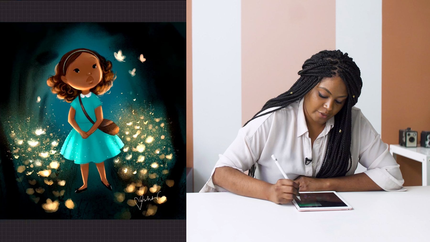
so very simple. [MUSIC] Hi. I'm Stephane Bourez.
I'm a 3D artists and a motion graphic designer. In today's class, we're
going to look at how we can paint on a 3D module
using Procreate 5.2. There are two main
aspects of my work. One is manual, where I'm sculpting or modeling,
drawing or painting. There is another end of that
spectrum where I'm using algorithms to create tools that in turn will create media. These are completely
opposite worlds and I really love to make
them clash together. We're going to start
with a blank 3D objects, and by the end it will be fully painted and
ready to render. First, we are going to have a look at the main
differences between a 2D Procreate file and
the 3D Procreate file. Then we are going to have
looked at materials. Finally, we will see
how we can use lot of creative ways to have
surprising results. This class is designed for people who know a little
bit of Procreate, but you don't need to know
much about 3D to follow along. By the end of this class, I hope that you'll have
discovered a lot of ways to be playful
with your canvas. All right, let's dive right in.
2. 3D Basics: Thanks for joining. We're going to first
talk a bit about 3D. What is 3D in the first place? 3D is the representation of an object in a
3-dimensional space. If we look at this
skateboard here, I can rotate around it. This object has been created
using all sorts of data so that we have all the
details and we can look at it on all the angles. 3D is a very vast world. You can create scenes with
thousands or millions of objects when you think
about films or video games, you have entire world
to built in 3D. In Procreate, 3D is
very much simplified. We're not talking
about an entire world like in a video
game or in a movie. We are going to mostly use a
single object in Procreate. You do not sculpt, you do not create 3D objects. You only paint on them. We're going to look at how
that works because there are a few technical details
that you need to know so that the rest of the
course will be quite fluid. What we're going to do
in Procreate today, think of it as we're going
to paint a figurine. Maybe you've played Dungeon
Dragon or Warhammer 40k. You had these little
plastic or lead figurines. Some artists are painting those figurines with an
incredible amount of detail, all sorts of nice
colors and they put the dust in and all
these scratches. This is exactly what
we are going to do in Procreate here. The only thing you need to
follow along is an iPad and an Apple pencil and of
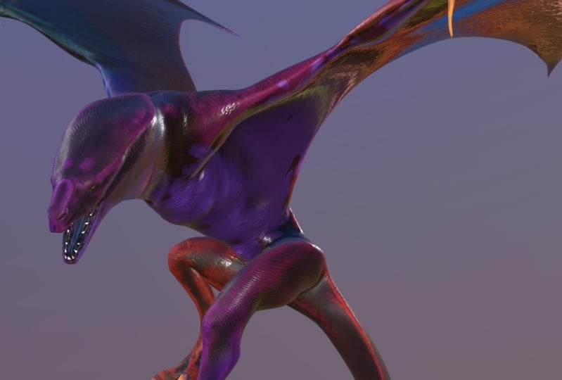
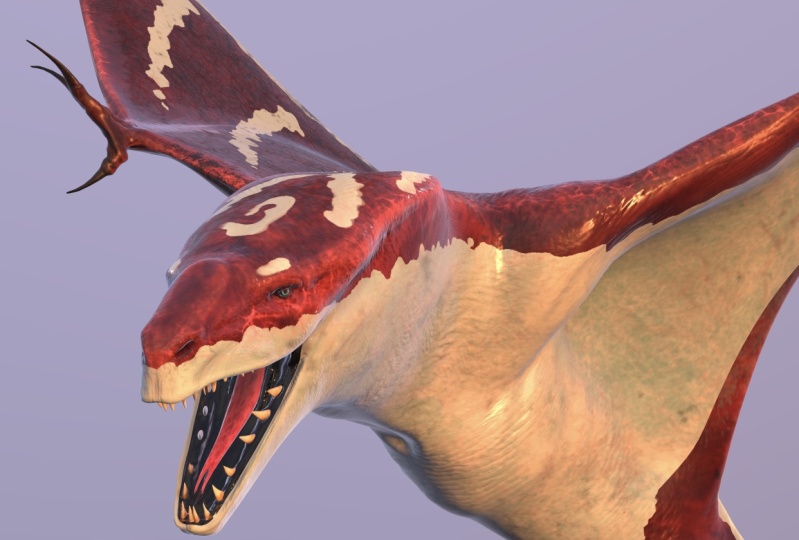
course, Procreate 5.2. I've prepared for you this little dragon here and here it is in its
finished version. We are going to
paint on this guy. You'll find this dragon in the resource
section of this class. I invite you to download it. You can download this
finished version because we are going to
have a close look at it. You can also download
the blank version. This is the one we're
going to focus on. I'm going to paint
every single step here. Once you have downloaded them, you want to upload
them on your iPad. Once that's done,
inside of Procreate, we're going to touch
on Import here. You go to your folder or
wherever you have uploaded your Procreate files and you touch on
Dragon_Blank.procreate. It's importing it. Now we
have our blank dragon. That's the one on which
we're going to paint. [MUSIC]
3. Using 3D vs. 2D: We're going to talk now
about a few 3D basics, first, we're going to look
at how we can navigate around our 3D object. Basically, inside of Procreate, when you use only
one finger to drag, you're going to spin
your object around. Now, you see that you
have an arbitrary point of rotation around which
we are going to orbit, and this point is being defined by the use of
a two-finger touch. If I use two fingers, and I drag or zoom, now, Procreate is going
to look at where is the point in the middle
of my two fingers, and this is going to be
the new orbiting point. Here, Here in the
center of the object, but if I zoom in
on its face here, and its nose, see see that
when I rotate around, this is where the orbit is. Let's now have a look
at the main differences between a classic
Procreate file, and a 3D Procreate file. First, when we go into
preferences here in the actions, we have a new icon
called 3D here, and the first item is the
one we're going to look at, it's called show 2D texture, and we're going to enable this. Here, what's going on here? We see our dragon might
look like a carpet, like this cartoon bears
it's like on the floor. Basically, this is the version of the 3D object
completely unwrapped, this is very important
to understand this. When we paint on the
3D object, basically, we paint on a texture that
is wrapped around it, this is the unwrapped texture
that is around this object. I'm going to show you
something pretty cool that I have prepared
for you here. This is not a Procreate feature this is something that
I've exported for you, I'm going to show you
the 3D Mesh here. This is the actual polygons that I've painted into
the texture here, and if we look again, we will do the actions, we go into 3D, and go into, Show 2D texture, I'm going to see here, this is how the mesh
is being unwrapped. We can see the two eyes, we can see here, the nose there, we can see the mouth here, this is the underneath
of the wing, this is the top of the wing, this is all its
spine, and the tail. When we are going to be
painting on this object, we're going to be painting
on that 2D texture. We're going to talk about these 2D space quite a bit
because it will allow us to do quite a few functions that
are going to be a very useful down the road [MUSIC].
4. Roughness and Metallic: Now another thing that
is new in the 3D files, if we look at our
layers up close, if you open one, any
of them, let's take, for example, the
base color here. You can see that on
the layers you have the same little 3D
box icon there. I'm going to tap
on this guy and we see that it opens
three sub-layers. One is for color, one
is for roughness, one is for metallic. In order to show you what the sub-layers color, roughness, and metallic do, we're going to open a blank dragon and we're going
to start painting on it. Finally. We're going
to start a new layer, I'm going to press
the plus here. I'm going to rename
that real quick, base color. There we go. We're going to take
a standard brush. Let's go to airbrushing, let's take medium
brush, for example. We're going to take a nice
and very vivid color, I'll go with bright red here. When I'm painting
on this object, you can see I'm painting some red paint directly on its
face here. What did he do? Automatically, the color, the roughness, and the metallic sub-layers
have been filled. We can see that the color
has been filled with red, so obviously the data or the
pixels in there are in RGB. It's all color in there. Now, roughness and metallic
are more like data layer. They are only black and white. In roughness, the
darker it would be, the glossier the
material is going to be. In metallic, if it's
completely black, it's non-metallic and
if it's completely white is going to
be very metallic. Why is that? Well, in order to
understand this, we're going to have a
look at the brushes. When we look at the brushes, if we take our medium brush. In the 3D version of a Procreate file in
the brush setup here, we have here yet again, a real cube icon. This is new, this is specific
to the 3D Procreate files. In this, we have
two sub properties, which is metallic and
which is roughness. What we are looking at right
now is the amount here, the amount of
metallic is at zero, so it's called nonmetallic. The amount of
roughness is at 50. If you remember, the
roughness was mid gray. What does it mean is that
when we are painting, we're painting with
a paint that is basically not too glossy
and not too matte. Let's erase this color there. I'm going to use three fingers and shake around the screen. This time, we're going
to go back to our brush, and we're going to put
our amount of roughness, let's say about 15 or 20. Now we should see a little
bit more of shininess here, you see that on its face here. We can see that our material
now is completely shiny. If we look on the
sub layer here, we can see that the roughness
here is now a dark gray. Let's have a look at this red, and let's turn it
into a metallic red. Still in our brush in
the material section, in the metallic section, this time we're going to put the metallic amount
to the maximum. You can see here already, it looks like we are
painting chrome, I remove the metallic now
we're painting white. We can have a nice preview
here already anyway. If I take red, this
is nonmetallic red, but glossy, let's put some
metallic all the way up. Now we can see we have almost
like a Christmas ball. Let's have a look at how
it behaves on the dragon. With three fingers, I'm going to shake
across the screen. I'm selecting our
base color layer, and I'm going to
paint directly on it. Now we have our red
metallic dragon paint. This is important for us to understand the anatomy
of these layers, because we're going to
use that quite a bit. You see, I was painting with
the base color selected. But you can also, if you tap on it on the
cube ones, you can, if you want, only the paint
on a selected sub-layer. You can call them sub-layer, we can call them
different channels. What happens if I erase
everything but only on the color. Now I completely cleared
the color sub channel. All the red is gone, but the information about this area being completely
metallic has stayed. Now we have this chrome dragon. Now, if we select metallic, I'm going to use
my three fingers and shake them to
clear the area. Now all the metallic
information is gone, and now we only have the
roughness information there. We can double-check that. You can see that this is
empty, this is empty, and we still have that
slightly darker roughness which makes this area
a little bit shinier. We've had a close look at the layers and
their sub channels, we now know what roughness and metallic are, in
our next lesson, we are going to paint the base
color layer of our dragon. [MUSIC]
5. Painting Your Base Layer: Now we're finally ready
to paint our dragon. We are going to start
with the base layer. So I've come back to
the blank dragon here. You can see we have just all those three
mysterious layer and we're going to
start to unravel their mystery very soon. I've created a new layer
called base color, which is right now
completely empty. So we have no color, no roughness, and no metallic. What we want is to fill this entire layer with
a dark blue color. We have three ways to do so. Let's pick one of the airbrush. We're going to pick
the soft brush there and we'll
start to paint it. I'm going just to look
at the behavior of the paint and how it
projects onto the model. We can have a massive brush to project all the paint
on the layer here. We think, okay, that's it
but in fact, no, it isn't. You see, like in real life, all the paint has been
projected on the mesh. But the different
parts that were not exposed have not been painted. We could go ahead and paint
everywhere and check, we need to do the
inside of the mouth, check underneath and check. But that feels a
little bit silly. This is like, surely there is a better way to do this
and yeah there is, you can go and click on the
layer and press on clear. Now we are again on a
completely empty layer. Have a quick look here. I have picked my
dark blue color and if I click on a base color here, we have somewhere here, something that is
filled layer here. That's it. What it did is entirely fill the entire
layer with this blue color. He only filled this
kind of island. If we look at actions, we go into the 3D tab here. We say sure to detector. Let's have a look at that.
We see that he has filled the entire silhouette
of our carpet dragon. Now something to note, let's go back into 3D. When we pick the layer from the top and we say fill layer. If we look at the
sub-layers here, it's only two colors of
the colors of channel. That's perfectly fine, we are going to do
the roughness of the skin on a separate
layer altogether. Now here is a third way of doing an entire fill
layer of the color. We're going to clear all this. I personally like to do it
via these kind of layers. You can also go into
the sub-layers, click on the cube, select color, tap on this, and
here fill layer. It does also the same thing. So many ways you
can choose one of these ways to fill
your entire mesh. Now we're going to
add a little bit of a cool roughness to that. And here we're going
to use a new layer. I'm going to rename that. For this, we're going
to select a nice brush. I've created quite
a few brushes here. I've created some with different
types of skin textures and we are going
to be able to look at them in detail later on. Let's take this one just
to have a quick look. We're going to go into
our skin roughness. Of course, here we're going to select the roughness channel. I think a good way we can
start is to first select an entire black color and fill our layer
entirely with black. Now it's entirely super shiny. If I take my nicely
gray here again, 20 or 30 should do. I'm going to start painting
with that textured brush. I can do it either by painting on this mesh
and it's manually here. It's a bit hard to see there, it starting to see
a bit better now, we can see that we start to have these nice detail
in the reflections. It's got these nice
little and even textures. I can paint that way. You will be thinking, well, we could very well just go into the 2D texture and paint
on the roughness here. Unfortunately, when we are
on the subchannel here, in the 2D mode of
the texture space, procreate doesn't show you the kind of different
subchannel, it will only show you
the color subchannel. So let's go back to 3D view there and
let's continue to add our little roughness texture
with the hybrid lower. I'm going to continue
to add that. Now here I'm completely done
with this roughness layer. You can see that we have some nice variations here
and there on the skin. It's very settled so you can see them a little
bit around here. When you have some
brighter, lighter color, it will show up quite nicely. [MUSIC]
6. Using the Curvature Map: This dark blue is very
blend and uniform, and it's time for
us to start to add a little bit of variations
and a bit of detail here. We have several ways to do that. One that is full of love
for painting and crafts. If you were painting
those figurines, you would spend ages and ages painting in
all the details. What we're going to do now is to select our base color here. Going to the same
layer and go make sure we are on the color channel. Now we're going
to start to paint our color on these ridges. You could use a textured
brush like that. You can spend ages and
ages painting this scene. It's very relaxing. It's actually a
form of meditation, and then you can go in there
and paint all those details. But surely there is a
smarter way to do that so a way that is
a little faster. This is what we are
going to have a look. It's a cool little trick. This is when we are going to reveal what is this
curvature map. When I display it, it's all gray, pretty boring. But it actually has
some nice properties. This is a texture
that represents all the convex areas in light gray and all the flat areas in a neutral gray and all
the concave areas, like those little valleys
in a darker grays. So like the roughness and
the metallic channels, this is if you like, a data map and we can use that to do some very
powerful thing. Let's have a look at how
we can use it to fill our base layer and it's going
to make an easy job of it. I'm going to duplicate it
because we're going to use that curvature
map again later. I'm going to hide the original. For now we're going to
keep that name. It's fine. We'll rename it later. This is the very cool trick in the latest
versions of Procreate we have a new effect here
that is called Gradient Map. What gradient map
does, I select it. See here we are on the Gradient Map called
Ocean that I have created. It's going to take
all the dark values and it's going to map
them to these black here. All the medium
values is going to map them to these blue here and all the white values and
bright values is going to map them to this final
color here, which is white. If I was to go basically
on the right is your brighter colors and on the left is the darker colors. If I am to compress
these gradient here, you're going to see, you're
going to have more and more of these white picking in. We can see that what
was light gray is now fully white and if I
compress that way, we're going to see that
everything that was a slightly darker gray
is now completely blue. To make my point even clearer, I'm going to change that color. Let's go to a flashy pink. You see, you can really go crazy with
that and you can create some amazing effects
while that's pretty ugly, but it's just for you to get the point I was
trying to make here. Now we want to have our
dark gradients here. We want to have almost no white, a little bit of blue here. I want to darken this here. We're going to darken that blue here, I'm going to match. Now you see all the
details that I wanted to paint manually they are
appearing themselves there. Once we're done here, just tap on this little
magic one icon here, and there we go. We have our color
base layer all done. That was that quick. Let's rename that because this is now our new base corner. I'm going to rename this like that and it can get
rid of these blend one a bit and we can put that
underneath the roughness. Since it is now a
fully painted layer, we can go on these
color channel. We can adjust this to
our heart's content. Hue saturation brightness, which maybe it's a little bit too
saturated for my taste, I'll putting down a little bit. Now we can play a
little bit with the darkness and the brightness. Everything feels a little
bit darker at the moment. But we want that because
we want that kind of design where we have
a bright contrast. Obviously you've seen
the final version of this dragon and there's a
lot of it that was inspired, which is the aquatic
animals like the ocher, maybe some salamanders all these very
contrasted patterns. The fact that it's dark, is probably going to
work well for us. Cool, I think we're good
with our base layer. Now we have an interesting
bit of roughness here. We've got some nice
little details in the color and we are ready to go and to crack on
with the patterns. If you're following along,
don't hesitate to share your progress on the
Project Gallery. Maybe if you've used a
completely different colors for your base layer, we'll be very curious to
see what are you up to. Now in our next lesson, we're going to focus
on the patterns. [MUSIC]
7. Creating Pattern Brushes: Now we are going to
design those patterns. Let's have a look at the
finalized dragon here to see a little bit more of
what we are going to do. A good way to tackle a complex task is to start
from the bigger parts, then to refine the medium parts, and then to finally end
up with the details. If we have a close look here, one of the biggest part is that mostly a bit like an
orca or a manta ray, our creature has a very light underneath its belly and
underneath it's wing. We're going to start with that. We're going to block in a
big white shape that is going to cover all these
parts underneath that beast. Let's go back to
our dragon here. In order to do that,
we can again use the various techniques
that we have seen earlier. But first, we are going
to create a new layer, which we are going to rename. I'm going through the patterns, I'm going to start to
block in those shapes. Now these shapes we know
are going to be a mask. It doesn't really matter
what color they are in, I'm going to use
this white color. I don't want it to bleach
the screen completely, so I've placed it at 80
percent of brightness here, so that it's a bit
easier on the eye. We can start with
a hard brush here. I'm going to go to airbrushing and we can start with
this hard brush there. We know that we
have these shapes that goes underneath
its face like that. It goes a little bit underneath
and towards its belly. Very quickly we see that
this airbrush here, it's nice, but I think this brush can work a
little bit harder for us. I'm going to cancel that. I'm going to show you a
really cool brush that I have made earlier
on the creature, and I have made a
pattern brush here. I'm going to try
to use that now. When I create that, you can see we have this nice
cool thing going on here. Almost creating this
camouflage thing, we can try to see it in larger. I'm so happy with this brush. It's a little bit
flickery but it creates such an interesting details. Basically, this is one of the
little secret trade things. I'll never tell you how
I've made that brush. Now I'm joking, of
course I'm going to tell you how I
have made that brush, it's actually really easy. We start from the airbrush here. Let's duplicate the soft brush. I'm going to duplicate that, and so there's
soft brush 1 here. We're going to go in this. We're going to start
and we're going to look at the shape here. We can see it's a
very soft shape and this is what we want. What we want here
in the stroke path, we want to have a
lot of jitter in the position so we're
creating this thing. For the purpose of this, let's preview the size,
much smaller here. Let's clean iPad. You see that this is a little
flicker that we were seeing. At the moment, it looks
a bit like nothing. But we're going to go
to the grain here. Inside the grain,
we're going to change the blending mode
and we're going to go all the way to
a hard mix here. Then in this hard mix, we're going to start
to play a little bit, with the contrast
and brightness. We see that at the moment it's
using this blending mode, but only on each little
dab of that brush. This is something that is very important to understand when we talk about this
grain feature here. I'm going to clean
that pad there. It's because we are in that
moving parameter here. If we slide that to texturize, suddenly our grain
is going to take the entirety of all
our little points and to blend them together. I'm going to show that again. This is when it's
using pair dots and here it's using
the entirety of them. Because they were so soft
and using a lot of contrast, we end up having these
nice wavy patterns, which is very cool
for us to create those organic pattern shape
that we can find in nature. There you have it. A nice
little brush for you to use. Let's check, we're on patterns. We are only interested into the color channel
so we can go there immediately and we can paint
these underneath elements, you see, and that's quite nice. We can refine it a little bit. Let's go add a little
bit in spacing, a bit more jittering. Let's have a look
how it works now. That's pretty cool. Anyway, you can refine those to
your heart's content. We're going to just basically, we're not precious here. This is why we start with
the big shapes first. We are not after the
detail, it's fine. We can go really rough here. We can really just block in. At the moment here, you going to see I'm going to
paint underneath the wings. But if you remember, we can go to the actions here, we can go to our 3D tab there. I'm going to show
the 2D textures. We starting to see where
we have painted here. Let's hide this. We know that this is the underneath
of the wing. This is the side. This is
the top of the wing here, and this is the belly there. We can make a quick job of filling up and it's fine if
we go outside this shape. I can show you this mesh here. Because this zone here is not assigned to any
part of the 3D mesh. We can go really quickly on top of everything here.
That's perfectly fine. Another cool quick tip here, when you go to actions
and you're going go to canvas, we can
use a reference. When we are in 3D file, the reference here
gives you a new option. You can have a reference
that shows a 3D object. Paint in a a little bit here, bam, it's appearing there. See? That is pretty cool. Then switching
between 2D and 3D, I'm going to continue to
refine this base shape and we're going to find ourselves on the other side
once that is done. [MUSIC]
8. Creating Pattern Stamps: We have our base for
the pattern shape. It's covering mostly
the underneath of the creature as
we wanted it to be. Now we're going to refine these shapes and
we're going to try to add all these cool
shape a bit like that. We could do that with
our new cool brush. That would be fine. It we'd
be actually fun to work with. But in that way, we would be painting and
designing the same time. I think that if we can
find a way to just do only designing and not designing and rendering or not
designing and painting. It's always a little bit better. What we're going
to do now is going to give us a greater position to find out about a
new Procreate tool, which is the 3D transform tool. Basically in this
free transform tool, what we're going to
do is we're going to copy and paste almost like stickers or stamps
on top of this 3D mesh. First we're going
to have a look how the free transform tool works. In this file here I've prepared quite a few little
textures and I'm going to show you. This guy. This is a little bit
of a texture pattern that I've created earlier. I'm going to select that layer, tap on it and copy it. Let's see what happens
when we're going to paste it on a 3D object. We're going to place
ourselves just on top of this pattern here. I'm going to drag three fingers down and I place myself
maybe on the head here, just quite close.
I'm going to paste. We're going to see that actually on the mesh and zoom here. We have a little layer here. Here I'm dragging
with one finger. We have this shape. If I pinch on that shape, I'm going to scale it down
or I can pinch and rotate. You see this is the shape
that we had before. We have that little strange
little contour line, is useful in some cases, but I find it personally a little bit annoying
in term of visibility. We can go from
automatic to advanced. Let's look first in
automatic we see that it's constantly following the
shape of our 3D model. We cannot go anywhere else
outside of that shape. If we start to go in advanced, we have a completely
new Gizmo tool here that helps us to
transform and rotate. Now, let's look at
this out circle here. If I drag this circle here, obviously we are uniformly
scaling up and down. Something that's
really well done, if I start to a
rotative motion on that circle and with its
very cool rotation shapes. If I drag on that little
disk in the middle here, I'm dragging that shape
across on surface. Of course, those two squares
you would have guessed, one is to stretch one way and the other is to
stretch the other way. Pretty much everything
is explanatory. Let's have a look at the
options that we have. Flip, a vertical and horizontal and we can
rotate 45 degrees. Then we have something new
here, we have projection. This is something that we
don't have in a 2D space. If we look at our
little pattern here, we see that if we
look underneath, we see that it's not going
all the way through. We tap on projection, we tap bidirectional
and there you have it. Now it's going all
the way through. Bi-directional basically
it means that it's going to stick towards
all the way down, but it's also going to do the same underneath
in both directions. But in our case
we probably don't need bi- directional to be on. I'm going to go ahead
and turn it off. That's going to give us a nice opportunity to look at this other projection
option that we have here, which is the projection depth. What is this? Let's have a look. I'm going to drive this
guy over here there. We see that our
tool is trying to project those pixels
into the 3D shape there. It's creating a
bit of a gradient. That gradient is basically
based on how deep we want the sticker to go and project itself
onto the mesh. This is represented
with a bounding box. You see as soon as I'm going to drive that projection
depth parameter, you can see our
little pattern here going more or less on
the leg in the depth. This can be very useful. Actually, we are going to
turn on bi-directional. It's going to be very
vividly visible. If I push to depth
all the way through, it's starting to have some
really cool accidents. There are of things that we
couldn't have predicted. This is what I meant earlier. If you can use tools
that are made to do design and not just purely
spending time on rendering. Here we have all the time
to do any experiment. We are placing just a sticker here and we have
immediate feedback. We can try all crazy
stuff. See, there we go. We're starting to have
this patterns mixing with our previous work on the belly. We started to see some
really cool stuff. Now, what does this
little ball do? This, if we remember
the bounding box, this is basically the angle
at which we are going to project the content of our
sticker onto the mesh. Like here I'm almost
90 degree there. If I go into the
projection tool, this is when it's
becoming useful, you can do all these
kind of crazy thing. Here I'm going to
push it to the max. Now at the moment, if I
drag that little disk here, it's still following
automatically the shape. But what if I wanted to have it dissociated from that 3D model? Well, if we tap once
on that little disk, we have this option
called detach. Well, you guessed it, is going to detach our
tool from the surface. Now we've got this
diamond shape. Now we can freely fly
around in our 3D space. Which means that when we drive that little guy is
literally as if we are armed with a
video projector and projecting some paint
onto our model. You can see how
playful that can be, and because my depth
here is to the max, actually is very, almost
to the max, very deep. When I'm projecting around, I'm actually projecting paint
across the entire mesh. This is basically welcoming
any happy accidents. We are going to paste this
pattern here or across the top of the back and
should say of our Dragon. The idea is that we want to
have this animal pattern, not necessarily like
a tiger or zebra, but something like
a salamander maybe. Again, here at this stage, we don't want to be too precious if we have a little
glitches and stuff, this is something that
we are going to do in refining. Let's place them. As we're going to place them, we're going to see that
there are a couple of things to know. I'm to reduce the
size a little bit. I know that I want to really
build a connection here. I'm just going to tap
on that little arrow at the top there and this is going to commit the
design to my layer. As soon as I do that, I lose this transform. You want to make
sure that you're happy with where it is now. As soon as you commit
to your transform tool, it will place your
selection of layers, not on the top layer here, but it will select
your color layer. This is something to know, at least in this version
5.2.4 of Procreate. If you want to go and paste
again another pattern, I'm doing three fingers
down and paste again. You see everything
has just disappeared. Basically what it did, it just took the entire content
of what we had already, squeezed it down and placed again the contents
of our copy here. I'm going to undo this. What you want to do after
you've committed to your transform tool is
to select your layer, not the sub layer
but your layer. Then when you're going
to do paste from there, you see we're going to have another instance
of our copy here, which is basically on a
new layer just above. Again, what we're going to do is to go into Advanced Mode, change the projection
from bi-directional. I'm going to use the
protection depth to extend it by quite a bit. Then we're going to
reduce that and you can recognize our cool
little pattern again. We're going to start to place
it in a cool fashion here. I'm going to place
a third one here. I'm going to let you
place your own patterns. By the way, you can create triangular patterns,
rectangular patterns, zebra patterns, dotted patterns, little hearts, you name it. You create your own L designs. Chill a minute and I'll
show you once I've done all my little
patterns on this model.
9. Coloring Your Patterns: We have played with these three Transform
tools and we have pasted quite a few of
these little patterns, we've looked at them, we've tried to see what
would be the right scale, we've placed them everywhere, maybe from the tail to
the top of the neck. Once I have placed them all, I've started to just basically connect them together
and I've used the UPF brushwork and UPF eraser to clean
this guy altogether. I've also added quite
a little bit of details here on the face. What we have here is just a completely solid color and we're going to basically use the same process without little curvature map trick to remap the colors that we've
used for the basic layer. We're going to use the
same trick to color all of these white into a nice, interesting much lighter blue but a blue that has
all the details here. I'm going to show you
again that curvature map. This is this guy. We're
going to duplicate this guy. We're going to rename
it and we're going to call it Patterns Color. I'm going to hide the
curvature again and drag this guy all the way
on top of Patterns. From now I'm just going
to basically tap on this and I'm going to
press on clipping mask. What clipping mask does
when it's enabled, that layer is
basically looking at the transparency directly
underneath it. Let's move on. If you remember what we
used just after that, we went to the effects
and went to Gradient Map. I'd remembered where we started, which was the dark-blue,
it's quite similar. We had this ocean setup here. If you were to invest
your entire thing, you just have to slide. For example, this dark color I'm going to slide it
all the way here, the mid dark I'll put there
and the white all the way here and now we've basically invest their
mapping of colors. I think this is going to
be quite cool for us to have all these
little interstices, all this little gap in a brighter color for
our design. That's it. I think this is going
to conclude pretty much our lessons on patterns. We've learned quite a lot of cool tricks and you
can see how you could reuse that in many
other conditions. Now, all we have to do is
basically in our next lesson, we're going to just paint those details for
the close here. We're going to have a
layer for the eyes and a layer for the mouth and that's going to be
done quite quickly. See you in the next lesson. [MUSIC]
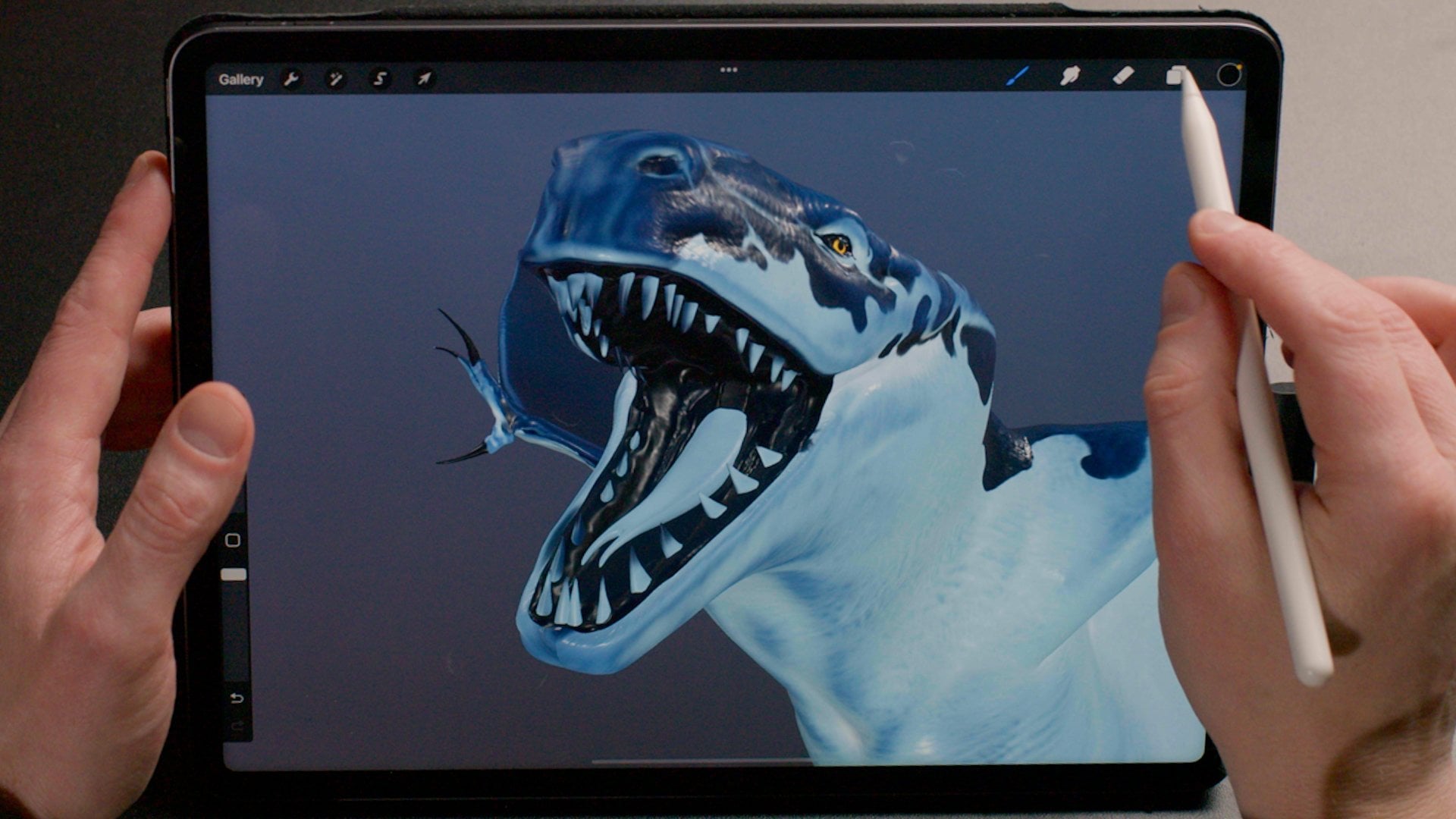
10. Painting Details: We are almost done
with our dragon. We just need to paint
his claws, his teeth, and his eyes, so let's get started. We're going to start
with claws immediately. As usual, we start
with a new layer, and we're going to
put that directly above the skin roughness
because the claws, the teeth, and the eyes will
have their own roughness, and we're going to get
to that in a minute. We'll create a new layer. We're going to rename that
and we're going to call it Claws. Here we go. Then you can choose the
brush of your liking. For me, I'm going to
go pretty classic with a medium brush from the
Airbrushing section, and then I'm going to
go plain black for this because we already have quite enough detail
on the skin there. We are not going to
push it, I mean, I'm not going to do that
with a little picture in the nails that this dragon is not that
fashionable. Let's go ahead. You see this is
where it should be important when I'm
zooming and pitching. I make sure that I'm pinching on each toe that I'm going to
turn around because this is, remember, where you're
placing your orbit. With such a model
it's going to be incredibly useful to be able to rotate around the very spot
that you want to paint. Let's change the size of the brush here and
just try it there. I'm going to actually going
up brush here just a second. Go to material, oh, we did well. Look, metallic is
completely for young. Where we put that back
down and the roughness, we going to put that quite down. We want it to be pretty shiny and the good old
25 will be fine, done and we're good to go. See I only have between
1-2 % to play with, to adjust the scale of the brush to my model and that's
not really ideal. If you really struggle
what you can do, is good to brush detail, go to the properties, and here you can just turn down your maximum brush size
to 100% or even less. That's going to give you a
little bit more breathing room in this scale here, it's going to be a
bit more manageable, just you could dip there. This is pretty much going
to be more of the same. [MUSIC] I'm going to see you on the other
side in a second. We are back so all those
claws are nice and painted, the one from the wings and the
one from the legs as well. I bet you have chosen some pretty interesting
colors yourself. Let's move on to the eyes and
see what we can do there. Again, using the pinch to place your orbit point is
super important here. We're going to be using
our Zoom quite a bit here. Just as before, we're going
to create a new layer, which obviously we're
going to call Eyes, and we're still on our
medium brush, that's fine. We go-to materials. Let's check if it's
nice and shiny. We might make it a
little bit shinier even, because this is the eyes, they are going to be
quite shiny, done. I'm going to paint them
all black, nice and shiny. Let me create a little
bit of a makeup, a little bit of
mascara for a dude. We will refine find a bit later. Using the same brush, I'm going to pick a vibrant
color, this yellow. If you're familiar
with Procreate, we're going to use
something that's called Quick Shape so I'm going to draw circle motion. I'm going to keep the pencil down and it just
created an ellipse. You see at the top here
to the edit, create it. Now if I tap my finger, my thumb here on the
screen is going to transform this ellipse
into a circle. That's pretty cool for
us because we can have a pretty dead-perfect circle immediately there we're going to do the same on the other side. Ellipse here, a little bit flat. We're going to go
back to black here, give you a little bit of flair. A tiny bit of [inaudible]
as if it was actually 3D. It's going to give it almost
like a fake shadow here. I promise that would
refine the makeup here. You can spend edges, I'm just brushing through here. But you get the idea. This is almost too much. I think, for now, this will do. We are going to be on a
roll here and we're going to move on to the mouth. New layer, we stay clean, we rename it Mouth, there we go. Now for the mouth,
we're going to do something a little
bit different. We're going to go back to the good old 2D view
because I don't want to go in there and show you if I wanted to
paint it all black, I don't want to go in
there and paint and "Oh, no we didn't paint behind the
teeth, " and go in there. That going to be a
little bit tedious. What we're going to do. Let's erase this. We're going to use the
2D shooter detectors. You see now we have the
nice little dragon carpet. We have here, the inside of the mouth and
this is the tongue. We see that the eyes
are already painted. They're here. If you
wanted to have them. There steal still things here, all the teeth nicely laid down, so we can just pick
them. Nice and clean. What we could do is just
basically paint these old black. That's perfectly fine for us. Let's have a look
at what we've done here and switch back
to 3D mode here. Now we have the
inside of the mouth, nice and all black like
that, it's pretty cool. Obviously we have
avoided all the teeth and tongue because we painted only on the
inside of the mouth, eye land in the two detections. Let's look at the sub channels. You see we don't
have a roughness. We don't have metalic. We're going to go into
the roughness here. I'm going to show you
something as well. We mentioned it earlier, if we go back to the 2D texture, if we paint on a sub layer here, I'm going to take a darker
color to make it shiny. We're going to see that we
won't have any feedback here. Basically, I'm working
a little blind here, but normally if we go
back into the 3D view, it should be
[inaudible] and shiny. Let's go and now work
on that tongue here. For this, I think we can easily work directly on the 3D mesh. We're going to take
our dark blue here. We're going to use one of the creative brush that we've created that
has a rough texture. Maybe I'm going to use
this one here [MUSIC] We have the tongue down. Let's finish with the
teeth really quick. We're going to go back
into 3D and 2D textures. There over here, we're going to take a
nice little bright color. We can to make sure we
are in the color channel. Let's take our
airbrushing medium brush. It might look a little bit ugly, but that's at least it's called the benefits to be
very efficient. Lets stay in 3D, I'm going to take this one here. I'm going to make it very small and black and I'm going
to paint the teeth here. [MUSIC] Here we are with the
mouth, and fully done. Again, you can spend as long as you want doing
all the details, but for the sake of this class, I think you get the
gist here [MUSIC]
11. Adding Final Texture: We are almost done
with our dragon. We're going to have
a few brushes. We're going to add a couple
of layers of details, a little cracks on the skin. Maybe a little
pigmentation of the skin, something that will give
it a little bit of flair. To do that, we're going to use the power of the
procreate brushes. I've used this
great brushing gene to create all cool brushes. Let me show you them. I've created a new layer
called details here. I'm going to go into
the subchannels. I'm going to set the color. I'm going to have a quick
look at those brushes. We've seen those funky
patterns earlier, they're saved as well. What do we have
here? Skin details. These are going to add a
little bit of pigmentation. It's going to pick
a blue color here. I'm going to show you. There adding this
little blotches. Again here I'm using a lot of the spread option in the brush. I'm going very heavy handed. But if you take one
of these blue here, and if you go really subtle, this is where you go back to this love of painting
details on these figurines. I'm going to continue just
painting a little bit. I'm going to remove
this little pigments,. Something that I like to do, we have our little
skin details one here. One of the technique
I'm going to do is to paint a lot of details in and then do what we call in French the [FOREIGN],
the removal. I'm going to press and hold for a long
time on the eraser. Now the eraser has the same brush that I was
using for placing my paint. Using the same brush, I can change the
size a little bit. By using a detailed brush, we're basically creating
those very nice, chaotic little details here, which would have been very
tedious to paint by hand. Let's have a look at
another one here. I've prepared some new veins here as well, I'm
going to show you. It creates all these
little veins here. We can change the size. That could be useful. I'm going to undo that
to another brush. We're going to use here
another set of veins, which is a bit more interesting. The reason it's more interesting it's something that
invites you to investigate is this brush here? Look at that we have two brush. At anytime in the brush studio, you can take two
different brushes and smash them together and choose what mode you're going to use to
combine them together. This is extremely powerful. I've not seen any other
brushing gene that can use to existing brushes and
that combine them together to have extremely
interesting results. This is what I've used here to create those
little veins there. I'm going to go ahead and
paint some of the details. For example, I'm
going to use value thin brush there with
a brighter color. I'm going to place it
here on the dark areas. It's going to create almost
like a node leather sofa. You have an old
Chesterfield Sofa or cracked from the '60s or '70s and it looks a
little bit like that. We want our dragon
to have a little bit of a history to tell. I'm going to place a lot of
little details everywhere. I'm going to spend a
little bit of time there. I invite you to do the same. I'm going to see you in a
minute and we're going to see these details finished. [MUSIC]
12. Creating Variations: We have painted all our details in with our fancy brushes, let's have a quick look. See, we have all these
nice little cracks there on the neck. We have this nice
little pigmentations and discolorations
in the skin as well. You can recognize the brushes
we were mentioning earlier. We have these little dots, they're all these
little imperfections. That really can help
a lot your models and your creations to feel a
little bit more alive. This is us done
with these details, we are going to see now why we have created
all these layers. We could have painted and collapsed all our layers
as we were going, maybe the file would have
looked a little bit simpler. Keeping your work
nicely separated like that can make it attractable. Because we can go
back to each and every step and modify them. One of the most
spectacular way to do so is to basically change color. Imagine if you were doing that for a video game or a movie and your director or our director looks at
your files, okay, cool. I like the overall
art direction, but we've moved on from
the blue in all our shots, we want it to be a fiery guy. Is more all about volcanoes,
you see where I'm going. We're going to make this
guy pretty much vivid reds. Because we have these layers
all nicely separated, it's going to be actually very
quick. Let's have a look. I'm selecting this
base layer here, and the only thing
I need to do to use hue saturation
and brightness, we're going to
shift the hue here, and you can see our dark values they are shifting towards
this nice brown leather, and if I go all
the way back here, we have this nice pinkish, reddish, looks almost
like it's transparent. We can add a little
bit more saturation here to make it even more mean, more red. Let's go back. Something a bit
more orangey, cool. We tap on the want, and then we just have to pick
our pattern's color layer, I just do the same. Hue saturation brightness,
change the hue, we're going to go
towards a nice red, orange here, we can see that our details are still
on the blue values, we're going to sort
that just after this. We're bringing on
that saturation. Let me go towards the reds here. You see where we're going. We stationary, we can
change the brightness, add a bit more saturation, and go towards something
a bit red as well. Let's come into this. We can now do the same without details here,
so we select them, and again, hue
saturation brightness, change that hue so that
it matches our guy. There we go. There we have it. You have a completely
different version here. Very quick to do that. You can imagine that
you could also use the gradient remap
function as well because you already have
your gradients here. Let's do it on one
of these layers. I'm going to just show you
really quickly gradient remap. Because you already
have all of those on, you can just change and
go and use all of these. We're not going to go
into much detail here, but you see how it will work
just the same and you can spend loads of time fiddling around with all these
pallets and colors. Basically, you could duplicate your files and have
half a dozen laid out on a wall treated to shoot your art actor or to
the director of your movie. [MUSIC]
13. Adjusting the Lighting: Before you export your images, maybe you want to tweak
the lighting a little bit, maybe make it more dramatic, or choose the different
color for different lights. We're going to have a quick
look at how this is done. We're going to go in
Action again in 3D. We're going to do Edit
Lighting and Environment. This is where you can edit the lighting
and the environment. What is the environment? The environment is driven here and we have different
types of environments. These environments
are simulating an entire source of light. Here we have the
Studio environment. It's a nice and even lighting, pretty much on the gray side. If we click on the "Environment
section" here we have the exposure that we
can shift on and off. We have an auditorium which is nice and
dramatically or pink. City, the nightlife, portside, industrial, sunrise,
beach mountain, daytime. Have a look, have a play. Try to feel a little
bit with the exposure. Basically the
brightness of this. We're going to stick
to mountain for now. We're going to keep
it purposefully a little bit on the
dark side because we are going to have a
look at those three cubes. Those three cubes are
lights and we can drive them by a
single tap on them. I'm going to tap
on this guy here. We have very familiar
sliders here. We can change its intensity, so we see we are really
brightening up inside here. Then we can add some
saturation there and we can change the
color of the light. If I put it in blue is
going to be very moody. We could do a
behalf of sunset or sunrise if we go into
the golden hour here, obviously you can
tap on one light. We can also duplicate
it or delete it. Basically this is also
another light here. We're going to do the same, we can add some saturation. Here we're going to put
that on the blue thing. You can also tap up
there here to add another one by a simple
drag of the finger, you can reposition them. If we want to move
it on the depth here we go on the top view
and we can do that here. It's quite intuitive. I invite you to try this. [MUSIC]
14. Exporting 3D Images: Welcome back. How do you export an image that you could
print on the wall? Well, let's have a quick
look. It's very simple. It's very much like what you
already know in Procreate. Again, you go into actions
and then you tap on "Share". You're going to have a
few new options there. Underneath Procreate,
you have USDZ and OBJ. These are 3D files. These two 3D files are going
to be useful for you if you want to reuse your mesh
in another 3D software. Talking about reusing
that in another software, at the very bottom here, you can share the textures. What this will do is
that you are going to pick a location where to
export all your textures, and it's going to
export a color texture, a roughness texture,
and a metallic texture. This about covers the 3D
options for the export. Now, what if I just
want to export a snapshots or render
of this view here, or I can go ahead
and use some of the usual file formats here, JPEG, PNG, and TIFF. If you don't want to
have a background, if you want to have a
transparent environment, you can go into the
action, you go to 3D, and you go to your edit
and lighting environment, and you tap into "Environment" and you
basically switch it off, which puts you on a
transparent background. Done. Which means that
now if you export a PNG, it's going to be on a
transparent background and you can do some composite [inaudible] in Procreate with another background image
if you want to do so. You can explore
different dragons of different colors to create a nice mood board for your art director or
you're director to review. We have a final option, which is pretty cool. I'll go back to actions, share, and look at
what we have here, animated GIF, animated PNG, animated MP4 or HEVC. Basically we can
export the animation. This is if you want
to send a file for your client or director
to review as well, but they just want
to see a turntable, which is, in fact, a 360. I'm pressing on MP4 here. You can see what's
happening here. We have our little guy animated. We can change the duration
of the animation, which basically is going
to make it go slower. We can change the distance of the zoom that's going to make it closer to the camera
or further away. The Ease here, you see it's slowing down at the
end of the spin. We can remove that altogether, so it's just a continuous spin. Here you have the choice to show or not your
environment as well. A nice little
shortcut for us here. You have different types
of exports, 1080p, 4K or Square. There you have it. This is all the different
[MUSIC] kind of export you can do with your model once you
have completed. Please do explore them. I can't wait to see what
you guys have been up to. [MUSIC]
15. Final Thoughts: Congratulations. We've arrived at the
end of this class. I hope you've enjoyed it and you've learned quite a lot
of neat little tweaks, and remember, this is not
the way of doing things. This is a little pipeline
that I like to use. There is no right or wrong
way of doing anything. Just use these insights and knowledge to create
your own workflow. Remember, this is the first iteration of
3D inside of Procreate, there is going to be a lot of improvement to all
of these tools. Let me know what you think and don't hesitate to share
what you guys have done. Again, I can't wait to see
what you've been up to. See you very soon. Bye.
 Stéphane Bourez, 3D Artist & Motion Designer