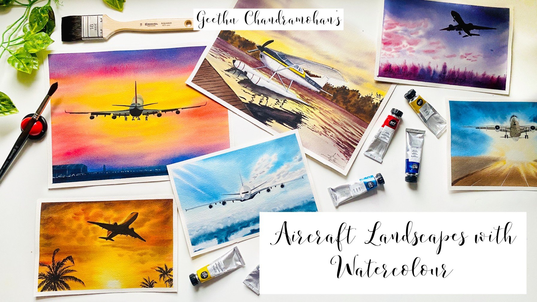
Transcripts
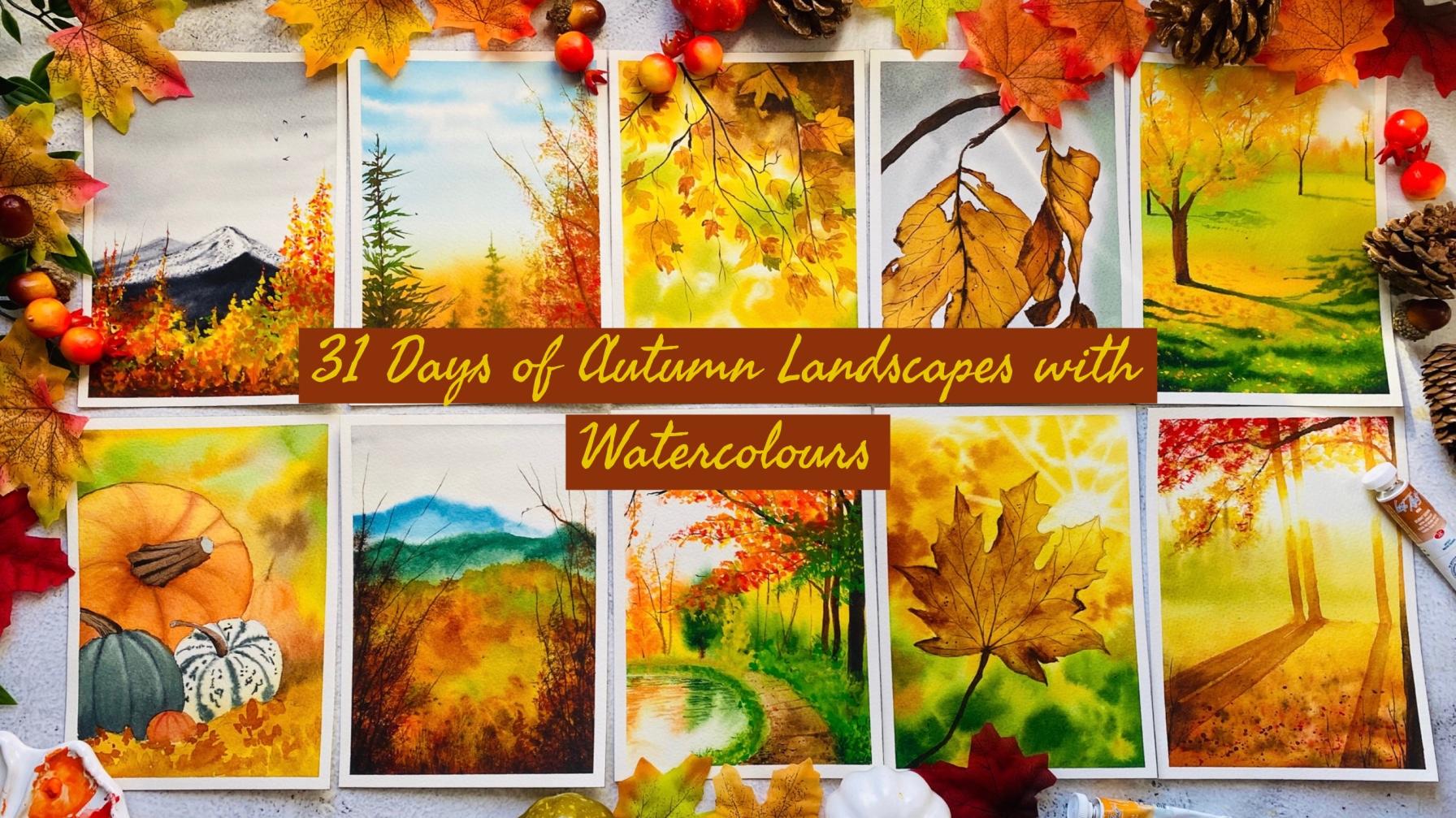
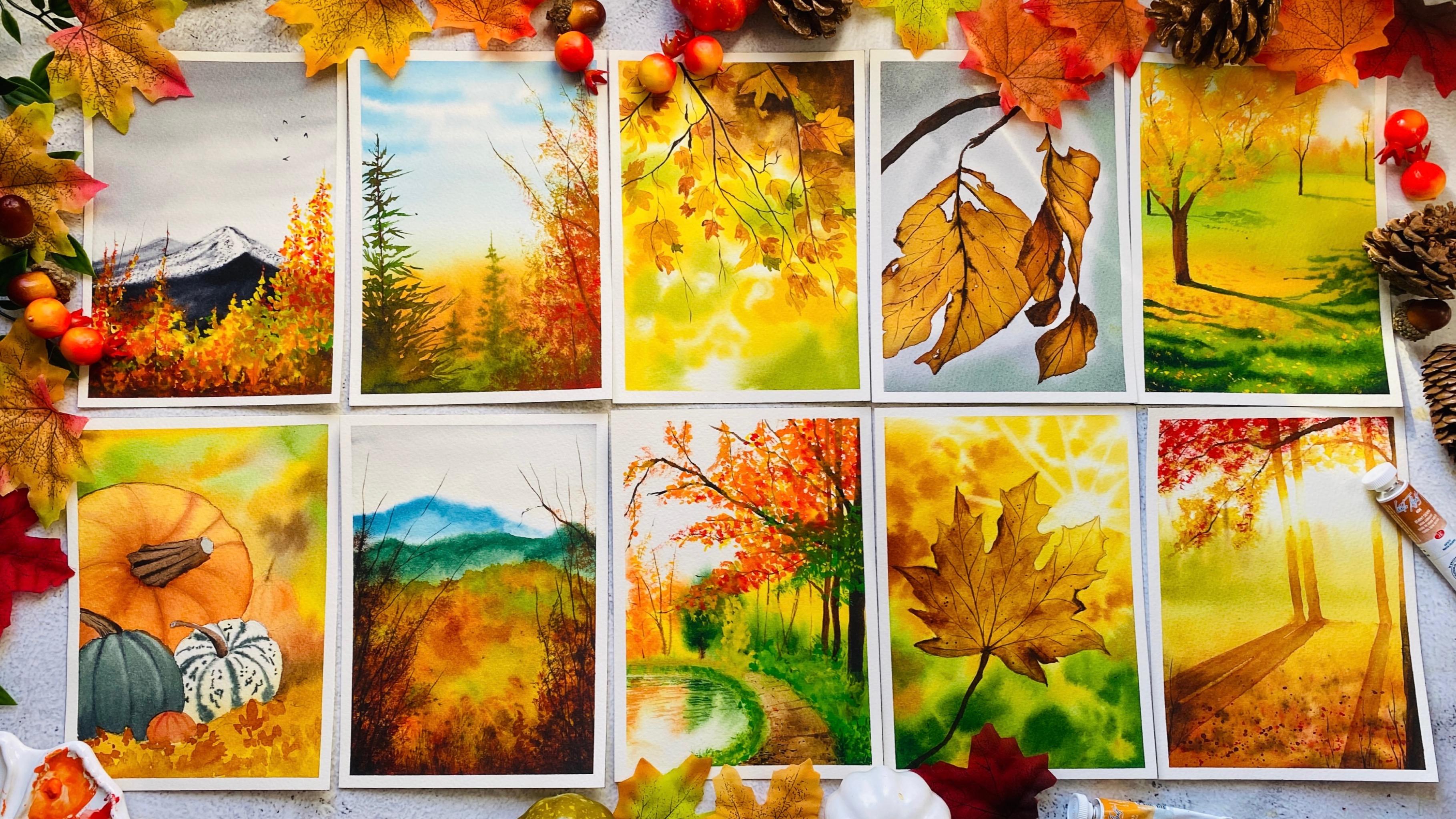
1. Welcome to the Class!: Autumn, is a second spring when every leaf is a flower, perfectly described by Albert Camus. When the sun's rays touch the fallen leaves, everything turns to gold. The gorgeous fall season has embarked upon us, showering us with golden shades everywhere. Hello everyone, I'm Geethu, an aerospace engineer, a watercolor artist, and an art educator based out of the UK. I have been teaching art for almost two years now and you can find all about me in my Skillshare profile. My works, in my Instagram handle, Colorful Mystique. Autumn, is the perfect start to a cozy indoor weather where we can sip our hot chocolate and watch the trees change colors magically. Welcome to this class on painting gorgeous autumn-themed watercolor landscapes. Isn't it the perfect time to go mushroom picking or pumpkin decorating through the woods and tread on the fallen maple leaves? One can never get over all the autumn things around us. But wouldn't it be more fun to make a beautiful autumn-themed painting every day to adorn your wall with all the things that are autumn-related? In this class, we will paint one autumn-themed painting every day for 31 days, which will be the ideal way to enjoy, be it your morning art routine or evening craft time. Each painting will take you less than 45 minutes a day and it's going to take you on a remarkable journey through a riot of bottom colors. Whether you're a beginner, intermediate, or advanced artist, the paintings in this class is going to warm up your hearts to welcome the season with a smile. Right from explaining all the materials and colors in it, we will be going through the step-by-step process in each of the paintings so that it is easy for you to follow through. The entire class is in real-time so that you can follow along and paint your hearts out. Without any further ado, let us jump into the class. See you there.
2. Art Supplies: Let us have a look at all the art supplies that we will need for this class. First of all, paper. I will be using this paper from Saunders Waterford. It is 100 percent cotton paper and it is cold-pressed, 300 GSM. The GSM is the weight of the paper, meaning that the paper is really thick. This is not the thickness, this is the entire pad. That is one paper and you can see it's really thick. This one is 10 by 7 inches. I'll be using half of these. I've taken out paper from this block and cut it into half. It's almost 5 by 3.5 inches, which means it's slightly larger than A6, it's not really A6. You can go for the A6, a square size, or even an A5 size or even bigger if that's what you prefer. I would recommend to go with 100 percent cotton paper for this class but obviously, you can always go with whatever art supplies that you have. Next, you'll need a board to tape your paper onto that board. I'm using a cardboard board like this. You can use anything like the top of a magazine, your table top, or any ball that you have. It's easy for us to work on when your paper is taped onto a board rather than a flat surface because then if we want to lift our board to get some gravity for the water to flow down it would be easier. Next, we need watercolor paints. I'll be using watercolor paints from the brand White Nights, which is my favorite brand of paints and I'll be using this palette to mix all my paints together and also this one for mixing my opaque watercolors. I will be explaining about the opaque watercolors and how to mix them in the next few lessons. Watercolor brushes, so you'll need a flat brush to apply the water onto the paper, or you can use the larger size brush that you have. I will be using this flat brush from Eskoda or if you have a flat brush like this one, you can also use that or go for the larger size brush that you have to apply the water onto the paper just because it covers a larger surface area. Then the other major brushes that you would need are a larger size brush such as a size 8, 10, or 12. Then a medium-size brush such as size 6 or 4, and a small detailer brush for the detail. Typically size 0 or size 1. I will be using this liner brush for most of the details. This is a liner brush or rigger brush. You can see the long hairs of the brush. These are all the brushes that you will need for this class, that's all. I might also suggest to use a synthetic brush at times. Don't be worried about the names. These are natural hair brushes and these are synthetic hair brushes. These hold a lot of water in them whereas the synthetic hair brushes hold very less water and paint in them which is why I sometimes switch to the synthetic brush when I don't want to have a lot of water or paint in my brush to add onto the paper. If your brushes are not that really expensive and you've just started out with watercolors, it would be so that you might be using a synthetic hairbrush, so it's all right if you don't have the natural hairbrush. Next you need two jars of water, one for washing off your paints and cleaning your brushes, and the other for applying freshwater onto your paper. The reason for using two jars is mainly because you can see that your water where you're washing off your brushes with the paints gets dirty and if you were to use the wet on wet technique, then you would be picking up this dirty water instead of freshwater. This is the reason why I recommend using two jars of water, a pencil, eraser, a ruler, and masking tape to tape the edges of your paper. I'll be using a mechanical pencil like this one because it is easy for me to use and I don't have to sharpen the pencil each time. Lastly, some autumn magic in your hands, just kidding. That was all the supplies that you will need for this class. Let us go into the next lesson.
3. Prepping the Paper: As I have mentioned in the art supplies, this is the paper that I will be using. It is Saunders Waterford, 100 percent cotton paper and it is cold-pressed. This is 10 by 7 inches and what I have done is I have cut it into half, so it's 5 by 3.5 inches paper. It's slightly larger than A6. It's not an A6 size. It's larger than A6 but then smaller than A5. These are the sheets that we will be painting on. You can go for any size that you prefer. You can even go for polaroid size, square size, A5, or even paint it big and make it an A4 painting. It's totally to you. Now, since the projects are daily painting-based, I will show you how we can prepare the paper for everyday painting. I've got my board here, which is a normal cardboard dive board here, and here's my sheet. Since we are going to be painting all of these paintings in the portrait mode, let's tape it down onto the paper. I've got my board here, which is a normal cardboard dive slightly thicker board, and Here is my paper. We're going to be painting all of the paintings in the portrait mode, so it doesn't affect you if you're taking the square format. Here I'll be taping this paper onto my board. This is the tape that I'm going to be using. It is from a brand called Tessa. It's the Tessa's perfect brand. I found that this is very useful and never bleeds out. That is the paint never bleeds out to the corners or anywhere. This is why I love this tape. I'm going to be taping down this paper but what I want you to note is that, if you're taping down your paper using any normal tape, it is absolutely fine. You don't need a specific branded one. The paper is what ultimately matters because it is actually the paper that causes the bleeding, not the tape. If you just have a normal tape try to tape down your paper and then press on the four edges to make sure that the tape is really intact. What I normally do is I use a ruler to press down my tape onto the paper so that I take off any air gaps between it. This also ensures that my tape is fixed firmly onto my paper so that my paints cannot bleed out. That's it. You can see the tape is now firm on the paper and board. That's it. This is how you can prepare your board and your paper for every day. I would recommend that you dip it down every day after a painting so that the next day your board is ready on your table to start with your painting.
4. Colour Palette: Let us have a look at my palette and the colors that we mostly need for this class. This is almost similar to my 100 day project class. It is exactly the same palette with just a few colors that I have added. The main colors that we need for autumn or the fall season is yellows, oranges, reds, and greens, plus some browns. These other shades that are there in our palette is for additional stuff that we might have in our painting like flowers or bouquet, basket, and things like that. Let me show you all the colors that I have here. This is Indian yellow, Indian gold, transparent orange, quinacridone violet rose, scarlet, cobalt blue, ultramarine blue, bright blue, indigo, viridian or emerald green, dark green, violet, raw sienna, burnt sienna. Then, this is permanent brown, transparent brown or burnt umber, sepia, and Payne's gray. These colors were already there in my palette from my 100 day project class, the two additional colors that I have added to this palette is this burnt sienna, which is from Mijello. This is because it's got a very bright golden shade to that burnt sienna and I love it, but don't worry if you don't have it because you can mix your burnt sienna with a golden shade or orange to get a similar shade. Then, sap green here, which is almost the same as mixing this green with Indian yellow. Apart from these, the additional colors that I would recommend having is some opaque watercolors which would be very useful to add in the end, that is the foreground details on top of darker colors. Here I've got cadmium yellow, cadmium yellow deep and cadmium orange. So these opaque colors that you can use are, cadmium yellows, cadmium red, cadmium orange, and also, I have found that this pale or green light from Sennelier is a very good option for painting on the top. That is, it doesn't say it is opaque but then it appears almost opaque in our paintings. So these are useful colors to have. But don't worry if you don't have these colors because you can easily mix this up using gouache paint or just using white watercolors or white gouache paint. I've got this Designer Gouache, permanent white from Winsor and Newton. If you were to mix yellow gouache using this, you would just need to mix a bit of yellow and orange plus this white together, a bit of orange because the more yellow you mix with the white, yellow is just going to turn lighter, so if you need it to be like a very dried yellow like this, add a little bit of orange to that. The same way with red, add more of red with the white but it's going to turn lighter. So try and add possibly a little bit of brown to that mixture and you might get a nice red shade. For the green, obviously, you can mix yellow and blue together to get a green but make sure that one of those colors is opaque so that you get an opaque green. Alternatively, you can go for an entire set of gouache paint itself, that is only when I'm using these cadmium colored pigments, then you can go for gouache pigment, otherwise, we'll be using watercolors itself. Now that you know the colors that we need, so let us dive into the painting lessons.
5. Mixing Colours: Let us have a look at some of the main colors that we will be using for this autumn season. All the yellows, oranges, and the beautiful greens that we will be using. The first color that I have on my palette here is Indian yellow which is a gorgeous transparent yellow. For this, you can go with any yellow that you have. You can see, it's a very nice and it's a transparent yellow. Then, I also have Indian gold shade. I will be showing you how to create all of these shades, so don't worry. This is a nice golden shade from White Nights. Then, I have transparent orange. This is again, another beautiful orange shade that I have. Then, we have permanent red which is another beautiful red shade. Alizarin or quinacridone rose which is slightly pinkish, red shade. Then moving on to the greens that we will be using. I have sap green, dark green which is a darker green from White Nights. Again, so you can see this green is very dark. Don't worry if you don't have this green because we can mix it up using just a sap green or Hooker's green, whichever green that you have. Moving on to the browns and grays, I will be using burnt sienna. This burnt sienna is from Mijello, which is a very beautiful burnt sienna because of the presence of a little amount of yellow in it. It's unlike any other burnt sienna that I have seen because this is more like a yellowish brown shade. Then, we have permanent brown, which is like a reddish brown shade, burnt umber or transparent brown and then sepia. Lastly, we also have Payne's gray. These are the main colors that we will be using apart from other colors which we might need for other elements. The main colors that we need for the autumn palette are these colors. I will tell you again, Indian yellow, Indian gold, transparent orange, permanent red, alizarin crimson, sap green, dark green, burnt sienna, permanent brown, burnt umber, sepia and Payne's gray. Now let us see how we can make some of these colors which you may all not have. For example, this Indian gold is not available in all of the palettes and many of you may not have this color. Let us see how we can mix this Indian gold shade. For mixing of the Indian gold shade, I would recommend starting with any yellow that you have. Let me pick up a fresh palette. There is the Indian yellow or any yellow that you have. Then mix a little amount of brown with it. Let's go with burnt umber. Here I have mixed my brown with it. You can see it's turned into a slightly yellowish brown. How do we make this golden? If you can pick up a little amount of orange and mix that to your shade, then you get a shade that is almost as similar to the Indian gold shade. A bit more yellow, then I guess that would be it. See, it's very much closer to the Indian gold shade. That would be yellow, brown and orange mixed together to get the beautiful Indian gold shade. Now, for the darker green. Let's say that you don't have a green as dark as this, then you can mix it up by using your green and any dark blue that you have. For example, if you have indigo or a dark blue such as Prussian blue and you mix it up with your green. Let's mix up. If you mix that, you should get a darker green. It's not dark enough. I think we need to add a bit more indigo and we'll get it as dark as that. See, now it's a darker green. Then for the sepia, you can mix your transparent brown with black or Payne's gray to get the darkest color that you want. Mixing brown with a little bit of Payne's gray and brown. I'll get a brown, very dark. If you add more brown and black mixture together, you will get the color like sepia. Now let us have a look at the opaque colors that I will be using. The opaque colors that I will be using are this cadmium yellow. It's very opaque. Unlike this transparent yellow, this is opaque which means that it will appear on top of a darker shade beneath it. Then, there is cadmium yellow deep. Cadmium orange. There that's cadmium orange. Cadmium red. Lastly, I have this Phthalo green light from Sennelier, which I have seen is much opaque as compared to other counterparts. These are the five opaque shades that I will be using. Let us see how we can actually mix these opaque shades now because many of you may not have these opaque shades. One option that you can use is you can use directly gouache paints if you have them because gouache paints are directly opaque and it is really easy to use on top of watercolors. But in case you don't have gouache paints and you would like to mix them using watercolors, here is what you can do. The only major thing that you would need, obviously is a white gouache paint or a white opaque watercolor paint. If you're using white watercolor paint such as titanium white or zinc white, then it should work because those colors are opaque. But, otherwise, you definitely need a tube of white gouache paint or white watercolor paint, just like I said, which is opaque. This is how you would check the opacity of a paint tube. If you see a filled square, that means that tube is opaque. We need that to mix any of the other opaque colors, so there is no way around but I suppose that most watercolor sets come with a watercolor tube of white paint which is really opaque. Using that, now we'll mix all of our opaque colors. First of all, let us mix up a nice yellow shade. Here is my yellow paint. I'm using the normal transparent yellow itself. Here we're going to make use of the property where transparent color if mixed with an opaque pigment will give an opaque pigment itself. It doesn't matter whichever yellow you're using, whatever you mix with an opaque pigment, you should be able to get a nice opaque pigment itself. Here I'm taking some white and I'm going to mix it up with my yellow. Obviously, when you mix up your yellow with white, it is going to turn lighter. How do we turn this a little darker? You can either mix a bit more yellow into it or mix a little bit of orange to that mixture and you should be able to get a nice yellow shade. More yellow. There, now I've got a nice yellow shade. You can see it's not as close as the other one. But then still now you have created an opaque shade. Make sure that you don't use a lot of water because the more water you add to it, your watercolor will become transparent. Now the next thing is, we need to make this closer to the permanent yellow deep or the darker tone. I'm mixing more of my opaque white watercolor. This time we're going to add more orange to that mixture. When we add more orange to that mixture, it turns into an orange shade. But let's try adding a bit more yellow so that we can make it into a nice permanent yellow deep shade. See, that's a permanent yellow deep shade. I know these two look similar. I should have added more white into this to get the nice lighter shade. Let's try creating an opaque orange. For creating an opaque orange, again, you would mix white. Let's mix up more orange into our mixture. If you mix more orange, I'm washing my brush each time because my brush has an opaque pigment and I don't want to ruin my palette. Picking up more orange and mixing it into that. There, it's obviously going to be lighter but this is how you can create these opaque pigments. If you actually want to make it a little bit more darker, you can add a little bit of red to that mixture. If you add a bit red to that mixture, then see your orange becomes a bit more darker. Now let's see how to create this cadmium red. For creating the cadmium red, pick up red and mix it into the white. Here's the white. If you mix it with the white, you get a nice red shade but you know that it obviously done a little bit lighter. In order to make it that darker, what you can do is, add a little amount of brown to it. Little amount of brown, if you add, then it should turn darker. Or you can add a little amount of pinkish red to that shade and it should become a nice red shade. See, that's the opaque red that you can create. Creating an opaque green is quite tricky if you try to mix it up using yellows and blues. But rather, let's just go ahead and start making our opaque green using the watercolor green itself. If we take the white paint and mix it with our normal green, you'll get a nice green. But obviously that green is going to be lighter. Like I said, in order to make it darker, you can just mix a little bit of blue to that mixture, that is now too dark. It is always the matter of just adjusting the color to your choice by mixing more of the colors that you want. See, I've added more green now and it's turned into a greenish mixture. Let's add a little bit more white so that it turns lighter. Obviously, because there is a little bit of blue in it, if we add a little yellow, I think it should turn into a nice sap green kind of color. See, that is the opaque green that you can create. It's just the matter of mixing up your different paints and trying to match the colors as close as possible to the opaque colors. But it is always better to have in hand a set of opaque watercolors which would come in handy a lot of times because it is really useful for when painting with watercolors and you want to layer down a lighter tone on top of a darker tone. Here are all the main colors that we will need for this class. Now that you know what we need, let us jump on to the first lesson.
6. Day 1 - Autumn Mountain: Let us start with our pencil sketch. I'm going to have a mountain here in the background, and then some autumn trees in the foreground. Let us sketch out the mountain. Just a simple shape for the mountain and maybe another one here in the front. Something like that. Actually, that is all our sketch is going to be because let's try to keep this as simple as possible. I'm going to start by applying the water onto my paper because we're going to work on the wet on wet technique. Here is my flat brush and I'm going to apply the water onto the whole of the paper Right now. Don't bother about the mountains and everything, just let it be. We'll just apply water to the whole of our paper. Make sure that you apply the water multiple times, and also to not form any large pools or blobs of water in the middle. This is the reason why I've held my board like this at an angle, so that all the water would flow down and it wouldn't form any large pools or blobs on my paper. The reason why I said that we have to apply the water multiple times is because we want the paper to be soaked in water. That is, when you apply multiple times, that will ensure that your paper stays wet for a longer duration of time. Especially if you're paper is not 100 percent cotton paper, then you definitely need to do this. Also, here is another trick that you can do. After you have applied the water onto your paper, try waiting for around 1-2 minutes where the water has soaked into the paper and the paper has started to dry. After that, reapply the water onto the paper. This time, when you apply the water the second time, your paper will stay wet for a longer duration of time because the underlying fibers of the paper has now water, and the water that you just applied on the top takes more time to sink into the paper. Here I have applied the water and I'm going to switch to my size 8 brush. We're going to start with a very light tone of Payne's Grey. Here is my Payne's Grey and I'm mixing a very nice, lighter tone of the same on my palette. We're going to start at the top. Start applying at the top. You can see I'm applying in a flat line going from left to the right. Then as you come towards the bottom, let's lighten it up. Also, note that I'm holding my paper here at an angle, so that my paint would also flow down in the water that I have just applied, and towards the bottom. I am just going for lighter strokes like this. This is like a typical autumn sky filled with just overcast cloudy condition. Let make it more darker towards the top. I've taken a bit of darker tone, but it's still not as dark as the original Payne's Grey itself. This is the reason why after I dip it into my palette, I mix it here so that I don't have too much dark color on my brush. Also, if you can't hold your board like this at an angle, you can place something there, and then it would rest at that angle, which would help you to work with the angle on the paper just like I'm doing. Here, I've applied the darker tone and I'm just going with some swish lines here, you can see. Do the same all the way up to the bottom, but make sure that when you come to the bottom, you make it lighter. Also, this angle is going to be really helpful. Whatever the paint is flowing down, you can see it is flowing down; let it flow, that is absolutely fine. Now, while the sky is drying, let us get down to paint some of the foreground elements, but the first colors of it. Here, I'm going to use my Indian yellow. This is a nice, dried, transparent yellow. You can go for any yellow that you have. You necessarily don't need the same exact color here that I'm using. Using the Indian yellow, let's just drop in some paint here to the bottom. Starting with our first autumn color, and drop in some beautiful Indian yellow shade. You can see, I'm just using this dabbing motion with my brush and trying to drop in those colors. This is just the background here still. We're still working with the background because our paper is wet. When we work with the foreground, we're going to be going with the wet on dry method where our paper will be dry. Here, I've applied some yellow. But as you know, the mountain is in the background, and we need our mountain to be seen in the background. Let us paint the mountain. Here, I have switched to a different size 2 brush. Also, it is synthetic, which means that it will not hold a lot of water. That is the major difference between a natural-hair brush and a synthetic brush. Don't worry that you need these specific kind of brushes because if your brush is not natural-hair brush, that is, it is not synthetic brush or not the natural, then you mostly must have this synthetic brush. The brushes that you actually buy from shops at the initial stage of our painting process is usually synthetic. So you might definitely have this brush, so there is no need to freak out. Let us get to painting. Now, we're going to go for a nice darker tone of Payne's gray. See, this is almost dark but make sure that you always mix it on your palette, so that you don't have any large blobs of color on your brush. Here, our paper is wet, so this is going to spread a little but then it's going to look beautiful as the background. Because as the background, we want it to be slightly blurred in vision like when you take picture of a DSRL camera and you focus on the foreground, you get the blurred images in the background. That's how this is going to be helpful, but not too wet. That's why I painted the bottom part first so that this part would slightly dry. Just use your brush to go along the shape that we have done. Also, you can see, I'm not going to paint the whole of it, just at certain places. Towards the top, just going to drop in slight amount of paint, so it's going to look like snow. The white areas are going to look like snow. Then let's give color to the foreground mountainous, so that foreground mountain, I'm going to make it slightly darker. It's not foregrounded still the background but it's in front of the other two mountains so that is why I said it's the foreground mountain. Lets just apply the paint. This time you can see I have applied a darker tone of paint's gray. Most as dark as black, but not entirely black. Let us apply this paint all the way to the bottom. It's okay if you go on top of these yellow areas because we will add some detail in later on so don't worry about it. Keep going over the white areas that you have left behind and it's okay to go in front of some of the yellow regions. It's absolutely fine. That the darker mountain in the front. Now that we have applied the darker mountain, let's add some more detailing on to the mountain in the background. Here, I've made my brush dry and we're going to work with some dry strokes. Here I'll take my paint on my brush and then make sure that my brush is really dry. You can see it's really dry, and then I'm going to rub my brush on the mountain in a sideways stroke. You can see I'm holding my brush here at an angle, and then doing these side strokes. Because my brush is dry, I would get those dry strokes are my paper. You can see just some dry stokes. Try to apply those dry strokes at random. These are dry strokes. It gives a beautiful texture to the mountains. Make sure you dry your brush if you take a lot of paint. This dry brush technique actually works best on drops and cold surface paper. If you're using a hot surface paper that is hot pressed paper, it's not going to work. The main reason is because this dry brush technique need some texture on the paper for it to work, so this is the reason. There, so I've added some texture to that mountain and it's looking so beautiful in the background. This one here. Let's not add too much, just a little because it's the mountain in the background. Now you can clearly distinguish between the three mountains. Now what we have to do is we have to wait for this whole thing to dry, so that we can add the foreground leaves. Here, so our mountains are not completely dry, let us go ahead and add some branches at first. Here I'm going to take sepia. If you don't have sepia, don't worry, you can mix your brown and black together to get a nice dark brown color, that is what sepia is. Here, I'm mixing this dark brown color and I'm using a liner brush, which is like a thin, long head brush because it would give me a really long thin lines. You can go ahead and use a size 0 or a size 1 brush. I'm just going to draw some tree branches like this towards the top, starting from the bottom, because if you start from the top, then your branches are going to have thicker edge at the bottom. It should be the other way around. This is the reason why we start at the bottom so that the thicker edge comes at the bottom and it tapers towards the top. Let's add some more. These branches, you can place them anywhere and make sure that the taper towards the top, the test, when you're doing this upward stroke, try to lift your brush off so that you get these smaller lines at the top, like that. We've added nice round strokes. Now let's get back to adding the foreground details. I'm switching back to my size 8 brush. Or you can go for an even smaller size, such as a size 4 brush here. Let's get back to adding the yellow. Here is my yellow. This is a transparent yellow, it's not going to come on top of the black. Let me show that to you. But first, we can obviously add at the bottom here. Just to add these tapping motion, I will show you exactly what I meant. Seem, and I'm adding the yellow on top of the black. It's not working because this is a transparent yellow. At the bottom, you can see that your brown that you just applied is mostly probably going to blend in and that's fine. Let's just drop this yellow on the top, at the base. Now that we have got the yellow, let's start dropping some orange. Here I've got a nice transparent orange. Again, this is transparent so you have to be ready that it's not going to appear on top of this. See, it doesn't become visible, but let's just start adding the autumn colors. You can see I'm just dropping on top of the yellow. Just because the yellow that we just applied is slightly wet, the orange that you are applying is going to spread out, and it's okay, let it spread. There you can see I've applied some orange. Now what I'm going to do is I'm going to take up some sap green color, and I'm going to add that as well just at random places and mostly towards the bottom, you can see. This sap green is actually going to mix with this orange and create an olive green color and that is also fine. Just at the bottom, I've applied the yellow at the bottom. Now is the time where we want to use some opaque watercolors like I had explained. If your watercolor is not opaque, that is you don't have an opaque watercolor, don't worry, just slightly mix a gouache with it and you'll be able to get nice opaque color. Let me just show you what I mean by opaque. I'm going to apply this yellow on top of the black. See, it is clearly visible. This is the reason why I said we need opaque watercolors. Let's start rubbing. You can use gouache paint here or you can use mixing your gouache with yellow or orange to get this nice color. I'm going with the dabbing motion again. Let's just add all of these yellows on top. You can clearly see it's visible on the top of the black as well. It is on top of the [inaudible] green and it doesn't affect the underlying color also. [inaudible] more of these and start applying to all of our trees. In the center here, I'm going to make it less tall, not as tall as this area, because we actually want some part of those mountains to be seen through the foreground leaves and cover up any white areas that you had left. You can see some white areas here where I had not been the black of the mountain, so those I will add the autumn colors because we just want to make it look as though it's completely the mountain in the background. I think this side, I'm going to reduce the yellow towards the top and add more of orange colors. I'm just dropping very little of the yellow. Let's get back to this one. Wherever you have white areas of the mountain, try filling it up with that yellow so that those white areas are not seen there, just like that. Now we have covered up with our yellow. Let's go with a darker dawn now. I'm going to go with an orange. This one is orange, that's cadmium yellow deep. Let's start adding the orange at the top. I think I'll go with a smaller size brush now because I want to get smaller leaves. Here I'm going to go with the size one brush, and I'll add to the top of the yellow that we already applied. Don't cover the entire area because we want to make sure that a little of those trunk is seen, just a little, but then add the orange on the top using your smaller size brush. You can now use a fan brush or a foliage brush. These are very good to get the foliage shapes. You can see how beautiful that already looks with the mix of the yellow and the orange. This is cadmium orange, and like I said, again, it's opaque, so it appears on top of black or darker colors. If you don't have cadmium orange, you can either gouache paint, acrylic paint or you can even mix it up with white gouache or white watercolor. The white watercolors that come in pallets are usually opaque itself. If you mix that white watercolor with your orange and red, you will be able to get a nice orange shade, and you can use that. Just adding it at the top and towards the base as well. I'm adding on top of the base because I actually don't want the trunk to be seen in that area, the entire trunk. Just little parts of the trunk, that's all I want. Go with a smaller brush for these detailings because we don't want it to be too big. We need to mimic the foliage and so it's better if you can make it smaller. This is the reason why I switched to size one brush. You can also go for a size zero or even smaller than that if you have. Sometimes dry brush strokes also work. If you can get your brush to dry and add the strokes on the top. For example, here at the top, I want to go as tiny as possible because these branches, I want them to extend outward without a lot of foliage there at the front. There I'm using almost similar to a dry method here. You can see, those are some dry strokes there. You can have these dry strokes at other places as well. See. Now that we have added orange, let's also drop in some bits of red to make this look beautiful. But remember, when you're adding these red strokes, let us try adding it to the top mostly because autumn plants, they actually start drying from the top and the darker colors usually appear on the top first. Make sure that you make them really small. See. Just some drops of red. Just like we added the orange on top of the yellow. Still the same to this side. I'm making it dry here. I'm not picking up more paint. I'm just making it dry. As in I'm not mixing a lot of water so that it will be dry strokes. We've added that. Let's also add some darker colors at the bottom to depict the depth in our painting. For that, I'm going to go with this transparent brown, don't worry if you don't have transparent brown, you can go for a brown and a red mixture. You add that at the top. I'm sorry, at the base. I meant at the top of the orange color that we had mixed. That'll give some depth in our painting. You can see how already this looks good because you've added a darker color to the base. It's looking as though this picture has a depth in it because when you add some shadows, that's when your painting has depth. Adding these darker colors towards the bottom ensures that there are some darker shadows at the bottom from the leaves at the top area. You can add even darker tone buy mixing bit of sepia. There I've have added that, let me go back to adding some more orange at the top of this just so that the brown doesn't stand out too much. There. If you want, you can also drop in some amount of green. Here this is the yellow green light that I was talking about and it's really good because even though it says that it is transparent, it appears on top of darker colors. See. You can drop in some of that green as well. I think that looks good enough. We can call this painting complete. Let us wait for this to dry so that we can remove the tape. Otherwise, if you remove the tape before the painting is dry, then your paint will seep out because it's still wet. Now my painting is dry. If you want, you can add some birds in the sky, which would just make this whole painting look beautiful. Actually, let's just add some smaller birds in the sky. I'm using my size one brush which is really small. What I'm going to do is just some strokes like that. Let me show it to you closely. What I'm doing is just trying some V shapes like that and try to add it in different directions. That will look like birds. See. Some some birds. It's absolutely optional. You don't have to add it. As I start, the sky looked empty so I wanted to add some birds there. Let us now peel off the masking tape which is the most fun part in a painting. Here is our final first painting. I hope you liked it.
7. Day 2 - Autumn Pine Trees: For this painting, there is no pencil sketch. Let us just dive into the watercolors directly. Here I'm using my flat brush and I'm going to apply water onto the whole of my paper. Make sure that you apply the water evenly without forming any large pools or blocks of water on the paper. As you can see, I'm holding my paper at an angle so that my water flows down if there is any pool in the center. Also, make sure to apply the water multiple times. This would ensure that your paper stays wet for a longer duration of time. I have applied water to my paper and I'm going to start with my size eight brush. I'm going to start with a bright blue shade. This bright blue is also known as Taylor Blue, is a very nice blue from White Nights. It can go with any blue that you have, ultramarine blue, cobalt blue, or whichever blue that you have, it doesn't matter. We're just going to start applying from the top. Observe this angle that I have on my paper. This is because I want the paint to flow down. Also towards the bottom, I'm going to go with a lighter shade, just picking up very little amount of the blue, and I'll go with a lighter shade. See. Adding a lighter shade towards the bottom. Let's actually go all the way up to around 1 by 1/3 of the paper. Towards the top, you can add any darker colors that you have, as in you can mix a darker shade for the top region but towards the bottom make sure that it's lighter. Now we have applied the blue for our skies. Let us start with the bottom part. For that, we're going to work with our wet-on-wet technique itself. Just adding a little bit more blue towards the base. Now we're going to start with a nice golden shade. This is Indian gold from White Nights. Don't worry if you don't have Indian gold, because you can easily mix it up by mixing a little bit of yellow, orange, and brown, you get this nice golden shade. We are going to apply this golden shade towards the bottom. I'm going to hold my paper again at an angle because I want my paint to flow down. You can see some of it goes up and that's absolutely fine but let's drop this paint here at the bottom. It's a very beautiful golden shade which you can easily mix. I added the yellow. Now, towards the bottom of it, I'm going to add some green. For the green, what I'm going to do is, I'm going to mix a nice olive green shade. For mixing olive green, I'm going to take this sap green, and I'm going to mix a little bit of burnt sienna to it. You can see as I mixed my burnt sienna to my olive green, the green starts to turn into olive green shade. This is what I'm going to apply to the base. As you can see, I'm holding my paper still at an angle so that all the paint would flow down. We want to go back to picking my Indian gold and add it at the top again. When you add the Indian gold at the top, it's going to flow down onto your green and create some beautiful texture, also create some beautiful colors by mixing on its own. You can see, I'm dropping the paint at random, completely random. Now we've got a base of dark olive green color and at the top some Indian gold shade. Let's also drop in some burnt sienna to it. I'm taking my burnt sienna there. As I said, this burnt sienna is slightly yellowish so try mixing your burnt sienna with a little bit of brown if your burnt sienna is not that yellowish in color. Next, I'm going to add a little bit of brown. Just dropping all of these colors at random places. You don't need to drop it evenly. I'm just dropping at random places. You can also drop in on top of the green. There. You can already see how that base is looking so beautiful. Now what we're going to do is, we're going to add some background trees in this wet paper itself. It's okay if your paper has dried because it's just going to look like foreground trees. Here, I'm switching to a smaller size brush and what I'm going to do is, I'm going to mix a nice olive green shade again. Here is my green and I'll mix burnt sienna with it. You can see now that's dark olive green shade. As you can see, I'm using my size one brush. Make sure that your brush is really small when you're trying to do this, and also, I'm trying to absorb all the extra water from my brush because that is already water on my paper and I don't want it to bleed. If you don't want your paints to bleed, then make sure that you absorb all that extra water, like here, I'm doing. Or you can use a synthetic brush. If your brush is synthetic, then you don't have the risk of your paint bleeding because your brush will not hold a lot of water. I'm just going to add some pine tree shapes. Like that. I just added some shapes and you can see it's still wet. I'm adding it onto the wet paper. Also, because my bottom part is still wet, I'm just dropping this olive green color towards the base of it. There. I'm going to also add another pine tree here. Like I said, I don't want it to bleed, so let me absorb the extra water. Using the tip of my brush to add some branches. There, added a pine tree. Now, what we'll do is, we'll wait for this whole thing to dry so that we can add in the foreground. Our painting is now dry and we can start adding the foreground. I'm going to start with burnt sienna. Here is my burnt sienna. Using my burnt sienna, I'm going to add a line for the trunk of the pine tree. This is really in the foreground, so I'm going to make it taller towards the sky. Because the sky is now dry, it's not going to affect the underlying colors, and also because the burnt sienna is a darker color, it would still appear on the top. There. You can see. Let's go with the darker shade again. This darker shade that we just mixed, Let's go with that. The same olive green. Note how I am going to do with the pine trees. I'm just going to add branches like this sticking out. Try to add them in different directions. You can also sometimes go for sap green, so that it gives a mix of colors on your pine tree. Here I'm taking sap green. Just adding these line strokes and try to add a mix of the greens. I'm mixing both sap green and my olive green here. Obviously, towards the base, we want to make it thicker. Because it thick, that's the reason why we don't see the branch towards the bottom, that is the main trunk. Also, there'll be less gaps through which you can see the background. I'm adding the darker color towards the base. Because like I said, it'll be thicker at the base such that you wouldn't be able to see much of any detailing. That's a nice pine tree in the front. Now, let's get to adding some more autumn leaves in the foreground on the right side. Here, I'm taking burnt sienna and let's mix it with burnt umber so we get a nice brown shade. Here, I've mixed it with burnt umber. What I'm going to do is, I'm going to just draw some branches and this time the branches are such that it's sticking out from the right side. As I have explained before, always start from the bottom so that your stroke or your branch would go thinner towards the top. That's absolutely essential. See, it goes thinner towards the top. If you start from the top, it's going to be thicker at the top and thinner the bottom. Always make sure that if you're drawing such branches, that you try to add it from the bottom. See, I started from the middle and I got a point there. What I'm going to do is I'm going to split it up and make it into a branch. There, just added some branches. Always make sure that your branch is thicker at the bottom, that's absolutely essential. Now that we've added the branches, let's go ahead and add some foliage. For here, for adding the foliage, what we're going to do is we're going to dig a nice old brush that you can press and use our new paper, for example, this brush. I'm going to press it down on my paper like that, see how the hairs go like that. It might damage the brush, to make sure that you use a brush which you don't use normally. Let us first mix the color that we want to do this. What I'm going to do is, I'm going to dig up Indian yellow and I'm going to mix it with this olive green so that it turns lighter. There, my Indian yellow is now mixed with the olive green which has made it turn lighter. Then I'll take some golden shade and we'll add that as well. This means that it's got a touch of the olive green, but also it's not that olive green; it's got dark yellowish autumn touch. These are colors that we can mix. Here, I've got my dry brush. I'm not going to dip it in water, what I'm going to do is, I'm going to to pick up the paint and I am going to dab it on my paper. See, when you dab it, you get those dry stroke, which is exactly what we want. Before you go over to the dark, make sure that your initial strokes after taking the paint is at the bottom, because you can see your brush, obviously, turns wet and you wouldn't be able to get those dry stroke. It's cool with more Indian yellow. You can mix it up on your own and just add these strokes. Then I'm going to slightly go towards the top, and you can see how my foliage is standing out. We want it to be absolutely dry, so this is the reason why I used a dry brush. If you're going to mix paint, use another brush to mix the paint, but then always pick up this dry brush and pick up the paint. I'm going to mix up more of Indian gold here. As you can see, each time I pick up the golden shade I add it to the bottom, because otherwise it'll be too wet for it to go over to the top. Once my brushes don't try again, that's when I go over to the top. We needed thicker foliage here so let's keep adding. Also, because Indian gold is transparent, you can see that it doesn't go on top of the brown that we have painted. Let's get to adding some orange on the top or red on the top. I'm going to mix my orange here and mix a little bit of the red so that my brush can pick it up. This is cadmium orange, and it will definitely mask out this brown line that we have. Adding some orange shades to the base, then let's pick up some red as well. These red and orange shade when you mask out the brown ranch enough for us to paint over it. Remember towards the top, only leave your brushes completely dry. I think this is good enough, we can stop there and wash our brush. This is already looking so beautiful. Now, we have to wait for this to dry so that we can remove the tape. Here our painting has dried, so let us remove the tape. Here is the final painting. I hope you liked it.
8. Day 3 - Riverside Path: Another beautiful landscape for today. Let us start with a quick pencil sketch. We're just going to have a small stream or river in this side, and then a part on the river side, then some trees in the background. Let us just add that river. It's going to come around like that. Then we're going to have some grass or something on the riverside. It's going to get thicker towards this side, there. There is the path. The path A is going to follow the perspective, as in it's going to come, expand, and come closer to us. It will be bigger when it comes near us. There, that's the path. Then behind there's going to be trees and branches. Lots of them. We don't need to sketch that. This is all there is for the pencil sketch of this painting. Let us start painting. First of all, we're going to start with applying the water to the whole of the paper itself. Let's apply water to the whole of our paper. Make sure that you apply the water nicely so that you get enough time to work on your background. That is on wet layer. We do not want our paint to be appearing as if being did on dry. We need to make sure that our paper stays wet long enough for us to work on. Apply the water multiple times onto your painting. As I had said before, you can also wait for your paper to slightly absorb that water, and then reapply that water. In that method, you'll be able to get much more time than when you just apply water in a single layer. I'm using 100 percent cotton paper, that's why it stays wet long enough for me to work on. But if you're not using a 100 percent cotton paper, then that is one trick that you can use. There, now I have applied the water and I'm going to start with my size 8 brush. I'm going to start with a nice yellow shade. That's my nice yellow shade. I'm going to apply here at the background. This is the really extreme background. Let's just apply. Towards the right side, I'll start applying a bit over the dot here, try to keep it towards the left side. But towards the right side, you can go up to around one by third of the paper like here I'm doing. Here again, I'm just applying the paint in a dabbing motion as you can see. This is starting with the first color, obviously which is the beautiful autumn color, Indian yellow, or you can use any transparent yellow that you have. Also, I'm holding the paper at an angle, so that my paper paint would flow down, or you can have an angle on your paper by putting something underneath like a masking tape, so that it gives you the perfect angle to work on. Then I have dropped in the yellow. Now let's go ahead and start adding in some of the other autumn colors. I'm going to switch to a smaller size brush now. This is a size 4 brush. Using my size 4 brush, I'm going to pick up some nice orange shade. There's my orange. Using my orange shade, I am going to just drop it here in these small, tiny drops here. Just mimicking the shape of a tree on top of that yellow. That's why I shifted to a smaller size brush so that I can get these tiny drops of paint. We're going to add here. Now the next color that I'm going to add is green. Here is my dark green color, or you can also use sap green. I'm using dark green because it's already yellow on my palette and when this dark green mixes with this yellow, it's going to turn lighter and into a sap green color. Here I'm going to place that green here. You can see how dark it is. You can also go with a sap green, but this is going to get lighter anyways. Just going to add this green and also mix it with some sap green there. This here is my sap green and I'm also going to add that. Now I'm going to work on my sap green. I'm going to add my sap green here at the base of that path, so that it will be nice and light green shade. You can see that all of these paints spread out and also moving towards the path area, but that's absolutely fine. Then I'll go with some dark green. Remember, if you don't have dark green, it's fine, you can mix your green with a little bit of indigo, and you'll get a nice darker green shade. I'm adding this darker green at random places on the right side, there. Now let's add the sap green to the edge of the path. There, I'm taking my sap green and adding to the edge of the path. This is the path. This here is the path. We've added the path, now let's paint the river part. For that, I am going to pick up my yellow again and I'm going to go in these vertical strokes towards the bottom because we want it to act like a reflection in the water. I'm going to also be the same with orange to create the reflection of that tree on the left side. Like that and some here. Then we'll do the same with the green color here. We want it to be dark green because we applied a darker green, so there, taking my darker green and I'll do the same. Now we've created a reflection, but we also need to make it look clearly distinguishable as the river itself. Let us try doing that. What we'll do is we can take either a flat brush or a smaller size brush which can absorb water and you'll also need some tissue. Here is the tissue and I'm going to use a small liner brush like this. I'm absorbing all the water from my brush and then I'm just going to absorb the paint from that side. This is bending too much so let me actually go ahead and use this brush, which is like a size two brush and it's synthetic so it won't bend too much, so it'll be easy to lift off paint. See and after you've lifted off, make sure that you dry your brush again because if you apply that back onto your paper, it's going to ruin that. Let's just create like ripples in the water, just small lines like that, which would make it look as though it's ripples. We'll add more later on, this is just for the initial stage, but you can already clearly see how it's looking as though if it's like the ripples. Before this whole thing dries, let's go ahead and paint that pathway. For that, I'm going to use burnt sienna. This here is my burnt sienna and I'm going to add it to that path on the top of the green also. It's fine if your green has spread into that region, that's absolutely fine. There, added that, then there is a little bit of that path there and there. Now we've added that path. Let's get back to adding more darker tones. This is like a darker brown now and adding this darker brown on the top. Add these darker sheets only towards the bottom. Towards the top, we want it to be lighter. Go with lighter tone. I'm still adding darker tone. Here I have sepia and we're going to add sepia to the base to get some slightly darker. That's good enough. Now we have worked on the background nicely. Let's also add some more trees in the background quickly before this whole thing dries. I'm going to take burnt sienna again. There, that's my burnt sienna and it may mix it up with a little bit of burnt umber so that I get like a nice brown sheet. You can go ahead and directly use burnt umber also. I'm using my liner brush now because I want thinner lines and using that liner brush, I'm just adding some thinner lines. As you can see, they will spread and I'm adding a trunk to this tree that we added. See and let's add another trunk to this tree. Then let's add more trunks in the background. I think my paper has already started to dry out a bit and it's not creating the perfect trunks that I want it to be, that is the wet on wet trunks, but that's all right. See. Some of those branches that I'm making are really thin, so try to use the tip of the brush to get that really thin strokes. Let's get back to adding some darker spots into our path. That's good enough. Now while our background is drying, you can work on other things that you want like for example, this tree here, I want to add some more paint on top of it and make it even darker. Just dropping some darker paint on the top so that that trunk is not that visible. There, I've added the darker paint on the top of it. Now, we'll wait for this whole thing to dry so that we can add the foreground elements. This was the background. Now I have dried the whole thing up with my hairdryer, and let us get to adding some of the foreground elements.. We'll start from the left side, the reason being this left side here is the furthest point and as you can see as the road turns towards this side, These here, are the closest points. This will be the furthest points, which will start first. Here I'm just going to mix all these paints and wet it so that I can use a dry brush to apply some of those backgrounds. Let me just wet all of these. Here I have wet all of these paints and so let us start by taking a dry brush. This brush is dry and I haven't dipped in water. We're going to use that dry brush to pick up the paint so that we get some dry strokes. What we're going to do is, we're going to use this dabbing method to get those dry strokes onto the paper. You can see how it appears on the paper. The strokes are really dry, you can see it up close. Dry strokes like that and make them thinner at the top because we don't want a lot of those dry strokes at the top. Let's go with some orange now. Added some nice orange, let's shift back to adding on the top here now, on top of this. As I've said before, these colors are opaque so it's going to appear on top of a darker background. Even though our tree is a darker color, this is opaque watercolor, which will appear on the top. You can mix it up with gouache if you don't have these opaque watercolors. Then let us have a nice yellow tree here. This is cadmium yellow that I'm using. Using this cadmium yellow, I'm adding on to the top, for the foreground details. I've added a tree there, maybe I'll drop in some green towards the base. This is very lighter green. Now that I've added all those backgrounds, what I'm going to do is, let's add some tree trunks first before we add any more leaves. Here, I'm going to start with my burnt sienna again. I'm going to mix it up with burnt umber. You can lighten up your burnt umber by adding a little bit of orange and you'll get this exact shade that I'm using, so there. Using the shade, I'm going to create some branches. I'm going to start somewhere around here. I'm going to create three branches all the way to the top, and I'm going to make sure that these are thinner as I go towards the top and thicker at the bottom, and I'll add more closer to it. For the ones closer, I'm going to make it darker by adding more burnt umber. You can see that one is more darker. Now, we'll go with an even darker shade, that is, we'll take sapphire. If you don't have sapphire, mix your brown with black or pink-green, and you'll get sapphire. That is the sapphire and I'm going to add that now. I'm going to start that right here at the base. This is obviously going to be much thicker than the other two. This is going towards the edge. Now let's add branches to each of these. For the first one, let's get back to the color that we used to add branches, that is, burnt sienna and a little bit of burnt umber mixed. Use the tip of your brush to create any branches like that. I've created a branch. Now, let's go ahead with burnt umber and add the branch to the next one. Now, for the one in the front, we'll go with sapphire, of course, which is the darkest of the branch, and we'll add bigger branches. I am going to have like a bigger branch going there and an even bigger branch towards the outside, extending all the way outward. I've added bigger branches, now to create smaller branches from that bigger branch, I'll switch to my smaller size brush because the tip of this brush is obviously huge. Now, I'll switch to my liner brush and we'll create smaller branches. Let us now start adding leaves in each of these branches. We'll start with all of these opaque colors. Starting with cadmium yellow, we'll start adding, so just drop little amounts of paint. Towards the edges here, I'm only going to add little amount of yellow because I want most of them to be in an orange shade. Just add little amount of yellow. I've added yellow. Let's go to the next color, which is going to be cadmium yellow deep. You can just mix a little bit of orange to get this color or use whitewash paint and use that. The orange shade is what I want mostly to these branches here. I'll add more of the orange shades more than the yellow and pick up a little bit more yellow and add. Now, let's go with an even more darker shade, that would be cadmium orange. These branches here towards the outside, they didn't have all leaves. Just at random, it's good to have some branches that are already shed as well, that is, shed their leaves. This part here where we're adding these foreground leaves is the most time-consuming part, but I love to do it because of how those colors pop out as soon as you start adding on top of them. That's why I love it so much, this part. If we had all the time in the world, you could just sit and keep adding all of these details. Wouldn't you do that? Well, I certainly would. You can even switch to a smaller size brush if you'd rather have your leaves as small as you want them. I think I'll add some red now. Now, I've added a lot of these colors in the background, as in the foreground, but at the backside. Towards the front side, I'm going to add a lot of green. Here this is the yellow-green light. You can mix up your yellow and blue together or you can use gouache, which would be the most ideal one to use if you want to get it opaque and appear on the top like this. Just adding at the top and also we'll start adding some to the base so that the edge of this pathway is covered up nicely. These edges off the trees, they don't look as though they are like standing in the air. Just cover the top with fresh patch of green. When I covered it up with fresh patch of green, it looks as though it's got some bushy edges at the bottom there. The same to this one at the edge. Then we'll also start adding some minute detailing to the bushy edge here. As you go further away, reduce the amount of the dealing so that it looks as though it's going towards that sea. See how we have done that. You can also add bits of yellow to give it a nice lighter tone. I've added the yellow. I'm going to go back with my green on top of the yellow so that it doesn't look too lighter. It's just going to be turning into a lighter green shade. See how that has turned out into a lighter green sheet. We've almost completed all the detailing on this painting, but let's just make this a bit more interesting. I'm going to add a little bit more of my green here. Now what I'm going to do is I'm going to get back with that dry brush and we're going to create some dry strokes. Here is the yellow and let's create a lot of these dry brush strokes in the background. See as soon as you add those dry brush strokes, this doesn't look as though it's got lots of dot structure. This is the reason why we do that. Just add those dry brush strokes. Let me get to orange now or the cadmium yellow deep and you can see that I'm using this dry brush to blend out the colors that are already there. You can see that dry brush stroke. Let's just apply those dry brush strokes on the top of our dotted leaves. Now with red. Now that red is done, let us add the last color, which is going to be green. Here I'm picking up dry green and doing the same thing. Here I've covered up that patchy green that we did. Let's do the same for the bottom slightly and also to this edge here. See just some dry strokes. Lastly, on top of that green, let us add some yellow. We're almost done. The thing this already looks so gorgeous. I'll pick up some yellow and drop some smaller amounts of yellow on top of this green here. Also, we'll add some yellow drops on the path. It's like the fallen leaves. You can also add some darker details, so the dried leaves. Just dropping some dots you can see. You can also create some dry strokes. You can also add some orange. I think this looks good enough already. In the water, if you want to have some more nice reflections, you can do that. For that, I'm going to switch to my smaller size brush and I'm going to pick up a nice, green shade and we're just going to add small lines like these to depict the reflection of this tree here. Just use a smaller size brush and just these small vertical lines. They'll be like the vertical lines in the water. We've added the green. Let's also add a bit of orange. Now that looks like the perfect reflection. We're done with our painting. Let's just wait for this whole thing to dry so that we can remove our masking tape. Here everything is completely dry, so let us remove the tape. Here is our final painting. I hope you like it.
9. Day 4 - Autumn Leaves: Let us move toward some beautiful autumn leaves today. We'll have some autumn leaves with some beautiful colors in the background, autumn colors. Let's have one branch like that, then another branch possibly like that. This is just roughly we build with later on with our brush properly. This is just like a place holder so that we can add the background. Then another leaf there. Then the autumn leaves are going to be, let's add them in the most common autumn shape. You know the shape. Let's just add in there. Just adding different shapes and these autumn leaves. Here it is. I actually I had this on my templates and so this is what we're trying to paint. When it's like bend or turning the other side, there will be looking like this. Half of it or all these different shapes. That's what we're trying to add. Here, you can use this as a reference if you want. Post it right here and you get the references that you want to find. This is what we're adding to the whole. I think most of it you can just add it with your brush itself in the end. I'm just marking these ones here because I want the color here to be a little darker. That's why I've marked out the shapes. Just some of them, there. I think the other ones we can go ahead and start with our brush itself. Let us paint the beautiful background now. I'm going to be using my flat brush to apply water to the whole of my paper. Don't bother about the leaves or any shapes you've added. Just apply the water nicely. I'm holding my paper at an angle, so that any extra pools of water would flow down rather than settling on my paper itself. You can see all of the water accumulating here at the bottom. You can actually use a tissue or something to absorb that water because we do not want that extra water there at the bottom. We applied the water, so let us now get to painting. What we're going to do is, we're going to start with a nice Indian yellow shade. This is Indian yellow, or you can use Aurelian transmitting any yellow that you have. We're going to start here at the edge. I'm going to place my paper flat for this one because I don't want it to spread. I'm just applying some random shapes, and most I'm trying to create some white gaps. But then because the paper is wet, I'm pretty sure that it's going to spread out and just go all over. But I've got to try. You can see creating some white gaps at random places and also in the side. But you can also see I'm going over the leaves and it's absolutely fine, because this is the background, and it will dry out. It will be lighter than when you've applied the paint. That's absolutely fine. Leave some white spaces at certain places, anywhere. You can see, I'm just creating great gaps at random places, and applying this yellow paint all over. Now that I've applied the yellow paint, and I'm going to add some green, but I'm going to add olive green. To create olive green, what I'm going to do is, I'm going to mix my green with a little bit of this Indian gold or brown shade. That will give me a nice olive green shade. That was Indian gold. You can also mix brown and green together to create Indian olive green. That olive green shade, I am going to apply at certain places. Maybe in some areas here. I'm not applying too divide areas that I've left behind. Note that, I'm just applying to other places on top of the yellow itself. Because olive green is slightly darker than the yellow, it'll just come on the top. We can put more golden shade, to mix my olive green shade. Now I'm going to go with a golden shade. Here is my Indian gold. I'll add that my Indian gold shade. I'll add that on top of my yellow. But again, only at random places and note my papers are still wet. That is absolutely important because if your paper has dried then your paints are not going to blend and you wouldn't be able to achieve this. Here I've added the Indian gold shade. Now I'm going to take burnt umber. That's burnt umber, then I'm going to mix it up with my burnt sienna. Like I said before, if you don't have such a burnt sienna, burnt umber just mix your brown with a little bit of orange and you should be able to get the shade. This is what I going to apply to the edge here. Because I was going to apply a darker tone here. This is the reason why I marked out the leaves on that area because I want to make sure that I don't apply colors to areas on top of the leaves. Here I'm actually trying to go around some of these leaves when painting. Just some background. I'll also add in a darker tone towards the edge here. Now that we have added that, I'm going to try to create some more white gaps so what I'm going to do is, I'm going to take our brush and dry it out quickly and I'm going to try and absorb some paint. See, I've tried to go around so that absorb it in a circle, just some small circles and try doing this at different places. I've got a circle there, maybe I'll try one here. Yeah, that's not bad. Those create nice bouquet effect. You can go for smaller circles as well and try doing this at random places. Obviously your paint, if it's too wet, it's going to flow back but don't worry too much. If you've left enough white gaps then it should be absolutely fine, so I think this is it for the background. We can wait for this whole thing to dry, so that we can start adding the leaves. Here, our background has now completely dried, and we can start painting. I am going to take burnt amber first, so here is my burnt umber, and I'm using my size 2 brush. Using my burnt umber, I'm going to paint this branch over here so that branch is going to come down like that. If you want, you can mix a bit of burnt sienna to it so that it gets slightly lighter, so see, or like I said, mix orange and this lighter shade did get up to this point. I think we can have small branches coming out of it. That is one branch, then let's go ahead and start adding the other two. For the other two, I want it to be darker, so I'm going to be painting with sepia. Sepia is darker brown, mix your brown with black if you don't have this darker brown. Let's take sepia and start adding the other two branches. Have I told you the story of how I never learn? That is, I know that I should always start painting from the left side so that my hand doesn't hinder the already drawn paint, but somehow I never learn. I always start from the right side and I think it's because mainly I'm right-handed. It's a funny story if you followed along in my 100-day project, you must have heard this like 100 times already. Taking sepia and adding the branches. Let's now add some smaller branches on top of this. Then luckily, this one doesn't have any smaller branch, otherwise, I would have struggled again. I added enough of the smaller branches. I think let's go and add some to the edge here. I think that's more than enough, now let's get to painting each of the leaves. For painting the leaves, I am going to be using Indian gold shade and don't worry, if you don't have Indian gold, you can mix orange, yellow, and brown together to get such a beautiful Indian gold shade. We're going to apply paint into those leaves. This is the reason why I say that even if your paint goes on top of these, it's fine because we'll anyways be painting with a slightly darker tone and also watercolor painting tends to get lighter. I think we can also paint with Indian yellow, which is a transparent yellow so even if your base is not that transparent you'll still be able to see the paint on the top because now you're painting with wet on dry, so watercolor paint typically appears nicely on the top of dry paint. I'm giving it a mix of Indian gold and Indian yellow. Like I said, the rest of it, you can just add with your brush itself. Like the majority of these leaves here, I'm going to add with my brush itself. This here is going to be the hardest part in this painting because we're trying to add a lot of these leaves and it's a repeated process but again, it's like a meditative process, you can use both yellow and Indian yellow to do that, so let's go and keep adding those. I think I'll switch to a smaller size brush because I want to get smaller strokes, so I'm using a size 1 brush. Now, you can actually go on top of some of those white areas as well. I'm going to have some branches extending outward using my Indian gold. This is one way to paint those leaves. That is, let me show it to you how you can make those strokes. Let me take one from here and then just press your brush towards one side. Then towards the next side and then towards the other side. See? I've created a leaf there. You can just modify according to however you want it. What I am going to do is, I'm going to paint with all yellow now. These will be the leaves at the bottom. They're all going to be having weird shapes because of the way they are bent. Just keep adding all of these leaves in different directions. Here is the leaf if you need it for reference. They'll all be pointing in different directions, so it's quite easy to make them. As in, you don't have to make them perfect, that's what it is. This is really fun, adding these leaves. I enjoyed a lot. I'm literally just adding some random shapes because it could be that the leaf is torn out. Then it has such random shape because it's not going to be every leaf in the perfect shape. I think I've added a lot of this yellow. Now I'm going to add some Indian gold ones on the top. On the top of any of these yellows that I have dried, let me go ahead and start adding some Indian gold ones. Take your time to do this. Don't rush because it's just meditative. Towards the edge of some of these, I'm going to just add bit of brown to the edge of some of these because I don't want all of them to be perfect Indian gold shade. Just the edge of some of these leaves. See, some of them are now dark. Now I'm also going to add some with olive green, so here is my olive green. I'm going to mix my green and Indian gold together to create that olive green shade. Here is the olive green. I'm just going to add one or two with olive green as well. It's just basically all those colors that we used in the background. Now we're going to use them in the foreground for these leaves, but just at random basis. Then, where else? Maybe add one of the small one here. We've added a lot of these leaves. Now what we're going to do is, using your small brush itself, let us pick up a nice dark brown color, almost the same color that we used for the branches which is [inaudible] or the burnt amber. We need a very thin brush with a pointed tip. We're going to create the veins inside of these leaves. Let those veins go from one end of the leaf towards the center, you got? Adding those veins will now make it look more beautiful. Make sure you use the pointed tip of the brush and we don't need to make it perfect, also, see how light that one is. It's almost not visible. Just adding these veins. Remember, it has to be very light. I've added the veins for almost all of them now. Now what we'll do is we'll draw some empty branches. Just use your brush and use the tip of your brush to just add linoleic empty branches hanging out, and you can go over on the top of these leaves. Let's extend that towards the base as much as you want and it's okay to have them broken. Now I've added a lot of the these empty branches. Now, the last thing I want to do is, you see this here it's not that clearly visible, so what I am going to do is, I'm going to apply water to the outside of those leaves, to the outside very carefully by avoiding the leaves as such, and apply the water towards the outside. Then, now we'll take a nice darker shade and we'll apply the paint. This is like outside of the leaves and we have to be careful not to touch the leaves or to ruin the shapes of the leaves. The reason why we are applying the paint, again on the top is now that you've applied a darker paint towards the outside, your leaf is going to pop out. We can see, now you can clearly see that leaf. Let's do this just at some places, just to make those leaves near the boundary regions to pop out. That's it. Applying the water because we want it to be wet on red stroke itself. Since then is a clear separation and it looks a bit odd, let's just apply a little bit of that water to this side as well, and then we'll lighten up our brown tone, towards this side. Here, we apply the same brown tone, so that there is a continuity from this side to here. See now there is a continuity. It doesn't look odd, but then towards the base of it, just apply water and spread it around so that now there is like a clear mix, so it doesn't look odd. too odd there. Just spreading out that brown there. I think that's much better, isn't it? We've spread out that brown. We can clearly see the shape of the leaf there. I think it's good now. Now we'll wait for this to dry, so that we can remove the tape. Here, everything is dry now, so let us remove the tape. Here is the final painting, I hope you like it.
10. Day 5 - Dry Leaves: Let us try and paint a gorgeous autumn leaf today, a dried leaf. Let us start with a quick pencil sketch. There's going to be a branch here, slightly bend towards the top. Let's have it go towards to top. It's an odd shape, like a one at certain places. That's how we're going to add the leaf. The other side, and this here, is the main line of the leaf. We'll have lines, the veins on the leaf. This shape doesn't have to be exact, that's what's most important, because you can just do it in any random shape. We're just trying to create a tone leaves. Don't fuss about getting the exact shape that I have, which is why I'm not showing any work because it's just a leaf and it's [inaudible] places so you can clearly understand. These veins can also be done later on with the brush, but I'm just trying to mark out little space for them and let's also have some gaps in which the leaf is tone like in the middle here. These three blocks are tone areas on the leaf. Maybe another one here, and some smaller ones there, then let's add this leaf. I'm extending and making the first vein first. That's the main beam, the leaf and we'll start to draw the leaf around it. Then this leaf can go on top of this. It's just some tone patterned leaf. I think that's good enough. We'll just crop it at that. Here, I'll show to you closely so that if you want to sketch it exactly like this, you can pause it right here and make the sketch. I hope we get to painting, which is of course the most interesting part, isn't it? I'm going to start applying water onto my painting. I formed my paper, the whole of the paper, don't bother about the leaf or anything right now because we're going to do the background. Let's just apply water to the whole of our paper. The background is going to be lead least quick in this one, doesn't have too much detailing. Most of the detailing are going on to the leaves, of course. You might have understood. I've got my water on the whole of my paper. Now that we've applied water let's get to the background. Here I'm using my size 8 brush and I'm going to be using paint gray. Here's my paint gray, and we need a lighter tone. First, I'm mixing my paints gray on my palette, and then I'll mix water with it to get lighter tone. There, I've mixed water with it to get a lighter tone, and this is what we're going to add, and we're going to add it all around the outside. You can see just along the upside and it's okay if some paint spreads towards the inside of the leaf because we also need some little bit of color in these gaps that we had for the leaf. It's just random. Let the whole thing spread. Any darker color they can go towards the outside. Towards the outside, try creating any random shape. Like here, I don't know, it's some shape that I'm trying to create and drop that color there. Then maybe we'll add a little to the side and that's it. Now we have added the gray, let's just drop in a little bit of green as well. This is a darker green, you can see that. I'm going to make this a little bit more darker by mixing a bit of indigo. You can see, now it's darker and this darker paint, I'm just going to drop it onto my paper, but just at the ends. This time, the green, I don't want to go over the leaf. Now be careful with the green because really the green, we do not want it to go over onto the leaf because the leaf is going to be yellow when we paint. It's going to be hard if it goes onto top of the leaf because as you know, the yellow is not going to work well with green, so there. It looks a bit more green and I love that green. That's all. This is where I said the background was going to be really quick and that's it. The background is done. Now all we have to do is wait for this whole thing to dry so that we can paint the foreground. Here the background is now completely dry, and let's start painting the leaf first, we'll get to the branch later on. I'm going to start with my Indian gold sheet. Picking up my mixture of Indian gold, make sure there's a lot of water in the mixture because we want the paint to be wet. Then using my Indian gold, I'm going to paint inside the leaf. What I am going to do is, I'm going to apply my Indian gold color onto my paper and I'm going to skip any of the gaps that we have on our leaf. Make sure that you go around. This is where a nice pointed brush would be useful. Get your paint to go around and inside. This is the reason why I said, you need your brush to have a lot of water as well because you want to have that wetness on your paper you can see this region is too wet. You don't want to make it dry. If you see that it's drying, go over it again and just wet it like here I am doing. Each time I'm picking up a lot of water and paint, we don't want our paint to be dry. This is something we have to be careful, if you're picking up more paint, then make sure that you water it down so that your mixture is wet. See this mixture here, it's wet and we need that wetness. We need our paper to be wet, that is, our brush to be wet and to have our wetness on that paper. That's absolutely necessary. We just go around the whole of the leaf. This left leaf is what we're painting first. Don't bother about the other one now. I know we've made the other leaf to go on top of this one, but let's paint this one first. As you can see, I'm going over these areas once more just to keep it wet. Just wetting it because like I said, don't let it dry. When you look at your paper, you can actually see whether there's any regions that is drying out. If you find those regions are drying out, then go over it again and apply the paint and just keep it wet. That's all we need for now. Keep applying. There, I've applied the paint. I'm just going to wet any region that I see. I'm not going to make it dry, let it dry, so here just wetting it again by applying more paint. See? We've added the Indian gold. Now, we'll go over on the top with some other colors. I want to switch to a different brush now. This is my size 6 brush and it's synthetic, which means it doesn't hold a lot water, so just use your normal brush. Don't fuss about it. As in the other brush that I was using was a watercolor brush natural hair that holds a lot of water. The first color that we'll go with now after the Indian gold is burnt sienna. Let's pick up a nice amount of burnt sienna. Here, I'm mixing burnt sienna. Let's take the burnt sienna and start applying. I'm going to drop it at the top here, on the top of our Indian gold. This is the reason why I said it needs to be staying wet so that if you let the paint spread on the top, if it was dry, then it wouldn't spread like this and we wouldn't be able to achieve this effect that we're trying. Here I'm applying towards the edge of these leaves, giving it a slight darker edge. We'll do the same for almost all the places. I've given it a darker edge here. It's not got too much around this area because obviously that leaf is there on the top and we need to paint it. Here I'm going outside of the leaf. Not inside. I've painted a little bit inside, but not too much. Then what we're going to do is let's add some color inside towards where the veins are, see the vein of the leaf. All of this, just go with your instincts. It doesn't have to be exactly the way that I'm doing it. Like I said, this is just a leaf, so every one of us, the leaves are going to be different. We just dropping a darker color onto it. Here I'll drop some darker color here. You see some darker shades. You can already see how it's turning out. So beautiful, isn't it? Let's go over in the center a bit. This is the reason why I said that we need our Indian gold to be wet and that we need to maintain it to stay wet. Otherwise, it wouldn't have been this easy to apply and blend that burnt sienna on top of it. Even now, when you're applying the burnt sienna, make sure that it doesn't dry out because we need to add the next color, which is going to be burnt umber. I'm going to take my burnt umber and mix it on my palette. Here is my burnt umber. Now we're going to add this burnt umber. This time, let's take a nice amount of burnt umber. Again, we're going to try adding it to the extreme edge at certain places. Not all, see, just dropped a little bit there. Then maybe we'll drop some there. Like I said, not all the places. Just try and drop in the darker color at certain places. Maybe a little here, then I think I'll add a little here. This edge a little. You can see how that makes that leaf so dried up. Then let's go around in the center as well. The center vein, this is where it's going to get exciting. That center vein of the leaf. The paper is still wet. Note that. Just join that and made some aligned with the burnt umber. Then the other places where you've drawn the line, the veins, let's drop in some darker pigment there in those center regions. Not as a line, but you can see just like set of paint strokes there. I think that looks good. I think I'm going to go around the edge of these holes in the leaf just to make it darker around the edge. Use the pointed tip of your brush because those are tone parts of the leaf, so let's make that clearly visible. I think that's good enough. We can paint veins later on, it doesn't have to be now. I think this region is dry. Yes, it's dry. Because it's dry, let's paint the other leaf now. For painting the other leaf, let's get back to it with Indian gold again, and again like before, use a diluted mixture, use water. There. We're going to go over. Like before, try to reapply the paint if you start to see that it's drying out, we shouldn't let it dry. Jut keep applying. These regions are starting to dry, so I'm just going to reapply. Just always keep a lookout for the areas that are starting to dry out. We have this region. This region now I'm going to go over with the Indian gold again on the top. It's absolutely fine to go over the other leaf because we're adding transparent color, which is going to appear in layers and the other leaf is just going to be seen through insight. Added the Indian gold. Let's get back to adding the other colors, burnt sienna first. I'm starting with the burnt sienna. I'm going to apply the burnt sienna at the bottom here. This leaf, I think, let's make it a tad darker than the other one. I'm adding a nice amount of burnt sienna to the top. Then in the other areas as well. This one, not just in the edges, but let's try to make it a little bit more darker. Again, darker color here. Let's apply the darker tone on the top. I think that looks good. Now let's get to painting the darkest color, which is burnt umber. I'm going to go with the dark color in the darkest of the areas, like the edge here. You can note my paper is still wet. That's one thing that we need to take care of, that all of these strokes are wet on wet. This is the importance of applying the paint and make sure that it stays wet like that. Center vein, like that. Some dark tones here, and I think some dark tones here and maybe another set of dark tones here. I'm adding some darker tones here. You can see that when I've added it in this manner, it looks as though this leaf is again bent at that place. Then let's go towards these edges here. We didn't touch that. Maybe go through the veins a bit. We'll darken the veins later on. For now, let's just add. I think that's good enough. Let's paint the top branch now. For that, I'll get back to my other size 8 brush, and we're going to paint it with transparent brown or burnt umber. Picking up the burnt umber, we'll just start padding. There just added that branch and it's good too adding the others. Just join it for now. We'll continue with the veins later on. Oh, my God, this is looking so interesting, isn't it? Now what we're going to do is, let us take some payne's gray or darker tone. That's payne's gray. Let's mix it with the brown so that we get a darker brown color. You can also go ahead and use sepia. We're going to create some shadows. Just towards the right side, I'm going to drop in that payne's gray. You can see either the right side or the bottom side. Half of it is going to be brown and the other half is going to be a darker brown, darker black shade. That gives it a shadow. Here, just at the bottom side is where I'm applying this darker shade. There, now you can see clearly there is a contrast between that. Can you see that? The painting is already almost complete, the only thing left to do is to add in the veins now, isn't it? Let's actually wait for this whole thing to dry. I think I missed out an extra part of the branch here. I think that's good enough. Let's wait for this to dry so that we can add in the veins and finish off. I've dried it up quickly with my hairdryer and here I'm going to use my liner brush for the details so we can go ahead and add sepia because that's a darker brown. Mix your brown with black if you don't have sepia, and that's what we will add for the veins. Let's add in the veins now. We're going to use a nice detailed brush and go over on the top, starting with the middle. This is where we connect the leaf to that branch there. Then use the tip of the brush and as you come towards the edge, make it thinner, like that. Now we'll just complete with all the other veins. Done that side, then the next side. See now we've added the veins. Let's just connect some smaller wigs to them so that it looks more realistic. Add the smaller veins with burnt umber so that it's lighter than the other ones. Remember to use a smaller detailer brush because we really don't want the colors to be blending out too much, so make sure you use a smaller sized brush. Added a lot there, now let's just complete this side as well. Now let's get back to this main one on the right side. I've switched back to sepia. Then this one. Now switching back to burnt umber for the smaller veins. I think that's good enough. Let's not ruin it anymore. But, oh my God, this is already looking so gorgeous, isn't it? I think the last thing I'm going to do is I'm going to add some splatters in the leaf, but very carefully, we don't want any splatters to go outside. I'm just going to hold my hand, hide out any other parts, use the smallest brush and just drop in some tiny splatters. Can you see that? I think it's going to be hard to achieve on this one because it might spread. Good. I'm not going to ruin it any more. Basically, that's it. I'm loving how this one has turned out. If you like this, let's peel off the tape. Here is the final painting for today. I hope you like it.
11. Day 6 - Mushrooms: Now let us paint some beautiful mushrooms for today. Just going to be some mushrooms growing out of bush or like part of a tree. We don't want it to be that clear. Just draw some random lines and then we add in the mushrooms. I'm going to have my first mushroom here, then the top of that mushroom. They don't have to be in any perfect shape either. Because it's just a photos mushrooms growing out of somewhere. Then we going to tab another mushroom here. It will be under the one in the back here. Just in a little seen. Then this one before its stem, let's add another one here. You can see some of those mushrooms I'm even distorting them because we don't want them to be perfect. Let me erase the stem inside. I think I will add a smaller one here as well. Let's not have it on the top of each other. Let's move out the stem of that. That gets slightly bent so that bent stem need to come towards the bottom and join the grass area there and also the stem of this one. Then maybe we'll add one, last one here because this area looks empty. To start this stem is like, car bent. I think that's enough for the pencil sketch. Let's get to painting. Again, we're going to paint the whole of the background first. Let's apply water. Don't bother about the mushrooms for now. Let your water flow to the whole of your background. Apply the water multiple times in order to make sure that your paper can stay wet for us to paint the background, especially if you're not using a 100 percent cotton paper lined paint. Water, I'm going to take my size eight brush. We're going to start adding the background. I'm going to start with a nice yellow shade. I'm just going to drop in that yellow paint to each of these areas here at the bottom. This is just because I want to create a lighter shade first. I'm not going too much towards the edges. You can see that, so at the base I've added. Actually let's paint the top regions as well. I'm going to mix a darker green. Here is my green. What I'm going to do is, I'm going to mix a little bit of indigo with it, so that will turn darker or you can mix Payne's gray. Here I've mixed indigo and you can see the shape that I have got. This is what we're going to use. Just adding some darker tones and careful around the mushrooms. We're not going to go over on the top of it. Because like I said, again, we need it to be nice and yellowish so that we can add. But don't worry about the stem. The stem is fine. Go at the base and keep adding. I think now i will go with the normal green as well. As you can see it's a different green and we've added that's outside of the line that we already have and the same here we'll add that green towards the outside and maybe a little bit of that green towards the edge here as well. Now what I'm going to do is I'm going to get back to that green, the darker green that I have. I'm going to apply it on the top of my yellow. This would make it like a sap green shade and also but have some yellowish shades in the background. Applying that whole of my green on top of the yellow and you can see how it's made it look like a lighter green sap green color there. You could have also gone and directly used sap green if you want. Now, I'll make some areas really, dark. I'm going to take my dark green. I'm going to drop in my darker green at certain places. Just cropped in the darker green. If you want to make it even darker, you can use a little bit of indigo on the top. I think that's good enough. I don't want to ruin it anymore, but I think that's fine. If you want to lighten some areas, you can go ahead and start adding some yellow again. Just be careful that you don't go and pick up yellow again after you've touched the green because I actually don't like to ruin the colors in my palette, because if I had touched here this area would have become green, which I don't want, so that's why. Just be careful to wash your brush each time before touching any areas. I think the whole thing has spread enough nicely. We'll create more background effects later on. For now, this is all that is there for the background. Let us wait for it to dry. Unless you want to create some background effects at the back like that, but I think that's totally up to you. See, just connected and added something. Now we'll wait for this to dry. Here, now the background has dried, so let us start painting the mushrooms. For the first few mushrooms that we're going to paint, we're going to start with Indian yellow. Let us pick up Indian yellow. Again, like the leaves that we painted yesterday, we're going to have to make it diluted so that we make up a pasty wet for us to work on. We're going to paint top region of the mushroom first, so apply yellow onto it. Using your brush, just apply yellow and just reapply the color so that it stays wet. Then we'll go on to Indian gold. Pick up a nice golden shade, but make sure that the golden shade is wet and we'll apply this wet Indian gold shade on to the top. There. You can see a little bit of yellow at the bottom, then a golden shade at the top. Let's keep our second brush in the hand, one that's got a nice point and we're going to add the darker details. Here is burnt sienna. Picking up a nice amount of burnt sienna and we're going to start adding it just to the top areas. Not the whole, just at the top and some of the areas. That's it. Let me blend that towards the bottom. I think that's good enough and we're going to repeat the process for all of the mushrooms. Let's take up yellow again and I'm going to add to this one, this mushroom here. It's got a lot of water in it, so I think I'll go ahead and start adding on some other mushroom. This is the reason why I said don't let your green to go on top of your mushrooms because see, it has a tint of green now. I think that's all right for this one. Let's get to adding for the other mushrooms. These two mushrooms are in the back and are going to have a lot of shadows and I'll show you that. Let's not add right now, let's add for these mushrooms here. Okay, added the yellow. I think I'll go and pick up the Indian gold now and I'll add to this mushroom at the top. As you can see, it spread a lot, so let me just absorb a little bit of the water. You can just absorb it with your brush if your brush is dry. There, I've gotten rid of any extra water. Now I'll just add the brown at top, the Indian gold at the top and maybe a little bit of burnt sienna to one side. I think that's enough. I don't want to put in all the sides. Then let's take for the next one, this mushroom, the golden yellow shade and a little bit of the burnt sienna. Just at the top. See, just add a little bit at the top, maybe let's add a little to the side as well. Now we've got the other mushroom, the greenish mushroom to add. That's added, the color, but it's too wet, so I'm just going to absorb a little bit of the paint. Now that's added yellow. Let's go over with brown on the top. There, I think that's good. Now, yes, I think this is dry, so because it's dry let's paint the other two mushrooms. This one I'm starting with Indian gold itself because I want it to be slightly darker than the other ones. With the Indian gold, let's go over on the top. Then I'll take my brown and I'm going to add it at the top, and also to the edge here, there. Now you can see I've made that mushroom a little bit darker than the other ones. Then we have one more mushroom at the back. I think we can't paint that right now because it's region is still wet, so if I apply the paint it's going to spread. Let's not paint that. Instead, how about we paint the stem? In order to be in the stem, start with the left one. I'm starting with Indian gold shade. I've taken the Indian gold and I've just applied, then I'll go over with my brown, my burnt sienna at the edge of it. See, so there is a touch of Indian gold at the top, then the burnt sienna. Then we'll go over it with burnt umber towards the base. This is how we're going to paint these mushrooms, the tricolors. See, I'm adding the burnt umber to the edge of the band sienna, so that it's darker and it's there. Just under there. Leave it at that point like that, for now. We'll add some foreground details later on. Let's get to adding the other one. Again, we want to start with my Indian yellow, move on to burnt sienna, then pick up the darker tone, there. We'll do the same for all of the mushrooms. Start with the Indian gold, then move on to the nice burnt sienna and then at the bottom with burnt umber, the dark brown shade. Like I said on the stem, having a little bit of green was fine because we're painting with brown and it clearly just appears on the top. For this mushroom here, let's start with burnt sienna at first, without the Indian gold, I'm just trying to bring in a variety of colors. Then go with burnt umber, there. Now that we've painted all of that, let me check if this is dry. Yes, that's dry. We'll paint that mushroom at the back. For painting that mushroom at the back, I'm going to start with my Indian gold itself. To just go over it. Then we take the nice burnt sienna and add it to the base. We need to clearly distinguish and show that it's got a bit of shadow. Here I've added burnt sienna to the base of it. Let's also add some burnt umber to the extreme end of the base. Now we can clearly see that it's dark and it's at the back. Well actually, there's a stem of this one. Let us assume that the stem comes in this way. You need to add in a little part of the stem there that is pending because I think it's still wet. I'm just using my brush to absorb the spread. Then [inaudible] here. That's the stem of that one. Now we've made all of the stems. What is left is to paint the inside part of each of these mushrooms. What we're going to do is, we're going to start with yellow. We're going to do with yellow and we're going to add yellow to the whole base of it. Let's not bother about anything else just let's add yellow to all of it's base since because mostly we're trying to make it lighter. We've painted all of them yellow but some areas we need them to be lighter. What we're going to do is we're going to absorb some paint. From the bottom areas we'll try to make it lighter. The reason why I didn't leave it white is because I wanted to have a tint of yellow. If we just use your brush and use the lifting technique. The lifting technique is basically just dab your brush and remove all the excess water. Then rub your brush along the paint and it will absorb the paint. Wash your brush each time because the brush then has the paint that you just absorbed. Let's do this for all of it at the bottom. The bottom side is where we're going to absorb the color. See, just a little. It will start absorbing and the same to this side. Now that we have absorbed, let's go in and add some darker tones to it. Here I'm taking my burnt sienna and painting along the edge. If you can see that it's dried up and doesn't spread, then just soften the edge of it so that it spreads to the bottom. Just soften out that edge the same for all of it. Soften the edge. Don't forget that. When you soften the edge, it looks as though it's spread out. But can you see now the distinguishing lines between the bottom and the top area? We can darken more of certain places by taking brown just like we did for the leaf. I've just dropped some brown there and I want to spread it out the same way. I think I'll go for this one. I just want this area of this mushroom to be darker. You can spread it out. Make sure that you soften them with just water on your brush. Soften your strokes. Now we've added the base on all of these mushrooms. While that dries out, let's add in the foreground. For the foreground, what I'm going to do is, I'm going to drop in some water. Just at this corner here. There, just until that point. I think the edge I'll just try to absorb with a tissue because I don't want the water to create like a dark edge. Then what we're going to do is, we're going to take our opaque green color, nice round of opaque green color and we're going to drop it onto our paper on the dark. Make sure that you apply it in the form of small grassy strokes. Like that, see. This area, I wanted it to be slightly wet. This is the reason why we're applying it like that. You can also apply some yellow strokes. It's just going to look beautiful by blending with the green. Then now we'll get on to adding other foreground details. Other foreground details, we're just going to add a grassy texture. Use a small brush and just add these upward strokes. Make sure that your strokes are upward because we need them to look like grass. If you start from the top then it's going to have a thicker edge. This is the reason why we start from the base and you can cover up the bottom of each of these mushrooms. This is the reason why I said that, don't bother about where the stem is standing now, I guess we will cover it up. That's the mushrooms. See, the edges are now covered. Now, all we got to do is fill in the rest of the areas. I wanted this edge to be softer so this is why we applied the water. The other areas are going to be fine. Just add in your strokes. Always remember that you do the upward strokes itself because we really do not want our grass to look odd. Make sure that you go in upward stroke itself and use a smaller size brush because then you'll get pointed edges. Now we need to turn this thing into a bit of autumn touch, isn't it? Let's go ahead and start adding some yellow to depict some dried-up leaves. Otherwise, how is this autumn? Just some yellow use can you see, as soon as we've added the yellow, this area looks as it got some dried up grass and we'll add in the same to all the places. Here in this region, I obviously wanted my strokes to be wet. This is the reason why I've wet that region. Now we've got that. Maybe let's add in a little bit of brown as well to show some really dried-up leaves. I'm going to go with my burnt sienna. There is my burnt sienna and I'm just going to add in some brown strokes just in the middle towards the right. Always remember to do the upward strokes, which is very important. I think that's good enough. The only thing left is to add in the important parts of those mushrooms and then we're done. For that, we're going to use a smaller size brush, and let's go with burnt sienna itself. Make sure that you use a smaller size brush and not have a lot of water on it. Using that, we are going to add in lines like that. Let me show it to you up close. Can you see the lines? Have them bend out from the center and join the outside. We have to make sure that we turn in the direction as well, like for example here, it'll bend this way. See that? It'll look good after it has dried up because this is still wet now. You just have to do this for all of the mushrooms, and then we're done. Make sure that those lines are closer together as well and you don't have to do it to all the areas of the mushroom, just random. If you feel it's too dark, then you can quickly absorb it with your tissue so that it becomes lighter. For example, see I just painted that and then I quickly absorbed it with my tissue so it's gone lighter, so you can do that as well. We are going to absorb that as well because I want it to be as light as possible. Then for this larger one as soon as I've touched it with my brush, I'm lightening it up, there. Like I said, you don't need to draw for all the areas like you don't need to draw at the bottom, just at little places. Now you can see how those lines have turned up, see that? Now, we'll finish off with some details. I'm going to take my darker brown and using my darker brown, just going to add some lines on my mushrooms. See I've added a dark line there on that one and maybe a dark line there on that stem. Maybe a line separating that to make it darker. Just a little here in the center. These are just little dyeing detailing that you can add to make the whole thing look more attractive, but I think that's it. You can stop now if you want. If you're sure then you can add in some splatters, but I'm not sure if it will appear on the top of the mushrooms. I need it to be on the top, I don't know if you can see just some tiny splatters. But maybe if you have a very tiny brush, you can use that and drop in the paint as well. Just drop in some dots like I'm doing here. That one was a big drop. I don't want that big drop. I think it looks good. Let us remove the tape. This area is still wet so I need to wait for it to dry. The whole thing is now dry, let us remove that tape. Here is final painting for today. I hope you like it.
12. Day 7 - Sunlight: This next one here, let us start directly without any pencil sketch. Let us start by applying the water onto the whole of the paper. Here, I'm using my flat brush to apply water onto the paper. Let us apply the water evenly onto the whole of our paper. Let's not skip any regions. We have to make sure that the water that we apply onto the paper is even and it does not form any large wounds or blobs of water. We need the people to stay wet long enough for us to work on the background. We have wet the background, then we start applying the paint. I'm switching to my size 8 brush. I'm going to start with Indian yellow. Here is Indian yellow on my palette, and let's make sure that we mix it nicely with a lot of water. We'll start somewhere in the center. Here, starting in the center and we'll apply the paint in vertical strokes like this. Such vertical strokes. Now, we'll take a little bit of green. You can also go with sap green, and I'm going to apply it slightly to the left side here. You can see, just slightly to the left side on top of my yellow, not to the right side, just at that left side. Then we'll get back to adding the yellow. Let's mix more of the yellow on our palette, and we'll start applying to the whole of the base. Let's just apply the paint to the whole of the base. There, we've applied the yellow to the whole of the bottom region. Next, we'll go with Indian gold. Let us mix up a nice amount of Indian gold on our palette, and again, make sure that the mixture is nice, and wet, and diluted. Then once the mixture is diluted, we'll start applying only towards the base, on top of the yellow that we already have. Just at the base. We'll see that our paint starts to spread now. Let it spread, but at the top it's going to stay yellow. Now, I'm going to keep something under my board, so that I'll have an angle and all of my paint would flow down. You can see all this yellow paint needs to flow down. Let us take more of the Indian gold and start applying towards the base. There, start applying the golden shade towards the base. I think there's a lot of water here, pool of water, the one I said that you should never have on your paper, but that's all right. You can always go ahead and absorb it like that from your brush, using your brush from your paper. See, I've gotten rid of that water. Then let me go ahead and add more Indian gold to the bottom. Now that we have added Indian gold at the bottom, I think we'll add now some burnt sienna. There is burnt sienna. Picking up a nice amount of burnt sienna, let's start dropping it at the base. Don't follow a strict line method now, just drop it at random places. We want it to look totally random, that is why. Just let us apply mostly at the base, and towards the top, just drop it at certain places. Now that we have dropped the burnt sienna, let's go ahead with a darker tool. That would be burnt umber. Let us pick up burnt umber now, and also I'm now going to switch to a smaller brush. There. Let's take burnt umber. Now, we'll start dropping that. Just at certain places. You can see obviously your paint is going to spread down, but that's all right because of the angle that we have. It'll just be some darkened leaves at the base, but you can also see there are other colors there that makes this more interesting. Now what we're going to do is, we're going to take some burnt sienna and we're going to add some splatters. I've accidentally made a splatter there at the top, but that's all right. That's why we always need to hide the top part and make sure that it doesn't have any splatters there. But then here at the base, if I add splatters, that should work. Then I'm going to add splatters with brown as well. Again, I'm going to hold my hand so that the splatters don't go to the top region. I'm using a small brush to add the splatters, note that. There, added the splatters. If there are too many splatters at the top, you can flatten them out using your brush and picking a bit more of the Indian yellow that we applied there. Here, I'm taking a bit more of the Indian yellow. I'm just going to flatten those. Because the paper is still wet, I'll be able to paint on the top of it without it affecting. There. Then, now we'll also add some splatters with nice amount of red. Here is red. I'll pick up the red in my brush, and now I'm going to add the splatters. Here again, I'm holding my brush and my tissue at the front so that those splatters don't go to the top region. But now you can see it is only there at the bottom. Now at the bottom, there is a lot of splatters, a lot of drama I would say. Any other places, we can just cover it up by adding yellow and making sure that it's not affected. There. Now, the bottom part looks much interesting with the whole thing spreading around. Now using a smaller size brush like this, with a pointed tip, let's pick up some burnt umber, and we're going to add some lines in the background. This region is still wet and we're trying to create some trees or some trunks in the background, so this is why I said you need your brush to be thin as possible so that you get the thinnest of the lines. I think that's fine. I'll take some yellow and blend them downwards, because I don't want them to be too detailed there. Next is, I going to take up some olive green. I've got an olive green already mixed here. You can just mix up your green with either Indian gold or brown and you'll get a nice olive green shade. Using that, I'm going to drop it again to that area where we applied the green. Now, making sure that I follow a line. There, you can see the line I'm trying to create, so it's the line of the background. You just drop these colors and shades, just at certain places and make it lighter as you go towards the right. We don't want too much, just add that, there. I think that's much better, just make sure that the line is not too dominant. That's why we wanted it to be wet on wet. Now we can see it's like a whole different background. If you want, let's add some more practice with the brown here at the base. I think that's good. Now since the background is done, we wait for this whole thing to dry. This painting is going to be really simple. Let us wait for this to dry. Our painting is now dry. Let us start adding some trees here in the background. That's what we're going to do. I'm going to start with burnt sienna. Here is burnt sienna. Using my burnt sienna, I'm going to start my tree here in the background. That's my first tree trunk, but I want to create a sunlight below here, so I've stopped there. What I'm going to do is I'm going to pick up a little bit of Indian gold and continue. I need to make it the same thickness. Then I'll continue with Indian yellow so that you can see it's lighter then towards that side. Because as I said, I wanted to have the sunlight effect, I'm just going to continue with just my brush. No paint, so it'll just follow this paint along. You can see this same yellow paint that we have, we pull alone but then there is no light. There is no paint there. Then at the bottom, we'll start again and I will take my yellow and continue downwards. Did you see what I did? First I started with burnt sienna, then Indian gold, then yellow, then I just used water to pull it down. That area became really lighter. Then I went with yellow again. Now here I'll start with the golden shade again at the base. Then back to using the darker burnt sienna. This is like creates a glow in between. Let's make it under here. That's where until we have. What we're going to do is, we're going to soften the base. I've washed my brush and there is a little bit of water and we're just going to soften the base. You see what happened? When you soften the base, the paint just extended onto the ground and it doesn't look as though it's got a dark edge there. That's what we've done. We're going to create a few more tree branches like that. Let's do it again using the same colors that we did starting with the nice burnt sienna shade. Let's have this tree a little bit further apart here. There I've started with my burnt sienna. Wash my brush and go with a little bit of Indian gold. That's a lighter shade. Then go with yellow. It's getting even lighter. Then once the yellow is done, wash my brush, then just use water, you see? Just using water to pull down that paint along the same line as my trunk should go. Then once I reach the bottom, I'll start with yellow again. Starting with yellow, then now I'll go ahead and continue with Indian gold. When you're going from lighter to darker, there is no need to wash your brush because it's fine, but when you're going from darker to light we have to wash our brush when we pick up the next colors. There is Indian gold, then there is the burnt sienna, and put on and do the same length. Let's go, there. Then obviously we soften the edge, so we're softening the edge. I've just taken water and I've just spread it around at the base so that can you see what happens? The base of it just spreads and doesn't create a harsh edge. We're going to do one more tree like that here, right next to that one. Here is the burnt sienna which I'll start with. I'm going to make it right next to this one. Then with my Indian gold. Then wash my brush and go with the next one which is yellow. Then just using water. This time here, I think it can be a little more darker because this is the brightest zone that we want to create, so outwards it can go lighter. There creating that light, then back with yellow, then Indian gold. Then lastly with the burnt sienna, all the way to the base and then let it spread. When you're spreading it around, make sure that you don't create any harsh edge. There. I've spread it around. You see, that's a nice little base and we've got two trees there. Now that we've added the trees in the background, let's just give them a little bit of shadow. For the shadow, I'm going to go with burnt sienna. Here is the sunlight. The sunlight is going to create a shadow in all of these directions. The shadow for this one here, this tree on the right side will be a slight angle towards this side. Let us take that and create that shadow, and it's going to get slightly bigger towards the top. This is how the shadow of that is going to be. You can pick up a little bit round to apply on top of it if you want, and there. That is how the shadow of this tree is going to be, then what? Let us do for these two. These two will be more slanting towards the right. But I'm just going to wait a bit because this region here we've tried to soften the edge is still a bit wet, so I need to dry it up quickly. It's dry now. I'll go back to adding with my burnt sienna. I'm going to add it in a slanting direction. Starting here for this tree. There, this tree is going to extend outward actually because they both are really together, there. I think that would be how the shadows are going to be, now let's paint inside. Like I said, you can pick up a little bit of brown to add on it. See, now we've got the shadow of both the trees. I think this one is now already dry. We can go ahead and start adding the foreground tree. I adding the foreground tree, I think this is really dry. Yes, it's completely dry. Adding the foreground tree, we'll add that with a nice burnt umber or you can also use sepia. I think sepia would be great to show the darker tone. We are going to start here at the edge. But remember, even this tree will have that sunlight shining through, so I've started with a darker tone. Now, I'm going to go with a burnt sienna. There, going with burnt sienna. Then let's go with Indian gold. This is in the front, so it can be just a little lighter, not like the others. Once you're down, get back to adding the burnt sienna. Then going down and adding the dark sepia color, which is in the front. It'll be darker at the bottom. Make sure that you apply a nice darker tone at the bottom. See that tree how it has gone. Now we'll add some branches. For adding the branch, I'm going to switch to my smaller size brush and we're going to take burnt sienna. Using burnt sienna from around here where we had already applied the burnt sienna, let's add a small branch. See, just a small branch extending into the front. There. Then we'll add more branch now somewhere at the top. For that, we can go with a darker color, so we'll pick up burnt umber and we're going to add a bigger branch now. Picking up burnt umber and I'm going to start at the top here. Because it's further away from that sun region which is here, we can afford to go with a darker tone. That would be creating branches extending downwards in different directions. Use the pointed tip of your brush to create such branches. These are the bigger branches of the tree from the top region. There, we've added some nice branches. Now we'll finish off with adding some leaves on that branches. Now we're going to go with some dry brush strokes. Get a nice and dry brush. Make sure that your brush is really nice and dry, one that can spread out nicely. See that? Then we'll start with yellow shade because near to the light we need it to be lighter. Here is the yellow and I going to drop in the yellow paint. Just go with these random strokes. With dry strokes, can you see how dry your strokes are? We'll do the same first for the edges of these trees and create as many dry strokes as we can. Now that we've added a lot of these yellow strokes, let us go with the next color which is going to be a nice Indian gold shade. That's the Indian gold. I'm going to make sure that my brush is dry. You can see how my brush looks on the palette. See that? That's what we're going to do. Pick up a nice Indian gold shade and it's not applied to that light there but to the top of it and other regions is where we'll start applying, like here and outward from that light point. There, we've added a lot of those Indian gold shades. Now we'll go to the darkest shade which is going to be red. Here I am going to pick up red, that's the red, and then let me now spread out my brush. We need it to be dry, so make sure that your brush gets really dry, and we can start at the top. Only at the top, don't go towards the light region. There, started at the top, we pick up more red and we get back to adding. Don't add into all of the places, just give it a little because we needed to see the Indian gold and the yellow through the painting and maybe a little burnt sienna that'll give it a nice orange shade. I think that already looks so good. Let me now wash the brush and remove all that color. Then because I feel it's too yellow there, I'm going to go with a little bit of burnt sienna, just a third. See, just a little. Don't spoil it too much with a lot of burnt sienna. I think this is good enough. We're almost complete. I want to give it a little bit red here. That's why I've taken more red. I think that's good enough. What we'll do is we'll finish off with some splatters of red and brown at the bottom. Here I'll take some nice burnt sienna and we'll add some splatters. Now we have to make sure that we don't add those splatters to the sky region, so I'm going to use my hand to cover up this region and add the splatters at the bottom. That's some nice splatters, and now I'll add some red as well. These red splatters will be like the fallen leaves from the top. I've added the splatters. Now the only thing I need to do is get rid of the splatters from on top of this tree. Just remove any splatters that were on the top of this tree. I think lastly, if you want, I guess I'm just helping them getting a lot of details in. I just love adding the details. Sometimes I can never stop. If you're okay, you can just stop right here. But then if you want, you can just add some branches or something here at the bottom, and use the tip of your smallest size brush to add the branches. I'm not going to add all the places. I think I might ruin it. But some areas if we add, it's just some twigs sticking out. But that's it and you can clearly see now how this painting looks. There is that glow from the sun. This white glow region here and then we have the shadow and we have a tree in the right and all of this is looking beautiful, isn't it? Let us now remove the tape. [inaudible] all of these regions are dry. Let's remove the tape and here is the final painting.
13. Day 8 - Pumpkins: How about some pumpkins for today? Because it's autumn season, it's the pumpkin season. Let's add some pumpkins. We'll start with our quick pencil sketch. Let us have a pumpkin here. I'll show you how easy it is to sketch. First, we'll sketch a round shape after that we'll make it into the shape of the pumpkin. Here, let's have another small pumpkin here at the bottom. Sketch the basic round shapes first. Here we're going to have leaves and other stuff in front of it, so just draw some random lines. Then let's have another pumpkin here. There's that pumpkin and there's obviously the leaves in front of it. That's one pumpkin. Let's have a bigger pumpkin here. That is going to be the bigger pumpkin at the back of it. Now we've added the basic round shapes. Now let us make these into pumpkins. This pumpkin, let's see, it's got a stem going outward like that and there's the stem. I know that's too many lines and looks confusing. Let me clear that up for you. This is how it's going to be. That's the stem. Then let's have the lines on the pumpkin. Then that's another one. When you draw those lines, try to curve the top edge, like that. That's one of the pumpkins. Then for this one, let us have the stem somewhere here in the middle. That's the big stem. Then the stem extending outward, and that's the top part of the stem. Now let's just join these. What do you see? I've added an inside line like that, which makes it look three-dimensional. Now that we have the stem in the middle, which means that all of the lines are going to be from that point and extending outward. See, like that, then outward there. When each of these lines are extending outward, then that means the shape of the pumpkin is also going to change. Let me show that to you there. That is how you build up the shape from using that round structure. You see that? their space for one on this side. Now that looks like a pumpkin. The last one only to add for this one here. This pumpkin is big, so let's give it a nice and big stem. It's extending this side. Let's say. That is the edge of it. See, that's it. Then, now for the lines on the pumpkin. There goes one. Make each of these lines come outward from the center stem, wherever you have marked the stem. That's all the stems of the pumpkin. Let's not make the circle a perfect circle just to add a little bit of wavy edge to it because we don't want it to be perfect. Then maybe let's have another pumpkin shape in the background here, and another stem there. This is going to be the background, so don't make it too dark. Just very light of added and I think that's it. That's it was a pencil sketch and we can start painting. Now, for us to start painting, what we're going to do is obviously we are going to paint the background first. Let's start applying the water onto our paper. Here I'll take my brush and I'm going to apply water. What I'm going to do is I'm only going to apply water in the background. We're going to skip the regions of the pumpkin so this pumpkin, we said that it's in the background. Let's apply that. Also here on this side, these are the leaves that we said are in the background we've applied water. Supply water to all of those background regions there. Let me remove this from the bottom because we don't need it. I'm also going to switch to my larger size brush to get to the edges of some of these lines. We need to apply water to the edge of these lines and the edge of our pumpkin. Make sure to get that shade correctly. Follow along the line. I think we have applied water at the background. Now we'll start painting. I'm going to start with the lightest color, which is going to be Indian yellow, and I'm going to start applying here at the base. I'm not going to go towards the edge for now with my Indian yellow. Just going to keep applying some random colors, and also at the top. Then I think outwards of this pumpkin also. I'm going to make sure that I drop the yellow nice and dark enough. I've dropped in the yellow, now let's go with the other shades. I'm going to go with a nice green shade now. I want to drop some green. I think sap green is better, so here is sap green. Using the sap green I'll just drop some sap green at certain places. Like I said, this is the background, so we don't need to be too bothered as to how we're going to do it. More sap green I think I'll add to the edge here, and maybe some there. Then I'll go with burnt umber, then I'm just going to add some burnt umber at certain places. This is just basically dropping in a lot of colors simultaneously at the background. Then I think we'll go with Indian gold now, and I'm going to fill up the other areas with Indian gold. Here is my Indian gold shade, and any remaining space, I am going to fill it up with my Indian gold. Also here at the base, going to go over the top of the lines that we have drawn for the leaves with my Indian gold shade. We have yellow at the bottom, then Indian gold at the top regions. There, adding nice amount of the Indian gold, dropping the paint. The whole background is still wet, you can see that. I think I'll pick up a little more of my brown, and drop it to the regions that I wanted it to be brown like here. Because it's spread out. But that's fine, it's background like I said. Then we have that pumpkin there. For that pumpkin, let's go with a nice orange shade. As you can see, it's the pumpkin shape. But this is a pumpkin in the background, so just try to get a round shape with your brush. Your paint is going to spread and it's going to look blurry, but that's fine. There, I've created a nice shape there, and I think I'm going to pick up a little bit of burnt sienna and go towards the outside of it, and create some darker leaves maybe, there. Some darker leaves, that's what it will be. Then let's pick up more brown for the edge here. Again, some darker leaves, that's what it's going to be. I'll go with some Indian gold. We're going to just create some shapes. We have the yellow there at the bottom, but just try to create some nice shapes with your brush. Just totally random, doesn't have to make any sense, and don't fuss about it either, there. You can see what I've done is just a random mix of a lot of colors, and this is all there is for the background. All we have to do now is wait for this whole thing to dry so that we can paint the foreground. We've added that pumpkin there at the background. It's completely wet. What you can do is, you can pick up a nice dark paint of orange. and on to this wet paint, you can try adding some lines. Also for the stem, maybe we'll take a little bit of the brown and try adding something. As you can see, that's the background. Don't make it too dark also, and it's wet on wet. You can see now that looks like a background pumpkin, something's there with the lines on it. We don't want it to be too detailed, let's wait for the background to dry. Now that the background is dry, let us paint the pumpkins. Here I am going to start with my orange shade for this pumpkin first. Let's paint that because that's the one that is behind these two. Here I'm taking my orange paint nicely and mixing a lot of water in it, you can see that. We'll take some Indian gold, the golden shade. Here I have mixed the Indian gold as well, so let us start. I'm going to start with my Indian gold shade, and start applying it onto my pumpkin from the top. You can see my mixture is wet. We want it to be wet, so we'll make sure that it stays wet. It's just like the leaf that we painted and we made sure that our leaves stayed wet, just like that. Here we also have to avoid the areas of the stem of that pumpkin. Careful along the edges. Here you can see, we're using a lot of water to make sure that it stays wet. Then now we'll go with the orange shade, then start at the bottom and join it along. You can see when you join it along, it mixes nicely because the region that we painted is still wet. Make sure that we keep it wet itself, that's absolutely important. Paint along the edge of the stem. We don't want it to be having any paint, especially here at the top because that's going to be a very lighter color. Here let's add orange. Add the orange all around. Follow along the pumpkin. You can see how watery my mixture is, that is really important. Here, again, along the edge of the pumpkin and being very careful not to ruin the edges and also the shape of the other pumpkin. See, now we've added color to the pumpkin. Let us now give some tiny details. For that, because I don't want to add a lot of water into my brush, I'll switch to my synthetic brush or my smaller size brush, and I'm going to take orange again. Here is my orange mixture. What I'm going to do is I'm going to add to the center area here. This Indian gold shade that we just applied is still wet, and helps in the mixing of this orange with the Indian gold shade. Go along the lines that we have added, see? Towards the center just a little bit. The center is going to be slightly darker, but then towards these lines, it's going to be orange. The other areas we leave it as Indian gold itself , there and there. See how that orange shade has appeared? What we want to do now is we want to make this orange a little darker. For that, how do we make it dark? Let's mix it with a little bit of red. You can either go with alizarin or any red that you have. Here I'm mixing it with alizarin, so that'll make it slightly darker. I'm going to add this to make the darker areas on the orange paint that's what I meant, not the fruit, so there. Then we'll also create lines using the same. We can also add some more dark depth here. You can see the same color I'm using, so that it's slightly darker. There is another color also that you can use, which is burnt sienna. My burnt sienna, as you know, is slightly yellowish or reddish so mix your burnt sienna with the red, and you should be able to get this beautiful color. That is also something that you can use. Here I'm going to add that. You can see as soon as it touches the paper, it gives a little bit of brown shade in the middle, and that's what we need. Just a depth to that pumpkin area, the center stem area. We'll do the same to the other side as well. Each time when you're applying just make sure that there is very little water on your brush because we don't want this whole thing to be ruined and to spread out. Here I am pulling out towards the paint. You can see it's turned into a [inaudible] shape now, so I'm just going to blend it along because we don't want this to look like a flower. Just blend it along. The same here. Now here, we can add in the lines using the burnt sienna so that it's darker. I think that's good enough. If you feel it's too dark, you can actually lighten it up just like I'm doing. Let's add more orange to these areas. You can see this pumpkin is now done. Just the stem is left, let's go ahead and start adding paint to this. We'll actually wait there is a little area here that is the other part of the pumpkin that's seen behind the stem. Let me drop in a little bit of burnt sienna to make it slightly darker because this is like in the shadow. See, orange and a little bit of burnt sienna mixed there. That's what we have added. Then now let us paint this pumpkin although I am debating against it because I think that this area here is still wet and if I start applying paint it's going to spread out in here. Let's actually quickly dry this up. I have dried this up, so let us go with adding this pumpkin. For that, I'm going to mix a gray and green together to create like a nice darker green. I'm mixing Payne's gray and my dark green. Here, my Payne's gray and my dark green has given me such a dark mixture. I also need a lot of water in it because I want this pumpkin to stay wet for me to add the details, so here, now that's it. Then I'll add this on the top of my pumpkin. You can see the shape that I have created. It's like a darker green so just mix your green with a gray shade, and you should be able to get this color. Then follow along and along the direction of the shape that we have created for the pumpkin. Make sure to keep it wet by applying a paint that is really diluted, that's the key, that's very important if we want to add in the details on top of this. We did have another pumpkin here in the front, we can leave space for that. There, we have added the pumpkin. Now let's add the darker details. For adding the darker details, we obviously need to have a smaller size brush. I'm going to go with my Payne's gray. Here is my nice Payne's gray shade and I'm going to add it to the lines on this one, so there. Now the line and there's the one here and another one along here. Then I'm also going to add in some depth, so just adding to the bottom. I'll mix with that green shade again so that I get a similar shade with not too much of the Payne's gray, and then blend along with the green at the bottom. The same to the side. We blend along and you can see how there is a depth at the bottom area to add those lines, again, you can go with the Payne's gray once more on the top of the line that you've already added. Now what I'm going to do is in order to create the effect of this pumpkin having a shape, I'm just going to lift some paint, just from the edges right next to the Payne's gray line. This is absolutely optional. If your paper has dried or if you are unable to lift then that is completely fine. Just a third, right to the left side of the Payne's gray that you have added, like that. A little bit here at the top, I think that should be enough. It should blend along nicely. Now you can see that pumpkin has a nice shape, isn't it? While this one dries there's something else that we can paint, we can actually go ahead and paint the stem. For painting that stem, I am going to go and add burnt umber, so starting with burnt umber. We're going to add the burnt umber on to the stem. This side. I shouldn't have gone on top of that area, but that's fine. We can blend it out later on. Here I have added the stem. When it is dry, we can add in some details on it, or you can add some darker tones on top of it by mixing a bit of sepia. Here I have taken sepia and I'm just going to add some lines. You can see I've taken a very concentrated amount of sepia, which is why it doesn't spread out too much, and I'm adding along the lines. See what I've done there, added along the lines, and just a little along the edge there. That sepia, done. Let's add to the stem of this one as well. Again, taking my crown, and going over the stem of this one. Then we'll take up sepia again, the darker tone and give that right edge a line. Just a very slight on the right edge. Remember we traced it like that when we were doing the pencil sketch, just like that. I've smudged my hand, then we only have one more pumpkin to do. This pumpkin is going to be a little bit fun. What I'm going to do is I'm going to start with applying a little bit of water. Let's apply water on top of the pumpkin. This is because most of it is going to be like a light color with just some lines on it. Here I have applied water. What I'm going to do is I'm going to pick up a little bit of Indian gold and drop it at the base. You see just a little bit of the Indian gold shade and I have dropped it at the base. Now I'm going to wash my brush and then pull out this Indian gold on the top of that pumpkin. Now you can see it start very light yellow shade at the bottom. A little bit of Indian gold and pull it towards the top. It's just got that light yellowy shade. You can do the same at the top. Just a third of Indian gold, and pull it inwards towards the center of that pumpkin. There that pumpkin, we've added the base color, it's going to be almost white, that's way we've added that color. The color inside that pumpkin is going to be the mixture that we made here. Remember the green and the Payne's gray mixture. Let's make that mixture once more. Taking Payne's gray and mix it nicely with the green so that you get a darker green color. This is what we're going to add. Then use a very small pointed size brush to draw along the lines. As you can see, when you reach the bottom, it spreads out. That's okay. Let it spread because this is fine to have a spread shape. I'm actually letting it spread and creating some lines and textures in the center as well. See, it's not exactly a single line that I'm trying to add. There. Now we've added that pumpkin shape. Now what we're going to do is we need to make sure that we add some teeny tiny detail. I'm just going to draw some lines and drop some dots on the pumpkin. It's just lines and some dots. You see, just something on that pumpkin and because there's water, it's going to spread out, but make sure that there isn't too much water. Otherwise, you'll not be able to achieve such a thin texture. Otherwise, it's going to spread out too much which we don't want. So see, that's that pumpkin. We're almost done with that pumpkin. Let's now just paint the top region here. I had that brown, I'm going to smudge it out a bit. Because I had a bit of Payne's gray in my brush that's appeared there. That's what we need to do here. Add a lighter tone of Payne's gray to the top of that region. Then we'll go with a darker sepia color. Pick up a nice amount of sepia, and we're going to add lines like that. Remember along the line that we had, just add some lines there in the center. Then just one more here. So add some smaller lines going towards the top, and there is just one more of the stem that we need to add. So here is the stem, I'm going with burned umber. That's burned umber. I missed a line here. I'm just going to water that and add my green line. Then a little bit of Payne's gray for the top region of this, and then sepia for the depth area. Then lastly, there is this pumpkin here, which we'll paint with orange again. Here I'm taking my orange and I'm just going to add to the whole of it. I'm just not going to fuss much about the details because it's a very small pumpkin. We can handle it I guess. There's a pumpkin, let's add some lines on it. I've mixed up red, that's too wet, added some lines onto it and I guess that's it. You can leave it at this or if you want, you can drop in some details at the bottom because I feel it's a bit looking odd, so here I'm taking my Indian gold shade and I'm just going to drop in some leafy shapes. When it dries out, it'll make a lot of sense. Maybe just some autumn leaf shapes, doesn't have to be too clear. Here, just trying to get a slight maple leaf shape. Yeah, I think this is already good enough. We don't have to add too much, just I'm touching my brush in different directions. That's what I'm trying to do here. To do that with yellow, just at the bottom. Not all the places, but you can see just dropped in some things. Now I think we can call this complete, since this is still wet, let me quickly dry that up so that we can remove the tape. It's dry, let us now remove the tape, and here is our final painting for today. I hope you like it.
14. Day 9 - Bridge: For this painting, let us have our horizon somewhere here at the top, so there along that line. That's around one by a third of our paper. That's where our horizon line is going to be. Then let's have like a bridge extending into the water, so that's the center portion of my bridge. It's going to come all the way to border sides here around there and there. That's how the bridge has extended, but I don't want it to be as perfect as this line here, I want it to be slightly curved towards that top region. What I'm going to do is I'm going to just bend it here inside and then take this to the top and the same here on this side a little bit bend and then towards the outside. Let me rub off that outside region. Also I don't want it to be exactly that shape, so let's curve it there and curve it there on that one as well. I think that's good now. Let us have two poles here. Actually, I think I want to decrease the distance between the bridge on that side. Let's extend it a bit more into the water area. I think that should do. Then two poles here at the end and maybe let's have another pole here, and the same height this side. There's the two poles and obviously our bridge is going to have lots of lines there. This is our pencil sketch. Let us start painting. It is going to be quite easy to paint this one. Let us apply water to the areas outside of the bridge that is including the sky and the water area, the sky region and the border region, that is any areas excluding the bridge. That's where we are applying the water, the overbridge extending into the water there. We have applied the water, now let's get to painting. What we're going to do is I'm going to use my size 4 brush and we're going to paint the background there now. There is no sky. As in the sky is there, but it's going to be white because of it's overcast conditions, so let's not add any paint to that region. We're going to start with a nice yellow and let's keep it flat because I don't want it to spread out too much. I'm just going to drop in some yellow like that in vertical downward strokes like these and little here at the top. Then that's cool. The back also. Done with the yellow. Now let's go ahead and start adding the next color. The next color I'm going to be adding is the Indian gold shade. Then using the Indian gold shade, I'm going to repeat the same thing. You can see it spreads to the bottom. That's fine. Let it spread. The point of adding such vertical strokes is it looks as though they are trees, like small pine trees in those regions and make them in different shapes, different height. Just these ones in the center, you can go and have a little bit of height there. Now that we've added the Indian gold, let's go ahead and add the next shade, which is going to be orange. Here is the orange, and let's drop in some orange as well just at certain places. There. Maybe I'll add some here. I think I'll add some there, added some orange. Now we're going to add some green as well. Here I'm picking up my green. It's my dark green shade and here is my dark green shade, but I don't want it to be too light so I'll mix a little bit of paints gray with it. See here it's already having a mixture of paints gray and the green from yesterday's paintings. I'm just going to use that, so that shade, and this is what we will add. Just at random, again, we don't need to make it whole in all the places, just at certain places. Maybe here I think at the back, I'll have more trees with the green shade there. I'm just trying to get the shape of a pine tree. I've added that. What I'm going to do now is I'm going to pick up a little bit of the Indian gold and just add it to the top here. When I add Indian gold to the top, it makes it looks as though if the yellow isn't in the front, otherwise the yellow goes backward, so this is the reason why we are adding the yellow in such a manner. Now it looks as though the whole thing is like something's there in the background. Let's just give it some random height because I think this area was looking a little bit uniform so that's why I've added random height to that there. Now at the base, it started to dry. I'm just going to quickly run over. You can see because we painted in such a manner, all of the paints that we had, we're flowing down. Oops, I've dropped water here. I always make some mistake like this. Anyways, if I just paint it once more, it should be fine there. Now all we got to do is just going to rewater that area, just applying the water again. Water that area, what I'm going to do is I'm going to pull out paint from that top region towards my water. That's just what I'm going to do, not a lot. You can see just all of these paints. Just use your brush and vertical motion and pull out those paints from the top. If you've pulled out a lot, then fill it up back with your paint because that region should not be empty. Here, pulling down my paint again. We only need this to be very light. We don't want this to be too dark so this is the reason why I said just pull out as much as is coming out. If it's not coming out, then that's fine. You can have a little dip of your brush, a little like I'm here. I'm dipping a little of orange because I think there is no orange here. Then see it's very light that I want. Very light. Just add dirt in all the places where you think the color is not coming out. Here a bit of yellow. I think that's fine. I don't want to go and add too much. Now what I'm going do is I'm going to use a very smaller size brush, like possibly a rigger brush or a size 1 brush to add some branches in the background. Here is my rigger brush. I'm going to pick up burnt umber. Here is burnt umber, but we need to make sure that our brush is really dry. Make sure that your brush is really dry, so try to absorb all the water from the brush. Then what we'll do is to try to add some branches, some empty branches at the back and make it very light. I know you possibly can't even see because it's too light. But just to show that there are some branches and some lines here. Can you see? Just let me show it to you closely how lightly I have added them. Let's just do that to all the places. Can you see how light those branches are? Do that to most of the places. It's such that if you look closely, you should see the branches and if you look from far away, it's not there. That's why I said that your brush needs to be really dry as well because if it was wet, then your down-strokes are going to spread out because this region might be still wet. That region is now dry and that is the background. This here is the foreground, which should be quite easy. Let's now wait for this whole thing to try so that we can add in the bridge and some reflections in the water. Let us now paint this bridge region. For that, I'm going to mix a brown. That brown is going to be a little unique. Here is my brown paint and I'm going to mix it with olive green so that I get like a brownish, olive green color. Here is my burnt umber, and I'm mixing it with olive green. Do you see the color that I have got? In case you mixed olive green by mixing your green with brown, this time add more brown to that mixture so that you get this shade. This is how you would get that shade. Here is my brown and like I said, you can mix it up by mixing with green and brown. Just make sure that you mix more of the brown this time. Here my mixture is really watery because I want it to be nice and watery. We're going to start with the top edge of that bridge and bring all the way to the bottom, and then to the right side. Note that slight gap that I have made in the middle. That is very significant and also make sure that your paper doesn't dry. You don't want it to dry, so that's why I've mixed a lot of water. That is, my paint is really diluted. That's very, very important. We've added that paint, what I'm going to do is, I'm just going to add water here in the middle. You can see it's already starting to dry. That's why I said that your paint has to be really diluted otherwise, it would dry out quickly. Here in my case, it started to dry out quickly. The main reason because we started painting this in the wet-on-dry and also I had used a hairdryer to dry my sheet, so those regions are really hot, so it dries up really quickly. Here now I'm just going to apply water so that it can make it. If you think that your paper is not going to withstand those washes and if you're going to start getting these dry strokes, then try applying in wet on wet stroke itself. Now I'll go back with my paint and add it to both the edges. I know this looks weird, so before it gets weird, what we're going to do is we're going to make our strokes into horizontal. All of your strokes make them horizontal so that it doesn't look weird, because this bridge is supposed to have horizontal lines not vertical. Make your strokes quickly into horizontal lines before it makes no sense. There I've converted all my strokes into horizontal ones. Now let us quickly add orally dose. The region is still wet, so here I'm taking my brown, I've taken more brown paint, and I'm going to add. This time, I'm going to only add in horizontal direction. Let's do the same all the way up to the top and only in the horizontal direction, and then towards the other side as well. The middle part, I'm just not adding paint there because I want it to be slightly lighter, not too much. Just a dirt. When this dries out, it will make sense. For now, let's just keep adding. Here I've got my brown again. We started with an olive green shade of brown, which you can see at certain places. Then we're now going with a darker brown shade. You can also go and start picking up a bit of sepia and add to the dark. I think I'll switch to my smaller size brush now, the synthetic one. Add pickup sepia. Here is my nice sepia shade and I'm going to add it. You can add in the form of certain lines there, so drop in the sepia just at certain places so it's giving certain wooden texture to average. That's what's happening here. Can you see? Maybe right next to this full region. Let's make it slightly dark and the edges as well. Towards the dark regions, let's not add too much details just that. I think that's good enough for now. Let us paint in the two polls now. That also I'll paint with sepia so I'm taking a darker tone of sepia and I'm going to add it. Very careful not to touch the existing paint and add the poles. Obviously, when I go and add the poles to this region, it's going to spread out. But that's fine. The water is not wet, so it's fine. It won't spread in that region. Just a base would spread, which is again fine because it would look as though it's having a shadow. Here I can add a shadow to this one and do poles at the top, that's what we have. There, I've added to poles at the top. Now, you can pick up your dark version of sepia and this time concentrated amount of sepia and we can start adding some lines for creating that wooden texture. Can you see? Just some lines. We will add it with dry paint again later on. But now let us just add some with wet paint and make sure that you use the pointed side of your brush. As you go towards the top, those lines needs to be closer together, following the rule of perspective. As you can see, the lines at the top are crammed together and at the bottom, they're more spread out. Now you can already see why I added that light paint. It's acting as though there's like a little bit of light in that area. It's not light, but it's like how the sky is affecting on that bridge region. Now all we have to do is wait for this thing to dry so that we can add in some foreground details and the reflection in the water. This here is now dry, so let us add in the reflection in the water. For adding the reflection in the water, I'm going to go with burnt umber. Here is my burnt umber. Mix a nice amount of burnt umber and also mix a lot of water in it because we don't want it to be too dark. There is the burnt umber and then let's start painting. What we're going to do is use the pointed tip of your brush and make sure that your brush is not having too much water. Not too much water, not do less water. What we're going to do is we're going to start here at the middle portion. As you can see, it's already too dark so I'm just going to quickly absorb that with my tissue. When you absorb it with your tissue, you can see how lighter it has become. This is what we're going to do, keep a tissue in hand ready and then we're going to add some smaller lines with the pointed tip for our brush. Use the pointed tip of your brush and add some thick lines and quickly absorb it with your tissue so that those lines are very faint. Can you see now they are very faint and it's lightened up a lot? Let's now add to the other regions as well. Just using the pointed tip of the brush, some lines. Before it dries out, I'm going to absorb it so that my line is like really faint. Make smaller lines not too big. This is going to look like the reflection in the water. See, I've absorbed most of that. Let's go to the right side now. We want smaller lines so make sure to add smaller lines and absorb it. Absorb it before it starts to dry. If your paper is one that dries up quickly, then make sure that you absorb it early enough. See now we've got a nice reflection on that side. Let's just quickly add some more lines here in the water. I want all of them to be light so this is the reason why I absorb it quickly with my tissue. I'm using the pointed tip of my brush. If you think that your lines are not going to be as thin, then use the thinnest brush. This is a size four brush. There adding more lines. Now here at the bottom, the lines are far away, you can see that. Next to the bridge I think I'll make some more lines. I'm drawing on top of my pole as well because the pole is in a darker tone and I'm using my burnt umber, which is not going to affect on top of the poles. See, it's not going to show up on top of the pole at all. Now let's get to the right side. [inaudible] here again at the right side. Here at the right side, I think closer to the area l'll leave it a little darker, darker as in I might not absorbed with my tissue. That's all. Here and I'm making slightly bigger lines, like that. Bigger and thicker but very slight not a lot still. Let's keep adding those lines. I think towards the right you can add some smaller random lines as well. There. See, this is how we have added the reflection for the water. Now that we're done with the reflection, let's add in the details here in the foreground. For that, we are going to go with sepia. That's going to be the line of the bridge. Take up sepia nice and dark and we're going to start adding some nice lines. You can add those lines broken. It doesn't have to be continuous because it is better to add them as broken lines because it is said that when you look at the painting and you see broken lines, your brain completes them. Completes them for you and creates that magical look so rather than creating continuous lines just go ahead and start adding some broken lines. You can see how I'm adding those lines. Like I said, make sure that those lines are coming closer together as you move towards the top, this gives the wooden texture to the bridge. See how close together the lines had become over there. Just some details. Now that we've done that, the next thing that we're going to do is we're going to add some details on the bridge because this looks odd now. Let us add some details. For that, what we're going to do is, we're going to first take a nice green and make sure you're still using your liner or your small detail brush, and from the holes in the bridge. It's made of plants sticking together. From the holes, we are going to have small plants sticking out. This whole thing will make sense in the end. Then let's have some land outside as well. Remember, when I said that you need to make sure that you do upward strokes when you're adding grassy texture always, see, just add some grassy texture. On the right side, let it overlap onto the bridge, and make it curved, see, onto the bridge. Now, we'll get back to adding our lighter colors and adding some autumn leaves in the front. Here is our opaque color palette. I'm going to start obviously with cadmium yellow. Here is my cadmium yellow. What we're going to do is, we're going to start adding at the top. At the top, the details would be smaller, so just add tiny drops of yellow. Very small, don't make them too big, otherwise, it wouldn't make sense. Then as you come towards the bottom, try adding bigger. There, it's getting bigger. Bigger again. Don't add it on top of the green. Let's leave that out. Also, let's add a little to the water as well. When you're adding to the water, again, make sure that you make it smaller as you walk far away. Here, I'm still very far away, so my lines are going to be very small, but you can see I've added some leaves fallen in the water as well, so they are floating in the water. Some leaves there. Now let's get on to adding on our bridge. Here, they are going to be bigger, and you can mimic the shape of maple leaves or any leaves that you want. This is the reason why I took a size 4 brush with a nice tip. See what I'm doing using my brush and holding it like that, and then touching it like that. I get these different shapes. You can have it turned down in different directions. We'll have this in the front. This is again opaque yellow, you know by now. Let's add it to all the places. I think that's enough yellow now. Let's go with cadmium yellow deep, which is more like a cadmium version of Indian gold, I would say because it's likely golden shade. We'll add that. Again, that, if you want you can add at the top, but make sure that they are tiny. We don't want too much of it. You can also add the same in the water as well, but very small, but make sure that most of the details that you add are towards the bottom because there are no trees towards the water, how come there's going to be leaves there? These are probably from some tree that's here next to the river bank and this has just flown away. That's why it's being seen there. Towards the base, let's add more. This is the time also that if you've actually made some mistake when you were doing the bridge, cover it up. This opaque colors are really nice and good to cover up any weird mistakes that we have done. Then how about we go with the next color, which is cadmium orange? It's just basically adding a mixture of all of the opaque colors that you have. Let's add more to the base. I think I'll go with the next shade, which is going to be cadmium red. I don't think I'll add any cadmium red to the water area because I think leaving it here is enough. I don't want too much red either, I'd rather go with more of my yellow. Here, what I'm going to do is, I'm going to mix this yellow with this yellow so that I get a slightly different yellow, which is somewhere in between these two. These are ways that you can mix out your paints to get varying tones. Does it make sense? I think I'm going to add a bit more to the base. Basically, cover up a lot of parts of the base. I think that looks good now. The only thing left to do is I'm going to add a little bit more of those grass in my painting. For that, I am going to take this green. I wanted to add a lighter opaque green, so this is the yellow green light. This is what I'll use to add a lighter grassy texture. Here, see there's a lighter green line there and maybe some green sticking out, but whenever you're adding anything sticking out, make sure that you start from a line because that's the point where there is a hole in the planks of the wooden bridge. There. Just adding. At the edge here, I'm adding more. There. Some plants that we have added. We can add more darker tone if you want. There is the green. See, just added some darker tone. This time when I'm adding it goes on top of the yellow. This makes it looks as though those yellow leaves are on the bridge and then this is like on top of the bridge. There. I think that looks good enough. The painting is complete. Let's wait for this whole thing to dry so that we can remove the tape. It's completely dry. Let us remove the tape. Here is the final painting. I hope you like it.
15. Day 10 - Yellow Tree: Let us paint an autumn tree with some beautiful shadows on the ground today. Here I'm going to have my horizon line somewhere just above the middle. Not exactly in the middle, but around a little more than one by third of the paper so that where my horizon line is going to be. This is where our tree is going to be. Let's have our tree branch starting there and some branches extending outward. We can bend this with our brush itself, but it's better to just add them just for reference there. That is the trunk of our tree and we'll have some other trees in further ground. This is our pencil sketch. Now let's get to the painting part so a painting. Let us start applying the water onto our paper. We'll apply water again, to the whole of our paper without forming any large pools of blobs of water. Let us water down the whole of our paper so that it stays nice and wet for us to paint the whole of the background. Make sure that you apply multiple times, because as I always say, if you want to keep working on your background for a longer duration of time then you need you paper to stay wet for a longer duration of time. We have applied the water, and let's get to painting. We are going to start with a bright blue, so let us pick up a nice amount of bright blue shade. But we only need it to be very light because as you come towards the bottom, we do not want to see any part of the sky. Just at the top, apply darker tone, and as you come towards the bottom, lighten your tone so you can wash your brush and just pull down the same paint easier so that it's not there. You can see the lighter blue only at the top. If you hold your paper like this at an angle, you'll see that you're paint flows down and naturally creates that gradient that you want to achieve. Now, let us paint the bottom part. For painting the bottom part, I am going to go with my Indian yellow shade, and using my Indian yellow, I'm going to paint the whole of the bottom. You can see I have my paper tilted at an angle so all the paint that I will apply will only flow down and would not go towards the top, so that applied right below the horizon line. You will see your paint flowing down. Let's apply the whole of the bottom with, a nice yellow shade. There. Here I have applied the yellow shade all below my horizon line, so just follow along the line so that you have your paint all in the areas below. Next, we'll pick up some Indian gold shade, and using the Indian gold, let us start applying to the area just right below the tree. You see that area right below the tree, and you will see my Indian gold spreading in the yellow, so let's just apply this darker tone in that middle region, just a third and let it spread. Now that you have applied the Indian gold, let's go with a nice green shade. I'm taking sap green and I'm going to apply the sap green towards the top. Just towards the top, and on the left side mostly. Here, just applying my sap green, towards the left side, and you can see some of it even if it goes and spread towards the top, that's fine because we'll be adding some background later on. Here is my sap green and applied it straight. I'm just going to draw a few lines, towards the right side, but you also want to leave some yellow areas, so let it be seen as yellow, would be absolutely fine. Then let's pick up some more Indian gold, and I want to apply it right below in that region again. Let your green mix with the Indian gold and it would create a nice olive green shade there. But it's just going to mix the whole thing and it's absolutely fine. Then we'll go with the sap green again and we'll add it in the area below the Indian gold. It's just trying to create this different shade and you can also create that shade in between, so just draw some lines. Then goes the Indian gold at the bottom, there. I meant the sap green, did I say Indian gold? Oh, no. There, adding the sap green at the bottom. Now we have the sap green at the bottom, now, let's make it more darker. Pick up the sap green again and make it darker towards the bottom. Use the sap green only don't use the dark green for now so there. Then where all of these lines that we did let's get that darker as well. Now we have like a nice mixture and I'm actually liking how it spread because it's created a nice background there. Do you see how, what it has done? There's also that yellowish tone there, then there's that golden brown shade there. The next thing that we're going to do is let's add in some nice small splatters using brown. Here I'm taking my smallest size brush and let's actually go with burnt sienna. Here I'm mixing my burnt sienna. What I'm going to do is, I'm going to add some splatters onto the yellow region. It's going to spit it out and fall on my green also, but that's fine. But all you need is to make sure that you hide out the sky region so that it doesn't fall into the sky. Here, just dropped in some platters. There. I think that's looking good. Now, this thing is still too wet. Before it dries out, we actually need to add in the shadows, but I think this area it is now too wet and there's a lot of water there. I hope you can see can you still see the sparkle here from the water. That's because there's a lot of water there. I need to make sure that it's not too watery and it's also not too dry because we're going to add some shadows now. This is the most important highlight of this painting, isn't it? But I think we are good to go and try adding some details in the background. For adding the background, I've switched to my smaller size brush, and here let's go with sap green. I'm going to pick up sap green and I'm just going to drop in like some bushy structure, see, some bushy structure. You can do the same with Indian yellow or orange or whatever shades that you have just dropped in some bushy structure add vertical strokes, so that they look like trees. There I'm going to go with some orange, so just all the colors or just to try and mix it up on your own, and make sure you do it only up to the horizon line. Because below the horizon line is all the grassland that we're painting. Let's go with the Indian gold, there. Just added Indian gold shade, let's also add some yellow maybe, so here I'm picking my Indian yellow and adding that. I think I might add some yellow here as well. This is above the horizon. There, some yellows and that green in the background that has flown over to the top side, that's just going to add more beauty to it. I think we're done with that background region, and I think this area is now good to go. Make sure that your brush is not too wet when you're applying the paints next. For these shadows, it's absolutely necessary to control the amount of water that you're introducing into the paper. Here is my brush. What we're going to use is we're going to use a nice darker green shade, so here is my dark green, mix it up nicely on your palette and make sure that it doesn't have a lot of water, so absorb all the water from the brush. We don't want it to be too watery. That's very very important. We're just going to add some shapes in the greenish area. Use the darker paint and add some shapes, so these will be the shapes of the shadows. Leave some gaps so that you can clearly distinguish that it is actually the shadow, there. The reason why it's not spreading too much is because we're not adding a lot of water onto our paper. If there's too much water, this whole thing will spread, which we don't want. There. We can also add it from the Indian yellow space right from the trunk of that tree. That's how you would add the shadow. The shadow is facing in this direction and that's how the trunk is going. Then what? We have branches on either side. Let the branches go. Good. This is why I said that if we sketch out the branches a bit, then we'll be able to trace it out on our paper and decide. Let's add some shadows there on the top. These are from the leaves that will add later on. Adding some nice shadows. I hope it makes sense. It will make a whole lot of sense after we've added all of the details. Don't worry about it now. Now at the top, I'm going to make it lighter because it's shadow and it's away from us. Let me remove much of the paint from my brush and then I'm just going to go with some lighter tones. You can see just lighter tone, lighter than the ones that we've used at the bottom area. There added some tones. Now what we'll do is let's add some trees in the background and then add some shadows to it. For adding the trees in the background, I'm going to go with my burnt umber. Here is my burnt umber. Again, because your paper might have dried, make sure that you don't add a lot of water. Absorb all the excess water from your brush and then use that to add any branches. See, I'm just using my brush and adding some branches and some trees in the background. You can use that. Let's have some tree here and maybe let's have another tree here. This is all in the background, which we will cover up later on with the foreground details. Don't worry about it too much now. We've added nice background. Now it's the time to add some shadow to it. Because this area is somewhat lighter, let's go with Sapling when we're adding the shadow, it's just because that's the next shade of green after that lighter yellow there. Using the Sapling will add the shadow. We've been adding the shadows towards the right side. There, add the shadow to the right side and you can see how lighter it is. Let's have the tree branches, the same with this then with this then another one here. There. For this one, this is going to have some trees and some texture in or on that branch. Let's just add some foliage that is going to be there on that tree. There, that's like the branch. Now, let's get to adding and making the shadows that we have made darker, if you would like. I think that's good and I think I need to add more on to those. It's not just going to be the branch. We're going to add details onto the branch. That's the whole point of adding the foreground, isn't it? Let it be there now when we add the foreground, it will make sense. Now that this thing is still wet, let's wait for it to completely dry. Our background is now completely dry. Let us add in the tree branch and all the foreground details now. Here I'm going to start with a nice amount of burnt sienna for the trunk of my tree. On to the top, join it along with the shadow and there's my tree. Now let's add in the branches. Let it go whichever direction you want, but try to make sure that it follows along the shadow that you've already painted. Picking up the burnt sienna and adding my branches. Make sure that you use the pointed tip of your brushes when you're moving towards the outer edges of the tree trunk or the branches. Here we have the branches. Now let's get in some darker shadows onto our pre-drawn. For that, we are going to take burnt umber and using the burnt umber painted to the right side, and also join it onto the shadows just right at the bottom there. You can see now there's a clear distinguishing line between the two. Just blend it onto the burnt sienna so that you don't see too much of the distinguishing line and also blended on to the shadows as you see, I've just blended that color onto the shadow and now it's darker there. Then let's go with a little bit of more brown and to certain places. Just at the right side, I am adding, for any places where you feel that you want to give it a bit of the shadow effect, or the depths in your painting. You can see when you add these different tones to your trees, that's how you get the depths in your painting, and you can add some smaller branches also with the scene. If you want you can go ahead and start using a smaller size brush, because I think that this is too big. It does have a pointed tip, but if you don't have control over the tip size, then it is better to use a smaller size brush. Now that we've added the branches, the last thing is to just add in some tree branches to all of these trees, that's it. For now, adding the leaves on the tree, I'm going to switch to my opaque color palette and to my brush, which I can do this again. Here I am going to pick up my nice opaque yellow and I am going to start adding to my tree. Adding the foreground leaves. This will be the leaves that are in the front, and we'll add it. As you can see, even if your sky is blue, it's going to come on the topic, it's Opaque color. Let's just keep adding. You can leave some gaps in between so that the blue sky is seen. Just don't cover up the whole thing. But right where the branches are, that's where you can try to add in these opaque yellow color, and also adding them in this manner ensures that it looks as though the leaves are really tiny and it looks beautiful, right? Also, let's just add to this tree in the background , and this tree as well. Not a lot, but just a little bit I have added. But the foreground tree we'll add a lot more so that it looks as though it's the foreground. Let's just keep adding. I've added a lot of the yellow as you can see. I want to keep this mostly yellow, but I'm just going to go with a little bit of the permanent yellow deep as well. This is still yellow, it's a deeper yellow, that's it. It's not too orangish, but adding this, I think makes a lot of sense. Just to give it a little bit of depths, not in all the pieces but some places, I don't want to turn this into a lot of other colors. The main reason being, as you can see, the whole of these things are still greenish. It's just the starting of autumn probably. It's only done into yellow, the first shade in the autumn. It's not turned into the other shades yet. There you can see how we've added in nice yellow sheet. You can go with the yellows again, and you can see how we've covered up the branches, but even then, the branch is still seen at some places, which is exactly how we want it. That's the beauty of it, and this is now making a lot of sense, with all these branches sticking out. Make sure you add them nicely because there is a chance that if you're mixing up your opaque colors, then when it dries up it might turn in a lot lighter. This is the reason, make sure that you added multiple times, and once you've added it multiple times, you're done with the tree. Now, all that's left to do is just to drop some teeny tiny details into the foreground here. That is, again, using the same opaque color to show some of the leaves which may have fallen down from this tree. Just going to drop some little tiny specks here and there. Don't add it to any of the shadow regions. Not too much, because they will be there, but then they'll probably be still darker with the shadow on the top. Here, that's why I'm adding to the areas that there is no shadow, and I'm using my smallest size brush to get in these teeny tiny dots, and you can have them grouped together as well. They're added, a lot of these drops. Then, let's just add a little with the permanent yellow deep as well, because we've added that color there, so just to bring that color to the bottom as well. I accidentally touched my shadow region. Okay, there I've removed it, and you can also add to the top. Make sure that when you add to the top, they are very light because it's further away from the viewer. Back to Somalia, I know. Even with my smaller brush I'm trying to create the same textured effect that I had done with this, and if you're going to do it on top of the shadow, make sure that you do it very lightly so that when it dries up, it'll dry up slightly as well. I think that is good enough, and I think looks really good. All the edges are now dry. Let us remove the masking tape. This one was quick. I hope you like it. Here's the final painting for today.
16. Day 11 - Mountain Range: How about a beautiful mountain range for today? Let's try doing this without any pencil sketch by directly applying the water onto the paper. Here, I have my flat brush and I'm going to apply water to the whole of my paper. Let's just apply to the whole of our paper. I'm just going to be working with the first layer of mountains now. It's all right, I don't have to go over multiple times with my brush. Now, let's mix the color that we're going to paint with. I'm going to be using green. I'm going to mix it with a little bit of blue, pale blue, so that we get a slightly bluish green color, like turquoise blue color, or a turquoise green color. There we've got a nice turquoise blue color and we don't want a lot of water. Make sure that you dry your brush. I think I'm going to use my synthetic brush so that it doesn't spread too much. There's my synthetic brush. I pick up my paint and we'll start with the first mountain range. We're going to start somewhere here. I probably need to mix a bit more of my paint. Anyway, so there's my mountain range and I just created something and a leaf. Here I paint inside it. I'll stop there. Now, what I'm going to do is I'm just going to spread the bottom region to make it lighter. Then we're seeing I've spread the bottom region to make it lighter. Spread your paint, it shouldn't have any lines. Because we have applied the water, it should spread out nicely. Don't bother about what's going to be there at the bottom. It's fine because we'll add some darker colors on the top anyways. Just make sure that your background mountain has like a nice misty effect. That's all. Now before the paper dries, let's go in with the next layer again. For the next layer, I'm going to mix my green. I'll mix more green into that same mixture. See, I have taken a nice amount of green. Here is something that we're going to do. It's a little trick. Let us just absorb water from right side here just a little. Using your tissue, dab it so that you take off some extra water. Whatever was there. I've absorbed the water, so there is no water there now. Now, I'll show you what the trick is. There is water on this left region. We are going to create like a mountain range. Let's go towards the top. When you go towards the top, this area, do you see you got a harsh line there. That's the trick I was talking about. That harsh line there is because you absorbed the water from that surface and the other areas are soft. Do you see that? What actually happens is when you look at this painting, it looks as though, these areas are soft and these areas are hard. Was that deliberate or was a deliberate or not? We know that it was deliberate. That's a little extra watercolor trick that we can implement. Just that region. See this region here, it's a hard edge and the others are soft. It's like, oh, no. Was that deliberate or not? We know that it's a deliberate trick and it's just beautiful to actually see it in action. It absorbed too much from the bottom area. I'm just going to wet the bottom area and make sure that I've water down. I have my paper at an angle, so all my paint would flow down. That's very important. We need up wind to flow down. Here, applying my green tone. You can see I'm just applying in lighter tone. It also gives the effect of mist in those places, which is very important. I think that's good enough. I'll keep applying the water towards the bottom. Now, I think you can switch to my other brush, the larger one, so that I can just water the whole area at the bottom. Any paint there at the top would just flow down in the water. But don't you really like the beauty of this one? In this painting, I think this part here is going to be my favorite. Now, let's get to adding the other details in the bottom. For adding other details in the bottom, here, I'm going to start with Indian yellow. We're just going to make this an autumn painting now. We've been drawing mountains. Let's make this into an autumn building. Here is the Indian yellow, and I'm just going to add it to the base, not yet to the top. Just the base and dropping in my Indian yellow, I like to start with lighter shades first. That's why I always start with the Indian yellow shade. We've got our Indian yellow. Let's go with the next shade. The next shade is obviously, you know it by now, Indian gold, the golden shade. Just adding the golden shade on to the top. We'll just use this dabbing motion of the Indian gold on the top because then this golden shade would just spread and look as though it's some trees and foliage. There, add this. Make sure that you can hold your paper here like in an angle because we want your paint to flow down. That's very important, isn't it? We don't want it to flow upwards. As I reach towards the top, I'm just going to make smaller strokes because it might flow too much towards the top, which I don't want. Because the Indian yellow that I have has got a high graded flows too much. We've got to be careful. I did the golden shade. You can see I've left yellow at slightly some places. It's there or is not there? The sky is going to be like an overcast cloudy condition. If you want, you can add. I've just added some water, but I'm not going to touch the mountain, because if I touch the mountain, then the whole thing that we've painted is going to be ruined. This is optional. I just added some water and I'll probably add a very lighter tone of Payne's gray. Very lighter tone of Payne's gray of to the extreme top so that this thing looks like the cloudy overcast condition. But the thing about adding water later on and painting later on is having this harsh edge here, which now I have to get rid off by using tissue or just blending it, also by making sure that I don't touch the mountains. I think that's good enough now. To that one, you can add still a medium tone of Payne's gray to the dark. It's absolutely optional, but you can see how we've added that cloudy effect to the top. That was highly optional and I was actually waiting for this to dry out a little bit so I can go with the next shade, which is obviously going to be orange and we're going to drop this orange. Again, just at certain places. Just adding at certain places. I don't want to add any red into this, so I'll stop with orange from this pallet and then we'll move on two grounds. Added some bits of orange. I think I want to add a little bit more of my Indian gold shade. Now I'm going to go over to the top and add my Indian gold shade. This time I'm going to make some shapes. Also as you can see, because this whole lower area was having water, this area has spread and created a harsh edge there. I'm just going to use my brush and spread it out and create that misty effect. Just look as though it's having some further trees there. I don't want to make it look bigger, so I'm just using my brush, just spreading it neat around. That makes it looks as though it has some texture on the mountain. This is also another trick that you can do. Watercolor it is all about trying to adjust your strokes, adjusting any problems that might occur. Those harsh edge, if your water has flown up just try and dab along and create these strokes. So that now see, it looks as though there's a texture on that mountain. It's still far away and it's still not too detailed, but yet we can see some texture. Then let's go with some sap green and we'll add it again in some places. That sap green is going to mix with the Indian gold to create nice olive green shade. There, adding the sap green at certain places. I'm going to go back with my Indian gold shade. Here I'm going to take Indian gold shade and start adding it in the form of a mountain. As you can see, my paper has now started to completely dry and we're getting dry strokes but that's all right. But let's try adding these in the form of a mountain and some vertical strokes. You can see my strokes are vertical. Once we've done that, let's try joining them on to the bottom with our brush. Using the same strokes, just drop in more of the colors that you had just used. All the mixture of the colors, like if you'd used green. Let's just drop in some greens, there I'm dropping in some greens. Then I think I see some orange down there, so you're going to add some orange. It's just trying to blend all of these colors together. Then back to Indian yellow here. But can you see how we have created a gorgeous mix of all of those colors? See? I think that's enough where are my colors were not blended together, but the foreground mountain can be easily seen now. Before we move on to the further foreground details, you can add some extra detailing on to our paper. I think I can still see some harsh edges, so this is why I'm still adding some paint and water to bring down my paint all the way down. That's how you would avoid any harsh edges. Here I'm using yellow and making sure that I bring down the water. Also I have my paper at an angle. See, now it doesn't have a harsh edge and the entire thing is soft even if it has dried. We didn't need that water down path towards the top, but towards the bottom we needed it. That's why we kept applying the water all the way to the bottom. Now that we have applied the water, let's add more texture and detail onto this. We'll add some splatters. Here I'm going to take my Indian gold. Nice amount of Indian gold, and obviously we don't want it to the top area so make sure that you cover it up and add in those splatters. It won't be too visible because it's already Indian yellow, but I just wanted to start with it. Then next we'll go with the brown shade, so here I'm going to go with burnt sienna. I'm going to add in the splatters, nice amount of burnt sienna splatters. I think I need more water in the mixture. But see, now adding the burn sienna splatters and you can see. You can also go ahead and add some darker dawns of burnt sienna at places because it's still wet and we just watered it down. You would be able to add in these strokes. Some of them are splatters and some of them are darker details. But leave down the yellow as well, don't cover too much of it. There, picking up the burnt sienna and I've added to the base. Let's give some more darker tones. I think I'm going to take my burnt sienna and add to some area at the top here, maybe some areas here, but don't cover too much also and also make sure that your brush doesn't have a lot of water. Otherwise, you'd have to do the process of bringing down the water all the way to the bottom again. Then let's go with a darker shade. That would be burnt umber. There, picking up burnt umber and I'm going to use that at the bottom. Just at a certain places. Again now, we use it even in lesser places than where we have used burnt sienna. See, we use burnt sienna more. There, my burnt sienna, I think I'll use it at the bottom. You can even add some splatters with the brown as well, but make sure that you cover up the top again. See, now we have a mixture of a lot of these things at the bottom. Now this is the background. We'll wait for it to completely dry so that we can add some foreground branches in the front. Now that the background is completely dry, let us add some foreground details. For that, I am going to be taking sepia or you can take burnt umber also. Here is my dark tones. Let me take a nice amount of sepia or burnt umber. We just need a nice darker tone to appear on top of this one. Here is my darker tone, and I'm using my liner brush so that we get the thinnest of the lines as possible. The using that, let's add some branches. What we're going to do is we're going to add some branches on both the sides, that's how we're going to add. There, just add as many branches and you can start from the bottom also. Just in various directions, that's what we need, let us pick up more of our color. Here is the sepia. Remember always upward strokes are what we need if you need to get thinner lines because when you do the upward strokes and you lift off your hand, you get the thinner strokes at the top. This time I remembered to start on the left side. That is something that I have trouble always, I usually start with the right side. Let's just add, and you can add to the top of those mountains and even all the way to the top. Let's see, I want to add another one at the top here. You see some smaller ones and maybe we can have some branch on them as well. Just add as many branches as you can and make sure that the branches are thicker at the bottom and dinner at the top, which is why we go with these upward strokes. We've added and it's cool and start adding on the right side. You can see how thin my branches are. This is because I'm using the smallest size brush, go with any smaller size brush and use the pointed tip of your brush. This is something that you need to practice more or less a lot of time so that you get the thinnest of the lines. I've added some nice branches. I think I'll add some more here at the bottom. There, maybe some more here, smaller ones. We've added the branches. These branches are like in the foreground and it's in the front, we need to add the foreground details now. For that, let's go with our brush that we were doing this in the previous lessons. You can see my brush, it's almost lost its shape now, I'm using it for that purpose. What we are going to do is we're going to do that with our burnt sienna and the darker colors. Until now I think we were adding the foreground details with all the cadmium and the opaque colors. Let's try doing it with brown set of colors now. Here I'm mixing my burnt sienna color. I'm just mixing it there ready so that I can dip this brush. That's done. Here I pick up my burnt sienna from there and we're going to add this at the bottom. That's in the front of these things and here there's a lot of Indian yellow greens and yellows and even some burnt sienna and some burnt umber and sepia colors at the bottom when we did the background. But they've all dried up. Now this is going to be on top of it. Going to give us the beautiful texture that we want, but remember, these are like dry strokes. I think this paint is very watery. I'm going to shift to taking from my burnt sienna directly so that it's not too watery, so this is not watery and I think that would be better. Yeah, see that's much better because otherwise it's going to have a lot of water, and also letting it can absorb all the water using my tissue. Using this, or another thing that you can do is you can take the paint and then dab it on a separate piece of paper and when you start getting your stroke as really dry and just dots, that's when you can use them. Like here, I'm going to try it out on the outside. I think it's now really dry, then I'll go onto my paper. See that's very dry. But each time when you pick up the paint, your palette is just going to get drier. This was too much watery, so that's why I've shifted to the side. There you can see now it's really dry, and we don't need to add it all the way to the top. Leaves and branches sticking out, but just some places. This is the advantage of using a darker color on the top plus this is the foreground. Let's do the same to this side. Also, because your brush has got like this shape now, so if you do some upward strokes, it is going to form like a grassy texture itself, so see. It's just going to form a grassy texture just because your shape of your brush is like that, that's what you need to focus on. If the shape of your brush is not very smudge and it's going to give you straight strokes, then don't do it. Also, it would happen if there's a lot of water on your brush. If there's a lot of water on your brush don't do those upward strokes. This is burned sienna. Because we painted this with sepia, the branches are still seen through. But I wanted to add the lighter colors first, so that's where we're going with the burns and add first. We'll add the darker color. My brush is too dry, so just give it a little dip in that mixture. But it's still does not have a lot of water. Just that if I dip it into my jar, it's going to pick up a lot of water that's why I just dipped it in the palette itself, which has a lot of water so that it doesn't get too much water on it. Let's give some nice upward strokes there. Now that area looks nice. Let's go ahead and start adding the darker tone on the top so that we cover up this burn sienna and some of the leaves at the bottom media. For that, again, let me dry off my brush and I'm going to pick up sepia. Here is the sepia mixture that we've been using. When I go with that, that is going to mask the branches because it's the same color as the branch. Don't make it as dense as the burns in our strokes because we want to see some burns through the sepia. That's the sepia. Make sure that you cover the corners nicely. It's good to have some darker shades in the corners. Then now let's go to the left side and slightly to the top region. But we want to make it the burn sienna to be seen through that, so don't make it too much. Then because my brush is still dry, I'll go and start adding some of those upward strokes here with the darker tone. I think we're good to go. That's our next landscape. I guess we can stop it here. I don't need to add any more details. This already looks so good. Once this bottom region has dried, let us remove the tape. Everything is now dry and I'll remove the tape. There you go I hope you like it this is the one for today.
17. Day 12 - Maple Leaf: Let us paint a gorgeous autumn leaf through the sunlight today. Just a single leaf, let's have the stem of the leaf here. Just a single leaf, so just one stem from the corner and then let's sketch the leaf. You can just go along with me and sketch the leaf. Just follow along and try to get the normal leaf structure. That's the top area, then let me go towards the center. I think I've come a bit too far in the center area, so let me make that closer. I think that's better. The leaves, the shape, they obviously don't need to be perfect. It's a leaf, just try and add it with the flow. I've added it, but doesn't it look weird because I think this area needs to come towards the center a bit. You can always change things while you're drawing or after you've drawn it. Now if I make the stem from here and add that leaf here at the bottom, I think that should make sense. Yeah, it makes much more sense now. That stem, I think that's much better. Then add the center line, edge of the center lines. The center lines I have done. We're going to have the main sun somewhere around here. Let's not sketch it because I don't want to have a pencil mark there but that's where our sun is going to be. Let us start painting. This is all there is for the pencil sketch. If you want to sketch it, here it is closer, you can pause it right here and make the sketch. Let's get to painting. We're going to go with the background first obviously, so let's just apply water to the whole of our background. Don't worry about the leaf, the leaf is the foreground. We'll paint it later on. Since we're going to go with much lighter colors on the background, the leaf is fine to be painted on the top, and even if some colors go on the top, just with the darker tones, we'll be careful not to go over the leaf. Apply water onto your paper nicely. Make sure that there are no large pools, blobs of water, and also that your paper stays wet long enough for us to work on. There, I think I have applied enough water onto my paper. I'm going to pick up my size four brush and we're going to start. Obviously, we'll start with the lightest tone, which is going to be a nice yellow shade. Here I'm digging my Indian yellow and I'm going to start. I'm going to start with the left side. There's the sun there. I don't want to ruin those areas, and just adding a lot of these colors. You can see I'm leaving some white gaps. They'll just spread out and create some textures on its own, let it do that. Here is the yellow paint, let it spread and do whatever it wants. It's okay to go on top of the leaf, like I said, but just try to leave as many white gaps as you can. Careful when you come closer to the sun. That's the sun we have sketched, let's leave that there. You can see I did not go too much closer to the sun just outside so that I stay clear of that area. Then let's come to the bottom. Keep applying and also leave a lot of white gaps for us. It's just like there is something in the background and this is like a leaf painting. There done that with the yellow at the bottom. We've added a lot of these yellows, you can see there's a lot of white gaps. Now we go with the next color. For the next color here, I'm going to take a bit of sap green. Make sure that there is not too much water on your brush. You can see my sap green, how I'm mixing it on my palette. Just lightly, and we'll start applying this to the yellow areas. But make sure you don't touch any of the white areas. Now when you're applying the green, make sure that you leave some space between the yellow so that some of the yellow can be seen. See, I've left some gaps and obviously your green is going to spread out a lot because of the water underneath and that your layer is still wet, so let it spread. But then leave enough space. Don't go too much closer to the leaf because we don't want to have our paint on top of it. The stem is fine, but not the leaf. Here, applying the colors on to the leaf area sorry, outside the leaf, that's what I meant. Just creating some shapes and I've added some nice greens. Then what we do is let's give it some darker tones. For that, I'm going to go with my darker green. Here is my darker green, and I'll just drop my darker green on the top of this. If you don't have dark green, don't worry, you can mix it up a little bit of indigo or darker blue and get this darker green and drop the darker shade on the top. Just a tad, not in all the places of course. Again, just in some of the areas and let it spread around. There I think that's good to go and I think I'll take a bit more of my green and start adding in some places. If you think that your yellow has spread out too much, you can go and start adding your yellow back again in the areas in between the green there. But make sure that when you touch it you don't ruin the green at all, or the yellow in fact. Now let's go with the next color. For the next color, I am going to take my Indian gold shade and I'm just going to drop it at certain places. Just a tad in some of these areas. Always remember, only apply this darker tones in the areas away from the sun. The sun is here so we don't want to disturb any of those areas because we want that area to be lighter. All our darker tones should be away from that sun area. Here I'm applying only to the left side, and at the bottom here, I won't apply my Indian yellow anywhere near that area. I won't go to that side. Done with the Indian gold shade. Now I'll go with my burnt sienna. Here is my burnt sienna. Make sure you mix them nicely on your palette always before applying directly onto the paper. Here is my burnt sienna. Each time when you're applying these colors in the front, make sure that you leave the underlying color gaps. I've got Indian gold here, so I won't apply my burnt sienna all over but just in some places so that that darker tone is there and also I can see the Indian gold through that. That's how I will add these colors. There is my burnt sienna. Now, because we're painting darker tones, make sure that you don't apply too much on top of the leaf. I think that's good enough. Now we'll just let the background spread as it needs. I think I'll just go with a little bit of burnt sienna towards the bottom. Just [inaudible] on the top, but not on all the areas. Maybe just some of the areas. It's going to mix with the green to form a nice brown shade, but make sure that you don't apply too much. We're just trying to bring out some of the colors. I think that's good enough. Now for the sun area. Here, that was the sun area. If you've got paint on top of it, let's absorb it with our brush and use a tissue to absorb whatever you have absorbed. See. I'm absorbing the paint and trying to create like a nice light area there. Now we'll do some more lifting. For that, I want to take a smaller size brush and synthetic because it lifts the paint easily. Here is my synthetic brush. What I'm going to do is I'm going to create the sun's rays. Like that, use your brush, and move out like that, pulling your brush across. Then each time you have done that, wash your brush, then dry your brush because that yellow paint that you just lifted is there in your brush, which we don't want to introduce back onto our paper. Do that in a continuous line. See. We've got something there. Wash your brush again, dab off, and remove all the excess water, and repeat in all the outward directions. This is why I said we need to keep it lighter. You might have to go over some of these lines multiple times like this one. I think it's still light, so I'm going to go over it once more. There, that's much better. Then this side. Don't bother about the leaf side now. We'll deal with that later. Just the outside is what we're trying to get. When we paint the leaf, we'll add more on the top. That side, I think I need to do once more. We've got a nice bright light there. Then this side. I think we've absorbed nicely all around. Let's just now dry this whole thing up so that we can paint the leaf. The background is completely done. Here, our background has completely dried, and you can see how good is it is looking with all the beautiful autumn colors, isn't it? Well, this is why I love autumn. It's just so beautiful. Especially because my two favorite colors are sap green and Indian yellow. That's my absolute favorite colors. Even as a child, my favorite colors were green, and yellow. First green and then yellow. When these two come together, I cannot just control myself. Anyways, so here is Indian yellow, which we're going to start with to paint the leaf. This time remember the trick where you have to keep your leaf wet. Make sure that there's a lot of water on your palette and you paint, and your brush. That's why here I'm adding a lot of water. You can see this mixture here. Keep adding a lot of water. We need a nice yellow shade. Here, that's the yellow shade. This is what I'm going to paint with. I'm going to start here at the bottom. We've got some of the green shade that has gone on top of our leaf, but that's all right because we'll be adding a darker tone there anyway because that's the furthest area from the sun, but towards the top, we only have yellow shades. Make sure that you use the pointed tip of your brush when it comes to the edges of the leaves. We need to keep the leaf as wet as possible to make sure that you pick up a nice amount of water when you're adding. If any area goes dry, you know what to do. Just go over with your brush once more on the top so that you keep it wet. That is absolutely essential. We need our paper to be wet. Keep adding. This side. Use the pointed tip of your brush to get the point of the leaves correctly. Here. Go over any areas that you feel are starting to dry, like here at the bottom. Just don't let anything dry up. Don't go over to this area yet because that's the sun. We need to create a lighter tone effect there. Just bear with me while I reach there. Those sun's rays that we had done on the top. That, let it be. That's fine. Because they are supposed to be below the leaf. We just paint on top of it and it's going to be absolutely fine. Now we are approaching the area of the sun right? Before that, let me just make sure that I keep all of these areas dry, so I'm just reapplying paint and dropping water there because you don't want it to dry out. All of these areas and still wet, that's good. Let's pick up the paint and go as close as possible to the sun. But do you know the shape? We've got that round shape there and we need to complete that round shape on our leaf mainly because the light needs to shine through in there. I have added the paint under there. What we're going to do is, we are going to remove the yellow paint from our brush and only use water to join that area. That area is now going to be really light and just joining the leaf end with only a lighter tone of yellow. We definitely need to add a lighter tone of yellow because the leaf is still yellow and it needs to shine through in the light. But then a lighter tone so that's why we stopped the yellow somewhere there and then just used water to spread it. Can you see now it's lighter to that region? Other regions don't make it dry. So drop water if it's starting to dry, not water, drop the paint again and just keep it wet. See I've added nice yellow paint, now let's go with the darker colors. For adding the darker colors, I'll switch to my synthetic brush because I don't want to introduce a lot of water onto my paper again. You don't have to bother about these synthetic and natural hair brushes and I think I've told you before, right? Let's go with our next color, which is going to be Indian gold on the leaf. Here I'm mixing a nice amount of my Indian gold on my palette, and you'll start. What we're going to do is, we're going to start in the areas further away from the sun. So closer to the sun, no darker tones, just the lighter yellow shades. But the other areas you can go ahead and start adding the Indian gold shade; which is obviously the next darker shade that we're going to apply. Also before your yellow dries out, you can see that was drying out so I'm just going to apply water again and spread out that area. Before it dries out, there's something that we need to do. We just need to make sure that these areas are as light as possible. See now that is very much lighter. Let's go and start adding the golden shade now. I'll add a golden shade to all of the areas even at the bottom. Remember I said that we will be adding darker colors at the bottom so its okay that even if some of your green has spread there. The Indian gold shade, let's just add it. Don't add it to all of the bases, just leave a little bit of yellow for some regions. Done with Indian gold I guess. Let's go with the darker tones. Any regions if it's drying out make sure that you run your brush along so that you can wet it. That's very important. Now the next color we're going to take is burnt sienna here is the burnt sienna and we'll go with it towards the bottom. Starting at the bottom. We start at the bottom and drop it on the top. Randomly can you see how that nice colors are forming into shape the same way when you add it to most of our edge of the leaves? Just to give some beautiful shades and also to distinguish the leaf from the background, that's absolutely necessary. See it just blended along, so this is the reason why I said that we need to keep our paper wet. Only then you can achieve this. Otherwise it's not possible to achieve this. There is no strict rule as to how I'm applying this, just go about and try adding it in your own instincts. Just randomly mixing these brownish colors onto the yellow, however you add it, it's just going to make the leaf beautiful. So it doesn't really matter. We added a lot of these rounds and blending it onto my leaf. Is a nice brown shade when you add burnt sienna on the top. Like I said my burnt sienna has some yellow content in it. This is from magento. If you don't have it, you can just mix a little bit of red or yellow to your burnt sienna and you'll get this gold gorgeous color. Here I won't go towards the sun because again like I said, we need that area to be lighter. But I'm just going to keep that area wet itself because otherwise, when you're applying in these other areas, that area is going to form a harsh edge or a line there which we do not want. Just keep it wet throughout while we're painting. The next color that we'll take is burnt umber. Let's go with a nice brown shade now. There is burnt umber. If you want you can go with orange also, or maybe, let's try out a different color tone this time. Let us go with permanent brown. I think that would look good. That's like a reddish brown color. All you need to do is mix your brown with red and you'll get this permanent brown color. I think that's good shade. Let me try that. Just trying to experiment in different colors because I don't think we've used this in this class yet. I don't think so, oh my God, it's looking nice. I've added a dark shade but now we need to blend it along with the background. We don't want it to be sticking out so just use your brush to blend it along. Let's start applying this in other areas as well. Blend it along. Don't make any of the edges have any sharp edges. Just blend it. There I blended that. Get back. There is the permanent brown. This permanent brown is actually from Art Philosophy. I've just included it in my palette. There's just only very few colors that are not White Nights. I think one of them is that burnt sienna and it's this permanent brown. These colors are extra two colors, I love it. I think the rest of all of them are from White Nights. There, I added the brown there. But you can see it's standing out so I just need to blend it. I don't want any area to be looking as though it's too much of color, and the unblended look. Good. I think this is looking good. The edges have started drying, so we're going to go over with water. Like I said, just don't allow any region to dry out. When you look at your paper itself, you can see the areas that are starting to dry. Now we've added that. Now what? Now let's go with the darker tone that I was talking about. Let's go with burnt umber that is even more darker. I'll just drop some darker tones here. Now with the burnt umber, wherever you think that you need some darker edge to your leaf that's what you can add. I think I want a darker burnt area there. Just the edges of some areas that you want it to have like a burned look. Maybe I'll add to the base here. You can see that area is dry. Before it forms a harsh edge, I'll just use my brush to spread it and mix it. I think this is already looking so good. You can see the lighter area there because of the sun. Just let it be light. That area needs to stay lighter. Keep absorbing any extra paint that goes onto that area. I think this is looking good enough. Now we'll wait for this to dry so that we can add the stem and that's it. Our leaf has now completely dried and I'm going to use my small size one brush to add the veins of the leaf and we'll add it with burnt umber. Mix up the burnt umber nicely on your pallet. There is the burnt umber. Let's start with the bottom, the base. It is going there. This is why I said the darker part, the leaf at the bottom here, that is the stem, it's fine if the greens flow onto it because we'll be painting it with a darker tone anyways. There, that's the stem. Now we need to carefully add in the veins. Let's see how we can do that. We need to use the tip of our brush that we get the thinnest of the veins. Remember upward strokes because the veins need to go thinner at the top. I'm going to remember to start on the left side. That's very important. Yes. My first vein is going to go onto that one. There. All the way to the tip of that leaf. Then the next one to that one. Then the next to there. You can start a little bit thick, but then as you reach towards the top, you need to have your lines as thin as possible. Now, this one is a bit tricky because there is the light there. Observe what I am going to do. I reach until there. I stop and I wash my brush and I'm going to pick up Indian gold to finish off the line. We need that line to be lighter. We made that line lighter and a little bit clearly visible when you look at it because you don't have the darker tone line going there. Then let's get back to adding the next line. There, we've added the next line. Now, all we need to add is the smaller veins. Let's just go ahead and start adding on the smaller veins. Use the thin brush, very carefully and the thinnest of the lines that you can get. Can you see how thin those lines are? That's absolutely important. Again, we're approaching the sun area. We'll stop with the brown and go back with the Indian gold, the golden shade to add the veins because it needs to be lighter. Then back with our brown for the other side. There. I think we've added all the veins. It looks so gorgeous, isn't it? Let's now add some splatters and finish this off. For adding the splatters, we need to make sure that we add the splatters only on to the leaf, not even the sun area that's going to be disaster. I'm covering up every other edge and just holding it closer to my leaf. I want some here. Or like I said, you can go ahead and use the tip of your brush to add dots. Some smaller dots. When they dry up, it's going to look beautiful. I think that's good enough. Maybe some dots here. That's it. Since we haven't painted anything on the edge for a long time, I think it's safe to remove the tape. Here is our final painting for today. I hope you like it. I think this is now one of my favorites, mainly because of these gorgeous colors. The combination of the yellow, and the green. Here you go.
18. Day 13 - Waterfall: For today's, there is no pencil sketch, let us just directly paint on our paper. We're going to start with the background. Let's apply water onto the whole of our paper. As you can see, I'm holding my paper at an angle so that any extra water would float out. Here is my paper, and I'm applying water nicely. Make sure that you apply the water nicely so that you have enough time to paint the background. Here I have applied water onto my paper. Let us start. I'm going to start with my size 6 brush today. It's in the tick because I don't want to add a lot of water onto my brush. I just use any old brush to do half, I don't have a lot of water to my paper, so that's fine. We'll start with Indian yellow. Here, taking Indian yellow nicely, and I am going to add onto my paper, starting from the left side and up to here. I know that it's going to flow down, but watch carefully what I'm doing. Whatever it flows, it's fine. This is the reason why I'm using a synthetic brush because if I had used a natural hair, there will be a lot of water on my brush, and the whole paint will just flow out a lot. I don't want that, so Here that's why I'm using synthetic brush so that I can control the amount of water that I'm applying onto my paper. Also to watch the top regions, let's just apply all of the yellow paint, just bother. Here I'm just applying the whole paint to the whole of my paper at the top. Up until there, just going to draw a line, and have applied the yellow paint, starting with yellow on the top. Now we'll move on to the next colors. For the next color, I'm going to take Indian gold. That is the Indian gold. Now is what we will start to slowly use the dabbing method. Just slowly use the dabbing method to dab your paint onto the paper. You can see it starts to spread, but we don't want it to be too much. That's why we're going to use smaller dabbing method to add paint like so just as small as you can onto the wet paper. You can see it spreads out and let it spread out, that's fine. But also just follow along. Add these smaller dabs, to the left also, we do that. I'm going to add up to that. I've added the Indian gold to this left side and to this right side, let's cover it up. But we're going to keep it at around that halfway length. Let's just keep dabbing and adding our paint and towards the top as well. But we need to leave a lot of these yellow there. Let that be visible and use these smaller dabbing motion. This is why I said our paper needs to be nice and wet when we're doing this. Before it dries now we're going to add some branches. Before that, I'm going to take my liner brush, and I'm going to use burnt sienna or burnt umber. I think I'll go burnt umber. Here is the burnt umber and on the wet paper itself. Make sure that your brush doesn't have a lot of water, because otherwise, it's going to create blooms, and just try to create branches in between like that and know that it's going to spread. That's fine, let it spread. But we're trying to create some background branches. You can see now what we're trying to do somewhat. The same for the left side. Leave some gaps while you're doing this, so that your trees look as though they are coming through the leaves. Just added a lot of those. These, then maybe some in the center, but in the center be careful. We want it to be thin and only some parts visible there. I think that's good enough for that area. Now before it dries out, let's go ahead and add some more darker colors. Here I'm going to go with orange. This is quite tricky if it turns out to be a little bit dried out. That's fine. But let's try to utilize the maximum. Here I'm using a smaller size brush, and I'm going to drop in the orange. Just dropping into the wet paper. If it's not bad, like I said, please, it's all right. Don't freak out that your paper it's not wet. Just using smaller strokes. As you can see my paper also, I think it seems to have dried out a lot, but I'm just going to try and apply these smaller strokes and mostly the gaps of the trees that I have added. You can see we left a lot of gaps, so we'll try to fill in those gaps with the orange. I think these areas here in the center are still a bit wet, so I just add some some random and more towards the top. But just small, random, dabbing motion and very small. You can see that. I can clearly see the bottom part is already completely dried. That's fine since we're working on the top. Mostly towards the base, it's going to be different layer possibly. Now that you've added the orange, let's add a bit of darker color as well. I am going to take a little bit of red also, and just add to the base and on the top. Here, and very little on the other areas. We just want to bring out a little bit of red, that's it. Not too much. Not as much as the rusty orange. The background obviously it's going to be really yellow. That's great for the background. Now, what do you think is going to be there? That's just surprise. First, let's get to the bottom. I'm holding this paper at an angle because I want that angle on my paper. I'm going to apply the water, at the base. Let's skip the top region. Don't touch the yellow region, just at the base because it's dried out. Any region at the top where your paint is ending, don't touch there. We're just only adding at the bottom. Here I've added water to the bottom part, nice, and watered down the bottom. Now at the bottom, what we're going to do is let us start with a nice yellow-orange color. I'll take this Indian gold shade, and I'm going to apply. You can see, just applied at the base there. But we're also going to apply some other colors. What do you think? We're going to take a little bit of the bright blue color, but we have to be careful here. It's going to turn slightly greenish also. There we've added the blue. A little bit of blue. Let's go back to adding the yellow and take a bit of brown. We'll add that brown on the top of that Indian gold. It's just trying to get that little golden shade. We'll also add that brown on top of the blue, towards the right side. Just leave that little bluish tone only at the middle area. I know this looks sort confusing, but don't worry. Here, at line brown towards the base, also pick up some Indian gold and apply towards the base. I've just left some gaps here. You can see we've covered the whole thing. That bluish tone is there at the bottom, and it looks weird. Anyways, let's get back to adding more details now. Hold your paper like that. It still looks weird. What exactly is this? Anyways, what we're going to do is, here is our ground, and we're going to add this brown to the right side. This right side here, at the bottom here, we have the paint and obviously it's going to spread. Right from this base here, that's where I'm going to start. I going to take this brush and start applying the paint. I'm also going to take a little bit of sap green and mix along with the brown and add. I just added a little bit of brown and green, then back to brown, and at the top here. I'm just trying to do this with our brush itself, so try to follow along. If you want, you can watch till the end and then try and add a pencil sketch. But I believe that this whole painting process is always based upon trying to develop our own skills. Here, what we're going to do is just try to add some lines there. I think many of you may have guessed what this is now. The darker brown color towards the right. I'm going to go over to the left side and do the same thing. Towards the middle, I'll just add little rocky texture. Just a little there. I think you've all got it by now. This is a waterfall that I'm trying to add there. That's why the water needs to be white in the middle, that's why I have left it white. Without the pencil marks, it's going to look more beautiful. This is the reason why I tried to avoid the pencil marks because otherwise, imagine when you draw those lines and its got pencil marks, it's not that great. Here I'll just mix up a little bit of green, then going back to my brown. Let me take my brown and add to the left side. I think I'll also have my brown all the way. At these top regions, you can add some of them as lined like that. Then the left side, let's just cover it up. This is very tricky, I know, but this is like completely learning a new thing, isn't it? Don't you feel so? Anyway, up to the base here. You know that this region was wet because we applied water. Let me just remove any excess water from that center region. Now we have something that's partially wet only. I'll pick this and add. I'll add some greens here at the bottom, maybe some green here. It's like the moss growing in between. Now is again the most tricky part. We're going to take our brown paint. Here's our brown paint. There. We need a tissue. Make sure that you don't have any amount of water on your brush because we're going to get some dry strokes. If you feel that it's not going to be dry enough, try first on another sheet of paper or on your board to make sure that your strokes are going to be dry. Only if it's dry, then use it. I dropped a little bit of water here. Let me get that water out of the way. We've got the water out of the way. My brush is really dry. I've tried, see it's getting a dry stroke. From the top, we're going to do this. Not a lot. I think there's a lot of water there. Let me get rid of the water at the deep end here. It's downward strokes but acting like the water. See that? Let's do that in different places, there. That's already like the water. A nice waterfall. Now let's get back to adding the browns and making nice shapes. Going with my brown and adding to the right side. Let's try adding that rocky texture here and here as well. You can add some browns in between. It's just to show that the waterfall, but the brown in-between. I added some brown and then I'm going to dry my brush and then I'm going to pull this brown upwards. It's like there is something there. Just a little of the background that we're seeing. Now we definitely need white paint. Here is my white paint. Using my white paint, take up the white paint nicely on our brush. Make sure that your brush is dry. Don't introduce a lot of water onto your paper. That's very important. We'll start at the base. You know that bluish area that we had? That's where we'll add the foam. That is the splash of the water is going to create foams in water. That's why paint the white paint. It should be horizontal, vertical when it's right next to the splash. At the base, make it horizontal. Don't cover up on top of these rocks because it's a rocky texture that we've added. Make sure your brush is dry when you're adding these strokes. I know that it looks a bit tough. But trust me, if you attempt this, you'll be able to do it. Trust in yourself and you'll be perfectly fine to do that. See, just added. Let me add the upward strokes. Any bluish tone that is there towards the top side, try to cover that up. Towards the base, it's vertical. Look closely how that looks. You've seen how I've made those strokes. It's just normal random strokes. Because my brush is dry, I'm getting these dry strokes. Can you see them? You can add dry strokes. Just the way we added the brown, add them on the top. It feels as though the water is falling. See that? Do the same to this side. We'll take the white paint and we'll add it. Make it a mixture of these brown and these white strokes and you'll be able to create a beautiful, gorgeous waterfalls strokes. If you want there, I'm going to go back with my brown, but you can see I'm not introducing a lot of water. I'm taking up the dry paint from my palette. Even then I'm sure that it's not going to be that dry. I'll dry my brush in my tissue and then try to add those strokes Right the top. The top, there are some rocks and stuff. That's why we see a little bit of those brown. You can add a nice brown texture at places. It's just going to be the texture in between the waterfall itself. Go back with the white, I mean. There's the white and cover up any weird areas. Now it looks as though those rocks are underneath and the water is falling on top of them. Let's do that again. You want to add some more white here at the base because we need to have a nice brush. Brush is dry, I'm not taking any more water. Note that, very important. Here I'm adding in this direction to depict as though it's a rock there and the water is splashing on that rock and falling towards the side, like that. Towards these areas, it's towards the other areas of the water, I'll just add the white paint using a smaller brush. Take the white and start adding smaller lines. It's just all of these water things have spread. Now it's just flowing just a feeble water splashes. Very feeble, but it's there. That's it. Now we need to add the front art in our painting. For that, I'm going to switch back to the largest synthetic brush. This area is now dry, I believe. I'm not going to go with a nice amount of burnt umber and sepia, here's my sepia. I'll also take some greens. Here's my nice green color. I start here and I'll apply the green. Now it's a darker tone that we're applying. I'm starting with the green on to the water area so that they can apply in the greened. Then I'll go with the brown to the base again. We'll just create different shapes here in the water. This is like the foreground. That's how the water is flowing. Now let's add to the left side as well. The top part where we're adding the green is actually the moss growing on these rocks. There is the moss in here. Maybe we'll have another rock there. This rocky shapes. Let's get back to adding the brown at the base of it. This whole painting, we did without any pencil sketch. The main reason was I didn't want to have any pencil sketch sticking out in between. How could we even add the pencil sketch? These were just like thin lines, maybe this thing could have been a pencil sketch, but then this here wouldn't be as white if we had added. There's the brown, filling the bottom part. I've filled in, I think I should go a bit more towards the light. Now I'll go with sepia, the darker tone, and just going to create some shadows on the top. I know it's already looking brown, but maybe which angle can I show it? If you see, this is where I added the sepia and this is the little bit of brown. I'm just going to create small shapes and see I just added on top. As soon as I added, it looks separate. It looks as though it's two different rocks. Let's try adding. Added that, now, all of these things looks as though they are in the front area. I think I should apply here as well. That area I'm just going to spread it and joined it to our greenish areas. Pick a bit more green and right there. That looks much better. All we need to do is we wait for this holding too dry so that we can add some foreground details. That's going to be very less, don't worry not a lot of details are there. Here everything is dry. When your watercolor paint dries white, actually dries lighter than it was before. Let us just pick up a little bit more white and add there. Now I'm going to add a bit more white, and again,the brush should be really dry, if not, dry it up. Make sure that your white appears white itself. White, you might have to give multiple copes that's it. Just to be careful. Now that we've painted and added the white, let's go with the foreground details. For that, I'm going to switch to my opaque colors. We don't need a lot, just a little bit. We'll start with the red this time. What we're going to do is, and I'm using a smaller brush observe that I'm using a very smaller brush. I'm just going to add some specs of red on the top. It's just the leaves that have fallen down, and here on the side as well, so you see smaller dots. It's just this the autumn leaves sticking onto the floor and the rocks. The scene will add and will also try to add in between just some of the leaves sticking out on the rocks underneath, but don't add to any of the white areas. Or maybe you can add to the white areas also because it's like those leaves that are falling out, and add it, red first. We're going with the backwards now, so from darker to lighter. Let's add some on these front rocks as well. Actually, maybe some is floating in the water. Done with the red. Let's go with the next sheet, which is going to be orange. Place smaller dots towards the top regions because it's far away. I'll apply to the base of the trees also because it's actually even these trees that they have fallen down, so we need to apply at the base of those trees. Same here. Which is going to be like Cadmium Yellow Deep. I'm going to add smaller drops. Because it's nice and yellow make sure that you add them much lesser than the orange and the red, otherwise, it'll be visible everywhere. It's actually very fun to see how when we're adding these tiny details, our picture come into life. See it's already the whole left and the right tail has come to life, isn't it? When you actually witness it coming to life like that, you never again stop adding the details. Literally speaking. One more shade lighter and we're almost done, so going with the yellow now, Cadmium Yellow. Again, you can see I'm adding them very less than the orange ones. That's because most of the yellow leaves, they don't fall down unless they've turned into red or orange, so we only need very little of them. Added, a lot of that. I think, maybe a little bit of green in some place. Maybe a little bit of green on this left side. It's not the fallen leaves, that's why I'm drawing with a dry brush. It's the moss on these areas. On the rocks moss area, so it's the moss growing on those regions. Just try to add, you can see at the base here also I've added using a dry brush. Let's stop right here and finish off with the foreground final details. I'm just taking a little bit of the burnt umber, and use a smaller brush. Don't forget that. We need the thinnest of the lines, so we're just going to add some lines in the water, and you can see it's very feeble. The lines that I have drawn, let me show it to you up-close. It's not even visible, so it's just thin lines to show the [inaudible] in the water. See that. Mostly from the sides, try adding them so it'll be like the reflection of these areas. There. I think we're good to go and stop. Although my brain is literally sane, I just want to add two branches in the front. I'm going to do that, so here, I'm taking my liner brush and here in the front, just do branches. It's just my brain, you don't have to do this. It's completely optional, but just some branch sticking out. That's what my brain was saying and I couldn't resist. Anyway, we're done with our painting and apart from this region, I think the rest of the regions are dry, but I'm still going to dry it up because I don't want that to bleed either. Let's remove the tape. There you go. Is it okay to say that each day, my love for each painting is just increasing? I love this more than yesterdays'. Oh my God. There you go.
19. Day 14 - Autumn Drink: Let us go with a beautiful autumn drink today. Let us sketch that first. I'm going to have a mug-shaped pumpkin and then some elements in the front. Here is the mug. It's just going to be very simple. We don't need to stress out as to the shape or anything because it's a pumpkin mug. There, that's the lines on the pumpkin. Then let's have some cream on the top. That's the cream on the top, and then we'll have an apple on it. Just part of an apple that's going to be. That's the middle seed part. Then the apple is sticking in the creamy area, and that's for the main part of the sketch. Let's just give it a handle. That's how the handle is. You can look closely here. Pause it right here if you want to get this part of the sketch. Then what else? Let's just add other elements in the front. Let's have a pumpkin here. We've already done some pumpkins, so it should be easy. Here is the stem of the pumpkin. I'm just trying to get the lines on the pumpkin here itself, so that's why. That's another pumpkin there. What else here? Maybe we should have another something in the front, like a donut maybe. I think that's good enough, let's just leave it at that. That's it for the main sketch, let's get the painting. Here today for painting, we're going to paint obviously, the background first. Let me show it to you how we're going to do it. We'll start with applying the water. I'm not going to apply water to that green area, this area here. Apart from that, all the areas we'll apply the water. Just because that green area needs to be white, we leave that area and also the apple. Around the apple and the green, that's where we'll apply the water. There and then around the apple, and applying the water. Don't bother about the handle, the other parts, just this white region is what we need to avoid. Don't bother about the glass or the mug also, and obviously the rest of the background, that's also fine. Just go ahead and apply the water nicely. I'm using my size 8 brush and picking up a lot of water and just applying it directly onto the paper, you can see, and I'm giving it angle in different directions so that paper stays wet and all the water just holds on in all the places. Obviously, with the flat brush it's easy to apply but since we're using this kind of brush, we need to make sure that we apply the water multiple times and ensure that the water stays in all the places. If you look at your paper at an angle under a light source, you'll be able to see where are the parts that doesn't have a lot of water or where the water is starting to dry. That's what I'm doing here, I can see in an angle, you can see that angle under the light where the paper is starting to dry. Those areas cover it up again and make sure there's water on all the places. That's really very important. I think I've added enough water. Now before all of this starts to dry, let's paint. I'm going to start with orange first. Here's my orange, and I'm going to apply orange at the top background. I'll apply orange and you can see it flowing. Let it flow wherever it wants to go, that's fine. Around the green area we'll apply some more nice orange. Now, I'll go with some brown. I'm going to go with burnt umber there and I'll go on the right side. The right part of the background, we'll let that brown mix in with the orange. Let it blend in. Towards the right, careful of the apple. Let it blend in with the orange, and coming down here. Then, now I'll go back to adding orange. That's my orange, and I'll go back to adding orange there. I'm adding my orange. Obviously because there's water here, your orange is going to spread on top of your mug, and that's absolutely fine that it spread, don't bother about that. Then the next color we'll take is a bit of sap green, and I'm going to add sap green here, but what I'm going to do is I'm going to make a round shape with my sap green, so it's like maybe there's a fruit there in the background. It just going to create that round shape by just going round with your brush. See, so it doesn't spread into the orange, but it just gives that softer edge to the green side that we have. Then orange and fill up the other side of the green. If you want, you can go back with your green ones more. Do you know, make sure that your shape is correct just like that. I've got my round shade. Then we'll go with a nice Indian golden shade, and we'll start applying that to that base there. Applying that to the base area. I'll apply that on the top of this whole thing there because those are the things in the background. This pumpkin, this round thing, and this mug is what is there in the foreground, so we'll paint that later. First, we're going to go with these ones. That's the background part they're done. Let's add this also in the background. For that, I'm going to go with burnt sienna. Here is burnt sienna, and I'm going to add that. There, I'll add that in the shape of the donut around donut. Just make the shape along with your brush and you'll see that it doesn't spread too much outside, but it gives us softer edge to it. That's what we're trying to do. That's the burnt sienna and also at the base. I've got a lot of water here, let me get rid of that. Absorb that with your brush. Because I'm holding my paper at an angle, the water has flown down and accumulated at the bottom, and you can always absorb it with your brush and wipe it off in a tissue or at the rim of your glass. Here, I'll absorb all that water, and we'll go back to adding burnt sienna in that shape. Here, again in that shape. Let me put my paper down so that I can go around that shape. Then we'll go with a darker color also. For that, I'm going to take burnt umber again. That's what we'll add in the hole. We said it's a donut, so there's supposed to be a hole in the middle. Just apply in that. Let's give the base of this donut a depth. Both mixed burnt sienna and the ground together in that region. You can go over multiple times to get the shape correct. I think that's good enough. We have that. We're almost done with the background. I think we can stop here and dry this out completely so that we can go with the foreground. Everything is now completely dry. Let us paint the foreground. I'm going to start with our mug. For that, we're going to start with applying the water, so take water and start applying to the whole of the mug. Follow the shape of the mug, and that's how we'll apply the water. I know many of you may have a question as to this thing is in the front of the mug, then how is it supposed to be in the background? Well, the reason is because it's like blurring part of a picture in DSLR camera, so the focus is on this object, this and this. These things on the right are out of focus, which is the reason why it has got that blur effect that we're adding. There, I've applied the water. We're going to start with Indian gold. Pick up a nice golden shade, and start adding there, and we'll add it. Again, avoiding the green area, we'll apply our golden shade, so that the lighter shade that we are going first, and leave the doughnut. The doughnut is in the front, but then it has got that softer edge. Now there is something that we need to do. I told you that the edge of that doughnut, we're supposed to have a softer edge, but then when you leave it like that, you get a harsh line. How do we get rid of that? What we're going to do is, I've washed my brush, clear your brush, and just a little amount of water, and we're going to spread that, so that there is no harsh line separating our glass and this doughnut. But then as you can see, now the separation comes down, so what do we do? What we're going to do is, we're going to absorb that part with a tissue. Just apply the water, or what you can do is, you can apply water to the whole of your doughnut, even at the bottom one. That would slightly bring it forward, but then still it would be in the background. Now that you've applied the water, just go ahead and absorb as much as you can. See. That makes it still in the background, but then it has got rid of that line which was separating it. Now before this dries, we need to add the extra details on it. Let's do that. I want to go back with orange. That was another trick that we were just doing to try and get to soften this edge here. Now you can see that area is softened. I'm going back with orange, and I'm going to go over the edge like that, and then also at the base. We want a nice darker color at the base, but we want it to blend nicely, then along these lines, we'll add the orange itself. But as you can see, the paint keeps spreading out and giving a harsh edge, but you can cover it up by just using your tissue and absorbing any extra paint that flows into that region. There, picking my orange again, and towards the right side, let's assume that the shadow in this whole thing is toward the right side. The right side, I'm going to go with the darker orange. All of these lines that we added, let's add some more golden shade and blend it nicely along with the orange. See that left side is blended nicely, then taking more yellow and going over this side then this side. Now the whole thing has blended nicely. Let's go with the next darker shade. I'm going to go with burnt sienna. Here is burnt sienna. Now using that, I'm going to draw a darker line. Let's draw another line at the base, then a nice line there, then here. Towards the right side, like I said, let's add in the shadow, so we are going for a darker color. Here is the darker tone towards the right side. You can go with the darker tone, but obviously we need to make sure that it doesn't stand out like this and blends nicely, so we're going to take a bit more orange. I know this looks tough, but it's just a matter of keeping on blending until you sort out the colors. See. There is that blending. We'll go with the further darker color towards the extreme right side, so obviously, you might know by now it's going to be burned umber, and take that to the top. Then let's add some further lines with the burnt umber. Let's also add a darker line using this burnt umber here, and this darker line, one, and maybe a little on top of this. I think that's good enough. We're done with that part of the pumpkin. Now again, if you want to spread out and make sure that there's no harsh edge, you can do that again, but I think it's looking good now. Just make sure that it doesn't ruin or any water doesn't flow there. I think that's good. Let's paint this thing in the foreground now. That one, I'm going to go with a mix of burnt sienna and burnt umber, a mixture shade there, and that's what I'll add. Either you can do it by mixing on the paper itself, see. I've added burnt sienna, then maybe I'll take a little bit of burnt umber, so it's going to give a nice dwell tone to that. We're going to skip the pumpkin, and this is a nice round shape there. Then, let's go with the pumpkin. How are we going to paint the pumpkin? I think if we start painting the pumpkin now, it's going to spread, and this brown is going to spread on top of it, and I'm going to let it spread. It's fine. If it doesn't spread, then absolutely fine, but if it also spreads, then it's also fine. Here, I'm going with Indian gold, that nice golden shade. That's what we'll add on top of our pumpkin. As you can see, I did not apply water first, but I'm making sure that my previous stroke is wet, and then I'll just continue along with it. I'm avoiding the stem of the pumpkin. We've added a pumpkin. Now let's add darker tones to it. That is exciting, isn't it? Here is burnt sienna and I'm going to go with burnt sienna towards that side then these lines. Each of the lines on the pumpkin, that's what I'm adding, the darker tone. There, then that. These one towards the right are almost in shadow, so we add more. These ones are also in shadow, so we add more. Let me just blend this edge here. Because when you look at the paper and you see that it's forming harsh edges, you can clearly understand that it's not blending well. You just take your brush and run along with the same amount of water as there is on the paper. It'll just blend nicely there. Now we have blended well. What we can do is, you remember where we lifted off some white space as in the color to reveal some white space so that there's a nice depth. Let's try doing that. I'm going to lift off. I've switched to my other brush, and I'm going to lift off like that. I've created a lighter tone there. I'll do the same to towards the right of each of these lines. There's another of those lines; the burnt sienna lines. I'm lifting off there. Then we've got here. Then another one we've got here. I think that's good enough. Now next thing. What is different from the other one where we lifted off is, I'm going to take yellow, Indian yellow, and I'm going to apply to that region where we lifted off. Not as a whole, but very little, so that it's slightly yellowish. That region is now slightly yellowish. Next thing is, let us paint this handle. For that also, I'm going to go with the burnt sienna first. Here I take my burnt sienna. We'll apply to that; the whole of it. We'll adjust the sides later on. For now, just go with burnt sienna and apply to the whole of the handle. It's a very small, delicate area. We have to be careful. I've applied. Now one thing I'm going to do is, you see this part where it joins, I'm going to just blend that in so that there's no harsh edge. Just that area. See just gotten rid of that harsh edge in that area. Now let's go with our next darker tone on the handle to get the correct shade for the depth and the sides of it. I'm going to go with burnt amber. The top part is going to have a darker shade. A nice darker shade towards the top. Then as it comes down, the darker depth goes towards the inside. That's what we have to do. Again, try to blend that in so that there is no harsh edge at the bottom. Just to give it a little more depth, we'll go with the next darker color, which is sepia, and add it towards the inside. There, just at the inside a little bit, and then at the extreme top here. That's it. That's all there is. Then let's go with sepia again, for the stem of this pumpkin. Just painted the whole of that stem. Now, let's lift off some pink, so that we create lines. In the other ones, where we painted pumpkins, we added a lighter color first and then drew lines on it. For this one, we're going to add [inaudible] first, and then lift paint for lines. See that? Use a smaller brush, rub your brush and remove all the excess water. Then go along on the paint and lift off. You might obviously have to do with multiple times in order for you to remove the paint from the paper. It's only possible while it's wet. If your paper has dried, then lifting is not at all easy. One more in the center. I think that's good enough. I'm going to leave it at that. The next last thing is only these two and then the final details. These two, that's cool with adding the apple first. For the [inaudible] first, I'm going to go with the outer skin. For that, I'm going to apply water first. For this one, I'm applying the water. You can see, apply water to that region. Then we'll pick up a nice red shade. Here I'm going to go with alizarin. Any red shade that you have, crimson or any red shade in fact. There, just adding that nice red shade. Also towards the inside here. I'm going to leave a little bit of white in this region. When you go, you can see, leave a slight amount of white. As in this is the reason why we applied the water so that the paint would spread. But then also it would not go into the areas where you're not applying it, so that you get a softer white edge. Going with the red and we'll come around. Very thin as you come towards the bottom. Going thinner; there. I think that's good enough. While that apple dries, let's add the creamy area. For the creamy area, again, we don't want it to be absolutely white as this. Because it looks odd. Let's just take our water and start applying, but don't cover up to the brim or the edge. Just a random set of water. I've just applied a little bit of water. Then I'm going to take my yellow, but a very lighter tone of yellow. We're just going to drop it so that yellow is going to spread around. But you can already see how it's not going into all of the places. Then we're going to do the same with our burnt sienna. We're going to take and then just draw. It will be like some drop of honey or something on the cream. But it won't be purely white. That's exactly what we want. Some burnt sienna, then we go with burnt umber, and we do the same. But very lesser, because it's a darker tone. But what we're going to do is, right where the apple is, let's add some darker colors. Here I'll add my burnt umber. Also then I'll go with my burnt sienna. It's just a mixing up of these colors. I'll add my burnt sienna right to the base of that apple, where the apple is sticking inside the cream. For the depth, let's take our burnt umber again, and give it to the edge. I've just dropped. Now it looks as though it's some creamy thing on the top. You can give tiny dots of this brown at random places. Maybe I'll give a little at the top here, and a bit of the burnt sienna. I think that's good enough. Let's not ruin it anymore. I I think this alizarin is now dry. Let's paint the inside of the apple. For the inside of the apple, I'm going to apply water, but I'm not going to apply water to where the brown is because it would spread into the apple which we do not want. There. Don't touch the edge where the brown is, just towards the other areas. I've applied the water. Now what I'm going to do is I'm going to take a very lighter tone of green. You can see there's green here on my palette, and I've just dipped the tip of my brush there so that I have a lighter tone of green. That lighter tone of green, I'm just going to add to the edge there. It's like the apple is not fully ripe, but it's got a little touch of green. Then we'll go back to taking a bit of yellow. We'll add that yellow in there, in the center as well. See it's like a mixture of those. We'll take our brush and we'll try to blend that all of these colors to be just applied. We try to blend that on the whole thing. That's it. It's a nice, darkish color now. Then we'll take a little bit of Indian gold also and try adding it. But you can see if it creates anywhere way, take your brush and run it along so that you can spread it out. Then we've spread it out. Now we'll add the center portion. For that, we'll go with burnt umber, but make sure that your tip it's not too wet. Because if it's too wet, then your brown is going to spread out onto the whole apple. Make sure that it's somewhat dry. See, mine is that wet. I've added that. Then now I'm going to go with a darker tone, which is sepia, and add the seed in the center. Or you can add it with beans green, whichever you prefer, there. Then let's pick up sepia again. Here I'm adding the dark sepia, wait. First thing before sepia, let's take the green itself. Nice amount of dark green. I'm going to start here at the center. It's green. I've started with green. Then I'll switch to sepia. I'm taking sepia now. This is the stem of the apple. We didn't draw it with a pencil, but let's do it. Started with green, and then I did with sepia. I think we're good to go now. All we just need to do is add a little bit of shadow to the base. Here I just apply a little bit of water around the stem and round thing we added. The shadows needs to be behind the doughnuts. Just applied a bit of water. Then we'll go with the brown again, and we'll add that at the base. We need to do the blending exercise again. This on the right side is the shadow of this. The shadow of this is going to be towards the right side because we painted the dark here. Then that means the shadow is on the right side. Here I need to blend that in again. Blend any places where you think it's not blended well. Let's blend it towards the top. Nowhere do we want any harsh edges? We just blended with our brush. We've gotten rid of any harsh edge, but then there's a little bit of shadow there. Then I think this is now complete. Let us now go for the final details. For the final details, we're going to use a bit of white paint and a nice dry brush. Here I'm drying my brush, but first, let me make my white paint nicely. That's now wet. I'm drying my brush. Then I'll take my white paint and make sure that I get some dry strokes. I take my dry paint, and we're going to add that on the top and let that green grip onto the glass, but in a dry manner. See it's dry and you can let it drip. We'll do the same, do most of the edges, but make sure that it does dry. Brush. Still do wet, we dry it up. What I'm trying to get is like some dotted edges and also cover up any pencil marks that I can see. See some dotted edges. Some nice edge. It's like the green is just dripping down at places. The brush is really dry. Yeah, I think that's good enough. You can also do the same on the top of the brown regions. Just a little. Now that we're done with that, what I want to do is I want to add some dots and some details onto these. The doughnut, so I've taken my other brush and just on the doughnut, let's add a cream or some sprinkles on the dot. But I don't want it to be that dominant. I'll just dab it with my brush so you can see it's lighter than the other doms. Here at the dom will add nice white dots, and then we absorb it, stand it there, but also not there. There, I think that's good enough. Then we should add on this, but I like all the shape of it so I don't want to actually ruin it. Let's not draw any lines because of the light effect. I'm just adding a line here. Another line here for the mug reflecting the light that's falling on it. Then what? Here a little on the apple. Yeah, I think that's good enough. Let's not ruin it anymore. Anyway, I think that's good. I'm just going to finish off with Duns splatters. These food illustrations, I love to add splatters. I'm just going to take my brown burnt sienna, and I'm going to add splatters, but make sure that we don't want to splatter all over. I'm just going to cover up these areas, and also this I just want a splatter to be here. Here just drops and splatters. I think that's enough. Actually we can add splatter on this element here in the front. For that, we can use our tissue, and got rid of everything else there. I'll hold my hand there and then I'll dig my brown. That's good. Because I'm using a smaller brush, we get smaller splatters. See any splatters on my pumpkin. We just absorbed that. I don't want any splatter on my pumpkin, but also upside. I think see now we've got that nice flat on top of that as well. It does not at all necessary. It's completely optional. You can actually stop the painting right here, there. But as I've already told you, I have this thing before keeping on adding details. But I think we can call this complete. This is just a simple painting to show you so many blurring effects and all these blending that we did. I think that's really a good exercise to learn. Because all the edges are dry, let's just go ahead and remove the tape. There you go. I hope you like it.
20. Day 15 - Lantern: Today, let us paint a nice lantern with an autumn background. Just magical little painting. I'm going to have them lantern somewhere around here at the bottom. First of all, find find the center point of this paper so that this line is going to be the center and we will draw asymmetrical later on that line. That's the center part. It's just something very simple. Just try to do the sketch as I'm doing. Just very length lantern, bush in there. Then let's add this. Now, we need to join this to the side of the lantern. Let's say it's got something like that, and same on the other side. This is the reason why I drew that line, that it is symmetrical on both sides. That's the inside part done. Now let's get to the outside of the lantern. Symmetrical on both sides. Then some joins. Here, let me show that to you closely. This is the sketch. You can pause right here and make the sketch. Since that is all for the sketch, let us quickly start our painting. This painting, we're going to paint it in different layers, and I'm going to show you some new methods that we can do. Let's start applying the water onto the paper. I'm just applying a few coat of water, not too much because I want to apply in layers. That means I want my people to quickly dry also, but make sure that you cover all the areas. That's very important because if you skip some region, then it's going to create harsh edges there. Then let start painting. I'm going to start with my size four brush. We're going to start with yellow. Let's pick up nice yellow. It's a nice yellow. Note what I'm going to do. What I'm going to do is I'm going to create bigger circles. Make bigger circles on the paper. The reason for making bigger circles is because they're going to spread inwards and going to get small. So we don't want that. Let's just create bigger circles and you can see each of these circles spreading inwards. This is the reason why I said to make bigger circles is like trying to create a nice bouquet effect. Any areas where there is no circle, you can fill that up. The rest of the areas try to make these bigger circles and don't bother about going on top of the lantern for now, it's absolutely fine. Let's just try to make them as proper circles. If they've spread out too much, just go and try to make them into a nice circular shape. I know it's going to get smaller and that's fine. So don't bother about it too much. Just try to add as many circles as again. That's our main aim here. I think that's good enough for now. That was it for that part. Let's just add more paint to the bottom. Somebody is taking my yellow and adding some nice don'ts to the bottom. That's what we're doing. You can also drop the paint to the areas in the middle but don't go on top of the lantern in the middle area. I think that's good enough. So that's the first layer. We're done with the first layer. Let's dry this up. I know that this is the hardest part when it's got multiple layers. We have a lot of waiting around to do that is to make sure that it stays dry. I know it's a task, but let's just dry it up. The paint is completely dry now. Let us go ahead and start apply the water the second time for the second layer. This is going to be quite tricky. Use your larger size brush and if it's completely dry, then it shouldn't bother the underlying paint. But if it's wet, then it's going to ruin the underlying paint. Here, I'll just use my brush and I'm applying water on the top. As I said, you might need to go multiple times. But go very likely do not press your brush too much because if you press your brush too much, then you're going to work on the underlying layers. That is what you're going to touch the underlying layer. If you don't want that, work on your brush very lightly. There I did it very lightly. Now, let's go ahead and start adding the next color, which is going to be Indian gold. Here is the nice Indian gold sheet, and I'm going to apply it to the bottom, and you can see it spread in the water. It did spread. Now what we'll do is towards the top, we'll just go for the dabbing method. Also here at the top regions, we're going to go for the dabbing method. Go for the dabbing method, but try to dab in those areas where you don't see the white. We don't want it to go over the white. We'll just go and try use nice dabbing method, and not on top of any of the white regions. We leave the white as it is. The other areas will go for the dabbing method with a bit of Indian gold at the bottom again. To see, added at the bottom and the top region. I'm going with the dabbing method. I know that this is quite tricky and quite difficult as in it's a lot of waiting around when especially there's multiple layers. We've added to the base and you can already see how that background is looking, we make it more interesting, so now we're done with the second layer and we're going to have to wait for it to dry so that we can add another layer on the top. Here, the second layer is now complete, we're going for the third layer and I promise this is going to be last, I don't want to add any more layers, although I would love to but let's not ruin your time. Here I'm going to use my flat brush and apply the water again. So like I said, this time now we have to be more careful because we have two underlying layers, which we do not want to ruin. Here is applying the water, I think that's enough, I'm not going to ruin it anymore, just trying to drop water in areas where I see it's kind of lighter. Then we go back with our brush and start adding the next color. The next color is going to be burnt sienna. There's burnt sienna and I'm going to start at the base again and you can see there's actually a lot of water. It's fine and dropping in the nice amount of paint. I'm starting at the bottom because if there's any too much water in those areas where we just applied, it can actually dry up a bit so that it wouldn't spread to all our bright areas. So that's what I'm trying to do. So see, there's a large amount of water there, and I've absorbed that at the edge with my tissue, so now there isn't too much water and we can go ahead with our nice dabbing method and get a nice rose. We'll go with the dabbing at the top. So at the top, what we're going to do is leave most of the center region and try to add the dabbing towards the sides. So this is the center region where the lantern is, so outside of those regions we'll try the dabbing. We wouldn't be able to get this effect if we had added all of these in the same layer, so this is the reason why we're trying to add it in separate layers. Again, try to skip the regions where it looks whiter, we shouldn't cover any of our white regions except for the edges because we're adding more paint towards the edges. Careful around the inside, we need that inside part of the lantern to be white, so that's one area where you need to be careful that you don't put your darker tones or any color, in fact. I think we're good to go with the burnt sienna. Now in the same layer we go to the next color, so ideally it should have been on the next layer but that's fine, let's just go in the same layer. So taking the next color, burnt umber and obviously I'm going to add to the base on the left, then on the right side of the base again but using the dabbing method. Also mostly towards the right but use the dapping method. Towards the top also, make sure that you do it more towards the sides, the extreme sides because we want the middle portion to be somewhat lighter. Thank you, I think that's good. What I'm going to do is I'm going to pick up a little bit more of my burnt sienna and just try to drop it in some of these regions and maybe a little in the center, not too much but just at that. Yeah, I think that's good. Now we'll go with the next darker color, which is sepia. So here I have sepia and I'll add to the extreme bottom. You must have understood by now, we're trying to get darkness towards the edges but we're not going with a circular or usual stroke motion, but we are trying to dabbing method. Using the dabbing method, we're getting depth at the edges. So because of that, you can see how that color is spreading around and we'll use the same and do the dabbing motion. Okay I think that's good enough. I want to go a bit more with my burnt sienna and add some dabs in areas that I feel is lighter, but I'm still not touching the white regions, you can see that, avoid any of the white regions. Okay, I think we're good, really good to go. I don't want to ruin this, so now we have to completely dry this for adding the lantern and the finer details. Okay, so now we've dried up everything, let us find the lantern. We're going to start in the center so let us apply water to the center region inside the lantern. So we just apply water to the inside region, very carefully just inside and then the first color we'll start with is Indian yellow. Using the Indian yellow, we're going to start along the outside. We're going to leave a lot of white space in the middle but we want it to be soft so that's why we applied the water. So using your Indian yellow, try to get like a U shape around the symmetrical line, that U shape and towards the top, let's just apply it as a whole. So I've got left a huge gap of white, you can see that, and we're only applying around it. Then the next color we'll take is Indian gold, so going for the golden shade now and we'll apply the golden shade along the outside. So applying the nice golden shade along the outside to that center portion needs to be lighter and towards the top. So again, we'll create like a hallow of the Indian yellow that we added first and then add Indian gold towards the top, now we see it more lighter. Let's go with the next shade which is going to be the burnt sienna, so using the burnt sienna we're going to create the next hallow around the outside. When I say hallow, I mean we are just going along the outside and leaving that inner color there so you can see that white, then you see the yellow and see now you see the Indian gold. So around that, let's add it. Added the gold. Now, let's go with brown. Here is burnt umber, and we'll add that to the extreme edge. This edge here needs to be dark. Added that. Then also the right edge, just at the bottom here. Can you see how it's turned up? Now, we'll go ahead and start painting the rest. We're going to paint the rest with a nice burnt sienna shade. Here is my burnt sienna, and I'm going to paint the rest. Let's just go ahead with that, the paint, everywhere. For the default ending of the shapes at the moment, I'm just going to go ahead and add the paint to my paper. My mixture is nice and watery. I have painted the burnt sienna at the bottom. Now, what I'll do is I'll quickly take burnt umber before that burnt sienna dries, and I'm going to go over, you know that portion where the lantern handle joins, below where it joins, that portion, I'm going to make it darker, but then I'm going to go with the wet-on-wet before it dries. Can you see? It's got that darkness, but then it's also softer. Then the line of the next one. Then let's add burnt on the right side, there. Just adding some brown, but mix it along with that burnt sienna, then go back with the burnt sienna and then this whole thing. The same, now let's go ahead and paint the handles. This lantern would even look more beautiful if it was a really big lantern in the center of the page, but I wanted to have that background, so that's the reason I made it small. Now, we've got the burnt sienna there. We need to add the darker tone. Here I'll take my burnt umber, and I'm going to start applying here at the bottom. Wherever you need to add a darker color, make sure that you add it on the top of the burnt sienna. Also, this ensures that the whole thing is blending because you just applied the burnt sienna, so it'll be wet. See how I add that. Now, you see that red tone color there. Let's go back to adding the burnt sienna on the top. I want to blend this brown that we just added. Added that. Now, let's take the dark color quickly so that we can give some depth here on the right side, right here at the base. Where else? We need to go along the inside here. Actually, we also needed to go along the inside here, but because it's the inside part of the handle, it's all right if it's wet-on-dry, there. What I'm going to do is, I've applied the paint, and I'm just going to soften this out onto the burnt sienna using just water. Now, we've added the handle, we just need to add the top part. Let's go ahead and start adding that. The entire top part, we're painting it with the burnt sienna again. We've added. Now, let's go with the darker tone, so burnt umber. The first is below each of those lines. Let's take that. Below each joint, we need to apply. Just mark the lines. You can see how it's added. Now, we need to add some depth. I'm going to go with the right side for the shadow of each of these, so adding on the top and blending towards the left side, like that. Make the darker side the wet that I'd said. Just add the paint and make these left strokes like that. See, just like that. Move it towards the left. You'll see now that it's got a nice darker edge towards the right side. You see how it has turned out? I think that's really good. Now, we'll just finish off by adding the small lines and little details on the lantern. Here I've taken sepia, and I'm going to draw that line joining the lantern. Another one here. I think I'll just draw the middle line like a little line there. Then there's something that we didn't draw, so there's a line that's supposed to be on the left side here. Just note, it goes like that and to the center. That's it. Use the smaller size brush because we need it to be lighter. Now we have that inner lines. For the inner lines, I'm going to start with Indian gold. Because there's white inside the center, we need it to be lighter. Start with the Indian gold and observe how I'm going to do it. Here is my line, and we go with a golden shade. The same here, go with a golden shade. Then we take the burnt sienna, which is the darker version, and we join it at the end. It goes darker towards the outside, but towards the center, it needs to be lighter. That's why we added the gold there. You can clearly see the distinction between the two colors. Pick up the Indian gold again and blend it so that you don't see any distinction. I think there, that's good enough. Now all we need to do is make sure that this lantern is not standing out. Let's not make it stand out. I'm going to take my brown, and I have shifted to my larger size brush. What we're going to do is we're going to add small dots and shapes of some leaves. Just add it so that it looks as though it's not standing out, but rather there are lots of leaves there. Once you've added that, I think towards the base, you can blend the whole thing because we did create a huge background and now we don't want to ruin that background, so here. Let's take up and add using the brown. Just added some things. Then you'll also add some foreground leaves or branches. Here I'll go with my brown. You can also go with sepia because it's such a nice darker brown color, Van Dyke brown or whatever brown you have, and try adding small branches, but don't make it as small as the lantern. The lantern is really small, so let's extend it towards the top. That you can see. The same to this side. You can see I'm using my smaller size brush, my liner or detailer brush, whichever you can get hold of. Just some branches, and at the bottom maybe some grass texture. That way your lantern will not look as though it's standing out in the air, because earlier on, if you looked at it, it was standing out in the air, which we do not want. It's like sitting on the floor on the grass. Now what we'll do is let us add some nice splatters onto the whole of the painting because I want to make it look like the autumn leaves are falling. I'm going to start with my yellow. Here is my Indian yellow, then I'll add splatters on my painting. It's not going to be too much visible because they're light and small. Maybe I'll make it lightly because I've taken my size 4 brush. Then we'll add splatters with Indian gold. Then we'll add splatters with the next color, which is burnt sienna. I've added the splatters. Now the last thing I want to do to add some detail is to add some nice white. What I'm going to do is I'm going to take up my white paint. Here is my white paint. Let's take it up nicely. We're going to add some nice bouquet. That's why we take the white paint, but make sure that it's not too dominant. We just want to add small bouquet. Good. You know why we added the circles? You can see the white standing out. Those areas, we'll come and we'll start adding some smaller circles. It's just a nice bouquet effect that we're trying to add. I think that this will add so much beauty to this painting. Don't cover up any of the branches, remember that. But wherever you think that you can add those bouquet, just go ahead and add smaller circles. I think that's already looking so good, isn't it? Enough of the white. Let's add some yellow ones as well. What I'm going to do is I'm going to pick up my yellow and I'm going to mix it up with my white so that we get a lighter yellow one. We'll add that either next to or at random places. I think I want more yellow in that mixture. You can actually go for the cadmium yellow ones, the cadmium yellows that we used to use. I am trying to not use that today. Maybe one here, another one here. In fact, you can go directly and add with yellow also, just going to look beautiful. Because it's wet on dry, it'll come on the top. See that? This is the magical painting for today. I hope you like it. I'm just going to wait for these edges to dry so that we can remove the tape. Let us remove the tape, and here is the final painting for today. I hope you like it.
21. Day 16 - Rainy Leaf: Today, it's an autumn leaf through a window on a rainy day. It's going to be fun. Let's see. Lets draw the leaf first. That's my branch or my starting point of my leaf and that's the center line of my leaf. We've already done so many of the autumn leaves so I'm sure you can do it yourself by now. That's the leaf sticking on that window and that's the stem of that leaf. Then obviously we have the wings, but let's not add it. We can add it with our brush itself. Let us start painting. For this, we need to skip the region of the leaf because the background is going to be in a completely darker color. Let's go with our smaller brush and add the water along the outside. There add it along the outside and carefully all around the edges. Now let's go and add around the edges carefully. Take your time in doing this. Don't rush. Sometimes you might have to reapply at the point where you've already applied it first because by the time you go around the leaf, the starting point where you started may have started to dry, so just reapply it. Then the second time when you apply it, it's going to take longer to dry out for sure. There, now we have applied the water. Let's start painting. We are going to go with a darker color, which is green. Here is my dark green. Remember, if you don't have such a dark green, you can mix it up with your sap green with a dark blue, like indigo or Prussian blue. Here I want to start and going to apply right at the base of my leaf. Let's apply the color. I'm just trying to skip a bit of that stem, even though it will be in a darker tone. But it's good if you can just skip that region, but obviously the paint is going to spread on to that. But a darker paint will not be there on the top of it when you try to avoid that, there. Carefully along the shape of the leaf. There, done that. Then coming over to this side. I'm being very careful to preserve the shape of the leaf, which is absolutely necessary. Also, now I'm going to try and get a darker color even. I'm going to mix up my green with indigo. At this point, if you had already mixed your darker green with indigo, just mix more of it. That's it or you can mix it with black also. I'm going to add that to the base. Adding the indigo to the base. You can see just adding some random shapes. I'm going to go back with more green and blend those shapes in. More green and blending it in. Now let's get to the top, so green and adding the green along the outside of the leaf. Now, at this point, when you've reached the halfway point, we're going to leave some huge gaps. There I am going to add some nice circles and this time larger circles. Make the circles as large as you can. Larger circles. Don't worry, this is only one layer, unlike yesterday. Let's just go ahead and add as many smaller circles and also paint around this region. There's no circle here. I'm just going to go and paint round, but I'll add a big circle here. Then maybe a big circle here, another one here, and the rest of it I think I'll cover up with green again. You can see the gap for the stem, even though the green has spread onto it, it doesn't have a darker tone. This is the reason why I said that if you go around, then it should be fine. I think that's the shape I want and towards this right side, let's try to leave it that, some of the white. Let's do light. I'm going to pick up more green and add it. The reason why I say it's too light is, after drying, watercolors will obviously be one shade lighter. If you want it to be the color that you see, apply more on top of it. Shapes at the door, I think that's enough. Now, this is our background. Let's now wait for it to completely dry so that we can bend the leaf and the window view. The background is now completely dry, let us paint the inner leaf now. For the inner leaf, I'm going to start with yellow. I'm going to start with a lot of watery yellow. I think we did this once where we started with a nice watery yellow and then we added more colors on the top, that's exactly what we're going to do. Starting with a nice yellow, fill up the whole of the leaf, but make sure that the paint is watery because we want to apply a darker tone on top of it and try to keep it watery itself, so you might have to reapply on the top at times to delete the water, that is to make it stay wet. Then from applying the paint, make sure that your mixture is also watery. You can see the water there, that's what I'm trying to add. It starts to dry remember, re-apply the paint in those regions, don't let your paper dry at any point. That is, whenever you're applying these strokes, don't let your paper dry. Then make sure that you apply your stroke right next to those strokes, where you have the edges because the edges otherwise will form a harsh line. So keep going on top of it. This is just like controlled wet-on-wet, but using the wet-on-dry. It's not really the don't bet essentially, but then you're trying to get that blending without letting the paper of the previous stroke dry. You can see how watery my mixture is. You see there's a lot of water there, and you can move that water around to get your yellow to appear on all the areas of the leaf, and remember to go back to any areas that you see are starting to dry out because don't let it dry out at any point. Here we've covered all of the leaf, I'm just going over it again to make sure that all the areas are still wet. Yes, I can see it's still wet. Now I'm going to add the next colors. I'm going to switch to my smaller size brush, and obviously the next color I'm going to go directly is burnt sienna. There's my burnt sienna. I'm taking a nice mixture of burnt sienna, but this time don't let it have too much water, and I will start applying it towards the edges, and it'll just spread inside of the leaf. Let it spread naturally. You can also blend it somewhat. I'll just blend these towards the inside, see. Then maybe I'll drop some darker shades at certain places. Maybe I'll drop a little bit here, and the center portion here, I think I want it to be nice and brown. Let's add to this edge too and I'll just spread it around. Now we take the burnt sienna again, and we're going to draw the wing, so make sure that your brush is really dry. Absorb all that water on your tissue. What we're going to do is starting from that center, make a single line, don't stop in between, and go towards the edge. Because if you stop in between, it's going to create a spread of water there. Here I've absorbed all that water from the brush, a single line and stop only at the edge. The same way once again there. Two more places. Yeah, I think that's good. I want to add some darker tone there, and because the background area is completely dry, let us draw that stem here along that white area. There, I've added the stem. Now let's dry this up so that we can add the veins. But before it dries out because the background is dry, we can work on something else at the moment, so let's work on the raindrops. For that, we'll go with paint gray and what we're going to do is we need a smaller size brush, so make sure you get the smaller size brush that you have, I think I'm going to use my size 1 brush here, and we'd take paints gray. Here is paints gray, and using paints gray we're going to add raindrops. Adding the raindrops, it's quite easy, and just do any of these shapes, and just paint one corner of it. See, it already looks like a raindrop. Different kinds of shapes, it doesn't have to be round. If you've followed along in my 100-day project, you must have done this exercise, and this is one of my favorite paintings, the rain drop one. Any corner of the raindrop is what you would add, a nice darker tone, and you can actually also add a darker tone with the green itself, that's because green is what the background is reflecting. Let me show you. I've added a raindrop, then I'm going to take green, and if I add a little bit of green, it doesn't make a huge lot difference when you're looking at it from far away, but when you come closer, you'll see that it's green and not paints gray. In fact, you can make those raindrops with the darker green that you created, because only when you come closer, you'll see that it's actually green and not paints gray. There, we added a green. I will go with both paints gray and green. I'm just going to give a mixture, and now we add on to our darker area also. Also to the leaf also we need to add, but not on the leaf at the moment, so smaller droplets, and let's add those droplets everywhere. Keep adding as many as you can. You can see I'm adding the color to just some sides of it. This is the only lengthy process in this whole painting. But it's actually very fun to try and add these droplets. You can even add lengthy line like this to indicate the water dripping down, but obviously give some color at certain places. We've added a lot of these now. We've added a lot of small ones. Let's just drop in some splatters, but we don't want the splatters on the leaf, so cover the leaf very nicely. I think I need to switch to a larger brush because my splatters are too small, I want larger splatters. There, covering of the leaf, see, those splatters are good. Let me add some on this side. I think that's good. None on the leaves, so make sure you cover up the leaf nicely. Now, one thing we need to do is, I'm going to take a bit of white and add to some of these droplets because those droplets needs to reflect wide also. Just only on those droplets that are closer to the white region. Like this one, it's quite close to the white region. If we add that inside and then we'll add some droplets with white also. Like this droplet here, we're adding it very close to the white region. Because of that, let's make that a bit white. You see, some white droplets and some corner here also we'll add. Add color to some of those droplets. It's not closer to the white, but then we're just adding some nice white droplets there. Towards the top, let us have some splatters again, so switch to my larger brush for larger splatters, there and covering up my leaf again, because I don't want splatters on that. We got some nice splatters on that area. Now, the only thing left to do is to add the veins properly on the leaf and we're done. For this painting, we'll add the veins with burnt sienna. Here I have my burnt sienna and my thin brush. My size 1 brush and I'm going to add the veins. The veins are going to start here. We've already added them somewhat lightly. Now we'll add on the top properly. That's what we're going to do. You can see, make that vein thicker at the bottom, not too much, just a little bit thicker at the bottom. As you go towards the top, make them thinner. Oops, my palette moved. I was resting my hand on my palette and it just moved. Anyway, just two more veins to add. I'm touching some of the splatters there and it's coming on my hand. There, that part of the leaf is done. I'm going to just add smaller veins, but very lightly, as light as you can. Use the pointed tip of your brush. Oops, I'm so sorry, I didn't see that it was out of the frame. I was just trying to hold it closer to my body so that I can see it well and I didn't realize that it was out of the picture, but you know how the veins are. There it is. There, and we've got the veins. Now, we're going to do something else, something more interesting. Let's go with Indian gold shade. I'm going to add some droplets on the leaf also. It's like it's sticking to the window, but then it's got some droplets underneath it. It's not properly sticking. Its got some tiny droplets and we'll add them with Indian gold at random places where it's that light yellow shade. We add those droplets. Just some droplets in certain places. We don't need it in all the places, just some closer to the veins because it's like sticking next to the veins. I think that's good enough. Let's just add a depth to the stem. For that, I'm going to take sepia, which is like a nice dark brown and using my smaller brush itself, I'm just going to give it like a twisted edge. I'm going to start here and adding a darker tone to it, just at one side. Now, you can see, it looks as though that little stem is twisted a bit. See that, that's all I wanted to do, nothing else. Now, we've got that covered and our painting is complete. Because there's nothing along the edges, I think we can remove the tape. Here is the final painting for today. I hope you like this one.
22. Day 17 - Water & Reflection: For today's painting, let us have our horizon line somewhere here at the top, but on one by third of the paper. Just a straight line. I'm not going to draw under the right side because we'd have something else in the right side. Some few trees here at this level. There is not much for the pencil sketch, so let's just go ahead and start painting. Let us apply water onto our paper first. We'll apply water to the whole of our paper. Here I have applied water to the whole of my paper. Make sure to apply the water nicely and evenly multiple times if you need to. Just to make sure that your paper stays wet long enough for you to work on. Now that we have applied the water, let us start painting. We're going to start with bright blue and nice blue shade for the sky. Let's start with the bright blue and apply it at the top. But I'm going to make some white spaces in between. All the dark tones make sure that it's at the top. We don't want any darker tones towards the bottom. Here, dark tones at the top, then we'll just create some small shapes for the sky. Can you see that? Leave some white gaps so they'll be like the clouds again. Then we'll also add the same color towards the bottom for the water. Just under there, I'm not going to join towards the right side. I am again going to leave some white spaces just like we did at the top so it will be like a reflection. We're going to make it more darker towards the bottom. I've left a huge gap here, note that. Then we'll go on painting at the bottom part. You can use any blue, it doesn't necessarily have to be the same blue that I'm using. This is just the sky and reflection of the sky in the water. The bottom part is the water. Just added that reflection. Now let's go ahead and start with some background trees. For that I'm going to go with a nice green sheet. Here is the dark green. Here's my dark green, I will add it to the top of the horizon line like that. Just some foliage at the back side. Make these vertical strokes like these and let it be in the shape of some trees. Only under here, I'll do and along the horizon and make it a flat line. It's going to spread somewhat towards the water, but that's fine, you'll be able to lift it off later on or even add any details or reflection. I added the background stuff's. Let's make it a bit more interesting. That is, to add some bottom touch to it. Let's take some yellow. Here is my Indian yellow and I'm going to just feed it at the top. Because it with green, it might make into a lighter green shade. Wash your brush each time, pick up some more yellow and then add it. I've added some yellow leaves at the top. I'm going to have to do it again. Wash my brush each time. This is because like I said, the yellow mixes with green and as soon as you go over the green area, your brush is going to be contaminated with the green color and might turn into a lighter shade of green. In order to avoid that, wash your brush, pick up the yellow again, start at the top. Now that is done, let us add in the reflection here before our paper dries. Here I'm going to go with yellow again. The reflection is what we need to add first. This is what I'm going to do. My paper is wet and I've taken yellow. I'm just doing these horizontal strokes like these, right below the line that we did here, so you know we made a line. Just right below that line, go ahead and start adding yellow strokes like that. This is why we left it blank there because if we had been into the blue then it would turn into a green shade. In order to avoid that green shade so we left it blank there. Now that we're done with that yellow, let's go with orange. That's the next shade. Here, taking nice orange, and we'll do the same on the top. Make sure that your brush is not too wet because then the paint will spread out a lot. Here is my orange. On top of the yellow we're going to add the orange reflection. Then I also want to add some Indian gold reflection, so a golden color reflection. Maybe we'll do that to the right side. As you can see, my paper has already started to dry, so we have to be quick. Then the next color, let's go with burnt sienna. With burnt sienna I'll go over the top of my golden shade, and a little over the orange, maybe a little here. Then let's go with a nice brown shade, and I'm going to add to the right side. On the right side let's make it a little bit brown. That's because it's got a lot of shadows at the base. You will understand when we get to the trees, we're adding the reflection first. I'm going to add back my burnt sienna and mix it alone. We've got a nice reflection there. Now let us paint those trees. For painting those trees we're going to start with their branch. Let's go with a darker brown. Let's take sepia. Here is sepia. I think I'm going to switch to a smaller brush because we want the tree trunks to be smaller. I'll switch to my size 1 brush. We'll take a nice amount of sepia. Here you go. Using sepia here, we're going to add the shape of some trees, the trunks of trees. Let's extend it upwards, all the way up. Then let's also add branches to it. Now that we've taken that, let's use our brown to create just a reflection of branches only at certain places using the same brown. We don't want it to be continuous. The reason is because now we're going to fill it with foliage so the branches will not be seen at all the places. This is the reason. Now that we've added the branches, let's go ahead and start painting the foliage. I'm going to start with my yellow. Obviously this is transparent yellow. It's not going to come on top of the brown, but we'll just start. As you can see, our paper has started to dry and it's almost as dried, but then it's all right. Because this is the focus on this main thing. We'll use a yellow and create foliage like this. You can see that I'm using a small brush, will create smaller strokes for the trees. Towards the top, I'm going to add [inaudible]. Leave some few gaps so that the blue of the sky is seen through. Here at the top, and not just some places. I'm going to take some yellow now. It's just adding a mixture of all of these colors and adding them to top. I'll go with more yellow towards the base. I'm filling up with yellow, but as you can see, brown is the dominant color and this yellow is transparent, it's not going to come on the top. We'll use the opaque pigments soon, but let's just fill it up with these first colors. Then I'm going to go with a little bit of orange. I will add to the top. You can see the same with the orange as well. It is transparent, so it's not going to come on top of the brown that we use. Now let's go with a little bit of burnt sienna. Here is the burnt sienna, and I'm going to add it towards the right side. Remember we added the reflection on the right side. The same way, we need to add those colors at the top as well. Brown towards the right side because remember at the base we added some brown there. That means the top region also needs to be brown because it's the reflection at the bottom. Now we've added that, let's get to the cadmium colors now. That is the opaque color palette. I'm going to start with a nice yellow shade. Using my yellow, I'm going to go over the Indian yellow shades. As soon as I touch with yellow, you can see that dominant yellow. This is entirely the difference between the opacity of the colors. Make sure you do the strokes smaller when you're doing with the opaque colors, on the top. What we're trying to do is we're going to add these yellow on top of the green so that the yellow is visible. When we were painting with the transparent yellow, it's not visible. This is the reason why I explained all about opaque colors. Maybe through here at the top, just at random places. If your paint is still wet, then obviously the opaque color is going to mix with the colors underneath. So you actually need it to be dry if you want those colors to be seen. Otherwise, it mixes and forms a lighter different shade of green. Let's actually wait for it to dry, and while it dries up, you'll draw the other details. The other details, let's go and start adding. Using yellow, I'm going to just drop in some leaves floating in the water. Use very small strokes. You can clearly see how small they are. Let me show it to you closely. It's as small as this. Using those smaller strokes, add them in the water. Then let's go to the next color, which is the cadmium yellow deep, and we'll do the same. Just showing the leaves floating in the water, but very small. I'm going to go to cadmium read now and make some smaller strokes again. Here we've added those strokes. Now what we're going to do is at the base here, we're going to fill it with a lot of nice grass growing out of the water. It's not grass. What do you call those plants that grow out in the water? We're going to start with a nice green shade, and we're going to do these upward strokes. First of all, let's switch to the liner brush. Go with a size 0 or a size 1 brush so that it's smaller, and have these strokes in the water. That's enough with that green. Let's add some with red; red here at the bottom. I know your question would be why red, but we'll mask it out later with a darker tone. For now, let's just go ahead and just add. That's enough with the red. Now we'll go with a darker green. Here is the darker green and we'll add that. You can have it in different directions bend. Here is how you would bend it. Just take your stroke upward and then bend like that. They're not going to be always straight. You can have it folding or drooping down, all of those different shapes. Then I think I'm going to have with a bit of yellow, a nice opaque yellow. You can already see this thing coming alive. Let's now go with burnt sienna now. It's like burned grass at the bottom part. I think this right side is the most burned area. You can have some sticking out in other places as well, like here. I want to cover it up most of the bottom part so that none blue here is seen, so just covering up all those areas with grass. Make sure that you use these upward strokes. Remember always upward strokes when you're trying to add grass. That way you get your grass strokes as perfect. Otherwise, if you start from the top, like I said before, you're going to have a thicker edge at the top and thinner at the bottom. This is why we always go for upward strokes. You can see some burned grass. Now I think I'll go with dark brown. Here is burnt umber. May just cover up this extreme bottom area. I think that looks good. Let's have few longer branches sticking out here at the left side, and like a plant or something on it, then here. Now the next thing is, since we've added some of those grass area sticking out there, we need to add a reflection for it. right it's in the water, just use your small brush itself and make these little zigzag lines at the bottom of each of them. The little zigzag line at the bottom of them. Now it makes sense as the way it's looking standing in the water. I mean, it's plants growing in the water. Tiny is exact lines that is what we want. Now we know they are in the water. Then we'll also use our brush to draw some lines in the water, even here the right side, we'll use our brush to draw some lines; smaller lines. It's like there are blue lines in the water, but not too much. Can you see how very light it is? I'm using my smaller size brush to do this. We'll also add some few lines on the left side, but very lightly. Make sure that you do not ruin the shape of the water. Then let's also add some lines here, but leave a slight gap of white. Do you see that? Also use the light based on brown possible. Or you can actually go with the lightest of the green also. Let us mix both. Here you can see I'm using a lot of water in my green for those lines. I want them to be as light as possible. I've added those greens, but because they look so dominant, I'm going to quickly absorb them with my tissue, so now it's very light. Can you see that, what we did? Just like that, try add some greens and then absorb them with your tissue, so that you have some lighter strokes. Let's have some more lines. These are lighter lines in the water, these are not exactly reflection. Just some lines in the water. Don't make them too dark. If it's too dark quickly absorb them with your tissue. I think that's good enough. Is this dry now? That looks dry. Let's get back to adding some details on those. I'm going to go with my orange first. Actually, we need to use the other brush so that I can get smaller, tiny strokes. Because I'm going to be using the dabbing method, this smaller brushes are best for the dabbing method. Then using the orange, I'm dabbing on the top. Now when I dab, can you see it's already masked out that brown area because this is opaque color. Let's add this orange at the top as well, a little at the top. There, added to the top, now let's go with some yellow, and I'm going to add this yellow to the right side here. Don't add too much on top of the brown, because we've made the reflection of the ground, so that needs to be clear. Going with this darker yellow, so that would be equivalent to the Indian gold shade that we added. Remember it's got a lot of these golden shade here at the bottom there, so that needs to go at the top. Now let's get to adding some more browns. We've added some nice browns. Now here at the base, let's make these shadow a little bit darker. Whenever I'm painting, I strive to make the whole thing in the painting make sense, to make it into as real as possible. This is the reason why I go on adding details like matching the top to the bottom and all of those things. It's kind of my OCD. I think that's good enough and we can stop there. Lets not ruin it. I just want to finish this off by adding some rocks in the water. For that, I'm going to go with a darker tone of sepia. Picking up a darker tone of sepia, I'm just going to add, so that's the rock in the water. Now, obviously because you've added the rock, you need the reflection. You can't just have it standing there. I'm going to go with a slightly lighter brown, and at the bottom, just add something like that. Just add the base and smudge it with your hand would make that look like a reflection. You can either smudge with your hand or you can use your tissue to smudge it.. Now that's got a reflection. Let's add some smaller rocks as well. Maybe one here. Then for the deflection; added the deflection also. I think that this is now good enough, let's stop right here. Are edges dry? Yes. Because all the edges are dry, we can remove the tape. There you go; that's the final painting for today. I hope you like it.
23. Day 18 - Forest: Let us go with a beautiful forest for today. No pencil sketch, let's just dive in right away. Let's apply the water on to our paper. Here is my brush and I'm going to apply water to the whole of my paper. Let's quickly do that. Make sure that you apply the water nicely. Here I've applied the water onto my paper, then I start. Starting with my size eight brush, and we're going to start with a nice yellow shade, so Indian yellow first. Let me mix it up nicely in my palette, and we'll start with this dabbing motion. I'm going to leave a lot of white space there. Just in the center, a little bit of white space. The rest of it, I'm going to cover up with yellow. But I'm going to go with this dabbing motion even though I'm covering it up with yellow. This is because your painting in the end, you'll be able to see the dabbing motion that you did. The brush strokes become clearly visible when the paper starts to dry. This is the reason, let's go with the dabbing motion. Just there, that is where we need the white gap. Rest of the places, let's fill it up, but use the dabbing motion. Here we have done with the Indian yellow. Now let's go with Indian gold, which is the next shade that we're going to use. There is the nice golden shade, and we'll use the same dabbing motion. Start at the bottom. I'm just absorbing the extra water there that was there on my paper. Go with the dabbing motion, and I think there's a lot of water here. Can you see the water flowing? Let me just quickly absorb that to the corner, otherwise it'd be just too much. I know I keep saying that it shouldn't form any large bubbles or pools of water, but this one had. But that's all right, you can always absorb it with a tissue just like I'm doing. But don't touch the tissue too much, just above otherwise you're going to absorb the paint and also the wetness of the paper. This is how you can absorb, just accumulate it all to one side, and try absorbing that. Now let's get back to adding the golden shade. I'll start at the bottom again, and go with the dabbing motion. Can you see? Now it's actually coming better because the too much water that was there on the paper is now gone. Only to the sides here, extreme sides. Also at the top, towards the extreme sides. Don't go towards the center because we've made it white, so we need it to stay white. Just a little bit at the edges. Now that we're done with the golden shade, let's go with the next shade, which is going to be burnt sienna. Here is burnt sienna, and we'll add that to the sides again, starting at the bottom. This is going to be like the one where we did for the London, and we covered up the site with these colors. Remember to use the dabbing method because we want to make sure that all of these other colors are seen. Again, towards the side, make sure they're very less. I've added the burnt sienna, now let's go for burnt umber, the next darker shade, and we'll add that towards the edges, but only at the bottom part now. Don't go more than halfway with the burnt umber. Then next, let's go with sepia, which is the even darker stone of the ground shade, and the sepia would go only at the extreme base. That's good enough. Now, this is our background layer. Let's wait for this to completely dry so that we can add the foreground. Now, the background is completely dry. Let us start with our foreground. I'm going to start with the yellow again first, and we're going to be adding a lot of trees and we're going to bring up the trees in the front. We'll start with the furthest of the trees and they're going to be lighter in shade. Obviously because it's yellow, it's not going to be seen further away. But what we're going to do is we're going to add the tree trunks using the yellow shade. Only along this line would be clearly visible. We'll just add some lines like that, which is going to be the tree trunks. Maybe if you want you can have branches and on top of this white also, they are going to be branches into the tree trunks. Then we'll go with the next shade, which is going to be Indian gold. There's the golden shade, and using the golden shade, now we'll add the trees. Again, these are going to be tree branches. But actually when you reach that area where it is light, let us switch to the lighter yellow shade again so that you go lighter on that region, and back to the gold. Switch to the lighter yellow shade then gold again at the top. Let's add more golden shade. You can see some of my tree trunks are thicker. They don't all have to be very thin. Now we've added those branches which are further away. Now, what we're going to do, is we're going to add some foliage to those branches. For adding the foliage, let's go with our dry brush that we've been using. Here is the dry brush, and we're going to go with the golden shade itself first. Remember what we used to do for getting the dry stroke like that. That's what we're going to do, and we're going to do it on those trees. Getting those dry strokes like that. Towards that lighter region, let's go with the yellow. They are light and yellowish, but don't cover the entire area of that white, we need that white to be seen. Let's just make it stay there. Then back to adding more of those strokes. As you can see, this is still somewhat like the background, but in front of the main background that we did. I'm getting rid of the water first by trying to dab on my board. Let's do it under the tissue. Absorb all the extra water. I think that's enough with the dabbing for that region. Now let's go ahead and add more trees to the foreground. The next color is again, the same color that we used in the background, burnt sienna. Here's burnt sienna. Let's add the next set of trees. The light is farther away. Now, when you're adding the trees, don't further and just go on top of it. Let's also split the branches in some regions. Have some spit branches. That's with the burnt sienna. Let's add foliage to it. For that, picking up on sienna now, adding foliage at the top region. Now we're done with the burnt sienna. Let's go with the next color. The next color is, obviously, you might know by now, it's going to be burnt umber. Using burnt umber, we're going to add some trees. Like I said, it's okay with having ongoing on top of this white region because these trees are like in the extreme foreground. Now for the foliage of that one, I'm just going back to the same brush and picking a brown and adding those browns. That's enough with the brown, not too much. Now lastly, let's go with the darker stuffed colors, which is sepia, of course. With sepia, we are going to have the branches coming from all the way down. It's like closest to us and so the biggest. You can see how I'm adding the branch and also make them thinner towards the top. Like that. Can you see how it went thinner towards the top? I'm just holding the paper at an angle because that's a very comfortable angle for me to draw these lines. That's good. Let's add more. How about another one here in the left part center? Even that out. Lastly, let's draw another one on the left side as well, may be starting from here and going towards the top. I think that's good. Now, we'll add branches to those trees. For that, I'II switch to my smaller size brush and I'm going to add branches to those. Smaller branches in different directions. Maybe we'll have some branch of another tree out here. I think that's good enough. Now for these foreground trees because they are in the foreground and it's so large, the foliage is going to be only at the extreme top. Just at the top there, let's add some dark foliage, with sepia, just for this tree on the right side, for the other two,let's not add. Let's build up on top of what we already have. I think this is already looking good and enough. Let's not add any more. This is already perfect. Let's wait for all of these edges to dry so that we can remove the tape. Everything is now completely dry, let us remove the tape. Here is the final painting. You know those paintings that has a lot of yellows in it. I actually love them. It's one of my favorite colors, and oh my God, this is gorgeous. There you go.
24. Day 19 - Lake Tree: For today, we're going to have a nice foggy mountain in the background, some water and then some yellow autumn trees in the foreground. Let's do a quick sketch. Do it very lightly because we want the background to be not that dominant. There's that mountain, there's the horizon line. All these areas is going to be water and here it's going to have some rocks and foliage here in the front, that's it. If you want to see closely, I know it's very light. Now, let's get to painting. We're going to apply water onto the whole of our paper again, so let's quickly do that. Here I've applied the water and we're going to go with painting the background first, so let us add the mountain. For that, we're going to start with a bit of Payne's gray and make sure that it's very light, we don't want it to be too dark so a very lighter tone of Payne's gray. We're going to add that just in some areas of the margin. See just dropped the Payne's gray on to the mountain. I think that's good enough, just a lighter tone. Now, we'll go with a red sheet, so I'm going to go with Alizarin crimson here. Using the Alizarin, we're going to add some trees, but background blurred trees on the mountain. Let's make them here. As you can see, because the paper is wet, it spreads out. There are just smaller trees further along on the mountain. Let's see. Let's add here and maybe some here. Add them on the top if they're not, too visible again. Added a nice red shade, I'm going to pick up a little bit of yellow as well, and add it to those trees. Maybe add some yellow smaller trees as well. We've got the nice yellow trees, now let us add the reflection. Using the red, just pull down your paint like that on the water. But we only need it to be very lighter tone, there. We'll do the same with yellow as well. There, added the reflection also. Now, we need to make the mountain a bit more clear, so I'm going to switch to my smaller brush and also we're going to do some dry strokes. Let us take Payne's gray, but make sure that your brush is really dry and we're going to run along on the mountain. Let's take Payne's gray but make sure your brush is dry, so dry it up on a tissue. Then along the mountain, we're just going to create some dry strokes. Your paper is still wet, so it might not be too dry because it might spread. But we only need it to have some of these little dry strokes, and these strokes are behind those trees so don't go on top of those trees. Maybe lighter strokes. Now, let's go with a darker tone of the Payne's gray and add in some places. It's just like some rocky parts of the mountain. On those rocky parts, we have the autumn foliage growing. You can see that our key parts, how I've added them, using a dry brush. See this paint here, it's literally dry. Now that you've added the rocky foliage, let's go back to adding some dark details at the bottom. Here, I want to take my brown, and we're just going to add towards the base of that mountain. We've got the base of the mountain, and I'm adding the brown. You can see how it looks so dominant. We'll make that not dominant by picking a little bit more of the colors that we used. We'll take more alizarin, and we'll add to those trees. Now they're going to be a little in the foreground, you can see. But then it makes the brown to not stick out. Same we do on this side. Use these upward strokes. Towards the center, let's blend it along using our brush. The yellow paint that we used doesn't look that odd, and also then we'll add more things in the foreground. Now let's mix up a nice turquoise blue shade for the water. Here, I'm mixing my bright blue with my green here on my palette, and that is what we will use for the water. We're going to paint the water. As you can see, the paper has started to dry, but that's all right. We'll just go ahead and start adding. Towards the top region, I have washed my brush, and I'm just going to run and blend it along. I know that this looks tough, but don't worry, we already have the blending done, and then we just spread it around. Even the brown flows a little down, and also the turquoise blue of the water is there at the top. See that? We can fill in in the other areas. Draw these smaller lines in the water using your brush itself, with the turquoise blue shade, on top of these shades that we did. It definitely shows that it's water. You can see there. Now it has the reflection and also it is water there. Now, at the base, we'll add brown there. I know this looks a little bit tough to do, but don't worry, I'm sure you'll get it. Going back with adding brown at the base. I'll take darker brown, sepia and add it at the base. Now that's the base done, we have the reflection ready, we have the plants here in the background ready, and all of that done. Now, that's the background layer. We wait for it to dry so that we can add in the foreground. But one thing we can do to get some lines in the water is, before this dries out, we can add some lines in the water. Use a very smaller brush and make the same color that we've been using, the turquoise blue shade. Make that turquoise blue shade and make sure your brush is completely dry. We don't want any water in it, so dry your brush completely. Then using that, we will add some lines. Can you see? When you're adding these lines, make sure that you don't stop in between, because if you stop, it's going to spread in that region. Dry your brush if there's a lot of water, and then we'll add these lines in the water. You only need to add to most of the right side, because on the left side we're going to cover it with foliage. I think that's good enough. Let's wait for the whole thing to dry. Everything is now dry, let us start with the foreground. Here, I'm taking sepia, and I'm going to add a branch here, starting on the side. There, that's the branch. As I go towards the top, I'm going to make it thinner, so I'm going to use the tip of my brush and make it thinner, and also add branches on it. Now that we've added that branch, let's make more smaller branches. For that, I'll switch to my smaller size brush. I'll have another branch here as well. We've drawn enough of the branches, now let's add the foreground, or maybe let me add just some smaller branches here. Okay, that's it. For the foreground, we're going with our opaque colors. Let's go with our opaque colors and I'm going to use my size 4 brush. Here, using my size 4 brush, I'm going to start with cadmium yellow, and using that, we're going to do the dabbing motion like that; dabbing stroke like that so that it creates the shape of a leaf. See, using your brush in different directions, you're going to create the shape of a leaf on all of these and do it in different direction. We're doing it in all of these branches that we have drawn. Let's keep adding them, this is the most time-consuming part of this painting and it's really fun to get those strokes in different directions, take your time in doing this. That's why I said don't bother about this brown here at the bottom because we are anyways going to cover it up with leaves. I'm using a size four brush. You don't need to cover up the whole of the branch, you can make sure that some of the branch is seen. Towards the top, I'm going to make my leaves smaller because this is the closest point and it's going further away from us, then the leaves at the top would be smaller. Now, I'm going to go with the next color, which is cadmium yellow deep. You can already see how this picture is coming into perspective. Take your time in doing this, there is no need to rush. Towards the top we're going to have more darker colors. Go with more of these colors, each color that we did, we'll add more of them at the top. Now with the next color, which is going to be orange. At the base, we only need lesser of these darker colors. Just at random places. But towards the top we'll make it more darker and more dense with the darker colors. Here, I am going with orange and adding at the top regions. You can see, even if you rewind up the mountains, you see it's only seen in the background. Now you can clearly see that yes, it's a mountain, but it's like in the background and it's not nearly feasible. That's why I said don't bother too much about adding all those details on the mountain, as in, you don't need to freak out that it's not coming exactly the way we want it to be. Done with the orange. Let's go with the red shade. Again, like I said, the red shade, we only need very minimal at the bottom area. Whichever tree this is, this has started to dry out completely at the top and it's still yellow at the bottom regions. I want to go with the further darker color. For that, I am going to take brown, so here is brown. Lets actually mix it up with bond sienna, so that we get like a nice golden brown shade. Here, this color. We'll add it at random places. You can see the darker shade at certain places. It's like really started to dry out at the top region. That's why we've got that darker shade. I think this is good enough. Now for the right side, what we will do is, let us just take a bit of yellow and extend that so that it looks like it's part of the same tree on top of that brown region like there's a long branch there. You can fill it up with the other colors just to make it look brighter, some orange. I think that's good enough. Now you can see how it has turned out. Let's completely dry this up so that we can remove the tape, that is all it is. As you can see, the branch you're seeing through some of the branches as well. If you feel that you want to have some branches sticking out, you can have your smaller size brush and have some branches extend outward like this, or draw like parts of the branch in there. That's it. Let's remove the tape. Here's the final painting for today. There you go.
25. Day 20 - Birch Trees: Let us paint some birch trees today. There's no pencil sketch, let's just directly go ahead with our brush. I'm going to apply water to the whole of my paper. Using my flat brush to apply water to the whole of my people evenly. Make sure that you apply the water nicely. We have a lot to work on the background, so make sure you take your time to apply the water onto the paper. Here, I have applied the water, now, I'm going to start applying the colors onto the paper. Let's take our size 8 or medium-sized brush and I'm going to start with my first color, it is going to be Indian yellow. Let us take up the Indian yellow nicely on our palette and start dropping it onto the paper. Here, again, we're going to do it in dabbing strokes, so dab it onto the big box. Keep dabbing the Indian yellow onto the paper. This is why I said we have to make sure that our background stays wet, otherwise, when we're using the dabbing stroke, the other parts of our paper starts to dry and it would be difficult for us to do this dabbing. We need the paper to be wet so that we get it wet on wet stroke. Also, make sure that paint you're taking is somewhat watery so that it doesn't allow the water on your paper to dry out. To the whole of the paper, we'll just dab Indian yellow, and there. Now, we're done with dabbing the Indian yellow, let's go with the next shade. Here, now, I'm going to go with orange. Let's take a nice amount of orange, mix it on our palette. Now, we'll dab the orange in some places, again, not all the places. I'm going to dab the orange in the corner here and I'm going to mostly use the tip of my brush, maybe some here. Don't make larger dabs, try to get these smaller dabs, like here I'm doing. You can switch to a smaller size brush if you're getting too large dabs, and also, you'll get the dabs to spread out if there is too much water on your paper. This is why I said it always is based upon the amount of water that you have on your paper and it's really, really important to understand the process of all these painting, that is water control, it's very, very important, but you'll get it all with practice. Now, let's go with a nice sap green shade. Here is sap green and I am going to dab that as well. Just at the bottom here, then at the bottom here, we're going to have some nice grass or some growth here, so we'll just use this dabbing motion and fill up that line. Now, I want to go with a darker shade, so I'm going to go with dark green. Here is my dark green. You know already, mix your green with indigo if you don't have this dark green. But then just try mixing this dark green at certain places. Here, again, you can see the sap green that I had applied spread a lot, so I just added a little bit more of the green on the top. Then I'll take my sap green, again, and I'm going to add a little bit here at the top. Just trying to add the background nicely before we add our birch trees on the top. I think now I'll switch to my smaller size brush because I want to get some smaller strokes on top of it. Here's my size 4 brush, and using my size 4 brush, I am going to take burnt sienna. Here is burnt sienna, and I'll also add that. But you can see now the dabs are smaller, so that is why I said you can switch to a smaller size brush if you want to get smaller dabs. Some at the top. Then at the base here for the dried-up grass, I'm going to add the burnt sienna. There's a lot of water here which I need to absorb, so I'm going to use my tissue to absorb that, and same this side. We'll do it with these upward strokes to get some grassy texture like that; upward strokes and some dabs as well. Then we land some dabs at random places. Let's go back with our orange once more to add some more dabs. When you add these fresher dabs, it appear on the top, can you see that color? Taking more orange and adding it to the top. I think that's enough. Now, I'll add a little bit of burnt umber, so I'm going to take burnt umber, and then taking this burnt umber, I'm going to add it to this corner right side here. It's just trying to give depth at certain places. Maybe we'll also add to some places at the bottom. Here at the bottom, it's basically the grass that's growing. I'm going to take my sap green and add few spots here. The background is now complete. Let us wait for this to dry. Here it is. It has completely dried. What we're going to do now is, let us add one more layer on the top so that this whole background becomes a bit vibrant. We'll take our brush again. We'll just brush over on the top with water. Just once so that it stays wet and we're able to add the same colors on the top for some vibrancy. Not too much water this time. If there's too much water, then the whole background will spread. All the water that I have applied, I've given an angle on my paper so that if there's any extra pool of water, I can absorb it. Here, I'm going to absorb it at the end. Here at the corner. Just using the tip of my tissue to absorb that extra water, whatever is there on the paper. Then I'll go back with my brush and we'll use the same colors that we used earlier. Starting with Indian yellow. Here is a nice amount of Indian yellow. I'm going to be dabbing this in the places where I can see yellow. There's no point dabbing it on top of an orange or a green because it is transparent and it's not going to appear on the top. But when you add it on to the yellow areas, it'll just become a little bit more vibrant, the yellow would become vibrant. Smaller dabs, as you can see, the yellow and there are some here. This whole process is just so satisfying, isn't it? I like painting when I'm using the dabbing method a lot, really a lot. Done with the yellow. I'm going to go back with the orange. We have to do it carefully when we're doing the second layer, mainly because I used a hairdryer to dry this whole thing. My paper is actually heated up a bit. When I'm adding the water onto it, it dries up pretty quickly. I also rub water so many times just like I do with my first layer because that will join my bottom layer. The second layer, I always end up having to work really fast. Here you can see it's already started to dry, I've got to work quick. As you can see, it's not spreading out too much because it's really started to dry out. I'll just work as quick as I can. Here is my orange. But now you can see when I'm adding the orange, it is more vibrant. But obviously again, it'll get lighter when it dries out. That's the thing with watercolor paints. Because your strokes get lighter after it dries. The colors never look the same after it has dried up. If you want to make something more vibrant, the main thing that you've got to do is to add as many layers as you can. The more layers you add, the more vibrant it becomes. I'm not touching here because I can see this is dry and if I add any water to that area, it's going to just create blooms on my paper which I don't want. Here I'll take brown and add to the tip area here, where I can see it's still wet, and to this corner as well. That's good. Let's go with burnt sienna and add to this corner. I'll do the grass texture also. That is upward strokes. That's good enough. Don't want [inaudible] anymore because the paper has already started to dry. Let's dry this for adding the birch trees on the top. Here, my second layer has now completely dried. You can see it's more vibrant than the first. Let's now add some trees in the background. Maybe they're not exactly birch trees. I'm mixing burnt sienna and burnt umber together to get a nice medium brown shade. Using this medium brown, we'll just add some trees in the background. Here is the medium brown and I'll start in the middle somewhere. Don't start all the way from down because as I said, this is going to be in the background, a little further away from the birch trees. Just add the tree trunk all the way to the top. Maybe another one sticking out from the right side. Then we'll add depth element to it. I'm going to pick up my dark brown and add at the base and at certain places like here, you see. Just added some dark lines. Only at certain places. We don't need to do it entirely. That gives some bark elements to that tree there. Then we'll also add in some branches. Use the tip of your brush to create some nice branches for your tree. Added some branches there. I'll go ahead and add another branch here. These all still will be the background. I'm going to add another one here. Just some branches sticking out. Don't worry, we'll cover all that up. We're done with the background. We're going to add the birch trees. Usually, if you wanted the birch trees to be purely white, you would have used masking fluid to cover up the birch tree and then painted the background. But I wanted this class to be painted by everyone. I didn't want to use the masking fluid because everyone may not have it. What we're going to do is, we're going to go with white paint. Any opaque white paint that you have, you can even use acrylics, you can use gouache. This is permanent white from Winsor and Newton. This is gouache paint. I always recommend using a white gouache paint with your watercolor paintings because that's how you can get the extreme by details if you do not want to use a masking fluid. Let's go ahead. Pick up a nice amount of white. This is going to be a bit tricky because you're going to paint over these colors. It's hard to get it to stay white because you might have to give multiple layers. I've taken the white paint and I am going to start adding. That's not bad. That's still nice and white. You make it come on the top of anything that's there in the background. Then you just add the birch tree, the white beautiful birch trees. We'll add the details on it later on. For now, let's just add the trunks for all of them. I have another trunk here. I'm going to have it leaning over, but not exactly parallel to the other one. Tree trunks should always be thicker at the bottom. So let me go and get this thicker here at the bottom. Where do I want it? I think I'll have another one here and get it cross over onto my brown at the top. When you go over on the top of the brown, it's going to be quite tricky to get your paint to flow on top of that brown. It's not that bad. That'll be here at the bottom. Let's add to this side. We want to add some more, make it thicker. Another one, right next to it. Starting along the same line. But let's make it bend towards the right side. More towards the right side. I'll have another one leaning this side and crossing over this one. Take your time doing this. You don't have to rush through any of the process. I'll have another one here. Again, going all the way to the top. As you can see, you might have to add multiple layers if you wanted to get it nice and really white. Because if it starts to dry and you see that the underlying colors are coming through, then add another layer of white on the top of it, it should be fine. Let's add just another one here at the edge. I think we're good to go. Now you see those other colored, the brown trees that we added, they're in the background. This comes in the front, there. Now, we've added the white paint. The next thing to do is now to make this look exactly like the birch trees, because as you can see, it's too much white and it's sticking out of the paper. We need to make it look like the birch trees. What we're going to do is we're going to take some nice little brown on our brush. I'm using a smaller size brush. Just absorb the extra bit of water. Just to one side of the white, we'll add in the brown paint. As you can see, because it's brown, it'll just mix with the white and give us a nice, creamy color along with the brown. This also ensures that your tree has a nice amount of shadow. I always say when you're painting, there are certain things in watercolor painting that you need to a, get off, if you want your painting to look real. Because it's easy to draw something and just leave it like that without making any sense. But if we want to make any sense and have a sense of depth in our painting, then always a shadow is absolutely essential. Just pick up your nice little brown and add it to one side. Let it mix along with the white, so that it has depth. If you look at that one, it's got the look of a bark of a tree. It doesn't have to be perfect. It just needs a little bit of brownish tones here and there, because if you know birch trees they're not purely white, right? That's exactly what we're going to do for all of the trees towards the right side. I know your white may have started to dry like this tree here, my white had started to dry. What I'm going to do is, just pick up a little bit of water and then blend along that brown that I just applied and see it's blending along. That's all you need to do, some water and blend in the white. This tree is on the top. Let me pick up brown shade. This is burnt sienna that I'm adding. Then I'm blending it onto the side of my birch tree, just like that and see. It's not purely white now. Also when we add more branches, it will make more sense. For now, let's just go ahead and add to all of our trees. For example, this tree here, you can see how that brown came on the top because the white dried. But then if I run my brush along again with a little bit of water on it, it just blends with the white without forming any dark brown edges. But then it also gives that little bit of edge to that like a shadow, which is perfect. These are little tricks that we can implement in our painting. Some secret tips that I usually apply when painting things like that, and you want to add in the shadow. If you had mixed your brown with white at first and then added this, you wouldn't get that white tone at the edge and then brown edge just towards the right side. This is the reason why we do it this way so that we get it like a really nice shadow effect. It will not be seen when you look at it from far away, but as you come closer to the painting, you'll see that, oh it looks white from the left side and a little bit of brownish from the right side. That's what it is. Now our birch tree, if you look at it, it's not perfectly white and it's not really red also. Let's now go ahead and start adding some of the branches to it. Let's get to a nice dark sepia. Here's a nice dark sepia. You use a smaller size brush to get the tiny little details. Then what we're going to do is, we're going to add branches. See some branches coming out of the birch tree and also just add these smaller lines on top of them. There, that's a branch, and you can have the branch coming out in any direction. Just when you paint on top of the white, you'd have to go with a darker nice brown, otherwise, it'll not appear in the top. Some lines on the trunk, see, that already looks like a nice birch tree. We just need to give it in all the places, some dots here and there. We'll do the same for all the trees. Maybe white is still wet, so this brown is going to spread out a little and give that beautiful look on the paper. I think I'll add a branch here and maybe another branch here. These lines that you add on the birch tree, make sure you add them from different directions. Like onetime from the right side, onetime from the left side. Some of them, you can make them be good also, see? Because they're not always in a uniform manner. These are trees and it's not perfect in every sense. Some of them, we can make them smaller also. You don't have to get larger branches. I've added branches, I think I'm missing this one. You don't need to add branches for all of them. Just some of them. I think that's looking good now. All we need to do now is the base because as you can see, all of these trees look as if they're sticking out at the bottom. Let's just add some grassy texture. For that, we'll go with dark green and we'll also use brown. Here is the dark green. We're going to add like nice grass effect. You can see just had these upward strokes. Always remember upward strokes. Very important. I think I'm going to switch to my liner brush. Go with the size 0 brush to get the thinness line for the grass. You can have them in different directions. They don't always have to be pointing upwards and exactly straight. Just make sure that you cover up the base of these birch trees. That's what's most important. We don't want to see how the base is sticking out as if standing in the air. It needs to be between the grass of the ground. You can have grass in different directions. See, it already makes a lot of sense, but now the bottom part looks empty. Let's just go ahead and add more grass all the way to the bottom. I know that this is time-consuming, but it's fun to see how your picture is coming alive. You can make sense that, oh, yeah, it's not looking weird anymore. You can also go with brown, not just green. That would mean some dried-up grass at the bottom. I'm making it denser at the bottom because that's the closest part to us and so we see it more dense and with more color and depth. I think I go with brown now. In here I'm taking sepia. Just adding larger branches. Just some so that it's there sticking onto the top of the tree. Can you see how that is? This is starting to look so beautiful, isn't it? What we're going to do now is let's just add some dried-up fan-type of leaves as well. What we'll do is we'll pick up a nice dark orange, cadmium orange. Because now this whole thing is darker and beneath that lighter to want to come on the top. This is the reason why I'm going with the cadmium yellow deep, which is almost like cadmium orange. Then use that so you can see that lighter line there. You can use that to get some nice lines. These are minute details that you would add on your painting just to make it stand out. Because until here it is easy to paint, but who thinks of adding that little lighter tone just to make it attractive. Some lighter tones. It'll be like dried-up ferns leaves. Now that looks much better. Going back with my brown sepia and I'll just add more to the bottom. I think that's good. Now we'll just finish up with some minute dealing in the front and for that minute amount of detail, I'm going to go with cadmium yellow. Taking cadmium yellow, I'm going to add some leaves in the foreground. Not all, all of these birch trees may not have. But if you add just a little bit of yellow to just some of the tree branches. We want cadmium yellow because we needed to be on the top. But can you see that pop out already? Let's just add some here, on that front branch. I don't want to add too much. I think that's it. Now the painting is complete. Unless you want to, you can go ahead and add as many details as you want to this, it's just literally fun to see this whole thing come into life. Now what we'll do is, I think I have to wait for this bottom part to dry for me to remove the tape. Here it is. Let us remove the tape. Here it is. I think this is one of my new favorites now. Just look at how those trees look and all the shadow on the right side. Just for the tree bark to look amazing, isn't it? I hope you like this one. Here you go.
26. Day 21 - Red Leaves: Today let us paint a different kind of leaf, not may be leaves that we've been painting. Let's see. We have a branch and one leaf this side, one leaf to this side, and maybe more leaves to this side. That's the branch. The sketching of this is going to be quite a task. Let's start, so there. I'm not at all a plant person so I actually don't know the names of any of these leaves. If you do know let me know. While I'm recording I don't know but I might find the name and add it after I've edited the video. It's got these dome shaped leaves instead of the maple look. You see this one? This is the one that I know but this is quite different. Don't bother about getting the shape symmetrical because it's a leaf. It's not an architectural building, so you're free to do any shape. The leaves don't always turn out to be perfect. Don't worry about that. They're now giving the thickness to the stem. I will add to this side. That's one of the leaves. We've got to do this on this side and another one in the backside as well. Let's start with this one. This one is going to go under this. If we try to follow along and try to create like how it looks under there. I've got to add another one on this side. Let's get that. I'm going to make this one smaller, not as big as these two. We're just trying to go with different sizes. That one is being behind that, then this side. We've added three leaves. I think I'm going to add another one in the background here. I'm just going to make the shape of it. Let's say that the branch of that one but make this one lighter because I want this to be in the background. I'll be showing you how to add that in the background. Make sure you do it lighter. There's that one in the background. Then there will be obviously other ones in the background. We don't want to look at it now. That's our sketch. Let's get to the painting part which is going to be the interesting part of course. For painting this, we are going to paint the background first. We need to actually avoid the address that is in the foreground, any of these leaves. We don't want paint on top of them. This again is obviously the toughest part that is to apply the water around the whole thing. It takes time and you need a pointed brush to go into each of these edges carefully and apply the water. But we've done exercises like this before where we had to apply the water around objects. I know it takes a bit of time and it's scary if your brush is not that pointed and your water spreads to all of the areas. But don't stress out too much. Even if it goes a little bit on the top, that's fine. Let's just go ahead and start adding the water on top of that. This here was in the background. You can go over that leaf. You don't have to skip that one. But the three main one is the one that we have to go around and paint. Also while painting keep an eye out for the areas that you've already added the water. The reason why I said to keep an eye out for those regions is because it might start to dry and you might have to just go over with your brush once more just to keep that area wet. Take your time in doing this, don't rush. Like I said, keep an eye out and look under the light and observe the areas that there's already water so that you make sure that those regions are still wet. When you look at your paper you can actually see, is this wet or not. You'll be able to see that and if you see that it's starting to dry, just go over it once more. You won't need to go over multiple times as in the whole area because water just spreads, so it'll just cover up. Like you can see if you just move around, I can see that these agents are still wet and if it starts to dry I'll just go over it like that. See, like these regions I can see it's starting to dry so I'll go over it. Any place where you see that it's starting to dry just go over it. We've done my papers so that I am comfortable to add along each of these shapes. Keep going over all the places. I haven't covered this tiny space here yet, so I need to cover that. I think I've covered most of the regions that I can see. But if not we'll add later on, don't worry. Now we'll start. What we are going to do is we're going to apply a mix of Payne's gray and a brown together. Here is my brown. Let me take that, and I want to take a little bit of Payne's gray and add to it. It'll be like a little bit of aqua brown. I think you can also go with sepia and then that is what I'm going to apply on to my sheet. I will be just applying it in random strokes like these, so you can see just random strokes like these. Let's go with more Payne's gray there and brown, and you can go closer to the leaves this time because obviously you haven't applied the waters, it's not going to spread too much. Just try to make random shapes, there, some more here. You can leave a lot of white spaces, that's fine. I want to apply here. You can go with a smaller brush if you feel that this brush is not working for you, because I think this is too big to go around each of the places. Then I'm going to take now a darker stroke of paint. I think you can also go with a nice brown such as sepia. Now I'll take sepia and I'm going to add sepia to most of the edges. Here, I will add sepia nicely. I think I would also go with a little bit of brown. Let's take burnt umber. Here is burnt umber. You can clearly see the color difference between the dark mixture and the burnt umber brown. Here is another region that I didn't apply the water, so I'm just going to go add to that thing, and then just use my water to spread it quickly so that it matches the rest of the areas. I think that's good. Down again, sepia here, adding maybe a little bit of sepia there. Okay, that's added. Now we'll go with the background, this leaf that I talked about. But I think I'm going to go with a smaller brush for that so that I can get the shape of the leaf correctly. But before that, I want to add some of these red shapes to the background. Here I've taken the red. Alizarin is what I'm using. I'm adding that to the background, maybe a little bit here as well. I can see it's not spreading, so I've washed my brush and blend it with water quickly, so that it spreads out into my color tones, that I have already. Now I'll go with red, so I was using alizarin which is more like a crimson shade. Now, this is a nice red shade already, and I'm going to add the leaf with that. We tried to blend along in the shape of the leaf. Do not use too much water because if you use too much water, it's going to spread out. Just make sure that you have lesser water on your paper and try to make it in a single stroke. I will show you why. The stroke where you stop, it spreads. If you were to stop at this point, that is at the endpoint of any of these leaves, it would spread there so this is the reason what I do is, go along the shape, come back and start towards the inside. Even if it's spreading, it would only spread in the inside area. Let me show it to you, for example, on this one. This leaf here, I'm going to show you. If I take my brush and I go towards the outside and without lifting my brush, I come back and then I stop, so that it retains the shape. Did you see that? Then we can obviously go and paint the inside part of it. The same way, do it for all of them. Stopping in the inside part would ensure that you get the shape or towards the outside of the paper like this one. But you can also already see that it does spread a lot, but then it gives a nice softer edge to each of these leaves. It's a nice softer edge that we've got there. I'm going to take a bit more of the sepia and Paynes gray and add it. Maybe a bit more sepia here at the base, and don't let it create blooms. If it's not spreading, make sure that you apply the water nicely, and use water to spread your strokes and make it even. I think this is good enough for the background. Now let's wait for it to completely dry. Now the background is completely dry, let us start painting each of these leaves. For painting each of these leaves, obviously, again, we're going to start with a wet-on-wet method. What I'm going to do is I'm going to just apply water to the inside of these leaves, especially these ones here at the bottom. Just use your brush and apply the water nicely onto these leaves. We've applied the water, and now we'll start painting inside those leaves. Let us go with a nice red shaded first. Just dropping the red band, and as you know, because it's water, it's going to spread. But now we need to paint along the edges properly getting each of the petals right. Do we say petals for the parts of these leaves? I'm not so sure. Anyways, I'm going to go with the damn petals. Take your time and add it. I love how the paint is spread in the middle, it just looks nice. That's one of the petals done. Let me go ahead and start with the next ones. Now for these bottom ones where we applied the water, what I'm going to do is I'm going to apply the paint along one side. You can paint along the whole side, but we are going to darken just one side of it, so it make it clear to you. The right side, I want it to be lighter. I'm going over with my brush and making sure that the darker side is towards the left. See, I've added the darker paint and then I'll just use my brush to blend it along so that that darker side stays on that side. Then I go with my paint again, and I'll do the same for these ones. Here is my petal, I've added paint to around half of it. Now I'll just use my brush to spread that into the other half so that it's lighter. I just wanted to have a lighter shade there. See, it's a bit lighter. That's it. I;m just using a brush to blend along. Now let's do the same, and I think these leaves, we can just cover it up as a whole. We'll be adding more shadows to each of these leaves also, so don't worry too much. Oops, my brush went outside, so I'm just going to change the shape of that leaf. That's good. Let me go over that lighter area once more with my brush and get it lighter. See how I'm getting it lighter, and then I'll just blend these spots. I think I want to go lighter for this petal as well. I think that looks good. Let us paint the next one. For the next one, I'm not going for the wet-on-wet method. I'm just going to apply the paint to the whole of my leaf quickly. Just showing you different methods as to how we can paint this whole thing. But for this one, we are going to have to take care to keep it wet like we have done in many of the lessons before. There, I've applied. I'm using a lot of water in my red paint so that I'm able to keep it wet. Use lot of water. Remember, to go on top of those regions if it starts to dry again. You can see I'm applying the paint again and again. Is all of them still wet? Yes. All of them are still wet. What we're going to do now is we're going to add some dark elements to that leave, that's why we wanted to keep it wet. We're going to exit the app. I've switch to my smaller size brush so that I'll be able to handle the edges. Here, I'll take sepia paint in a nice consistency, and we're going to go over on the top and let it blend. On top of the head, go on, don't let it blend along with the red. You see? Just that side of the leaf is now dark. Then the same we'll do to this one here at the bottom. We'll just blend with the red and give a nice darker tone and make it stop in the middle, then the edge of this one. Let it red towards the middle. Let me blend that in along with the red. You see how I've blended that along with the red? I washed my brush, go to Dr. Brown, then just blended it along. The thing will add to the top of this one as well. Just maybe for these ones, I'm going to go along the center and a little bit along the edges. That leaf is done. Now, we need to take care of this leaf. As you can see, it's a somewhat lighter and not as dark as this one, so we need to make it darker. How do we make that? Now, we're going to give it another coat of paint, but then this time we're going to blend it along with the brown. This petal here doesn't need any brown, so it's fine. This petal here and needs to be lighter towards the right side, after I applied the red, I wash my brush and then just use water to blend it, and I'm blending it all in the middle. The same one for this. You just need to red paint toward the right side and we've blended towards the middle and the bottom, so that it stays lighter. Going back to that, adding red on top of the next one. The next one, I need them down on it, so here I'll take my sepia. I'm not going to be adding like this one, but I'm going to add some brown spots, leave some spots and let it spread in the water itself. Here, red again, for the next one. This leaf, we painted it in layers so that we get that vibrancy, whereas this one we just spent directly with the red paint. Just showing you different methods. Then, here is sepia again and I'm going to go over the edge of this one, I think add maybe a little bit in the center. Go back with the red, then back with the brown, which I'll add some here and there's only one more better left on this one. I need that right edge to be lighter, so then, I'll apply the red and then I'll just use water to spread it and lighten that area. Now, what's left? There's just one more leaf there left. How about we make that dark brown sheet? Here I am going to take my permanent brown. Permanent brown is like a mixture of bond, about 100, so if you don't have permanent brown, don't worry, mix your red and brown together and you'll get this formula down sheet. That's what we need. Here it is and I'm going to add using that brown sheet. You can see how you've got that nice reddish brown sheet, so what we can do is even when you've created the permanent drawn, try mixing your red along or another way to do it is, see I've added my red paint all over in the center. I'm just showing you different methods to this, so you see, I've added the red. Now, I'll go with my permanent brown and I'm going to add it on the top. Now, what will happen is this permanent ground is going to mix with the red and create a beautiful shade. Like give it dwelt on to that leaf. See like in the center, it's got that nice amazing brown sheet. Let's go and get this. The reason why I went for a different colors is so that you could distinguish between these two leaves. You can also add some red towards these leaves as well. Permanent brown. Do you see how that red is giving that dwell tone color to this leaf? Just look at that. It's called the dwell tone color. Exactly what we're trying to achieve here, but I this looks more nice in my eyes. Anyway, since we've done with adding those details, we'll go ahead and add the stem. Let's go with a nice amount of sepia. A smaller stem in the background very lightly. Just draw some line for that one in the background, but we're not going to strengthen it up. That's basically it. Once this dries, we just need to add some details onto this and we're done. It's completely dry now. Let's go ahead and start adding the details. We'll add that first with sepia then with some white. Here is sepia. Just like with the maple leaves, we're just going to add those lines that go all the way to the center. But you may not complete the lines. You can have them as broken lines as well. I've added to that one. Added the lines. Now we'll go with the white paint. Let me show you what we're going to do with the white paint. Here is the white paint. Let us take the white paint nicely in our brush. Make sure you're using the smaller size brush with a nice pointed tip. To some of these leaves, we're going to add the veins in white. Not all of them, these ones, and make sure you're using the smallest size brush, that's absolutely essential, because we need the veins to be as thin as possible. Then also the smaller veins coming out of the leaf. Nave you seen the small veins on the leaf? Why do I keep saying branch? Anyway, let me show it to you closely. See, the smaller veins that I've added and use the pointed tip of your brush, that's absolutely essential, and as small as you can make them. It's very tricky to get these smallest of the smallest lines because we tend to press our brush and get thicker lines always. It's just like adding branches but then smaller ones on the leaf. To some of the ones here. See, I accidentally made that too thick. That's too thick for a small leaf, so let me quickly absorb that with my tissue. That's lighter, so it's much better. It's not too standing out. See, when we added those branches, now it's looking much better, isn't it? Otherwise, at the beginning, it was looking a bit odd with nothing. Don't add to these ones here because they are dark and in a shadow. We don't want any details on that one. But wherever there is red and you can see some lighter areas, that's where we'll add these veins. Now, another thing that I'm going to do is just do some of these leaves and I'm going to go around the edge and add some white. See that? Just a little bit along the edge and added a white. Let me show it to you closely. I possibly add to this side here. Just note. I'm showing you up close so that it's clear. But see? Just a bit of white to the edge. It's just to show some light reflecting on that leaf. Especially on this side where we wanted it to be lighter. Oops, that's big. See, I made a big stroke there, so I'm just going to absorb it with my tissue and get rid of it. Some white zones, I think I'll go for this one as well. Broken lines, don't draw them in a straight line. Just some broken ones, and maybe you can even add dots. I think that's enough. Let's not ruin it anymore. Anyway, our painting is complete and because there's nothing in the edges that we need to wait for to dry, we can remove the tape. That's the painting for today. We hope you like it. My favorite part in this are the veins on this one.
27. Day 22 - Autumn Lights: For this painting, let us have some queued bottom lights hanging from some branches. For the pencil sketch, we'll just have the branches on the right side in different directions like that. I'm not going to sketch them in detail, but all we need is one main branch where those queued lights can hang on a thread. There's the light, and it's going to differentiate. I found this picture and I remembered it now, so I want to try it out. It was a lantern that was shaped somewhat like this. It's not exactly a lantern, I think it's just some lights. Queued bottom lights. See that's one of the sketch. Then maybe we'll have another one here. This is also again on a hook. I think let's make that hook like that and then on the hook is the string. I think I'll do it like that. There's the hook, and on the hook is a string. That is how the pencil sketch is going to be. Now we'll get to painting. Let's start with applying the water to our paper, let's just again directly apply water to the whole of our paper. You don't need to skip the lamp region. For now, I'll show you how we can avoid lamp. Just for now, let's just apply water to the whole of our paper. I'm going to hold it at an angle so that if there is any extra water on my brush or paper, it would all flow down, so you can see it's accumulated at the bottom, which would make it easy for me to absorb with a tissue because we do not need any large pools or drops of water. Make use of gravity to absorb any extra water on your paper. I See that water and we apply at the top. Here I have applied the water nicely and now we'll start painting. For painting the background first, there is something that we need to do. Keep a tissue in your hand, and just at the center of the Lantern, we are going to absorb the water. Just a little space in the center will absorb the water. Just a little space in the center. If the water has been absorbed from the sides of the Lantern, make sure that you re-apply the water, but it's just the center part that we don't want. Even towards the inside, it fine, but that center part is where we don't want the water to be. That's why we just absorbed it with a tissue. That area is dry, that area is dry, just that center part, and now we'll start painting. I'm going to start with Indian gold this time. Here Here my nice golden shade and I will mix it in my palette, and I'm going to apply to the paper. I love to see the way the Indian gold spreads on the paper. I know that your paint may not spread like this because this is the property of the Indian gold pigment that I have. Don't worry, I shouldn't have said about the spreading actually. Anyways, if you're wondering, this is Indian gold. This is from White Nights and it's my favorite, one of my favorite shades that they have. I cannot live without this. I mean, in my palette, I always need to have this Indian gold. As you can see, I'm avoiding the areas of the lantern as such. Deliberately, I'll not put any paint. That's what I'm doing. I do not cover it up as a whole, but rather I did this in dabbing method. Now we'll go with burnt sienna. Here is, burnt sienna. Burnt sienna, and I'll start applying my burnt sienna. Again, I'm just moving and dabbing this at random places. Next to the lamp, try to keep it a bit lighter. But not all the areas, but like some areas you can see this lamp is good, it's got some areas lighter around it. Cover up the base, that's fine. Just using the dabbing method and getting the paint in all those places. The next color we'll go with is sepia. We're going to skip the brown here and we're going to directly go with sepia. Here is sepia, we'll apply that. Apply to the base nicely, and make sure to use those dabbing methods as you go towards the top. This is not like the other lantern that we did in another one of the days. Remember, that we had gone from each of the colors, Indian yellow, Indian gold and burnt umber brown, burnt umber, and then sepia. With this one, we skipped the Indian yellow and also the brown, again, the burnt umber one. We're not exactly applying with the same method as this. We'll apply the darker tone. Pick up the sepia and will apply towards the top. Here at the top, I'm applying the sepia nicely you can see. I'm covering up some of the areas at the top, but I want to leave a large chunk of white there. I will not cover that place, but just in these regions. As I move towards this center portion, I'm going with smaller dots because I wanted to bring out that Indian gold and the burnt sienna color that we already have. Just towards the edges here. I'll give it a nice sepia and here as well. I'll retain that little amount of the yellow paint, the Indian gold that spread, then here at the top, and start applying, but leave a lot of these white spaces and I've created some circular shapes. But this region here, let's leave it white. We don't want paint there. If you want, you can just gradually spread this sepia onto that white space but not a lot. Just use a little bit of water to spread that so that it's slightly lighter, that's it. Don't add more on that region. Then I'm going with burnt sienna again and just trying to drop in some burnt sienna strokes. The dabbing method. When you dab again on the top of the existing color, it little stands out as you can see. I think we're good to go. Now, all we need to do is wait for this to dry. It's completely dry now, the only thing left to do is add the foreground details. Let's get on to that. I'm going to add the branches first. For adding the branches, I am going to start with burnt sienna. Let me explain to you this first. Why the burnt sienna first? The burnt sienna for those branches that are closer to the light. The light is being reflected on that part. It's getting a nice, golden tint. The other branches will be in black. That's what we're going to do. I just wanted to make sure you understand why we are using these two different tones for the branches. Here I have got burnt sienna on my paper. This is one of the branches that, where this string is hanging on here. Use that and use the smaller size brush to create the branches. You can have other branches here. The branches extending closer to the light also suggest that the light is not hanging on that it's just hanging on some other branch at the top again. But we obviously always can have so many branches that some branches that I've added there. Now we'll go with a darker shade. For adding the darker shade, I'll go with paint gray. I'm going to take paints gray. Or you can even go with black or darker tone of sepia, just make it look almost as dark as black. That's it. This is the reason why I use paint gray. There picking paint gray for the branches at the top. I will add them with paint gray. Just add them in different directions. Lots of branches on the right side. In fact, this right side I want to have so many branches that it almost looks flattered over there. We're just covering up. The edge of this branch that we added with the burnt sienna, we can take that, but as it goes towards the inside, it can go lighter. I think that's good enough. Now let's add branches more towards the bottom. I think towards the bottom, we also need nice burnt sienna once we get closer to this lamp here. Let's go back with the darker tone towards different directions using the pointed tip of your brush. I think that's enough. Now we'll paint each of these lamps. We're panting the lamps. Let's go ahead. What we're going to do is we need that little area around here to be white. We'll apply water first. Here, I'm applying the water. Remember we painted the land on the other one. It's almost exactly same as that. We painted with water, we just added water. Then we'll take our Indian yellow here. I'm going to go over on the lamp. That's the whole of the lamp. Let that little gap of white be there. That'll be the light reflecting. The rest of the regions, we'll apply the color. Take your Indian yellow, and start. I think I went a bit outside the line here, so let me just absorb that so that we can add it properly and then adding within the line. There. But we're not done yet. We need to add it more brighter. Now we'll take Indian gold and just go around the bottom edge, then just the edge here, just to get that little nice tone but otherwise, we let it stay yellow itself. There is the yellow, take the yellow paint and add it nicely. Let the bottom be there exactly like that. Now we'll do the same to the other one as well. Here I'm applying water to the whole of the other lamp down. Taking the Indian yellow, again, applying on the top. Along the side, we're going to skip that large region to stay white. There it is. All around, we'll add the yellow and then, now just along the edge here, we'll add the Indian gold shade just along the edge and at the bottom, there. Now, we obviously have to wait for that to dry if we want to add the other details on top of the lamp. Let's add in the string now. For adding in the string, what I'm going to do is, we are going to take Indian gold, golden shade because the light is being reflected on that. Use the golden shade and let's try and make that ring. That's the ring of the lantern. But observe closely now, we've made the ring of the lantern, but we need to give it a dwell color so that it shows that light reflecting on that ring. I'll take sepia now, and I'm going to add it to the top region. When I add it to the top region, it means that the lower part is darker because it's got the light reflecting from the lantern just at the top region, Add a sepia so you can see it's darker at the top and then gets lighter towards the bottom. Now I think you can go back to using your sepia bid to add in the string. Where is the string? What we got to do is this like a string that's hanging from this branch. Don't make it too thick. Use your thin line and just add it to any one of the branches. The scene with here. You wouldn't be able to see it clearly because it's a lot of branches, but see, it's going to one of the branch, and it's lying there. That's how it's hanging from that branch. Now, while the lantern is drying, let us just add some beautiful lights and some berries on that. For adding in the berries, what I'm going to do is, I'm going to take cadmium red. This is opaque red. Obviously know by now, taking that opaque red and using the pointed tip of your brush, we're going to add in some berries. What we're going to do is, we're going to just touch on the top and make these smaller dots on to the branches. These are the berries. They usually grow during winter and actually they bloom out in autumn. That's what makes this painting an autumn painting, is just not the lights. These winter berries, I've seen literally these blooming out in all the places around here when I go for walks. Add those little dots that make this an autumn painting. Small winter berries. Again, another trick here, this is the time where if you see that there is any branch that's broken or doesn't make any sense or like you got it accidentally too thicker, cover them up with berries. You can see how that varies, it's looking so beautiful and interesting. Let's not add too much towards the extreme right side, I'm trying to keep it all a bit towards this side. These are not foliage, these are berries, so try to get round shape when you're dabbing, that's why I'm just using the tip of the brush. They usually grow out in bunches, so have them close together like that. I think that's good enough, that's enough for now. There's one thing I want to do, is this lantern dry? No, it's still wet, so I actually have to wait for it to dry up. It's dry now, so there is one thing that I want to do to make this lantern stand out in our painting. What we're going to do is, let us just apply some water, we've done this before in one of the other exercises where we wanted that the leaf to come out towards the front. Along the side, just apply some water. Can you see? We've applied the water and to avoid any harsh edge let's just absorb the ends of that, so that it doesn't form any harsh edge. But then what we'll do is, we'll go with a nice sepia tone, and we're going to drop that sepia tone at around the lantern area. That will bring out the lantern to the foreground, making it look beautiful. But we needed it to look like the background and spread out, so this is the reason why we applied the water. You can see how I've applied the water and it looks spread out, but then we don't need any harsh edges so make sure that you take your tissue and absorb any edge of the water that you are applying. If there's too much water on your paper, it's going to create a harsh edge, so make sure that you absorb any edge. That's why I'm absorbing, see, absorb any extra edge that you have, and here on the right side as well. Now you can see that lantern stands out and just spread along your paint, that's good. Here at the bottom, I need to spread it out, just use a dry brush and spread out the water. It now gives like an aura for the lantern, we'll not do anything with this, I just wanted this one to come into the foreground. Since the lantern is now dry, let us go ahead and start adding some lines into it. For that, I'll go with brown, so I'm taking brown and then what we'll do is just add some lights. See as soon as I brought that line in, it looks more interesting, so there. Also for the bottom area, we can add some broken lines, you don't need to complete it, adding the broken line makes it look more interesting because your brain actually completes it. Here as well, but don't add in the center because it needs to be lighter. There. I think that's good enough. Now what we'll do is some last things to add to this painting is some lights, some bookie lights, so I'm going to go with cadmium yellow. Nice cadmium yellow shade, and I'm going to add some nice bookie lights on top of this. It's just making some round shapes, and you can make these shapes anywhere, just don't touch the berries or go on top of the trees. There's no branch here, that's why I added one there, I'm going to add another one here, there's no branch there, it's just a small bookie light, and another one there. Now, I'll go with the next color, which is cadmium yellow deep, so it's the orange, yellow shade. I'll add with that. We will also add closer to the yellow. Just some last ones with cadmium orange or you can also add with red, so add some orange there, maybe some orange here, and just one or two with red. I don't want a lot of them with red, so the red one, I think I'll make it come on top of the white region here, because then it would show clearly, and maybe another one here in the corner. Maybe let's just add one to the top here because there's nothing here, and make these half of one. Yeah, I think that's good enough. Now all we need to do is wait for everything to dry, especially this one here at the corner, because I made it at the corner, and if I remove the tape now, it's going to spill it out. I'll just wait for this whole thing to dry and the painting is complete. There, we have dried up everything, let us remove the tape. Here is the final painting, so you can see how when we painted there was brown strokes around, how we brought this lantern to come into the foreground. Otherwise, it was looking like a little bit of golden shade and yellow, so it was close together in color. I wanted to bring that to the foreground, so that's why I added this color outside of it. This one is also already looking this bright because it's got that white edge around. I hope you like it. There you go.
28. Day 23 - Halloween Pumpkin: It's not Halloween yet, but what is autumn without Halloween? That's why I wanted to bring in one Halloween-themed paintings so that you will be able to post it before or on the day of Halloween. Totally your choice. Let's just go ahead and add Halloween pumpkin today. Here is my pumpkin, let's say it is resting on some surface. We've already done so many pumpkins and now, it must be quite easy. It's doesn't have to be perfect round shape. Then just add in two eyes, cut-out like a triangle, another triangle for the nose and then another cut-out for the mouth. That's it basically. There is the surface, but to make this interesting, let's just add some small string light or something around it going through the back, I don't want to go on the same surface. Let's say the lights are there. That's it, that's our pencil sketch. It's going to be it really easy. Let's start painting. I'm going to be starting with my size 8 brush. I'm going to apply water all around the pumpkin. We're going to skip the region of the pumpkin because we want the pumpkin to be in a lighter tone. Around the pumpkin, all around so carefully along the shape of the pumpkin and also the lights, that's fine. Just a pumpkin is what we have to skip. Take your time to apply the water and make sure that the water is even. Also you might have to apply the water multiple times if your paper start to dry. Let me just turn it around to get these edges correct. I've applied water every everywhere. Now I'm just going to reinforce that water so that's my paper stays wet and doesn't dry out quickly. This is the most hardened part just because your paper might dry out quickly and you have to work on it multiple times, that is the key to wet on wet technique. If you've been following along, you know by now. We've got that done. Now what I'm going to do is I'm going to switch to a smaller size brush so that I can get these lights in there. I want it to be smaller. I'm going to start with Indian yellow. There's is my Indian yellow, picking up a nice sheet of Indian yellow. What I'm going to do is, I want to just drop those colors right next to the light. Because there's water it's going to spread out and that's absolutely fine, so let it spread. There I've added those lights in, now we will paint the background. Painting the background, I'll switch back to my larger size brush so that we can cover a large surface area. What we're going to do is we're going to make a nice darker tone. For making the nice darker tone, what I'm going to do is I'm going to go with permanent brown. There is my permanent brown. Permanent brown is like a mixture of brown and red. I've already shown you in other lessons before. This is permanent brown. We're going to start with permanent brown all around. You can see that I'm adding the permanent brown. What we're going to do with the permanent brown is, we're going to go around our string light. Try to make it a little farther away when you're adding in the light. Just because it will flow into the yellow and it's going to go all over the yellow and cover up the yellow which we do not want, that's why. This is a little bit tricky part where you have to go around the yellow and I've accidentally gone on top of my pumpkin here, but that side of the pumpkin is going to be slightly darker. I'll forgive myself for that. There, let's go around. Carefully around the pumpkin. Even at the top, just apply nicely at the top. We're covering up the entire surface surrounding the pumpkin. We have covered up the entire surface surrounding the pumpkin but we're not done yet with the background, we need to work quickly, of course. I'm going to go with a little bit of golden shade now. I'm just going to apply on the top. The reason I'm applying it on the top is I don't want it to be too much. On the top of the brown I mean, not the top area of the paper. On the top of the brown end, just adding. You can see it's got some yellow tones there, see that? Just a bit. It mixes with the golden shade. If you're not able to achieve this, you can go with golden shade first and then adding the brown on the top, that's absolutely fine. But this is the best way to do it, to get that nice golden shade at the bottom, let's see. Now that we're done with that, I need to add darker layers. We are adding the darker layer on the top, what I'm going to do is I'm going to pick up a nice violet shade. Here's is that one color we haven't used before. So I'm going to take up that violet shade and I'm going to add it at the top. This thing is going to turn into like a nice reddish brown violet shade, see that. That's the violet I've added at the top. Just at the top is what need. We're trying to get it into like perylene violet shade but first we'll apply the violet. Then we will go with the brown again on the top. When you mix the brown on the top of the violet, it's turned into a nice reddish violet shade, more similar to the brown. This color is almost like perylene violet. I didn't want to mix it on my palette mainly because I wanted to show you how it is to mix on your paper. Before this all thing starts to dry, let's just start applying the brown all around because I don't want it to dry out so we have to work quickly. The key thing is to just go over the areas that you've already applied but make sure that you go over all the areas, we can't afford to stop at some place because wherever we stop, that's where we're going to get blooms. Also to maintain the amount of water correctly, that's very important. Now we've added the brown. You can see how the transition is from a dark to light at the bottom. Then we go with paint gray at the top. At the top, I want it to be extremely dark. I'll take paint gray and I'll add it at the top. You can already see that's some dark effect at the top there. You might have to work multiple times. There, I've got nice dark it at the top. But the reason for doing this, that is adding these darker colors one by one, is to get that depth effect. Here, back with the violet a little. Just go on, mix with our brown and create that nice Berlin violet shade. Any extra water, pull it out of the paper. I think that's good now. Now, what I'm going to so is, I don't know if we've done this in any of the lessons in this class, we're going to deliberately create some blooms. In this lesson, what I'm going to do is I've dipped my hand in water. I'm going to do it with my hand because it creates all those different sizes of the blooms. I'm just going to sprinkle water on to my paper. You can see, there are some smaller ones. Let me try getting some bigger ones. Some blooms. Once it dries up, it's going to create more blooms. Let's add some of the base as well. All the places, I've just sprinkled water all over my paper. You can see the blooms coming? You can either do this with your brush as well. All you have to do is dip your brush in water and tap it. But I wanted to do this with my hand. In case if you're not able to get something huge, then you can take your brush and drop some water as well. Wherever you drop water, it's going to create a bloom. Now, all we have to do is wait for this whole background to dry. Our background is now completely dry. We can start painting. You can see the effect of the bloom, see these large droplets and some smaller here. This is what I was saying. If you use your fingers, you don't get these even splatters. But if you use your brush, then the splatters are going to be somewhat even. Now, we're going to start with nice Indian gold shade. Make sure there's a lot of water in your brush because we want to add more layers on the top. We'll start with Indian gold and go around in the pumpkin. You can see the amount of water on my brush and we're going to skip the areas of the eyes, nose, and the mouth that we have added also. Also make sure that the layer that you're adding is wet and doesn't dry out. We're going to use the method that we've been using to keep it wet. That is, to use a lot of water while painting. If you think that your paper is going to dry out and you're unable to keep your paper wet, then you can go ahead and start applying water to the whole of your pumpkin and then adding the yellow. When I say whole, I mean skipping the eyes, nose, and the mouth, obviously. We don't want paint inside those. Just around. You can see, I'm going over the areas once more just to keep it wet. Let's just keep painting all around. Make sure to keep going over the areas that you've already painted so that you can just keep it wet. Don't get any harsh edges. There you go. I've covered up the entire pumpkin with a golden shade, and now, I'm going to go adding more colors on the top. For that, I'm going to switch my brush to a smaller one, which is easier for me to work on because we want to add smaller details onto it. I'm going to go with orange first. Here's my orange shade. Picking up a nice amount of orange. We're going to work on both the sides. Starting on the left side, I'll add the orange on the top. This is why I said we need to keep it wet so that we can add these darker colors on the top. The dense the color is, start applying it to the edge and make it slightly lighter as you come towards the center. That's why when I'm picking up new shade, I go over to the side and also the dark colors at the base and also towards the extreme right side. But observe here something. Here, we have a light. I'm just going to make it leave a little gap when I'm adding my paint so that my pumpkin would be slightly lighter in that region. Not a lot, it's just like reflecting a bit of light there and then adding my colors. You see that? Let's just keep adding the colors on the top, going darker and darker towards the center. I can see my paper is drying so I want to quickly wet that region so that it doesn't dry out, I can't allow it to dry. We want the whole side to be uniform. If it starts to dry, just pick up more Indian gold and add it any region that starts to dry. There. Now, we've added the orange. Let's go lighter and lighter towards the inside. See? As I'm going towards the inside, the shade of orange that I have on my brush is lighter, and it's almost similar to the Indian gold shade. Can you see that? Now, we'll go with an even darker shade. For that, we're going to take our burnt umber or actually, we can go for burnt sienna because that's a much better shade. Here is the burnt sienna. Now, taking the burnt sienna, I'll add it to the side, but again, the darker colors towards the extreme sides. We're going to add the darker colors towards the edge and make it lighter towards the inside. Also, the base, we'll make it darker. That's burnt sienna adding to the center and the corners only. I mean, not the center but just the corners. But then what we can do is we can blend the color towards the inside. Just use your brush and see, just stroke it towards the inside. But for this, you need your paper to be still wet. If it's dry, then we won't be able to achieve this effect, so make sure that you make it stay wet. Just move the paint towards the inside, it would also add some darker color here to the sides. To go further darker, we'll go with burnt umber. We'll pick up burnt umber. With the burnt umber, we'll go at the bottom. Taking the burnt umber and we'll paint the bottom of our pumpkin. The bottom of our pumpkin, we need it to be nice dark depth. Here, taking the burnt umber, and adding it at the base. Once you've added the paint, now, we need to go ahead and start blending it to the other colors that we already have. We can let it have the brown sitting there just as hard, so just blend it towards the inside and see. Now, that's got a darker depth there. There. Now, we've added the colors. Now, let's add in the lines on the pumpkin. For adding the lines on the pumpkin, I'm going to go with the burnt sienna again. Using the smaller brush, we'll add the lines. We need to make sure that the line follows along the shape of the pumpkin, but except for the areas where we've marked the eyes. You can see. Just add in the lines. There. Now, we've added a nice lines on the pumpkin. I think the base layer for the pumpkins are done. Now, all we need to do is paint the inside of the pumpkin. For painting inside of the pumpkin, let's go ahead and start adding Indian yellow. We're going to go with Indian yellow and just in the inside of the pumpkin. But what we're going to do is we're going to apply water like a little bit in the center of that triangle. We apply water, and then we take yellow and we'll start applying along the side, but let the water blend in towards the middle. The middle part, we're just going to leave it a slightly lighter, let the water blend in towards the middle. It'll be like there's some lights in there. See, I did not apply the paint in the middle, but the water will let it just spread towards the inside. Now let's do this. All of the eyes that is applying the water just in the middle portion. Then taking the yellow and applying along the edge so that it's spreads towards the middle, leaving some uneven white in the middle. We'll do this for all of the holes in the pumpkin. Taking yellow, for the mouth, what you do is again apply it like in the center, in a line. Then we take the yellow and start applying along the edges. Just go with the edges and if it starts to spread to the whole of the mouth, that's fine. But we just need, lighter areas in some places. This is the reason why we're going with this step. You can see just some teeny tiny amount of lighter area are there. That's all we want. Added those, while this whole thing dries, we can get around to adding the string lights properly. We're going to use sepia, so let's take up sepia nicely, that is sepia. What we're going to do is, we're going to draw the lights just outside of the light area that we did. Here comes the other line. Use a smaller size brush to get these string lights. See some light, but we're not done yet. Let's add some white to it to make it look beautiful. We'll do this while the pumpkin is drying, it just saves us time. Here's my white paint. Picking up a nice amount of white, we'll add it on to the strings. Because the strings, they need to have some reflection of the light just on the same string part, but not the entire length of the string. Just in some places we'll add white. It's going to be a combination of the brown and the white together, but right next to the lights, make sure that it's white. Then another thing to do is in the center of those string lights, let's add in some white, so it's shining, bright, white surrounding yellow. There, we can see. Now the pumpkin is still drying. Another thing that we're going to do is we're going to add some bookie lights to this painting. To add bookie lights, let's go with our nice yellow, cadmium yellow paint because that will come on top of this. We're going to add it on top of that brown shade, just at certain places. You can already see how gorgeous it is looking. Don't go over the blooms because I'd like to have the bloom's to be seen out because we deliberately added those blooms. Let it be there. Maybe half of something behind, that's done. I'm going to go with a nice darker shade of yellow now, so that's cadmium yellow deep. The next shade, we'll add that. Maybe we'll add on top of another existing one. These are smaller lights that I'm adding. Added those, now what we'll do is, let's add some lights with white also. Nearly there I think that's fine. It just stopped right there. I don't want to add too many details. Only one thing is left, can you guess what that is? The shadow. We can't forget the shadow in any painting. Here I am going to take my burned umber and I'm going to add it right below the pumpkin just where it is touching the surface that it's resting on. Just adding some nice brown shade. Then I've washed my brush, using my brush, I'm just going to pull out the colors so that there's a softer edge for my shadow. Can you see that? The ground is now softer, isn't it? You can go with a bit more brown there. But now that there's water, the edge will be softer. See, that's a nice shadow that we've added there, if you feel that your water is looking odd on the yellowish brown paint, just add a bit more water and spread the whole thing around, so that it's just uniform. Or you can dab off the edges with your tissue. Let's do that, let's dab it off with the tissue, there. Now we have a shadow. I think that's it for this painting. My pumpkin is almost dry. Just this edge needs to dry, so let me quickly dry that off. Everything is now completely dried. Let us remove the tapes. Here is our Halloween deemed autumn painting, I hope you like it.
29. Day 24 - Leaf in Water: Let us go with another autumn leaves, but in water today. Let's draw the leaf. This is the stem of the leaf and I will just trace out the shape of the leaf quickly. Here's the shape of the leaf that I've made. The rest of the things we'll be adding with our veins. Let's just go ahead and start adding. The first thing that we're going to paint is the leaf itself. Let us paint that with the wet-on-wet method. Let's apply water onto the leaf suggested leaf area will apply the water. I'm using my size four brush. Using my size four brush, I'm going to apply water to the inside part of my leaf. Careful around the edges because we've drawn such sharp edges for the leaf, so we actually have to be very careful to have it inside that shape itself. There. Take your time to apply the water. Don't rush through this because it's such a delicate shape. If we want to get this correctly, then we have to take our time to do it. You can see I'm using the pointed tip of my brush to go through the edge of the leaf towards the center. It's easy because you can do this and just get the water in the center. But when you go towards the edges, we have to be really careful to maintain the shape of the leaf. This is why I always recommend for using a pointed round brush. Also obviously there's the high likelihood that the areas that you already applied the water starts to dry. You can reapply water to those places. But no need to stress out. I mean, if you just apply the water once or twice, it should be sufficient. Now we have applied the water. Let's start painting. The first color I'm going to add is Indian yellow. Here is my Indian yellow. I'm going to mix it up nicely with water also, so that when I'm applying, there's already water as well as the water that's already there in my brush is also going to add onto it. Let's just spit it out everywhere. Towards the edges, be very careful. There you can see how I'm painting along the shape then I we'll go to the right side. Just paint the whole leaf first with Indian yellow. Because we had applied water, it will stay wet more time than the other method where we were painting with a lot of water. Then the only thing left is now this side. You can go for a smaller size brush if you want. If your brush is not pointed enough and you're not able to get to the edges. Don't worry about that. Now we'll add some orange shades into it. I'm going to shift to my smaller size brush to add these little shapes and do it. I'm going to start with a nice orange sheet. There's my orange and mix it up on the palette there. Don't bother about any shapes, just apply freely. Let it spread the way it wants. We're just trying to create some colors on the leaf. If it spreads unevenly, that's absolutely fine. Then, now I'm going to go with a little bit of red also, so here's my red. I'm just going to apply it on the top. I'm going to let it spread the way it once. I'm not going to bother as to what's happening, so here, you can see it's spreading on the yellow. Let it spread, paint carefree such that you're not bothered about what is actually happening there. I've just applied the paint and you can see how all those colors have spread. Now we'll take a little bit of green and we'll go with green on that side. We're just trying to bring in different colors into our painting. Some green there and maybe a little bit of green on this side. I think I'll probably add a little bit of green here in this corner. Now you can see how it looks. If there is too much green, spread it out. But don't try to blend it. It's just we're letting the whole thing follow on its own there. That's it. Now the only thing left is the stem. For the stem, what I'm going to do is I'm going to pick up my yellow itself and add it with the yellow. There is the yellow and the stem added, so there. Now we're done with the leaf. All we got to do is we had to wait for this thing to completely dry so that we can add in the background. Here it is after it has dried, you can see how gorgeously the leaf has dried. This is why I said don't bother about what the shape of the leaf is or what the colors are, how it is spreading. Let it just spread naturally. That's how you get this. We use the wet-on-wet method remember that. Now we'll go with the background. For the background, obviously, we'll start with applying the water all over our paper, but skip the region of the leaf. I dropped some water there, so I've just wiped it off. But the rest of the areas, we'll apply the water as we come closer to the leaf, again, we have to go around. But for now, let's just go with the corners, cover up all the areas as close as we can to the leaves then we'll go around. This is as close as I can go for now and applying the water. Make sure you cover the edges nicely because that's where the water starts to dry faster. Now that you're done there, let's get to adding to the areas closer to the leaf. If you want, you can go with a smaller brush so that it's easier to go around the edges. Here is my smaller brush, and I'll use it to go around the edges so that I have the edges perfectly in water. Because if we use a larger brush today is the possibility that you might go on top of the leaf. We can avoid that by simply using a smaller brush to go around the leaf, okay? I'm taking my time to do this. That's why I said we don't have to rush in part of this, just take your time. This is the only time consuming part in this painting actually. Then also the stem, go around it for now. You might have to add to the other areas because you might be able to see that when it starts to dry, meaning to apply on top of it. I'm really done. I think I've covered all of the places, I just need to re-apply the water to strengthen it, because many of the areas have started to dry. I'm switching to my larger brush and I'll go over in larger areas once more. The thing about water is that when the paper is already wet, it'll just flow do all the areas. But if it's dry, then it won't spread, so like for example, so I've applied the water. If I just move my sheet around, it'll go to all the areas that there is already water, and you can clearly see where are the areas that has started to dry. Because if it has started to dry, the water will not flow to that area, and you can easily spot those areas that it doesn't have water and you'll be able to re-apply the water. You don't have extra water on your paper, don't let it accumulate though, because that will drain our painting, so any extra water bring it outside the paper. Like I have all the water accumulated here in this corner now, which I'm going to absorb. That's the extra water which I don't need. Now, we have wet the whole surface of the paper, let's start painting. What we're going to do is, we're going to pick up a nice shade of blue, so it's actually go with cobalt blue. Pick up the cobalt blue nicely and we're going to apply. This is the water that we are adding, so don't go too much closer to the leaf at the moment. Let's just apply all around, so I will show you. Just pick up your brush and apply the cobalt blue all around. You can see how the blue is spreading nicely in that wet paper. Now, once you have added all around, now we can go ahead and start adding in the areas closer to the leaf. But again, like I said, you have to be very careful because the blue wouldn't mix with the yellow near the leaf and would create other green colors, so we have to be really careful here. That's why I'm going slow next to the leaf and padding. We also don't need any darker colors right now next to the leaf area. Just make sure that you cover up all the areas, that's it. Don't bother that it's not too dark. At the moment, we just need the color all around. There, so already looking so nice, isn't it? With all the water around, but now we need to make this look like it's in the water. Now, what we're going to do is, I want to use my smallest brush to add in some details. These details, we are going to add it with a nice dark green color, and we're going to mix that dark green color by mixing green and beams create together. Here I'm using white knights dark green, so just mix your green with black if you don't have either with of these because it would be the same effect. A nice dark green color, let me show you. See, it's almost as dark, but then if you'd lighten the dark, you can see how that green shade is. That is the color that we're going to use so that's the green and I've mixed it with Payne's gray. We're going to start. What we're going to do is we're going to apply it on top of the water, so this is like some reflection of some tree branch or something that's above this in the water so that's what we're trying to get. We start with the corner and just add in the shape of some foliage. We let it spread also, it's fine, and leave some gaps like I'm leaving. It'll show that there is the gap in the foliage. I'm going to go over to all over the right side area, but don't go near the leaf yet. Leave the leaf as it is. But I'm leaving a lot of gaps, as you can see. Towards the right side is what were adding now. You can see it looks like some foliage, but I know it doesn't make any sense right now, when we finish, it will make sense. Here is adding more, but now I'll go over to this side. I don't want it on the bottom left side, but we'll go over to the bottom left, topside. Leaving some gaps. This is why I'm using a smaller size brush. I'm leaving a lot of gaps. There. Let me add some here. Now, we going to go over any of the areas where I feel it's too lighter and we want to this whole thing to be softer, that's why we added with the wet on wet technique. The edges I am going with darker tone. I think I want to add a little bit here as well, but not much, just that. Now, we have to wait for this whole thing to dry. This is the background, we'll add in the water [inaudible] and this painting will be done and we just have to add the veins that's all. Let's dry this up quickly. Here it's completely dry now, the first thing we'll add let's add in the veins. For adding in the veins, I wanted to be added with yellow, so I'm going to go with that cadmium yellow shade. Just because it is opaque and it would be easy to paint on top of the red, orange and all. Using my pointed brush from the center to some lines towards the edges. We can see how that line is, thin line towards the edges of the leaf. Then some veins. We don't need to add a lot, just a few, especially on top of those red ones, just to depict some veins on our leaf. Now you can see there is a lighter line on that leaf there. That is all for the leaf. Now we'll add just some ripples. We'll go with same shade that we were using. The green mixed with the Payne's gray shade. What we're going to do is, we're going to add in some shadows and some ripples. For shadow, let's start right here in that area, and follow along in such a small shape around and then paint inside it. We've added on that side then here maybe a little here. Just follow along the way I'm adding. Now you can already see it looks a bit raised, isn't it? So that's what we're trying to do. But we also don't need to apply in all the places. Just few places. I've added in all of those places now I'll just add here. Now we'll add the ripples. For adding in the ripples, what we're going to do is we're going to form some circular shapes around like these. Just note how I'm making those circular shapes. Some semi-circles are collect shapes. That's what we're trying to do. Just add it and join along. We'll also add on top of the leaf also. See, I've gone on top of the leaf on this side, and these ripples try to make them thicker at some places. Try to join along the stem. These are just like the ripples that you would paint when in water, some thick, some loose, just forming arcs around like that. Just leaving some arcs around. These arcs make them join onto that already existing underneath paint that we have. We're almost done. Now only thing we need to do is, we want to add a lot of water into that mixture, see? So that my paint gets lighter, look here. It's very light now. See the lighter shade that I have, so add a lot of water into that mixture so that you have a very lighter shade of paint. Now we're going to add this. Using that, we're going to go over our leaf. That would create a lighter shade, but with seeing the colors of the leaf underneath. That's what we're going to do. See that? Even if you add it on top of the leaf, you still can see some of the green and all the colors that is already there on the leaf. That's what we're going to do. That's why we added a lot of water. This is known as the glazing effect because you're essentially adding a layer on the top, but with seeing the underlying layer through the paint that your applying. You've applied the paint, but you can see the color underneath. You're not applying it as a whole. That's why we use a lot of water for that. This is dried now. You can see it's the green on the top, but you can still see the other green through it. The only thing left to do is to add some white. Here I take some white paint. Taking the white paint, we're going to add some white lines. Adding some white lines will help to get in the colors and the details correctly. Also go over on the top of the leaf and it's absolutely fine. I think we can stop at that. Now see how it looks. It's looking gorgeous, isn't it? But I also want to do one thing. We added the veins, but I also want to add some darker veins. For that, I'll go with burnt sienna. Here is my burnt sienna. Again, using my smallest size brush, I will add some darker veins, but not in all the places. Just a little, and that too badly to the one that you've already done. Let the yellow be there and let this go on the side of it. Don't make it on top of the yellow, and not in all the places either. Just in some places. Do you see that? I'm leaving some gaps when I'm adding that burnt sienna. Oops, I made that too big and too thick, let me absorbed that quickly. That's now lighter. That's all. Our painting is now complete. I think all the edges are now dry because we haven't touched the edges, so we can remove the tape. That's water leaf painting for today. We hope you like it.
30. Day 25 - Acorns: Let us paint some beautiful acorns today, autumn acorns. If you haven't heard of it before, this is what they are. They are also known as oak nuts and this is also one of the many fabulous things about autumn. You get to see a lot of these. Let's try a painting with that now. I'm going to have like a branch, from the left side and we'll have some acorns hanging on it. Just sketch along with me or you can pause at the end of my sketch and see how it looks. That's how that fruit looks. Then let's add one more behind it. That is coming from the branch here. Maybe we'll add another one here. Then maybe another something in the background, these are going to be blurry. Because it's going to be blurry, I'm going to draw it very lightly. You can see it's very light than these ones. Just some branches and some other details. This is going to be our main sketch. Let us get to painting. What we're going to do is we're going to apply water to the whole of our paper, except for these three acorns in the front. That's why I'm using my larger brush to cover that whole large surface area and then we'll come back later with a smaller brush to cover those other areas. Let's just use a larger brush now to apply the water. Don't worry about the branch that we can do later or we can make that also blurry. I've applied water there. Now let's go around our tiny acorns, getting there. Let's just apply the water once more to reinforce all the areas so that it stays wet long enough for us to work our background on. Well, we have applied. What we're going to do is we're going to start with a nice sap green color. Now I'm going to lean my paper down flat. Taking my sap green, I'll start by applying that tone at the top. But I will also leave certain gaps, some white spaces but don't stress about leaving the same exact type of white space that I'm leaving. You can go and have changes of your own. You can see a lot of white spaces. Before it starts to dry, now lets go with a darker tone on the top. We'll go with a nice darker green. I'm going to apply that darker green on the top. You can see how the green has spread to the bottom. Taking my darker green, I'll start applying some random shapes. But now we want to leave more gap when you're applying so that the first sap green that we applied can be seen through. Make sure that your paper is still wet, otherwise we won't be able to get this effect. As you can see, I'm making some circles with my green. Just make some circles at random places with your brush itself. Now we'll go with burnt sienna. Here is the burnt sienna. We'll start on the left side to do same thing that we were doing, leaving some gaps and trying out the colors. We will also apply here in the background. Making some circles. Then I'm going to take some Indian gold. That's the golden shade. Using the golden shade, we'll start applying to some of the places here. As you know by now, Indian gold spreads a lot. But then it's just going to spread and create a tone pin, which we will let it go on to go around the acorn for now. You can see. Just apply some colors. Now I'll go back to my burnt sienna. Taking my burnt sienna I'll start applying on the top of the Indian gold and make circles like with the dark green that we did. But also we'll try to leave some white spaces as they are. There, be a nice circle here. I think that's all for the background effort. We need to add in here the acorn that we painted. For adding the head part of the acorn, I'm going to mix my sap green with a little bit of brown so that I get a shade of olive green. If you have olive green, you can use that directly. I'm going to mix here. That's green, Here I have mixed the burnt sienna with it. I think it need a little bit more of green. That's my olive green shade. This olive green shade is what I'm going to paint on top of the acorn. I've switched to my synthetic brush because I don't want it to spread a lot when I'm painting on top of the acorn. There I'll apply the paint by following the shape that we did. But make sure that you apply by following along the shape itself, so that this thing is blurry. You can see. Don't have a lot of water on your brush, otherwise you won't be able to get the shape. But there you can see how it has turned out, then we'll add the bass part. For the bass part, what I'm going to do is I'm going to mix burnt sienna with burnt umber so that we get a darker brown. Not dark as burnt umber, but slightly light, that's why we're mixing it with burnt sienna. That brown shade, and we'll apply that to the acorn itself. Get it along the shape of the acorn itself. There. Now, we've added the shape of the acorn. If you want, we can add more shapes like that in the background. Here, I'm adding another shape, but you can do this with your brush itself since we haven't added anything with our pencil, or you can totally skip this, this is completely optional, there. I've added another shape there. I'm going to take my olive green and just go over on the top to create the head of it. See? There. You can just soften the edges somewhat. Now, I'll take some dark brown. The next thing is to take some dark down or burned umber, make sure that there's not a lot of water on your brush because I'm going to draw this branch because I want that branch to be slightly blurry as well. There, that's burned amber on the branch. We take the branch, you can see already this part here is dry, so that's why I'm using a dry paint, otherwise, the water on our brush is going to create blooms on the paper which we don't want. We let that slide through, there, added the branch. I think what I'm going to do is I'm going to add just a little bit of green to the side because I think this side looks a lot empty, so just created some shapes and the paper was still wet, that's why I did it. If your paper is still not wet, don't add. But I think that's it. That's for the background. Now, the only thing remaining is to add these acorns there. I think there was a branch here, but I'm very afraid to add onto that branch, maybe very lightly I'll go and add with my brush. I think that's enough. Now, let's quickly dry this up. It has completely dried now and you can see how these acorns look dried up. It's blurred and you can clearly see it in the background. When we paint this, this will come forward and the other things will be in the background. Let's go ahead and paint these. For painting these acorns, I'm going to go with the same olive green shade that we made. Let me mix that up again, so that's sap green with a little bit of burnt sienna, olive green, there. Now, that's olive green and what I'm going to do is I'm just going to go and paint directly on top of it. We don't have to look anything, just go ahead and start painting on the top, follow along the shape of the pencil sketch that you have made, there. We've added the olive green on the top and what I'm going to do is, I'm going to add a little bit of burnt sienna at some places, like at the top just to give some effect of these; do you see what's there? It's got some texture on top of it, so that's what I'm trying to do. Just drop in some brown, we'll add it with our brush later on in a different color, but for now, I'm just dropping some browns, there. Now, let's paint the base. For painting the base, I'm going to start with Indian gold. That's a nice golden shade. Let's go ahead with our Indian gold and apply on our acorn. It's okay if you touch the green and it spread onto the acorn, I just want to make it have the nice watercolor effect, so that's absolutely fine. As you can see, it did not spread too much, there. Now, I'll go on the top with burnt sienna. Here's my burnt sienna, and I'm just going to apply to the left side. Here I'm going to assume that the light is from the right side, this is mainly because you can see most of the white areas are on the right side, so we have to assume that the light is from the right side. Assuming that, that means all the darker colors to the left side. Let's get that added. Just added some shapes and then I'm just going to blend that in, there. Leave the right side lighter. Now, I'll go with next darker shade on the top, so that would be burnt umber, and on the top, I'll apply the burnt umber. This time, very less, not as much as we applied the burnt sienna. Let's paint under this line here so that, this is like a cap on the top, a covering on the top, so that means that that covering is going to create a tiny amount of shadow, so that's why we draw that line. These are little things that when we take care in a painting, gives it a more pleasing look to the eyes. Adding some lines, can you see that? Just some lines like that with my brush, and add the same at the bottom towards the top , not a lot. Also, try to soften those lines that we added. This is the first acorn, we just need to add that little end here; this one doesn't have it, but I know that it has an end to it. Now, we'll go ahead and paint this one. I didn't paint this one at first because I wanted to wait so that this part here that we painted dried. Now, I'll go with my olive green and add it to the top. If you'd painted together, then you wouldn't see a separation between the two. I wanted to clearly have a separation between the two, so that's why. They're added olive green. Remember what we did then. We added some spots of burnt sienna on the top, so let's have those spots. There I have added the spots of burnt sienna. Now next, let's add the Indian gold to that acorn. There's the Indian gold. Let's add that. This one's got a really weird shape. I feel okay, that's fine. There're fruits, they are going to be in different shapes. They won't always be the exact same shape. There I've added the nice Indian gold shade. Next, I'll take my burnt sienna and we'll do the exact same thing that we did for the other acorn. Here to the left side, adding the nice burnt sienna. This one, we're going to make it slightly more darker. There, I added the burnt sienna. Now I'm going to go with the burnt umber on the top, so here's the burnt umber. Let's add the burnt umber on the top, adding that line at the top. The next acorn we have added, maybe I should correct the shape a bit. That's much better. It's almost like an umbrella. You can see the shape of it, how it looks. Anyways, now, we have just one more tiny little thing in the corner. Adding Indian gold at first on the top. There added the Indian gold. Now going to go with the burnt sienna, paste the burnt sienna to this side, then the darker tone, the burnt umber. Again, just leaving a very little tiny space as lighter here, I applied the color here because this acorn here is going to cast a tiny amount of shadow there, so we need to get that in there. Then going with some more paint to make sure it's dark enough. Let's get this thing all blended and smoothed. Now we have our acorns. I think what is left is to just add some branches maybe or not. Let's not add the branches and ruin it, I already like the way it's looking. Let's go with a nice brown shade. Taking burnt umber for the little details here because I got to join this branch to the acorn just at the tip. Then we had a tiny little tip at the end to add just a small line. With this, we will add here so that it's facing in that direction. There, is like a small end for the fruit and then remember I said we'd add some texture on the top of it. For that, I'll take some green, some nice dark green and we don't want to add in all the places, just go ahead and add some tiny dots. The same to this side but leave some gaps. I'm leaving some gaps and adding those dots. See some dots and let's make some small arcs like these. I will show you too closely now, or another method to apply is, you can apply water on the top again so that you can add those greens and make it blurry. I'm going to do that for this one. I'm going to leave the other one like that. I just want to show you different method to add in those tiny texture on the top part of the acorn. Here I've applied the water. Now I'll take my green and I'm just going to drop in and make some dots at certain places. Those dots will be like the texture on it just like we added the brown. See, you can see the difference. I think I actually like the vet one in this one. But anyways, that's okay. I think our painting is complete. I'm just going to wait for this to dry, although there's no need for this to be dry to remove the tape because the edges are all dry but I just want to make it dry. Let us remove the tape. Here is our acorns for today. These ones, I hope you like it?
31. Day 26 - Dried Flower: Today, let's try our hands on a beautiful dried autumn flower. You know that flowers and everything starts to dry out, even the leaves during autumn, so I just want to try that. Here is the sketch. This is the flower that's almost dying, so sad. That's the stem. Let's have the stem going all the way down. You can see how it's bend there, that's how the stem of the flower has bend, then now we'll add the flower itself. I'm just going to sketch it in a haphazard manner. We'll add the petals. I know that it looks tricky, but all we have to do is first, I'm just adding some lines here at the top, then for the petals, we're just going to create some bubbly shapes. See what I have done there, and we'll add another petal on the top. Another petal here. I think I'll extend that, then maybe another one here. You can see how it's going, now it will make all the petals towards the bottom. This is just forming the normal petal shape, we know the shape. We'll follow that, and we'll add in all the petals. I'm adding some of them very long like this. What the thing is, we don't have to make all of them in exactly uniform shape, so this is why I said we don't have to stress about what's the shape of the petal. That's the dried flower here. I'll show it to you closely so that you can see the shape. You can pause here if you want to try and get it right. For the flower, what I'm going to do is I'm just going to add a little dried-up part of a leaf as well here. That leaf is going to go behind the stem because it's just a dried-up leaf. Remember we painted nice dried-up leaf, it's just like that. There, I'll show it to you closely now, this is the final sketch. We paint the background first, so all of the colors on this dried flower is going to be darker than the background, so we'll just apply water to the whole of the background without getting about what is the lines on these. Whether we're painting on the top or not, let's just apply water to the whole of the paper, this background is definitely easy. When you don't have to go around the edges, I personally prefer these ones because it's just so easy to apply the background without caring about the foreground. Let's just apply water to the whole of the background. I think this is good enough, let's go with the background. For the background, I'm going to go for a nice Indian gold shade. Let's take up the Indian gold. Here, taking up the Indian gold, and I'm just going to apply in the center and you can see how the paint spreads. I just love the way the Indian gold spreads. That's just a pigment in this one. Your Indian gold may not be the same if you're not using the one from White Nights, but that's absolutely fine, it doesn't have to spread like this. That's fine. What I'm going to do is I'm going to extend it all the way down like that, and creating wall behind. It's not any wall or anything, it's just I'm drying my hands-on any background. I've left a gap and then I'll use Indian gold again. Maybe I'll add a bit more darker tone here, so it might be part of a tree or something that stay behind, there. I have added the Indian gold now. I'm going to try my hands-on completely different tone than we've used before. I'm not used Indian gold and Payne's gray combination before, so I'm going to take Payne's gray. There is Payne's gray, but I don't want it to be that dark, so I'm going to mix it up with water and make it lighter there. Applying the Payne's gray here at the bottom using the water to my advantage, and maybe ago a little over this side. Yeah, not bad. This is totally experimentation, and maybe a little darker green dawn somewhere here at the bottom. This is entirely the background, and I'm going to leave that white line there. I don't know, it looks nice. Adding Indian gold at the end of the paper and there, its a line. My paper is starting to dry, so I need to make sure that I apply the colors again and to get those background textures nicely, because if it starts to dry, then we won't be able to apply the background. That's good taking the Indian gold again for adding here. I'm going to go with the Payne's gray towards the edge here. I'll probably add some paints gray strokes. This is totally from my head, so don't worry if you're not getting exactly the same, you can try your hands on something similar. I've taken some sap green and I added, to that right side, mixing with the paints gray. Okay, I think this is enough for the background. I don't want to jinx it and I don't want to ruin it. Or maybe a little bit of paint gray to this corner like that. Something like that. That's it. That's it for the background. Let's now completely wait for this to dry so that we paint the flower. Here it is after the background has dried. I must tell you this is completely the weirdest background that I have ever painted. I mean, I just added some colors in the flow, but I'd really love it. Let's now go ahead and start adding some colors onto our foreground, which is the main leaf. I am going to start with burnt umber, here is my burnt umber and taking, my burnt umber nicely. I'm going to start with the stem first. Just going to add along, the shape of the stem. This should be easy because there is nothing we're just following along the shape of the stem. The flower is actually the trickiest part so let's just go ahead and add with the burnt umber. Obviously, we'd have to add the details to the stem later on, but for now, let's just go ahead and apply the first tone on the top. Then I'm going to pick up a darker tone so that would be sepia. Taking up sepia, I'll add to this part of the stem that's going down. You can see that's slightly darker. Of course, when you're painting the stem all the way down, just be sure to try and keep the part of the flower that's joining. Just that is one thing that you have to be careful about. So here going around the flower petal. Then here is another part of the petal. I've started painting all the way down, but now I'm going to switch the color to make it slightly lighter. What I'm going to do is, I am going to take burnt sienna and we're going to blend that into that sepia tone here, but careful, of the flower. Now you can see it's turned slightly brownish lighter. Just this area. Now I'm going to switch back to burnt umber, not the sepia, but the burnt umber, the first color that we applied and we're going to add it at the base. That'll be like a blend of three colors on the stem. You can just blend that burnt sienna with the burnt umber and you can see the transition, the color transition right there. Now we'll add some details on the stem. In fact, we can also paint the dried-off leaf. Let's take burnt umber. We're going to paint it with burnt umber, so I'm just going to add my paint by following the shape. It's pretty easy, nothing to do just follow along, the shape. It was sepia on this part of the leaf, so then your leave should be somewhat lighter than the stem. Now the other side of the leaf. I know these lines on the leaf will add that later on so don't worry, just apply the brown on the top to the whole of the leaf, so there added the leave. Now let's get to the flower and we'll add the details later on. For adding the flower, I'll go with, Indian gold shade. We're going to apply and start with Indian gold for all of the petals. All of the petals, let's paint them with Indian gold. We want to switch to a smaller brush so that I can get a nice pointed tip. Taking Indian gold and will apply to all of the edges of the flower. I'm making my mixture watery because I wanted to be wet. Only if you make your mixture watery you'll be able to get a continuous shape so this is the reason why I'm making it watery. Now you can paint the petals going over to the stem. Take your time to add the pointed tip of each of the petals. We don't want to rush this, but it's really fun to get that pointed tip in different shapes. There, we've added to the whole of that petal. Now we'll add some of the details on the stem first. Let's go with a nice dark sepia. This here is actually supposed to be brown, so let me get that brown on top of it. Using sepia, I'm just going to add some lines. Darker lines here on the top, in which sepia it's not going to be seen after it's dried because it's sepia itself. Let's get this edge darker. This part here darker. Add some lines on the stem. You see just some lines added. Those details. Now, these petals are not dry yet. What I'm going to do is, let's add more details on the stem itself. I'm going to add some white onto the stem now. Because this is the autumn-dried flower early in the morning with some nice dew drops on it. What we're going to do is, we're going to add some white on the top. White lines and dark as well. Let's go over to the right side with the white. We've added the white. For the white on this side, we're going to go with the left side. It'll all make sense when we add the final details, so don't worry. Now let's get to the petals. Adding the details on the petals, let me show you how it's done. What we're going to do is we're going to start with brown, which is burnt umber. There's the burnt umber. We're going to paint each of these petals individually now. Let's start with the top one. I've added a brown on the top of the Indian gold and then wash off the paint and blend it at the top. You see that we've created a nice dark effect on the top, and we'll do this for all of the petals. But obviously, if you touch this petal now then the whole paint would spread. I'm going to do alternate ones at first. There I have applied the brown sheet. I wash my brush, and then I'm just going to blend that brown to the bottom of my petal. See that. Now once you've blended, if you want, you can add more of the brown on the top of it. That's how we get each of the petals done. We'd have to go with alternate ones, definitely, because otherwise, our paint is going to spread onto the adjacent ones. This now is the separate one. Let me apply the darker brown paint along that. Then as soon as you've applied it, take your brush and spread it. You'd have to wash your brush multiple times, otherwise, you will spread the whole brown to the bottom. See, that's a dark petal, let's get to the next one. Which one is separate? I think this one here is separate. Wash my brush, I'm going to spread it. See that. We'll do that for each of the petals and we'll get it right. If you're using a hairdryer, then you can quickly dry out each petal as you paint. But if you're not using hairdryer then you obviously have to wait for each of the adjacent petals to dry, otherwise, you won't be able to get that blend. These have now dried. Let's go ahead and add it. Now let me soften those screws on the petal. Wash your brush if there is a lot of brown coming out because we want to retain the Indian gold shade towards the end of the petal. See, end of the petal is just water, but we're just blending the whole thing out into that golden shape. Repeating for all of the petals. This is the most time-consuming part, but it's just beautiful to see your whole flower coming alive in your painting. As you make each petal, you'll see that, oh, it's making a lot of sense. I can see already how that flower is looking. If you paint all of them slowly, then you'll be able to see that once you finish with one petal, the other one has already dried. You'll be able to add the details. Only very few left. It's already looking so nice, isn't it? Each of the petals. I know that this is a bit time-consuming, but it's usually fun to do with this. Almost done. I think just two more. This one at the top here and another one there. There. Now we're done with that flower, let's just get the details on the leaf. I'll go with sepia. Using sepia we'll add those bends that we had, so I'm just drawing some with my brush itself. You just need to make some shapes with your brush itself, and I just painted inside that shape. Let me take that shape to the other side. Maybe another shape on this side, and maybe a little bit this side. I think that's enough. Now we're almost done, the only thing left to do is to add the teeny tiny white details that I was talking about. For the white details, we take the white paint and we'll add in the dew drops on the plant. For that just go with these tiny strokes, let me show it to you closely. It's just making these tiny lines towards the outside, this is why you need a pointed brush where you can make those tiny, tiny lines at the edge. This is again another part of the time that's going to take up, but then it's done and beautiful. You can also do these tiny dots and lines inside the stem but use the pointed tip of your brush, make sure to use that, and all around here as well. It's like tiny thorns, but these are actually like the reflecting part and dewdrops attached to the land. You can have it everywhere, literally everywhere. There will be a lot on the stem, so we'll have to add those tiny drops. We can add some on the petals, each of the petals, a little bit of white to the edge of each of the petals. Some dew drops everywhere and on the leaf as well. We can see how watery it looks. We just need to correct those lines here at the top. For correcting those lines, we can just use our brush and apply water. Then the white will blend along with the brown and create a nice lighter shade and that's what we want. We can go with a little bit more brown. Now once that has dried, we'll add some more dew drops there and we'll be done. Adding some final dew drops, we can add them as dots. We're done, so now we can remove the tape. Here is the final painting. I know this took a lot of time to get each of the petals done and each of those lines, and blending it and then adding those lines again. But it's looking really beautiful, isn't it? here you go.
32. Day 27 - Halloween Ghosts: Let us try another Halloween ghost painting today, something really exciting. First of all, let us sketch out our tiny little ghost. It's like a bed sheet or something covering on the head of a ghost. Let's go. There are so many folds on that sheet. The sketch is really simple, so don't worry about getting it exactly like I have here. Let's say that ghost is holding a pumpkin in its hand. A pumpkin with no heads, and a pumpkin with eyes, ears, and nose like the one we did already sketch. Something like that. That's the pumpkin. Now we'll have to add as if the ghost is holding the pumpkin. We got the folds on the cloth, then the folds at the bottom part of the sheet. Something like that. We'll have two weird eyes there. Then more folds at the top. That's one ghost. I say, let's add some more at the back. Do weird eyes. This one's not holding anything, just add folds of the cloth and that's it. Maybe another one right behind here. It's just fun to add more things into our painting, isn't it? I think that's enough. That's our pencil sketch for today. Let's start painting. What we're going to do is, we're going to apply water to the background because we work on the background first. All you need to do is apply the water all around, but without touching any of the ghost figures. It's just fun, isn't it? Halloween is coming soon and it's just something really part of autumn itself. Let's have a ghost painting today. They're are covered, water everywhere where I can. Now I need to go closer to the ghosts and around them carefully. Take your time to do it and go around each of the ghost without actually getting any water on their dresses. We need to make this as spooky as we can. I've covered there. Some more places around. I've covered water all around. Now I'm just going to reinforce the water on each of them. So that might best stays wet for me to work on all the areas of my background. Let me just go in over once more in all the areas, but quickly. I think this is good enough. Now what I'll do is we'll paint the background. For painting the background, we're going to make this a dark, spooky things, so let's go with a darker tone first. What I'm going to do is, I'm going to take a darker green and I'm going to mix it with Payne's gray so that we get a nice black green color with Payne's gray. That's what we're going to add in the background. Let's pick up green and Payne's gray and add it. I'm adding to the bottom at first. When you're adding, be careful to go around. I know there's already water there, but we also have to be careful by ourselves that our paint doesn't go on top of the ghost figures. I've added to the bottom, let me add more. Now I'll take some Payne's gray, darker Payne's gray, and I'm going to add to the bottom just to make that bottom a little bit more darker. Towards the top, as you can see, it's slightly greenish, but at the bottom we definitely want it to be darker, that's why I'm taking Payne's gray and adding Payne's gray in a haphazard manner. We've added Payne's gray, now let's go ahead and start painting the dark region. For painting the dark region, I'm going to go with burnt umber. Here is burnt umber, and we'll apply that at the top. At the top with burnt umber. Then we'll also take some burnt sienna because we want to get a lighter brown sheet. There's the burnt sienna, and we'll add that below the burnt umber joining to the green area. There's the burned sienna. Remember to go around each of the ghost and blend it along with the green. We've added a nice background. I'm going to go with a little bit more brown. Taking a nice brown shade burnt umber, and we'll apply that at the top. Applying that at the top nicely. Then I want to add some small tree-like figures in the background. I'm going to go with sepia, taking a dark sepia tone. Then what I'm going do is I'm going just add some lines like that. You can see there some lines. Starting at the top, it's behind so that is why. That's some drops added. Now what we'll do is, let's also try adding some lattice. What we'll do is we'll add some nice lattice but with a cadmium pigment so that we get it on top of this. Oops, that's a lot of brown in my brush, I'll clear that up. Let's take that nice yellow shade. I'm going to drop them as splatters at the bottom. Can you see? It's splatters and it's coming on the top. Those are was are wet-on-wet splatters. Let it be here. Some of it's going to fall on top of your ghost, but that's fine. Maybe a little at the top. But most of them tried to get it at the bottom. I think that's good enough. This going to be our background. Now let's wait for this to completely dry so that we can add in the ghost. Here, our background is now completely dry. Let's go ahead and start painting the foreground. First we'll paint that pumpkin. What we're going to do is we're going to apply water to the inside of that pumpkin, to the whole inside of that pumpkin. We will apply the water. I think my brush has an undertone of yellow. Since we are going to paint with a yellowy tone I don't mind it anyway. There's pumpkin. What I'm going to do is I'm going to start with burnt sienna. I use for now, we can add that we did on because it's going to be with a darker tone. Just go ahead and add the paint to the whole of the pumpkin. They're added to the whole of that pumpkin. Now we'll go with darker tone I'm going to take burnt umber here. Using burnt umber, we'll add some darker tones towards the side. But blended along with the burnt sienna. You can see how I've blended it. Slightly darker down here, let me just blend that whole thing. There blended. Then we need to add some darker tones for the top region here. Then we'll go at the top with sampia, there. Then, what about the lines on the pumpkin? Let's get that in there as well. We'll go with sampia again. Smooth using sampia and a smaller brush, add the lines in the pumpkin. Don't mind the eyes and all for now. It's there. We'll add it later on after this has dried. But for now, let's just get in those lines there. Now we know it's a pumpkin. It's there. Let's get to the ghost. After that, we'll come back to the pumpkin to add the eyes. For painting the ghost, what we're going to do is again, we're going to apply water to the whole area of the ghost. I see that the yellow is coming from those splatters. I had some tiny yellow drops on there. That is now spreading when I'm adding the water, that's what's happening. It's fine. There I've added the water. What we're going to do is we're going to take a lighter tone of Payne's gray. We have some Payne's gray here, and it's very lighter tone as there is not much pigment in that area of the ballot. We're going to apply that all over the ghost. It's a lighter Payne's gray tone color for that pool area of the ghost. First, we'll apply to the whole of the ghost and then we will add darker colors. We've added a darker tone. Now we need to get those lines on the ghost. For getting the lines on the ghost, we'll go with nice Payne's gray shade. Here is Payne's gray. Mix the Payne's gray nicely on your palate. We need to go with a medium tone, not a darker tone. If you're using black, remember to use a lighter tone. Using that lighter tone, we're going to add in lines and then the cleaves on the bedsheet. Use a smaller brush and remember, it has to be the wet-on-wet technique. That's why we wet the paper first and then added the Payne's gray. Can see adding those folds like that. There is a lot of detailing that we can actually go ahead and do in this. But since I wanted to keep this simple, we're going to do it in this way. Some of them make them thicker. You can see I made this area thicker, this right side thicker, this here thicker, maybe I'll add some thickness to this area as well. I think that's good enough. Let's go ahead and paint the next ghost. That would be the ghost at the back because I think the pumpkin is still wet, so I don't want to ruin it. Going to paint the ghost at the back. I've applied water. Now we'll go with the lighter tone of Payne's gray all over the ghost. We have added the lighter tone. Now, let's go add in the crevices and the folds on the sheet. There's my Payne's gray. I've switched to my smaller size brush again and I'm going to draw those lines. Remember some of the lines, I'm making them bigger. I think that's it for that one. Maybe another, on the left. That's good. Now, is that dry? I think so. Because that's dry, let's go ahead and add to this one. For this one, I'm just going to be careful to do not go on to the very edge where my Payne's gray can spread. I'm going to leave a little gap when I'm applying the water. There'll be like a little white area there, but that's going to be fine. Apply the water to the whole lot of ghost, but skipping that slight little white area adjacent to this ghost. Applying the water carefully, this one's more tricky because you've got to skip around the pumpkin as well. I've applied the water. Now we'll go with our Payne's gray and start applying to the whole of it. You can leave some areas lighter, let the paint spread on its own. You don't need to spread it out to yourself and cover all the areas. I've covered it in a haphazard manner. Now, I'll go with my smaller size brush and get to adding more details on to that. Let's get the folds in there, starting with the larger fold like that. Put another fold coming in here. There is the hand holding on to the pumpkin. That one, we will draw it with a darker tone. Here again on the side. That is a real ghost itself holding the pumpkin, I've added the folds. Let me just re-wet the folds because I think the black I've added is like a bit too much. I'm just going to lighten it up there. We see with the other ones. Now we've got that. Let's just get this corner done now, the one where we left a gap. I'm applying a slightly darker line there to bring this one to the front, there. After I applied the darker line, I want to spread it with my water towards the inside. Now that would bring that ghost to the front. There, can you see? Now, all we got to do is add in the eyes on all the ghosts and the pumpkin. For the pumpkin, we add that first. We go with sepia, a darker tone of sepia. We need to get a nice darker tone of sepia. Here is the darker tone of sepia. If you can see your pencil sketch, do it on top of that, but if you can't see it, then also it's fine because you can just simply draw some eyes, ears, and nose on top. That's eyes, let's get in the nose and the mouth. The hair, that's looking nice, isn't it? Now we'll add in the eyes for each of the ghosts. For that, we're going to go with Payne's gray, a nice darker tone of Payne's gray. You just simply draw the eyes in there, that's basically just drawing inside. You can see as soon as we have added those eyes, this one has done in [inaudible] It's looking so nice. Then to the left one. I'm just going in the order that we've painted so that my paper dries because I think the third ghost that we painted, that is the one in the front, might be still a bit wet. But this gives us like one minute while we draw the eyes for the paper to dry. Let me see. Is it still wet? It's somewhat still wet. I'm just going to wait like maybe half a minute for that to dry out. I think it's dry now, and I'll add in the eyes, I'm just going to paint inside, and the other one, there. I think this eye is a bit smaller. Let me make them bigger and match the other one, although it doesn't really matter. Anyway, that's our spooky painting for today. I hope you like it. There you go. I think it's safe to remove the tape because we haven't done anything on the edges for a while. Let us remove the tape. Here is the final painting for today. Happy Halloween, although it's not Halloween yet, but I wish you all a very happy Halloween. There you go.
33. Day 28 - Autumn Path: Let's go back to another beautiful sunlit landscape for today. There's no pencil sketch, we're going to do this with our brush itself. Let's go ahead and apply water to the whole of our paper. Applying water to the whole of our paper. Take your time to do this. Like I always say, make sure that there is no large pools of lots of water and that your paper stays long enough for you to work on your background, so we need wet it multiple times. You need to let the water soak into the paper fibers so that we get enough time to work. Now that we have applied the water, let us start painting. We're going to start with a nice dark green. Using the dark green, we're going to drop the dark green in the middle. This is like the background where we add in the darker green. I'm using a medium-size brush. This is size 4. This is the background. Here I'm adding the darker green and letting it spread in the water. This is the line where I'll add the darker green. Here, adding the darker green. Anything that's spreading below it, that's fine, let it spread. Adding the green. As you can see, it spread to the bottom, but that's fine, we like a nice reflection. As you can see, I'm just dropping in my green paint. The thing about this water here at the bottom is it'll act as though it's the reflection, let's see as it spread towards the bottom. But keep adding that darker line so that you know that that's where the land is. You can go with a darker shade like indigo to get some darkness there. See, I've added a little bit of indigo to that region. I'm dropping in some indigo paint in-between the green so that I get it like a nice tiny amount of darker shade. You can see just add some smaller drops. Now, we'll get to adding the other details. Let's go with Indian yellow. Then adding the Indian yellow. This is a tree at the top, so I'm going to add that with Indian yellow and we're going to just drop the paint so that we get a small tree-like texture. We're going to leave a large gap there because I want to have some sunlight in that area. There adding the yellow to the top and some areas around and we'll be dropping the paint by using a smaller size brush like this, and drop it all the way towards the right side and also where these plants are. This is the foreground tree, so you don't have to worry. Done there. Now, let's get to the bottom area. Now, before we add any more, let's go ahead and add in the branch. For that, I'm going to take burnt umber. Here's my burnt umber. Using burnt umber, I'm going to add in the tree. As you can see, my paper is wet, which helps in adding all of these details. Here I got my tree. I'm going to switch to my smaller size brush now. It's my smaller size brush. Using the darker brown, we add in the tree branch to the top. Also, the branch needs to go like that, and another branch here. We'll have another tree going like that. You can join the bottom parts. Now, let's go ahead and add in the other details. Here, I want to have a path at the bottom area, so I'm going to use my yellow, Indian yellow, and create a nice path. I dropped some water there, so that's why I just use my hand to get rid of it. But here is the path I've created with yellow. I know that this would have done better with a pencil sketch, but I'm not using pencil sketch because we need to develop that skill where you know you're not using a pencil sketch and you get to the exact same intention or the last final output that you think in your head. Let's just go ahead. See that the road or the path, it needs to go thinner and thicker towards the bottom, then let's just add a split on the road. Again, the whole thing is still wet, so this is why I said wet your paper thoroughly, you might have to wet it multiple times, maybe four or five times, wait for the paper to start drying, and then reapply the water. All these methods will help to keep the paper wet for a longer duration of time. That's the yellow added. Let's go back to adding more yellow in the other areas. Add yellow to this other grassy texture outside of the path, and then we need more grassy texture here. There, added a lot of those yellows. Now, let's go with the next color, which is going to be Indian gold. Taking up Indian gold, we're going to drop these on the top of the yellow, at the top, but, again, we're going to use the dropping method. Just drop in, but don't go closer to the light area. You can go on top of the stem that we have added, that's fine, the branch, but the other areas, try to keep it empty, that is, closer to this light is where we want to keep it empty. Let's get to adding. You can also add on top of the green. Although, it's not going to come on top of the green, but then at least they'll be a nice blend on to that area. Then we'll add it at the bottom as well of the path. Keep adding to the bottom and to the middle portion of the path. I see that the paint has spread here. Let me clear that up for the path. It's just lifting technique to lift that area. There. Then we are now going to think at last the water here. I'm just wetting that region a bit. It's because we didn't apply any paint there so that region doesn't stay wet, but all those regions where we're going on applying the paint will stay wet. Now, we'll go with the next one, which is going to be orange. Picking up orange, nice orange shade. We'll do the same, this dropping, but then now again, very much further away from the sunlight and not even closer to where you've applied the Indian gold. Stay away from the sunlight area. Keep adding those drops. We can already see how this is starting to look gorgeous, isn't it? Take your time. There. Now, we'll add the same to the bottom, because that's the grassy texture at the bottom. Added that. Now, we'll go with the next shade. Can you guess? It's going to be red. Alizarin crimson or any red shade. That is what we'll add on the top. Adding a nice red shade on the top. You've added the red shade on the top. Now before everything dries out, we're going to try and create some sunlight. For that, we'll switch towards the thick brush. Wet it nicely, as in wash the brush clearly, then remove all the excess water. Then I want to use that to draw some sunlight. Just as in, trying to lift off some light. It's not possible if your paper has completely dried, but we can try it out. Wash your brush each time you do this, but you can see some nice light coming out there. You might have to do this multiple times to get rid of the paint. There I applied and I didn't wet my paper too much, but then you can see because I wet it I got that nice line. We need to do the same in all the areas and get that light out. See? Let's get one in this direction as well. The one in that direction is good. There. Now we have the light there. Let's get to working on the other areas. I'm going to go with the burnt sienna. Using burnt sienna, I'm going to add to this area of the path. As you can see, it's not wet. So I'm going to wet that area and let my burnt sienna mix nicely there. We take more burnt sienna and add to the bottom here. When we are adding at the base, you can add it in the form of small bushes or grassy texture. Use the pointed tip of your brush. Let's go with the next shade, which is going to be burnt umber. Here is burnt umber. Using burnt umber, we'll add in some darker drops on the top of that red, but not a lot. We need the red, orange, and all the colors to be visible, so just a few. Also, careful not to touch the sunlit area. Now, we'll get to the base. Using burnt umber, let's get to the base and add in those dots. At the base, we'll paint it nicely in the form of grass. Just do these lines towards the top, also at the tip. You can see the grassy texture at the bottom. We'll also drop in some darker shades here in the center of the path. Then at the other end of the path, let's add in some tiny details. For that, I'm going to go with sap green. A bit of sap green, and I'm going to add some small grassy texture, but make sure use a smaller size brush. Can you see? Some small grassy texture at the other end. Added that. Now let's get some rounds in there. Now, in this background here, let's get more greens there. We're going to just take our paint and add some bushy shapes. We'll just drop in the paint like that on top of the existing green, so that will make it in the foreground. Because the other trees that was there, that's in the background. We'll add this in the foreground. Also we'll go for some lighter green shade, that is detailer green light. This is almost like the cadmium pigment where you get the lighter green shade on the top, and we blend that along with the other green so that we get a nice background bush there. You can see, I'm just blending it along. Those bushy shapes in the front, we can add it again later on. Then we'll take the green now and add it to the top. You can also add some indigo to get a nice darker shade. I'm adding indigo on the top and dropping some of the darker paint. You can see how that bush is come to shape. This one is in the background now. That's why I said we don't have to bother about that paint spreading out. Now let's get back to adding the grassy texture in the foreground. You can already see how our path is looking. Now, we need to add in some nice shadows. For that we'll take the brown, and this is the shadow. Shadow or the drops from the trees, so we'll just add some shapes here at the bottom. Remember, towards the end of the path, you can add smaller grassy texture. Adding some brown to the base. I have added the brown to the base, but I am going to spread it out, so that it comes on top of my path and it's spread out nicely. You can see it's all spread out, and the green and the brown spread onto the path. Because we don't want to have any clear distinct lines. It's supposed to be like a path and with no clear distinct line. Just added some brown sheets. Because we don't want that path to be extremely perfect. Here, I'll apply water to that region. It's just basically going on using water. I know that this looks a lot of tough, but I wanted to include this today because this is like, adjusting to your picture. I know that I'm doing a lot of things and it looks scary. But you've been here for like this is the 28th day, so I'm pretty sure you can do this. We're just trying to adjust our painting and going and adding more strokes. Now you can see that path. Maybe a bit more yellow, and now all that's left to do is to add in the trees properly. We'll go with sepia. Start at the left. But remember where the sun rays are. We need to stop there because the sun rays is crossing the tree. Let in the tree. When you're adding the branch, you can see leave the gaps for the sun's rays. Then we'll switch to the smaller brush to add in more tiny branches. As soon as we added those tiny branches, this is looking beautiful, isn't it? Add as many branches as you want. There was no drying process for this painting. It was just trying to make all these come into perfection. I think I'll just add some branches at the bottom and finish off. Finish off with a darker tone at the bottom because it's the area of closest to us, and so has a lot of depth, as in shadow areas. Make grassy texture at the bottom using sepia. You can see how dark the area is at the bottom. You can do the same here in the middle area of the bar. I think that's it. We can stop right here. Now all we got to do is wait for this whole thing to dry so that we can remove the tape. Here the painting is now completely dry. Let us remove the tape. Here is the final painting for today. I hope you like it.
34. Day 29 - Autumn Through the Window: Let us paint autumn through a window today, so let us make the window first. I'm just going to draw a line in the center for the window frame, that would be somewhere there. That's part of the window frame, then at the top, let's have a slanted, curved part of the window, there and again we'll have a second curve for the frame part. Then the other side, and the same on this side. There you go. We've added that then let's just finish off with the bottom part. Then how about we add another frame here? For the window, and basically, that's it, then the frame of the window facing outside. Those are two windows that comes and closes, so let's say that there's glass here and the window closes there. This is the pencil sketch for today. We'll first paint the background, so let's go ahead and do it. For painting the background, we'll apply water to the whole of our paper, let's not bother about the window frame because we'll add it with a darker color later on, so for now, let's just apply water to the whole of our paper. Make sure to apply the water nicely and evenly onto the whole of the paper. Take your time to do this because we need the background to stay wet for us to completely paint the whole of the background. I have applied the background, now we'll start painting. I am going to be starting with sap green color, so that's a nice sap green color and what I'm going to do is, I will be dropping the sap green color onto my paper so you can see it's spreading. Drop your sap green color there and you can see how gorgeously it's spreading out onto the whole of the paper, but also because you're doing it using the dabs, it's going to stay there. Let's do it all the way to the bottom of the window. Like I said, don't bother about the frame, but just don't do it all over to the side because we will need to cover it for the fall part later on, so just do it only until where you can. Then keep picking up the sap green and adding on to your paper. Done with the green, now let's go with the next color. For the next color, we are going to need our cadmium pigments because we want it to come on top of this green. I wanted this green to be the underlying layer, that's why we started with that. Now we'll go with our opaque watercolors, so whatever you've been using all this while for the opacity, let's use that. I'm going to start with the cadmium yellow, and I've switched to a smaller-sized brush, and we'll start adding that on the top. You can see, it's going to get blended along with the green, but then it will be still on the top area. Let's just go ahead and add that in drops, you can see we will use the same dabbing method here also, just keep using the dabbing method. It's some autumn trees through the beautiful window. Try to avoid the window frame as much as possible. The main reason being when you apply the brown on the top, it's going to mix up with the cadmium yellow and release some lighter tones, but if it spreads out, it's absolutely fine, so don't stress out that, oh no, it's spreading out. This is the cadmium yellow, and going over the green, the green was the background and then next to the window, it's surrounded by some nice autumn colors, there's some plant growing in the front of the window, showing off some beautiful autumn colors, so that's what we're trying to add. This dabbing method is so effective when we want to paint some plants like these, it's really good. Done with the yellow, now let's go with the next color, which is cadmium yellow deep, it's like light orange shade. Let's pick up that and start adding on the top, same dabbing method. But we'll have some yellow showing through the background. Keep dabbing onto your paper. We need to cover up the green along the edges, so that's what I'm doing. Done with that shade, let's go with the next shade, that's going to be cadmium orange, so it's a more orange shade and we'll start to dab that on the top. You know by now, it's going by each shade and trying to get the darker colors on the top, so starting with the lighter shade. We want the darker colors more towards the edges, so the lighter tones let it be outside. Keep dabbing and adding the colors on the top. You can already see how it's turning out to be, all those gorgeous colors coming together. So now we're done with the orange. Let's go with the next shade, which is going to be red, cadmium red, the next darker shade and we land that on the top. So for adding that on the top, but make sure that you added much lesser than the other tones that you've added and all of them mostly closer to the window sill. There, it's really close to the window sill that I'm applying these gorgeous colors. We've applied the red all around. Now what we have to do is let's wait for this whole thing to dry. But I think before that maybe let's add some branches. So I'm going to go with my smaller size brush and I'm going to pick up sepia. So here is a nice amount of sepia in your brush and we'll add some branches in there. So just through the same colors, in between that, try to make some branches, broken branches in between, and maybe extending outwards. So you can have more branches on each side. Just added some branches at random places. Now we'll wait for this whole thing to dry so that we can add more details on the top. Our background has now completely dried. What we're going to do is we're going to dab some more smaller details on the top. So remember our dry dabbing method, I'm going to use that. Picking up my brush, drying it up on my tissue and I'm going to first start with cadmium yellow and I'm going to go with the dabbing method. So there is my yellow and I'm going to start with the areas where I can see the yellow through it. I'm going to go with the dabbing. Now that your paper is dry, the yellow is going to go and appear on the top more, and plus this dabbing is going to give a slight shape of the leaf itself. So it'll be helpful. So starting with the yellow and I'm going to do the dabbing. Dabbed enough of the yellow, now let's go ahead and try adding the next color. So that would be the cadmium yellow deep. So we'll get the paint nicely on it and then start dabbing that on the top of the yellow, but then leaving some yellow through the front. Also now the branches would go underneath the dabbing part. So that would be really great because then it would seem like the branches are coming through the leaves. In this dabbing method, we're just reinforcing the already existing paint that there is on the paper. You don't have to do much of it. Just a little. Done with the cadmium yellow deep. Let's go with the next shade, which is going to be orange. Picking up the cadmium orange. Let's go on the top. Done with the orange. Let's go with the next shade, which is going to be cadmium red and this will be all towards the edges. I think that's enough. Now while the dabbed part dries up, we can paint the outside part which would do the window. So for that, I'm going to take a raw sienna. Here is my raw sienna and we're going to paint it on the outside part. That's very simple, just add the whole raw sienna color onto the outside of the window frame. We've got the windows here, but that will add later on. For now, let's just add to the whole of the outside with raw sienna. This should be pretty easy and pretty fast because it's just a single color that we're leaving outside of the window frame and I know that some of the red and the yellow and orange have spread there. That's fine. Just go over on the top of it with the raw sienna. Especially this side, I think it's going to be really tough to get the raw sienna there. But somehow I've managed and I have this side left and since that is part of the window, we can add it with a darker tone later on. Now we've painted the whole thing. The only thing left is to add the main window frame and the window itself. First, let us wait for all of this paint to completely dry so that we can add in the frame. Everything has now completely dried and we'll add in the window frame. We're going to add in the window frame using sepia. Let us take the sepia nicely. Starting with the top, we'll just add the paint on the top, on to the frame. So just covering up. This is why I said we will be going with the darker tone, so it's okay if your green or your red or any of the colors spread on top of the frame. It's absolutely fine. Just painting on the top. That's the top frame done. Now let's move on to the left side. So use a pointed brush to get the frame correctly. It's just a straight line, we're just adding in the frame on the top of the existing colors already. Adding the paint inside. If you don't take a nice darker tone of sepia then you won't be able to get it on top of the cadmium pigments because the cadmium pigments will slightly move and mix with the sepia. Take a very nice darker tone of sepia or the darkest brown you have. To make sepia mix your brown with black and you'll get this nice dark brown color there. That's the left side done. Now, actually, let's go to the right side. Onto the right side. There we're done with the inside. Before I paint the bottom one I'm thinking I'm going to go for the frames inside. This time, I'm remembering to paint the frames inside because I think otherwise, I'll have my hand touch the bottom one while I'm painting the one inside. Let me go with this one first. That's the center frame. More darker sepia because the cadmium yellow there is actually coming off. Done with the middle frame. I'm already loving how this one is turning out. It's looking so beautiful, isn't it? Now, let's go with the middle frame, and to the right side. That middle frame is done. Now, the only thing left is the bottom frame for the window. I mean, in the frames. After that, we just finish off with the window and some my new detailing on the wall. This was pretty easy, I think, don't you? I also love painting window views because it's just so beautiful when you actually add these darker tones for the window on the top, you can see how it comes into picture. Now, you can really see that, yes, this is some land on the outside of the window. Doesn't it look like that? That window is completed. Now, we'll go with burnt umber. That's a lighter shade of brown, and using that lighter shade of brown, we'll just add in the window. Right next to the sepia we've painted. That's the window frame there. Taking the burnt umber. Now, just this side as well. You can see that brown is not as darker as sepia. This is the burnt umber. For sepia, if you're using brown then all you need to do is mix a little bit of black or Payne's gray with your brown and you will get the sepia color. Or a darker brown such as Van Dyke brown will also be sufficient. Anyways that's the window seal, we're actually done with it. All I want to do is to make this wall look a bit like have a wall texture. What I am going to do is, how about some burnt sienna? Taking a bit of burnt sienna and what we'll do is just draw some lines on the wall very lightly like that. Just giving you it bit of a wall texture and the same we'll do here. Some lines, see just some wall lines that we have added. Actually, that's all we need to do, nothing else. But again, seeing some of the red peeping out there, let me see if I can mask it with more of my raw sienna and trying to take out that pigment. It's quite difficult to get it out because it's such a darker tone but that's fine. It's just some small additional parts in our painting, which actually makes it look like a painting. What now we have to do is wait for these edges to dry so that we can remove the tape. Everything is now completely dried. Let us remove that tape. Here you go. Do you like it?
35. Day 30 - The Tree: For this painting, we're going to have a nice thick autumn tree in the foreground. That's the tree trunk and we'll have all the branches and its leaves outward like that. But we'll also have something further away in the background. It's going to be like a small church, but it's going to be in the background. We just draw the shape like a small structure. You can sketch along with me or you can pause at the end of my sketch and get it. I'm drawing it very lightly because it's the background. Remember that, there. We'll have something in its front, a small window here, maybe a small door inside there. But this is all going to be in the background and there's going to be trees behind it. Let us go ahead and start painting. This is the only sketch. There you go. You can see it closely how I've drawn that church view very lightly. Now we'll start painting. We'll apply water to the whole of our sheet. Don't mind the tree in the foreground now. Let's just go ahead and apply water to the whole of our paper. Here I have applied the water. Let us start painting. I'm going to start with my Size 4 brush. We're going to start with Indian yellow. Here is Indian yellow. Picking up a nice shade of Indian yellow, we'll start adding the trees in the background. We're just going to go and make some tree shapes. Some edges pointed like that. They'll be looking like some pine trees. But it's not essentially pine trees because pine trees do not actually turn into autumn colors, but we're just trying to add some tree shape for the background. That would be the background. We can also give other darker colors. What I'm going to do is I'm going to take orange and add it to the top of it. The paper is wet, remember that. There we have added that. Now we'll get on to our church view. For that, I'm going to go with Payne's gray. Remember, it's the background so that's why we want this to be blurry. But then if there's too much water on your paper, then it would spread out a lot, but we need to make it stay in the shape. Make sure that there is not too much water on your paper nor your brush. Dry it out in the center first and if you see it's spreading out a lot, which means that there is a lot of water either on your paper or your brush. That's why I'm going to dab it and remove all excess water from my brush because I want it to stay in shape, See that? Also, like I've said before, another thing is to never stop in-between. If you stop there, the area where you stop is going to spread. In order for it to not spread, just go all the way down when you're creating those lines. Now you can see it turns out like a blurry version, but also not spreading out too much. There, wherever you want to get in the blurriness added, but don't stop midway. You can stop midway only inside the center part. That's done. Now let's go ahead and get some nice brown shade, burnt umber. That's what we'll go for this line of the church. Adding a light there. Then we need color inside of the church. We're inside of the church. I'm going to go with raw sienna. It's just painting the whole of the inside with raw sienna. Painted the whole of the inside. Now let's get in and add some door structure and window that was there in our sketch. That's the window. But again, like I said, try to make it inside the pencil sketch and not spread out too much. That's the door. All of it is going to be blurred so don't worry. There you can see I've added that shape again. The rest of the parts where it's blurred up, that's fine. Now we'll go ahead and add in the base. For adding in the base, I'm going to switch to my larger Size 8 brush. Using my Size 8 brush, I'm going to go with sap green at the base. Right where the raw sienna ends, going to go with sap green. You can see my paint has already started to dry out, I mean my paper. But since we're painting all the way to the bottom, we'll be fine, see? There, added green, I'm going to go add some darker green on the top. Here is my dark green. That would be at the bottom, some dark green. Also on the top, we leave, you see, just some small lines so that it blends with the sap green to create a gorgeous texture, there. We're not done yet. Let's add in some splatters or some things on the top. For that I'm going to go with my smaller brush again. I think I'll take my Size 1 brush and we're going to add splatters with the opaque red, that is, cadmium red. The reason being, I want it to be coming on top of this green area, but also we don't want it on top of the church, so we need to hide it with our hand or use a tissue to mask out the church area. There's the church area and then using the red, add the splatters. You can see I've added the splatters. I think I need slightly bigger splatters. I'll go with the Size 4 brush, I think, because that would give me slightly bigger splatters and hiding out the church area. Yes, that's much better, there. Some nice splatters with red, that's great. Now we'll also add some nice splatters with yellow. Let's pick up yellow. The other red, if we had used a transparent red, you wouldn't get such beautiful splatters on the top. This is the reason why we're going with the opaque pigment so that it spreads out the existing sap green and all those colors and will give us beautiful textures, there. I think red and yellow splatters is enough. I brought splatters accidentally on the top. Let me just dab it off, anyway so that is our background. You can see how this whole thing is spread. But because it's the background and when the foreground comes into picture, it'll make a lot of sense. Let's now completely dry this up. The background has now completely dried. Let us now go into the foreground. For the foreground, what I'm going to do is I'm going to apply some water here to the dark area. But to the top of the church area, don't touch any of the paint of the church because we have a chance that it might spread out. Just towards this dark area that's because I want some part of it to be on the wet-on-wet site. Then we'll also paint the trunk of the tree, but now let's follow along the shape that we did, there. That's the trunk of the tree and just the top area, we have wet. We'll start with Indian yellow. Starting with the Indian yellow, we're going to go with the dabbing method. I love the dabbing method when we're trying to paint the leaves on autumn trees because it's just beautiful the way the paint spreads when you do the dabbing method. This is the reason why. We just randomly, let's go ahead and start adding those nice yellow on the top, so very little towards the bottom. I think that's good enough. Then we'll start with the next color. For the next tone, let's go with burnt sienna. There is the burnt sienna. Using burnt sienna, we'll add in the drops. More burnt sienna towards the bottom side and less covering the more top area, that is the yellow. More yellow visible at the top and burnt sienna towards the bottom side and towards this left area. You can see how nicely it's spreading in the water. This is far as the dabbing method is the most efficient when trying to paint the leaves. Then let's go with burnt sienna. Burnt umber, sorry. Now the burnt umber on the top of the burnt sienna, but not as much as there is the burnt sienna because we need that burnt sienna to be seen through. But you can see how those small dabs are coming. Like I said, more dark and depth towards this left side, but towards the other areas. Let's reduce it up. I think that's really good. I really want to bring some orange shade into it. Let's go ahead and pick up some orange as well, dusty, transparent orange shade. I'm going to add a little bit of that as well to some places. It just brings out some orange. There isn't much difference between the way the burnt sienna looks and the orange looks. But I think it's better to add just at some places some orange. I think that's good enough. Now let's get to the bark of the tree. For painting the bark of the tree, we're going to start with burnt umber. That's why I said this area has to be darker. There, taking burnt umber and adding to the tree. The thing is for the bark of the tree, we're going to have some shapes on the bark of the tree. We're going to create the olive green shade. Olive green shade is by mixing green and burnt sienna together. There's the green, there's the mixing burnt sienna, take more green. There's more green and there's the olive green shade. Using the olive green shade, I'm adding on the top. Then after the olive green, now I'll add some burnt sienna onto it. We're just adding a mix of all of these colors onto the tree bark. Back to olive green, just trying to get the nice shape of the bark of the tree. Some burnt sienna, getting to the end and create the shape of the trunk. Some burnt sienna, so now I can see how this whole thing looks and blend all of them together. There's the tree trunk. Now we'll add more shades, so taking some burnt umber and adding on the top. Don't confuse between the burnt umber and burnt sienna, they are completely different. This burnt umber, we'll just drop it as some darker tones on the top. Can you see? It'll be like the texture on the tree and then you also add some lines, we'll also give that color towards the base. Maybe towards the base, we'll also make it slightly darker, so we'll add sepia on the top. There, that's the tree added. Now what we need to do is we need to draw some branches. For that, I'm going to go with my liner brush, and using my liner brush, we're going to pick up sepia. Taking sepia. There is sepia and we're going to add branches in here. For adding the branches. Through these leaves that you have already added, we'll add lots of branches and try making them smaller as well as thinner and also in broken lines because we need them to be coming through the leaves and let them be hanging downwards. That's the most important part. We're going to have these branches to be hanging downwards from the tree. There, keep having those branches hanging downward. Lots of those branches. Now you can see how that church looks in the background. It makes a lot of sense. But let's have these small thinner branches, all the way down. Just adding smaller detailing onto them. You can see adding just some smaller drops onto them, they look like branches. Now we've added all of these branches hanging outside. I think there's some more branches to be added to the top. Now that we've added the branches, let's go ahead and add in some few leaves which are going to be the foreground because this has now dried. For those leaves, we're going to be using burnt sienna. There is the burnt sienna and just a few on those branches. Very little, but make sure that they are there. As you can see, they look almost dried up on the side. But they'll be in the foreground because they're not on our background. Just some smaller leaves, we're using the dabbing method. Some to the bottom, not everywhere but if you think that you ruined some part of the branch, just add the burnt sienna on the top. That would get rid of any areas that you've ruined up. Just adding to the front area. Just so it doesn't look weird, we'll add some drops of foreground into that top area as well. But you can see, just not clattered together. I think lastly, let's finish off that part with some splatters. Here, I've just got my burnt sienna and I'm going to just add some nice splatters. We've added some nice splatters. Now, let's dry this off so that we can add some details onto the bark of the tree, and then we're done. It is completely dry now, so we'll add some lines onto the bark of the tree. Let's do that with sepia. Taking sepia, and using the tip of your brush, just add in some lines. Almost like a lightning, this is like the shapes on the bark of the tree, so just keep adding some lines. There you go. Lastly, let's finish off by adding some branch or something plant-like shape at the bottom, just so that it doesn't look empty. For that, obviously, we need to add in branches like that, coming from the bottom. You can see. There, I think that's good enough, let's not ruin it anymore with any more details. That's got branches but I think because this area is wet, I need to wait for it to completely dry so that we can remove the tape. Now let us remove the tape. Here is the final painting for today. I hope you like it. You can see how clearly that church is in the background, all those trees and everything and this tree has come forward so, this was a way of showing you how to bring that background to really blurred look and have something in the foreground come into focus in the picture. I hope you really like it. There you go.
36. Day 31 - Autumn winter: Welcome to Day 31. Can you believe it's the last day of the Autumn Series? I literally cannot believe that it's been 31 days since we've been painting these autumn paintings. I actually wanted to end this one with an autumn-winter painting. Obviously after autumn, it's winter, it's snowy time, isn't it? So I wanted to transition from the autumn to the winter. We have a painting today in which actually it's autumn but it's snowing. Oh, it's going to be so beautiful. Let's just go ahead and paint it. There's no sketch. Let's just go ahead directly and paint it. We are going to apply water to the whole of our paper first. Apply the water evenly onto your paper, onto the whole of the paper. There I have applied the water now let's get to painting the background. For painting the background, I'm going to use my size 8 brush and we're going to start with a lighter tone of Payne's gray. We want a lighter tone of Payne's gray so you can see how much water there is on my brush. This lighter tone of Payne's gray, which is going to apply in the middle like that. So there just applying the lighter tone so it's very light, note that. A lighter tone of Payne's gray all the way in the middle, that's it. Then, we're going to add the Payne's gray like that. It's a slight curve that we're doing, there. A curved shape like that. Let's take some more Payne's gray and same we do this side. It's like a path that we're trying to create. I think we can paint inside the path. Remember the perspective that it has to go smaller towards that area. That's why our path is coming bigger towards the bottom. You can have darker colors here towards the bottom. We have to be careful because this whole thing there's a chance that it will spread, so be careful where you stop your brush. Because the point where you stop is the point where it spreads. You can see how I went all the way up there and then I'm coming back before lifting my brush. The reason is because I don't want that paint to spread there. Added that, now let's go ahead and add in a nice yellow background. So for that, I am going take my Indian yellow. But again, let's take a lighter tone, so add a lot of water and we'll just drop in. I think that's again, a lot of color, so I wanted just to lighten it up using my brush. See I've just lightened it up. We'll add that lighter tone of the Indian yellow into the background, so that's very light and that's the background. Now we're going to do something else, something interesting. What we're going to do is, we're going to take a smaller, medium-size brush and we're going to load it with Payne's gray. Here is the Payne's gray. After loading it with Payne's gray, we are going to add some splatters here, but we need to cover the other areas. Covering of the other areas and a splatter needs to be just in this corner. Because [inaudible] to spread, it's going to spread out slightly but that's the splatters we want. There. We've added some nice splatters. I think that's good enough. Let's do some to the side as well, just this corner here. More than enough. We got some splatters at the top but that'll be masked off later that's fine. Just make sure that you don't get a lot of splatters to the top area. This here now is our background. You can see how beautiful it looks. Anyways, it doesn't make any sense I know but this is the background. So, let's now wait for this to completely dry so that we can add more stuff on top of it. Now the background has completely dried. What we're going to do is we're going to add some trees in the background, but not with the wet-on-wet that's why we had to wait for it to dry. We need a lighter tone so you can see how much water I've added to my palette here in the beginning grace. We're going to go with a very lighter tone and a smaller size brush. Using the smallest size brush and we'll start here at the very tip. I think that's still very light dark so I'm going to go and you can see how light that is. Using that lighter shade, we'll add some trees. These are trees in the background. A lot of these tree trunks in the background and we needed to be lighter so that's why I've added a lot of water to my mixture so that I get a very lighter shade of Payne's gray. There, keep adding the tree trunks in the background and they all go towards the top. You don't need to join anything now, some here as well. We'll move to one shade darker, so I've picked up and added some more Payne's gray into that mixture, and we'll add some trees to lose up. Those closer trees can have some branches and also make them a little bit thicker than the one that you drew far away, so [inaudible] tree. It's a bit more thick. It has some branches. Some where on this side as well. Now we'll get to adding the trees in the front. So for that, we'll go with a darker tone of Payne's gray and I think I'll change my brush to the size 4 now because we don't want it to be as small as this one. As the darker tone of Payne's gray and I'm going to have one large tree here. That large tree is going to have a nice big trunk. Then splits into smaller trunks at the top. There, then I think I'll have some another tree branch here. That branch is going to come all the way down. Then let me switch back to my smaller brush or let's go with a liner one now to add in branches. So going with the liner. We're going to add in branches now. These branches, they need to be bigger and extending all the way to the left so we'll add, but then create breaks in those branches. You can see I've added a branch there and I'm adding another one there. Let's add another one there. More branches to this side, maybe another one to this side. Have branches coming out from each of those. This is just a branch added to that tree because that's what's in the foreground. You can add branches to that one also because it's in the foreground. Then small branches, it has lots of small branches just add them outwards for now. Then the next thing we are going to do is we'll paint with yellows. I'm going to take my size 8 brush and we're going to start with Indian yellow. Here is Indian yellow. Using Indian yellow, we're going to go for the dabbing method. We're going for the dabbing method because we want the dabs to be larger and that's why I've used my size 8 brush. On top of the branches we'll add in the nice dabs of Indian yellow and even at the top region. This is why I said, don't bother about those trees going upwards it's not going to be seen anyways. The top part of the old branches because it's going to be covered by the branch of this tree. This is the reason why we've actually created breaks in them because we want to cover it up with branches, these yellow leaves. Wherever you've created breaks cover it up with the yellow leaves and also towards the outside places. We want the dabs to be larger so this is the reason why we're using a size 8 brush now. Using the size 8 brush, we've covered the top region now let's go to the bottom region. For the bottom region, I'm going to switch my brush and move to my size 4 because I want smaller dabs, but with the same yellow. These are smaller dabs with my yellow paint. As you can see, this is transparent yellow, so it's not clear on top of the paint gray. But not to worry, we will add with some cadmium yellow as well so that we can actually paint on top of this dark road. But let's first do with the Indian yellow. Now we're done with the Indian yellow let's go with the cadmium yellow so that we can see it on top of the dark paint screen. You can clearly see the difference how it's coming on the top. This is the reason why we always go with these cadmium colors if we want to make it appear on top of darker tones. But I wanted it to have a blend of these different shades of yellow. So this is the reason. Add in some of these places where it's going across over on top of the trunks and we want the yellow to be seen. Like in many of these places, those trunks are in the background, so we need to bring it to the background. More here. Any of the places where your trunk is being seen through the foreground, let's cover it up. The top part of the background trunks that's what I'm talking about. Blend it with the existing yellow. We can see how it comes. Now let's add some more colors on the top so I'm going to go with burnt umber. Here's my brush. Let's go with burnt sienna first. That's the burnt sienna. Then taking burnt sienna we just drop in little bits, not a lot. Just like yesterday's painting where we be dropped some burnt sienna on top of the yellow but very little. Also, burnt sienna won't be clearly seen on top of the cadmium pigment because cadmium pigments are so dominant. So we need to be careful where you're adding the burnt sienna. It'll be just any where it's not visible on top of your cadmium pigment. But wherever there's the yellow pigment, you'll be able to add the burnt sienna on the top. I think that's enough of the burnt sienna. Let's go with burnt umber. Taking burnt umber. There is the burnt umber. We add that. I'm using my smaller size brush, you can see that. Using my smaller size brush, I'm adding these smaller drops, so make sure that your drops are very small. Note of these drops. Now we'll finish off with some nice splatters of blunt amber. Adding the splatters just at the top region. There we added a lot of those platters. Let's actually add some splatters of cadmium yellow as well. Now, the whole upper part looks like there's a lot of splatters, lots of things going on and these things are in the background. Now what we'll do is we'll wait for the complete thing to dry so that we can make this into a winter painting. Not exactly winter, but autumn winter. You know what I mean. It's now completely dry. I've taken my liner brush and we're going to add some branches in the front. I'll take sepia, and using sepia, just going to add some grassy branches in the front. Like that. Some lines and some there. Just some lines sticking out. You see. That's it. Now, we need to get some white paint so that we can make this into a snow weeping thing. Here is my white paint. With the white paint, we're going to add some nice dry strokes at first. Take a dry brush, and using a dry brush, we're going to add some dry strokes. Make sure that you test your strokes outside of your sheet somewhere to make sure that it's dry. You can see it's dry. Now using those dry strokes, I'm going to apply onto the back of my tree. It's like snow sticking on it there, and also add to the other trees and to the base. Then we're also going to add to the tip of our road. These are the areas where mostly the snow is sticking out and also starting to dry out. Then in the center of the road. It's like splitting that road into two but using the paint itself. Then let's get to the end of the other places. Once you've added the paint in all of those regions, now we go ahead and add some snow onto the branches. For that, let's go with our smaller size brush and load it with white paint. We'll start adding the snow sticking out on the top of those branches, not in all the places, but some of the places we needed to have the snow. Wherever you can see the branch coming out, add the snow on the top. There. Now we've added the snow on the top. Now let's finish off by adding some nice snowflakes. Adding some nice snowflakes. It's just going to be splatters on the whole of our paper with white. It's almost winter time and it's so exciting, isn't it? I know it's cold. But then it's the most literally cozy weather to stay indoors, and especially if it's snowing then it's so beautiful. All over just add the white splatters, and that is the final painting. Because all the edges are now dry, you only added some splatters and some white on the top, we can remove the tape. Here is the last painting of this series. I hope you like it. Have a happy great autumn, winter, all the seasons. There you go.
37. Thank You!: I honestly cannot believe that it's been 31 days since we started painting these autumn paintings. It's been so amazing, isn't it? Thirty one paintings for the month of October, 31 days, 31 autumn colors. I cannot believe that we have reached the end of this class. I want to thank you all for joining me and painting along. This has been one of my favorite classes, mainly because of the autumn colors and autumn is my favorite, favorite season. Let's have a look at the paintings that we did, the 31 different paintings. There, that's the first one and all these leaves. I love this one because of the dried autumn leaf. This one here is actually my most favorite one, mainly because it's got both the colors which are my favorite. I love sap green and yellow, and this painting is mainly composed of these two colors, and so is this one, but I actually like this leaf a lot and this one as well. There's all the paintings. Autumn obviously is the season where the pumpkin starts to grow and all the leaves start changing colors. That's why it's so gorgeous. Of course mushrooms. We were actually hanging out in the back garden yesterday, and I saw some mushrooms growing, and I was like, mushrooms. Then I realized, it's autumn and that's why there's a lot of mushrooms here in the backyard. Then there, the art is a waterfall, the bridge, yes, and of course, autumn drinks. They are so perfect for a cozy indoor weather. Then I love this one as well, again because of the colors, I guess, the yellows. This is so attractive with the colors and obviously, it's not entirely rainy season, but it's like overcast, cloudy, always drizzling weather. Then we have more of these paintings. Yes, this one here, is another of my absolute favorite one mainly again because of the colors, the yellows. I like when it transitions from light yellow to the brown shade, literally love it a lot. The birch trees also. I love how this one turned out. These, when this autumn lights. Then we obviously have a Halloween pumpkin, a leaf in the water, the autumn acorns, the dried flower. I love how I created the background of this. I've never done any random background like this. Then the Halloween ghosts. The spooky painting. Then we have the sunlit path. Yes, then we have this, the church, the window view. This are not in order because I can't remember the order. Anyways, the window, and then finally transitioning into the winter season. It's not winter yet. November doesn't really have a start of winter in all the places, but then still, I wanted to end this with a nice winter painting, so there you go. Those are the 31 paintings that we did this month. I hope you like them all and you find all of these paintings beautiful and is able to adorn your wall or your studio, or your art table with these gorgeous paintings. Once again, thank you all for joining me. I hope to see you in my next class. Until then, bye, bye.
 Geethu Chandramohan, Colourfulmystique - Top Teacher, Artist