Transcripts
1. Introduction to User Experience (UX) Design - The complete process: Hi, and welcome to user experience design,
the complete process. This course will
cover the entire UX process from start to finish, including product
definition is research, analysis, design,
and needed testing. Throughout the course,
you will learn how to complete user and
product research, carry empathy maps, user
flows, and Poseidon's, you'll make storyboards
and create sketches to transform them into
wireframes and clickable prototypes
ready for use, Justin, at the end
of this course, you will have a complete
UX project ready for your portfolio and
lead design thinking. Use interface design tips, accessibility, and
more along the way. Hi everyone. Thanks so much checking
out my course. I'm a UX lead working in London, and I've worked in
the field of UX and UI for over five years. Every day I am part of the
process that research, designs and builds
products that uses love to use I for every 1000
students in UX, design, accessibility,
design systems, and more. Really excited to start
a unix journey with me.
2. What is the difference between UX and UI: User experience or UX and user-interface. You are, I will be terms used throughout this course and you've probably come across them interchangeably before. A user interface designer and a user experience designer, or two completely different job roles. Lots of job adverts ask for UX UI designers because they are probably looking for both of the skills. However, it's important that you understand the difference in the roles and the responsibilities. Mistaking a user experience designer for a user interface designer is like asking a pilot to drive a train. So then what is the difference between new apps and new eye? Ux deals with the ureters, overall experience with a brand, product or service. To do this, we must consider all aspects of the user's experience. Or UX designer completes user research like focus groups and entities. They take time to understand pain points and identify ways of improvement. Ux designers usually collaborate in a mixed team spanning departments of engineering, marketing, design, and more. The UI user interface refers to the look and feel and interactivity of a digital product. The cosmetics of the experience, the topography, the fonts, the color, the spacing, the images, the icons, and the buttons. Ui designer is someone who is responsible in designing the actual interface. The user will see a news. Sometimes UI designers code the finished product to. This course will focus on the full process of user experience design and is not an in-depth course on user interface design. For that, we will call it the basics. This course will prepare you for how to properly, from start to finish on any project, a quick search on the web that can lead to many different UX processes. It can seem a bit daunting with all the different stages. Ideate stage, define, beta, launch, production, validate, you get the idea. All these processes are very similar. We'll be learning the iterative process of product definition, research and analysis, design, and testing.
3. UX and UI in real life examples: Let's look at a few real life examples to tell the difference between UX and UI. Takes us from online fashion retailer achieves a great UX by offering next day delivery, flexible payment options, filter systems, personalized recommendations back in stock notifications, discount codes out for builders reviews, quick and easy returns, the list goes on. This considers the entire experience of the user and satisfies them in so many areas. The user interface, however, is all of the product images, the buttons, the icons, the font, and the colors. Let's take a look at this within a physical product catch-up. Ketchup usually comes in two products, glass or plastic bottles. Both products look good. They're strong and they're able to hold the catch-up. In my opinion, the grass one looks cooler, slightly retro. So as a designer, the grass one is better, right? Wrong. A UX designer considers the entire end-to-end experience. As you can see, the plastic one is better for the experience. It's squeezy, it comes out easier and you don't have to mess with the sticky lead. An extra benefit of the plastic product is that children are able to serve their own catch-up benefit for catch-up companies pockets for sure. Use interface, how something looks and feels plays a big role in UX, which isn't the same thing as shiny looking product, doesn't always mean a great user experience.
4. Introduction to example project: Make it easy to follow along. We're going to use an example project or case study. Throughout. You can watch me complete each activity from the UX process building on the example project. As we go for this course, I'm going to research, design and test a small app that reminds you to drink water throughout the day. This is a basic project and is only used to demonstrate the UX process. To get the most out of this course, I recommend that you watch each lesson and apply the learning to your own projects had ended the course. If you complete all the assignments, you will have a complete project which demonstrates your full UX process, ready to add to your portfolio. To help save you some time where possible. I have provided a template shown in each lecture. Check for the resources for templates to download and print or online templates to work straight on in Figma. You do not have to use these templates. And I would suggest that for some parts of the course, like sketching, it would be much easier for you to do straight on paper.
5. Project discovery: One of the most important phases in UX design is actually done before we even design or create anything. Before we jump in, we want to take a moment, think about the user experience and the problem we're trying to solve. We complete Project Discovery to have a better idea of what project's success looks like and to identify our goals. Since designing for the user experience is all about adjusting your users pain points in it. Answer the question, what's the problem? Here are some things to think about for your projects. Will issue. Are you trying to solve for the user? What problem are you trying to solve? What is the goal of the project? Here we'll use it and why will they use it? If you're completing a UX project for a client, how would they personally define project success? What are the user needs? He will your biggest competitors. How does this compared to any business needs? And finally, what challenges or issues will the experience for the users? Let's have a look a few examples for the example projects. The issue that we're trying to solve for our users is that we want to get people to drink more water. The problems that we're looking to solve is people failing little bit healthy from working in an office. And the goal of the project is to increase the amount of water that people drink each day. An example of why they're going to use our app. It's because they want to cut down on drinking soda. Let's look at a few more examples. With this project was going to be completed for a client. They would probably define as success, as number of downloads, or how much revenue the office mate. Looking at the detail as mobile user needs or uses possibly need some small reminders to remember to drink more water, which fits into their busy schedules. And finally, let's have a look at an example of some of our biggest competitors. We've got a whole garment and Fitbit. There isn't really any right or wrong answers when doing Project Discovery. But it will encourage you to the problems we're looking to solve and keep us aligned to meet our users needs. Good research and product definition and good design decisions. If at this point we decide our project isn't going to solve any user need. It's okay to fail fast and stop here. We haven't wasted any time or money on design and development resources. So this would still be a good outcome.
6. Competitive research: But still research, or sometimes known as
Competitor analysis, is the process of researching rival or competitive products which will hop size of the
competition in the market. See how all the businesses
are functioning and will help to identify
strengths and weaknesses. Each competitor research
to learn what mistakes to avoid undiscovered trends
you can implement. For our case study, I'm going to TV products similar to our water drinking reminder. I'm tracing government, a
leader in sports watches, and the Apple Health up. There are no right or
wrong answers to this. Just think about products or businesses that are similar to your project
and compare them. Some common techniques
for analysis can be read, reveal, talk to you and
pass the customers, or check the brush. Let's look at an example of analysis I've completed earlier. I've compared garment, apple, and my products against
the following criteria. Best feature, price, whether they have
freed or paid plans, witnesses or cons, and
the platform and device. Let's dive in a bit deeper. We can say that garment uses built-in notifications
to the government for a reminder to drink water. That would be a good, better
functionality to copy. But the downside
the garment is that the wearable devices
are very expensive. Apple health requires
expensive iPhones to, however, the apical up, those provide the functionality
of looking back on diets and water intake
data in the last year. This can provide a pretty
clear picture of how my example project
would live up to expectations in the market
and rival competitors.
7. User research methods: User research is essential to
help us focus on the needs, motivations, and
goals of our users. In early stages of
product research, you need to find out more
information about our users. So be confident in
our product will work for them and meet
their expectations. You may have come across the
term of user-centric design. This basically means
what we design or build is centered
around the user, is simply means we focused on the user and build
what works for them. Now, you might be thinking, pillow my users and
level I find them. And how can I be a user-centric? Well, the users of the kind of people who
you want to actually use your products need to
start thinking about who your likely users are and
what they're trying to do. Need to find out
highly users currently complete the service or task
that you're building for. Need to find out the problems or frustrations that
they experience. And finally, into find out what users need from their service
to achieve their goals. For example, if you're
designing a new app that recommends books
top achieve life goals, like how to become
an entrepreneur or how to save more money. You would probably look
to carry out research on users who liked reading
or listening to podcasts. Those are the kind of people who aim to be more successful. All kinds of people who follow influential people
on social media. To my example project, the kind of uses
that I'd like to research are those that plan and difficult to stick
to a healthy diet or busy coworkers if it gets, take proper breaks and drink enough water
throughout the day. If you are serious about carrying out your
own user research, it's important to
focus on the kinds of uses they actually want
to use your product. If your project is
for work or school, I'd recommend
completing research from colleagues for
other students. As you are only just
learning user research, I would suggest that
you ask your friends or family to step into the
shoes of your users. A survey or questionnaire is a fast and cheap method to
target a large user base. Usually completed
online, you can use a survey website like
Survey Monkey or microsoft bombs provides
survey distribution and easy analysis of results. Some things to think
about for your survey. Consider the purpose
of the survey. The title of software
you will use. Remember to keep surveys brief. Provide a way for
users to supply contact information if they are comfortable with
being contacted. Further, remember
to use a mixture of open and closed
questions and provide a gatekeeper question to keep responses to
your target audience. Finally, here are a
few example questions for the water drinking
reminder projects. Question one, how many cups of water do you drink in a day? Question 2, how many cans
of soda drink in a week? Question three, on a
scale of one to five, how often do you
feel dehydrated? When analyzing results,
you can easily count up the responses and start to gauge user needs by the results. For example, if the majority of the survey results
showed that uses drink too much soda and often feel dehydrated is a strong use
case for our example on. The next user research
method is focus groups. Focus groups can be another
good user research technique to identify the attitudes, beliefs, and desires of
multiple users at one time. A focus group typically involves three to
10 participants, where the group is
because it's a set of topics and provides verbal or written feedback through exercises and questions. Let the users do the
talking and the discussion. Get them to tell you about their experiences
or expectations. To prepare, group
different types of users into one session. This way, they can
see other uses, points of view, and
bounce off each other. Make sure to include
a variety of traits or characteristics
of your users. For example, vary the age or occupation so that you gain different insights
from across the board. But running focus groups
decide on the range of topics you'd like
to discuss beforehand. Ask open-ended
questions to encourage discussion and always erase the questions in
a logical order. Provide time for the users to discuss and listen properly, make notes and
record observations. And finally, maybe
helpful to have a moderator and the note-taker in the focus group session. The third user issues tightening
will learn are used to introduce a US entity is
similar to a focus group. You ask questions on the sun, the user's needs,
expectations, and experiences. However, the only involves
one user at a time. Of course, you should run multiple user
research interviews. Just don't group them
all into one interview and accidentally
fall a focus group. The benefit of individual use interviews is
that it provides the opportunity to dig deeper and probe for your users needs. User interviews can take place
face-to-face by phone or video conference about a set of questions beforehand or what
you want to ask your user. Make the user feel
comfortable and ask questions in a neutral manner and always remember to listen. When conducting user interviews, I talked to one person at a
time, provide enough times. Talk about topics in detail. Make lots of notes about
your users experience. And always remember to
fight needs for that time. Regarding focus groups
and use entities. Harrison final tips on creating discussion and asking the
right kinds of questions. Make sure to ask open questions. Like, Tell me about
a time you did x or how often do you do why? You need to be
able to understand the activities or tasks? These takes, for example, walk me through
how you would do X or what's the difference
between x and y? It's really important
to understand the user's pain points to ask questions that get them to think about what
bothers the most. For example, how does
this affect you? Or what's the hardest and most
frustrating thing about X? If you need to, you can also
turn to the question to dig a little deeper and
double-check the clarification, for example, what do
you mean by that? Or it sounds like
you're saying this. Is that correct? Lastly, always ask the
most important question. Is there anything else
you'd like to add or is there anything you think I should have
asked you today? Now it's time to complete
research for your own project, compose and send out a survey, a range of focus groups, or run two to three
individual user interviews. If you want to, you can use a combination of all three
user research techniques.
8. Personas: The somas are realistic
representations of our target audience. To help us represent our
users from the research, we need to turn the user needs
into a fictional persona. When created before
the design process, a persona helps the team to make the right decisions
and soundtrack. Creating personas
from our research means that we avoid
designing for fake users persona's
droplets from designing something that
isn't useful or doesn't work. Persona is best grade when you've completed some research, there should be based on
your findings from surveys, focus groups use interviews, or from other user
research techniques. You're working in a team, you should create a
persona together. This helps the full team
to understand the use of the persona and increases the chances that you will
actually stick by it. If you have multiple types
of users, for example, are front-facing
customer service user, under behind the scenes warehouse worker create
two different persona's. Though no real right or wrong answers and how to
create a persona. There are loads of
persona templates on the web with different
sections and you can even use the template I provided when
creating a persona. Try to identify characteristics under description
that include age, gender, occupation of
each type of user. Make sure to create
a new persona. If the persona, a name at the picture include motivations,
pain points, and needs. Remember referred to the
persona and making decisions. Let's look at a
completed persona from our example project. I've given the persona
a name, a job title, that education
background, their age. I've added the picture
I'm building got realistic characteristics
of my user. From the research I'm able to include what their
responsibilities are. That pain points, for example, by users to visit, state proper breaks when
working in the office. I've included goals that
the user wants to feel. They want to feel more
healthfully and lose weight. Finally, I've included
the 10 store experience. This is a fun way of saying, nice to have user needs. Remember, this is a
fictional persona for that is based on
my user research.
9. Synthesizing research: The aim of the analysis phase
is to gather the insights we collected in
the research phase and group them into themes. We gather the insights, meters, evidence on widely used
as 12 lead something. We always refer back
to as evidence. Keep on track and
to make sure that we are building for
the users needs. At this point, we may find other users do not
need our product, which is a fine outcome. It's been shaped to
find out and haven't spent any money on
development or even design. You should now have some rough
insights from your users in the form of survey
results or quotes, observations and insights
from focus groups. For individual user interviews. We can now use something
called an empathy map to not only create
empathy for our users, the top summarize and
digests our findings. An empathy map is split
into four quadrants, says, thinks those and fail. These are all of the actions
that our user is performing. The complacent
image or drawing of your persona in the
middle of the page. If you have multiple persona's, you should do an empathy
map for each one. The next step is to
analyze your research from place the data in
the right quadrant. For example, quotes
from these interviews, but they mentioned frustration. Place that in the
field box for a start from survey results on the number of times
someone does something, placed the information
in the DOS box. Now it's time to complete
your own empathy map. You can create your own, use the templates in
the project resources, or walk straight
into Figma file.
10. Needs statements: Needs statements,
sometimes called problem statements or
point-of-view statements, is an actual problem statement
used to summarize her, particularly USA is the users need and why the need is
important to that user. You should create a nice
statement after you've completed research will help your thinking
to remain user-centric. The benefits of using
these statements includes helps you catch
the user and the need. And need statement brings all the knowledge and
evidence from research, surveys, focus groups, etc, into a single sentence. And needs statement
helps define what you want to solve in a concise goal. This statement is that a
helpful way of communicating the user's needs through multiple team members
and stakeholders. These nice statement
allows you to provide a metric for success to be used throughout the
design thinking process. When writing a needs statement, you should not
include the solution. Traveled to include any features and use the following template. Our user needs a way
to address this need. Say that they
benefit in this way. Try writing a few
neat statements. You can mix and match. Tweak your language until you come up your funnel
needs statement. If your needs statements dots
to get you thinking about design ideas or
you're competent, summarizes the need of the user. You're on the right lines. Here's an example
of a neat statement for my example projects, I've considered my
research survey results, focus groups introduce, check the goals and
expectations from my persona and Craig's
the needs statement that accurately summarizes
the need of the user.
11. Storyboards: We're now ready to
start generate ideas, and begin the design phase. We can learn from all of our
user research on their needs and start to plan and design solutions to achieve
their goals. Storyboards or cheap, quick and effective
design techniques that help paint a picture
about your user and how they go about
fulfilling their needs. There are no right
or wrong answers to storyboard should be to
generate quick ideas. And when used alongside
some narrative, they can quickly communicate ideas and articulate
your user's journey. Storyboard can
quickly help convey ideas to other
members of the team. Now, storyboards
are not wireframes. Think of your storyboard
is a comic strip. Include quick sketches, actions,
captions are narrative. Remember to think
outside the box. You don't need to be a great artist to
create a storyboard. Stick figures are fine. The main reason for
storyboards is to explain the user journey and each frame is not need
to be able to details. Let's look at my example. Storyboard IVs a
template of six squares and drawn graphics
and other narrative to articulate the story. My journey follows
my needs statement. And COO was a busy coworker. It always chooses sugary
drinks over water. Storyboarding is
time for ideation. In my story, I've
included a bell to signify the feature
of notifications. Included user actions
like going to the kitchen to fill
up a bottle of water, and included other
product features like a water tracker
and gain budgets. Overall, a storyboard
should explore the user's experience
of my product. The flow of the storyboard can help us think about
our user flow. And the use of flow
is the process of a journey that I use a tapes were actually
using our products, going through screen by screen.
12. User flows: I use a float or
sometimes known as a flowchart or
diagrams or display the complete path or G&A user takes to complete a task
in an app or a website, or even a physical product. The user flow starts
at the entry point, like a homepage or an
onboarding login screen, and navigates through
different steps or user interface screens until the successful
completion of a task. While user flows helpful, User Flows can help you quickly create an intuitive interface. A user flow unhappy double-check either
processes streamlined, and doesn't require the user
to make lots of clicks. A user flow can evaluate
an existing interface. If a product is already in use. Mapping our user flow can help identify pain points for
block is in the process. User flows are easy
to communicate. A user flow can be easily
communicated flow of the products to the
team or stakeholders. The flow displays a step-by-step
process of the products. Usually closer grape AB testing a user's
login happy tests, or visualize two different flows to decide which is
the better option. Let's look at an example user
flow for checkout process. Step 1, the user starts
on the homepage. Step to the user
selects a category. Step 3, the user
searches for a product. Step for the user
clicks on a product. Step 5, these are apps
that product to the cart. Step 6, these eclipse checkout. Step 7, DC completed purchases
on the checkout screen. We can make the use of
flight more visual. We can build a user flow
of different shapes. For example, we can use a diamond shapes
represent a decision. Rectangles are different
screens or pages. Arrows show the direction of the flow and a circle
marks into the flight. He don't need to follow
these exact shapes. Just keep those
consistent and clear. Let's look at my example
of a use of light. Start the flow is marked and an arrow points to the decision
diamond, the login step. At this point these has a
decision of logging into the existing account
or heading to the Settings menu to
create a new account. As you move further
along the flow, the screens are represented by the rectangles and the
arrows display the order, whether it's a
double-sided arrow. This means that within the app, the user can go back and
forth between two screens. And this example is the water tracking screen
and the progress screen. A user flow can
quickly help visualize screens of our products and
the order that they function.
13. Sketching: Sketching is a useful
design technique that should be completed
early in the design process. Sketching can help generate quick ideas without focusing
too much on the detail. And similar to storyboards, sketch should be used to quickly iterate and how
visualize those ideas. The great thing about sketches
is that they are cheap. You don't need to be an artist. And that can be done on a
white board or even a scrap piece of paper and
easily thrown away. Sketching before wireframe
and can help you quickly try out different ideas
before settling on mom. They also play a large
part in collaboration. Sketching can be
used to communicate your ideas to the
rest of the team. Sketches are
surprisingly powerful when you already have an
idea locked in your head. By visualizing and experimenting with your idea in a sketch, you be able to
understand how some of them will look or
how it should work. Once you have a sketch, it sets the foundation
for how you want to approach the next part of the
design cycle, wireframing. And added benefit of
sketching is that people or users feel more comfortable
providing feedback. When people are shown a pixel perfect high fidelity prototype, it looks finished and
people don't want to push back and ideas and
upset the designer. When shown a sketch, the work is only taken
a few minutes and people are much more comfortable
to provide feedback. Crazy eights or a sketching
design techniques to make sketching even faster. The idea is that you
start at eight boxes, or you could even fold a piece of paper into eight squares. We have to come up with eight
different ideas quickly. Using Google design sprints, it forces you to think outside the box on rapidly
develop ideas. Set a timer for
eight minutes and tried to keep to one
minute per idea. After one round of Crazy Eights, pick your best or
most favorite ideas. Perhaps vote for two or three, and do another round of
Crazy Eights to focus on generating ideas that
particular feature. Let's look at some
crazy eights for the example projects following
on from my storyboards, needs statements and user flows. I've quickly generated ideas
for my water drinking out. Each design has an annotation, a bit of a narrative, help explain any drawings
if required. Some of my sketches
include motivation, animations of a water bottle
filling up a bit like again, a chart to track water
intake throughout the week. A bit of a log assessing screen to select the
date and time for drinking reminders
with a belt and an option to change
how you want to measure your water intake, copes milliliters
whenever you feel. We can now use our
sketches to help develop our ideas
into wireframes.
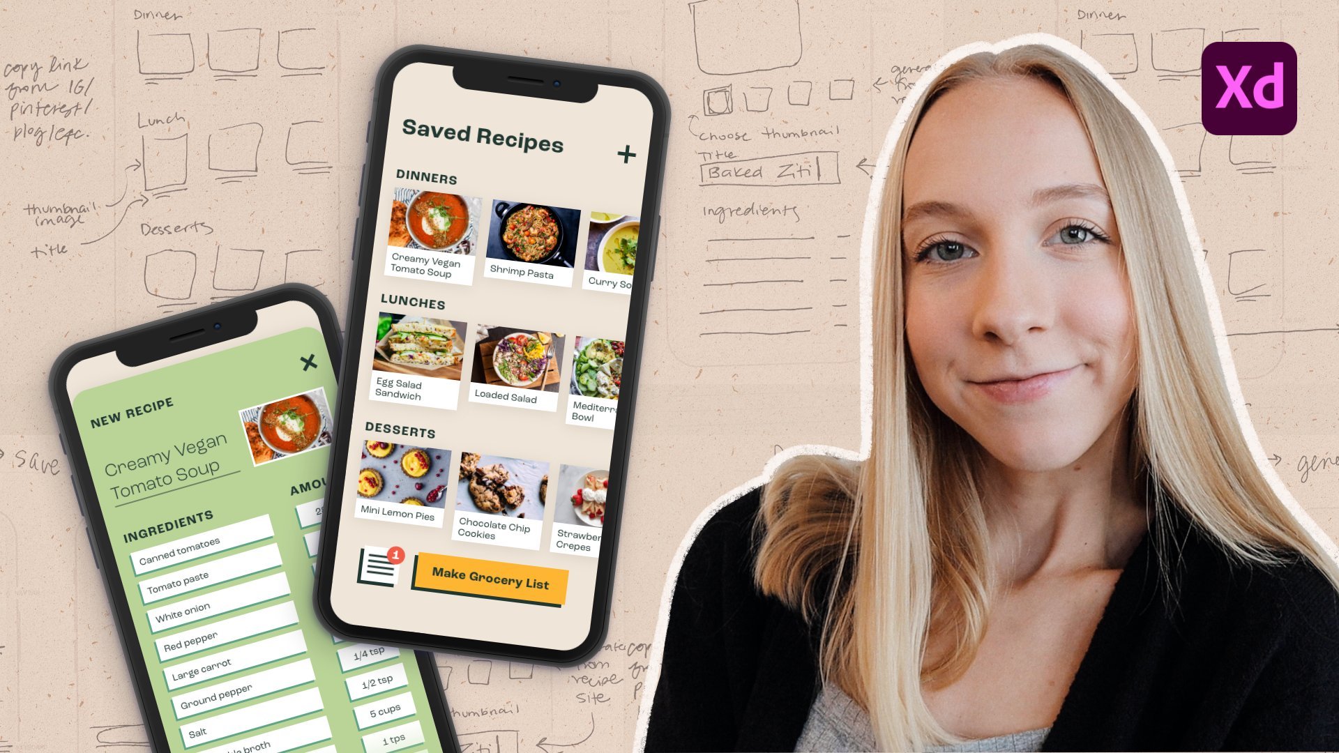
14. Wireframing: Wireframes are illustrations
of an app or website which specifically focused on the layout and features
of the product. They do not use any
color or styling and simply used to help plan the
bare-bones of the product's. Benefits of wireframing means that we can help connect to our user flows and storyboard
into a more rounded design. He helps plan out
the functionality of these interface and it helps us thought
layout the content. When we create wireframes, wireframes should only be
used to plot out navigation, content elements and
basic feature design. We keep the design simple. We do not use colors,
we do not use images, and we use one generic fonts. The following content is
usually found in wireframes. Logos use interface elements
like text boxes and buttons. We can use headings and other topography and on navigation. There are two types
of wireframes. Low fidelity wireframes
are the most basic, simple shapes and text
to start to recreate the foundations of the design and perfect for
usability testing. This is because they are
quick and easy to make. We don't have to
worry about spending too long or making them perfect as they may need to change up surrounded
user testing. The second kind of wireframes are high fidelity wireframes. These wireframes often include more information like including
pixel perfect dimensions, interactions, and other actions related to a more
finished design. These are the six finished
low fidelity wireframes from our example projects. The wireframes
follow my user flow. And this is the first
time we've really thought about the design
and its features. Remember, the goal
for my product is an app that reminds people
to drink more water. The wireframe start with a login screen or
on boarding screen. A user then fills up the settings page, which
includes notifications. Once sets up, these are
screened and put water intake. And finally, there's a
log to check progress. As you can see from
these wireframes, they do not use any color. They are not perfect,
and they're only used to get a rough idea of the
design and the features. These wireframes
have been built in Figma or wireframing tool. You can look straight
into Figma file provided in the resources. And there was a template
frame to get started. This course is not an in-depth goals and how to use Figma. There's plenty of
tutorials online. And if you want to,
you can even use a different wireframing software like envision or Adobe XD. The first wireframe to create a login screen or
the start screen, I'm going to use a
combination of shapes and text to plot
our roof design. I'll use a square
in the middle of the page to represent
a logo in the center. And change the color to black, which is perfect for wireframes. I can add some basic text and then pretend button at
the bottom of the screen. Stop. Build the
foundations of the design. I'm using the same
process to create another two of the
wireframe screens. These have not got
to be perfect. We want to keep them
simple as we'll use these wireframes and
I'll usability testing. We may have to do some rework. So it's best not to get carried away at the design just yet. These are the
finished wireframes. We have a login screen, which is the first screen the user sees. We move on through
the flow of the app, through the setting screen, selecting the days of the week
and time once we notified. And finally through to the water intake screen and finishing with the log
or the chart screen. To make our wireframes useful
for usability testing, we need to transform them
into clickable wireframes. Clickable wireframes are
interactive prototypes which function like a real app. We can link parts of
the wireframe together. And when the user
interacts with them, it will simulate clicking
through the app. In Figma, click Prototype and
the top right-hand corner. From here, join of elements of the wireframes
to form a path. I've connected the stop button
to my second wife frame, as this is the second
screen and my flag. I can link all the
buttons, right? The screens linked together
in the correct order. I can connect wireframes
four or five together. You'll add button.
Links the chart whenever a user clicks the
seven day average Woodson. I can click Play and Figma
will load up my white friends. From the wireframes
function like a real app. I can click through
and Bhutan t is my floral usability testing. We can share our prototypes, wireframes and thus test is to click through and test it out.
15. Usability testing methods: Usability testing is the
process of evaluating how well a product works
when used by Saturday. During different usability
testing techniques, we observe users complete tasks or simply interact
with the product, which then helps
us gather feedback on how usable the product is. When we design and
build something. We often think is extremely useful because we
know the ins and outs of the products when I was a clerk and how to
navigate around. When you watch someone
Newton short products, you can say areas
of improvement. Let's look at the benefits
of usability testing. Usability testing can
help us Jackie for product meets our
users goals and needs. Takeaways. The product is th, they
can help create empathy, how our users work. Holidays design decisions. We can identify how long it takes the user to
use our products. And it reduces the
risk of building a product that does not work. Now you only need to
test with five users. People often think that
usability testing is a costly process that takes time and I need to find
many volunteers to test. Research has shown that
five-years will usually identify up to 85 percent
of usability problems. This is because users usually
work in a similar way. During usability testing, you will see themes and
trends and you'll notice that uses while identify the same usability
issues as one another. After 50 usability tests, it can be confident that the majority visibility
issues have been found. For some usability
testing methods like surveys or using heatmaps. It's okay to test with
more than five users. As usually there is very
little willing costs and effort after a
national corporation. Let's look at a few different
usability testing methods. First of all, the usability, which will focus on further
later on in this course. Visibility test involves
a facilitator looking to observe and gain
feedback from live users, sometimes called
moderated testing. During a usability test, task, participants are asked
questions and lead three tasks. Usability of the product. These sessions provide
the opportunity to ask for clarification. Observe body language and
things that they might say. Ab. And AB test that the
process of comparing two designs or ideas against each other determine which
one performs better. So Survey, System
Usability Scale, or source, is a tool for measuring the
usability of the product. It can tonight on
questionnaire which is scored and the usability of
the product is calculated. An example question
from the survey is, I found the system
unnecessarily complex. Session recording
can be completed at large-scale on websites or apps. This process involves
a tool which records the user's
activity on a product. For example, heatmaps coming generated to show the most
used areas of a product, what buttons received
the most clicks. They can record how long
users spend on the website. Some session recording
can involve eye tracking, which monitors where the
user's looking at the screen. Guerilla testing is a
usability testing approach which involves selecting
test participants randomly, usually completed in public
places at the coffee shop. Well, testing is a low-cost, relatively simple method which
enables instant feedback. Usually if the price of coffee. A phone interview is a
basic form of visibility. Trusting similar to
moderated usability test, participants of verbal
instructed to complete tasks over the phone
or video conference.
16. How to run a usability test: For this course will complete a moderated usability tests, observing of the five users complete tasks on our
clickable wireframes. If you want to use a combination of the other
usability testing methods. As you are still just
learning usability testing, I would recommend that
you ask your friends or family to be your
testing participants. Before you run a
usability tests, there are a number of
things to prepare. Firstly, you'll need to decide how you want
to run your test. You can share the
clickable wireframes and Figma and asked to eases
the screen-share or range testing participants
to interact with your wireframes on your
own computer in-person. You will need to find
out the five volunteers to complete usability testing. You may need to arrange
them on to help me take notes or facilitate
your usable assessed. And you need to decide
what tasks you will ask the user to perform
on your products. When creating tasks, It's
important to keep them realistic and to
make sure that I cover all phases of the product, tasks should be in
a suitable order and not lead the user too much. We don't want to give
away the answer. Might the tasks too easy? The task should actually
be able to be completed. And we should keep these
abilities tests Valley show. So avoid too many tasks. Here are the tasks that
are lost my users to perform a task one, again, the sign-up process, task to choose your setting
preferences for reminders. Task 3, choose your settings preferences
for the water goals. Task bot, can you record in the app the amount of water
that you have consumed today? Task 5. Can you check to see water
consumption for the last week? The tasks are appropriate
for the wireframes. They're in an order
that allows easy to fly through the
clickable wireframes. And I did not give away
any answers or solutions. These tasks can help you understand the
usability of the app. And if it's easy to
set up a profile of the goals at water consumption and check a weekly progress. The forwarding a usability test, It's important to know how to
observe the user correctly. We want to save our users can successfully complete the tasks, but there are extra
observations that will help us validate
our design and understand how easily product is TAs can lead to successfully
complete the task. Observed definite
user behaviors, for example, things
that they say. Like, I'm not sure
where to click. Watch the user's body language. Do they pause and stop and
think for the complete a task or during a task time, how long it takes for a
user to complete each task. Record the number of times the user cannot complete a task, and identify any areas of improvement whilst
watching the user. With all this extra information, we can improve our product and make our design
changes as necessary. For the source of the
test, introduces Usher, and tell the user
that you'll ask them to try and complete
several tasks. Just before you begin
the usability test, you should let the
user know that we are testing the
product and we're not going to blame them for testability of the user scale. During the test, read
the tasks out loud. Wanted Design providing
enough time in-between, easier to attempt the task. During the Task, Observer theory, successful
in completing. Remember to make notes
about these body language, the time it takes
them to complete the task, common from the users. After each task asks the user has any
additional comments. At the end of all the tasks, ask you these as
any final comments about the usability tests. Voice memo to thank
them for their time. And repeat this with
up to five users. After all, these tests, use your findings
and results to make design or usability
changes to your products.
17. User interface design: User interface
design patterns are reasonable design solutions that have stood the test of time. Many websites and apps reuse the same patterns
to keep the learning curves down and bring simplicity and
usability to the users. For example, a navigation
bar is always, usually placed at the
top of the page in a banner or Donald left-hand
side of the screen. We see common
patterns like this in our everyday lives as we use different pieces
of technology, the following tips and best
practices can be used as a checklist to make sure you follow basic
usability guidelines. We're going to look up how to provide feedback to the user. Keeping consistent
with visual standards. Similarity to the
user help users preventing fix different
kinds of errors. We can look at how
to use color and typography to bring attention to different things
on the screen. First of feedback, use enough feedback to tell
the user what is happening. For example, when
something is loading, you can show a loading bar when something is
added to a car, show message to say
added to a car. This provides feedback
to the users in a timely fashion so they
know what's going on. Consistency. Users should not have
to think too hard about what something is or
how to interact with it. It's not broken, don't fix it. When users use something
that is familiar, they often feel more comfortable and get things done quicker. Once a user learns
how to do something, you should be able to transfer
that skill or the parts of the website or even
other websites. Use interface elements
are frequently used. Widgets that are
recognizable about the web. Using these, we'll hybrid design look and feel consistent. Now how many user interface
components can you think of? Here are a few examples. We will input controls like buttons, text
fields, checkboxes, radio buttons,
drop-down lists, lists, boxes, toggles or
switches, date fields. You've got navigational
elements like breadcrumbs, sliders, search fields,
pagination, tags, icons, or informational
components like tooltips, progress bars, notifications,
message boxes, modal windows and dialogues. Yes, there's loads using these elements in
your interface from when the users are
already used to seeing them and know how
to interact with them. Familiarity. If something is familiar or consistent and
works as expected, it's likely to meet
expectations and produce lower learning
curves for the users, which means how easy is
to pick something new. For example, the navigation bar, It's always enough familiar
position on the screen. Consider layout buttons by the relationship
between items on the page and stroke to the
page based on the importance. Careful placement of items
can help draw attention to the most important pieces of information which can have
a scanning and readability. For example, if there's a primary action on the page that you
want users to click, change it to a different color placed in the
center of the page. Put it in a place where
the user's going to look. Helped uses prevent
and fix errors. Y mean by errors is when
something goes wrong, there's nothing worse
than when using a product and then
something goes wrong. I often find myself trapped in apps and it's not
quite clear if I've missed a form field or not met certain password
requirements when designing, tried to put in place
Arab prevention to stop users from making
errors so easily. And if they do make warm Lum understanding one
when one occurs. For example, don't allow a user to reach a page
not found screen. Error messages should be
written in plain language. Don't use error
codes and clearly outline the problem and
suggests a solution. Most importantly, never
tell the user off. It can create anxiety and is not an inclusive
way to treat users. Color can be used
to direct attention and make items on
the screen standout. A good option would be
to use a color palette, which helps make
sure your use of colors is consistent
throughout your design. For example, user read for errors and agreed for
success messages. Take look at this web page, it's Google Flights, everything that you can
interact with this page, such as the link, the buttons, the icons down the
left hand side, the textbook outlines,
they're all blue. This show straightaway
that anything that I use, you can click on all that Google will need
to interact with. A blue color. It helps readability and it shows what things Google
will need to click on. Use typography to
create a hierarchy. Different font sizes, fonts, and arrangement of
texts can help increase scalability and help show what's most important
on the screen. Let's look at the other
benefits of following daisies interface
design patterns. While following consistent
unfamiliar patterns may not. It's less brainpower
on the users. Users not got to
think about what something's going to do
before they click on it. Time and effort can be saved from not reinventing the wheel by using those recognizable
user interface elements, which uses already know
how to interact with. We didn't have to design
our own or create new ones using
existing patterns, how it will accessibility. This is because
users are already familiar on how
something's going to work. It's familiar to the user. It meets expectations. And overall, we providing level learning
curves for the user. The further you are
design patterns, I'd recommend reading the
10 usability heuristics for user interface design
by Nielsen Norman Group. These heuristics or
general guidelines produced in 1994 after the test of time on are still
relevant today in building and designing
usable interfaces.
18. Accessible inclusive design: Accessibility means ensuring your product
on content that can be used and understood by the
widest possible audience. When we think of accessible
inclusive design, we often think mostly about disabled users, which is true. However, building for
accessibility will also improve the experience that
many other types of users. For example, those who have
a temporary disability, like a broken arm or a slow network connection
or situational impairment, like requiring subtitles
and allowed office. Baking in accessibility
can help those users. In the UK, one in
five people have a long-term illness,
impairment or disability. And many more Hubbard temporary or situational disability. This means that 20 percent
of our users might not be able to
intractable product the same way as other people. Let's look at several
different impairments. Some you may not have
thought of before. Division. Visually impaired
users usually require the functionality of assistive technology like a screen reader. People who have got
colorblindness would be in this category to hearing. Auditory impaired users usually require captions or subtitles. Hub of deafness. Motor, motor impaired users
may have lost a limb, will have Parkinson's disease
with an unsteady hand. Nutrient pad uses mainly
the modified mouse or prefer larger hit zones for buttons when they
looked to click. Cognitive users may have ADHD or dyslexia and may prefer to read more simple words
in the user interface. As already mentioned,
building to me, accessibility can also
help extra users. Temporary means that a user may not necessarily be disabled, but the awesome
times temporarily disabled by their situation. For example, I use it in a noisy office who is
struggling to hear their colleagues on a video call isn't disabled with deafness, but we're still benefit from
captions and subtitles. Another example is a
user of a broken arm. They may not have lost a limb, but they would benefit
from accessible design until their arm heels. Depending on the situation, it can be illegal to not
build an accessible products. Here are two examples
of laws in the UK. The Equality Act, 2010, which protects discrimination
in the workplace. And the public sector bodies accessibility regulations 2018, which enforces public
sector companies to comply with accessibility. If you're building a small
outfile, friends, family, or for school, don't worry, you won't be taken to court. But it is always good to think
about accessibility and to try and make your
product work for as many people as possible. Wcag, Web Content,
Accessibility Guidelines or sets of rules and criteria to follow to comply
with accessibility. Produced by W3C
standards for the web. For what kinds Web
accessibility principles. There are four, and
they are often referred to as pour perceivable. All users should be
able to accurately see and read your
website content. That means content was not exclude people with vision loss, hearing loss, and
over disabilities. Some we've already
discussed. Operable. Website content should be responsive and simple to
navigate for all users. For example, using keyboard only commands to navigate website
rather than a mouse. Understandable. Website interfaces and
information should be organized in a way that
makes it easy to use, predictable to
navigate and contain language that is
understandable to all users. Ribose website should be compatible with a wide
range of technology, including assistive
technology that are commonly used by users
with disabilities. Now these are just the four
principles of wacko LG. I'd recommend to go reach
further and look at over 100 criteria to make sure that your app or
website is accessible. Let's look at some tips on how to design for accessibility. How to design for users with cognitive impairments like
autism, use simple colors. Don't use bright
contrasting colors as it can make them
difficult to say. Writing simple and
basic language. Don't use complex
words and phrases or make sure to keep your
reading age to a lower level. May use of short sentences and use bullet points and less. Don't create big paragraphs of texts as this makes
it difficult to read. How to design for Redis
for screen readers. A screen reader is a piece of assistive technology that reads out the content of a webpage, often used by visually
impaired users. And designing for
a screen reader mentioned to always
provide alt text, to provide descriptions
to images. This is a small description
if an image fails to load or if an image
cannot be seen by user. So make sure you
don't use images alone to provide the context. These are simple, linear,
and logical layout. The screen reader
needs to flow through the screen in a linear way. So don't create complex
Cloud's user interfaces. Make labels and
buttons descriptive, such as start now, ostium of an own harmful
label, such as Click here. If a blind user is using a screen reader or they're
going to hear is click here, click here, and there weren't understand
what they're clicking. Cards are designed for
visually impaired users. Make sure to always use a suitable size
and readable font. So don't use small font sizes. Use color, shape,
and tax to explain information and don't rely
on color to convey meaning. A big button on the screen
is red because it's dangerous for is going
to delete some of them. Remember, people about color blindness won't
be able to see it's red and how important it is to make sure you signify
that in other ways. Designing for motor impairments, people with motor impairments
may have lost a limb, will have an unsteady hand. So make sure that clickable
buttons are large. So don't require a
small click area. Give elements on the
screen of space so user can move their
mouse and between them. Don't make a cluttered
interface and place interactions
too close together. Designing for users
who are deaf, make sure to always
provide subtitles and captions and don't provide
content in audio form only. If you're building a product
for the customer service, ask the user how they
prefer to communicate. Remember, not everyone is
able to take a phone call. Finally, let's look at how we
can test for accessibility. There are several different
ways to test automated, which is plug-ins to
automatically check websites and apps for
accessibility compliance. They'll great to
quickly understand the accessibility of a product, but the only catch
up to 40 percent of the accessibility
problems manual. This requires a test expert
to manually test all parts of the website or app using a screen reader or
keyboard navigation. To complete automated
accessibility testing, I would suggest installing the
Web Accessibility Insights plugging from the Google
Chrome app store, from hair. You can install
and run the plugin on any website you want to. The plugin will provide a
report on what parts of the website is not meeting
accessibility guidelines. Even Facebook has some work to do to improve accessibility. As you can see on
the right-hand side, the report shows what's
not quite accessible. Why didn't you run
this plugin on your favorite website and see how accessible they really are.
19. Design systems: A design system is a collection of design guidelines, styles, and components that
can be used to help design products
consistently at scale. Some example content and
the design system can include color palettes, fonts, design patterns, and
placement and functionality guidelines for user interface
elements, and a lot more. Let's use Spotify to demonstrate the impact
of a design system. This image, taken a few
years ago now shows the different
Spotify applications from different devices, like mobile applications and desktop software on
laptops and computers. What do you notice that's
going on in the image? While there's no consistency across the different
user interfaces. When comparing the
screenshots of the computer and the mobile, looked like two completely
different apps. The gray color is different on the Spotify Web Player
and the Spotify software, there are different
shades of green throughout the example
fonts or different to. This is what happens
when a company does not have a design pattern
and rules to follow. Inconsistencies can
occur, and it's down to the development or design team to them make these decisions. Now what do you notice? The Spotify we know
today it has a theme, a brand, regardless
of the device, Spotify has a consistent
field throughout. Looking a bit closer, the colors are the same. The button size and the
shape of recognizable. The power of the design
system has curated a flawless user experience
across multiple devices. Here we have a preview of
Apple's design system, the human interface guidelines. This is an example
of the Tab Bar page, has a software developer apple. They did not have
to think about how a tab bar should function, of what it should look like. It's already been decided and documented in the
Apple's design system. That's why whenever you use
Apple apps and as a tab bar, they always look the same. And as users will
learn how to use while months and we learned how to
use it in every other app. Not just tech companies
that use a design system. This is an example of
the Audi design system. You can see a preview of the color palette
with there's so much more looking
down the sidebar, including brand guidelines,
layouts, imagery, icons. All these guidelines
are used across our D TV adverts
to show off cars, that magazines in the showroom, websites, anything that has
the Audi motoring name on. This is a preview of material design,
Google's design system. You may recognize
some of the look and feel from things
like Google Maps, Gmail, or Android apps. The example shows the
button component page or the button user
interface elements. The page shows what
a button looks like an interactive demo. Let's have a look
around the page. There are putting variance
like outlined and tax specks on the design
and the design rules, do's and don'ts
hierarchy in placement. Everything on this page is
needed to tell people how to correctly use a button and how to follow the
guidelines set by Google. Every user interface
element needed to build apps for Google
is documented. Hopefully these examples explain the benefits of design system. But in a summary, design system can help promote that
visual consistency, like we've seen
Spotify do today. Copper line, the
brand guidelines saves duplication of design
and engineering costs. What I mean by this is
it's built, designed, and documented once and
can be used over and over again by multiple teams,
are multiple products. The following website
design systems for figma.com is a collection of
different design systems. Wants to share
their designs to be eastern Figma from
companies I'm sure you'll recognize last year and Spotify, Microsoft,
Salesforce, monday.com. Let's return to our
Spotify example. We are able to duplicate these design assets and use them in our own
Figma projects. When a few moments, we now have access
to loads of colors. Fonts use interface
elements and patterns, used to be in a suite of applications
produced by Spotify. Now this course isn't too
in-depth on design systems, but for accompany that will produce multiple
products requiring a consistent brand should consider creating a
design system to help. If you want to. For this course, I'd recommend me picking a design system and I'll help you Trump's form your wireframes and two beautiful looking apps.
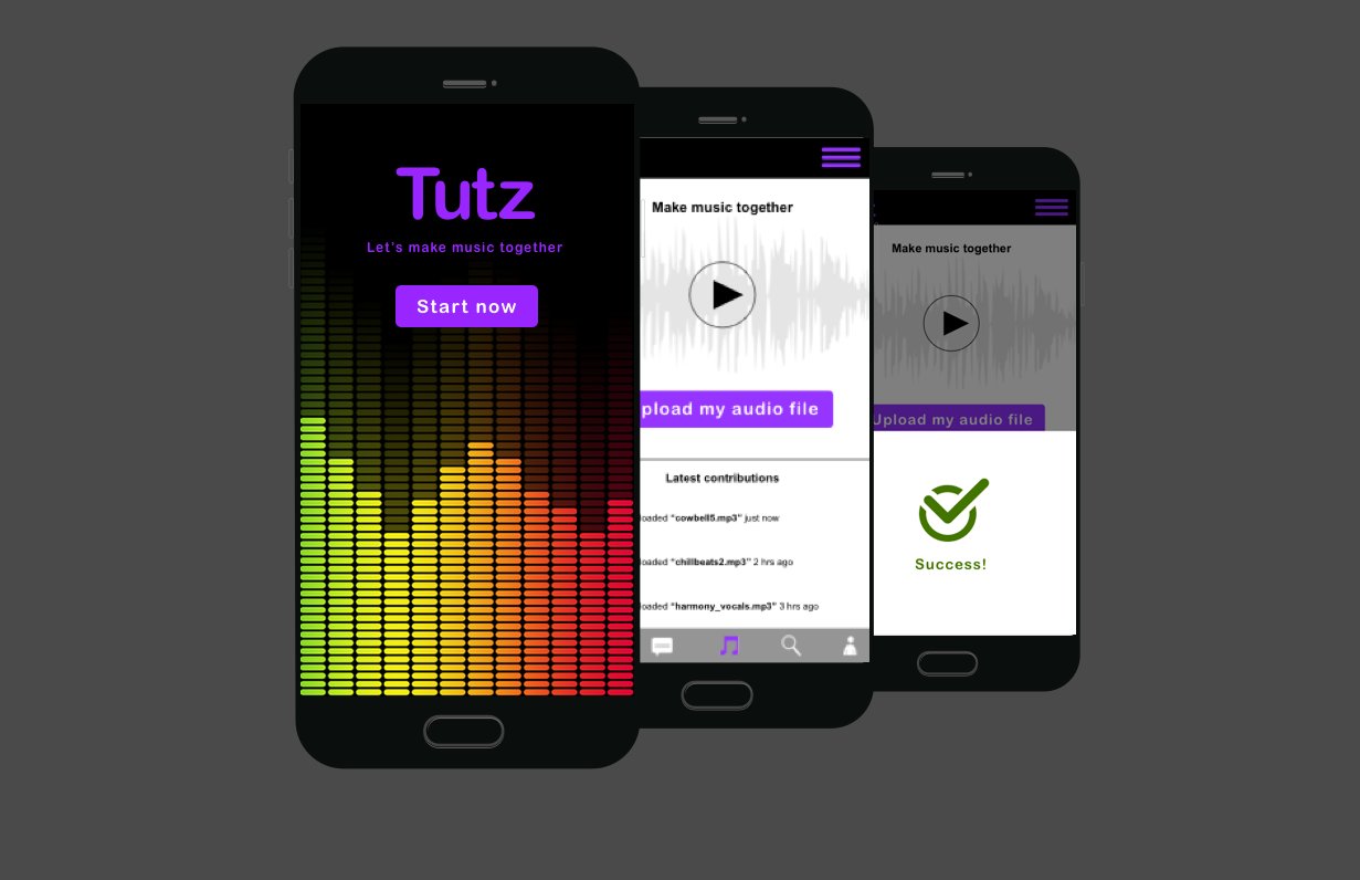
20. Prototyping: Prototyping is the final part of the design cycle and the
last part of the course. We'll use everything
that we've learned from our usability tests and apply our new knowledge of user
interface design patterns, accessible and inclusive design, and everything that
we've learned about design systems to transform these wireframes to beautiful
clickable prototypes. Once created, these
prototypes can be used to further test our app for
any development occurs. At this point, I'd
suggest you going back and haven't looked at
your usability findings. Now is the time for you
to update your designs. If there's any areas of usability or where
users struggled, you should adjust that now and going forward into your design, Let's have a preview
of the prototypes for the example project. We have our home screen on
board and login screen. We have a couple of
settings screens where a user can set their
goals and reminders. Our water intake screen. Finally, the log screen. Hopefully you can notice how we've got this part
of the journey. We've gone from our
storyboard, user flows. We've created wireframes. Now onto our
finished prototypes. I've taken inspiration from the design system
session and I've made my own mini design system. I decided on a small
color palette, fonts and headings, as well as common user
interface elements. From here, I can make
sure that my style of my prototypes is
consistent throughout. Use my wireframe for help. I'm not gonna start
transform it into a beautiful prototype of start
by adding in the graphics, changing the fonts, the colors. Adding in my button component, as you can say, doesn't take long until the first prototype
screen is taken shape. I can continue this
process piece-by-piece. Converting the wireframes
to the prototypes. Makes it easy is that
you can copy and paste similar parts of the app
to speed up the process. Here are the
finished prototypes. I've done is I've applied
all of the learning from the previous sessions
and transform the wireframes into
finished prototypes. I think you'll agree they
looked like a real genuine app. At this point, we can repeat the process from
earlier and turn these prototypes into
clickable prototypes using the prototyping tool. What I'm gonna do
is I'm gonna select my button and connected
to prototype two. I can do the same
for prototype three. Unless we did before, I can connect certain
parts of my app, the different screens
it to make it flow. Here's our finished products. We have a clickable
prototype that we can use to do even more
user testing on. Or simply use this to
help us with development.
21. Wrap up: Congratulations on finishing
the end of the course. Thank you so much for starting
a UX journey with me. I really do appreciate it. Now this course took
so long to make. I'd love some feedback so I
can improve it for others. Accomplish SEO projects. So please upload
them for me to say. If you have followed each lesson and complete each
part of the course, you will now have a complete UX project from start to finish, ready for your portfolio. We can play it, use research to find out if our
product was a fit. When we gather the insights and analysis from that research, we transformed it into
empathy maps, personas, and neat statements,
but it'll help us with decision-making
later on in our designs. We create storyboards
and sketches, but our wireframes, and we tested our wireframes
if usability test him. Finally, we uncovered
interfaces and patterns learned for
accessibility and design systems to transform those wireframes to beautiful
clickable prototypes. The fundus and stop here. At this point, you should use
a clickable prototypes to do further testing
engagement with users. And perhaps you could
go back and check your project goals and needs statements to see
if you're on truck. Thank you once again for
checking out this course.
 Matt Wagg, UX Designer working in London