Transcripts
1. INTRO TO COLOUR SEPARATIONS: Hi, I'm a promo Any wells and I'm a textile designer and illustrator. Welcome to my Siris of classes and textile design. In this class, I'm going to teach you how to reduce the number of colors in a complex. Artwork had to create new, exciting color ways from the artwork. And then, lastly, how to color separate it, ready for screen printing. Textile designs created from ham painted artwork are really on trend at the moment, but because they contain hundreds of pixels of colors, they're impossible to screen print. So this class will show you how to break down that artwork into simple colors on how to prepare even the most complex artwork. I could walk two color painting ready for screen printing, being able to reduce the number of cars in an artwork diver, Klein's or essential skills for any textile designer. I'm frequently asked by my clients to reduce a watercolor artwork, dying to a limited color palette using their preferred Pantone shades. In this class, I'm gonna teach you the techniques on how to do this, and I will show you hi to reduce the number of colors in a watercolor place in print in fact to shop had to quickly and effectively recover the artwork to create new and exciting color ways, and lastly had to color separate the artwork ready for screen printing at the end of this class. If your appetite for textile design has been wetted, why not pop over to classes one and two on skill share and check out the techniques I use every day is a textile design. I will show you how to create a placement print, had to clean up your artwork and had to create professional repeating patterns. So grab some artwork, boot up your computer and let's get started.
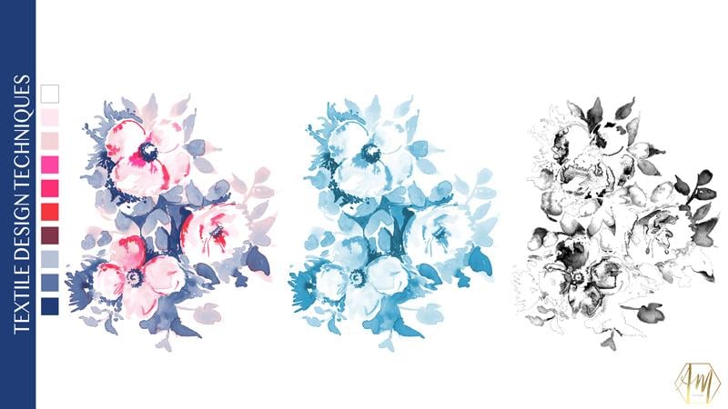
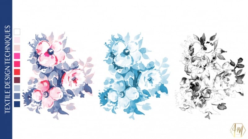
2. 1. REDUCING THE NUMBER OF COLOURS: Welcome to this first video in the process of how to color separate artwork for screen printing so this class might be of interest to you. If you're a screen printer, I would like to print something that's quite fluid and water color. It also might be really useful if you're a textile or surface pattern designer, and you've sold smart work to a client. But they want to go on and screen printed, and you need to reduce the number of colors and maybe pick a particular color palette. But the customer wants. So in this first video, I'm going to talk you through the process of using indexing info to shop. And this is the process of breaking down your artwork into tiny, tiny pixels of sect colors, so using a color palette that you've chosen and you force the computer to use. So once you've opened your artwork into photo shop, the first thing that we're going to do is reduce the DP I of the image to go to image image size and change the resolution to 150 pixels per inch. This is because we don't want there to be too many pixels when we come to the screen printing process. When you're ready, just click OK. The next step is that we need to change the mode off the image to index color. So to do their secret image mode, and you need to select index color if it's great out, you need first. Next year, your artwork is selected as RGB, and then you can select index color. So is this point. We have to decide how many colors that we're going to work with, so in this example, it has already said it to 15 colors. So what it's done is it's chosen the best 15 colors. It thinks on its broken, the image dying. If I uncheck the preview, you can see the original. And then if I check it again, you can see this is what it looks like. It just 15 colors. It's not too bad, but it's not perfect. I'm just gonna change the palate to local adaptive. Not quite sure why do that? That's just what I've always been told to do. I'm gonna keep forced. Is known matters none. I'm going to select dither as diffusion, so when you open this up, it might say none. The just select diffusion on don't have it anymore than about 75% Now. If I zoom in, I'll show you what's happened. So basically, indexing is breaking the image down into pixels of individual colors, but having the diffusion on it spreads out, the color is more evenly. If I turn this off, you can see that it's made a lot more blocky and chunky, and the pixels aren't so spread out. By putting on a diffusion, it gives more of an even flow on even distribution to the pixels of color. And this is really good for creating radiance of color that you can see in water color. So as Wavell example, I'm going to change a number of colors just to let you see what happens. So I'm going to changes to five colors, and you can see that it's made it very, very muted. So what happens if he changes to 50 colors? Okay, so it's a lot closer to the original watercolor, but you may not want to print and 50 colors because every single one of those colors is going to be a screen for screen printing. So I know for this project, I'd like to work in 10 colors, so I changed the colors to 10. And I'm just clicking the preview button on and off so that you can see that I'm missing that gorgeous bright pink color in the top flower. So if you're not happy with the options a computer is giving you, you can actually force it and pick the colors that you want to use. So in order to do this, just go over to the box and select preview, just uncheck previous and then go to forced and select custom. This will bring up are forced colors. Dialog box allows you to pick individual colors that you'd like to use in your screen printing process. So if you already created a color palette that's perfect. You can use that. But if you haven't and you'd like to pick the colors from the image, this is how you go about doing it. So select the first box on. What I'm gonna do is pick the darkest color. First, I'm gonna pick a shade of gray and it's in the image with the picker and then select. Okay, Been cooking to the next box, and I'm gonna pick mid shade again on click. Ok, then I'm gonna pick a slightly lighter one on then A very light sort of orangey gray that propping these leaves. Perfect. Okay, so that's four colors. Now I'm going to go ahead and pick a dark red Onda mid read on a pale pink and that now leaves me with eight colors. So I've got two more. That leaves me with seven colors. I'm gonna go to more. I'm gonna pick bright pink, a lighter shade of pink. Andi. Then I'm going to pick the background color. They don't have to select the background color, cause if you're printing onto white, the background isn't actually a color. But you may wish to change the background color so you can always select that on when you're happy. Just press OK and go back to preview. What it's going to do is preview the colors that you've selected. So by clicking this on and off, you can see the differences. Okay, so I'm not happy with this area. So I'm gonna Day was unchecked preview and go back to my custom color in any now I think insisted of gray beige color. I'm not very happy with how it's turned out in the flower. Just click on to that and you can go back and select a different colors. I'm gonna pick a sort of grayish pink okay and click OK, and just OK again and check preview to see that. Okay, so I'm a lot happier that in the flower is you can see it's also put it into the leaves. No, I think as a design and much happier because I was finding that yellow color a little bit distracting and now a much happier of how these colors diffuse into each other and create a water color texture. So once you're happy with how this color palette looks, just go to custom and then click save unjust. Save this where it's most appropriate to you. So I'm going to call this color palette one, and I've saved it in a folder called Color Separations and just click save Click OK on Okay again. So the next step is to prepare this file for the client, So I'm going to open up swatches we just created by clicking on the swatches icon and then on the little drop down arrow in the top right hand corner. Then select. Replace watches, navigate to where you saved it on kick open. You can see here these are the 10 colors were used in this design to make it more presentable for a client. We just need to change it back to our GP to go to image mode RGB. And now we're going to create a color palette based on the 10 colors that we use for the design. Select your rectangle to and draw a box holding down the shift key. I'm turning off the stroke and I'm selecting a color for the Fail. It doesn't matter what color is at this stage. We're just going to draw out the boxes. So holding down old and shift drag kite 10 boxes each one of these will represent a color in your color palette. When you've created all 10 squares, select them all over on the layers by holding down shift and then go to distribute vertical centers in the top options. Many now click into each color chip over in the layers and using the dropper to select the relevant color from the swatches panel and then click. OK, just repeat this for every single color that you've got. What I'm doing here isn't being quite selective, and I'm choosing the darkest colors, working through to the lightest colors for the customer. Now with the white, it's watch a match. You're going to have a stroke to go to the top and click on stroke and select a color on again. A changes to one point just to the client can see that the white is actually a color included, although it's the background. And there you have it. A watercolor design reduced, dying to 10 colors very to present to your client. In the next video, I'm gonna talk you through the process of changing these colors and creating a new color palette. See you there.
3. 2. RECOLOURING INDEXED COLOURS: so welcome to my next video in this video. I'm gonna take you through the process of how to re color design the husband index. You might need to do this. Every client comes back and would like to create a new color palette or would like to create a new color way for a new season. You might just want to do this yourself for your portfolio, but it's a really useful skill tohave. So the first step is the changes back to index mode by going to image mode Index, as we've got Layers is asking me to discover that time that's OK and then just say OK in the next dialog box. So now it's time to get re coloring that my client has come back, and they said they really love the design, but they'd like it to be re colored in shades of blue and pink, and they've actually supplied me with the shade of blue that, like me, to use to amend the colors we need to open the color table. So at the top, many go to image mode and dance gotten, says color table, so select the very first check, which is the dark gray color here, double click on to that. And then at the bottom with hex code is I'm cutting and pasting in the exact color the customer has given me. And then I'm just clicking, OK? For the second color, I'm clicking into the second chip and diamond a hex code and pasting in the original hex code. Then I'm going to use the color picker to select a slightly lighter hue. But before I click OK, I'm gonna go back down and copy this hex code and then click. OK, Now go into the third chip gonna paste in the color that from the second chick and use the color picker to find a slightly lighter hue again and then click. OK, as we did before we're going to save. This is a new color palette, So just click, say navigate where you'd like to save it, give it the appropriate name and click Save on. Okay, as before. If you'd like to replace this watch, just go over to the swatches and click on the little drop down arrow in the top right hand corner and click on the place it's watches another gate to where you saved it and click open. And there we have it, the new Swatch panel ready for you to work. So I'm just going to save this new color way. So I have it for my clients. I'm going to go to file save as Navigate Toe where you'd like to save it, And I'm going to call this watercolor flowers color way too and click Save. It's in over a bit of fun. If you'd like to read color this and you're maybe not sure how you would like to re color it or the color palette us to use. You have another option for recovering, and that is using the hue and saturation, so I'm gonna take you through the steps for that now. So the first step is you need to change it back to an indexed mode to go to image mode index color. But you can see here it's telling me that I've got 13 colors when we only want 10 on. The reason for this is because forced has been set to custom, so to change it back to 10 just click on the word custom and select none. And just make sure transparency isn't ticked. And as you can see, the number of colors has reduced to 10 on the palate is exact, so just click. OK, so now I just pop up to image adjustments and select hue and saturation. You can always get to this by using command you or control you on your keyboard. And now you can slide the Q two on the saturation to around to get the color combination you like. So here I'm just gonna dark in the back lined. That's quite nice, gives you something quite moody, and then you can change the colors. The other option is selected colorized just down in the bottom right hand corner, and this will give you a tonal color palette. So this process is quite nice as well. If you want to create something that is a complementary secondary print with coordinating print to a major collection. Oh, I quite like this one. This is quite similar to blue and white China, so I'm going to select OK on that one. Okay, so we go to image mode color table. You will say that it's apt people up all 10 colors for the color palette that you've picked and again. You can save this in the usual way by going to save navigating toe where you'd like to save it. Give it a name, for example. Here, I'm gonna call it Color palette three and click. Save this point. You're free to go on and create the color swatches that you'd like for the customer. So again, just replace the color swatches and then you can create the boxes and the color palette. I don't forget to change back to RGB mode for the customer. In the next video, I'm gonna talk you through the process of how to create color separations you might need for screen printing. See there.
4. 3. CREATING THE COLOUR SEPARATIONS: so welcome to my class on how to create the color separations from your index design. I just want to say at this point that this is a theory on high to do this, but you may find you might need to change some of the settings or some of the steps, depending on the processes that you're using. So if you're using a company or you're doing this for a client, you might want to check first that this is suitable for their screen printing processes. If you're doing your own printing, you may wish to do some experimentation with some of the settings, just to see if it produces images that are suitable for the mesh on your screen on for your printing processes on exposing processes. OK, so let's walk through the steps on how to create these color separations. The first thing you need to do is you need to make sure that you've got the correct color palette open. If you haven't got the correct one open, you can do this by clicking on the little drop down in the top right hand corner of the swatches, and going to a place watches you can never get to where you've saved it and then open it up . The next step is the very top menu. Go to select and then color range at the top. Just make sure sample colors is selected on. The fuzziness is set to zero, so you might find when you open it. It's somewhere in the middle, but you just want to slide it all to the left. It's your preference, but I prefer to keep the selection eyes white Matt rather than black matte or any of the other options. Okay, now you've got a little paint dropper to just select the very first color in your palate and click OK, you can see from the dancing ants on the screen. It selected just that color to create a new layer and put on your paint bucket till either by selecting it or doing hockey G on your keyboard. I just collect anywhere into the image, and this will fail the area with the correct color. If you find this hasn't worked, you may need to check. You haven't got contiguous. Take to the top of the screen, so don't just create a new layer for the second color and repeat the process to go to select color range. Use the eyedropper tool to pick up the second color in your palate and click OK again with the paint bucket too long. Just click onto the screen to fill that area. Now just work through all of the colors that were in your color palette. I'm gonna wish through that now and see you in a minute. Now, as the white isn't a color to be printed was actually the background color in this design. I'm just gonna create a new layer and fill it with white and drag it to the bottom So all the other separations sit on top of this. So now that we've finished that, if I turn on the white mayor and turn on each layer individually, you can see how the images built up with each layer on each color being individual. I'm just gonna zoom in so you can see. And if I seem in a little bit more, be able to see how it's made up of lots of tiny pixels of each individual color. Okay, I'm really happy with that. So now it's a case of just saving this so I'm going to go to file savers again. Never. Gateway would like to save it. I'm going to keep this the term color step on the end. Just so I know these are the color separations and click save. So we're not quite ready for this green printing process yet in order to develop the screens, it's a bit like a photographic process where each layer on each screen has to be created in black so that it could be developed like a photograph. At this point, this is where we need to change each one of these layers into black and white. So I'm just going to show you with the first layer. I'm just earning all the other ones. Officer, you can see better on do command you or control you and your keyboard to bring up hue and saturation. I'm just gonna drag a lightness lighter all the way to the left, where it says minus 100 kick. Okay, so now I just go on to the next labour picked the process. That's command you or control unit keyboard and change likeness. Tu minus 100. I'm just going to speed through this for you. know. So now if I turned the white background layer on and zoom in, you can see that the image has been made up all these individual layers with black pixels, and these are exactly what you need to create your screens for screen printing. To do that, you can turn off all the layers except the one that you want to print. And you can either print this out with a transparency at home. Or you can save each individual layer as a J peg or high res. Pdf. You may also want to add on registration marks as well for lining up during the screen printing process. If you're sending these off to a client, you might wish to contact them to see how they would like them supplied. They might just want the layer file so they can put themselves. They may want to. Each one saved individually it a pdf. Okay, that's it. I hope you really enjoy this class, and you've learned a lot about how to color separate on with juice time the number of colors you need in your file. In the next video, I'll take you through what I'd like to see in the class project and give you my final thoughts. You there
5. 4. CLASS PROJECT AND FINAL THOUGHTS: I'd like to talk a little bit now about the class project. I would love for you to try at techniques covered in this class using your own artwork, preferably something ham painted watercolor inspired. So please upload the following three things. A screen show our image in the artwork that you have reduced the number of colors and include how many colors abused on a color palette, an image showing an additional color way using the techniques described in the second video . And lastly, please include a few off your black and white color separations. I'd love to see what you guys can do, and I find it really exciting to see what other people can create if you happen to take it as faras screen printing the artwork, don't hesitate. Upload a photo of your final print so we can cheer you on. Thank you again for taking this class. I hope you find it inspirational. Remember, if you're interested in textile design or surface pattern design, why not pop over to my skill share page and check out my other videos in particular textile design, Part one and Part two, which, taking through the skills I use every day as a designer. I really love Instagram and I'm on there all the time. And I love connecting with my students. Don't hesitate to pop over and say hello. Please cooperate. Upload any of the artwork created from taking more classes and use the hash tags April Winnie and A M. D s design essentials so we can all see what you're up to. Banks again. Take care. Bye for now.
 April Mawhinney, Illustrator & Surface Pattern Designer