Transcrições
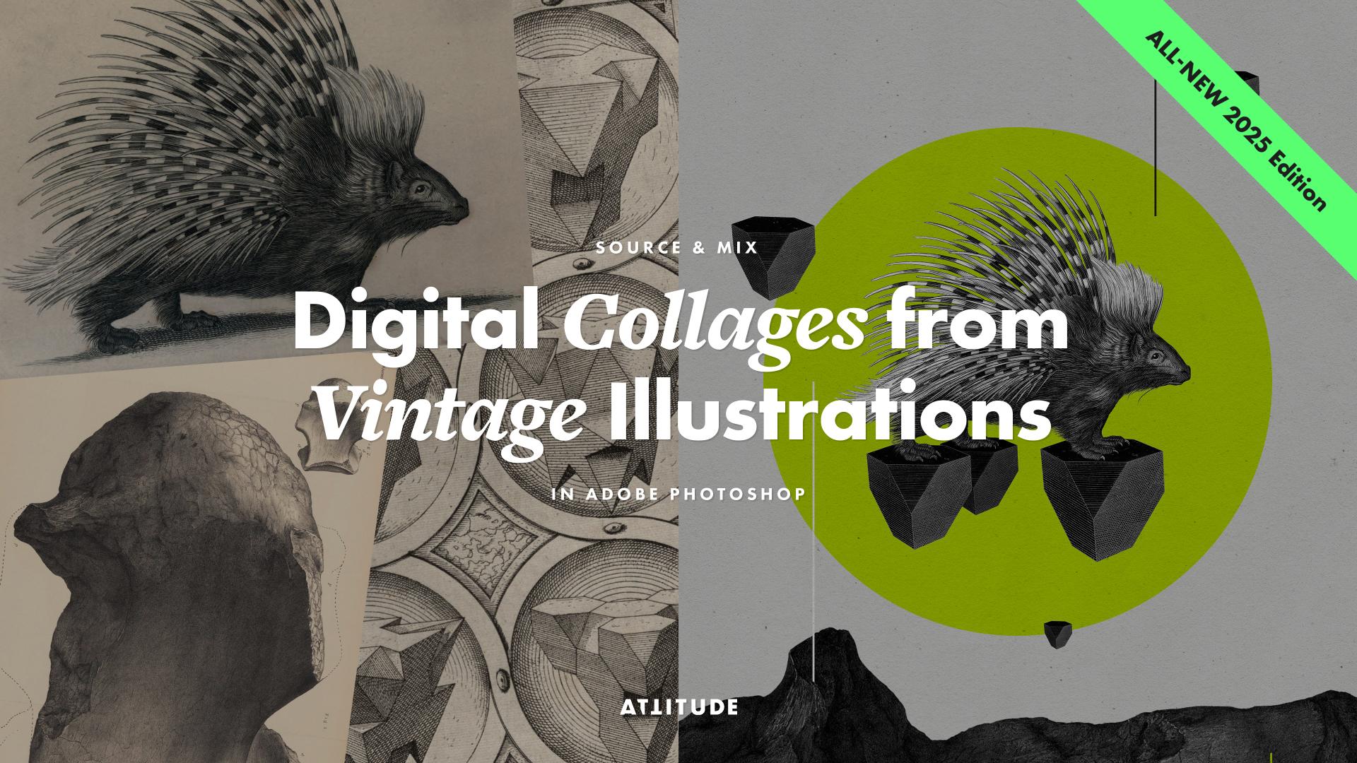
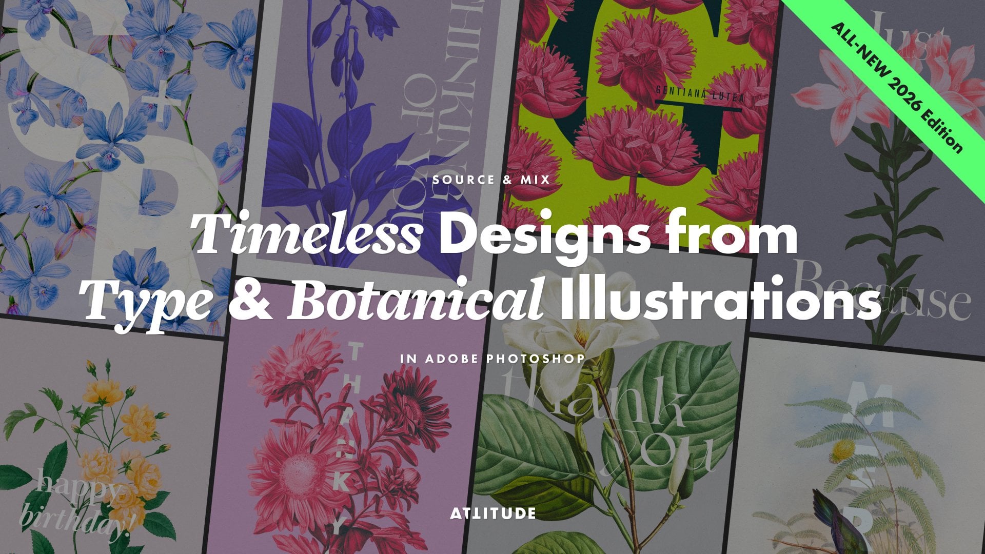
1. Introdução e visão geral do curso (edição de 2025): Criar colagens digitais é uma
forma divertida e acessível de criar ilustrações originais,
às vezes peculiares, surreais ou engraçadas, mas uma
forma divertida e acessível de criar ilustrações originais,
às vezes peculiares,
surreais ou engraçadas, mas sempre envolventes. E se você quiser
criar uma composição rápida e espontânea ou uma
obra de arte cuidadosamente construída com elementos
bem cortados e organizados
com uma variedade de ferramentas disponíveis no
Adobe Photoshop,
você pode transformar facilmente
suas imagens encontradas em
algo totalmente novo e, você pode transformar facilmente
suas imagens encontradas em muitas vezes, completamente Sou Jenya, da Attitude Creative, e adoro trabalhar com gráficos
vintage e dar a eles uma nova vida como
estampas e padrões de superfície E com esta aula, convido
você a explorar a criação colagens digitais
cativantes, usando ilustrações
vintage, todas ilustrações
vintage Esta aula é ideal para iniciantes e perfeita,
quer você esteja apenas começando no
Adobe Photoshop ou simplesmente procurando
um projeto criativo divertido e de baixa pressão e perfeita,
quer você esteja apenas
começando no
Adobe Photoshop ou
simplesmente procurando
um projeto criativo divertido e de baixa pressão
. E mesmo que você não seja
novato no Adobe Photoshop, tenho certeza de que aprenderá
algumas dicas e técnicas novas para usar uma variedade de
ferramentas diferentes e trabalhar de Ao longo desta aula,
mostrarei processo
passo a
passo, incluindo o fornecimento de ilustrações
vintage arquivos
de imagens on-line,
abordagens para criar colagens
e combinar elementos, recortar imagens de diferentes
níveis de complexidade, usar uma
variedade de ferramentas do Adobe Photoshop, organizar, dimensionar e sobrepor seus recortes para criar sua colagem todo o processo
passo a
passo,
incluindo o fornecimento de ilustrações
vintage de arquivos
de imagens on-line,
abordagens para criar colagens
e combinar elementos,
recortar imagens de diferentes
níveis de complexidade, usar uma
variedade de
ferramentas do Adobe Photoshop, organizar, dimensionar e sobrepor seus recortes para criar sua colagem criando elementos geométricos para adicionar mais interesse visual
à sua colagem, aprimorando a estética de
sua colagem com ajustes de imagem não destrutivos,
ajustando as cores e
texturizando sua colagem
para reunir tudo e salvando seu trabalho para impressão e compartilhamento texturizando sua colagem
para reunir tudo e salvando seu trabalho para impressão composição,
criando elementos geométricos para
adicionar mais interesse visual
à sua colagem,
aprimorando a estética de
sua colagem com ajustes de
imagem não destrutivos,
ajustando as cores e
texturizando sua colagem
para reunir tudo e salvando seu trabalho para impressão e compartilhamento on-line. Se você quiser
criar
colagens atraentes apenas por diversão,
crie designs para vender como estampas, camisetas ou pôsteres. ou apenas queira ter mais
confiança no uso do Adobe Photoshop, esta aula é para Mal posso esperar para
ver que tipo de colagens você cria
após esta aula Então participe agora e vamos fazer
algo incrível.
2. ATUALIZE o que esperar e o projeto do seu curso: Desde que ministrei pela primeira um
workshop de colagem digital na Uni em
2009 e depois criei a primeira iteração
dessa aula on-line em 2016, tanto Adobe Photoshop quanto eu
evoluímos Demorei um pouco, mas estou muito animada para
finalmente compartilhar com vocês uma nova edição
desta aula que reflete todas as
mudanças no Adobe Photoshop, apresenta algumas das
mais recentes
ferramentas revolucionárias e apresenta uma
forma mais inteligente As colagens digitais vêm em
muitas formas diferentes. E nesta aula,
exploraremos o uso técnicas
digitais
para criar colagens que
lembram as colagens físicas tradicionais em papel,
que envolvem
cortar, combinar,
organizar e colocar elementos em
camadas,
mas com os
benefícios digitais adicionais de escalar, refletir, recolorir e duplicar imagens que envolvem
cortar, combinar,
organizar e colocar elementos em
camadas, mas com os
benefícios digitais adicionais de escalar, refletir, recolorir e com facilidade de técnicas
digitais
para criar colagens que
lembram as colagens
físicas tradicionais em papel,
que envolvem
cortar, combinar,
organizar e colocar elementos em
camadas,
mas com os
benefícios digitais adicionais de escalar, refletir, recolorir e duplicar imagens com facilidade. E também usaremos algumas formas digitais
simples para
imitar recortes de papel colorido
ou linhas desenhadas com uma colagem como técnica é uma
ótima maneira de contar uma história, mas você também pode abordá-la de
uma forma mais abstrata ou
divertida, onde a peça final não precisa ter uma narrativa clara, mas simplesmente parecer
intrigante Inspirado na minha série original de colagem de
arquétipos, onde toda essa
jornada Nesta aula,
criarei uma nova colagem que
segue um tema semelhante, mas vou aprimorá-la visualmente para poder
compartilhar com você uma variedade de
ferramentas e técnicas que
você pode usar para criar suas colagens usando
diferentes tipos de elementos No corpo principal desta aula, passo,
mostrarei todas
as ferramentas e técnicas necessárias para criar
suas colagens do zero E em uma aula bônus separada
no final da aula, compartilharei um exemplo de colagem diferente e
mais avançado, exemplo de colagem diferente e
mais avançado falarei mais sobre meu processo
criativo
e minhas
decisões e compartilharei
algumas dicas
extras e técnicos alternativos Você pode criar sua colagem apenas como uma obra de arte,
por exemplo,
para impressões, arte de parede ou cartões postais Ou, se quiser dar
um passo adiante, considere
usar sua colagem em um contexto de design específico,
como capa de livro, gráficos de
calendário, uma publicação em redes
sociais
ou uma etiqueta de embalagem Mas se você está apenas começando, eu recomendo
manter as coisas simples e se concentrar em criar sua colagem
real, sem se preocupar adicionar
elementos extras de design ainda E se você estiver
interessado em explorar tipografia e combinar
os gráficos vantajosos, depois de
terminar esta aula, não
deixe de
conferir minha outra aula na
qual nos aprofundamos Para seu projeto de classe,
acompanhe a turma e crie
pelo menos uma colagem digital e compartilhe-a sozinha com as imagens
originais que você usou na guia Projeto e
Recursos desta Você pode concluir
seu projeto de classe e compartilhar tudo de uma só vez. Começamos fazendo o upload das imagens de
origem que você reuniu e adicionamos sua
colagem finalizada quando estiver Se quiser, você
também pode tirar capturas de
tela do processo à medida que avança e compartilhá-las no projeto da
turma, junto com as imagens de origem
e, eventualmente, a colagem
finalizada Adoro ver as imagens do seu trabalho em andamento e ver
seu processo também
facilita o fornecimento de feedback mais
detalhado
e a resposta a quaisquer perguntas
que você possa ter. Mal posso esperar para ver quais
imagens você escolhe e como as combina em
suas próprias colagens exclusivas Sem mais delongas,
vamos começar.
3. Arquivos de imagens vintage e considerações de direitos autorais: Embora muitos museus tenham
começado a digitalizar seus arquivos há muito
tempo, hoje em dia, finalmente
existe
uma grande variedade de arquivos de imagens de domínio
público e creative
commons, que incluem uma variedade de imagens
diferentes
e, o mais importante, para nós designers, o
tamanho e a qualidade
dessas imagens as tornam adequadas para uso em qualquer tipo Após esta aula, você
pode criar sua colagem usando qualquer tipo de imagem
vintage que Falarei sobre quais
tipos de imagens formam boas combinações de colagem
na próxima lição Mas primeiro, nesta lição, quero abordar
rapidamente as considerações sobre direitos autorais
e compartilhar com vocês alguns dos meus recursos
on-line favoritos para encontrar imagens em
domínio público Para ajudá-lo a
começar a fornecer suas imagens nos recursos da
classe, você pode encontrar um PDF com uma lista de links
diretos para os álbuns
contendo diferentes tipos de imagens expiradas por
direitos autorais
que eu
recomendo especificamente que você confira, pois
elas farão ótimas colagens links
diretos para os álbuns
contendo diferentes tipos de imagens expiradas por
direitos autorais
que eu
recomendo especificamente que você confira, pois elas farão Mas se você quiser navegar por arquivos
mais amplos e
selecionar outras imagens, aqui estão algumas dicas para ajudar você a encontrar o que está
procurando com mais rapidez. Se, como eu, você gosta de
plantas, animais
e história natural, não deixe de
explorar o arquivo da Biblioteca do
Patrimônio da Biodiversidade. É um arquivo extenso onde você pode se
perder por horas, mas certamente encontrará uma boa variedade de
imagens interessantes para usar em seu trabalho. Se você está procurando outros tipos
de imagens, incluindo mapas,
arquitetura ou anúncios antigos, arquitetura ou anúncios antigos, confira o British
Library Archive As imagens aqui são organizadas nos álbuns
por assunto, o que facilita a navegação. Mas a desvantagem desse arquivo é a qualidade de
algumas das imagens Arquivo da
Universidade de Sevilha é meu favorito recente para
algumas imagens mais originais, incluindo vários
objetos, retratos, ilustrações científicas, culturais e
religiosas Geralmente, esse arquivo apresenta uma vasta gama de imagens
diferentes, e a maioria está em altíssima
qualidade e resolução. Independentemente de qual
arquivo de cintilação você obterá
suas imagens, sempre baixe
o maior tamanho disponível
para ter o máximo de flexibilidade ao criar suas Antes de começar a baixar
imagens para suas colagens, você precisa verificar o status de
direitos autorais delas A vantagem de usar instituições
flexíveis e confiáveis é que
a licença correta para
cada imagem é
exibida aqui a licença correta para cada imagem é Se o status de direitos autorais indicar domínio público
ou nenhuma restrição de direitos autorais
conhecida, essas imagens estão em domínio
público com os direitos autorais expirados devido
às datas de criação e
publicação Isso significa que
você é livre para usar essas imagens e
não precisa creditar
a fonte original. Você também pode
encontrar algumas imagens sob a licença Creative Commons ou com o status de
reserva de direitos Sam E, nesse caso,
você precisa verificar qual é a
licença específica. Desde que seja uma licença
creative commons, que não seja não comercial nem derivada, você pode usar a imagem
para qualquer finalidade E se a licença
exigir atribuição, você deverá incluir um
crédito em algum lugar,
por exemplo, na legenda das
imagens Uma coisa a
ter em mente aqui é que atribuição deve ser atribuída ao criador
da obra de arte
original,
não à pessoa ou instituição
que a digitalizou que a digitalizou E se a obra original
foi criada há séculos, ela está em
domínio público por padrão. Portanto, se alguém
solicitar a atribuição, ela não é tecnicamente necessária Se você achar que as imagens sob atribuição não são comerciais,
compartilhe como licença Você pode usar essas imagens para projetos
pessoais ou
educacionais, mas não pode usá-las em projetos
comerciais ou vender
seu trabalho derivado Mas se você quiser
fazer algo apenas por diversão para você, seus amigos ou familiares,
tudo bem. Você não deve encontrar nenhuma imagem com
todos os direitos reservados nos arquivos que eu
recomendo que você explore. Mas se você fizer isso, lembre-se de
que não pode usar nenhuma dessas imagens
sem permissão. Dito isso, é
sempre melhor usar imagens de domínio
público com imagens de domínio
público direitos autorais
expirados
sempre que possível Felizmente, a maioria
das imagens nos arquivos que eu recomendei
se enquadram nessa categoria Lembre-se dessas
considerações sobre direitos autorais ao adquirir
imagens para suas colagens Mas antes de começar a
procurar imagens, junte-se a mim na próxima
lição, na qual abordarei algumas abordagens
diferentes para criar colagens. Ah,
4. Abordagens para obter e combinar imagens: Há algumas maneiras diferentes. Você pode pesquisar
imagens para suas colagens, e a escolha
dependerá principalmente de seus objetivos criativos e quanto tempo você tem
à sua disposição Se você já tem
uma visão forte para sua colagem, por exemplo, se deseja criar uma ilustração
narrativa
ou uma obra de arte conceitual, pode começar procurando imagens
específicas
que se encaixem imagens
específicas
que Essa abordagem é
ótima se você estiver trabalhando em um resumo, por exemplo, para uma ilustração editorial ou em um projeto pessoal
com significado por trás disso. Mas a desvantagem é que pode levar muito tempo para encontrar
as imagens certas
e, às vezes, elas simplesmente não existem
na forma desejada Então, se você está aqui para
jogar de forma criativa, apenas começando
ou não tem todo o tempo do mundo
para vasculhar arquivos, pule esse método por
enquanto e salve-o para tarde, quando estiver trabalhando
em um projeto mais definido Como alternativa, você pode tentar o que eu chamo de abordagem do mergulho da sorte É a forma mais divertida e orgânica de criar colagens
, perfeita para quando
você quer experimentar, relaxar ou simplesmente continuar
sem Então, se isso
parece divertido para você, comece a navegar pelos arquivos de domínio
público com a mente aberta. Salve qualquer coisa que
ressoe com você, visual
ou conceitualmente, mas não
enlouqueça e seja seletivo Eu sei como é fácil passar horas apenas
procurando imagens. Portanto, para evitar se
perder nos arquivos, é uma boa ideia
definir um cronômetro,
digamos, para 15 ou 50 minutos
e
desafiar-se a encontrar uma seleção de imagens
interessantes
nesse tempo alocado E quando estiver pronto, analise
suas descobertas e decida quais imagens você
deseja usar em sua colagem Adoro usar essa abordagem
porque você nunca sabe o que vai acabar
encontrando e criando. A terceira abordagem
é começar com um elemento específico e
criar uma coleção em torno dele. Esse é um ótimo meio
termo se muitas opções o sobrecarregarem e
você quiser um pouco de orientação Essa abordagem fornece uma restrição útil
para trabalhar, ao
mesmo tempo em que deixa espaço para espontaneidade e combinações
inesperadas Basta começar escolhendo
um tema geral e encontrando uma
imagem de assunto específica com a qual você deseja trabalhar uma imagem selecionada, procure outras imagens
que funcionem com ela. O objetivo principal da colagem como meio é criar
algo novo a partir partes
existentes, combinando justaposição e Independentemente da fonte e
abordagem que você escolher usar, o que você precisa
procurar será o mesmo. Ou seja, imagens com
contraste visual, contextual ou
conceitual A coisa mais interessante
sobre colagens é que realmente não
há limite para combinações
inesperadas Mas para ajudar você a começar, aqui estão alguns temas
e abordagens comprovados que você pode explorar. Meu favorito pessoal são orgânicas versus formas estruturais
ou geométricas Por exemplo, combinar animais ou plantas com formas
geométricas ou arquitetura Depois, há uma abordagem
que chamo de troca de cabeça. Basta substituir uma cabeça humana por uma cabeça de animal
ou algum outro objeto e sua colagem estará pronta Você também pode criar contraste
por meio do assunto. Por exemplo, animal ou humano versus objeto ou máquina
ou algo vivo, contraste com algo
anatômico ou Outra coisa a ser
explorada é o contexto. Por exemplo, você pode colocar criaturas
marinhas no
céu, pássaros na água
ou qualquer animal no espaço e, em seguida levar a narrativa adiante com alguns elementos adicionais
inesperados. Depois, você pode criar
colagens com um aparente contraste
visual forte Eles podem explorar contraste de escala e
proporções exageradas para criar um preenchimento em série ou apresentar uma combinação de elementos estéticas muito
diferentes Por exemplo, preto e
branco versus cores, pteralístico versus gráfico ou
altamente detalhado ou texturizado
versus altamente detalhado ou texturizado E, finalmente, se você não
quiser torná-lo conceitual, você pode criar colagens baseadas na
unidade Eles podem utilizar a repetição
ou o arranjo de elementos unidos por um tema ou estética
específicos A propósito, todos
os exemplos que
acabei de mostrar são de projetos criados
pelos alunos que frequentaram esse
curso ao longo dos anos. Você pode ver todos esses
projetos e muito mais na
guia de projetos e recursos desta classe. Ao começar a
coletar suas imagens, você também deve pensar em como deseja que sua colagem seja
construída Talvez você queira
criar algo complexo e
em camadas em que
os elementos se entrelaçam e formem uma única
composição ou objeto,
ou talvez prefira organizar
seus elementos discretamente,
colocando-os um ao lado do
outro e deixando
que se sobreponham e
se sobreponham levemente para outro e deixando
que se sobreponham e
se sobreponham complexo e
em camadas em que
os elementos se entrelaçam e
formem uma única
composição ou objeto,
ou talvez prefira organizar
seus elementos discretamente,
colocando-os um ao lado do
outro e deixando
que se sobreponham e
se sobreponham levemente para que ainda pareçam separados. De qualquer forma,
é quase o quão complexa ou confusa você
quer que sua colagem Além disso, você precisa considerar o estilo visual das
imagens de origem Se você deseja uma aparência distinta de
recortar e colar de colagem, escolha qualquer combinação
de imagens de sua Mas se você quiser criar uma colagem
mais minimalista e
refinada, concentre-se em coletar
imagens criadas usando
a mesma técnica
ou que podem ser facilmente editadas no Photoshop
para Não se apresse na
fase de busca de imagens e aproveite o processo. Ao reunir suas imagens, você começará a ter ideias apenas ao vê-las
próximas umas das outras. E se você acabar
coletando muitas imagens, considere
agrupá-las para serem usadas em algumas colagens
diferentes Para sua colagem, você precisará de apenas algumas imagens interessantes Qualquer coisa de 2 a 5 imagens geralmente é
suficiente para você começar. Depois de ter uma pequena seleção de imagens para uma colagem, você pode
recortá-las. Falaremos sobre as
técnicas de corte em breve, mas primeiro, vamos
falar rapidamente sobre a organização dos
arquivos.
5. Organizando arquivos de projeto: Com todas as imagens que você
deseja usar em sua coleção, agora é uma boa ideia
organizar seus arquivos
em uma pasta do projeto. Como a criação de
colagens geralmente requer alguns elementos, é melhor configurar
uma pasta separada para seus
experimentos de colagem e criar algumas pastas dentro dela para
organizar todos os Comece coletando todas as
imagens de origem baixadas em uma pasta, chamada de algo como
fonte ou materiais. E se você quiser encontrar
facilmente suas imagens mais tarde, renomeie seus arquivos Essa pasta
conterá as imagens
baixadas não modificadas e é sempre uma boa ideia
mantê-las por precaução Nesta aula,
recortaremos cada elemento de colagem em
seu próprio arquivo separado Dessa forma, você poderá reutilizar facilmente qualquer um
dos materiais em suas futuras colagens sem precisar obtê-los
de Portanto, você precisará de uma
pasta separada para seus recortes. Não coloque nenhum arquivo
nele ainda. É aqui que salvaremos nossos elementos de recorte
do Photoshop Em seguida, crie outra pasta para seus futuros arquivos de colagem
e chame-a de CollagesPSD e chame-a Em seguida, você precisará de mais
algumas pastas. Um para
imagens finais niveladas em resolução total e outro para qualquer versão em escala
ou recortada para compartilhar em seu portfólio nas mídias
sociais ou em
seu mídias
sociais ou em Você também pode precisar de algumas pastas
adicionais, por exemplo, para maquetes ou
para versões
separadas de
suas colagens finais,
convertidas para impressão convertidas para Então, se você quiser
criar qualquer outra coisa, configure uma pasta separada
para cada tipo de arquivo. Organizar seus arquivos de projeto em pastas separadas e dar todas as pastas e arquivos nomes
compreensíveis a
todas as pastas e arquivos pode
parecer uma
perda de tempo desnecessária, mas acredite, a longo prazo, você economizará muito tempo e frustração quando precisar
procurar algo ou quiser
colocar seu projeto em um Portanto, organize seus
arquivos de projeto e, quando estiver pronto, junte-se a mim na próxima lição,
na qual compartilharei dicas para preparar as imagens de
origem para corte
6. Como preparar imagens para o corte: Com todos os arquivos de origem
prontos e organizados, agora
podemos começar a
prepará-los para o corte. Comece abrindo seus
arquivos no Adobe Photoshop. Em seguida, pressione Command Shift
S ou Control Shift S no Windows e receba cada
arquivo em sua pasta de recortes Envie o formato para o
Photoshop aqui, incorpore o
perfil de cores e clique em Salvar Em seguida, repita esse processo para todas as imagens que você planeja usar. Se você tem uma imagem
com vários elementos, mas deseja
usar apenas um deles, agora é uma boa ideia
recortar a imagem para se livrar de qualquer coisa
desnecessária no documento. Alterne para a ferramenta de corte
na barra de opções, clique em limpar se algum valor estiver definido, selecione a largura por altura
pela predefinição de resolução e deixe o campo em branco para
preservar a escala e a resolução originais Verifique se a opção Excluir
pixels recortados está marcada
e, em seguida, recorte o
elemento que você deseja usar Quando estiver pronto com sua seleção, pressione Enter e
salve a imagem recortada em sua pasta recortada
como um documento PSD Se você quiser usar
outro elemento da mesma imagem de origem, basta desfazer o corte e cortar
a imagem de forma diferente
para esse segundo elemento Em seguida, pressione Enter, abra a
caixa de diálogo Salvar como e salve essa nova
imagem na pasta recortada, mas certifique-se de usar
um nome diferente Por exemplo, curta isso
e salve seu documento. Quando terminar de cortar, volte para a ferramenta Mover E se você salvou vários elementos
da mesma imagem de origem, vá em frente e abra
esses novos arquivos agora que eles estão
prontos para serem cortados. Com todos os seus elementos agora
salvos como PSDs separados, você pode redimensioná-los se necessário. Pressione Command Option I ou Control Alt I no Windows para
abrir a caixa de diálogo de tamanho da imagem. Verifique se a largura
e a altura estão vinculadas
e, em seguida, altere uma
das dimensões para
o valor desejado. E você verá os dois
valores mudarem. Se você estiver criando sua
colagem para impressão, é melhor alterar as
unidades aqui em 2 “centímetros ou milímetros, dependendo das unidades com as
quais você está
acostumado Em seguida, defina a
resolução para 300 DPA, se for menor que isso Depois, apenas as
dimensões da imagem para o tamanho aproximado que você
usará na colagem Por exemplo, esse
tamanho é muito grande, então vou redimensioná-lo para 30
centímetros de largura assim Ao mudar para unidades de impressão, você também verá as dimensões em
pixels aqui. Fique de olho neles e, se seu computador não for
muito poderoso, evite trabalhar com arquivos enormes para evitar problemas de desempenho. Depois de definir o tamanho
e a resolução, acesse o menu do método de amostra e selecione Preservar detalhes 2.0, o que ajuda a melhorar a
qualidade da imagem ao aumentar a escala Brinque com o controle deslizante de ruído
reduzido aqui e assista à prévia
para ver o efeito Uma pequena quantidade de redução de
ruído geralmente faz uma grande diferença. Não exagere e evite fazer com que suas imagens pareçam excessivamente
processadas ou muito Quando estiver satisfeito com
todas essas configurações, clique em OK e sua imagem
redimensionada estará pronta Portanto, certifique-se de salvá-lo. Mas no meu caso, para evitar problemas durante a
gravação desta aula, vou desfazer as alterações e
ficar com o tamanho original, que já é grande o suficiente
para o que tenho em mente Não há problema em ampliar um pouco
suas imagens, mas se você quiser
criar colagens de alta qualidade em
grande escala, é sempre melhor dar uma
olhada e tentar encontrar as imagens de
origem maiores e de melhor qualidade para começar Agora, antes de
prosseguirmos com os detalhes, vamos dar uma olhada rápida em quais painéis você precisará
em seu espaço de trabalho Ao trabalhar no Photoshop, é essencial manter o painel de
camadas
sempre visível para que você possa trabalhar
com os diferentes elementos Portanto, certifique-se de mantê-lo aberto. Também usaremos o painel de
propriedades nesta classe. Portanto, se ainda não estiver aberto, adicione-o à
sua área de trabalho por meio do Windows Manu,
exceto esses dois painéis.
Se você tiver
outros painéis abertos, poderá minimizá-los por enquanto, para que não
sobrecarreguem Salve novamente e redimensione suas imagens de
origem, se necessário. Em seguida, vamos continuar com o corte.
7. Técnicas de corte: introdução: Para cortar suas imagens
do fundo, você pode usar algumas técnicas
diferentes dependendo do tipo de
imagem com a qual você está trabalhando. Nos últimos anos, o Adobe
Photoshop percorreu um longo caminho e agora oferece uma
variedade de ferramentas para
ajudá-lo a recortar imagens de
forma rápida e limpa E nesta aula,
mostrarei algumas ferramentas diferentes para que você
possa decidir quais funcionam melhor para suas imagens específicas e
a maneira como deseja cortá-las. As ferramentas de corte no Adobe
Photoshop variam de opções automáticas
super simples, como a ferramenta Seleção de objetos e
a ferramenta Seleção rápida, que permitem
selecionar rapidamente objetos ou áreas
nas imagens, até algumas ferramentas manuais,
como as diferentes ferramentas de laço
e a ferramenta caneta, que permitem maior controle E, finalmente, há a ferramenta
Selecionar e Mascarar, que você precisa usar para cortar imagens
mais complexas e
detalhadas. Examinaremos todas essas ferramentas em ordem crescente de
complexidade em um momento. Photoshop também tem
algumas ferramentas antigas como a ferramenta Magic one, que permite selecionar
áreas com base na cor Mas ao lidar com colagens, com a
ferramenta de seleção de objetos agora disponível, você pode esquecer
essas ferramentas básicas, pois as novas oferecem resultados muito
melhores e mais limpos Então, vamos
dar uma olhada em como você pode usar diferentes
ferramentas e técnicas de corte para cortar com eficácia vários tipos de imagens
para suas colagens
8. Usando a ferramenta de seleção de objetos e máscaras de camada: Se sua imagem tiver
uma diferença clara entre o objeto
e o plano de fundo e o objeto tiver formas e bordas bem
definidas, você poderá usar a ferramenta de
seleção de objetos para isolar Quando essa ferramenta está ativa, passando mouse sobre o objeto, nós a destacamos assim Mas antes de clicar para
criar a seleção, verifique suas configurações
na barra de opções. Certifique-se de que as bordas rígidas sejam selecionadas para criar bordas
limpas e nítidas, perfeitas para uma aparência de colagem
tradicional sem qualquer franja suave ou transparência. No menu suspenso aqui, escolha Nuvem para obter resultados mais
detalhados Pode demorar um pouco mais para ser processado, mas vale a pena. Como não estou selecionando pessoas, essa opção aqui não é
importante no momento, mas se você estiver trabalhando
com imagens de pessoas, essa opção será útil. Com as configurações prontas,
clique no objeto em seu documento e aguarde
o processamento da seleção. Você verá
formigas marchando aparecerem ao redor da seleção e agora você pode ampliar e inspecionar sua
seleção, se quiser Com a seleção pronta,
vá até o painel de camadas, desbloqueie a
camada de fundo aqui e clique no botão
Editar nova máscara de camada para aplicar a
seleção como uma máscara. E se você tiver sorte,
essa técnica
fornecerá um
elemento perfeitamente utilizável para sua colagem E se não, agora você pode inspecionar
as bordas com mais detalhes e limpar as coisas se algo foi selecionado por
engano ou não Para verificar a qualidade
do recorte, acesse o painel Laris, clique no botão Adicionar nova camada de preenchimento ou ajuste
e escolha a cor sólida Clique em OK. Em seguida, arraste rapidamente essa nova camada de preenchimento de cor abaixo do recorte, desta forma Agora você poderá
ver claramente quaisquer problemas de corte. Então, clique duas vezes na miniatura da
cor de preenchimento de Lea e escolha a cor que desejar para ver
melhor as bordas
do elemento cortado Eu costumo comparar meu recorte algumas cores diferentes, incluindo algo
brilhante como magenta, bem
como branco e preto, porque eles geralmente
destacam problemas diferentes Mas algo brilhante geralmente
é meu
plano de fundo preferido enquanto eu
refino as bordas Então, defina sua cor e tudo bem. Se você encontrar algo que precise ser corrigido, como no meu exemplo aqui, vá para a camada da imagem, selecione a miniatura da máscara e verifique se ela mostra
uma borda ao redor dela, que significa que ela está As máscaras de camada permitem remover partes de uma imagem de forma
não destrutiva, o que significa que todas
as alterações feitas máscara podem ser desfeitas em
qualquer estágio do processo, o que a torna uma
maneira mais inteligente de trabalhar Ao contrário do corte ou do apagamento, que exclui
permanentemente os pixels, mascaramento mantém todas as informações da imagem
original Se você nunca usou máscaras de
camada antes, há uma pequena curva de
aprendizado, mas o conceito é simples. A cor preta esconde
partes da camada. branco os torna visíveis e os tons de cinza criam diferentes níveis
de transparência. Para colagens, recomendo usar preto puro e branco
puro para manter uma aparência gráfica limpa e manter uma aparência gráfica limpa e evitar bordas suaves ou Então, por exemplo, para ocultar qualquer bit visível que foi adicionado à
seleção por engano, como este aqui, você
precisa cobri-lo com preto. E você pode pintar na sua máscara de
camada usando a ferramenta de pincel. Com o pincel selecionado
na barra de opções defina a dureza para
cerca de 95 a 100% Para criar bordas duras com
apenas um toque de suavidade. Em seguida, pressione D para redefinir as cores em um
painel S alto para preto e branco
e, em seguida, pressione X
para trazer o preto para o primeiro plano e pinte sobre os
pedaços indesejados para removê-los E é assim que é fácil. Portanto, inspecione as bordas e
limpe-as sempre que necessário. Use as teclas de colchete para ajustar o tamanho do pincel rapidamente à medida que você trabalha para que o tamanho funcione melhor com a área em
que você está trabalhando Com elementos como esse
que têm bordas limpas, realmente não
é preciso
muito tempo ou esforço. Mas, às vezes, a ferramenta de seleção
de
objetos pode perder algumas partes de seus elementos
e, em seguida, você também precisará
pintar algumas áreas dentro do objeto novamente usando a cor branca para
torná-las visíveis. Quando estiver satisfeito com a máscara, pressione V para voltar
à ferramenta de movimentação. Agora você pode excluir
a cor deixada aqui ou mantê-la oculta se quiser refinar a máscara
mais tarde Com seu objeto
recortado e pronto contra o
fundo transparente, clique em salvar. Agora esse elemento está pronto para
ser colocado em sua colagem. Essa é a
técnica de corte mais fácil, tente sempre primeiro. Para qualquer elemento, você precisa
recortar totalmente
do fundo, mas nem todas as imagens
podem ser cortadas dessa maneira Vamos passar para a
próxima técnica de corte.
9. Criando seleções manuais com a ferramenta Laço poligonal: Se você estiver trabalhando com imagens em que
é difícil para
o Photoshop descobrir qual é
o assunto e o plano de fundo, você precisa usar as técnicas de
corte manual Cortar coisas manualmente também
é a
melhor quando você precisa isolar partes
específicas de uma imagem, recortar
formas personalizadas que não seguem o
contorno exato de um ou simplesmente quando o objeto tem
um contorno básico e você
deseja bordas limpas e precisas Muitas ferramentas antigas que permitem criar seleções precisas incluem o
Lasoto poligonal e o Pentl Vamos começar com o Lasoto
poligonal
bastante simples e
compartilharei com você os
benefícios de usar Pento
mais complexo Antes de começar a
criar sua seleção, vá até o painel Camadas e
desbloqueie sua camada de fundo. Em seguida, adicione
a máscara LAA a ela e certifique-se de que ela esteja selecionada para manter
todas as alterações que você começará a fazer em um
momento não destrutivas Começar com a máscara é particularmente útil
ao trabalhar com imagens
mais complexas que você não pode selecionar para
cortar de uma só vez Agora, para usar a ferramenta
poligonal las, amplie sua imagem, clique para colocar seu
primeiro ponto de ancoragem e continue colocando pontos para criar segmentos de linha reta Pense nisso como usar um bisturi para cortar
papel ao longo de uma régua Você precisa ser bastante preciso
ao colocar seus pontos, mas se colocar um ponto
no lugar errado, você pode pressionar delete ou backspace para remover
o último ponto Para objetos simples como esses, você pode facilmente contornar
todo o perímetro de uma só vez Mas para formas mais complexas, é melhor
trabalhar em seções. Por exemplo, assim. Para fechar uma seleção, retorne ao seu primeiro ponto. E quando você vê o cursor
mudar para indicar o fechamento, clique para fechar a seleção. Para ocultar a área selecionada, verifique se a
cor do primeiro plano está definida como preta A miniatura da máscara
é selecionada aqui e pressione Option Delete
ou Alt backspace no Windows para preencher a
área selecionada na máscara E isso ocultará essa
parte da imagem. Em seguida, pressione Command D ou
Control D no Windows para selecionar
A e continue selecionando e mascarando
todas as outras partes que você deseja ocultar da mesma forma Uma coisa irritante ao usar
a ferramenta poligonal Lasso é que clicar duas vezes nela fecha
automaticamente
a seleção, o
que às vezes pode
dificultar se você estiver trabalhando com fecha
automaticamente
a seleção, o que às vezes pode
dificultar se você estiver trabalhando Se você fechar a
seleção por engano, pressione Command D ou Control D no Windows e inicie a
seleção novamente do zero. E quando terminar,
feche novamente a seleção,
preencha-a com preto e a ferramenta Selecionar todas as folhas
poligonais é ótima para cortes
retos e limpos, perfeitos para geométricas ou
formas estruturadas Mas você precisa ter cuidado
com o posicionamento dos pontos e sempre verificar
se está trabalhando
na máscara antes de
preencher qualquer coisa. Mas é uma ferramenta muito
útil para dominar, não
deixe de experimentar. Depois de preencher a máscara, você pode verificar a qualidade
do recorte em
um fundo de campo sólido, como mostrei
na lição anterior. Vou pular isso aqui, pois
esse foi um corte bastante simples. Mas, se necessário, certifique-se inspecionar e refinar as bordas E quando estiver satisfeito
com o resultado, como sempre, salve seu documento. A seguir, vamos dar uma olhada em uma técnica de
seleção braçal mais avançada usando o pentel
10. Criação de seleções manuais com a ferramenta Caneta: Se precisar
selecionar e
recortar manualmente alguns elementos complexos
para suas colagens, você pode usar o Pento em vez
do asuto poligonal Antes de criar uma seleção, vá até o painel Camadas, desbloqueie a camada de fundo
e adicione uma máscara de camada. Embora com a caneta, você também possa criar facilmente a máscara posteriormente a partir
da seleção final Para criar uma seleção
usando o pentol, contorne o elemento que você deseja isolar e desenhe um caminho para cortar Isso é semelhante ao uso do acutol
poligonal, mas com o pentol, sua seleção
permanece editável à Você pode mover pontos
mantendo pressionada tecla
Comando ou Controle
desta forma e depois continuar
de onde parou. Se você está acostumado a trabalhar
no Adobe Illustrator, isso parecerá familiar Com o pentol, você também
pode criar linhas retas
e curvas Se necessário, você
também pode converter curvas em cantos por
opção ou clicando em um ponto e criar
uma curva a partir de um canto arrastando o mouse para
fora do ponto,
enquanto mantém pressionada a opção ou
a tecla antiga Isso lhe dá muito
mais flexibilidade ao delinear seu objeto Embora seja mais avançado,
também pode ser menos estressante do que usar o Lasot
poligonal porque as seleções feitas com
o pentol não são
destrutivas e podem ser
salvas em qualquer ponto do processo e salvas em qualquer ponto as seleções feitas com
o pentol não são
destrutivas e podem ser
salvas em qualquer ponto do processo e editadas sempre que necessário. É muito útil se você estiver trabalhando em um contorno complexo e formas não lineares
intrincadas e para
fazer pausas ou retornar para refinar seu Depois de terminar
o esboço, feche o caminho e
mude para a ferramenta de movimentação Agora, para transformar o caminho
em uma seleção, você precisará do painel de caminhos. Se o painel ainda não estiver na
sua área de trabalho, abra-o pelo menu
da janela Com o painel aberto, você
verá sua trajetória de trabalho aqui. Para convertê-lo em uma seleção, basta clicar com o botão Command ou Control no Windows em uma
miniatura como Agora, como
já adicionamos uma máscara de camada, precisamos inverter
a seleção para que ela cubra o fundo
em vez do objeto Pressione Command Shift I ou Control Shift I no Windows para
inverter a seleção Em seguida, verifique se a máscara está
selecionada no painel Camadas e o preto está definido como
a cor do primeiro plano E aperte a opção delete
ou out backspace no Windows para preencher a seleção na máscara e ocultar
o plano de fundo Feito isso, pressione Command D ou Control D no Windows
para selecionar o casco Agora você pode fechar o painel de caminhos ou minimizar e encaixar
com outros painéis, para que ele esteja prontamente
disponível posteriormente Se necessário, agora você pode
inspecionar e refinar as bordas do
recorte uma cor de
fundo sólida, como você fez anteriormente E quando estiver satisfeito com o resultado, salve seu documento. Nesse caso, isso foi apenas
para demonstrar a técnica, e não vou usar
essa forma na minha colagem Então, basta salvá-lo para futuras
colagens e fechá-lo por enquanto. Usando a seleção de objetos, laço
poligonal e
a ferramenta caneta para criar as seleções iniciais e, em seguida, fazer pequenas
edições manuais Usar a ferramenta de pincel
permitirá que você
recorte a maioria das
imagens para suas colagens Mas, às vezes, quando
você precisa
cortar algo ainda mais
complicado e complexo, você precisa usar a ferramenta de
seleção e mascaramento com todos os recursos
disponíveis E eu explicarei
esse fluxo de trabalho mais avançado
na próxima lição.
11. Criando seleções complexas no espaço de trabalho Selecionar e máscara: Usar as ferramentas
que abordei
nas lições anteriores funcionará para cortar a maioria das imagens. Mas quando precisar cortar algo complicado e
confuso para o Photoshop, você precisará usar
uma combinação das diferentes ferramentas disponíveis na
área de
trabalho de diferentes ferramentas disponíveis na
área de
trabalho seleção e É um fluxo de trabalho mais complexo e
demorado. Se você está apenas começando a criar suas colagens,
eu recomendo
escolher seus elementos
com eu recomendo
escolher seus elementos cuidado e evitar
qualquer coisa com cabelo ou
detalhes muito complexos que você não possa isolar
ou Mas se você está pronto para um desafio e quer aprimorar
suas habilidades de mascaramento, veja como realizar
o processo de recortar imagens mais
complexas Comece desbloqueando
a camada de fundo aqui e, em seguida, alterne
primeiro para a ferramenta Seleção de objetos a ferramenta Seleção de objetos e confira quais
resultados ela produz Nesse caso, ele seleciona algumas
formas muito bem, mas também perde algumas
partes porque o Photoshop pode distinguir
o que é o plano de fundo
e o que faz parte do assunto O fato de essa imagem ser
uma impressão monocromática não ajuda, mas essa seleção é
um bom ponto de partida A seleção inicial criada com a ferramenta Seleção de objetos, vá para a barra de opções. E clique no botão Selecionar
e mascarar aqui. E isso abrirá a área de trabalho
Selecionar e Mascarar. A interface Selecionar e Mascarar combina várias
ferramentas e recursos diferentes, que permitem
refinar sua seleção, visualizá-la em modos diferentes e também fornece acesso às
mesmas ferramentas que você pode usar na interface normal do
Photoshop,
incluindo as ferramentas Lasso, a ferramenta de pincel, a ferramenta de seleção
rápida
e a ferramenta de seleção de objetos Antes de começar a
refinar sua seleção, acesse o
painel de propriedades e o modo de exibição, selecione a exibição que ajuda você a ver
melhor as bordas
da seleção Nesse caso, eu recomendo
usar uma sobreposição, que imita a vista
contra um Você pode definir a cor
da sobreposição aqui e escolher qualquer cor que
desejar no seletor de cores Você também pode controlar a
opacidade da sobreposição aqui. Isso permitirá que você
veja sua imagem vagamente enquanto trabalha, para não perder nada
ao refinar Neste menu aqui, certifique-se de
selecionar áreas mascaradas para que você possa ver
claramente quais
áreas estão sendo mascaradas e quais permanecem visíveis Então, antes de usar qualquer ferramenta
para refinar a seleção, você precisa selecionar o modo
refinado aqui Use o reconhecimento de cores
quando sua imagem tiver um bom contraste entre o
objeto e o plano de fundo e ambos forem relativamente
simples e configure-o para reconhecer objetos
ao trabalhar com objetos
complexos e planos de fundo
cheios Nesse caso, como
estou trabalhando com uma impressão melocromática em um
fundo liso, vou usar o
reconhecimento de cores para garantir que todos os pequenos detalhes do pelo
sejam selecionados corretamente Em seguida, na seção
de detecção de bordas, você pode definir o raio. Quanto menor o raio, mais nítidas
são as bordas. Eu recomendo configurá-lo para
zero para obter bordas afiadas adequadas. Você também pode ativar o raio
inteligente, que ajusta o raio de detecção de
borda dinamicamente,
dependendo do conteúdo da imagem Mas ao preparar imagens para colagens em que você
deseja bordas rígidas, sugiro manter o raio inteligente desmarcado para evitar Também existem configurações globais de
refinamento, que você pode ajustar posteriormente após refinar Para começar,
mantenha-os em zero, para que não afetem a visualização e não
atrapalhem tudo. Quando a configuração estiver
pronta, agora você poderá refinar manualmente a seleção
usando qualquer ferramenta disponível Primeiro, existe a ferramenta de seleção
rápida. Ele permite que você
selecione automaticamente objetos bem definidos ou suas partes, bem
como quaisquer áreas
de cor semelhante que
tenham bordas claras. Como acontece com qualquer outra ferramenta baseada em
pincel, você pode alterar o tamanho do
pincel usando as teclas de colchete
à medida que avança Para adicionar à seleção, basta pintar sobre a
área que você deseja adicionar e remover
da seleção,
selecione a opção subtrair
da seleção selecione a opção subtrair
da seleção aqui ou mantenha-a configurada para adicionar
à seleção aqui
e simplesmente mantenha pressionada a opção ou a
tecla antiga enquanto pinta A ferramenta de seleção rápida
pode ser boa para alguns pequenos ajustes
e bordas complicadas Mas se houver
áreas maiores que você precise preencher, como dentro desses espigões aqui, é melhor usar a ferramenta de
pincel. Essa ferramenta de pincel funciona
como qualquer
pincel comum no Photoshop, então você pode ajustar
suas configurações aqui Novamente, defina a dureza de 95-100%. Vou usar 100% para bordas duras. Em seguida, redimensione-o aqui
ou vá para a área que você precisa refinar e ajustar o tamanho
em relação a ela usando
as teclas de colchetes Em seguida, basta pintar para preencher as áreas que
devem ser selecionadas. Em comparação com a ferramenta
de seleção rápida, isso fornece campos limpos e não há
áreas ou bordas estranhas ou difusas O pincel também é uma ótima
ferramenta para limpar as bordas e remover
pedaços da imagem. Para remover áreas, novamente, basta manter pressionada a opção ou tecla
antiga e
escová-las cuidadosamente. Como ele funciona como
qualquer outro pincel, você também pode pressionar
a tecla Shift para desenhar linhas retas
entre dois pontos para acelerar o
processo e criar seleções retas
claras
ao longo das bordas Se você precisar refinar cantos ou pequenas áreas complicadas como essa, precisará usar
qualquer um dos lastols Por exemplo, você pode usar o lastol poligonal,
como fizemos anteriormente, traçar uma
forma e fechar Nesse caso, ele será adicionado
à seleção para subtrair
da sua seleção Você precisará manter
pressionada a opção ou a tecla
antiga ao criar uma
seleção como Ao usar a
ferramenta laço para subtrair, mantenha
pressionada a opção ou a tecla
antiga antes de começar a
criar a seleção Caso contrário, não
ativará a subtração. Você notará que
as bordas criadas com as ferramentas de laço
são bastante duras Mas depois de refiná-las com
as configurações de refinamento, elas terão uma aparência semelhante
ao resto das bordas
da sua seleção Além do Lasotol poligonal, você também pode usar
o Lasot normal para desenhar sua seleção Ele
fecha automaticamente a seleção quando você solta o botão
do mouse e pode ser super rápido de usar
para
preencher algumas áreas dentro das formas Acho que é muito
útil para refinar qualquer canto e
subtrair pequenas áreas,
por exemplo, por exemplo, O asto é ótimo para refinar as seleções de forma
previsível e precisa, mas pode levar
algum tempo para dominar as seleções
desenhadas
onde você deseja que Mas se você aprender a usá-lo bem, permitirá que você crie rapidamente
seleções
complexas
à mão para imitar
a aparência de elementos recortados à mão com
bordas duras e sem imperfeições, o
que é ideal para uma aparência de colagem mais
tradicional Mas, dito isso, mesmo gravuras
vintage podem ter alguns
elementos, por exemplo, como este aqui,
que você precisa refinar
ainda mais para evitar uma aparência de recorte
muito rudimentar E para isso, você precisa
usar a ferramenta de pincel de borda refinada. Com essa ferramenta selecionada,
basta escovar as áreas que você deseja
refinar dessa forma para
adicionar à seleção
ou subtrair da seleção escovando enquanto
mantém pressionada
a opção ou a ferramenta Refine Edge Brush detecta
automaticamente as áreas a serem adicionadas ou
subtraídas da seleção e torna a seleção das
áreas muito rápida Use uma combinação
dessas ferramentas para refinar
sua seleção e sempre escolha a ferramenta com base nos detalhes
da imagem
que você precisa selecionar Vou refinar
os elementos do porco-espinho que o Photoshop não
conseguiu selecionar corretamente e vou acelerar esse processo, que você
possa ver como
eu faço isso, mas sem tomar
muito Se ficar difícil ver
o que você precisa selecionar, lembre-se de que você pode
diminuir a opacidade
da sobreposição de cores para
ver melhor os detalhes na imagem original E então continue
refinando sua seleção. Ao cortar elementos
para suas colagens, pense em como você deseja que
eles apareçam em sua colagem, em vez de basear
sua seleção no
que está exatamente na que está exatamente E às vezes você
precisa recortar as coisas de
uma forma diferente
do que realmente está na imagem, só para que fique
melhor em sua colagem Esse processo de mascaramento exige
algum tempo e esforço. Portanto, se você não for tão
paciente quanto eu, é melhor evitar assuntos excessivamente
complexos como esses, que você possa chegar ao
estágio real de
criação de colagens mais criação Mas se você escolher
algo
assim, esteja pronto para
gastar tempo e tornar sua seleção o mais limpa
possível. Na maior parte do meu processo, geralmente uso a combinação
da ferramenta de pincel e do asto normal e alterno
entre elas enquanto trabalho Para agilizar o trabalho, considere aprender e usar atalhos para
alternar rapidamente entre as ferramentas B é o atalho
para a ferramenta de pincel
e L é o atalho para os Lasotols, que serão
o Lasote normal
ou o Lasotol poligonal, dependendo
do que você usou pela última vez Para formas maiores
com cantos afiados, acho mais fácil usar o Lasotol poligonal e trabalhar em segmentos de linha curtos
para Em vez de tentar criar seleções
complexas e precisas
manualmente com o Lasot normal Escolha as ferramentas que funcionam melhor para a área que você precisa selecionar, pratique o uso delas
e em breve você se tornará proficiente e o complexo processo de refinamento do
mascaramento não será muito Quando estiver pronto com sua seleção, é hora de aplicar
um pouco de refinamento. Primeiro, aumente um pouco o
contraste para garantir que todas as bordas
estejam sempre nítidas. Se você empurrá-lo totalmente para cima, notará bordas pixelizadas super
nítidas Portanto, não vá muito longe e
fique com cerca de 20%. Ao começar a aplicar
as ferramentas de refinamento, você notará que algumas
áreas mudam um pouco e agora talvez seja
necessário
limpar ainda mais a seleção manualmente, por exemplo, desta forma Se você aplicar um pouco de
franja, apenas um pixel,
junto com o contraste, junto com o contraste, isso pode ajudar a
limpar algumas rugosidades e artefatos Depois, você pode adicionar um pouco de suavização, algo
em torno de cinco, que simplificará
levemente
a borda de Eva e removerá
qualquer Nesse estágio,
é uma boa ideia
aumentar a opacidade da sobreposição para 100%, para que você
possa ver claramente as bordas
do recorte Em seguida, basta o valor
da borda de deslocamento aqui. Defini-lo como um valor negativo
move a seleção para dentro e ajuda a eliminar pixels
translúcidos ou franjas indesejadas
ao redor Algo em torno de -5%
geralmente funciona bem, mas confira em
relação ao tamanho da imagem e ao nível de pequenos
detalhes nas bordas Depois de aplicar as configurações globais de
refinamento, você precisa inspecionar rapidamente
sua seleção
novamente e adicionar ou remover
bits para finalizar a máscara E quando a seleção estiver pronta, verifique se tudo correto e se você não cortou acidentalmente
nenhuma parte da imagem Em seguida, vá para as configurações
de saída selecione a máscara de camada
aqui e clique em OK. E aqui está seu elemento de
máscara pronto, e agora você pode
salvar este documento. Essas são as diferentes
técnicas que você pode usar para recortar seus elementos de
colagem. Resumindo, recomendo
sempre começar com a ferramenta de seleção de objetos e ver o resultado que ela fornece. Se estiver bom, use-o como
está ou construa em cima dele. Caso contrário, use um método mais
manual. Recorte todos os elementos que você
deseja usar e, quando estiver pronto, junte-se a mim na próxima
parte da aula para
começar a juntar tudo em uma colagem
12. Configuração do documento de colagem: Com todos os recortes prontos, agora
podemos começar a
juntá-los em uma colagem Estaremos criando nossas
colagens em um novo documento. Então, vamos começar acessando
o menu Arquivo e selecionando novo. Decida o tamanho
do documento com base no que você
deseja criar e tenha em
mente o tamanho
das imagens com as quais você está trabalhando
e não exagere. Vou criar uma colagem
bem grande. Isso será um
pouco maior do que um formato livre e
cerca de 13 por 16”. Em geral, eu
recomendaria criar algo com
pelo menos 2000 pixels de branco. Se você estiver optando por um formato de pôster de quatro a
cinco para o Instagram , busque um mínimo de
2.000 por 2.500 pixels Isso proporcionará
uma qualidade boa o suficiente, mas ainda assim um tamanho de
arquivo gerenciável para trabalhar Seja qual for o tamanho escolhido, defina a resolução de
2300 pixels por polegada Use o modo de cores RGB, mesmo se você planeja imprimir
seu trabalho, pois
poderá convertê-lo em
CMIKey posteriormente, se necessário Defina a profundidade de bits para oito bits, o conteúdo do
plano de fundo para branco
e, em Opções avançadas, selecione SRGB para o
perfil de cores e os pixels quadrados Em seguida, clique em Criar. E
assim que o novo documento for aberto, pressione Command Shift ou Control Shift como
no Windows para
salvá-lo na pasta de colagens e dar a ele um nome descritivo Defina o formato como Photoshop. Verifique se o perfil de cores incorporado
está marcado e pressione com segurança. E agora podemos começar a trazer nossas imagens para este documento.
13. Adicionando imagens cortadas em seu documento de colagem: Há algumas maneiras diferentes. Você pode adicionar imagens ao seu
novo documento de colagem. E embora possa ser tentador, eu recomendo não copiá-los
e colá-los diretamente. Em vez disso,
usaremos objetos inteligentes, que permitirão que você
trabalhe de forma destrutiva, evite problemas com a qualidade da
imagem, aplique ajustes consistentes às cópias dos mesmos elementos e mantenha seu documento de
colagem principal um pouco menos confuso Agora você pode fechar todas as guias de documentos
recortados salvas
e manter aberto apenas o novo documento de
colagem Para colocar suas imagens
neste documento, acesse o menu Arquivo e
selecione Inserir Incorporado. Em seguida, localize sua pasta de recorte e escolha as imagens
que você deseja adicionar Você precisa selecioná-los e
colocá-los um por um. Comece com o
primeiro e clique em Colocar. Quando a imagem aparecer, ela ficará restrita ao
tamanho do seu novo documento e você verá que
a escala está sendo colocada na barra de opções Como você está trabalhando
com objetos inteligentes, realmente não
importa em
que escala a imagem
está sendo colocada, e você poderá
escalá-la livremente mais tarde. Então, quando a imagem aparecer
na tela, pressione Enter. Em seguida, repita o processo para todos os outros elementos que você
deseja usar na colagem Ao colocar documentos como objetos inteligentes
incorporados em
seu novo arquivo de colagem, a camada famnil
terá esse ícone no canto e você
verá apenas
o recorte Mas se você clicar duas vezes
nas camadas Famnail, ele abrirá o
conteúdo original em um YouTube e você verá uma máscara de camada e quaisquer outras camadas
que você possa ter aqui Como esse é um documento
incorporado, qualquer alteração feita
nele
afetará apenas a aparência dessa imagem no documento de colagem principal O objeto inteligente incorporado é armazenado em seu documento de
colagem, e as alterações feitas nele não serão salvas no
arquivo
de recorte original Essa é uma ótima maneira de manter
seus recortes originais intactos. Por exemplo, se você quiser
usá-los em várias colagens
diferentes e aplicar tratamentos gráficos
diferentes a cada um deles,
para evitar confusão
sobre o que é o quê? Preste atenção nas
guias e nomes dos documentos aqui. Então esse era nosso objeto inteligente. Vamos fechá-lo por enquanto para
retornar ao nosso documento principal de
colagem. E agora, com todos os
elementos colocados, vamos salvar rapidamente o
documento novamente. Em seguida, podemos começar a criar
nossa composição de colagem.
14. Criando sua colagem: Depois de colocar
todos os seus elementos dentro do
documento de colagem como objetos inteligentes, você pode começar a organizá-los na ordem correta
no painel de camadas, movendo-os pela tela e colocando-os em camadas para criar sua composição Durante esse processo, é muito importante prestar atenção
ao que está selecionado no painel de camadas e
você pode
selecionar manualmente a camada desejada e usar a ferramenta de movimentação
para reposicioná-la Ou, alternativamente,
se você não tiver muitos elementos e puder facilmente vê-los e clicar neles
na tela,
ative a seleção automática aqui de camadas e, em seguida, basta clicar
e arrastar os elementos
da maneira desejada Se você quiser
começar organizando primeiro
um elemento de colagem principal
em relação à tela, para poder criar sua
composição em torno dela, desative a visibilidade de todas as outras camadas e depois
mova esse Se os guias inteligentes começarem a
aparecer como aqui e ficarem no caminho, acesse o menu de exibição e
no programa e marque os Guias inteligentes Assim, você pode mover as coisas
livremente sem
colocá-las em alinhamento com a
tela ou umas com as Como você está trabalhando
com uma colagem digital, além de colocar elementos em camadas,
você também pode escalá-los, você também pode escalá-los, girá-los e até
refleti-los, se Para dimensionar um elemento, selecione-o e pressione Command T ou
Control T no Windows para entrar modo
de transformação livre e, em seguida, use a caixa delimitadora para
dimensioná-lo até o tamanho desejado Nas novas versões do photoshop, verifique se as proporções estão restritas na barra de opções E se o
ícone do link não estiver ativo, mantenha pressionada a tecla Shift enquanto escala
para restringir as proporções E se você quiser
escalar a partir do centro, mantenha pressionada a
opção ou a tecla Antiga. Como alternativa, se
as proporções estiverem vinculadas, você não precisará
pressionar a tecla Shift e, nesse caso, fará com que
você distorça seu elemento, o que provavelmente
não deseja fazer Sempre verifique se esse link está ativo e se
algo der errado, basta pressionar o Comando Z ou o
Controle Z no Windows para desfazer e voltar ao estado anterior
desejado A maior vantagem de usar objetos
inteligentes é que
eles permitem que você escale seus elementos
quantas vezes você precisar sem afetar a qualidade da imagem e, em certa medida,
evitando a pixelização, desde que você não aumente os elementos
muito além da
escala de 100% Nesse caso, esse elemento é muito maior do que a
tela, que é ótimo, pois me dá flexibilidade para escalar
e experimentar livremente. Então, vou
escalá-lo para o tamanho que eu quiser e colocá-lo em algum lugar
que pareça certo por enquanto. Quando você terminar
com a escala e posicionamento
geral do seu
primeiro elemento, pressione Enter. Em seguida, ative a visibilidade da
próxima camada ou camadas que
você deseja adicionar à sua
colagem e continuar construindo sua composição usando as
ferramentas de movimentação e transformação livre, quando necessário Se precisar
girar um elemento, mova o mouse para fora
da caixa delimitadora, segure
o botão do mouse
e arraste para girar o elemento o quanto quiser. Acho que adicionar um elemento
por vez realmente ajuda a
manter o foco e a não se
distrair com todo o
resto do documento Se você tiver vários elementos que ainda não adicionou
à sua colagem, pode ocultá-los
por um momento para se concentrar em organizar os
outros Por exemplo, vou construir a composição
do meu
porco-espinho flutuando no espaço e quero incluir algumas cópias dessa forma
geométrica Por ser um objeto inteligente, eu queria criar um link para o
mesmo documento para poder fazer alterações
consistentes em
todas as cópias de uma só vez mais tarde. Se você precisar criar
cópias de um objeto inteligente, selecione-o no painel de camadas e pressione Command J ou
Control J no Windows. Isso cria duplicatas que são instâncias do mesmo conteúdo do objeto
inteligente e isso permitirá que você
faça alterações unificadas, por exemplo,
ajustes de cores em
todas as cópias de uma só
vez posteriormente Se você clicar com
o botão direito na camada Smart Object, você também verá uma opção chamada New Smart Object via Copy. Evite usar isso nesse caso, pois ele cria um novo objeto inteligente
separado com
conteúdo independente. E o Command J ou
Control J no Windows é o atalho para o comando de camada
duplicada aqui Ao criar sua composição, talvez seja necessário
reorganizar a ordem das camadas Lembre-se de que, assim como as camadas
físicas de papel, o
que está na parte superior do painel de
camadas aparece na parte superior da tela e cobre
o que está embaixo dela Para alterar a ordem
das camadas, basta arrastá-las para
cima ou para baixo
no painel de camadas para criar
o efeito de camadas desejado Em seguida, selecione
as camadas manualmente ou use a seleção automática e
continue compondo sua Se precisar fazer
pequenos ajustes posicionamento dos
elementos em sua colagem, em
vez de movê-los manualmente, vez de movê-los manualmente, você pode colocar os
elementos no lugar usando as teclas de seta desta Ao criar sua colagem, preste atenção à relação
entre
as formas, a escala e como elas se sobrepõem, para que tudo
funcione bem junto
e você obtenha um efeito e você obtenha um Se, nesse ponto,
os elementos começarem a se
misturar, não se preocupe. Você poderá
diferenciá-los posteriormente com edições simples para adicionar
mais profundidade à sua Então, experimente girar e escalar seus elementos para
que funcionem melhor juntos e continue adicionando mais elementos para criar
sua Na minha colagem, quero usar
isso como uma espécie de paisagem, então vou torná-la bem grande, mas ainda estou atento
à escala aqui, e não vou escalá-la demais
e mantê-la perto Se você quiser
refletir qualquer elemento, selecione-o
no painel de camadas
ou usando a seleção automática e, em
seguida, vá para o menu de edição, transforme e escolha virar
vertical ou virar Eu quero virar esse
recorte horizontalmente para que essa parte da imagem
acabe no
lado oposto Então eu vou
colocá-lo onde eu quiser. Se você quiser mover
vários elementos ao mesmo tempo, basta clicar com a tecla Shift para selecioná-los juntos na
tela com a seleção
automática ativa ou
no painel de camadas e
arrastá-los para onde quiser. Eu quero criar uma composição um pouco mais
complexa aqui, então vou adicionar
mais algumas formas geométricas e colocá-las
ao redor da tela Nesse caso, estou simplesmente
arrastando os elementos na tela enquanto mantenho
pressionada a tecla de opção, que também os duplica e
os mantém vinculados ao mesmo conteúdo do objeto
inteligente Uma das melhores vantagens colagens
digitais é a
capacidade de escalar elementos livremente e também usar vários elementos repetidos de maneiras
diferentes em toda Divirta-se experimentando, mas lembre-se de que você
não precisa criar algo supercomplexo
e não
precisa usar muitos elementos
como estou fazendo aqui Basta explorar diferentes ideias e composições usando suas
imagens de origem e ver o que você criou. Certifique-se pressionar Command S ou control como no Windows, de tempos em
tempos para salvar seu trabalho, para não perder nada Então, crie sua composição usando seus elementos de recorte e
veja o que você pode criar Mas certifique-se de não se
restringir usando as imagens que você escolheu
e recortou originalmente. Ao criar sua composição de
cores, você pode achar que
precisa de mais imagens para unir tudo. Então, se necessário, escolha e
recorte mais imagens para dar vida à
sua ideia. Da mesma forma, não hesite em
remover alguns dos elementos
para simplificar as coisas. Além de usar imagens de
origem vintage, talvez
você também queira
aprimorar sua cor
adicionando algumas formas geométricas criadas diretamente no Photoshop Eu vou te mostrar como
na próxima lição.
15. Como aprimorar sua composição com formas geométricas: Usar apenas imagens
vintage de origem em suas colagens pode
funcionar Mas às vezes você pode querer adicionar alguns toques adicionais , mas imitar a aparência de formas
recortadas em papel colorido Para fazer isso, você pode usar várias ferramentas de
forma no Photoshop. Você pode usar qualquer forma que desejar, por exemplo, para criar um círculo, selecione a ferramenta Elipse Mantenha pressionada a
tecla Shift para restringir as proporções e desenhar
seu círculo dessa forma Segurar
a tecla Shift funciona da mesma forma para todas as ferramentas de modelagem e
permite criar formas perfeitas. Depois que sua forma for criada, você a verá
no painel de camadas. Se quiser alterar sua cor, você pode fazer isso
no painel de propriedades e alterar a cor do campo
e a cor do traçado. Como estamos imitando papel cortado, recomendo definir
o traçado Para alterar a cor do campo, basta clicar aqui e selecionar o relógio Ace ou usar a torta de cores para
escolher qualquer cor de sua preferência. Por exemplo, quero usar uma cor verde brilhante para
contrastar com os outros
elementos da minha colagem Escolha sua cor e pronto. Depois disso, você pode reorganizar sua
camada de forma como qualquer outra Por exemplo, eu quero
movê-lo abaixo de todos os outros elementos, então vou arrastá-lo até aqui. Isso me permitirá
experimentar facilmente diferentes posicionamentos
dessa forma Usar formas
geométricas adicionais é uma ótima maneira de adicionar
um toque de cor a outro item (
colagem cromática) ou adicionar
uma mancha de cor branca ou preta
a uma colagem uma mancha de cor branca ou preta
a uma E também é uma maneira
fácil de tornar toda
a colagem mais interessante
visualmente Portanto, tente adicionar formas
à sua colagem e experimente
o posicionamento e as camadas em relação
a Nesse caso, quero
colocar a forma centralmente. Para fazer isso, vou até alinhamento
na barra de opções, certificar-me de que alinhar ao
Canvas esteja selecionado
e, em seguida, clicarei nos botões de alinhamento
aqui para centralizar
a aqui para centralizar Gosto de usar formas
geométricas dessa forma para adicionar um ponto focal
às minhas composições Portanto, considere experimentar
isso também se, ao usar formas
geométricas, não
deixe de
experimentar a escala e usar a ferramenta de transformação livre para fazer isso diretamente na
tela, desta forma Novamente, se você quiser escalar a
partir do ponto central, lembre-se de manter pressionada a opção ou a tecla antiga durante a escala. Isso funciona exatamente
da mesma forma que com
qualquer camada de imagem e, como é uma camada de forma, você pode escalá-la o quanto
quiser sem perder qualidade. Depois de adicionar qualquer forma
geométrica, você provavelmente precisará
reorganizar levemente os outros elementos para tornar toda
a composição
mais equilibrada Por exemplo, vou selecionar o porco-espinho e essas formas
enquanto pressiona a tecla Shift e depois
juntá-las todas para melhor
alinhá-las com o círculo e o
centro da composição Em seguida, deslize rapidamente
as outras formas para que tudo se encaixe bem
em relação ao círculo Outra forma de adicionar interesse
à sua composição é usar algumas linhas
ou elementos traçados, o
que criará contraste com
os elementos que criará contraste com volumosos ou preenchidos
em sua Para desenhar linhas, você
pode usar a ferramenta de linha ou simplesmente usar a
ferramenta retângulo para criar retângulos altos e
estreitos como esse Novamente, selecione a cor de
preenchimento desejada para sua linha. O Photoshop mostra as cores usadas
recentemente aqui. Então, vou aplicar a mesma cor verde
brilhante para manter a coloração
mínima e consistente. Para manter a forma
limpa e simples, defina o traçado como nenhum. Ou, como alternativa, se você estiver usando uma linha ou qualquer outra forma, poderá aplicar um
traçado fino sem preenchimento. Depois de configurar sua nova forma, volte para a
ferramenta de movimentação para semear com clareza. Em seguida, selecione a forma
no painel de camadas
e, se necessário, seu tamanho
no painel de propriedades. Você pode bloquear ou desbloquear
proporções dependendo de como você deseja escalá-las e
alterar os valores aqui. Alterar o tamanho
dos elementos dessa forma é consideravelmente
menos complicado do que tentar escalá-los
usando a ferramenta de transformação livre Se você tentar movê-los com
o recurso de seleção automática
ativado, também poderá achar que
é bastante complicado Nesse caso, é
melhor desativá-lo e selecionar camadas manualmente
no painel de camadas e
movê-las dessa maneira. Se quiser, você também pode
copiar facilmente seus elementos lineares, então você tem mais
com que brincar. Para fazer isso, basta
arrastá-los na tela enquanto mantém pressionada
a opção ou a tecla antiga. Ao usar várias cópias, você também pode explorar a coloração das linhas de forma diferente
umas das outras, se quiser. Por exemplo, vou criar
esses direitos autorais e colocá-los em camadas sobre o círculo
para torná-lo mais visível. Em seguida, vou fazer
outra cópia e configurá-la para cinza escuro,
mas não preto puro, para que não seja muito forte e funcione melhor com o
resto das cores, que vou ajustar em breve Adicione quaisquer elementos lineares à
sua colagem, se quiser e organize-os ao redor da
tela selecionando camadas Imagine
arrastá-los para o lugar certo. Depois de adicionar novos elementos, você sentir que alguns elementos não estão muito bem posicionados
em relação uns aos outros, não
hesite em escalar
ou mover as coisas ainda mais Criar colagens significa
fazer alterações até que tudo
se encaixe Por exemplo,
acho que o porco-espinho e essas formas são
um pouco grandes demais. Novamente, vou ativar a seleção
automática e, em
seguida, clicar com a tecla Shift para
selecionar essas formas no modo de transformação livre e
reduzi-las levemente. E então eu vou colocá-los
em uma posição melhor. Também acho que essas
linhas são muito estreitas, então vou desbloquear as proporções e torná-las um pouco
mais largas, uma a uma, para que fiquem mais visíveis. Portanto, continue ajustando e
refinando sua composição conforme necessário e use a
escala, a rotação e alinhamento para melhorar a
relação entre os elementos recortados e
as Se você estiver trabalhando
em um plano de fundo simples, como eu fiz
aqui, agora você
também pode alterar rapidamente a cor do plano de fundo. Para fazer isso, comece selecionando sua camada de fundo para adicionar
uma nova camada logo acima dela
e, em seguida, clique
no botão Adicionar nova camada de preenchimento ou ajuste
e escolha a cor sólida. E escolha qualquer cor para
imitar papel colorido. Vou usar um cinza
claro e clicar em OK. Se você quiser ajustar ainda mais
essa cor, basta clicar duas vezes na família de camadas de
cores de preenchimento para reabrir o seletor de cores e escolher
a cor conforme necessário Você poderá ver
as alterações feitas à medida que avança, que é ótimo para ajustar
a aparência e muito melhor do que preencher o fundo com a ferramenta de balde de
tinta. Quando estiver pronto, aplique as alterações. E se quiser,
você pode até mesmo excluir essa
camada de fundo neste momento pois ela não está mais
afetando nada. Finalize sua composição e lembre-se de salvar seu
documento regularmente Quando a composição da colagem estiver concluída e você tiver adicionado
todos os elementos desejados, a
seguir, analisaremos os ajustes e reuniremos tudo
com um pouco de edição de cores
16. Aplicando ajustes de imagem não destrutivos: Com todos os
elementos de colagem organizados, você pode mantê-la como está para manter uma aparência
vintage genuína ou pode usá-la como filtro e tornar sua colagem mais refinada,
sofisticada ou divertida aplicando
um pouco de correção de
tonel ,
sofisticada ou divertida aplicando você pode mantê-la como está
para manter uma aparência
vintage genuína
ou pode usá-la como filtro
e tornar sua colagem mais refinada,
sofisticada ou divertida aplicando
um pouco de correção de
tonel e cor. Por exemplo, se, como eu, você está trabalhando com
várias imagens que deveriam
ser monocromáticas, talvez
queira
torná-las todas em preto e branco para simplificar a
aparência geral da colagem Ou, se estiver trabalhando
com imagens coloridas, você pode ajustar o contraste
das cores para obter consistência. Nesta lição, mostrarei uma maneira
não destrutiva de fazer ajustes nas imagens de origem para desenvolver
ainda mais a aparência da colagem usando níveis de saturação,
brilho e contraste humanos e Para começar, escolha o objeto inteligente que você
deseja editar e clique
duas vezes em seu Fumnil
no painel Camadas para
abrir seu conteúdo Para editar de forma não destrutiva, você precisará adicionar
novas camadas de ajuste dentro desse documento de
conteúdo do Smart Object Por exemplo, se
você quiser alterar as cores ou dessaturar sua imagem, vá até o botão Adicionar nova camada de preenchimento ou ajuste e
escolha matiz e Coloque-a acima da camada da imagem e edite suas propriedades
no painel de propriedades. Para dessaturar a imagem, basta arrastar o controle deslizante de
saturação até
-100 ou aumentar a saturação se quiser que a Se quiser, você também pode usar
a opção colorida aqui. Ao marcá-la, você aplicará uma única tonalidade em toda
a imagem, que pode ser controlada
usando o controle deslizante de matiz
e controlar a saturação usando o controle deslizante de saturação Ou, se você não marcar a opção de colorir
e não diminuir totalmente a
saturação,
poderá mudar os matizes das cores originais
usando o controle deslizante de
matiz cores originais
usando Experimente e veja o que
funciona melhor para sua colagem. No meu caso, vou simplesmente
dessaturar essa imagem. Além das mudanças de cor, talvez
você também queira ajustar o
brilho e o contraste, e há algumas
maneiras de fazer isso. Uma opção é usar uma camada de ajuste de
níveis. Quando você adiciona uma nova camada de níveis, um histograma aparece
no painel de propriedades e você pode fazer ajustes
usando esses Arraste o controle deslizante preto para a
direita para escurecer as sombras,
arraste o controle deslizante branco para a
esquerda para iluminar os realces E use o controle deslizante de meio-tom
para ajustar o contraste. Isso lhe dá muito controle sobre os ajustes do
túnel. Brinque com os controles deslizantes
e veja aonde isso leva você. Há algumas outras coisas que você pode fazer com
o ajuste dos níveis, e eu as compartilharei em breve. Quando terminar de
ajustar sua imagem, lembre-se de salvar
o objeto inteligente, fechar o esboço e as alterações aparecerão
na colagem principal Agora você pode prosseguir com a
edição de outros elementos. Abra o conteúdo
do próximo objeto inteligente e
aplique os ajustes desejados. Por exemplo, também vou
dessaturar rapidamente este. Em seguida, adicionarei um ajuste
de níveis novamente e ajustarei rapidamente
o controle deslizante aqui Além de usar controles deslizantes, você também pode usar os
conta-gotas aqui Por exemplo, para definir um ponto branco e tornar branca uma faixa tonal
específica, selecione o
conta-gotas de ponto branco e clique na imagem na área que
deveria ser Em imagens em tons de cinza, esses
são apenas os tons
e, em imagens coloridas, isso também afeta as cores
e o equilíbrio de branco Portanto, use-o com cuidado. Se você segurar a opção ou a tecla Alt
enquanto usa o conta-gotas, Photoshop mostrará quais
áreas estão Em seguida, você pode fazer o mesmo com o
conta-gotas de ponto preto para definir o Blackpoint e usar o cinza se quiser
definir tons médios neutros Essas ferramentas de conta-gotas são especialmente úteis
ao trabalhar com imagens em
preto e branco e principalmente, com gravuras ou
gravuras vintage Portanto, tente usá-los para ajustar suas imagens e
torná-las mais limpas. Novamente, quando terminar, lembre-se de salvar o documento do
Objeto Inteligente, fechar a guia e, em seguida, passar para o próximo elemento de
colagem, que requer ajustes Eu guardo o melhor que minhas formas
geométricas para final porque todas elas
vêm do mesmo objeto inteligente Só preciso aplicar ajustes uma vez e posso acessar
o conteúdo do objeto inteligente clicando
duas vezes em qualquer das instâncias do objeto inteligente
no painel de camadas Então, novamente, vou
dessaturar rapidamente a imagem dentro do objeto inteligente e ajustar os níveis para
aumentar o Agora, quando eu a salvo e volto ao documento
colorido principal, todas as instâncias da
forma são atualizadas. Isso parece ótimo, mas eu
quero tentar inverter as cores para fazer com que as formas
pareçam mais escuras e Então, vou voltar
ao Objeto Inteligente e adicionar uma
camada de ajuste invertida acima de tudo Então, aqui está a aparência invertida. Agora vou salvar o documento novamente e verificar o efeito no documento
de colagem. Há um pouco de contraste
demais agora, então vou editá-lo ainda mais. Por exemplo, posso marcar um pouco mais
os ajustes existentes, mas quero compartilhar uma técnica
útil diferente. Para ajustar o brilho
da forma, adicionarei a boa e
velha camada de ajuste de brilho e contraste
acima de todas as outras camadas. Em seguida, no painel de propriedades,
marque o legado aqui e mova os dois controles deslizantes para a esquerda para reduzir o
brilho e o contraste Esse pequeno truque funciona bem
para todos os tipos de imagens, use-o se quiser criar
uma aparência escura de baixo contraste. Ainda quero trazer de
volta um pouco mais de detalhes, então continuarei ajustando os ajustes até que sejam
preenchidos Depois, salvarei as alterações e retornarei ao documento principal da
colagem. Então, esses foram alguns ajustes de imagem simples , mas impactantes, que você pode aplicar aos elementos de colagem de
origem Eles podem ajudar a unificar
sua composição e elevar a
aparência geral da colagem Divirta-se experimentando e não se esqueça de salvar seu
documento com frequência e não se esqueça de fechar todas as guias de objetos inteligentes
quando terminar Adoro usar essa
abordagem de usar elementos
mecromáticos e, em seguida adicionar um Pop de
uma única cor brilhante, experimentá-lo também se quiser ou usar imagens
coloridas ou
outras combinações de cores que se
adequem ao imagens
coloridas ou
outras combinações de cores seu próprio estilo adequem Na próxima lição,
compartilharei com você. Se você
terminar e tocar, você pode adicionar à sua
colagem para
17. Retoques finais: Ao comprar
roupas para finalizar a colagem, é uma boa ideia verificar todos os elementos e
ver se eles estão nítidos E, se necessário, é apenas a nitidez de reunir
tudo visualmente Para aumentar a nitidez de um objeto inteligente, selecione-o no painel de camadas e vá até o menu de filtro, ajuste a e selecione
nitidez
inteligente Certifique-se de que a visualização esteja marcada aqui para que você possa
ver
o efeito na janela de visualização e na imagem
real na tela. Mantenha o raio bem pequeno em torno de um a dois pixels,
dependendo da imagem Defina o ruído reduzido para cerca
de 10% para ajudar a minimizar qualquer pixelização e, em seguida,
ajuste a quantidade Mas não exagere e veja como isso afeta sua imagem. Depende da imagem, mas geralmente 52 a 100% é
uma boa faixa para explorar. Evite o excesso de nitidez,
ou sua imagem pode começar a parecer processada demais
e perder o charme vintage Um grande benefício da nitidez
inteligente é que ela também ajuda a reduzir o desfoque relacionado à
digitalização Verifique entre o
desfoque gaussiano e o desfoque da lente e veja qual funciona melhor O desfoque da lente geralmente funciona
bem para corrigir imagens digitalizadas. Brinque com as
configurações e clique em OK. Em seguida, repita o processo para quaisquer outros elementos
que precisem ser afiados Se você estiver usando
várias instâncias do mesmo objeto inteligente, não as afie no documento de colagem
principal Em vez disso, abra o objeto
inteligente com o botão direito, clique na
camada da imagem dentro dele e converta-o em
outro objeto inteligente. Em seguida, aplique nitidez nela. Dessa forma, ele permanecerá não destrutivo e
você não precisará
aplicar nitidez em todas as cópias
no documento de colagem principal separadamente Novamente, as configurações
variarão dependendo da imagem. Quando estiver pronto, aplique as alterações, salve este documento e feche a guia Objeto inteligente
e suas atualizações aparecerão em
todas as instâncias
do mesmo objeto inteligente
em sua colagem Repita esse processo para garantir que todos os elementos estejam
sempre nítidos. Além de afiar,
você também pode adicionar textura para tornar sua
colagem mais tátil Você pode colocar a
imagem de textura em camadas sobre ou abaixo colagem ou aplicar textura
usando filtros do Photoshop Se você quiser aprender como
fazer isso com filtros, confira minha aula sobre
cinco técnicas fáceis para texturizar imagens usando
filtros no Adobe Photoshop Se você preferir uma textura de papel
real, você pode adicionar a sua própria ou usar uma que
eu forneci nos recursos
da aula. Ou para obter mais opções, confira meu pacote de textura de papel
antigo de alta resolução ,
disponível como um produto digital
acessível separado. Para uma textura, acesse
o menu Arquivo e
selecione Colocar incorporado. Bloqueie sua textura e
incorpore-a ao documento. Dimensione-o para cobrir toda a
tela e pressione Enter. Você pode colocá-lo em todas as
camadas como plano de fundo ou na parte superior e usar um modo de mesclagem,
por exemplo, multiplicar Como é um objeto inteligente, você também pode aplicar edições rápidas e não
destrutivas a Por exemplo, pressione
Command U ou controle você no Windows para abrir o ajuste de matiz e
saturação. Ajuste a saturação para
torná-la menos intensa, o automático, e esse
ajuste será aplicado como um filtro inteligente
ao objeto inteligente
com sua textura Se a textura parecer muito forte, você pode experimentar
outro modo de mesclagem ou reduzir a opacidade da camada
para obter um efeito mais Nesse ponto, você também
pode
ajustar rapidamente as cores em sua colagem Por exemplo, eu gosto
dessa cor verde, mas quero ver como ela
ficaria em um tom diferente Então, vou adicionar uma nova camada de
ajuste de matiz e saturação, colocá-la sob a camada de
textura e ajustar a Como o resto da minha
colagem é preto e branco, isso afeta apenas o círculo
e a linha na parte Mas se você tiver outros elementos
coloridos
em sua colagem, coloque a camada de
saturação de matiz logo
acima da camada que você deseja
ajustar Em seguida, clique entre
as duas camadas enquanto mantém pressionada a opção ou a tecla antiga para recortar o
ajuste na camada abaixo, isso não afeta
mais nada no seu documento. Nesse caso, quero
ajustar o
círculo e a linha. Vou desfazer as últimas etapas e trazer essa camada de
volta assim Agora, geralmente gosto
da aparência de tudo, mas quero
mascarar rapidamente essa linha, para que pareça vir de
dentro dessa forma aqui. Vou encontrar essa camada,
ampliar, adicionar uma máscara de camada a ela
e, em seguida, vou mudar para a ferramenta de pincel normal, definir
a dureza em
95% para dar um pouco de suavidade e, com o preto definido
como cor de primeiro plano, pintar
rapidamente sobre a parte que
quero esconder Portanto, confira sua colagem
geral e faça as alterações finais Por exemplo, aqui, eu também quero deixar
o fundo
um pouco mais escuro para que
as coisas se destaquem um pouco mais Além disso, se você tiver alguns
elementos em camadas em seu documento, talvez queira
destacá-los um do outro Por exemplo, quero
ajustar essa forma aqui porque tenho a camada de papel acima de
tudo e desbloqueada Não
consigo selecionar a forma
com a seleção automática, então vou desligá-la e procurar essa camada
manualmente no painel da camada s. Para se adaptar à sua colagem e diferenciar os elementos
em camadas,
você precisa tornar
os elementos você precisa tornar
os elementos mais distantes um pouco mais
escuros Nesse caso, usarei uma camada de ajuste de
níveis, mas você também pode usar o ajuste de brilho e
contraste para obter o mesmo efeito. Adicione sua camada de ajuste logo acima da
camada do objeto inteligente que você precisa ajustar e, em
seguida, prenda-a nela para que ela não
afete nenhuma outra camada. Então vá e deixe-o um pouco mais escuro. Então finalize sua colagem
e salve seu documento. Em seguida, é hora de salvá-lo para publicação on-line ou impressão.
18. Salvando sua colagem para impressão e uso online: as cores prontas,
é hora de salvá-las em alguns formatos diferentes
para que você possa compartilhá-las, imprimi-las ou usá-las como
quiser. Comece pressionando
Command Shift S ou Control Shift S no Windows
para abrir a caixa de diálogo de salvamento. Escolha sua pasta para os arquivos achatados de alta
resolução no modo GB Defina o formato como JPEG, incorpore o perfil de cores
e clique em Salvar Defina a qualidade para o máximo. Em seguida, clique em OK, e
essa é uma versão concluída. Em seguida, se você precisar de uma
versão para impressão em CMYK, vá para o modo de menu de imagem
e selecione a cor CMYK Quando solicitado, escolha
nivelar a imagem
porque o modo CMYK não Depois de convertido, você
verá uma mudança de cor, e isso é normal
e inevitável ao converter Agora, abra a caixa de diálogo Salvar
como novamente. Escolha sua pasta
wiki de impressão, defina o formato como TIF e
incorpore o perfil de cores Se você estiver imprimindo
profissionalmente, precisará perguntar à sua
gráfica qual usar Clique em Salvar e
defina a compactação como nenhuma. Se
sua gráfica
exigir configurações específicas, clique em OK. Geralmente, a
conversão de SOC só é necessária se você estiver trabalhando com gráficas profissionais
e se estiver
imprimindo em casa usando serviços
básicos ou fazendo upload
para plataformas de impressão sob demanda, você pode manter seu arquivo em
RGB e pular Em seguida, abra o
JPEG que você salvou anteriormente. Agora você pode redimensionar essa
versão para compartilhar online. Para o Instagram, por exemplo, você precisa reduzi-lo. Pressione Command Option
I ou Control Alt I no Windows para abrir
a caixa de diálogo de tamanho da imagem. Defina a largura lateral. Para o
Instagram, são 1080 pixels, o que, no meu caso,
resultará em um tamanho de 1080 por 13.50 pixels, que é ideal para No menu de reamostragem aqui, escolha uma
nitidez bicúbica e verifique pré-visualização ou experimente
o uso
bilinear Eu geralmente prefiro bilinear. Agora você também pode reduzir
a resolução para 72 DPI ou deixá-la em 300 DPI Para compartilhar seu trabalho on-line, isso realmente não importa. E quando estiver satisfeito com
as configurações, clique em OK. Agora abra a caixa de
diálogo Salvar como e salve essa versão em
escala pasta de visualizações e anote no nome do arquivo
para que serve Em seguida, selecione o formato JPEG, incorpore o
perfil de cores e clique Defina a qualidade para o máximo mais
uma vez e clique em OK. Se você quiser
compartilhar sua colagem como um projeto Skillshare, o
que eu adoraria ver, vá em frente e abra a imagem JPEG de alta
resolução novamente Abra a caixa de diálogo de tamanho da imagem
e, desta vez,
escale-a para cerca de 1.200 pixels largura e use o mesmo método de
reamostragem de antes Você também pode
aumentar, se quiser. Por exemplo, costumo usar 1920 pixels por hábito para
preparar imagens para vídeos em HD. Mas 1.200 pixels
estão perfeitamente bem. Clique em OK e salve essa versão na pasta
anterior com um nome diferente. Novamente, selecione JPEG,
incorpore o perfil de cores, clique em Salvar, insira
a qualidade no máximo e pronto Agora você tem todos os seus arquivos prontos para serem compartilhados
online ou impressos. Vamos encerrar a aula
com algumas reflexões finais sobre onde você pode aplicar suas habilidades em colágeno
e Photoshop a
seguir habilidades em colágeno
e Photoshop
19. ATUALIZAÇÃO Considerações finais e conclusão: Então, é assim que você pode
criar colagens digitais no Adobe
Photoshop usando Espero que você tenha
gostado dessa aula, aprendido algo novo e
se divirta muito trabalhando com
ilustrações vintage e criando suas colagens Se você quiser aprender um pouco mais sobre como eu abordo a criação colagens do zero e ver um fluxo de trabalho
técnico um pouco diferente, assista ao vídeo
bônus a seguir nesta aula Mal posso esperar para ver
quais imagens você seleciona e como as combina
em suas colagens Certifique-se de compartilhar as
colagens finalizadas e as imagens de origem que você usou
na guia Projetos e Recursos fois Se você quiser algum feedback
técnico ou criativo específico, inclua algumas imagens
ou capturas de tela do
trabalho em andamento e
faça qualquer pergunta que você possa ter.
Não hesite em
explorar o projeto criado por seus colegas na footie
da
guia projetos e recursos Eles são uma ótima
fonte de inspiração e é sempre bom
elogiar os outros. Se você quiser
compartilhar seu trabalho criado nesta
aula no Instagram, marque-nos na
Attitude Creative em suas postagens para que
possamos descobri-las facilmente e compartilhar seu trabalho
com nossos seguidores. Compartilhamos nossos projetos
estudantis favoritos no Pinterest, Instagram e Facebook,
não hesite em
nos seguir lá e se juntar à nossa comunidade on-line
mais ampla Se você está criando
sua colagem apenas como
uma obra de arte ou para um aplicativo de
design específico,
é sempre uma boa ideia
visualizar as possíveis aplicações como maquetes uma obra de arte ou para um aplicativo de
design específico, é sempre uma boa ideia
visualizar as possíveis aplicações como maquetes visualizar as Se você gosta de criar suas próprias maquetes para
mostrar suas colagens, não
deixe de conferir
minhas aulas sobre a criação de maquetes exclusivas usando o
Adobe Firefly e o
Adobe Photoshop e Adobe Photoshop suas próprias maquetes para
mostrar suas colagens, não
deixe de conferir
minhas aulas sobre a
criação de maquetes exclusivas usando o
Adobe Firefly e o
Adobe Photoshop e apresente suas colagens em qualquer configuração desejada. Se você estiver interessado em levar suas colagens mais longe
adicionando elementos tipográficos, confira minha aula dedicada
à criação de designs
que combinam ilustrações
botânicas
vintage E se você estiver usando uma aparência de colagem mais minimalista
e gráfica, não
deixe de se juntar a mim em minha outra aula para aprender a reimaginar gráficos
vintage encontrados
como colagens atemporais
e limpas em paletas de cores
reduzidas E se você quiser aprender algumas técnicas
super fáceis
para trabalhos de texturização, não
hesite em conferir minha aula de texturização
no Adobe Photoshop , cinco técnicas fáceis Então, vamos nos sentar para esta aula. Se você achou útil, deixe um comentário no esboço de
avaliação desta aula Isso realmente significa muito para nós e ajuda outros alunos a
descobrirem nossas aulas. Se você tiver algum
tipo de dúvida, deixe um comentário
no esboço
de discussão desta aula, e eu ficarei feliz em responder
e fornecer feedback E não deixe de
nos seguir aqui no Skillshare. Seja o primeiro a saber sobre
nossas novas aulas e atualizações. Obrigado por
assistir a esta aula e espero ver você em
nossas outras aulas.
20. Aula bônus: de ilustrações vintage a uma colagem vibrante surreal: Ótimo ver você ficar por
aqui por mais tempo. Nesta aula bônus, vou mostrar os bastidores de outra
colagem que criei É bem diferente das
minhas colagens habituais e
explora alguns
elementos divertidos e explora alguns
elementos divertidos E é um ótimo exemplo de como a experimentação lúdica pode levar sua colagem a uma direção
inesperada, mesmo quando você começa
com uma ideia aproximada do que deseja criar Comecei com essa
imagem de caveira que destaco
e queria combiná-la com
algumas plantas e talvez
alguns insetos para criar
uma composição em que
as coisas
saíssem do crânio e vivessem ao redor e queria combiná-la com algumas plantas e talvez
alguns insetos para criar uma composição em que
as coisas
saíssem do crânio e vivessem Comecei isolando
o crânio e, para isso, usei apenas a ferramenta de
seleção de objetos e ela
funcionou praticamente com um clique Em seguida,
retoquei e removi rapidamente os números usando a ferramenta de pincel para cicatrização de
manchas, o que foi muito fácil Se você precisar
retocar suas imagens e quiser aprender como
fazer isso de forma não destrutiva, você pode aprender isso
em nosso
guia de aulas para retocar fotografias antigas no Portanto, não
hesite em conferir. Com a balança pronta,
edito uma planta, que também isolei usando a ferramenta Seleção de objetos e depois
limpei um pouco manualmente. Comecei a brincar com a
combinação das duas imagens, mas depois tive essa
outra imagem aqui, que achei que seria uma boa adição
e
ajudaria a emoldurar o crânio Mas depois de colocá-la em camadas, notei que essa
parte aqui parecia um
pouco com uma peruca
ou um chapéu chique,
e mudou o tom de toda a colagem
para mais divertida,
o que eu realmente gostei e mudou o tom de toda a colagem
para mais divertida,
o notei que essa
parte aqui parecia um
pouco com uma peruca
ou um chapéu chique,
e mudou o tom de toda a colagem
para mais divertida,
o que eu realmente gostei. Então, decidi seguir
a direção em vez do
que planejei originalmente. Tive que
recortar meticulosamente essa imagem manualmente porque todos esses elementos não
podiam ser selecionados de
outra forma Eu cortei as
formas das flores
usando a combinação
dos Lasots e da ferramenta de pincel para
limpar as bordas e também tentei duas alternativas Mas este com mais flores parece um pouco mais exigente
sobre o Então, optei por uma versão
mais simples. Mas, como você pode ver, eu mantive as
duas versões aqui dentro do meu
documento Smart Object para o caso de
eu querer experimentar alguma
alternativa no futuro. Coloquei essa
composição de flores em camadas sobre o crânio e a escalei para
que
funcionasse bem com o
formato do crânio e funcionasse com minha Era assim que ficava
nas cores originais
dos dois elementos, mas eu queria criar mais contraste entre
a caveira e as flores para tornar
a composição mais
vibrante e divertida Como tudo estava
nessa paleta natural quente, comecei adicionando
ajustes no crânio Nesse caso, apliquei todos os ajustes
no documento principal, para que eu pudesse
ver instantaneamente como eles
funcionavam em relação às
cores dos outros elementos. Já que nesta colagem, estou trabalhando com apenas uma única instância
do objeto inteligente aplicação de ajustes
no documento colorido principal
funciona perfeitamente bem. Essa é a abordagem
que costumo usar quando não
tenho várias cópias
do mesmo objeto inteligente
ou quando preciso aplicar ajustes
diferentes em cópias diferentes. Esses ajustes são
aplicados como filtros inteligentes
e, para aplicá-los dessa forma, você precisa
usar os atalhos para vários ajustes ou
adicioná-los ao objeto inteligente
por meio do menu de imagem Essa é uma alternativa ao uso de camadas de ajuste
separadas
acima do Objeto Inteligente. E como você pode ver, eu
tenho alguns desses aqui também. Mas, nesse caso, eles
costumavam aplicar ajustes partes
específicas dos
objetos inteligentes que estão mascarados E eu vou voltar a
isso em um momento. Mas se você quiser saber mais
sobre os diferentes tipos de ajustes e as diferenças entre camadas de ajuste
e filtros inteligentes, eu tenho uma postagem de blog detalhada sobre
tudo isso, então não hesite em
conferir e ver como você pode integrar diferentes ajustes não
destrutivos em seu Mas voltando a essa colagem. Então, primeiro, aumentei o
contraste e depois em uma espécie de cor
complementar aos tons
quentes E para isso, usei um ajuste de matiz e
saturação com a coloração ativada e mudei a tonalidade para obter essa cor violeta Em seguida, adicionei alguns ajustes de
níveis na parte superior e gosto de
usar vários
ajustes de níveis para
poder ajustar o
efeito com mais precisão. Alguns deles eu uso para a correção geral da
faixa tonal e outros para
ajustar o contraste Em seguida, também adicionei um filtro de nitidez inteligente
para deixar o crânio
um pouco mais nítido para deixar o crânio
um pouco mais Adoro como essas imagens
agora funcionam juntas, mas também queria usar as cores vibrantes
no filtro de colagem e
adicionar mais contraste de cores Eu experimentei algumas origens
diferentes. Primeiro, experimentei uma cor roxa
azulada inspirada na
tonalidade do crânio, mas isso não estava criando Decidi experimentar
algo mais quente e testei uma cor laranja
inspirada nas flores E então eu tentei um verde ácido ainda
mais brilhante, que funcionou muito bem e melhorou o
contraste na colagem Também verifiquei uma opção de cinza mais suave
como alternativa, mas no final,
optei por essa cor verde Mas, novamente, mantive todas essas camadas de preenchimento de cores
em uma pasta separada caso eu queira
alternar entre elas ou experimentar outras
versões de cores posteriormente. Gosto muito das cores
da imagem original da flor e apenas aumento
ligeiramente o contraste usando o ajuste de
níveis A. Também aplicado como filtro inteligente. Esse foi o único ajuste
aplicado a essa imagem, e foi isso para o trabalho
inicial de cores. Gostei da
aparência da colagem nessa fase, mas ainda sentia que faltava
algo Então, como costumo fazer em minhas colagens, comecei adicionando
uma forma geométrica Nesse caso, eu queria fazer um círculo parecer um halo. Eu tentei usar uma cor sólida, mas não gostei de como ela
interagia com os elementos, então optei por um traço relativamente
fino Em seguida, mascarei rapidamente para
que não ficasse
visível que a mangueira no crânio
o deixasse um pouco mais limpo e o mantivesse
acima e ao redor do crânio, o que também ajuda a unir a
composição na Com a adição de
um elemento branco, a gola começou a ficar
um pouco mais interessante Então pensei que,
como estou trabalhando com um crânio que tem ossos
e dentes, talvez fosse divertido trabalhar
com os dentes separadamente e trazer um pouco
mais de brancura
à composição,
clareando-os Primeiro, trabalhei com a máscara aplicada aos filtros
inteligentes aqui, os ajustes e
as mudanças de cor não
afetariam os dentes Em seguida, apliquei ajustes nos dentes usando camadas
de ajuste separadas. Eu adicionei uma camada de
ajuste em preto e branco para
clarear os dentes e fixei na camada
do crânio, para que não
afetasse mais Porém, neste caso, eu tenho uma máscara precisa aqui
para a área tif, então esse ajuste não pode afetar nenhuma camada
abaixo em nenhum caso Em seguida, adicionei um ajuste de
níveis, também preso à camada de
objetos inteligentes por hábito, e usado para aumentar
o contraste nos dentes Gostei muito de como
a pequena mudança instantaneamente tornou a
composição mais divertida adicionou um ponto focal extra e fez com que a colagem
parecesse mais Então eu pensei, por que não adicionar
um dente de ouro ao crânio? Dessa forma, eu poderia
trazer mais
do tom amarelo-laranja
das flores para
a composição e
também tornar a colagem um pouco mais divertida Então, adicionei uma nova camada em branco acima do crânio e das camadas de
ajuste, defini seu modo de mesclagem para colorido e pintei o
dente de amarelo Foi um bom começo, mas eu queria intensificar um pouco
a cor Então, dupliquei a camada, enviei a cópia para Caliburn e reduzi sua opacidade para
obter a cor certa E esse tofu dourado adicionou um pequeno detalhe divertido
à colagem Nesse ponto, olhei
novamente para a composição. Essa área era muito
bonita e detalhada, e a parte inferior do
crânio
também estava funcionando bem, com
contraste e detalhes suficientes Mas a
área da órbita ocular era chata. E como é um
espaço fechado dentro do crânio, apresentou uma oportunidade colocar algo
dentro do crânio, tanto para aprimorar visualmente
a composição quanto para potencialmente introduzir
um pouco Embora minha ideia inicial
fosse adicionar plantas, achei que seria
mais interessante adicionar alguns insetos ou
borboletas. E enquanto procurava imagens, me deparei com essa imagem
delas que achei que funcionaria ainda melhor
conceitualmente do que Então, eu os corto em dois objetos inteligentes
separados, uso a ferramenta de seleção de objetos para isolá-los e limpo
um pouco as bordas com a ferramenta refinada de pincel de
borda na área de trabalho de seleção e
mascaramento E funcionou bem
para as duas imagens. Em seguida,
coloco-as sobre as órbitas oculares e, para
fazê-las aparecer dentro do crânio, coloquei as duas camadas no
grupo E e adicionei uma máscara ao grupo usando a seleção das
órbitas oculares e da cavidade nasal, que selecionei usando
a ferramenta de seleção por clique, que é uma ótima ferramenta para
criar Os mofs ficam bem com
a cor do crânio,
e essas são, na verdade as cores originais dos
mofs da impressão Gostei muito de como o laranja
nos mofs funcionava com as flores e como
os tons de azul esverdeado
funcionavam com as cores do crânio Mas eu também queria
ver se eu poderia fazer as mariposas parecerem
um pouco mais surreais Eu tentei um
ajuste invertido junto com um pequeno galho de matiz e
saturação e um pequeno ajuste
de níveis Embora
parecesse que estavam brilhando
dentro do crânio, o
que foi muito divertido, eu ainda preferia a aparência
mais natural Decidi ocultar os filtros inteligentes
aplicados, mas os mantive aqui caso de eu mudar de ideia mais tarde. Em seguida, eu queria
fazer com que os mofs se
destacassem um pouco mais
da parte interna do crânio Então, copiei a máscara
do grupo mos e a apliquei em uma camada
separada de ajuste de brilho e
contraste, que usei para escurecer levemente a parte interna do crânio Isso ajudou a
reunir tudo isso, aumentando o contraste e adicionando
mais foco aos mofs Com a máscara aplicada ao
grupo com as imagens dos esfregões, foi muito fácil
brincar com
o posicionamento dos esfregões para adicionar uma sensação de movimento como se estivessem voando
dentro do Mas arranjos mais dinâmicos fizeram com que o crânio
parecesse meio cruzado, o que foi uma descoberta engraçada, mas eu queria algo
um pouco mais equilibrado Então eu decidi fazer
esse acordo. Enquanto eu estava mostrando
tudo isso, eu já tinha todas as
minhas camadas de textura aplicadas na colagem E essas são apenas
minhas texturas padrão que costumo usar em minhas colagens Uma é a textura
do papel do meu pacote de papel antigo, exatamente como
mostrei na aula, e as outras duas foram
geradas no Photoshop E você pode aprender como
criar o tipo de texturas na minha aula sobre texturizar seu trabalho usando filtros do
Photoshop Então foi assim que essa
colagem surgiu. Pode parecer complexo com
todos esses elementos diferentes,
mas, na realidade, são
apenas cinco elementos principais. O crânio, os esfregões, as flores e o círculo Mas a forma como eles são
organizados e coloridos faz com que essa colagem pareça mais Eu me diverti muito
trabalhando nessa colagem e acho que reler
100 anos de solidão
no momento está influenciando
algumas das minhas escolhas de design, e acho que reler
100 anos de solidão
no momento está influenciando
algumas das minhas escolhas de design,
incluindo cores e temas gerais. E isso é algo
que você também deve considerar. Se você está aqui para
jogar e experimentar criativamente, inspire-se
nos livros que está lendo, filmes ou séries que está assistindo
ou até mesmo nos jogos que está
jogando e veja como isso pode influenciar o que
você explora em suas colagens e
sua linguagem visual,
e como suas
colagens podem ser usadas além Por exemplo, acho
que essa colagem poderia ser uma capa divertida para o livro 100
Anos de Solidão Isso é tudo para
esta aula bônus. Espero que você tenha
aprendido algumas ideias extras e dicas
técnicas sobre
diferentes maneiras de trabalhar com ajustes, que ajudarão você a escolher entre aplicá-los dentro do documento
do Objeto Inteligente ao usar várias instâncias
ou, se estiver usando elementos
individuais, simplesmente aplicá-los como filtros
inteligentes no documento de colagem
principal E se você fizer isso, lembre-se que eles não precisam
bagunçar a camada espinhal, e você sempre pode minimizar os filtros inteligentes aqui e
ver sua camada assim E se você precisar aplicar ajustes adicionais partes dos elementos
em sua colagem, lembre-se de que você sempre
pode trabalhar com uma máscara de filtros inteligentes aplicada
ao seu objeto inteligente E você também pode adicionar camadas de ajuste
adicionais, recortá-las ao seu
objeto inteligente e usar máscaras para que elas afetem somente partes
selecionadas da imagem. Lembre-se de que, se
precisar movê-los, você deve movê-los completamente para
que nada se desfaça De qualquer forma, divirta-se
experimentando suas colagens. Mantenha a mente aberta e
aproveite o processo. Hum,
 Evgeniya & Dominic Righini-Brand, Graphic Design & Photography