Transcripts
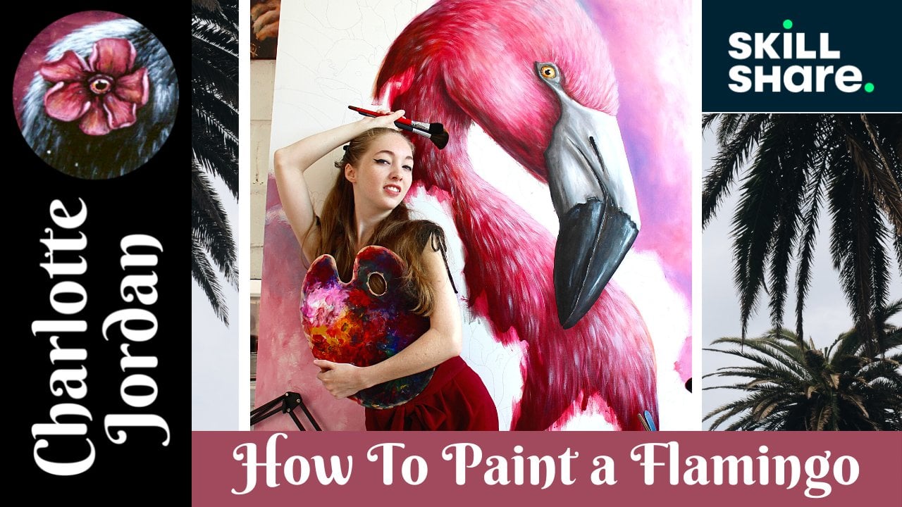
1. Introduction: Hi there everyone. My name is Charlotte Jordan. I, a surreal animal artist based in Florida. In this class, I'm going to be teaching you how I painted some bookmark designs, specifically a festive holiday Christmas flamingo. Just one today. But I did complete a couple of other designs that went alongside this one. And I hope to teach you a few techniques in this class such as how to painful or feathers really. And how to create your own flamingo and sizing for your own book block designs. I've been painting professionally for at least three years now. However, I've been creating and making up all of my life. I love to paint animals and nature, and I find a lot of inspiration and ideas that come from nature itself. So I hope you'll enjoy this class today and loves me techniques from it. And most importantly, I hope you have fun with it and perhaps get into the holiday mood. I also encourage you to check out my website as well as my Etsy shop that will also be featuring these bookmarked and amongst many other little products and handmade items. So let's get straight into the first-class then.
2. Supplies: Hey everyone, and welcome to today's lesson. We're going to be painting a bookmark design that you're going to then later turned into a bookmark. So as for the paper here, I'm actually using to some regular watercolor paper. And all I've done is actually measured double the size of a bookmark. So the block size I will be going for later on is going to be two by seven inches. So I've got an doubled it to a four by 14 inch sort of area that I'm working in for my bookmark sizes. I'm going to give me doing one design today. I'm going to pick one and simply just laid down there. He might want to tape with some masking tape your design down to the table. This is going to help with buckling issues, keeping your paper in place while still working on it, and a few other things. As for your brushes, we've got a small selection of brushes that we're going to be using for this. I've got a couple of different sizes and shapes here. Starting with a couple of rape brushes, flat brushes, and a detailed brush. So you can least have one flat brush, one detail, and probably a rake brush. You might not need anything to swallow. Obviously a small detail is useful for those teeny tiny highlights and details will make later on. And then these red brushes here, I went for the middle rate brush or the mid-sized Greek brush. You can get big ones, tiny ones, and et cetera, et cetera. Of course you want your paper towels or water. You need a palette. All the basic things for acrylic paints. I have a spray bottle to keep my paints wet and the palate and two sometimes spray onto the paper to make things workable. Again, I've got some glazing medium in case I needed to use that for later on to boost my colors. And then of course, you want to have a good selection of patients available to you. Most importantly, some black, white and red because we are going to be painting pink flamingos for this bookmark design. And then you may pick and choose what kind of colors you want to use. Obviously, paying is going to be primary for a flamingo. So those are all the supplies you're going to need for this class. I'm going to go ahead and tape it down and meet you in the next lesson.
3. Background: All right, so I'm going to start with a background color for this lesson. Just really, really simple. I'm actually going to be using some burnt umber and my medium flat brush. And all I'm doing is just filling in the background with this color. Pretty straightforward, obviously avoiding the lines are where the flamingo is. I'm gonna go ahead and speed it up for you because I think it's pretty much straightforward and you get the point. You can choose any color you want for your background. I really don't mind. It's just completely up to you how you want your colors and the layout to be. So I'm going to go ahead and do that. Alright, so our background is pretty much done. Again, just filling it in and keeping it completely solid, Make sure you get all the gaps in between whether flamingos like head versus his neck is et cetera, et cetera. We're gonna go ahead and let that dry before we move onto our next step.
4. Value Layer: So now for this next layer, we're actually going to be starting work on our flamingo itself. And for this, I'm going to be starting with my value layers, or I sometimes call them my base layers. And to do this, I'm taking some crimson red paint and mixing a little bit of black into it just enough to make it a little bit darker. You can also mix a little bit of that burnt umber in that sort of give it a duller tone. But that's really up to the kind of palette that you're going for. And I'm going in with my medium flat brush and I'm starting to add in basically the shadows or my darker values where I think they're gonna go on the flamingo. In order to do your values, you kind of want to pick a rough light source. So for my light source is coming from the right-hand side of the page above the flamingo on that right corner, that, that's sort of where my imaginary light source is coming from. So you want to base your highlights and your shadows around this premise of the false light, if you like. So you can see I'm adding these dark shadows underneath where the beak overlaps on his body, just underneath the chin or the neck here where his head meets with the rest of his neck. On the underside of his body facing away from the light. Just all the different places that you'd think that the light would not be hitting. So we're going to be putting all our shadows in here. I'll go ahead and speed it up so you can get a rough idea of what I'm doing with my shadows. Next, I'm taking a little bit of white and mixing it into that red tone just to make a sort of my mid pinkish tones for the flamingo now. And this is the mid-tone. So I'm putting this pretty much in all the places where it's not too dark, not too bright. It's literally just to fill in the mid-tones of our flamingo. So again, I'll speed that up for you so you can see the places that I am putting this, but pretty much is the mid areas, the areas that are not so bright or too dark. And finally, taking some more white and mix it in with that pink to create the lightest values on the flamingos body. So you can see me just basically filling in all of the rest of the white patches on my flamingo here. Again, trying to keep it to the point where it makes sense. Where the light would be hitting, all those little places where the light would catch. And then being very careful around the edges of the flamingos body. And that is basically how you lay out your basic value layer. You just want three different colors through different steps. You want to go from your darkest layer to your mid-tones to your brightest layer. Next, I'm taking this rake brush and I'm just gonna start to blend the fur texture or feather texture of the flamingos out little bit. Because right now it looks a little bit patchy because we've just put on the basic blotches to our values. So now I'm going to start to smooth all of that out and give it a little bit of texture and soften everything. I'll go ahead and speed it up as it's pretty straightforward what I'm doing here. But you want to use the right brush. I'm not picking up any other paints on it. I'm just using it as a dry brush and I'm just pushing the paint around on the paper too smooth and blend out and just to give it a little bit of texture. Now don't worry about going outside of the lines if you like, because that's going to add to a little bit at the fluffy texture we're going for on our flamingo. And finally we're going to go ahead and let this layer dry before we move on to the next one. So he can really, what basso with the textures in the next coughs. Remember, you can always go back and forth between your values and textures and things like that. So don't worry if you feel like you've lost it or over blended and little too much.
5. First Texture Layer: All right then, So now about this base layer has completely dried, I'm going to go in with a much lighter shade of pink and my rake brush. And I'm going to start to add in the first layer of texture to really make affluent go look a little fluffy and like he has feathers. So I'm using my big brush. And when you use a rake brush, you might want to send the paint out a little bit with some water. This is going to help the bristles not stick together so much so that you actually can see that texture that we're going for. And when you're painting fur or feathers of any kind, you want to make sure that you're staying in the direction that the feathers author will naturally grow. So you can see me going in a downward stroke, head down the neck of his body or NAK or gas. So just loading up my paintbrush with some more paint and just adding in some strokes of feathers or whatever you want to call it. And you're going to do this all throughout the flamingos at body. I'll go ahead and speed up here as I think it's pretty straightforward what I'm doing here. Just adding it all throughout the body. And again, keep it in the direction that it would naturally grow. So you want to really pay attention, especially as you are going around the neck. Because you want to make it seem that it is 3D and not going straight. When you're also painting feathers off. You want to kind of clump them and also sort of have alternating directions just a little bit. So it seems a little more natural and not so straight and manicured because this is a wild animal that we're painting. And obviously the more natural something is, the more likely it is and be organic and a little more misshapen or sort of wild looking. Also with this layer, you can see me going back over some of the brighter areas or where that light source would be hitting our flamingos body. This is going to help build up our layers a little bit so it looks more realistic. I find that if you build up some of the highlighted areas and make it more solid with less texture or clumps, then it will achieve a more realistic look with the values. And it will also help with or value layer as well. But remember, you do want to leave some clumps so you can see all of that value layer underneath, as well as that texture. And you can see the validator does show through. And remember, you can always go back and forth between your value layer and your texture layer, your first extra layer. And you can just keep using the right brush for as long as you need to. So we're going to let this layer completely dry before we move onto anything else. And just adding the last few and wrap up.
6. Painting The Beak: All right, so now we're going to move on to painting the beak of the flamingo. And I'm actually going to start by using this small flat brush here. I'm actually going to be mixing a gray color using some black and white. And I'm going to be starting as we did with the flamingos body, with the values of the beak. So again, we're going to be lining all the areas where it would make sense that it's darker on the flamingo. And whilst you're working with this paint, you do want to try and keep it somewhat wet. So do keep your spray bottle handy or at least keep the paint wet or walk very fast with it. So again, just finding all those areas where it would make sense that the shadows would be session. Again, I'm putting a little bit on the front there where the beat curves to make her look like it actually curves and isn't a flat item. And I'm going to wash out my brush. And I'm going to switch to some white paint and I'm going to fill in all the other areas with this white paint. Flamingo beaks are typically white with a bit of black on the tip. Sometimes they have a little bit of that pink faded into them by it just really depends on the look that you're going for. And all I'm going to be doing is these two colors or two shades into each other to give the subtle effect that it is a shadow and there's dense and curves in the bird's beak. And I actually like to use my fingers to blend so I just find it gives a better blends. Hmm, there any brush gird? Because I don't know. I guess it's just the texture of your skin's a lot smoother than a brush. So I'm gonna go ahead and smooth that out. And you can see it just gives really subtle shadows and helps blend everything together really smoothly. And you can go back and forth between the values if you want to, and just play around until you're happy with that. I'll go ahead and speed it up a little bit for you so you can see more of what I'm doing. So you can see I filled in the tip of the beak with the black that flamingos typically have, as well as the nose area. I'm just finishing off with some white around the edges on the brighter areas where the light would be hitting. You'll see where the tip of the beak is in the black, I've left a little bit of a white lines so I can easily find the separation between the upper and lower beaks. This is just really helpful to leave in place so you can find those later on. And then just adding some more white to smooth into the beak and just give subtle shadows and highlights again. And just blending those out. And then I'm also going to go in with a detail brush. And I'm going to start working on the rim of the eye. So the rim of the eye is typically a little bit of white as well. It's all follows on from the beak. And I'm just starting with white, but then we're going to add in those gray tones and shadows again to make it look a little more realistic, I'm just outlining that i, and then filling in with the white and bringing it down into the beak, which is how it normally connects. Don't worry about filling in the eyeball for now. We're going to do that a bit later on. When I switch back and forth between our darks and shadows and just start to create some depth along the beak and the eye. So just finishing up with the shadows here. And in a few small highlights along the bottom of the beak so it's easily distinguishable between the background and that obviously adding a little bit of those shadows in the room area. And now for the last step of the beak rash, going to add some little highlights to the beak itself. I'm starting with that gray tone color that we used at the beginning of the beak. This is just going to help add our subtlety, kinda like on mid-tone layer. And I'm just using my detail brush to source, move that in. You don't want to cover the beak completely or the tip of that being completely with this because you do want to leave that black showing through. And then finally adding some brighter highlights. So just putting a little bit of white on there and dabbing them off so they're not so bright. And this is going to help the beak look nice and shiny. And that's all we're going to do for our beak.
7. Glazing: So the next stage of this painting, because our flamingo body should be completely dried by now, we're going to be glazing some more pink onto our flamingo. Glazing is a great way to boost any vibrancy on your animals. It just helps bring them to life a little bit more. Once I started glazing and my paintings, I haven't stopped since. So all you need is a small touch of pigment or color and paint and then mix in a bit more extra glazing medium. So you want to create sort of a translucent mixture with this stuff. And the idea of it being translucent is so that you can still see all the work and the details that you've made underneath. I'm going to be focusing this pink glaze sort of more towards the shadows of the flamingos body. Because I really want to help build up that contrast between the light and dark on his body though she's going to help him pop out of the page a bit more. I'm just glazing that on with a small flat brush keeping to where the shadows are. So right under his beak waves P could be sort of hovering over or resting on his body. And also don't forget the neck, under the chin, things like that. And if you have a bit too much excess, I've just wiped it off there. And then continued with the rest of his head. Pretty straightforward what I'm doing before you do anything else to his body. After this layer, you want to let it completely dry. Otherwise, you're gonna get muddling of colors or just it's not going to look pretty. So do let this completely dry. I, once you've done a glazing, the next step is to state systems.
8. Second Texture Layer: The next step that we're going to do after our glazed layer has completely dried and I'm incompletely is we're gonna go back over with our rake brush and are pale pink color. And we're going to add some more texture to our flamingo and just rebuild up those texture layers again. Just because sometimes glazing can look a little bit patchy. So you do want to reflux our flamingo out. So just, just like we did with the first texture layer, I'm focusing more on the highlighted areas and again, being really sparing with the paint and the texture more towards the shadows leaving those clumps. So they really show through. I'll go ahead and speed it up here. So it's pretty obvious what I'm doing, Just making sure to focus those textures and the paint more towards the highlighted areas of the flamingo rather than in the shadows. And you can see I've really built up the highlights on his actual forehead. And it looks really, really bright there, which is great because it really makes the contrast of the highlights and the shadows popping out more. That's all we're going to be doing for the flamingo body, or we have to do left is the eye, which we'll do in the next class.
9. Painting the Eye: So now I'm going to be moving on to the final part of the flamingos body, which has the eyeball. We're going to be filling that in and giving him more life. So I'm actually going to be using a bit of yellow. I'm using this cadmium medium, yellow for the eye color. I figured this color would stand out the best amongst all the pink and white. And it's also quite a complimentary color to pink. So I'm filling in all of the area with the yellow color and I'm leaving a little white dot available for the IRS to go eventually. And remixing a tiny bit of white in with that yellow just to make it a little paler. And I'm going to add some pale areas on the eye. You really don't have to be too meticulous with this as it is such a tiny area that most people weren't really notice or those teeny tiny details. I'm now going to go in and put in some of the black fill in the IRS and start out a little bit of shading to the eye. So just taking that black and I'm going to start outlining the eyeball itself is just going to really help it to stand out against all of that white the white rim of the flamingos. I I'm not going to blend it too much just because it's such a small area and it's really hard to bring out the color and the light in such a small area. And then of course I'm going to fill in the center of the eye as well. Can have him looking wherever you want. And then finally, just shade a little bit of that. I can round the rim of the eye with the buck. I'm going to help the entire eye stand out. And then finally, adding some bright highlights to the eye itself, making sure the brightest and biggest one is sort of in the eyeball so that it looks like he is alive and the light is reflecting from his Hi. I'm also going to take a little thin had very tip of the brush to line the eyes itself to make it look like they are wet and a life.
10. Base Layer of Florals: So now I'm going to start focusing on the elements around the flamingo. So all of the florals that I want to add in this festive Christmas painting. So I'm actually going to add some pink points yet, etc. Here's where that pronounced, as well as some pale green leaves just to give it a contrasting color within the pink newness of this painting. Starting with the poinsettia flower leaves, I'm just going to start blocking in the colors. And that's all I'm gonna do for this class. Just block in the colors, the placement of where all those leaves and petals and things like that are going to go. I'll go ahead and speed that up here. And all the colors that I'm using is pretty much everything we've used before, the flamingo colors. So that mid tone would be a really good color to use for these pink points. Yet her leaves midtone that we used for the flamingos first value layers is what I'm referring to there. And then ask for the leaves. I actually took some sap green and mix it in a little tiny bit of that cadmium yellow as well as some white to make it pale and light. And I simply use that to block in my leaf color. I'm just finishing up with blocking in the colors, making sure that they're really solid. Going back over any of them that look a bit too thin or just not showing up as I want them to. And then after that, we're going to let this dry completely so that we can add in shadows, highlights, and texture to the leaps.
11. Shading the Florals: All right, so now we're going to move on to shading our florals. And I'm going to be mixing a little bit of a darker color of pink here. So I'm taking my red, a little bit of black, and a little bit of that white to make it pink rather than just a dark red. And I'm mixing those together to create a deeper red shade. And I'm going to start to outline all of the individual points yet or leaves with this using my small flat brush. And you can outline everything with this. I also added sort of the stem or the main vein up the middle. And then you can see me using my finger just to gently smudge those lines out so they're not so harsh. A bit more of a fade. And I'm gonna go ahead and do that for basically all of my pink points yet leaps. Next, I'm going to be taking some paler pink that we used earlier on the flamingo. And I'm going to start to add a little bit of texture and B, some highlights to the data leaves. And this is going to start to help distinguish them from each other and make them pop a little bit more. So I'm just adding that brighter color. And then using my finger to smudge that out, create a little bit of texture as well. Leaves are similar to animals in the sense that they have a center that their veins kind of point towards. So kind of like with the direction of feathers on an animal. Veins also have a direction. So do try and keep that in mind as it will help your leaves or petals look a bit more realistic. Or in keeping to the nature. I'm not going to add this author out the pink points. Yes. Hello. Hello.
12. First Frost Layer and Shadows: So what we're gonna do now, I'm taking my smallest rake brush that I have, my brushes. And I'm actually going to start to add sort of a frost effect to each of the points yet or leaves. This is just going to be the first layer of frost effect. It's going to get a little bit muddied with the paint, which is fine. It's going to give us some layers and depth to our frost. And because it's a regular brush, it'll be nice and textured. All I'm doing is taking some white and I'm dabbing it on the very edges of each leaf. And this is going to give an illusion that the edges of the leaves are all frosted up. Because this is a winter painting and it is very festive of the floras. I'll go ahead and speed that up for you. The next thing we're gonna do is take our small flat brushes again and mix a little bit of black into our green that we were using earlier to paint these leaves are going to start to add the shadows into the leaves and again, smoothing those out with my fingers just a little bit. And also adding that sort of main stem that a lot of leaves half. It's a pretty straightforward, just the exact same thing we did with the points yes, the leaves except it's just with a little green ones. And then finally, for this lesson, we're going to add some shadows underneath each leaf, or where the leaves and the potholes are overlapping on the flamingo. And I'm just using that same dark pinkish reddish color that we used for the points yet of these earlier. And I'm going, and all of the leaves and petals overlap the flamingo. So you want to really pay attention to your light source here. What makes sense for the rest of the painting and the light source that you chose. Obviously be very careful to do the right petals and leaves and just smudging those out with my finger as well. So now we're going to let the layers dry that we've done. They need to be somewhat completely dry in order to move on because we're going to be putting highlights on and much more clear a frost on top of that. So in the next class, before you add anything, make sure this layer is completely dry before you move on.
13. Second Frost Layer and Highlights: All right, So now our leaves have dried a little bit. I'm actually going to be using some highlights now for each leaf so they can really start to pop out from each other and the page taking a mixture of white and that light green that we used earlier on to first paint the leaves and just making a light color. And I'm going to start to add little lines of white just along the edges of each leaf just to help them stand out better. And then again, using my finger to blend them out. Or you can use a brush if you're more comfortable with that. And I'm going to go through and do each leaf as fat. So you can see now we've got some bright highlights on our leaves that really make them stand out from each other and from the page itself. So now I'm going to switch back to my flat or rake brush, I should say. And we're gonna add that next layer of frosting over our points. Yet the leaves, I'm using bright white for this and it's really going to stand out. And you can see I'm just alternating, turning the paintbrush handle in my hand as I go to create a unique texture with the frost, looks a little more natural. And you're gonna do this all around the edges again earlier 20th or leaves. So they look nice and frosted for the holidays. And just finishing up on the frosting here. This is one of the final steps we're going to do before completing our painting. In the next class, we're just going to finish the whole painting off by adding a few little sparkles hand. And that.
14. Final Details: And then finally to finish our festive flamingo bookmark painting, I'm going to add a few stars or sparkles throughout the painting with a detail brush and some bright white. I'm just really carefully drawing some sort of crosses and then adding a dot in the middle. And I'm just choosing a few places here in that at this, I'll also go throughout the painting and kind of smush them a little bit with my finger, just tapping them just to sort of smudge them out in a circular motion. This way they look like they're actually shining rather than just sort of sparkles. It'll create more of a ombre effect to the stops backlit itself. And so here is our final festive Christmas flamingo bookmark design. So I hope you had fun with this class and learned a lot to make my bookmarks and I made several different designs I made to other designs off camera. And I'll show you in just a second. I made these into actual bookmarks for an Etsy store that I run. And I used a company called sprinting to order my bookmarks and they did a great job. But with sizing them, there's many different ways that you can get bookmarks. If you do print them off yourself, don't forget to buy tassels for them. That is the finished product for my bookmarks. And here are some of the extra photos that I took of them. So I really hope you enjoyed the class and thank you so much for joining me for it. I hope you have a great holiday and I wish you a Merry Christmas or whatever you choose to celebrate.
 Charlotte Jordan, Artist | Entrepreneur | Teacher