Transcripts
1. Hello! Class Intro: Hi. I'm Mimi and welcome to my Skillshare sticker course. I'm going to be showing you how you can create your own custom set of chat stickers. I'm a freelance illustrator and love making up characters for stories. Now, also I'm a human being that likes to chat with my friends on my phone. So I thought it would be a perfect opportunity to combine those two things and show you how you make your own character face stickers to use for chat. I also just want to say that stickers are actually just a great framework for learning some very important skills. By the end of this course, we'll have gone through tailored exercise in making up characters, thinking about how to communicate effectively through expression, and learn the basics of how to color in Adobe Illustrator. The path for this course can be tailored to your drawing abilities. The great thing about stickers is that even stick figures are funny. If you're great at illustration, there's even more potential for you to make this truly unique and special. So I'm super excited to get started and I can't wait to see what unique stickers you're going to come up with. I'll see you in the first lesson.
2. Getting Started: Your Project: What exactly are we going to be making in this class? Together, we're going to create our own set of custom chat stickers which you'll be able to send to your friends and family as images. If you're interested in then making them available to a wider audience, lookup for the next course in this series, we'll show you how to do just that. Now when I say chat stickers don't let your imagination be limited. These are essentially just transparent images with characters. You can imagine using them on your blog, e-newsletter, your website, you get the idea. Also stickers are really just a framework because by the end of this course, you'll have gone through a creative exercise in character design, expressive communication, and learn the basics of how to color in Adobe Illustrator. Just a quick note, in this class I'm going to be focusing on stickers that involve a character in action or having some expression. If you look on the right, these are not really what I'm going for. These are decorated stickers that have their purpose but since this class is partly to build skills in communication and expression, we're going to be focusing on stickers like the ones you see on the left, which are much more useful in chat conversations. Those of you that are a little bit worried that you can't draw, it's okay. There's two reasons why that's not too worry. First of all, stick figures are still funny. Stickers are adaptable to your artistic skill level and sometimes crude drawings are even more relatable than skilled drawings. I think the picture I have here on the left is a great example. It's from the comic Hyperbole and a Half by Allie Brosh. I think it's hilarious and it's using a very crude and simple style to convey very complex scalings, and she can actually draw it. I just think this is a funny example. Another piece of good news was that nowadays there are many app tools out there that can help you create graphics with shapes, simple finger drying and more. I'll touch upon some of them along the way, but I'll list some in the discussions below so you can check them out. Let's quickly go over what tools you'll need for this project. Besides some pencils and paper to do your sketches or a tablet, of course, if you feel comfortable with that, you'll need some computer program that will digitize your drawings. I'll be showing you how I use Adobe Illustrator to vectorize my stickers. You can use whatever program you feel comfortable with, but I personally highly recommend using something vector-based, such as illustrator. Now that we're clear on what we're making, let's go to the next lesson. I'll do a quick stickers 101 to explain what exactly stickers are and why they're so important. If you feel ready to jump straight into the lesson, you can go to step 1, which is some inspiration research. I'll see you there.
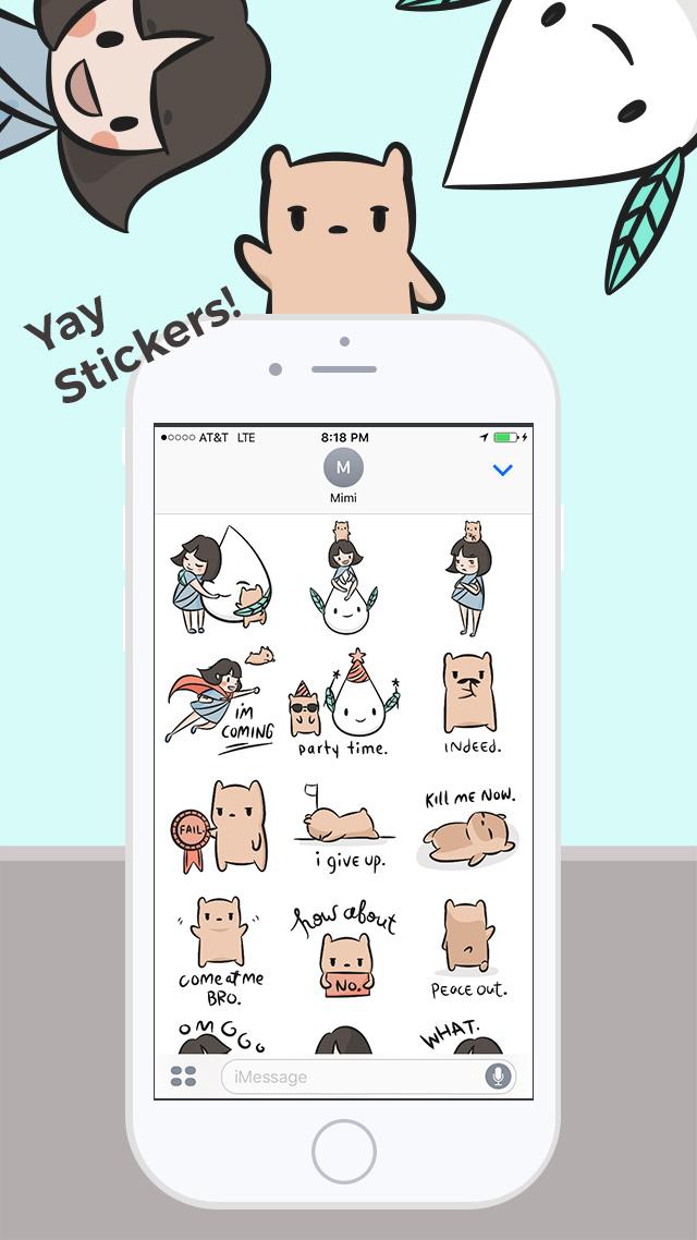
3. Getting Started: Stickers 101: Are you still not totally clear what stickers are or why you should care about them if you're not, say, 12 years old? That's okay. I have a Stickers 101 for you. Stickers are basically a casual term for referring to images with a transparent background that have characters on them. You can send them in text conversations or leave them in comments that support images. Think of them as expression enhancers, not just a pretty or cute image that you send to a friend. They can either exaggerate some texts that you're already sending, or it can replace text entirely. Stickers can be still or animated. For this introductory class, we'll be making still stickers. The different platforms allow for different sticker functions. In general, it's straightforward like the one you see here, you send it as an image, and it shows a floating little character within your conversation. But different platforms are starting to update it to make it more interesting, and one of my favorite new functions is the currently little-known iMessage ability to actually stick stickers onto other people's texts. Any of you might be more familiar with GIFs. They are similar in concept in terms of using visuals to exaggerate a reaction or feeling. Here, I've shown Patrick Star from SpongeBob SquarePants, and that GIF's a good example of what GIFs are good for. They're generally moving and usually pulled from existing media. Stickers can be moving too, but they can also be still, and they're typically original illustrations. Of course, the close relative of stickers are emojis, and they again are similar in terms of using graphic images to reply to a conversation or to react to content. You'll probably notice that emojis are much more simple and smaller, and they are part of your keyboard. They're actually little pieces of code that are displayed as text, and that's why sometimes they don't work when you're communicating with somebody who has a different phone. Stickers, on the other hand, are graphic images, and they can be, of course, much more complicated and fun in that way. Now that you know what stickers are, why are stickers important, and why are they so popular? The main thing about stickers is that it really helps you communicate clearly in a text conversation. They convey a wider and more nuanced range of expressions. They really enhance a text chat by making it funnier, more engaging, and arguably more effective. Text can often be misread or misunderstood, and stickers leave less room for ambiguity. Something else you want to know about stickers is that they are serious business. Some people still think of stickers as a trendy thing or something just for kids, but business people are taking notice of their lasting importance. The example I have here on the left is from Line chat which is a very popular messaging app in Asia, and these are some of their characters that are most well-known. Line had one of the biggest tech IPOs in history last year, and they generate over US$270 million a year through sticker sales. A lot of these sticker sale will be user-created, so people like you and me. In fact, Line's CEO directly credit stickers as the turning point of their app's success. Now, major companies like Apple are playing catch-up. They, last year, update their iMessage system to be more sticker-friendly, and they opened up their Messenger App Store to creator-submitted chat stickers last year. To further prove my point that stickers are not just for kids, business outlets such as The Wall Street Journal and prestigious investment firm Andreessen Horowitz are paying attention. I pulled this quote from The Wall Street Journal, "Why all the sticker insanity? A sticker is worth a thousand words, of course. With text-based communication, we miss facial and visual cues. And you know those tiny emojis that come with your phone? They just don't cut it. With stickers, you turn your boring message transcript into a fun comic book." I also really like this piece from the Andreessen Horowitz Blog where writer Connie Chan explains, "Complex feelings, actions, punch lines, and memes are all possible with stickers. They are an acceptable response to end a real-time back and forth conversation, great for punchlines. They are a low-risk way of saying hi and initiating a chat with an acquaintance. And they reduce the social friction of saying something emotional in text form." Now that you're hopefully convinced that stickers are not only fun but also important, let's go to the next lesson where we'll get started with our project with some inspiration research. I'll see you there.
4. Step 1: Inspiration Research!: Now that we know what we're making and what stickers are for, let's get started making our own set. Let's get informed. I like to look at the sticker marketplaces of the apps that I use or would like to submit to. I'm going to be focusing on LINE chat App Store and iMessage App Store. Let's start with the iMessage App Store first as an example, because I think a lot of you guys may be using an iPhone. I have a message to myself setup here. To get to the App Store, you're in iMessage already, and you go here, and there's the App Store icon here. Then these are the stickers that you've already downloaded. To access more, you click on this little icon here, on "Store", and now we are navigating to the iMessage, iOS App Store. You can see that they already have new stickers we love, right up top, and they have other iMessage apps, but we're going to be focusing on stickers obviously. They're really emphasizing it. There is one right here, so you can click into there, and these are their favorite pixel packs. They have them organized by different categories, so you can find stuff. Let's look into new stickers we love, to get a sense of what they like. Hello Kitty, probably a good one. What's good is that you can just without purchasing anything, just see what other people are doing. I'm, of course, showing you my style, but you can really do whatever speaks to you. There's something like that. It's really text-heavy and lettering style. For letters, that might be a good idea. A lot of movies these days will put on their own stickers. This has a promotion, so you can think about it if you already have a brand or a company, how can you incorporate stickers into your customer's lives so that they're thinking about you more often. This is a good example of, if you're not great at drawing, but you can build with shapes. These animals are just built with something like circles, triangles, lines, and there's apps that can help you do that. Yeah, look around here, another thing you can do is go to categories, stickers. I'm going to category, stickers, and then look at the categories that are out there to give you some inspiration. I've got Animals and Nature, it's gives you a good sense of what's out there. We'll talk about this, WWF, World Wildlife Origami. One other thing I like doing is actually here, Top Paid, Top Free, and see what's doing well. Obviously, the big brands are going to be doing well, such as Hello Kitty, and Disney, and Pokemon. But it gives you a sense of what people like and their stickers. I haven't heard of this there before, maybe he's popular in a certain audience, but shows what things people might be looking for. Take a look at Top Charts. Now I want to do a quick case study of two existing sticker sets to go over what I think makes a successful sticker set versus just a pretty one. Here I've pulled up two sticker sets from the iMessage App Store, both of which are very skillfully done and very attractive. But the one on the left is just good-looking while the one on the right has a personality. The World Wildlife can put out this origami set, and it's beautiful and cool to look at, and they anime actually when you send them. But they don't really come up very often in chat conversations because there's no expression, it's not a reaction to anything, it's just something cool to look at, which is not to me the purpose of a chat sticker. On the other hand, on the right, Pusheen does a great job of being perfect stickers because they're simple, they are easy to understand, have a small size, and they have lots of useful expressions that I can imagine coming up in chat conversations such as crying, or love, hello, goodbye, surprise, and little angry dinosaur, Pusheen cat, this green one right here. I think it's great because you can send it as you translate as being bad ass or you're sending as if I'm angry, but not really because I'm sending you a cute dinosaur sticker. Anything that has variety is great. Besides the iMessage App Store, you can check out LINE chat, which I really like. Their official characters are these two. Well, they have more than two, but the popular ones are called Brown & Cony, which is this brown bear down here and this white rabbit. I think they're such a good example of something that when I saw the first time, I didn't think they were that cute, but I just love them because they have these great expressions and interactions that make chat conversations way more fun. For Android users, check out Google Play. You can just search stickers, and I don't think that you can submit them as a creator right now, so this is more just to see what's available. KakaoTalk is also a very popular chat app out of Asia, and they have a blog you can access on your computer just to check out their stickers, and see what they're putting out. Of course, good ol' Google Search never hurts. You can search best chat stickers, and see what's there. I would say don't overwhelm yourself. There's a lot of stickers out there and just taking a little bit of time to see what's doing well, what's popular, will give you a sense of what speaks to you, and what kind of stickers you want to create. Of course, you don't need a limit yourself to actual stickers. I think comics are a great example, other things like stationery that have characters. Gather your inspiration and research, and lets meet in the next class where we will start brainstorming for our different themes and ideas. I'll see you there.
5. Step 2: Brainstorm Ideas: Hi. We have a sense of what makes very good sticker. Let's start brainstorming for our own. As you saw, the sticker sets tended to be built around a theme or a category of interests. For purposes of this project, I decided to break the brainstorming session into categories to make it more organized. For me personally, I think in both free for all manner. I'll just write down whatever comes to mind, but then also go back through and go into more organized list to make sure I didn't miss anything. The first thing I would say is, stickers are basically a way to express yourself. How can we reflect you? Are you a cat person? Do you love gardening? Are you all about food? What is something you can really speak to and form expressions around that flex yourself? For me personally, I like cute animals. I have these original characters that I like to draw. They're obvious go to, emme and hamster cat up in here. I like coffee and tea culture. That's a good example of something that's personal to me, but obviously is a big part of a lot of people's day-to-day lives. I can imagine a lot of good expressions within that. Put that down. One thing that I think is great, about this exercise is that you can really think about what community or niche interests that you're a part of, and how you can turn that into a sticker set that is usable. For example, I have a lot of friends that are really into bouldering. I can imagine that there's lingo or different sayings that would be funny not just amongst them and their friends, that they decided to share it with others in the bouldering community, they would really appreciate that too. Once you're done thinking about what kind of things you really like, you can also start looking around. I know that sounds similar, but it's a little different in terms of just getting engaged, everything really observing with your day to day life, and similar scenario are in that you can turn it into a sticker forum. It could both be going out on the street, with you walking your dog and maybe seeing something there or it could be on vacation. I have with me here the sketchbook that I brought with me on a recent trip with my family. I was just watching my niece and nephew play on the beach. I started drawing like a bunny and a swimming costume. That turned into this whole like life's is beach, beach bunny sticker set. I think what's fun is that, you can start with the basics like, oh, let's go swimming or I need a vacation. But also think about in day-to-day conversation how that could be tied in. I would say, hello, goodbye. You're going to be common conversational things. Here we're like, "Oh, hi," and it's like not going and saying hi to fish. I can imagine, if you have a dog, and you walk your dog around the neighborhood, it's like dogs sniffing each other and saying hi. It's, in the context of something that you're familiar with, an experienced but still using general conversation setting. Third category, is inside jokes. Most like friends, family, coworkers, are the things that, this is a great exercise for if you want to create a sticker that where just you and your friends or your family are going to use and how can you translate maybe some sayings or common phrases that you guys always use into your funny sticker. Coworkers obviously are great if you have some jokes at work that could be translated into a sticker. We always had jokes about Thursday cry, and this thing called Mr. Splashy pants which, I don't need to explain, but I'll add that here. Friends and family can be a great unwitting source of inspiration, just try not to hurt anybody's feelings. After you've gone through those three more familiar topics, the next topic that I think would be really interesting is cause and concerns. Is there a topic or an interest that you really care about that you would like to raise more awareness for? Think about how you can do that through stickers. Because if you do distribute them, they're a way that people will engage with on a day-to-day basis if it's done successfully. We're better way to make people more aware of something that you care about. For me, and I care about nature conservation, put a bee here because the care about saving the bees. Oh, one thing that I always really wanted to do is to do some conflict resolution stickers. I think a lot of times we resort to more passive aggressive ways of approaching serious topics. But what better way to utilize what's good about stickers, and keeping things in a light hearted, and casual, but also able to talk about something more serious. Even from something as simple as like, what's wrong? Or are you mad? To specific situation I can imagine, say for roommates. You can design a fun sticker set that helps boats on the more uncomfortable topics like, "Hey, please clean the fridge." Instead of passive aggressive sticky note, you can send a cute bunny cleaning out of the fridge. He's so happy how clean it is. Think about along those lines. How you can talk about something you really want to get awareness of, but in a fun and engaging way. Only, the last category is just, if you're aiming to meet these stickers widely available and just want them to be as popular as possible. But popular topics are there or types of categories could you work on. Cats and puppies are obvious. It's going to be junk food, doughnuts, fries, plants and flowers are always popular, and how can we incorporate that into a fund sticker set? You're probably aware of what else is popular within your community. Think about how you can incorporate, and make them into a sticker set that's more widely applicable for people. I'm going to keep working on my idea set. Once you feel like you have a good list going on, let's meet in the next section, we'll, we'll start picking out some of our favorites and really flushing out a sticker set. I'll see you there.
6. Step 3: Character Creation Sketching: Hopefully you have a nice list of ideas and themes now and we can start picking our favorites to create characters to represent and reflect that theme. This isn't going to be a formal lesson on how to draw, instead, I'm going to take you through the steps of how to think about creating characters. I'll show you how I personally do it too. In thinking about these characters, we can borrow concepts from character design, even though this is a very simple context. When we see character design, we are thinking about how we can use the forum to match the function. In this case, these are stickers. They're going to be on a digital screen and probably a small one. We want to think about how can we create characters that will read well at a small scale, but still have enough room for expressiveness to communicate what we're trying to say. Thinking simple shapes in the course, this is a benefit for those of you who are still just starting to learn how to draw or think maybe they're drawing skills aren't that strong. Another thing to think about is that since we are going to need to factor these and they're going to be at a small scale. Things like really complicated silhouettes or hairy edges, really tiny details, they're going to get lost and then very difficult to really make it clear. This is something to think about. Don't limit your creativity, but when we're thinking about designing, those are the things I'm considering. Let's get started on drawing. I went through a lot of formal steps, but you can also just start doodling. The guides are more to help those of you who struggle with a blank piece of paper or without direction. But for me personally, I often just start looking at the ideas and think about a character that comes to mind or maybe something that's funny in that context. Obviously, some categories are going to lend themselves to characters such as people, animals, different types of sports activities, things like that. When you have to think a little more abstract, such as maybe nature or hiking, how can you represent that? Straight forward way is to just use a character to demonstrate those activities. Say, if it's hiking, you can think about maybe using a bear. Doing the different hiking activities or camping activities, I'll drop the bear here with a tent. Another thing to consider is that even obscure or abstract characters will work. I was working with somebody in, he had these abstract gloves. I put a face on it and that becomes a character. This is helpful for those of you who are really confident and maybe drawing a human character or animal character over and over again. I just want to give some quick tips to people who might be struggling with this sketching section. When you need to drawing, your impulse might be to start drawing with little tiny strokes on the picture you have in your mind like this. Then it ends up looking funny. It looks fine, it's cute on its way. If this isn't turning out well for you, into bad things and shapes. Pushing this circle with little triangles on top and a tail, some ice. That's pretty much pushing. How can you apply that to what you're doing? Say a character is a cub. Draw a circle, put two more circles on top, triangles, some lines, circles, circle, line, line, some ellipses and that's already looking like a cub. Smiley face. Do you want to draw something more straight forward? Then just stick to that as a style. A rigid, simple look could definitely be a style and if you look on the App Store, you'll see examples of this. I just drop everything like this, so it's the style of your sticker set. Don't get too hung up on any one thing. Play around with all your ideas. I have this idea here and when something's not working out, I'll just move on to the next one. Another aspect to think about besides just the context of how they're going to be shown, is your target audience. Maybe it's everybody, which is fine, but say you have a more unique audience or you know you already have a style or you say you're creating these stickers for your company and you know your audience is within that company, think about who you're trying to get to use these. I deal with the type of persons who likes really clean, modern graphics, make more silly cartoon styles. Cute little animals are another type or maybe something more text-driven, some glittering. This is another way to direct the design thinking you have behind your characters. I'm going to keep working on flashing out my character set. When you feel like you have a set of characters that you're happy with, let's meet in the next section. We'll pick our favorite and start flashing that one out with the full set of expressions. I'll see you then.
7. Step 4: Expression Expansion: While you are designing your characters, or sketching doodles, you probably came up with a few expressions already. In this step, we're going to really think about various moods and actions that we can represent, and then come up with as many as we can so then we can select the best to make our final set. I'm feeling the best about my Emme and Hamstarcat set. I'm going to work on that for this class. In terms of thinking through your expression set, start simple. You can either just brainstorm in a series of doodles or we think better in a more organized manner. List out a bunch of expressions that you'd like to depict. Again for me, I tend to work both ways. I'll first do a brainstorm of everything that comes to mind first, and then when that's exhausted, I'll go back through in a more organized manner to see if I've missed anything. In this step, I'm still not focused on making super neat drawings, I want the ideas to come in a flow, so I make fast simple sketches with the expectation that I'll clean up the ones I like later on. For those of you who find yourselves having a hard time with this step or don't know where to begin, here's an easy eight for you to start with. Hello, goodbye, thank you, okay, happy, sad, mad, in love. If you're looking to do something more complex than your basic emotions, take a look at popular cartoon characters that you like to try to understand how to show expression. You can even try the mirror. You'll find out that is mainly in the eyes, eyebrows, and mouth. Body language is, of course, a big part of it too. Sometimes expanding your expression set, you can start with an easy eight, and then go through in a more categorical way to organize your brainstorming, if you want. You start with the easy ones, like greetings, then questions, and slowly build up, and to reactions and common scenarios. I personally think the most entertaining ones tend to come out from the latter two. Next, let me quickly show you a little bit of my thinking and sketching process for my sticker set. So these are my original characters and I want to use them to express day-to-day sentiments in my own style. Just I'm using other chat stickers and working with these characters a lot. I know there are some stickers I wished existed, so I'm going to start with those. So here I'm going to try to drop huge one. Next, I thought about reaction expressions I have in real life and how I could communicate that via a sticker. So I use this hamster cat character a lot to express my more snarky comments like, how about no, art like I'm done, is mad, is not taking it anymore. Then I use this turn it sprite character to express some more sweet sentiments. They could be like this, hello, or what's wrong? What kind of expressions you come up with also depends on what the goals of your sticker set are. My sticker set, it's important to think of stickers that could withdraw laugh, but also make someone feel better, especially for people who might not be great with words. After some more sketch brainstorming, this is the final expression set that I came up with. I tend to think and sketch at the same time, so I wasn't literally listing out each character category and the text underneath. But I was thinking about how to make sure to have variety across both the visuals, and the expressions. So I distributed both funny, sweet, and silly sentiments between individual, characters, pairings and all three together. Now I'd like to address some common questions or dilemmas you might face during this process. First, should you make your expressions universal or niche? For that, I think it's really going to depend on what the goals of your sticker set are. If you're trying to appeal to as many people as possible, then the universal expressions are going to make more sense. On the other hand, if you're making any stickers just for yourself, your community, or a group of friends, then go find a niche. I think that's what's going to be awesome and exciting about these stickers actually, to see how many different unique expressions people come up with. Another dilemma you might run into is whether or not to use words in your stickers. As you saw, there are sticker sets out there such as pushing the great cat that don't use words, but are still very successful and communicating an expression or an action. Words of course make the message more clear, especially if it's a complicated emotion, your drawing skills, or not able to convey something more nuanced. On the other hand, wordless stickers aren't language reliant, which makes them accessible to people in any country. It also allows people to decide for themselves what a sticker means. Again, a mix might be a good idea here. For me personally, I thought about whether the word really benefited the sticker and if it was a close call, I went without it. For kill me now, I thought the text was really important because that was a specific feeling I wanted to convey, and without it, it could be any number of things such as; he fell down or he turned into a stone bear. On the other hand when I first drew this, an amused looking sticker on the left here, originally had it say, not funny next to it. If I actually liked it without words because then people could decide for themselves what it meant. It could mean not funny, but it could also mean, I'm waiting, or I'm mad at you, or something else that haven't even thought of yet. When in doubt I would say, go wordless, or try showing your sketches to people and getting their opinions. Is it clear to them what you're trying to get at? If not, is that a problem? This way it might guide you in deciding whether or not to put a word on your sticker. Lastly, if you find yourself stuck and not coming up with enough expressions, just remember that you can get inspiration from real life. So in this situation, I recommend going out and talking with friends and coworkers, or even actively listening on conversations that are happening in public spaces, social media, or even TV shows. Listen out for what seems to come up often in conversations, what saying seem especially funny. Basically, what expressions would you like to see in sticker form? Now I just want to close out with a quick summary of the do's and don'ts for you to keep in mind as you're expanding your expression set. Of course, this is more for if you're wanting to create a sticker set from more than just yourself and your friends. So this is a set that I ended up with, keep working on yours until you feel like you have a set that you feel happy with. Then meet me in the next lesson, where we'll pick our final set and digitize them. Don't forget to take a picture of this step, is always fun at the end to share the whole process or even just for yourself to see how far you've come. So I'll see you there.
8. Step 5: Digitize! Pt. 1- Tips: Now that we have our expression set ready to go, let's pick our favorite and start digitizing them into our final sticker set. As I mentioned in the previous section, this was the final expressions that I came up with. For purposes of the class project and to keep things manageable, we're going to pick eight for our first sticker set. Of course, if you feel ready to do more, go ahead, the process is all the same. I'm going to be showing you how I vectorized my stickers in Adobe Illustrator. There are many different ways of digitally coloring your sketches, so you already have a set weight that you prefer to use, please go ahead and use that. In that case, you can stick around for this lesson and then skip the next and meet me in the exporting section. In case some of you are planning to skip the next section, I want to start with some tips and advice upfront so you don't miss out. First, a word about raster versus vector programs. I actually usually paint in a program such as Adobe Photoshop, which is a raster graphics program because I like the painterly quality, you can get with it. Raster graphics are made up of pixels, which can become pixelated when resized. Vectors on the other hand, are made up of formulated lines and curves. They don't lose quality when they're resized and they're very easy to adjust. For this reason, I highly recommend using a vector-based program to create your stickers. You might need to resize them, or you might want to make uniform changes across your line weights and colors, which is much easier to do in a program such as Adobe Illustrator compared to programs such as Adobe Photoshop. Now here are some things to keep in mind no matter how you're digitizing your stickers. The first thing is that it's critical that you use a transparent background. Because stickers are sent as floating images, if you have a white background, it will show up as such. In addition, if you're planning to submit your stickers through programs such as Line and iMessage, it's required that you have a transparent background. Since they're transparent, you're going to want to check for missed colors and stray marks. What I do is create a solid background in a very contrasting color, something that's easy to miss, for example, when you're working on a white background, are objects that you actually need to color in white. When you're working on a white background, it's also easier to miss little gaps in between lines and colors. These are things that could distract from the quality of your stickers, so it's a good practice to check. The next thing is to leave a little margin, but not too much. Stickers show up the way that you format your file, they're not automatically resized for you. In this case, you want to have a little bit of breathing room to allow your stickers to have some space, but not so much that they look missized. If you don't have a set coloring style that you definitely want to use, I highly recommend using some sort of style that incorporates black lines. This matters a little bit less in programs such as iMessage, where all users have a white background. Some chat platforms such as Line, allow users to change their backgrounds to different pictures and colors. In this case, it's hard to predict what their background will look like and so it might get lost if you don't use something with very clearly defined lines. Finally, when it comes to color, color does not need to be complicated just clear. Think about using complementary colors that work well at a small scale. Those are my tips and advice upfront. If you're ready to start coloring, join me in the next class where I'll show you my process of how to vector your stickers in Adobe Illustrator.
9. Step 5: Digitize! Pt. 2- My Process: Now I'll show you how I personally digitize my stickers in Adobe Illustrator using vectors. I want to provide a quick overview of what to expect in this lesson. First, I'll show you how I set up my illustrator file to maximize efficiency. I'll then copy and paste my sketches into individual art boards per sticker. I'll set up a color palette and graphic styles, which I'll apply to keep a uniform look throughout all of my stickers, and then begin to line, color, and finally export and test. Let's get started. The first step is to send yourself your sketches so that you can access them on your computer. You can do this with a camera, your phone, or a scanner. I personally finished my sketches on the iPad app called Procreate. I sent them to myself and opened it in Photoshop. You can open your sketches in any program where you're able to individually select your sketches and paste them onto artboards in Illustrator. Now let's set up our Illustrator file. Go to "File", "New", and you should see a dialog box like this or something similar depending on the version of Illustrator that you're using. First let's put in the number of artboards we'll need. One per sticker. In my case, eight. Then let's put in the dimensions for each artboard. I got these from the Line chat requirements. They work for iMessage as well since with vector programs you'll be able to resize as you'd like. This doesn't matter too much, but it helps save you a step down the road. I'll put 370 for the width pixels and 320 for the height. You can put a name here too, if you'd like. You don't need to change any of the other settings, and RGB color is fine for digital. Now hit "Create". You should see your eight artboards appear, similar to this. I reset my Illustrator to be the default workspace. If you don't see this, you can check under "Window", "Workspace", and go to "Essentials". This is the general layout of Illustrator. We have tools on the left, layers and artboards on the bottom right, you can add new layers with this icon on the bottom and add new artboards. The names of the artboards correspond to the little label you see in the top left when you hit the artboard tool in the tool bar. Here you have brushes, strokes, graphic styles, and colors in the top right. I'm just going to quickly rearrange the artboards so that they're aligned here.What's good is that you can easily reorder your artboards by dragging them into the order that you would like in the artboard window here at the bottom right. Now they're in the proper order. Now I'm just going to go back into Photoshop file and cut out the sketches to place into my Illustrator file. I'm just using the lasso tool, shortcut L, to select eight, which is what I said is the starting set number, and just something to keep things manageable. I'm going to pick eight that represents a good variety of the characters and the expressions. I'll start with this one. I'll paste it into an artboard file. We hold shift and drag it open, it'll keep its proportion. Now I've finished placing all of my sketches onto their corresponding artboards and we can start prepping for our line and color work. I'm going to show you just how I've colored one of them. It's pretty much the same process for all of them. I just don't want this lesson to get too long. I'll show you one representative example. I've all my sketches on one layer and I'm going to call it sketches, and then lock it so that I don't accidentally start vectoring on top of it. You lock it just by clicking on the box next to the visibility icon, which is the eye next to each layer. I move sketches to the bottom and then rename my two layers, lines and colors just to keep track. Within Adobe Illustrator, I just want to note that most people think of the pen tool in terms of drawing, and that's definitely one way to do it, especially if you're on a mouse. But because I prefer natural drawing, I actually enjoy using the brush tool, which is right here. The paintbrush tool, shortcut B, or select from the toolbox on the left. With that, you can actually draw more naturally. The other thing I want to mention is that I like to set up a color palette up front. I just experiment with colors that are complimentary and that will show up clearly, and then develop a shadow color for each version so that I cannot create some rendered dimension. Here's the color palette that I came up with for the girl. I've loaded it here to use. The easiest way for you to create this is to experiment with your colors and save the ones you like into the swatch library or under my library if you're on Creative Cloud. Build up your palate and make sure you're consistent in how you apply them to the same characters in your set. I'm going to start by aligning with the basic default paintbrush tool. One thing I want you to know about the paintbrush tool is that you can actually double-click on it. The thing about Illustrator is that it can help you smoothen your lines. Under fidelity, you'll see a toggle from accurate to smooth. Basically what it does is determine how much illustrator helps you smooth out your lines. I like to work one notch below the maximum amount of smoothing. For lining, I'll keep "Fill new brush strokes" deselected and have the second "Keep Selected" on. At that, let's start lining. I'm using a Wacom tablet, which makes it easier to line. But with the smoothing ability, it's actually still possible to do this even with the mouse or a touchpad. If you're not looking to get into a lot of digital drawing, try using a mouse first. You can also use the pen tool to draw your anchor points. I'm just lining and adjusting as I go. I'm doing a very rough layer first. I'll then refine and adjust in just a second. I'll turn off the sketch layer just to see how it's looking. Obviously, it's very rough. I'll show you how I adjust it. On each vector path, there are these anchor points, these small white squares, and you can move them just by clicking on them and dragging them. There are also these toggle points that come off of each anchor point. You can adjust them by dragging them, and that changes the angle and how far it pulls. You can also go here under the pen tool by double-clicking or right clicking, and there you can either add or delete anchor points as well. Another thing you do is if you hit A and then click on the direct selection tool, you can click on a path directly and move it like that. I'm just going to go through and do minor adjustments to clean up all of the lines. Where there's gaps or overlaps or misalignments or just things I think that could look better. I'll work on the anchor points and the paths until I feel like they're in a good place. One thing to keep in mind is that you can hit shortcut V, which is the selection tool, and move an entire path, or hit shortcut A, for the direct selection tool to move the actual path itself. It's just pulling versus moving the whole thing. You can stop here. There's definitely a lot of stickers that have this style of a solid simple line, or if you would like, you can change the style of your brush either through Illustrator's default brushes provided, or you can go online. One place that I'd like to go to for Illustrator brushes is Creative Market. Here are some of the brushes that will come up. There's over 3,000 results just from searching "Vector Illustrator brushes." The one that I use is actually the one up here; Vector Hero, and each one will tell you how to install it on your Adobe Illustrator. I want to use the vector here, Ink 1 pop CS4 and it gives me this result. You'll get a little bit of gaps which I'll fix really quick. For starting after I determined that I wanted to use this brush, I started inking with the brush directly so that I don't have to do double the work. One thing you might find is that you don't need to move the line around so much as change the weight of it, so go to Stroke and Weight. To make something thinner, such as a smaller detail like her nose, you can put in a smaller line width. This 0.5, 0.75. For these eyes, I'm going to try maybe 1.5, so I'll fix maybe 1.25 would be better. Don't worry about this if it's too complicated for you, but adjusting for different line widths allows you to provide some sense of proportion to your drawing. One thing I want to talk about quickly right now is Graphic Styles. If you don't see the Graphic Styles window to the right of your workspace, simply go to window at the top bar and make sure that Graphic Styles is selected. Now to create a new Graphic Style, select the line whose Graphic Style you want to save, and then go to the new icon in the Graphic Styles window, click on it, and it is saved. Then say I'm working on something else and I meet this very different line, all I have to do is select it and then click on the Graphic Style, and Illustrator automatically conform it to the style I've set. I think my lines are looking pretty good at this point, so I'm ready to move on to color. I'll lock my line layer and work on the color layer. You can work with as many color layers as you feel comfortable with. I like to work with the max of two or three. Now we're going to make sure our paintbrush is filled with color. You can use this Swap function here to change the colors. The solid box is the fill color and the border-box is the line color. I'm going to select the hair color that I've chosen from my palette, and just start lining the area that I want with that color. I don't want it to have a line, so I'll select the borderline, and make sure there's a no fill. Then I'll adjust my shape so that it fills in the lines completely. Because it's behind the line, you don't need to be too careful about it, just make sure you don't have any gaps, and this is where the solid color in the back is going to come in handy. Now I want to work on the skin color. Actually I'm going to move it onto its own layer. You don't have to do this because with an Illustrator remember, you can select by appearance, but just to keep things clean, I'm going to put the skin color on top of the hair color layer. I'm going to do the tear colors. I'm going to base it off her dress color, but just lighten a little bit, so I'm going to clean it up, keep them both selected, and then choose a lighter color, and save it out as its own graphic style. I just didn't want it to be the exact same color as her dress, it also might be visually confusing. Now let's do the dress. I'm going to do it on the layer of her hair color. Again I'm just tracing the shape and I don't need to be too careful because I know it's going to be the back color. For the arms, I'm going to go back up to the skin color layer, and now you can see the graphic style come in handy, so I just have that key selected, hit "Skin Color", and the it matches exactly what I've set before. Now it's already looking pretty good. You could stop here. Actually, it's a nice flat style, but I just want it to be a little bit more rendered just for my personal taste. That's why I've set up some shadow colors and some highlight colors as well. Let's start with adding some blush to her face, it'll give her some more life. I've set up this blush color and you'll see that it's on top of her tears right now which doesn't make any sense. In order to get it behind her tear, you now go to Arrange, Send Backwards. Also Apple or command key left brackets for the shortcut. Hit it a few times until it goes behind the tear color layer. It's all on the same literal layer, but within that layer, Adobe keeps track of which one's basically dominant over the other, so you can use Right-Click, Arrange and Send Backwards or Send Forwards to determine the priority order that you want it to show up in. Right now I'm putting her blush behind her tears. Now I want to add some shadows to her hair, so if you're not too familiar with light and shadow, this might be a little bit difficult because it does require some study of how light and shadow works, but as a very basic idea, imagine where the light source is coming, and the shadow would be on the other side, so eyes with stickers you can keep it very simple. You can just have a very light shadow line on the edge to give it some dimensionality, and it doesn't have to be literally perfect as long as it looks visually sensible. Normally I would just do maybe a thin shadow line right here, but because I want to exaggerate the expression, I want to show her basically half in the shadow, so emphasizing that the passiveness of this expression. So I'll put almost half of her head in the shadow. Here I'm just using my understanding of the volume and how it'd react to the light and shadow, and then matching it down her face, with her skin shadow color, creating another graphic style for that. Then making sure it's on the right layer and sending it back behind the tear and the blush layers, there. Maybe that looks good. Again this is a good example, it doesn't have to be literally accurate. If this was true to life, the tears and blush on the right side of her face should also be a little darker, but for our purposes, this amount of shading works. I'm going to finish up the shading on her hair a little bit, and then move onto her dress. I prefer just a slightly darker blue and I'll put it on top of her dress. I'll put a little piece here, create a graphic style, and I think that's looking pretty good. Again we could get much more complicated here. I could add some more shading to her arms, to the folds of her dress, but because of the stickers that I'm creating, I meant to feel at least a little bit flat. I feel comfortable having it at this amount of rendering. It really is a stylistic choice, so I recommend that if you do want to try a little bit of rendering, just do some experimentation and figure out what works for you. I want to quickly talk about one aspect of Illustrator that I think makes it have a huge advantage for a project such as this. In Illustrator, you can select items that have the same appearance. For example, I was testing the Emi stickers and decided that her dress needed to be a different color. I could've just select one of the dresses, go to Select, Same Appearance, and then all of the dresses would be selected, and I can adjust them all at once. Same thing with the line strokes. At some point I decided that, after testing, the line color was too light, so I selected all of them by the Same Appearance, and was able to make them darker. I was also able to adjust the line weight as needed. In Photoshop, even if I had put all the lines on the same layer and was able to adjust the colors at once, there's no good way to make sure that I can adjust all the lines in a cohesive and consistent manner. You can imagine how that could save a lot of time when you're working on something that needs to have a uniform look and a uniform style. That's the basic coloring process. I just repeated it for all my other stickers, and just keep in mind the tips I mentioned in the beginning about having some margin, making sure that you export and test as you go along. For me as I was testing the stickers, besides color adjustments that I mentioned earlier, I also moved the text around and played with the line weight to make sure that it was legible and looked similar across all the stickers, and also adjusted the sticker sizes themselves so that the group stickers didn't look too much smaller than the individual stickers. Okay, you've made it to the end of the digitizing section, now go ahead and vector your stickers. Remember it's totally normal to go back through the portions of this section that you need to spend more time on. If you have any questions or are confused about anything, please do leave a question in the discussion page and I'll definitely respond. Once you're ready to export either some test stickers or your final stickers, let's meet in the next section on exporting and I'll show you how to do just that.
10. Step 6: Export + Test :): So now I'm going to show you how to export your stickers for testing and usage. So here are the final eight stickers that I put together for the class project. To make sure that the backgrounds are all turned off, and if you've set up your artboards the way I showed you in the previous lessons, exporting is very easy and straightforward. Just go to File, Export, Export for Screens, and you should see this dialog box or something similar depending on the version of Illustrator that you're using. So here I want to have all of them exported, so I've all selected. Say you just want to test one, then you can put the artwork number and range. If you want to export a specific folder, specify that here, and you can choose to open location after export, which just means you'll see the stickers come up. Now and to have them at full scale, make sure the format is PNG, which ensures that has a transparent background, PDF, JPEG or PDF selected, then I'll show the white backgrounds to make sure PNG is selected, and now hit Export Artboards. So I save them under Skillshare example, and these are the stickers which I'll show you how to test. Save it on the Mac, you can follow along. But if you're not, just send the stickers to yourself as you would transfer any sort of file images to your phone and open them up there. On the Mac and the iPhone, you can hit Share, AirDrop, and send it to yourself on the iPhone. Once you have this sticker sent to your phone, you can put them in their own photo album for easy access. Now, to test or use your stickers, simply open up a tap message and go to attach an image as you normally would when you want to send someone a photo. So say just sent myself the stickers. My phone is showing them as the most recent images. Let's say they're not, and just navigate to the photo album you created with your stickers. Select few sticker and hit Send. You'll see that it works very much like a real sticker afterwards. Of course, without any special functionality that a sticker app has since this is being sent as a photo from your phone. But in terms of sending just a straightforward sticker, you'll see that it looks very similar. Just to show you a compare and contrast, I did in fact submit my stickers to the iMessage store, so they are live there now. When I send the same sticker from the sticker app, you'll see that it looks very similar. iMessage just resize it a little bit to conform to their set dimensions. You could do that too. Just adjusting your Illustrator file and re-export. It can look very, very similar, and for purposes of chatting with your friends and family, it totally works, even without submitting it as an official sticker pack. So once you feel good about how you're stickers are looking, save them out and you're done. Don't forget to share your process in the class project section. It's so great to see things go from concept, to sketch, to done.
11. That's it! Final Thoughts: Congratulations on finishing this course. I hope you learned a lot while having fun making up your own chat stickers. To be honest, when I made my first stickers I was surprised at how challenging it was and how long it took. But at the end when I was able to use them in real life, it was so rewarding. I hope you feel the same way and I can't wait to see your class projects. So as promised, here's a final set of stickers that I ended up with. Besides the eight that I've showed for class, I did end up finishing all of the expressions from an iMessage and Line sticker sets. Don't forget that you can use these exported stickers in many other ways besides just chat stickers. I personally have used them in graphics for my website, thank you notes, and I'm even looking into making real physical stickers after people requested them. If you are interested in making your stickers available on chat platforms and take user submitted stickers such as iMessage, please watch out for the next course in this series where I'll show you how to do just that. If you follow me on Skillshare, you'll automatically get a notification for when it's live, and you can also sign up for my newsletters at mimochai.com. Of course, you're always more than welcome to go online and learn it yourself. The instructions for both Line and iMessage are available and not too difficult to follow on your own. So that's it. Thank you, and I'll see you guys next time.
 Mimi Chao, Owner & Illustrator | Mimochai