Transcripts
1. 01 Introduction: Hi, everyone. My name is Cassandra, and welcome to Introduction to Typography. They're at the SYRIZA videos. We're going to discuss some basic definitions to get you started. So we're all on the same page. I'm gonna give you some history of typeface design and the printing press, the anatomy of a typeface and how to properly typeset any phoned toward the end. We're going to talk about proper tech sizing for print and web, the different personalities of typefaces and how that can help you on picking multiple phones. And finally, we'll put all this into action by seeing how to properly choose typefaces to pair together so you can insure your designs look good and state readable. All this information is going to be done with a lot of visual aid. So I'll be screen sharing to show you examples when it comes to typography. Examples will be very useful to you so that you can reference what I'm speaking about. Or else these concepts maybe too abstract. They're going to be some small quizzes throughout the video. Siri's If you want to test your knowledge on what you just learned otherwise, let's get into the course, and I hope you learn a lot from these videos
2. 02 Why Typography is Important: topography is actually a very technical thing, and so much more than just choosing beautiful phones. Typography should guide and form users and believe it or not, it's a big part of excellent user experience. Good typography should be reader friendly and allow readers to get all the information they need. This actually can work so well that most people don't even notice the phone or the typesetting, which is exactly what you'd want for ease of understanding. When used correctly, typography can convey a certain mood or feeling, which also enforces your brand. Customers will subliminally associate the typeface with your brand, so using consistent and strong typography throughout your branding is important to help move. The brand forward type also establishes information hierarchy, which help guides the reader or customer along. You can make them see what you want them to see and actually influence their decisions through typography. Another important factor is the typography is also a big part of ensuring that a product, website or piece of communication design is accessible for all users. People who are elderly have poor eyesight. Etcetera should be ableto have the same reading experience as everyone else.
3. 03 Definitions: let's start by going over some basic definitions in terms that will be using throughout this course. All of these terms are used by graphic designers on a regular basis. So if you want to become a designer or even just communicate with the designer you work with. Understanding these terms will be key on a very basic note. What is typography exactly? Typography is the aren't technique of arranging tight, tight meaning. Letters and characters, which can sometimes also be referred to his cliffs, note that typography is more than just the design of letters and characters, which would be typeface design. The arrangement of those letters and characters placed Justus Big of a rule on important distinction. To make is the difference between a typeface and font. Sometimes people use these terms interchangeably, but they have a very set definition. A typeface is a set of typographical symbols and characters. It's the letters, numbers, punctuation and other characters that let us put words onto a paper or screen. A fault, on the other hand, is traditionally defined as a complete character set within a tight face, often of a particular size and style. Fonts can also be specific to computer for also contain characters and glimpse of a typeface. So, for example, as you can see, an entire phone family like Helvetica would be referred to as a typeface. But Helvetica light, Helvetica regular or Helvetica medium would all be individual phones. Keep in mind that a typeface can also sometimes you refer to as a fault family and that the terms are interchangeable. Another subtle but very important definition is legibility versus readability. Legibility is a function of typeface design. It's a measure of how easy it is to recognize one letter or word from another, and how easy blocks of text are to read. This is directly related to how the typeface you're using was designed to be. Readability is a function of how typefaces are used. It's about how inviting your type is to read and about getting the viewer toe Want to read it. This will be covered Maurin the typesetting portion of the course. But essentially, as a designer, I would want to choose a typeface that is very legible, like Helvetica, for example, and I would typeset it and create an inviting layout to make it even more readable to the reader if I were to choose the typeface that is already not easily legible, like this difficult to read, hand written font that I have on screen. I would type said it to be a little more readable, but I'd be very limited in what I could do to help, since the reader is still not able to read this already illegible, Fond. Lastly, we're going to go over Sarah Ifs and San Serif fonts. We'll go over this more in depth later, but I wanted to discuss the basics so you're not confused. In the next video, two of the main foreign types we're going to talk about our serif and sans serif. They're the two font types that most designers use the majority of the time eso, syrups or typefaces that have small, slab like feet on the ends of the characters. And San tariffs obviously have none. So you can see in the example that the version on the left is a serif font, and the version on the right is a Sancerre fought. This distinction is gonna become much more important later in the course. On overall, very important to know is a designer, but just in case, you're confused. It all moving forward. These are the basic definitions, and we will go more into depth about this later.
4. 04 Printing Press: we're going to dive into a little bit of history about the printing press. Typefaces were created alongside the printing press, which was essentially a device that allowed for the mass production of Pretty Materials. So, for example, books, pamphlets, newspapers, etcetera. No one knows whether who invented the very first printing for us, but it was originally created in China. Sometime during the first millennium, a D. Initially, panels of printed blocks were used, but this was quickly replaced with individual letters that could be reused and moved around in China. They originally used movable clay blocks, which eventually became wood blocks. This became adopted in Germany by Johannes Gutenberg, who was Goldsmith, an inventor. The integral difference was that the Gutenberg's printing press was able to use metal blocks instead of the wood blocks that were used in China. Metal Box allowed him to create cast for blocks so they could be replicated by using the same mold over and over again. Goudenbour became the architect of the very first typeface black letter. Soon after, others began dabbling in the new art of typeface design. A fun story. I like to tell that usually sticks of people is a story of why we refer to letters as being upper case or lower case. So when Typographer is use the printing press, they had a set of drawers where they kept all their tight blocks. The capital letters were always kept in the upper case drawer and what were referred to at the time as many seals were kept in the lower case. So that's where the terms come from. People sometimes enjoy that. I just thought I'd share it.
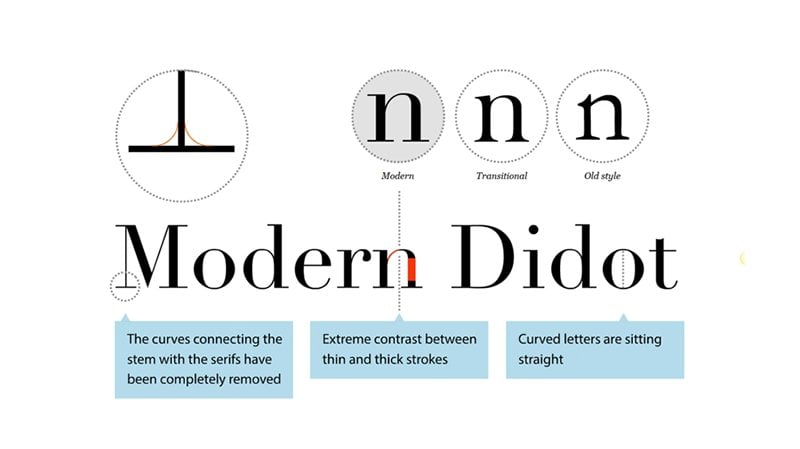
5. 05 Serifs: I'm going to go over the classifications of typefaces. Throat history type design has gone through different phases since the printing press, and each could be captured by a historical period. Most typefaces created today. Kim referenced the style of one of these periods as well. So I'm going to explain the major visual differences between them. I'm going to start with Sarah Typefaces. So what exactly is a Sarah? This is something that's going to be reference quite a bit. Eso serif typefaces are called Sarah ifs, which references the small lines or feet that are attached to the main strokes of the characters. As you can see in this example, this typeface has little feet at the ends of its strokes, which I've circled for you. Uh, so any typeface that has thes feet is referred to as a serif, so you can see the S has a Serra phone either around the R has a Sarah. If the eye has a serif and so does the F. There are several styles of Sarah ifs that have been created throat history. The 1st 1 we're going to cover is the oldest style of serif, which are literally called old style Sarah ifs and sometimes referred to as humanists tariffs. The's typefaces date back to the mid 14 hundreds and their main characteristic compared to all the other Sarah's we're going to discuss. Is there diagonal stress? Meaning that the thinnest part of the letters appears to be on an angle rather than vertical or horizontal. So as you can see in the example on screen, I've drawn somewhat diagonal lines through a couple of the letters to show that they are ever so slightly tilted and not perfectly vertical, like many other later created Serifis would be so. Some examples of old style Sarah ifs are Adobe Jensen sent or Gara Monde, as you see on screen, Kazel on and Goudy old style transitional Sarah of state back to the mid 17 hundreds and are generally still the most common type faces we used today. Some examples are times New Roman Baskerville, Georgia and Bookman. The difference between thick and thin strokes and transitional typefaces becomes more pronounced than the old style syrups, but it's still less so than modern Sarah's, which we're going to discuss in the next slide. You can also see that when transitional stairs were created. They have a vertical stress rather than that slightly diagonal stress that the old style serves Had modern Saref, such as Dido, MBA Tony, have a much more pronounced contrast between the thick and thin lines and also have a very vertical stress. So these typefaces came into existence in the late 17 hundreds, not too long after transitional Scarabs says. You can see the fix and thins on Adoni, in the example, is extremely exaggerated. The fix are very thick and the thin zehr very thin. Our final group of Sarah ifs are called slabs tariffs. They have little to no contrast between thick and thin lines and have thick rectangular slab like serifis on the bottom of them. These were created in the early 18 hundreds. Some slaps tariffs have Sarah's that have fixed fixed winds as well, so every Sarah is the same size. Despite the width of the letter itself and slabs. Arabs are also transitional into se and Sarah's, which we're going to talk about next because, as you can see, the contrast between the thick and thin lines has almost completely disappeared in the slams. A slab serif
6. 06 Sans Serif: continuing on throat history. We're going to discuss the different types of Sand Saref that have been created. The names San Serif is quite telling of what it is. They're typefaces that lacks sheriffs. Eso the first Sands tariffs were created in the early 18 hundreds and generally had a more modern appearance than Sarah ifs. There have been some studies done on Sarah's versus San Tariffs over the years on, and basically they're trying to find out which one is more legible. So some studies have shown that Sarah Ifs are innately more legible, since the Serapis guide your eye from care one character that to the next. But some studies have shown that San tariffs are so common now that they're Justus legible as any serif. So essentially, at this point in time, there is no one answer as to whether a Sarah for Sand Saref is more innately legible. They're both generally quite legible. For the majority of people, there are four basic classifications of san serif typefaces. The earliest are grotesques, which include Fonz like Franklin Gothic and accidents grotesque. These typefaces look most similar to serif typefaces in the sense that they do have some mild differences in their stroke weights. There are some thicker and thinner areas to the strokes, and they're still following serif letter styles such as the uppercase G having a spur on the bottom, which is that little, uh, section of the stroke on the bottom that comes out that jets out, or the lower case A not being like a modern lower case A, for example. But the's typefaces are still generally quite uniform in their strokes. They just have a little bit more of a thick and thin compared to the ones we're going to look at soon. New Yorker test typefaces include some of the most common type faces used today, such as M. S sent Saref, Aerial, Helvetica and Universe. They're relatively plain in appearance when compared to grotesques that have they have a very even stroke weight. As you can see here, there's not really any difference between the thick and thin areas that these typefaces everything is quite uniform, and they have a even larger X height than before. So in neo grotesques, this is really where we are completely straying away from any kind of serif type style humanist Sand Saref, such as Gilson fruit. Eager Tahoma, Verdana Optima and Lucy two grand are a little more kala graphic than the other sans serif typefaces. Because there were kala graphic, there are also more legible, which is why they're so popular, especially for text on websites. Some of these typefaces that I mentioned were even even created for Web specifically like Tahoma and verdana, As you can see in this example, there's more variation in their line wits, which is part of their enhanced eligibility. The final and most modern group of san tariffs are called geometric sentence tariffs. As the name states, they're based on geometric shapes. For example, I'm using Futura. So if you saw the letter O or the letter A, they look very circular. The letter a literally looks like a circle with a line attached to it. As you can see on the screen, the O would literally look just like a circle. So these typefaces are commonly not used for body copy and are mainly used for titles instead. Eso the geometric nature of these typefaces means that each character is extremely varying in with, for example, uppercase G compared to an M compared to a tea or an I would be very different. So in the word on screen, you can see that the width of the letter T is very, very thin compared to the width of the letter A, which is very wide. So when you see that it makes it difficult to read at smaller sizes, which is why these are not used for body copy that much because the characters with differs so greatly.
7. 07 Scripts and Display: in this final section about classifying type. We're going to discuss all the other, less commonly used type styles since they have fewer classifications. So we're going to begin with script phones. There are both formal and casual scripts. Formal scripts are often based on handwritten letter forms common in the 17th and 18th centuries. Some scripts are based directly on the handwriting of a famous person. For example, George Snell, like as you see on screen, Snell, Round Hand and George Bickham are some good examples. They're very elegant typographic designs, but they are unsuitable for body copy and should be kept to titles or any kind of embellishment on a page. Casual scripts more closely resemble modern handwriting and date back to the mid 20th century. They're much less formal and usually have stronger strokes and a more brush like appearance , as you can see in brush script, for example, So some other examples besides Brush script would be Mistral that is very common, casual script phoned once again. Casual scripts are also unsuitable for body copy and should be kept two titles only the next, and the largest group is displayed typefaces. So this is a really broad category to cover. As you can see, I have two completely different examples on screen, So the main characteristic of display typefaces is that they're unsuitable for body copy, and they're best kept for headlines and other short copy that needs attention drawn to it. Display typefaces condemn for greatly, and they could be formal, informal and evoke any kind of mood. Black letter, which we spoke of earlier when talking about the printing press, is also considered a display typeface today. And this is probably the group of type that you will use the least out of all the ones that we've talked about thus far, even though there are so many of them out there. If you were to Google fonts, a lot of them would be displayed typefaces, but they can Onley be used very sparingly. So if you're going to focus on tight faces and learning about them, I would focus on a Sarah for a Sand Saref because those are most relevant to your everyday life. The final classification is ding bats, and any other specialty type faces. Eso ding bats are pretty obvious and straightforward. They consistent symbols and ornaments instead of letters Wing Dings is probably the best known dingbat fonts. In a more modern sense, there are icon fonts that would also fall into this ding bat category.
8. 08 Weights and Spacing: understanding how to use different phones within a typeface is a basic. An important skill is a designer. Within the majority of typefaces, you'll find more than one style or wait. Weights are often classified as thin, light, regular, medium, bold, heavy black etcetera. There are many weight classifications that can go all the way from ultra thin to black. Each of these weights is a version of the previous phone, made thicker or thinner in some way, the degree to which they are made figure thinner really depends on the type face, and there isn't any kind of required standard that typeface designers have to meet in that regard. So, for example, my regular wait font could be a little lighter or a little bolder. Thin someone else's regular waited fond. Most common and high quality fonts come with multiple weights. Some examples are Helvetica, Avenir railway or open sands. Selecting typefaces that have multiple weights is very beneficial for a few reasons, one being because usually typefaces that come in multiple weights are made by a skilled typographer, which ensures that your fault will be of higher quality. This doesn't always apply, but it's something to look out for and to picking one typeface with multiple weights can be an easy way to ensure that your typography is going to look good altogether. So if I choose Helvetica regular and Helvetica bold, they were made to work together. So becomes kind of a no brainer. Different styles outside of the original phone style is italic and oblique, which are often confused or used interchangeably. There are actually two distinct styles. An oblique is simply a slanted version of the regular characters, and sometimes an oblique is included as a separate fault within a tight face. Metallics are slanted, just like obliques, but are actually a separate set of characters with their own unique letter forms. A typographer draws italic letter forms separately from the rest of the typefaces. These two often get confused because of language used in common text editing software like Microsoft Word. For example, if I select aerial regular as my phone and then I press the I button to italicize it on any kind of text editor, that is just the computer mathematically slanting the typeface, which is actually an oblique and not a metallic. In order to get a true italicized thought, the typeface would have to come with an italic version that you can physically select from the drop down. Now we're going to discuss the difference between all caps and small caps. First of all, what are small caps? Most people actually haven't seen riel small caps. They see the small caps generated by a Web browser or a word processor rial. Small caps are a separately made fought by the typographer, a similar situation to italics. Oftentimes, small cap fonts even have to be bought separately from the rest of the typeface. Small caps are essentially short capital letters that have been designed to blend in with the lower case letters. They're usually the same or ever so slightly taller than the X height of the other lower case letters. If you're going to use small caps, be sure to use the separate small caps phone. And don't just have your word processor scaled down regular all caps because the phones capitals are just being scaled. Eso results in the fake small caps being too tall and their vertical strokes being too light. As you can see, all screen, all caps and small caps do have a certain kind of scaling to them if I were to take the top version, which is in all caps, and scale it down to be small caps, all it's doing is taking those all caps and squishing them to be shorter. And it looks squished and designers comptel that they are not small caps. The final area we're going to talk about in this video is spacing, So there are two types of spacing for typefaces. Proportional or mono spaced. Proportional means that the space the character takes up is dependent on the natural. With of the character, a ni takes up less space than an M. For example, mano space typefaces are the complete opposite. Each character takes up the same amount of space. Narrow characters simply get a bit more spacing around them to make up for the difference. In with a good example of model space type that some people may remember is a typewriter. A typewriter uses little metal blocks for each character. Each block was the same with, and thus each character is mathematically spaced instead of optically spaced. Proportional typefaces, which are optically spaced, are innately more legible than their monitor spaced counterparts. So when you're setting type, go for proportional spacing, don't go for mathematical spacing
9. 09 Anatomy: typefaces have anatomy just like the human body. In this video, we're going to go over all the terms for the different parts of letter forms. If you're looking to become a designer or improve your typography skills, thes air, not terms, you will use verbally that often. But they are terms that you will think about when choosing and analyzing typefaces. So let's get into it. The baseline. It's the invisible line in which all letter sit on as even. See all the major portions of the letters sit along the same line in order to keep text straight and easy to read. Cap. It is the distance from the baseline to the top of any capital letter. All capital letters should have the same cap height within a typeface, but the cap height will differ from typeface to typeface. Some have a larger cap height than others, which is neither good nor bad, just something to be aware of. The X height is located somewhere between the baseline and the cat pipe. It refers to the height of all the lower case letters, like the cat pipe that excite within a typeface should be consistent but varies from typeface detect face Sarah ifs, which we've already discussed. Are there slight projections or feet finishing off the strokes of letters on certain type faces? Dis enders refer to the part of the letter that falls below the baseline. For example, a lower case. Why G J work you. Conversely, a sender's refer to the parts of letters that full above the phones X height. This does not apply to capitals, which fall innately above the X height. This is only referring to lower case letters such as B, D, H or L ligatures are the strokes that join adjacent letters. For example, An effort and L. A could be combined to become one glyph. This was used in the days of the printing press to save space and materials. Paper was expensive at the time, and it made everyone's lives easier to use combined letter forms where they could rather than to individual ones. Today, many phones and don't include ligatures, but some still do. It's a throwback to earlier old style Sarah Ifs and the printing press. The stent is the straight vertical stroke that appears on many different letters, including letters such as lower uppercase L or H, as you see on screen, try to remember this by thinking about the stem of a flower. The arm is a horizontal or day or diagonal stroke that is only attached to one end of the letter form. For example, the top of this upper case E the bar, or sometimes called across bar, is the horizontal stroke in characters such as an upper case, A or H or a lower case E or F Ah, bowl is the curved part of the character that encloses the circular or curve parts of some letters like lower and uppercase d be Oro. The counter is the empty space inside the bowl on letters like D. B O or A The spine on Lee refers to one letter, and that is the curve portion of the body of the letter s. No other letter has a shape that remotely resembles a spine. So this term is Onley referent referencing the letter s Whether that's lower case or upper case, Finney, ALS or terminals are the tapered ends of letters without sheriff's, such as E, C, F, or J, a letter that could be very different and has a lot of turn specifically for it is the letter G on. Here is the small stroke that projects from the top of some lower case cheese. Not all lower case cheese have this. A link is the stroke that connects the top and bottom of some lower case G's. As you can see in the example, once again, not all lower Case G's have what is called a link. All lower case. Jeez, do have a loop, and the loop is this lower portion of the lower case G. If it's a more modern G, that curve is still the loop of the G. The spur, as we actually mentioned in an earlier video, is the projection off the main stroke of a capital G, and this Onley references a capital G. No other letter has a spur, at least in the Roman letter system. The shoulder is the curve stroke at the top of an H, M, or N, and finally, a tale is the descend er of a Q or the diagonal stroke of an R. I know this was a lot of information, and it's not something you have to fully memorize, but it's something I urge you to look into and notice about letter forms. When you look a thumb, there are lots of sites out there that will help you learn the anatomy of typefaces. So if you want to look into this further, I urge you to do so. It's just something you have to understand. So when we're talking about letter forms later and how to pair them and I start referencing anatomy or something along those lines just so you know what I'm talking about?
10. 10 Leading: these videos were going to get more into application of typography from here on out. I know the other videos were a lot of information. Hopefully, that wasn't too overwhelming. But typography is one of those things you can spend years learning and still not be an expert. Let's get into the topic of this video. Leading letting refers to the distance between two bass lines of type, so as you can see the example from the bottom of the second line, toothy bottom of the first line, that is the space were referring to, and all the numbers we talk about are going to be referred to the number of points between those two lines. So if I measured from the baseline of one line two of text to the baseline of the one below it, that measurement exactly is letting. It can also be referred to as line height. If you're familiar with coding or development, the two are the exact same thing. The word leading originates from strips of lead that hand type setters used on the printing press to space out lines of text evenly seven between each line of wooden or metal blocks. There would be a strip of led. So that's why we use the term letting. And that's also why it programming. We used the term line height, which is a little more modern, so the stir, the truth has stuck and basically refers to line spacing or line height. However you wanna refer to it. So how do you determine how much leading to use? There's a vague mathematical formula to it, which depends on your phone size. So if you're trying to figure out the leading for a paragraph of text where the text is 16 point, for example, you want your letting to be minimum two points larger than the font size. So in this example, that means if your body copy is 16 point than you're letting, should be at least 18 point. You're spacing will very based on the font you're using, some just innately have more or less space built into them. Ah, general range I like to use is to add 2 to 4 points, depending on what looks right, which means in this example, you're letting could be anywhere from 18 points to 20 points. So as you contain the examples, letting is very important to how you read, you can see the first option. The leading is very tight in the second option. In the middle, the learning is extremely spaced out and on the right. The leading is just right essentially, and the one on the right is easier to read than the other two because you can easily go from line to line and find your next line and not re read the same line or get confused in any way.
11. 11 Tracking: tracking is our next topic of conversation. Tracking refers to the space between individual characters within a broader group of characters. Eso changing the tracking affects your overall character density of your text. So when you set tracking in a program like Sketch Fig MMA, any adobe programs, whatever, using your setting, a character spacing that applies to all characters in that group. So that could be, in a word, a line of text, a paragraph or any broader portion of text. It could be across an entire document. If you're familiar with coding, tracking is referred to as letter spacing or word spacing in CSS, so those are synonymous. Adjusting the tracking can enhance the re the ability of type, but can also be used in print designed to make lines of text. Look. Even so, if I am designing, let's say a magazine or book and my text is looking on, even maybe I have some lines of text that go over into the other page, and it doesn't look good. I could track out previous lines of text to maybe a little tighter so I could fit that line of text back in with the rest of the paragraph, for example, so each typeface comes with a different amount of letter spacing built into it. So sometimes you may not need to use tracking it. All the phones. Letter spacing may be sufficient, but for some you may have to reduce or increase the tracking until a text is not looking too tight or too spaced out. As you can see in the example, the one on the left is too tight. The letter forms are very close together in the middle. They are far too spaced out to the point where the I can't even connect one letter to the next letter to put a word together easily and then on the far right. This examples good. There's a little bit of space between the letters, but not too much that they don't look related to one another anymore.
12. 12 Kerning: Our next topic is Kern Ing, which is very similar to tracking, since it refers to the space between letters. But it refers to the space between individual characters, and when you change that spacing, it also happens on an individual basis, not across the board, like it does with tracking. Most bonds have defaults, basing for individual characters so that the spacing seems more natural. But this is something that's still done mathematically by a computer. Humans view space optically, not mathematically, so it's still up to the designer to typeset text so that it looks evenly spaced rather than it being actually equally spaced. Turning is not something you do toe large bodies of text. I would never current an entire paragraph. I would only use tracking or letting on a large body of text. Kern ing is something that's usually limited to titles and headlines. When we're turning all caps, you want to make sure that you put much more space between the letters. Since all cap letter forms appear closer to one another than lower case letter forms, turning is something that is also not expected in digital design, since it would be very difficult for developers to current properly, if at all. There is no CSS command for Koerting since letter spacing in CSS actually refers to groups of text, which means it is tracking and knock earning. So turning is something that is mostly sticking to the print and traditional graphic design world. So in the example, on screen, you can see on the left side the Kern ing is uneven, like the space between the K and the E is very different between the E and the R, and or in the end and so on and so on. This basing is no optically even at all. Ah, and then on the right, you can see that the spacing is more or less optically, even which makes it easier to read. You don't get hung up on the differences between the spacing and you just read the text very easily.
13. 13 Paragraphs: There are a lot of details, like go into typesetting and we're going to cover all of the most common ones that you're likely to come across. If you are familiar with typesetting at all, that I'm sure some of these will come as a surprise to you. Let's start off with widows and orphans. Designers have kind of a morbid sense of humor when it comes to these names. By the way, a widow is a loan word that appears at the bottom of paragraphs. A column or page, As you can see in the example Avigen Z. Something about this feels a little bit awkward, and you want to avoid it as much as possible in weather app design. It's something that you can't really control very easily. The text will fall based on how the text boxes set by the developer, and every situation will never be accounted for. So don't stress the small stuff in that situation. But in print design, you can manually fix this by adjusting the tracking of the line or lines above the widow. Or you can forcibly bring down a word from the previous line so that the widow is no longer alone. An orphan is a similar unwanted straggler, but describes words that appear at the top of the page. As you can see in the example, the word or group of words has been separated from the rest of the column and also creates a broken, awkward way of reading. Once again, this is something that designer would manually fix by tracking out the previous lines of text to maybe try and fit that word or a couple of words back into its previous column, or bring over a couple of lines. A text from the rest of the column Paragraphs continue on the other page or column should have at least two or three lines of text on that page in order for them to be comfortably right. So in this situation, there is one line of text in the column, So I would take the last two lines of text from the other column on the left and bring them over to the column on the right so that there's not that straggler on on that side dashes or something that most people don't get technically right. I see people use dashes and incorrectly all the time, so there are three kinds of dashes, hyphens and dashes and em dashes. Hyphens are the shortest of the three dashes and the ones that are most commonly used since they are directly on your keyboard hyphens air used at line ends or on hyphenated words such as state of the art. You can also see the hyphens used in this example there hyphens at the end of all these words, which are cut off due to the text box with. When words get cut off and become hyphenated and paragraphs, you have to make sure that enough words are left behind and carried forward into next line in order to make sure that the word can be recognized, or at least so the reader can recognize that the word is being cut off. So, for example, finally, if you're forward is finally leaving F I dash, and then now Lee into the Next line is conventionally acceptable as a line hyphenation. And but final dash at Why is not because it takes too little of the word ahead to the next line final could be a word in itself, and it doesn't necessarily indicate to the reader that there is more to the word because final is a full word. But F I is clearly not a full word, and neither is Nalley, so the reader would pick up on the fact that these words or hyphenated and that something's missing. You also want to make sure to avoid more than three consecutive hyphenated lines in a paragraph, because it breaks up the cadence of reading when there are too many hyphens in a row. So, as you can see in these examples, there are four hyphens in a row on the left side. This is far too many. The one on the right has three in the entire paragraph. It doesn't have three in a row, so that is technically more acceptable than the one on the left. Let's talk about the other types of dashes. So alternatively, an en dash is wider than a hyphen, and an en dash is even whiter than an en dash. The name and dash refers to the dash being as wide as the letter n in net font and the em dash being is why does the letter end in that phone? An en dash is used to represent a span or range of numbers dates for time, whereas an end Ashkan replace commas, parentheses or Coghlan's run world that most people don't follow when it comes to all these dashes is that all dashes actually should not have space around them. As you may have noticed in the examples I've shown thus far, there are no spaces around any of them. So if I were to write a date and it was May 28th to May 30th there would be no space around that dash. I often do see spaces around the dash, which is technically incorrect. Okay, setting openings. Two paragraphs is also something that a lot of people don't fully understand. Whatever you may have learned in school may be wrong. So in classical type setting, a paragraph in Dent and a space between paragraphs both mark a pause, setting the paragraph apart from the one that precedes it. So in Indian and space functionally mean the same thing and should never be used together. If the paragraph is preceded by a title of some kind, that first paragraph should not have an in debt. Since the paragraph start is already made evident by the title now that you know this. If you look at most magazines or newspapers, you'll see that this is actually how most print pieces or types that even if you weren't doing this before, it doesn't matter if you choose an Indian or a line break to separate your paragraphs. It's totally up to you, and it depends on the situation. You just have to pick one on websites. Line breaks have become more popular, but it's really just whatever works best for you. Text alignment isn't always an issue for most people. There are only a few options for you to choose from. As you probably seen in your word processor. There's great aligned left, aligned, center aligned and justified just to give an example in case anyone is unsure of what I'm talking about, right Align Text means that the line of text starts all on the right of your page or text box, and the left side of the text has ragged edges, as you can see in all these examples. So when the edge is not perfectly straight, like it isn't justified, that is referred to as ragged. So, for example, left aligned, ragged, right is also a term that designers sometimes use justify. It means that there are no ragged edges in your text, all the text lines up so that it lines up on both the right and left side, which sounds great but actually isn't so easy to pull off properly. So first of all, your last line of text may not reach the length of the textbook text box in your justify text, so your last line of text in a justified paragraph could end up being right, centered or left aligned. But the main issue with justified text is that justification creates rivers, which are these gaps that you see between words and letters on the screen. These rivers make it extremely difficult for people to read the text and are an absolutely no no and typography. This doesn't mean you can never justify text, but if you do want to justify your text, you're going to have to put in the work to current and track the entire body of text to remove those rivers. It's quite a bit of work, and if you're not open to doing it, then I would advise you to just not justify your textile and the final detail that often goes unnoticed is that there are different types of quotation marks, typewriter quotes and typographic quotes. Typewriter quotes are the one on the top in this example, and typographic quotes are the one on the bottom. Different languages also use different quotation types and have different rules around quotations. But here I'll be focusing on the rules for English. In most phones, the default quotes are typewriter quotes, which are these straight quotes you see on the screen. They're introduced to take up less space on the typewriters keyboard. These air technically, not the quotations you want to be using, but most, if not all, fonts also come with typographic quotes in there glyph set. And if your software allows you to go into this cliff set, you can turn on a typewriter quotes in your general settings in order to make thes automatically available. Using typographer quotes gives your text more refinement, but won't really change your ability to get your point across whatever you choose to use. The most important thing is that you use the same kind of quotation marks throughout your design because the only thing that would be worse than typewriter quotes would be inconsistent. Quotation
14. 14 Line Length: for every line length there's was considered a comfortable measure for the human eye to read. The measure we're talking about refers to the number of characters in a line of text, which includes not only letters but also spaces and punctuation. So for a single column in print or on a desktop, uh, you want to stay between 45 to 75 characters in a single line of text. You don't want to go below 45 or above 75 or us. The reader's ability to read becomes hindered, which will discuss more later. The ideal number of characters in a line was actually found to be 66. That's the measure in which humans read the most optimally. But I don't expect anyone to try to make sure that all their lines of text have 66 characters in them. That's near impossible to do, and it's not important enough to try to do it. If you want to be more optimal about your character, count on more realistic goal to aim for would be between 50 and 65 characters. When you're reading lines of text on a mobile device like a phone. The measure you should be aiming for changes due to the fact that the screen is a much smaller size and the text is also enlarged to be more readable in that small screen. So the measure you want to aim for on the phone is 30 to 40 characters per line. If you're line of text is too long, then the reader's eyes will have a hard time focusing on the text. This is because the line like makes it difficult to gauge whether where the line starts and ends. It also makes it harder to continue on to the correct line in large blocks of text. I'm sure some of you have accidentally reread the same line twice, or maybe skipped a line when reading. I know I've done that. That's because the measure for what you were reading was too long. It's not your fault. It was just improper typesetting. Conversely, if your line is too short that I will have to travel back, often breaking the readers rhythm lines are too short can put stress on the reader, making them begin the next line before finishing the current one and potentially missing important words and not really understanding the content
15. 15 Text Sizing: tech sizing is a very big question for a lot of my students and people starting out with typography in general. So I'm going to give you some pretty easy to follow rules. I'm gonna break this up into separate rules for Web in print type because they are quite different. Let's start with Web tech sizing. So for body copy. Also notice paragraph text. You want to keep your text between 12 points and 17 point. The most common tech sizes in that range are 14 point and 16 point, which I find are used overwhelmingly mawr than other sizes in that range. But technically, anything in that range is not too big or too small. They should work well for people who don't have perfect vision. Accessibility standards recommend 16 point as your body copy size, but it also depends on who your audience is. If your website or product is for an elderly audience, I would recommend 16 or 17 point. But if that's not the case, you can really choose. However, you see fit to use any of the typefaces and type sizes. Within this range, large text or title text is considered 18 point and up. There isn't really a standard or a limit to what your text can be. As a title, it's very dependent on the design and the look you're going for. It also depends on what your paragraph text is. For example, if you use 17 point paragraph text, an 18 point heading wouldn't offer enough of a difference between the two. But statistically, the most common header text is 24 to 26 point. However, Like I said, that's just just a statistic. Don't let that limit you, and it really depends on what you design for print tech sizing It's a little different. Prince sizing is actually much smaller than Web sizing. So for print, depending on the type faced, your body copy would probably fall between nine and 12 point a typeface with a larger X height. Like many Sant's Arabs look larger and can thus be used at smaller sizes. So, for example, if I was using Helvetica, I would probably make the text nine point maybe 10 point max. But if it was CASS alone, I would make it 11 or 12 point because the letter forms appear much smaller, especially in the lower case as you can see in the example in the screen, in some instances you can go a little smaller for body copy like on business cards. For example, Text can go a smallest seven or eight point on a business card and title text imprint is also comparative, just like Web, so some subtitles could be 16 points and titles could be 20 point, but it really depends on the range of texts that you've used for your body copy and captions.
16. 16 Roles and Personalities: in this video, we're going to discuss the different roles that type biographers in 10 typefaces to play as well as the different personalities they can have with some examples. When I'm talking about rules, I mean that some fonts are made with intentions to be used a certain way. For example, some type faces were meant to be only used for header text and were not meant to be used for body copy. Sometimes that's very clear, like we've already talked about with scripts and display phones. Those are far too difficult to read his paragraph text, but sometimes it's a bit more subtle in that I'm going to bring up a few examples of phones that were meant to be header text. One that makes the most sense is baby us. It's a very bold phone, and it's only available in all caps, so it's kind of obvious as to why that wouldn't work out well. For paragraph text, let's try a more subtle example. Future up feature is a geometric san serif, which was discussed earlier in the course, and as I said earlier, geometric typefaces are usually limited to header text the width of each of the characters in Futura is far too different, making it not as ideal to read his body copy as some other phones. It doesn't mean that future would be yours choice, but it wouldn't be the best choice for body copy. Now I'm going to show you an even more subtle example. Railway, the designer of Railway actually flat out states in its description that he intended it to be used for headings and large text usage. But it seems like a pretty average looking typeface. It's not overly geometric. The letters don't have crazy, varying wits, which is why, if someone did use this, his body copy, I wouldn't be surprised or upset. It would probably work just fine, But certain characters in the phone are slightly unusual, like the italic k, the W and how the numbers fall in the baseline. As you can see below the title here, all of these in your body copy wouldn't be a huge deal, but these little details, or what signified that railway was intended to be header text. Now let's get into fault personalities. The possibilities are endless with fonts that you could choose to fit the look of your brand website or product. We're going to go through some examples, and we're going to describe their personalities along the way. For a first example, Modern Serifis like to Dough or Bertoni, have a very elevated, sophisticated, luxurious personality. They be perfect for a brand that is very expensive or sells luxury products. As you can see, Harper's Bazaar is written in, but in Dido, and so is Vogue, or at least some variation of Dido, and both are very elevated brands. Castle On is also a surf on but has a bit of a different personality. It's very classic and serious. It's something you would use till look serious, corporate trustworthy, something I'd maybe write an important document in. As you can see, a lot of books are written in Castle on our next example is Most Era, which is a very friendly and casual sand serve. You could use it in a blob or something where you want your brand to seem very approachable in modern, just like you can see in the website here. It's a very modern website, very minimal, and Monserrat gives it a little bit of a fun personality. So when you're thinking about how to choose a phone for your business or for your client's business. Think about the personality of the business itself. What does the business stand for? What do they want people to think of them? What situation will be used in What is your audience used to, and what are they attracted to? Asking yourself All those questions will help you choose the personality of the font you want. And once you understand what that personality is, it doesn't mean that there's on Lee going to be one typeface that will fit the bill. There could be many typefaces that match that personality, and that's perfectly OK. There isn't one right answer.
17. 17 Hierarchy: hierarchy is a huge deal in typography. You can set your text perfectly and choose amazing phones that look great together. But if there's no hierarchy in your layout than it all goes downhill, typographic hierarchy can be used. In many ways, it really depends on what exactly you're designing, but it's usually recommended that you have three levels of hierarchy. So that means one primary level, like a header, a secondary level like a sub header and a tertiary level, which would be your body copy. It doesn't always have to work out exactly as I just said, but that's very common, hierarchical combination. You can always look to traditional publishing formats like newspapers and magazines for good examples of visual hierarchy. I'm going to show you a few examples here. You can see that the fonts are combined in a way that visually separates the different textual elements, and this one has a lot of different textual elements. This could be achieved in a multitude of ways. A simple one is font size. Obviously, fallen size is a clear one, having a larger header, smaller subhead and even smaller body copy creates clear hierarchy. Other ways are the weight of the fonts. Maybe a boulder fought for the title, and the spacing between each section of the text can all contribute to how the I should navigate the page. You can see in these examples, which are both print and digital. The hierarchy is very strong and has been achieved in different ways. The one on the left is using a huge variation in text size. The example in the middle is using size as well, but not to the same degree is the one on the left. Ah, and it's also using boldness, and the one on the right is using primarily color to create hierarchy as well as some size differences. Ideally, you want your hierarchy to reflect how you want the user to read the text with. The most emphasis should be the first thing that you want your user to read.
18. 18 How to Pair Fonts: they're several things to consider when pairing typefaces, and we're going to run through this list with examples. One. Choose complementary typefaces like we talked about in an earlier video. Typefaces have distinct moods and personalities. You want to make sure that the mood of your type choices matches the purpose of your design . For instance, a rounded, bubbly tight face may be appropriate for a child's birthday party invitation, but not for your business newsletter. As you can see here, here's an example of type that matches the mood of what they're designing for its very modern. It's a little bit rugged in a way, and you can see that the two typefaces that they used reflect that to consider context where your design is going to appear should help you determine the typefaces that will work together for your project. Both should be relevant to your designs context and should be typeset in a way that makes sense for the situation. For example, text on a billboard and text in a magazine are two very different situations, as you see here text in a magazine we've chosen a Sarah font at to varying sizes. One is very small because it, after all, is a small piece of paper. In this example, this is a billboard very large fought. There is no pairing of fonts in this case, but we have a very large font, very minimal text because I'm driving by this billboard. I'm not choosing to sit down and read it like I am a magazine. Three. Limit the number of typefaces use. In most cases, you should limit the number of typefaces used in a project to a maximum of three. This is my no means a heart of fast rule if you're season professional. When it comes to typography, there are ways you can make more typefaces work together. But for the majority of people, you should limit the number of typefaces used to fall between one and three. Most examples of design will have no more than three typefaces in them. As you can see here, we have an example that uses far too many typefaces, and one uses just one typeface, and they kept it simple, and it's much easier to read because of it. Another option, but not necessarily a rule, is to use violence from the same family. This is always a safe bet since they were created to work together. There's no way to fonts within the same family. Won't look good together in the example I'm showing you on screen. This entire site is using Gilroy as their fought. Try looking for families that have a range of options, which include different weights styles in cases to ensure that you have enough variation toe work with for your purposes. If you don't feel super confident pairing different fonts, try using one farm family and use that to get used to using hierarchy and different kinds of contrast to create a good design. Once you feel comfortable that then you can dive into pairing different phones. Another suggestion, but not necessarily a rule, is to mix sheriffs and san serves. This could be your next step. After becoming comfortable with using phones within the same family, Sarasin Sand Saref are often mixed because there clearly different and that clear difference really helps creates hierarchy. Thies to font styles tend to work well together, particularly at contrast ing sciences. But by no means is this a rule. For example, you could pair a serif with another Sarah, and there isn't anything wrong with that. It just depends on the syrups you chose. Keep in mind that this suggestion doesn't mean that you compare any Sarah and any Sand Saref and that they're automatically going to look good together. You will have to make sure that your typefaces have a similar mood and look good together. We're going to go more into detail about that later. You can see in the example on screen the serif in the Sand Saref have some similarities to them, like they're both kind of rounded, and they both have a similar X height. But otherwise they're very clearly contrasting. Going into my next rule, it's to create contrast. Like I said, one of the main reasons pairing a serif and sans serif work so well together is that there clearly contrast ing. The idea of contrast brings together multiple concepts that you should be considering including hierarchy and how typefaces complement each other. Contrast can be achieved in a number of ways, like through style, size, weight, spacing and color. The difference helps great distinct rules for each typeface, allowing them to stand out as individual pieces of information. Seven. Steer clear of conflict When parents faces. You do want contrast, but you don't want conflict. Just because phones are different doesn't mean they automatically work together. Typefaces that share some qualities are more likely to look harmonious together, even if their overall appearance differs. Some qualities you can look. Four are similar. Proportions seem cap height, X height, similar curvature like if both look very rounded, like in the previous example I showed on screen, you could look for if they're both condensed or extended and see how that makes some work together. So in this example, this is not a great combination. Both of these are Serra's, which could be fine, but in this case, the stair of certain in a way to similar and also different in the wrong way. So their differences is that one is condensed and one is extended, which may not be another problem in another combination, but in this combination, it's not working. Our final rule is to avoid pairing typefaces that are too similar. Choosing phones that don't have enough contrast becomes problematic. It can either make the information not seem separate is as it should, or maybe someone will notice something is off and assumed the designer made a mistake. Not enough contrast means no enough hierarchy has been established within your design, which can hinder reading ability. As you can see, here is an example of typefaces that are not too similar on the right, but also not the most contrast ing compared to the other type faces that look far too similar. Something about the design on the left seems off. Hopefully, these tips help you with pairing phones. In our next video, we're going to go over some examples of free phone pairings for you to start with and discuss why they work.
19. 19 Pairings: welcome to the final informational video of this course. You had a lot of information thrown at you throughout the course. So now I'm going to go over some fault pairing examples and explain how exactly they work together. I'll be mainly focusing on Google fonts since their free, good quality and easily accessible for everyone. So let's get right into it. Our first example is going to be a serif and sans serif. Remember, one of my suggestions in the previous video was to combine Sarasin San Sarah, since their differences offer clear contrast and help create hierarchy in your design. So here's the first example. The title fond here is Lotto, and the paragraph text is Merryweather. One reason these work so well together is that their cap height two X height ratio is almost identical. Usually, say Sarah, phones have a smaller, X heightened Sansa, her fonts. But Merryweather is a very modern fault and is made for screens, so it has quite a large X height that also happens to match late owes X height, which is perfect. They're also quite open in their rounded letters and have a similar aperture to their letters. What I mean by aperture is I'm referring to how open the letters like S or C are in the areas where there's negative space. You also can't tell in this example. But they're tallix are slanted at the exact same angle as well. The difference here that makes them contrast each other. Just enough is obviously the Sarah ifs, of course, but also that Merryweather is slightly condensed compared to Lado. My next pairing features open Sands in the title and Laura for the paragraph text. This pairing is a little more contrast ing than the last, so the cap height to excite ratio on these two phones is similar, but not a similar is the last example. The character within spacing on both East phones is almost identical, though the strong contrast comes from Laura's Kala graphic styling and the very open aperture then open Sands has, which Laura does not have. This next concept isn't as easy to come by, but it's not completely unheard of. The title we have here is quatre gentle, and the paragraph text is Quadra Gento Sands. So these are two separate typefaces made by the same typographer and were clearly meant to work together. Quadra Gento Sands looks quite similar to its share of counterpart. It, of course, has the Sara's removed, but otherwise they have the exact same cap height, X height and with to their characters. The San Serif version is just more uniform, and it's strokes, and the Saref has more thick and thin portions to its strokes, as most tariffs do. But otherwise they are extremely similar. Let's move on from serif and sans serif combos into something a little more difficult. How do you pair to San Serif typefaces? How do you know if they're too similar or if they're conflicting with one another? In the example of the screen? Right now, I'm using Fear, a Sands for the title and monster rap for the paragraph text. If you look at them, you can see that something about them feels different from one another, but not so different that they're fighting each other. So fear A is a big condensed. Where's Melissa is a bit extended and has wider characters in the average typeface compared to fear of being condensed. This difference becomes enhanced fierce. Vera also has a more open aperture, whereas Melissa has quite a closed aperture. Otherwise, both typefaces have quite uniforms, strokes and not so drastically different catfights and ex heights. Something else that isn't super apparent is that both fonts, a senders and dissenters are the same length, which is kind of hard to tell here, since they're at two different sizes. But they are almost identical. Our next San serif and sans Serif pairing is Poppins in the title and open sands in her body copy. So Poppins has quite a bit of personalities for a san serves go. It's very rounded in geometric. I wouldn't say open. Sands is a condensed fought, but compare a ble to Poppins. It is. Poppins also has some thickened thins to some of its characters that are a little more exaggerated than open sands. They also have extremely different apertures. As I said earlier, open Sands, as the name implies, is very open, and Poppins has a very closed aperture. So I have a lot of differences here. What's making these two not butt heads. Both have a very large excite, and their cap height to excite ratios match up almost perfectly. The fact that Poppins has a little bit of thick and thin to it, Which is kind of hard to see in this bold version. But when you lighter on Poppins, you see it more clearly. Kind of makes it a little more similar to a serif and sans serif pairing. Even though they're both sent tariffs, our final grouping is going to be serif on serif typefaces. This is going to follow a similar analysis to Sansa earphones, but I wanted to show some examples anyway for reference. So Bree Serif is the header in this example, and the paragraph text is Laura. So clearly Brie is much bolder. It has slab like Sarah ifs and more uniforms strokes than Laura. Laura is more Kala graphic and has a lot of picks and thins. Laura also has longer a senders and dissenters, which may not be super obvious at first glance due to their size differences. Right now, however, both fonts have a very similar cap, height and excite as well as aperture. These proportions is was visually anchoring the two fonts together. Our last example is to more Serifis inner Header. We have Playfair display, and in our paragraph text, we have Alice. Both fonts are very curved, especially at the fin eels in the terminals of the characters. They have almost a feminine appearance to them. One other major similarity they have is their apertures. So you can see when you look at an E or an R that they're both open to the same degree. These things are truly what's anchoring these two falls together because when you analyze them, or deeply you see how much they contrast one another. They're Capito. Excite ratio is very different, with Playfair display having a march larger. Excite play fares also much more condensed, whereas Alice is neither particularly condensed or extended. I'd say it's quite average in with they're senders and dissenters don't match either. Alice has much longer a sender's compared to its X height. And, of course, since their serifis, they both have thick and thin areas of their strokes. But Playfair strokes are so contrast ing that it's heading into the territory of a modern serif. Where's Alice is more uniform in comparison
20. 20 Conclusion: in our conclusion, I'm going to take a minute to recap the course. We went over some basic typography related vocabulary as well as the history of typography . Like the beginnings of typography is an art. During the creation of the printing press, all the way through to the different stages of typeface design. Until modern day, we extensively went over the anatomy of a typeface and discuss different elements of a typeface like wait style spacing. Typesetting was a very important area we went over and something I really wanted you to focus on in the future. Typesetting is something that you have so much control over, so make sure that you take that control when you're designing. And finally we went in depth into how to pair fonts along with examples. Typography is one of those things that goes unnoticed a lot of the time, but it's unbelievably important if you want your design to be good. People may not consciously realize something is wrong with the tape, but they will live the consequences of those mistakes when what they're trying to read is not as readable is it could be like we discussed earlier, not knowing where to start reading, reading the same line twice, skipping lines and feeling stressed. Wall reading is not something that you want people to experience. I wish you luck with your journey into typography and design. And I want to thank you for taking my course. I hope you learned a lot.
 Cassandra Cappello, Product Designer and Educator