Transcripts
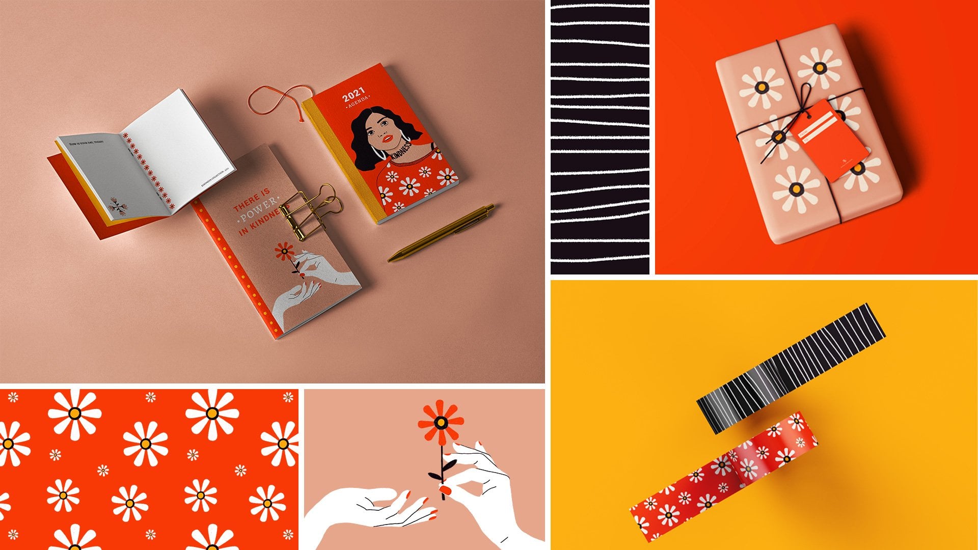
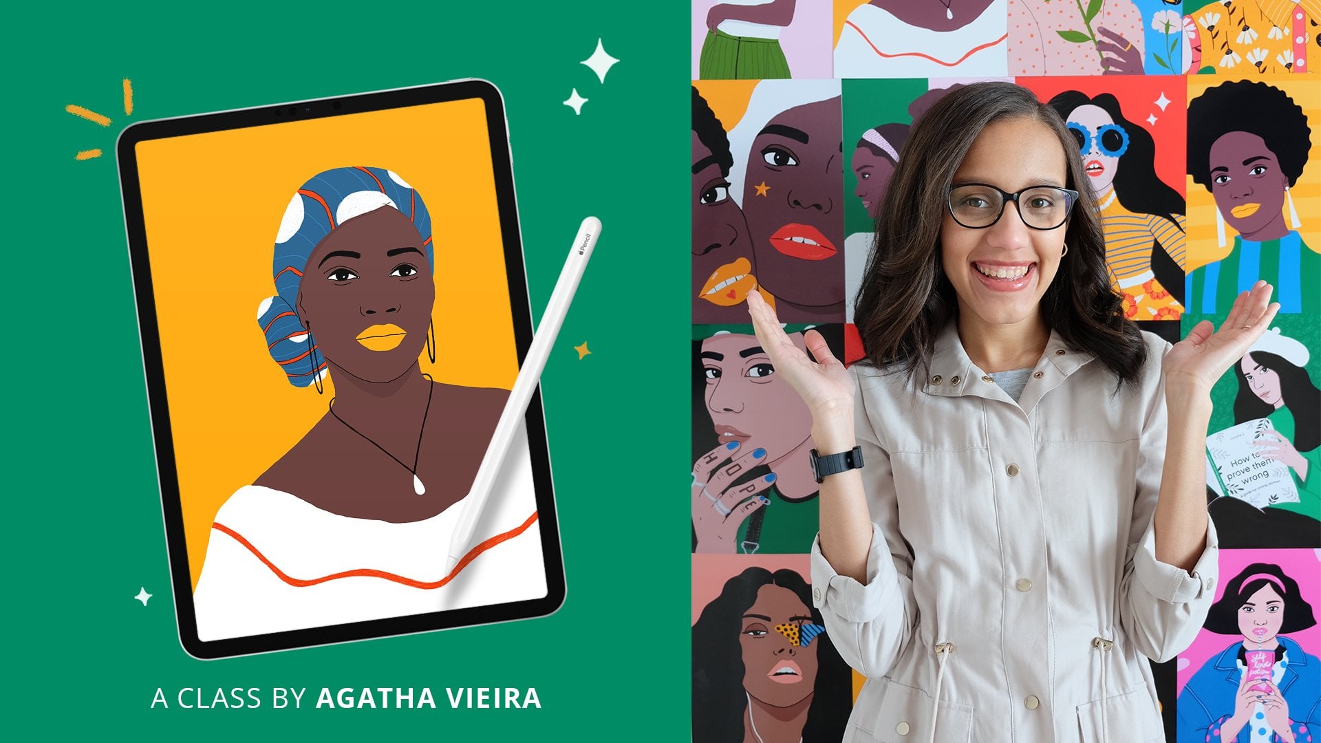
1. Introduction: What does design means here you? For me, it's a way to express myself through colors, typography, and imagery. It's a language I can use to communicate with the world. In this class, we go to journey, and learn how to use graphic design, to express an idea, or a message that is close to your heart. Hi? I'm Agatha Vieira, a Brazilian graphic designer and illustrator based in the UK. I have been working as an in-house graphic designer for different brands, in both Brazil, and the UK for many years, and most recently, I started my teaching journey here on Skillshare. I have always been a visual person. I love to pay attention to colors, images, and textures around me. For graphic design, I can express myself and channel all my creativity, my thoughts and feelings. In this class, I'll teach you how to express yourself and share methods visually, by creating and designing your very own personal manifesto. A manifesto is a declaration of your core values and beliefs. What you stand for and how you intend to live your life. It could be a statement of principles, a call to action, or bringing awareness to cause you believing, or fight for. By designing your manifesto, you will learn layout and composition tips like alignment, proximity, and contrast. What do you think when choosing impairing typography, color psychology, and how to make your designs pop. The skills learned in this class can be applied to any other graphic design project you decide to create in the future. This class is great for anyone interested in graphic design, self-exploration, and personal growth. To follow along, you need a competitive research and look for inspiration and access to Adobe Illustrator. But feel free to use any program of your choice. No prior experience is required. I'll take you through the basic graphic design rules you need to design like a pro and bring your ideas to life. By the end of it, you'll have a beautifully designed manifesto. They represent yourself, your values, and your beliefs. See you in the first lesson.
2. Your Class Project: Your project in this class is to design your very own personal manifesto. I would like you to create and design: Option 1, a personal manifesto with a list of 5-10 rules to live by. A list that will be your magical mantra to guide you to achieve your goals and to share your personal vision with the world. Option 2, create and design a manifesto on a subject that speaks to your heart as a call to action or to bring awareness to a cause you believe in or fight for. To follow along with the class project, you will need a computer with Adobe Illustrator or any other graphics software of your choice. You can also apply the same principles to design analogically, if you prefer. Once you have the project finalized, please share it in the projects gallery so other students can see your project and get inspired by it. I would also love to see your creations. Sharing is caring.
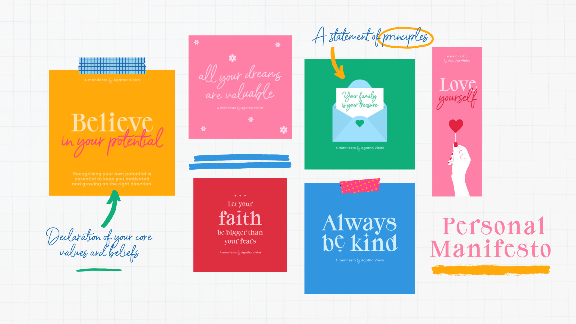
3. What is a Manifesto?: A manifesto is a declaration of your core values and beliefs, what you stand for and how you want to live your life. It could be a statement of principles or a call to action. It will highlight everything you like, fight for, or believe in. Your manifesto does not need to define you or label you. You can adapt it or you can create a new one in the future. As we're all work-in-progress individuals that keep changing as time passes by. The act of writing a manifesto is creative at its heart and it's also a journey of self-discovery and a way to share your vision, ideas or purpose with others. Your manifesto is a dream in progress and it can help you as a daily reminder of what is essential for you. I don't know if you're familiar with the most common manifesto style. I want to show you some examples, so you can understand a bit more. Traditional manifestos are usually seen in the format of a poster, text-heavy with statements like, spread your truth, grow and be disciplined, live your dreams, and so on. Usually, the text is a mix of different fonts or as in this example, the designer used only one font but changed the font size to bring movements and direct the eye to specific areas, making it much more interesting. Another manifesto I'd like to show you are the brand manifestos. A brand manifesto is a powerful tool for brands and companies. It is a clear and bold public declaration of purpose and intent. It goes much beyond the traditional mission statements. It can be used in different ways, from a brand book to an advertising campaign. Brand manifestos help brands to connect with people in a deeper way, making them relate to the brand's personality and culture. Everyone knows that Nike has always excelled in the marketing campaigns. Their Dream Crazier Campaign is a great example of brand manifesto with strong and inspiring statements like believing something, even if it means sacrificing everything. The campaign features top resilient athletes and inspire the public with strong messages of encouragement. My last example is from the UK fashion brands Jigsaw. In 2017, they released a manifesto campaign, called Love Immigration. As an immigrant myself, I love this campaign and I remember seeing it for the first time on my way back home in the London Tube. It was a very bold, socially conscious campaign in support of immigrants and immigration in a post Brexit, Britain. Let me read it for you. "British style is not 100 percent British. In fact, there is no such thing as 100 percent British, or 100 percent Dutch, French, American, Asian, or European. Whatever your opinion, at some point in your ancestry, someone moved in and unsettled the neighbors. Because none of us are the products of staying put. And we are no different. As a clothing brand, we couldn't do what we do if people weren't free to move around. Without immigration, we'd be selling potato sacks. We need beautiful minds from around the world. Working with beautiful materials from around the world. To make beautiful things for people around the world. Fear, isolation, and intolerance will hold us back. Love, openness, and collaboration will take us forward." Now, that you know more about manifestos, let's have a look into some graphic design inspiration.
4. Design Inspiration: Now that we had a look at traditional manifesto posters, for your class project I'd like to propose a more modern approach to the design. Instead of a post with all the information together, breaking your manifesto into bits can improve readability and can be easier to share with others, either online or in a print version. Here are some examples of designs that I find super interesting. I got inspired by this Instagram post by a designer Nikki Miles. I love the childish style with irregular flowers and extra elements. The hand-drawn typography is so unique and makes it fun and lighthearted. She used bright yellow as the main color and it makes total sense as yellow is a color that reminds us of happiness. We will talk more about color and its meanings in the following lessons. This design by Proper Good Prints, the designer use the limited color palette with super creative typography. I love how this extra elements, the stars and the checked border relates so well with the retro psychedelic style, pairing perfectly with the topography. My next example is by refinery29UK. This design is a good example of how to use contrast. By using contrasting fonts in the same phrase, the designer could instantly make the piece more interesting and bring attention to some of the keywords in the copy. My last example was designed by myself in May 2020 after the death of George Floyd in support of the BLM movement. It is a good example of how you can mix that biography and illustration. I think it's also amazing to use art to express a feeling in the heat of the moment and I believe my emotion was reflected in this piece. This one is also a good example of how to develop your design. You can always think about different formats to create multiple assets. Like I transformed an Instagram post into bookmarks. I also put together a board with lots of cool inspiration for you. You can access it in the link below. As you could see, most of these examples are from social media posts. I think social media is such a powerful tool for us share our ideas with others and reach a big audience. I'd love for you to share your manifesto on social media and inspire others. You can have the social media format in mind when creating your project. But feel free to choose any other formats you prefer as well. We'll talk more about formats and size and resolution in the following lessons. In the meantime, you can download this PDF with useful sizes ideas in the projects and resources area. I hope you found this lecture inspiring and you're now excited to create your own manifesto.
5. Writing Your Manifesto: For your class project, you can create a personal manifesto or a manifesto on any specific subject. Here is a quick recap on the options. Option 1: create a personal manifesto with a list of 5-10 rules to live by, a list that will be your magical mantra to guide you to achieve your goals and to share your personal vision with the world. If you choose this option, here are some examples of what you can write in your list: be kind, be supportive to others, believe in yourself, love yourself, be creative. Option 2: create and design a manifesto on a subject that speaks to your heart as a call to action or to bring awareness to a cause you believe in or fight for. If you choose this option, here are some examples of topics for you. It could be a political or activist cause that you want to bring awareness to, like fighting for women's rights or to stop racism, for example. I put together a PDF for you to download in the projects and resources area with more examples and quick exercises to help you decide what you want to create. Let me show you mine. This exercise is very personal, and there is no right or wrong way to do it. But I thought it would be interesting to show you mine as an example if you are unsure of how to complete the exercise. I chose to create a personal manifesto, Option 1. Here are some of my answers. What do I stand for? I stand for a more equal world for kindness between people, for loving relationships, for the environment, and for education for all. What are the things I like the most? My family and friends, art, and nature. What are my strongest beliefs? The importance of mental health, human rights, education, and opportunities for all. How do I want to live my life? I want to live a peaceful life, a creative life, and a purposeful life, where I can somehow inspire others on a positive way. One advice is to not overthink this exercise. Your answers will act like a starting point on your self-exploration and personal growth journey. Under my subjects of interest, I put some things that I am interested in at the moment, like personal growth, mental health, creativity, kindness, equality. Because I chose Option 1, I wrote down some ideas for my manifesto list in this space. I hope this exercise can help you to get better direction for your manifesto. Here are some important things to have in mind before you start creating your manifesto. Make it uplifting, use short sentences. For future design, keep the same style throughout; having colors, typography, and graphical elements in mind. Think about it as a mini collection or a mini-campaign. Keep it positive.
6. Creating Your Moodboard: Finding inspiration and creating a mood board is one of the first steps in any creative project. A mood board is basically an inspiration board. It can be a physical board like this one or additional collage with all your ideas and inspiration. Creating a mood board can help you to establish a strong foundation for your project and it can clarify your vision. By then you might be asking, so Agata, what goes into your mood board? Mood boards vary a lot depending on the project and there is no right or wrong on how to do it. But you must have your manifesto idea in mind and you should include color palettes, imagery, and visual language inspiration. The things includes on mood board don't necessarily have to relate directly to your manifesto. Anything can be a font of inspiration, photographs, films, illustrations, books, nature, and so on. For this project, it is ideal to focus on color, typography, and visual styles, and this inspiration can come from anywhere. As an example, in my mood board, I selected this flower as inspiration as it might illustrate a flower as a symbol of kindness. I also like the contrast between these turquoise and yellow and I like how they used contrasting elements to bring attention to this text. In typography, I really like this font star is so elegant and modern at the same time. I think I might choose something similar as my main font. In this example here, I love this script style and for my manifesto design, I think a simple script font paired with a more bold contemporary font would look super cool. Quick note on mood board references. Get inspired. Do not copy. Recap and call to action. First, research and collect your visual inspiration and then create a mood board with your collected visual inspiration.
7. Understanding Colour: It is totally okay to chose colors randomly when you're working on a personal project like your manifesto. But if you want to take a step further and become a visual communicator, you need to think about the message you're trying to get across and how colors can help you to portray this message. Understanding the meanings of colors can be super-helpful when you are unsure of what colors you should use in your project. The problem here is that color is not an exact science and its relative to our cultural differences and point of view. Something as simple as changing the saturation of a color can already evoke a different feeling to it. But now in the most common ideas behind each color can help you to make more conscious choices. Colors evoke feelings and emotions. Let's have a look into the psychology of colors. White is mostly seen as a positive, pure and sometimes a religious color. In Brazil, we wear white on New Year's Eve as a sign of peace and prosperity. In the West and Japan, brides wear white because it's a color of purity. It reminds us of innocence, peace, light, and clean. White can also be related to power, luxury, and minimalism. That explains a lot about Apple's aesthetics. Did you know white is not really a color, it is actually wavelengths of visible light. Black, on the other hand, is the absence of visible light. Yellow make us feel joy. Everyone knows the smiley face and the happiness feeling behind yellow. Because of the sun and the summer, yellow can also give us the sense of warmth and optimism. Bright yellow can also mean attention, and it's commonly used in urban signage. Darker tones of yellow reminds us of power and money. Did you know in India, yellow is a symbol of peace and knowledge. The art historian and author, B.N. Goswamy has described it as the rich, luminous color that holds things together, lifts the spirit, and raises visions. Blue feels like nature. It reminds us of water and sky, and it's also known as the color of heaven. Blue has many different meanings depending on its shades. Dark blues reminds us of trust, dignity, intelligence, and authority. Light blues reminds us of peace, serenity, cleanliness, slowness, and strength. Blue has also been associated with the masculine. Did you know blue is the number one favorite color of all people, and it's the most commonly used color in corporate identity. Orange is a confidence color that reminds us of intelligence, innovation, and vitality. Orange is also very energetic, happy, and young. Nickelodeon, the world's leading entertainment network for kids, chose orange and white for their logo. A combination that symbolizes happiness and evokes smiles. Like yellow, orange is also used as a warning color because of its vibrancy and high contrast. Did you know, because orange contrasts very well with blue, the black boxes on aircrafts are actually orange, in the hope this will make them easy to find if an accident happens. Purple tends to be a color that people either love or hate. For most cultures, purple symbolize nobility and luxury. Purple is also associated with supernatural energy and the cosmos. It symbolizes magic, mystery, spirituality, the subconscious, and creativity. Light purple are light-hearted, floral, and romantic. The dark shades of purple are more intellectual and dignified. Red is the color of extremes. It's the color of passionate love, seduction, violence, danger, anger, and adventure. Red was first perceive as the color of fire and blood, and that can explain it's power. Red captures attention. It is one of the most visible colors, second only to yellow, which explains why it is used on fire engines and stop signs to trigger alertness. Did you know, the color doesn't incite bulls, they are actually color blind. They respond to the movement of waving fabric. In the West, pink is stereotyped as the color for the female gender. But less than a century ago, pink was actually seen as a masculine color. Pink is most often associated with charm, politeness, sensitivity, tenderness, sweetness, childhood, femininity, and romance. Did you know the bright pink color of flamingos comes from beta carotene which is found in high numbers within the algae, larvae, and branch shrink that they eat. Green is universally associated with nature. It symbolizes ecology and the environment. It is fresh and reinvigorating. In Ireland, green is a lighter color. Since the beginning of time, green has signified growth, rebirth, and fertility. Did you know, before the '50s Santa's suit was green, until Coca-Cola changed his outfit to red. You can find a PDF for downloads in the projects and resources area with more information about colors and its meanings. Now that you know a bit more about the color meanings, do you think this knowledge will impact your choices? Can you think of what colors relate more to your manifesto, subjects, or style?
8. Layout & Composition: There are five basic design principles that can help each level up your manifested design and do composition, like alignment, proximity, repetition, whitespace, and contrast. Let's have a look at each one of those. Proximity is all about creating visual relationships between elements. All you have to do is group together elements that relate to each other. So if you are creating an event invitation, for example, you can give the title its own space, the group similar details like time and location together. Whitespace is all about giving your content some room to brief. It helps you define sections of contents and also helps your design to look a bit more harmonic. Whitespace is the same as negative space, like the spaces between your content, between lines, and even the outer margins. It is important to have it in mind so your design doesn't look too busy or cluttered. Alignment is crucial in any design. It's the first step to start organizing texts and elements together. The key to master alignment is to keep it consistent. You can choose to align everything to the left, to the right, or straight down the center. Without consistent alignment, your work could look a bit disorganized or unpleasing to the eye. Contrast simply means that one element is different from another. in layout and composition, contrast can help you to create emphasis or call attention to something that is important. To create contrast in this example, I've used color and extra shapes to bring attention to certain words I'd like to emphasize. This makes the design more dynamic and therefore more effective at communicating its message. Hierarchy is a visual technique to help you to give the elements on your designs different levels of emphasis. Establishing hierarchy is very simple. Just decide which elements you want the reader to notice first, then make them stand out. Important items are usually bigger, bolder, or more eye-catching in some way. Repetition is a reminder that every project should have a consistent look and feel. This means finding ways to reinforce your design by repeating certain elements. For example, if you have a specific color palette or special elements, look for ways to carry through, or if you have a special header style, use it every time.
9. Choosing Typography: Like colors, fonts can help you to portray a message and get the right mood and style for your project. You can think about what colors relate well to your personality or to your manifested subject style. To help you decide what fonts to choose, let's have a look at the four main types of typography. Sans-serif. Sans-serif fonts are those without the little feet at the ends of the letterforms. Use a sans-serif font for a modern, elegant, smooth, or clean look. Serif. As you might guess, serif fonts are the ones with the little feet at the ends of the letters. Use serif fonts for a classic, simple, traditional, or more sophisticated look. Cursive. Cursive fonts can be called script or brush fonts. They imitate handwritten and calligraphic styles and they can vary a lot. You can find formal typefaces or also messy and casual ones. Use cursive fonts for a natural, handmade, friendly, elegant, formal, or calligraphic look. Display. The display typefaces are the ones with lots of character, like this one I'm using for the class design. They're meant to be used for headers and titles and to create mood or feeling to your piece. They don't work well for big amounts of texts. Use display fonts to bring character and personality to titles or big texts. Now that you know more about the most used font styles, it's great to also understand how to pair different fonts. Here are some tips. Like in layout and composition, it's important to establish a visual hierarchy. Make sure one of your fonts is more prominent than the other. It could be the weight, the size, or even a color. This will help to separate the fonts and direct the viewer's eyes. Opposites attract. Pairing a bold font with a thin font, for example, can create a balanced and interesting look. Combine serif fonts with sans-serif fonts. If you're a beginner, this is probably the easiest combinations to have a harmonic font pairing. If you are working with only one font, you can create contrast by changing the font weight and size. Please avoid combining fonts that are too similar to each other. As you can see, it just doesn't look great. Make sure the font you choose have enough contrast between them to create a balanced look. Now you might be thinking where to get interesting fonts to start experimenting and pairing typography. It's easy to find fonts at the web at low or no cost. Free fonts are usually for personal projects only and paid fonts are for commercial use. If you plan to sell your manifested design or share it in an editorial project, for example, be sure to buy a licensed font. Here are my favorite places to download fonts. Free fonts. Behance is one of the largest creative networks for showcasing and discovering creative work. I use it a lot to find inspiration and you can also find fantastic free fonts just by typing free fonts on the search bar. Paid fonts. There plenty of great sites to find paid fonts, but my suggestion is to go on the biggest creative marketplace called Creative Market. Creative Market is an online marketplace for all types of design assets and graphics. Call to action. Think about your manifesto projects, look around the web and download and select fonts that match with the style that you want to create. You'll be using those fonts in the next lessons. Have fun.
10. Sketching Your Ideas: Sketching can be super helpful to start the design process on a good path. Painting down some shapes and forms on the paper before you start designing on the computer can save you time and make the process much easier. Please grab both pen and a paper and let's get started. Grab your exercise sheets, and think of what formats you'd like to use for your manifesto designs. It can be one or many. I'll be creating most of my designs in a square format because I want to share my manifesto on social media, but I will be adding other formats as well to create extra assets. Like a bookmark and poster, for example. Based on your exercise sheet, think about the message or messages you want to add to your designs and roughly sketch one of them to have an idea of layout and composition. It starts by sketching rough shapes and forms. At this point, you're just trying to put down ideas and see what works well to bring the best options to the computer to finalize the designs later. On my class project, I'm doing a personal manifesto. I have a list of rules to live by, and I'll be adding those quotes into the square formats. At this point, you can draw only shapes like I'm doing. You don't even need to draw the letters if you don't want because this way you can already visualize the composition. One of my quotes for my manifesto is love yourself. I'll be using this quote to think of my composition and typography. I could experiment with a script font for the words love and maybe a display font for the word yourself, and I could have a manifesto by Agatha Vieira underneath it. I can also try the opposite. A display of sans-serif font for the words love, and a script font for yourself. I like that. The important thing for you is to try different styles and play with shapes and letters. Spend some time to think about what works for you and try to identify why you believe one design is better than the other. Is it the composition, the hierarchy, the alignment? This is a good way to understand graphic design and improve the quality of your work. Select the designs you like and refine it in the computer.
11. Designing Your Manifesto: Layout: It's time to bring your manifesto to life and put into practice everything that you have learned so far. I'll be using Adobe Illustrator to design my manifesto and I'll talk you through my process, so you can follow it and create something with your own personality and style. Let's get started. Let's start by setting up your document. When you create a new document on the illustrator, this is the first screen you'll see. You can set up all the details of your projects, like size resolution, number of outputs, and color modes. If you are unsure of what size to use, you can refer back to the Formats PDF in the projects and resources area. I'll be working in pixels, and we'll set up my document to the square format, 1080 by 1080 pixels, as I want to share my manifesto on social media. On color modes, I'll leave it as RGB and on the resolution, although not necessary at all, I like to work on 300 PPI even for social media posts. Because, if you zoom in on the image, on Instagram, for example, the images still look sharp and the quality isn't lost. Once you're happy with the settings, just press "Create". To make the process easier, I have in these documents all my manifesto quotes, and I will just copy and paste it inside Illustrator. If you have many codes, you can do the same. I will start by exploring these two designs from my sketches. They are very simple, and you can try similar approach if it fits your manifesto style. Before you start designing, make sure to save your document in your preferred folder, and it's good to keep saving it as you go as well. Maybe every five minutes or so, just in case the computer crashes or something like that happens. Now we are ready to go. With the text tool, this letter "T" here, I'll copy and paste the quote, "love yourself". You can change the text size by holding the "Transform" tool, this little box around the text and by pressing "Shift" on your keyboard, you can make sure that you're keeping the original proportions. In this first phase, when I'm just thinking about the layout and composition, I like to start with designing black and white, so I can pay more attention to the composition, the fonts, how to place the elements, so I leave a great amount of white space, and it's also easier to create a strong contrast between the different words. I can add color later when I finalize adjusting the layout. Choosing fonts can be really difficult and time-consuming. For that reason, it's good to pre-select a few fonts or have in mind a clear direction for the style that you want to achieve. As per my sketch, I want to pair a script font with a display font and I will try a few combinations to see what works best. I'll actually check as well how it looks to pair a script font with a Serif Font, and then try the opposite as well, having "Love" in Serif Font, and "yourself" in script. With this either of the two, you can sample a color or a style. It's very handy, it's like copying and pasting a style. You can sample a color by pressing on top of it. You can copy it to another object, or you can copy and paste an object style, like this. Between those two options, I like this one the most, as it looks like a strong balance between the short word "love", and the medium word "yourself". I think this design could look really nice when brought to life with colors and interesting type phases. I will explore more options of fonts, to bring more character, but I'll keep the same structure. We have a winner. I'm pretty happy with this combination. Both fonts have a good amount of personality, and the contrast between them is strong, but also pleasing to the eye. The display font is strong but also feminine because the thin lines and the Serifs bring a touch of elegance to it. A script font is delicate and personal. I think it's the perfect pair for my manifesto. Now add the paragraph underneath the main quotes and to do so, I'll use the Text too and select the area that I want the text to go. Now, I'll choose a simple Sans-Serif font for this text, and then, I'll go to the "Type" menu and press "Fill it with PlaceHolder Text". This way, I can experiment with the text size and fonts. I'd like to reduce it to around three lines. The text can't be too small as this is for social media so it needs to have a good readability. Here, I'll write down a few words that relate to my manifesto quote, like a reinforcement of the message. While I'm placing elements like this, I like to pay attention at White Space and leave enough free space for the design to breathe. Up here, I'll add "A manifesto by Agatha Vieira". I will change this font to Poppins because it's more rounded and it looks much better in a reduced size. I'm happy with the fonts and now to finalize, I'll add my final quote in here. Having a second look at this design, I think the header text, "A manifesto by Agatha Vieira". It's a little bit weak, so I will change the word "by" to have the same script font from the main text, to bring a little bit of charm. Looks good to me. Time to add some color.
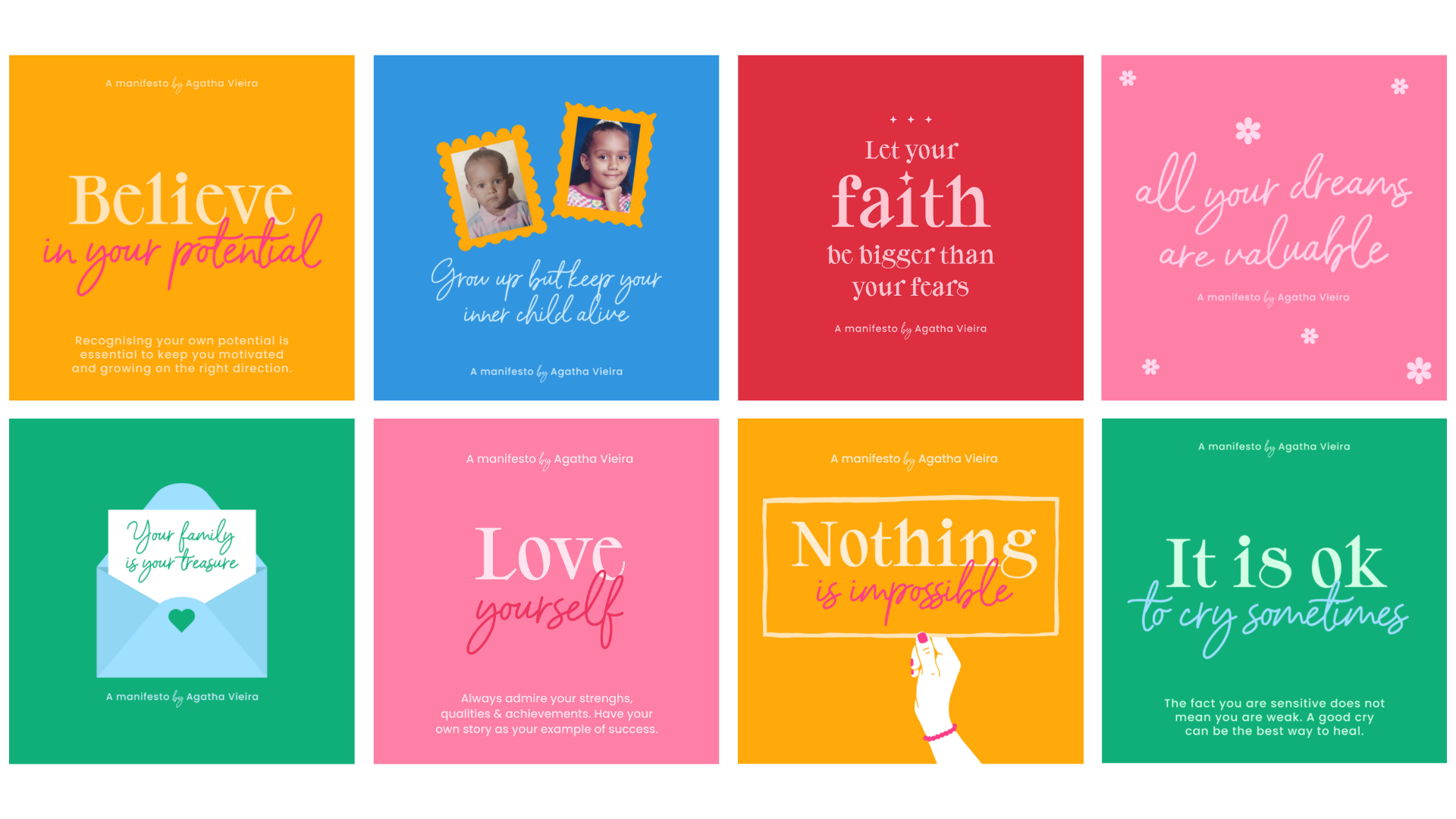
12. Designing Your Manifesto: Assembling: Now I'm ready to start adding some color and create all the other designs. I have pre-selected colors from my [inaudible] color palette, so I'll be importing those colors to this document. There are colors that I use already in my illustrations and personal work, so they relate really well to my style and personality. I'd like you to choose colors that relate to you or to your manifesto subject. You can also think about the feeling behind your message and choose colors that have a similar vibe. To add a background, I like to create a new layer, so I have text and color background in separate layers. For this, you can go into the Layers panel, click this Plus button to create a new layer and I'll bring it below the Text layer, and I will rename it. Now on the background using the Rectangle Tool, I can create a color background and go to my swatches and choose one of the colors from my palette. Because I'm talking about love, I will choose one of the pinks. I like that. Go back to the text to choose some colors. Now I will experiment with some colors for the text. I like to work with vibrant colors and contrasting combinations. It's time to see what colors go well together and what colors I should avoid putting together. Thinking about love, I'll also bring the [inaudible] color to vibrant red. I think this looks nice. To find a color that is similar to the background but much brighter, I like to select the background color, go to the Color Picker window and select a tone that is close to white. I'm happy with how this looks, and I'll go to the next quote. To copy an output, you can press "Shift Option" on Mac or "Shift Alt" on a PC. I'll keep working in the same process going through colors and topography. I'll keep the same fonts in all of the designs but I'll mix the way I'm working with text depending on the size of the quote. As this is a very simple design, it's good to mix things a little bit to bring a balance and make the design less predictable. In, all your dreams are valuable, I'll add a simple wave effect to the text. It will make it more dynamic. I want to give it a dreamy look if that makes sense. To do that, you can go to an icon here called Envelope Distort, and you can find many options of distortion. I think the wave effect works really well for this, and you can control how much of the effect you'd like to have in here. To add a delicate touch, I will add some flowers like a dream garden. To quickly create a geometric flower, all you need to do is go to the Shapes menu, choose the option Polygon, and choose six sizes and click "OK". Now you go to the Effects menu, click, "Distort and Transform", and then the option "Pucker and Bloat". Now you can slide to the bloat side and control how you'd like your flower to be. Once you're happy with the effect, you can go to Object, expand the appearance. So you have your final flower. To add the final touch, I'll go to the Shapes menu again, create a circle, and add it to the middle of the flower. To make it transparent, I'll select both shapes and go to the Pathfinder menu over here and press the second option. This will subtract the circle from the flower shape. If your workspace looks different than mine, you can always find everything in the Window menu over here, and select the option that you need. Now just rearrange the flowers around my quote to have a harmonic look. I'll carry on repeating the same design process. For the, "Grow up but keep your inner child alive", I'll be adding two pages of mini-me. To add a picture, you just need to go File and Place and choose your images. I selected some photos from when I was a kid. It's very cute. I will select both and press place and then place them here and resize it. This will bring a personal touch, and for me, it's a beautiful way to look back and celebrate my inner child. I want both images to have the same size so I will create a clipping mask. Basically, I will add a shape on the size that I want, then I'll click my photo to it. To do that, you need to have the shape on top of the image you want to mask, select both, and with a right-click, you choose the option clipping mask. To refine the photos, I'll add two frames. These are rather childish and fun look. To do that, I'll create a rectangle and bring back my photo just to get the right size and I'll right-click to send it to back. I will adjust it to the perfect size and we'll create some circles for the frame border. I'll change the color, so you can see what I'm doing. With "Shift Option", I will duplicate the circle and press "Command D" on Mac or "Control D" on PC to replicate the last action. Doing this I will fill the rectangle borders with the circles. Once I'm done, I will select all the shapes and go to the Pathfinder and click the first option to unite all the shapes in one. For the second frame, I'll also create a rectangle behind it, and then select the rectangle, go to Effect, Distort and Transform, and choose the Zig zag effect. I will then choose smooth and we'll play a little bit at the options to get a nice Zig zag effect, and that's all. For this design, I will create an envelope with a letter to symbolize how important this message is. To design the envelope, I start by creating a rectangle. After that, I will create a triangle and I'll flip it and resize it to be the top of the envelope. With this white arrow called direct selection, you can double-click on this little white dot to modify the corner of the shape. You can do that as much as you want to achieve a smooth curve. I've changed the color a bit to visualize where the envelope folds. I'll now create the sides by placing two triangles, one each side. I will now duplicate the shape and add it to the bottom of the envelope and adjust the colors to have different shades of blue. To finalize, create another rectangle to be the paper inside the envelope. Right-click to add it backwards until it looks like it's placed inside the envelope. Now I can bring the quote on top of the white circle. To add a final touch, I'll add a little heart on the envelope. There are many ways to create a heart, but this one is the quickest, in my opinion. Just create a square rotated 45 degrees, and with the curvature tool, this one here, select the middle of the top sides and hold it up until you're happy with the shape, and you can repeat it on the other side. Now, I will adjust any details and just finalize the other designs. This is the result of the social media posts to give them. The fonts and the colors show a lot of my personality and style. Although it is a simple design, it is visually appealing and positive. I used repetition by adding "A manifesto by Agatha Vieira" in each asset and made a great mix of styles keeping the same fonts throughout my designs. The fonts have a good contrast between them and the white-spaces are allowing my elements to breathe. I hope you like the results and are now inspired to create something of your own.
13. Where to go From Here?: In addition to the social media square designs, I'd like to show you three extra designs I created just to give you an inspiration and show you the possibilities of your manifesto designs. You can always resize your designs and recycle them. I do this a lot. It could be changing the format or giving it a different purpose. As an example, I created a second design option for the quotes, nothing is impossible, a bookmark for the quotes, love yourself, and a poster for the quotes, always be kind. To differentiate those designs, I added some hands illustrations. I worked on the illustrations in Procreate and exported them with a transparent background so it's much easier to add them to my current designs. I think it looks really nice in harmony with the typography. Because the background colors are so vibrant, I created those hands in white, to have a strong contrast and a clean final look. I hope you explore the possibilities and create many different assets for your own manifesto. Once you finish your designs is time to export it. To export, you can go to File, Export, Export As JPEG and make sure you select the option, Use Artboards to save all the designs in one go. I'll keep the color mode and resolution as per the original setup. I won't change anything. If however, you plan to print your designs, you can change the color mode to CMYK to convert the colors. Now you're ready to share your designs with the world.
14. Conclusion: Congratulations for completing this class. I really hope you enjoyed it, and that this class was helpful to you. We created a beautiful manifesto together, and learnt some valuable design skills on the way. I cannot wait to see your creations and I am available for feedback, questions and discussions, so feel free to contact me here on Skillshare, or on my Instagram page. If you post your manifesto on Instagram, please make sure that you tag me so I can see it. Thank you so much for taking my class and please follow me here on Skillshare, so you can get a notification anytime I share free downloads or announce a new class. Bye bye.
 Agatha Vieira, Graphic Designer, Illustrator & Mentor