Transcripts
1. Welcome to the course: Hi, My name is George, and in today's scores, you will learn how to make this wonderful landscape painting using acrylic colors. This is a very simple and easy to follow course. You will be encouraged all along the way with step by step encouragement, for instance, you will learn how to use the fan brush to create the illusion of detail so you don't have to painstakingly paint every single leaf. You will just use the fan brush to create multiple leaves at the same time. Don't feel intimidated by the complexity of the painting. This is very, very simple to make. You will see as you go along that everything that seemed very complex will easily become very simple. This is a very good course for beginners and people who have painted before to sharpen their skills that they acquired in other courses. As a beginner, you will learn how to blend colors, how to keep them clean and how to mix very vibrant and luxurious colors. No matter of the size of the canvas, you can create this specific painting on any kind of canvas. If it's a rectangle and even if it's a square, you can just squeeze the image a little bit. For example, moving this tree here could leave enough space to make the specific banking on a square. In case you don't find me on pink, you can also use a normal pink by combining white and red that will give almost the same effect. If you don't find neon pink, you can always make your own pink, combining red and white. The difference will be Onley in the intensity of the pink, the neon pink being a very, very intense pigment and giving a lot of color to the painting all along the way. If you have any questions, you compose the comment on the video. It's very simple to do, and with that said, Welcome to the course.
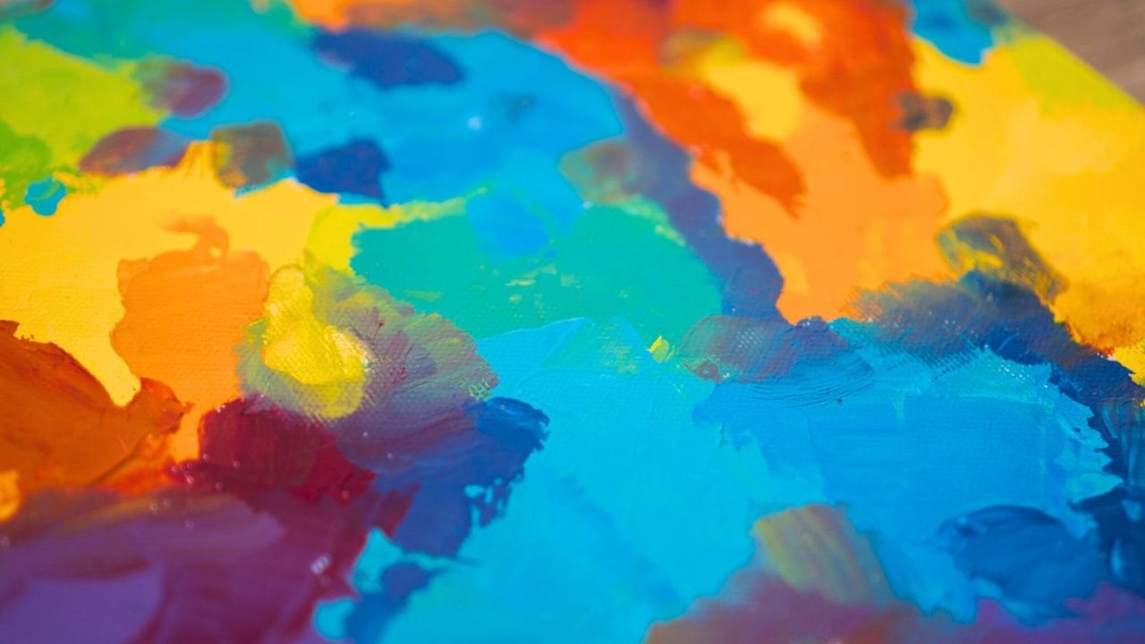
2. Materials: For this course, you will need, of course, a canvas to paint on. You can use a campus board, a stretched canvas as well. This particular campus is about 30 centimetres this way and 40 this way. It's a 30 by 40 centimetre canvas. You can use a bigger or smaller, depending on what kind of canvas you have for the brushes. You are going to need a big flat brush, a fan brush, everyone's favorite band brush and a liner brush. This is all the brushes you need. You are going to need a mixing plate. Ceramic is very good because you can reuse, recycle and repurpose for the colors. Of course, the first color is always white. This is Amsterdam acrylic paint, 500 milliliters. Quite big. You can do a lot of painting with this size of, ah, jar of paint and not worry about it finishing too soon. We have yellow brown, blue tour, Coy's, Redd's and Neon Pink. You are not going to use this copious amount of paint, but it is very good to have. If this is your hobby and you want to paint more, the suggestion is to buy big jugs of quality paint because it's cheaper than even the cheap one and lesser quantities part quantity. This is way cheaper than less qualitative paints because of the size, of course, and you will also need some beautiful paper towels to clean the brushes and probably some water. If you so needed at that point, those are all the materials you need for this project.
3. First acrylic layer for the sky: Okay, Welcome to the actual course. We're going to start with some turquoise and just lower than the middle. We're going to create this. You're going to crew and just lowered in the middle. You are going to create this beautiful horizon line just like that, going with the big clock brush from side to side, spreading the paint may be taking a little bit of water as well, and just spreading that paint around fast and easy to do. Just left to right, trying to flatten out all the paint So it doesn't have this, uh, paintbrush streaks, as you might call them, as well as stops in the middle where we've taken brush up, you can see them and then you can. And just like that, let's put some whites on our plate. Yes, from the big white tube. This is absolutely wonderful. It's just titanium whites from Amsterdam paints, and we are going to make the bottom of the sky a little bit more white and mixing it from side to side. Maybe add a little bit of water as well. If it's not blending enough to go is to create this Grady int to create this color Grady int for the sky. It's lighter on the bottom and then it becomes almost pure. Well, actually pure turquoise just like that. And then you can also and more blending and mawr white. Just as you can see, it creates this beautiful effect this beautiful Grady int. The more you go from left the rights, you don't have to overdo it. And there you go. Just like that. This step is done Wonderful.
4. Dark brown for the ground: Okay, So for the next step, you're going to need to use a little bit of brown and a little bit of blue. This is a different blue from the turquoise is a surreal ian blue. And just like that, we are going to make a beautiful, wonderful dark blue dis blue will be applied to the bottom of the sky, just indicating some dark brown ground just applying from left to right, covering all the canvas and also keeping in mind, too. Cover everything and make the paint thick enough so the campus doesn't show true after we've applied this this this layer is just to have a ground where to put our grass in the future with the beautiful fan brush. As it can see, it goes quite quickly. You can just relax and paint slowly and easily, this layer of paint on and some more strokes and it's almost done just like that, getting rid of those marks that the paintbrush leaves when you move it from left to right. And there you go with this step as well
5. Purple for the mountains: this is going to be a very fast and easy layer as well. You're just going to need to take a little bit of that turquoise and a little bit of red and maybe one small part of brown and make some mountains. Those mountains don't need to be triangles. Try to make them a little bit like waves and a little bit like triangles. Make them almost flats, as you can see, just going and making some marks going down and up with brush a little bit and breaking that line, making them each different from each other. As you can see, those mountains start to take shape and look wonderful. Let's add one on the right side a little bit taller, and you can see that every one of them is different from the other. That it's very important to give the sense of realism, and this layer is done as well
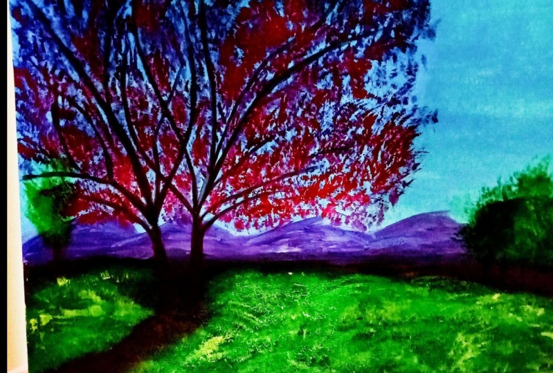
6. Fine lines with the liner brush: okay, Turning the canvas around, we'll give you a lot more control over the branches you are going to make with the liner brush mixing a brown with red. You're going to get this beautiful brown color more towards the red side. Okay, you should start on the right side of the canvas, with one branch just going down and then curving it to the right just like that. Let's make another three just to the left of that 1st 1 and this time the curve is a little bit lower, starts a little bit lower. And now let's add another beautiful branch just like that, and continue its longer. It's very important to add branches, but also keep in mind that you need to start the branches at different sides at different points on Ah, on the other side, if you make it on the same exact point on the other side than it will look like a fork, not like a three. So that's one helpful tip. As you can see when you put it lower or higher than the branch on the other side, you can just look at it and see that it's not Ah, fork and then continuing the branches, making them longer thicker as you go and adding even mawr just like that on the on the left side and continuing lower on the canvas as you go along. Just making this very nice branch adding another one and another one and another one and another one bites the dust. Yeah, okay, It doesn't matter if they overlap, that's OK. And if you are going to do a mistake, don't worry about it. Once we put in the foliage the leaves, you can hide those mistakes. It's okay to not to a perfect branch or something like that. Yes, making the right three a little bit thicker and continuing on the branch to make it thicker . Branches don't just become very thin very fast. You have to continue as a flow. Think of it as roads. Think of it as branches. They just go thinner slower than you think, so it's very important to keep that thickness almost. You will judge it by herself and see how then or think it is, and you need to make it and then don't just abruptly and the thickness of the branch very nice. Just add another one. As you can see, there is a point there. What were they overlap? Too much That's gonna be hidden once we add the leaves and the foliage. So no worries about that. Just another one. Once again as a reminder. Don't at them at the same at the same point on the branch as the branches on the other side , because this will make them seem like they are forks. It's very Ah, very easy to do that mistake. But ah, now you know better. Yes, don't worry if it's doubling, it's like that continuing. Don't don't be afraid, Teoh. Get out of the canvas with the branches because this three is quite big. Those two trees actually are quite big, and they need to get out of the new canvas. This makes for a better composition. It feels like the painting is bigger than it is on. It has room to to breathe, and let's add another branch lower. And just like that, let's work on the thickness of the branch. This will as continuing it longer. Of course, your trees will look a little bit different. Just continue adding a little bit more. Don't go overboard with the branches. Just make them leave them room to breed as well, because they need that. As you can see, they're very, very easy to do. Just have your brush. No. Hold your brush too much to the tip. Hold it by the handle further back so you have more control to do longer lines. You can see that the lines are longer. They're not like scribble e drawing lines because and the way you do that is by holding the brush higher on the handle, and you can do longer. And also you can focus on the tip of the brush. This way, it's very easy to focus on the tip of the brush so you can just create beautiful long branches, not scribble e ones. Yes, and we are almost done. One more branch than this layer is done as well. Wonderful. Okay, wonderful. So let's add some beautiful trees smaller this time on the right and the left of the canvas on the right. Having a taller tree will help with variety and on the left. Let's make some beautiful small trees bunched together. And there you go. This step is finished
7. Grass with the fan brush: Let's start with the fan brush making a beautiful green with the blue, not the turquoise. We're going to add the turquoise later to make a very interesting, more intense green. With the fan brush, you can start adding some grass over the brown, going from left to right. Try to make the grass a little bit different and also trying to keep the brown a little bit more trying to keep that brown intact. Don't cover it all because it gives more variety more intensity to the green, actually, because having darker and lighter parts gives it contrast, that contrast is very important and painting. So you need to keep that brown. You can go over the trees just so it's easier to half continuities in between them. You know, where you out that you will get a chance to put that Brownback there. At some point near the end, we are almost done with the first color, and then more gonna makes another, more intense green and put it there. Leave a small portion where the tweeze meat into brown for the shadow. This is almost a straight line. You can see it, and I, uh, I left it there, but I'm gonna revisit it. Don't worry if you if it's not perfect, you can revisit once we do the bark as well. The barks of tree. You can revisit that that area then, but keep in mind to leave it there as a line. It's just the beautiful line on the on the left side, but it has a little bit of textures that they'll make it just a straight line and has grass . It's a shadow. Going to the left with this scholar is done. Now we need to mix not a one just adding a little bit of yellow, making that green a little bit and more intense just like that, and adding it straight into the middle of the landscape near the horizon line. Just with small little dabs, you can get this beautiful texture of small grass and then working your way down. You can see it starts to have a layered effect on the grass, and as we go along, it becomes more like grass just moving to the left side, near the trees, keeping in mind to leave that shadow part over there intact. Cain. Let's go to the right corner you can add it. As you can see, the brown is still showing up a little bit that it's quite important to have contrast in the whole painting. And then you can just about see how wonderful that is going to the left side, keeping that shadow in tack, knowing for the corner, taking a little bit more color, and then even more color to put in to left hand side, upper corner and in between the trees well over them. Yes, this grassy grassy grass looks wonderful. Okay, just over there. Let's put it over there. Yes, a little bit more yellow, as you can see and wonderfully put stabbing around and trying to make it as abstract as possible. So the texture is varied in the different areas of the paintings. It's not just the same brush mark all the time. Okay, this layer is done as well. Let it dry, and we will come back to it with a lighter color with a lighter green
8. Highlights for the grass with the fan brush: Okay, now that the first layer of grass has dried, you can take a little bit of that tour, Coy's and a little bit of yellow and make this very intense queen. It's more intense and more light than the green with you've put down on the planes as you can see straightaway much, much more intense and light in color. Very beautiful green and just dab with a dab of paint, making them different. You can create this even mawr texture textured effects on just like that. Give this impression of distance by making the as you go lower on the canvas, you can make the lee the grass a little bit bigger. So it seems like it comes. It comes towards you. So it seems like you have some, uh, distance as it goes some perspective, just like that, also leaving a little bit more space in between brush marks so that do you have, um, as you go down so that you have this effect of perspective as well. With the distance between the brush marks not only the bigger brush marks or the bigger no grass, but also the distance in between as you go to the left corner. And don't forget to leave that shadow as well. So if you are just adding more water than you can, you can have the paint become a little bit more flowy and have more textured as well. Easily, easier to put down, taking a little bit more color now to continue on with the grass, Just trying to have different brush marks. Think of each blade of grass as its own individual person. They are all different and wonderful, so relaxing to do this grass, and it's quite easy as well. You could see we've covered a lot of space. What a little bit of time. Such an easy painting to do It seems so complex, but having this in mind to vary the texture very no colors and layer colors on top of each other can give a very complex look to the painting we put. We've put a little bit more yellow and made the color a little bit more yellow, and now Letterman more towards the turquoise. As you can see, you can also try to blend it a little bit more, just a little. Don't don't overdo it with the site of the brush from the left of rights, where you think it has too much texture. Who knows? It's a very, very interesting process. Yes, there is always the feeling that you should over work on area, but don't feel that way. Try to leave it as sparse as possible. And now you can take a little bit of yellow and a little bit of turquoise and then a little bit of white to create an even more lighter and more intense green. You will see how light and intense this becomes. Oh, here is a speck of white from when the white was put on the plates. Yes, you can already start to see that this green is you and more intense and light. And it goes very far because the brushes full of paint hope seems like I didn't mix the color too well, but it doesn't matter. Happy accidents happen for a reason and just going over it texturizing it even more, going quite fast year. You don't have to go this fast. You can go at your own pace, and you can just do this layer as you see fit just going over. So we've created so many different colors of green with just three or four colors. Yeah, blue, yellow, green, turquoise and white. Is that for Yeah. Okay, so let's take a little bit of blue and a little bit of brown. Maybe a little bit of yellow. A swell? Yes, make this beautiful, dark green. As you can see, putting a little bit of brown makes it even more intense and dark. And with the corner of the fan brush, you can start working on the trees. Don't connect, and don't connect them to the plane to the horizon line, because trees have a little bit of height from the horizon line all the time. Except if you're a bird, then you're looking down. And don't put a lot of color trying to leave a little bit of space for the birds to come through the foliage, so it's very important not to make them this round. Puffy, cloudy three. Now clean up your brushes good as you can so you can make a little bit of green using some yellow and some turquoise. Don't worry too much. If your brushes not clean or anything and then with the corner of the brush, you can start to apply it on the right side of the trees, and the upper side tried to avoid the left downside because that's where the shadow is so mental. Left corner, upper higher. Harder to explain, but you can see what I mean. Yeah, so good that you have video as well. So on the tall tree as well, you can go on the right side because this is much easier being a taller tree, it's just on the right side. Going towards the middle a little bit would a lighter color. You can put in just some more foliage on the all right corner of the tree and on the right side of the solitary as well. You can start to see how much texture you can build with just Onley three colors because of the contrast, having that dark, dark green at the beginning and now putting a lighter tone. It brings up this contrast, and it makes it look more texture, more colorful. It looks like it has light part, a dark part. Use that corner brush the corner of the fan brush. To make this, you can also use your fingers a swell and just like that you can see the texture and the complexity that you have created using this amazing fan brush and the colors. Yes, you can also add a little bit more grass on the lower part just like that. It never hurts to have a little bit more grass in your life. Cleaning up the brash you can now, and a letter bed of brown just like that. He can also use the liner brush for this. A swell man. Yes. Working on that branch has promised on that three that we covered earlier. You can see on on the shadow where I forgot to at it. Yes, hoops. That's a lot of round where it doesn't have to be No worries. We can clean our brush better and at the green once again just making some minor Oh, it looks even better with more green with more yellow. Yes, yes, like that, taking a little bit of the darker shade that we created earlier. As you can see now it's more grounded, but that shadow, it crowns the trees and it makes them very, very beautiful. And there you go with step as well
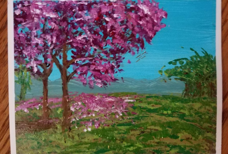
9. Leaves with the corner of the fan brush: having some rent and some blue on the mixing plate. You can now make this dark purple more towards the red and apply it with the fan brush, this time rotating the brush and using almost the tip and a little bit of the side as well . So it's very important to rotate and make different kinds of marks on the campus. Don't overcrowd the tree with the scholar. Leave a lot of space for the air to pass through end. Also, some space is for the birds to fly. You've done such great work on those branches. You don't want to cover them all up, and it's very important that you realize we are going to mix a lot more colors on top of this, so use it very lightly, I would say. Even what you see on the video, it's too much. It should be a little bit less now, continuing with another color. Just add a little bit more red and put it, try to put it on top of the dark on top into the right, so that's where the light comes from, so you have to each patch you created. You now have to put it onto the side. This new, lighter color, you have to put it on the side exactly like you did for the small to ease. That's a very great example. The small trees where you've put basically the small trees are just a patch, a smaller patch of the bigger tree. It's very easy to understand. Just put it on to the top and right of the patches you created around the tree cover. Some branches as well don't work just around branches because leaves are also on the branch . Not just around have seems, and I've seen some people just coloring around them. Okay, and now, taking some white and some red you can just makes this beautiful pink, just like not and added exactly the same on the right hand side. At the top of each patch, you've just created it tried to have a lot of texture. Try to have the space in between each mark, so it's not not just a big blob off paint. Try to know, Don't just do each individual leave, but try to think of them a little bit, just as individual leaves and you see you have some spaces you have some. Some don't group them too much. Leave them be. Leave them, have their own life and go towards the left towards the right. A little bit more outside of the shapes, as you can see. And don't forget to leave space for the bodies. Leave space for the bodies. Very nice now Okay, Yes. Covering a little bit more. Making those shapes a little bit more connected as well. And now we are going to put everyone's favorite neon pink. Yes. Don't use straight neon pink. That is way too strong, Way too strong. Combine it with a little bit of red, just as you can see just to get a little bit of that intense collar out. See, It's still a little bit too intense, but it will do. It will blend together with the last last layer you've just applied. And don't do it like me. Just use the corner of the brush. As you can see, there is just a big smiley just over there because I didn't use the corner brush. But you you will do it better. I'm sure Yes. And continuing. Put them on the right side. Top right side of the three of each patch of the tree. Basically, the tweet treat every batch of leaves as its own basically shape not only because if you only put you take the tree as a whole than and put on Lee on the right side this this, um new pink, it doesn't. It will not look like it's street dimensional. It will look a little bit fake. So put them on the right side and try to, um, make the brush on its side to put the brush on its side to rotate it and change and make every mark a little bit different. You probably have a lot more patients than I have going very fast at this. Yes, making some red. In case you, I feel like there is too much of this new pink, very intense bank. You can still add on top some of this dark red, of course, just added, you can also add it into in between on the bottom of the three as well. Just like that, that is absolutely wonderful. It's very easy to paint in this style now. This is very important, like you did put the grass you will now, but basically layer of leaves that are dropped down on the grass just like that. But then, on top of the green of the graphs, Yes, like that. Unfortunately, I've covered the shadow. But if you did as well, don't worry. We're going to make the shadow dark again. Just like not Adam a little bit. You should probably add a little bit less leaves under on the grass than I did it. Looks like someone just shook up the three and holder. The leaves dropped down. Yeah. Okay, let's make Unfortunately, you should use a little bit more brown because using I just created a purple. It doesn't really look that good for the shadow on the bark of the tree. And you should use a little bit more purple. Oh, get back to that and do it as well. The purple in the next video in the next step, which actually is the last one
10. Lighter layer of leaves :
11. Finishing touches. Congrats :): Congratulations. We are at the last layer for this layer. We're going to use the small metal liner brush. We're gonna take a little bit of yellow, some of that pink dark bank you've created and a little bit of white to make this beautiful orangy yellow. And with that, we're going to start to make on the right side of the branches a highlight just like that. Just making some lines. You can wiggle them a little bit, make them double, and try not to think about it too much. This is just a small detail, too, to give the impression that we've created such a beautiful and complex painting. It's all about the illusion of complexity. Yes, and, of course, for the small branches as well. Just like that, Yes. Small little attentions here and there. Make a whole lot of a difference and just wouldn't another one. And now you can take a little bit more white, mix it in with the orange, a little bit of red, make that a little bit more more pinkish. Just want had bid pinkish on. And as you can see, it's very, very intense. If you put too much of this new color, you can just put some more of the orange and some more of the brown. Of course, the brown will be needed for the shadow as well, because, as it conceded, that purple I've just put down is way, way, way too intense, and it stands out too much as you can see a little bit more yellow. A little bit more orange on the bark has, yes, perfect. Then, of course, even more of that lighter color you created and put it on the bark, just like you can see how interesting it started. The look with just a few touches on a few lines. Of course. Don't forget about the ones in between the foliage. You shouldn't pay too much attention to them because they are basically in shadow because they are surrounded by leaves, but they sometimes have a little bit of light catching as well. And with the brown exactly as mentioned previously, you can do the shadow if you made it to purple is like that. He can also use the fan brush. I used exactly what I had in my hand, which wasn't quite smart of me. But do you auto very your way, way, way better at this. Of course, it's always easy to look back and see all the mixed mistakes we've done and judge ourselves , but we shouldn't. So it's very, very good to just make a beautiful green now to make some some some grass in between the leaves on the grass as well as you can see. Just wiggle that brush. Well, of course, if you use the fan brush, it's gonna be way easier to do this. No, not like me. I'm just complicating myself, okay? And you can also put some of that pink back again. Just overlaying it on, making it very nice and beautiful. And, of course, taking even more intense pink. Just a more intense bank and putting a little bit more pink on that ground. As you can see, the whole painting looks absolutely gorgeous, and I'm sure yours looks even better. And of course, if you're gracious enough, you will post a picture of your creation, leave a beautiful review on the review page and check out the utter courses with acrylics with water color and procreate. Thank you so much for being bark of this community and being part of this course. I hope you had a lot of fun. And also you enjoyed painting and creating something very, very nice.
 George-Daniel Tudorache, Together we will create amazing things.